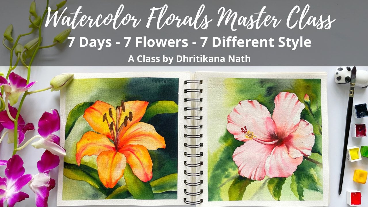
Transcripts
1. Introduction Clouds and Skies: [MUSIC] When we look up, we see a cranky
atmosphere or weather, which continuously changes
its color, shape and size. Have you ever wondered how to capture it
with watercolors? If yes, then this
class is for you. Hey, guys, I am Dhritikana Nath, an artist, instructor, mother, a teacher, educator and business owner
of VibrantParcels where we manufacturer handmade
artists sketchbooks and brush rolls. [MUSIC]. If you are joining me
for the first time, I go by the name watercolor.illustration.letter
on Instagram. Most of my artworks are
displayed over there. Today we're going to explore seven different
types of clouds and skies starting with our
romantic skies, sunset sky, bellowing clouds, night skies, cotton candy clouds, colorful skies and lastly, my favorite, passing the light. Every three days, I'm going to introduce you to a new set called
skies and clouds. The first would be
our small exercise above our romantic sunsets
on a travel sketch book. Moving on to our final
two projects, Project 1, that is about the open sky and Project 2 which is
heartwarming young sky. Both of these are unlimited
palette exercise, once we are done with
these two final projects, we will move on to the
next set of skies and clouds, everything
about sunsets. There we would be following
again in the same pattern with the exercise and
final two projects. All the projects are done
from a reference image, which I have selected from
copyright free website. It is going to give you
an insight into not copying each and everything that you'll see in a photograph, whereas we can get to
an extent by taking only the inspiration
and making it your own. Lastly, if you are
new to watercolors, are taking my class
for the first time, I would recommend you to go through my two other classes, Easy and simple way
to paint clouds of seven different types and exploring skies and
clouds with watercolors. This would help you to ease through this class very easily. So without any further ado, let's grab your art supplies and start with our first lesson.
2. All you need: Hey guys, let's
discuss everything that you need for
completing the painting. Now there are various sizes of brushes [LAUGHTER] that
I've kept over here. You can of course,
have imperial sheet and you can cut out pieces from it and paint along with me. This is the smallest
one which I have kept. This is for various exercises
we will be using this size. It is called press, 100 percent cotton paper and it is 300 GSM, 140 LPs, so that we can
do all heavy arches. One thing that I need
to tell you over here, in this particular classes, we will be using a
lot of heavy brushes, as well as some
wet on wet method, which is one of the
reasons I would always tell you to go ahead with the cotton paper only in case you are using
any handmade paper, please go ahead
with full 40 GSM, a 100% cotton paper that
can also work well. The next is our masking fluid. Now this is the masking
fluid that I'm using. It is from Sennelier. You can go ahead with any masking fluid that is
available with you. I have been using
this masking fluid for quite some time now. By the way, these
were the papers that I wanted to tell you. It is nine into 12 inch if you see this
as seven into 10 inch and this is the
smallest one which is 3.9 into 9.8 inch up. These are the
papers as well as I have a sketchbook
from vibrant parcels, I use it very often for
many of my other paintings, for skies then water, then your drawing, landscapes, seascapes,
fluoresce, etc. You can even use these kinds of sketchbooks for these
practice exercises. I would leave that up to you what you want to
go ahead and use. There is a paper, which is basically your
tissue, your towel, and this is going to be
your best friend throughout your entire section of
painting the clouds. It is really important for us to have some
tissues handy with us. I would be using a
ceramic palette. I'm using a simple ceramic
palette that is available. You can go ahead with any
ceramic palette that you have for or else any other mixing palette which you
use, it's good to go. I did not explain you these
two kinds of erasers now, one is for removing any
type of pencil marks. The other one is basically
to remove the masking fluid. Now you can also take off
the masking fluid with your hands or with this
kind of an eraser. But this is one of the
most preferred ones, it is majorly for moving
your masking fluids only. There are two kinds of
tape that I've kept. One is around 6'7 and the other one is about half an inch shorter
bit more than that. These other two types that I'm using for most of my paintings, then a different color for tips that I've used here to just lift up our moods during the whole
of the painting process. Let's just discuss all the
brushes that you need. I have kept one scale handy, you can always keep this, is a good source of, I would say help any
time you need it. I have kept one flat brush. This is one-inch Princeton
Neptune flat brush. You can have it now, another one that I would
be using is the Vinci size zero brush and the last one is my Davinci three
by zero brush. So these are majorly the three brushes that
I would be using. Now, there are two other optional
brushes that I've kept. One is for the smaller, I would say paintings
that we will be doing and this is basically a liner brush that I go ahead and use in few of our paintings. It has got a nice tip. If you see it's from Escoda. This one is from
Princeton again, half an inch brush
that I've kept. These are major the
four of the things. While you paint there is one important aspect that I wanted to introduce as
our acrylic sheets. Now, this is the acrylic sheets where I would be
actually pasting my paper and then going
ahead and adding the colors. So that's another thing
that I wanted to tell you. A pencil keep it always
handy for drawing. Two jars of water. Two jars of water
is very important. One is for our fresh supply and one is for
washing our brushes. So I would leave this
two jar of water, it's one of the most
important aspects while we go through all
of these paintings. Majorly, I have discussed
everything that we would be required or that we will need throughout our entire process. Those that are left is
majorly your colors now, each and every day, or I must say the seven
different kinds of skies that we will be painting
over the 14 days will have a different palette
of colors which we will be discussing individually
as we progress. So let's move on to
our next lesson.
3. Palette & Practice Exercise Romantic skies: [MUSIC] For working
with this exercise, I am going to use my
sketchbook from VibrantParcels and we are starting with
the first painting. Over here, of course this is a small thumbnail sketch or
you can say a bit bigger of course but it is just
going to give you one idea about what we are going to
paint in our first painting. I do not want you guys to combat with everything at
the first paint and this would really
help you to get an idea as well as ease
out in the process. Going ahead with some Opera, I know many of you do ask
me how to prepare Opera. See Opera is a kind of magenta. With magenta, usually
company does this, it adds a fluorescent dye. Now that fluorescent dye we usually do not have
[inaudible] it with ourselves, that's one of the reasons you cannot prepare Opera at home. I would request you guys to go ahead by purchasing
an Opera or else using alternate colors like crimson or else any
other kind of pink. But of course the
brightness of the color will not be what you also
write up on the paper. I think that's the only
thing which I wanted to tell you as there are repeat
questions on Opera a lot. I do use this color
very often and this is one of my favorite
colors to walk around with. I'm going ahead with
my Indanthrone Blue. Indanthrone Blue is one of
the blues which I really love nowadays and it is
becoming my go-to color. Adding some darker value is
pretty easy with this color. We would also use some
amount of purple after this, but it's an option that
I always give you. I think two colors, it's very important for completing your painting,
two to three colors, and this is one of the blues that I see giving very
beautiful and pretty colors. Even when you add
it to anything or any other shade of pink
which you want to add, then adding some amount of
our purple onto the sky area. Now this is something that I always love to tell you is
leaving some white spaces. Why we did this exercise is to actually get a hang off
leaving some white spaces. This is not an exact match
of how we would be painting, it's just very close or something which is similar to what we
are going to paint. It would help you to understand that leaving
these white spaces within the painting is really important for our
first two skies as well as our watercolor
palette that we are going to use for
these paintings. They are majorly limited, the color palette, for both of these
paintings I tell you we would be using
very few colors. For this one it would be Opera then your
Indanthrone Blue, your Bright Violet as well
as your Payne's Gray. Those are the four colors. As I have told you it's a limited palette exercise
that we are doing. Limited palette actually gives
us a lot of opportunity to not actually make any
kind of muddy colors. In the meanwhile, this
painting is drying off, I would like to tell
you about the palette. As I've already told you
Opera is difficult to make, so you might have to buy this color or else
you can go ahead with other options like crimson or any other pink
of your choice. Once you have added the Opera, take Indanthrone Blue, that's the second blue
which we are using. Then is our Bright Violet I'm using from
Mijello Mission Gold. You can go ahead with any
other violet of your choice. The last one is
your Payne's Gray. There might be some color
a bit here and there, that's always up to you. Many of you might not
have Indanthrone Blue, you might use Prussian Blue though your pigments
are different, so I think it's up to you. See the colors how they react, work on the smaller
piece first and then only go ahead
with other pieces. This is the color that
I was telling you, it's from Sennelier
that I'm using. Two of them are from Mijello
Mission Gold that is the Opera and Bright Violet and this one is from Sennelier. I think the Payne's Gray is also from Mijello Mission Gold. Why I like Mijello
Mission Gold for my clouds is they do
not spread a lot and it helps me to control
the colors a lot more than any other
brand pigment. I have used PWC too and
it really spreads a lot, it's difficult to control when you are working on your skies. I'm not sure exactly
what component of the pigment actually
makes it flow a lot more, but I think Mijello
Mission Gold is one of the perfect colors that I would love to go ahead
with for painting my skies. We are done with the
palette of the day 1. There is something more that we need to add and it is
the dry brush technique. I just take some of my
Payne's Gray on the brush, take off all the extra paints on the tissue and then add
this dry brush technique. Now this is something
that I love to use for my future paintings too. You have to go
ahead and work with this technique more and more as you progress
in this journey, so it's good to learn. Do try it on this painting, it would help you to
get a hang of it. Yes, it takes a while, but once you take out
the moisture from your brush you would
get these strokes. It is perfect to paint
your trees, your bushes, that's what we are doing
over here and that's what we would be doing even in our first romantic
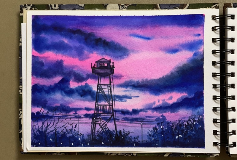
skies painting. Romantic skies, I
think was the name because I just felt the
colors were so beautiful. Anyone would love to
have dinner or watch this sky when you
are sitting out. I think it was just one of the most pretty skies
that I have seen and that's the reason
the name came from. I'm just going ahead and making some lines now for the painting. Once I'm done with these lines, this part of the
painting is done. It's a quick exercise
as I've told you, it's not the exact one
that we would be painting. Believe me, it's just
to get a hang of it, understand what we
are going to do, understand this dry
brush technique, understand your palette, those are the important
small aspects that we always forget. Every two days a palette is going to change as I
have told you earlier, because I love to
use new palettes and I am going to add more and
more colors as we progress. The first one of course
as I've told you, we want to use lesser colors, make it less muddy. Going with the few colors
is the best title. There are lots of techniques
that I'm going to cover in this particular
second painting. Though we would be working
with only basic two colors, that's vermilion
and Payne's Grey. But there's a lot to learn. Apply your first wash. Once you have applied
your first wash, let it dry a bit. Do not just go ahead
and add your colors. Keep it for one or two minutes, as we are working on a very
small size paper right now. We don't want our
colors to flow a lot. As I've told you earlier, also, how to work through your brushes and how
to apply your colors. We are not going to add our
brushstrokes when it's a lot muddy or when there is a
lot of water on the paper, we're not going to do it. Those are the aspects
we are going to follow. I have used my thicker brush to just blend the colors well. Once I have added the colors
with my thicker brush, I would go ahead and start adding the clouds
towards the bottom area. Now, the clouds that
I'm adding towards the bottom area is
absolutely random. I'm not painting much. Here I'm going to tell you one important technique that is how to pick up your colors. Though in this case, we are using our half
an inch flat brush. Always pick your colors, take off the extra
paint on the tissue, and then wash your brush as
you observe me doing it. I do it for one or two times, and then I just washed my brush. That's very important. Whenever you are
picking up your colors, you can keep on
repeating the process for more than one or two times. Use both sides of the brush. That is, yeah one side, just picking up the colors. Then again, you've seen it, it takes some time
to get a hang of it. But once you know how to use it, it can be used in so many ways. It would help you to
paint skies like pro, whenever your light is so throwing from
in-between the clouds. You can work through it. You will find this very useful when you are doing
any underwater sea painting. These techniques have their
use in multiple places. It's just up to you how
you want to use it. Now, I am just adding
some more lines. Again, this is not what we have really done in
our final painting, but it's good to
even know how to add these lines and show
there's in a better way. Adding something gray. Now, I'm using again the tip of my brush,
as you observe. I am not going to use the whole of the brush
to work around with this, adding some more lines. Then once we are
done with this part, I would go to the
top area of the sky where we are going to
add our paints gray. Then once we have
added our paints gray, we would mark our
palette though, you already know what is
our palette for D1 and D2. But it's good to just do it on the left
side of the paper. I have used a very good
travel journal for myself. I always say this, that your paper is really important when
you are painting. Many of you do ask me that there are less options or there's no 100 percent
cotton paper available, less 100 percent cotton
paper were available. What is the cheaper
way to go about it? Guys, there is one thing
that is handmade paper, which you get for 40
GSM in the market. Go ahead and use that in case you want to invest
less right now. But believe me this case, one thing that you
should invest always, because you are going to read
the returns like anything. If you are using a bad paper, you will always feel that
you are not good enough. Whereas, once you start
using a good paper, you exactly know that you are getting the
best of the results. Now, I am using the
major two sheets, which is your vermilion
Payne's gray, and as I've told you, this is the brown ocher
which I have left. It's not mandatory at
all to have this color, it's something
like you're bit of burnt sienna added into your yellow ocher
or your raw sienna. They are way more similar to the color that you observe
right now on the palette. I think these are the colors, majorly it's optional
as I've told you. Two colors, which is very
important for this painting. One is the lighter shade and
one is the darker shade. Warm and cool are always a
good idea to go ahead with. They produce best of the colors, and they look
amazing altogether. In case we last a few
minutes of the painting, and once we are done
with this part, we would let the area dry off completely and then have a final look at both
of the paintings. There are two years of
mountain that I would love to add is basically the
hills or the mountains, whatever you want to call it. It is going to be a
part of it even in our final vermilion,
romantic sky painting. Going ahead and making you a bit more well-versed
with it right now. Adding the color, once
you have added the shade, go ahead and add one
more darker shade. This is the lighter shape
that you have added. The darker shade though
would be more with the Payne's Grey and
less of vermilion. This is more of vermilion,
less of Payne's Grey. These mixes you should try always some on a separate
piece of paper which is measured in a draw for
any paper which you are not planning to use any more or 25
percent cotton paper. This is 100 percent
cotton paper, or else sending handmade paper. I think those are the options. You should always
go head with and checkout for your paintings. Checking out your colors
is very important, as I always say. Let your paper dry off. Now, once your paper
has dried off, so one thing is that every layer needs to be dried off before you add the second layer to it. That's important. I think we are
happy and good with our small thumbnail sketches
or smaller squares sketches. We're going to finalize this and it's going to be amazing. I am not telling you something
that you will not follow. These are two of the major sky that I have fallen in love with, and I think you will
also love it completely. Let's just move on to
our paintings now. Full pleasure paintings that is waiting for all of us
and paint together.
4. Romantic Opera Sky Project 1: [MUSIC] We're on to
our first painting, and here we're going to
paint with the opera. That's one of my very
favorite colors which I have been using for a
really long period of time. I'm applying some of my opera directly on the paper and then I have applied
some clean water. I'm using my flat brush to
apply the colors as I'm trying to actually occupy
a lot of area on my paper. This is one of the good
ways to use your area or use your flat brush to apply your colors on a
larger piece of paper. If you were working with
the small size paper, then you might go ahead with some of your
smaller size brushes. I would leave that decision
absolutely up to you guys. The size of the brush will
not define your painting. What I would ask you
to do is go ahead with whatever size of paper
is available with you, whatever sizes of brushes
is available with you. Just do not take a really small brush
for a large size paper or else do not select a very large size brush
for a really small paper. That would be my only request. Once you are done
with this part, go ahead and apply
some indanthrone blue. Now, indanthrone blue is one of the very favorite colors which I'm going to use
in this painting. I'm using the Sennelier
indanthrone blue. You can go ahead with whatever
is available with you, or else go with Prussian blue. Though the Prussian blue might be a bit
different compared to the effects that you would
get with indanthrone blue. Wherever I feel I want to
push my paints down or else I just want to take off all the colors from
a particular area, I'm going ahead with
some clean water and applying it with the
help of my brush. Now this is my da
Vinci size 0 brush, which I'm using as a nail. You can go ahead
with any brush that is available as I have
already told you. A few of the places I have
genuinely kept as white. I always feel that every
painting where you are actually going ahead
and painting the clouds, the white of the paper, if it reflects
that looks really, really nice though
in the photograph, you might not find it. But as you progress in
your watercolor journey, you will understand
the values and you will understand how
beautifully it reflects. The more you add, the white to your clouds, the better it looks. I have just placed my
paper below this paper and that's one of the ways my paints will move
towards the bottom area. I hope you can still watch it. I have actually fixed my frame [inaudible] because
that really helps you to concentrate and understand one after another how I am
progressing with the painting. Going ahead and adding
some more clouds. Now, this is a
really small brush. I think it is 2 by 0 or 3 by 0, something like that
which I'm using again. It's a brush from da Vinci
and it is my latest favorite. But you can always go ahead
with any other brush. If you observe my brush
doesn't have a lot of water. I'm working with really
less amount of water as well as on my
background paper, I do not have a flowing water. If I have a flowing water, I will not get exactly
the clouds which I want. I'm going with the simple
way of applying my colors. One thing that you have to
always work around though, when you are working with clouds is to apply your
brush movements. Sometimes I am applying it towards the opera color that we have already applied
on the paper or else sometimes what I usually do
is I'm going a bit below, so the direction
I keep changing. Now, direction is really important when you are
working with clouds. If you are having the
same direction clouds for both the layers or
say, for two layers, two layers in a way I
am trying to tell you is the first layer that you
have applied is your opera, and on top of your opera, you want to paint
with another layer, though, it comes within
the first layer itself, but still if you want
to paint on top of it. I don't want you to paint
in the same direction. Some of the clouds will
move towards the bottom. If you see that top left cloud, it starts to from the top and
slantingly it comes down. When I go towards the
bottom area of the clouds, I'm going with the
darkest value, which is practically
my paints gray and applying some amount of
my indanthrone blue. This area is now quite
dry, I must say, and that's one of
the reasons I'm getting really dark
clouds and they are not moving a lot or the colors are not moving a
lot, it's absolutely okay. Few of the areas you have
to see how you want to add your colors and then go
ahead with your painting. I am even adding some shadows towards the top
area of the clouds. These are small
things which we keep doing while we progress
with our painting. You can even stop in case
your paper is completely dry. Just let your area dry
off completely and then go ahead with
your darker values. Once you have
absolute dry paper, apply one layer of water, but really like that, and then go ahead with the
darker value as you observe. I do add some darker values now, though I feel that I
could have avoided it, but it's absolutely fine. They'll look confident
with your stroke still you feel that
this can work for you. Always go ahead and paint. That's one thing which I
have absorbed in my journey that if you think that this
is going to work for you, it's absolutely going
to work for you. I am going with a bit of
blending brush if you observe, I'm then just blending
it towards the bottom. This can only happen
when your clouds are absolutely dry in the
area where you are blending. Now, that's really important
while you paint it. There might be a few
areas here and there that you might not be very
happy with the outcome. All those things can actually
come in this journey, and you might feel that, okay, I'm not really happy
with how it turned out, but do complete your painting. I always say whenever you are
painting from a photograph, it might be a bit different
from when you are actually applying your colors
and painting on a paper. Practically, a watercolor
painting is really different. Going ahead and applying some of my water towards
the bottom area, and once I have applied the water towards
the bottom area, I'm going with some of
my indanthrone blue. This is just to create the darker values while you work towards the
bottom area of the clouds. This area is going
to be really dark, so do not worry much. You will only observe one thing while you
paint the clouds. Seven to eight
minutes is the max that you need for
painting the clouds time. Your paper will only
remain wet till that time. In case you are planning to keep your paper wet for a
longer period of time. I can suggest you one thing. Take an acrylic sheet, and just apply water on
both sides of your paper. Then when you feel that
the water is dried up, or you feel that you want to go ahead with
another layer of water, just to apply it on the area
where you are painting. Let it just become a bit dried where you can
start applying your colors. Then you will feel
that this paper is wet for a longer period of
time compared to if you were taking some
watercolor pads like this to add the colors
or to paint your clouds. That's actually a pretty
easy way to paint your clouds and to keep your painting wet for a
longer period of time. As we progress, we will
see how that also works. But for this painting, I do not think that we need a really long period for
keeping your paint all wet. While I apply any blue that is set on tone blue
or any other colors, you have to always see
that your paper is wet or else you will get those hard edges that we
really want to avoid. Some of the places where I think I have got
that hard edges. I'm just blending it
with my blending brush. Now, each and every area
seriously we can't blend. That's one thing
which I have seen. Wherever we can't blend it well, I am going ahead with
one more layer of water, as I have told you all earlier. Then I am just adding the colors so that I
get that bloody effect. Yes, you will also have this happening in many
of your paintings where you will not get exactly the effect
that you wanted, and you might have to
work two times on it. I think it's just an
extended work that we will do and sometimes we do
not get the desired results. Still we are satisfied or happy, we keep working on it. But to make sure that you
have this opera pretty much visible on your paper
in case you are covering it with the complete blue
and dark blue clouds, whole of the painting
will come crashing. Yeah, I have to tell
you this very well, that do not try to actually cover all
the areas of the opera, opera needs to be
there and opera is practically the beauty
of the whole painting. I do want you guys to
remember that there will be only about 30-40 percent of the space where
we're going to add these darker clouds rest
area will be more of opera. Once this part is done, go ahead and start
painting your bottom area. You can only paint
your bottom area once the paper is
completely dried. Do not try to add any
lines or any trees. If you see the brush
movements which I'm doing, just going with some
straight lines. That's absolutely okay and then making some dry brush strokes. Not all of this you
have learned earlier, and I would just like you to
go ahead and apply it now. Dry brush is a really great way to actually create your trees. They will give the look
of trees as well as they will not make it
look like it is overdone, or you have practically
not need something. I have used this
technique in many of my other paintings and I just wanted to share
it with you guys, that use these dry
brush technique wherever you want
to add any trees, or wherever you want to
add those dry lines, and give the impression
of trees or bushes. It would practically make
a lot of sense to do it. Some of the places you can
alter the values of it, which means that you
can have darker values and some of the places you
can have lighter values. That decision, of course I
would leave it up to you. Then you can have
these dry strokes, and understand that some of
the areas we are leaving, even as the skies appearing, we are not covering
the whole of the area. The best part about
a cloud painting, as we are not going to
overdo much of the space, few of those spaces we
are willing to work on, which is majorly about 1/3 of the bottom area
of the painting. The rest of the painting, we are going to leave
as that gives you a lot of time for doing
other stuff here. I know most of you
are really busy, and you are trying to just get yourself
de-stressed or you are just not so much into the painting as you have a lot of
things pending. You can practically leave it
over here too and in case you want to incline to
move along with me, and to paint along with me, paint that tower and have the whole beauty come
together, just carry on. I am pretty much sure you will be in a
position to nail it. It's just the last part where
we have lot of details. Details means yes, we have to concentrate more and
just keep on painting, or just have the patience
to go with the flow. That's the only thing
which I always say having the patience as the most
important aspect in watercolors. Patience actually gives back
a lot to you in watercolors. We can't think that we will
create masterpiece every day. Practically when I was
painting this one, I failed four times
till I did succeed. It takes a while to understand how you want
to paint your clouds, how you want to add the
direction to your clouds. Direction to your
clouds is really important when you are working
with watercolor clouds. I would give you further details into how I
added action, etc. As we progress, there will be some different kind of clouds that we are
going to paint, and you will understand
each and everything about adding the
directions, etc, with it. Here I've kept it more simple, just adding some background, the color, and then
applying the darker values. Keeping it simple always
gives back a lot of time. Not only a lot of time, it even helps your spectator
to understand exactly how you are working around
the with your colors, exactly how you are trying
to add simplicity to your painting and still have a very beautiful
painting altogether. Using the tip of my
[inaudible] brush just to add these lines. Now, this brush holds
a lot of water. That's one of the reasons
I have to take off all the water on the
left side of the tissue. You will see the color
of the tissue changing. That's absolutely okay. Take off all your colors
on your tissue before you apply it on the paper whenever you are
doing dry strokes, or whenever you are
adding these trees, it just takes a while. Everything that we're painting
over here is real-time. Real-time actually
helps you to understand how much time I needed to
complete the painting. Accordingly you can also
go ahead and channel your energy in a way
that you can plan and understand how you
want to apply your colors. Now this is more of our dry
parts that we are adding, and dry parts is not going to challenge you that you have to finish the
painting now itself. You can always do it in parts. But it's always a great feeling to finish it and have a
look at your painting. Once the left part is done, let your paper dry off, and then I'm going
ahead with the tower. I'm starting with mostly the
left side of the painting. I do not try to place the towers in the
middle absolutely, that's one of the things
which I never do. Placing these towers or these buildings is
good towards the left, towards the right, or towards the bottom
part of the painting, wherever you want to
add it's always good. Going with a very rough
and simple sketch, I think you should be in
a position to see it. One thing that I always tell everyone who is
watching the classes, do try to watch the class
on a bigger screen. Bigger screen
actually helps you to understand how you have
to apply your colors, how the strokes are when
I'm adding these lines. In case you are watching it on a smaller screen it becomes a bit of a challenge to
understand each one of them. Going with some more strokes as you absolve and I would be finalizing more on this as we progress with
the final painting, or with the final
outlining with the colors. But just a rough outline
that I'm making right now. With my paints grade, there will be some of
the places where I will apply some lighter
values and there will be some of the places where
I would be altering the values of the color of
paint is going to accept now, that's something
which I have been doing for many of my
paintings and I'm so happy to show you how
this all comes together. Adding a bit of tone blue. Now, why I do even
change the values while I'm even adding
any of objects, it just gives the real
picture I feel adding completely flat colors
for your buildings. Some, doesn't add that
much amount of flavor, as well as that much amount of expression to your painting. That's something which
I always love to add. It should be expressive, it should appeal to anyone
who is watching it. Overall, yeah, that's something
that I look forward to. That's one of the reasons you
might feel that sometimes I am actually taking off
the color from my brush, and then applying
it on the paper. All of this, as you progress, you will understand
more and more. Wash your brush
wherever necessary lift off your colors as
I'm doing right now, after washing my brush, and then now slowly
moving to the top part where I have applied in and around the
colors for the window. Once we are done with
these smaller parts, you have to think that this is actually
one of the paintings, which is not very easy. But it gets very less
time for the clouds. Do not keep painting your
clouds when your paper is dry. That's one thing which
is rule of thumb for getting these soft
and nice clouds. If you are working through your painting even
when it is dry, you will get those hard edges. Blending brush might come to
your advantage in that case. So keep your blending
brush handy. I will do a quick recap of whatever we have learned
in this particular. I would say one.
This is just one of the two paintings that we are doing from the romantic sunset. The second one also we will
be painting one small heart or you can say a small bond or someone who is
living in a house, whatever you want to call,
that's absolutely fine. We are doing those kind
of both paintings too. This is all a limited
palette exercise which I wanted to show you here we are using four colors There we are majorly
using two colors. Whenever you have two or
three colors to manage, it becomes really easy. You do not get any
kind of muddy mixes. I have carefully chosen
all these colors. If you see opera
and your portfolio looks beautiful together opera, purple, blue, and pink is great. All of these work
together very well. They never give you any
kind of muddy mixes. Always test your colors on a
scrap piece of paper before you go ahead and paint
directly on your painting. That's one thing which I
have always made a point. I will show you how I
checked my colors and I do not just go ahead
and start painting. As I do tell you that
all these paintings which you observe have
been done at least two to three times before you
finally see it coming up on any kind of channel
like Skillshare or you see me teaching
it anywhere else. I do paint flawlessly only because there's lots of practice that has got into it. Sometimes when you guys tell me, this is really nice and
this is really pretty, the outcome did not come according to how
you have called. Guys do not get this harder. You are going to get there. Practically there
is no mathematics. I would say, there is nothing
different in getting there. It's just a bit more practice than what you have been doing and that's one of the reasons of getting this daily exercises. One of the days you are
practically practicing how to get these smaller
clouds and how to get these paintings
in a small piece of paper and the second
we're finalizing it. Always it's a good idea to
do your thumbnail sketches. Thumbnail sketches gives you a really good idea to understand exactly how you
want to apply your colors. In case you are not confident enough anywhere or in case you just feel that you are not getting what you exactly wanted, just go ahead with
another thumbnail sketch. It just takes a lot
less effort compared to if you scrap on
painting and then again start with
another painting. That's another aspect
which I can tell you can help you really in
your watercolor journey. That's something which I
have used every time in my watercolor journey and I have actually succeeded
like anything. It gives back lost time
as I run a business, as I am working, I take many other
classes in person, so everything put together, I do not have a lot of time. I have a very small baby
of 16 months old in and around the house and many of
you have just one question, how are you managing such
a huge show yourself. It's just a bit of planning. I must say that few things I do very
deliberately like planning. Planning is really
important in this case. I do plan out the smallest sketches if I
feel it's good to fill on smaller piece of paper and then just work it out on
a bigger piece of paper. I think that's one of the best place you can walk
through your paintings. You can get a beautiful
future painting done. I think these are just a
few lines that I'm using, just a tip of my brush
to add these lines. Everything put together. These are simple, easy, and I feel that there is so much less work
that I have to do. It's just finalizing
the painting and I'm practically seeing the whole of the painting
has come together. Some few details and details usually take
a lot longer time. If you see our clouds
were done during the first 13 to 14 minutes
or 15 minutes max. Then we're just going ahead and detailing and
detailing and detailing. Something that you will also understand
takes a lot of time, takes a lot of effort. For completion of a painting, it's important to
add the details. Details can really help you to take your painting
to the next level. I think I have added all the lines wherever I
feel it was necessary. I'm using the tip of my brush, if you see I have been
using only two brushes. One is my Da Vinci size 0 brush, and this is size
2 by 0 or 3 by 0, something which is really
small in terms of the tip. You can also go ahead and use a brush like this or if
you have smaller brushes, go ahead and start. It's absolutely fine. I always tell you what are
the materials that I'm using, but you do not need to purchase all the materials that you see. You go with whatever
is available, then create your own painting
and treat your own magic. You guys, seriously,
I can't wait to see what you create in
the project gallery. Always do upload your projects
in the project gallery. This is a really
important exercise. I love to give you my feedbacks in case you
are going wrong anywhere. I would love to add how
you can correct it. I think that's important. I'm just adding a
few more lines. These will go on till you feel that your painting is finished. Wherever you think
that you want to stop, just drop it there. For me adding these lines
will create that sense. There are some electric
lines which are also going. There's a tower
that you can see. All of it put together
will make lot more sense. It will feel like that we are
actually living somewhere. Yes. It would give the feel of life and you are absorbing
it from a distance. You have taken a photograph for your reference and we can't completely ignore it in view of the places we are adding
some highlights now. Now highlights are
something that I always love to add down. Why? It really gives the
painting another level and sometimes I get over it with so much that I keep adding more and
more highlights. But do remember highlights
is just for your details and it would just add some more, I would say expression
to your painting, some more depth
to your painting. The whole depth
that you have added to the painting is based on your clouds as well as what you are painting
for your foregrounds. Foreground is something
that you should always watch out for
because that really helps you to give depth
to your painting as well as details, which is important. Yes, always break up your painting into
your background and into your foregrounds. Even for paintings like
cloud starts very important. Once this is done let your paper dry off and then just remove
the tape at an angle. I did use white gouache
for the highlights.
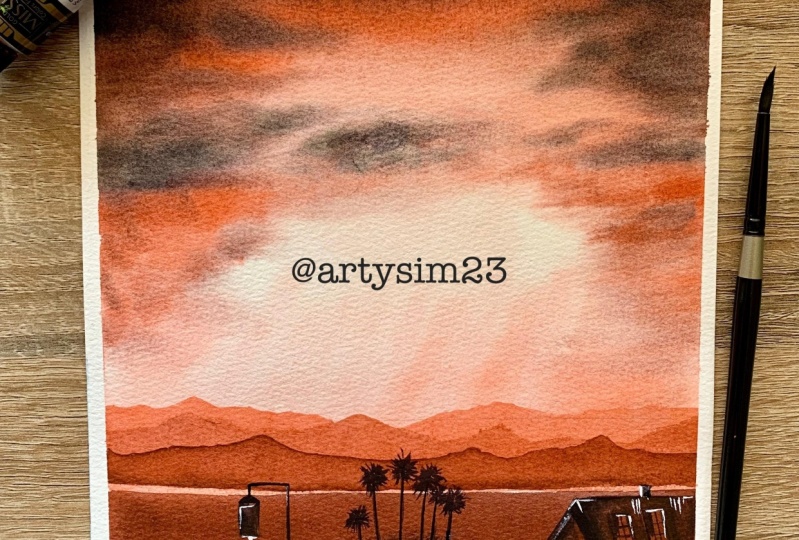
5. Romantic Vermilion Sky Project 2: [MUSIC] We are onto our second painting of
the romantic skies. This is one of my favorites and the best part about
this painting is we're using a
limited palette. As you already known that there are mostly two colors that we are going to work with and I have applied one
layer of water. I would be then picking
up some of my vermilion and applying it
with my flat brush. This is one inch flat
brush from Princeton. I'm going ahead with just a very light wash of
vermilion over my paper. Some of the area I want
to keep it as white as I want the sun rays to move
out of a particular place. I will show you
exactly how I pick up my colors when my paper is wet. There are two ways of
lifting off your colors; one is when your paper is wet and another is when
your paper is dry. Over here, we are trying to work around in the painting
when my paper is wet. Now, something that
you need to do or understand when you
pick up this color, just not all the colors
you can pick it up. Why? Some of the colors are staining in nature and
because of that reason, once you apply it on the paper, you cannot remove it. Now, if you were not using
100 percent cotton paper, it becomes again, really difficult to pick
up your colors. This is something which I have
learnt over time that you cannot always pick up your followers from every
paper that you use. If you are using
cellulose based paper, then again, it becomes really tough to pick
up your colors. These are the aspects
which you should keep in mind while you
pick up your colors. You will observe that I'm using my size one inch brush from Princeton to
pick up my colors, every time I'm picking
up the colors and then taking it off on my tissue. This is a very easy
exercise to do, but along with it, you have to keep in mind that you need to clear out
your brushes each and every time you are going ahead and
picking up your colors. This is a very important part of your watercolor journey
to keep your paper clean. The only way you can keep
your people clean or white wherever you want it is by taking off all
the extra paints from your brushes
into your tissue. Tissue should be
very handy to you. I'm mixing up some of my
vermilion with my Payne's gray, or this is basically your sennelier orange
that I'm using. It's a very beautiful shape. Practically I came across
the shade a few days back. I just thought to include
it in this painting though I'm exactly not
sure of your pigment, etc. You can get more
information about it, when we started out, what are the colors that
you need for this painting, there I have added everything. Going ahead, I'm using my Size 4 silver
black velvet brush to add the smaller clouds. You have to go with
a very easy way of adding these clouds. There is no different thing
that I'm doing over here. It's just that keep
adding the clouds. Still your paper is wet. If your paper is drying off, let it dry off completely. You will observe me also do it. How I keep working through
it is very important. You will practically not get more than 3-4 minutes
to paint your clouds. In the northern part of India, it's already very hot
because of which it becomes even more difficult and challenging to paint my clouds. Here's one of the challenges that I took to myself
that let's try to paint the clouds in a
better way during this hot summer season so
that weather should not be a question that comes to my
mind when I have to paint these beautiful and
natural looking skies. Going ahead and adding
my vermilion color. You have seen that this
makes us more vermilion, or you can say sennelier
orange compared to the other part of the sky. We are going ahead and this is basically your layering
technique that I'm doing. I would be adding three
layers of mountains. Though it is a very
easy exercise, but the layering
technique over here will set a lot of perspective
to your painting. There is sky that you have added and there is some amount of land
that you are adding. We will even draw
one small house. Then there will be
some palm trees as well as some of
the smaller bushes. Along with it, there is a small bell that
you will observe. Now, either you can draw in the beginning, according to me, I have just left it empty
for now and went ahead with the drawing only after this layer and this
part was complete. I'm going from top to bottom while you
observe me painting. That's one of the ways of
moving ahead in your painting. Though many people,
and even for me, I have worked around with
different techniques, but this is one of
the best ways where I have also painting the sky and painting the whole landscape comes together pretty easily that way. Once I am done with this part, I would allow the spot
to dry off completely. Again, to be precise, I'm going ahead, with my Sennelier orange
towards the sky. How I go ahead with? I would be applying
one clear water on the sky area and then I
would apply this orange. You will see that I
am going ahead with very light hands while
I apply this layer. You need to work very quickly in this case
as well as we will not have a lot of time to work
around for our clouds again. Going ahead with
the Vinci brush, again, this is one of my favorite brushes
as I have told you. Adding that amount of Sennelier orange that is
required for this painting. Once I have applied
the Sennelier orange, I would go ahead and add
small dots here and there. It is just below
the darker clouds which I have added as well. I go towards the bottom
area on the left part. I would even add this
Sennelier orange mix a bit. That would make my painting look more vibrant and more dramatic. Our photograph is not
exactly similar to the one that you are observing
me painting over here. One of the reasons
of the same is that we take the inspiration
from the photograph. What we create with
it is always on us. We're not here to copy the
entire photograph, but again, not going just against it
completely and working it up. That's one thing which you
should always keep in mind is that go with the flow and understand how you want to
recreate the photograph. You should add a
lot of your own to this photo and practically
that will help you to create your own
creative field work because there are a lot
of times where the photos are watermark though this
this particular photo and all the other
photographs that I have chosen is from
copyright free website, which is my Unsplash. But still, I think always changing the
photos and recreating something of your
own will seriously help you a lot in your
journey and how and what you recreate is
the whole guidance I would love to give you
through this painting. Adding some of my darker values
now for my mountain area. I think the mountains are
quite below the line. Now done what I really wanted. I'm going a bit
slow while I create this lead because
it is free hand. I'm going a bit slow, will really help
you to walk around on all these parts more easily. Why I say always
cool a bit slow? Going slow is good when
watercolors rather than coming back and
again, redoing it. Watercolors leaves us with lesser opportunities to actually correct our mistakes compared to many other mediums
like wash or acrylics. You have to be really mindful of how you apply your
colors on the paper. One of my important, I would say suggestion to
each one of you is not to think or not to leave
any painting in the middle. Always, do complete each
and every painting. I seriously had at least
3-4 bad attempts and I could not make any of my paintings when
it started off with this whole class,
it's absolutely fine. You will have your mistakes and those all mistakes
are good till you can create something that is in your happy space and
it makes you happy. It is a stress buster. Everything put together, now really add up a lot. That's what I always think. Already the sky
looks amazing to me. Now I am creating this mountain. As I have told you, I just
felt that the mountain has come quite below where
I exactly wanted. Going ahead with
my thought here. Now letting one of the techniques that I
always love to cover. It is wet on dry method and we are here to work wet on
wet as well as wet on dry. I am a firm believer that to run all the styles and to learn how to walk around
with your paints, it's important to work
both ways and that really can help you to master the skill set of
watercolors in a better way. Go ahead and complete this
part of the mountain. Once you are done, you let it dry and we can start
with the bottom are. Again, it would be a mix of your Sennelier orange
and your paints green. Both of them can create
real wonders. I must say. I'm adding a bit of my
orange into the mix and then going with my mop brush to
add the colors on the paper. I'm going with a bit of a darker value over
here as we have already applied two layers on the
paper and that might show up. So it's good to add
the darker values. Even in the photograph
it is darker values. When I saw this
photo on a larger, I would say screen,
like my iPad, I understood that there is
something that is even on the photograph and that's how
I created this bottom part. There are not only trees, there is a small
house on the right, which can be seen with
the normalized on your particular mobile
sets if you are using now, that's why I always say that try to observe the class or try to observe everything
on a bigger screen. Bigger screen always
helps us to get these smaller parts of
the painting pretty easily compared to if you're observing it on a smaller screen it becomes very
difficult for us. Though the painting might look bit more dramatic
compared to what you observe on the
photograph and that's absolutely perfect as
I've told you earlier. Going ahead with darker values of our paints gray
towards the bottom area. It's the white that
is showing off and we do not want all the
white to show off a lot. Adding just as a
Sennelier orange is quite enough right now. I guess I would allow
the spot to dry off though nothing shows off for now and then we
will start adding our graphite marks
for the small hut, as well as where we have
to place our trees. Now you might not be in
a very good position to understand what I am
placing there exactly. If you can't, then no
problem at all just wait for a while where I would go ahead and start
adding the colors. You can understand it better and then just start painting it. Once you observe me to do it, also it will be easier for you that way rather than
going ahead and right now trying to
paint along with me. I'm placing a small bell towards the left part then I would place some
bushes in the middle. On top of it, I would add some of my palm trees
for the background. This is a very easy painting. I must say it's just that
there are a lot of steps, which is broken on
the painting into a bit longer process compared to what it would have
usually taken. I think that's the only aspect which you have to keep in mind. The overall, you have to feel
confident because the sky, you can nail within
a few minutes. Practically our sky
then all this layering, etc, did not take us more
than 13 to 14 minutes. This part of the
painting is of course, is more detailing
and I would like to add those details
towards the bottom area. I'm one of the firm believers
that even if you were painting the sky and the
whole focus is on the sky, some parts of the
painting really make up your painting or take your
painting to the next level. That's what I think over
here we are trying to add. About four to five
palm trees you can go ahead and add exactly the
way I am doing right now, and then start
adding your bushes. Of course, for the bushes I am doing a dry brush technique. You would see the colors that I picked on my brush
are really dry. If there is a lot of water, I would just take it
off on the tissue and then start adding
my colors on the paper. Once your watercolor is dry you need to understand
the layer would be one shade lighter compared to what you would have
applied on the paper. I will add these bushes
from my background area, and this dry brush
technique you have already done it in the
previous painting. It would be pretty easy for
you to work through this. It takes a while to understand
how to use this dry brush. It's only very less amount
of water on your brush, and then just blending it. Towards the top area
make it more dry and you have some tooth which is already prevalent on your
paper because of which it is more and more dry. Now the more toothy
paper you take the rough you will get a better
outcome for this. I've observed it that it
becomes better with it. I am practically
mixing two colors. One is a lighter value of my Sennelier orange
plus my paints gray. Another is my paints
gray, darker value. Now this really helps to create that beauty for
the painting where you can see that the
bushes are not only of one single color as we always
observe even naturally, that some of the
leaves are darker in shade and some of the leaves
are lighter in values. It can be because of the
sunlight that actually falls on the particular plant
or tree that you're observing always even when there are new leaves coming out, you can see all of it. Putting together
everything you can understand that
these small things that you observe actually
brings you closer to nature as well as
it really creates, I would say,
recognition in front of any of your fellow, people, or spectators who are really
seeing your painting, or who really are potential
people who want to actually have this small
creative piece with themselves that would bring them closer to nature as well
as that would really bring them to a point
where they can understand your thought process and how you are painting so naturally. Going ahead and
mixing some colors. Now, this mix is very important
though you might think that why she's mixing so much of orange and your paints gray, but never in a painting you
can paint everything black. Why? If you paint
everything black, what usually happens is the
whole painting doesn't have all the wear and tear that
usually is there in a house. When you observe any house, you can see that there
would be a lot of wear and tear on the walls as you do not keep painting the walls
every day there would be lot of rainy seasons and a lot of other seasons
which come and go. Because of those seasons, you see all of it. Along with it, while
you go ahead and paint, you have to even
understand that there are sun rays which
are falling on the hut or on the house that
you are drawing right now. Because of those summaries, the colors will change to
an extent here and there, and that's what I like to
add even in my painting. Going ahead and adding
the color for my rooftop. The rooftop has this small lines that I'm adding to make it look more organic and
aesthetically pleasing I would say rather than
keeping it more flat. Now, if you add flat colors, what really happens is it
doesn't give that effect of it being so naturally
there in your background. Though I always say
that watercolors is not to actually show everything that you observe from going ahead and just doing it like that and
creating the realism. I do not believe on
realism for watercolors. Watercolors is a quick medium
where you can be done with the painting within
30 to 40 minutes max, as well as it can be lower. It starts from 10 minutes
and goes to 40 minutes. That's usually the duration
which I have observed. It's for everyone who are beginners and
who want to be done, who want to adapt this
medium as their hobby. I must say that those are
the aspects that you can always keep in mind while you are working
with watercolors. Watercolors is very rewarding when you start
understanding this. Of course, it becomes really
rewarding in that way. Going ahead and adding
more colors for the top part or you can say
the rooftop of my house. It's a very simple
way of adding colors. I'm just leaving two
windows on the rooftop and then adding some colors of darker value as
well as lighter value. Adding two small windows. While we go towards the
left side of our house, then some small black dots. That's it. I guess
this is good to go. Once we are good with this
part of the painting, let's go ahead and add
some of our trees. You can observe that
we really added some darker values while we were walking
through the bushes. But now they are all gone and they have
become more lighter. Go ahead and start adding
these lines for the trees. You are not going
to go very precise. In this case, we
are only trying to get something which is
similar to the photograph. As I say, we are not
here to create realism. Going ahead and making
these trees is very easy. Just go towards the top, add some loose lines. You see how I added
small lines on the top and then extending
it on the left as well as on the
right. That's it. Keep adding more and
more lines to extend it. Do make sure that the
top area is smaller while you go towards
the right and the left. That area for the leaves is larger or longer in size
compared to the other parts. Leave one or two
dots here and there. That would make it more
aesthetically pleasing as I say. Let's keep painting our trees. Now this is really therapeutic. As I've told you,
you have to just add a few lines and you see
the trees are done. I think that's the
real satisfaction which I get in watercolors. Adding a few strokes
and you can get so much done in this medium. One of my favorite
mediums to work with and as you progress
in your journey, you can understand
that it can be one of your own
favorite mediums too. Seriously as you progress, you can understand more
about this medium. The more you understand, the more fascinated you would
be to understand it more. I think that's what magic of
watercolors is all about. I always say that
watercolors are magical. They are truly a blessing to anyone who is in love
with this medium. I can dream. It live watercolors. It's something like that. The reason of this
is practically, I have worked so much
intensively with this medium. Every time I think about
working through this medium, I even have more to
discover about the medium. Some of the mediums
are granulating, some of the mediums
are non-granulating, some of the colors are something on the ballot
and something on paper. Then some of the colors have
underlying the other colors to it as they are made out of two or three
pigments together. Overall, whenever
you are working with medium like watercolors, you would be more
and more fascinated to know about the pigments, to know about the colors, to know about what is the
light fastness of it? Is there any stainingness of it? There are so many properties
that you have to look into. One only request that
I have is always, please do use artistry pigments. Artistry pigments
will leave you with so much more opportunities
to work in a better way. I feel artistry
medium practically gives us so much
more flexibility. Whatever we want to create, we can get it as we do
observe a particular shade. I know that I would
be getting one shade lighter than that or a shade
that is similar to that. Whereas if we are working through those
student rate pigments, we practically don't
know how exactly light this pigment will
go as there are a lot of binders than many
other additives that usually makes it way more cheaper compared to
the artistry pigments. You'll need not go for all the artistry
pigments at one goal. You can slowly keep investing
in it and then understand. If you need it more, you can add more money
into it and buy it. All the shades that
you want rest. I think it's a decision on
which you can take personally. If you want to follow this as your passion or
even as your hobby, slowly steadily start
investing on the right parts. I would say basically the
right tools, the right colors, the right paper, everything
you need to have intact. Always my paintings are heavy washers and you'll need
100 percent cotton paper. That's the most important aspect which I follow in watercolors. Paper is the most
important thing colors. Anything that is
available can still do, but paper can't do. Most of you or many
of you have told me, I think that I do
not like watercolors or they don't exactly turn
out the way we wanted. The only answer that I have is because of the paper that you have practically shows
how well you can do. Just believe me, go with a good paper and rest
everything can work for you. Whatever we will be
doing from hereon is basically to just add those
details into our paintings. Most of our painting is done. We are just adding some
dots, some small lines, a bit of wash for highlights
and few of the places I would take some white wash and then add a bit
of orange into it. Add some small lines, as I've told you. Those are the changes or the details that
I would be doing. It's always good to
add these highlights. They really help
us to understand. Pull off the painting or it gives another level
to this painting. The small things
like the windows, etc, do get highlighted
in the process, as well as it does attract the concentration even to the bottom part of the painting. As I know, the sky
looks way more interesting than
what we have painted towards the bottom
though it took longer period compared to what we did towards the
top part of the sky. I'm going ahead and adding those white dots
as I have told you. I think I would love
to add some more for the walls as well
as for my bushes. I would go ahead and add some. Even for my bell. I think the rooftop needs
some more highlighting. It's just really
boring I must say. I want to add some more
intensity into it. Or you can say some
amount of addition of attraction as well as aesthetically pleasing
thing I really want to make. Adding one more line
for the bell and then allowing my paper to
dry off completely. This is a very
important process. If you do not allow your
paper to dry off completely, it might clip off. It's really important to not allowing your paper
to dry and make the whole painting
go for a toss as you have done all the hard work
and the paper will peel off. You will not get exactly
the outcome that you want. Meet you all tomorrow
in the next lesson.
6. Palette & Practice Exercise 1 Sunset Skies: Guys, this one is a very
simple and easy exercise. It is exercise 1. It is just for your benefit
that I have added it. The first color which I'm
using is Naples yellow. I would request you
to just consult this all together and then
only start with your painting. There will be multiple
colors that we're going to use for all
these three paintings. All these colors I
will be using for my sunsets skies as well as
for my next set of clouds, which is majorly your
cotton candy clouds. It is important to
first understand the whole concept and then you should go ahead and
paint along with me. I'm using two colors. One is the blue,
it is my phthalo blue that I'm adding
towards the top area. If you do not have phthalo
blue go with cobalt blue or else you can also use any other blue
that is available, like cerulean dark
that you have. Else, ultramarine is also good. I'm adding a bit
of ultramarine now just to blend the colors
as you observe me, or else you can take a darker
value of the same blue that you have added and then
just add it on the paper. You would work majorly with water compared to the pigments, because I am a firm believer whenever you are working
with watercolors, it's majorly the water that
adds most of the flavor to your painting compared to any other pigments
that can add on. I would love to keep
the transparency of the white that
you hardly see. That white can practically reflect and give you
on great outcome. Blending my white with the
middle part of the paper. Once this blending is done, I would go ahead and just
add a bit of orange into it. Either you can take permanent yellow paint that has some amount of
orange color into it, or else go ahead and add
a bit of orange, red, whatever is available, but in lighter value, that's the most
important aspect. You might not be
in a position to watch my entire palette, but that's absolutely fine. As I have told, first observe and then
only start painting. Most of the paints that I
have taken is really dilute, so check your colors
on a septic paper and then start adding it
on your final sheet. Once this part is done, I would like to place a small
tape towards the top area of the people so that the paint do follow towards the bottom, or they flow towards
the water area easily. That's how the direction
of your paint should be. Once this blending is done, we would go ahead and start
adding our workloads. But the first layer that we add is for
these very important. We are going with the
darkest value right now. It's majorly the purple, or else you can also go
ahead and use red violet. Red violet is a very
beautiful color. This red violet is from
the general mission gold. You can go ahead with any other red violet that
is available with you. Once I have added
the red violet, I'm going with my vermillion. Now since my brush quality
had a bit of red violet, therefore the red
which I'm adding right now on the paper is more
towards the purple shape. These things do keep happening. It's perfectly fine because we have to create
clouds in that way. I'm changing the
direction of the clouds. This is one of the important
aspects of painting clouds. If you have added a very flat
layer for the first wash, always change the direction of the clouds in
the second layer. Now, we're doing layer
and layer two together. You can also let your
paper dry off completely, add a really light
wash of water, and then go ahead with
the final painting. All of these are possible. It's just that my
paper is wet for a longer period of time and I would love to use
that to my advantage. I'm mixing some amount of
my ultramarine and purple. It's a bit of purple
that I always add to my blue and it gives
a beautiful shade. You'll see that there is a
light hint of purple into it. These are small
experiments that I do. Then you can see finally how
the painting is turning up. We have added the
lighter value first and then we are going
with the darker value. Though this is not the particular way to go ahead in this painting for
the second layer, we can either go ahead with darker value and then again
come back to lighter value. Those are the aspects
which you will observe me using
for this painting. Going with some of
my lavender too, you will observe how beautifully I add lavender to these clouds. The clouds is like a cup shape, so it's coming down from the left side as well as it is coming down from
the right side. But the whole concentration of the clouds is towards
the top right corner. One of the important points which we should always notice, do not occupy the whole space of your clouds or the atmosphere
that you want to paint. If you occupy the whole of
the space of the paper, then it would become
really tough for you to practically focus the whole of your cloud area
into one particular part. If your spectator is coming and the whole side is going to get the direction
where to look at, it becomes really
tough for them. That's one of the reasons I am concentrating it
towards the right. Now I'm adding some lavender. You might feel that the way in which I'm
painting is a bit quick, but that's absolutely fine. Do not worry, as you are absorbing this and you'll be painting
along after it, the color palette, etc, everything we would
be discussing once we are done
with the painting. You don't need to have
this color all together. You might have a bright violet
and have a titanium white. Just makes it a bit and then you can get a
color like this. You can see that I'm
using only two brushes. One is my da Vinci, [inaudible] and it
is 3 by 0 size. As well as I have
used another brush, which majorly my flat
brush, half an inch. You can go ahead with any brush that is
available with you. I'm adding some smaller clouds towards the bottom and then we will just discuss the palette
that we have used till now. I have started with
the lightest value, that is your Naples yellow. Once you are done with Naples
yellow, it's vermilion, then your phthalo blue, a non tone blue, or ultramarine, whatever
is available with you. You can also use Prussian
too as another option, but you might have to take
a lighter value of that. I have even taken some
amount of lavender. If you are not having
this lavender, go ahead, mix it, that is your violet with
some of your titanium white. Then you can get
this lavender color. You can see my
colors on the top. I'm just adding in tone now. Keep a yellow by yourself
for your own benefit. I love to use the yellow, that's one of the reason I keep it really handy with myself. Let's move on to the
next exercise now, where we are going to
paint another cloud.
7. Practice Exercise 2 Sunset Skies: Guys, this one is
going to be more of color mixing and I would be
showing that on this palette. I have started with
my Naples yellow. With Naples yellow,
I'm mixing some of my vermilion and then creating
a peach kind of a color. I would be applying that
color on the paper. I am keeping it very transparent
as this is watercolors, and watercolors are
meant to be transparent. That's the beauty
of watercolors. As I always say, the more transparent
you can keep, the better would be the outcome. Once you have added this, go ahead and keep blending
it with the background. I would use some water
for blending this. Once I have added water, I would blend it
in a better way. The tip is peeling off
in few of the areas, that's why I've used my
fingers to just fix it a bit. Once I have fixed it, I would take some more of my vermillion and add it towards the bottom area as I want
it to be darker in value. The top and the bottom
would be more darker. There would be a transition
of colors from blue to this beautiful
vermilion peach kind of a shade, which
we are creating. Now, something that I
need to tell you is, every time you will not have all the colors
available for yourself, it's good to mix your colors
and then start adding. I did not want to get into this overwhelming feeling
in the first exercise. That's one of the reasons I have told you to keep
all these colors. Again, I'm going with
my [inaudible] blue. Now, this is a beautiful
shade that I had. You can also go
ahead with Prussian blue or your ultramarine. In case you do not
have this blue with yourself, that's
absolutely fine. I have extensively
used this blue for all of my clouds exercise. Yes, it's something
that you might like to purchase later
on, that's also okay. Or else, whatever color that is closest to yours on this
particular painting, you can use that. Not a problem. Even cobalt blue is
good. Do not worry. I'm mixing some amount
of white after this with my purple color
that I already had. I did create that
purple color mixing some blue and purple
in the last exercise, as you have seen. I would be adding
some white into it. That is the whitewash basically, which I had, and then create this
kind of a cloud. It's beautiful,
how you can create so many colors only
using a few of them, how the whole of the painting changes and how the whole thing comes together. I am adding some
more smallest lines and these lines will
create the clouds, which you'll need
for this painting. Again, the hole concentration of the clouds is
towards the right. I would change this concept of painting the clouds
in the next one. Believe me, then next
painting that we have is one of the most
amazing paintings that I have done till now. There's so much
to learn in that. How to actually create
your skies with only a few directional strokes. That's it, you are
done with your sky. It's one of the easiest. There, I would be adding some birds so that it
looks even better. Going ahead with some more
vermillion and white in it for creating
these denser clouds. Once we are done with this, I would be adding some
more darker values. Few of the areas, I like
to add this vermilion. I have used it even in
the last set of clouds, that is romantic skies, the same vermillion we're using over here for this painting too. It's a beautiful
color from Sennelier. In case you do not
have the vermillion, you can get orange for yourself. That should also work. On top of the peach
that we have added, it was really light. That's one of the reasons, even the vermillion, which we are adding, is shining. Or you can say, it's showing up very well. These are small things, which you can keep in mind. I think, it would even help you in any of your other paintings of clouds or skies that you
want to go ahead and attempt. Adding the top part of my brush for creating
some more strokes. Yes, I think these are the denser ones that I
wanted to create always. Once this part is done, we will be actually done
with the complete painting. I'm not going to do anything
more for this part. It's a really small
painting and I'm going to keep it easy and
simple the way it is. This one thing that I've understood about watercolors is, the more simple you can keep, the better would
be your outcome. The more you touch
a painting or the more you try to complicate it, the difficult it would be
for you to actually paint. I'm taking more denser color, which means some more blue
and some more purple. More of blue into it, and lesser purple into it, and then adding in
few of the areas. Again, some strokes,
just a touch, and tip of my brush we will be using for
doing this magic. It's completely magical when I think how the color
changes for the sky. Every time and every point of the day is so much
different than the other times of the day, as well as in every
season we find so many different type
of clouds, sky colors. How the whole magic
happens in nature is something that
practically no artists can capture, to be frank. This is just an
attempt by which we can try to capture a few of them on our sketch book or on our paper with
colors and brushes. It just feels so good, when I add this
darkest value of red. Now, this has a bit of red in it as I am moving
towards the vermillion, so I need to have
some amount of red. Now, we will move on to
the next exercise where, actually, a lot of magic lies.
8. Practice exercise 3 Sunset Skies: This is practically
our third exercise. In this third exercise, we would be learning
more about how to actually have
directional clouds. The directional clouds
we have already done, but how to basically have a
sky which is one directional. By direction I mean that you
will be blending your colors moving from left to the right top area and from
the right to the left. I would be starting with
my very light wash, that is of Naples yellow. Then, I would be adding some amount of my
yellow on top of it. Now, yellow is the next one that I want to go ahead and add. It's not the first choice that I always do or go ahead
with because I just find yellow to just mix
with the blue that we have and create the
color of green. That's one of the reasons I like to avoid it in the first go. Naples yellow is one of
the yellows where we do not get that color. That's a great way to practically avoid
all of these mixes. Blending it a bit with some
water, as you all saw. Now my water is
becoming a bit dark. The top one too. It's always that way. You have to keep
one fresh supply. That's very, very important. Going with my phthalo
blue in the first go and then adding more of these darker and
border strokes. I have already applied
one layer of water and now I'm going over it. I did tape down the bottom
area of the paper because I just want to show
the colors that I would be using for
the painting too. These are all usually
the same colors. Only one color that I would
like you guys to add on is crimson or else
quinacridone or pink. That's one of the
colors which we will go ahead and use in our
final paintings too. Now, this set of colors which
we usually get in well, [inaudible] set color,
whatever you have. In case you don't
have the color, go ahead with whatever
is closest to it. I'm using a bit more thicker
brush this time and it is my da Vinci brush
which is size 0. I am making these strokes. You might find me
painting really quick. That's because I like to work quickly when it
is a clouds painting, or else the paper will
dry off very fast. That's one of the reasons for this quick stroke
and quick painting. Going with my purple now. When I have added the purple, we can go ahead and start
adding some more strokes. Now, I like to use
the lighter value initially and then go ahead
with the darker value. That's one of the aspects
which I always follow. It's easier to go with
the darker value earlier, but yes, you can go back there. It's always great
if you can just go with the lightest and then
move to the darkest spot. That's fine. This
already looks so nice. I think that I
would add some red and that would make this
painting even more better. I did try this out in my last part that you have seen earlier
on the other paper, but it did not exactly
turn out the way I wanted. It was a fair attempt as I did not mention how many
failed attempts I had. It's okay to fail. I always fail. That's one of the reasons I
have taken this paper and I'm going ahead with
another trial of this, as I'm not sure that what could be the final
outcome, even of this. Still, it's a good
idea to go ahead with what I think is important. Once I'm done with this one, you can see how much
it is different from the original one that
I did paint earlier. There are reasons when
I don't like something, I just go ahead and
discard it or I don't use it or follow it
for any of my teachings. We all fail, and we all learn. Learning is most important. I'm going ahead and
adding some more blues. You can see that
continuously as I am painting with
water and brush, I'm keeping the strokes. That's one of the
reasons my paper is not drying up or else my paper
would have dried up till now. It's a way that you can follow. Do not try to mix the
blue and the yellow much. If you try to mix this
Naples yellow and blue, you will be finding it
difficult to go ahead with. Now I'm adding more of the
yellows as you observe me. These are border strokes. They are not as light as
you have seen earlier. They are directional. They are moving from
left towards the right, as well as from left towards
the top left corner. There is a direction to it now. This is the sky which has become more directional compared to the clouds that used to
be more directional earlier. Now, this is another way
of painting your skies. There can be various ways in which you can see your skies. This one is basically
for your first sunset, now where we will have some direction and we will be adding our
clouds accordingly. First and the second,
both are almost similar. We will have these directional
skies, and that's okay. It's just setting up the pace for that particular painting. It's an exercise. [NOISE] Even these
exercises will really help you in the third skies, which I have told you is majorly
our cotton candy clouds. The colors that we are using, the mixes that we are doing over there would be really helpful. All things is going
to really help there. Overall I think you can go ahead and keep adding
all of these strokes. Once you are done
with the stroke, we would start
painting our boards. Once you have added
this quinacridone, I told you we would be using our quinacridone or carmine
or some amount of pink. I wanted to introduce it in this particular painting as
we have done both so far. Peach or red, vermilion, all these colors
in the last sky, whereas we haven't
used any pink. It's always great
to use this pink. The colors that you
also have right now on the paper is going to dry off completely
and it is going to be one shade lighter than
what you observe now. Be sure of the colors that
you want to get on the paper. If you're using a
student grade paint, it might be 2-3 shades lighter. If you were doing wet
on wet technique, it might be two shades lighter. If you are using wet on dry, it would be only
one shade lighter. Now, these are the aspects that you have to keep in
mind while you paint. I am now adding just the
colors that we need. First is my Naples yellow. I have created that. Once I have added
the Naples yellow, I will even keep my
yellow with myself. Then, the vermilion
that you have, you can have the pink, you will have the phthalo blue. You'll have your purple. All of this, yes, you can just make
these small dots. It's just a way to keep in mind what you had used
for this painting. Seriously, you don't need to keep a track
of all of this. But even keeping a
track is good for any of your future paintings where you want to replicate
something like this. Replicating or I think in
exact copies, of course, not possible altogether, but something which is closer to this one is surely possible. Now I'm adding either
blue or you can go ahead with the
purple that we had, adding some of our paints gray. That's it. These are the
shades that I've added. For the boats, they will be
lying in all the directions. I already have a class on painting your birds
and [inaudible]. If you are not very sure
of how to paint the birds, you can go ahead and
take that class. That would really
help you to ease through any paintings where
there are birds involved. Let's have a closer look. I will only remove the tape. I did not mention it, but we
do only remove the tape once your painting is completely dried off or else you keep it. Otherwise, your
painting rips of. That's something
which we do not want to see for our paper. Or we do not want it to
happen for our paper. Adding the wings. First, I have add one wing, then I added a bit of a body. I did extend it again
towards the right. I have added another
wing for the bird. I am making the body
a bit and then, again, extending it
towards the right. That is the other wing
that we wanted to add. This is the third
bird that we have. We are adding the wing, a body and then again. The process is very repetitive. It's a pattern that you follow. If you can follow this pattern, you can practically nail any of your birds that
you want for your sky. I am using all kinds of
direction to paint the bird as it is nature and they will not fly in only one
single direction, they will fly in all the
directions possible. That's the aspect you
have to follow to make it completely natural and
absolutely grounded, just the way you see or
absorb any painting. This is the last bird
and then we are done. We are done with all
the three exercises, and we will move on
to our first set of painting for the sunset skies. I need to tell you
it's going to be a bit longer than what we have already done in our last skies because the skies are easier, but we have more elements to it, whether you say it's
the ocean or you say it's the board
that we are painting, as well as we will use our masking fluid in one
of the exercises, the sky. Then meet you in
the next lesson.
9. Sunset Skies By the Ocean Project 3 Part 1: Well, we are already onto our third project
and I must say, there is only one
thing that would take some good amount
of time from you is drawing the human figure. There's no difficulty at all. Where you paint or when
you make your sky. Anything and everything
would be perfect that way. First, I like to draw a line and just see where exactly I
would be drawing the head. Then look at my photo reference. Once I have decided my head, I would extend it a
bit into the body. I am just going with
the flow there, there's no actual measurements which I'm taking and
going ahead with. This is something that I
always love to do going random as I already have
a reference image, which is like a guide to me. You can either trace it if you are not very okay doing it. You just take the photograph
and trace it on your paper. If you want to give this a try, the drawing will
take a bit more time compared to when we
start with our painting. Adding a bit of
hands over there. Now, they look really odd to me, so it is singlet and then, again not trying to change
it a bit will be good. Once I have added the body, I would go ahead add the legs so the reflection of the legs
will fall onto the wet sand. Now wet sand also has a reflection because
there is water on it. It's not like it
has less moisture. We've had just come and gone. That's one of the reasons, so the wet sand will have
for the reflections. Once you have added the
pants that we want, of course, we cannot go without them and then
extend the legs. The legs would be from
your knees to the toes. That's how we see it and this is practically seeing
it from the backside. The person is facing the sky and he's having a look
at the beautiful sunset. Of course, this one is
something that I have tried to include maybe
many of you might not be very much willing
to do it but believe me, go with the flow
include an object and include humans,
includes birds. They are really a game
changer for any painting. We will be doing even
easier painting, so do not worry at all. It's just that, I want you guys to try this out. Give it a try whatsoever
it turns out. If you are not confident, go ahead by tracing
your human body. That's all I can say. The photograph is
already with you, so tracing should
be easier that way. You can also draw along
with me. Try drawing. If you were not happy
with the outcome, then you can of course
go ahead and just trace it as well as then
paint it. That's all. I feel that it should
be an easier task and it's more easy being said but when I was
myself drawing, I literally felt that this [LAUGHTER] is a
very tough one for me, as I'm not a person who
actually paint a lot of human figures or a lot of birds or
something like that. I like to go more
loose when it works as a landscape or like to
add a lot of buildings, so flowers whatsoever
you talk about. Nature is my forte. When this came in, it was a challenge for me, so I just thought to put up the challenge even for you guys. You are following me on Skill Share or if you
have seen my classes, you have never seen me including all human figure practically. It is weight off for
me also to paint it. Go with the flow just know that this is
the place where you should restrict your
figure till that much only and then now
you can of course. If you are very well
aware of how to sketch, how to make human figures, etc. That's an additional benefit. Go ahead and use your knowledge. I think you will have way better outcome that
way if you are already very good with these small
aspects of drawing, sketching. Drawing and sketching
is basically a base for any kind of watercolor
or any kind of journey. Now initially when we start
off with our journey, we are never so much
inclined towards drawing. It's more about letting the creativity and letting our creative juices
flowing but with time, of course this becomes important
and I slowly feel that, how things are quickly and steadily changing
for me moving from an absolute landscape
focus to more of florals then, including humans and boats, etc. The style of the painting and
the work changes so much. There is so much more life
that we add to our painting. If we do all these small
additions to our painting, I have myself thinking of having these humans to more
of urban sketching, to more of any other
things that I do because that really eases or that really uplifts the
mood of a painting, the life that it adds, the creativity that
happens once we start adding that is something
that is unparalleled. You cannot practically compare
it with anything else. I would specifically ask you to yes come and do
this along with me. It's an important aspect of watercolors and
you will enjoy it. Believe me, you will
enjoy it to the core. The sky is one of
my own favorites. It's all about skies
and I do understand that you also like
to paint the skies. But with that, many of us should not forget the fact that
skies are not so easy, you need to know exactly
when your paper is drying up and even walking in
the worst of the condition, which means that you have
high summers like an India. I was telling you
that I switch off my fan AC and everything
when I paint. That's a very, very difficult situation to
work with but till my sky is done I keep that and then only work
with my watercolors. Usually when I'm working
with watercolors, it's a 30-45 minutes exercise
and during that time, I just switched on my AC or fan whenever my
paper is drying off. That's the only place where
I change or where I actually add any fan or any kind of AC because
AC what it does is, it takes up all the
moisture from the room. I literally need that
moisture on the paper, so that it stays wet for a longer period of time
though you might see me using only edges but
still it's difficult at some point in time to deal
with the whole situation. I have added some amount
of some water on top of my paper but do remember that we do not want
puddles of water. It's just normal flowing
water which we need. Once we have that
normal flowing water which is going to only
moisturize your sheet, is exactly the requirement. Time-to-time you would
even also of that, I will also add some amount of water on the paper
and accordingly, that might help you to keep
your paper moisturized. Now, this is something which
I have observed that you can't actually judge
how much moisture is there on your paper. There is times where there's white space that
is there you will observe. Where I would go
ahead and just apply one clear water in there and
then go about painting it. That's how I like to actually work through
the paintings, etc. I hope it's easy to follow for you because there's
nothing much over here. We are working with
some amount of pink and then adding some of
our Naples yellow. Wherever I feel that I
need some darker values, I am making it more
dark right now. I pick up lighter
values first to just take a look that
it is absolutely fine. Once I'm happy with that, then only I will go ahead
with the darker values. This darker value,
as I always say, we don't have much
space to get back on. It's just that only a few times where there is a
probability to get back. Most of the time in watercolors, you do not get any
ways of going back. I think now the pink looks
really bright and beautiful. Whatever color you observe
right now on the paper will absolutely change once
you have added the blue, as you observe me
adding it right now. This is wet-on-wet technique
that you were doing, so your colors will
be one or two shades lighter compared to if you
were doing wet-on-dry. Wet-on-dry is one shade lighter, whereas wet-on-wet is at
least two shade lighter. That's how you can see it. I'm going ahead with my
cobalt blue right now. I have taken even
endon tone blue. Usually, I mix some of my cobalt and some
of my endon tone. But while I'm adding
my first here, I would like to keep it to
just cobalt blue as of now. You can always go ahead, mix some of your colors and
then come back to it again. Going with the left
hand on the right. As I say, I really
like to change the direction of my clouds. If you see while we go towards the bottom media,
they are more straight. Whereas while we go to what's the top-right and
towards the top left , they're moving inside. Whereas even from the right
they're moving into the sky. Whatever you do over here, most of the clouds
are moving inside. That's what makes the
whole of the painting very different
compared to if you have only
one-directional clouds. Now it's time to add
some darker values. How you go about adding
the darker values is the major question we
would go about by mixing some of our endon tone blue with our cobalt that we have already taken and then mix our colors and come
towards the bottom medium. Wherever it is already wet, we will only go
over those layers. We are not going to touch any place where it
is already dry. That's something which I
always, always follow. That go over the places
where it is wet. Now you might find a challenge during the hot summer season, as I have told you earlier, it really becomes
difficult to keep your paper wet for a
longer period of time. What you can do is you can
actually stretch your paper. Now, stretching is an exercise
which many of you can do for keeping your paper wet for a longer period of time. You can give it a
bath altogether. Those all things can also
be done and I will give you way more detail as we progress. Let's
first discuss this. I think this is really important when it
comes to stretching. There are inexpensive paper that are available
in the market, which is 190 GSM compared to what we usually use
that is 300 GSM. 300 GSM is always good to go. Anything less than
a quarter sheet without stretching can go and
there will be no buckling. You can just tape it
down on a board and go ahead as we are
doing right now. But there are many paintings where you will
observe that if you have taken lesser LV paper
compared to 90 LV paper, 190 GSM, that is all
drawback of this buckling, as well as it will
dry up faster. In those cases, we
do the stretching. Stretching larger pieces of
paper is very important. Where you are working on
a really huge size paper or else you're working with something which
is of lesser GSM. Go ahead and immerse
the paper in water, keep it or soak it
for 30 minutes. You can also soak up to
two hours, it's up to you. It depends on how much
water your paper can take. Then remove it from the water, shake off all the water
that's there on top of your paper and then place it
on a rigid waterproof board. Now if you do not have
a waterproof board, go ahead and use
an acrylic board. I mean, that's really
easy to get and you can really have a better
outcome that way. Go ahead, use an acrylic board, place it on top of it, and then just stick
your tape on the sides. But before you stick
any tape on the sides, just use a sponge to remove any excess water that's
there on top of your paper. Now this paper will
take at least two hours to dry off completely or you
can even leave it overnight. You can dry off
that way and then in the morning it's absolutely
ready for your work. I think this should be a good one in case you are working
with a lesser GSM paper. This method should
also work and you will not find any buckling
and your paper will stay wet for a longer
period of time that way as water is quite absorbed
in the paper already. That's one of the
ways you can go ahead with or else you can also go
with two layers of water. One you have applied first, and then you can again go
ahead with second layer. Let your paper dry off a bit after applying the first layer, then again apply
the second layer and only start your work. That means also your paper remains wet for a
longer period of time. I think now we are towards the bottom media of our clouds and you
can see how small, small our clouds are right now. While you go towards the bottom, I always say your clouds
will become smaller. That's the only
change which we have, rest everything remains same. I will meet you in the
next part where we will be working through
rest of the painting. I think you have been able to follow me for the clouds area, and we will move on
to the water next.
10. Sunset Skies By the Ocean Project 3 Part 2: Guys this is the second
part of the painting and in the second part we are going to do just a small thing. Go ahead and first
apply some water in the middle part of the painting and then start
painting your sky. This you can only do when
your paper is completely dry. Do make sure once
your paper is dry, then only you go ahead and
start adding these colors. Before your paper is dry, if you start adding
your colors what would happen is that you will
get cauliflower effect. That cauliflower effect is not a very good thing to have at this point in time as we have already completed the
major part of the sky. Only a few parts of it
where we want to add something in the dark or
lighter value is left. We should not, anyways
so just follow the part of adding colors or going ahead and taking risks
at this point in time. We would like to get those soft nice edges and wherever necessary
as you observe. Me I just pick up the color with the help of my damp brush. I have been doing it very often and I will be doing it
even in future, yeah. This is an exercise that I
have always done it even for my other paintings
wherever I feel that it is necessary I go ahead and
pick up my colors that way. If you see most of the parts towards the
bottom of the sky is just touching our brushes
and then lifting it off to get those small lines. While you always go towards
the bottom as I've told you, it's just a few dots
here and there. We are not going to
go ahead and add a lot over here and nor I am going to actually
show you that we will pick up a lot
of colors too. Only wherever it is necessary
we will pick up and only wherever necessary
we will add. That's it. I think it's time to
now go ahead and make the sky a bit more
darker in few of the places wherever I
feel it is necessary. In case you are happy with
how it has turned out, then leave it over here. You don't need to do
anything further. We will move ahead and start with our painting of the sea. I can tell you that because I do not want to touch each and
every part of painting, that's something
which I always avoid. I like to preserve the
white of the paper, and the white of
the paper really makes the whole of the
painting come to life always. That's how I see my painting, I love to work with the white that is already
there on the paper. If you see most of
these places we haven't used any masking fluid. Now masking fluid
is mostly used in only one or two
paintings where we want to just resolve a
small part of the painting. You can also use
your masking tape, cut it out in that shape, and then use it. All is whatever is
available with you, try to use that for your own
advantage as I always say. This is something
that you decide, this is something
that you like to do. Do not just go ahead and
start adding or start making anything that you don't like or that you do not want to add like you do not
want to work with. I'm adding some vermilion. First have added
some maples yellow, then I'm adding some
vermilion on both the sides. Once I've added the vermillion, you can go ahead and just start adding some pink and then blue. That is how we go
about our painting. We always start with the lighter value and then
move to darker values. I think by now you-all know it how to walk
around with it, but still it's always
a good idea to keep repeating the same
process so that it just registers and it is
like muscle memory for us or in our hands that
than it being in our mind. That's how I always
see my paintings or that's how I always like
to use and work around it. I'm going in and around right now with the darker values
that is majorly blue, and I have added some amount
of my Payne's gray into my blue and then mixing some
amount of my orange with it. Now orange, what
it does it gives a darkest value with
your Payne's gray. We have already
walked around with this color in the
second project, and I'm pretty sure
about it you might have already nailed
those projects. Here we are just going to add a bit of colors
here and there, and then I think we are
good to go with it. Just adding some more lines
in the necessary spaces, I do keep using my
tip of the brush. Now this is something that
I have learned over time. Always takeoff any extra colors which you feel is
necessary as I did. It's such a quick
process for me. I will take it out
on my left and then just keep adding my colors. I will show you and then do it. It's nothing like that
because it is just in my memory and I just know that this is how I want
to go about it. That's one of the
reasons you might find the whole of the
process being quick and fast but believe me it's not a faster process
as I could say. It's mostly and mainly
because of the reason that I have been painting
so often it's there. I know that I have
to do it this way. Do keep following
me as I proceed. This is completely real-time, believe me, I worked through
the paintings just this way. There is no speedup video, in case you want to
pause anywhere just stop and have a look at your painting
and have a look at mine. I think you would be in
a position to understand anything that you
still have to add and then you can now move to it. You can also reduce
the speed of the video in case you want from
the bottom part of your device in case you are watching on
any larger screen. If you are watching
on a smaller screen like your mobile, etc, you can do it from the top
most right corner, yeah. You will slowly observe that
your paper is drying up as you have already worked on your paper for
about 4-5 minutes. That's one of the reasons right now whatever you
would be adding will stay and it is going to be way more smaller and it will not flow a lot more like it was earlier. Why? As you progress, as your paper becomes
less wet, of course, you will also find
that your painting is becoming less of blooms
and more of drier parts, just the way as you observe me. I am now splattering
some of my water. It is clean water. Many of you always go
ahead and ask me what I use for these white spots and
I always have to say water. Water has all the magic in
it guys in watercolors. You practically don't need
anything else for the magic. As I did earlier
tells you that we would be ducting a few
of the parts of the sky, whereas I just wanted to attempt my bottom area of our painting first and then
go ahead with the sky. This is just a bit of
a touch up I must say. I feel that the sky is a lot lighter than I
would really like it to. I loved it more
vibrant and beautiful, that's one of the
reasons I have added some water and then I'm going ahead and
adding the colors. It's just on the sides that
I'm adding it and even on the right side and the top
part I will be touching it. It's not that I
would be touching all the parts of the
sky I always say it. I like to touch only
a few parts of it. You can of course go ahead and
use a non-tone blue color. If you have used ultramarine, go ahead and mix your ultramarine with a bit of in-dawn tone and
then start adding it. You can also go ahead and just apply some amount
of your Payne's gray. Now, these are the
colors that I really, really like and I really, really want to use
for my painting. I think it's always a
combination of colors that you use and no one can actually tell you how
to apply your colors, what colors you should choose. I always have this one thing
in mind when I'm painting. Whatever is available with me, I would walk around
with those colors, I really don't go ahead and buy any new color when
I have to start with a project or follow artist
or follow an instructor, that I always keep in mind
that I'm not going to do that. It's just a process and I really love to actually
follow the process, which is one of the
reasons that I like to keep following many artists and understand their
painting process, how I can improve upon
my own processes. I challenge myself
with new paintings, with new photographs, with
whatever I see in and out. Those are small things that
I do for myself and you can practically also do it this way and nail anything
that you paint. I think now the whole painting will need to dry out first, and then start adding
one more layer of your mountains or hills that you observe
in the background. It will define your
horizon in a better way. I would just make some
amount of my red with blue and yellow to get
this a dirty brown, and you practically always do not need all the colors
that you see on the paper, whatever color you have on the palette try
mixing it a bit with other shades of it and you can create
something like this. Another way of getting
any dirty mix like this, use your Payne's gray, use your vermilion and you will get a color that is
closer to this one. Rather than the browns, you can also use that color
as you have already made that kind of a color
earlier and it would become more easier for
you to deal with it. Going ahead and just adding
a few lines here and there. Once we have added these lines, we would start adding the
lines towards the bottom area. This is majorly to
show the waves, to show the ripples. Now again, I'm touching
the tip of my brush. As I said, that's your
best friend right now. Believe me, the better you can walk around with
the tip of your brush, the better results
you will have. I would just use the tip, touch it, and then pick it up, touch it and pick it
up in a few areas. Make small lines in some of the areas and just leave
a few areas like that. That's the process which I
love to follow while I paint. I think it's a good way to keep a control over your paints, your brushes, how you
go about your painting. You are working small areas, that gives you a lot more
control on your brush, on your lines, on how to want to paint around small aspects. But those are the things
you should keep in mind. As I keep adding these lines, I would make the
painting more in-depth. I am going to add more
and more depth into the painting and you are
actually working in layers now. The first layer
was already done. Now this is the
second layer which we are adding for our bottom area. This is something that you
would do when you are very versed or when you are
more experienced and I'd like to actually
teach you guys this, as I know many of
you want to learn more of the intermediate as
well as advanced techniques. Though this is not
completely advanced, but this is something that
many advanced artists do use. I think it's important
for all of us to learn and progress through that. Once I have added this brown
that I've already told you, it is also called
as the red brown. You can even use burnt sienna. You do not need to go
with the same mixes that I do or I'm doing on my palette. It's absolutely fine to use the color that is already
available for you. Maybe the burnt sienna
is available for you. Why do not use it? Go ahead and use that. Adding some amount of my Payne's gray now towards the bottom. Once I have added the Payne's
gray towards the bottom, I would go ahead and add some more darker
values in some of the areas for this
boy who is fishing? I love the idea altogether. You can fish for
so many reasons. It's such a pretty
nice, lovely day. It's a nice hobby, you like to spend
the time outside. Overall, everything
put together, it just makes this whole
thing come to life. Anyway, I'm just so much
in for a such kind of day. I can completely feel it. I can just be by the ocean for as long as you
want me to be there. We make sure that we go and just stay in any of our ocean villas, anything like that for
quite some time every year. That's what we do as a
family because I'm more of a water person and I like to be there for
quite some time, spend some time with myself. Those are the things that I do. That's one of the reasons I can associate with it so much more. Adding some of my Naples yellow. These are all darker mixes. You can practically go ahead with any dark value
that you have. Just don't make it
completely black. It is one of the things which
I like to avoid always, not making my painting
completely black. You aren't getting a closer look at how I'm painting this boy. It is important to have a
closer look right now at the subject because this is
one of the subject in-focus. It is closer to us, though it is in darker
value as I did not want you guys to get into the complications of
painting a human being, which is not the major subject of reflection of the human being in the water and how to
paint the sky and the water. Those are, I think, the important subjects for us. Even the sky has turned out
so pretty and so beautiful. I'm so happy, I must say, with the
whole of the painting, how it has turned out. There are a few of the
paintings where you have to make less effort to
make it come to life. I think this is one of those
paintings where we had done so much less effort
to make it come to life. Whereas when you would be
doing the next painting, you might feel a bit more effort is required to work it up. It's just the length of the
video which I feel is longer. But the rest, I think everything is fine. I'm adding some of my water with the help of my brush towards
the bottom area. Then I'm adding this
reflection. It looks nice. If you add the reflection, it just adds depth, as I always say,
to your painting. It just shows how dimensional
your painting is, how beautifully you have
just taken a note of everything that is
required to be done. I'm adding some amount
of my royal blue now. These are just the highlights, as I always say, for any painting
which I like to add. It's majorly the details and these details just add
a bit more flavor. I'm happy already, as I have told you. Sometimes I just use
my fingers to paint. It's a very good habit. I can tell you that and you
would be very happy to do it even as you progress
in your journey. It's the best way, I must say. There are so many
times where you can just paint with
your fingers only. Adding some more highlights
to the two people who are there at the distance and
touching a bit on the head, and on their body part
for this highlight. Then going ahead and adding some amount of black
or Payne's gray. I do not like to use black, so I like to use
my Payne's gray. There is one more thing, if you sometimes use your Mars Black, it gives some more
of granulation. That's one of the reasons
I do not use black. It gives me granulation
and I don't like it. That's one of the things
which I like to avoid. Adding some more
black for the ears and for the head a bit. Touching again the tip of my brush and then
just adding it. I think the black looks, on the hands, it
doesn't look good. We have to just blend it. There are times where
I'm always not correct. There will be times
where I will be wrong and that's where I
say that sometimes even instructors do not
get it at the first go and we just don't pick up
the colors or just blend it. Those are small aspects that anyone can do and
everyone is learning. Every painting is a new
learning for us even. It takes a while
for each one of us. Let your paper dry
off completely and once it has dried up completely, go ahead and remove
the tip at an angle. Be super proud of this painting. I know you guys have nailed it. It's something that all of
you will look forward to. Practically, the sky has
turned out so beautiful. It is the life of the
painting, I must say. If you are also scared
to paint skies, I think this is one of the skies where get
all the confidence, where you just know that
you are nailing it. See you in the next lesson.
11. Sunset Skies Evening Sunset Project 4 Part 1 : Guys we have moved on to
our sunset cloud now. Sunset cloud is
something which I have painted for
past so many years, and every time, whenever
I have to paint sunset, I am more excited. First, let's just draw
a line for our horizon. It is basically about if
you divide your paper into 2/5 and then mark a line. 1/2 would be your top part and then about one part
would be your bottom part. That's how I am planning
to mark my paper. It is major part would remain as the sky and then
the bottom part would be your water as well
as the beach area. Why I have practically
given more space towards the top area
as our major work, is in the clouds
and that's one of the reasons we are focusing
majorly on the cloud area, so that's how we're
going to do it. I am going ahead and marking
small buildings lines. It is not something that you will think that can't be
achieved or can't be done. It is pretty easy in terms of achievement and any one
of you can do this. Only one aspect that you
should always keep in mind while painting
these sunsets. Sky will not offer you a lot of time to paint and that's one of the reasons
whenever you think your sky is drying
up, let it dry. I might have told
this trick in each and every I think project
that we are attempting, but I want this to register absolutely well with you guys. Never feel that your
painting is drying up and you cannot work
upon it once more. We can always go ahead
add some amount of water, clear water of course. You will always observe I have two jars of water on my right. I never work with one jar. That's how I keep working
with my painting and I still can keep
working on it till the end if I have one
fresh supply of water. We will repaint our surface. I'm going to again
start painting. Do not fear or do not
work on semi-dry paper. Let it dry completely
and then start working. I'm making a few
lines here and there. This is not to depict anything, it's just to show that there
are some buildings, etc. In the middle part
where I have just made a small dip
towards the bottom, that's where I would
be painting my sun. I have taken Naples yellow and a bit of yellow
for painting the sun. You will understand that
as we move forward, only one thing you have
to wet your paper well. While you wet your paper, you have to understand that
it should not have a lot of water as well as it should
not have way less water. If it has very less
water, of course, you will get patches
and you will get some hard edges after a few minutes from the
time you start painting. Right now, of course, the water is quite a lot, but still I wanted to go
ahead with this much amount of water or also I will not get the time to
keep working on it. We'll start with the
lightest value and I have taken some amount of
my Naples yellow on the Da Vinci paintbrush and I've started adding
the colors on the paper. If you observe, I'm going ahead with very very
light wash on them. This of course will
become more lighter after it is
completely dried off. Now that's one thing
you should always keep in mind whatever colors
you apply wet on wet, it could go one or
two shade lighter. Whereas if you were
doing wet on dry, that might go only
one shade lighter. That's absolutely okay, I think the expectation which we have applying some
amount of yellow. This is an Indian yellow which I always use and this is a
fantastic color to be frank. While I go towards the sides, I like to add my Naples yellow, whereas just in and
around the sun, [inaudible] yellow
which you have. Naples yellow, the best part is, if you add any blue also to it, it will not turn into
or muddy or dirty mix. Now, I'm going ahead and
adding some vermilion. The vermilion is of course, from Sennelier again, and this vermilion I have been using for many of my
other paintings too. In fact, I think initially
also we have worked out with vermilion on paint [inaudible]
our were painting. Yes it makes one of the major
part in my painting story. Each and every
painting becomes more amazing and important as we progress and
as we understand. Well, this is a softer, I would say sun, which I am making. That's one of the
reasons I have to clear out sides of this
area again and again. Similarly, I would now go
ahead and add some amount of my Rosie or you can also
go ahead with carmine. You can go ahead with any
other color of your choice. You seriously do not need the colors that
I'm working with. It's just another pink. It can be any kind of carmine
or it can be any Rosie. It can be anything that is available on your palette
or whatever you have, any dark pink color
that you have. Going ahead and adding
some more clouds. Now if you see the direction
of the clouds changes in this case and that's one of the important
aspects in watercolor. You have to understand how
the direction of the clouds. If you see the top area
from all the sides, it's moving towards the center. Whereas while I was
in the bottom area, it was simply moving
from the right and on the left-hand it was
mutually applying the colors. It was on a single
direction or it was basically a single direction in which we were
applying the colors. It was simple, easy, but as we progress, I would like to tell you a
bit more about the direction of your clouds or
watercolors are. Basically the direction
of your clouds as you learn to paint,
of course, similarly, your watercolors will
also need to be applied, so that's one thing
which I have observed. You usually change your way of applying the paint with
the help of your brush. But yes, you need to understand
how the direction of the clouds are and
that's something which we would
continuously work on, and that's one of the important
aspects of watercolor, clouds for this
particular class. I in the meanwhile, I am
taking some amount of my cobalt blue over here and
along with the cobalt blue, you can, if you do not have
the cobalt blue go ahead and use any surrealism blue
which is deep in shade. Or else you can also go
ahead and use ultramarine. It will not serve as an exact I would say
color replacement, but it would be
something similar and that's absolutely fine. Always you do not need
a similar color change. It just needs something
that is similar to what you observe
on the paper. Every time I'm pulling the
paints towards the center, I'm even now removing the
paints from my brush, and then again pulling it. That's how we go about painting
on this particular area. Adding some pink, yeah, I think it just makes
the painting looks so much more organic
and beautiful. Adding those clouds, of course, you can practically feel
the clouds right now. But as we progress, you will understand how it is to paint the clouds and how beautifully your
clouds are turning up. Mixing some amount of my blue
on my vermilion and getting a bit of darker value like
this dirty color like this, and then adding it. While I go towards the top, I will make more bolder strokes. While I go towards the bottom, I will make more
thinner strokes. As we move from top to bottom, you will understand that the clouds are broader
towards the top, and while we go
towards the bottom, the clouds become thinner
and smaller in size. That's how I go about
painting this one. Just mixing some more amount
of my [inaudible] blue with pink that we have, sometimes I mix it with bit of
orange and sometimes I mix it with some amount
of my quinacridone rose or else I will not get a color that's
something like this. Mixing again,
there's some amount of my vermilion as well as my naples yellow and then applying some
drops here and there, this will give a
beautiful looking cloud. Believe me, once it dries
off, you will understand. While you have this mix of your vermilion
and naples yellow, add it even towards
the bottom area, we even need some clouds
over there though I know that this place seems to
be drying off already, so it might be difficult to add these lines, but it's okay. Go ahead and drop it in few of the areas so we
don't need to add it everywhere and I do understand that few
places will become wet, and few places will dry off. They don't evenly dry off, that's another thing which
I have observed always, that there is not much
way where you can see or where you can understand why these places are actually
drying off faster, whereas this place is
not drying up so fast. One, another reason is the
pigments that you apply, which I have also felt a few places that
sometimes because of the pigments are drying
is also quick compared to the other places where the
drying takes some more time. Guys over here, I think it should have
been a bit easy way of applying your paints
because we're just dropping a few dots
here and there, and whenever I'm going
towards the bottom, I will just take off all the extra paints
on the left side of the tissue and then
only go ahead and start painting the area
towards the bottom. Do understand that
every place where you're adding the darker [inaudible] is usually
on the top area, whereas or while you go towards the bottom
you're not adding such dark clouds or else the whole paintings
will not look aesthetic. As for my understanding,
see again, this is a painting where we are walking through
the photograph and it's not that
everything that we paint will be similar to the
photograph that we observe. There will be a few areas which is as per the photograph
which you see, whereas there will
be a few areas which is not as per
the photograph or maybe actually apply
our own changes that's the unique style. That's the change that I think each and every
artist looks forward to. [LAUGHTER] Because you have
to add something of your own or you cannot just go ahead
and paint the same photo. That's why I have always looked forward to create
in your own style, it is your style that
matters the most time. Though your style, of course, will keep changing. I have observed the
same in my own journey. My style has changed so much, if you observe my previous
two classes on clouds, they are way different than
what you observe right now. The way in which I
apply my colors, the brushes, the way I hold, the less number of brushes
which I use nowadays, so I don't want
so much of chaos, I feel I just keep it
very simple and easy. Whereas all the other at first, I was all in, I was trying to yield, I was trying to
move there and then of course the brushes [LAUGHTER] also
changed accordingly. There was so many brushes
which I was using, whereas now I just use the tip of my one single brush
and that really works. In case I need any
dry brush technique, I will take off all the colors from the brush and
then start using it. If I have to apply any colors or if I have to pick up any colors just the
way I'm doing right now, I will pick it up,
wash my brush, and just take off all the extra color on the tissue and then again
start picking it up. I think all of it put
together you will understand truly that there is no one
single way of painting on. There is no one style which
you can follow as and when you continue painting
your style changes a lot, and as such you will keep seeing that you are
just going ahead and building up yourself as a better artist and as
a better person who understands his subject
or who understands how to paint a particular scene, everything you can't include and that's one thing
which I have understood. We should go minimalistic while
we approach our painting. If we detail
everything possible, then the whole painting
will get lost, and that's one aspect of watercolor which
I have understood. Do not try to imitate or do not try to get the
absolute realism. The more you let it loose, the better you get, the better the final
outcome or the better, final overall look and
feel of the painting is. I did make a small
straight line, that was to mark where
exactly I want to paint my bird and how exactly I have placed
the head over there. Then understand it's
a really small bird, you do not need to
worry much while you continue your sketch. I wanted to keep the
bird to this length. That's one of the reasons I
like to mark it beforehand. If we do not mark these areas, it just becomes too difficult
when we are finalizing it, of course you can trace it, so many of you might
be thinking that, "Can we trace it from
[LAUGHTER] the photo?" Yes, go ahead if you're
not so well versed with how you just paint, that's absolutely cool with me. But the better you do of
free hand drawing or if you can try it out with your
hands how to draw it, I would be more than happy to guide you through
the process. As I feel drawing is a very, very important aspect
of watercolor. The more or the better
we know how to draw it, the better usually
the outcome is. I am pretty good with
how the bird looks now, do a few changes, I think. I would just see even with the exact reflection
of the sun would be. Now, this board is not exactly
in the area of the sun, so go ahead and
paint it as you want or the real colors of
the photo that you see. Just add in the similar way.
12. Sunset Skies Evening Sunset Project 4 Part 2: I must say that we're
pretty happy with how the complete painting has
turned out in the initial part. Over here, I'm just
lifting off some things. I'm using my flat
brush to do it. You can also do it this way. You can take a smaller
flat brush if you are not very comfortable with the
larger flat brush and see how I can pick up the colors from in
and around the sun. We can see that the sun
rays are dropping in and in few other places where I think that I'd need
some patch-up there. I would go ahead and just add
a bit of colors over there. While I go towards the left, I could just add some
texture in the background, which is basically to show that there are some buildings or
something like that far away. We are not going to
detail much over here. It's just drop and lines
here and there which basically makes up
the painting right now, and that's it. Then let's move on to the part where we are going to show the reflection
onto the water, paint a bird as well as
paint the water radial. First, we're going to
paint the water radial, and as we move forward, we're going to paint the bird. It's easier, as I
always say to mask your bird and then go
ahead and paint over it. That requires much less effort and you do not need to think, how do I cover the
bird also on water? How do I just save it
and then cover it? I'm applying some water, leaving just the
space below my sun and then extending it on the right as well
as on the left. I like to keep the
space as white, though you can also go ahead and paint just the
way you did the sun. I would leave that
option up to you. But for me, I have
saved this space and then I'm going ahead and adding my Indian
Yellow first. Over that, I think I would just like to get some amount
of my Naples yellow. That's one of my
favorite colors that I have been using throughout this painting as well as you have also seen me using that pretty often in
other paintings too. Either you can use Naples
yellow or there's a peach which you get from White Nights. But I think this
Naples yellow is better compared to the
peach because sometimes I do get those hard
dark and muddy colors once I mix blue or some
other colors with that. But over here, it
doesn't happen that way. That's one of the best reasons
I always ask you to check your colors on a set off
sketchbooks or paper, whatever you think
of you have at hand, and then only go ahead
and paint over it. Applying some more amount
of Quinacridone Rose, as I've told you
Quinacridone Rose Carmine color which is pink and you can go ahead with
anything of your choice. There is nothing like a particular one which you
have to go ahead with. Yes, I guess that's good to go. Once this part is done, I would go ahead and start
applying some darker values. Now, darker values means more
of blue so pick some mix of your indoor tone blue and some amount of your
pinks today to add that. I would go ahead with
lighter values to see how my colors
are appearing on the paper so that I
do not end up making any many mixes or any
darker wrong mixes, which is not up to
my expectation. I would go ahead and start
adding now the darker values. I will mix some amount of my Payne's Grey with my cobalt
blue and then apply it. It would give a darker value, slowly and steadily as
I increase the amount of Payne's Grey, I must say. Then you can see how it appears. Of course, I'm going wet on wet. That's one of the
reasons you have to be slow at adding these colors. We can't be really faster
at adding this layer. Why? As we do not want the whole of the
painting to be covered, whereas we even don't want
lesser area to be covered. It's majorly the shore
line which we want to cover with the darker
values and better version. I'm left out with
lesser paints going ahead and fetching some
amount of my darker values. I'm adding some more orange
into it or vermilion into it. This is a very beautiful color. You have already seen it during the initial project where we did the paint only the
basically two colors, vermilion and our Payne's Grey. I'm using those same technique
which we did over there, as well as the same
mixing technique which we used over there
for the darker values. Once we are done with this part, I would start adding
the other waves. These waves look really organic when you start
doing only bits and parts of it with a wet on wet technique and some parts of it we have to do
it in wet on dry. Clearing out a bit and then just making some
more darker values. On the right, it is to
show that there are waves, there are ripples, then
there's shore line. Everything put
together has to come up the way we exactly want. It is not a tough thing. But you need to know that your brush should have less
amount of water in it. Usually, pick any water that is there on your brush
and then start adding. That's one thing
which I must say you can always understand, and then you will find that the overall painting has some actually turned out exactly
the way you wanted it to. Something that I have noticed is picking up less
colors on your brush as these brushes are like water
reservoirs, I must say. Water reservoirs,
you have to take off the extra water from it and maybe you will lose
out some pigments also. Of course, that's
perfectly fine, and then start adding it. Using my blending brush
to blend the areas. Some of the areas we
had the white space, which we have preserved
looks already dried up. I'm not extending
a lot over there. Picking up some water
on my brush and then splattering it towards
the bottom area. How many of you do
have this doubt, how do I get these whites
and how is it done? Is it with salt or
is it with gouache? I just use simple clean water. You can say that's it, and then you'll get these
beautiful textures. Water can do wonders every
time you do not need salt, you can say medium or any other particular thing to actually give you
the textures, etc. Water colors is all about so much more, I should say, flow, as well as how to just work around only more with water
rather than with pigments. If you can work more with
water and less with pigments, I think that's the
one important aspect which we are always
looking forward to. Painting the bird now, I'm using my darker
values towards the top right-hand
corner of the bird and the lighter values while I
paint the body of the bird. That's what I follow and
I'm using the tip of my brush to paint this bird. Of course, this is [LAUGHTER] becoming one
of my favorite brushes. The tip is so beautiful. I cannot literally tell you how good I feel after investing
on this kind of a brush. There are times where
we do feel that why are we even investing so much on a hobby or
something like that. But believe me, this is a
different brush altogether. If anytime you plan to actually go ahead and
invest on good brushes, I must tell you
this can be one of them on which you
can actually invest. Going ahead and adding
some brown values. Now this brown is of course
mid and it is a bit of blue, then some amount of Quinacridone
Rose as well as some yellow to get this brown
that I have that you also, and making these small lines
which would be like ripples. I have to go ahead and add some more closer lines in and around this
inflection with yellow, which I will be doing
either now or maybe later. First, let's just add
these smaller ripples and that would practically
show the wave which we want to actually depict
through this painting. I think I'm pretty happy
with how it has turned out. The bird looks amazing. It's just a reflection
that we have to paint, which we will be
doing as we progress. Keep adding smaller
details and smaller lines. Once you have added
these details, use some colors to
your advantage. That's something no
one can seriously tell you when you are
coming closer to the sun, you have to use more of yellow, more of your Naples yellow or any other orange
that you have on your palette. Rest of the time, of course, you can leave it and move with the colors even
from the darker values. If you observe, I am
using really light values to go ahead and paint in the white area of
the reflection. While I go towards the right, I would increase the intensity
as well as the changeover. This whole thing is giving
a depth to your painting. If you slowly observe, these waves are coming together. It shows the perspective
so well while it is towards the shoreline
which is closer to you, they are far away
from each other. Whereas as you progress, you will see these waves are getting closer
to each other. That is something which
is so perspective. If you can put the
perspective together, well, I can tell you that you are
going to nail in painting. Adding some more lines. As you see, this is the
place where you're going to only actually add
lines and that's it. Small lines. You set off
your brush to do that and whole of the painting
will come together. There is nothing much
that is left over here. We're not going to
overdo any part of it. If you see last 6-7 minutes, this what we are
going to work on. It's majorly the detailing part. Taking the darker values, making these small lines, then just flattening some
of our paints as well as adding some of our watercolor marks
for the stones etc. on the shoreline. These are those small aspects which we are to
watercolor to show it more organic as well as
to give it a feel that yes, it is a shoreline. You can also etc. I hope that you can now compare the photograph as well as the painting
which we have done. I usually like to just
go a bit different on the photograph that
you observe as that's what makes whole of
the painting your own. You will see more of it
coming after this project. Many more projects are
there to come and you can see each one is
done very differently. I will practically teach you how you can make any
photograph your own. It is just the inspiration
that you need to pick. Every time you are
not going to pick up everything that is given
in the photograph. If you can pick and choose two things
from a particular photo, then practically
you know that you are avoiding a lot of
noise from the photograph. You are just concentrating
on a few things and those few things practically
make up your painting. Like over here, we had to focus a
lot on the clouds. From clouds, we moved
on to the medial part, which is our bird. I did not do a lot of additions, I must say, to the water etc., we did simple wet-on-wet and
some textures that we added. But the rest, everything else was
kept really simple. We have gone ahead and added a bit of reflection,
that's very important. It should be done in
lighter value than the color in which you have
already painted the leg. That's one thing which
I must tell you. It would show that the
reflections are coming through. We are happy, [inaudible]
What more can I say? I think this is one of the
painting where I am super happy and excited to show you
the whole of the process. There is some splattering
that we are doing right now. Once the splattering is done, I would add a few stones
as I did tell you already. Then there would be some
reflection that I'm going to add for the
stones. That's it. Just see if the area which is majorly your sea or which is majorly where you
have the ripples and the waves adding
some more lines. These are small dots
practically which would make or which would
actually show the stone. It is basically an illusion that you create
with your painting. This illusion will show that the stones are lying
on the beach and there is a reflection which you see
the water has just gone. On the sand it's not there, but still it's there. The reflection is coming. Everything put together
will actually make so much sense for any one of
you who actually loves sea. They can practically, I think, imagine the whole
of this scenario. I am a complete sea lover, we are so much into sea, that every year I have to
visit any of the beaches. That's there always in
my holiday bucket list. If it doesn't happen, then it becomes very
tough for me to carry on. I think I'm so much
of a sea lover, [inaudible] so much
when we are there, the reality and how it looks. It practically makes so much
sense when I start painting. I just feel this looks
exactly like my painting. This looks exactly how
I work on my painting. I can practically relate to it. I always love to relate to each and every
painting that I do. This is what I feel is the
soul of your painting. The more you can imagine
how you are painting, or the more you can
imagine how it should be, the more soul or the more, I would say, life that
you add to a painting. Of course, it's not life, I know, but still it's
something like a passion, it's something like
exact illusion, exact photo, or exact painting
that we want to create. I'm just lost of words to tell
you how I feel right now. But we are done over here. Do not try to touch a
lot on all the areas, let your paper dry off. Once it dries off, then just peel off the tape and have a final look
at your painting. It's not a very easy
one, let me tell you. You guys have nailed
it completely. You need some amount of
patience to get this through. I do understand at each
and every level that you will be challenged
with this Skype class. It's a walk into the clouds. Anything that you can think of, from clouds, skies,
it's coming through. It will take some time, but you will get a hang of it. Stick around. Let's move on to
the next painting.
13. Cotton Candy Clouds Project 5: Let's just go ahead and
start with our painting. We are first applying one layer of clear
wash on the paper. It's going to be simple. This one, as it is, nothing but a painting where we are keeping
our foreground simple, only for our clouds. Yes, there is some kind
of a bit of complexity. I think the last few
exercises were way more [inaudible] because
we had backgrounds, we had foregrounds, we had a lot of stuff that we did paint, so I wanted to keep
it simple this one. You guys should feel more relaxed as well as you should feel way more
better in this one. You can apply some
of the yellow color. How you apply it, just mix it with your Naples yellow
and then apply it. Once you have done that, go ahead and clear this peach kind of a color which you all saw
on the palette. There will be times where
I might miss out on actually explaining exactly what I'm doing on the palette. Let's just go ahead and see
how I'm applying my colors, how I'm mixing my colors. That would give you
a rough idea about not purchasing all the
colors as I always say. Work around with
whatever you have, though Naples yellow is not a color that you
get in any palette. This is one of them where you might
have to make a purchase, but anything that is closer
to it is good to go. I'm keeping the
white of the paper pretty intact as I
always tell you, I leave a lot of
white-spaces compared to not applying the reds or the
orange or whatever you say. I keep it empty as the
white can reflect and that reflection of the
white of the paper will give a lot of
edge to this painting. I'm going ahead and
blending my colors of my blue with some of my quinacridone rose or the pink that we already
have this custodial. A very, very light wash on
the left side of the blue. Once I have applied this blue, we will go ahead and go towards the bottom area where we will apply some more colors. Though the blue is pretty
bold and I must say that I could go ahead and apply it with my
flat brush of it. What happens with
the flat brushes? It works or it actually helps to apply color in
majority of the area it covers a lot of space that
becomes easy to go ahead and even cover the
areas whatever you want or whatever
you feel is necessary. Mixing my quinacridone
rose to get this beautiful purple
kind of a shade that you observe
now, for the sky. We haven't used practically
any kind of purple, but still we get that
purple kind of a shade. It is all color mixing that you can do for your having
these kind of outcomes. Quickly going with some
more amount of each color. The paper is still wet, that's one of the reasons
I can keep working on it. But your paper remains wet
for four to five minutes, which I have usually observed. What happens, is that it normally starts
drying up in few of the places and few of the places will
still remain wet. If you stop applying
colors on the dry places, it would give you a
cauliflower effect, which we really do not
want for our painting, we want those soft, nice, beautiful edges
for our painting. I hope you can get it and you can understand now
what's the reason for only going ahead with these shades initially and just working on the top
area of the clouds, because bottom area would
be our cotton candy. That's one of the
reasons I'm not applying any colors over there. It's just mostly the white that I've covered with my flat brush, the rest of the area, I would leave it empty. I guess this is around five minutes
that we have worked on. Once you are satisfied with
the top area of the sky, you can let it dry. You do not need to
keep working on it or just keep applying or retouching
each and every place. The one good part is that the
paper which we are using is arches and the arches is wet
for a long period of time. As I did tell you earlier, that this is the time where you have to let
your paper dry off. Mixing some amount of your
yellow and some amount of your lovely neon as
well as a bit of Naples yellow to get
this one beautiful sky. The sky has one of the beautiful colors
that we already know, which is some amount of yellow and a mix of your
quinacridone rose. It is in very, very less pigmented quantity
that we are applying. I am not sure how I want to go ahead and how I want
to apply the colors. That's one of the reasons
I am going with the flow, what I think is necessary
and then slowly, I would keep adding more
colors as we progress. Blending it wherever I
feel that it's necessary, that's absolutely fine, we do commit
mistakes and in case you have also committed
a mistake like this, please go ahead and make those so thoughts
as you observe. Few other places. Yes, we will have those hard edges and few of the places you
can always keep it soft. That's how we usually observe
in any kind of a painting. You already have a
photograph which I have referred to for
this painting and that you can use for actually
having a look at how to not exactly use the same photo or not to actually copy
the photo majorly. You can always take the
inspiration as I see. Do take the inspiration, but do not try to copy and
you can practically see a different version
of the painting and how beautifully you can challenge yourself and
make the painting come to life without even going ahead and just doing a
point-to-point copy. As I always say, copy is not the best way. Even if you are taking from
copyright through website, I always feel I never want to
copy any kind of painting. I just love to change
it a bit of my own. I take the inspiration,
the clouds, etc. Many things that I keep changing for all my paintings
if you observe. I am touching the
tip of my brush for the darker values and few of the places wherever
it is needed. One of the most critical
parts which we are going to paint from your own is to actually make the colors
look one shade lighter or way lighter in few of the areas and darker
in few of the areas. This will come with practice, so I would suggest
you guys to try this out on your own on rough paper and see
how it works for you. If you see I'm blending
some of my colors in a really light shade and then
applying it on my paper. Going ahead with my
Quinacridone Rose. Once I have applied
my Quinacridone Rose, I would go ahead with my blue and then blend
it with the background. I have already
applied the colors, that's one of the
reasons whenever my darker shade is coming in contact with
the lighter shade. That is the blue is
coming in contact with the sample of the peach that
we have already applied. It's making its own blend. We are not actually
trying to blend it artificially or
with our own hands the water will do its job, it will make things
work for you. Now applying some of this
peach color also towards the bottom area of the
top of the clouds. See slowly instantly
as we move down, it would be way more darker. But till here I must say there will be some
more lighter shades that I keep applying. Yes, there will be areas which we will completely occupy, it's just one of the photos
that we are painting now and based on this only I have even
painted my next painting. We are blending in few of
the areas as you observe, and then I would go ahead and blend it even
with the top area. Blending is something
that I have always done and I love
to do it till now. Blending really
helps any painting to get where it has to be. I think these are few of the techniques that
you will learn or we all learn in the
process and wet on wet is, so you see amazing part that we are now applying the colors, applying some of
our lighter values, and then blending it
with the darker values. It needs a bit of control and it needs some amount of practice. You will absolutely
get a hang of it, it might take some
time as I always say. I will take off all my colors and then
just try to blend it. Few of the areas I
can even lift off my colors as you observe
me doing it now. It's okay to lift off your colors or add one or two
small dots here and there, wherever you feel
it is still wet. These are the aspects where you experiment and understand
what is actually needed. If you exactly know
what is needed, then it becomes very easy for you as well as for any
other participant, any of you who wants to have their own outcome
or who wants to try out the old paintings in the way that will also
be really helpful. If you do this exercise I think that you can ease
any kind of cloud. This is of course not an
excessive project altogether. But overall, I must say that this is one of
the exercises which can help you to
paint any kind of colorful clouds or any kind
of cotton candy clouds. It's just the technique that you need to know which
we are discussing now, and this technique can help you work through any
of your paintings. Touching here and there
and I did blend with my flat brush as we go
towards the bottom area. Once we have added the clouds, I don't think that I'm going to touch it everywhere anymore. Few of the areas
where I I'm adding some water and then
some of the colors, it is with a very
light hand I added so that I can add one or two drops
of colors here and there. This is something
that you should be very careful of while you add the colors and while
you get this thing working. From here on, I really want to discuss each and
everything way more in detail because we are
going to lift off our colors as well as add
colors in many of the areas. I would be using my flat
brush it is close to, I guess six semen and I'm using my pencil of black
brush for this one. It's a very normal flat
brush that is available. But if you see, whenever I'm trying to pick up the colors with the round brush, I'm not going exactly or I'm not getting exactly the
way I want to pick up. You see the difference how the flat brush works and
how the round brush works? That's the reason of switching from my round brush to
the flat brush or else I love to use only one or two kind of
brushes for all my paintings. As I did tell you earlier it's just that every painting
has a different requirement and lifting off really requires that high flat brush thing for getting a good
final outcome. Picking it up. Then again, just picking it from
the darker areas. You should know
that you can only pick up the colors from most of the darker areas if you try
to touch your lighter areas, it would become a bit
more white, that's it. But touch your brush and then
pick up the color, wash it. Again, go ahead and try to just pick up the
colors from other places. You have to go with a damp brush for picking up your colors wherever you'll feel it isn't necessary and you want
to add some colors, feel free to go ahead, just make that a bit more wet. Then just apply the colors
of the darker value. If you want to keep
it more lighter, you can just even pick up
the colors from that area. That's how I look into it. You see those whites
small patches makes that thing look so better and so
much more than nice. If you even want to
blend hard edges, this is a good way to
blend the hard edges. This is absolutely
a new technique which you might be
coming across and I'm helping you to
understand this as we have hardly discussed
it to be frank with you all, the whole of this technique
and how it falls together, how you can paint clouds, etc. But once you get a hang of it, I can tell you this would be an amazing
experience for you. I now want to discuss the second way of
picking up the colors. It is using your brush.
How do you do that? Just apply the colors. Take off any extra colors with your brush or
use the tissue. That's the easiest way. If you use the tissue, you can pick up the
colors very easily. But what happens in a tissue is that you can't control from exactly where you want to remove whereas if you are
using a flat brush, you can practically control from the areas you want
to pick up your colors. That's the reason I have actually told you to
use your flat brush. This is one of the
thinnest flat brush, as I've told you earlier. It is 67mm or you
can go ahead with 1/4 the inch that you
get in the market. Applying some clean water
towards the bottom area of the top cloud is so
thin and then going ahead with a few small
drops of this cloud area. Just to show that it's not
completely white as we have already some amount of
colors that we have added. Picking it up a
bit more as I feel it did not make much of sense. [LAUGHTER] [inaudible] says, I always tell you some of the places we do make
our own mistakes and then we have to do a very simple and easy way
to just pick up the colors. But on the right, when
I've applied the water, I'm going ahead and
adding these small dots. We have the areas we will add, we have the areas
we take it off. It's always good to
use your tissue, keep it handy as I always
say to pick up your colors. It would help you to add
your watercolor paintings, watercolors needs some tissue
or some kind of eraser. Now, watercolor
cannot use an eraser, that's the basic thing. Tissue really helps to pick up the colors from
wherever we want. I'm wetting a few of the areas and then picking up
the colors with my tissue, that's another way
to go about it. Once this part is done, I'm applying again
some more water. I've taken the water of
course from my clean jar. I keep two jars handy for
myself as you always see. Now, keeping one jar of
freshwater really helps you to just keep that fresh supply of water wherever you need that clean wash. You
don't need to again, get up, get the water, and then start painting. It makes me feel a bit
more lazy to do that. I do it initially and keep
it handy with myself. I think I would let
the clouds dry off now completely and then go
ahead with my paints gray. Now paints gray is the
color that I've been using for long for
painting my foregrounds. As I want to keep my
foregrounds really simple, I'm not going to add a lot of changes to it or
I'm not going to add a lot of highlights to it. It's going to be absolutely
in the darker color. You can also use
black if you are not having this
paints gray with you. That's also okay. Go with the smaller
strokes to get those bushes and lines
for the foreground. It is a simple bush
that we are painting. We will just keep
adding up the colors. I would even give
you a closer look of exactly how I proceed
with my painting. These are just touches of
brushes here and there. Once we do touch our
brush, we will pick it up. Then again, we will touch our
brush, we will pick it up. That's how we go about touching our brush
and picking it up, touching our brush
and picking it up. You see there is an
underlying blue to my color that you always see. This underlying blue really
helps to give that good, beautiful outcome which
usually you don't see with any other black
paints that you use. Applying some more
of my paints gray. Once I have applied
the paints gray, I would blend it
with the background. Once I have done this blending, I will again go ahead and make the top area of this
foreground more detailed. That's what I think, the rest of the area
can be in black. You keep extending it. There is less as of now to
speak so I would leave it. At this point in time, I would let you
paint along with me. It's simply going ahead
with the darkest value. We will again meet
when we have to do some more difficult things. I think we are practically
done with the difficult part. It's mostly the easier
part that is left now. It would help you
to relax really. It help me to relax when I say that I could just
do the foregrounds, which is very easy. [MUSIC] Blending some with my
other colors and applying it wherever it is necessarily. As I've told you, you can even
use a black. That's fine. We're just at the end and now we have to add these small
dots here and there. Once we have added these dots, it is done and we will
have a very close look at what more details we can add for our foreground and then let our paper dry off
before we peel the tape. That is one important
aspect of painting. You have to let
your paper dry off. If you try to peel when
your paper is wet, what usually happens is that
your paper will rip off. We really do not want any
reaping of paper at this stage. We have practically
done all that we have worked so hard and hence, there is no way we can allow anything to go
wrong at this stage. I guess you can all
make these small dots. Once this is done,
as I have told you, have a look at your final painting after
pealing off your tape. Cool guys. I will meet
you in the next lesson where we are going to go a bit more colorful than what
we did in this case and we're going to paint a
bit bigger than this one. Now, you can choose your
own size and shape, as I always say for
the paper going ahead with whatever is
available with you is good, but just 100 percent
cotton paper. That's it. Meet you
in the next lesson.
14. Cotton Candy clouds Project 6 Part 1: Well, we are onto
our sixth project, and this is going to be
cotton candy clouds. Guys, we're not going to use anything different
compared to what we have used in terms of the color
and you have already done a lot of exercises in
your second set of clouds. I have not included any
exercise for this session. It's going to be a really simple one as I
have told you earlier. The first one is also
a cotton candy cloud, and this one is also a multi-colored cotton
candy cloud that you see. We are going ahead with
either you can take your [inaudible] or else you can go ahead with
your end on green, blue, whatever is
available with you, go ahead with very thick brush and start adding the
colors on your paper. Once you have added the colors, go ahead and make these larger brushstrokes
one after another. Once you have made these brushstrokes value are
going towards the bottom. Make it more and more light compared to what you
have applied on the top. Now before you
decide how to make it lighter while you
go towards the bottom, it's always a good idea to
make it look more bright. While you are going
towards the bottom since your top area would be
with the darker values, which you will see
how I go ahead and apply but while you go, do what's the bottom,
as I've told you, we will be using warmer shades. Warmer shades means
very light value of yellow or very light value
of your orange vermilion, whatever is available with you. We would be using that once you are done with the light value, they see it as lightest value that we are adding
right now on the paper. While you have added this part
to the painting then it's important to go ahead with the darker value
on the cloud area. The base area should be light
as we will go ahead with one of our work dark sheets while we make our foregrounds, whereas when we make the clouds, we will of course
make a few colors. We will work with a few colors. Few of them would be in the warmer shade and some of them would be in
the lighter shade. That is more change
that I have done to the clouds painting. You can find the reference image of course in the
resource section, so go ahead and download. There's only one
reference image, which I have considered
for both the paintings. It would not be the best to
actually attach it over here. Hence, I think it's
better for you to download it and then start
with both of these exercises. Going ahead with my vermilion or you can go ahead with a bit
of your quinacridone rose. Both of the colors
look very nice. This is more of the wet on wet technique
that you'll see because the paper is still wet and
we're going ahead with our brush on top of it
to make these clouds. When I make these clouds, you will also start dump. Some of the places will get
a very nice outcome and few other places we'll
even give harder edges. Those are all things that
are absolutely okay. You will get a bit of
cauliflower effect maybe because you guys
are starting out. These are the
difficulties that you might face as we
progress in our journey. Something that I
want you to know before we make our move, that's very important, before you make your move, you should always know what are the difficulties that
any painting comes with. There are a lot of difficulties
that you might have faced previously in your
clouds painting. But believe me, this is going to be something
really wonderful. You will be very happy
with the final outcome. As you progress, you
can understand how beautifully you can add more and more from cognitive
to the painting and how all of these colors
to blend with each other. How wet on wet can create
so much magic on the paper. It's unbelievable. Going ahead with
ultramarine blue. As I am going ahead with ultramarine blue I
would tell you that this painting is more to relax
so you can just listen to some good music or else you can listen to me and
just keep painting. I have taken some of the indigo or else you can also go ahead with paints gray. Both the colors are absolutely
okay for this painting. I think one important aspect of painting is to relax and to paint and for the
clouds I think that is one of the most
primary requirements. Whenever I'm painting clouds, I have to relax a lot more. Few of the areas I
have to touch and go, and few of the areas I have
to have some darker value. This is all as we progress, you'll get to understand
and you get to learn. This whole series is more
about multicolored clouds. That's one of the reasons, even though cotton candy
clouds are multicolored, we will have more
of billow clouds as well as the water laden, no clouds coming up later. Once we are done with
our rough night skies, then now those are
also coming up. A lot is there and I hope if you have done
the previous exercise, you will be really good with, this particular except
it is a bit advanced, I will not deny. As we are working with
our blending brush, we are working with wet on wet, we are working with wet on dry. Some of the areas I'm
picking up the color, some of the areas I am
adding more colors. It takes a while to understand
and to get a hang of it. Once you get a hang of it, I think that nothing
can stop you. It's like you get hooked
to painting these clouds. It's something like that every day I want to paint only clouds. Every time it
happens to me when I am into this mode
of painting clouds, I start painting clouds and
I keep painting only clouds. Those things do
happen and it's okay. All of us do have this
tendency of painting, something that we like. This is one of the subjects
start all of us like, there is nothing that can
stop us from painting these. I think that's the
reason every one of you might like to do this. I keep up tissue
very handy with me. What happens is
sometimes I want to pick up the colors
or sometimes I want to just make
my brush more damp. I will just remove
the extra paint from the brush and then
add it on the paper. I really go very slow
in the whole process. If you observe me, I'm not trying to fast
forward the process. It is absolutely real time so that you can
paint along with me. The first part of this
video is majorly focused on painting this clouds and once you are done with
this cloud area, we will move on to the next spot where we are going to work
on a foregrounds. Foregrounds is going
to be really simple. We will be working with only dark values for
our foregrounds. Let's go ahead and
keep painting, keep adding more and more
flavors to our beautiful sky. Once we have added
this sky in here, I'm going to add
some more pink to the orange or to the one
that we have already added. It's just that I wanted
a multi-color clouds, that one of the reasons I am
touching it again and again. But if you are happy with the outcome that
you had already, I think keep it as is, you do not need to touch
it like I am doing, again and again and again. That's something
which I always say, whatever you like,
try to keep it, try to keep the originality
or try to keep it the way you are
liking it as of now. Watercolors is all about
how you perceive it and how you think that
it can work for you. Something that I have
always learned in the past and I'd like too
even though in my future, keep adding the colors
when you think that it is the right time and you can actually paint in the
best possible way. If you think that this is
how it should look for me, then keep it as is. If you think that, yes, I need to touch it and I want to work something more on it, we have to add it. Again, the one most
important aspect of watercolor is to know
exactly where to stop. If you don't know where
exactly you should stop, then there will be a bit more difficulty
when you finish it or when you actually finish
any of your artworks. It would be either
overworked or else there are chances that you
have worked less on it. It's really important
to know how you actually finish or
how you actually make copies come to life along
with the fact that you know exactly where to finish it or where to not add
anything more to the painting. That is what I love to always teach in my classes
and my workshops and any place which I work on or on anything
that I work on. This is something that I love to actually add and point out. While you paint, we are working mostly with Ultra
Mini, if you see, there might be some amount
of granulation that you might observe in Ultra
Mini when you use it. We would be actually
picking up some of the colors with the
help of our flat brush. This is the six mm
flat brush which I am using from my
Winsor and Newton, it is a very basic brush which
is available in anywhere. You can either have any kind of a flat brush that
is available with you or in case you want to actually go ahead and
buy this kind of brush, feel free to go ahead and even buy this kind
of a brush that can also help you in your
future studies, etc. Either a bit of clouds or either of any other subjects
that you want. I'm adding some more
quinacridone Rose over here and I'm blending it with
my brush a bit. Of course, I can blend
the entire area, that I know I can do. It's okay to not
blend right now, we will be blending it later on. Everything that I
paint right now, you must have observed
that it is wet off. But as I have told you earlier, we would be blending
it later on. I'm bending it now as
you observe me doing. All that is wet on wet gives
you a very nice outcome. But it is a possibility that you might find some hard edges. Go really fearless
with your painting. I don't say that always, but with your clouds, I always do say
this, go fearless. That is very important for
anyone who is painting clouds. All the outcome will not be appropriate or will not be
as per your expectation. But as you progress
on this journey, you will have more
favorable outcomes. Those favorable outcomes will
actually help you to get beautiful final paintings as something which has a background as well as a foreground, it has a beautiful sky. Everything put together, it might feel something
really amazing. You see some kind of a brown
is now seen on the paper. These things do keep
happening, these are magic. As I always say, watercolors are magical and
as you paint more and more, you will find more
and more mixes, you will find more and
more beautiful outcomes, you will find more and
more happy accidents. Yeah, that's what I love to say. Yeah, this is a happy accident. Every time you will not
see this happening. All the colors will not give you the same kind of an
outcome as there are different kind of
pigments which each and every company uses for
preparing these colors. That's one of the
reasons you don't get these kind of colors
every time you try to mix a particular shade
with another shade. But yes, I think
whenever you find this kind of mixing and you
find these kind of shades, to keep a note, keep one of the paper or one of
the sketch books handy for yourself where
you make lot of swatches. Now, that's something
which I always say and suggest to
each and every person. You should keep a
small sketch book to make your swatches, to understand how
your color reacts, how your pigment reacts
with another pigment. This is something that you
get to understand over time. This is something
that you will work, work, and work more and
more to get a hang of it. I think this is it
for my lower clouds. I'm not going to work very hard. Why I say this, as it would be covered with my foregrounds. I know that my foregrounds
is something that I want to go ahead and work on. That gives me a
beautiful outcome. In few of the places, you can pick up the colors
as you observe me doing it. It would be more of picking
up the colors and just doing some additions here
and there. That's it. I think the best brush for
that is your flat brush, which you observed me using it. Once you have used
this flat brush, you can see there are a
lot of places from where your colors might get lifted. Once you lift the color
from these areas, you can again add it back, if you think that
you have lifted up a lot of color compared to
what you really wanted to. This is a good exercise and I hope once you are
done with this part, we will have a closer
look at it and how you can remove small areas. You can use a tissue to just wet that area first and then remove it with the
help of your tissue. Place a wetter area
with your brush, remove it with a tissue. In case you want to
add more colors, go ahead and add it, then blend it with
the background. That's also is a possibility. Each of these things
might look really small, but these small, small
steps add up to a lot. You will find that there
is something which you would end up making
absolutely beautiful. Yeah, it's miraculous, the way when I see
everything getting together and how this whole
cloud has turned out. Already it has taken a shape. Even if we don't
touch it much now, you can see that most of the areas look perfect
and look perfectly blend. Each and every part of
this painting looks great. I guess this is very cool. Let's move on and just add some beautiful thoughts or some beautiful small,
small golden touches. Not past your golden touches, I must say. That's it. I will just add a
bit of music over here and I will meet you
soon in the next lesson. [MUSIC]
15. Cotton Candy Clouds Project 6 part 2 : This part is way more easier compared to the last
one, it's less complicated. We are working on a fulcrums, and for the fulcrums, there will be one electric pole, there will be a light attached
to that electric pole, there will be few
electric lines, and then in the foreground
there will be some bushes, some dark values which we would be using for
creating those foliage. It's going to be
simple, and hence, you will have more of
music in this one. We will just sit back, relax, some paint. It is more to relax. You have already dried version of what you have
created for the clouds. This is only to make the
clouds look more original or I must say that
the foreground actually add that an
edge to your painting. You can always leave it with
just painting the clouds, but I personally love to have
these kind of foregrounds, and hence, we would be adding the darkest value for
these foreground. Just adding some of my
darkest value, as I told you. It is either paints gray, black, sepia, any dark color that is
available on your palette. These are the colors
that you can surely use. You can even use
indigo if it is pretty dark for your palette. I guess that's all from my end
in terms of what you need. We are using the
same color palette that we have used earlier. There is no change in
the color palette. All the colors that you
have used earlier will be used in this
particular series too. It's only that you
might have to add ultramarine if you have
not used it earlier. In case you do not
have ultramarine, you can go ahead with
cobalt blue also, which I might have
mentioned earlier, so that's another
option that you have. I think, yes, that's it. One thing that I
must tell you about the electric lines is they will all converge to
one single point. That is one-point perspective. If you are not aware of
this perspective as a rule, I would ask you to go back and check out my earlier
class on clouds. There I had mentioned
about the perspective, how all the lines converge
to one single point. There are three aspects
of perspective; One is the vanishing point, one is the horizon line, and one is one point
of the spectrum. I would request you all
to go through that, it will help you not only
this particular painting, it will also help you in any
of your future projects. This is something which
can act as a base even for your urban sketching
or any kind of travel sketching that
you are planning to do. Once you are aware of these small facts that
I like to always do, then you start out with
the darkest value. I am using my paint's gray, as I have mentioned earlier, and I started adding
it on my paper, with the help of my da Vinci, the [inaudible] brush
that is three by zero, which I am using
for this painting. You can go ahead with any thin dash that is
available with you. If you're not very comfortable with these kind of brushes, go ahead and use any
thinner brush like size 2, size 5, size 0,
whatever is available. If you're working
on a smaller paper, the size of the
brushes might differ, so always keep that in mind. If you're working
on smaller paper, if you are working
on bigger paper, accordingly, the size of
the brushes always differ. Right now, you have to just go with the outline and
paint inside that outline. It's simple, we would be
adding more of music. I, at least, would be adding more music in this
particular session, as you have to just
observe and paint. There is nothing much
that I have to tell you. Over here, it's only
smaller dots, and there, the rest, everything
is so simple, easy. Just hang in there
and let's paint this, so pretty outcome. [MUSIC] Hi, I hope you have enjoyed
this painting a lot. I'm just adding few more
details here and there. You can use any of your
liner brush for doing this. Now, every painting comes with a few different kinds of
brushes that I might be using. The basic brushes
remains the same, that I have discussed
maybe here and there, some liner brush or maybe a thin brush
or small flat brush. Those are the aspects, so those are the things
that might change a bit with each and
every painting, but the rest of the
things remain the same. Now, so adding few more
lines for my electric pole around there just to make
it look more original and to give more natural vibes. It is nature, as I say, even electric lines
and never straight, overtime there are
some wear and tear, adding more lines to it, because of something or the
other that we usually see. Maybe they're branching out or anything else that is there in some electric box that
they have fitted, etc. Once you have added these lines, go ahead and make one or
two lines for branching out these small branches that
is there for the stem, which is going towards the top, or moving towards the top. And remove the tape at
an angle, that's it. Once you remove the tape, have a fun look at this painting and I hope that you are
super proud of yourself. We will move on to the
next set of clouds where it is more about
painting night skies.
16. Palette Night Skies: Let's discuss all
the colors which you need for completing
the painting. It is your non green-blue,
then your indigo. You're familiar and cerium blue that we would be majorly using for completing
the painting. Along with it, I need
to keep some amount of white quash and masking fluid. That's all for this
painting [NOISE]. Now let's discuss all the colors which we need for this one. I'm going ahead with my
main green over here, either cobalt three and you can have porous compost blue, some amount of your portion blue had your indigo
along with it. This is what we need for
completing all the paintings. You just need to
have some amount of highlights over here which means you need white
quash and red color. We will give some
of these platters for the stars over here
with white quash itself. Let's move on to our
first painting now.
17. Night Skies The moon light Project 7: Hi guys. We're onto
our seventh painting. This painting is all about
creating night skies. We are going to create
two night skies. One would be project 7 and
another would be project 8. I've already told you about the color palette that you would need for completing
the painting, as well as this is going to
be simple, easy painting. It's relaxing and it's
really nice to go ahead and really
paint night skies. Most of you have
already figured it out. Most of you know how
to paint night skies, but here I'm going to include
clouds in the night sky which might be a bit
challenging for a few of you. Though blending the colors, I know you guys can do
superbly by now but including the clouds may be a bit
difficult as I already said. Let's keep working towards it. I'm using a coin and I'm
just masking out my moon. You can also do the
same or else you can even use a masking tape
to mask out your moon. I would leave that
decision up to you. I'm using a cerulean blue. You can also go ahead with royal blue if that's what you
have with yourself. Cerulean blue is a
very beautiful color and I have it from Sennelier. Cerulean blue really
acts or gives that light value of the blue that I need for this
painting of mine. Guys, many of you always ask me what's the size of paper, etc. I have already listed it down
in the materials required. If you still have any doubts, paper is always up to you, whatever you want to use. I love to use a bit
bigger size paper. That's one of the reasons
I have taken the size, but you can go ahead with whatever size that is
available with you. I have added vermilion
now and I am using my absolute flat 1 inch brush for doing the whole
of this painting. Why I always go ahead and use bigger brush is because
it really helps me to add all the colors
very quickly and I can move around with my
painting very quick, as well as adding the cloud also becomes easy
just like that. So one of the reasons I always like to use
my bigger brushes. I'm only adding water
while I go towards the top area as well as I will like to squeeze out
some amount of my Cerulean blue or else you
can also use royal blue. Royal blue is also a great combination if
you want to try that out. Royal blue blends
in very well with the vermillion that we have used hence I think whatever shade is available with you out
of these can be used. Once you have added this color while we
go towards the top, we would be adding
the darker values. I would add some
darker value initially and then slowly blend it and
take it towards the bottom. Now, how always adding the darker value at the
end is advantageous is? That you cannot come back in your watercolor
painting very easily. If you take that now, I want to pick up
my colors and I want to come back into
my watercolor paper, it really becomes
tough that way. Hence, adding the darker values at the end makes more sense. That's one of the reasons
I'm also adding it towards the end of the painting. I would say once I have
added the lighter values, then I'm going ahead
with the darker values. Adding some yellow
towards the bottom left. This is Naples yellow
that I'm using. Many of you by now, already know that there's a
love for Naples yellow in me. I can tell you this
Naples yellow looks so beautiful whenever you
apply it on the paper, you would get to see how much
magic it can create always. Once you have added
this Naples yellow, go ahead and take some
indanthrene blue or else you can also use a Prussian blue
or a light value of indigo, whatever you see beautiful
as I always say. You do not need to go ahead
and purchase new shades. Start applying a very
light value initially. Once you are happy with that, go ahead and apply
some darker values. I have also taken
a mix of my indigo as well as some of
my indanthrene blue. That's how I go about it. I'm making a slanting
of movement of my brush from the right
towards the left. This would give you a
very beautiful outcome once you've finish
off your painting. Keep adding the colors, and once you are done with this spot we will
go ahead and apply some more colors towards the middle as well as
towards the bottom area. It's going to be a
simple painting, as I've told you already. But adding the clouds is
always challenging and keeping your paper wet for a longer period of time
is even more challenging. Whenever you feel that your
paper is already dried off, let your paper dry off completely and add
the second layer. That's what we're
going to actually understand as we progress
through this painting. Wherever you see that
the paper is drying up, I have taken on damp brush. I'm going ahead and
just cleaning up or just making the hard
edges more softer. That's how I go about it, and adding some more cerillium. I think cerillium is one
of the beautiful colors that anyone can have
on their palate. It's a very light value. That's one of the reasons this can be used
anytime for the clouds, as well as this color is very pretty if you are going
ahead with any of your other skies or clouds where your major intend is not the skies or clouds, it is majorly focused on either urban sketching or travel sketching or something
else as an object. You can keep and
work through it. I guess this is it where we keep working
through the painting. Now, I guess we should
let our paper dry off. If your paper is still wet, you can work through it. In case your paper
is not wet anymore, you have to let it dry off and check it as I
am checking it now. Once you feel that your
paper is completely dry off, then you have to
apply a very light wash off water as I am doing. After you have applied
this light wash off water, go ahead and just take it
towards the bottom area. Once you actually take it
towards the bottom area, then you have to make sure that none of the colors are
blending with each other. That is something which
you have to take care. If your colors are moving into each other or
you are overriding one color with another
color it might create a chaos within this painting or it might look more chaotic. That's what we should
always go ahead and avoid. Going ahead with some
more vermillion. Vermillion is one of my favorite colors throughout
the series of the painting. I have specifically gone ahead
and purchase this tube off Sennelier for making
all of these paintings. It might look sometimes so difficult that if someone
purchasing a tube, but this is a very
rare pretty color. Really, I could not stop
myself when I had to even think that I want
to purchase this. I just went ahead and
purchase it already. Now I'm just adding
one of my tips to allow the colors to move
towards the bottom area. That's something that you can
always do. Tilt your paper. If you tilt your paper, what happens is that automatically because of
the gravitational pull, your colors that you apply on the paper will
move to which the bottom. I have taken some cerillium, and I'm making the same
movements that I did earlier while I added my clouds. Take some more Indanthrone blue and just start at these
long, long lines. The clouds are of two types that I'm introducing over here. One is that it is
concentrated towards the top area as you are
watching me add right now. Another one are the smaller
and the longer ones which we usually observe as we come
towards the bottom area. I will be having clouds even towards the bottom
area of my painting. But I just wanted to
tell you what are the kinds of clouds that I'm
introducing in this one. Smaller and thinner lines as we go ahead and make
these brushstrokes. I'm just touching the tip of
my brush and picking it up. Again, I would touch the tip
of my brush and pick it up. That's how I will go ahead
and make these soft clouds. Wherever I think
the paper is wet, I would go ahead and just add some water before
we add the clouds. As we know that they are all soft clouds which we are adding rather
than the hard edges, that's one of the reasons
it's important to go ahead and add it
slowly and steadily. We are not going to fast-forward
this process at all. All my videos, of
course, are real-time, but over here you need to go
slow and just have a look at your photograph once and then come back and again
start painting. Some of the area, I would create depth. Depth is by adding your darker values and when
you add your lighter values, it would be creating some lighter shadows or the light shades of
clouds that you add. Now, darker values
whenever you add they will show depth or the
shadows of the clouds. They would practically make it more better looking compared to if you were not adding it. It's always good to add
dimension to your clouds. This is practically adding
the dimension which is required for this
particular painting. Let's go a bit more board
as we now go ahead and add our vermilion to the clouds, which is basically the area where we have already
added the cerulean. Now, cerulean is a light color, that's one of the reasons
I did keep it a bit lighter as I wanted to add
this vermilion over here. Then I'm blending it a
bit with the background. That's how I always
go ahead and add it. Do make sure that you are not
creating any muddy mixes. Now, this, of course, will not give you
any muddy mixes, but still, if you are
getting the muddy mixes, do try out these colors
on the paper so that you are not getting those mixes. We really don't require that and we should not get it either. That's the thing. Now, once you have added it, just fine-tune some of the
details here and there. There's some more work
which is still left. Of course, it might seem very, very easy to many of us, but believe me, it's not the easiest thing that
I have come across. There is so much that is there and there is
so much to learn. I still, whenever I paint, I keep learning
it and whenever I look above me into
the atmosphere, I see there is so
much wide range of colors that are available. Starting from your
dawn, to dusk, to the night skies, everything looks so amazing. Everything looks
just very, very, I would say it's close to unrealistic because it
doesn't seem like real. How can nature have so many various different
colors for one single element? That's what always fascinates me whenever I have
to paint this cloud. There are just few
more final touches which you can keep
doing and we will move on to the next step, which is eventually
painting your moon as well as giving the final touches
anywhere which is required. Remove the masking fluid that's already there and
apply some yellow. Once you have
applied the yellow, there is some amount of
vermilion that you need to add. Once you have added
the vermilion, we will add some small drops of our darker value vermilion
and then some white gouache. That's how we're going
to progress with this. I thought now just go
ahead and paint it. We will paint a bit more
in silence, I would say. That really helps
every one of us to concentrate and
move on, I guess. Let's go ahead and continue
with this painting. Let's remove the
tape at an angle and have a final look
at our painting. I think there will
be some more changes which I want to do to my moon. It just doesn't look
like moon a lot. I would like to add some
more white gouache. Let's have a closer
look at it and fine-tune the
details a bit more. Once we are done with this, we would take a palette knife
and then remove this paper. That's one other thing
which I wanted to tell you. If you have a glued part, you can always use
a palette knife. Any of the particular
place which is open toward your paper, and then move it all around
and take off your paper. That's how I always
use my own paper. It really helps, the glued part, so you don't need to
apply any tape if you do not want
those crisp edges, just go ahead and
paint on top of it. That's a great way to work and that's a great
way to continue painting.
18. Night Sky Aurora Project 8: This is one of the most, I would say enchanting
and lovely paintings that anyone can do. Practically it requires
really less number of colors, as well as the outcome
that you can get from this is close to something
that is really amazing. I feel that using
minimal colors and getting the best outcome is something that you
always look forward to. We will first wet our paper, and once we are done
with wetting our paper, we will go ahead and start
applying our colors. You have already
seen that I have taken some colors on
the left of my palette. I'm going ahead with the
main green from Schmincke. I think this is gradient yellow-green and some of the other companies'
colors or yellow-green. There are many kinds of green that is available in the market. You might have to
try and experiment a bit or else you
can make some amount of yellow and green and get
this color for yourself. Once you get this color, go ahead and start applying
some of your darker shades. Now, darker shades is basically my cobalt green that I have. Now, in case you do not
have this cobalt green, you can also go ahead
with the compose blue. Compose blue is another
beautiful color that I have from my
Mijello Mission Gold. I have been using this
color for many of my other classes as
well as night skies. Go ahead and start applying
this color on top of this area that you can cover in more of the
cobalt green or compose blue. You can also use with
the lighter shades. I had some green on
my brush already so that is giving a bit of
a light green shade in it, which makes it look even more
brilliant and beautiful. I would leave out some whitespaces which
is there in the middle. As you observe, I always love to keep the white of
the paper intact. That helps to actually
make the painting glow. Something that I have
learned over time, if you keep some of
the spaces empty, you can get a better
outcome compared to if you are using all the spaces, then it might not give you the best of the outcome
though there are many paintings in
which we cover most of the places that you observe. But here, my colors are actually moving around and I'm so
happy to see that happening. I am going ahead with
my Prussian blue. Again, this Prussian blue
is from, I guess PWC. That's one of the reasons
you can see the flow is very high compared to
Mijello Mission Gold. Mijello Mission Gold
is one of the colors where I have seen
that the flow is not so high or they move around pretty less compared
to the other colors. I am using some of my permanent violet or any other violet that
is available with you. You can go ahead with that. Either it can be
even bright palette from your Mijello
Mission Gold sheet. There are many kinds
of violet which is available in the market and you can have whatever is available
to use on this painting. I'm tilting the paper. Many of you have asked
me what is the kind of sheet that I use. I use, first of all, 100 percent cotton Arches paper. Most of the time I'm using an acrylic sheet
to tape it down. You can also go ahead with these acrylic sheets
or also if you have any cardboard or else
some kind of a wooden board, go ahead and use it
for your advantage. I'm mixing up some amount of my blue with my purlple
that I already had. I'm applying some smaller
clouds towards the bottom area. I would not add a lot
of colors right now. But as we progress, you will see me adding more
of my deeper values of blue. Some of my Payne's
gray, I have added. If you do not have Payne's gray, please go ahead with
some of your indigo. Indigo and Payne's
gray is one of the most favorite
colors of mine which I have used throughout
this cloud series. I think you can also
really make a lot of difference with these colors when you start applying it. Going ahead with
some smaller clouds now towards the top area, I would also apply some
loose brush marks. I'm not going to define this a lot as you all saw
on the photograph. You can see I will not make an exact copy of it but I
I keep the originality of the photo which
you see as well as I would just mark
a few of the areas where I think it is
necessary to give a look or the painting what we are doing is something that is closer to
what we observe. I always say you have to make your own tweaks to
make it your own. We're not going to copy
anything, whatever we see. We are going to make something
closer to what we observe. There is something
that I have learned over these years is how to understand what you want to paint and how you actually
put it on the paper. Something that you
really understand about watercolors is there is nothing that you want
to achieve should be close to realistic
or realism. We are not trying
to actually attain realism through any of
our painting sketches. That's what I understand. I would love to keep it
loose, simple, easy. The better you actually
add the contrast colors. Like if you see over here, there are lighter
and darker shades. If you add the contrast
to your painting, you can get a really
great outcome. I even had this contrast to my travel sketching or
to my urban sketching. The better you get the
light and shade or shadows, etc, on your painting, the better would
be your outcome. I guess that's
something that all of us need to learn over time
and it takes a while. Also, it's okay. I mean, we all are
learning and I think if you have
that urge to learn, there is nothing that
can stop you and there is nothing that you can't be
also great at watercolors. Watercolors is all
about practice. I must say it's a guidance
which if you can practice, you can get better
and better at it. This is something
that you learn. There is so much that I do
challenge myself always. I have been working
on 300 GSM paper for so much longer
period of time. Over the years I've realized
that I want to work on even 185 GSM
or 200 GSM paper, and I started challenging
myself with that. Though this is an amazing paper, 300 GSM to work with, 100 percent cotton, you get the best outcome. But how about working on all
fit more than one paper, where you can go ahead
and work on layers rather than only working with one or two layer you
work on a lot layers. Yes. These are small challenges that I also went
myself and understand what would be my best outcome in case I am trying to achieve
something like that. I guess this is it and let's just start
adding our bridge. I have added a line
and post that. If you have a closer look at it, this would be a great idea
to actually see it on a bigger screen or else watching the lines
might become bit tough. That's one of the reasons
I always say please do watch the classes
on a bigger screen. It can give you a
better outcome. It can give you a
better understanding. There are small
details that each and every artist does
add to the painting. Every time when we are
placing our cameras, there might not be a very
close look that you get. Yeah. I think adding that
things to your painting will make your outcome or just watching it
on a bigger screen, doing these small improvements
can add a lot of value. That is something which
you will actually have a lot of takeaway
through each of your classes. If you see I'm making smaller lines now
closer to each other. This bridge there are
two lines that I'm making and once I am done
with the sketching part, we will go ahead and start painting with
the darkest value, either at the Payne's
gray or either at any black or even
it can be indigo. Whatever is available with you. Secondly, I will just
tell you one thing. You cannot do this exercise till your paper is
completely dry. I always allow my paper to
naturally dry off before I start with any of this
sketching on top of my paper. Again, I'll meet you when we have to start
adding the colors. I'm starting with
the darkest value. Once I start with
the darkest value, I would take a
script liner brush to add these longer lines. I have a better control with
this script liner brush. But if you have any other
brush, like size 0, size 1, size 2 round brush, that can also work. You really do not
need this kind of a brush for this painting. Let's go ahead and keep
adding the colors. As you progress, I would give
you more insight into it, though our bridge is just
a very simple structure. I have kept it real-time
so that you guys can work along with me
and paint along with me. Seriously also, most of
the painting that we did for the sky happened
during the initial part, which is majorly about the
initial 10-15 minutes we did. The rest is more to be done as a bridge or filling
up with the colors, so I'm going with the sketching. It's simple, easy. It's just that when
we have a photo, we just can't understand how we have to interpret it and
how we need to paint it. Once you start
understanding the fact that we need to keep
the sky really simple, easy and go ahead with our very easy structure
for our painting, that is our bridges, etc., you will get a serious hang of it and you can do
wonders with watercolors. I have to add some more broader lines now, and that's one of
the reasons I have switched on to my broader brush that is majorly your item. This is again from da Vinci, that I'm using the brush. It has got a very nice
tip which can be also used if it is required. I have two of these
pillars and I need to make these pillars
in a very simple way. Keep adding the colors
as we progress. Simply just make the top a bit broader and then extend
it towards the bottom. Now I've started with the lines on the left and on the right, as well as I'm extending
it towards the middle. Both the sides we have to extend it and then
join it in the middle. That's how we go about it. Again, I'm using
this brush of mine. You can also go ahead
with any other brush, size 4 brush or
any other size 2. Whatever is available with you you can use that to make it, which makes you more comfortable while you paint this one. Making some small dots
wherever it is needed. Once I have made
those small dots, I would go ahead
and again now join the lines from the top
towards the bottom area. These are basically the
really things which do exist, and you can also see
it on the photograph. You can go ahead and download the photograph from
the resource section. I would again leave that decision up to you in
case you want to download. If you are more comfortable watching it on the
screen itself, you can of course watch it
and then paint along with me. That's a great idea. That's one of the reasons it
was a great big background. One of my students asked me to include these cell
reference images whenever I am painting and I think
that really works well for anyone who wants to
paint from the real photos. Using my script liner brush to make these longer lines. Once I'm done with
these longer lines, I have to make sure that
there are two parallel lines. One for basically the
top hanging bridge line which is connecting the
back towards the bottom, and one that is
there in the front. Both of them you
need to always add. Adding some more final details with the help of my liner brush. I'm using the tip of my brush absolutely to make
these details. Here is for the bridge top
area that I am adding it. Now if you want to add
it go ahead and add it, if you want to employ the
step, that's also okay. It's just that
these small details really adds a lot of value to your painting, as I always say. Splattering the stars is
an important aspect for a night sky and I think we should do it for
this painting too. Though I do not want those white dots to
come over my bridge. That's one of the
reasons I would go ahead and just cover
my bridge before I have to add these smaller dots with whitewash on the left
side of the painting. Once we have added these smaller dots on the
left side of the painting, then I would go ahead
and let it dry off. You can also move your
tissue as you want. Tissue is your best
friend, I think, throughout the entire
watercolor paintings that we did till now. Let's go ahead and add
some highlights with the red gouache and the
white that we have. Once we have read
these highlights, I would let the paper dry off completely and then remove
the tape at an angle. Always remove the
tape at an angle whenever your paper has
dried off completely. Do not try to just take off your tape before your
paper is completely dried. You may have the chance
of ripping it off, which we do not
want at this stage. Adding some more lines for
the highlights of the bridge. Once you are done with this, there is no particular way in which you should add
these highlights. In fact, there is no rule in which you can add
these highlights. It's just simply what you think. Where you think you can add, just go ahead and add in a
very simple and easy manner.
19. Exercise 1 Billowy Clouds: Guys, this is the first practice
exercise along with it, I will keep discussing
all the colors that we have used
till now will be only used in this
practice exercise except the compost blue that you
might not have used earlier. You can also use any kind of turquoise if you do not
have that compost blue. Yes, most of the
colors we have already used throughout this session. Now, let's go ahead and
first wet our paper. I have not taped down my paper, that's one of the
best things which has happened in this
particular painting. I am not going to tape
my paper anymore. It's just that I wanted to
keep it loose, easy, simple. We are going to do a very simple exercise on the left as well
as on the right. The first one, is to
actually tell you. If you're not working under
fan or air conditioner, this is the outcome
that you might get. If you are working through your fans and air conditioner, on the right side,
you will see that there might be a few
patches that do come in. And I will even teach you
how to make it better, or else how to improve upon it. It's not that you will
get the best outcome, but some way or the other, it could be good and
it would be fine if you even are making it, you will get a good
outcome and so you don't need to worry
on those facts too. This time, I just
thought to cover how we can actually just go over and get over
the difficulties that we usually face during
the hot summer season, in India, it's very hot, so that's one thing
which I wanted to cover. Going ahead and taking some of my burnt sienna
along with it, I have taken the blue that
was available on my palette. This is any blue that
you can go ahead with, whether it be cobalt
blue or neon blue, or any other blue that
you'll find on your palette. You don't need to have the blue that I have mentioned
or you don't need to work through the same blues that we
have done till now. Once you have added this, once you have already
applied the smaller patches, as we go towards the bottom, our patches will
become smaller and smaller as you have
already known. You have even done that in
your all your exercise. And I'm just cleaning up a few spaces wherever I
feel that it's necessary. I pick up the colors with the
help of my blending brush. That's absolutely fine, we do these kinds of
things so pretty often in our cities or in any of our
paintings that we plan to do. Because I feel very strongly that every
time you do not get the same outcome which
you think in your mind or you think that you will
be in a position to get, it's good to go
ahead and just to see what's the best outcome that you can have and how
you can handle it. Even if it means picking up some of the colors, that's
absolutely fine. I have told you this is any blue that is available
on your palette, there is no low turquoise or two would be a good
one if you have that. In case you don't have that, go ahead with this blue
whether it be cobalt, whether it be ultramarine, anything will do, and anything will look fine. But one of my favorites is the little blue or
yellow turquoise as another color which
you can try out. Yellow turquoise
is a bit greenish, which I do avoid. Blue is something
that I have been using and I really,
really love it. Once I have added this blue, I would go towards
the bottom and add some lighter values of it. Few of the areas I would make more darker patches and few of the areas I will make
lighter patches. You have already
seen that I have applied the darker value earlier compared to the lighter value
which I am applying now. Few of the areas where
I have added the blue, I will just blend it a bit more. As I do feel that there
were some patches and I really do not want any kind of patches in this
kind of painting. It has to be loose,
simple, easy, and it has to give an impact of like we are going
with the flow. With this, with the flow
of watercolors we're painting and that's
something which I have learned in my journey that if you
have to go with the flow, you have to paint it more loose. Painting more loose
only comes with a bit more experience and
with some amount of practice. Yeah, guys practice is
the key as I always say, a guide for person, or someone whom you'd
like to follow. Do try to practice
along with them because practice makes all
the difference in watercolor. Once we are done with this blue, we will go ahead and take
some light yellow green. Now this light yellow green
is from Mijello Mission Gold. You can go ahead with any other light green that
is available on your palate. It has got a very
nice yellow patch underneath and it has
green on top of it, which makes this color
really one of my favorites. I always go ahead with this color in many
of my paintings. Once I have applied this, I will have two more shades of green which I would be using. One is using my sap
green or olive green. Both of them are pretty
close in shades. Whatever is available on your palette, go
ahead with that. In case you do not have that, try to mix some burnt
sienna with your viridian, you will get a darker
value of green. That is more on the dull side. You can even use
[inaudible] that is a good way of using viridian. Viridian actually shines
on the paper a lot. That's one of the reasons I
do not use it very often. But yes, this way
I think you can utilize your viridian and
it would look really nice. Once this part is done, go ahead and start adding
some other colors. What are the other
colors that you would like to add
in this painting? It is a spring season and in the spring season we cannot avoid the flowers
that come over. Let's just add
some of our orange than red or purple that we have towards the right
side of this field. It's a very imaginary painting
that I'm doing right now. It's just out of my own imagination and what I think that I would
like to paint. I usually don't do this
kinds of paintings much, but there is no reference that
I have for this painting. It's just what I feel, how I go. This painting or how I
approach this painting, I just think about it and
I keep approaching it. There might be few difficulties which many of you
might face when you are doing a painting out of your own imagination or out
of your own thought process. Adding some more green and this is the forest green which I have or else you can also go
ahead with vandyke green. So vandyke green, I usually find it very useful from Mijello
Mission Gold brand, and for forest green, I have been always
using Sennelier. Sennelier has got a
beautiful forest green, you can go ahead and use it. You can see that I'm mixing
some amount of my red with the orange that I've
already applied and then I'm going ahead
with my red violet. Now, if you do not have
this red violet color, you can also add a
bit of your pink and mix it with your bright
violet to get this color. Once you have a bit
of darker value, go ahead and add a few
dots here and there. Now, our paper has a
lot of water right now, which is one of the reasons
you can find that it is spreading lot more than
what we might like it too, but that's absolutely fine. Every time you will
not get the outcome which you want or
which you need. Those all things are part and parcel of watercolors or are part and parcel of
anything that you do. I can now feel that most of the part what I
wanted to paint is done, but my sky looks really empty. It has called got a
lot of quite space, which is one of the
reasons I would love to add one small
branch of the tree, which is on the right. One thing which,
actually, I mean, after I have completed
the painting, I realized is that on the right, making it more darker
is not a great idea. You can even go ahead
with lighter values, but this is not too bad, not nor it is a great idea too. Towards the top, try to keep it more loose and try
to keep it more lighter if you're going
ahead with this painting so that your leaves of the
trees are better seen. That's the only thing you
need to keep in mind, rest you can follow this pattern or follow
the way I am painting. It will give you something which you will
really love to do, or you will have
an outcome which you would really
fall in love with. I'm picking up some
of my light green and just starting to
the tree branches. It is very random way in
which I'm applying it. I have not thought
anything or there's no thought process that I've
applied and I am adding it. It's simple leaves that you have on the trees and
you keep adding them. Once you have added these trees, just make sure that the leaves are also there
towards the bottom. Now our tree branch
will have lot of, I would say, leaves
on it and that's really important to make these
leaves loose and simple. If you observe, I am actually taking two to three different values of one single color and
it is my yellow-green. In some of the places, it is of darker
value and some of the places it is of
soft light value. Once you have added
this light green, go ahead with some of your sap green and start
adding small dots. You'll see these
dots are very loose. I'm not trying to define
any leaf to be frank. I'm going literally
loose towards the bottom of my painting of
this tree branch. I would go with the darker
values and towards the top, I would leave it as
lighter value because the shadows always appear
towards the bottom. The top part of
any tree you will observe is mostly
of lighter values, so do not try to add a lot
of darker values over there. While if you want, towards the bottom area, you can add more darker values but it's important
to make a contrast. Contrast will give
you the required tip to the trees and
leaves which you need for this painting
and that's one of the reasons I'm going
very loose in this way. I want that kind of look
for this painting where it makes the thing more organic as well as
make it more natural. Watercolors is all about
making it loose, simple, easy, and to complicate
it is not the idea. This time as I've told you, I do not even like to
tape down my paper. I want to go so much
loose in my approach. Though I think that
you can always go ahead and make
it as you want to, you can also tape down your paper but this would
be a cool approach. Try it out. I think
that's really nice and make some more dots
towards the bottom area as you have observed me with
your bright wallet or else mix a bit of your
purple in your pink and get a color which is like your light violet or something closer to that,
that's absolutely fine. Then start adding
the darker brown. Now, darker brown
is something that's really important for you to add. That again gives a
depth to your painting. As I always say, the depth is very important. If you cannot add
the depth then I do not think the whole
painting will come to life. Yeah, I have not
stressed so much [inaudible] about the
depth and contrast, but as we progress
in our journey, we have to look at more and more not nature and nature oriented
aspects of painting. Going with my liner brush, you can use this kind
of a brush for making those small lines and I have
this brush from Escoda. I have been using it
for quite sometime. I really like it. Even if you have a thin script
liner brush of zero size, you can go ahead and use that. There is no rule as such what you have to use or
what you do not have to use. Make sure that whatever is
available with you, use that. Even if you have a
round zero size brush, that's good to go. Go ahead and use it for
completing the painting. Once you are done with the spot, let your paper dry
off completely. That's another important part. If you do not allow
your paper to dry off, then in few of the
places where we want to add some highlights
of white gouache, will not be possible. Make sure that your paper
is completely dry before you approach this second
part of the painting, which is more about
the layering. Whatever we are doing right
now is all about layering. We are going ahead
on top of one layer, which we have already applied in terms of the clouds and then we have painted this
branch of my tree. Once we are done with this, we are now going ahead with some smaller dots to
make the flowers. I guess this is it, and once you make this, just have a final
look at it and I'm pretty sure you would
be happy with it. I will meet you in the
next lesson where we will be painting another floral, beautiful field as
you observe now. It is all about
painting flowers and it is during the spring
season you get this kind of a blowy
water lading cloud, as well as if there
are any mistakes, how you can fix it, all of that we're going
to learn next. Meet you in the next lesson now.
20. Exercise 2 Billowy Clouds: We're on to our
second exercise now. I did not tape down my
paper on all the sides. It's just that I
covered one side of it, as I do not want the clouds to move
towards the bottom area. I could be painting some
floral fields over there. Again, this is an exercise
where I want to show you the problems which happens in case you are under
an air conditioner, or you have a fan, or you are in a
very hot climate, which many of my
students have faced, and I really want to
tell them that there are a few small things
which you can do. But the time of outcome
that you can get on the left side is
very different than the time of outcome you would be getting on the right side. But on an overall basis, this will not turn out bad. This would turn out
somewhere really close to what you can expect
from a cloud's painting. But along with it, you have to factor a few things like there might be a few
hard edges here and there, whereas there is
no hard edge when we are going ahead with the
left side of the clouds. Now, I'm adding
some of my colors. This is basically the same color that I have used earlier, which is mixing
some blue and some of my brown to get
this dark dirty shade. You can also experiment
and get this shade, that's not a problem. I have already
applied some water, now going ahead and applying some of this color
in few of the areas. I'm going with a very
easy and small movement. Again, this is a very imaginative painting
that I'm doing. It's not that I have
thought or I have any photograph in front of
me when I'm painting this. It's just out of my mind
and I wanted to make something close to
springs. This is it. When I want to paint
something spring, I think floral fields are really a nice thing
to go ahead and do. While you are adding these clouds and going
towards the bottom, as I always say, please make it smaller compared to what you add
towards the top area. The blue that I'm adding
looks really huge, as well as it is quite dark than what I do expect and
what I really want to add. Few of the areas are already
dried up as you can see. I'm going ahead and
applying some of the freshwater and
now you can see I'm extending the colors a bit from the top towards
the lower side. Plus I will pick up some of the colors and few of the areas as it is touching the darker values
which we have applied, whereas I like to keep it
really simple and easy. I like to keep it separate
altogether compared to if you see it very
close to each other. I don't like it that way. I like the whites
that we really get in a billowing cloud situation. If you have any photos
of water laden clouds, they look something similar to what you observed me
doing it over here. I have already added in one
of my classes about clouds, where we have painted
the bellowing clouds, but it was with a hard
edge thing that we did, rather than making
it really soft, exactly the way we are doing this time in both
of these paintings. I would leave that
again up to you, how you want to go
ahead and do it. There's no best way. You have to paint it. You can have hard edges, you can have soft edges, whatever looks good to you, go ahead and paint that. There are a lot of darker values that I do not want to add while I go towards the bottom so I'm blending it a bit with
my blending brush. The paper has already dried
off as there is a fan, an AC which is
running in my room. You'll see how much different it is in this situation compared to what we did in the
last situation break. That's one of the things
I really want to tell you that if you are also facing
this kind of a situation, use a blending brush to blend in few of the areas rather
than going ahead, the way you observe
me going now. It gives you really hard edges which we do not want
for our painting. That's for sure. I do not
want it for my painting. Once we are doing this, I'm going with a huge brush and I'm blending it to
the lighter values, as you observe, they go towards the bottom and we get
the lighter colors. Adding some of the
water near the tip or the horizon line which you
can observe I did add. I'm taking off some of the colors and then blending it with my
largest size brush. This can give a
bit of patch here and there or some hard edges. I have already told you we are working under extreme
conditions and this is not the best outcome
that you can always get. Be ready for it, but you will really get
something which you like. Once you're done
with the blending, just remove the
tape at an angle, and then we will
start with our greens and yellows and orange,
red, everything. But first is a yellow-green
that I would love to apply. My cloud just above the
green is still wet. That's one of the reasons the colors are blending
so well with the greens. Once I've applied
the Indian yellow, this is [inaudible]
which I'm using. I would go ahead and
apply some orange. Now, the orange is
the Winsor orange, and it is more of the
yellow color that I see. I'm adding more of reds
now, and from reds, I would move to a bit of
pink, and then pink-violet. This is color shades which I'm using more in the warm family. I'd love to add warm
colors on my painting, and going in a very random
way with my brushstrokes. There is no best way to add your florals or
anything when you are working on a paper where you don't have any
edges or anything like that, you just go simply
with the flow. You just let your
creative juices flowing. There is no best way, as I always say, whatever you think looks good to you, continue doing that. Most of my red has
gone into the yellow. Now, once it is done, there is no point now thinking
what we can do to edit it. That's okay. If it is
actually something like this, then also it's fine. Do not worry. It's all part
and parcel of the game. You will get to understand
it better as we progress. I would add some of
my greens over here. You can see this is the green, but it is turning brown as
we move towards the bottom, it's the olive green
that I'm using, and the olive green, I don't know why it is turning brown. Whatever it is, I'm
going to add it as I go towards the
bottom and then extend it with the liner brush to show that there are
some floral fields. To show the floral fields, one thing that I
want to tell you is we have to work wet-on-wet. In wet-on-wet, we will
make those small dots that really gives the
outcome which we want. Sometimes what I do is, there is an underlying
yellow which is already present on the paper, and I just use my brush
that is thick brush to remove the red or the
orange that you see, the underlying yellow
comes up automatically. Now, going with some small dots, as I have told you earlier, they may become more
bigger and broader if you have a lot of
water on your paper. If you have less water or if you have waited for about
three to four minutes, you will get the exact dots like the way I'm
adding right now, and it would make your painting
look even more amazing, so I would request you
were to add these dots. When you move more
and more in detail, it creates that depth. I actually add two
or three colors to create the depth
which we want. The faraway flowers are not having any lines or anything, where we want to define it. Whereas, the flowers
which are closer to us, they have some other definition. But as I've told you, we want to make it more loose, so I'm not defining
anything properly, it's just simple dots
that I'm adding, and then I will just add some
lines with my liner brush. Before we do that, going ahead with
some faraway trees, simple lines with your brush
and then blend it a bit with the background which you have in yellow or the orange which
might have touched it. That's all okay. But your brush should
not be really wet. What will happen is, all the greens that
you are adding on the top will come
towards the bottom, which we really don't want. The green that I have picked
up on my brush is the forest-green or the [inaudible]
green, which you can use. If you do not have
both the shades, just mix your dark green with some amount
of Prussian blue, or else if you want
a more dull shade, then you can go ahead
with your viridian, as I've told you in the last painting on
the last exercise too, along with your browns or some other shades
so that you can get the darkest
color that you want. I think all those
experiments are up to you, what you want to experiment, what you want to add. I'm just going ahead
with some lines now and just pulling the paint
from below towards the top. This is one of the techniques
that I really love and I keep using
it for my florals. I might not have introduced
in the last two florals, but as we progress
in this journey and as we make more florals
in the coming days, you will understand how we progress with these
flowers, etc. I'm going to paint a
floral sometime in future and you will figure out a class very soon on that, but before we go ahead with it, you can really see how beautiful
this altogether looks. We even don't need a
practicality highlights, but just to make it more prominent and make
it more beautiful, I would allow the
paper to dry off. Once it dries off completely, I will take some white
gouache on my brush and just start adding this small dots. These dots really help to
give you that look and feel which you want for your flowers in terms
of the highlights, and then again, a few lines
in wet-on-dry method. Wet-on-dry, you are applying
wet paints on dry paper. This is again the second
layer that we are adding. We will work in layers, as I always tell you, I like to add layers in
my painting, a few of it. I think I'm pretty happy
with how it is turning out, maybe a few more
lines here and there, or some more details
which we want. Once those details are done, like adding these small
foliage here and there, we will have a look
at the painting. But before we have a look, we always need to make sure that our painting is
completely dried off, rather than it being wet. Make sure your painting
is completely dry, and then only you
close your sketchbook. I really love to use this 100
percent cotton sketchbooks. They are such amazing stuff. They give such amazing outcome. Though you have many sketchbooks available in the market, but cotton sketchbook really gives you the time to paint on, and this is from
Vibrant Parcels. If you really like to
use these sketchbooks, you can go ahead and try it out. I would leave this over here.
21. Project 9 Billowy Clouds: Guys, this is going to be amazing
at a most beautiful painting. We are going to do
billowy clouds, first. I would mark my horizon line. My horizon is basically about
one-third of the paper, or maybe on one-third
rest of the part of the paper I have
kept it as my sky. Sky is something that I've
always loved to paint, just that every time
whenever I see the sky, I'm more excited, and I just think how we
can paint it differently. We have been experimenting majorly with a lot of
styles, but over here, I must say it's going to
be about painting billowy, and those rainy
water-laden clouds. We have done it initially also in the seven different
days of painting the clouds, which was one of
my first classes, and if you haven't
still watched it, I would ask you to go
ahead, and check it out. That was majorly on
wet-on-dry technique, which we did, and this time we are going completely wet-on-wet. You might have already done
the first part of this, which was a bit easier compared to what we
would be attempting now. I did fail in this completely, and I must agree to it
that the other side of my paper is already wet or you can say
it's a failed attempt. You can see that buckling, etc, but I left it when
I saw that, okay, the cloud is not coming together exactly the way I wanted it to. Though I could have
experimented it more, but this one is something where I did not want
to take a chance. I have kept my paper wet for some time if you observe and
then only I would go ahead, and add any color on top of it. I need the paper wet optimum, I would say a moisture, it should not be very running, whereas it should
not be too dry, that is something that
I always take care of. In India right now we
have absolute summers, and because of the
summer season now, I cannot use the fan as well
as the AC when I am working. This particular sheet needs to be wet for a longer period of time as we are
painting the clouds. I am just going with
the flow I have not thought about how I
really want to add my colors. What I usually keep in
mind is towards the left, I would be adding the clouds, and the right would be more of the darker values as you all
saw from the photographs. I think whatever is good
with you go ahead with that. Now, I'm mixing up some of
our three beautiful colors, which is our tailor blue, then some amount of our ultramarine as well as
some amount of indo-tone blue. If you do not have
indo-tone blue go head, and use Prussian blue, though this might not
be the best option, but at least Prussian blue is available on everybody's palate, usually, that's what
I have observed. So you can go ahead with that. There is no
requirement of having the same colors that you
observe me using over here. It's good to have
if you have it, but if you do not have it, do not worry, go with
whatever is available. In case you even do
not have ultramarine, go ahead with cobalt
blue or cerulean blue. These are the colors
which I really like, and I have been using
for quite some time. So those things should
work even for you. I have already added
the darker clouds, and now whenever I'm trying
to go towards the top area, I think this paper has already
dried up in that area, I am not going to touch the
darker values of the brown. To get this darker
value of the brown, it's very simple, go ahead, and add some amount of your blue into the brown that you have. It would give you
all those image which you need for
painting the clouds, that's a really simple way
of working through it. Going ahead, and adding
some amount of our mix, and towards the right as
well as towards the left. Now, this mix is
again experimental, this blue I really liked, that's one of the reasons I use a lot of color formatting. But if you are good with cerulean or any other
blue like cobalt hughes, go ahead with that. They would also look
equally beautiful. Going ahead, and adding some more drops of
blue here, and there. Once we have added these drops
of blue here, and there, we would start adding some of our darker brown clouds
towards the bottom. But before we add that darker brown clouds
towards the bottom, do make sure that
your paper is wet. As I do observe that my
paper is becoming dry, and dry as I progress. I do not have much
time to work on it. Wherever I feel
that I need to work more I would let
the paper dry off completely then
apply another layer of water on top of it with really light hand so that the layer which we have already
applied doesn't show up. That's most important. Once done then of course, I think it becomes really easy, and simple for you guys
to apply the colors. We do not want any hard
edges for this painting. That's one of the reasons I have only worked
with wet-on-wet, but that's something that you can always have thought through. This whole process is focused on those soft,
beautiful, nice clouds. We will have another round of clouds where we would
be working through the cotton candy clouds and those cotton candy
clouds would be more of a wet-on-dry method. There's a lot that's
coming up, believe me. You will enjoy it completely. Adding those smaller clouds, as I did tell you earlier, we would always add those smaller clouds
to our advantage. Bigger clouds always
appear towards the top area of your cloudscape, smaller clouds up here
towards the bottom area. I always keep a
blending brush handy, and practically my blending
brush is my size 0. I'm guessing it gets a
new brush by Da Vinci, you can keep any other
blending brush to your choice. You can even have silver, black, velvet brush
like I have kept. But practically all these
paintings can be done with three major brushes. One is the flat brush that
you are observing me, which I am using, and another is my
size 0 casaneo brush, and the last one would be, of course, I think this is 3 by 0 or
2 by 0 by Da Vinci only, and it is petite brush
that's what I know. So it's a bit smaller. I am good to go. The less crowded or the
less brushes you use, the sorted you are, right? I'm just blending
this darker value in a few areas wherever
I think it is necessary. I am going with applying
some of my darker values, and then blending it
with the blending brush. This is one of the ways by which you can paint your clouds, rather than going ahead, and applying the colors
on the total area or on the totality of the
painting, you can go ahead, and only apply it on
just a few places, and then keep adding your cloud, that's also a way to do it. Though, in the first painting, we did not use this
method in particular, but try whatever
looks good to you, and then you can always get the final
outcome as per your choice. I always try to give
you more options, and opportunities to understand
whatever way you like, you should be in a position to paint your clouds that
particular way only. I'm wetting up the paper
a bit in a few places wherever I want to add
these darker shadows. I was not very happy with how the painting was turning out
with the blending brush, though it is not
that you cannot get, but I just wanted more of softer clouds,
and softer edges. That's the reason
of going ahead, and doing this part. Adding some more darker clouds
towards the bottom area, the bottom area also
seems to be drying up, I don't know what do I do right now with my
paper. It's drying up. But it's okay. I think
that's part and parcel of our watercolor journey
we should experiment, and exactly as we keep
on experimenting, we will understand
how much water, how much colors should be added. It's absolutely
okay to go wrong at some places or
picking up the colors exactly the way right
now I was doing, and then adding some smaller
dots here and there. It's not always that you
have to be correct with the first move or with the
first colors that you add. You can slowly build
up on the style, and you can slowly
get exactly what you really want to achieve from
a particular painting. Secondly, never leave
a painting in between. I have always
followed this rule. A thing that I must tell
you was the cloud is a major attraction for this painting as we are
focusing on the clouds. I have told you that I did fail because my clouds
did not work out exactly I wanted to
but over here I'm helping you out to
understand the structure, how you should add
the colors etc. That's why I've said do not leave your
painting in between. I really want you guys to go ahead and complete it and then only understand how your
painting has turned out. I'm adding some water in few of the places wherever
I think it is necessary and then blending
it with my blending brush. This is a great way of working
through smaller spaces where you do not want to touch on all the areas that you
have already painted. I have this work always and I wanted you guys to
also note that this is a way that you can
attempt your painting. Always take off your
colors or as I know that this brush is something
which can hold a lot of water I do take
off all the water. I think even if it is
pigment laden still I like to take it off on my
tissue and then only apply it. I always keep the
tissue really handy and now when I see my cloud I
can feel that of course, something has come together. There are the whites
which I can absorb there are the taco
values that I can see. Once the painting is
dried off you can always see that it has
become one shade lighter. Going with the horizon blue, this is again becoming
my go-to color. It's one of the beautiful shades that you get from
Mijello Mission Gold. Of course, you might have
pearl or any other color available with you which you
can use for this painting. It's just the color that I wanted to tell you
I'm in love with. Once this is done use your thick size one-inch brush and then start adding some
amount of your Taylor blue. Once you have added the Taylor
blue go ahead and then add some more darker
values in few of the areas as you
observe me adding it. Mixing some amount
of the horizon blue with the Taylor blue that you already have on the palette and then we add it in
a few darker areas. Now Taylor blue is really important I already
had some horizon blue on my brush here
and I just mixed it with the Taylor Blue that's
absolutely okay. You always do not need
to wash the brush and get the exact
colors that you want. The color of the sea
will not stay the same at every place
it would change over a few areas and that's
one of the reasons I do like to change my colors and then add the
darker values of a non-tone blue or else you can see even though Taylor blue. In a few areas, some of
the areas would be wet on wet and some of the
areas could be wet on dry. I'm using the tip
of my brush to add these longer lines as you
observe me doing it now. Once I have added
these longer lines, the ripples or the water
would be easier to follow. Using the light
yellow-green to apply for the green patch of this
painting but believe me, the right side of
the paper would be some area where I want
to add this green. I do not want that all the area on the right becomes
green completely I want the white of the sky to
be also visible well and only apply the colors once this part is
completely dried off. Go ahead and first check with your hands that this
area is dried off or not. I did add a small line with my pencil to understand
exactly how I want to place my small green area or just small hilly mountain that I want to add
to this painting. This is basically
piece of land and it helps to complete your
landscape painting. Landscape is made up of
three important components, your sky, water, and land. If you can add all of these three within
one single painting I can't tell you how beautiful the whole
composition will look. I sometimes use more
of water rather than now pigments as you observe
me adding it right now. Now, this yellow-green you can use or you can
also go ahead with olive green from Mijello
Mission Gold it would give you a similar
color like this one. Or else you can also just
go ahead and add some of your darker green into
the olive green or yellow-green and then get a color similar to
what you observe. It all depends on the
experimentation that you do not have the colors
always available. You can go with
yellow and then add some drops of green
that should also work. We're not here to match
up the color as I always say just adding a few darker
patches here and there. Adding the darker patches
is very important. Darker patches will give the depth that you
need for a painting. Always you see me
altering my values, you always observe me adding some places darker,
some places lighter. That's always to show that
we have some trees appearing with the darker value and some of the trees appearing with the lighter value or land
area with the lighter value. It would give the impression
of trees or it would give the impression of land and that's how we put all
of this together. You can even add
blue if you want more darker patches or
more darker small dots. I'm using the tip of my brush of course to add these dots and as I've told you
use your blue to the advantage that's
really important. So many of you always think
why I always ask you to use or mix colors and then
you set on your paper. This is something that we always do not need to
purchase every color. We can mix a few colors and
get exactly what we want. That's a way to not only save your resources but it's also a way to
understand your colors, to understand your painting, or to understand the
pigments that you have. It takes a while for each one of us to get hands-on
with watercolors. Watercolors is
something that I have always thought of using that I've always
fallen in love with. It is not a thought, it's a process that comes
to me pretty easily. But initially, when
I was starting out, it was not so easy. I used to be pretty demotivated. I was not happy with the outcome
etc, that was coming in. But over time, I have realized that everything
that you do will not be a success it takes a while
to get the best out of it. Till then keep
experimenting and keep understanding about your
watercolors in a better way. I would go ahead and
add some ripples now. Now, these ripples are
on the dry surface. We did work wet on wet. Now there are only the ripples part which would be wet on dry. This wet-on-dry technique is
very important over here. If you are working wet on dry, you will understand that whenever you are closer
to a water body, some of the reflection of the mountain will fall on
the water and that area will become darker as this
place is quite far away from us so we will not
observe the exact reflection, as well as the water, has quite good
amount of movement. Now when you have a lot of
movement in your water, you will not get the
best of the reflection. You will only get a fairy pale picture or just a shadow that you would
get on the water area. That's one of the reasons
I'm not using green to depict my land area
in a better way. While I have added
these smaller lines, I do have to make sure
that some of my lines are longer and larger compared to some of the lines
which are smaller. You can use pressure of
your brush which is majorly to make the broader
lines and release the pressure of your brush when you want to make
the smaller lines. Again the concept of depth is very important when you
are painting the water. Whatever water is closer to us, you will observe the
ripples in that part of the water in a better way compared to when it
is far away from us. Those are like
simple small lines or you can just
leave it as this. We do not need to
paint everywhere possible that's a thing which I have always considered
that we do not need to paint every time or we do not need to go here
that paint everywhere. Few of the places
should be left empty, that would give us a
lot of space to play. That would actually help our painting to come
together on its own. Though the billowing clouds
ring rain-laden and you might think that it
can rain anytime, do we need to paint the picture gloomy or something like that? I am not a believer of that. You can make that
beautiful blue sky for yourself and still have the option of painting your billowing
rain-laden clouds. That's how I see it. That's what I have tried to
add even to my painting. From the photograph, you
can also see the same. I haven't picked up
the entire photograph. The entire photograph
was quite longer. I did picked up a
few portions of it and added what I
really wanted to. I have left out the beach area. You can go ahead and
add it if you are working with even
larger size paper. That's absolutely up to you. We are not going to pick up
everything that we see in a photograph or everything
that we actually observe. There will be few things that
we would be leaving out, and there would be
only a few things which we would be choosing. That's an add or
that's a progress that we all make
slowly and steadily. It will not come
on the first day. It comes over time
and experience. But never try to include everything that you
observe in a photo. If you try to include everything that you
observe in a photo, then it would become
really difficult for yourself only to finish off, or the detailing that you have to do for it will become
really tough in that way. Adding some smaller
lines here and there. Once this part is done, then I guess we will add some more darker blue value
towards the top left corner. As I feel that that
looks really white, and I'm not very happy
with how it has dried up. The royal blue that I have is, of course, one of the lightest value that
you can work with. Even after adding
ultramarine into it, I did not exactly get the
color which I wanted. Going ahead, wetting my paper, and then adding some more blue. This blue looks so amazing. It looks so pretty on the paper. Once you complete this painting, I'm pretty sure about it, you would be very
proud of yourself. You have to tap your
back that you did it. It's you who did really
[inaudible] the painting. This is one of my
favorite paintings from the whole series, though the whole series is absolutely beautiful
and noteworthy. But I would say there are a few favorites
that every artist has, and something that they
are really proud of. This one falls under that
category where I'm really proud of myself to paint these
beautiful billowing clouds, rain-laden, when it's all about not having that outcome
that I tried earlier. So many times, I failed. I failed at least 4-5 times
before I painted this one. Once this was done, I am so happy. I am really, really happy. It's like achieving
something or getting that thing which
you always wanted, getting a chocolate as a child. If you are [inaudible]
student and you really wanted to achieve a particular
percentage, you get it. The feeling that you have, I'm having the same feeling, the same, I think, the rush or gush of
emotions in me right now. Using the tip of my flat brush just to clear off a few areas, because I think
the paper was wet. That's one of the
reasons the color was coming a bit down. I did not want to actually
play more with water media. You saw how I added
the colors towards the top right corner and
towards the bottom left corner. That was more lighter
values as you have seen. That's the only
change which I did. I like to add a few details. Now, this is the time where
we are adding details. We have already practically
completed the painting, and we do not need to
add a lot over here. But a few details are
always good to go. You can't leave the
painting over here itself. That also will make
a lot of sense. But some of the
areas for my land, I think I want to change
a bit or add more depth, and add more textures to it. This part would be more focused
on adding some texture. Adding the depth, of
course, we have done. It's not that we
haven't done that. Adding the texture is something that I always look forward to. It is the land which
is brown in color. This brown, we really
want to show some. Some small lines and dots, that set what you need, use the tip of your
brush to do that. I'm also using the tip
of my brush to add that lines that is required to
show the darker value. Again, how do we create
this darker value? It's only mixing some amount
of blue with your brown. You can either mix cobalt
blue with your brown or else, you can go ahead and mix
any other color like a non-tone blue or any other blue that is available with you. Use your finger sometimes
to just blend it. That's absolutely
fine rather than using your brush always. Yeah, it might look
pretty amazing that how simply even doing a dry
brush technique can add it. I have taken off all the
color that I had on my brush. Now I would go ahead and add
this dry brush technique. I hardly have any
color on the palette. It's only the dry brush
which is left now for your addition of the brown
spaces into the land area. I think I'm very happy with how the whole painting
has turned out. I do not want to touch
a tone more from here. Going forward, we should exactly know where
to stop painting. That's a very, very important exercise which I have learned over these years. If we do not understand
where to stop, we might end up
spoiling a painting. Adding a few birds. I think the sky
looks really empty. I want to add those birds for the beautiful sky
that we have created. A few of them. We do not want to get overboard. We want to keep the beauty
of the sky that can be seen. Then adding the birds, a small dot in the middle, and then extending it to the right as well
as to the left. I'm using the tip of my
brush to do the same. That's what even you all
can do to add these lines, and the body of the birds. We have painted birds earlier. This is just a small
exercise that we are doing. Some of the birds
would be longer, some of them would be shorter. Some of them will be flapping their wings towards the top. Some would be just going
on the left, right. You can place your birds
as you want them to fly. Remove the tape pattern
angle once you are done with the birds and your
paper is completely dry. Then have a final look
at your painting. Those crisp, clean edges, I think will even serve as a
high point in your painting. Let's go ahead with the next
painting where we are going to change the
palette completely. Then paint two of different kind of clouds
from what we have done now.
22. Project 10 Billowy Cloud: Guys, we're on to
our tenth cloud. Practically, this is something
which I am so proud of. You guys are all on
the tenth painting. I can't tell you how
proud I am as a teacher, whosoever has joined
this journey, has practically learned a
lot through this process. I know many of these might have been very
difficult for you, but I have constantly
tried to tell you that I have two preliminary
classes before this. If you are a beginner, go ahead and join
those two classes. One is seven different
types of skies and clouds, and another one is
watercolor skyscapes. In case you are interested
in learning skies, I think both of them
can help you to just develop the base, and on top of that you can actually go head and learn
all of these clouds. All of these put
together can practically help you nail any of your future paintings and any of your future class projects, or any projects that you
want to try out on your own. There are specific
requirements of every project, and in few of them,
I have included practice exercise and in
few of them I have left it. If there are more
practice exercises in one kind of a cloud, maybe I have left it
out for another kind of a cloud as I know that you have already learned it in
the older projects. While we are discussing this, I know you might have
already seen me taping down my paper and applying
some water on my paper. I like to apply a lot
of water on my paper, but I do keep in mind that
there are no puddles. Puddle means in any place on the sheet there
is a lot of water, and it just so much that you can practically
feel that there is a small puddle or there is a small space where you can practically
pick up the water. In that case, you might have
to move around your sheet a bit and then start
with your painting. One thing that I have understood right now on the paper
is the colors which I've chosen practically
move around a lot more than what it did earlier. Hence, I am going ahead and taking off all the
colors on my tissue. I do keep my tissue
really handy. If you observe, I am not defining any
horizon line for now. I am just thinking about
adding these smaller clouds towards the bottom and larger
clouds towards the top. If you see from the
photograph which we have, you can understand that how the clouds are
practically moving. I always say, I do not try
to imitate the entire photo. I just take bits
and some parts of it and then add something of my own so that whenever
you are attempting it, or whenever you
want to attempt it, you exactly note that you
should not copy your photo. It's just a reference, you have to take the
inspiration and move on. We are painters, or I can say you are
an artist right now. If you are an artist, you have to make sure that you can let your creative
juices flowing. They will only work when you start a bit differently
compared to what you really also you have to
look in-between the lines. As I always say, just read through it and
understand what it is required to make your painting
a lot more interesting. That's it, I guess.
I wanted to tell you and let's make some of our blue. You can use indanthrone
blue or you can also go ahead and use
your cobalt blue. Whatever is available with you, there is no rule as such, what blue you should go ahead
and mix with your brown. As well as this brown
is burnt sienna. I have used burnt sienna
as this is one of my favorite colors
that I have been using in many of my
older paintings. You can even see that, particularly, the illustrations that we had in the
practice exercises, you can see that I'm
mixing up these colors. All the colors have been
already used, practically, there are some orange and yellows which
you can try it out. Rest everything we already
have on our palette. I have discussed it with you. There is nothing new that I want to tell you
about the colors. Whatever is available with you is good to go
as I always say, and I'll let you know what are the alternate colors
which can be used, so that at no point you just feel that you
are out of place. Whatever is available you start, and in case you do not have, you just have a
few basic shades, just read through
the color theory like how you can
actually make a color, read through the color wheel, read through the color theory, try to mix your colors and
get something that is closer. I think all those things can help you through
your journey, if you are just starting out, I think the color
wheel is great to have it by your side always, that really acts as
a guidance for you. Let's keep painting. You will observe me adding
some clear water on top of my paper in places where
I think it is already dry. It is very hot in
the Indian weather, right now, it's Indian
summers which is going on. I can only tell you
we are about to touch about 50 degrees and
another side of India, it's so hot that you can not practically
keep your paper wet for a really long time. Even if you switch off your AC, your fan, everything still it becomes very tough
to keep it wet. Anyway, I think these are small challenges which
we all need to face, and it's absolutely
okay to face them and understand what are
the other challenges you can have in the future. Everything comes
with a challenge. Whether it be your watercolors, whether it be anything else, we are here to
face that and move on. It's time to add the colors. I have mixed two colors, which is my ultramarine
and Taylor blue. Both the colors are from
two different brands. One is from Sennelier and
one is from Winsor & Newton. Though Winsor & Newton
is the ultramarine one. Blue blue is from the scenario. You can use any color that is
available on your palette. I have taken a
very light wash in the first quarter and then I am going ahead with the next one. I would take some darker values. We will keep completing the
bottom of the painting, and then we will move on to
the left side of the clouds. Ever you think that your
paper is drying off, go ahead and just add some
water onto the dry paper. Now, my paper is drying
off very quickly as this is not exactly the arches
paper which I have used. It is linen paper and linen
paper is so bit less. I would say it's not as
thick as arches and it takes a while or it takes less time
to dry off for complete. The arches remains wet for a longer period of time
that's a very simple thing. In case you're
working with arches, you will not face
this difficulty, as I've already told you in
the northern side of India, it's very, very hot. It is becoming really
difficult to keep the paper wet for a
longer period of time, whether it be linen or any
other brand of 300 GSM. I think this current situation
is really difficult, so let's move on and use our
greens for our painting. I am using my yellow green. This is a beautiful
yellow green which I have from Magellan
Mission Gold orals. You can also go ahead
with olive green. Both these greens
are absolutely cool. This olive green also has a light shade of yellow
green underneath. We will figure out
how beautifully this blends with the background. You can even leave the painting at this state to be very frank. But I want to add
more flavors into it, I want to add more
shadows into it, more depth into it. That's one of the reasons I have taken our darker value of green. Again, it can be the same
shade, darker green, and mixing some blue into it
to get the darker values. Or else, if you
have other greens like Vandyke green
or dark green, or even viridian, go ahead and use that. That would also help
you to paint this one. As your paper is wet enough, so go ahead and start adding
some of your greens into it. I am making some shorter lines and longer lines
to get this one. Once you have added this
longer and shorter lines, you can really see how beautifully this whole
thing has turned out. Just simply adding lines can add so much depth
to your painting. The shadows and depth is very
important in a painting. Shadows are the darker
values which we add. Some of them would
be simple grasses. We will even add highlights
with the whites. You can do a lot
of things in it. Though I have added way
less highlight compared to the darker greens
that I have added. Once this paper dries off, you will see that
all these grasses have turned really lighter compared to what you are
currently observing. Anytime you're working with
your wet on wet technique, whatever color you absorb, it would be one or
two shades lighter. I have already set it in many of my other classes as well
as in the current class too. But I like to repeat it
as many of you might be new and maybe following
up this tutorial itself. It's great to always
hydrate it once more before you actually
approach your painting. Let's keep adding
some dark dots. You can see now my
paper is almost dry, so the colors are not
actually moving a lot. You can see precise
strokes rather than there being completely wet-on-wet as we
were doing earlier. I'm using the tip of my brush, that is the petite that we
see size of two by zero. That's the brush, I guess. You can use any thin brush
that is available with you. It is not a requirement
that you have to use this particular
brush only. Go ahead and use whatever brush is available with you to make these loose grasses and
loose background color. You can say, loose
foregrounds to be frank. Yeah. It is not what
we want to focus on. That's one of the
reasons we have made the clouds to center for us. There are only these
grasses that we want to add to make it more organic and to make
it more lively. I will go ahead with one
more layer of clouds. That's why I'm applying
a clearer water on top of the sheets that
we have already applied. This is absolute clear water. I have two jars of water, if you see on my
right top hand side, one jar is for the
dark greens that is already added and one jar is clear water that you've seen. One thing that I
want to tell you is if you want to download
the original picture, go ahead and check
out my gallery. You already have it
uploaded over there, that is the resources section. You have all the photos with day-wise as well as it's there on the top
left hand corner. In case you don't find
anything of course, you can let me know and we can do those edits
and upload it. That's not a problem. But I guess keeping a photograph by your
side is of real help and every time I do not like to edit a photo and keep
it for my reference, but still, if you
find it more useful, I think many of you have
told me that you find this more useful compared to what
we were following earlier. That's one of the
reasons I like to add it towards the top
left-hand corner. I guess I'm good with this right now and I'm adding
some darker values. Again, I'm using
the same sheets, which is mixing some blue with my brown and
then adding it. It's a very easy process. As I tell you, this is
loose brushstrokes, and this time I'm using my size four silver black velvet brush. If you do not have this brush, please go ahead with the
petite two by zero brush, which we were using. Now since it holds
a lot of water, that's one of the reasons I
just shifted to this one. Again, silver black velvet
holds a lot of water, but it is not a mop brush. Mop brush is like a reservoir. It has so much water that
you can practically paint as much paper or you can cover
as much paper as you want. Those are a few things which I have observed and I
would like to tell you, if you are going ahead
with these paintings. Now I would like to add some dry brush strokes
with my petite brush and you can have a closer look at it whenever you
are observing it. You can observe that, I'm using it in a
very loose way. I'm not trying to define
anything right now. Whatever definition of
the grasses we did was on the left side and I'm not adding anything towards the
right hand side. I guess this is it. I'm pretty happy with the
outcome overall and I think that I would go ahead and add one
or two more lines. The rest everything
looks perfect to me. I would do just let it dry off. I'm not going to touch it a lot. Only thing is that I might add one or two highlights with
the white as you observe, but it did not turn out
very well so I left it. We can really concentrate
on a bit more greens. Let your paper dry off, and then remove the
tape at an angle. Have a final look
at your painting. I'm pretty sure about it that you will fall
in love with it.
23. Multiple Colored Skies Project 11: Guys, we are on to our Day 11 and I'm excited to
teach you this topic, it is all about painting
multicolored skies and clouds. One of my favorite
topics I must say, I don't know till now how
many multicolored skies and clouds I must have painted. This is just sharing one of the paintings that I did get
inspired from a photograph. The photograph you
can, of course, find in the resource section as well as on the top
left-hand corner, you can also find it over here, which you can always
go ahead and check it out before you start
with your real painting. Again, it's like an
inspiration that we're taking, we're not trying to
exactly copy what we see. It's by this we can put
this wooden deck bottom, I have taken off a
few of the things, one or two things
here and there. You can figure it out pretty easily once we are done
with the painting. But I think overall, once we complete it, you will understand
that it is pretty inclusive and there's nothing much that we can add or we
should add in the process. All these lines that are
there on the wooden deck will converge to one single point which is called as
invisible point. This is as per the
rule of perspective. As per the rule of perspective, you need to go ahead
and always converge all the lines to one
single point when we are working on perspective. I think that's one
of the basics. I have it in one of my
other clouds classes, so watercolor, clouds and skies. Go ahead and check it out. I have taught how you can actually converge all the
lines to one single point, whether it be fields, whether it be wooden deck, whether it be anything
that you are working on. Once you are done with
this particular part, just go ahead and apply some
clear water onto the sky. The sky is majorly about
60 percent of the paper. Sixty percent of the paper means most of the
paper goes there, hence when you think of even doing this
particular sketch, make sure that you have most of the area dedicated
to the sky. It's very hot in India, in the Northern
side, I must say. That's one of the
reason my paper might get dried up
pretty quickly. It's good to go ahead with the sky
into all three layers, that's how I always
like to paint my sky. Now, going ahead with
some Naples yellow first, and adding a few lines. It is using one of my very
easy and simple 11C brush. You can use Size 4 brush
or any other brush of your choice and keep adding the lines as you
observe me doing it. Once this part is done, we have to make sure
that we can add opera. While we add the opera, there are chances that you
might not have this color. Many of you have asked me
how you can prepare opera. Now, opera has a fluorescent
dye in it because of which you can
practically prepare opera. You can use carmine
instead of this or any other pink that you have, maybe Quinacridone Rose or
anything pink of your choice. I am not going to actually
define the exact thing that you can use because opera practically
cannot be replaced, and whatever you have close
to the color that I'm using right now on the paper
you can go ahead and use it. I have picked up less amount
of the color when you observe and now I'm
mixing some of my blue. The blue that really I
love to use is a mix of my ultramarine and some
of my phthalo blue. Now, this has been the case in many of
my other paintings, as well as I've told
you one of my go-to colors nowadays is
in [inaudible] blue. Though I have not used you're
in the current painting, but if you have it do
go ahead and use it. It is a bit darker compared to the phthalo blue
and ultramarine, which is one of the reasons
I've tried to avoid it as I wanted to make the sky
really bright and beautiful, so keeping the glow
of the morning. It's not exactly a sunset, it's basically the
morning time and it must be bright, beautiful. You will observe
that the paper is drying off very quickly. When your paper is
drying off, let it dry. Then apply one more
clear layer of water, go ahead with your second layer. We will be working
in layers even on this painting so that
there are no hard edges. You know that I love
to use my colors to my advantage and get those
beautiful soft-edged clouds. I guess that's how
it's going to be. I'm mixing some amount
of my royal blue. Royal blue is from Sennelier. I have been again, using this color very
often and you might have seen when we made
this below clouds, at that time we did use some
amount of our royal blue. Royal blue is a beautiful
and nice color. Why? Because it has very
light shade of blue in it and if you want to
actually change the shades, that's a great way to do it. I'm applying some more
darker values on the left. Right side, I will
make it more brighter. I like to use the contrast in the skies too so that we
can create the depth and that way we can really manage the beauty of an individual
colors that we have applied, as well as show the
various tonal values within a smaller part
of your sky area. [MUSIC] Let's keep adding
some darker values even on the right side. But I'm not going
to touch it a lot, as you understand
that slowly I will keep adding some strokes, and rest I will keep
as the royal blue. I really like this color
I have told you already, so keeping it as is will
create a good outcome. I think once this
paper dries off, the colors will become
way more lighter, so I might have to go ahead
and apply one more layer. In the meanwhile, you can start adding colors onto
the bottom area. I'm going ahead with a bit off my opera and a good
amount of blue in it. Once I start adding the colors, I will make lighter values
towards the horizon line, and as we come
towards the bottom we will keep adding
the darker values. I'm using lots of
water in my brush, I want to use it or else
it would be difficult for me to go ahead and keep
painting on a dry surface. We have to make ripples
even for the water. We will have two ripples
for the water area; one would be in wet and
one would be in dry. So both of them we
are going to paint. [MUSIC] Adding some more phthalo
blue for our quick studies. As you know, I like using
this color and there's a beautiful blue that you have. In case you do not
have phthalo blue, go ahead and use
any cobalt blue. Don't try to use Prussian blue. Prussian blue is
way more darker. I'm using a touch of gold, and that touch of gold is opera, in few of the places
so that I get a hint of violet in few of the areas. Though you can observe
that violet is really light in
value and I'm not trying to add a lot of
darker values towards the top side or just below the horizon line
or the water area. Now, we will go ahead and
get some more darker values. I have taken my
Size 2 brush though you do not need
the Size 2 brush, it's just that I wanted to
explain to you how to have that control over your water
or paints, etc, everything. Size 2 brush gives that quick control
though I'm not very happy with how it is moving. It's good if you can switch
on to a bird bigger brush, it will give you quick help. Initially while you are
towards the bottom area, I think Size 2 brush
is not required, you can even go ahead with
Size 4 or Size 6 brush. But as we progress
towards the top area, at that time we really
need thinner brushes so that we can get
those ripples wet. Most of the area over here adding the ripples
would be straight. I am not going to
change a lot in terms of the ripples
that we had over here. But when we progress
through the entire journey, you will understand that
adding the ripples, etc mainly for the water is not the focus or
the perspective, it's just to complete
the painting, to complete the picture, whereas our main focus has been the sky. Once the sky is dry, you will find more work that
we need to do over there. You can see a light and shadow, it's only because there is sunrise and once
the sun is there, I am getting these smaller
lines on my paper. But do not worry, you will see a clear picture very soon
once the sun moves a bit. Keep adding smaller
and smaller lines towards the top as
I have told you. Let the area dry off and
then only we will add the smaller or you can say the
dry ripples that we need. By the way, I think my sky is also
drying up in the meantime. So let your water dry, let your sky dry, and then we will start
working on the sky. [MUSIC]. I guess I would go ahead
and add some more blue as well as a bit of my
purple and white, again, not operon and make a darker
blue and purple shade, which is not exactly what we have applied earlier
more of Taylor. This is a darker value that we are adding and it has some
amount of purple in it. Because of the purple, you can see the darker
shade coming up. I'm mixing the colors
a bit more as I like to see the colors popping up. We have already applied
our first layer, and I'm not going
over the first layer completely whereas
my second layer also needs to be seen, and we have to show the clouds. The clouds on the left
are in a direction which moves towards
the middle area, whereas you will observe
that the clouds on the right will just
cut across the paper. It's something that I was not sure of will
look good or not, but once I've completed
the painting, I think this is one of the very best outcomes
that we have done now. Going ahead and adding some more small clouds
towards the bottom area. The cloud is the major important aspect
of this painting, that's one of the
reasons you have seen me walking through
the clouds more, though the whole painting is real time because of virtue, or finding it a bit longer, and the size of the paper
is also not very small. It's a bit smaller than A4 size. Hence, everything takes a while, I guess so we would keep adding some more smaller clouds on the right as I've
told you earlier. Smaller lines will make whole of the paper or whole of the cloud area look
even more amazing. We have so much to explore. Every time I just see above me, and there is so many colors, there are so many range of
outcomes that you can have, there are so many photographs, there are so many
paintings that we can do. Everything put together, it's sometimes amazing how nature gives us so
much to think about, so much to work on. I am so much inspired by nature each and every
time I have a look at it, I'm like, there is something new that I can
do, there is something new. To make it more organic, we keep trying out
different aspects. I told you that this cloud
will be cutting across. I will even make
some smaller clouds towards the middle bottom area. I can see that my paper
is becoming dry in few of the areas because
of which I'm using my flat brush to
blend it a bit more. These things you have to keep doing or else you can
even keep a spray bottle. What's the problem with
the spay bottle is you can't control the
water flow over there. Whereas if you are using a
flat brush like this one, you can seriously see exactly where you want
to apply your colors. There is nothing like you
cannot apply the colors here, or you cannot apply the
colors or water over here. If you are trying to control the water in
a particular place, you can even do that rather than only trying to concentrate, or else if it's a spray bottle where it puts pray,
we don't know. Or exactly, you might be focusing on a particular
area for the spray, but water will move in. We can't really control water. Whereas using a brush, as I've told you earlier, it's way more control method. Losing control is
not a bad idea, but maybe for this cloud, we would not like to do that. [MUSIC] I guess I'm pretty
happy with how the clouds have
turned out and let me just add some amount
of small bushes. It's basically foliage that you add in and around the horizon. It's a good way to show that there is some
greenery that is there. It really helps you to define the horizon
line in a better way, though you can blend it better and then have some
reflections too, but it is really far off. When something is
really far off, you cannot see the reflection. When something is close to you, then only you can see the
reflection in the water. Keep this thing in
mind, it can help you even in your
future projects. This is something
that I have observed, not only in photos
but also in live, wherever I've gone
then you are to beach area since every year we have a plan where
we visit beaches and we have till today fallen
in love with beaches, and I must say I do visit these areas very
much, water bodies. Whatever I have absorbed
near the water bodies is whenever it is close to you
and there is still water, you can see reflection, whereas if it is
not still and you are watching it at
a real distance, you will not see a lot
of reflections, etc. It's really far off. You cannot figure it out. Whatever is close to,
you can figure that out. That's why I think given the ripples that are closer
to us are bigger in size, whereas I always say when it is near to the horizon, they
are smaller in size. That's how even
perspective works. For any painting, any
drawing, anything. I think perspective is one of the basics when you
are working through any of your watercolor or
any of your sketching, any of your drawings, anything. You want to try it out? Try perspective. I feel that perspective can
really help you to ace along. Once this part is done, go ahead and move on
to the right side. Once you're going to the right, just make sure
that you're adding small bushes on the
edge only. That's it. Let's then go ahead
and start adding our colors toward
the water area. It would be all
wet on dry method. Wet on dry is that
hard paper has already dried and we're
adding the second layer. We will just use some wet
paints to go over it. [MUSIC] I think this is the time
to make the ripples. Again, the rule of
perspective is, while you go towards
the horizon line, you have to make
the ripple smaller, while you come
towards the bottom, you have to make bigger ripples, that's how we go about it. It's a simple process, so I have kept everything
really simple. It's just that earlier
it was more wet, so controlling the
water is a bit tough hence guiding your more over
there was very important, whereas now I think you can pretty much do a lot
of things on your own. This would take some
time and then we would start with our index. [MUSIC] [MUSIC] The process of painting our wooden deck is,
again, really simple. We will start with some blue
and then you can keep adding a touch of [inaudible] to it just to give that
[inaudible] of a look. Its majorly reflecting
the same colors that you have for the sky. I like to keep it that way. In the morning it's
shining and I really like it the way you can
observe even on the photo. Yes, going ahead with
the same colors, going ahead with
the same things, I feel makes it look
better and nice. Once we are done with this part, go ahead and add some more darker blues while you are just in the bottom area. This is very close to you. That's one of the reasons
we have to detail it more. Which means you have to
individually show the planks as well as you have
to make those lines. Then some white highlights
in few of the areas. I guess that's it, what I wanted to
tell you and rest we can continue adding the colors. Make sure that this
paper dries off completely and then
only you start with your other parts that is adding some of these lines
for the wooden deck. As I have told you
it is perspective and all of these lines have to converge to
one single point. Keep that in mind and
then start adding it on top of the drawing
that we have already done. [MUSIC] While I paint the lines I have made sure that few
of the lines are broken and they're all
not absolutely straight. I've taken my size 2 brush. You can go ahead with any
other thin brush for all of these and then continue
adding the colors. Going ahead and adding some more of our row lines
wherever necessary. Once this part is
completely done, I would ask you to just see how your painting now looks
compared to how it was. Adding few more
highlights with white I would take some off my opaque white and I would use it for
adding the highlights. I'm using it until
nowadays and I feel that it is better
than even whitewash. I was using some
other white goulash and it was not as
opaque as I wanted. Whereas this one I'm using in terms of the opacity for
the highlights that I need. [MUSIC] After adding the
highlights your painting looks more complete
and beautiful, ones though highlight suntan. Let your paper dry
off. Look at it. In case you have taped
down your paper, do remove your tape at an angle. Do not try to take it
off without going ahead at an angle or else it
might be difficult for you to actually prevent
ripping off your paper. Though I'm going with the scale, but I'm not very happy with
how my brush is moving. It's good to use
small liner thing rather than using this. Yes, going ahead with it. Once this is done just
blending it more, blending it and adding the white highlights
in a better manner. This a size 2 brush so that it looks more
organic and nicer. Let's just remove the tape after this and have
a final look at it. I'm excited now
to have a look at it using the scale
often whenever I feel that it can give me
a very nice line. I use my skin, I don't
mind using a scale. It's absolutely fine if you can get a good
outcome why not. [MUSIC]
24. Multiple Colored Skies Project 12: [MUSIC] Hi guys. We are on to our Day 12 and this is the multiple
colored skies that we would be doing. It is the sunset palette
that we have used earlier, but there will be
a few new colors, as well as we will learn how
to paint a wet vermilion, red then your Naples yellow. That's one of my
go-to colors always. These are the colors that
we would be mostly using. It would not be a lot of direction that we are
giving to the clouds. But there is one layer of color
that we add on top of it, we would be adding [NOISE]
somewhat darker values. That's how we go about it. [MUSIC] Take some orange
from my palette, but I'm not really
happy with the orange that I took hence I'm
taking the vermilion. This is the vermilion
from Sennelier. We have used this
vermilion during our second project and
you can say that that was one of the most amazing
projects we did with only two colors that is Paynes
gray and your vermilion. If you haven't really
gone ahead and seen that, go ahead and try it out. You would be very happy
to actually see how beautifully even
one painting can be done by using only
limited palettes. Those are the things that
we started off with and now we're working with so
many different colors. The last lab that we did
was multi-directional. If you see we had outs in two different
directions coming up whereas here
that's not the case. We are going ahead with some
flat washes or two during the initial part of the sky
that is towards the top area. As we come towards the bottom, you will see more of
multicolored as when you are going to watch
the horizon line or towards the bottom, we see more of smaller
clouds compared to what we see towards
the top area. [MUSIC] I did use my largest brush
for adding the purple. I wanted to add a
very light wash and now going ahead with my pale blue to add the
other blue color into it. You can even go ahead
wet paint onto or just mixing a bit of purple into any of your blue that you
have on the pallete. Don't go ahead with a
lot of lighter values, but don't even go ahead
with a lot of darker blues. That would really not be the
best one to go ahead with. I'm using my Da Vinci round
brush, it's size zero. I have used this
brush throughout most of this painting etc. But here in today's session, we would be also switching
on to our size two brush as we have really smaller clouds
and it gives me more, I would say confidence as
well as lot more control. If you have smaller brush, the larger brush you need
to take off the colors, then apply it on the paper. Again, take up the
colors that way. Many of you might feel
a bit more challenged compared to I have, of course never noticed it much. I really do not find that I'm actually being challenged a lot when I'm using a bigger brush, I just need to take off
all the extra colors on the tissue and then apply it. Though by using a smaller brush, it becomes way more easier
for each one of you. [MUSIC] Let's just make some
amount of our royal blue. I have been using this color very often for many
of my paintings, and I have been very happy with how the whole painting
guns up that way. Today I just thought to show you how I worked through
my entire palette, one of the blues. Though we have already used this blues in many of
our earlier paintings, but still each and every
time I mix some color, each and every time
you have a look at it, sometimes I directly
use the colors from my particular rough bands and sometimes I do mix
it and then only use it. There are so many ways
of using the colors. I even try it on
a separate paper. If I don't like something, I will pick it up
from the paper. I slowly move my brush, though I know that the cloud is something that you have
to work very quickly. Moving very slow might
not be the best idea, but I just prefer
thinking and then moving because if you were not thinking much and if you just
go ahead and keep painting, what happens is in the process, you might spoil the painting or overdo it at some point or else even might not do it to the extent you would
have loved to add the colors. That's something I
do keep in my mind. Right now my paper
is completely dry, and I would go ahead
and start applying some water on the top area. Once I have applied the
water on the top area then I would add
the second layer. I know that we have been going on in layers
for our painting. I would really like to even do the same for this
particular painting. It's very important to go in
layers for your painting. In case you are doing
any clouds painting, that's something you
should always keep in mind when you are working through your
different exercises. Because in the first
here we really do not know how much taco values
you would really need. One of the colors that you
have applied for my tab I've added thinking that
it's wet on wet might become way more lighter than what you would
have expected, that's the reason it's always great to go ahead
with the layer 2. [MUSIC] Start applying some of our red. Yeah, this is a beautiful red, and I really like
adding this color. I am using my size two, it's called a travel brush. You can go ahead with any other size two brush,
that's absolutely fine. You can even use Perla
from the series. I really like the Perla
series from the Escoda brush, and I have a lot of them. But somehow I think this particular
versatile one goes well, so in case you are there and you want to
try out these brushes, I must say that it's a must
to go ahead with Escoda. Escoda is something that you will really fall in love
with once you start adding, or once you start
using it, I must say. I mean, any fancy brushes
that you want to invest on, I think that's something you
can really look forward to. Adding some of my darker colors. The darker colors is
majorly my orange, it's dopants orange that I have, and I'm adding it
towards the bottom area, making it more brighter. If you see, I've just
taken the inspiration from the particular
photograph that I see. It's not that I'm going to copy each and everything
from the photograph. There are so many
paintings where I just take the
inspiration and move on. It's never a great idea to
copy each and everything that you see in a photo
or you see outside. Just add some of your imagination and add
something of your own. It would really make
the whole painting come to life with
your own lenses. I feel it so
strongly that we all have the power to see
it from our own eyes, and it's always great to
show the world what you see, rather than what others
would like to see. Yeah, I think this I have been following for
quite some time. I have evolved a
lot as an artist in the past years because of how I look at something
and how I observe it, how I love to paint it. There are so many
different ways in which every artist go ahead
and paints something, but it's always up to
them what they all saw, and how they all solve it, that's something no one
can practically teach you. It's more about
letting it loose, or letting it flow. How it flows, that is that it is majorly
your creative self, the creativity flows within you. Those are the aspects I
think I would like to always tell you that go ahead and just explore it a bit more. Never try to just use
all the same colors. Never try to work on
everything that you observe. That's something which I have been doing
and I would really like you all to also go ahead and try it
out if not follow, maybe but trying
it out will also give you an
understanding about it. [MUSIC] I'm pretty happy with how the whole painting
has turned up. I do not want to touch
it more over here. I will just move ahead
with my flat brush. This is the one inch
brush which I've been using throughout the series, and I'm going ahead
with awkward color, adding some doing to it, and then just mixing all
the colors that I see on the palate and adding some of the darker
values for the painting. This is very important
when you are doing any kind of buildings, etc, towards the bottom
area of the sky. You can always go ahead
and add these lines. These can be done with a
flat brush very easily, so I'm going ahead with my
flat brush for the same. Once I'm done with this small part of adding
the colors or adding, I would say the bottom
area for this painting, then I would move on to the darker values and we will have layers even
for the building part, it would really give us a depth. Now, creating depth is very important for any
kind of a painting. Creating depth really
helps you to see through it and show that there are multiple
buildings that are there, and maybe some in
the background, and some in the foreground. I would say any kind of painting we continue
building like that. Going ahead and just
leaving it over here, I think I should
not touch it more. While I go towards the bottom, though I think that at times we keep working through
it or feel like to do it, but still here is something
that we should always avoid. Some places where you want
to just clear up a bit, go ahead and clean it up
wherever it is necessary. I just added some water
and I'm cleaning up a bit around the orange
color because it had the dry strong brushstrokes, which I really did not
want for this painting. Yes, that's the only reason, picking up some of
the colors as it was moving towards the
top area of the sky, which I really did not want. Keeping a tissue, very handy, it's very important, and I have been stressing
upon it for quite some time. Tissue not only helps you
to remove the extra paints or taking off the droppings
from your brushes, but it really comes handy
in case you just add a drop to your painting somewhere or your brushes
fall onto your painting, whatsoever it is, you can just take it off with
the help of your tissue. Those are the aspects
that I always say is important for a watercolor
painting as therapy, if you wish to get back
to watercolor painting in case we do not like
something about it. Going ahead with some darker
values towards the top area, it's a mix of blue and purple. You can also do that
and keep adding some of the plain or simple
water or you can just, while you go towards
the bottom area, you need to go ahead with the
clear water and blend it. I'm using my same, I would say Da Vinci
brush for this part because it has a nice tip, and that can really help to add the colors
in a better way. Once I am done with this part, I would go ahead and clean some of the areas
as you observe me doing it right now and
blend with my clean water. I have two jars of water. One of the jars you can see it is very really, really dark, whereas I would shift out to the clean jar that is kept on the top for any of my
freshwater supply. That's again very important. Now, once I'm done
with this part, I would go ahead and
directly start adding the bottom area for
my houses, etc. Now, if you do not want
this, you can of course, go ahead and draw a few
lines here and there, that would help
you to Ace through it in a better way if you
are just starting out. I just thought to go
ahead directly over it, but now I would
use my pencil and then just add some of my
houses towards the right. It's majorly just to define
a better view of the areas. I am not a person
who will concentrate a lot for the bottom
part, but seriously, when you think about
the time that goes into the bottom area is way longer
than what we did for a sky. You have to work in
layers and again, you have to add the colors in a particular way so that
it creates the depth. All of it kept in
our mind, yeah, I think it really takes some
good amount of time for us. The next five or 10 minutes
we would be spending actually doing all of it
and going with the flow. Here, I am not thinking much about how to go
about it as this is just a very simple bottom
horizon line definition where more of buildings
are coming in, etc. But there are times where we need to think a
lot where we work even on the horizon
like our last painting, where we had the water and then we had even
the wooden deck. We had to practically work a lot more than what we are
working over here, and it took some good amount of time to even create
those highlights. Over here, we will also
add some highlights, but those highlights are simply for showing that there are some lights
within the building. Yeah. I guess that's it. For this particular painting, you can go ahead and check out the photograph from
the resources section. That would be easier
for you to just have a look at it and go ahead
and paint along with me. I am adding some of my darker values while I
go towards the bottom, but I would be even picking
up some of the colors, so yeah, be ready. Picking up the colors is the best exercise I
think I would have done for this painting and
I have used it a lot. I mean, to a great
extent I've used it for this particular row painting. It's not that every time you use it for each and
every painting, but wherever we need, we would use the techniques
that we have learned, and something that we
have learned really comes handy for all of us. [MUSIC] [MUSIC] I have very
less to explain now. We have some good music and let's go ahead
and paint along. Have our peace of mind
for this particular part. Something that I have
learned for watercolors is going into my own meditative
mode for painting. That really helps
to ease through any of the paintings
when the mind is not calm enough
or when you have so many thoughts running
just to calm yourself down. I think painting is one of the
great ways to go ahead and just to see how you can actually make things
work for yourself. I think this is it over here, we are done and once
we are done with power plus here we have to go ahead with more layers to it. Let's continue working on it. I would need to work
towards the end where we will be discussing a few more things
about the highlights and some more aspects
of watercolor painting. [MUSIC] Adding some smaller highlights
with royal blue and some of my other crystal
shades of yellow. Now, this really helps
to show the light. If you are under the observation that the
spill out a lot of light, that's not the idea, it's just that one or two
cases we would be adding it and rest of the
places we will just leave it. If you see it's just
small dots that I continue adding
for our buildings. We can see there are some
foreground buildings, there are some
background buildings. That thing is also established
which I really like. If I don't like something I would go ahead and
just blend it at the background as you
observe me doing it right now and I feel the whole
painting has come together. This is the time to
have a look at it and feel really great about yourself because you
have repeated or not a photograph into a
painting of your choice. How you do it is really simple. Keep some white areas, that white areas of a
particular paper really helps you to actually go through it and understand that
your painting has some light in it and that light really gives so much
life to the painting. Overall I think I'm very happy with how
it has turned out. It's time to just let it dry off and then have
a final look at it. Once I have a final look at
it I really want to take off the tape at it and see how
the final look of it is. It gives us crisp beautiful
edges and that's something that I always wish to see. For each of my painting
I wait for this moment, it's been so long. I have been painting and every time I paint I just wait for this last moment to see how the whole
painting has turned up. It's like a child receiving a chocolate who
has a love for chocolate. [LAUGHTER] I think
that's the best part of a painter that when you paint something
you will need to have a final look at
it and once you have a final look at then
only do you exactly know how beautifully it
has turned out. I guess let's move on to
the next project now.
25. Passing the light Project 13: We're on the 13th day now. We have just one more day to go. This is going to be
very exciting as we are going to do my
favorite exercise, which is about
passing the light, I will just mark the area
where I want to paint the sky. Of course, it's all about
the clouds and the sky. I had taken majority
of the ADR as fat. I would go ahead and first apply a generous
amount of water. Once I have added this
generous amount of water, then we'll start
adding the colors. Do make sure that
you are working with quite a thick brush. That is wash brush, like a one-inch brush
or two-inch brush. Whatever is available with you will be helpful
for this exercise. Just go ahead and change your brush once you have to start
applying your colors. I'm just wetting my paints. Before I start with my painting. I'm taking some amount of my
Naples yellow right now and using the same brush
for adding the clouds, not this is the bigger size
brush that I'm using now, you can even use a smaller size brush if you are working on
a smaller paper. In case you're working on a bigger paper you
have to work with. Because I splashed,
that's how it works. Now, what is the main idea right now is to apply
our first layer. The first layer
needs to be really, really light in the color. That's one of the reasons this
brush can be very helpful. Now to add these colors. Once it is done, we will shift our smaller brush for adding the darker values. Now when we add
the darker values, it's going to be very
different compared to when we are adding
the lighter values. I would be working majorly
what my Naples yellow and some amount of my Payne's gray for
completing the painting. These two have been one of
my go-to colors to be frank, which dominates this
painting altogether. Mixing some amount of
yellow, Naples, yellow, of course, both of
them together to get this shape off the yellow. And then using my mop brushes in this gas annual
which I have from the vinci to add straight
long, long lines. Now, I'm moved from the right, from the top, from the Mac, everything is going
towards the inwards. And inwards is more in my lighter values as of
now compared to where I am towards the
outer side to side is more ductile compared to what it is right now for the inside, there would be some part
which is there in the inside, which would be more in the darker values compare to
when you are In the outside, which would be a mix of your darker and the lighter values. Now, whether it be you
are considering me pull CNO or you are concentrating
using Payne's gray, both of them will be used
in a similar fashion, I would say, because that's how we are going to
apply the columns. Now, applying the colors becomes really,
really important. In this case, the whole of the
painting is really simple. It is that I'm doing it
within 15 to 20 minutes. You wouldn't be in a position
to complete the painting. This is absolutely
the same time. I have not increased the
speed anywhere to be frank. Now I'm applying
my Payne's gray. Now, basically which I have
is from Magellan mission. You can go ahead and use any other things clear which
is available with you. This has what beautiful
blue in it and it looks very pretty
when I apply it. I'm using my brush
to apply the colors. You can also go ahead with any smaller Street
crash for doing this. It's not that you have
to use the same kind of, a similar kind of progression. Very sure about it. Whenever I'm telling you
about the brushes panel around getting your
buck the colors that are very few colors, as well as all these brushes
can be interchanged. Whatever is available with you, I think you're good
to go with it. There is no need of actually buying anything new as of now, then you feel that this is the hobby that you want to add, that then you should always
invest on good supply. Of course, having said that, I always feel that having
some good as supply or owning some good supply can really help you
to have enough. But the most, most
important aspects of watercolor painting
is your paper. I'm using arches, 300 GSM
watercolor paper for lighting. These colors. And this is one of
the best papers that is available on
the mountain top. My current lovers for one
of these sides here, seven, which is one of the best
papers right now for me as I am now to watch the
coastal side of India. And here it's more humid. Because of which I like to use one of differentiation
which is more tenuous and it stays wet for the perfect amount
of time compared to if I'm using 300 years. Some, it stays wet for such a long time
and become fully disclosed for me to
naturally dry it. I have to use hairdryer. And what usually happens in a hairdryer as if you start
applying your hair dryer, the deep sometimes being. So that's one of the things which I don't want for my crisp, beautiful answers
using my round brush. Now, I scenedesmus city. Of course, the
clouds are becoming more and more and
try it yourself. So you can always
see where the cloud is wet and just
apply the colors in those PBS benefit.
It's already dry. It would be difficult
for you to apply the color during this time. And let your people trial. Once it has vital, apply one more layer of water. Again, it has to be really, really light layer of
portal that you apply. We do want our
underlying phosphate to come up or the colors to mix, which is one of the important aspects that
you should always understand. You should always
follow while you are working with watercolors. You can include layers
and layers and layers, but venue of wetting
your people, which for me has a first-year, it's important to go
head as weighted. Very, very likely to wait for your people to become
dry absolutely. Before you even start this part. Okay, going ahead and applying some of my things in the middle. This is the most
exciting part for me. Now, why I say this is
the most exciting part. You don't know how the whole
painting will turn out. It can turn out absolutely dark and it can
absolutely great. This is the kind of momentum truth in this painting and when you are done with this, but I can't tell you how excited you would be to
get that perfect Cloud. And I tried, decided
or three times before I actually
recorded this tutorial. But hi, I'm so happy and
glad that I tried this out as many times as I could because all of the
painting is so beautiful. It is so pretty that I would like to try it again
and again and again. Every time whenever I paint, I would like to check the progress that
I've made and this is something that you
guys should also do, try maintaining a sketchbook. I always say this. Maintain a sketchbook because
your sketch books app practically the kind of proof that you are improving or
you are trying to paint them to do the last few days
where it becomes really, really difficult to think. But still a few go head and
try to paint a bit odd. Try to draw it. I draw, I paint, I do everything possible
on my sketch book. So there will be one of the exercises where we will
be working on a sketchbook. I actually there was one
of the exercise where you worked on a schedule
during the initial part. And I always like to
include those exercises. They are so amazing
and they're so good using your sketchbook
to the fullest. There are days. I just don't get anything
out of my sketchbook, so it's okay, there
will be perfect. They would be bad this
they will be good days. Now, applying some darker values of my Payne's gray and this is practically using my size stroke discard off traveling fresh. It is optimal and it is a great gosh that
I have been using. No, it's practically most
about so I have one of those, Tibet and remove
those size k to one. And this is the smallest
size which is will suffer. And you can go ahead and
use any size two brush. You don't need to
to paint this one. I have kept the middle path, I would say in the painting
completely like this is. So Greg, Stock, key things. Subpart, preserving
some of the parts of your painting and white is tactically shows that you
have matured as an artist. You are using the whitespaces of the paper for your painting. For many of my other
paintings also, I have been doing it convey
often and fast for 34 years, whatever I have been been been. You can also see the
progress and glasses. And how things are
changing. Again, MVK. That's something which
pile like to work on. And then like to
create for myself. Going ahead and adding some
smaller, smaller clouds. And these clouds are only just cuts off the
wound, I would say. What is touch on the whole, it is practically dropping
your documents value. But with your drone, lot of lots and lots of
concentration over here. And I would say just touching
on picking up your best, just touching and
picking up your batch, not allowing your brush to practically go head and had
lost darker values over here. You want them to have these
beautiful colors that you see in some of the
places as you observe that the water has
already dried out. I have taken my gosh. It is from the Vinci. I'm using my mop best to
just add a bit of water, but I have taken off. I mean, basically I made a
damp all the water has taken off and then I'm
bonded on the paper. So that's how you
should use your brushes when you are adding
some water, et cetera. And it's time for some
more of our yellow color. Of course, it's something that I would leave it up to you. You want to add?
You do not want to. Since so I do feel
that this place look way more lighter in value. I would like to add it and then running maybe with my size. One inch wash brush. So yeah, it's practically how I progress
through the painting. Trying to add these. Why? Beautiful lines. How do you do it? Just pick up your brush, make it completely down, and then start picking up the
darker value of the plots. You see how beautifully
this line stands out. You can do it as
many as you want, but high practically
like to do with two less extent compared
to what I usually do. This is more of white like
that we want to show. But in some places what
happens is we might not get the complete bike as
there is some amount of screen which
happens with color. But try as much as you can. Whatever you can is
great for this painting. I'm slowly doing this process. If you see we worked
on the clouds only for about ten to 15 minutes. It's never more than that. You can use your paper. I can practically see this
is only possible when you are working without a fan. Now, if you are
working inside a fan or kind of a setup where you are having some
trying kind of an agent, then it would become
more and more tough for you to get this outcome. Finally, I think I'm happy with the darker values
that I'm adding. Now, when you want to
add these darker values, you are absorbing
how I'm actually adding very light a bit mind
very, very light hands. I'm going ahead and add
some layer of water. Then using my brush to
add the darker values. That's how it should
be because we cannot take off the first layer on the secondary which we
have already added. It's great to work in layers to make sure that this
is a bit tricky. Working with me become bit. In case you are new
to watercolors, I would request you to just go ahead and first
act and all the other clouds that we have painted audio
as well as I have. What does Alice clouds class? So try to even check that out. I think they will be way
more helpful for you to work on this particular
cloud as this is a quick one. It has a lot more elements
that we have covered compared to what I have done. My other parts of the clusters. Okay, fine. I guess I am great. You guys. How I would
leave it up to here. I do not want to
touch a lot more, but there are times where
my heart doesn't stop. It wants to pink
paint and paint and others menu see these kind
of smaller things happening. But it is only possible, killed your paper's wet, so you will have applied
another layer of water, make sure that you
have two people wet. And then only apply these
clouds because we are making those soft and
gorgeous and beautiful skies. I do not want that. You get those hard
edges for the light. That you want to.
Once this is done, I feel that we should
move on to the water. The water is going to be
really, really simple. Like me tell you,
it's one of the easiest that you
paint over here. In this case,
whatever you paint, you will see that it is simple, easy, and very interesting. How we make the lighter
values in the middle, how the darker values
come on the sides, how you are replicating
those tie into the water now since there is very less amount of water that we are showcasing. So there would be
very less amount from that you would
be absorbing, which has the reflection
into the water, as well as one more thing. This is a moving water, which means there will be lot of foods that I would be adding. But in case you have calm water, you can see an exact reflection. Now, this is not a
particular waters plus, and that's one of the reasons
I have not covered it. But they're grove there
is a plan of going ahead and having low
class from water. It, whether it be your underwater or whether it be your reflections into the water, you will get better insight. Recall, we have to take the OP. I have applied my lighter value as you observe in the middle. And then asked newly added a very lighter value of my
Payne's gray on this side. Now I'm adding a darker value of my Payne's Gray
from the sides and then I am taking it
towards the middle AD. It's easy, just that I
like you to gain that confidence really steadily and then start applying
the followers. That is the darker value while you had into
your painting. Using the tip of my brush for
making these smaller lines. As you observe me adding
these mono lines, you can literally see how the whole thing,
thing has taken chip. Actually the total painting is dependent on the cloud spot. It's just a bit of reflection
that you seem to the water. So there is not much told
that we have over here are some facts that you need to add and then we
will see how it goes. I'm removing some
amount of the colors from the existing layer of
yellow that we have added, not get them mixed up. Naples yellow and yellow
had on our palate. It's not that perfect. Naples, yellow that
we have added. Making these white lines and how you create these
white lines penetrating up your color is
something that I have known a lot of factors and it comes with
a bit of practice. The lifting is not so easy and every kind of paper
doesn't even allow them. Secondly, all kinds
of colors on, so don't be late because they
have the staining quality. And because of that
staining quality, it's difficult to pick up the colors and make
it absolutely wife. Now, there are a lot of
qualities of watercolor that you must grow before you go ahead and think of before you go ahead and try
them out on your paper. Try to understand the
properties on a separate sheet, which you will of course use
for your final painting. Use both sides of the
shape to study that, understand it and then
go ahead and paint it. I think that's how I would
like to keep it for you, as well as the spot dry. That's not try to add
anything more than this. I am very happy with
how it is still not. Hi, I'm making a dry and then printing off the tape to
have a final look at it. Very happy, excited,
as full as it makes the painting look
so much organic, nice. I can see those beautiful
lines into those Kai, overall, it makes my heart
goes yea, yea, yeah. I am super happy when
I see this painting. I hope you enjoyed and join
me in the next 14 days. Fact, the last code in
there I would say for making another passing
the light, painting.
26. Project 14 Challenge Part 1: The major colors that we will
be using is Naples yellow, then your orange or neon, or any kind of price that is
available on your palette. Keep some yellow by your side and you need to,
and some purple, as well as for the sky area
for the waterway here, you can go ahead with any dark colors which is
available on your palate, like your dark blue, which means so
cobalt blue, brush, tool and non-tone blue
or any other blue I have used particularly in non-tone blue and Payne's
gray mixed for the water. We're onto our day. 1414 is good surprise because here we are going
to do two quick exercises. And I just want you
to get prepared for any kind of painting
or any kind of clubs that you want to work on. So yes, I have applied some water on the
paper and now I'm going ahead with
my Naples yellow and adding some amount of lines. It's a very easy painting. I must say it's just that it
would take some amount of time as I'm using one
PDE5 cheers some arches, watercolor, cold press paper. That is so much if I take, which qualifies belief that
185 years and cannot work. So I just thought that let's
challenge ourselves and work on something which
is less than 300 shares. And yet, you can
practically paint exactly how you work
on a 300 GSM paper. I have been experimented on
this kind of sketch book for quite some time and this was
a heavy wash that I did. Of course, we might
not be in a position to do like a tendril washes, but three or four washes,
it doesn't matter. You can easily accommodate on a 185 to 200 years,
700% cotton paper. Now a 100% cotton paper
of course, is the key. You have to understand
that whenever you are using a 100% cotton paper, then only these kind
of what is possible. Going ahead and
mixing some amount of my pincer orange with
yellow and I'm leaving some white spaces
as you absorb me doing and then applying
the orange again. Now, why I have chosen this, I must say, first of all, I wanted to challenge myself, as I've told you that there's a myth always that we have to use 300 GSM paper
or 620 GSM paper. There's nothing like that. Whatever paper you
have available, I always say that
go for 300 GSM, but even 185 GSM is
great to work with. So do not worry, go ahead and use money
for GSM or 200 GSM, Fabriano, 100% cotton paper. It works exactly
the way we want. Applying some more orange now, another aspect that
I want to tell us, I am right now in
the coastal side, which is more on the wet or
the monsoon season, is there. Hence, the humidity
in the air is pretty high because of which
it becomes easier for me to work on a 185 GSM paper compared
to 300 GSM paper. 300 GSM paper really
takes a long, long time to dry off. So that's something
which I can tell you that this doesn't work
exactly the way we want. Okay? Applying some amount
of darker value, that is the Payne's gray. Once I'm applying
this darker value, let's make sure that you are applying it towards
the right-hand side. The orange there I've taken is this Emilio orange
or you can even go ahead with balmy me on whatever is available
on your palette. And this is a flat brush. And the movement with the
flat brushes pretty easy. So it's great to work
with the flat brush. Can these kind of passing
the light exercises. I have kept me at day 14 as two different
paintings and it's in the exercise from us I wanted to end this complete
series on are high. And that's, I think it's pretty challenging for all of us
to work with the passing, the light kind of exercise. And the last one was
not easy. I ignore. So let's make it
simple this time. I don't have any
reference photos for this because I just saw them from my balcony and it's just that I
wanted to paint it. I am dying off because I've told you that I'm right now in the eastern side of India and we have
clear beautiful skies. It is raining and
I see these kinds of beautiful skies every time. So it just took my heart
and I wanted to add some water for adding
that kind of good factor. But that's it. This is
all I always keep saying. I will of course share one
or two photographs later on. Then I send you e-mails
so that you can also have a look how beautiful
this geyser over here. Taking some more darker values and towards the
top I have applied some amount of my Naples yellow. Naples yellow is
the color which is one of my go-to colors
for ways to apply the yellow as they
don t mix up with the blue to give bad green shade, which I always like to avoid for my watercolor
paintings. I guess. This looks way
more prettier now, and I'm even removing the
excess water from this side. What happens is
their backgrounds. If you do not remove the
excess water from your tape. Now, what is background? Background is nothing but
your water accumulates at a particular place and
then when it is drying up, it comes towards the
inside of the paper. It takes off the pigments
from that particular place. And it is a cauliflower kind of an effect which
you usually see. Overall, it's not a great idea. I would say if you keep
your water towards the side or if you have puddles
of water on your paper. I think that's not a great
idea to walk around with. So keep making these
smaller efforts to clean up the sides so that
you have that perfect, beautiful painting which you
have been looking out for. I think that I could have practically left my
painting at this stage. But somehow I just wanted to
have more colors into this. And when you want more
colors into something, I think you just move on. But let me tell you, this was looking very
pretty at this moment. And I literally was like, Do I need to actually go ahead
and again paint over it, or can I leave it up here? I will show you something
that I shouldn't have done at this stage had it can actually lead to lot of
problems when you are working on semi dry paper. If you observe the
paper right now, there are a few effects
which you will see that it is kind of semi dry. The water keeps moving and
I'm getting those back edges, which are basically when which usually happens when you
have semi dry paper, you are not having
good wet paper. Now, these are the
issues which you may face with the 185 GSM paper. Yes, that does happen. But it's okay. We can always go ahead with
a second layer and fix it. I will even show you how you
can fix this altogether. There will be no marks, no traces of any kind of struggle that you
might have done. Like I'm also doing
pretty much now. This here is some amount
of purple that I've added. I've mixed a purple, wet my paints gray, and then I've added cleaning up a few spaces wherever
it is necessary. I'm using my flat brush. This is a one-inch
flat brush as well as I have a half an
inch flat brush, which I mean it's a bit smaller than half
an inch flat brush, which you can use for using
these for making these, cleaning up some of the areas where you want to lift
out the colors from. I guess that's it. We will read the
painting to dry. Once it is dry it
off completely, we will add one more
layer of water. As you observe me doing, I'm going with a really
light hand when I apply these this
particular layer. And then you will absolve
me fixing up a few things. It's simple, easy. It's just that sometimes we are heartbroken only with the
first layer you are firstly, I never defines how
your painting turns up. Practically you might be more happier after your
first year is good. But you, you cannot, you cannot really see what is coming up in the next layer
still you start applying it. Never ever get disheartened
with your first layer. Or if it did not work well, just try fixing it a bit. Do not try to fix it a lot because that also
doesn't happen. So let the watercolor
is towards choppy, are not here to
practically fight with it. Just try to do as much as you want or try to only
fix it to an extent. I am applying some
more amount of purple. You can see that I am adding
some generous amount of my Payne's gray into the mix
and then applying the color. Of course, this is
with my round brush. It is a squad of
size eight brush, but whatever brushes
you have been using, it's perfectly fine. You don't need to practically switch to these
kinds of brushes. There are only few brushes
which I have used till now. Size eight, size six, or size 21, thin brush. Those all things are fine for you to complete
any kind of painting. Once you complete the painting, you will seriously, No. Before the journey ends, you should never define how
the final destination is. Because the roads
are also beautiful than might be a
little bit bumpy. But yes, they are beautiful roads and you
should go ahead and explore it to the
final destination is even more beautiful. Once you finish off with the paintings that we
are doing for day 14, you will understand
it how seriously the whole of these two paintings have turned up on a single page. I am fine with how it is. You can have a
closer look at it. None of the lines, et cetera, which were
there in my force. I would say the first
layer is visible anymore. So yes, that's great. We do not have any kind of visibility into that
particular path. And now it's time to
clean up a few areas. This is the kind of touch
of code that I always say. Remove the tape where you
have to paint your water. Once you have removed the tape, where you have to
think what does start with in downstream blue. Mix it with some amount of
your Payne's gray if you want. You can also go ahead
with another color, like blue and mix it with
some amount of your room. Again, Payne's gray, or
some amount of water, whatever is available
on your palate. You do not need to follow the same color pattern
that I'm using. It's just that I
always like to tell you what are the
alternative colors you can go ahead with. Even ultramarine is good one, what happens is our company has a bit of granulation and add because of which I do not
like to use it pretty often. And hence, I have switched on to these two colors for
my size, for my water. They're very pretty and you can even use
cobalt blue cushion. Anything available on the
palette is good to go. Adding some more darker values
towards the bottom area. You might not be in a
position to write now see it. But yes, it is closer to you or anything is
pretty close to my eyes. I usually add the darker
values in those areas and whatever is far away
from me, I liked simple. Towards the top, I
would be even adding some darker lines because
the ripples are very close to each other
and we do not need to define
anything over there. Yes. Again, I would be
going ahead and adding some darker values towards the top as you also
see over here. I think there's a
lot more colors than I would like to add
for the water part. So I will go ahead with my flat brush size one-inch to clear that up
in a few places. So you will see how it goes. Particular painting is full
of difficulty to reframe. First of all, the paper
is a bit challenging, but I have started loving this paper so much that I want to experiment everything on it. Most of my urban
sketching that I do is done on this paper. And so that's something which I have been
loving seriously. The line and Wash
Park is most amazing. You can use any kind of pen. You can work with any
kind of medium on it. I have been using pencil
drawing than I have been doing. Different mediums like soft
place stills adding it. Watercolor, pencils is the next thing that
I wanted to do. So much to experiment on
a sketchbook, your node, that's one of the
major goals for me to keep a sketchbook
always by my side. And I think you'll
all be all should practically keep a sketchbook to understand how we are
progressing in our journey. There will be bad days. I will never denied practically if you see
my entire sketch book, one or two paintings
are not great at all because they are
always, always practice. As I see. Everyday is not a good day. Everyday is not the perfect day that you would like
to walk around. So yeah, there were data types which can
not great at all. Still we make it happen. So I think there should
be an urge to paint. If your paints call you, go ahead and paint
your heart out, it might be imperfect. That's absolutely cool. Do not try to say or sell
that or not come out. Well, I did not get the exact
outcome that we wanted. Everything comes with practice and you'll have to practice
in the right direction. Try working on with
different timed or subjects. Try working out with nature
initially if you want, not. Great with your drawings. As I did always during the
initial part of my journey. And slowly, steadily I went into the urban sketching part. And now I want to explore
more of the drawing, sketching how to build up
depth within a pencil drawing. So all of this can
come even later, but the intention to paint, the intention to draw, the intention to hold
onto your hobby. The whole intention of giving yourself that
time and effort. New beautiful aspect
where you can practically de-stress
yourself like everything is very,
very important. So that's all I would like
to say that do try to paint. You would fall in love with it. As you progress, you
will find so much of happiness in it that
there will be much, much more coming up
for each one of you. Okay, I think we have to get
back to our painting now. I have been adding lines now, when do you add lines? Whenever people instruct, first, you have to allow the paper
to dry off completely, then you start making these smaller dry
lights on your water. Now, when I go towards the top, I make thinner lines, man, I am towards the bottom. I may draw the lines. That's how it should be and that's how you should
be always painting. Closer to your eyes. You see them, they go
farther away from your eyes. You see them smaller. I guess. This was one of the most important aspect
that I wanted to tell you. This. So once you add these
smaller, smaller lines, go towards the top where you have almost close to no
ripples, make it darker. And then while you come a bit towards the bottom or
while you come down, make one or two
lines over there. And hence, I guess that's
it where we would like to stop ourselves and just see how the whole
painting has turned up. I think this is fair enough. Try in case you have any kind of mistakes
that you have fixed. I guess this is it. I do not want to
touch it a lot more. Once it dries off, I
peel off the tape. You will see how
beautiful that is. Nothing that is less compared to 300 GSM vivo or this is not that the colors
have not worked out, maybe exactly the way
we wanted or anything. This sharks are perfectly fine. We have worked with two layers. I think everything worked perfect after we are
done with this water. Of course, this adds a lot
more depth to your painting. And it is important
to add this kind of tip to any kind of painting
that you are doing. Or the second mere always is
for that particular reason. One or two smaller lines. And then these smaller
lines will face a way for the larger
ripples or four. Beautiful. Also. I think keeping a bit of space
in-between always helps. It shows the majority of an
artist to actually block everything that is
available and walk around with a few ideas and
keeping to alias empty. I will move on to the
next exercise where we going to do passing
the light part d 14.
27. Project 14 Challenge Part 2: Next, discuss all
the colors that you need for completing
the painting. It is yellow, that is suddenly then some amount
of your Naples yellow, blue in non-3GPP to any other darker value of that is available
on the palate. And the last would
be your brown. Now, again, brown, whatever is available with you on
unsatisfied sienna. I'm like a brown. This is it. From the
color's perspective. Let's start with the lesson. We are starting with our
part two of this series. Again, it's a challenge. This is going to be easier
compared to the last one. Why I say because I
got on major hang of how to work with
the one in p5 js and people in the first go with
the heavy washes because I usually go with light
washes for my 185 GSM paper. But this time I was so impressed with the way this
185 GSM behaved. And I'm literally very
happy as well as shocked, happily shocked that I would say that you can practically
the entire thing. So we're starting out
with the sunspot, some amount of yellow
plus Naples yellow. This is basically the Sennelier yellow or brown mixed
pinning kind of Naples yellow that is
available with you and get something like
this in and around it, start adding some
amount of orange. I'm taking my Winsor orange, all the colors I have
discussed in the beginning, and I will even tell you about alternate colors in case
you do not have orange, you can make some
amount of red into your yellow and then get a
color that is similar to this. None of the colors that I have mentioning right now
you need to own it. Whatever colors is
available on your palette is good to exempt
the Naples yellow, which usually
doesn't happen to be available always you will get the yellow ocher
part, part Naples. Yellow is not always available, so that's something you
might have to own later on. But you can surely
try it with the yellow initially as we are mixing the less
amount of blue in this and the middle part, I'm keeping more of water, which means that hardly you
will get any kind of greens. Just fixing my son Albert, with the help of my
clean damp brush. This I usually do very often whenever I am making
any painting like this, as well as this one passing the light is more
about lifting technique. And I really want you guys to learn this
lifting technique. This lifting
technique needs to be done at the perfect timing when your paper is not dry as well
as it is not really wet, that the water is flowing. So that optimum amount of water that should be available on your people who are
lifting out your colors. Just very important to note
before you do this lipstick, going ahead with my flat brush, I'm mixing some amount of
might and non-tone blue as well as some amount
of my tailor blue. Now these are the two colors
which are used pretty often for my paintings
as well as I use. My violet. Violet is something
that I have been using for my clouds,
for my water. And it gives me such a wonderful as well as
a beautiful picture. I must say that you guys should also try this out mixing up some amount of inventory in blue in case you don't
have this color, go ahead with any
dark blue color that is available
on your palette. But don't try to go ahead with only indigo mix integral with some cobalt blue
or some amount of ultramarine to make it
a bit more lighter. And then apply it
for the Cloud area. Once you have applied this
part to your Cloud area, start going towards the side that is on the left as well as on the right to make some of your darker values are
adding your taco van. Now, this darker value
which you add should be with the flat brush
that is half an inch. We have been using one
inch flat brush for most of the parts of the wash. But over here, I do like to
go ahead with thinner one. Once that is done, again, I'm mixing some
amount of my wet, my orange that I already
had on the ballot. Then I am adding
this to my paper. Now these are the loops kind
of clouds which I like to go ahead and add for my
watercolor skies. Again, you can only paint
this when your paper is not very damp or there's not
a lot of water on the paper, there should be
optimum amount of dryness to the humidity
of the paper macro. So most when you are
working on this, your clouds will actually
move around a lot, which means the pigments will move if you have lot of water. And if you have very less water, you might get some
amount of images, which we do not want
for this painting. Now how this is, uh, something
that I would like you guys to avoid for the
software based clouds. Though, it's a choice
that I always say many people like to add the hard edges to
the clouds painting. Again. I see that you can choose
how you want to paint. For this particular painting, I would love to add
the softer flux, adding some amount of King
non-tone do now towards the top area and adding
some red to the bottom, as well as some
amount of orange. Now the orange again, I have told you is
mixed with some yellow to get this orange, you can even take the median is a beautiful color
from scenario, you should try it
out and see for yourself how you get the colors. Those scenario has
been one of my go-to brand as well as Winsor and Newton Magellan
mission board. You have being watching me
Picking up for colors from these particular brands
fosters that they are absolutely professional
grade watercolor paints that I choose. The second part is high and very comfortable using these
colors for yours. Now, that's one of the
reason I go ahead with these sheets more often
compared to other shapes, do I like to always try new
shades from various brands? Parties have been my go-to brands along
with White Nights. Many of you even like
to use white nights. But I have used two white
plaques very less compared to these few other brands
that I've been mentioning. So that's something
I can tell you. But my experience but do try out whatever colors
is there with you. Do not just go ahead and buy all the expensive part materials before you adopted
as you're foggy. I think this looks very
much clean and pretty. I do not want to touch
it to a lot extent. I would like to right now work on the bottom
area of our painting. The bottom area of our
painting needs to be in brown. You can go ahead with
your burnt sienna. Now been CNR needs to be
mixed with some amount of blue for getting those
taco values orals. If you have Van **** brown, please go ahead and new SAP and I came around
for our heading on these various
shades into your drum. Read fields or any kind of
fields that you want to add. It can be any field
of your choice. I have not thought about a particular kind of
shape, size, fields, etc. It's just absolutely random. I told you that I'm super inspired from where
I live right now. I can see the entire city. I can see Greenfield's, I can see water patches. I could see the
clear skies overall. It's an inspiration
that I haven't myself and I just want to
try it out on the paper. These are both the painting. On any particular photograph. I initially told you that
all the paintings will be done from a photograph
last two days. I wanted to keep it
as whatever you see. Just try it out on your paper. That's what is most important. Sometimes you are so
inspired by nature, you want to try everything out. You want to see how
well it works for you. There was some amount of
yellow which I use for my grounds to so you can
also do it that way. Keeping the middle part more lighter compared to
the sides. Sides. I have kept it on
the darker values, adding some amount of brown. Once you have added this brown, make sure that you are just blending it well with
your flat brush. Again, I'm blending does
happen on its own to be frank, whatever do its job. And you will see that the pigments will
flow into each other. You do not need to
make much of effort if your paper is wet
on its own drive. Now, if your paper is not wet, then it becomes a
bit of an issue. As you can see that
there might be patches, there might be some
cauliflower effect coming up. So try to avoid that. Wherever you think that your paper has
become dried enough, just go ahead and stop there. Absolutely. And then start off with a very light wash
once your paper is Christian, going with my darkest
value of brown, again, I told you you can choose
when like a brown, mix some amount of blue into
your burnt sienna orals. You can even go ahead
with black plus one C, and this is a choice
you can make. There are various combinations that I have told you
what you can use. Just dropping in some amount
of these beautiful small, small drops off darker values, keeping the bottom area more darker compared to the top area. Now why in and around the sun, it would be lighter. And that's what we want to show. I am going ahead with
my thinner brush, that is my size two. This is size two, but I'm more comfortable with my size four is
called optimal brush. I have been using it so
much and I am still so comfortable with that brush that I love to use it more often. Making some small, small dots
now they look a bit more. Some areas are more
darker compared to other areas
which are lighter. Again, I have told you the
combination of the colors. This is cochlea compared to what you have in
your background. If your background
is really dark, you will not be in a
position to see these dots. So make sure that your
background is not really okay. Once this part is done, then let your a or dry
completely before it dries off. We will be doing one special technique that is about lifting up your colors. Lifting up your
colors is the most favorite of this
particular painting. And I can't tell you how happy I am to teach
you the spot. There have been so
many struggles. I have listened to so many of
my students who have always told me how do we do
this lifting technique? How it works out the best, what's the best way to do it? What's the best paper to do it? There have been so
many questions to be flagged this as being
a challenge initially, but now when I see it is
not a dollar challenge, you just need to be confident. You just need to be
sure that the paper is optimal amount of
amount of water. It has the optimal
amount of water. And then you have
to wash your brush, take off all that extra water that you have on your brush. Then do this small
technique that is, use your flat brush.
Just let it out. Okay, I am doing it again. You can see the repeat process. Once this part is done, I will go ahead with
one more time on this for the third ray of light
that I want to show that. Yes. Super comfortable, super happy. You can see that the
water from the sides or the paints from the sides have not got into the
white of the paper. That's what I was saying. You'd need the optimum amount
of water on the paper. This is an experience. This is a trial that
you have to do. I can only guide you
through the process. I always say anything thing
that we do is guidance. The rest of the work is with
the practice that you get. So do try to practice this out. If you want to actually
get a hang of it, you'll want to do these kinds
of techniques more often. Try, try, try. The more you try, the better you will be at that time,
the better outcome. I think that's still only
via this whole process. And I'm just using a
bit of my tissue to pick up the extra
water that I had. So that's how I do what I'm
using both the brushes. If you see one was a one
inch brush that I use, now I'm even using
half an inch crash. So both of them are being used alternatively for getting
the best outcome. Again, you see that
the paper has dried off and there are small
lines that I need to make. Going ahead with that dealer, only a few lines that
I make right now. These few lines
and enough to show the white wheat fields or any kind of fields that
you want to paint. It can be any other kind of fields which you
want to show up. That's also fine. Going ahead and adding a few more lines from the
top towards the bottom. Here, stretching and
from the top towards the bottom isn't
very, very important. That's something
which always want. I'm sure that this is
what we should do. This is how we should do. I guess so here it's more
about the confidence that you have with your brush on your paper as well
as with your pain. I have more confidence with
this brush and that's why I'm using this particular
brush to make these lights. If you are more confident with a tenon brush that you
have available with you, please go ahead with that
to make these scan lines. I think that's it. I have to make one
or two fields. So I mean weak field. Particular, one in
to the field spot. To make it look more organic, they are more closer to me
and I can see it clearly. That's it. You can just make something
more abstract looking. We don't need to make it
absolutely beautiful or something that has to
be exactly the same. I hope you have enjoyed
this whole class, has been a lot of
learning in this class. Each and every painting is
absolutely different data, six to seven different types
of clouds that we have done. Most of them have photograph which you can refer
to and then paint. I always say do not make all
go with the photo as such. Just try to make it on your own. How you just change it as per your requirement is something that we all learn
in the process. As an artist, you
should always make a few changes so that it
looks absolutely like yours. I think that's all. I wanted to highlight. This particular class. If
you have like anything about the class duly me a
positive feedback, it really helps us
to reach out to many more students and do upload your projects
in the project gallery. I always eagerly waiting
to have a look at them, as well as I would like to add my feedback in case
there are there's anything that I can add on and see you very soon
in the next class, which is going to
be really exciting. Yeah, I dropped a hint very
soon on Skillshare about it. Meet you next time. Happy painting. Till then.
 Dhritikana Nath, Watercolor Artist and Instructor