Transcripts
1. Introduction: hi there under and I've helped many entrepreneurs create unforgettable. This course is the ultimate guide to visual marketing. It's time to step out of the shadows and really give your brand that X factor. This classes for anyone who wants to create a brand that's unique, stands out in the market and is envied by others. We'll start with the basics. In order to really appreciate the power of visual marketing, I'll explain how the brain processes images. Then I will show you how to spice up your business messages with visual storytelling. I will take you through all the important steps towards building your visual brand. You'll also learn how to convey trust and reliability through your visual marketing and attract the right clients and how to create engaging visual content. Not only that, I'll also show you how you can get more mileage out of your visual content that you create so none of it goes to waste. Next, I'll take you behind the curtain and show you how you can create graphics that convert for advertising. And lastly, I'll share with you my arsenal of visual content tools that you can start to use starting today. so you can create your own visually appealing brand for the class projects. You'll create a mood board with Jill. Create along with me in a live demo. Your mood board will be the basis of your brand guide. I can't wait to see what you come up with. Sound good. So what are you waiting for? I'll see you in class.
2. How Our Brains Processes Images: I think the best place to start this course is to start by asking why Visuals matter. If you're a fan off some Cenex, start with why philosophy? Then you'll understand why this part is really a port done today. This is, on the surface, the simplest step in the whole course. That really does help draw in the understanding and appreciation of how visuals can have an impact on your brand. Once you realize the opportunities and potential that live within visual branding, then you'll not only understand why it's important, but you'll also have that you know that determination on the motivation to create outstanding and engaging visual content that converts for your brand. The first reason why visuals matter is the brain processes in the just much faster than words. To prove this point, let's take a look at this famous scene from The Lion King. All right, so now let's process the same scene, but in text in the same amount of time. So as you can see from this exercise, the brain processes images 60,000 times false that than it does text as it's more accustomed to processing images. No, only that studies show that 90% off the information sent to the brain is visual on. Believe it or not, 93% of all human communication is also visual. So as he can see, images are absolutely necessary for your brand. Your avatar icon and brand logo is instantly recognizable to your audience. The colors and design features you use for your website and marketing materials. Instantly communicate your message. Just consider the apple logo or McDonald's golden arches. That's an instantly recognisable logo, and everyone has become so familiar with What about the three lines? Three lines on any piece of clothing? You know, that's instantly Adidas, even without seeing the word Adidas printed on it. Now that we clarify why we as humans are designed to capture and process visuals foster than words, let's take a look at what this means for your business on the Web. So pages with images or video draw on average 94% more views than their tax only clan, two parts. Another reason is landing pages with video, which are a complete non fatter online 20 years ago, can convert 86% more frequently than those with boring old words or motionless images. And what about email? 65% of female readers prefer messages that are mostly images. So you'll see this in law, especially on e commerce sort of newsletters. So why is this? So not only is like a picture worth 1000 words, we've heard that all before, but in my opinion, the rial resort officials are so important is not only because it's immediate impact on your audience, but it's also because of the speed that it travels, the ability for people to digest the information quicker than texts. In this noisy world that we find ourselves in, people no longer have time to read long paragraphs of text. You have about three seconds to make an impression. That's it. So it's vital to do this quickly and effectively without losing the attention of your potential customers. There's a reason why platforms like Instagram and Pinterest is one of the most popular social media platforms out there is because it's quick to digest and allows more information to be consumed in a small amount of time.
3. Facts Bore, Story Sells: images are especially effective and marks in because of their ability to tell a story. Stories resonate with people. Andi can help to create a strong bond between you and your followers. These stores are especially effective when they make use of humor. So let's look at a few examples. Just take this example of flax landing page is telling us that NASA also uses slack on the impact. Is immediate. It is good enough for NASA. Surely is good enough for May, right? Not once did they list down their product features, benefits or even price. It lets the story do the selling not only effectively, but more importantly, it does it quickly as well. Thanks to the power of visual storytelling, here's another example of how visual storytelling can immediately paint us a picture off how everyone's counter might look like in December and January. If we were to be given this information in text format, it will probably take longer to explain, and people might even find it less relatable. If you put a calendar in front of them something that everybody knows and understands, they can immediately step into their own shoes and visualized there. December and January calendars almost instantly and relate within the 1st 3 seconds in business. We also sometimes have the boring task of explaining certain data or insides to persuade an influence. Our audience writing a whole case study might actually bore someone to death. But if you take something like this, you can inject a bit of humor to put across a point. In less than three seconds, you could be more successful in getting people on board. In this example, you can see that the school pride is at an all time high when the football team makes a bowl game compared to when the school calls for donations. It's kind of funny incident. These are just some examples of how you could use visuals to tell a story and drawing your audience in rather than pushing them away. Let's just take this moment to appreciate how much video has made an impact on businesses. Well, did you know that most people watch at least one video per day? No. Only that website visitors are 64% were likely to make a purchase after watching a video. An 80% of viewers recall watching a video add up to 30 days after seeing it. And also 92% of those watching video on mobile devices are more likely to share the content with others. These numbers are just too hard to ignore. Businesses would be crazy to ignore these signals when building the brand strategy. Another great reason is visual content is great for social media. Over four billion videos are viewed everyday of Facebook. Facebook posts with photos saw the most engagement, accounting for a whopping 87% off total interactions and tweets with images received 18% more clicks on 89% more favors and 150% more with tweets. Facebook has even changed its profile, full meant to the timeline to make it more visually oriented. There are also hundreds of popular social media size such a Spencer's or instagram, made exclusively for images. You'd be crazy to ignore visual marketing, so now it's time to take action. First, I want you to look at your current brand look, or if you're just starting, take a look at brands that you admire. The look off what stands out, what doesn't. What do you like? What don't you like while you're assessing the look. I want you to think about the opportunities that your brand has to be more visual. Is your office visually appealing? Why not show it off? Do you have an event coming up? Why not put a visual strategy together To complement the event? Dig deep into your brand's personality and attitude to release more of the visual brand. Also, while you're at it, think about the creative resources you have at your disposal. Do you have creative people on your team? Are you creative yourself? If you don't have that, think about people that you can hire to execute on your visual branding strategy.
4. Building Your Visual Brand: in this lesson, I'm gonna teach you how to build a visual brand that you will be proud of and be the talk of the town theme. Building a visual brand is all about consistency. Your customers expect to have the same experience whenever they deal with your brand. This consistency will lead to you customer reliability and trust. An important part of creating a consistent brand image is to choose a visual scheme that will always be associate it with your name or your company's name. A common business mistakes is to bring in outside visual experts as an afterthought rather than a central part off your businesses. Initial planning your brands Visual plan is just as important as your unique selling proposition or your products is part of the company's basic image being presented to your target market. So with that said, consider me your visual expert, and I'm gonna take you through a couple of live demos and lessons too quickly. Help you identify your brands atmosphere. This is probably a few months worth of knowledge condensed into one hour, so pay attention and go through all the lessons one by one, and this course you'll know only walk away with a good idea off what you want your visual brand to look like, but also how you can shape your visual brand to attract the type of audience you desire. Before we dive in, I'm going to explain how you're going to build your visual brand. First, we'll start with building your mood board so you can start to visually explore your visual branding. Next, I'm going to show you the secrets behind color and how you can take advantage of them. Then I'm going to explain how your visual brand congenital rate the feeling of trust and reliability with your potential customers. Once we've covered that, I'll tell you how you can create engaging visual content so you're always top of mind. I'll also cover how you can get more mileage out of your visual content assets so they don't go to waste. And you'll also don't want to miss my super secret guide to how to create visuals for advertising that convert. As a bonus, I'll also share my visual content tools and some industry tips on how to work with creative content. Raiders Let's get started
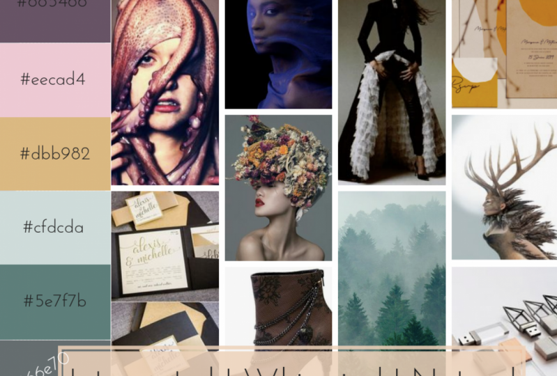
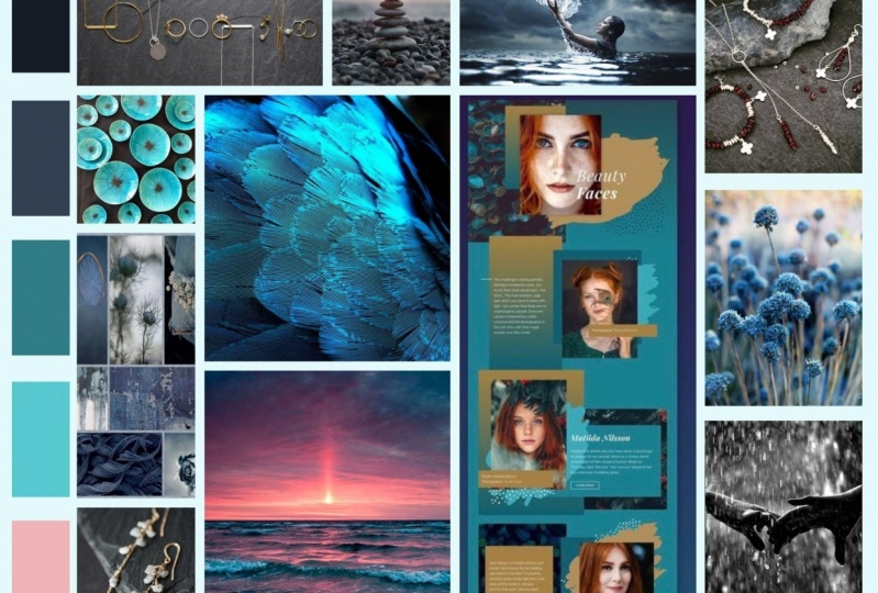
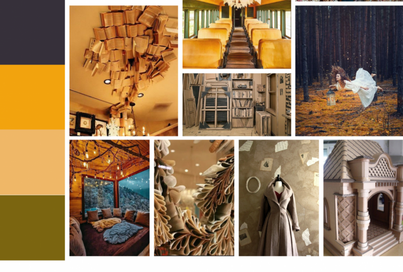
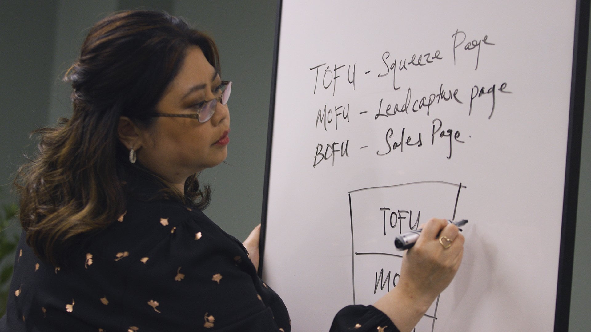
5. Create Your Mood Board: The best way to build your brand is to work backwards. You know, Think Like a researcher. So first we're going to create a mood board. A mood board is like a guide that reflects how you want your prospects and customers to feel when they first meet you, you know, when they first say hello, it's like this. So imagine your brand right now to be like a blank white room. The mood board helps you to really express how you want your brand to look like. So you're going to pull in images, colors, fonts, accents, and textures to bring this room to life. After you've created a mood board, you can then really start to build your visual brand with a clearer idea in mind of what your brand visuals will look like. So this really is the starting point of where all your visual ideas will come to life. So to kick this off and want you to ask yourself a few questions. First question is, what was describe or represents your brand? Will call these tone words. A little tip to get you started to choose these words are to choose words that are very visual, like luxury, vibrant, fun, creative, professional. And so here are a few more words to inspire you. Take a look at them and see if any of them Sounds like you or sounds like your brand. Once you've selected a few words, write them down on a piece of paper. Have you written them down? If you haven't, don't worry. Take your time. If you need more time, just hit pause and come back to this lesson to continue. But if you're done, let's move on to the next question. What visuals best match your tone load to find out, let's go to Pinterest.com. If you don't have an account on Pinterest, please do get one as you will need it for this exercise, it's free to sign up once you've logged into your Pinterest account and have your tone words that you have written down at hand. Go to Pinterest and start putting in those words in the search bar to get a better idea of how that word can be applied. This step is very important to really hone in on your preference. Because if say, you were just to tell a graphic designer or brand consultant what your tone word was. They could take that word and apply their interpretation of that would visually based on their experiences, which can be totally different to yours. Trust me, you don't want to make that mistake. So make sure you start penning those images to your board. Sawyer designer can really understand what you mean visually when you say professional or quirky. I'll do this with the, so you have a better idea of what to do is create a new board, a secret board. So let's just go to boards, then create bullet here, and then just slide that slider. So it's the secret board and put their blue and click rate. Okay, and now we go into our tone word. So my first tone word was luxury. So I just typed in luxury. And just see what tickles my fancy, you know, what I think will represent my brand. So I really like that actually. So I'm going to save that. Where's my mood board? Save. Ok. So that's my first thing that I would associate with luxury. Looks good here. I do like marble. I find marble does say luxury to me. So once you've saved, once, it will appear on the top of your top board suggestion. So make it easier. So that saved as well. See if anything else comes up. That's quite nice. I like that. As you can see, I can start to pick up the colors that I like here. I kinda like the bluish AND pinkish thing going on and it seems to show luxury to me. I quite like that as well. So that's a splash of kinda gold. Let's see anything else? That looks good as well. A quite like that. See it's blue again and take a valve, a T-S texture. Else. Oh, that's nice as well. I like that. So let's say that as well. Okay, I think we have enough luxury images to go with. The next one was smart. So that see if anything he comes and jumps out the page. It may sometimes don't worry if nothing jumps out at you just means that maybe that took tone word isn't the correct tone words to use for your brand or it's not the right tone, what to describe, what you're trying to look for. So you can't see anything like that. See again, I'm drawn to the blue for some reason. And so as you can see sometimes like once you start looking at crossovers into all the other words that you've chosen. And you start to create this image in your head of what your, what your brand visually looks like, or what your brand. You would like your brand till I like that as well. I like that wall thing. But I'm just going to save that. You see if we would just say the word smart to design a. I mean, it could be so many things, which is why this is such an important process to define in your own mind what you consider is a small to attribute. So I love that. I love the wall and I love the bold colors here. So I'm gonna save that. Alright, let's go to our other word. The other world is feminine. So I'm going to just type that in and see if there's anything here that jumps out at me. Not saying anything. Nothing that's jumping out at me. Maybe feminine wasn't the right way. Okay, there's something there that I'm gonna save that. So a lot of sort of modelling pictures, fashion pictures. Here's so it might have not been the best word. Go with and searching on ten truss. You could always, you know, bronchial. You don't have to stay in Pinterest. You could go to other websites. You could just go to Google. And then if you find a picture, you can literally upload a pin and put it into your mood boards. So you could just create a pet, upload it, and add it to your clipboard so don't feel confined to just okay. I think yeah, feminine wasn't a good word for me to use. Oh, wait, oh, yeah, like that. Okay. I'm gonna save that. I'll write. Yep. It says, okay, I'm going to go back home now. I'm going to check what my mood board looks like at the moment. And then members a secret one. So she might be down here where all the secret boards are. So here it go. Oops, oops, I think I've gone too far. Okay, so click that. So this is everything I pinned so far. That's what I've pin so far. So can roughly get an idea of where I'm going with this. So I hope you've got your mood board started as well, continued to do it as much as you want, and then move on to the next task. Okay, so the next question is, what types of visuals to look out for that match your tone LEDS. So to get you started, we need to start searching for a combination of these types of visuals that Tone words with these words like, you know, minus luxury. So I should start searching. Luxury design or luxury graphic or luxury branding. Will luxury photography, will luxury layout. Do you get y mean we're honing into the visuals and the type of visuals that we're looking for. So once you get an idea of what interested in holding into that word by searching the Talmud plus the types of visuals will help you to get a better idea of the direction of your visual branding. So let's get back into Pinterest and continue searching. Okay, so now we're back into our Pinterest board and we're going to start searching. So the first thing that we needed to search was our tone word plus the word design. Okay, so let's put that in the luxury design. Let's see what we come up with a right. So now you can see more options at slightly different options than we saw before. And start looking and seeing, you know, look for different things now, look full fonts or look for textures. Anything else that you would, that when you look at it, you know, makes you think luxury. So I like this slight clean lines and it's almost like an unexpected thing here. So there's an element surprise. I like that. I loved this. I like this font here. So I'm going to say that I do love gold against that dark kind of bluish, so I'm going to save that as well. See here I'm getting more options I'm getting and love as well. I love rose, gold, and gray. So that could be an option, unlike that. Cber already picking up quick as to what we like, just by adding that another combination to R such that that actually goes really well. Green and gray or blue. I'm not sure what that is, but I'm going to save that. We'll look at that. That's Coolidge's. Alright, I'm gonna save that. Alright, so what was the other wed graphic? Okay, now we're gonna try it luxury graphic. Let's see if we come up with other things. Ooh, that's nice. Let's see, that's an ad, but I'm going to pin it anyways. Because unlike kid. Okay, so nice to see. Other things are coming up. Like templates and forms and design elements. Packaging. Oh, look at that. That's somebody's brand board. A quite liked the look of it, so I'm going to save that. So I like this as well. Again, dark blue. That must be my color. Are blue and kinda gold or copper, I would sake is more copper, zinc gold. L. So I like here, you see, I don't really like that one because it's blacked. Prefer blue. Those beta's goes better with my definition of luxury. Okay, what was the other way? I think I want to move on to the next word is branding. So luxury. Luxury branding. Okay, so now we're getting even more light prints, printed materials or packaging. That's nice. I like that. Slush keys. So I hope you're doing this with me. And while you're doing that, you're also making your own assessments in your mind as to why you like certain things. Why don't like certain things, you know, take note of that so you begin to understand yourself. What is it that you're actually looking for? Because trust me, most times, even when I'm doing my own websites, sometimes I don't know what I want and I have to kind of go through this process myself so I can tell my designer or tau by people who are working with me. This is exactly what I want and be able to show it and to be able to describe it eloquently so they get the right idea. I love mobile. So I'm gonna take the, i like that. I've always loved the brand as well. They are what I consider a luxury brand. So yeah, that's a good example. And love that. I love the simplicity of it. And it's just a shouts luxury to me. Okay, let's see what else do I find interesting? I think that's it for this key would the other one is luxury photography? So remember whatever is your tone would just put homeward plus photography or graphic design or branding. And then you get more images to help you figure out what your brand should look like. So now I'm looking through the photography and obviously we're seeing other different things than we saw before. Because of this search term. I'm trying to see if anything here grabs my attention. I loved that texture. That's a salmon. That's when it isn't. If it's so quirky, a pen like that, I'm gonna save that. I like, I love these unexpected things in almost kinda jumps psi you. Because say, let make C12. And I love that elements of surprise away. I think I've kinda gone back in time here. Okay, there we go. Alright, so my mood board, that's great. Okay, I just realized I love the element of surprise. So something unexpected that is going to be one of my, that's what I want my brand to be. Something unexpected. You see, I didn't know that until I start to do this research. So things that might come up for you as well. Oh my god, look at that. So all this funny. Okay. That's going in is so cool, man. Okay. I'm getting ahead of myself here. Sorry guys. This disc-like psi sin u. So this is how you should be feeling as well when something just jumps at you, it's kind of screams at you in a way. Don't deny that because it's, that's why your brand is all about. Then, then go for it. So the next word was layout. So luxury layout. Let's see what we come up with. This interesting, not interesting enough for me, I think is mine's not so much. You see, even though that's nice I think is to dog must still, I love white. Even though I love these dark colors, I still love white. I love Clem, continent, you know, clean, sleek. All of those are good. Was I should've chosen those words. But you know, I see it's those words start to jump at you. Jump out of you that you didn't think of before. Just go back and start doing a search for sleek is search for clean. And see what that comes out with. Just start pinning them to the mood board. It's totally fine. This is just a exercise to be done on your own, to let your mind go wild and just p53, we're gonna cut all the options down later. So right now just pin as much as you want. Make sure that oh yeah, look that. I love that. Make sure that you just start getting a better idea of what you're looking for. Okay guys, I think we're good for luxury, so I hope you get what I mean here by doing this exercise, just continued doing it with all the other tone was that you've selected. And if Newton was came up like, you know, like it did for me just now. Yeah, continue doing it for those words as one until you come up with a mood board that you're happy with. So let's have a look and see how my mood board is looking so far. Okay, so there's my mood board. Solid stuff I just pin C is quite a lot. But there could be more. But there could be more. This is just half of what I usually do. So now we're gonna go back to the next question, which is going to kind of conclude our mood board activity. So once you've done or if you need more time, just hit pause and come back and join us when you're ready. Okay guys, so this is the final step for youth mood board and it will help you to pull everything together you've learned so far about the visual brand that you would like to have. Now I want you to create a new Pinterest board and call it, I don't know something like mood board final ten. And I want you to repent only ten out of the mood board that you've pinned before. So out of all those options that you've pinned, I want you to choose your top ten, only ten. And imagine those elements being part of your brand. If anything, that you don't see being part of your brand, then you should leave it out and put something else in. So you probably have pinned hundreds of things now and now it's time to focus pin ten things. And then we're going to come back and we're going to create your own mood board in Canva. So let's go through that pin, ten of the top ten things that you liked on your mood board, onto a new board. And once you're done with that, come back here and we'll create a canvas, a mood board for You. See you in a bit. Okay, so first you have to log into Canvas to do this. If you don't have an account, you can sign up. It's free. And all you have to do is it lets you have an account signup. So what you have to do is once you've signed, then go to this lake here. This will bring it to this that I set up for you. And in order for you to use this, it's important that you follow these steps. So first go to File and then make a copy, and then close that tab from before and use the copy. So this is how you know it's a copy. It says so right here, copy. And if you click here, you could just change, you know, just put your name. So I'll just put dissolves and moves will mood board. So now this will be in your account. And first step u and du is just get rid of this. First, get rid of this link, and then get rid of this. And this is the mood board. All you have to do now is to add the ten images that you've selected from the Pinterest board. Okay, so in order to upload your images, all you have to do is I just put them here on the desktop and all you have to do is drag it here. First off to select upload. If you're sailing on a different tab, slit up load tab and just drag the image into here. So I just want to show you that again. Click up loud and drag your image into here and it will upload to Canva. Let's add that's done uploading, all you have to do is start dragging those pictures into these boxes. There's ten boxes and you just drag the image where it hits the best. I'm just going to start dropping these in. All right, so as you can see there, those of the images I've put in all the 1010 images. And this was just a place holder. And I think that once you see all the images together, start really using the words that you think resembles what you see here. So I think it is still luxury. It IS sleek, IT IS unexpected, but I feel like I really want to convey that. It's a velvety, I like the velvet in these pictures, so I won't, whoever it is, that's going to design my brand to really take notice of the velvety features of this mood board. So you can just change this based on what you have. And the next step is to insult this extension on Chrome. I do recommend using Chrome, so it's called color pick, I think let me just double check. No, it's called eyedropper. So eyedropper, Chrome extension. Search for that on Google. You'll be the first one man. And then just because I already have it, instead, if you don't have it, they'll say Add to Chrome and then come up here. So what you do is once you have it, I want you to start selecting, click, pick color from page. Self-selecting the tones that you learnt from this page. So okay, so first thing I really want to pick up is that blue color. I like the blue shades. So I'm gonna make sure that it hovers over the blue, The alike. Think that's it. Select that colour. Then I go to one of these boxes. Had a color and then replace it with a color that I want. So what's the next colored outlooks?
6. Be Colour Clever: now that you have your mood board is a good idea to then develop your brand board. But before that, let's look a little bit into the impact color can have on your brand. As it's such a huge elements of your designs. Marketing service have shown that color places on associations in the mind that can elicit certain responses, which is why it's one of the most powerful design elements on websites, ads, direct mail and other marketing materials. Right colors do elicit responses, but these responses can very slightly from persons present. However, according to marketing research, they're awesome common associations made with certain colors. I feel that colors are sometimes like a secret language had only the human subconscious can understand. And there's a reason that the walls off say of McDonald's. Like most fast food, restaurants have orange, red and yellow. Have you noticed that? And these are like the colors that subconsciously excite. You intend to whet your appetite, and that's why they use these colors. There's even a science behind the calming shade of green of your favorite coffee shop. You know, Starbucks, right? That's what immediately comes to mind on why there's so much red in casinos. There's a color impact on how we visually see things on the language of color is a huge advantage in the world of marketing, if you know how to use it right. So today I'm going to show you how you can use color to your advantage. So the first colors we're going to look as colors that trigger assignment, so the colors that trigger excitement are red and orange. And this is because red tends to remind us of energy and movement, which is why it's often used for culture action buttons on buy now buttons. I don't know if you've noticed, but this is often the case. Wells Orange is usually associated with enthusiasm and cheerfulness, so it's also often used to urge customers to take action, which is why sometimes you see it's creating some of sort of tension, and it might be check out. But that's flashing orange, and that tends to trigger some excitement within us. Next, I want to talk about colors that are calming so the colors are calming, are blue and green. On. This is the opposite of red and orange is because colors like blue tend to remind us of stability and security on. It's often used in business, and I'm sure you've noticed this or technology websites where trust is very important and green has that similar cessation to blue. But it's a so more associative to money, so I mean, that's why monies is often seen in the color green and associate it to money. So that's why you see a lot of like corporate companies using blue and greed. So if you're a corporate companies, choosing blue might be a good choice for you. Now let's look at the colors, associate it with youth and positivity. Yellow is an attention grabbing color that the minus associates with youth and positivity. Here's an example of a website that does just that. Now let's look at the colors that are associated with power in luxury. I think you got all guess by now that the color associated to this is black on Black, conceding ominous. But it's also associate it with power sleekness and luxuries, so you'll see a lot of brands that are geared towards luxury on power tend to have these colors, and here are a few examples. So what about if you wanted to create a website or brand that's associated with purity and cleanliness. So, you know, if you're a cleaning product or something to do with nurturing young Children, you know something very fuel. Why it would be the best color for that because it's associated with these two attributes. And here's a few examples of just that. So now that you roughly know what those basic colors mean, the question to ask yourself is, Are you using colors effectively? So the little tip is the best way to use colors is as an overall themes. You can say you want to use orange, but there's different shades of orange. How do you determine what compliments that orange? Because your brain can't just be one color, right? There's gonna be layers of color because it's gonna be layers of images and cant just use one color. So, for example, very selling something associates. It's with full, useful colors, such as like maybe browns and oranges or an earthy red colors, that sort of thing. Another tip is to really think about your market. What best color scheme suits them and not just what will look good, difficult? I mean, I say If you're marks into older adults, then they're really interested in stability and trust, and that's important to them. So you might want to lean towards the calm and muted colors to establish that. But for young and hip, if your market is young and hip, that maybe retro colors might work better for them. Also think Kathleen about what associations of your color scheme will trigger. So, like the muted colors, you might want to go with the shade of blue or green and cause that makes you feel more professional, you know, so really, use those basic color sort of associations to help you in determining which color is the best for your brand. So the next question to ask yourself is, Are you thinking outside the box? Quick tip on this one is that although it's good to stick to common knowledge about colors and to air on the side of caution, sometimes widely unexpected colors work well to trust me. Take this. For example, Christian Lou Baton for those men's out there is the shoe with the Red Sole. The brand that made this is Christina Lobaton, and it was a simple decision, but it continues to be the most popular reason why women by Chris Luca tone shoes and they're like I'm not quite sure, but I think they're at least $400 per pair. Threat is it's sexy and its alluring, and it's matching how women want to feel when they're wearing it. So this was a really great decision made by Christian rebuttal, because it's continues to be one of their hottest selling point, their USP. And it's such a simple thing, and totally out of the bus. Who would have thought just the sleek black shoe with a red soul that could be a great selling point as well. So this is what I mean by thinking outside the box. Is there something that you could do that makes your brand stand out? Maybe this next tip will help you figure that out. Another example is the case of Owens Corning Corporation, an installation company whose color mix up in the 19 fifties led to its selling pink insulation. So which ended up branding it on, leading to more sales. Everybody would know I want that pink insulation one because all the other ones are probably whites or gray or something really boring. But this was one of the is like the Red sole. ITT's something no one else did at the time on it really made them stand out in the market . So I really want you to try to think outside the box. How can you use your color to change a common item that you're selling that maybe, you know, you're not the only person selling a 1,000,000 people of the businesses sell it. So how do you make your stand out in the market? The last thing I really want you to ask yourself. This is one of the most important things that people always skip this. But it's It's really important that you do this because you don't want to waste a lot of money and time for nothing. So the last question is, Are you testing the market with your designs? You have to test your market. As everything comes down to cultures, markets and individuals, they all react differently to colors. Start by looking at a color scheme in your niche on, then choose accordingly. Test different colors to see which ones, um, your market response best to and the easiest way to start testing is by using on creating social media image posts. So then you could test drive, you know, a particular color and see if that stands out in the crowd, you know, stands out for your market, for your the culture that you're the market is in. You need to test that so you can get a rough idea of what will work and what won't work if nobody say your new company. Nobody really responds to your social media image posts, you know, asking friends and family. Go out there, talk to people, show them the design and Austin what they think. And but make sure that the people you're asking are also your target market. Now that we've created your mood board together, I want you to go out there and test those ideas and make some social media posts graphics and share them to the world. See how people react to it if you're finding it hard to get a response, you know, again, all school friends ask a phone family to look at the posts and get their opinion to start off with and then share it for business forum on Facebook or read it even just get some feedback because it's important to really know that you're making the right decision before pouring thousands of dollars in to, say, your website to redesign a website branding or ah, hiring a graphic designer, you don't want to start on the wrong foot.
7. In VBL we Trust: in this lesson, I'm gonna teach you all about visual brand language. A visual brand language includes the's own elements, such a shape, color materials, finished, PA graffiti and composition. All of these items together should communicate your company's values and personality. And most people think that branding is just like the logo design, and it really isn't doesn't just stop there. Branding is so much more. It is the sum total of all experiences that people have with your brand. So one of the critical and most important of those experiences is the visual language of the brand, which includes the brand identity and design but also much more. Other experiences include the marketing message, custom interaction and service, your product or your service quality and benefits, and so on. For a good example, take BMW's front grille when you see it on an advertisement or website, you automatically think being BMW and all the qualities associates with this luxury call maker. The distinct design feature is used as a visual marketing tool by the company to trigger feelings and associations in the minds of its target market. Importante to creating a visual brand language, or vbl is to remember that it isn't static but can be changed and used in different ways, so it's very flexible. Consider Google's local and the basic letters on a clean white background during different times of the year. I'm sure you'll notice that during promotions or, you know, like Halloween or something. Small changes are made to this basic design thing, so your visual brand language can be something as flexible as that. So now I'm gonna break down. What? The visual brand languages. The visual language of a brand consists of the following elements. The first thing is the logo design off course. That logo is the core of all visual branding. It starts with the logo, and to be really effective, you need the right kind of logo. Not the best looking, but rather designed that connects with their target market and resonates with the world view. The best practice when designing a logo is to start by choosing a primary and secondary color. The primary color is for a symbol icon and lettering. The secondary color is for the background. Take advantage of color, meanings and associations when choosing your colors. The second element of your visual brand languages the funds, believe it or not. Ideally, it would be nice to have two sets of funds to represent your branding. The primary funds used in your logo should not necessarily be used in every other touch point. In fact, that may actually end up diluting your logo and make the fonts ineffective and common. So your primary fund can be sparing the headings or quotes or message call outs, etcetera everywhere else. You should use a complimentary front that sits well with the primary funds. I do recommend buying premium phones rather than using free funds. Premium forms usually come in families of Fonso that were buying one front license that will give you the same funds in different weights. Innocents styles. If you want an idea of what form will work for you, I recommend you installing this chrome extension that identifies what funds a website a year is using is a great exercise to research on what you like and dislike about certain funds and picking up a fonts that you will love for your website and for all their marketing materials. The next elements is colors. Using one or two colors consistently throughout your brand creates a visual impact that creates brand we call these colors should be in the same palette as your local colors. Again, finding complementary colors is crucial to create the right impact. The next thing is designed elements. Design elements are pieces of your brand identity that can be used as supporting visual cues to create a consistent visual language. These can be parts of your local, or they could be a new independent secondary icons or characters or even mascots, which are developed separately from your main local design. Using design elements creatively in your print materials and online touch boys is very crucial to create the impact off a big brand. For example, I love this little right used by Paul Jarvis on his website. It's so tiny and simple, but it shows character and makes a big ing pats on his brand. And every time I see it right, I got to say I immediately think about poll Jarvis on his website. So it's pretty cool, and he actually has a pet rat. He has pet rats, which is why he chose Rat as his little design element, which I really love. The nice thing to consider is the positioning. So when you porting over your visual design elements toe all your brand touchpoints is very crucial, and that establishes the messaging and positioning that you are going for just by looking at these touch boys, the messaging is clear and filters out ideal customers from the non desirable ones and enables the brand to attract the right kind of clients. Think about your messaging and make your visual cues match the message to ensure you attracted the right kind of buyer. So, for instance, you might want to use a nem bossed gold foil for your letter heading. So this will likely be attracting, you know, people who are interested in luxury on. Did you know that is very high end? So those air like positioning? Um, you know, not just material, but also off where its position on the piece of paper itself or on the website, even brands awful often have to think of this one. It comes to printed materials, which is why I say that Andi also remember this day and age. You also have to think about your social media profiles. What does the company profile image looked like? Is it sometimes When you have a logo, it's too wide. It wouldn't fit so well into a company profile image, so you have to somehow reposition it or redesign it slightly to be able to fit into a square box. So how do you display your logo on the cover image off your social media profile? That might also be different, And so you have to decide on this and be consistent throughout again. Be sure to decide on this and use the guide consistently throughout your brand presence online or offline on That's all part of your visual brand language. Remember what I said In the beginning? Consistency creates reliability and trust off the customers towards you. So being able to consistently use thes visual brand language across your online and offline presence really ties everything together and creates that bond of trust and reliability for your brand. So now that you know what visual brand languages, I really want you to take action and go back and do some research and dick deep within your brand and decide on the answers to these questions I have down here. If you have any questions, feel free to ask in the comments
8. Creating Engaging Visual Content: in this lesson, I'm going to show you how to create engaging visual content. So many businesses are sometimes clueless or unaware of just how easy is to produce unique and engaging visual content. It's so important to know what you can do with visual content because our Web surfing experience or in our interaction with the Web, is ink is really visual these days. You know, with with those wishing to platforms like Instagram, Pinterest, Snapchat they're all kind of like visually oriented people are in the on their mobile phones, consuming social media content. And so, if you're the social media content you're creating, doesn't have that visual edge or doesn't cater to a visual audience, you might be missing out on something there. So here are some of the easiest ways to create visuals, along with some ideas for each format. The first type of visual content is obviously photos, and the first idea have for you is is to take photos of your products. I mean, you can take original your own original photos with your smartphone. You don't have to hire a photographer. I mean, phones these days have really good cameras, especially iPhones and you can edit them using APS and, you know, put filters on them on. You know, you could manipulate an image using using APS to make them look really visually appealing. You don't even have to be, You know, somebody who knows how to use photo shop. For instance, Everything can be done on the phone these days, but if you don't have a smartphone, you can buy a digital camera cheaply and editing of phones on your computer using a free software. So you know the sky's the limit. Here. Everything is all the tools out there are there for you and easily accessible for you to capture your own unique content. Another tip I have here. Another idea I have is to take photos of customers using your products, and that includes original uses of your customers That may not have been considered. So why I'm saying this is because sometimes you tend to final companies using stock photos for the images, and, you know they're really missing out on the original photos of people using your products. I mean, start photos are okay for Web design, but they won't be shared, liked or commented as visual content your photos need to be unique to your brand. And what better way to be unique than to take photos of your customers even using your service? Oh, your product. And you know, including ways that you've never would have thought of yourself. I mean, usually, customers tend to provide these images. If you're an author, you have customers taking a picture with your book. Never know what people might do with your product when it's within their own environments. On the more personal Monreal the photos are, the better. The next idea is to take behind the scenes photos that shows how your company and industry operates. This could be if you're somebody who makes jewelry, why not take photos of you making the jewelry? I personally, myself, I love those companies that show the process of how the end product off, how the piece of jewelry that will look up on me, how it started, you know, I mean, like I was when I was looking for a ring the other day. I was like, Oh, this is this company was on Instagram. I think it showed how the process of making the really thought that was really cool, and that made me want to buy from them even more so. Behind the scenes photos can be sometimes they're not pretty. You know that when when you're working behind the since usually is not a pretty picture. But people can really appreciate the work that goes into your craft to that way, so it creates some sort of brand atmosphere that corresponds with your niche. Considered that your target market and what they like. Think about the products. Look at how other companies in your niche create their brand atmosphere. For example, some niches tend to favor Stark and five prints visuals, while others like soft retro filters. So really depends on what your market likes and dislikes are. Each image a company uses fits within its atmosphere to create a sense of consistency. If you remember, I said before, consistency is important. So if you have consistency across all of the marketing and content creation than that will increase trust and reliability in with your brand. So say, if you had, if you notice that some of the more popular Instagram accounts, if you look on their page, there's a sense of consistency in color is not that they use the same color in every picture. They might use the same type of filter on every picture on that creates that that feeling of consistency throughout their, um, images. And that's one of the things that you should consider when you're using photos as a type of visual content, the next type of visual content is videos. I love videos. There's so money easy to use Softwares out. The allows you to make, edit and publish videos quickly. I mean, just the top of my head is Cam Tasia screen flow. I know there's some a service called Wave Video that's quite knew where you can edit videos too soon. Every type of platform, social media platform and videos couldn't can be short and simple. They don't have to be long. The best type of content for videos is the top of it is that you know, could really only be communicated through videos. For example, showing your product in action you know, as somebody actually using and safe is moist, tried to somebody actually putting it on their skin. And for each video, ask yourself, Could it have been communicated through text or pictures if it can't, then is definitely for video. You can also do like a step by step instructions on how to use your product and get the most out of it. May be that is like a Nike eh? Furniture. I wish I care would do that. Just do a video on how to put this thing together rather than send me a booklets where you have to figure it out yourself. In a way, that's one idea where you could do for videos. You could just step by step instructions. If your makeup artists he to do a step by step on how to create a certain look on video would be great for that. Another were idea is to do a step by step instructions on how to do something related to your niche. So this could be like I said, the makeup videos Good. If your trainer than maybe, um, a workout video on how to, you know, get a six pack is or something like that. I remember there was once a video of a doctor showing how to get a new born baby to stop crying. I thought I was way cool, and that video got millions of hits. So that's another idea. Another one that's a little bit left field is creating funny videos related to your products. Your company. This this one could be, You know, something that just happens off the cough or something that's planned. It's not something obviously you could do every day because it takes a lot of effort to think of something or toe wait for funny moments. So this is like Philip content work. If it works, then it will be you know something that you just shoot quickly on your phone, and that's, you know, you feel that your your audience can relate to. Then that's a great idea. Don't hold back. Humor is a great way to engage with their audience. Another idea is behind the scenes. Look at your company or the products being made or your industry. So sometimes if you go, for instance, if cuticle conference or a trade show right, if you go to a trade show, maybe could take videos of people asking questions at your booth. Or you can interview somebody could interview speaker or you can, you know, just behind the scenes. You know what's going on when your company goes out to a conference when a company goes out to a trade show where company goes out for a team building thing or how a piece of clothing is being made. So all these things are great examples or ideas on hankies video to communicate your brand . The next type of visual content is infographics. You could create any text based content and turn it into an infographic. I often find you could just take a really well known report within your industry and then take the statistics within that report and create a new effort, infographic from it, especially if those statistics are statistics that people in your industry would be interested in knowing and probably you know they didn't have time to read the reports. So this infographic will give them a really good idea what's happening within your niche. And, like I said before, present statistics, figures or other hard data related to your niche and latest trends in the industry. So this could even mean that you conducted a survey yourself. It doesn't necessarily have to be from a report, pretty your own survey, you got the results, and now you're going to present the results to your audience via Infographic, and that's a very effective and engaging way to present that sort of like heavy and kind, sometimes kind of boring type of content in a very engaging way. Another idea is to create a step by step instructions presented as a flow chart. So this is another way cutter like how I Cheick has the you know they have that visual booklet on how to put something together. The same goes here. You create an infographic on how it could also be how somebody could access your help desk . Or, you know, I mean, like something that if it's too complicated to say in words and easier to show in a flow chart or an infographic, then use that to your advantage. You only have a few seconds of people's attention before they start drifting away. An infographic is a great way to capture someone's attention without having to use heavy text to communicate this same message. Another idea to use infographics is to maybe presented timelines. So the history of something in your niche presented in a timeline or ah better now comparison. That's also really cool idea. I've seen some really cool timelines off, I think. Was that Facebook And I thought, Oh, that's pretty cool, you know, because we're using it now today. But, you know, some people didn't know that Facebook was called the Facebook at some point, and it was actually only for universities and colleges and then, but the timeline shows the progression of the evolution of this platform and a new infographic. It's such an effective way to do that because, you know, you don't have to read a whole biography of, you know, face. But you can just look at this time line and know what they just they've been through throughout history. There are free online tools that allow you to have make infographics easily. I'm going to show you in the next lesson what those tools are. They give you the backgrounds, the templates the design features you need, and you simply have to plug in your content. So before you get started, take some time to plan how to best present your content. Remember that the key to a good infographic is that it takes something complex and makes it easy to understand And remember, you know, don't be afraid to look at other infographics to get ideas. Usually that that helps to get the brain juices flowing and you know ideas will start to generate just from getting inspired by other infographics. So it's now time to take action. Listen on the top of visual content that you would like to create, is it photos? Is it videos is infographics. Which one really works with your brand? It might be all three might be just too might be just one. Also, consider what your resources are. Do you have the resources to produce these visual content? And if you don't, where can you get help to produce them? You could outsource them, or you can hire someone. Think about all the things that are involved when wanting to create more engaging visual content. Also, take a peek at my other course on how to create social media content to get more ideas. That course has been taken by 900 students so far a Zoff, this recording and has got, you know, more than 64. I think good with positive reviews, and there's a lot of room reviews as well and has a lot of more ideas on high can create engaging visual content in that, of course, it goes a lot deeper, so, yeah, feel free to check that out.
9. Get More Visual Super Power: in this lesson, I'm going to show you some practical things you should be doing when executing your visual branding. So this first step is about all about your images founding, so you have to choose the right filing. So, for example, you have this image here of the London eye, and the name of the image is this. And you know, this is usually a name of an image that you get after you downloaded a photo to a computer . But you shouldn't upload the image with this image name to your website because it's not great for ASIO. So in order to make this image file, name more S. You'll friendly. You'll have to name it something like London Eye London sudden set dot jpeg like that. So because the main keyword would be London eye and that's as that's the main subject of the photo. And that is why I added at the beginning of the founding, that's the other thing. The main sub focus of the photo should be in front of the file name, so because that's what's going to be noted and when people are searching on Google or any search engine. So when This is the first thing. If you want to make the most out of your images, you have to make them a seal friendly. Make sure is the right file, Ming, before you hit, publish Or I mean, even if you have already published that, you could still change it afterwards. But make sure that you do to make sure that you know you get the most juice out of your visual content. The next tip I have is to scale your image for S U. So loading times are really important factor for user experience and and also from the S e o aspect the foster, the site, then the easier it is to visit and for it to be indexed. So images can have a huge impact on loading times, especially when you load a huge image. And so it really small. So say, for instance, you upload a 2500 by 2500 image to your website, but the page only really shows 400 by 400. So that's an indication that you're not using the right. You're not scaling the image for its use. The entire image will still have to be loaded, and then it's going to try a scale, the image to the size that you want to show it. So that's going to cause more loading time than it needs to. So what Press helps by providing the image multiple sizes off the upload already. But unfortunately, that doesn't mean the far sizes optimized as well. That's just the image size. So I recommend having some tools. Where you can optimize is well, so the next step in image s years should be to make sure that the scaled images served in the smallest far size possible. There are a lot off tools out there, and I've tried a lot of them, and these are the best ones that I can find. The first ones is imagine firing, and the other one is smushed pro. It depends on how many images you have for like both services. There's a free version, but if you have a lot more images than you might have to start paying. But it's not a lot is just a little bit to make sure that your images are optimized. So what it will do is it will create different sizes for your image and display the one that is gonna create the fosters loading speed for your website. And this is gonna be great for eso and is gonna be great for your audience. User experience in situations where the image is not available to the reader, perhaps because they've turned off images and ah in their Web browsers. Or they're using a screen reader to do to a visual impairment the alternate text reinsurers that no information or functionality is lost. Always remember to add the all text to an image, so they will be in descriptive text when the image, for whatever reason, can't be displayed to the visitor. Don't just put the name of the file beat as descriptive as possible in your all texts. Imagine if somebody was blind. You know, how would you describe the image to them? And that's what you'd put in the altar text. The other thing that you have to do in to ensure the all visual content creation efforts doesn't go down. The drink is to promote to your visual content consistently, so make sure that all the work you've put into your visual content you don't forget to promote, and you could use thes tools. I recommend one of two of these tools. There's a lot more, but you could use meant meet at Ghar or send a bubble to queue up all your visual contents to be shared on social media automatically. You could even scheduled them in advance, and you could rotate them as well automatically. So these are really great ways to make sure that you know your content is continuously being promoted and not being forgotten once it's published. So now that you know what's working now, I want you to take action, go into your website and review the names of their images. Are they s your friendly? Are the descriptive? Do they have all texts? Are they scaled on optimized for the web? If they're not, you know you should optimize your images used. Imagine fi or W W. P smushed pro of your using WordPress. Andi optimized those images used tools to distribute your images foreign. Why don't just want sea freight in image? Just use it once and not use it again. It takes a lot of time to create images, so it's better to get more mileage out of them by distributing them over, say, various platforms rather than just one platform and and promoting them again and again when it suits full.
10. Advertising Visuals That Convert: I have a few best practices I want to share with you that will give you a little inside into how best to position your visual content. This is especially important when you're creating ads for your brand. So say, if you're creating Facebook ads or Google ads on your using images to attract attention, the first best practice is to position images and graphics on the left. So say, if you have an image of a subject and text, so you always position on the left. Because the right hemisphere is better suited to process pictorial information on the left , one is more logical and verbal, so placing the image on the left hand side of the text enhances the processing of the whole message. Just remember that when you're creating any sort of graphic that this is one of the key things to remember. The next tip is you should always show the products in a way that encourages mental interaction. So say, if you just have the product and put it there, that's not quite as effective as if you had the product and you kind of showed how it would look in somebody's hand. So there was a study where they compare these two images on where the hand was visible. It led to hire purchase intentions, and when it wasn't it had the reverse effect. So although right now it might make no sense to us. But the brain works in such a way that when you look, you're looking at something like an ad. If you have these two images of two different products and one of its say, it's when your competitors and one is you, you know everything is a similar. But one has an image of you with hand holding the book that would work better then, say the one that just has the product laying there on the table. Another good practice to follow is to have the model looks towards your call to action button because you know, people usually tend to have the model look straight to the front. He knows. Look straight at you, but actually what you want is to encourage people to look at what they call to action is is it to buy your product? Is it to download something? Is it Teoh? You know, try something, or whatever is it's actually more effective to have the model look towards that thing that you want them to react to. So as humans, we experience an inborn tendency to follow people's gazes. That trade helped our ancestors discover threats more easily so and thanks to the evolution , that tree is still ingrained in our brain, so you can apply that tendency to your ads. If your ad contains pictures of people than Orent them to the call to action, you'll trap more attention towards that area. You should usually avoid warranting models towards the viewer. The next best practices a little bit of a weird when it might be a little bit controversial . But if used in the right manner, it could be really effective. So the next one is to show attractive models when relevant. So as you can see here, it won't be relevant if you use a really lovely looking lady with the vacuum. But she looks like that like she's just gonna come off like some sort of photo shoot, but instead, do you know if you want to promote makeup, then yes, absolutely. Using more attractive models can be really effective for you when doing either Facebook ads or whatever add that you're doing to promote your product. Studies show that when examining the results for the attractive model condition appears to be one condition in which an attractive model is not the best choice. So here are the types of products that would be relevant. You know, luxury products, you know, like sports cars, appearance. Like I said before lotion or, you know, art and beauty, makeup and health. But it's never relevant to really use an attractive multiple technology, food, office supplies or home decker. The last best process is all about colors. A lot of studies show that when you use bread and blue to motivate, you could use red and blue in different situations to motivate motivate buyers. So studies show that color theories believe that the color influences cognition on behavior through learned association. So when people repeatedly counter situations where different colors our company, by particular experiences on door concepts, they form specific associations to color. So imagine if your ad was describing tangible benefits of your product. In that case, use a blue color scheme. For example, we usually associate red with danger threats and mistakes. So because of those associations, red activates an avoidance mindset. With that mindset activated, people identified problems more quickly and easily. So if your ad is negatively framed, So, for example, you describe a problem that your product resolves than a red color scheme will trigger a stronger reaction for your products compared to red blue is associated with the approach mindset. So because blue is usually associated with openness, peace and tranquility, it is likely to activate an approach off motivation because this association signal benign environment. So study showed that when examined the red and blue color schemes, they showed participants from two different frames for toothpaste advertisements. So when trying to prevent something like this is, it's good for cavity prevention than they will use the red color scheme. But when it's like a gain frame like it's good for teeth whitening down, they'll use a blue frame. Do you get what I mean? So remember when how you're framing your product use the so so the you know the right color to associate with when creating the image for the ad. The results of the study was consistent with the learned association. Red colors performed better with the prevention Froome, whereas blue colors performed better with the game frame. So just keep that in mind the next time you create ads
11. Visual Content Tools & Creators Tips: in this lesson, I'm going to talk about visual content tools. There are so many tools to create great visual impact designs for your business. I personally use photo shop in design and illustrator, but you don't have to use those tools to have the same impact on your designs. In this lesson, I'm going to share with you some of the tools that you can use to create your visual designs. Before we go it. Get into the tools. Let's talk about the type of designs that you can create so you can create infographics videos. You contended images. Using these tools you can create means you can create coat quotes, word clouds. You can create cartoons, creating charts and graphs. You can create logos, create slide shows, and you could use free and paid stock photo sites. There isn't enough time to go through all these tools with you, but I've compiled them all in this visual contact creation tools list that you can download on this links. The Linkous character says that, so just make sure the V and the tea is capitalized to make sure that you get the right link . I hope that you will find the tools list useful. And if you have any issues, please just leave a comment or write to me at support at digital dash matchbox dot com. So once you've done that, I want to talk a little bit about working with a visual content creators. So if you don't want to create your own visual content yourself, it can always work with the content creator. This is the service provider with experience in making photos, videos, infographics and other visuals that you may need. Instead of hiring a cheap worker from a one off job on a site like five or dot com, try Teoh. Create a long term relationship with a designer. If you work with the provider over a period of time, they'll get to know your brand well and the content and create content that communicates your vision. So the's air. Some of the other tips that I have for you. If you would like to work with a visual content creator, the first thing is to always have your brand colors, manual and guide ready to give to the designers so they know all about your brand, and so they can easy click, create designs that will match you were brand. Next thing is to always give them a high res image of your local, preferably a PNG image you know, a transparent image on but just makes things so much easier for them. The other thing is to be ready with the brief of what you actually want them to do. The more detail you give, the better. And if you get give samples of what you want them to do, you know, provide samples off how you would want it to look like then that will give them a better idea of what to achieve. The other thing is to provide constructive feedback. You know what you like, what you don't like, because this relationship with their desire is likely to be a long term one, and they going to be learning what you like and don't like over time. So give them the time to learn that and give them the constructive ah criticism or feedback that's needed to allow them to learn what's to do and what not to do the next time around. This usually this process usually is about, you know, it could take up to six months for somebody to really understand the brand and what you want to communicate through your visual designs. Please be patient and allow that time for them to grow into your brand. The next tip is to give the feedback as soon as possible. I mean, the worst thing is to wait two weeks or two months after they've done the project, or done that visual and give them feedback. Then by then they've done maybe hundreds of designs. After that. Andi, they're probably don't remember what they did exactly for that project or that design. And, you know, as a designer myself, I struggle with this as well because, you know, we're just human. So if you can provide feed by as soon as possible, I would say within 2 to 3 days of the design, completing That's the best time. Because at that time, you know the project is still fresh in their minds. They're not. The last tip I have to give is to make a list of changes before providing the feedback. So the worst thing you can do to a designer is just a sporadically giving them feedback on . There's no way of keeping tract of what the amendments are and what what's been requested. So as a designer myself, my experience is that if you give feedback sporadically, you yourself will forget Italy set. You might even contradict yourself in the next. It's aeration off the designs, so that's always a bad thing. If you know, once you start to create an atmosphere where people are getting confused and nothing is being written down on dumb, you haven't actually you yourself haven't thought through what were the changes you wanted and nothing, and you're likely to forget why you wanted it that way. So is best for you to sit back, take a good look at the design. Really think why you don't like this and give constructive feedback with your reasons so the designer can learn from land rather than just having a sporadic feedback session where you're likely to forget what you thin said to them. All right, there's there some my top tips when working with the designer, and if you have any questions about that, you can ask me because I have myself what is the designer and I could definitely help you if you have any issues. Working issues with your designer. So now I want you to take action. So first, what you have to do is download the visual content creation tools list. Andi, try to start training visual content, you know, tried the different tools and see which one works for you. If you If you need help with the designs, then start looking for graphic designers. I would say the best way is through word of mouth. So ask people that you trust that have used graphic designers before an awesome you know, who they would recommend Or just, you know, put a shout out on social Media Arlington or somewhere and say, I'm looking for a designer. Can you refer me to somebody that you know and trust that and like, maybe get them to send me their portfolio, always review the type of work that the designer has done before before hiring them and make sure you interview them just like you would interview somebody that you're hiring full time? All right, so the next lesson is a very interactive one. I'm gonna show you how to create your brand board, and we're going to create your brand board together. So see you in the next lesson.
12. Project: Hi, guys, is great that you made it to the end. Now that you here, let's get onto the project. I know we already did. The mood board, which is great. Now, what I'd like you to do is to upload the mood board that you made in can va onto the project section. In this course. I'd love to see all your mood boards. So get on in there and upload your masterpiece. See you there.
13. Bonus — My A to your Q: Hello. So I had a question that came from one of skill she teaches on. That question is from Beth Miller, and she asked, Heil, is your class sounds great? Will you talk to many differences to keep in mind when incorporating visuals into various communication channels, like, you know, a lot post social media, etcetera. So I have to guidelines for using visuals on different platforms. The first thing that you really need to consider is the size. Every social media platform has a different size, you know, Pinterest is kind of like a poll trait and for other platforms is more landscape. Some of it is kind of squarish like Instagram. So really consider what platform that you're making the graphic or the image four. So I suggest using some. It's something like Can Va because you can automatically resize the images that you make two different platforms. The other tip that I have is to really not just consider the size. We'll also consider what the environment of that platform is. I know different. Pathum has different flavors. So, like with Instagram, you know, might consider using filters before something like YouTube. There's a little bit more science. When it comes to making the thumbnails that you make for your videos, a really good thumbnail can make somebody click on the thumbnail and watch the video, and that's how you get get views. So if you don't have a strong thumbnail, something that pops out and say the home, um, the whole page of somebody's channel or, you know, the home page where people discover you if you're YouTube some there wasn't attractive enough on doesn't engage, then that will probably cause people to skip your video and go for somebody else's thumbnail. That looks better. So it's really judging the book by its cover when it comes to YouTube. So those are two things I want to just clarify when creating images for different platforms . Consider first the sizing. It has to be the right size. If no, it gets cut off and it looks really rubbish, and you don't want that. The second thing is about the sizing thing is to use something like canvas, or if you know how to use photo shop, make sure you know all the sizes. Sizes can change sometimes, so always kind of just Google social media image sizes 2018 that sort of thing to get the latest updates on the sizing for each platform. The other thing is to consider the environment that you're creating the image for. So something like Instagram would probably have a different flavor to something to YouTube . So really study that platform? No platforms I made equal. So, yeah, I hope that really helped to answer your question if you have any other questions. If anybody else has entered the Advil questions, what I'll be doing is I'll be answering them like I have with this video on, um, adding it to the course so other people can also benefit from my chances. Okay, guys, just if you have any questions, pop them in the comments. And if, um, I'll make a video so everybody can hear what the answer is. Thank you guys, and thank you for taking this course.
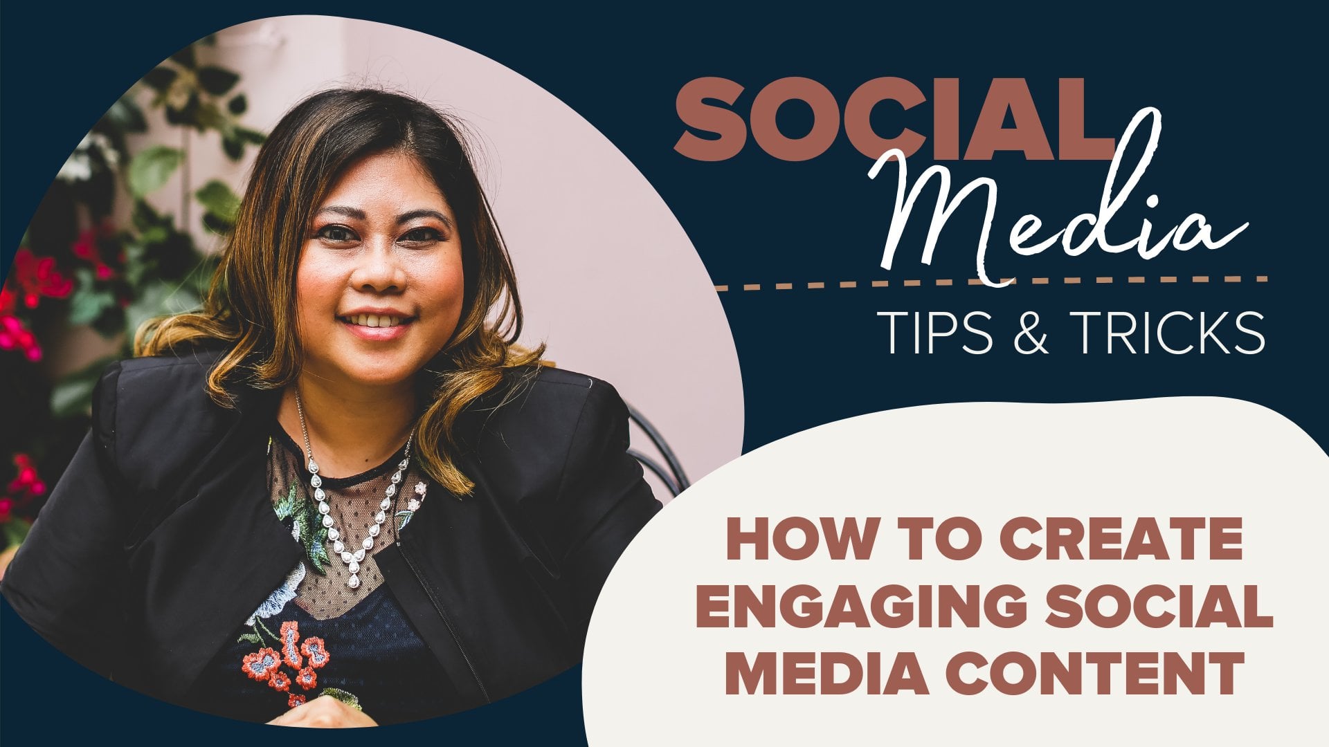
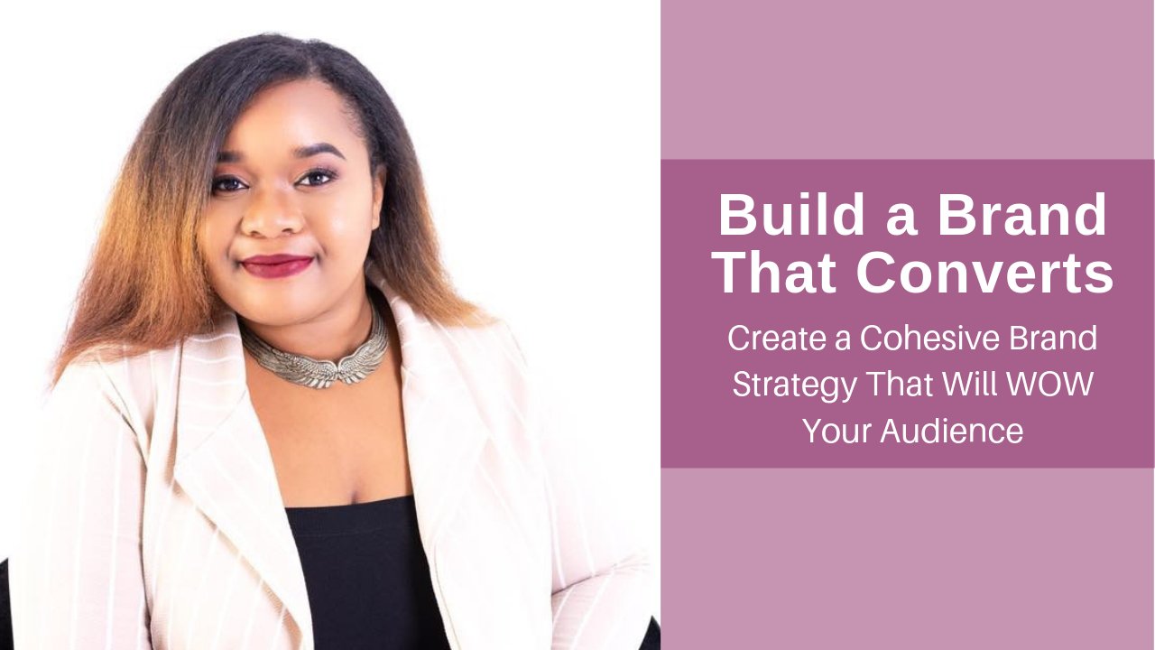
14. More: Thank you so much for taking this class. If you've enjoyed this class, I'd like to introduce you to my other classes here on skill ship. As you can see, I teach a lot of different areas of digital marketing. And the links to the classes are in the notes below. Just click the pin and the bottom right of the video and you can view all the notes to see them. When you click it, you can then bookmark the other classes for you to watch when you have the time. So I'm just gonna go through the different classes and what they're about briefly. So you know, what you can look forward to. The first one is how to create engaging social media marketing content. This class is great if you ever feel stumped as to what to post on social media, come behind the scenes and I'll show you how to create highly engaging social media content immediately. If you're interested in video marketing, This course is a no-nonsense approach to video marketing, is designed to help you hit the ground running with your video marketing, you'll get plenty of templates and a powerful contact founder to get you started on the right foot. Interested in branding. This class will walk you through the basics of building an unforgettable brand. You will learn how to build your brand from scratch and understand what decisions to make when it comes to your brand color, logo, topography, and imagery. Interested to learn on how to build a website that converts. This class will walk you through the basics of planning and building or redesigning a website. You will learn how to create a multifunctional website that's not just pretty to look at, but also constantly serving a purpose for your business even while you sleep. Do you want to create a Facebook ads campaign, but not sure how to start. In this course, I'll show you how to create high converting sales funnel for your Facebook ads campaign. Lastly, if you have enjoyed this class, I'd love for you to leave a review and let me know what you think. I hope to see you in the next class.
 Liz Azyan, Digital Consultant