Transcripts
1. Intro: Hello, everyone. And welcome to my first ever skill share. Close first of all, big things for checking out the class. I hope you learned something today. My name is Shell, and I'm a designer and skateboarder from Belgium. I live together with my girlfriend are two dogs and we also have two bunnies. My work mainly focuses on a clean and minimal style for Web design. And that's what I'm gonna teach you today. This class is all about visual hierarchy and spacing in design. I'm gonna talk about why visual hierarchies important the different ways we define visual contrasts and how to use grits basing to come up with a minimal style off Web design. First of all, we're gonna small parts of theory. But then we'll go over to a fun exercise where I'll explain how you can use a theory in your own work. This class is for beginning and intermediate designers who already have the basics of photoshopped down. But of course, everybody's going to join me at the end of this class. You will have a good understanding of visual ire against basis, and you will be able to use it in your own work to come up with a minimal style for design . So let's get started
2. Why is visual hierarchy important?: Hey, guys. And thanks for enrolling in the class. So, like I said in the intro, we're going to start with some theory in this. First listen, we're gonna talk about the importance off visual hierarchy. So, first of all, whites, visual hierarchy importance. Well, visual hierarchy is important to guide a user to a webpage, for instance, by using titles, subtitles, paragraphs and so on. You can make it a lot easier for a user to skin through a page. You got to think about what information is the most important to a user and put that in for in the title, for example, like the caption on the sly treats. If you give people a massive block off texts, chances are that 99 out of 100 won't bother to read it. But why is that? Well, that's because most humans are visual thinkers and, no doubt a processors. Here you can see an example that I made to make the point more clear on the left. We have a regular block off text, and on the right, we have the same text. But this one is divided in paragraphs and titles. The left one seems like a pain to start reading to me, but the right one looks much more inviting to read And last but not least for this lesson. How do we define or establish a visual hierarchy while we do that by using visual contrast , but more on that in the next lesson.
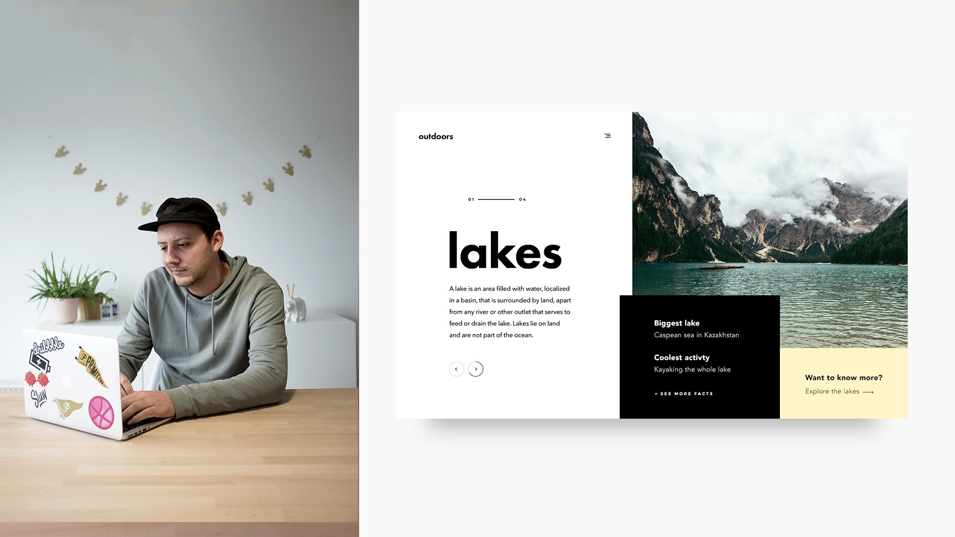
3. Different ways of visual contrast: So, like I said in the previous lesson, we establish visual hierarchy by using visual contrast. In this lesson, I'm going to go through the five different ways of visual contrast their size, color, alignment, character and, last but not least, animation. First you got size. This is probably the most used way of visual contrast. Like you see, the one that is bigger in size draws the most attention. Like you can see in this example, it's used for the title, The title Gramps. More of the user's attention because it is bigger in size. The second way of visual contrast. Scholar. This is also a very popular one. Like you see, the one that has the brightest car draws the most attention. You can use this, for example, in buttons or culture actions like you see in this example, I mostly work with to tone down cores like light blue, gray or white, and then I use, like one bright color for the culture actions. That way, the user can easily understand which parts are clickable and which are not. The next one is alignment. This one isn't as used as much as previous ones, but it can be a pretty cool. You see that the middle circle isn't the line with the other ones. Because of this, it draws the most attention to die. In this example, you see that using this way of visual contrast can make an interesting composition and draws the eye down to the text. The 4th 1 is character. This can be a lot of things. You see. I chose for the roundness of the shape to make it draw more attention. But it can also be like texture, shadows and other effects that set it apart from the rest. In this example, you see that the white rectangle with shadow draws more attention because of its character . The last one is animation. This one can be a very powerful one. If you use it right, you can see that the Middle Circle draws attention because of its movement. In this example, I didn't want to use text on images, but I wanted to keep the vacation feeling. So I first showed a full image with the lower and then I reveal to you I with animation, you can draw attention to objects, make the lights for loading animations, and so it's very cool. But it's easy to overdo quickly, so keep the animation settle
4. My grouping principle: in this lesson, I'm going to explain how I group elements and how I arranged those groups to get a minimal pipe in your design. So, first off, the important thing to keep in the back of your head is that you have to see elements like groups. But this will become more clear towards the end of this Listen. So he received a simple example that I made with on the left image and on the right, we have stifle and a paragraph. So if we take a look at how I group these subjects, we can see that I used to blue rectangles here to show the left and the right of the composition. The great lines would be where the Britons on the left side, we have only one elements, so that's a simple on the image. But on the right, we have two elements. The title and paragraph. The wave place those objects is the following. You look at the title and the paragraph as a whole, like they were a group. Then you just place it in the middle of the blue rectangle that's on top of it, like you can see here on the right. The text is centered horizontally and vertically, and that's what gives it the balanced feeling. So that was a pretty simple example. But now let's take a look at the more complicated you see in this example. We have a whole lot of things going on. We have the image. We have the title subtitle Paragraph rectangle with some USB Aikens things on it, but we see that the same principle applies here just way more complicated. Let's start with the top left part. You can see here that we have three items Title subtitle and a paragraph First of all I spaced subtitle entitled Towards each Other. Those two together are a group now for me. Then I space that group as a whole towards the paragraph and those through those street together again former group off their own, which we can use to space for the composition later. Next, let's do direct angle on the bottom with the icons here we have directing over, we're gonna work on and there are four items on there, so we divide the rectangle in four equal pieces. Those are the four blue rectangles you see. Those are now the places where the icons are gonna go. So for the Aikens, I grew those each time together with the word beneath it. Those are the pink rectangles you see, and now it's just a matter of placing them in the middle of the four blue rectangles. So that's that for the rectangle and finally on the right. We have just a image, like in the previous example. So now we have three main groups toe work with with we have to image on the right. We have the rectangle, and we have the group with subtitle title and paragraph. So now it's more easy toe space. These three groups towards itself, each other, instead of having all those separate items to space, I noticed, may sound complicated for now, but when you start using this principle, it will come all the medically with time. When you're designing
5. Whitespace and balance: this lesson. I'm gonna talk about how your best place and space, the groups we talked about in the previous lesson. I use the spacing method mainly for textbooks, but it can apply to anything. Really. So now we're gonna cover how you can place your groups in a balanced way towards the background or come off or whatever space you have to work. So here we see a simple example with just a title in a paragraph. Let's say that the white rectangle with drop shallow is a space you have to work on. Well, here we see how I placed this textbook. So first off, you see again that I see this as a group Thailand paragraph. And by seeing this as a group, we only have one imaginary rectangle to center on the background by just centering the imaginary rectangle vertically and horizontally. We get a very balanced feel, and that's what we're going for. So how it is apply when we're working on a design. Well, he received a simple split few that I made with on the right of the image and on the left, we have our space to work on. You can see here that the text on the left is just centered. As in the previous slides, I just saw the title and paragraph again as a group. And then I placed that in the horizontal and vertical center off space I had toe work in. You can use this technique of placing objects and elements almost everywhere in just a matter of defining what the spaces you have to work on. And last but not least, I wanted to tell you guys how I define the width of a block like you see on the slides. For me, a good ratio is 60% for the objects you're placing and 40% of wide space. That's 20% on each side, less white space you give onsides. The letter is gonna have a breeding feel to it. If you would give it more, it can become more minimal and breeding. But you have to watch out that the sentences are a to least 5 to 8 words vertically. The same applies, but it depends on the space you're working on. So that's it for the theory part. I hope I didn't bore you guys too much, but now we're gonna go over to an exercise where I'll explain how you can use all these things in your designs.
6. Exercise: Briefing/Subject: Now we're going to start the exercise, and here's where you will see how we can use a theory. We we just went over, and I can use that in your own work. So first of all, I'm gonna explain how I make a brief for myself for this kind of exercise. So for the dimensions, I'm not gonna do a full page. I'm gonna do ah, full view off screen for a website and for the for the for the subject. I'm gonna do something that I'm interested in, and I'm gonna work with something gonna be revolving around Scandinavian workplaces. We're gonna use a simple workflow for these exercise. So we're gonna do first gonna do a wire frame to get an idea out of our head, and then we're gonna start with the design for this exercise. I'm not going to use a great, but you can use one if you want. So let's start with a wire frame
7. Exercise: Wireframes: So now we're going to start to the simple wire frame. Um, I already dropped. Dropped out six books here I'm gonna work in. And the reason why we do this just to get untidy out of our head much more quickly than, like, we could do it in photo shop or something. So, um, I have my six boxes here. These represent the pages, and I'm just gonna start drawing out some I d. So, actually, the first thing I need to think about this what items and content I'm gonna work with. So I'm gonna work with a title and some text an image on I'm working with Scandinavian workplace. So I'm probably gonna do something with, like, a featured products in a big cult direction. Big collection for the user to see it so it can click to a detail page much easier, easier and the feature product so that there's some metadata where the user can work with. So I'm going to start out with a simple split for you, where it could have, like, the image on the right. We could have the local here and like a menu I can hear in here. We could have a text featured product could be like in a card here with an overlay over the image or something would like, Button said. They are here another one, and this is just they have some quick ideas that are so it doesn't have to be perfect logo . We can work with some diagonal lines for the image. Could could could go here. Now we can work here with a featured product and then here we could have, like the text with the call to action. This books could be like a call to action, and here we could have, like a split few like this one. But in the other way, like like so there could have, like, the lower here menu Aiken or a full menu could have, like some the text come over here. This could be the image and would be cool to have a cart with the featured product, like an overly here and for the culture action. We could have it like over here with a narrow or something could be like here and totally up to you. So here I'm going to try to work with something in three rows so split it up in three rows . No, I'm gonna have the image in the middle Loga menu. Aiken, some text, and then we could split this up. So we have a nice here on the left. These are the same. And then this party's to pieces, and then this part could be, like the featured product here, right? I'm product. And here we could have, like, the c t a. So that's that, um, Then we can try some other stuff. Like we could even work with a circle or something. So, like this from around the shapes with the image going here, featured product could be like in here in a court or something. Now, we could have our text with a call to action logo. Just menu I can over here. Or we can just change it up. We also we always have the text on the left, so try a different one with the image on the right on the left, I mean, sorry. And then here's some text. The featured could be like from edge to edge product. You know, we could have, like, a call to action over here. Low and a menu, Aiken. So when I'm looking at this. The one that strikes my interest the most are is this one and this one. But I think I'm gonna work with this one. So now we're gonna now we're gonna go over to the exercise will explain how we can make this wire frame that I made in tow the design.
8. Exercise: Making the design: So now we're going to start with the exercise. I just opened photo shop. We're gonna make a new document. I'm going to call it Scandinavian workspaces. It's gonna be 1500 pixels in width and about 850 in height. The resolution is gonna be 72 pixels per inch and the color Moz going to be rgb. So just press OK? And now we have Ah, this this canvas to work on. The first thing I'm gonna do is I'm gonna make an art board off it so you can do it by clicking and holding here on the move to and then you'll get this pop out. You can just choose for Ardmore Tool and then we start here in the left stop corner. You can click and direct. You're smart, guides will pop up, and then you can just drag it to the right bottom corner, and then you'll see here in the layers panel that we haven't art board. So I'm going to call this Scandinavian workspaces. So doesn't it? The white layer here is just a background, so you don't have to worry about that. So the reason I made in art board of this is Ah, that is going to be easy to duplicate. The Congolese were working. So now the thing we're gonna do is we're gonna zoom out, and we're gonna try to recreate our wire frame that we made. So the one I chose had an image in the middle. So I'm gonna go over to the rectangle tool right to you. So I'm just going to roughly set a rectangle here in the middle by clicking and dragging. So that's that. Just going to give you a light gray color. So I know that's that's there. You can adjust the core by just clicking here in the terminal directly. Gary, get a color, Papa. The reason I'm I put the rectangle there's because it's going to be the placeholder for the image. So here on the right, we're going to have two blocks, the one for this for the cult direction and the one for the features product. So I'm just gonna take this over here with all chieftain drag, so we make a duplicate of it going to make it a little bit darker so I can see the difference between the two and then with hitting go months t for transform. You get this bounding books and you can drag it here to make it smaller, just going to drag it here. You see the smart guy that means it's in the middle. So I'm just going to do with death and then command clicking this one for auto select seats checked off. But when I pressed comments, it goes on. So every time I press command and I click somewhere it select that layer. So, for example, now this one is selected. If I command click here, the other one is selected. So I'm gonna go over here again. I'm gonna do the same as I did with districting of selected. I'm gonna press out and shift and drag it down. I thought hits the corner of the other one and I'm I see there's a one pixel line between them, so I'm just gonna hit arrow up to move it. So they are against each other. Gonna make that a little darker, too. So you see here, actually, the thing we did now if we just recreated our wire frame so it is going to be the space I'm going to be working on. It's another. We have this set, our wife frame. I'm gonna go and try to find a good image to put in this rectangle here. So I'm gonna go over to Luke Room and I'm gonna go to interests. The dress is a good place to search for images and to get some inspiration about images and stuff. So I just gonna look here for Scandinavian workspace. Let's see what images will pop up. So I kind of already like this one different. Different is a little bit busy here. This one is a nice one. So just going toe, click on it and then a simple trick so that you don't have to save the image is always Yes , you can just right click on it and a copy image, and you can go over to photo shop on. Do you have to select the rectangle here where you're going to place your image on the place for it, and then you press two months fee to paste it, and so it will become the layer on top of it. So now we see that the images loose from the from the placeholder. So if you want the image to only be appear on the rectangle we have here. There's a simple three critical, a clipping mosque, and we can create it by holding Ault and clicking between the image layer and the placeholder layer. So you see this arrow. So if I click, it only shows in the layer that's been need it. So here that the direct angle. So if you see now, if I click the image and I'll drag it around to see it, only it always stays in the rectangle. So that's good for no. So I have this image here and maybe we could try some other ones. It's really easy so you can go back over to interests, can scroll down a little, see what kind of images are on here. Ah, kind of like this one. So including about Pinterest is when you find an image that you like, you can always scroll down and Pinterest will give you suggested images. So here we have a whole lot of more images. The songs are cool like this one, but this one I like, I think I'm gonna go with this one. So same thing, right? Click, copy, image, then see that we're on the same place here in the layer. Fill it. So we're here and I can just come onto V again and you'll see that the image appear here. But you see again, it's loose from the from the placeholder. So we can just again press ault between and click between the two layers. And I'm going to keep these two images because when I click the eye here on this layer, it will show me the image has been Eat it. So later on when we're a bit further in the composition, we can see the difference. What the feel gifts with the different images. So I'm just going to place. I'm just going to click the I again. We see the image. I'm going to come and click on it. So I have it selected that I'm gonna drag it in place. So that's it. Now feel that maybe it's a bit too narrowed place, although that I made So I'm going to command click on this one in command shift Click on the one beneath. So I see here that I have the two layers selected. I'm just gonna compress command t again to transform and just going to make them a little bit smaller in with Maybe like this number center. And then here we have to make the placeholder bigger. So I can just click here on the rectangle again or place over same thing. Come on, T drag it over. Now we can replace. We can drag her image a bit. Now I see that the rectangle is too white on the side. So again, you select directing all monte for transform, and you can bring it back here. So press enter image here, going to make it a little bit smaller. So like this, So Okay, I like that. So now that we have done this, I'm just going to name my layers. So this one is a placeholder that two images going to command click on the other two. So we have the trick, the tria in the three layers. We have them selected, and I'm gonna press command g to make a group of it. So here I can name the group image enter. And here we have, like, two blocks. These are going to change, probably. So I'm not going to give them names, the background and just like a white color, but I'm just going to delete it because it's automatically white. So that's it. So the next thing I'm gonna do is put all the information here that I that I wanna put in the in this design. So first of all, so I'm gonna Presti to bring up the typography. So I'm just gonna make text books here and remember. Like we said in the theory, I wanted to be, like, 60% in which off the off the place we have to work on. So here it would be the white rectangle that that the space where we can work So I'm just going to roughly do it like 60% gonna probably something gonna be something like this. I'm just gonna drag it to the middle and then the title I'm gonna work with just gonna be Scandinavian workspaces. I'm going to make it left the line here. So does that just gonna put their The front is not the the one that I'm gonna use, probably, but just set a default here for me, and then I'm going to go over to the Internet again. You're gonna make a new top and I'm gonna search for Scandinavian Works basis and then involves. See, we see here that we have some some articles. Like here, for instance, this one. You see, we have some text here toe work with Just going to see here. If I can copy and paste some of that like these 25 we don't need that. But just gonna take, like, here, designed to it in space restrictions space. Something till you gonna print command. See, just a couple of times to be sure. And then we'll hit command up to go back to photo shop. So now again, gonna make. I'm just gonna copy this text books. So that is the same with I'm just gonna Presti. And then I can You can select the text in here in this box. I'm gonna press command A to select it all. I'm gonna press backspace to delete it and command V to paste the long text we have. And I'm gonna change the body text to ah, phone time mostly used for body text in skulled source on spro. It's gonna take the regular one. It's a free funk. You can download it over at the phone. Squirrel I think you can just google it. You'll find it. So that's that. I'm going to make it, like, 17 points, and I'm gonna go over toe this penalty the character and I don't have is that the line height. And now we see it set. It's way too big. So I'm just gonna stand here and I'm gonna click and direct you see, in the sentences that is going to come up. And now we want something good and greedy. So, like this, this would be to Jim together for me. Someone to make it a little big. Bigger. See that all the texts can fit in there. So I dragged it down. So we have hold text here, so that's dead. And maybe gonna give it a little bit. Nous, maybe something like you don't have to use us as much of a text like this. But we can, for example, cut it off here, so I have a little bit less text to work with. Remember, it's not a client job. Just have fun and to try some new things out. So now we'll have reading this. So click here. So now it's back to this. Okay, That's it. Next thing I want is Ah, Lower. Just gonna click here and type something out. Um, works basis, for example, Gonna make this like, uh, 20 points, for example, on this, remember, we're just setting everything. This is no definite or something, but we're gonna We're gonna make it. We're going to change it. Teoh. What is gonna be We're going to see what, like what it's gonna feel like when we have the whole composition set. So we see here. I have pressed space a couple of times that just to click and direct a pen inside the image . So you see the cursor changing to the hand when I press space, and then you can click and drag around. It's pretty easy. Um, so next thing we're gonna do is we're gonna create a menu. I can So it's going to go over here, probably. So I'm just gonna take the line tool and he received set to three pixels. I'm gonna change it to, and I'm gonna all scroll to zoom in just like this. And then, like something like this, like 66 700% or something. I'm just going to drag a line something like this. Like 20 pixels in width that, like I said before we direct angles click here in the terminal and you can change the color , so I'm going to make it black press. OK, then we want to We have want to have, like, a hamburger menu. So we want three of these stripes so we can just duplicate this one by pressing commands. And Jay, So, like this, you see here it will will have a copy. So there's that and then we'll do that again so that and we select this one and will press shift and a road down, so this moves it 10 pixels. So if we do that with the other one, then we're gonna have this. But if you zoom out, we're gonna go back toe 100% of the actual view size to see what it looks like when we have our zoomed out and an easy way to go back to 100% this command shift one so like this. And then we'll have begged this. So I'm just gonna Bennett again right here. So if we select this tree layers, those are the menu I can just gonna press. Come on, G. Make a group of it. You name it. Menu. I can. So the thing I see now is that it's too high and that the lines are too, too far apart from each other, so it's going to be going to come right over here. So I want these to be a bit closer to each other, so I'm gonna so, like this one here, gonna take my arrow keys. I'm going toe. 123 Okay, it's looking better, and then we'll select the are tooth and 123 So that's starting to look a little bit better . So I'm going to all zoom again to go back into the menu, and I were going to make it a bit more dynamic. So the thing I'm gonna do is I'm gonna change the wits off to off the lights. I'm gonna do this by pressing a is the direct selection toe. This is ah to where you can select anchor points with. So I'm going to press a see here. It's not the white tools. I'm gonna click and drag, and then we have the direct selection toe. I'm gonna click this I won't select these two left points, but just dragging over them and in with the arrow keys can make them bit shorter like this . And there are no set rules for this is just you can experiment with this. You can try as much things out if you want, but I know like I know I wanted to be a bit like this. So we have, like, three different wits now. And I'm just going to go see again how they look in actual size. I'm going to press command shift one again. Enough with ease. I kind of starting to like this, But maybe they are a bit too far apart from each other. So I'm going to select the lowest one again, the middle one, and then going to press one key up, and I'm going to have to have to move the bottom 12 pixels. So now we're getting somewhere. Okay, let's leave that for now. So does that. Now we're gonna see what we can do for fold size. Oh, are, or the orphans in general. So this one is kind of my goto body text forms, but I kind of like it so I think I'm gonna keep that is going to select it all. And I think it's maybe a bit too to white now. The textbooks. So I'm going to select this. I'm going to take this anchor point here from textbook. I'm going to drag it a bit down and a bit to the left, so I kind of like death. And for this field, I kind of like this phone work in pretty much every weight and size upper case. Lower case. A pretty good multi functional front. But I'm going to go with something nice. Kind of fit here are kind of fun, I guess, on trial for Duda. So we have here Duda, and we're gonna choose for a heavyweight. And the reason for that is that I want to have a good Contras between the bullet text and the title so that the title really pops out. So you see here that the title it has kind of the right fit. You can try to make the big, bigger maybe a bit smaller again. Kind of like it and then we're going Teoh, you see that the space between the two toe like the title of Scandinavian and work space. The space between two big toe bitch too big. And then, by holding Ault and using your arrow keys, you can change the line height. So if you use Ault, you press alternate. You use the Iraqi press UPI seeds that it's becoming smaller, the space. So did that. See how that look there that looks un selected. So I'm gonna click here. So that's starting to look like something already. Maybe the space here between these two, it's now been too much. I'm going toe move the bullet text a bit. Yeah, so I kind of liked is already maybe the whole. Like I said before the theory, we have to see this like one group. So if you see this like one group, you can you can just use a simple rectangle to put it in the middle. Casey like this. And if we give it a color, you can see the space between it and then all direct to move it over. Something like this doesn't have to be perfect for now. So now we selling these two like they were so to speak a group, and we can move them over like this would something be more like in the middle? So now I'm going to delete districting is again because they're not part of the design. But now you see, it's starting to look like something. The reason why I put the logo here on the top because Lois, always for me left on the top because people always read from left to right. And the first thing you want people to see when they come on a website is the lower off your company. So that's why I put it over there, the local here, the menu I can over here because we don't have enough space for a whole menu to type it out . And I kept it here in the white space and not here. For example, on the right side toe have this part off the design always for text. And this one could be variable for images are called directions or something like that. So now I'm gonna select these two over text layers on a group them text and this is a group for the logo and then you can if you choose, you can you can choose if you want to. If you want to do this or not, But you can put, like, glower menu Aiken together and call it headed, for instance, so that that the next thing we're gonna work on is ah, call direction. So I think I want to do here is I want to use one of these books and give it a color. So it pops. And the reason for that is that I want that to be the call to action. Like if people click on there, they go to a detail page or something about Scandinavian workspaces. So I'm gonna start out by taking this book and giving you the cold. I'm gonna go with but still kind of blue right now a bit, right? Something like that. I'm just going to give this, like, this great place holder here. I'm going to give it a white core phenomena so it doesn't bother me that much. So now that we have death, we have here for the call direction, and I'm just going to take like, a rectangle to show you the space and I'm going toe working. So I want to have, like, a good space in here where where I will working with my text. So, like, here we have, like, 60% to 40 percents, for example, like here. So here, I'm gonna try to do the same. So what I'm gonna do is just gonna set up like a title area for like you could call it. So that's gonna be something like this again. It doesn't have to be perfect. For now, I'm just going to make this one a little darker. So I noted that the area that I'm gonna working so the first thing we're gonna do is we're gonna make here gonna make the texts for the cult direction. So I'm just gonna press d again to bring up the typography and I'm gonna click here, and then I'm gonna gonna write something like check out the workspaces, for example. So you see already that this way too big. So I'm gonna click here in the phone size, and you can just scroll in here toe easier if it's like you see, I'm just scrolling in here and you can quickly see what looks best. You don't really have to give in the values or something that can just scroll here. So I'm going to doing something like this. Maybe you can also use the arrow keys. So maybe something like 28. 26. 27. Something like 28 for example. Let's press enter. So we're not changing the phone sides anymore. And then again, you see that the two lines are way too far apart. So I'm going to press Ault again with and then you again, like you can use the arrow key to change the line heights. So I'm gonna do that. So something like this looks good and I'm just going to breast V three v accusing visa shortcuts. Toe Just bring up the move to again. So, like this. So if I'm a text or breastfeed and go back to the move toe So again, command click. To be sure we have selected that, I'm just going to drag it down. So the first thing I see now that maybe it is too small, So I'm just going to, uh, first day again, select all text, make it a big, bigger, a bit bigger. So something like that. But now the lines are way too close to each other again. Hold Ault and with the keys arrow keys to press down a bit. So they're going to be like this. Just going to select this rectangle and click on I. So I don't see it. Kids looking quite good can make some adjustments later. So the second thing I want to have here something Teoh, get to the eye. On top of this block is something in all caps, a little bit smaller front. That's this, um, our workspaces, for example. It doesn't really matter what it says right there, but something small and upper case I usually use Monserrat because it's it works really good for for this kind off text. So I'm just going to take Monserrat and I'm going to use, um I mostly use semi bald and then breath year again. I'm going over here and we're going to make it all caps, probably going to make it round. I mostly for upper case. In this scenario, I used like 12 points or maximum 14 so I'm gonna go with wealth here. So the thing I always think that works pretty well with uppercase small, small text is ah, the space between letters so that we can make that bigger. So I'm just going to go here, click here and direct. So the letters were going to go a bit out of each other like 200 or something. And I see that gives it also adds to the minimalism because the letters are now, they they have more room to breathe. So she's gonna click here and drag it down so it could be like this could come like here. And then I'm going to click here on this rectangle again and click on the I. And I would see that maybe it's leaning too much to the left. So I'm just going to click this one and come on shift, click this one. So we both have them selected, and then I'm going to move it over a bit to the right, maybe a bit down. So something like this. So the only thing I think that that can add to this it's like an arrow here and a narrow always indicates that you're going off the page, that there's gonna be a new page load. So the user sees the arrow any I think 95% off people know that they're gonna have a new page load. So I'm just gonna go over here to my custom shape tool. And I have some custom shapes here, Loaded in. See here I from arrows. I will. I will make a note with a link through these files where you can download these arrows, and I'm going to go for, like, a really thin kind of arrow here, pointing to the right. So I'm just going to drag here like this, huh? Change the color black so that we can see it. And then I'm going to zoom in by all, assuming again, drag to the middle, and then we're going to click Type A for direct selection tool again because I wanted to be a little bit longer, so I'm just going to select these anchor points and then which shift and my aero to left, I can make it longer. So I'm just gonna try something like this Oppressive V again to bring up the move tool. Come on, shift one to go back to 100% for you, and then I'm just a seal. I have my my arrow selected. Going to name is every real quick like this, and then I'm gonna just click and drag and position it the right way. So now I'll see that it's too close to the to the end of the composition. So I'm going to make this texts again, little smaller, something like this. And I just can't come little bit closer. Something like this. Okay, so kind of like this. Now, if you want to try out different course, here's where the art board copying comes in handy. So we can just here click on the name of the art board and you'll just go over here to move toe and you press all to shift and drag it down. So you just make a duplicate of the tone. So here we can just quickly changing color and see what kind of things work. Maybe something like are still being or something. Make another duplicate. We could try like, um, something green. Make another duplicates and try something. Something like light yellow, like your Louise or something. So see here, maybe a bit lower. Yeah, maybe something like this. I do like this because this this complements that image more because the image has a lot off brown yellowish stints in it. So I think this one is going to work the best. Well, just closed. The other art boards hear clicking on the on the arrows so that we're not confused to it. So I'm going to work with this. So the only thing missing now from this layout or composition is ah, the featured product that I wanted to put on here. So we have a nice base over here. I'm just going to big this one for the title dragged over. I'm just gonna type out. Um, maybe this one is going to be better for the name of the product like we have here. We have the small text on top and we have the bigger text year down low. So the I goes from the top and it automatically draws you down because this Texas little bits, it has more contrast with the big the big round. So I'm going to type out here product name, and it's also is going to be a link. So the arrow give me a blind here, See, like this is the secondary call to action. The main thing we want to use it to do is click on this culture action, and that's why it has the color background so it draws more attention. So I'm just going to put this down here. I'm gonna take this text Small text uppercase on, going to put it here, and I'm in the middle. I'm gonna just going to type out features product like death. So if I have I want to place this in the middle here. So I have district angle. This is the place holder for the product. Placeholder, probably. And if we have this selected and we select the text together, we can use it aligned to here to put it in the middle. So now this is in the middle. This also select this together with the Terryl gonna make a group out of it. Cold direction, brother. And you can also do this with groups. So just again, I have selected this group and I'm going to select the background to rectangle is going to put it in the middle. So now dissented. So the only thing missing here is something like a chair, something like like here in the image. So I'm just gonna go over again toe to the internet and I'm going to make a new top. I'm just going to type out something like signed chair or something. And then I'm going to go over to images all these images, something like this. So I'm just going to so also important. We wanted to have a wide backgrounds so that we don't have to do much work getting it out and making shadows and all that stuff. So I'm just going toe put PNG behind it. And we have, like, these kind of images. So this one kind of like I'm just going to try out a couple, like, for instance, this one just the same, like with the image in ah, a couple of moments ago in an interesting and do right click copy image. Go back over to photo shop. Come on, Fi. And we have it to you and income. Auntie Transform could make it smaller again. So does it. So the only thing I don't like here that it has, like, no shadows or something just like standing there and doesn't look like realistic or something. Just so I'm just going to delete this one, Gonna go back, and I think these chairs are called Eames something, so I'm going time. But here, teams Yeah, success. So just going to look at all these images if we have. Ah, nice picture. We can work with something with some shadows on it. Uh, no. It's like it's not real shadow and searching for images. It's not the easiest thing. Mostly takes me around, like, a couple of hours to find perfect images. But, um so maybe some related images could help us out here. Something like death. You need some shadows. So OK, guys, I have found my image. It I want to use. He's gonna copies again, Back over to photo shop and Basit here. So you're going to press, Come on TV again. It's killed is down. It's here like there's a wide background in the image, but it's not really a problem because we have, like, white background here again to so we can just play that over here. So now we know that this Texas sent it already so we can You can select the layer featured product and un select the image and then align it here again. Middle Oops, incentive, the wrong one. So I'm going to take the image in and background again, and so that's that. Now we have everything centers. Going to direct this down a bit is going to be This is gonna go up. I don't quite like it turns down in which so notice Churkin can we can scale it up a bit more. So it's more like an I captured. So I do like something like this. Check this out. So now this sort we're working with, um, the only thing I think and maybe improved this is like if we can put this the cult direction, the color block, we could turn it to the top. Because, like I said, people read in most countries from left to right and from top to bottom. So the first thing we want them to see it's like, this call direction, because we want them to click it. So I'm just going to zoom out a bit and make a copy of this. They were just going to flip those over so this one's gonna be a group. So we have the background layer, featured product text, layer the image, and we already made a group for the call to action of the product. Torres, that so I'm gonna make a group out of this and this is going to be and, uh, feature thrilling group. That's and this is going to be the subtitle these days in the background. It's going to be a group, and it's going to be the culture action or c t. Eight. So that's that. And I were just going to switch them over. So the state, the I was going to go to the top. What is going to drag it over like this? I'm just going to and take the eye for the other group. So I guess he was working with. So do call direction goes to the top and the features product is gonna come down like this . Let's see what it looks on. I do have to say I do like this more deflate out. So now we have all the elements in our design that we wanted. There we have the text, we have the image. We have the like kind of logo, a menu I can in a call to action. So I'm going to just a line. I tear a bit more, want to make it a bit smaller, just the Arab. It put it back up so something like this. So I do kind of like this. Like here we have like the texts. The title, with the paragraph as a group is in the middle off the white book. Just a little bit more here. If, like, this is a group with the featured product text the image and the call direction for the features Products like a group. And it's like in the center going to take these three toe featured product text layers. See ta for the product and the image. Move it up a bit. Okay, so that's like in the middle. And then we have here are works basis. Check the works basis and the arrow for that. Our workspaces text layer. So now we have dead. We can just you can just step. You can just use your arrow keys toe, move it around a bit and see where it feels best you can. You can take the subtitle and move it a bit down or something. But then the space between here has to be the same, like test here. Am I I personally I think that for bottom and top, it has to be the same. But also on the left and the right and I tried to match the left and right margins to the one on the top and the bottom. So, like, if this one would go here, then this as a group, I would go up. But then I also have to adjust the phone size because this has to become smaller also so that we're not gonna do it so monster to undo that. So that's the now. The only thing I think I want to add here it's like some some fun, like like some arrows like this could be like a slider, for instance. And I think I'm gonna do another class rai what I will animate. It's like a slider in the short. So in the next, the next lesson of this of this class you'll see for a class project would be cool. If you guys could do this to, like atoms atom so kind of interactive elements for like making a slide or something for the next Listen, I'm going to try to explain how you can make a slider. Animation with the shot attitude is now made and do that in principle, but that's for the next to close. So here, for the for him going to add some arrows. So just going, Going to go over here to the lips stool and by pressing shift and Ault, I'm gonna drag a circle. So just like this, something like that. Okay. An impressive V again for the move to So we just have. So we go over here to the layer, you can call it, pero left. And now we're going to add some layer style says, Actually, one just a stroke. So the first thing I want to do, but I don't see the circle because it's wide on wide. But for you guys, if you see it's like if you see it like this, for example, the thing you want to do is you want Teoh turn off the field. So we're gonna make this 0% like this and the difference between opacity and feel is it. When you turn down the opacity eight turnovers, opacity for everything. Also, it turns up tested on for the layer, but also for the layer styles or anything that's applied to the layer for the fill it. Only it only turns on the opacity for for the core or something like that. Just what's inside of the layer, but not for the layer styles. So if you want to see our stroke or the only thing we want to see the stroke, then we're gonna have to turn off the field. I never gonna double click here on the layers, not on the name, because then you're going to adjust the name never going to go over here to stroke. And they were gonna do, like, a two Bixel stroke insights or outside doesn't really matter. It a circle. And they were gonna choose, like a lied bluish great color. I don't really like plain great colors. I do like them or like, in the blue area, and just go over a little bit to the right. So they have some You in it some some blue. So I'm gonna press. Okay. Here. So does that. I'm just gonna zoom by. I'm just gonna assume by all scrolling, So here we have our circle. So now we want an arrow in there. So the first thing I'm gonna do is go over to the custom shape tool. So we have our arrow from the last time, but maybe these are a bit too big for this, so I'm going to do, like, a narrow like this. So in the middle of a circle we wanted to stand, So I'm gonna go with my cursor to the middle of a circle First click, and then all shift dragged out. We'll make your arrow something like this, and I were going to make it black. So come on, shift one again to go to 100%. Few kind of like this. I'm going to select these two and align them. So these are technically a light, but not optically, you see, like like it's because of the arrow and goes open to the rights. Because of that reason, it seems like it's leaning more to the right, and it's not in the center. So we're just going to adjust that a bit by selecting the shape layer here, move the move, move to the left a bit with the arrow keys, something like this. So you see it like this? It looks more centered. Okay, so we're gonna group this, um I'm gonna call it, pero left. So that's it. And the only thing we have to do to make um heralded goes to the right is just like I said previous, we're gonna duplicate it by hitting command J like this. And then we have a copy off our arrow going drag it over by holding shift and dragging it over. So it's on the same line, then just gonna press command t to transform it. And I'm just going toe, turn it around 180 degrees. So I'm going to hold down shift and which shift If you rotate it, you hold down, shift it. It goes in steps off 45 degrees. It was like 15 degrees. I mean, eso it goes over like this. 180 like this. Or now I think they're a bit too far parts, so don't call this all right? Like this. Well, with a bit to the left like this, I kind of like this. So this one has to align with text here. So Ford is I'm just going to put simple Ruler gonna select the title going to go over here and a simple, trickier toe to make another a ruler in ah, horizontal or vertical way by just pressing Ault when you drag one down. So it like you see, it's flips. So going to president also, it flips. Now we're going to put it left on
9. Class project: So I hope you guys learn something from the previous video where we made the design together. Now for the class project. I want you guys to do the same thing. Search for something you're interested in and use that as your subject. It could be like famous person soccer team, an athlete. Ah ha Buf game. It could be about anything. Really. Then you the same dimensions as I did to come up with a similar kind of design. Make your wire frames first and think about what info you're gonna work with. Think about what could be important for the user. I used the featured product as something that could be important to the user. But for example, if you're working with an athlete, you can work with the age and the nationality or something like that. Then think about how you can make the information pop out, post your project here in the class, and I'll make sure to check them all out and give you guys some feedback. I'm looking forward to what your guy they're going to come up with and remember, have fun with it.
10. Round up: So that was it for the class. I hope you guys learn something about visual hierarchy and spacing big. Thanks for sticking with me. Keep in mind this was my first time doing this. And I know the clause is far from perfect. It was a fun project to work on. I'm really looking forward to what you guys are kind of going to come up with in a class project on DFO. Or I'm gonna do some future clauses about animation and some other kinds of topics. So that was sort of class and thank you for sticking with me again. And I also added a little bonus. Listen, about how I make my design ready for a dribble show. So see you next time.
11. Bonus lesson: Making a dribbble shot: Hey, guys. And welcome to the bonus lesson. So, in this Listen, I'm going to explain how I prepare dribble shots with the design we just made. So the first thing we're gonna do is we have our design open here. We're gonna save it as, ah j pic file. So there's an easy way to do that. You just go over here to your art board name and you click, right? Do right. Click and then you choose option export as we're gonna do that. Now, we're gonna choose for date back here. We're just gonna do export all here in my skill. Sheriff Fuller, I'm gonna call this nine and exported. So then we're gonna make a new a new, uh, document Gonna be eight under 600. Speaks ALS because there's the size for a dribble shoot. Gonna call it dribble, shoot and in prison. So now we have our new file here on. I'm gonna go over to my design that I just saved us a J pic. I'm gonna just drag it in here. So now we see it's over here with bounding box here. I'm just gonna make it a little bit smaller, like this and I'm just gonna give the big grounds minute. Drag a rectangle there for a background color is gonna drag it over here. I'm gonna make that a light gray color so that we have some contrast between the background and the design toe, something like this. And then for the shadow we could do like, a normal drop shadow here like this. But I do like a more interesting shadow, and I'm gonna create it by pressing Come on, Jay, and duplicates design. I'm going to click the bottom one that I'm gonna press command t to transform. But I'm gonna make it a little bit Gonna make it go sides scale it down a little This maybe Diskin from down too. So we don't have a shadow on top here and just press enter and then the designers below it , that is the one we're gonna apply the shadow to double click on the layer for the layer styles. Then I'm gonna choose drop shadow a nice a year. The angle is 90. Now we can just play with, like, the distance. So the distance you see here it could be something like this, and I'm gonna turn on the size of it. So I kind of like how this is looking, and then we can play with the opacity. So that's maybe two horse going down a bit. So it's gonna be something like this, and that's it, actually. So there you have your dribble shelter ready. So thanks again for sticking with me. And I hope you guys enjoyed glass.
 Gil Huybrecht, Ui & UX designer, Branding