Transcripts
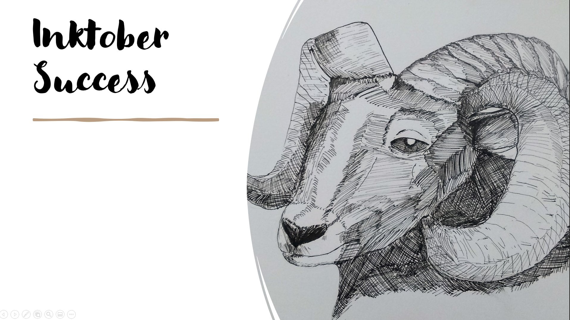
1. Course Introduction: Hello, I'm glad to hear and textures and pending for urban sketches traveled or in Laos. And anyone who wants to get good at art with pen and ink. So who's a class for? Well, if you're an urban sketcher where you keep a travel journal, or really if you're just anyone looking to increase your skills drawing when textures and pen and ink. Then this class is for you. I've designed the class to be excellent for beginners. So if you're just getting started in pen and ink, we are ready to just take the next few steps password you can already do. This class is great for you. We're going to learn two major things. The first is my three component process to drawing textures and pen and ink. And then we're going to apply that process to bricks, foliage. And would as we go, I'm going to show you some demos of what I can do with this. I'm going to show you in real time how you can use this in a quick urban sketch. At the end of the class, I'm going to go through a sketch book tour where I've had a little bit more time to work on these things and show you the results if you spend the time to really get those textures down. And the class project, you're going to be finding a scene with lots of texture. Sketching I've seen only in pen and ink, even if you love working in watercolor, other colors, I want you to focus only on penitent and posting it below. I'm excited to see what you can do and I really want to give you some feedback on how you're progressing. So let's get started. Here's an example of something that I was able to do it using the techniques that I'm about to teach you. I'm excited to start teaching it.
2. The Basic Process: Hello and welcome to texture in pen and ink. I find that when I'm out urban sketching, when I've traveled journaling, or when I'm doing a bigger project, I like to understand how to do some textures, my pen and ink. Now pentatonic is a slow medium. So when we're out urban sketching or a travel journaling, we need to be a little bit faster and take some shortcuts. When we have a lot of time though, we can spend a ton of time to make Sir Oliver textures are right. My texturing process is in three steps. Number 1 is you want to find the pattern. The pattern is the thing that repeats. Second, you want to figure out how to randomize. If you think about things like breaks or leaves, they're not perfect patterns. So if we can think about the pattern and then randomize it a little bit, we're going to have a lot more time to work on our sketches or we're gonna get that texture down quickly. And we don't need to think too hard about in rendering every single individual little piece. And the third one I call the flavor. Even if you randomize a little bit, you still have a little interesting things here in there that you want to pick out and put into your texture. So for every texture we're going to show today, we're gonna talk about the pattern that you want to follow, then how to randomize it, and then those little extra flavoring bits that make the drawing really pop. In this class we're going to talk about three different textures, bricks, foliage, and wood. So join me and I hope to see you in the next lesson.
3. Supplies: So this is a very basic course where you don't need too many supplies. But to get you started, I recommend using inkjet paper. Weirdly enough, inkjet paper, if there was not really an artist grade paper, it doesn't take ink really, really well. So if you're doing some texturing or you just want to practice, it's plentiful, it's cheap. You probably have some lying around, so I do recommend it. Now today I'm going to be using my fine liner. And specifically I use a career in micron, their pigment. This is a 01, which means 0.01 of an inch, not point oh, one millimeters, that would be super tiny. So point 1, 0, 0.01 of an inch would be about 0.25 millimeters or so. Now this is the one that I tend to use when I'm doing my broad textures. And you'll see what I mean when we get to the actual texturing. And if I want some really fine extra detail, normally I wouldn't take really tiny fine liners out when I'm urban sketching or if I'm travel journaling because it just takes too much time and I don't have it. So I might even go a little bit bigger maybe to an O3 and that would be my only pen that I would bring with me on to travel journaling trip or in urban sketching trip. But if I'm doing something more thought out something a larger piece where I have some time to sit down maybe over multiple sittings. Then although even smaller than the old one, I do have 0, 0 fives and 0, 0, 3 as well that I've been using. And then I do tend to go only up to about and 0, 0, 3. So something about ten times bigger than my smallest pen. If you don't have a particularly fine liner that is okay. You can do a lot of what we're about to do using a ballpoint pen. And this is just a regular black ballpoint pen. It came from Office Depot. And you can go ahead and use that as well. If you don't want to work on inkjet paper, maybe you don't have any or maybe you just want to put everything into your sketch book. A small sketchbook is fine. You'll see I have a little sketch here of some flowers. And you can use a lot of the techniques in this class to do things like flower textures as well. So just be aware of them. But this is the basic supplies. Now if you're going to be adding things like color and maybe your urban sketcher or maybe you're doing some travel journaling. You want to add some color, you can go ahead and do that, but that's not going to be the focus of this class today. We're only looking at the pendant ink techniques that we can use to get that texture down. So go and grab your supplies and meet me in the next lesson where we're going to talk about bricks.
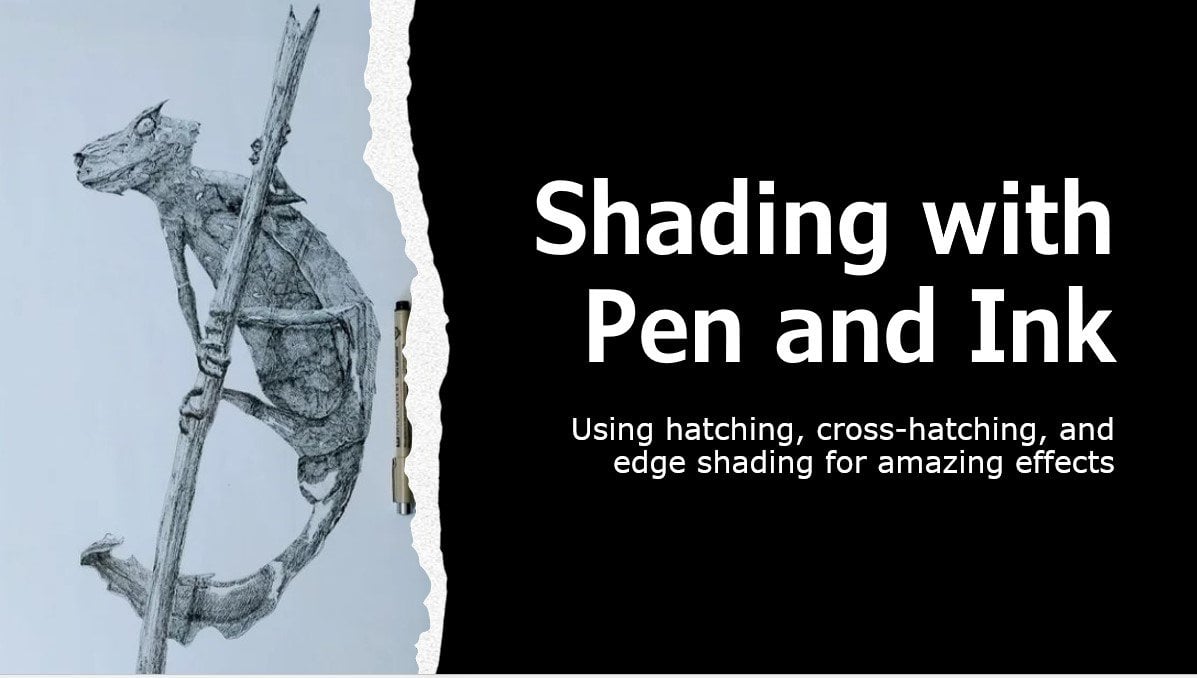
4. Texture 1 Bricks: So I figured we start this class when we're talking about bricks and bricks or something you're really going to encounter in an urban sketching scenario. And also understanding the brick pattern I feel is one of the easier ones to do. And so starting there might make a lot more sense for a lot of people. So if you're just starting out in pattering, then maybe starting with bricks would be a good idea. So I have my test cheat here and it's broken up into different pieces. So we're talking about the pattern. We're gonna talk about randomizing that pattern, the flavors. And I'm going to show you three different types of flavors. One of them is fast typically for urban sketching. And one of them is just by changing your line weight to make it look a little bit cool. This is a much, much faster technique. And the other one is adding some interesting details using pen shading. Then I'll do a quick demo when I'm talking about how to put this altogether into a very fast urban sketching scene. So what does the brick pattern well, at its very basic, the brick pattern might be a grid, so I would think about a grid. Now, there's a problem with this pattern. And if you've ever been looked at a building, you know, that's not what it looks like. The first thing we need to think about is when we put breaks down into building, typically we have them layered on top of each other in an overlapping way. So probably you want to start with the individual bricks and it's a rectangle. And then somewhere in the middle, you're going to put down another brick. And notice this is sort of important for bricks. The pattern involves a gap. And then I'm going to add another gap and I have horizontal and vertical gaps. And so this is starting to look a lot more like bricks. And here's gonna keep on patterning that. So this is the pattern you're going to think of. You have rectangles, you have gaps, and you have these things which are overlaps. Okay? So that's the pattern you're going to be using for your bricks. Now when I say randomization, What is it that I mean, well, if you take exactly the same rectangle every single time and I'll try to draw exactly the same one every single time. It's going to look really boring. Sometimes you do have that as a pattern in your brick, typically with buildings that were done where every single brick as exact same shape and every single brick as exact same place. But even then, you don't really have that precise snus with the bricks. And so a couple of randomization we can do. The first one is size. And the huge benefit of doing a size randomization is that you also don't really need to worry about getting everything exactly right. So if I'm doing a size randomization, maybe one of the bricks is larger. And what I need to be worried about when I'm doing this is that the other BRICS makes sense together. So for instance, this doesn't make sense to have one brick and then a giant brick and then maybe a really small brick. Unless you have a very specific type of stone work, you're probably not going to see that in a building. But instead, if I have every brick on this row is going to be the same. Height, may be different lengths. I'm not worrying too much about getting straight lines. Make sure I have my gaps. And then here maybe we have thinner bricks in the scrotum. And then maybe again we have larger bricks. So that's just going to make it interesting. Now when you go and you're doing your urban sketching, take a look at what you actually have because sometimes you just don't have that. You actually do have similarly sized bricks. And the second one, we might call them crags or lines in general. So bricks, maybe they're not going to be precisely straight. And so I might take maybe a little bit of brick texturing and I'm just going to randomize the edges a bit. And that involves maybe there's some cracks on the bricks and maybe they weren't poor it exactly right. Maybe it's an old stone building. And you want to have some, a little bit of randomization there. Finally, if you want to move away, number 3 might be something like stone. And if you're doing stone, well now it's completely up to you. So you can have rounded corners. They can be very large. They might have little crags coming in. And then if they're going to come in, maybe they're just going to fit just right. Maybe the stonemason found exactly the right kind. And we're going to do all that sort of stuff. So we're just going to randomize that and that's gonna give us our stone texture. So you'll notice that this is basically the same pattern that I've been doing. It is a grid of rectangles, ish, give or take and do these ones aren't exactly rectangles. We have much rounded corners. These ones have much more squiggly lines. But at the end of the day the pattern is the same. It's a shape repeated and that shape is primarily rectangular. Now let's start adding the flavors. And again, when I say the word flavor, what I really mean is that we want to take our texture and make it look like something other than just a flat rectangle. So I'll show you three different ways to do this. And again, we're gonna go with a fast shading, a line weight shading which is even faster. And then some detail stuff which we're going to actually use them, some scratching and some shading techniques there. So if I'm doing a fast shading, then I'm just gonna put down a basic brick texture. I'm not going to worry too much about randomizing a huge amount. So I'm going to have three bricks to say. And then maybe we're just going to make this row a little bit bigger with my bricks. So we have some kind of randomization. There we go. And then what I'm going to do, and this actually came from a book called Castle is from David McCauley, who's quite a remarkable pending Illustrator. And all he did when he talked about showing his bricks was just basic hatching, not even cross hatching. So you're gonna take your pen and you're just going to go across like that, staying inside the brick and go across again. And again and you'll notice I'm not worrying too much about keeping my lines exactly right because we're dealing with a texture and not every brick is going to be the exact same. Now if you do this and you're doing some urban sketching, that's often good enough, especially if you have a rather large urban sketch to do. And you just want to show a couple of bricks. Sometimes though this outlining technique, it doesn't really look right. It's not really the style you want to get to. So instead what we're going to do is vary the line weight. And the way we're gonna do that with a single pencil, if you're out there urban sketching, you only have one pen, which you're gonna do is you're going to go over your lines multiple times. And so to do that, that means you're going to add shadows and highlights. So you have to decide which direction your light sources coming in from. And let's assume for now that our light source coming in from the top left, which means that anything on the bottom right is going to be maybe in shadow, maybe the bricks are protruding something around those lines. So we're going to again start with our basic brick texture, maybe a little bit of wavy lines this time. And what I'm gonna do now, I'm only going to draw a couple of bricks here. And I'm going to go over my lines again and that's going to help them to pop a bit. And so it's looking now like the bricks are more 3D. Okay? And then maybe I'm going to also add a little bit of hatching, but maybe I'm not gonna do the hatching all the way. So I'm just adding a couple of hatches there. Now, another thing that you might consider doing when you're doing your line weight is to not have the top edge at all. That's going to look like this. Have maybe some squiggly lines. And you notice I'm being very careful to have some randomization on my lines. And then maybe there's a little bit. So I was going to touch here and there just to give a tiny number of tiny indication, maybe we're going to call it of some brick on the top there. And I'm going to do that again. And I want to make sure that's super dark. And you'll notice that it's already looking a lot like a brick texture. It's somewhat faster because I'm not worrying about what the insides of it look like. And it's letting me show that pop, that 3D pop. All right, finally, let's get to some details. So let's say that I want to actually sit down and do a longer-term drawing, something we're drawing maybe a castle, maybe an old ruins and everything. I really want to render it properly. These techniques are great, but they're not going to get me all the way. So I think in layers and let's just do one piece of stone here because this does take awhile. Alright, so if you're doing this, it's not really a good urban sketching technique. So when I'm adding detail, I'm going to think now about more line weight. I'm going to think about adding those details and making sure the shadows and the crags and all the rough surface of the brick shows up. So I'm going to add my line weight already and I'm adding that line weight so I have a little bit of shadow. And you'll notice that all of these techniques, they can really be used together. And I'm allowing, you'll see that I have some some pens, strokes coming out. So I'm letting those guide me and I'm just adding a little bit of extra. My pen is just dancing around the brick. And so I'm adding, and that's just going to guide me to where I need to start adding more shading. Okay, and I'm doing this completely randomly. I don't have a plan. I just have these imagined as though they're kind of cracks or depressions in the brick and that sort of stuff. Okay. So now that I have these, I'm still not done. I want to add more shading. To do that, I'm going to introduce you to a fascinating feature of a pen. And this is true whether you have a ballpoint pen or whether you have a fine liner. If I go slowly, I get a line. If I go quickly, I get a thinner line, even though it's the exact same pen. If I take it and put it on an angle and I start shading like this. There's a certain angle where I start to get broken lines and that's what I want. So you'll see that I'm scribbling and I'm getting these nice broken lines. And that's really going to give me some great detail in my texture. So I'm going to come in and I'm going to start shading and I'm not going to worry too much if my angles too high. What it's going to happen is I'm going to get it to be too dark. And that's just gonna give me another sort of crack or valley that I'm going to work with. And we're going to keep on coming in, keep on shading, adding a bit of extras here and there. And it's almost like you're shading with a pencil, right? So oftentimes people say, Oh, you only have two values, which is the white of the paper, in the black of the ink. But that's not true at all when you're dealing with pen and ink, as long as you can take advantage of the flow of your material. And now what I'm also going to do, I'm going to come in and do a little bit of hatching. And the way that's going to go again, I'm using the side of my pen and I'm coming in and that's just again indicating that shadow. And I'm going to come in here to dark in that part of the shadow. Maybe I'm going to dark in that part. And you can go on forever like this until you're satisfied, until you're done. Now I do strongly recommend that if you're doing a longer-term drawing, the first thing you really should do is some studies, because if you tried to get this texture exactly right exactly first, well, maybe that's not going to work for you and now you've done all of your pencil work. You're ready to do your big drawing. It just doesn't work. All right, so now let's talk about the demo and all I'm going to do here is just a building and I'm going to show you how to integrate some of these things, but also to get it quick for an urban sketch. So let's say, I don't know, it's a building, so we have maybe some ground here. And we don't want our building to be too tall, but maybe it's somewhere around those lines. You'll notice I'm not being too concerned when I have straight lines or if I have sketchy lines, I personally like that in my urban sketches. Some people don't. And so however, you're a style normally works sometimes I do tend to use pencil first today, I'm just going to be using the ink. And so I have this coming out. And that's my basic building. And so now I'm going to put a door on my building and that door is going to anchor me for the rest of this demonstration. You'll see what I'm going to do. So now maybe that comes in and maybe you have a step on my door. Okay. So that's my basic, basic sketch of my building. It looks a lot like a schematic of a house you might draw in grade school. That's okay. We're not worried too much here. We don't have a reference and a big giant doorknob. And now we want to add some bricks to this. So I could theoretically go through the entire thing and put that grid of bricks on. But if I'm an urban sketching, Let's can take me so long to do. So instead, I'm going to highlight specific areas. I have this door here, so I'm going to use the door frame and I'm going to use that and I'm just going to have the outlines, like I said, right, that vast area to do. I just want some outlines. So that theory suggests that there are bricks here, but we're not going to put every single one of them in. Varying the size. I'm varying the placement. Maybe a little bit on top there. And I'm going to put some here. Now I'm going to do again that line weight variation, rectangular. Something around those lines. And you'll see the bricks are already coming together. I'm going to use some big line weight here. Maybe this is huge bricks that made this building here. Okay? And then I'm just going to add a little bit of hatching some times and that's going to tell me that these bricks, the hatch bricks are a different color. Maybe you have a variegated color on your house, and that's what that's going to tell me. And so that's all I'm really doing some focusing, my brick work around the door, sort of highlighting things. Maybe I'm going to now say my door is a different color as well. And so I'm coming in very quickly with my hatching. And then if you can imagine, I were to continue to do this now I'm not gonna make you sit here and watch me put bricks onto this house. But if I were to continue to do this over and over and over again, then what I would end up with is a fairly complete representation of the bricks on a house. And so that is the basics of texturing bricks in NYC.
5. Texture 2 Foliage: All right, so our next step is to talk about foliage. And foliage is interesting because the pattern is the brushstroke or the pen stroke. So I'm going to show you the fundamental pen stroke that I like to use for my foliage. And that is actually the pattern we're going to use. And fascinatingly, this pattern, if you apply it in the appropriate layers at the appropriate place, is going to allow you to build up value and then show things in 3D. So the basic brush stroke that I tend to use are the pen strokes or it is, I'm going to come out and in something around these lines. So it's like I'm making a squiggly line out, in, out, in over and over. And I'm going to change the size of my strokes. I'm going to change the how close together they are. And that's what's going to give me the basic pattern of foliage. Now again, if you're doing this in a much larger and long-term project, maybe you're going to want to do something a little bit different. So maybe you're actually going to want to come in and maybe you're going to do foliage like this. So this is where we actually draw individual leaves. But again, for an urban sketching and for the most part, even when I'm doing larger pieces, I tend to fall back on this pattern because it tends to work fairly well for me. So the randomization step is actually just working with the pen to go over things again and again. That's going to give you some details and some, some value. So if I go here, this is do very quickly. Let's say this is my maybe it's a pine tree. Maybe it's a leaning pine tree. And then I'm going to come in again and I'm going to add over that and you'll notice I'm not worrying about staying inside the lines. That's not important to me. I'm going to bring out my pine tree more. And then here I'm going to do that. But I want my light source coming in from here. So I'm going to make sure this side is dark. And dark means more layers. So the benefit of this technique here is that if I do too many layers on one part, then I just do layers and the other part to document. Okay, so here's my basic tree. And then to randomize, I'm coming in, again, I'm adding another layer and I'm shading it so this side of it is dark and you'll notice how I'm getting some volume. And I'll do it again. Maybe I really want some of the parts dark. And I'm randomizing where those darks are. That's going to be those clusters of leaves that are casting shadows on things. And maybe there's one right here. Maybe that's really casting shadows as well. So this is the basics of foliage that I tend to work with. Pretty commonly actually, even if I'm doing a larger piece, The flavor is actually just going to be a little bit of hatching and a little bit of outlining. So I'm going to show you both ways to do it. And we're gonna talk about outlining. And the outline technique is really fantastic for when you have a large but fast to get, you have to do so. Doing this for a very, very large tree will take a very long time. Instead, if you just want to suggest that there's a tree, maybe even a background tree, then the outlining technique works really well, and I'll show you how to do that first. So the outlining technique is the exact same idea. So we're still going to do something like a pine tree. But on the light side I put a broken line with very little line weight on the other side, the dark side, I put a non broken line which is much stronger. And then only on the inside a little bit do I add a little bit more flavor here in there? So let's do that. So I will start with the dark side. Again. I'm just using my random back and forth pen stroke. Nothing really spectacularly there. And now as I move to the light side on the top, I'm going to start to break up my line and to reduce the randomization. And so now already we're seeing that I have some forums showing up. I have a dark side here, and I have a light side here. And now again, I'd maybe I don't want to do the whole thing because I'm an urban sketching scenario. Maybe I'm going to be adding color with watercolors or pencil crowns, whatever it is. So I'm now going to come in and just add a little bit more. Again, just indicating that there is some kind of texture here. It's not just a flat piece of paper. And I'm going to be adding some more here. And I'm just building up a little tiny bit of detail here. And that's it. That's going to be as far as I'm going to take that and you'll already see that I'm getting some detail there. Now the next one is going to be hatching. And hatching is a really cool technique because it lets you add darkness, but again, quite fast. So we begin with an outline. You don't have to. You can start again if you want to do more randomization. And there we are broken up. So now I have my light and the dark side. And now what I wanna do is I still want to add in these extra pieces, so I still want some value on the other side. And now I'm going to come in and I'm going to very gently hatch and those my pens on angle because I don't want too much flow. And that hatch is going to allow me to dictate where there are pieces of sort of holes in the tree so I can see through it. And now what I'm going to do is come in and I'm just gonna put some randomization around those parts if I don't have it already. And that's going to be as though there's like leaves and closing the holes in the tree. And then maybe I even want to come in and just do a hatch all the way on one side. And now this is really an urban sketching technique or travel journey. During link technique, you just don't have time for it. And so you want to come in and you just want to add some shadows and indicate that this tree is in 3D. So maybe I'll even add some shadows at the end there. And suddenly I have this 3D tree that just shows up because I've done a little bit of outlining. So let's do a very quick demo. And the demo we're going to do is no longer a pine tree you why don't we go ahead and do a actual deciduous tree. So that's outlined first, and I'm going to have my light coming in from here. So I'm going to have this bulbous tree and this is the dark side. And then it coming in. And I'm just breaking up my line to indicate, hey, there's tree here. Maybe my tree goes in a bit. And if my tree goes in a bit, that means that that part is in shadow. So I'm going to outline that more darkly. And then I'm going to be adding, I don't know, maybe a tree trunk is coming in here, so we're just going to again, this is in the light, so we're not going to be putting in too much the outline. And here we're going to worry about line weight. Maybe coming out here I have a tree branch and then maybe we're going to shade this now I will show you how to do wouldn't tree bark in the next video, but why don't we just shade it to indicate there's something there. And we will once again add little bit of shadowing coming in. And that shadow is going to follow the leaves just to indicate that it's there. And now I want to make sure that my tree, first of all, it looks right. You'll notice it looks a little bit too small. So what I'm gonna do is add, right, this is the benefit of having a light side and dark side. I'm going to add some stuff to my dark side. And that's also going to fill up my tree. And I'll make sure it's somewhat random so that the shape is random as well. Especially if you're doing texturing of a real tree. That's what you're going to see. And we're going to come down. And then we're going to add in additional stuff just to indicate that form. And maybe a little bit here. And then I'm going to start hatching to give me some depth to my treat. Indicate that my tree has holes in it where you can see through it but not through to the sky. Maybe there's some over here as well. And then I'm going to maybe hatched just over here. And this is a nice technique I can use because I don't want to render every single individual leaf. And so we'll just say, well the trees casting a shadow on itself. Maybe there's some patching over there and some hatching over here. And then we're just going to fill in the rest with a little bit more texture. And suddenly we have a tree merged, fully formed into an urban sketch. So in the next video, we're going to finally talk about wood and some tree bark.
6. Texture 3 Wood and bark: All right, So now we're at what is probably a vexing pattern for a lot of people, which is bark and wood. And so we're gonna go through some basic patterns. And what's interesting about this one is I'm going to still use the ideas behind find a pattern, randomize it, and add some flavor. But I'm going to break it down into two separate patterns for a plank of wood, which is going to be a grain and nuts. And then I'll show you a little bit of patterning for bark. And then I'll do a demo which is a wood plank. So if you think about wood grain, in fact, you can see some over here on my table, or at least false wood grain. Then you'll notice that first of all, it's linear. Second of all, it has different line weights. Essentially, if I were going to do this in pen and ink than it would be different line weight voce was in watercolor, it would be different values. And you'll also notice that some of these are different sizes and then they're not quite straight, but they're fairly close together. And then if you look at this one here, this part of the wood grain, you'll see it's also going off, instead of going in straight directions. It's more of a diagonal direction, almost like it's concentric circles. So what we're going to do is take advantage of that. And the first wood grain pattern we're going to do is just the straight lines. And that's going to again, I'm trying to use as, as narrow and angle as I can because wood grain isn't this. It's going to be something a little bit more subtle. And if I'm using a fine liner, then I'm going to have to be careful with that because the fine liner, really once you put the final enter down, it's going to get dark if you don't do it with some finesse. And so the first thing I'm going to realize as well, It's a bunch of lines, but they're not exactly straight and they're sort of parallel. So why don't we go ahead and do that. And I'm just going to come across my paper and do some dips, not exactly straight, sort of parallel. And that's going to be my very basic wood grain texture, right? Maybe I have different. So you'll see I put these two lines, both going down. Maybe this line goes up and it's something different. And you get to those concentric sort of chevron things, then what you're going to do again is the exact same thing. It's just make sure that you're now going in some kind of direction. All right, maybe I now have these things coming in together. You'll notice I'm trying to vary my line weight a little bit as well. And maybe now the concentric circles are done. So I'm going to carry on with my straight lines from this point onwards. The exact same thing is going to happen when I go on the other side. Linewidth variations, adding in these things. Now the huge benefit of doing wood is that you really don't have to worry too much about whether or not you have straight lines are good head control the wave here it is, the more realistic it's going to look. Now let's talk about knots in the woods. So when you have knots in the wood and you have these dark pieces and typically the, the grain is going to go around those dark pieces. So what we're going to do is first of all think about the not-self and we're going to think in circles. And so we're going to add depth to this, to a circle. So this is a not of my wood. And depending on the type of wood, maybe it's fully filled in, it's fully dark. Maybe it isn't. Some would sort of have a lighter part inside of a naught. And so I'm just going to think about a circle. And I'm going to darken one side of it, right? This is my randomization step. And maybe there's a little bit more going on inside. And maybe all this hatch bits to indicate that it's dark. So this is the basics of a naught. It's just a circle, basically a hairy circle. And then we're going to add the wood grain around it. So that's really what makes it not interesting and challenging isn't so much that it's just a circle with a bunch of lines on it. But now if we add the wood grain, the wood grain is going to curve around that circle and make it look really nicely. So if I just put it on top, so this is not going to curve around. So I just have this random wood grain coming in. And now as I come in, the wood grain is going to get pushed by the knot and come through. And then if I have even another one, maybe it gets pushed as well, almost to the very top of the knot and then it's going to come through. And why did we make that a chevrons or we're just adding a little bit of differences there. And it's going to come around as well. And then this piece of wood grain is going to come in like that. Maybe it's coming in and coming in. Okay. And if you have something coming in like that and maybe it got stopped as it was going and we're then going to have at the end there, it's not going to curve around anymore and we're just going to have carrying on with our wood grain. So that's the basic idea behind a naught, is that you want to curve the grain around it. Otherwise it's just a circle. Now let's talk about tree bark now there's a lot of different types of tree bark. And the tree bark that I'm going to look at specifically as pine bark. And if you think about what pine bark looks like, it has this wonderful almost diamond shape texture. So the pattern is going to be diamonds. And then we're of course going to randomize that because I don't know about you, but I've seen a lot of pine trees that do not have just random diamond shapes on them. So the huge thing about bark is that it's really craggy. There's no such thing as a really straight line and bark. And so we're going to use that edge scribbling technique, that technique where we come in and we're just going to use very basic remainder. I'm going to add a little bit more. And we're going to think and diamonds, but we're not going to worry too much if it doesn't exactly follow that diamond pattern. And we're just going to come in and we're going to have this broken up bark pattern that we're going to use to demonstrate that we have an interesting part of the tree. And some pine trees have really, really large diamonds compared to their, their length. And so that's really, really noticeable. Now once you're done with this, if you want to curve the tree, so you want to indicate that this is actually a tree. There's a couple of things you can do. First of all, again, we're choosing a light direction. Let's say the light's coming in from this direction, which means that the diamonds on the other side are going to be darker. So we're varying line weight just like we did with the bricks. And that's going to indicate, hey, there's some 3D stuff going on here. And I've done this in an urban sketching situation and traveled during links situation where I have sat there and done the line with variations. If you don't have that well, the texture is very, very similar to bricks when you think about it. So I can just add some hatching on one side and add the idea that things on this side are curving away. And maybe I'm only doing half of that particular piece of bark. And then I can add a few more crags and some line weight. And that is the basics of doing something like a pine tree. All right, So let's get to our demo when we're dealing with a wood plank. So a wood plank, well, what is it? It is a rectangle made of wood. And so we're going to have to consider the fact that it's almost like a brick. So I'm going to worry about my line weight variation and then I'm also going to worry about my texture. So I'm going to make it a largish rectangle, maybe about this big. And you'll notice in some wood planks that they might have a crack on one of the sides over is going to add that in. That's going to be a place that's not necessarily wood grain, but it's going to give us an idea. And then we're just going to outline very lightly, right? We are using the broken line technique because maybe I want my light source coming in from here. So this part of the wood grain would be illuminated. And then on this side I'm going to now have a darker line weight. So it's going to go over that a few times again, if you have a larger a larger pen, then that's going to be easier to switch to that. And I'm going to go here. Okay, so now I have the basic outline that looks vaguely 3D. Again, we're doing this in a sense that we want to give an impression of 3D. Now when you're doing a wooden plank or when you're doing and maybe a fence post or something along those lines, you typically want to put the knots in first and that way, you know which way to put the grain. So let's put a naught. I don't know this but one here and just make it fairly small. So you notice I'm just going around in circles and putting a knot there and I'm not worrying too much about getting it exactly circular. I'm going to put in another naught here and maybe this is much bigger one. And it's not going to be entirely filled in. Maybe there's going to be a reason to not have it in, maybe some weathering. And now I can worry about my wood grain without having to worry about exactly where they're not SAR. So the first thing I'm going to do is come in and we're going to come in with some straight lines. And now we're coming up to this not so we want to curve around it. Again, straight lines. We want to curve around that. Not many Mu add some extra stuff here. And now I'm going to come in curve around this knot and then come in with some interesting texture where we have those interlocking chevrons. There we go. And we're going to carry on there. And you'll see it's looking a little bit like a face, which wasn't entirely my intention, but why not? And we're gonna do some more interlocking stuff there. And you'll notice that I'm just worrying right now about the basics of the piece of wood. So I'm just worrying about the wood grain and now I'm going to add just a little bit of extra stuff. So I'm really going to get to my edge now because I do not want to add too much shading. I don't want to be too dark, but I do want to accept the fact that not all of these lines are going to be the exact same width. So now what I'm going to do is just come in here, just get my edge until it's giving me a little bit of ink. It's a bit much there we go. And I'm going to come in and I'm just going to follow. And this is just adding in those lighter pieces of wood grain. That's going to add just that extra little bit of flavor. Maybe over here we have a piece that's broken or maybe you got burnt a little bit or whatever this plank happens to be. And we're going to shade that in just like that. So just like we're doing. So it's edge scribbling sort of technique. And hopefully you can see that that's pretty convincing wood grain using only some rather simple techniques. So let's head to the next video. We're gonna talk about your class project.
7. Sketchbook Tour: So I want to take you through a sketch book tour. And that's because really when I'm doing the demos in real-time, you can't see that process, especially if something takes, you know, one or two hours. And so I want to show you what I was able to do using these techniques that I have. And hopefully you can take from this and really explore your own, your own learning. So this one, it's pretty familiar to you hopefully from the slide at the beginning of the class, it probably hopefully drew you in. This is a tree bark study was done on location. So this is actually something I did outdoors in front of this giant tree up near vacation spot. Basically, caterpillars had come and eat and all the leaf. So this was actually done the summer and this giant oak tree, all of his laser, it is eaten away by the caterpillar. So I thought that was really interesting to draw on. So this was on location. And I want to show you some of the tree bark texture I did here. And you can take a look on this side over here with the tree bark. I have things like these giant knots and the everything coming into the tree bark and all that texture coming in and that did take a while. So if you're wondering the actual tree outline took, I'm going to say maybe 20 minutes service and make sure everything worked out in my proportions and the shading and everything else in the tree bark probably took me another hour to hour and a half to do. And this was a 7 by 10 drawing. So this is a texture independent and things while, and if I were gonna do this and maybe as an urban sketch that I might rely on watercolors to do a bit more texturing and that might be a bit faster because I could lay down larger swaths of color. But I knew that for this one, I really wanted to do penance for it. And so that's why I did this one like that. Here's something I really recommend you do, which is called the texture sheet. And so you'll notice a lot of I have here is stuff I was talking about. And this is basically the prototype for all of the demos or the bricks. And I did a texture sheet and I actually use these myself. So it's not just because I wanted to do it for the Skillshare teaching. What I did this for was to practice and test my own understanding of my own texturing, especially for urban sketching it. So on days when you just can't get out, maybe it's not time to go outside and sketches. Maybe it's too cold or maybe it's raining, then sit down and make up a texture sheet. And so this is something I used to give me an idea of different ways I can draw my textures, different ways, I can shade them and all that sort of stuff. And it really helps me to work out problems before I get out into the field and I have to do very quickly urban sketching. This is a larger study of bricks and you'll notice also in the background I did some trees as well. So this is using my foliage technique with the outlining and just getting a little bit here and there, darker shades and sort of stuff. And then it's a much larger study at risk. So each individual brick was rendered while individually. So this one took quite a while. It is on 11 by 14 paper. So this one, I would say probably took me three or four sittings. It's definitely not something that I would recommend for an urban sketch, but for a longer-term project, I think I really had a lot of fun with this one and I could get into all the nooks and crannies of everything. Now one thing to keep in mind with this particular thing is I'm using different techniques for shading. And so you'll see here, I have some hatching going on, so this was literally darker brick. And then I have additional hatching here to indicate some depth. And then also here where there's a lighter brick and maybe the light's hitting it or whatever it happens to be. I'm just doing that edge scribbling that I was showing you with some darkening in just a few areas here to indicate this is illuminated. And then as well, you can see that it's some different textures, maybe the background, a little bit of tree bark there as well. So putting it all together really helped. And again, this did take a while, but it was a lot of fun and it was something really, really meditative. I could just say I'm working on this brick wall for now and then that might take me an hour and off, I go to the races. And then this is what a, completed, again, in this case an urban sketch. So not too much time taken here, maybe about an hour. You'll notice I did this one from Google Street View. It says in the caption, because I really wanted to sketch this really nice store. It's a cool little flower shop near me. The only problem was that I've never, never really have enough time to stop my car and take that sketch. So I did this one off Google Street View, which I think is really valid way of doing some urban sketching if you just need to get some paint down on the paper. And so this one is again seven by ten. And you'll notice that I wanted to keep the idea behind the urban sketch, so I didn't want to sit down and do three or four, sitting maybe five or six. Our drawing, I wanted to make it still look like an urban sketch, even though I was doing it in my living room with Street View open. And I didn't worry about rendering each individual brick. I didn't worry about that. All my texture and my hatching and all that sort of stuff. What I really was concerned about was getting the idea across using much simpler brick textures. And so that's what I did here. And this is something I recommend you do when you're out urban sketching. And the way that I was able to add a little bit more texture was in variation of the color on my watercolor. So I started out la, light, very light using yellow ocher and that sort of color. And then I started adding in some reds and things like that just over top of that. So it gives a little bit more texture. And so this is an example. Hopefully you can take away from that where I use my pen and ink texture techniques. But then it wasn't enough because I was still going to be urban sketching and I still wanted to make sure that I had that watercolor vibe and the look to it. And so what I use there was more watercolor to add additional texture. And on top of that. And finally, the last demo I want to show you this one was also done on location. It is a, a landscape and this one had to be done relatively quickly, but I wanted to do it only in pending. So again, this one is a seven by ten, and so it was rather large to do. My light was going and so I needed to make sure that I had fast textures coming into my landscape, but also that I captured little bit of the sense of depth of where I was. And so you'll notice here, I use line weight variation on the trees to indicate that they're there, they exist. And again, you'll notice that very broad strokes in terms of how I might use my texture. When I was doing the, the back-and-forth stroke on the foliage, I wanted to make sure that this was something that I knew what it was. So I was looking at my child journal to go Yeah, I remember going to bed rock pool. But this definitely isn't something I would use a finished piece. This is just something that I wanted to show you, to show you how these techniques can be adapted for different situations. In this case, again, it was the evening, it was about seven o'clock in the summer, so definitely son was still up, it was going down. And I had to get this down quickly and I did a lot of texturing with pen and ink in the background. So I didn't have a ton of time for the trees. And so I said, Well, let's just make sure that we're using some variation so that the trees are obvious, at least to me and that I would give that out. So hopefully this was helpful to you to see how I might approach different scenarios and how I will use my pen and ink and maybe some watercolors as well, and maybe an urban sketcher travel journaling situation, or honestly just in my studio when I'm drawing some stuff and I want to make sure that everything works out. When you go out, remember you can simplify all of these texture techniques as much as you need to four-year particular scenario. So again, if you only have 30 minutes, well maybe your trees is going to be the outline. You don't even worry about the shading. And maybe if you have three or four hours or multiple sittings or whatever it is, you can really get into the individual bricks. And that level of decision-making is going to be entirely up to you. And I'm excited to see what you can do with them.
8. Class Project: So your class project is fairly simple. We've talked about a lot of textures, so now it's time for you to go and find a scene with a lot of textures and draw it. I want you to find a cool scene and what that means to use different from what it might mean to me. And I'm really excited to see what you're going to come up with. I'd recommend something though, like a wood fence next to a building with a bush that lets you work on your wood texturing, lets you work on your brick texturing, and it likes to work on your foliage texturing. I want you to draw it in pen and ink only. I know you love adding color for urban sketches. I know that it's really cool to put in some water color and everything else. But if you do it in pen and ink only you can really focus on the underlying texture and you can add color later once you're good enough for the texture to just do it automatically. Submit it below. I really want to see it. I hope you had a lot of fun in this class.
 Michael Cooper-Stachowsky, Creative explorer