Transcripts
1. Introduction: Hi, and welcome to urban
sketching in Singapore. Urban sketching with line and
wash is a fun way to create fresh and spontaneous works while enjoying some
time outdoors. He combines the benefits of ink drawing and
watercolor painting. Urban sketching
is a great way to improve your drawing
and painting skills. In this class, you
learn how to transform some urban scenes
of Singapore into some beautiful line
and wash sketches. This class is aimed
towards beginners with four line unwashed
demonstrations, which I'll guide you
through step-by-step. Their scans, drawing, and
tracing templates included for each demonstration helped me transfer you drink over
quickly and easily. You can follow along to
my real-time drawing and narration videos for all
of these demonstrations. This class, I explained
every technique I use, or drawing and painting, such as using watercolor to
paint shadows on a building. I'll be going over the basics of wine and washes, sketching. I'll show you how to
sketch with a pen quickly and accurately using a
variety of techniques, including drawing
lines in the segments, hatching, and using different size nibs
to your advantage. I'll also talk about
what materials you need, your options and
which ones are using. Recommend. If you have a pen,
some watercolor paints and paper, and you're set to go. So join me in this class. Let's create some
beautiful drawings and paintings that
you can be proud of.
2. Materials Required: So before we start
with this class, I want to talk a little
bit about materials. In particular, I want to
talk a bit about paper, paints, bit about
brushes as well. Just to go through what you need and the materials
that I use and recommend. The paper that I'm using is a cold press, watercolor
cotton paper. So it's a 100% cotton. And I'd recommend that in the first instance because
it just allows you to get in a wet and wet and layer over the top of other layers without disturbing the previous ones. Now you can use other
types of paper as well, particularly
cellulose paper. It's often not
labeled as cotton. Watercolor paper will just be labeled as watercolor paper. And that's when, you
know, it's gonna be a cellulose type paper that
works pretty well too, but you just have
to remember when you're laying over
the top a few times, it can upset and liftoff
the previous layers. So that's about all
that I use to make sure that the paper has a
bit of a texture to it. I find that just helps for the different layers to blend together very, very slightly. If the paper is
completely smooth, that does work as well, but that can also lead to
areas of inconsistent drying. So for that reason,
I tend to use pixelated textured
paper in my scenes. So I'll talk a bit about the paints that I use now
that these paints here just paints that I've
squeezed out straight from these tubes right
into the palette. And starting from all over here you can see I've
got warmer colors, the yellows, oranges,
bit of red here. Then we go into blue
and a darker blue, got some browns, green and then some purples and a bit
of neutral tint over here. And you don't need
all of these colors. Most of the colors
that I use tend to be around the yellow to yellow ocher sort
of range to get in the general light sort of feel here as you
can see in this scene, the air of the ground is mostly just a bit
of yellow ocher. I think I use a tiny
bit of orange in years. Well, I've got a bit
of buff titanium, which is basically
an opaque white like an off-white color that I
used from time to time again, that does help with
indicating some of the light. And I've mixed a lot of water
into that when I'm getting in these little
colors like that, I've got this color here,
which is cerulean blue. Really nice to get
in areas of the sky. It has a nice kind of
granulated effect, which I actually prefer need to have that
you can actually use something like a cerulean. And notice cerulean button, ultramarine or a cobalt blue, which works really well when you dilute it down to get a really, really light sky color as well. So that's another option. These are just some
earthy colors, a bit of, a bit of green here. But apart from that, those
are the main ones I use. I've got a little
bit of neutral tint, some purples here which are really good for darkening down, getting some of these
darker shadows, as you can see here. That works really nicely. I do also have a bunch
of these colors here, these gouache colors,
the main ones, the main one that
I use in a lot of my paintings is this
bit of white gouache. And you can see it here on top of the highlights
of the vehicle, on the shoulders and heads
of some of these figures. So it works really, really well to get in these
little bits of light, bring back some light
into the scene, even some of this smoky
effect as you can see here. So it's really an opaque
watercolor paint. So you can get this pretty
cheap here in Australia, I think it's about
$8 a tube at last, you forever tend to also mix it around with some of the
transparent watercolors. If I want to get
a colored gouache that has a bit more
yellowish tinge to it and maybe a
bit of blue in it. I can mix that in. And it creates an opaque version of your transparent watercolors. So great little tip here. I always loved to add in
a bit of this at the end. So in terms of brushes, I'll just show you some
of the brushes that I use now I've got a bunch here. This is a little
cloth that I keep around That's always important
to keep a cloth as well. When you're painting
because it just allows you to dab
onto that cloth and remove a bit of paint from the paintbrush just to dry that paintbrush a
little bit as well. Sometimes you're using effects. We don't want too much
water on it, just a little, little bit of water just
to apply that paint down, say for example, these
little leaves here. So having a, having
a, some type of tau, maybe some tissues are like a little cloth is really
great. Over here. You can see that I've got
a bunch of these brushes. These are watercolor brushes. They're designed
with a large belly and so they actually
pick up a lot of water. They're really good
when you're trying to get in large areas of
sky bit of the ground. Just large washes of
color where you need to pick up a lot of paint. I find these brushes
are fantastic. I actually use all
three of the east of different sizes to get in
different areas of washes. So sometimes the buildings might and get a
little bit smaller, so I'll just use a smaller,
smaller mop brush. I also tend to use this small
one for detailing as well, sometimes just to get
in a bit of a shadow on some of these buildings
and stuff like that as well. Fantastic. So I also have some of these round brushes,
as you can see here. These watercolor round brushes. And they're made of a
synthetic material. And they hold a
really nice point. They don't pick up much water, but they're really good for
getting in little highlights. So you can see here
with the gouache, perhaps some of the
details and the windows, the legs of the figures. These brushes are
really, really good. And I think that's about it. I'm gonna do have a few these
specialty brushes here. It's a flat brush that just
has a bit of a uneven edge. And fan brushes can be good
for getting in some grass. This one here is
like a rigger brush, which is good for getting
in trees in the distance, little twigs and branches. So those are some
bonus brushes that you happy you don't really
need them. For the most part. Having a large couple of these larger mop
brushes and one of these smaller round brushes do very well with any painting. So that's about it
in terms of brushes, paints, and paper.
So let's move on.
3. Sketching: Exercises: Okay, so before we get started
on any of the projects, I want to talk a
little bit about some sketching tips
and techniques. This will just be a bit of a practice run for
you to pull out a pen and just try a few of these little exercises to
get yourself warmed up. And especially for
those of you who haven't had much
drawing experience, I think this will be
very useful for you. So let's go ahead. I'm going to talk
a little bit about simplifying shapes
to begin with. So what you need to know is with everything that you
see out there in the world. Whether it be a person, whether it'd be a tree, whether it'd be a
glass of water, there are simplified shapes within that
particular structure. So if we're talking about
a person, for example, one of the things I
always look at is of course the head and the
head of most people, it's mostly an oval like shape. I tend to just draw
it more of like a oval slash rectangular
shape like this. Something like
that is completely fine for the head, the body now, depending on what the
person's wearing, that kind of thing
normally has this sort of longer sort of
shaped like this. Okay. It's a little bit longer, can be rectangular depending
on the person. I mean, some people
have more boxes, sort of builds like this, and people have
narrower shoulders and larger hips like that. Okay? So what you can do from here is just simplify the
body shape like this. Now in terms of the legs, I look at the legs as just to almost too long
triangles like this. Okay, so you can have people that are just standing up like this, standing
completely straight. Or you can draw people who are basically in various
stages of motion. So this can be someone
just walking a little bit, but you can see in terms of
the little structures here, this is just t-shirts. The side of the t-shirts. You can see here it's
just some triangles are square and a rectangle
for the head. So finding ways to simplify things rather than looking
at the entire picture, I think really makes
it a lot easier. Now this goes for things
like cars as well. So if you're drawing a car, I always kinda look
at it as a bit of this trapezoid shape here
that's almost rectangular. Canaan, the bottom of the car is like this rectangular shape. At the base. You often have some
wheels here as well as the base
which are darker. Maybe a bit of a shadow. And then you can
start drawing out little extra details like
the Nike mirrors here. You could put on
some brake lights here in the back as well, number plate, that
kind of thing. Okay. But the essential shape is, is it's this trapezoidal,
almost rectangular shape. Rectangular shape for
the base of the car and to almost square
shapes for the wheel. So you can simplify things down. It turns a building's depending
on the type of building. But if we're looking at
very basic buildings, most of them are rectangular in shape or in various colors, square, rectangular
type of shapes. So if you look at something
like this, It's just a box. It's just a box like a cereal
box or something like that. Okay. And you can draw
them on this side. Like this. There could be facing
the front and inside the buildings you're
going to get windows. Sometimes they're gonna be
square windows like this. Sometimes there'll be larger
windows with some ornaments, some curtains or
something inside them, but they're all still the same. I mean, that's just like
a rectangular shape with a few couple of lines running
through the center of them. So I always try to look
at things like that. Sometimes you get buildings
with dome on the top, which is just drawing
a circle like a semicircle or something
like that here. I mean, this could be this could be seen in Venice
or something like that. Okay, and you can have
another dome here like that. Now the dome here because
if you can draw a circle, then you can draw these
domes in quite easily. So again, you've just got to look at the shapes
and simplify it down. And that takes time
because obviously, when you try to work out at, at the start, what
those shapes are. Trying to see those shapes
is a simplified form, quite as loud and thinking,
but after some time, it becomes a lot easier. You'll be able to identify them. For all types of objects, all types of things that
you want to draw and paint. Now, I'm going to
talk a bit about some sketching
techniques as well. So one of the things
that I do sometimes when I'm not so sure whether I
want to put a line in or not. So for example, I might think I'm going to draw in the
head of this person, but I'm not sure about the body. Sometimes I might turn that
pen on the side like this. Came a turn the pen on the site. It kinda just grazes the paper. As you can see, it gets
in a very faint line. And that way you
can sort of put in some basic details in
there, have a look at it. And once you're confident, you can then go in
there with the actual. Details and use the entire Penn. So that's a little
technique I do. I sometimes do this when I'm
marking in the horizon line. So if I just want to put
in the horizon line here, for example, I think, Oh,
that's not in the right place. I want it a bit further up, then I can just marketing like that. And once I'm confident, I can
draw it in and that can be just something that's
ignored in a scene. Okay, so again, this is just a little
technique, a little chip. I think that will help you, especially when you're
starting out drawing. And I feel the techniques
I'll talk about as well. And also in terms of pen nibs, I think is really important. So creating depth, making something come towards a scene
or go away from the scene, I think is really important. And what you can do
sometimes is that you might have a whole bunch of buildings. For example, you might have these buildings here
in the background. Then you might have one
that's a little bit closer towards the
front or this one here. Okay. At the moment they
all look pretty much in the same air
and the distance. What you can do though, is that you can use this
technique to hatch so you can create a little bit more yes, a little bit more darkness
in those buildings. And what this does is
that helps to bring forwards these
particular buildings. Now, we're just draw the
lines all in one direction. You can do them vertically
or horizontally, but this helps to create
a bit of contrast, helps to bring forward that bit, especially if you start creating lines that are further apart for these
ones in the back. Okay, so those are
these buildings here. We'll peel it all the
way off in the distance. And there'll be a little bit lighter compared to these ones, which will be appearing
a little bit darker because these lines
are closer together. And there's another technique
called crosshatching, which is basically
the same as hatching, what you just hatching in the opposite direction as
the lines you first put in. So you've got these kind of checkerboard pattern here just emphasizes that
darkness in there. And another thing that you can use as well to increase and
bring objects forwards, push them back by using
different sized nibs. Now, for example, I
might have a nib here, this is a 0.05 is small nib. And when I'm drawing in a
person with this smaller nib, you can see all the way here, it's very thin line. Okay? Especially if we're
contrasting it against say, these figures here,
which basically drawn in with a 0.8
millimetre nib. This figure looks quite diminutive and pushed back
because it appears lighter. It's, the lines are thinner. So you will find
that if you're using a thicker line or it's going to bring forwards certain features, objects, people, cars, buildings,
and that kind of thing. So even if I were to say draw some buildings here all the way in the distance like that. It's going to look they're going to look a little
bit further back, especially if I
start doing a bit of hatching those buildings, we'll look further back than say these ones and these
ones together. So the size of them is
really important as well. I tend to just use two, maybe two to three
different size nibs, normally like a 0.3 which is a little bit a little bit
thinner, just slightly thinner. And then I might have
something like 0.5 or 0.8 that normally uses 0.05. But again, the more,
more nibs you use then we'll see that
the more choice you have in terms of creating different levels of
depth in your drawing.
4. Sketching: Simplifying: When you're out there
drawing in the real-world, there's obviously
a time limitation. Could be the place
that you're sitting. It could just be uncomfortable. Maybe there's some wind blowing
in a certain direction. Maybe you've got to draw quickly because there's
people moving around. Either way. It's quite exciting,
but you have to be focused and capturing the
essence of the scene. I'm going to show you a way to capture a
scene quickly and easily and also be able to focus a bit on the perspective. This is a scene that's
fairly complicated, but I'm going to
simplify this down for the sake of this demonstration. And I'm going to get
in a little French, that quick little frame for this scene, something like this. Okay, so it's a lot smaller than the actual page
that I've got here. Okay. So I always start off. The first thing I do
when I'm drawing is that I put in the horizon line. Now, perspective is a
really important thing and I'm only going to touch on one-point perspective
because that's going to help you in
this particular class. And in terms of most of the scenes that you
will encounter, 99 per cent of the scenes
that you encounter. So I tend to put
the horizon line. The horizon line is basically the line all the
way in the distance where everything appears to disappear at the sky
meets the ground. So it's roughly here. If you look at those buildings
all the way in the back, you can see that horizon line
is somewhere around here. So I'll look at that page and I think it's not in the middle. The middle horizon line
is not in the middle, and it's not really a third
of the way through the page. It's less than a third of
the way through the page. So that's where I've roughly
put that horizon line in. Also, you sometimes might not be able to see
the horizon line, but you'd be able to see where the buildings
touched the ground. That's the area that you want to mark and roughly in this scene, that's where everything is. Okay? Now in terms of creating
a flat looking scene, what you wanna do is you want to make sure
that the cars and the figures are roughly aligned on the same point in
the horizon line. What do I mean by that? So when I'm drawing a person, I'm gonna put their
head about here. Okay, so this is
a smaller person maybe off into the
distance like that. This could be someone
here just walking left. Okay. This could
be another person walking towards the right. As you can see,
all the heads are roughly in the same location, even if it's a really small
finger off in the distance, that the heads are
still roughly in the same position on
the horizon line. Okay? This is going to
indicate a flat plane. So basically the ground
that is completely flat and you can add the same
thing even with the cars. You might have a car here that's a little bit
further into this scene. Over there, came out of a car that's all the way over here, which is a lot bigger. Now they've got the windscreen
sticking out the back like that and the back
of the car there. Here, the wheels like this. Okay. So you might have
a car that looks a bit like it looks a little
bit like this. Okay. But it's still on
that same point, roughly on the horizon line. Okay. And what this does is
that it creates a, an impression notes
flat, Flatland. If you were to draw these figures going up into the distance further
up and further up, it would look back
with going up a hill. Same as same thing goes. If you start putting the
heads further down and down on the horizon
line will look like we're going down a hill. So I tend to, I tend to pay really close
attention to this to make sure that we've got the heads and the cars
all line up in the right way. Another thing you can
do is even if you want to figure in the
foreground really close, you can draw that head
all the way here, large ahead and put
that body in like this. Then we can put the legs in. But keep in mind, the
legs may actually be going out of the scene. They might be going on in the
scene if we're putting it really putting the fingers closer down to the front there, but notice the head still
lining up on the horizon line. You've even got the van or
some kind of vehicle here. Often the distance
couple of wheels, they're off all the way up into the background
section like that. But again, still on
the horizon line. Another one here. Of course, you have some scenes where it's not going
to be exactly. You're going to have areas where the there might be a
bit of an incline, but it depends on the
scene that you're doing. For the most part. You're gonna be
looking at scenes where you will need to get
some kind of alignment there, especially in a flat city
scene, urban landscape scene. So that's one of
the aspects that you need to really keep in mind in terms of
perspective in drawing, I draw with a really
simple style. I always start by putting
the horizon line. Once you get the
horizon line in. Everything else becomes a
lot easier and you know, where to place everything in relation to the horizon line. We look at these buildings. We've got a big
building coming through the right-hand
side of the scene. It's only just sort of
cuts off in an area, but you've got
something like this. There's kind of looks like a
movie theater or something. I'm not sure, but it
comes all the way across. I'm like that is
trying to get into the basic shape and just kind of actually comes in
front of this car, not forgotten to put it in, but comes in front of
that car like that. Okay. And we want to look
at where the building start and finish these
buildings go out of the entire scene
so we don't have to worry about how far they go out. They just know that they
go out of the scene. But in some scenes you find
that the buildings will stop just a little bit before the end of the
page are halfway through. So you have to really look at the building and look at it in terms of where does it where is it placed on
the pages in the middle, does it finished as a route to stop in the middle of the page? Here and here. So it could be in the right
smack bang in the middle, or it could be in the middle, but a little bit
more to the right. So you really need to look
at those objects together. I tend to use other objects
to help gauge where we're. Everything else should be, assuming that you've placed this car roughly in
the right position. You might think, okay, this
is a giant enormous building. And again, it's just
a rectangular shape, but it'll come down like this. Okay, and then we're going to
have what have we got here, like the building running
so that right-hand side, you've got some billboards here, larger billboards here, that's the side of
the building there. That can be another building off in the distance like this. Okay. And then you've got
some other other buildings there. Okay. The sign and then you've got this side here and
then all the rest of them maybe just gets
smaller and smaller part of this large block there. They're just gets smaller and
smaller and smaller as we go into the distance. And that's another thing
you got to remember as well as you move
into the distance, you're going to get smaller. Beak is smaller buildings, smaller cars,
everything about you. Kind of a big car
like that all the way up there in the
bag was not going to. Otherwise, it's not
going to look like it's going to look like
it's more in the front. So that's one of the things through to
really keep in mind. And it's something that we
often don't focus on too much. We just kinda take
it for granted. But in a drawing or a painting, we really have to emulate
what we see in real life. We notice when things are out of place in terms of perspective, when a figure we put in my
two big up back and it's just looks like a gigantic
person walking around this. Certainly when perspective goes wrong that we start
to notice things. So we have to take into consideration these
rules that we, that we observe in nature
and tried to apply that when we are creating even a quick little
urban sketch like this.
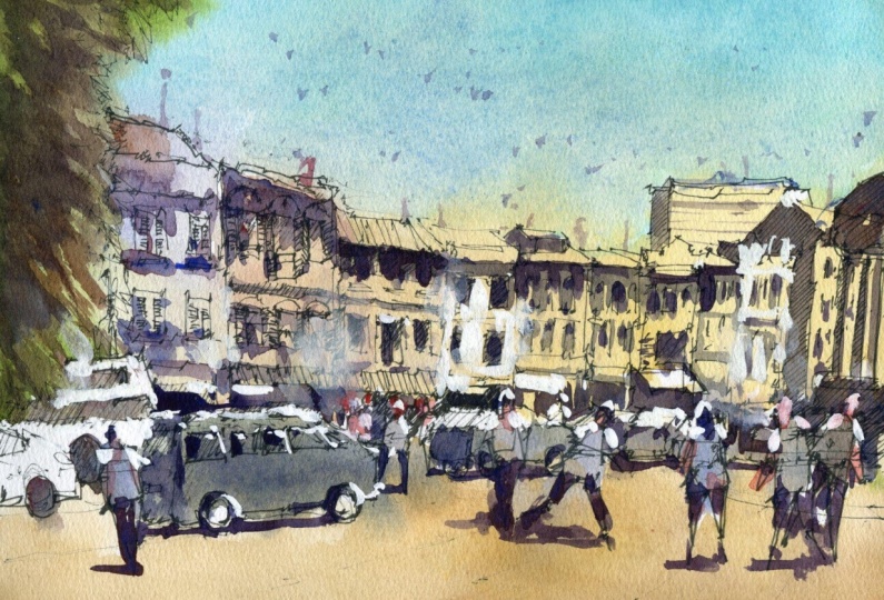
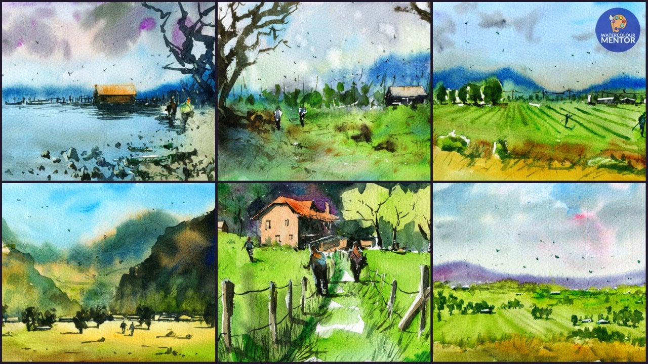
5. Chinatown Drawing: So this is a photograph
that I took just on my phone when I was
Holiday and in Singapore. And this is an area
in Chinatown and I thought it was quite
a nice photograph, a nice sort of seen because we have a lot of these
older buildings, I think back in, back in the early days. And so you can see
it's just quite, quite an interesting
blend of East and West. And I thought this would make a really nice little sketch. And especially with the rows of houses, some
different colors. Strong light source like this. I thought this would be quite
a good thing to, to paint. So anyway, I am going to go
and get into the drawing. And Firstly, before I started, you want to talk a little bit about what I'm planning to do. Now. I really like these
buildings in the background, and I think the emphasis
will be mainly in the buildings and also the
cars, perhaps a few figures. What we're missing
is a bit of figures, bit of life going
through here just with some people walking through. And perhaps on the
right-hand side as well. I'm thinking whether
to emit that larger building on
the right-hand side is actually a train station, I believe, but we'll
see how we go. I do like the tree to the left and I might even
extend it out a little bit more to give that impression of more, more
contrasting foreground. So I'm going to pick
up a 0.5 lineup. And at some point, I've got to tell me as well, which is just a
little bit smaller. I'll start off with this 0.5. And let's go ahead
and give this a go. So I want to put in just a general line where
the buildings finished. And you can see there's
a bit of a incline. The line just goes up all the way up until
the corner there. I might, for example, just
starting around here. Let's just draw that, this joy, that general line going
all the way up like this. It's just a general line
for the time being, but I'm just estimating. We know it starts roughly about here and then it goes
up a little bit more. So I don't need to
measure it exactly, but it's certainly starts to approach the
middle of the page. Not too close though, just a little bit like that. In the foreground, we've got some little
shoves at the bottom. I don't think I'm
gonna get that enough. Reckon what we'll do
first is work a bit on these buildings and
find a way that I can simplify them down
a fair bit so that we're just looking at a simple way to put them
in and view them as boxes. Look at them as so many.
There's 12345678910, potentially ten buildings. But the good thing is we
have little separations, slightly in the middle of them. So if we put a line
right in the middle here, first for buildings. The fourth building ends roughly in the
middle of the page. So if I can go ahead and potentially put a
little indication, and I've just swapped to a 0.3. I just thought it might be
better to use a smaller liner. That one there was just making
too much of a strong mark. Okay. And what we can do is already
my account for buildings, and of course we can go a line in-between
roughly like this. And then we can go line in-between for
these ones as well. Okay. So we've got
four buildings. 1234 year, roughly
four buildings. Okay. Because we've got some drops
or something like that. A big tree coming in
from the left-hand side. I'll actually get a lot of, lot of that in with
the watercolors. And later at the time,
for the time being, I just want to put it
in a few little brush, feel a little line marks and
stuff like that coming in. I've made it a bit
bigger than the actual the actual
photograph itself. What it shows that isn't
in the photograph, but I think this is
just wanted to have a little bit more
of an impression. And again, let's try to estimate where this
building comes in. I'm just having a look. I think really close to the
top of the sky. We can see it sort of
starting almost at the top of these trees here. Okay? And you don't have to get it in exactly as per the reference. But you can see it's sort
of start roughly here. And then slowly just
starts to incline a bit as we get down
further and further. Okay, So of course at the
moment it's just a pretty, pretty quick impression
about from here, we can start building
in some more details. So this could be, for example, that the rooftop of this one, we're going to go in with
the rooftop for this one. And there has been
a little section here that's hidden behind
the trees actually. But I'm not going to worry
too much about that. I'm just going to try to get in this impression of the
roof, talk like that. Sort of coming across
just like this there. And then we can make it
sort of come down here. There's a little
sign up the top as another line here just for
this part of the roof. Interesting thing is
down below as well, we have cars and
stuff like that. There's actually a big bus here. Not only that, we have
a mind of a large vein, so to just driving cross
into the foreground, almost near to the
foreground anyway. So let me just try to put it in this car, this van basically, it's just going to get it a
little bit further like this. It goes almost up into the
shops and just comes down. Okay. If we just simplify down, so it's just a box that curves, changes and just tapers
off at the front. But you can see that costs
are just going into the scene and that sharp dark
shadow underneath. Really just a simple sketch right now, just
something like this. Let's keep on going. Window is a window here
at the front as well, and maybe a light there. And I will also get an
another car here with Brenda. Can you wonder why am I actually
doing these cars first? And the reason why
is because we've got so much overlapping shapes
here in the foreground. If we don't get the
overlapping shapes in, it's going to be very
difficult because we're just going to be drawing over
the top of everything else. So I try to always draw the
stuff that's in front first. And of course, when I start working on some of
this stuff in the back, like this big boss,
you in the back. Notice that there's
some overlapping shapes in the foreground that I can go ahead and get
in at the same time. So that way you can
see it overlaps and it looks a little bit
more or maybe more natural. Suppose we not just
cutting everything else. So there's this kind of building here in the
background as well. And you can already
see there's like a little section here, but a bit darker. We've got this second building. I'm going to just
work on this one. It kinda just starts with
a rooftop finishes on that one coming down like this. Here. I'm going to move that
one down little bit further, like this third building. It's trying to get this
third building coming down the rooftop just
like this perhaps. And we'll just take this off. There. Have not left enough
room actually, it's in the middle
of the page for that fourth one, but
it doesn't matter. We can always chop out one of these other buildings
further down. Let's have a look at this a little bit coming up the
facade of the building. Then there's like
a rectangular top of the building like this. The, the, the top of that
building like that coming down. You'll notice as you go into
the background as well, There's a bit of this
reduction of detail, okay, because you'll find that as you move into the distance, the camera captures
it very well. But when you're
doing watercolors or when you're
doing any drawings. If you want to imply
a sense of depth, or I guess focus even on the, on the foreground subjects
or bits and pieces, you actually want to decrease
the amount of detail in the back and cleaning bit. There. Again, we've got
other cars that are running through
this whole scene. I'm going to just work on this roof top of
this other one here, just a little mini rooftop
like this, as you can see, it's kind of like a
structure on top of the and off the roof here. And can you some little
structure like this. And we'll kind of
move this one here. Okay? There we go. Just a little bit. This is
like kinda shade of course. Let's get into the
other one behind. Just overlapping. Bring that down as
well, like this. Okay. What else have we got? We might have this
other building which is like a really
sure what it is, but there's a structure
on top like this and stick out this side. When I'm looking at
drawing these things, I'm just thinking
it's a rectangle or kinda triangular bit or it tapers off into a
corner, something like that. I don't really look at
them even as buildings, I convert them on
the go into shapes. I'm just looking at
these and the tummy, they just look like rectangular,
rectangular like shapes. I'm purposely not going too
much into the bottom bit because I still need
to get in a few cars down there as well. But let's go ahead. I'm just going to go at getting the side for this one here. It's getting a little
indication of that one. There's another some type
of building here, railing. In this one down
as well like this, we've got another
overarching building all the way in the background like this. To the top of this
other building. It just disappears off all
the way into the distance. But of course I can still work on the side and
that side of the building in this train station over here seems to have
sorted itself out. I don't think I really
need to to get it in. I mean, if I really wanted to, I could put in some sort
of indication like this, indicating some building,
perhaps to the left. I don't need to really
emphasize this. Again. I do like these
kind of bush here. I didn't know what it is. Just a little green bush
or something like that. Okay, I'm gonna go grab that 0.5 line and let's start working
on these cash shapes. I'll go to another
car shape here. The windscreen just running out like this is a
trapezoidal shape. There's a four-wheel drive coming down and you can see
the front of it just dip down a bit there in a couple of round shapes there
for the wheels. It's getting the
back of the car. Like this. Just like this. Another one? Yeah. Yeah. Yeah. They're fantastic. Okay. So you can see that cast off
in the distance like that. Let's get an, another one. Like maybe in front. Just overlapping
shapes. See them. Another one here,
the back of it, and you can get in
another one here, even start seeing overlap a little bit more with
objects in the foreground, especially these little Bushehr or whatever I've drawn in there. Okay, a little bit of that. And what I find makes
it It's just leaves, we're just putting in some of the wheels at the
bottom like this. And a bit of a
shadow at the base does give it the
stronger impression. There being a con in
that, in that area. So it's a bit like that. Okay. I'm going to just work
on rework these ones. I'm going to bring
them out of this. It's just in a bit more. This is your darkness in these windows
to one of course, some of this stuff
you can put in later through the watercolors. But I'm just looking at
them and thinking, hey, that's a square for
this particular window, That's a squared as a frame
there that kinda looks a bit like a like a, like a frame. I suppose another shape that looks a bit like
a rectangle here. The Mac and little
window here as well. Let's just going all the
way into the side of the car is a windscreen here. So there's not really
when you look at it, there's not really a
lot of detail in there, but just the impression of it that you can look at it and
think, Hey, that's a car. I think that's probably the probably the best
thing to keep in mind. Of course, we've got shadows
and things underneath, but I'm not going to muck
around with it too much. I'm quite happy
with how it looks. At the moment. I will shift this wheel to make
it a little bit lower and work on
this part of the car. Teeny bit more. Scrape out of the
wind screen here, there's actually a
real here, this bus. Then I will emphasize again these pods that
are lost as well, that section, that
section there. Then we can already start to add in some smaller
details in here. You should lowering the
wheels of this car again because it's looking a
little bit too far up. That's a car. That's a car. There's a real here. This is like a area that
turns off into the spine. That and then
you've got the kind of barrier or something
like that here. The barrier there like that. Through this you got some
little vertical holes or what have you little support supporting structures
like that. Like that. So having a look now we might look at getting into
perhaps some figures. Now we have a guy looking to
walk or as the road or maybe run across the road getting
in the way of these cars? No, I'm just thinking,
what else could we do? I mean, I could turn another, something like
this seem to work. I figure as well, just
in the foreground, perhaps walking into the scene, leg going out like this. I think this would be
good to get in a sense of light and shade in here. Sometimes these little lines on the ground and really
help as they sort of give the scene a
bit more direction. In perspective. The perspective here
is very, very gentle, as you can see, it's kinda vanishing point
somewhere over there. With all the lines going towards that point,
off the distance. All the way off in the
distance somewhere. And Destic some more figures. I think we need a
few more, at least. I'm going to put one here. Another bigger just potentially
walking into the scene. The leg another leg that it'd be walking towards us could be
walking away as well. Another figure had
another one just behind that car waiting
to crush the road. I'm just looking
for opportunities where I can place went in. For example, CEA,
or may not be too disruptive on what is going on. Here we go. Maybe someone wearing a
dress or something here. Again, just maybe going
towards the back. We're just standing there
waiting to cross the road. Let's put another one in here. Maybe this person's
just managed to cross the road and running
across in the leg. This one just off in
the distance like that, kind of running a
little bit faster. Sometimes you have an
arm out like that. That really helps to emphasize
a little bit of movement. Their legs tilt of the head forwards and
the arm outstretched, kinda like that, gives
it a bit more life. Okay. You can put another
one over here. Kind of an intermediate
intermediary figure like I'm halfway through the scene that you notice I haven't definitely
drawing over the top of a few bits and
pieces in here. I do prefer to draw
in the figures. Actually eat without
cutting over things. But this still works quite okay. There's thinking maybe I could
get in another one there, just behind that car. Standing around. One to create a
sense of dizziness and just a lot of
movement in the scene. So if I do have a bit going on, That's no issue at all. I actually want that these legs that kind of
overlap a bit, perhaps here, the two figures that are just
going opposite directions, this one's going forwards and to the right and the other
one's going to the left. I get my arm out like
that to make it look a bit more better. Notice as well how the line work I'm using near the front for
the figures, it's thicker. And when I use a thicker line, this brings those figures
out closer as well. So that way, what's going to happen is that you're
going to have a lot more, um, I'm gonna have a lot more contrast between the background
and the foreground. So it's a little trick
that I've learned. Just changing the basically just changing the name
of the panel makes, makes it really makes
a big difference. This thick. Alright, I've done
a bit of work on those figures now I
think I'll swap over and started working a bit on the buildings and what have you. I think I've
forgotten this to get this building here all the way in the
distance, it's thicker. It's like a really
long one That's just disappears off into the back foot taller
than that building. But it doesn't matter. Just
get it in somehow like this. Beautiful something
on top as well as what can even start by
painting parts of it as well. So just hatching essentially,
as you can see here, just drawing lines in
one specific direction. And that helps too. Portray the direction
of the shadows. So we know the light source
is coming from the right, hitting the right
side of the buildings and then casting a shadow. And I can already imply
a little bit of that. And you can put
in a few windows. I'm just going to draw
a bunch of them like this is some vertical
lines running through it. It's nothing too tricky. And then of course,
here in the foreground, we've got some larger shape. It's the what do you call it? It's the station,
the train station. You'll notice it's
actually quite a lot darker than everything else. I'll have to rework this
in watercolors afterwards. For the time being. I'm just going to
shade parts of it are marginally darker
to bring it forward. Another reason, this
is good as well as that it allows me to
contrast with the figures. As you can see the figures
here in the foreground, because I'm just
darkening around them. It actually brings them closer and makes them
stand out better, just a little bit like that. So let's have a look here. I want to just start
doing headings, adding in a little bit of
details for the buildings. So working on this one, Let's go ahead and just
continue, continue on with it. At the top of the building it's doing there and there's
little bits and pieces, antennas and things at the
top which aren't getting afterwards. Not too fast. There's two sets of Windows, one here and then the
other ones that sort of start around here. You try to separate
their building into two parts like
this so that you've got obviously the
roof section and where the the name
of the building is. And then you've got
these two sections here, which are for Windows. And then you've got
the bottom bit here. As long as you've got
those sections sort of figured out, you'll be fine. But you really have to think where you draw the
windows, for example, you don't want to
draw the window is too close together and leave an entire norm is meter
space at the bottom. So I tried to look for
patterns to try to see where, for example, in
relation to the tip, the top of this
box, we know that the Windows Start
roughly around here. So we can just draw in
this one set like this, just to suggest a rectangular
squarish shaped like that. There's a couple and then
we've got a couple up the top here as well. Okay. Just like this. Then another one
here. Excellent. It's been a little
bit of this going on. Of course, there are some
shadows and little shutters here that we can
work directly on. There just some lines that run. As you can see, horizontal. Horizontal lines. Okay. They just indicate the shutters that you don't have to
draw all the shutters app, but this is what I do. I will use broken
lines quite often. As you can see here to indicate. Yeah, that's like a corner of the shutter or
something like that. But I don't state the obvious. I think that's a mistake because you can just get bogged down so
much into details. And it becomes tedious and start getting annoyed
at the whole thing because you're trying to make
it look too much like the reference picture
instead of just using it as a guide to
help you with this tree, I've decided to make it
kind of going a bit more. Maybe help frame the frame
the scene a bit better. Something like this. There we go. Down like this. And let's go ahead and I will just draw inside
of this building. Yeah. Okay. Fantastic. Let's start working
on this one now I'm going to separate
this out into, again, a few different sections. This section dispiriting out, but there's a rooftop. The little shade area, sorry, of this building is here. So I'm just going to
draw that out like that. And again, separate
these out to two. So we've got the top row of, as you recall, windows and
a bottom row of windows. And the windows here,
really quite complex. I mean, there's just
so much going on here, but we make it simple. This three is three
rectangular shapes like this. Rectangular shapes. Okay? Then on top, you've got more kind of
shapes as well as one here. One here, one shape like that, and then another shape here,
another rectangular shape. Okay, It's just to get in. These windows, don't want to do them in the same style
as that one as well. So we've got some
of these, again, these horizontal
lines like this. And then they sort of
indicate the shutters. And then inside the Windows
there's all kinds of stuff, but I'm not going to try
to draw it all in there. The shadows. I think the important thing, just making sure that we've
got enough of the mean. And a little bit of a
separation between the shutters were one opens and another one sort of
closes off as well. Just stick out like that
and a bit of an angle. And then they join up like
this here and that one again, so it sticks out a little bit towards the right-hand side. Then the inner part of
the window is kinda like a darker frame in
some areas anyway. Okay. Like that. It's again, just
worthwhile for me to note. Another time. While I'm drawing. I'm not even looking
at it as a window. I'm looking at it
as just a shape. These three little things
on top of the windows, I'm just looking at them as
the semicircular shapes. I'm not even sure exactly what
the four on the buildings. I'm just drawing them in
little bit of this rooftop. There's something
on top years well, whether or not when
it is retreats back, I think that's enough
detail for those windows. Let me think. You can always just do a little bit of
hatching away in there. It's quite dark
and those windows, but there are some
statues and I think ornamental things
in there as well. They had a big deal,
I think later, just getting in those
shadows inside, but the time being that's good. Just getting more of these semicircular beats
here on the building. Also bit more hatching
like this, the center. And I'm going to just
start drawing in a few these bits and
pieces here on this side, That's where shutter,
shutter, shadow here. It comes across like that. The more these little shadows. I'm just again trying to get an indication of them
not wanting to state the obvious because we're going to run into troubles with
all the details and effect. Thick enough as it is. There's
other things and all kinds of interesting bits and
pieces in the Windows. And whether you want to put
them in how much you want to detail is up to
you essentially. Okay. I think that's me, that's more than enough. I will get in some of these little bits here
for the roof that just the shade area of that
building and just with a walkway is you can see here there's a little
sign board as well. I'm not a big fan of getting in the rotting and all
the sign boards, but It's something if
you would like to do, then go ahead and just a
bit of shading like that. This is the car here
and the third time, really want to make sure that it's coming forwards
a bit more. Okay. Let's have a look at
the other buildings. Certainly getting there. Just outline the top
of this rooftop. Cni bit better. There we go, That's better. Read. That just sort of comes in
and goes over France as well. I think that's
something like that. Yeah. Okay. Fantastic. Now this one, I'm just going to draw the line
that runs across there. And once you've once you've gotten in one
of the buildings, fairly accurately in terms of the proportions and
the features older. Hope everything you can start using that building as a reference
for the other ones. You can see the separation running through the
middle of these buildings separating the two
the two levels. This is also the same separation on the building to the right. Okay. So I'm using that as a guide. And then I'm also
having a look what's, what's going on up here. It's again, just separates
out how much the two. And then you've got bits
and running through here. They're just Windows really. But I'm going to hatch in
some darkness in here. There's some bits and pieces
underneath here, here. Here. It's a darkness
underneath like that. We've got another kind of
shade here, running a curse. This. And again, I'm just going to
get in the directionality of these shades like
this directionality. There's these little lanterns. You can see these kinda
Chinese lanterns. They like those red
lands is that you get, but all around the bottom, there's a lot of
darkness and that's something that I will
actually leave for later. But let's work on these windows. It's drawing a few
of these windows. Again, it's kind of a
rectangular shape, is one. And then you've got another
one here that's kind of longer rectangular
shape like that. Then you've got another
one here like this. And little shutters like this. And it's kind of a little sign sticking
out of the building. And of course, some little areas inside the windows as well
that we can of course, just paid and coloring to darken off a bit
inside the windows. As we move off into
the background, there's really less details
that we need to pay in there. This year is just the middle. Some line work on
the roof top there. Look at this building,
this is getting a little bit easier as you move into the
background buildings. No need to sketch or too much. And that's another
two angular shapes or square-like shapes
for the windows. There. There's another window here. The window here. Two windows like that. Then at the bottom there's a bit of darkness there as well. I really want to get some
of that darkness in. Actually, I just
want to see some of that come through already if I can with the pen work. If I can just pick up this
year is just a darker sort of number, 0.8 liner. And this can help me to get in a little bit of
contrast in here, little bit of darkness. While help to push the push
forwards these figures. That's the idea. We got here. We've got another
bits and pieces again running through
this section. These, all these buildings here. Now there are
actually a little bit more simple. You can see this. There's just a few,
these arches like that. A lot more complicated
to bitterness, but we kinda look through them. We're going to simplify
them down, okay, because as you move
into the background, the one thing you want to
remember to keep them. Keep the bits and pieces simple and decrease the
level of detail. Because if you do that, if you do that, it's going to give the scene a lot
more of a feeling of debt. It's also going
to make it easier on you when you're
doing the drawing. Then look at that. Such small details like this blue shade
organelles is beautiful. Blue shades, the splash of
it running through that. And I'm going to capture
that watercolors. Some of these buildings. I'll
just make up the windows. And this one here, I don't
know what this one is even just like a white
building, really. The White Building
and fantastic. So we're going to
go ahead and get started on the painting.
6. Chinatown Painting: To start off with, I'm going to pick up a medium-size mop brush,
something like this. And you have very
small mop brush. And I'm gonna go in with the sky wash first and I
want to make sure that it's a light blue sky
wash cerulean here, which I just grabbed
off the pallet. Quickly. Just drop that in here. And I'm just putting a bit of that light wash of cerulean. We go straight into the
sky and move that around. We're gonna go straight
to the edges as well. Actually, I'm Julian is a naturally blue color. I've got a bit of
turquoise in here as well. Darkens it. Marginally. The meeting just shift that around that near the trees
and stuff like that as well. We can shift that around, bring this down, which here, here around the buildings
like that, like that. Like that. That I'm going to start putting
in a bit of color for the for the buildings as well. But let's have, let's
have a look now. Always remember
you don't have to go with the same colors
as the reference photo. You can always change
things up if you'd like. So I might, for example, pickup a bit of
this burnt sienna. I've got a little
bit of burnt sienna may drop that in
for this building. Actually made me
a bit of English. Read my vote share. Now there is it somewhere here, up here is next door, actually something like that. I hope that in there
just a light wash. And because I want to
create the impression of greatly impression
of a nice sunny day. It's a little bit of
that running through. See actually some of it's gone
into the sky. No big deal. Just let it, let
it do its thing. Things, you will get bits and
pieces that run together. This one here next
door is a kind of an off-white color are dropping a bit of
this titanium white. I think that's
perfect for that one. And that one here
I think I'll go with look maybe like
a lavender color, which is a bit of a, it's almost like a
Laila at very purple, purplish color, light
purple color dropped, returning something like that. Again, very light wash. And continuing on, let's have
a look this yellow ocher. And now just start
putting a bit of that yellow here
actually to some of these buildings
that just mixed in. Also a teeny bit of teeny bit of Hansa
yellow there as well. This is like a quinacridone and also create a bit of quinacridone color that
I'm using as well. What I want to really
get that nice contrast between warm and
cool colors on here. So I think this is
going to be good. Just color all that in, we'll make a lot of that in a
little bit in here as well. Get that kind of golden age
permeating through the scene. A little bit here on
the right-hand side. I think we're going
to need to go in a little bit with
the ground as well. And I've got some yellow
ocher dropping here. You just cut around the
cars are in the figures. Just getting a bit more
that connected or in color. And around. Go further down. We'll just yellows here. But of course, you can pick up other colors as
well and drop them in. For example, this is
just a bit of bluish, dirty sort of bluish color
mixed in with a bit of red. You can drop in as well. What's this? I think at the end of the day, all I wanna do is just
getting a warmer color. And maybe in the foreground just had a bit more
strength like that. But apart from that, I'm happy with how it really all those colors
have run together. Do have some do have
some green as well. So just pick a bit of
that green and just drop that in there for that three. And a bit of sap green, this is going to help
the sap green just like a really light
and vibrant green. I love this green. It's great to great
sort of background, green color that you can
mix in with darker greens. Okay. Dropping that in like that. Bring that down. I can just pick up,
lift off a bit if it's too much color and dry it off. Let's look at the cars. I will grab a little
bit of this color, which is just basically getting
primaries mixed together. And just getting a bit of
darkness for this car. Bit of darkness here. Darkness in that car. That moment. I'm really not worrying about
details just a bit of and I'm just a bit of darkness. Some of them we've got lots
of cars in there as well. Mixed in with all of
them are sort of darker once we should have changed
it up as we move through. Here, there's some
car that has like a darker kind of weird, and we've got a car
in the background, that one's got a bit
of a wheel as well. Darker we'll mood. I'm actually going to look at mopping up part of that sky, a touch, a bit of paper. Just a little bit of
these because I feel like some of that yellow
is gone into the sky and tended to be much of a
greenish color for my liking. So I'm just using this bit
of tissue paper to lift off, drag off a bit of that paint near the top of the
buildings like that. Okay. Something like that. And let's have a look. Looks a little better and
also appears like it's kinda getting a lighter near
the buildings as well. If you want, you can always pick a bit of extra
paint and dropping. They're just having
a look at a bit of this little bit more of this cerulean that
the son of that in. Good. Alright. I'm gonna work on these
figures a little bit as well. It's getting some colors. I can, I'll get
into some blue for some of these ones
like that one there. Just cooler looking
colors as opposed. There. Let's get in a beauty of this. There's a bit of this
lavender color there, for example, for that figure. And I'm using kinda cool the colors because
they help to contrast. I'm with the warp in the ground. Grow this warmer
color and I think some coolest stuff already. I've given that all
a bit of a dry now. And what I wanna do is just start putting in
some of the shadows, bit of the contrast here. So let's go ahead and do that. I'm gonna be using
smaller round brush. And I've already got a bit of a shadow color mixed up here
from the three primaries, a bit of ultramarine mixed
with a bit of perylene red and a little bit of this
Alonzo yellow medium. Okay, So we can use
this mixture here. Okay? I'm gonna go and just start putting in a bit of a shadow
underneath the buildings, as you can see here,
there's a bit of this little bit of that shadow underneath
the buildings like that. And the top of the buildings, especially this, which you call them
these little tops there. Okay. Notice the little
window is also quite dark, but we can go over
the windows again later with this second wash. Once this is dry, I find this area, this wash is so crucial. The shadow wash here because
it's kind of like a, it's not a full tone. It's more of a sandwiched in-between a
mid-tone and a full tone, or even just a mid
tone in general. Really gets the impression
of light in these shadows. And I use a smaller round
brush like this so that I can also detail a bit along the way. As you can see, little
bits and pieces. I can get in some of
this stuff years, well, that building, these
little windows, just impressions of the windows. That course we've got a
darker part of this building running into the
background and I can just work on as well, just to drop in a bit of it. There we go. I'm going
to blend that on softer, lighter section of that
building to the left. Bit more here, more on the buildings and the
windows like that. The important thing is leaving the middle section of
the rooftops like that. In the light. This is a really
dark shadow shapes here in the foreground for that, which you call it that
little train station. And I'm just going
to round it like this and cut around
those figures. And this is creating a sense of in contrast around
those figures. I can go into the bottom here like that and just
dropping a bit of color at the base underneath
the buildings. Not doing it everywhere, but just enough to
cut around the car's. See. If I see the top of that
car, they're doing areas. You can leave out
some bits and pieces. And since not all to the same, same thing running
through this darkness, running through the entire area. And you just want to leave it, give me a bit of rest
and then continue on. Bring this whole dark
shape across and really seen it done with a
bit of the pen before. But we can bring
that all across. I mean, even see it
just carry that. Just putting it in
that color like that. Here. It underneath here as well. Just, just a touch
of darkness, really, nothing out of the ordinary. And then I see some red in the ears dropping a
bit of red, perhaps, some more darkness. Then the buildings of
course here as well. You'll notice there's
actually a fair bit of darkness and shadow for the area of the building. Okay, so I'm gonna just some
of this color in there. It's just a cooler color,
predominantly blue actually, if I can use a bit of red
and blue mixed together nice purplish color
which makes it great. Shadow. Indication of a
shadow like that. And in a bit underneath
here as well for the windows that they're
underneath here. Surprise just handled it. All. You need to put into these
background here is to create a strong sense of light. Darkness also running
into the background. Abilities. Darkness in the car as well. We use, of course, the shadow underneath
the nice shadows or shape just running
across towards the back. Not only that, we've got the
shadow of these figures. Again, I'm going to keep it
kinda this purply color. Then you can mix you
three primaries together. And also that works quite well. You can add the
legs just darker. What I'm doing here, just dark and the legs
off a little bit. And then I'm just putting a bit of a shadow
underneath like this. There's not a huge
indication of a shadow, but it's just kinda like
directly underneath, I guess, to indicate me son being
directly overhead. Hey, maybe running a bit
towards the left-hand side. Never know. And we can do the cars
out in the back as well. A little bit of shadow
underneath those cars. Bring them out a bit as is just a little bit more
shadow here and just darken that side
of that car to the back more and leave this side of the right a bit more exposed. Say a bus or something.
I've been back. Here is just some
more of that shadow. That little bit of
darkness around Windows here underneath as well. I'm going to work a bit on the how these Shimon column
shrubs or just tree leaves. So yes, I'm running
my brush it for us to create a sharper
shapes like that, but I'm also leaving if you
can see some of that yellow, lighter green behind trusses, lots of greenback because
that needs to be darker. But at the same time, at the same time, the bits of light and
they're really add interest. This one a bit more, the legs of this figure here. Hello, there. You can start putting in touch of hair as well
for these figures. Here is good because
it helps indicate almost the way the direction
that people are walking. If you notice that one here, I've put in here running
down the back of the head. So you can indicate that this lady moving forward
in that direction. Just at the top means there may be just standing
straight and looking towards the camera. Small. Here's
another figure here. Little bit of a
shadow underneath. Figure. This one here, two more on these tires. You find that these little
finishing touches, I mean, they just be surprised how much they make
everything come together. And if they're not
there, just looks funny. Here is what I was talking about before
we can go back in and drop in a bit of color to darken some of these
windows again. Okay, So we know that perhaps some of these areas
are a bit darker. We can of course, go in and do that, add a bit of darkness in here. Because the windows are
slightly, slightly darker. Just simplifying
it down as well. Not I don't want to spend
all day doing this. Is actually a nasty
blue color there, but I'll probably leave
it for the time being. I'm just looking at
what else we can do. A few more lines running across the background for that
building like that. We'd put a bunch of these other buildings and
shades and things like that. The background here too. The layering of these
different brushstrokes. The key of really
bringing out a sense of whatever you've got in there. For me, it's these
buildings really make where they really
tell the story. But we need to, of course, have extra bits of darkness
in there. Otherwise. Otherwise it doesn't communicate properly from light on
top of the buildings. For example. In a few
movies, bits like that. There is Windows need a bit more darkness running
through them as well. Redo their shadows to touch. A look at this one more. Yeah. Maybe putting a few
birds or something. The sky lighter colored ones. Here. These little indications of some birds weren't really
there on the day, but why not? More here, a few more. I wanted to get in a bit of red for the faces of these
figures as well. If I can just pick a
tiny bit of this red, just soften that down a
bit and just drop it in. I'm just going to help identify their faces and even I can even drop it into the arms that helps as well. It actually drives off
a pink color if you, if you go to lighter. Fantastic. There is also on top of some of
these buildings, there's like a little,
little bits and pieces example of something. Then there's a bit of something here on top
of that building. Just soften this down. Let's have a look. For example, this one here
is while they might be like a antenna or
something like that. Look what else can we do? There's something up here. It's more likely in gouache. But these little bits sometimes
on top of the buildings just help to connect
it to the background. So I like to drop in
a few like that even if they're not actually
not actually there. So we're going to finish it off. I'm going to use some little
bit of white gouache. Adding some finishing touches. Really got some
here. Just re-wet. It does work a lot better if
you use it out of the tube. There's just less chance
of it and mixing around with other kinds of paints, turning gray or any
other kind of color. So just really reactivating that by just grabbing
a fair bit in here. It can be tricky to
get it to a nice, thicker consistency,
especially when it's already fairly dry, but it is possible. So be patient with it, which you've got
enough on there, you can start doing some
interesting things like this are exactly is dropping
a bit top of that car. I say, I think I'll actually
use some fresh loaf. Just a bit of that
white wash Here, bit of water in there
to activate it. This is just to bring up
the final highlights. And I'm dropping a BQ
and chocolates car. Yeah. Here. Here. Indicating maybe
some of the frames, the window frames
and stuff like that. The car. This figure here, just to
highlight for the head, another figure there that was disappearing off
into the distance. Here, that's another figure. The interesting thing about
these is that you're going to see shadows more
on the shoulders, highlights and the shoulders
and the top of the head. Because we've got the light
source coming from above. Little bit of that like that. Perhaps in the
buildings you could find some bits and
pieces as well. It's not so apparent at times, but might notice some parts
of the buildings that are more, more white. So you can actually go over
the top of some of it. I don't know, I normally do this but something like
that or bring out, bring back out some
of the whites again. Don't overdo it though. That's my only bring out
some of those highlights. Once it starts looking good, then just leave it. And to be happy. Some of these buildings, top of that building, some of these ornamental bits and pieces on top
of that building. And this one is actually
getting more of a white color. Dropping a bit of gouache
in there like that. To make it soft and off, I'll just add in a bit of paper gouache here and
just soften off the edges. And this also creates this
kind of misty like feeling, smoky like feeling if you do it, if you do it right, you might get some of
this stuff anyway. The scene with Louis, cars and bits and pieces
running through there, so smoke and then the background might actually be a
good thing and actually helps to break up a bit of the sharpness inside this
kind of milky color. Just a bit of water
and gouache like that. More greenish, green and blue. If I can get in some
darker bits here. That's good. Okay, and I will call
that one finished.
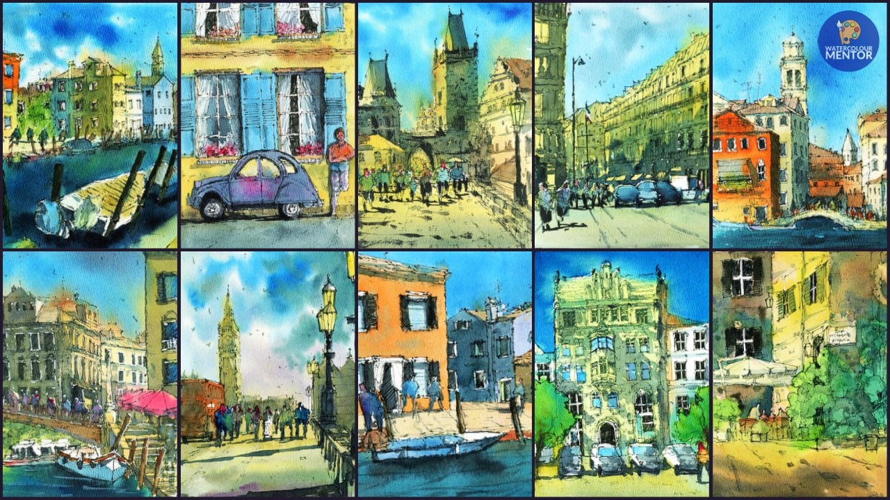
7. Chinatown Road Drawing: Again, we've got a
great little scene. Here's a different
view of Chinatown looking straight down
on one of the roads. So you can see, of course, a lot of different buildings
in the background. It's a very simple
perspective where we've got the vanishing point right
in the center and the road, the lines on the
road just hitting all the way towards
that vanishing points. So you'd normally,
what I like to do is I will just put in
the horizon line, a general indication
of the horizon line. So I'll just draw it
in like this. Okay? One thing to keep in
mind as well is that the reference pictures of
the square orientation. So I'm going to enlarge it, just widen that
orientation a little bit. I might make up a few
buildings here in there. I might put in an extra car
or something like that. It's not a big deal, but that's just something
to keep in mind. And what I wanna do first is I want to just start
looking around at some of the cars and
see if we can go ahead and sketch
some of these in because they right in
the center of the page. We've got of course, there are all these tax season, there's one right here, so I can just start drawing one in. It's just a box, okay,
if we look at it, it's more like a
rectangular style sort of box like
this as you can see. But inside there are a little, you know, little bit more detail and smaller shapes in there. But in its essence, you've got a rectangular
shaped sort of boxy object like
this as you can see. And you can of course
look at the lights, some of the cars you can put
in there, the lights here. There's a grill here as well for the radiator course on top here you've got the windscreen, little indication of that
wind screen like that. That we've also got some of the mirrors on the left and
right-hand side of the car. So simple sort of thing
like that in other cars or they come in all
different shapes and sizes. So don't feel like
you need to make them look exactly like what they
are in the reference photo. But one of the things I do recommend is to follow
that general shape, that boxy looking shape
here on the ground as well. You can actually tell where it hits the ground
because you've got the wheels, we've got one of the
wheels up to the side, one of them over here, and then straight underneath,
It's pretty dark. You've just got a very sort
of dark age underneath there. So it joins the wheels up. Now we've got other bits and pieces here in the background. You can see the side of a bus. It's pretty far
into the distance, so I can just go
ahead and draw in a little bit of
that bus like this. It's just another
rectangular shape, almost like a box or something
like that. Of course. It's going to be this
bit on top of that car as well to indicate
that it is a taxi. You can see here, this
is another just a bus looking box-like shape. And I'm going to draw
in some details inside. So for example, this is just
part of the wind screen. I'll just hatch away. Came to darken that
area a little bit. Even hear something like that. You might put in a couple
of lights or something. Not a huge deal. Just a little indication that
the other ones you've got, of course, other cars, you've got a car
that's just behind. Like this. Of course, a little bit,
little less detail. But nonetheless,
you've still got the wind screen and
everything behind as well, so you can pick out a
few others as well. So for example, this
side we've got a car that's a lot larger,
so the wind screen, I'm just making
that a bit larger, making that front of it
come down more like this. We can see the side
of the wheel here. For this car. You've got to light
like that here. Light here. I remember still. So approximates this kind
of rectangular boxy shape, caves long as you can preserve
that boxing this on there. And all the other details
are not a huge deal. We'll just indicate them. And you see you get
a little bit of darkness under the bumper
and stuff like that. The main thing if
you get that wheel in these wheels underneath
and join them together, it really makes a
big difference. So it kind of anchors them
off to the ground just like this little indication
of the side of the vehicle here as well. Like that. Of course, you've got
other cars back there too. Here's another one just off in the distance
and you've got some wheels again
like this and you might have a track or
something here behind. I do like to use a
smaller nib pen, like a 0.3 pen as you
move into the distance, sometimes it does help
to indicate that sense of perspective of
decreasing size of objects, cars, that kind of thing as
we move into the distance, it makes it a lot easier if
you're using a thinner pen. Because you find that when
you use a thicker pen, bits will always what was bring forward,
whatever you're drawing. Of course we've
got now some cars and one of the things I want
to put in some figures, So I've got a nice bit
of space here like that. So why not just
drawer in a sort of a figure walking is leg going
forward and using Lake. Kind of going backwards
to figure just walking through the scene here, the head roughly on
the horizon line. The horizon line is about here. So that's okay. Maybe the
camera is a bit further down. Bigger, just walking
across the road perhaps with some a bit
of a shadow as well. I'm thinking with
shadow as well. I do want that to follow this general pattern where it's going towards
that right hand side. So even the cars might have a shadow just cost
towards that back, back area as well. So we can draw in
a little bit of that shadow to start off with, just as an indication, of course, one on
getting a few more. Here's another figure here. This one might be run in
a bit more of a hurry. So the body, the
slant of that body is moving a little
bit more of an angle towards the front so that
we indicate a bit of a more vigorous sort
of direction that these figures moving in. This one here could
just be in the bag, perhaps just standing
or something like that. I'll just get a bit of
dizziness going on. So that we have some
variation of figures. That one there might be a little bit further in the distance, that figure just in the back. Like that. I love to put
figures in where possible, especially if we get
them to interact and cut over the top of the cars and stuff
like that as well. It makes a difference
in terms of the overall interests of the scene just gives
it a lot more life. We've got, say, a figure
here on the left-hand side. And I might just
draw a car that's just off in the distance
here like that, just behind that figure. Maybe the front of it
just coming out there that there's a light. And then we've got a
wheel here for example. Okay, so just something
like that and that might be the side
of the car there. Another taxi indicating the
taxi status of the car. But we've got some
interacting figures in cars and what have you here. So it's really up to you
how much you want to go, how far you want
to go with this. But as you can see, I've drawn in a lot of these interacting shapes
and making sure as well that the heads roughly line up in the same place on
near the horizon line. If you make the heads
go too far up or down, or if you make an irregular, it's not going to make sense. It's gonna, it's gonna
look inconsistent. Especially it's going to
make the ground look. And even if you've got to
have figures that are going, the heads are going further
up into the distance. It's going to look like
we're on an incline, so I want to make
it look like it's a completely flat area. So I'm going to start drawing in some little indications of the buildings and stuff
in the background. And again, I'm just
going to be using this reference picture
as more of a guide. I don't really want to try to get it in exactly
as what it looks like. Having a look here we can see near the center of the page, we've got these buildings that just especially this
large dark and building off in the distance we
can see goes all the way up like this. And then it's got this
little shape here with a rectangular area there on the side that comes
down, hits this building. They're looking at the
angles of the lines as well. You can see that's a
side of a building which I can just emphasize
a bit more like this. That, okay, Now the
side of a building, perhaps going up
further like this. Okay. I'm going across here, I guess that sort of
creamish colored building. And then of course got some of these other
buildings which have a more interesting top
section of roof as well. So simplifying these down, I like to put these
square sort of areas underneath the buildings
around here as well. Just sort of indicates
a shop front scenario. Suppose that just keeps
things a bit more simple. Here we go. I'm just gonna put in these buildings on
the right as well. And again, you can
just look into however you'd like in terms of simplifying
the details down. I just look at them as shapes, very basic shapes and look at
them as triangles is looks like a curved area like that. That just comes down. There's a bit of darkness
in here in case. So we can just indicates
shading a little bit of that. Little bit that looks
like there's a typo. Something attached to a light post or
something like that. It's hard to say exactly. Okay, here we've
got a few windows and you can just
start getting in some of the floors indications
of some of these floors. As we get down to the front, we can start doing these things, getting in the shade
cloth buildings. I love doing these shade cloth. They always add more interest
in terms of flashes of color and shade underneath. Especially it's
sort of give a bit of makes it makes sense of
the shadows on the buildings. So I have to extend
this one out to the right, a touch as well. Or I can just imagine that it's fades off into the
side like that. That's completely fine. We can now start looking at
a bit of the left hand side, some of the houses, some of the buildings. And again, I think I'll just
start roughly around here, leave it, leave it a little
bit of space in between. We've got this kind
of rectangular and another rectangular
building that goes all the way up around here. That off into the distance. But of course we've got
buildings in the front that's sort of just go off like this. Sort of dip down
into these areas. That could be just
an indication of a side of a building or
something like that. They're just remember
you're drawing boxes. If your chart, if you
look at them as boxes, it becomes a lot easier rather
than you picture them as buildings can really take note of the angle of
these lines as well. If you are measuring
the horizon line is just off the back here. You are imagining
that all these lines meet on the same angle. So if we draw these
lines are running all the way emanating
from the horizon line. That's going to help you place the angles of the
sides of the building. So here, for example, or here. So after a bit of time, you get used to it becomes
a lot easier to do. But I find the best way
is just to give it a try and one-point perspective scene like this, it's quite essential. Something that you always do. No matter where you are
doing some urban sketching, start getting in a bit of this, maybe some buildings here
right in the background. Now, here I've got
obviously some of these buildings that are
just getting a bit closer. And I will simplify
this one down again. So we've got three example. This one just coming up
in this kind of like this strange stepping
pattern up there. That doesn't matter, we can
just get that in there then of course is another one
maybe just over here. Just want to be careful with
this error or something. But when you get closer
to the foreground, that's when you just want to
make sure that you're adding in as much unnecessary detail as you can does make more sense, especially when you move
closer to the foreground, that the objects
and details become more apparent and more parents and recognizable as you
move towards a distance, you generally speaking, it's more difficult to
see what is going on. So I can start putting in just some quick little
perspective lines here as well, which is running
into the section. They're just across the ground. Yeah. That yeah. That that really starts to add in a bit more of that three-dimensional
feel, three-dimensional. We'll look at scribbling a bit down in terms
of this building, these couple of buildings here, that there's another
window here. And looking at, again, looking at the angles of the lines of those
windows as well. Really quite important. You can them, the edges of them appear as well as
you move into the distance. We just sort of dropping
a few lines are there. And then that will indicate those buildings or what have you done the bottom of some
of these buildings as well, you're gonna get some
darkness because they shop France
or who knows what. So that's why I'm just doing a bit of
shading here with the pen. You can even do
things like this. Little poll here, just goes off. It goes quite fun around here. This is just a pole and that connects onto a little
lamp like that. So bits and pieces
like this you can, I'm certainly add on, on thinking and some more
figures here we'd be good, especially maybe a crowd of figures just a bit
more busy-ness here. And then look, I will
just draw in the body, the heads first
of these figures. Then I drop in the legs and
everything else afterwards. It just helps so
that I can get in the general sense of
the crowd forming, the feeling like there's something missing on
this side as well. So I'm going to drop in a figure walking cross the road there. Fantastic. So other than that, I'm quite happy
with this drawing. You can just drop in a few
squares and things like that. Again, for the Windows. Little bits of details here
and there might even pick up, pick a line unlike a 0.8 liner, and look at things like
thicker style windows, window frames here as well. Okay. A bit of shading
under there. Okay. I think we're good to
go with the drawing.
8. Chinatown Road Painting: Alright, it's time to add in
a little bit of color now. And the first thing
I really like to do is getting some colors
for the buildings. And you've got orangey
sort of colors. You've got a bit of burnt sienna light
color in there as well. So I guess warmer
colors that we can start adding in to begin with. And we've also got some of this milky *****
in here as well, which is basically
due to the yes, the lightest, the lighter
colored buildings. So instead of leaving it wide, I'm actually using a
bit of buff titanium. And I'm going to just
work my way in with very, very soft and diluted levels
of orange and burnt sienna. So you move off into the
distance here as well. You're going to notice a bit of this building as
a yellowy color. So I can just pick up
bit of yellow ochre, not using many vibrant
colors in here at all. This year is a bit
of cerulean blue. And I thought a little bit of
blue would be nice in here just to contrast with
all that warmth. So I'm keeping it pretty nice, sort of vibrancy colored here, just dropping a
bit more of that, bit more of that milky color up the top, coming down further, bit more of this
burnt sienna for the top part of the state. Hey, good. And of course, these buildings
here in the background, I'm just going to pick
up perhaps a bit of blue bluish color or just
a double down color. Really like a dull dark color. I'm going to turn out to be great because
it's just whatever is mixed into the palette,
everything together. And just drop that in. I don't want that to stick out too much. And as we go over to that
left-hand side, again, just picking up some
warmer looking colors and dropping them in
for these buildings. I'm not fast as to what
exactly these colors are. But having a splash
of coolness in it at times just
helps to offset it. So you can see here
I'm just dropping in a bit of like a cooler color. And actually this left-hand
side is going to be cooler than the right hand
side, right hand side, because we've got a lot of good, a lot of shadow coming
in from the left. So it's looking good. I just mix this to come
down to the foreground. Let's get into some
of this yellow ocher into the ground as well. I'm going to keep it
very sort of really bright and a little bit more vibrant as we get
near to the ground. And notice how I'm blending that Washing from that
top area as well. Letting it all flow downwards. Okay. Just letting it all
flow downwards. Bits of that coming down, bits of this wash
blending in as well. Okay. I can paint to the edges or
you can just leave it like this and also be fine. Let's have a look. My go all the way to
the edges actually, just since I'm almost there, drop in that color
like that, good. Into the sky. What I wanna do is
put in some blue, so I'll use a bit of lavender mixed in with the
cerulean as well, good and lavender and Cerulean. And I'm going to use a pretty fixed lavender cerulean collage. Just want to make that sky a little bit thicker
and more obvious. Normally I keep the
sky very, very light. And even, you know, even if you mix up a very
thick layer of cerulean, you find that it's
not going to be enough anyway to
get a dark color. But I do want to
make the buildings just stand out a
little bit more, which is why I'm just picking up heavier wash of cerulean. But even if you use cerulean
straight from that palette, as I'm doing here, you'll notice the
very light, okay? This drop that in. Just mixing this around and
getting it to go in nicely. Okay, so to even it
out a touch as well. Like that. Okay,
Good. Fantastic. So what I'll do as well as muscle just getting a
little bit of vibrance C4, these cabs, they have
like a yellowy color to them and I'll just drop in a bit of a yellow in
there for the cabs. Just trap that in
nicely like that. And I can also just
pick up some of the, the darker color
on my palette and dropping the wind screen like a dark and down
wind screen like this. Remember a lot of these
calves are going to have shadows and things
on them as well. Then what we can do here. You look at some wet
and wet and dropping a bit of darker color on
some parts of the buildings. So for example, I've got a bit of purple or
something like that. So if I can grab it and purple and I'm just dropping
a little bit of little bit of purple like that and the
bottom parts of the building. So it just looks a little bit more
interesting rather than, rather than it being
that same color all the way through the walk. Now, the figures, why not just dropping some
color for them as well? So here's a bit of a purplish
color there for that one, there's a couple here. I'm just trying to get
in a little bit of life, a little bit of interest. Okay. I'm dropping in a
bit of color like this. If you've gone overboard,
just lift off, touch a dry brush and
just lift off paint and it will and it will
come straight off. So a lot of this is just whatever I've got
on the palette. Not fast. Okay, so that's it for the first wash. We'll give
this a really quick dry. Okay, so that first
wash is dried off now and what I want to do is work on some
of the shadows, the details on the buildings. So I'm gonna be
using the mop brush and also a small round brush and number four to
six round brush. But the main thing I
want to look at is getting in a nice shadow. And to do that, I'm going
to pick up some kind of purplish sort of paint
that I have here. There's some purplish paint, some mixing a bit of it up. This is called amethyst. Amethyst. And quite a bit of it here, it is probably about 50%
water and 50 per cent paint, so it's thicker, certainly
in the first wash, I'm kinda look at
some of these areas. So for example here, I don't want to get
in a large sort of shadow coming in from
the left-hand side here. So I can just get that in on the ground as
we can see here. I also wanted to leave in more of that yellow
on the ground then is actually is actually in
that reference photo. So I'm just a bit of that
dot is here in the ground. And then we can just see a little bit of this
come across like that. Okay, just these darker
shadows on the ground. You only really have one
chance to do this as well. So you got to make sure that you are confident with
your brushstrokes. Put it in there,
and just leave it. That can look at that just holding the end of
the brush as well. And I'm letting the shadows merge with the figures
here on the right as well, that these figures
are gonna be kind of under a bit of
shadow as well. Perhaps in their fur
underneath those buildings, there's gonna be
a bit of shadow. Just like that. As I'm
moving to the foreground, I'm going to just
add in a little bit more of this neutral tint color. Pick up some more of these grays here on the palette as well. Let's look at continuing
this light pattern. More water. Just drawing that on. Good, good, good work here. I'm going to darken this up, touch as well in this
section like that. But I really want to leave
enough of that yellow here on the paper as well, so that we've got just enough of that light
coming through without leaving these
lighter bits in. You're not gonna
be able to get in that beautiful sense
of light. Though. Keep in mind, always
keep that in mind. Of course, some of
these cars are going to have shadows on them as well. So we need to merge
these cars a bit. I'm just going to
just put in a bit of color on the right-hand
side of some of these cars. But I'm going to also leaving, leave out some of the
other bits of the castle, for example, that left
hand side of the car. I'll just leave some of that
warmth in there as well. To contrast. Contrast with the cornice. Very light wash of hello there. The buildings here
on the left as well, you're going to find that
they will be a bit darker. So I'm going to just
mix in some of these. It's really just a bit of brown mixed in with the purple to create another shadow shape
here in the distance. And this is going to
help indicate these dark without sort
of buildings here and the distance here. Of course, this building
here is a bit more. I'm more light on it here in the background. We
move out to the back. You don't want to
make things too dark. This building is
slightly darker than me, but I'll get that one
in this light wash. And really it's mostly just water with a bit
of that purple in it. Okay. All these buildings here are really, certainly really light. So there's a lot of light
hitting those buildings. So I don't want to mess
with that too much. So I just want to make sure that this shadow pattern is in. Okay, That makes sense. If it's not dark enough, especially you got
to make sure that you darken it to a level
that you're satisfied. For example, here
in the foreground, I just think a bit more
darkness would be nice in here. So why not just
add in a bit more while that paint is still wet, I think that's a good,
good thing to do. Or you've got the opportunity. Fantastic mice pickup. Now, the little round brush, number, number six round brush. And I'm just mixing a bit of purple with a bit
of neutral tint. I'm getting in are
really trying to get in a really dark color
for some of the areas, especially underneath,
if you can see here some of these buildings. Okay. So they kinda cut
around the fingers. Can you just the shades
and that kinda thing. But just some of this
darkness in here. To really again draw out the sense of light
on the buildings, you need to add in darkness. It's just, it's a
100% necessary. I'm creating the largest
contrast I can overhear by using the darkest
tone that I can use, which is basically black. By mixing whatever I've
got here in the pellet, which is basically a
bit of purple and a bit of neutral came to a
bit of black together. And to really draw out a sense of lights
on this building. You can also use
it as well to cut around shapes and
things in there too. To draw out the figures. See here I'm just cutting around the shoulders of the figures. Okay? And it makes it look like
they're negatively way. We are negatively painting those because by
cutting around them. Okay, with really the darkest
pigment that you've got. Often people are afraid to go too dark with
their paintings. But I find that if you don't
do this, what at the time, you don't get that
beautiful contrast and sense of shadow and
running through the scene. So you've even got the
legs of the figures, which is, well, it helps to
draw out a bit of those legs. For example, here.
Here, for example, could just be legs
of the figures coming downwards in here. And then the shadow of
those legs on the ground like these running
towards that back. That helps create a bit
of consistent shadow. I suppose. We've got one here
as well for this figure. Drawing the shadow up with the legs of that
figure so that it just looks like they
combined not only that, but we've got this little
car here, for example. And the need that car getting in a dark line there to indicate the tires
and it's in pieces. Okay. This is a
windscreen of that bias. Often that distance as well, I've just obliterated that
to get it in here as well. There might be a bit of darkness
on that windscreen here, underneath that car,
underneath this car here, there's certainly going
to be a shadow connecting the wheels that the bumper bitter the right-hand side of
that car as well like this. The legs of this figure here. Okay. So just as you can see, following that same
shadow pattern, as you can see at the front. The stuff on the left
would have almost dried already of the buildings. And this is where you
can take the opportunity to again dark and
around the cars. And by doing this, the cars will come
out of the dark. And this figure here as well, by using this really dark color, mix up whatever dark
color you have. And you can of
course, some details, some of these buildings
that touch as well, the lines are too sharp, just wet your brush and just soften those areas
if it's just a bit much. We go a bit more like that. But the main objective
here is just to cut around the cars or touch so that they will come
out of this theme. Okay, Good, good. I'm also putting in things like Buddha here
for the figures that helps to also what
do you call it, sort of place where
they're where they are. It's pretty loose at this point, so there's not a
whole lot of detail. But you can see it's
starting to take place and these little
perspective lines as well then I'm just
going to draw in B. Notice some of these lines
running through the scene. This will start to make it look a bit more
three dimensional. Normally that you
can pick up a bit of white gouache and see if you can drop in a bit of this kind of opaque paint running
through as well. And that also helps
because it blends and melt into the melt into the
ground area like this. So it doesn't look too obvious. It just could look like
part of the on the ground. You can see just bits of this pedestrian crossing
and markings on the roads, making it a bit more natural looking there for a
particular reason. Okay. So it's all starting
to really come together. At this point. We're just looking for areas that you might
want to draw out more. For example, these windows. If you want to outline them with more accuracy or
that kind of thing, you can also just drop them in. You can define the
figures better. You can use some
gouache for that too. So I always like to finish things off with
a bit of gouache, a little bit of white
gouache for the figures, especially in the shoulders
to sort of bring them out and bring them
out of the darkness. But as you can see, just
these little splashes of color of the background. I guess just for the Windows, this darkness in areas helps to indicate little details in there without you having to do
too much work at all. Just use the shape of that brush to dab as you can see
and look at that. And you've got Windows,
you've got Windows. You just got to pay more
attention to the ones up front. But apart from that, the
ones that were backer, pretty simple to do. You just use that again as shape of the brush
as you can see, what I'm doing here. Why not put in some
birds and then just dropping a few
in the distance. Okay. Not good. Give it a quick dry. Alrighty. So a bit of gouache
to finish this one off, I'm just going to use a
small round brushes and number two round brush,
number two or three, just a small run and pick out, picking up bit of
wash is squeezed off the pallet and looking for some areas that might make
for some good highlights. So here for example, the top of the head of this figure and then the
shoulders like this. In the darkness here you
can just indicate a bit of that to help bring
out the figures. You're back of a
figure like that. This one here. We lost the head, so I can just drop that in there and bit at the back here. Okay. Here as well. Yeah. Okay. As a figure here, there's one here as well. Okay. So these little highlights, their magical, which is
bringing together the scene. And wherever you are. Perhaps a bit of light, suddenly you can just
bring it back again. Just a little shearing there is just not to overdo it. Dropping a bit of cerulean. I like to use a bit of
cerulean sometimes in the gouache to create a kind
of a bluish or a guess, I guess another color, not the color just in the buildings. Bit of a dry brush technique. Suppose in some areas to, to create areas of interests, just splashes of color. Because we've got all
this warmth in here and I think a little bit of, little bit of coolness
off in the distance and in the background
does help. Okay. Good. Okay, and we're finished.
9. Haji Lane: We're gonna be doing
this interesting seeing here of Haji lane. And this is done in a portrait style orientation and a little bit different
from the others. And main thing to remember with the portrait orientation
is you need to flip your page apart from
that, everything else, all the rules still apply in terms of drawing
your different shapes, placing the horizon line,
that kind of thing. The other thing I'd say
you need to keep in mind is just making sure you're
placing your objects, your areas of interests
carefully as well. So this reference photo
here, it's already placed. This building right in the back and the
center of the page. But one of the things you can do is you can
change the figures. You might be able to
put your fingers just in little corners
here with where we maybe imagining the page
divided into thirds each way. And we're placing the figures are just some areas of interest. It could be a tree or
something like that, just in those spots. And I find that's just
a quick shortcut way of making things look a little
bit more evenly dispersed, also draws a bit more
attention to those areas. So let's go ahead
and give this a go. And it's gonna be a quick
one in terms of the drawing, we're going to grab a 0.5 pin. And I'm going to put
in the horizon line, it's really quite
close to the ground. So we've got the
ground about here. We've got the horizon line, I'd say roughly about here.
It's not even a horizon. That's just where the buildings disappear off into the ground. Okay, we've got a bunch of
figures just walking through. You can put a few heads, those figures in here as well. Another thing you can do is look at their figures
and try to put on a little bit more
detail in terms of the clothing that they're
wearing and stuff like that. So sometimes I do like to zoom
into the reference photo. You can notice this lady here. She is wearing a large hat right there and
she's looking in, peering into her bag or
something like that. Here. I'm just going to
draw this sort of dress coming down like this. Just a quick indication
for the shoes like this. We've got a man with his
head turned a little bit towards the left and he's
wearing a little hat there. So I'm just going to put in
a little detail like this. Okay. And put his shorts just
putting some shorts there and legs like this can couple of couple of
his shoes like that. So I'm putting the arms maybe
just down the side there. Okay. We've also got a few figures
here off in the distance, and I'd just like to
simplify some of them down all the way off
in the background. So there's really not a
whole lot to sort of put in, in terms of details, but you can sort of get them
in sort of walking through, walking away, that type of
thing into the distance. Okay. Of course you
remember this area is just where the bottom
of that building is. I like to start putting in a little bit of this
besides buildings. And we know we can see
here this is kind of like a shade cloth or
something running to the, to the n like that. We've got maybe another
shade cloth here that just runs a little bit
further lower like this. So I'm changing it up a
little bit as well so that we've got just bringing
these a bit closer. I suppose. You've also got some trees. I think this is going
to be nice as well. Just to put in some
of these trees, we're going to
extend this one all the way up to the top like that. Let's get into some
of these leaves just quickly indication of where
that might be like this. You know, you've got some
other sort of leaves and trees just running around
the background like the suitcase and not a, not a huge deal, just
something quick. And not only that, you might also have some trees and things running into the
foreground as well. So I'm just having a look
to see what we can do. For example, here,
there looks to be a lady that's kind of just
walking or standing over here, which you can just
sort of putting in occasion of the figure there. There's all kinds of clothes and stuff
like that here on a, on a bit of a rack. Looks like kind of like
a rack of marketplace, like a makeshift marketplace, people looking through
that kind of thing. So just a bit like that. The reason why I'm doing
all this stuff here in the front burst is
so that we can use, we can have this
basically coming forward so they're not gonna put
the building in afterwards. Okay. Another tree here, often the
distance is smaller, one, wagon add in another
one even here, just a smaller one again, off in the distance. And use it more as a sketch. Don't worry too much about
the accuracy of this. You can see here there's an area of this building
in the background here. So we've got. We've got a couple of
these arches that are just running through
the back like that. Look at that, just follow the little contours,
little areas. Terms of the drawing, I might actually add another
one there and that side. And look at the
shapes as well in terms of the shape that's more of like we've got these arches, the semicircular sort of arches, and we've got almost
this triangular like air and talk like that. Okay. Here in the fall, in
the mid ground as well, we've got sort of rectangular
shapes. In the front. We've got sign boards,
all kinds of things. And when you're
sketching in real life, you really have
such a limited time to get in all these details. And so when you give yourself a time limit and you try to do it a little
bit faster than you, then you sketch, normally, you find that you will
automatically gravitate towards, I guess, getting an impression
of the entire scene, not worrying too much about
all the little details. So I'm gonna go ahead and let's get into some
more of these little trees. I know we've got one coming up around here somewhere
in the distance. Again, just sort of indications
of these palm trees here. There's another one
here coming down. Not only that, but we have a really big one
over here as well, which I can start drawing
in quickly like this. And you can see just the
leaves just come out in opposite directions,
just like that. Okay? But importantly, coming through
them at these buildings. So I can start by sketching in a little bit of
these buildings. And of course we've
got these little, what you call them, these
little shades as well. Just jot out the side of the buildings and I find
these are fantastic. Just indicates some darkness, especially underneath
the buildings as tables and all kinds of bits and pieces
running over here. One thing I wanted to just
add in is a larger figure. That's getting a
larger figure here, front and I'll use a
thicker pen, 0.8 Penn. Get a larger figure, just kind of walking
into the scene. Walking through the scene. We do have a couple of those
figures I drew earlier. It was quite rough as well. That doesn't matter. We've got a couple in there. We might have another one just, just sort of standing up. Maybe these two are talking, for instance, you know, having a variety of
figures we, you know, in different different areas and also close and further away from the camera
really helps as well. Okay. I thought I'd put in
another one here. Why not just getting another
one here on the side? I'm standing over there. Okay. And let's go and start with this building
in the background. I'm going to top of it here. And it's actually a mosque
and I'm going to put in area on top of
interest over here. So like a round, the area
where it finishes off, the squarish side of it sort
of finishes off in front. So there are a few of these
sort of windows like this. And here as well. And looks like, let's
have a look here. There's more bits and
pieces on the side. This is all going to be white, so there's not much detail we need to add in there rather
than just cut around it. There is a pylon here just
sort of going up minarets. I think. That just again just has
a little point there. Quick little point like that. Often the distance
and I'm going to stop putting in the dome
up the top now. Kind of like this
just to kinda like a circular shape
at the top there. And some of the little
details as well. Now, again, we don't
need to we don't need to think too much about
what we're adding in here. Just need to look
at the basic shapes of what we're trying to create. Okay? So that's kind of like a square shape and assuming
this would be the side of the building is going to
be more of like a kind of a rectangular squarish
shape off in the distance. So a very simple sketch, but when you have something
like 1015 minutes to sketch, and that's just
enough time for you to get something like this. So let's go ahead and
get in some color. Here. I'm going to
be using firstly, little bit of burnt orange. Also. A bit of yellow. Just pick out a bit
more of that orange. Okay, because I want to get trying to just get this sense of a golden color on
the roof of this, just the dome up the top here. So something like that. I think that replicates
it fairly well. Maybe with a bit of
something at the bottom, just a bit of
shadow or whatever. It'd be too wet and
wet color there. Okay. Why not? Something like that? And of course, in the
buildings There's not a whole lot left to do in here. It's just, I can pick
out bits and pieces, for example, just like that. That sometimes if you've got a thinner brush as
well, it helps. I don't want to fiddle around with too many different brushes at this stage. I just want to see
how I can get it in, in the most minimal sort of way. And you can see even near
the windows as well, that there are areas
of just this sort of yellowish color in some spots. On the top here. It's
kinda warms up again, the back-end of the building, there's a bit of coloring there. Okay. But apart from that,
there's not that much. It's mostly just white in there. I'm picking up a bit of green. This is just some
undersea green, which is just a really and really lovely
granulating green, which are mixing with
a bit of yellow. Because I want to
get in some water, some of lighter greens as well. This is about the only way I'm
going to be able to do it. Mix that in here as well for
the tops of these trees. Why not just get a dab of
this color in there as well? Okay. Like that. We can do the other ones
to just drop that in. Okay. I'm purposely trying to
look at the easiest way to do this and using this few
brush strokes as possible. And a bit, a bit of green
here at the bottom as well. You might get a bit running
through the base there. Okay, Fantastic. Let's have a look at maybe some brown or something
like that for the tree trunks and
they're pretty dark. But I'll just drop in
a bit while I'm here. So I just want them
to blend a bit with the, with the leaves. So there we go.
There's another one, there's another one there. Another one here. Another one here. Okay. What kind of going downwards? Fantastic. You're going to also remember
where the light source is and it's coming straight
from above release that there's not a whole
lot to think about. But I can start doing is
looking at getting in some nice little colors for these shades and things here
on the right-hand side. So I've got put it in
a bit of pink here, a bit of orange in there, and we can drop in some
purple at the base as well. Okay. I'm just replicate some of that over on this side as well. A little bit of pink, maybe a bit of burnt sienna
or brown up here as well. It's just drop that in. Let's have a bit more,
little bit more pink perhaps in some of
these spots to just to change it up a bit like that, maybe putting a bit
of purple as well. So these buildings
have just a touch of interest and coloring them. Something like that. What I'm gonna do now is
just go into the ground. Let's put in some warmer color. I'm just going to pick up
a little bit of a yellow. This is basically
some Buff Titanium mixed in with a bit
of yellow ochre. Just drop that in like that. One isn't really light. Mix here at the base and cutting around the
figures as well. That said, soften that down. This removes all the
way down the page. Just carried a carry it
through and just one wash. I'm not going to bother about making it dark or anything like
that near the front. And add. What we'll do is
also on the sky, we're going to start
putting in a bit of color. I'm going to actually
use some turquoise color for the sky over here. So it's just a nice little
turquoise see coloring. And you'll find also
that it will actually blend with some areas
that are still wet. So for example, the
trees and stuff. So if you've left a bit of a bit of wetness
on the trees they haven't dried yet
or what have you. You find that just by letting
it and mix a little bit, it actually works
completely fine. So don't worry too
much about cutting around and things mixing. Just let it do what
it needs to do. And you find in the
end it will work out. But obviously just try to avoid going into some
of these areas too much. You see I left a
bit of white here, cut around the leaves
and add a bit of white. And in some areas I just let it go through and do its thing. So having those kind of
Lost and Found edges, top part of the dome
has already dried off, so I'm not getting that
effect, but it's more. The tree leaves. Heirs of the buildings
which are still wet from the previous wash that
I added in before. Okay. So I'm just going to
carry this through just a light wash of turquoise, turquoise color for the sky. Just bring this down. Okay. There we are. So it's really cool
getting there. Certainly getting there. I'm gonna give this a quick
dry in just a moment. But before we do, I'll
actually start putting in a little color for the figures. It's a good, it's good to do
this at this stage because obviously a lot of this area
is still wet and if we can get a bit of mixing
and softness in here, it's always going
to look better. We do it this way. We'll get a darker figure here. On the left are some more
darker figures here. And here as well, you notice, look at all these color for these clones and
things like that. And I like to rather indicate this indicate what's
going in here rather than stating exactly
what's in that area. So just a bit of
color like that. Does the trick for me. I know the little bit
of these little lines, these perspective lines as well on the ground
just leading into the, into the distances is good. So I'll give this a quick dry. Okay, this is all
completely dried now. And the final step of this
painting is just putting in some small details that just basically draw
out the shadows. And B, the contrast, a little bit of details
in the figures. So I'm gonna be using some leftover paint
here on the palette. I'm going a bit of brown and I'm going to
mix that with a bit of blue just over here. So I've got a kind of a general
grayish or darker color. One of the things I need
to do also is just to make sure that we've got
some really dark areas here. The distance, for example, these areas of the windows,
they're pretty dark. It's just underneath the arches
and not actually windows. So some of those areas under the arch is
there, not only that, but also in the windows up
the top here you're going to get a little bit of
darkness in there. And this one I'm doing here with the brushes are
very, very basic. But it adds a touch
of interests in here. Okay? Underneath here as well, you're gonna get a bit of darkness. So just looking at
the scene and picking out some middle highlights
that you might want to add on. This little minarets
actually darker. Go back into that later. Just having a look. For example, underneath here, shapes, There's, It's a
lot darker under there. So we're putting in all the final finishing
touches, really old figures. You're going to find
that there is a kind of a shadow here on the ground that we might
be able to add in. So I just make it going towards
the right so that there's some larger shadow shape of that shadow shape
going towards the right. Sometimes you can just
add a bit of color into the figure as well
and draw that, that shadow shape all the
way up into the figure. This out. These two here in the foreground is this figure here as well, just getting those legs in, getting that shadow run
towards the right like this. Right? And of course
underneath the figures, you're gonna get the
shades over here. You're gonna get some darkness. So I will just add
in a bit of this, a little bit of
color on there here. Cut around that beautiful
color that's already there. Sort of a good opportunity as well to draw out some of
these figures a bit better. It's kind of a, using some
negative painting like that. You might want, I'm getting
a bit more of that tree, just a bit bit of extra
darkness in that tree, for example, like this. Okay, there we go. Just like that. Let's put in a bit of, I'm going to put
in a bit of pink into the faces of these figures. It's just a bit of red. Just a bit of red
mixed in with white. Just adding in touch
of color in there. And that's just more to
signify that signify that these are people because I have not really
detailed them as much. So this is just something
quick that you can add on. And I think, especially for the ones in the foreground here, a little bit more indication
is going to be helpful. We'll drop in a bit
for their hair as well while I'm in this section, just a bit of darker paint. Just a little bit of dark paint doesn't matter what it is, but just something like that as well, that's
going to help. This can be longer
hair of this lady. This can be someone
with longer hair as well here in just a bit
on top for that person. Okay. Good. Finish this off. I will just add on some little white
highlights and we'd be leftover quash that I
have here in the palette. I'm just going to mix
in a bit of yellow with white gouache so that
it's not too strong. And I'm just going to
add it in like this. Over the top. Heads and shoulders are
some of the figures here. It's really just the
finishing touch. It's not anything to
focus on too much, but it helps to indicate
the light source coming, coming towards from
the left, sorry. And just kinda give the fingers a little bit
of an outline as well, especially if we've lost some of the detail around them
and that sort of thing. A tiny bit of gouache
like this can make all the difference. Okay? Someone just standing there. Here is well, not
only that and you can even go back into the buildings and stuff like
that and just dab, dab a little bit
of color in there. Sometimes I like to
pick up a bit of bluish bluish paint as
well and just add that in. If we've got a cerulean
or something like that. I'm just, just to get a bit of coolness sometimes
into the buildings. Given that we've got a lot of warm colors in
those buildings, can pay to change it up a bit. I'm good. This building actually has
a lot of detail on it and I don't want to get it all in, but some of this line
work on a building can help to indicate some details
that aren't really there.
10. Peranakan Place Drawing: We're going to have a
go at this scene now. And this is a scene
actually Orchard Road. It's an area called
apparent not going place. And it's actually
an old shop front, pretty classical Southeast
Asian shop front on the right. And you can see
it's like a double, double story area of shock. France goes all the
way into the distance, through this alleyway and
over into the distance. And you can see there's a
nice light pattern coming from the left-hand
side of the light coming from the left
hitting the buildings, the roofs, and causing some shadows to the
right-hand side. So quite interested to
give this one a go. And what we're gonna do is basically just go
through, do the sketch. I'm going to go through
how to draw and how to reduce down all the
shapes into simple, a simple sort of drawing
and simple shapes. And we'll go from there. So I've got a sketchbook here. I'm going to draw straight
into the sketch book and got a few pens. I'm going to 0.50.2, nearly as long as you've got a 0.5
liner, you should be fine. I'm mainly going to be used. The 0.5 also got some flat liners which I'll go through a little bit later
than not too necessary, but it just allows
me to get into a darker area a lot quicker. Like those door underneath the door frame somewhere,
It's pretty dark. And have you go through
those a little bit later? I've got a 0.6. What
else do we have here? We've also put a
three here as well. So I think what
we'll do is we'll actually just go through
probably the 0.3 or 0.5. I'm either these are fine for the main areas of the drawing. I think I'll start
with 0.31 just because it's got a
lighter touch to it. Okay? Now what I wanna do
first is I just want to get into a bit of the air of the roads such as
starting off here, holding the pen near the edge. And I'll just get in
a line running across like that just to put a
little section of the road. Of course, you've
got a car shape here and I always like to simplify down car shapes into sort of boxy looking, boxy
looking shapes. So for instance, we can already start
putting in this car. We know that roughly
it starts around just to the right of the
middle area of the page. So we can maybe go here. We can see where the
curve is roughly here. So I can start putting
in the back of the car and I'll
simplify it down. Just a square like shape. This, you can see it
coming out there. Then we can get in a
bit of the wheel here, simplified sort of round
shape for the wheel. We've got in the windscreen
here for the back of the car, side of it running like this, like this, coming
downwards like that. Okay. And then we've got
this bit next to the wheel running
towards the right. Again, the wheel at
the France, and again, just having a look at the
structures of the vehicle. So we've got the the
windows over here. So we want to make sure
that the second wheel is just in front of
this window here. This window of the sides, so kinda around here. Okay, so just a round
shape like that. And then of course, we've got the bumper
around about here. Yeah. Rounded off, touch
in the front of the car. So there we go. Just a quick
little sketch of that car. Of course we have
another one here in the distance just
from France or minus, I'll just get this
one in as well. Similar sort of
structure like this. Windscreen sort of
going up, curving over. This one goes out
of the scene so can't really see the
entire car as well, but it does overlap
and overlapping shapes always makes them more
interesting sketch. So let's go through that one bit of the
window there as well. In other window there. Part of that car. So of course, really
simple to begin with, but I just wanted to get in basic indication
of those cars. I always like to wear possible draw the
shapes in front first. And you can also do the
same thing with figures, so a little bit early, but you can start, for example, putting
in a figure here. It's going to be a
person just walking into the scene like that. Just make the legs make sure
that the legs around the same as where the wheels are, the tires are around here
just to make it look like they're in the same area. Someone kinda just walking in and looks like
they're walking in into the scene like that. There could also be
walking towards us. But at this point that I'm trying to make
it look like they're walking in because that leg
is a little bit shorter. It's just perhaps
going up a little bit. We've got another figure, a couple of figures here. They could just be
walking on the footpath. Couple of people just walk
in here into the distance. You occasionally
see a couple here just hanging around
behind those cars. Okay. Pretty simple. Now, what
we wanna do is we want to look at the most simple
shapes possible. Again, we've got all
these buildings. And I like to think
how can I make this? I'm going to draw them
in the most easiest way. Now. I reckon I'll start with
this building to the right, either that or the
left-hand side. Change my mind. I'm
gonna go with the ones on the left actually. And we'll go finish it
off roughly about here. Okay. We know that's where it goes off into that alleyway. So the alleyway is roughly here. We've got a bit of space between the car and
that large building. Now I just want to
go up make sure as well that we end the
top of the building. I'm just going to put in the
top of the building here. Not only that, but there's
a little rooftop here, this orangey sort of rooftop like this as a
selection like that. And at this point, you're really just drafting
in the details, okay, So we're not really we're not really putting
anything in set in stone. We just want to make
sure that we've got the different sides
of the buildings. And then you can see here there's one side
of the building. Then you've got this side here, which is really the
front of the building, the little walkway at the door that just sort of starts here. You've got the side is
kinda separated into two. As you can see, it's kind of
companies pillars going up. Again. I don't want to draw
all the pillars in exact details or proportions. I just want to get in a quick
indication just like that. Okay. You can see that roughly resembles a pillar like that. Then you can see that it just slices and half the
building rapidly. Here. Another pillar running
downwards like this. Let's get another
one down like this. Okay, here. Here as well. There we go. And
I can just start working on the new structures here underneath the rooftop. We have already the pillars that we can then start to
place in this doorway. It's actually further
up, somewhere like that. Part of that pillow
comes inwards, but we can of course
just simplify that down. There's a pillar like that. This one's kinda just hidden
behind somewhere there. We've even got to a person
like walking through a door, doorway somewhere like that, put a bit of an
indication like that in information sign here. I mean, it's just got
a little eye there, but we don't have
to put that in. I can just put that as a red
highlight there later on. Okay, so going in this half
semicircle shape there, and then we've got a couple
of these uncoupled but just like a window and then we've
got the shutters as well. So just join a bit of that. And it's actually the window
here and then I'll shut up, runs a bit to the right. Okay. It's important here
to imply as well, I don't want to give the drawing too much emphasis because we remember we've
still of course got the watercolors to go into. Later on. The rooftop has a white
section here that I just continue adding in, kinda joins onto the
rooftop like that. Sticks out the top. There. We go. Just a bit of that
rooftop in the distance. Of course we have this more modern building in the background
and I purposely, we'll simplify that down. I really don't want to add
to much detail there at, for that building
and the distance, but I will add in
maybe a couple of lines here just to indicate the, the perspective of the building. Like that. I want to focus more on these buildings here in the front. They look more
interesting to me. There's a bit of a rooftop here. And you will notice in some
of these Booleans and simple, they will just
preserve buildings. So the heritage
listed buildings, and so they really
stick out when you compare them to the
other city buildings. You've got these more
modernized skyscrapers and larger buildings with air conditioning ducts
all over the place. But then you've got
mixed into those, these, these older buildings,
which I think are quite, quite interesting. So let's go ahead and put in this roof where
we've really got that in. And that's a bit of the
darker sort of area of this little rooftop or
what have you learned? Another line here. This is like they've
been converted. It's being converted
into a visitor's center actually, just around here. I'm not gonna I'm not gonna put in the names of the
buildings or anything like that. I wouldn't bother with that. Main thing is I just want to make sure that
we've got a nice, strong indication
of light and dark. Okay, so we focus on just
getting in the line work. First, we will be okay. Of course, while I'm here, I would keep trying to
add in some more figures, bit of extra details. Sometimes you draw the
figures in and you realize they're not quite the
right proportion. So you can restate the figures. Just simply go over
the top of them and go over the top of them. And you'll be fine. The way that we get them to overlap as well adds a lot
of interests to the scene. For example, that figure
that it looks a little bit funny of the leg. The legs are probably too short. That's okay. We can probably
change that up later. It doesn't make too
much of a difference. But if you do want
to restate it, just make sure you just
draw over the top. Don't scribble, don't
scratch over any areas, just restate it
and then leave it. Sometimes it's even
better to just leave it. Leave it untouched and set
that set how it looks. Okay? The more you go over
an area and pen, more. The more that little
imperfection or I guess mistake you could
call it stick out. So this is the side of the building and of course
there are some windows and some areas there on
the side that I'd like to just draw in a bit in there. I'm going to start working on these buildings to the
right and just a moment. But before that happens, I'm going to just go along with some of these
shop front area like here. More detailing, tiny
bit more detailing. More of this pillar here
at the base as well. There. What else have we got? I mean, it's really just a lot
of darkness inside here. There's some kind of
square area here. Could be a painting, this could
be a feature on the wall. This could be a plant
or something there. It doesn't really matter. Okay. They just shapes. They're not a, a more normal
feature of this scene. The buildings are important, but I don't want to
make them too detailed. Just go across It's putting
this area of the building. There's some vertical lines
running down which like this, you can see the kind
of just part of the sarah of the roof
of the building. I mean, not only
that, you've got some little scratchy lines that you can indicate
here as well. For the rooftops. Got two windows here, I've been avoiding these, but we're going to just
two semicircular shapes. You can see looking at those
two semicircular shapes, finding patterns in
just the findings shapes rather than
looking at as window. You've got this area of the window which is
like a rectangle. You can see there's a little
area here in the center. There's these little, when
you call them shutters. This shutter here is kind of opened the literal and
coming upwards like this. So I can just indicate
a bit of that. And then you've got
the lines a bit at an angle like this. That window appears more
open, of course, there. And then I can just
draw this one in, which is just completely flat, completely straight, like this. K. That's looking
pretty good so far. So a few more quick bits and pieces running
through here you can see actually some little pillars and ornamental features
on the buildings that you can draw
in if you'd like. I'm not going to state them too much,
something like that. I think that building
looks okay for now. I'm going to work
on this building here to the right-hand side. So I'm going to place the
front part of the building. So the equivalent of that
just through this car. So we can maybe get the pillow
running upwards like this. And we want to end it roughly. Roughly here. Okay. And just having a look
at where it might end, the top of the building roughly hits just underneath
the roof top here. Okay. Of course, we can change
it around as well. Okay. It goes upwards into an
angle like that down here. Now we're just placing it to
get a general shape again. So don't feel like
you have to get in the exact proportions
straightaway this area here, which is like a roof, a cover for a sharp or something like that here
is drawing that in. We've got sidewards here. This side would air. And not only that, we've got some figures off in the
distance, just walking up. Walking up this area. Maybe just hang
out and chat here. Great. And I'll just
start moving this down. It's the side part
of this building. And there we go. We've got kind of like this side ideas of these buildings
and separate them out. And you've got the, you can see here the little separations of these buildings and I'm not counting them exactly to
see how many there are. I'm probably sure there's
about four to five. Looks like there's
five in there. But it doesn't really matter. I just want to get in a
quick education side of it. You can see the railing of
the buildings here as well. Okay. The front part of this building, there's actually there's
probably a window here and there's a banner covering that window like
an advertisement. I don't like that,
so I'm gonna get rid of that banner actually. And I'll copy and paste over one of these
windows, so forth. So I'll just draw,
drawing them first. So here's one semicircle. Again, semicircle. Yeah, we've got this
rectangular bit there. Let's do the same here. Little
rectangular section there. I'll do the same thing here. Just get that semicircle and rectangular section like this. Then we can just put
in some of these, some of these others quickly. I've got them in
just scribbling in a few quick things like that. And then we can, of course, look at the door area down
below somewhere like this. You can speed up the
frame of the door there. There, there's
another larger door coming all the way across. And this will form a
really good negative shape with the car is actually, I'm thinking to change the
shadow pattern and Lidl. And the shadow pattern just
looks a bit too disruptive, especially with this building. I might get in a bit of it, but then still have
highlights on the buildings. Maybe just a softer shadow with bits of whites still
left on the building. Whereas in the
reference it looks like the entire
buildings almost being covered by that shadow.
I don't like that. So changing around
that shadow pattern will be, will be fantastic. There is a pole or
something here. I know whether I'm wanna
get that in or not. I may actually emit that. Okay. But before, before
we do all that, let's just start working a bit onto all these
background houses, okay, we can see just a few more than that
distance and they just interact together and go towards this building to the left. Okay. Pointed tops. Just trying to visualize a bit better the edges
of them like that, just trying to get that
slither of rooftop in their overlapping
rooftops shapes. And I think because this
so far in the distance, we don't need to draw them in
with a whole lot of detail. But having them just
on the right angle, I think is important. Something like this. If that knee angle, I'm good, I just get another one maybe
coming up interacting with this building that
simplify that down. This can be another, we've topped the one cutting
through a lot of this. I'm just observing the
shapes and making it up. Then we can just
start separating out maybe some of the buildings here in the distance. Like this. Yeah. Yeah. I'm separate out those
buildings off in the distance. And the shops also have, again, this kind of
two-storey sort of pattern. This you can separate out some of the buildings into
half like that, like that. Of course, you've got
some of the windows and things in there too. Let's have a look. Let's start putting in some of these background buildings and I don't want to again
emphasize them too much. They're the kind of
newer type of buildings. So I'm just going to go in like this and work on
getting into shapes. The top side of those shapes,
just looking at them. That's like a I don't
know what that is. It's just the shape of
that building at the top. They were just
rectangular shapes. I mean, this one here
especially is a rectangle, so we can just get that side
or that side of it here. There's another
rectangular shape that just goes up like that, interacts with that one. There. They don't have to
be too accurate. And again, they are
often the distance. Let's have a look and also
the illuminated by light. Well, actually, I've actually drawn them
a little bit higher than what they are in the
reference, but that's okay. Go and just continue on. Like this. Bring this one down, then we'll taper it off. Somewhere around here. Yeah. Just taper that off
so that it finishes. Pretty much. Yeah. It doesn't go too far
off into the distance that what do we got here? This is again, another part
of this building that okay, So we've almost got
the entire drawing in. Really the, what we
wanna do now is just think about what else we want
to put into the drawing. Anything, any extra details, anything want to change around? I mean, for example,
I might think, hey, let's put in a,
within a person here. The person standing in the middle of the
road or something, another person here just walking in the
distance like that. We could have a
few little people off here all the way out in the back to indicate scale
and a sense of perspective. And we've got this larger
figure here in the foreground, which I'm quite pleased with. I don't really want
to touch that one. Another thing you can do is also look at during
a larger figure, maybe even closer
than that other one, and pick up a pen that's a
little bit thicker, maybe 0.6. Okay. Normally I tried to
draw them first, but in these last
minute decisions, this is the only
thing you can do. I can get in a figure here
that just, for example, it's just a little bit
closer than the other, than the other one
walking into the scene. You might look around
and think that figure, it looks a bit funny
now maybe we need another one, okay,
another one here. So why not? Let's put
in another figure here. Maybe this one is just standing, standing by the side like this. The head sort of turned
towards the right. And there could be shirt or something like that just
sort of standing there and I'll cut off
the legs so that it doesn't interfere
too much. The same. Of course, we've got
this larger car here. I'm going to use a thicker line. A thicker line is help to push objects closer into
the foreground. So sometimes I like using
this technique too. More depth. So this car of course is closer. I want to indicate
that it's closer. Look at the extra
details here as well. I can just hatch with a bit of a few little downward
strokes like that. Hatch away like this. Now that we've got part
of the wheel here, these wheels or I've had
drawn them in before, but not with too much details
so I can reshape them. Adding a little more a little
bit more detail like this. Okay. Restate that rooftop
like this as well. Bring that all the
way down here. By darkening this
whole area of the car. You see that it actually
starts to bring it forward. Which is really important
because we've got all these buildings in
the background which I've used one particular pen width. But having a combination
of these thicker lines, combined with the darker, thinner lines just adds to the overall believability
of the same perspective. Here's a bit of the
computer though, the window up to you, whether you want to
actually go this far, not to detail the car, which he called the mirror. The car also has a
bunch of things here. You've got the door
the door here as well, which comes down like that. Again, it's up to
you, it's up to you. There's infinite amount of detail that you could
continually add in. You can continue the Adyen, but you've got to
at some point stop and That's that's enough. Okay. Good. Let's have a look at
using another pen now. So I think you mentioned
before that I have some flat dark aligners
that I like to use. I've got these three here that are a little bit darker,
a little bit flatter. I mean, like this one here, it's almost like a bullet
tip or a bullet tip marker, but like a flat tipped marker. And what that does is that it allows you to do
this sort of thing. We can color in large
section like this. I'm getting extra
contrast into that area. If you cut around that
car, it does help. It makes it stick out, makes it makes it look more. Sort of pops out a bit better. And you can do it
here as well with the figures just cut around
those figures like that. Notice that I'm not coloring in the whole
areas were on kind of just leaving some bits
and pieces of white in there too so that it
doesn't look all two. Doesn't look too dark and
the same color in there. Something like
that. That could be a polar or what have you. So we kind of just
finding bits and pieces. Several Look, I've got
two other ones that I can grab out as well. I've got this smaller
two millimeter one. I think this one is a three
millimeter, two millimeter. So they're just different sized, different sized nibs really. On top of this window, you've got these
patterns as well of the just all these little
patterns like oval shapes. I think that I've realized, I've not put in some
section here of the the pillar and
not only that, the railing on top
of that building. So just drop that in. Sometimes the quicker
you do it the better. I don't know why, but you
can do it too slowly. And you make them look very
perfect and you've got to make all the other ones
look perfect as well. I'd rather end up with a loose impression
rather than sit here for many hours trying to get every little window and
everything incorrect as long as they're in the general. But that that you want them
to be in the buildings, got two floors, you're
completely fine. So even for these windows, I am going to simplify
them down and I want to draw everything in
for those windows. It's just too much, That's simply just
too much in there. By simplifying those
details as well. What happens is that
you end up creating, end up creating more
focus in the foreground. These buildings here. I'm putting in a few
downward strokes like this, just to indicate the shadow
pattern on those buildings. You don't have to do this.
You can do it in watercolors. I'm just doing it to remind myself later too dark in that area to keep
the other bits. Like to preserve
that light in there. Again, here we got
more of these windows. Just, just draw a few little rectangular
shapes like that. That's all we need. Just a few rectangular
shapes on more here. Even downward, downward
lines like that. Completely fine,
little downward lines. They create. I'm window like shapes. Window like shapes. Of course in the base as well. This is where we were thinking. There's a bit of darkness there. And we can use this liner
again just to cut around. Add a bit of darkness
in their lives. They use a small
bit of darkness in their head around these
figures and make it look like there is a
bit of darkness to that bottom error that shop front gotten to getting some of the windows here for this building.
So we'll do that. Okay. We've got to get in some
of these darkness as well. I just thought I'll just
indicate a bit like that, not only there but also
inside the Windows like that. Darkness and the
entire car stopped, just bits and pieces like this. You can see there's
actually reflections on some areas of the car. There, the wheels and even like here in the lights
and stuff like that. But be sure to
preserve a good amount of the light on the car as well. We don't want to just
eliminate all of it. This is the section that I
was thinking of changing. I might leave that actually lighter and get that
shadow pattern perhaps to a bit more to the
right-hand side, right? Right front, but not
covering that car. I do like, I do want
this car to be lighter. And the reason being is
I'm hoping that will actually create a
bit more contrast with the background as well. So of course here there's a slight bit
of light on that side, but I can just indicate again, just under this darkness here. Draw out the shape of that car. This helps certainly helps to leave in white
and also just to get in a little bit of darkness behind and it shapes their car. You're drawing something
by drawing around it. Similar to negative painting. It's the same thing
when you're creating a negative shape. Being a negative shaped
through this car. Of course, on the ground, we do have some little
shadows of the card. I put in a bit of it like this, put it in a little bit there. I want to leave more light
under that car as well, just something like this. And then we'll get in a bit
of that light pattern running towards the front like
this, something like this. I'll do the same
for this car there. Because I want to create a bit more just want to create a
bit more lights in there. That little sliver of
light underneath the car. Hope with that, of course here we've got the figures and we can do the same
thing for the figure, is just start drawing a bit of this darkness
on the ground. And we can see already things
are beginning to take form. Another thing with the trousers and things at these figures, you can color some of
the trousers and darker. You can leave some of the
trousers in lighter as well. So that just makes it look
like they're not all the same. Again, the shadow you
can see is kinda coming off on a slight angle
similar to that car. Okay. But you want the
shadow is running roughly in the same direction. So I'm just going to extend that shadow of the car bit more, perhaps this one as
well, like that. Don't be afraid to create
these broken shadows as well. When I say broken
shadows, I mean, like if you're doing
this one for instance, you're not coloring
in the whole thing. You just kind of leaving part of it broken edge like that. This one's coming
through that figure. And the darkness here you
can see draws out the light. Sort of trousers of
that figure there. Here too. You can have a darker trouser figure wearing some dark trousers
in the background. There. Then it brings to attention this figure in the
foreground here. This one here is a bit awkward at standing
too close to the front, but I'll get the
shadow in there. They're starting to
come together slowly, but it's slowly starting
to come together. And I'll just draw around
this side here like that. Again, this is just
darkening that area, cutting around the
head of that figure there underneath this
building as well. I might want to just start adding in a bit
of extra darkness. This, again, this is a really good technique to
bring out these figures. That a couple of these figures that are
just walking around below. We've got this area of this building as well,
which is darker. I don't want to color too
much of it in just yet. We'll leave that to later, but some little bits and pieces in here will
be will be fine. The shadow on that building. I do want that to be dark, but I don't want it
to be as dark as this pen that I'm using
right now, it's just a bit. It's a bit too much. Okay. Here we go. I can just use this dark
area had around that figure. Another, another bit here that we can draw
out these figures. So I'm fairly happy
with this drawing now. I'm gonna go in and
get in the paint.
11. Peranakan Place Painting: Okay, so we'll go ahead
and start on the painting. Now. I'm gonna be using some
smaller mop brushes. And I've got these two here. Essentially just
choose a mop brush that is large enough to get in a larger color and
pick up a lot of paint, but still allow you to
cut around features. I think I'll actually go with
this really small on here. This is a ten slash 0 brush. And I'm gonna go ahead and put in some of the colors that
I want on these buildings. And I want them to really have a nice light color to them. And in-person, these buildings are
actually quite lot there, almost a white color in areas. So I'm going to try to preserve as much as
that as possible. And as you can see,
I'm just making, picking up bit of orangey
color mixed with a bit of this pale white colors
is called buff titanium, bit of buff titanium. And also start putting a
bidding for the background. Background Buildings two. Okay, I'll make the background
a bit lighter as well. Hey, there's someone
is actually a little darker here on the
right-hand side. Don't be afraid to use wet and wet paint as much as you can have love using wet and wet because it just
saves so much time. And not only that,
you can create some really amazing kind of main sort of
blending effects. So just picking this white
straight off the pallet, dropping that in and
not being afraid of really whether it
mixes in with each other. They want to keep in
mind the big picture. And the big picture here is whether whether an area is
cool or whether it's worn. Okay, So we are
using warm colors because it sounds kind of
sunlight sort of color. And the other thing
we want to keep in mind is how light
and dark areas. So you don't need
to really hyper fixate on the exact
color really at all. You just got to make
sure that you've got either a cool or
warm color in there. Very cool or warm color. Here. It's actually a
little bit cooler. So you can see because
it's in shadow. We don't have to worry about
that too much just yet. The reason why is because that area we'll go over later again with the
sort of shadow color. I made that slightly cooler. We've got these orange
soda rooftops here. Let's go ahead. I've got
some of this quinacridone, burnt orange, love this color. Drop that in like
this on the rooftops. Light orange color. I don't want to overdo it. And you can leave some of
that white on there as well. That white little buildings
and stuff in the background. They're quite dark in some of these spots
like here, in here. So that was the area
that I've marked out with pin little bit before just hatched
in those areas so I can just color
those in like that. A little bit like that. Um, I will just
leave the other part of the building to be white. Let's go ahead and do this one. A little bit more white in here. But again, I don't like to make everything
completely white. It completely one-color. That's why I drop
in different shades of colors in here,
different variations. And through these variations. And they just mixed
together in something. Something amazing just
starts to happen. You gotta let it.
You're going to let it mix together,
do its own thing. Because the moment you try
to control everything, you lose that spontaneity
and the beautiful, beautiful sort of mixes
that you get with, with letting the wet and wet watercolors mix and
combine on their own. So always good to remind
myself whenever I start getting too precious
about how something looks, the exact color or
my brushstrokes, I'm being too thinking too much about the exact color that I'm coloring
in the pudding, the buildings in always within loosen up my brush
stroke straight after. So what I'm doing, as long as it's a warm
color and leaving some in, some of these white
bits in here as well. These white bits
are so important. There's a little bit
darker underneath there. No big deal. Rooftop here again is a
kind of orangey color, so we'll just pick
up that same orange, drop that in here. Orangey color like that
is actually a bit of white in the roof
which I won't touch. Let's go in. I've got a bit of this
cerulean blue here, but I'll actually
mixing a bit of this ultramarine for the
building here in the background. Again, just leaving in some
of that what you call it. The white on the
paper, blue there. As we come down here, what we're going
to find is again, this kind of ground area
is gonna be pretty light. And I'm mixing some yellow with a little bit of
yellow and a little bit of this white, buff,
titanium white. And I want to get a
very milky light, yellow slash, milky wash
running through the ground. Don't, don't want to
make it dark at all. Because in order to create
the illusion of light, we need to make sure
that we keep this area of the foreground
as light as we can. We can go straight to the edges. I mean, I've gotten
even some pink or something in here,
but it doesn't matter. The predominant
color that I'm using here is just basically
yellow. Okay. We can even leave
part of that car because that car is
actually white. So why not? We can just leave that white. Now even with this car here. And we could do something
like adding a bit of, I've got a bit of
lavender color. So I can just drop in a bit of that lavender color like this. Just to, just to create
a different color here. And of course, in the
distance in the sky here, I'm just going to
pick up some cerulean blue, blue sky color. But it's also represented
in this reference. Very light just going through. And building hasn't even dried yet, but it
doesn't matter. Just go through, just
mix it all together. Light wash of color. This contrasted with the white, especially of these
buildings here, create these negative
shapes of the buildings. I don't know if that
white is a bit too overpowering and we
can always go through afterwards and soften it
down with a bit of yellow. But just putting this blue
first and let it dry and we'll see the what I
think it's looking. Okay. Just adding a dab of this. White is some of the areas. It just looks too, too stark in some parts, so I'll just do that. A little bit of white,
white in there. Okay. So we're almost done with
this first wash. We've got one more wash lift
due perhaps to add in a few more details. But one thing I like
doing as well is starting to put some
little color bits of color for the figures. So we might think
for this one here, I want a bit of light
blue for this figure. So it's dropping a
bit of light blue. That person, we can put
it in a bit of red. So this is just read
that I found on the palette,
something like that. And keep it very light as well. Because remember
these figures are still in direct sunlight. Okay, so I can put
in a bit there. I want to alternate between
cool and warm colors. So this one is kind of
like a greenish color. As long as you've
got lighter colors in here, you're
going to be fine. I just want to put in that. Sometimes you also have figures
that are dressed like in, in darker, really dark
clothing, for example. I don't think that's
a good example, but we can perhaps pick up a darker paint and just
drop it in for that one. Let's have a look. This one here. Little bit darker. Just to create some variation. In the back, I'm
just going to leave. It can be leaving
completely white as well. And again, these
darker figures here in the background also help to draw out a bit of
detail in the car. I'm going to just dark in that part of the building
and touch as well. Here. Let's have a look
at a color for this one. Color in there. Okay? So I think what
we'll start doing now is I want to start adding in some little shadows on the
buildings just some quick. Spontaneously with
shadows, softer shadows, I'm going to pick up a
bit of purple mixed in with some of these leftover
gray on the palette. I can just do
something like this. Let me see, might
be a bit early. We can get into a
bit of a softer shadow is running like this. It could be part
of the building, shadow of the building
and running to the left, something like that. A bit of this purple here, here. Again, there's this sort of pattern like that
running across, but also preserve
enough of that light. The building now for that
sort of warmth in there. So here you can see there's certainly a lot of darkness
behind that building. And this is all, again, can create wet into wet work. So it's really that it
is the second wash. But again, we can go in and
with the third wash later on if we feel that it's
just too light, sometimes it just
dries off a bit light. But my intention here is
to create soft shadows. I don't want the
shadows to be too dark. And perhaps underneath
these little eaves and stuff like that of
the building, like that. We can darken some
of those spots. But I want to create I want to create sort of
sharp shadows on here as well, if possible. So something like this, you can see it better, these sharper looking
bits and pieces. So that's not possible until we wait until later once
things have dried. But I do love the soft shadows where I can get
them in at times. They can look quite magical. And here is the little modification
that I wanted to make. I just wanted to create
some softer shadows here on this building. Don't want to
completely obliterated. As you can see this bit
of a shadow pattern. Even here on these
back buildings, we can get a little shadow
pattern perhaps like that of some buildings running
from the left to right, casting a shadow on these
white of those buildings. Okay, if it's too light, continue just adding in
a little bit more color. Patch of color in there. Remember to preserve the
orange in there as well. Moment it starts to look good, just leave it here. And of course I'll,
I really like this light pattern here and the building is white light just coming across
that building. So I can be very careful with this now and
just start putting in a bit of that color that
I'm just tapping it on. This is what I mean by there's sharper looking shadows
running across like this. Suddenly it can be
caused by this part of the window or features to
the left of the building. Here as well. We might have a bit of
that light coming out and then we've got some
darkness under here. Okay? So when you mix this
kind of purpley color with the warmth of the oranges
and the yellows in there, you get something quite special. But you've got to be
patient and you got to just let it do its thing. So I'm hoping that
turns out a coat and that drives the ground. These are all pretty
soft shadows, so there's not
really a whole lot of it required there to get in too much accuracy
or anything like that. Hey, but I will
leave this to dry. And what we'll do is getting some final
finishing touches, some final sort of
shadows to bring it, to bring it all together. That's all dried off. And again, like I said, we're gonna go
through and pick out some bits and pieces
that we want to darken, just add in some
final highlights, shadows and things
like that as well. For example, here we can go in, I can just pick out the legs of this figure and just connect them to the
ground a little bit. Something like this,
maybe a bit of darkness to the right-hand side
of that figure as well. They're just connect
that to the ground, off to the ground
like this and onto the shadow and the shadow on the ground as well like this. Whether you want to restate
the shadows as well, is up to you. The watercolors I
find tend to be, you can get them a lot
darker than the pen, depending on what pen that
you're actually using. But little bits like this. I find that they
help to anchor the, anchor the figures a bit better. And especially with
these ones off in the distance where it
can be quite tricky to see into pinpoint exactly. So what I'm doing is adding in little bits of darkness to
bring everything together. And of course
you've got a bit of the hair you can just drop into here for
the figures as well. Like this. This is the kind of
finishing touch stage of the scene where
we're really just. I'm trying to detail, add little details and you
have to be very careful with this part because if you
had too much detail, I find what can happen
is you disturb the, the beauty of that
previous wash. So you gotta, you gotta
be pretty sparing, I suppose with how
you're doing this. Even in the car, you can
actually see there are shadows. Shadows running
towards the front of the car for miss them
out before it like that. Keep it keep it very light. I'm also indicate almost indicate the shape
of the car as well. Okay. Little bit of that. I wanted to leave that enlighten
them back into the car. Just the source of the
light has to be a parent. The other parts of the
car can be darker, but that back-end of the time it needs to be pretty light. Maybe. Just fell off those
tail lights a bit. Underneath that bumper. Here. Here. You can sort of play
around with those bits. Touch as well. Can this shadow
here on the ground? I'm just go in and restate
some of that if you'd like. I've I've done that. But again, it's not necessary. It's just maybe a few things. For example, the, these
little bits of the handrail. You might think it just
looks a bit weak so we can put in a bit of darkness here. It's just a little round brush, tiny little round brush that I'm using where I'm
adding in that paint. Really trying to just touch and go over it
so you can see I'm not really staying in
there for too long. I'm picking out little
bits and pieces and then I'm moving
along straight away. Because if you, if you go
in there for too long, what's going to
happen is you start disturbing that
previous wash and you want all those layers to show through some way or form where you might see a lot of these vertical lines for
these railing for the roof, you might only put
in a few of them. Um, my emphasize
some little points. Okay. Some of these buildings in
the background as well, you'll notice there's
actually bits of things running in the
buildings out in the back. And it's up to you
whether you want to indicates some of that. Just dry brush. So just pick up a bit
of paint, dried off, draft the paint brush and dab on a few little indications of windows and stuff like that. It's really quiet. I mean, the building is pretty
pretty light anyhow. But it breaks it up, makes it appear as if
there's more detail in there then in the case. And as long as it
appears that way, That's as much as you
want to put in there. Otherwise, it will just look out of place compared to
everything else we've done. Even in these rooftops
here of these buildings, you'll see this little
bits of darkness, little bits of cooler color
running through in here. I don't want to overdo
it because again, we've gotta be careful. We're not getting rid of
all that beautiful sort of warmth and orangey
color in there. But a little bit
of that is good. Okay. Anything like that? I think that was a
good idea as well, just to get in a few of these little strokes
and things in here, because the starkness, all this white here just looks a bit too. It looks a bit too stark. So I think having a
bit of that helps to merge everything together. It makes sense. Creating a harmony
between all the, we want to join the
foreground, midground, or the background and
doing this sort of thing. Blending areas like this where we've got lost
and found edges. But then we've got some very, very obvious contrast here. For example, being the car
in the foreground and in the midground building
here where we've got all this darkness in the back. But then we've got
a bit of merging. If we look at the figures here, that really brings
together everything, the looseness of it away just helps to join everything
up. Let's have a look. What do we got here? I mean, that there are little
bits of detail, for example, on the
tops of these have not really done too much. You look at that just a
few little brushstrokes there and you've got an
indication of that already. So I shouldn't
really use a smaller Brush, if you've
got a rigger brush, this works quite well. To sort of get in the
middle indications of the windows and
stuff like that too. But if you use something like
this, it's fine as well. Just little round brush. Normally when I when I travel, I do some sketching at
home or when I'm out. When I'm out, I just
use three brushes, even two brushes a lot of
the time for this painting, I think I've used
these two brushes, and I've used two brushes. So really goes to show if you practice minimalism
in your painting, if you take out some
of these variables, it makes your job
so much easier. Rather than fumbling
for your millions of brushes, I'm getting lost. You can make you can make
it work with very little. Just wanted to add
in a bit of darkness and that right-hand
side of the building. Yeah, I do feel
that there should be some sharpest shadow here. I don't know whether
I should do it, but we'll just try it. Why not? Just indicates something
like that and just get some of these maybe shadows running across the
building like this, keeping the light of
that building as well. Underneath these windows, you're going to have a
bit of shadowing here, here, running towards the
right-hand side like this here. I mean, this could have a bit
of a shadow here as well. So I'm just creating a bit of a darker shadow pattern
on this building and sharper shadows to contrast
with the shadows as well. That good. Let's put in I think I want to just quickly dark and admitted this building
here in the background. And the reason being
is that it seems to just blending with that
building in the front too much. And also by darkening it off, it will create a little bit of contrast for the
building in front. Okay. But I don't want to overdo it, just something like that
bit of dry brushing. Some line work like these just indicating perhaps it could be a window or a floor or
something like that. There's no birds in this scene, but I want to add
them in because as a compositional technique, I always find that it
helps to connect up the sky with the buildings. It's kinda the same with
these little arrows and stuff on the
buildings at times. Even when these buildings
may not have any of them, I tend to add some of them
on because they just create a just create a bit of a connection between the
buildings and the background. Otherwise, you've got this
sky in the background. And then you've got buildings
but nothing in between. So it's kinda like what I
was talking about here where we're creating
little connections, even the cars and the bigger this to join up
the foreground, midground. And the background overdid it a bit with those
birds, but that's okay. We'll have to just
live with that. The distance that just
gets smaller and smaller, almost like little dots that you might even
want to pick up. Some final bit of gouache, white quash that finishes off. On the highlights. Squeezed off a bit here. Squash. Put in a bid for the yeah. The shoulder to the
left-hand side of that bigger like that. You can drop that in
sometimes on the Windows, edges of buildings
and stuff like that. And you can just drop in a bit, just these magic sparkle brings out the figures in
a bit of what's going on. Wet into wet. But mostly I do it do this while the
paint is actually dry. More predominantly dry, may have lost a bit of area of white so you can
go in and just re, regained some of it like this. If you've got a
poll, for instance, like here or here, and you just want to draw it
out a bit better, you can. That's what that gouache is for the separations of
this building as well. Just use it sparingly. And yeah. Just use it sparingly. Don't don't overdo it. Was you end up with
a gouache painting. I tend to combine Washington,
whitewash and watercolors. Very often. I find the touch of capacity in a watercolor painting
has amazing contrast. And it works quite well. For some of these assemblies
like Windows as well. Lost a bit of that white
and we can of course just bring it back fairly
easily like this. Okay, and that's finished.
12. Class Project: Your class project
is to draw and paint your own urban landscape. This can be a saint featured in one of the class
demonstration videos, or based on one of your
own photographs or scenes that you've
observed outside. You can also refer to the skin drawing and painting
templates attached below, which will allow you to trace the drawings if you
choose to do so. I recommend drawing
each scene freehand. Drawing is an important step in improving your
painting skills. This provides you with
an opportunity to compose and plan your painting. Once you've finished
the drawing, use the watercolor
steps and processes included in the class demonstrations to
complete your painting.
 Watercolour Mentor (Darren Yeo Artist), Art Classes, Mentoring & Inspiration!