Transcripts
1. Intro: [MUSIC] Hi everyone and
welcome to today's class. I'm Julia Henze, a
professional artist and urban sketcher
based in Netherlands. I am a top teacher
on Skillshare, but I also run my own project. I create tutorials
and courses and write articles or blogs on different
aspects of sketching. My mission is to help beginning artists
learn the skills and mindset to become creative and find confidence and inspiration. Do not forget to
check out my website and subscribe to
my newsletter to get your weekly boost of creativity right
in your mailbox. Go to juliahenze.com or write slash subscription to sign
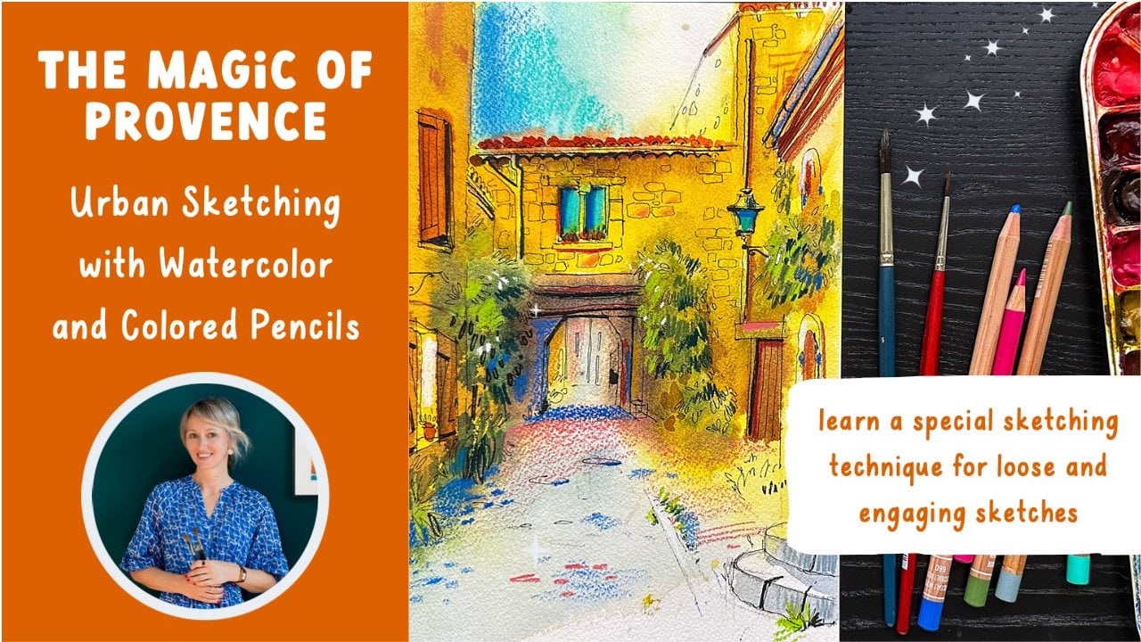
up for my newsletter. In this class, I will take you through a
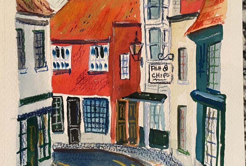
step-by-step process of drawing this lovely street with gouache and
colored pencils. First, recall the tools and
materials you will need. A few gouache colors, some colored pencils
to be lead pencil, and some paper,
nothing extraordinary. Then we will experiment
with mixing colors, with beautiful
color combinations and create and thumbnail
of your sketch. If you are not sure why
you need the thumbnail, this class is for you. After that, we will
create a pencil sketch. The perspective in
this sketch is a bit complicated as the street is
curved and goes down a bit, I will show you my technique
for creating a sense of perspective in such
a complex scene when the sketch is complete, we will paint it using
the colors we've mixed. Finally, when the gouache dries, we will add some more details
using colored pencils. This class might be a bit
complicated for beginners, but I have two more
classes I recommend for those who are just
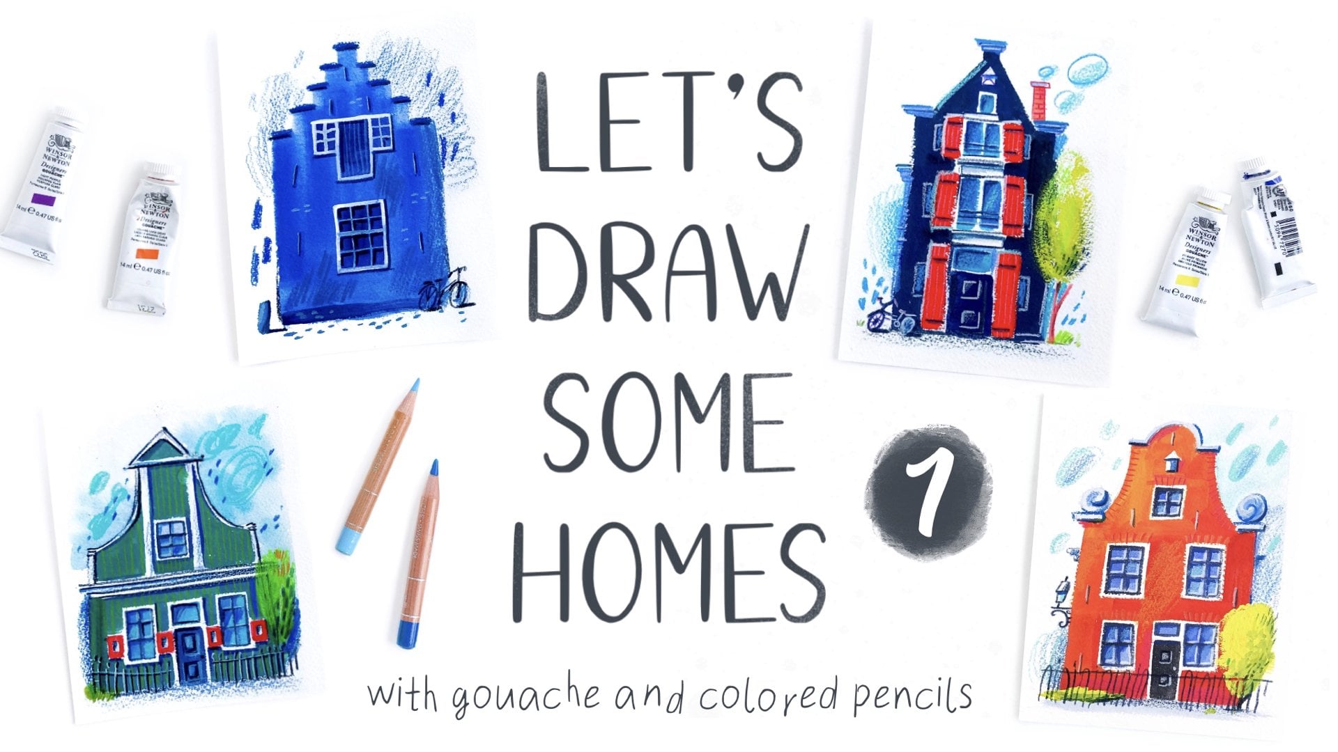
starting out with gouache. First, you can do
a class called, Let us draw some homes. For this class, you don't need any drawing experience or any experience with gouache
and colored pencils. This is a perfect
place to start. You will learn how to use
gouache, make brush strokes, mix different colors, and
apply colored pencils to create more engaging
and beautiful drawings. Another class you
can do is draw with me expressive sketching with
gouache and colored pencils, which focuses on the
gouache technique I use for most of my urban sketches to make them look impressive,
whimsical, and dynamic. Whatever class you choose, make sure you do not hurry, allow yourself to make mistakes, to try, fail, and try again, take your time and enjoy
the creative process. Please feel free to share your artwork in the
project gallery. I look forward to seeing
all your beautiful artwork. Are you ready? Let us get
started then. [MUSIC]
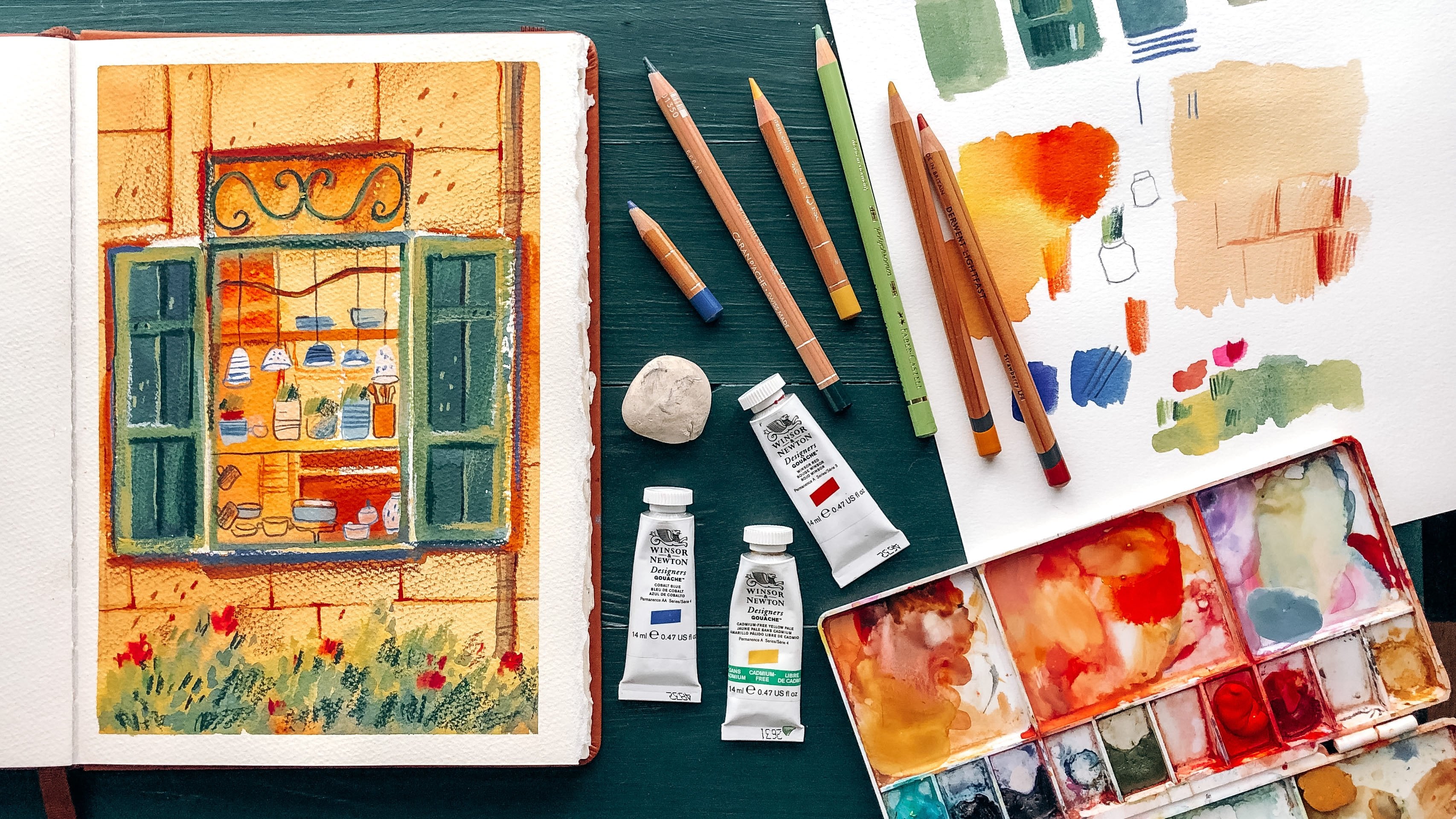
2. Tools & Materials: In this part, I will show you what materials I'm going
to use for this class, but feel free to use
something different, something that you have at
home and what you're used to. First, we will need a
sketchbook or a block of paper. I will use this Winsor
& Newton watercolor paper block for practicing
and making a thumbnail. It is a file format. For my actual sketch, I will use a larger
sheet of the same paper, a bit bigger than A4. It's cellulose cold press paper, which is great for
gouache sketches. You can use mixed
media, watercolor, or any other type of paper. Gouache is great on
pretty much any paper as long as it's not the thin. The thickness is essential
for avoiding buckling. The best paper for gouache
needs a thickness of at least 200 grams
per square meter. Second, we will
need some gouache. I will use Winsor &
Newton designers gouache. I prefer to put it on my palette because it's easier
for me to mix colors. Keeping gouache in this palette means it's always ready to use. Just make sure that
the paint dries a bit before it clumps in the palette and putting it in your bag. If it's too bad, your
gouache can make a mess just like the
one I've got here. I closed my palette too
soon and the colors ran. Fortunately, this mid yellow palette
is tight and leak-proof, so my bag didn't get damaged. Here are the colors I'm
going to use in this class, but feel free to
use your favorites. Next, we will need
three paint brushes. I recommend synthetic watercolor or acrylic brushes for gouache. There are slightly stiffer
than soft nature hair of watercolor brushes
that tend to be too flexible and
hold too much water. Also, synthetic brushes give you much more control
or less expensive, it work great, and are better for animal welfare
and the environment. My largest brush is an Escoda
ultimate travel brush, size 12 for large areas. The second, a smaller one for most paint work
is also travel brush. I draw a lot on location
so it's convenient. This is an Escoda Perla size 8. The last one is a Winsor
& Newton's Cotman series round brush size 3
for small areas and details. Next, we will need
a gold pencil for the thumbnail and the
preliminary sketch. I prefer a 2B pencil, which is quite soft
and easy to remove. Especially with this
soft kneaded eraser that doesn't damage paper
as some regular erasers do. Then we need a bunch of colored pencils of
different colors. I use a lot of different brands, but luminance series
from Caran d'Ache, derwent lightfast are
definitely my favorites. They are bright and soft and
work best on top of gouache. Here are the colors I'm
going to use for this class. But again, feel free to use the brands and
colors you like. What you need is some
different colors that match your gouache paints, but are not exactly the same. They should be lighter or
darker than the paints. Otherwise, we won't be able
to distinguish them from the gouache color and it will be difficult to create
beautiful textures. A few other things. We will need masking tape, a paper towel, a jar of water, and a spray bottle. This one is essential
if you keep your paints on the
palette as I do, to reactivate the color and make the gouache soft and easy
to use when it gets dry. That's it for materials.
Let's start drawing.
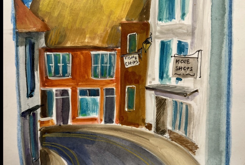
3. Don't Forget a Thumbnail!: If you have voiced a
nucleon latest classes, you know that I'm a
big fan of making thumbnails and I think you
should also be coloring one, whether you are a beginner
or more advanced artist, at Thumbnail we'll help you
prepare yourself for drawing. Loosen your hand, focus on
the subject you're going to draw and choose a
good composition and the best color combinations. Some students asked me
at a recent workshop, if I always make a
thumbnail myself, and the answer is, it depends, what I draw with an
urban sketching group, I skip the thumbnail. I'm not worried about the result because for me it's
time to relax, chat with other sketchers
and enjoy the process. I just sit down and
start to draw and chat. Sometimes we chat a
bit too much actually, and then I automatically use familiar color
combinations which I know always worked for me. In all the other situations, when I do care about the result, I make at least one thumbnail, and when it's a
commission or job or something else
really important, I make a few thumbnails. This is something that many beginning artist don't
know about professionals, we'll always do a
lot of preparation. It might look like we just sit down and create
a masterpiece, but it's not true. A good composition or a beautiful color combination is not a heavy coincidence, so if you want to make progress and clear about how your
sketch will turnout, don't skip this stage. Make a thumbnail. Let's start. First, I draw a frame that represents the format
of a drawing paper. In this class, we're not going to talk about composition, it's a big topic we will cover in one of
the later classes. For now, we'll just follow the composition
of the reference. Someone has already
done the composition of work cross in the thumbnail, as in the actual artwork, we'll always start by
drawing the larger shapes, trying to fit our scene
into the page space. But unlike drawing the
actual sketch we don't need to draw any details this
time only the largest, the most important ones. What is important here, the objects we need to
choose a color for. I look the reference
and ask myself, what color do I want to use
for the houses, the roofs, the road, the windows, the sky, hence zone. Then I grab some colors, that thing will
work for the scene. Just put them on the paper and look at how they look together. Also try to mix it. When I think that I have
great combinations, it happened very quickly now because I know these
colors very well, but when I want to
try something new, it might actually take some
time before I'm satisfied. If you're not happy
with the colors yet, pause the video and keep trying different colors
and combinations. When I have colors I like, I apply them to my
thumbnail very loosely, using quite a lot of water. Of course, you can skip
the previous step and experiment with the colors
right on the thumbnail. But if you're not that familiar with the colors
in the reference, there is a big chance
the colors won't work together and you will need
to draw another thumbnail. This might also
be good practice, but let's keep it quick
and easy for now. I also choose the best colors for the pencils at this stage. Make some practice drawings and draw details
at a larger size, if I think it might help
me draw the actual sketch. I think we have enough
information here. Our hands are loosened up and we're ready to
start doing our work.
4. STEP 1 | Make a Pencil Sketch: Looking in the picture, you can see the
perspective. You might be wondering if it is a one
or two-point perspective. But for this class, it's not important at all
so don't worry about it. The perspective here
is complicated. There is a curve in the street and the street goes
down a little. It doesn't make any sense to try and use the rules
of perspective. Still, we need a tool or a
technique to help us draw such a complicated scene and create a sense of
perspective in it. Otherwise, our
sketch will turn out messy and unclear. Here's a technique that will
work best for this sketch. We will compare every line, or at least the most
important lines to the lines that are parallel and perpendicular
to the edges of the paper. I promise it is much
easier than it sounds, but it requires all
your attention. Let me show you what I mean. I start here with the most
prominent perspective lines, the top of the one roof. I draw a horizontal guideline starting at the highest corner, look very carefully at
the line of the rooftop in my reference and ask myself, how does this line go
compared to the guideline? What is the annual
year or what is the shape of a triangle? If it's easier for
you to determine. Then, I tried to
reproduce it on paper, but with a little curve to make it look a bit more interesting, then we have this
perpendicular line, no perspective here,
so nothing special. Another perspective line, again, I compare it to the
horizontal guideline. The angle is now
a bit wider than the previous one
and just straight. Here is another
perpendicular line and a perspective line again, this one is almost parallel
to the horizon and here it's important
to pay attention to draw the line in
the right direction. A very common mistake
among beginning artists is that their line goes
up instead of down. In the reality, it's
not even possible. This is how it works. If you look down at the cube, which this part of the
building actually is, we will always see the top. Do we see the top here? I don't think so. Because
when we look up at the cube, we can never see the top of it so it will be
at an acute angle. Sometimes it's not easy
to see with your eye, which makes it so complicated. But just remember one thing. When a corner of a cube shape is higher than your eye level, it always forms an acute
angle on the visible sides. Always. Now, let's draw a vertical guideline. It works exactly the same way. I place it here in the
corner between two roofs. Look at the right
roof line first, determine the color and
reproduce it on my paper. Then look at the left
roof line and do the same. Determine
and reproduce. We continue drawing
the whole scene. I think the street band
is quite tricky here. Let's do it together too. Further, you can
do it on your own. I draw a horizontal and a
perpendicular guideline, analyze how the
curve of the road goes and put it on my paper. I sometimes exaggerate curves to make my sketches
look more dynamic, so I draw the line a bit
higher than the guideline. You can draw it as it
is in the reference so it will be easier for you
to understand how it works. Then pay extra attention
to the shape of the triangle created by the guidelines and
the road curve. It's much flatter than
mine and exaggerate later. Or just draw what I draw. The other line is pretty
much identical to the vertical guideline
so it's easy to draw. Now, we can go on and
finish the pencil sketch. I know it takes
quite some time to compare all the lines
to the guidelines. But don't be lazy and do it at least for the
most important, nice neat sketch,
is not a problem at all if some of the
lines are a bit off. But when nothing is gauges
in the right direction, it looks pretty wonky. When we've got all
the main lines, we can start drawing details. Windows, doors, chimneys, and all the other things we
want to show in our sketch. Now, we have a
pencil sketch down. Let's move to painting.
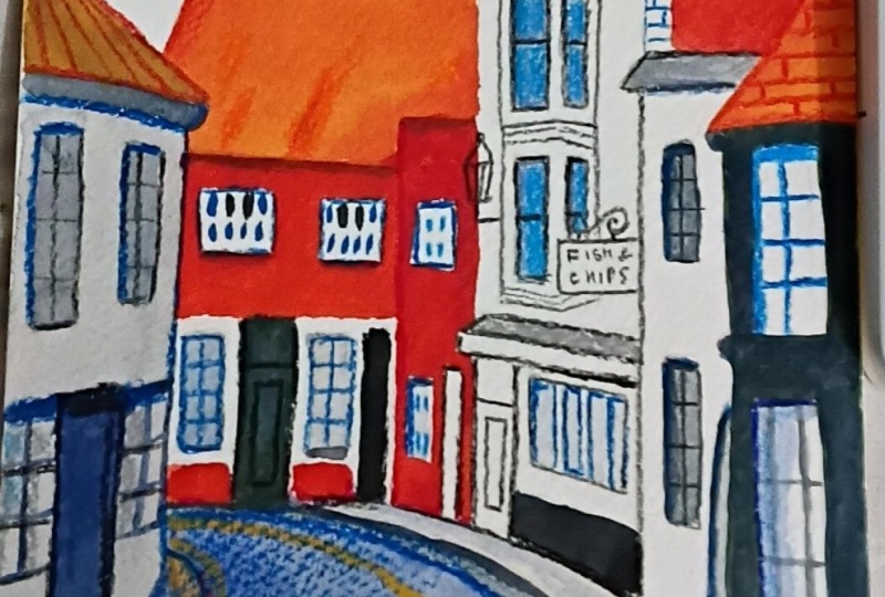
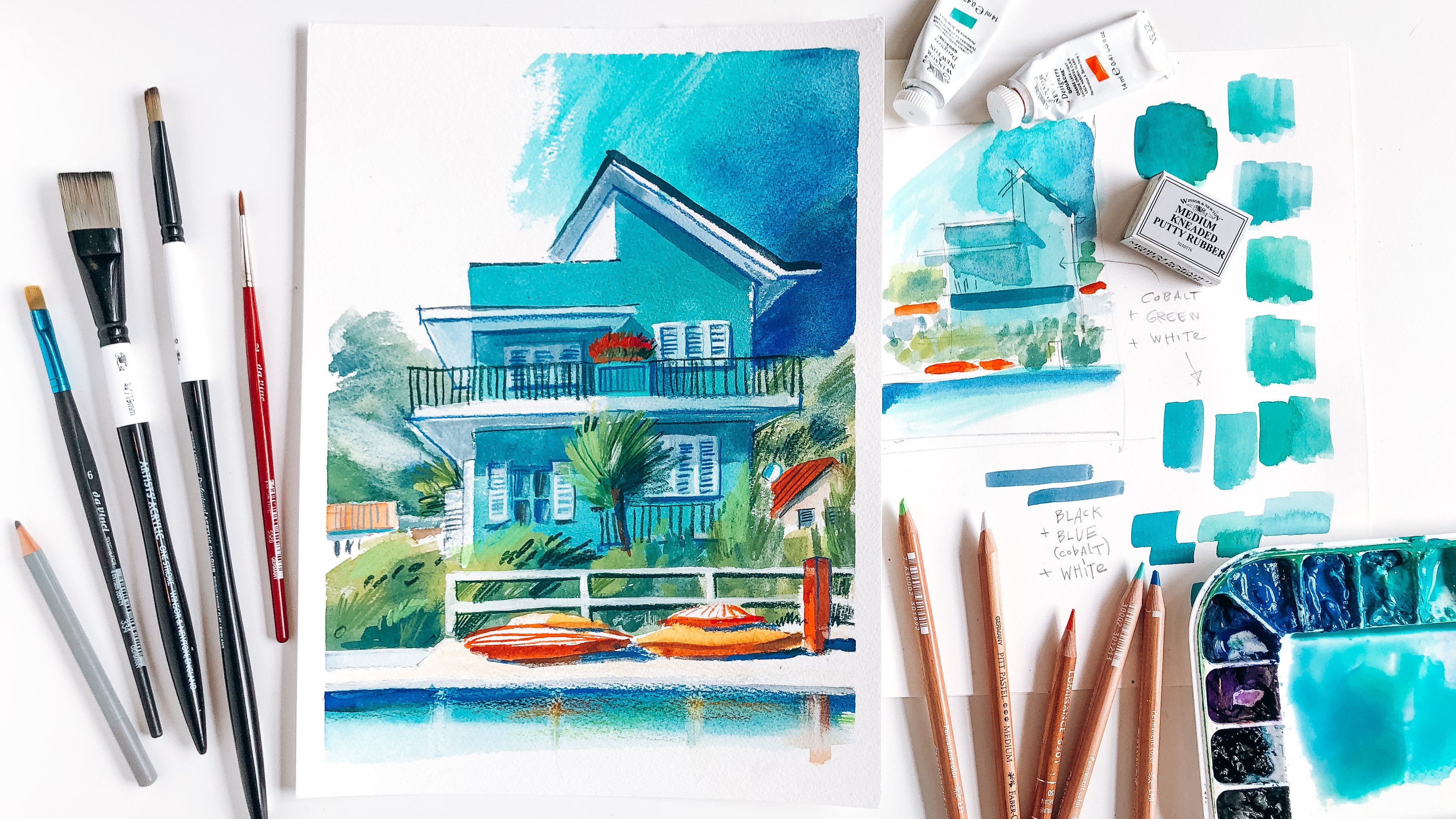
5. STEP 2 | Paint with Gouache (Part 1): First, let's get
our paints ready, moisten them if you have
them on the palette or squeeze some fresh
colors from the tubes. In this class, I don't
use any special mixes as I did in the class
with the turquoise house, but I still mix colors
with each other sometimes, just to make my picture a little bit more interesting with all this fantastic
color transitions and sometimes because I want to
create my own unique colors. I make my brush red, not only at the tip but
the whole hair part. Take some transparent orange, put it in the palette, add some burnt sienna, and start to paint. The paint flows very
easily because I use a lot of water and applied with the
watercolor technique. I explained in my
other gouache class, working with gouache
and colored pencils, let's draw some homes. Then I add a bit red
to create beautiful, subtle gradient on the roof. For the wall, I
use the same mix, but this time with window red as the main ingredient
and a drop of a bingol rose for the
more interesting color. Add more bingol rose for
the small house beside. Look, the colors flow so
beautifully into each other. Now, I rinse my brush thoroughly because I'm going
to use cool colors. I guess, I must create some clean space on the
third when you mix this. However, I have already
mixed the color for shadows when I
painted my thumbnail. Now I can use it again. It's a mixture of black, carbon blue, and zinc white. The front of this house
is on the shadow side, so I painted gray entirely. Then I add some burnt sienna to the same mixture and
paint the ground. The color is a bit too warm. Shadows are usually cold, so I need to add more blue, and even more black and blue for the middle
part of the road. The road will belied
closer to the foreground, so we create the sense of depth. I just grab a towel
paper and remove the paint here and then spread it a little
bit with the brush. The light part of the street is light in their appearance, so I add water to my mixture to make it more
transparent and light. If you prefer to paint
with thicker gouache, you can add white
instead of water. We'll take another
lighter color like Naples yellow or yellow ocher, if you have this
colors, of course. Now I take a smaller brush, it's also stiffer one, it holds more color and less water so that the
colors appear even brighter. Mix some burnt sienna
with a drop of Linden green and apply it to the
right side of the roof. Then make the
mixture darker with purple and apply
to the other side and to the shadowed
side of the sidewalk. Add some more purple
and black and draw a line to define the sidewalk on the other
side of the street. The paint gets slightly
lighter in some places, so it looks beautiful. Now I clean my brush
again and paint the roof of the right with the same mixture I used
for the other roof. Make it lighter on
the other side, but not too much. There are some dark doors
and windows in the picture. It's difficult to see what
the exact color it is, but I think dark green will
work very well for my sketch. I mix ultramarine
blue with yellow, more blue than yellow
because we need dark green and draw the frame of the window and the door besides. Add more ultramarine blue
for even more darkness. It became blue-gray
with a touch of green now and paint the frames
on the other side. The previous layer
is still a bit wet, so the paint runs out and we
get this beautiful clouds, darker fluffy and the lines on the drier part
look a bit torn. It makes our sketch
more playful, you can do it here and there, but not too much of course. The door in the distance has
pretty much the same color, but on the dry surface it
appears slightly darker. For the chimney, I use
the orange mixture, and make some green
to make it dark at the bottom because this is just what we see
in the picture. The roof in front of the
chimney has light gray color, so I mix cobalt blue with zinc white and paint the
shape of the roof, and then the red
wall underneath. I don't want all the doors to be the same color because
it looks boring. So I'll make a dark gray
mixture almost black and paint the doors and other dark details I
see in the picture.
6. STEP 2 | Paint with Gouache (Part 2): Make the shadow side
of the sidewalk any darker on both sides. I use the same mixture but diluted with water for
the windows on the right. The curtains are probably white, but they appear grayish because they get some shadow
from the window frame. Here it's difficult
to see which part of the window is glass and
which part is framed, so I painted all the ones with the same dark green mixture we used for the door and
the window frame. I deleted at the bottom because the stones
are light gray there. Then I paint the shadows with a lighter and
darker mixture. There is always a pretty
large shadow under the roof when it hangs
over the house like here. I had some burnt
sienna for painting the bottom of the roof and
the shadow on the left. I grab the dark gray again and paint another
shadow and the windows. I lay my brush flat to make
the color less intense. I paint the window here with
a diluted blue mixture. The windows are
not blue but if we use the same dirty gray, yellowish color we
see in the picture, our sketch will look boring. Blue is not the
most cheerful color but it's complimentary
to orange and together they make a lovely
impression on the eye. More shadows here,
very light ones. Once red mixture
you already have, goes for the chimney. I use my smallest brush
for the small details and thin lines here and there
with dark gray color. I change my water
very quickly and keep adding shadows with
my smallest brush. Notice that my shadow
colors are pretty dark, much darker than the light side, but also not black, which is a quite common
beginner's mistake. A mixture of Bengal rose and burnt sienna is perfect here. But I add some ultramarine
blue to make it dark under the roof and all the other
objects that stick out. The roof on the left, hangs quite far over the house, so the shadow will
be large here. I soften the hard edge here
with my largest brush, only wet it with water
without any pigment. For the sky, I'll rinse my brush thoroughly and
make the area wet. The wet area should be bigger
than I need for the color. Then I take my favorite
cobalt turquoise slide and roughly paint the sky. More water and less pigment on the left for the
beautiful transition. Then grab one of my blues
apply it to the paper. Then paint here much thicker. Yes, I know this guy
is not blue there, but it's so good to
make things brighter and more cheerful than
there are in reality. I try to paint carefully around the chimney and spread the color a bit more
on the right side. I don't really like
the boring green road, so I make a more bluish
mix of blue, black, and white, less black, and this time bluer. That's much better. Then like some more texture
here in the foreground, so I lay my brush flat and with a quick movement
from left to right, create this beautiful effect. The dry the brush gets, the more texture. The same for the sidewalk, but a little bit light on the right and
darker on the left. It adds some dynamic and
looseness to the sketch. Now I want to make the color
for the tiles on the ground and makes the orange on the pellet with my
green blue mixture. Try it on the draft paper and paint the line with
my smallest brush. The tiles will appear
bigger in the foreground. Now I add more ultramarine
and green mixture and paint the window frame here. Turquoise for the windows always makes the
sketch livelier. I paint with short strokes
and make them slightly different so that they
don't look like a fence. Yellow lines on the road is
an important detail here. Nothing special here. I just take my yellow and paint them with the same
curve as the sidewalk. That's some orange
here and there to make the lines a bit
more interesting. Now with our painting, however, don't put your gouache away too soon because we
might need it later.
7. STEP 3 | Add Details with Colored Pencils: As one of my favorite
urban sketching teachers once said, "This is the stage where you
must let your heart speak." We already have the most
important objects in the place but this scene doesn't look impressive without some details. Details bring it to life, draw the viewer's attention, and catch their eye. Play around with
colors and textures. Draw details that
capture your attention. Details that you find important enough to draw, tell your story. I take my light green color and start adding textures
to the orange roof. It looks like all the
houses in the picture have some green and
brown moss in the roofs. It's a very lovely,
authentic detail. I use different stronger
color for the brown parts. It's a bright and
beautiful color that makes my sketch look livelier. Add some orange. You can see that it doesn't
really make sense to use a color that is dissimilar
to the grayish color. Strawberry works
much better here. I vary the pressure and keep switching
between the colors. Add some darker
textures here and there with very short lines. I only suggest a mos
pattern on the roof. Don't try to
reproduce it exactly. I just want to
convey my impression of this scene fast and lively. Here, I add some shadows
to the chimney under the edge and on the
right side of the pipes. The shadow on the white building appears gray in the reference, but I think cobalt blue will make my sketch
more cheerful. I see some bricks here. It's an interesting detail I want to show a viewer. Now, I grab my gray and
draw the bay window. The light turquoise on the glass part makes
it look more vivid and corresponds with the turquoise in other windows and the sky. Some blue on the shadow side. Here I do actually the same thing but in
a different order. I start recoloring
the window glass and only then draw
the contour lines. I wanted to have more
than one technique so you can vary them
in your sketches. The sign boards are also quite an important
detail in this picture, I have already drawn one
of them in my thumbnail, so I look at my thumbnail and try to repeat it in
the actual sketch. Another blue shadow here. Then orange and maybe also brown
contour on the roof. Then the tiles here with blue. Here, I use colors
that are quite similar to the ones in the reference
but brighter and more vivid. Make shadows dark and colder and define the
contours of the roof, houses, and the details. The lamp on the row here
is an authentic detail, we need to draw to create an atmosphere of
an English street. We keep looking at the
reference carefully. Notice the most
important shadows. They are quite clear here and details and put them
in our picture. Vary the colors. Blue is always great for
shadows and all the colors you like or see in the picture
for details and textures. Add some tiles to the roof, bricks through the
walls, and so forth. Here are no rules. Only your attention,
imagination, and spontaneity. Our sketch is finished. As you can see, I added a lot of textures that don't
even exist in the reference and at
the same time ignored some details that I didn't
find important enough to draw. If you like details, you can keep adding some more, but don't get carried
away because the sketch overloaded with details
is not that engaging. We need to find the sweet spot, the perfect moment to stop.
8. Final Thoughts : That's it. Thank you guys so much for joining
me in this class. I hope you enjoyed
it as much as I did. I also hope I have inspired you to do more gouache painting. It's such a vibrant, flexible, and forgiving medium. When you have
completed the class, please leave a review to let me know what
you thought of it. I will really appreciate that. Also, I will be delighted to
see what you have created. Please share your artwork
in the project gallery and let me know if you want to
get more profound feedback. I'm always happy to help
you grow as an artist. Also, please take a
moment to check out other students' projects and write a few nice words
in the comment section. It is truly inspiring
and motivating to get encouragement from
a fellow artists. If you share your
artwork on Instagram, don't forget to use the
hashtag, Juliahenze_skillshare. I'll be happy to feature
you in my stories. Also, if you have any
questions, thoughts, or suggestions, please leave a comment in the discussion
section under the video. I would love to
hear your thoughts. Thanks again. Have fun and keep
practicing and making art. See you in many other
classes. Bye bye.
 Julia Henze, Artist | Teacher | Urban Sketching Lover