Transcripts
1. The Intro: Welcome. This is unlocking your creativity and
Adobe Illustrator. I'm Jeff. I'm a graphic designer based
in Brooklyn, New York. Working for over 20 years
specializing in logos, websites, presentations,
and animation. Inspiration has always
fueled my work and my clients have really come to appreciate the unique way
that I look at things. But we all get stuck. We all lose our originality. We all get distracted
and need help getting back on track towards
authenticity. For many artists, that
means pulling out the sketchbook and doing some drawing to
loosen things up. But it's hard to bring
all of that free thinking back into the computer when you're doing
your design work. In this class, we
will bridge that gap. Our goal is to connect that free world of
drawing with the power, precision, and possibility
of Adobe Illustrator. And by doing so, reactivate
your own creativity. How will we do this when the software's can be
so complicated? With endless distractions
and possibilities. Most classes tried to teach everything everywhere
all at once. But we will approach
Illustrator differently, focusing on just one
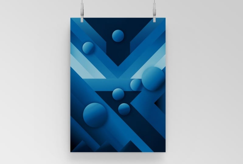
tool, the Pen tool. Your project will be to create a beautiful geometric poster with the pen tool traced from your own original pencil sketch. You'll learn how to
set up your workspace, eliminate distractions, create the perfect conditions
for spontaneous magic. I'll share my favorite tips
and techniques along the way. And you'll also get my PDF of secret shortcuts in a bunch
of additional resources. This class is designed
for artists at any level trying to find their
creative voice and the digital space. But suppose you're
just starting out in Illustrator or you
need a refresher. You will find this class
particularly useful as it takes a unique approach
and fills in many gaps. Other courses don't cover. This process of
creative discovery has been so exciting and
productive for me. I can't wait to share with you. So let's get started.
2. The Project: Hi. The project for this
course is to transform a geometric pencil sketch into a beautiful poster in
Adobe Illustrator. Let's jump in. As a designer, I loved this
process because it connects my drawing world to
my digital work, really opening up my
brain creatively. And there's always an element
of surprise at the end. But you might be asking,
why use Adobe Illustrator, this complicated program
to unlock creativity? Many of us just freeze
up with all the effects and filters and
endless possibilities. Here's why I designed
the project this way. Working with simple
flat vector shapes is the perfect entry
point for beginning artists or artists who
are feeling stuck, or artists that need
help with the pen tool. The pencil sketch
connects you with your unconscious emotions at in gravitas and originality
to your concept. The grid lines give you some
parameters to work in so you don't sink under the weight
of endless possibilities. It's a relief as a graphic
designer to not have to plan everything out by just
creating the proper setup. Magic happens. Besides posters. What else can I use
these designs for? I've ended up using
these geometric designs and my work on event
marketing campaigns, abstract backgrounds
and presentations, as well as annual reports. Here's what you'll
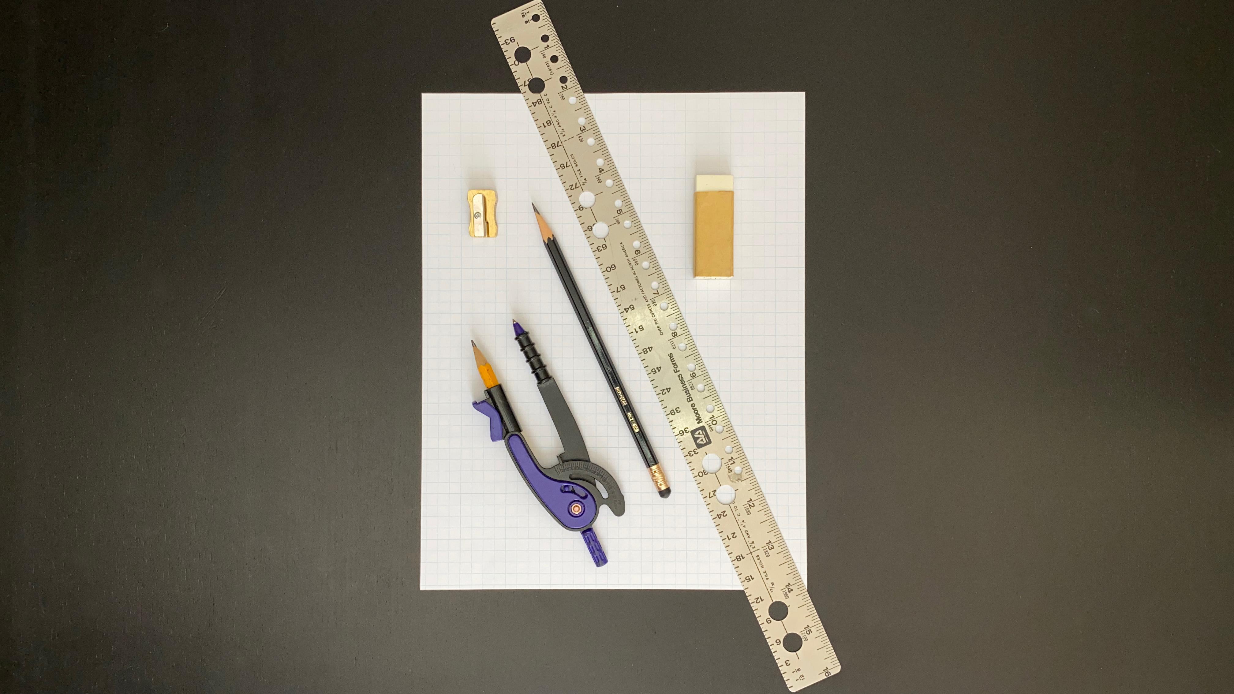
need to get started. A pad of graph paper, 8.5 by 114 squares per inch, or download the template
in the project resources. A pencil, an eraser, a simple compass to draw
circles with, a ruler. And finally, a pencil sharpener. That's it. You have
everything you need. This process has been so
rewarding for me personally. I can't wait to share with you. So don't forget to
put your sketches in the project gallery so I can
get you direct feedback. And let's get started. Grab your grid
paper and let's go.
3. The Template: Okay, let's make our
template on our grid paper. Here's what's going to happen. We're going to
make a grid that's essentially three by
four. In our case. You don't have to
follow this exactly. But I would like you to use a six inch wide by
eight inch high box. If you want to use a
different dimension, you could stick to a
three to four ratio. Our target goal is 18 by 24. Here's a graphic that shows
the process and four steps. First, the graph paper, then a six by eight
frame using dots. Then we'll put dots everywhere
the axes intersect. Finally, we're going to outline our frame and add numbers if we want. It's
not that important. So let's go ahead and do
that together step-by-step. We're going to start our
box right about there. Stay on the bold lines and
then make six columns. 345612345678. Same thing on the bottom. Something comforting
about how easy this is given a lot of the things that we deal with as artists,
a lot of challenges. So hold off on making
the other dots, right, right now we're
going to do some counting. Finally, we're going to
actually not finally, we're going to make our points
where the axes intersect. If you're making a grid
without the graph paper, this, you can see how
you would do this. We need to create
six inches wide by eight inches grass and
then create a grid where you at least have the major boxes where the inch lines intersect. We don't need hundreds of
little boxes on our page. If you're making
your own template, then you can simply make
a six by eight inch page. Then finally, do not connect
the lines within the grid, but we're going to
connect the lines along the edges to
make a little frame. It doesn't matter
if you go outside. This is loose. And as a sneak peek, I will let you know
that in the end. We're going to use a system
in Illustrator that will keep our lines exactly on the grid. So we don't have to make our
drawing exactly on the grid. We can keep it a
little bit loose. It's not going to be a precise
correlation between our drawing and the final
illustration in Illustrator. But the illustration will
be precise in Illustrator. So right now we can keep
it a little bit loose. We just want to be able
to give our eye and easy path to whatever part of
the grid we're working on. So that is our template. We have 123456 inches across
by 12345678 inches high. Okay. Let's pause there. And once you have
that all set up, we'll get started
on our drawing.
4. The Sketch: Now we are going
to open our minds and allow whatever
comes to your vision. You could even blur your eyes. You can close your eyes
right now what we're trying to access is your inner eye. You're, I'm not judging myself. I'm not overthinking this. I really just want to divide up the
space into something that feels right for you. So right away for me, I'm just for some reason
seeing some steps. So I'm just going to follow this line here and I'm going
to use my ruler for this. I'm just going to keep
it and you don't have to have your page pencil that taped down like this if it's easier to
hold it at an angle. No problem. Alright, so I'm just
going to stop there. That's just something I saw. Now, why did we have the compass and why do I have such a
chunky little accompanies? It doesn't matter.
You don't have to have a very precise campus. We just want to be able to
make circles on the fly. We're going to try to
divide up the space in a way that just
feels right for you. It's put on some music. Let the moment come over you and try to block out
everything else you can. We don't wanna get too detailed. If you're a fancy Illustrator, try to resist the
urge of adding in a lot of shades or
textures or anything. This is, this is geometry. We want to keep it as bold, as big as possible. So that's the rule of thumb. I don't like to go beyond
nothing should be much smaller than an inch by an
inch is a good rule of thumb. So if I'm gonna make
a box anywhere, I'll make a box that big
and not too much smaller. And that's it. We've divided up our
space. Let's take a break. Get your sketch to the stage, and it'll take it from there.
5. The Lines: Okay, Now that you've
had a little pause, the final step
before we take this to the scanner or
take a picture with our phones is to just maybe go over maybe the basic
lines that seem important to you
don't lose sight of the points too
much because we're going to have to connect them and put points on
them in Illustrator. But I wanted to just
give a little definition to the overall
layout you've made. So nothing is too vague. Resolve any kind of
questions you've had. With wedge-shaped hatches. What we don't have
to decide what shape gets combined
with what so much yet, because we have that complete
freedom in Illustrator. But I don't want too many of these lines to have
to move later. We really want to know where
they're going to land. So as you can see, and
this is a very sad, I mean, if you'd like to
work with your pencil, this is extremely
satisfied because this is loose tracing. It gives us a little
bit of a break from all the precision involved
in most graphic design work. So bound to the specs and there's always too much
text and not enough room. And you're just constantly trying to make room
for everything. Well, right now, our world
we answered to know in here. Just me a little bit right
now as I'm your guide. But I'm so appreciative
that you've put your trust in me that you're not making shapes smaller than one inch and that
you are having fun. And that you are letting
your own personality come out and sort
of an abstract way. What should be aware of why you don't have to
explain it to anyone. That's just because
you put it there. That's why this
is basically what I want and I'm going to bring
this over to the scanner. We're going to scan it in. We're going to import it
into Adobe Illustrator, put it on an art board, align it up with a grid. See this, the blue grid that you can barely see on the video. We're actually going to
create a duplicate of that in Adobe Illustrator and then line them up so that
there's an eight, a kind of comparison. That when we trace our grid, we're going to use
a feature called Snap to Grid and
Adobe Illustrator, we're going to drop dots onto our digital
space and they're just going to fall exactly
onto these points. And that's the
beauty of going from loose sketch on a grid page, too precise, vector illustration
in Adobe Illustrator. So I'm going to
peel out this tape and then we're going
to take it over to the scanner. See you there.
6. The Scan: Welcome back. Now we're going to bring
our sketch over to our scanner and make a
nice scan of our drawing. Don't worry, if you
don't have a scanner, I'm going to cover how to use your phone later in the lesson. Now let's get back to scanning. This is a sketch I
made the other day, but you'll be making a
lot of these, I hope. So. You're putting your letter sized graph paper at the spot on the scanner
that it says 00. You want this scan to really line up because
it's so easy to do it and having it lined
up in the scan will make the next step in
Illustrator that much easier. When you open up your
scanner software. There's a few things I'd
like you to keep in mind. First of all, let's keep
it black and white, although no harm done
if you do color. But more importantly, let's
keep the resolution to 150. We're not going to be
printing out the scan, so don't feel like
you have to scan. And then at a very
high resolution, As a general rule, I would keep about
three squares around the outside of the artwork in terms of your scanning area. Although it's not highlighted, I have chosen tiff
as my file format, PDF and JPEG would also be fine. So when you've chosen
a 150 as your DPI, and you've selected
an area that's about three squares
around the outside of your artwork for
your scannable area. And you've chosen tiff or PDF or JPEG as your file format. You've set the
destination that you want the scanning software
to send the file to, will finally be ready to
click the Scan button. And for those of you
that are going to be using your phone
and not a scanner. The most important thing
is to find a flat, well-lit area holding your
phone parallel to your sketch, as you can see in the diagram. Next, we're going to bring the image you just created into Adobe Illustrator
and align it up with the grid system as you can
see in this sneak peak. So we'll see you in
the next lesson. Great job.
7. The Import: Now we're ready to import our beautiful drawing into Adobe Illustrator
in this lesson. And we're going to
create our 18 by 24 inch Adobe Illustrator file
with an eighth inch bleed. Then we're going to
set up a one-inch grid in Adobe Illustrator. Import your scan, make it semi-transparent so we can see through and align
it up to the grid. Then we'll lock your
scan layer once everything's all lined up
and turn on Smart Guides, after which will be
all ready for tracing. Let's get started. Now let's set up your document in
Illustrator together. First we'll go to the
File menu and choose New. Then you're going to have a
width and height of 18 by 24. Your bleed is going to be
0.125 all the way around. Finally, your color mode will be RGB and your raster
effects will be 300. Then you can click Create. The first thing we'll
do is set up your grid. So hit Command or Control
K for preferences. On the left-hand side, you'll see in the
list Guides and Grid. The most important thing is
that you want a grid line every one inch and a
subdivision of one. Turn on your grid by going
under the View menu, choosing show grid or
Command, single quote, because we set up our grid to be every one inch and our
document is 18 by 24. Everything should
line up nicely. Now let's get your
workspace setup. I won't go over every detail of all the tools and pallets
that I have opened. But as you can see, I have a specific configuration that
I've become adjusted to. And most importantly is to have only those tools that
you need visible. And so for me it's having these particular
tools on the left with the Layers palette and the properties pallet as
the only visible palettes. Everything else nested in these
little tiny nested menus. And for those I group
them together like transform a line and
Pathfinder go together. Whereas I also have
color, swatches, stroke and appearance together
with transparency as well. And then character
glyph and paragraph, followed by Library's
links and art boards. So that's basically my setup. Once you have your
workspace setup the way it's comfortable for you and
eliminate all distractions. We're going to get your
sketch into this document. The first thing
is to label layer one in your layers
palette as scan. Then we're going to
make a new layer and call that one artwork by
double-clicking on it, we can change the name. I'll just call it art. And I'm going to
hide the art layer and make sure I'm
clicked into scan layer. Now we're going to
import our scan by going to the File menu
and choosing place. We'll navigate to
our class files, choose our scan uncheck template because we don't want it
to be semi-transparent. And just click anywhere
in your document. I don't care how it's
placed at the moment. Then we're going to zoom
out by hitting Command 0, hold down the spacebar
and you can drag yourself into a nice
comfortable viewing position. Finally, before we start
moving things around, let's change the
transparency of your scan to 50% using the item tool, we're going to move our scan
to the top left corner, holding down the Shift key, we're going to drag on
the bottom right corner until we see that the
frame of our drawing is lining up with the outside edges of our
Illustrator artboard. We can zoom in by using
the zoom tool and make sure that our zeros 0 mark is at the same spot as the
00 in Illustrator. Now, it does not
have to be exact. I'm going to turn off guides
so I don't see my bleed. I don't need to see the red
line of bleed right now, so we're going to
hide the guides, but we do want the grid to show. So that looks great there. So another way to
do this is to use the scale tool as long as
your sketch is selected. Now we're going to click once to set the origin
of our expansion. Zoom out a little bit, holding down the Shift key. We're going to drag
our sketch to the, down into the right
holding down Shift. It's going to expand
from the point that we created and we will stop dragging when the frame
of our drawing matches with the outside edges
of our art board. Now that our scan is lined
up with our art board, I'm going to turn the
transparency backup to 100 and I'm going to
lock my scan layer. The last step we need
to do before we start tracing is to make sure
it's smart guides are on. So we'll go to the View menu and choose Command U
for smart guides. And that's it. We are now ready to start tracing the lines
on the art layer, which will now make visible. And I'll see you in
the next lesson.
8. The Trace: In this lesson,
we're going to trace our beautiful sketch using the pen tool in
Adobe Illustrator. The main theme of this
lesson is snap to grid. Yes, we'll be using the pen
tool and the rectangle tool. Everything really happens in this lesson because
of snap to grid, we are going to be
able to draw without worrying too much
about precision, by allowing Adobe
Illustrator to make our artwork jump to
these precise points. Even if we don't drop it exactly there on the page, I'll
show you what I mean. If I turn on snap to grid
right now, Let's turn it off. And I'll just draw a rectangle. It does not adhere to the grid. It just sits there on the
page wherever I drew it. And now we'll turn
on Snap to Grid. I'll draw the same rectangle. Except this time it wants to
land along the grid lines. One more time. This time around my
frame of my art work. So that's the goal right now. We would like to draw a border that goes around the
frame of your sketch. And the stroke should be 15 points and the color
should be RGB blue. Once you've done that,
we're going to lock it. We're going to go to the
Object layer and choose Lock Selection or
Command Control two. So now we have a frame that has a stroke on the art layer, but it's locked, so we
won't be able to select it. Great. The next step is the pen tool. So we're going to hit
P for the Pen tool. And again, we're making sure
that snap to grid is on. I'm going to start my tracing
with the vertical lines. So to do this, I'm going to start with this
particular point. And for the first
I'll zoom in just to accentuate how important
the snap to grid is. If I start drawing
in any place here, the point will
automatically jump to one of the grid points. That's what I'm talking about. So I'd like to start
on that point, using the space bar
to pull myself around temporarily and then letting
go back to the pen tool. And I'm going to click a
second time outside my frame to complete that path holding down the
Command or Control key, I'm going to de-select
by holding down Command or Control
and clicking on the art board to de-select. Once again, clicking
once to start my path. Again to end it. Then
deselecting by holding down Command or Control
and clicking off of my shape than Spacebar. It'll be nice to
connect these lines, but right now we're
just going to do vertical lines holding
down spacebar, going to zoom out. That is Shift Command
option to zoom out. And then we will click once here all the way
down to that point. Great. I'm going to extend the
line beyond the frame. And then de-select. Every time I make a line, I de-select Command Z to undo. My left hand is always
resting on the keyboard, so I can quickly access the
Command and Option keys or Control and Alt keys on a PC. So I think I've done all
of my vertical lines. Let's do the horizontal ones. Same rule. We want to start
outside of our frame. Now, you could see on that one, it wants to connect with
the shape I've already made by that tiny little o that pops up when
you connect shapes. That's fine. We don't need to
connect shapes in this stage, but we can, It's actually really
forgiving in the end whether or not our shapes
are connected or not, this process will work
either way, which is nice. Now I'm gonna go ahead and
do all my horizontal lines. Alright, let's take a pause. Very good. So now I've traced all my horizontal
and vertical lines. And importantly, the lines are going outside the
frame when they touch. So for the angled lines, I'm going to click once
on one end of the line. And then holding down shift
Illustrator is going to help me make a perfectly
45-degree angle. And then a second click to complete the line holding
down shift is key. So I'm going to hold
down command or control to de-select clicking
off of my shape. Very important. Then again here, all the way outside the line
holding down Shift. Brilliant. Now we have traced all of our horizontal
or vertical and angles. And now we're finally going
to wrap up with the circles, which are actually really easy. We'll use our ellipse tool. Holding down the
Shift and the Option. Or for those of you
on PC, Shift and Alt, we're going to click
in the middle of our desired shape and drag from the middle to the
outside with Snap to Grid on. These will be a piece of cake. Once again, holding
from the middle, drawing outside and
making my circle. Now, these lines are if
we hide our art layer, obviously that is not
the exact design, but we're not going to start
eliminating things yet. So even if we have too
many lines right now, we can get rid of them later. This is where we want
our drawing to be. Here's a little sneaky trick. If you Command or Control Y, you will show the outline view. And we're going to zoom in. This is not how your
artwork will ever print, but this will show you your lines in a more
precise and clean way. And if you want to give
a quick check to make sure that things are lined up, it's frequent that you
would see one stray point, maybe that's not behaving, but snap to grid should
keep us on our grid in a really precise way without us having to
worry too much about it. And that's one of the
goals of this process, is to eliminate the need for us to be Command or Control Y. Eliminate the need for us to worry with every click about whether or not
we're being precise. Let the computer do that. So this is great. We're going to stop right here. The final step is we're
going to unlock all. So we can unlock that frame
that we had made originally. And then you can
just zoom out and appreciate the work
that you've done. This is where we want
our project to be. All outlined with a 15
stroke in RGB blue, with all of the lines
that touch or a but the frame to go
outside of the frame. Once you have your art layer in this shape with the unlocked
frame and all the lines. At 15 stroke, we're
going to select all or drag your cursor across the screen so you
select all of those points. Then we're going to use, in the Pathfinder tool, we're going to use
something called divide. Once you've done that, we're
going to change the fill to blue and the stroke to none by hitting this little
arrow swap and fill stroke, or you can hit Shift X. So now we have, all
of our shapes have a stroke of none
and a fill of blue. And now we're just
going to hide, go into our Layers palette
and hide the scan. Then de-select. Hey, you've done some great work of getting to this stage. I am sorry that you're staring
at a boring blue shape, but trust me, in
the next lesson, we're going to turn it
into something beautiful. See you there.
9. The Shapes: All right, welcome back. Now we're going to make
a beautiful poster out of this really
boring blue shape. First, I'd like you to
turn on Smart Guides. So go to the View menu or Command or Control U and
turn on Smart Guides. Once those are on and you have
the Direct Selection Tool, select it and holding down a, you should be able to, if you're in the art layer, hover over your shapes
in your design and see the various components without actually
clicking on them. And that's what we want.
So smart guides, great. Once that's set up, I'd like you to go over to your swatches palette and
drag that so it's visible. Very good. So now we've got our
swatches visible, we've got our smart guides on, and we've got our Direct
Selection Tool selected. So what we're gonna
do now is click on the first shape and
choose this red color. Click on the next shape, doesn't matter which
one on your design, and click on the next red. And the orange. Moving through the color
spectrum across my design. Not spending too much
thought on any one. But staying in a kind
of continuous groove. I'd like you to experiment with the rainbow palette
with your own design. Have some fun. I'll come
back in the next lesson and put together a
custom color palette for your final poster. You've done some amazing work. Now, let's take this rainbow
palette and turn it into our own color custom palette
for our final poster, I'll see you in the next lesson.
10. The Palette: Okay, again, you've
done some great work. Now. You have your poster
in Adobe Illustrator. It's all traced. It
has colors in it. You've had some fun with
the rainbow palette. Now I'm going to help you find a color palette that feels
right for your design. To do that, we're
going to want to have our libraries palette open. So I'm going to click over
here on the right-hand side, open up my libraries and drag it into the
middle of the screen. For now, I'm gonna go open up my Skillshare library,
which is empty. So in your library, I'd like you to create a
new library by going up to the top menu and choose Create New Library
and give it a name. I've chosen Yaz
Skillshare as my name. So for right now I'm
going to drag it into the swatches group here. And so I've got my
library's open, but it has no assets inside. Libraries are used
to share things between Adobe programs or
even things from the web. And today, we're going
to create a palette on a website called Adobe Color, and then share the
palette that we create on the website through
Adobe libraries. So we have access to that palette while we're
working in Illustrator. It's real quick, it's real fun. Let's get started. So we've got our library's open. We're gonna go to the website color.adobe.com,
forward slash explorer. If you have an account, I'd like you to log in to your Adobe Creative
Cloud account. I can see the tiny
little word Yaz up here that tells me
that I'm logged in. Right now we're on Adobe Color. We're looking at
the Explore page and we're going to
just kind of scroll through and see some palettes that other users have created. C of anything strikes you
right away. For some reason. This one at the bottom
jumped out at me. So when I see
something that I like, I'm going to add
it to my library. I'm not going to
download it yet. I can do that, especially
if I don't have an account. But let's add it to my library. I'm going to add
one more palette to my library just in
case something darker. And this summer I've
been interested in like purples and reds. So let's try something with
purple, red. Excellent.
11. Poster #1: Now that I'm back
in Illustrator, you can see that my new
palettes are already in the Skillshare library. For this, I'm going
to move my libraries so they can be seen
next to the swatches. Now I'm going to
right-click on one of these palettes to add
the theme to swatches. I'm actually going to
do this to all of them. I'm going to right-click
on the second one and add the theme to swatches. Right-click on the second
and the third one. And then I'll right-click
on the third one. And the fourth,
you can see I have these four beautiful palettes that I sourced from
a color.adobe.com. If you do need to download
them for any reason, you could download as a JPEG and then use the
eyedropper tool. There are other
ways to get these. If you are having
trouble sharing the pallets through the library, then I suggest downloading
the palate as a JPEG, opening it in Photoshop, and then using the eye holding
down I on the keyboard, you can then sample each color and determine
what the real colors are. I'm not gonna get
too deep into that. But for those of you that
know a bit about Photoshop, That should not be a problem. And also it provides the
hexadecimal numbers as well. So there are several ways to get these into
Adobe Illustrator, but in this course we're
discussing the way to import the swatches through Adobe Creative Cloud
into your libraries. So I'm going to start
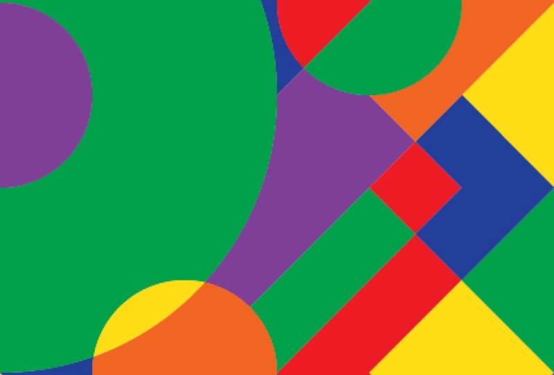
with tangerine. Actually, I'll start with
colorful background. And we're simply going to use the direct selection
tool like we did last time and color our artwork
with our new palette. I'm going to get
rid of everything. Holding down Shift, selecting all of the swatches
and deleting them. Now we have only our new
swatches and the color palette. It might be a good
idea just to get rid of the old color altogether. So I'll select all
the shapes and make them one of my new pallet. And then go back through
and maybe do my purples. We're looking for variation. A nice even distribution of
the shapes with each color. We'll switch over to pink. Letting my mind
just kinda wander. We don't want any of the pink shapes to touch
each other at this point. So it's a bit of a puzzle. Command Z, Control Z to undo. Switching over to the peach and holding down the Tab key, I'm going to hide
all of my palettes. Zoom in a little bit and appreciate this fun new
design we just made. Holding the Alt Tab
to bring it back. I noticed I forgot a few did, didn't distinguish all of these shapes and the way that
I wanted to, There we go. Now we've created
a beautiful poster using our new color palette
called colorful background.
12. Poster #2: So let's jump over to the
Layers palette and drag the art layer to
the plus symbol. So we duplicate the
layer, hide art. Call this art too new layer. And we're going to,
let's consolidate here. Let's click on this
little tiny button to bring our libraries back to a small size and
maybe drive them over. We don't need the
library at this moment. So holding down the space
bar to center things, Let's select all making sure that the first art
layer is not visible. And let's color all of the artwork
with the new color from one of our other palettes, namely this bottom one
will try tangerine. I'll try that particular orange just to color them
all one color. And then I'll start my work with the direct selection tool Of I like to call
it color blocking. I'm not sure it really is
called what color blocking is. This is where color
and feeling intersect. Because we've already
drawn all of our shapes. So we don't have to worry
about form too much. And so we're choosing colors, following RI, following
how we're feeling. The criteria is up to you. One of my rules is I
tried to avoid having the same color in shapes
that are next to each other. So I'm trying to find
a little contrast, but not too much. And I'm not afraid to
sometimes combined shapes to reduce the
overall complexity. Sometimes that
meant blur my eyes are just looking at
it through one eye to see how the colors are
really landing on the page.
13. Poster #3: Okay, once you've
done that poster, we can do the same thing. Drag the art e to
the plus symbol, hide art to call this
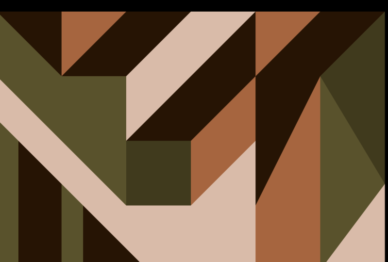
new one art three. Select all. Choose one of the colors from
your other palettes. Use the direct selection tool. To do your color work. I like to go color by color, creating an even distribution across the page of each color. And then coming
back and working at it. Once I've done that. Fantastic, I really
like how using these pre-made swatches takes
the pressure off of you. We don't have to do all
of the creative work. We can let our minds focused on our design and different
possible ways that we can display our work using these beautiful palettes
that others have created. Now of course, you
can tweak these colors and make them your own. But I find this is a great way to settle on
something after you've done all the hard work
of designing and drawing and importing and
setting it all up and tracing. It's nice to be able to
browse and a little, a little candy
store of colors and download something that
just speaks to you instantly and then
start playing. This course is all about
creativity and inspiration. I don't want you to always
have to be creating a beautiful new color palette every time you want
to be creative. So this is a way
that it's almost like having a little box of
crayons at your disposal, but you get to choose the
five colors in each box. So I'm going to stop here. I've got my first poster
holding down tab to hide. Poster number one.
Poster number two. And poster number three. Hey, I didn't tell you
we're doing three posters. Now. Please post your
beautiful new posters and the project areas so I can see you've done incredible work. All we have to do is one
final step will learn how to prepare this poster
for final printing. I'll see you in the next lesson.
14. The Cleanup: And I would like to
call out one thing, if shapes seem to have these little ghosted
lines between, It's not going to print, but there is a really nice
tip to get rid of those. So that happens when the
same colors next to one, next to each other,
you might see a little ghosted white lines. So I'm going to close this, go back to Adobe Illustrator and use something called
the Shape Builder tool. So we click on the
Shape Builder tool and then with the
direct selection tool, click just the shapes
that we want to combine. Then with the, with the
shape builder tool, we're going to drag a line
through those three shapes. Going back to the Adobe
Acrobat for reference. I'm just going to look over my Acrobat file once more to see if there are
any other problems. This shape probably
could be combined. So I'll use the direct
selection tool. Click on one, hold down, shift, click on the other one, and use the Shape
Builder Tool to draw a line between the two
of them to combine them. Great. So now I'm going to
make sure that my file is closed in Acrobat. And then repeat the steps, Save As this time, I'm going to save
this PDF where it belongs in the PDF folder. And I'm going to click on
top of the existing file. I'm going to override it. Yes, I want to replace it. I don't need to have those
same settings as before. And now we can open
our PDF in Acrobat, holding down Command 0. And we can see those
ghosted lines are gone.
15. The Digital Export: So please go to File and
Export, Export for Screens. We're going to have R1
art board selected. Choose where you want
it to go under Export to choose the file type because this is a
flat vector file, a PNG is just fine.
You don't need a JPEG. It'll stay quite small. And the scale, you can make it change it however
you need it to be. Let's just keep it at one
because it's quite large. And I'm going to make
sure that it's going to my class files. I'm going to create a
new folder called PNG. Choose that and
export the art board. It takes me to the
file on my desktop. And this is what I
would like you to share in the class projects.
16. The Print Export: Alright, this is
our final lesson. We are going to prepare
this file for printing. All we have to do is basically give it a little bleed,
which means drag. It's not as bad as it sounds. Which means that we're going to basically stretch
our artwork. So it goes across the
edge of the canvas. It goes beyond the
edge of the canvas. And then I'll just talk about file types and how
to save it out. So right away, I want to hide all the other layers
that you don't want. Just be on your art 3D layer. And we're going to show guides. And that will allow us to see this red line that goes around the outside
of our document. If you don't see the red line, I'd like you to hit
Command or Control and Option or Alt on a
Mac Command Option P. And it's going to show
you your documents setup. And I'd like there to be
0.125 all the way around. So we need a 0.125 bleed. That means there's going to be an eighth of an inch
around the outside of our document that our
artwork extends into. I'm going to zoom in. I'm going to hit Command or
Control a four select all. And then we're going
to drag our artwork using the direct selection tool. Now, using the
Transform palette, I'm going to enter
minus 0.125 for x. I'm going to enter
minus 0.125 for y. For the width with proportions, the constraint and
width Proportions. Unchecked, this should
not be checked. I would like the width to be 18.25 and the height
to be 2.2540. Very good. And hit Return to
get out of the box. And then de-select
by clicking off of your shape Command or
Control Zero to center. And let's hide your Transform palette now
we don't need that, that back over here. So if we were to zoom in on
the bottom right corner, we would see that
artwork, sure enough, goes beyond the edge
of the art board. And that's what we want. Because in printing,
if this is going to go to the edge of the piece of paper that it's printed on, the printer needs to print beyond the trim
line or else they would frequently be white
borders around our artwork. So we stretch our artwork
beyond the trim line. And that's called bleed. So now we've got
our Bleed setup. I'm going to save, go up
to the File menu and save. And the last step is to export, to send to a printer. Now, luckily, because we created this using vector graphics, this is not going
to be a big file, even though by dimensions
it actually is 18 by 24. However, vector files
do not get large. Now before we export
for printing, I will tell you that if you
want to simply save this for the Internet or
for social media, we're going to want to
go to Save for Web, Export As, or
export for screens. Those are all ways to export these files for the
digital universe. But right now we're
talking about print. So we don't want to be
using the export because all of these will
be exporting at a less than ideal resolution
where we want to be is Save As we've saved our EPS
that way we want it. And now we're going
to save this as a PDF because we would rather
send a PDF to a printer, not an EPS file. So we change the
setting under format from EPS to PDF and click Save. The only thing that we
have to change from the default Illustrator
settings is bleed. So we want to make sure
that bleeds is checked. Use document bleed settings. Then the only last thing
is to click trim marks. And then we'll save the PDF. Now when we go to the folder where we've kept
our class files, I can see that there's
a PDF in my EPS folder. I'd rather make a
new folder called PDF and drag the PDF into that. Let's open up that folder. Open up the mosaic PDF that we just made by double-clicking. And we can see in Acrobat
that are beautiful poster has these crop marks and we have this white
border which will not print.
17. The Conclusion: So now we have a PDF for
print which is seven megs. Then with crop marks and bleed. And we have our digital
file for sharing on social and with Jeff, that's me. I'm so honored you went
on this journey with me. I'm delighted to
see your work in the project area and answer
any questions you have. Once again, my name is Jeff. Yeah, This has been a joy. Let's be creative together. See you in the next class.
 Jeff Yas, Yas Graphics