Transcripts
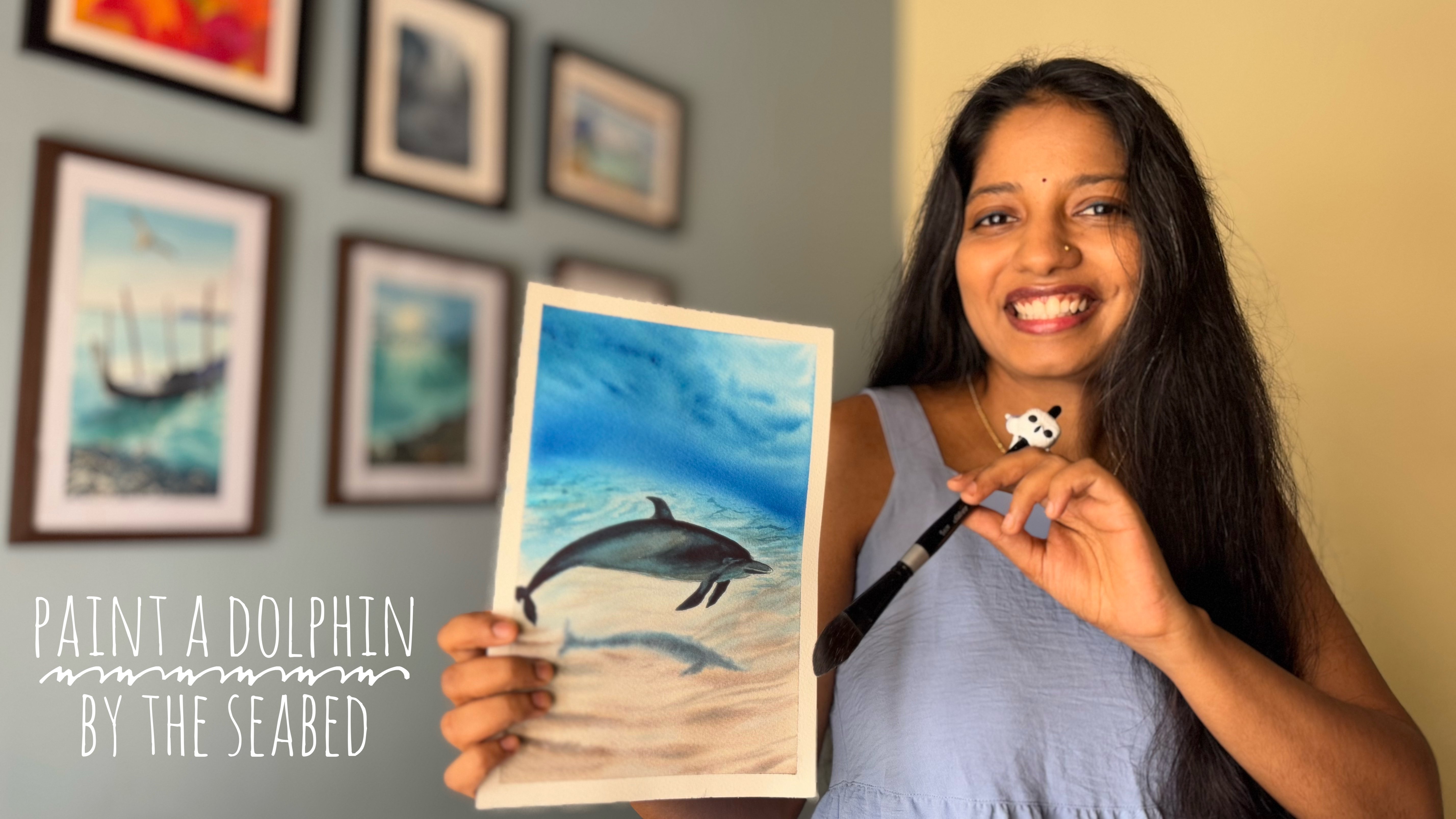
1. Lets dive IN ! : Hey, everyone. I'm Swati Hide, a watercolor artist based
out of Bangalore, India. You can see all my works
on tinted Toodles, and you can see most of them are water themed or aqua based. I have structured
this class in short, easy to follow lessons
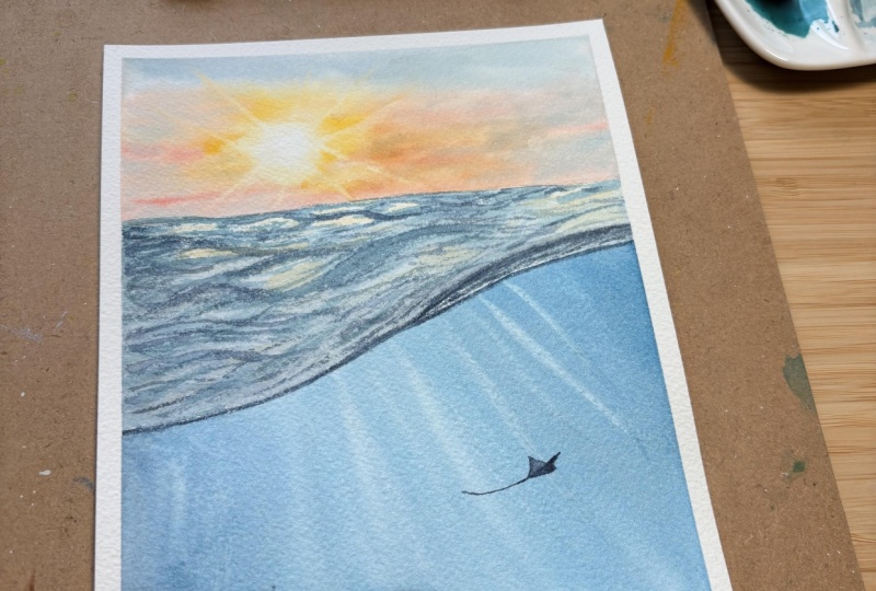
where we build the painting step by step from the sky to the
underwater globe, to the wave textures, and finally, the sting ray. You will learn how
to layer colors, create moment in water, add light rays, and bring life to your painting
with small details. This class is perfect
whether you are a beginner or someone looking to deepen your
watercolor skills. All you need is your
basic watercolor set and a little curiosity. If this is something
that excites you, I humbly invite you
to join my class. So grab all the supplies
required and get started.
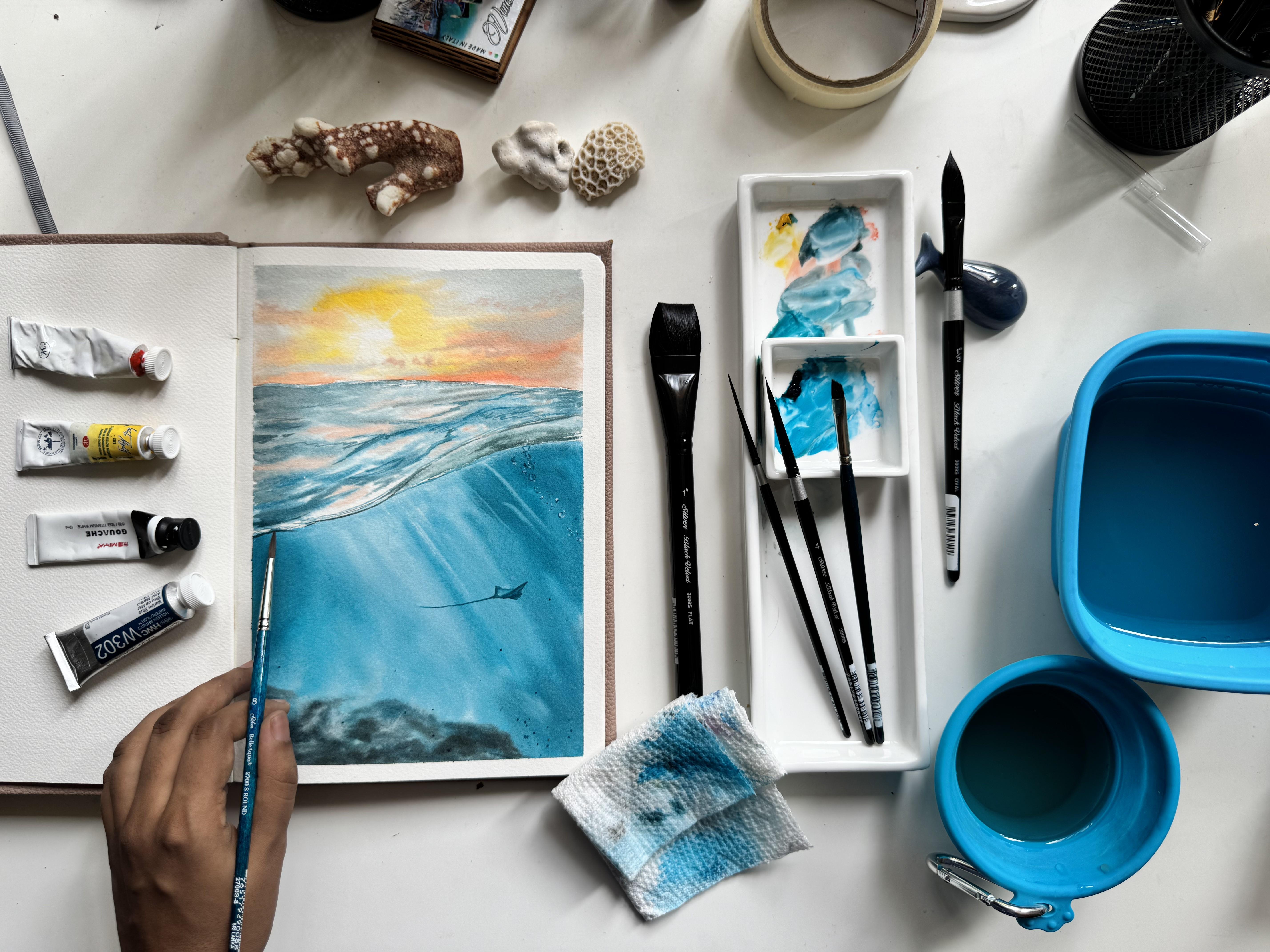
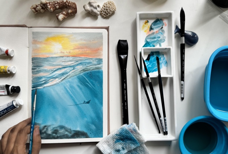
2. All that you would need!: Let's go through all
the suppliers that we would be needing for this
painting, starting with paper. I'm using Arch's 300
GSM cold press paper in form of my sketchbook. This is of size B five. For brushes, I'm going
to be using brushes from silver brush brand.
They're really great. I'm using black velvet
and belli aqua series, starting with this flat
brush of size one, I'll be using it
mainly for the washes. Next up, oval wash
brush of size one half. This is a great size for adding my underwater scenes to create that moment of underwater rays. Next up, some round brushes. This is size eight round
brush from Bale Aqua. This is a synthetic brush. I'm using it mainly
to create paint in the wave section
for crisp waves. Another round brush is from
black velvet series size four that I'll be using for sky as well as some parts in the underground underwater. Then we have angle
brush of size quarter. I'll be mainly using
it for creating the rays as well as rocks. A liner brush again from the Black Velvet series to mainly add the
boundaries, the lines. I'll be explaining all the
paints that I'm using. But again, it's marine
blue from Holbein. That's a turquoise shade,
and these are the shades. You can use any other
brand turquoise as well. Next up, it's cadmium yellow. Cadmium red light. These two are from white knights and a white wash,
this is from mi. I'm using a water two water jars for cleaning the brushes, a paper towel for dabbing
off excess paints and water, a pencil to initially
draw my sketch. I'm asking to tape it down the paper and
begin with the painting. We have all the supplies.
Now let's get started. W
3. Painting sky: Welcome to the first lesson and thank you for
joining the class. I've already completed the initial sketch
for this project, and you will find
the reference image available in the class
project section of resources. Feel free to use it as a
guide as we paint together. We'll begin by
working on the sky. I'm using a flat brush of size one from silver brush,
black velvet series. I've started by applying
a light even layer of clean water only to the
sky portion of the paper. Roughly, it is one
third of the paper. For this, I'm going to be using the BFI paper size as mentioned
in the material section. I feel it provides a very
balanced vertical composition. Let me keep all these brushes
aside so that I can use this mixing palette for creating a very good
gray for my sky. Create the cloudy moody sky, I'm mixing turquoise
blue or marine blue, cadmium red light,
and cadmium yellow. These three colors
are essentially the primaries for this painting, so they naturally combine into a harmonious gray with
a soft blue tint. I'm keeping the blue or turquoise a bit more
to get this tint. Since all the shades in this mix come from
the same palette, they blend smoothly
without turning muddy. When I even apply orange
or yellow over the sky, they won't mix each other
and create muddy shades. This is one of the
biggest advantages of using a controlled
harmonious mixtures. I like this gray
sheade for my sky. So next up, I'll start
with wet on wet technique. It's always starting with
the lightest shades. So I'm starting with
the yellow for the sky. I'm first adding yellow, leaving a small circular
area untouched for the sun. Since it's wet on wet,
it will blend and create a very good sun in the middle. Next up, I'm introducing cadmium red light
along the horizon line and blending it gently
into the yellow to create a warm,
glowing sunset effect. Our skies need not be the same. You can use reds in different
places than how I'm using. For painting this section, I'm using round four size brush. This is a natural
black vevet brush. This helps me create softer,
cleaner transitions. Switching back to my
bluish gray mixture, and I'm applying it to the
topmost part of the sky, blending it towards the
red and yellow layers. Since all the colors come from
the same limited palette, everything merges
beautifully without being muddy, as
you can see here. Once you're happy
with the gradient, switch to a angle brush. I'm taking off size 14, wet the brush lightly, dab off excess water on a
tissue paper or a paper cloth, and gently pull the strokes
outward from sun area. Apply light pressure. This lifts some
pigment and creates soft glowing rays
across the sky. This technique works on wet
on wet as well as wet on dry. So if your sky is
completely dry, then also you can achieve this, but you might have to put a little bit more pressure to it. My paper is still semi dry and I would like
to add some clouds. I'm picking up a
synthetic brush from silver bell aqua series and using the cadmium red light to add small subtle clouds. This brush gives
excellent control for precise details like this. If I choose to add it from
the natural blend brush, there is a risk of water or paint seeping
into my background. That's why I would like to go with a synthetic brush here. I'm adding clouds sparingly
along the same horizon lines and adding it as in where
I feel they are possible. You can skip this step if
your paper is completely dry. This completes our sky. This brings us to the
end of lesson one. In next lesson, we'll move on
to painting the underwater.
4. Painting underwater: Welcome to the second lesson. In this, we'll start working on the underwater portion
of our painting. I'm switching back to my
flat brush and applying clean water only to the
underwater section, not on the wave surface for now. Follow the boundary line and wet the entire underwater area,
including the rocks part. This section will be painted
again in wet on wet, which will help us achieve soft blends and natural
underwater light effects. Using my oval brush
of size water, I'm applying the paint in diagonal strokes to mimic the direction of the
underwater rays. Our main color for
this underwater area is turquoise or marine blue. One of the beautiful
qualities of watercolor is that once
these strokes dry, their texture remains visible, giving us a lovely organic
pattern of underwater. I'm extending these
strokes all the way to the bottom edge of the paper
to avoid having a flat, single tone underwater,
we'll have to introduce tone variations
with our color. But I'll continue to keep the middle area slightly lighter to give that glowing
underwater effect coming from the sun rays. I'm mixing a bit of cadmium red light with the turquoise shed
to create a darker, richer shade of blue green. I'm adding this deeper shade to the sides of underwater area. This frames the
painting and draws the viewer's eye towards
the center where we want the sunlight to appear as if it's filtering through
the water and the wave. If you do not have
an oval brush, you can also use a flat brush or even a bigger size round brush. Switching back to
my angle brush, I'll create more of that darker mixture and begin
adding underwater rocks. I'll gently dab the brush onto the paper to build texture. Since these rocks
are underwater, they naturally appear
in cooler, bluer tones. The dabbing motion creates an uneven organic texture
and subtle shadows, giving that illusion of
depth and reflection. You can keep a watch on
the angle and pressure of your brush to
recreate this effect. There is no need to paint
each rock precisely. If you're looking
for a precise look, you are welcome to do so. I'm also adding tonal variation here by darkening one
side of the rocks, suggesting a soft
shadow cast underwater. I feel there is too much white
space toward the bottom. So I'm switching back
to the oval brush and slightly glazing some turquoise
over those lighter areas. Since my paper is still wet, I'm also dropping
in a bit more of the darker turquoise along the sides to deepen the effect. If your paper has already
dried, you can skip this step. Now with an angle brush, I'm using it to lift the
rays again underwater. Just like we lifted paint to create the sunlight
rays in the sky. We'll do the same
here. Remember that turquoise is a staining pigment. So after every lift, make sure to dab your
brush on a tissue paper or a paper cloth before
touching the paper again. I'm lifting the strokes at the same diagonal angle as before to keep the
underwater raise consistent. You can keep the rays
thin or hold the brush horizontally for a
wider, softer raise. Choose whichever
effect you prefer. I'm lifting also with my oval
brush so that I get more of the softer raise in
the middle of my paper. At this point, you'll
notice that some rays look soft and subtle in the
background while others, especially made
with the oval wash, appear sharper and
more prominent. The ones that are done
with the angle brush. This combination creates
a beautiful illusion of cylindrical light rays
traveling through the water. To finish, I'm switching back to my angle brush to add
a bit more texture to the rocks with a
darker turquoise mix and a touch of
cadmium red light. Since the paper is drying, I'll get to see how much the paints are
drying in what way. This will help me again to add some of the depth to my rocks. This completes our
underwater section. Let this completely
dry before moving on. In the next lesson, we'll be painting the surface of
the wave. See you there.
5. painting wave surface: Welcome back to lesson three. In this lesson, we'll paint the surface of the wave
visible in our reference. We'll continue using the wet on wet technique, but this time, the surface needs to feel slightly sharper than
the underwater area, so the viewer can
clearly distinguish between water surface
and what's beneath it. I'm using my oval brush to apply a smooth even layer of clean water across the
entire wave surface. Covered the whole
section while leaving just a small space for
the white section there. Wetting the area ensures we
can create smooth blends while still allowing some sharper strokes for
the wave structure. For the waves, I'm
mixing turquoise, red and yellow, keeping the overall tone more blue
green to reflect the water. Unlike the gray that
we used in the sky, these shades give the wave
a lively watery feel. Since I want some
harsher edged waves, I'm using the synthetic
brush Belle aqua because it provides more texture and control for
the wave strokes. Natural brushes tend
to blend too smoothly, but we want defined
flowing structures to capture this
surface movement. As I paint, I'm switching between different
mixes of turquoise, red and yellow creating the
subtle variations in town. Your strokes may
differ from mine, and that's perfectly fine. The key is to keep blue green tones dominant
and avoid overblending, so the waves remain distinct. B I'm paying attention to the direction of the waves following the flow shown
in the reference sketch. Near the horizon, strokes
are small and fine. While closer to the foreground, they become broader and thicker. For the wavefold where the surface appears from
the underwater area, I'm using a darker
shade of the same mix. I'll also lift any excess
blue in that area with a lineup brush to create a clean separation and
have that white boundary. This fold will appear darker, adding depth while the
highlights remain brighter. Since we have used cadmium
red light in the sky, I'm reflecting the same color lightly on the wave
surface as well. This mimics how water
naturally reflects sunlight, helping to tie the whole
painting together. I'm also adding a few
tiny wave details near the horizon for
making it more real. To prevent the surface
from looking flat, I'm adding subtle blue
tones wherever needed. You can adjust the intensity
based on your preference. Oh I'm also using my liner brush to add
details to the wave pool, drawing small
boundaries and lines across the waves that
follow the water. This creates the illusion
of movement and depth. Zig zag strokes are added here and there to mimic
natural water flow. I'm also placing small bubble like marks with
the darkest shade near the fold to
enhance the sense of movement and activity in water. I feel this will be much better when the paper is
completely dry, so I will stop it for now. So see you in the next lesson. E.
6. Adding sting ray: To start this final lesson, I'm adding a few turquoise
plats across the water area. These tiny splashes help suggest bubbles and
movement underwater, bringing an extra sense
of life to the scene. I always feel that platters add energy and spontaneity to
a watercolor painting, making it feel more
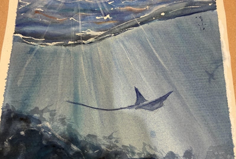
dynamic and alive. I'm going back to the bubbles once my paper is completely dry. Next up, I'm painting
our stingray. Painting this completely
freehand, but if you prefer, you can lightly sketch
it beforehand using the reference provided
in the class project. You can also sketch it after
the water layer has dried, but be careful not to make any mistakes as you may
not be able to erase it. To give the sting ray
a sense of moment, I'm starting with a darker
shade made from our mixture, applying it to the lower
portion of the stingray representing the flap and the
shadowed area underneath. For the top surface
of the stingray, using the lightest
blue to reflect the light hitting the
sting ray from above. I'm keeping the surrounding
underwater colors intact so that the reflection
from water is preserved. Since sunlight and
underwater rays are falling on the stingray, I'm first defining
just the border to create a clear shape. You can use any brush you feel comfortable with
synthetic or natural, or even a liner brush. I'll be switching in
between these brushes. I'm adding the tail now, which is the key
for showing motion. I'm doing it in
one swift stroke, but you could also use
a pen or liner brush for more precision
if you prefer. To finish, I'm going back to the bubbles we added earlier. I'm using a bit of white paint to enhance them and give them more dimension so that they look realistic with both
light and shadow. Some areas remain darker
while others get highlighted. This creates the
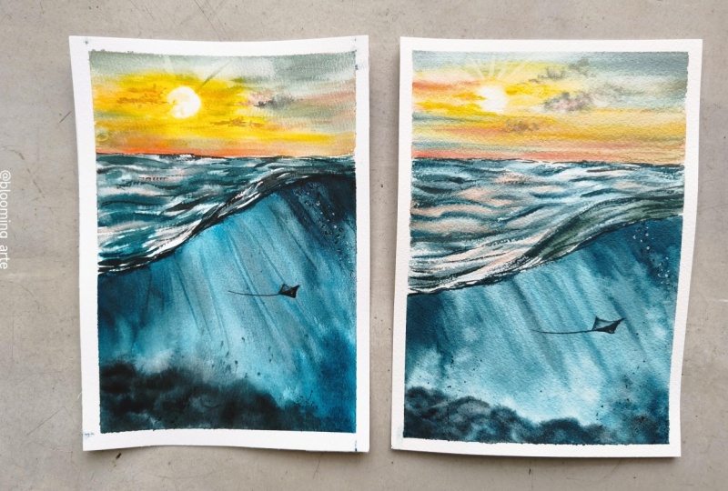
perfect illusion of bubbles floating in the water. And that is it. This is our final look, and I'm really happy how
it has turned out. Thank you so much for joining the class and
painting till here. In the next lesson,
we'll do a tape, peel and reveal our
final painting.
7. Thank you & thoughts: He
 Swathi Hegde, Watercolor artist | Aqua | Night sky