Transcripts
1. Introduction: Spend hours tweaking colors only to end up with a palette
that still feels off. Hi. I'm Ruben Suspez, principal product designer at Del Technologies, and
an Adobe partner. 20 years in design had
taught me one truth. Color makes or break a product. Any white color theory, build accessible palettes
in Figma and Adobe XD. You will skip the fluff and
learn a repeatable workflow. Pick a base hue, expand
it into primary, secondary, and accent colors. Then test everything against
WCAG contrast in seconds. We'll practice live together, building a palette and
applying it across headings, buttons, backgrounds,
and dark mode. You'll see why small
tweaks in saturation and temperature can guide the
eye to boost usability. You'll master gradients, sto overlays, and
brand integration. Then tackle a capstone, redesign two screens of any app or website
with your new palette. Post it, get my feedback
and level up fast. What tools are
we're going to use? It's up to you. You can
use Figma or Adobxt. And as a bonus, you
will be receiving my best selling 100 page eBook, Conquering y Design for free. So are you ready to
start guessing and start designing with
confidence, hit and roll, and in less than an afternoon, you will be shipping color
palettes that look great and also work for everyone.
See you in class. Let's make color
your secret weapon.
2. Basics of Color Theory: Hi and welcome to this
lesson on color theory. Color is an essential element of design and understanding how it works is crucial for creating effective and visually
appealing interfaces. This lesson, we'll cover
the basics of color theory, including the color wheel,
primary, secondary, and tertiary colors, and the role of hue,
saturation and value. First, let's talk
about the color wheel. The color wheel is a
visual representation of the colors of the spectrum
arranged in a circle. It's a useful tool
for understanding how colors relate to each other and for creating
color schemes. The primary colors are
red, yellow, and blue. These colors cannot be created
by mixing other colors, and they form the basis of all other colors
on the color wheel. The secondary colors
are created by mixing two primary colors. They include orange made
from red and yellow. Green made from blue and yellow, and purple made
from blue and red. Tertiary colors are
created by mixing a primary color and
a secondary color. They include colors like yellow, green, red, purple,
and blue green. Now, let's talk about hue,
saturation and value. Hue refers to the color itself, such as red, blue, or yellow. Saturation refers
to the intensity or purity of the color. With more saturated
colors appearing more vibrant and less
saturated colors appearing more muted. Value refers to the lightness
or darkness of a color. The lighter the colors
appear in brighter, the darker the colors
appearing more subdued. By understanding these basic
concepts of color theory, you will have a strong
foundation for working with color in your
UI design projects. In the next lesson, we'll explore the
different methods of selecting color palettes. Thanks for watching.
3. Choosing a Color Palette: In this lesson,
we'll be exploring different methods for choosing a color palette for
your interface. Selecting the right
color palette is very important because it can have a big impact on the overall look and
feel of your design. There are several
different approaches you can take when choosing
a color palette. Let's start by looking at
monochromatic schemes. A monochromatic
palette is made up of different shades and
tints of a single color. This can create a cohesive
and harmonious look, but it can also feel
limited if used on its own. An analogous color
scheme is made up of color that are next to each
other on the color wheel, such as blue, blue,
green, and green. These can create a harmonious
and cohesive look, but it can also feel safe and uninteresting if not
used creatively. A complimentary color
scheme is made up of colors that are opposite to each other on
the color wheel, such as blue and orange. This creates a
high contrast look that can be very striking. But he can also feel Jain
if not used carefully. A triadic color
scheme is made up of three colors that are equally spaced around
the color wheel, such as red, yellow, and blue. This creates a balance
in harmonious look, but he can also feel too
vibrant and chaotic, if not used in moderation. When choosing a color palette, It's important to consider
the purpose of the interface, the target audience, and the
overall design aesthetic. You will also want to pay attention to color accessibility and ensure that your palate is readable and accessible
to all users. In the next lesson, we'll explore how color
can be used to create hierarchy and emphasis
in UI design. Thanks for watching.
4. Using Color to Create Hierarchy and Emphasis: In this lesson,
we'll be exploring how color can be used
to create hierarchy. And emphasis in UI design. Hierarchy refers to the
relative importance of different elements
on a page or screen. And emphasis is used to draw attention to a
specific element. One technique for creating hierarchy and emphasis
is color contrast. By using colors
with high contrast, you can make certain elements
stand out and draw the eye. E.g. using a light color against a dark background can create a high-contrast look
that draws attention. Saturation. It's another tool you can use to create emphasis. More saturated colors
tend to be more eye-catching than less
saturated colors. Using highly
saturated colors can help draw attention to
important elements. Size is another important factor in creating hierarchy
and emphasis. Larger elements tend to be more prominent and draw
more attention. So using larger
elements to highlight important information
can be effective. It's important to use
these techniques in moderation and to consider
the overall design, aesthetic, and purpose
of the interface. Too much emphasis can
be overwhelming and using too many contrasting
colors can be jarring. In the next lesson, we'll discuss the importance of color accessibility
in UI design. Thanks for watching.
5. Color Accessibility: In this lesson,
we'll be discussing the importance of color
accessibility in UI design. Ensuring that your interface is accessible to all
users is crucial. This includes designing
for users with colorblindness and other
visual impairments. Colorblindness is a
condition that affects around 8% of men
and 0.5% of women. It can make it
difficult for people to differentiate between
certain colors. And there are several
types of colorblindness. The most common is
red-green colorblindness, which can make it difficult to distinguish between
these two colors. To design for colorblindness, it is important to consider color contrast and
use combination of colors that are high in contrast in easy
to differentiate. E.g. using blue and yellow
or black and white can create a high-contrast
look that it's easier for people with
colorblindness to see. It's also important to consider
other visual impairments, such as low vision or sensitivity to certain
color combinations. Using large, clear text. In avoiding color combinations
that are hard to read can help make your interface more
accessible for all users. In the next lesson, we'll explore the role of
color in branding and how to incorporate those
brand colors into our UI design.
Thanks for watching.
6. The Role of Color in Branding: This lesson, we'll be
exploring the role of color in branding and how to incorporate those brand colors
into your UI design. Color is a powerful
tool for branding, and it can help create a
strong visual identity and emotional connection
with customers. Different colors can evoke different emotions
and associations. So it's important to
consider the message you want to convey when
selecting brand colors. Once you have established
your brand colors, it's important to use them consistently across all
marketing materials, including your website or app. This helps create a
cohesive look and feel and reinforces
your brand identity. When incorporating brand
colors into your UI design, it's important to consider the overall aesthetics and
the purpose of the interface. You will want to use these
colors in a way that enhances the user experience and supports the overall design. It's also important to consider
color accessibility and ensure that your
brand colors are readable and accessible
for all users. Using colors with high contrast in avoiding color
combinations that are hard to read can help you make your interface
more accessible. In the next lesson, we'll cover advanced techniques for working with
color in UI design, such as gradient,
blending and layering. Thanks for watching.
7. Advanced Color Techniques: In this lesson,
we'll be covering advanced techniques for working
with color in UI design. These techniques can add
depth and interests to your interfaces and help create more cohesive
look and feel. One advanced technique
is using gradient. A gradient is a
smooth transition between two or more colors. It can be used to add depth and interests to flat elements
like buttons or backgrounds. Gradients can be created
using a gradient tool or by using multiple layers of color and adjusting
that transparency. Blending. It's another advanced
technique that can be used to create seamless
transitions between colors by using blending modes, you can create a
range of effects, such as overlaying one
color on top of another, or creating a colored
dutch effect. Layering. It's another technique
that can be used to create depth and interests
on your interface. By layering different elements, you can create a sense of depth and create a
visual hierarchy. You can also use layering to add texture and interests
to flat elements, such as using a pattern overlay on top of a solid colored. These advanced
techniques can help to abcdef and interests
to your interfaces, but it is important to use
them in moderation and consider the overall aesthetics and the purpose of
your interface. In the next lesson, we'll take
a look at case studies of effective and ineffective
use of color in UI design. Thanks for watching.
8. Analyze Real-World Case Studies: We'll be looking
at case studies of effective and ineffective use
of color in UI design and a lysine real-world
examples can help you see how different color choices can impact the overall look
and feel of an interface. First, let's look at an example or the
effective use of color. Bmws official website. The car brand uses a harmonious color palette
that includes shades of blue, dark grade, and why. These colors work well together and create a
cohesive and inviting Look. The website also uses color effectively to create
hierarchy and emphases. Using larger, more saturated elements to draw the
eye and guide the user. Bmws website employees that 603010 color scheme
or color rule, with 60% of primary
color, white, comprising the background,
30% of the secondary color. Great, is utilized as an overlay
on photographs in texts. While ten per cent
of the accent color. Blue, is feature on icons,
graphics, and buttons. Now, let's take a look at an example of ineffective
use of color. The design of NYU's homepage presents a few
challenges for users. The use of a single color, purple for the navigation, body section and footer creates a lack of contrast that
makes it difficult to distinguish between
different areas of the site that can be confusing and make the
navigation more difficult. Additionally, the grid
layout of the body section, which is primarily
composed of blocks with a single solid background
color in some texts, gives the impression that the
page is not fully loaded. To address this, incorporating more images or using
different background colors for the blogs can help provide contexts in make the page
more visually engaging. These case studies
illustrate the importance of considering color carefully
when designing an interface, a cohesive and harmonious
color palette can enhance the user experience and
create a cohesive look. While a chaotic or poorly
thought out palate can be overwhelming
and confusing. In the next lesson, we're
going to practice together how to select a color palette and apply it to a
mockup website. It is time to unleash
our creativity and experiment with different
color combinations will be mixing and matching
until we find a harmonious and
balanced color palette to bring our mockup
site to life. Are you ready for a
hands-on experience? Thus as fun as it
is educational? Then let's jump in
on the next lesson. I'll see you there.
Thanks for watching.
9. Applying a Color Palette: Let’s Practice Together: Hey, welcome back.
In this lesson, we're gonna be practicing
what you have learned so far. We've talked about
basics of color theory. We talked about selecting
a color palette. We've talked about
color accessibility, which is very important. We talked about working
with brand colors and also advanced techniques
such as gradients, blending modes, and layering. So in this practice run, we are going to select
a color palette. We're going to select
a whole color palette. And we're going to apply it to this amazing website that
I created for you guys. It's a Furniture website
and I called it. Let me just zoom
in cozy comfort. So we're going to be
creating this color palette, doing some of the research, doing some color
accessibility testing. And then we're going to
apply that color palette. Once we're happy with our
color palette and we're going to apply it to this website. So that way you kinda like learn how we can apply color
into your UI designs. For this example,
we're going to be using the rule of 603010 rule, which is 60% of
this whole thing. And I'm going to clarify
this because some people get confused with this 603010 rule. What it means is like 60% of your entire UI design will have that color,
that primary color, which is usually soft colors like whites and enlight grades, or even like colors than 30%, it's going to be your
secondary color. And then the 10% will be
kinda like your accent color, which in sometimes it's the primary color depending
on your branding. But we are going to use that rule and I'm going
to show you how to, how we can accomplish that. So first things first, since we are doing a
Furniture website, we need to go ahead and
kinda like look for ideas. When we talk about colors. We've got to think about like the color meaning behind it. In this case, we're not
using a brand guidelines. We just like creating
our own color palette. So when you think about college, you need to think about
the meaning behind it, like red, meaning passion
and energy and in danger. E.g. purple meaning spirituality,
uniqueness, royalty. Yellow, kinda like meaning like happiness and
friendly and energy. Black, meaning like power and sophisticated in
death and mystery. Why the impurity and cleaning, simplicity and all
that fun stuff. When we think about a
website for furniture, we think about cleanness. We think about how
clean they should look, how elegant should look, because that's what, that's
what we're looking for. That's what we're aiming for. So when we're selecting
a color palette, you're gonna think
about a product. You've got to think
about a user's. You got to think about like, what's the intention
behind it in color plays a pretty big part. When it comes to all
of that, a Furniture, website or product, you
think about how cleanly should look, how earthy tones. Think about browns and we
think about the white color, or we think about
some yellows and oranges and greens
depending on like, depending on, on what do you what's your
intention behind it? So we're going to go ahead
and start experiment. And this is why I created this here on the side to
do some exploration. And that's what we're
gonna do right now. We're gonna go ahead and look for some inspiration.
That's one thing. We're going to hop over to behance.net and we're gonna
just like in the search, we're going to type
Furniture website, right? And we just get to see
what's out there and what, you know, you know, we got some greens here. We got some we got some
really light background. Like most of them are super
like light background, which is good
because that is what are we looking for
it, look at this. This is super simple. That's what I'm
talking about when you think about colors. White, It's predominant
here in is because it reflects simplicity and that's what you're
trying to aim. And I think we're gonna
do something like that. What I'm gonna do now is just
going to take a screenshot of the whole thing here. So that way we have something. I'm gonna pull this and
just drop it in here. By the way, I'm using Adobe XD, but you can use whatever tool
you feel comfortable with, whether as Figma or Sketch
or Adobe XD, even Photoshop. If you use Photoshop to design your website, It doesn't matter. So we do have some inspiration
here that we can definitely get Inspire from. You see those colors. This is really nice. This is really nice too. I love those colors. And I'm going to show you a
really simple trick. For. Creating a quick color palette
when it comes to design. Alright, so plus Joe's make
this a little bit smaller. Just put this right here, but this right here, I just
have this as reference. There's nothing
special about these. It's just, I really
like this one a lot. And I'm gonna show
you a trick on how to create a quick color
palette if you want to. We're going to go ahead and
choose the rectangle tool. I'm going to just like make a rectangle and then just
pick a random color. And I'm gonna do
probably four colors. So I'm gonna hold down Option
on the Mac, alt on a PC. I'm just duplicating this. So I can have like four different for different
colored squares. So I can pick, pick some of
those colors that I like. I like this right here. So what I'm gonna
do is just like press I for the eyedropper. And I'm going to
start picking some of these colors
like that one, e.g. I. Like this one. Let's see, this one. It's in there too. Then probably like this light gray and maybe
I can I'm going to switch them right now and then pick this one
and put it right here. That's kinda like,
uh, one way to pick a color palette
really quick. Of course you have to
explore and experiment and kinda like if you wanted to make this a little bit lighter, just go in here
and just make it a little bit lighter.
Pulling this up. Let's say e.g. if you
like this one, e.g. we're going to do
the same thing. We're going to, we're going to duplicate this color
palette by pressing Alt. And then I kinda like
these colors together. So I'm going to start with
the light color first. See how light it is. And then from there, I'm going to move
into the couch here. Maybe this color is kinda nice. That's good. It's kinda, kinda has that earthy tone that
we're looking for. Then we're going to probably
draw this one here. And finally, probably the green, probably something
like about there. See how cool that looks. We already created
a color palette, two different color palettes
just from images, right? And then what I
suggest you to do is kinda like play around
with these colors. If you want to do something
totally different, e.g. if you wanted to make
this a little bit greener and has much
more punch to it. And you can just drop it down, maybe something
like about there. Maybe you want a more green, maybe this one you
want it super light. So you can go ahead and make
it a little bit lighter. Love this earthy tone, this brown, and then this
light gray is great. So this is how you can do a simple yet straightforward
color palette. Now, I'm going to show you
another way that you can use their amazing websites
out there that can help you create and
generate Carlo palettes. The one that I liked the most, I would say, I would
say is Adobe Color. And you can go ahead and
go to color.adobe.com, forward slash create
forward slash, color wheel. And then in here you
can experiment and just do like Analogous
monochromatic. We already talked about
this on previous lessons. But what we're gonna
do is we're gonna go into the explore section. And then what we're
gonna do here is just going to type what
we're designing for it, which is a furniture company. So we're gonna do furniture. Press Enter, and
then we're going to see so many different options. As we talked about. There's a lot of
browns, earthy tones, but we've talked about there's some greens as well,
which is awesome. And the great thing about
Adobe Color is that you can actually add these color
palette, Let's say e.g. if you like this one, you wanted to add
it to your library. You can add it into
your color library. Of course, you have to have your Adobe account
setup for that. And then when you go
into your libraries, you can find these colors already in your library,
which is awesome. And you can use it
across multiple, multiple platforms within Adobe like you can do,
there'll be express, Photoshop, Illustrator,
InDesign, whatever, whatever platform you
are designing in. So you can see there's
so many Browns. That's the one that it's
more like predominant, like I really like this one. That's really nice. So we're going to pick one in. Just this one feels kinda nice. You can also download, you
can take a screenshot of it, or you can just
download the JPEG. And then once you
download the JPEG, we're going to go ahead
and show in the Finder. I'm going to go ahead
and go back into our exploration and just
going to drop it in here. Look what this
program does for you. It provides you the hex
code with everything in it. And also you can sample those colors using the
eyedropper if you want to. So I'm going to
drop that in here, something like about there. And then what I'm
gonna do actually, I'm gonna bring this up and
I'm going to start exploring different options for
our color palette here. So what I'm, what
I like to do is actually get some green
in there somehow, maybe this type of green. So I'm going to just pick
one of these colors and just go ahead and
pick this green. I'm going to have,
I actually like this color that we picked
here, that it's kinda nice. So what I'm gonna do is just
like I'm going to drop it. I'm going to just copy
that color there. And then we need to add some of these colors
like the light color, maybe these, these cream
colors that we have there. And then we wanted
to add more colors. We can definitely do that. K. So that could be
our primary color, but primary color for the, for the branding, but not
necessarily for our page. So let's say this one, I want a lighter
version of this one, so it probably do
something like that. Maybe for this one I
do a darker version. Maybe I'm going
to go into greens and just like go down
just a tiny little bit. Maybe like around like
around hair maybe. And then for this one also, we're going to go super
light as well if we need to. All right, thing this is, this is good enough. And then we've got, great. Let's see. We can go even
more neutral with this color. Perfect. I think I'm happy with
this color palette. And what I'm gonna
do is just actually, I'm going to grab all of these colors and I'm
going to add it into, into my styles here so I
can use them right away. So I'm going to just click Plus. It's going to add all
of them together. Now I think it's time to start adding some colors and
some graphics into here. So that way we can apply
these color palette into our new furniture website. One thing I wanted to mention is accessibility color
accessibility is very, very important. And I'm going to show you
a quick trick and how to test your colors.
Let's say e.g. that we have this
color and we want to test that against the
white background. So what are you going to do
is just copy that color. We're going to copy that color. We're going to head over to our website and we're
going to go into here, which is webaim.org slash resources for his last
contrast checker. And we're going to check against our background color,
which is white. And then we're gonna
put in our new color, which is that brown. And we're going
to test this out. And this is what
kinda like provide to you is telling you
the normal texts like this passes the WA
WA accessibility. This is what he's gonna do, is gonna provide you
whether your tags in your graphical elements pass through, through
the accessibility. And we can see here that
the Double, Double a past, but the AAA doesn't pass because there's not
enough contrast for that. But if you wanted to make
it a little bit darker, you can go ahead and do it
until you get the pass. If that's something that
requires you to do, it is very important that you test color contrast all your, your, your, your colors. Because it's very important
for accessibility. You want to make sure you are
universal designer and you provide accessibility for
people with visual impairment. And you're going to make
sure all your colors work. And sometimes there are
some trade-offs, of course. But as you can see, our color for the
most part passes. And even the graphical
object elements like buttons and
stuff like that. They pass, which is good. And they even pass for
some of the texts. So that's, that's pretty good. So make sure you understand
color accessibility. We talked about this
on previous lessons, where we talk about how
important accessibility is. And how you can work with
color contrast and work with other advanced
techniques to make sure you have everything ready when it comes to
designing for a website, designing for a mobile app, or designer for software
or web application. So let's go back into our design and let's just start
experiment and an adenine, some of these colors to
make sure they all work. Alright, so first things first, we do have white background
here, a weekend, do something crazy
from the get-go. And we're going to
start by adding, like, we get at this color e.g. I'm sorry, let's go back again. I selected the wrong folder. So we're going to go ahead and click on the actual background. And then we're gonna go and drag this color if we wanted to. That's one thing to make it. We can make it a little
bit darker if you want to. If we wanted to make sure
that all the color works. But since we're doing, I think we need to bring some, some photography in here. So I'm going to just go
ahead and go into Photoshop. I already cut out
this amazing chair. So I'm gonna just grab this. When I copy this, I'm going to go back into here. I'm going to paste this. And I'm just going
to play around and just like put this one in here. We see how color is
making its way in. I don t feel very
confident with this color right now because I
think the contrast is a little bit too low. But what I'm gonna
do is I'm going, I'm gonna go ahead and
just select this color, which we already have in here. And then we do have some
tax and stuff in it that we need to transfer or to use a different
color code for that. In what I'm gonna do
is use the eyedropper. And then I'm going to
pick that kind of like that green will do the same
thing for here, maybe. For the navigation also, we can pick that probably
dark green maybe. So that way we have
more contrast. And then in here
maybe we're going to add in some dark gray. Maybe we can go ahead and have some something like
a violent there. Okay. I see I see. Maybe for the texts. Maybe I don't like that. The gray. I'm sorry. I don't like the
green for the texts. Maybe maybe I can add a
new color for the text. And then what I'm gonna do is probably pick this color, maybe. Let's see if that works. Okay, I'm going to add
it into my palette here. And I'm going to edit
that color because I still don't like how it looks. Way too dark. Maybe. So maybe maybe he's not married. Go kinda like that a
little bit better. Just make sure you
test this against white or any other color. If you have a disk background
and use test set out that it passes the
accessibility tests. Okay, I think I'm
happy with that. So let's see how it
looks on the TX. Okay. Alright, It's not bad. Maybe I want to add
up a little bit of more padding in there. K, this is working. I think I'm going to
add, I'm gonna do, I'm going to add something
in that behind this chair. And I'm going to go
ahead and probably use one of these colors. We said we're gonna
do this 603010. So that's what I'm gonna do. Maybe this is too dark, but we can make it a
little bit lighter. This color right here. So we're going to edit
that color and we're gonna just go ahead and make
it a little bit lighter, just a tiny bit about there. See how it changed here, so we have more contrast. That's very, very important. So okay, I like that. So we're going to
add in some stuff. I don't know, maybe maybe some graphics in the back
to make it more dynamic. I'm going to use this color. Maybe. I'm going to
just bring it back in, probably just
lowered the opacity. I don't want it to
be too too much. Maybe something around
those around there. That is great. Let's just add a button
here so that way we have some accent color. So we're going to go ahead and just pick the rectangle tool. This is what I'm
talking about when we say have an accent
color in there. We're going to
either we can pick either this color which is nice, or we can pick this color for more contrast. This
one is kinda nice. So we're going to
test this one on. We're going to test this on
the color contrast checker. I'm going to go ahead
and let's say we have a we have a background
of this color, and then we're going to have the texts mean white, 123456. We're going to test
it and we see that he passes everything,
which is good. It's not passing of the AAA. But what you could do is
just make it a little bit maybe darker if you want to. You can go ahead and push it to the left until you get it right, until you get that pass. Contrast ratio, which is
seven, which is good. But sometimes it's not. We have some constraints and you have some
trade-offs, and that's fine. You can go ahead and
for the sake of this, Let's just keep it up. This color being
our accent color. And then we just
can, I don't know, maybe just for this, we're going to say buy now
or something like that. It doesn't matter at this point, we're going to make
this probably bold. And let's see. K we're going to center, this is a little bit bigger. Maybe we can make this
a little bit smaller. So that way it's not
that in your face. Kind of like about there. And then we're
going to just group this and have it right here. So we have that as our kinda
like our accent color, which is kinda cool. Then we're gonna go ahead
into the next section, which is our philosophy. We're going to go
ahead and actually use this is the one we picked
four color for our texts, but then for, I think
for our headings, we can use the same color. So we're going to do that. We're gonna do that for
the welcome as well. Perfect. So remember, we're
going to do this. I'm gonna do this 603010. So what I'm gonna do is I'm going to pick this
one which is the 60. I'm going to put it
here on the sides. So the way you see it,
we've got this 60. Then we're gonna, we're
gonna get the one which is the one which is the 30%. And then we're gonna get
this one which is the ten, which is the accent color. And then we're going
to make it smaller. So this is what we're doing. In order for you to see
it a little bit better. I'm gonna put it right here. So this is what we do in 60%
of our entire design will be this light,
super light color. Then 30%, which it's going to be composed of our
probably our texts, maybe in some graphics or stuff, is gonna be with this dark gray. And then the accent color. It's 10%, which is gonna
be probably our titles in some graphic elements like buttons and
stuff like that. So you kinda like get the idea
where we going with this. So let's go ahead
and keep designing this fun stuff for these icons. What we could do,
well for the text. First of all, let's just
make this uppercase. And then for the tax, I'm, I'm, I'm going to use this color which is our secondary.
You can rename this. So that way you can, you know, like this is my secondary
or this is my primary, this is my tertiary colors like you can name it
whatever you want. So we're gonna go ahead and actually add some
color to these icons. So this icons, this one, we can do the 30, I mean, the accent colors. So we're going to do this green. We're going to do the
same thing for this one and for this one as well. So that way we see some
implementation, our, of our 30%, which
is that dark gray, and then our accent color, which is this green. That's looking really nice. I think there's good. Alright, for this services, I want to do something really
dramatic and do something totally different
and use something like probably like super dark, maybe something like
this is awesome. Maybe we wanted to
bring some of that. Some of these Light tan color like that
cream color somehow in here. So for this I'm going to use
probably probably this one. I'm going to do the same
thing for this one. And for this one. We can use the light
green that we created, but it's not necessary. So let's just turn it,
turn it back to white. And I'm going to
just, for the icons, probably going to use
our accent color. And then for these, we're going to use our next
color, which is that on. And then for these bad boys, there's not enough contrast, as you can see in here. So let's try something out here. It's all about our
experiment, right? So we do have this color and our color palette we can use, but you can see that
it's not good enough. There's not enough
contrast. It's hard to see. If we go back and we see this. It's really hard to see. Like you can barely see it. We don't want that. Want to make sure, like we
do have enough contrast. That's really bad. If we test this out. It's not going to pass. And I can show you right
now like pretty quick. So I'm gonna go ahead
and grab this color. I'm gonna go into
my color tester and I'm going to put
the background color, which is that one. Then I'm gonna go ahead
and grab the font color, which is this copy. I'm gonna go ahead and
put it as a foreground. You see everything. It fails because you
cannot read this. In order for you to
be able to read this, either, you have to
have high contrast. So what we're gonna do is e.g. we're going to bump this up
like our background color. You see how he changes, right? So what we're trying to do here, there's always gonna be
constraints and trade-offs. So are we gonna do here
is try to make it darker, like this one probably, that one probably passes. It all depends. If
we want to test this out, Let's do it again. Pretty quick. I'm going to copy this color. I'm going to paste it in here. Then this color, I
think we change it. So we're gonna go back.
So we're not cheating. I don't think he's going to
pass all the way through. That's why you need to test
for color accessibility. It passes the first
one. She's good. Some graphics, graphical
elements like that one is floating in there
and for tax, it's passing. So we're good there if
you need to pass because it's necessary for your website, pass it 33 A's, then you have to make the
contracts work for that. For the time being, we're going to leave it as it is right now. And we're gonna do
for these two icons. What I'd like to do is
probably bring some of that brown maybe in there just
to see how it looks. I kind of like not
like it because it's It's kinda like too much. So it's either I go let's see. For use the same one. We could, if we want to. The only problem here is
that I might have to make this one and this one
a little bit lighter. So that way we have more
contrast, enough contrast. So look at this. So we do have some, you know, some difference between these two and those two. But I want more. I want more. Maybe I'm gonna go
ahead and do it again. Maybe. Maybe I don't know,
maybe I can go ahead and use this one as
well as this one. This is why it's very
important to experiment. Because when you experiment, you can see what works
and what doesn't work. As of right now, probably
these two colors don't work. But this is on top of this. And then this is what exactly
what's most important, the tax and actual icon. So if you have enough contrast
here, that's good enough. So we're going to leave
it out there right now. We probably need
some background, some, some texture or
something that goes behind it. So that way we have some dynamic happening
in the background. But we're going to leave
it at that right now. Then we're going to go ahead
and go to the next section, which is our collection. Maybe we came from this super. Dark section, maybe now this
one needs to be lighter. So we're going to go ahead
and use our accent color. And then we're going
to use our text color. Then for this section,
we're going to probably use this in an evil lighter way. We're going to go ahead
and make it super lighter. Maybe. I'm going to probably go ahead and do something like this. And I think this is not
perfectly centered. So I'm going to go ahead. I'm going to bring this
two out of the folder. And I'm going to center, this is perfectly centered. Okay? My eyes are playing
tricks on me. Right now. 36, Let's do 42, maybe a little bit more space. I think we need some, some other images in here. Maybe we, maybe we
left align this. Maybe we do this. Maybe we can go ahead and do, and bring some some
furniture here. So we're going to go
ahead and go into unsplash.com and just
look for for neater. We're gonna go ahead
and pick one that, you know, let's pick this one. Since we're dealing
with this kinda green. Go ahead into Photoshop. We're going to just
like go ahead and paste this new furniture. And I'm going to do
something pretty quick. I'm gonna duplicate it,
go into select subject. It's going to select a subject. I see that there's some
craziness happening in here. So we're going to clean
this up like pretty quick. So I'm gonna just remove
this section here. Okay, I think that's good. Maybe we move this section
to maybe make it flat. Cane as good. Let's see, we have some other right
here that we need to move. Okay? Okay. I think we got a
really good selection. We're missing something
in here in the middle. So we're going to go
ahead and use the magic one and just include
that in there. Oops, hold on. There you go. And we are missing
this part right here. So I'm just going to
go ahead and hold on. I'm going to use the lasso tool. It's gonna be a lot quicker. If I do this. I'm going to just select here, go ahead and select this one, and then I'm going
to select the mask. Let's see our
alright, That's good. I like to do is play a
little bit with this. We are in Photoshop right now, just getting some
images for our stuff. We're going to just go ahead. And I don't like this part, so I'm going to just
remove that part from the actual photo. I don't like this
part right here. So I'm gonna just go ahead
and remove that part. Bear with me. I'm going to just
delete that from there. Doesn't matter. Alright, so I'm
going to copy this. I'm going to bring
it over to XD. I'm going to paste it in here. Whoops, I think it pasted the
whole thing. Hold on 1 s. When I remove that and go
back again into Photoshop, I think this is way too big. Probably. Let's see. It's way too big. So I'm gonna do probably 2000s
resizing this whole thing. I'm going to select all. And I'm going to paste this
right here. There you go. Oh, there you go. And look at this color. This is a great combination coming from here
with the same color. And then coming here. Perfect. This worked out pretty good. So I'm going to make this a
little bit bigger maybe and just maybe like around there. I'm going to go ahead and
make this there maybe. Excellent. Really like it so far,
perfectly center. Then from here we're
gonna go into contact us. I'm still on the fence
with these colors. I'm not liking these
colors again, that color. Maybe we can do
something about it, but we're going to take
care of it in a little bit. So the last section right
now is the Contact Us. So what are we going to
do is actually select, Let's go into our color styles
and we're going to select our color and then
our text color. And then for, for these
buttons and stuff, we are using this
same accent color. So we're going to go ahead
and do all these sections. They do have an outer
line for the TextField. So we're going to go ahead
and choose our accent color. And then for the texts, remember that we
do have the 30%, which is this color tax. So we're going to make sure
we have that in there. Maybe this one is the cortex, but then this one is
actually our accent color. Okay, Perfect. Okay, I think this
works really good. Maybe for this couch, we need to have some sort of some sort of shadow
maybe behind it. So I'm gonna go ahead
and do that shadow. Right now. Then this shadow will be probably
our accent color. For sure. Bring this back. And we're going to blur
something like around there. And then we're
going to just turn the opacity down like really, really, really,
really, really back. Or you go just a
little bit of shadow. So we have some shadow in there. Perfect. So remember how we started and
we kinda like implemented, we started implementing
our 603010, really well-balanced
color, color palette. We do have some. Our accent color is this
green, this olive green. We do have some 30%, which is kinda like covering the 30% of our entire design, which is basically, we're
using it on the TX. We use in our accent color. And then we're using some other colors that are
supporting this color palette, which is this super light cream, like ten, we're using
it here too as well. You got to make sure
like when you use color that the tire, the entire design fields
cohesive and feels good. You have to
experiment, of course, like I said, I'm not a
big fan of this one. E.g. and I'm going to just
go ahead and duplicate this whole layout
and experiment. Because you need to experiment. Maybe we don't have
to use this color. Or maybe we do because I like This section going into this section, which
is kinda nice. It's just like in here, these colors are
not working for me. So let's just try
something different here. Let's just see what it will
do if we do something like, what if we do something like we duplicate this background? This is what I'm
talking about when it comes to exploring. And I'm going to duplicate
this background. I'm going to pull this
one I'm going to do is actually go ahead and pick another color,
maybe from here. Maybe I'm going to go
up and pick this color just for the sake of
testing things out. Just testing it to send it out, just to see what works. Make it, we can even make it a little darker if you want it to. Like if we wanted
to make it darker, like this section,
that could work. Of course, we have
more background, but when we do
color combinations, we kind of make sure
like colors work. And this is what I'm gonna do. I'm gonna just like make this
kinda like kinda like that. Maybe, maybe, maybe,
I don't know, we just testing things out. Again. Experimenting is the key. What if we use that
accent color here? Just for the sake of
testing things out. Alright, maybe we can change
this back to white maybe. So that way we have
more contrast. And maybe the icons as well. I mean, there right now they pass because they're
graphical elements. But Let's just stick with white, so that way we have
more contrast. Alright, so look at that, that it's not that bad at all. I would say this is way
too close to the tax. Maybe for the texts, maybe we don't need
all of that copy. Maybe we can get rid
of some and also make the text a little bit smaller. Maybe like around there. Maybe we do need we do
need a button maybe. So we're going to go ahead
and duplicate this button. And then this button
we're going to reverse. The background will
be probably white. And then the text inside the button will be
probably our accent color, which is this one. And then we're going to probably change this
to I don't know. I don't know. I'm getting touch something
like around there. Perfect. We can move this around. Padding is very important, so make sure you
have enough padding. Then you grab your
three elements. In here, 12312 In three. Just perfectly centered. This, maybe this works, maybe it doesn't work for me, is working right now. Again, you got to experiment and make sure the
color combinations that you use is they work. As of right now here doesn't feel like it's not a big deal. But these two colors are
not working a little bit because there's not
enough contrast in they're not working together. But in here, of course, we're adding a darker
version of this color. And then you have more contrast
and there's more harmony. When in here, There's
not enough harmony. And this is what I'm talking
about when it comes to creating harmony between colors and also working with color. Same time. Then for the sake
of this example, I'm going to just
duplicate this again. Or even like in here, I
don't have to duplicate. We're gonna do something
totally different here at the top just to, you know, to make
something fun out of it. Instead of using these
light gray color, we're going to use
that light tan color. We're going to go ahead
and use this light color, this tan color, but we're going to make it
lighter, like super light. So go ahead and
we're going to make this super light like about there as we have enough
contrast like about there. And then maybe for the primary
color or the accent color, we're going to use something
totally different. Instead of using
this olive green, we're going to use
this brown and just see how everything
works and feels. Alright, so I think all these
content have the green. So we're going to
turn it into this. Maybe this now turns into white. Maybe that would make it
a little bit lighter. Maybe we can do we can do probably like a
shadow or something. To add more drastic thing. Maybe we can use the dark. We're going to use this one. Lawn. It's gonna be linear. Then. For this one, we're
going to use that one. And for the live version, we're going to use this
light version of that green. Okay, and then I'm just
experimenting guys. This is something I
like to do when I'm working with some stuff. I want to duplicate this and just like make it a little bit bigger and just turn it down. And then I'm going to
turn it down all the way down, both of them. So I'm gonna go ahead into my layers and I'm going to
turn them down together. So I have some sort of
something that comes in there. See the difference in
when you're using color. In here we use a
like an olive green. Let me just go ahead. And then in here we use a more
like an earthy brown tone. Makes sure, you know, your contrast is high enough. We can also go
ahead and just for the sake of this practice. And just make first, make the first one even darker. We're going to use one
of those techniques we use on previous lessons, which is working with
gradients and stuff. So I'm going to go
ahead and go ahead and use a gradient for
the top header section. So I'm gonna use a
linear gradient. And then for the darkest, probably going to use
our accent color. And then for the lightest, I'm going to stick with
I don't know something. Around here, maybe I'm going to just pull this on the side. Maybe I have to make
this a little bit darker because I want
enough contrast. So I'm gonna go ahead and
just turn it even more. Then the light, I'm going
to go ahead and add more bluish to it about there. Alright, so check this out. So I'm going to go
ahead for this example. And I'm gonna be using
the same color palette. I am going to use this color. Probably the texts
will be white. Course. And our accent color could be, could be,
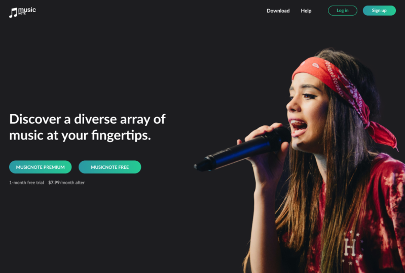
10. Your Class Project: Get ready to enlist your creativity and add some
color to the digital world. For the class project, you will be creating
a color palette for our music website
and mobile app. Then you will add the new
color palette to the provider. Low-fidelity wireframes, the color palette should
be visually appealing and complement the
overall design aesthetic of the website and mobile app. The possibilities are endless. Head over to the project and resources tab to download
the starter files, whether you prefer Figma or Adobe XD. I've got you covered. I can't wait to see the
masterpieces you will create. And don't forget to show off your heart work in
the project gallery. Let's blow the community
away with your designs.
11. That's a Wrap!: That's a wrap on our class
on using color in UI design. I hope you have
learned a lot and feel more confident
in your ability to create visually appealing in a stunning User-friendly
interfaces. Remember the key takeaway, e.g. number one, color can greatly
affect the user experience. And it's important to understand
the psychology of color. To color theory is an
essential tool for creating a cohesive and visually appealing, pleasing
color palette. Number three, play around with different color combinations and tried to create
something unique. Now, it's time to put your
new found skills to the test. Post your projects in the project gallery and let the community see
your heart work. And don't forget to leave me
a review and follow me on Skillshare for more tips
and tricks on UI design.
 Ruben Cespedes, Principal Product Designer, Mentor & Educator