Transcripts
1. Welcome to my course!: Hi and welcome to my watercolor tropical
fruits series. This is the final
episode of my series of courses where we
will paint a Durian. Following our usual structure. First, we will go over
materials for this painting, figure out the shape of this fruit and how to
draw it correctly. We will select main colors to realistically
portray the fruit. After a light pencil sketch, we will paint a Durian
with watercolor. Using already familiar
technique, wet on wet. We will create
software washes for the skin and inner
part of the Durian. We will devote a
special attention to the spikes of the skin, and final touch will be
adding intricate cracks on the smooth surface
[NOISE] of the fruit as well as already
traditional splashes. This is the final fruit we will paint in my tropical series. Here you will use already
familiar skills and apply them to create a
more complicated painting. If you're just joining in, I suggest you start this tropical fruit series
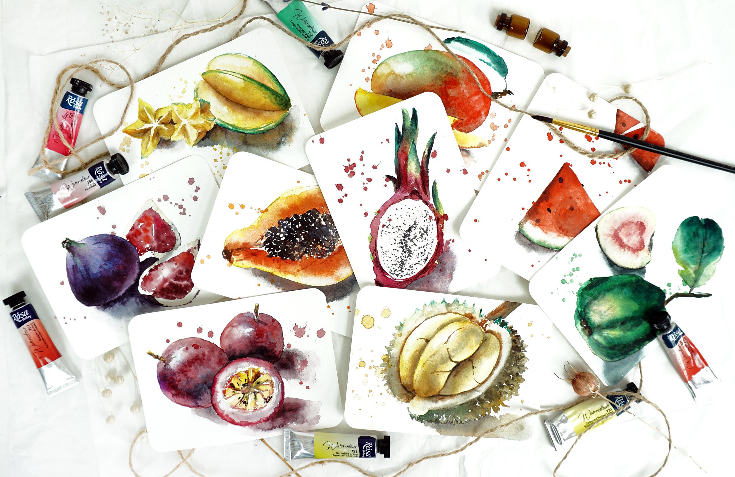
from the beginning. We painted some awesome fruits
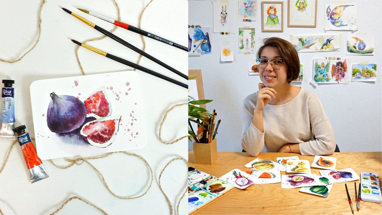
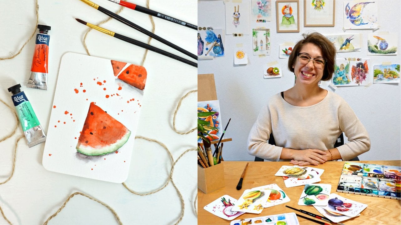
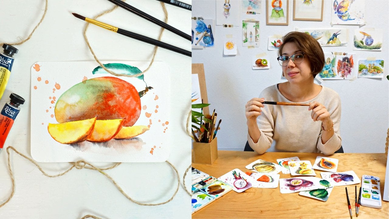
like watermelon, pawpaw, dragon fruit, figs, mango, guava, passion fruit,
and even a star fruit. Since every course from the tropical series is
structured in the same person, you will feel confident in
the layout of each class. You will be able to build
up your skills gradually and create a lovely fruit postcard collection
along the way. That's not it,
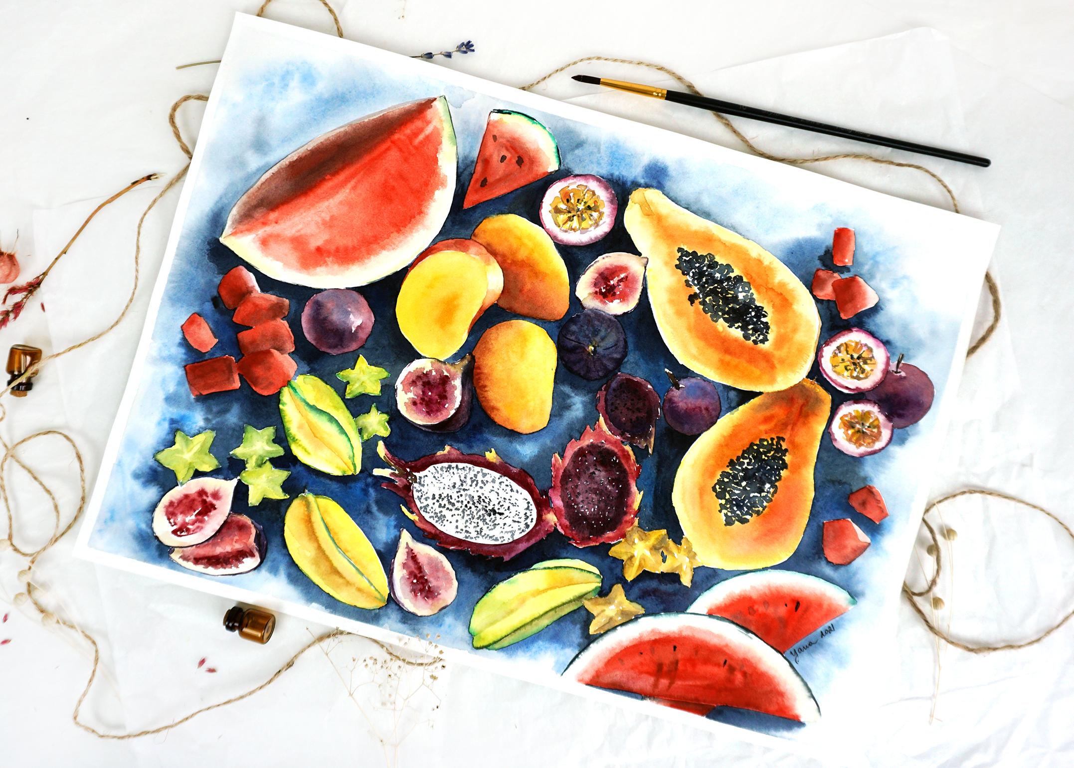
after this course, you complete the series, total of nine different fruits, but we do not want
to say goodbye. There will be a bonus
course where we will paint a masterpiece with all tropical
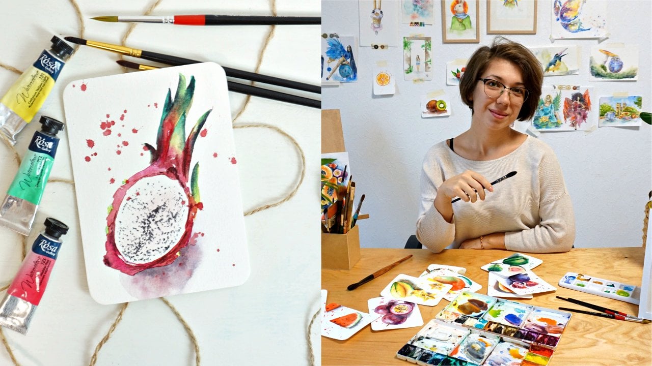
fruits in one artwork. About me, my name is Yana. I'm a professional watercolor
artists from Ukraine, and I'm here for you to help you master watercolors skills. I had been painting with watercolor for more
than 10 years. I sell my original work
as well as prints. My original watercolor
paintings are now in private
collections in the USA, Australia, the UK, and other
countries around the world. My work received multiple awards in International
Watercolor Competitions, and during the past 5, 6 years, I have been sharing my
knowledge online and offline. I'm also a full-time traveler, which gave me a chance to host watercolor workshops in different cities
around the world. I have been regularly
teaching classes in Thailand, Vietnam, and hosting
various art events in cities I traveled to. Working with students
face-to-face gave me an insight into what
they actually need, what difficulties with
watercolor they have, and now, I know how
to help them best. That is exactly what
I'm going to teach you in the series of my courses. Are you're ready to paint
this exotic Durian with me? Let's start. [MUSIC]
2. Your materials for this durian postcard: Let's talk about materials
you will need to paint the last fruit in
our tropical series. If you have been following me
and this series until now, you already know that we use the same materials
for every painting. So feel free to
skip this lesson. If you're just jumping
in, welcome on board. Let's discuss the materials. Usually, I work with professional
watercolors SMLT brand. It's really high-quality, good paper with a 100
percent cotton in it. I really prefer to paint
on cotton paper because this paper is really
great and gives you much better results
due to its content. It absorbs the paint better, it keeps the paint inside
its layers for a long time, which allows you to work on different mixes and combinations and color transitions without struggling with sharp
lines and edges. If you do not have cotton paper, it's fine because you can
still use cellulose paper, which is also good
quality paper, especially this brand Canson. They behave similarly
to cotton paper, but it's a student grade paper so pretty much anybody can
use it for their work. The texture that I will
suggest to use would be cold press or hot press. I would not suggest you to
use rough texture because it will be visible through
the watercolor layers. You probably want to go with smoother texture so that
it doesn't distract the viewer from the
painting that you do. Food art is a very
particular type of art. Then the thickness of the paper, I will suggest you
to use 300gsm. This one is a bit less, 210, but the thicker you
take the paper, the easier for you
will be to work on it. It's not going to buckle. It's not going to deform with the water that you
will apply on it. For drawing, I will
use automatic pencil. But if you don't have it, you can use a regular
pencil like this one. Just make sure that you
use 4H or any type of H, really any type of hard pencil that you have in
your collection. A hard pencil will allow you to work on the thinner lines
and they're not going to be smashed on paper
because of your palm. Then if you need
to erase anything, you can use kneadable eraser, which is great for watercolor paper because it
doesn't damage its texture. I always offer people to
use kneadable eraser, but if you don't have one, you can use a regular one. Just try to not
scratch the paper too much because it can
damage the texture, the surface of this paper. The brush, you will
really need just one. I work with one brush for
every painting in this series. It does everything that
I need to be done, especially considering the
postcard size of paper. It is a synthetic brush with the pointy end that
will allow you to work on washes as well
as on small details because of this thin pointy end. Watercolor, I am going to use is a collection of
different watercolors. I have here ROSA, local Ukrainian brand,
as well as Sennelier, Winsor and Newton, ShinHan and other different types of
professional watercolors. You can go with the
student quality paints like Winsor & Newton
Cotman for example, or Koi, or any other type of student quality watercolors. It is not going to affect
your learning process. In details, we're going to discuss all the
colors you will need to paint durian later
on in this course. Of course, you will
need some tissues, paper towels, and bucket of
clean water. Let's move on.
3. How to draw shapes of durian: Durian is a very special fruit, not only because
of its shape but also because of its taste. [LAUGHTER] I don't know
if you've ever tried it, but people really are divided
into two camps when they eat durian as those who absolutely love it and those
who absolutely hate it. Let me know if you ever tried it and in which camp you are. Let's talk about the shape. The reference photo that
we have is showing us only durian that's cracked open and I think it's more interesting because you
can see the inside. The part that cracks
open looks like a heart, and the one that's
inside and also there is a part where we see
the skin like this. Here what's interesting is that it looks like
a heart or a peach, but it's only the outside skin. Here you can see the thickness of the skin
and it goes like this. Also because we see it
at a particular angle, for example here the thickness is bigger and more noticeable, here it's smaller and
the whole fruit is turned a little bit on
the side over there. Then here's the branch. The inside [LAUGHTER] is
also very interesting. It consists of three parts. The first part goes here. It follows the shape of what
we already drew earlier, then another part here inside, and I'm showing it
like this and it goes out of the outline
that I already did hear, and the last part inside is here but limited by the skin. The inside is a
little bit cracked, sometimes they're not, [LAUGHTER] and they have a very special flavor,
I should tell you. Anyway, now that we figured
out how to paint the inside, you can notice that
the skin is sharp, [LAUGHTER] like a hedgehog. You can show it, like so. But really, I don't want
to go into the details of painting every single spike, we will work on it in
watercolor and show the sharpness of them with
the shadows and highlights, but there's really
no need to draw every single thing
with the pencil, we will work on the sketch. The most important to see
here is light and shadow. As usual, we need
to define where the light is coming from, the source comes from here, that's why our inside
[LAUGHTER] of the durian, this soft part of it, the eatable parts of it, has highlighted area here, and then the shadow over here. The same on the second
slice over part here, the highlighted area and then the rest is in the
shadow like so. The very bottom one is
a little bit opposite because this one in the middle, it's popping out a lot, so naturally it would drop shadow on the half on the
piece that's in the bottom, and by showing this shadow, we actually make the central
part stand out even more. Then there will be some
shadow on the skin here, but not here. This part will be highlighted, this part will be a
little bit shadowed, and the darkest part will
be here in the bottom, which we will all show
with watercolors.
4. Sketching your fruit on paper: [NOISE] I am turning my paper
into landscape format. I think it's going to
fit the painting better. Since we are only painting
half of the fruit, I can place it right
in the center, which I'm going to do now. Remember what we
discussed just before, that the oval shape
looks like a heart. The middle part is going out of the center here,
I'm showing it. Now I am carefully
outlining the skin. I also need to correct
my lines right away. I tend to draw multiple lines at the time which is
not the best way because then you will
have to remove them, it slather with your paper. That's just a matter of habit. [NOISE] I am outlining the
other side of the skin. The one that is
light almost white. [NOISE] I feel like this side
of my fruit is a bit too extended so I want to close it a little bit
like this and like this. Then here we'll have, on the contrary, a bit
more of exposed skin. The rest on the bottom here
is the thick shell of durian. I'm not really going to draw all the spikes. We know they're
there but I don't want to spend time
on drawing each of them because we're
going to work on them with watercolor directly. The thing I would
need to do though is to actually remove this
line with the eraser. Because when we will paint it, I don't need any
pencil line that will be right under the spikes, should be all white and clean. I will have to
actually remove it. But other than that, our sketch is ready. Now we can discuss all the colors that we will
need to paint this fruit.
5. Selecting a limited color palette: Of course, the main color for this painting will be yellow, and all the variations
of yellow in this case. For yellow, I will be using cadmium yellow from
Winsor & Newton, actually cadmium, which is a
student grade watercolors. Nice warm yellow color
that we will use for the highlights
for the light areas, and for the shadows, it will be a darker tone. Let's say it will
be cadmium yellow with a little bit of brow, like Van **** brown or you can use burnt sienna as well if you
want and a tiny drop of blue. But be very careful with blue because in a mix with yellow, it's going to give you green. It's not exactly what
we want to have in the fruit that's why I have drops of brown
in it to compensate. Then for the skin. That will be interesting. We're going to use aureolin
green which we already used in previous
paintings of our fruits. If you don't have it, you can create it by yourself. It is essentially yellow with
some green undertone in it. The way you can do it, you can take lemon
yellow for example, and add a tiny drop of green
to it to get a similar tone. Of course it's not
exactly the same, but it is the idea,
it's something close. Then I will be mixing aureolin green and
color switching between aureolin green and emerald
green and tiny bit of burnt sienna when I
will be painting the skin; the shell, with all
the spikes on it. I will also use the
same brown with a little bit of Van **** for the branch where the
fruit is hanging on. Also for some of the
darker areas around our inside of durian and for the shadow parts in the bottom of
the aureolin it's going to be green with a
little bit of burnt sienna. For blue, I'm using
indanthrene I have it here; indanthrene blue. Those three will give me the deep dark tone but not exactly gray or black. That will be enough for
the bottom of our fruit. I think that's pretty much it. I might use some other
additional random colors that I think will work
better in the painting. I can't really think
of them right now, it usually comes in the
process when you feel like something is missing
and you just add the touch. But those are the main
colors that we're going to use the foundation of our color palette
for this painting. Prepare the colors
and let's paint.
6. First watercolor layer : I'd like to start painting
our durian from the center. For this I will use already
known technique for you, wet on wet and I will apply clean water first on the
area where we're going to paint the left half of all the central part and
I'll start from the very [NOISE] light layer of yellow and just drop it exactly where I placed
clean water before. Here we have a highlighted area. Remember what we discussed in the previous class about
cleaning our painting and highlighted area shows where the light
drops on our fruit. You can lift the pigment if you need to if it's
moving in that place, just to make it much
lighter than the rest. The same time I would like to make yellow
more concentrated. Only in the area
where it is close to the middle half of
the inside of durian. Then I'll take a little
bit of burnt sienna, add yellow to it. It's nice, warm orangey, brownish tone and again
add this color to the area that is slightly darker and close to the edge
of the next half. Then I'll add a
tiny bit of blue. Remember that you need
to be careful to not get green color because blue
plus yellow gives you green. You want to add more of burnt sienna it doesn't have yellow in its content and you get this darker tone
for the shadows of our durian part. Intensifying yellow. Now, I don't like this
super sharp, clear outline, so I'm smoothening out with almost dry
brush, slightly wet. [NOISE] Add a little bit of shadow once more. Since we work with nonstop, applying darker tones
on still wet surface, the colors are
blending smoothly. You don't need to worry
about sharp edges. Everything looks natural and
we can now move on and paint this one so that the
central one stays dry and the paint doesn't bleed from this part
into the center. [NOISE] I forgot to put water first so I do it now. Clean water. We almost don't
have highlighted area here. It's a much darker piece. I'm not that worried that
paint is covering everything. I also can have much more
concentrated paint in here and then the same thing, little bit of burnt
sienna mixed with yellow. We have some orangey
lean in tone, but it's still more
brown than orange. A little different sub-tone and locating the
shadow right away. Again, I take my burnt sienna, add some blue and I get brown, almost actually gray tone, which is perfect for
painting the shadows. The reference is almost
black in the place where it is close to the middle part. I don't really want
to go that dark. But I'll mix another
brown blue mix here for the darker tone and I'll try to achieve a
much darker tone than before. That we can show it here. Because I really don't
want to use black. [NOISE] and now we need to leave this to dry so we can carefully and confidently work on
the central part and paint doesn't bleed inside.
7. Panting the middle part of durian: I used a hairdryer to
dry the whole paper. Now, everything is
dry and I can move on to painting the central
part. That's what we do then. I apply clean water first, then yellow, and as well, remember to leave very
light almost white part in here to show the
highlighted zone. The rest around it is pretty
nice, vibrant yellow. I'm working with cadmium yellow. Gamboge will work well
as well if you have it. Then the same approach, I'll take drops of brown
sienna, add some yellow. Drop it here and there for a
nice tone for the variety. Also, you can see that the
shadow goes in a center. But here on the side, which is the bottom of our half, it is still lighter,
it's yellow. This gives us this feeling
of three-dimensionality. I can emphasize on that yellow zone even more
by adding clean yellow. This way we show more the
shape of this central part, and make it look realistic. When I'm talking about
making it look realistic, I don't mean hyper-realistic, I don't mean we're trying
to make a photocopy of the reference that
we have, that's boring. Why would you want to have just a perfect copy of a photo? But what I mean by realism
is that you follow all the rules of fine art so that you show that the object
is three-dimensional, you show the volume, you show the angles, so it looks like it's
taken from the real life. It has all the properties
of real life object, it's just the technique you
use is more creative in artsy than a plain photocopy. That's where art steps in. I'm removing the hard edge
of my highlighted area. I would like to even add
more of just pure yellow. Now we need to work
on the shadows. Blue with burnt sienna, and we get darker tone. Same as usual. You need more blue in your brown to get this grayish tone. Very carefully, I'm
applying this shadow, right in the central
line of our fruit, keeping the bottom light. Given this realistic
feel of the volume, that it's not flat. Nine on paper, but it's
three-dimensional. With nice burnt sienna color, I would like to amplify
the bottom over here and leave it to dry.
8. Left side of the skin: Now I would like us to
work on the skin and we will do it half by half
[LAUGHTER] step-by-step. I would like to
work on this half first and then on
the other half. Why are we separating two parts? Because I want to start painting the whitish skin here first and at the
same time I will add spikes and I want to add them right away while this
layer is still wet because it will make
it look more natural and integrated than
if I paint this half, then this half, and
after that it gets dry and I add the
spike and every spike will look cut out and [LAUGHTER] forced into the
painting and I want to make it look as
natural as possible. For the skin, I'll take yellow, tiny drop of already
existing brown with blue. I'll take it straight from
my palette over here. My brush carries water
but paper is dry. That's too brown, I need more gray entered. By gray, I mean this mix
of burnt sienna with blue, not diluted black
color but a mix. I'm not using wet-on-wet
technique here, I'm using wet-on-dry. I keep things humid, so to speak but more in control than if I would
apply water first. As you can see here and there, I'm switching between
gray and yellow or burnt sienna so we have nice and different
variety of colors. Here I dropped a little
bit of burnt sienna. At the same time I take
one **** which is darker brown and I add this
shadowy dark tone right at the edge where it's
touching the yellow part of durium and now I feel like
things get way too dark. [NOISE] I take the
tissue and I lift some of the pigment
completely randomly leaving interesting texture on this
skin part which I do like. I don't want it to be like one
flat tone, one flat color. I want it to be different and look more natural this way. At the same time
while it's still wet, I will carefully
spot add in spikes. I do it with this moves
that I'm barely touching the paper and
moving really fast, which gives this feeling of [LAUGHTER] spontaneous
drop of paint. It wasn't planned or
carefully managed, measured. It's more playful and
spontaneous and natural. As we go higher up the fruit I want to
add more of a yellow, both on the skin and
into our spikes. I also get a little bit of green and because our skin was wet, the area where spikes
are connected to the skin is very soft. We don't have a clear separation between where the
spikes start and skin ends or reverse
[LAUGHTER] [NOISE]. As we reach the top, the skin has more of a greenish tone and also drops off burnt
sienna here and there. I will use this as a chance
to also show once more this edge that separates
yellow part from the skin. Be careful so that this
paint doesn't bleed into [LAUGHTER] the yellow part. We want to keep the
yellow nice and clean. While I'm still here, I want to dilute the edge of the line
that I just created with an almost dry brush
so I rinse it against my tissue and dilute the edge. Also as I said earlier
but didn't do [LAUGHTER], add green into my spikes. Luckily, the spikes
was still humid so I can carefully add it
without being too dry. The paper was slightly
wet so the paint mixed and [LAUGHTER] moved nicely. I want to darken this
side of the skin a little more but only here, and the rest of the skin
keep nice and light. Maybe even lift some of the pigment so that it feels like the source of
light is coming from here, highlights this part and this part gets into the
shadow because naturally those big pieces are showing off above the skin and drop
the shadow on this part. Now we're going to
do similar actions [LAUGHTER] with this side.
9. Right side of the skin: Now the bottom, I don't really love my pencil
line that I see here, so I will carefully remove it. I should've done it
earlier, my mistake. But the pencil line
is really showing off through my watercolors and this is not the effect
I would like to get. I need to prepare
the space for me. Now, I'll take some yellow
with lots of water on my brush and drop it here
where the skin goes, and slowly start building
up our skin the same way, step-by-step as we
move up over here. Darker tone, I add
the shadow right away so it blends smoothly. Then as we go up, it gets very light, almost bluish or greenish. But the most important
part is that super light, very diluted with water. Now here I start to
outline the shape of our yellow part by
adding our burnt sienna. Sometimes I make it
darker with blue. I play with different tones. Somewhere it's clean,
bright, burnt sienna, somewhere it's dark mixed
with some blue burnt sienna. If it's too much, you can
always remove it with a tissue or with semi-wet brush. I just drop a tiny
bit of orange. I connect this orange
with the bottom of our half and the skin so it
can blend into each other, which I think looks nice. Here, the interesting
part is that we don't really need
to be that careful with the spikes as on this
side because here there's much more clear
separation between the skin and the spikes. We also have much more
of brown in our skin. I am mixing up burnt sienna with van **** with blue. For now, it's more of
one being layer of different colors without
clear definition of where the spike is. I only make the separation
between the tones. Here as we go away, the tones become more
leaning towards orange or towards burnt sienna. As we go closer, they are leaning towards
darker brown and green. But as the paper will get dry, I will have a chance
to work on tones and using darker tones,
separate each spike. It's always about light and shadow that gives us
the feeling of volume. This is exactly how we will
create volume for our spikes. I also purposely leave some
blank spots if you noticed, to give it more of
a vertical look. Now, I take my blue, as usual, add some burnt sienna to achieve a dark
tone, almost gray. Start from the top again
forming the spikes. Again here you
don't need to draw every single spike to make it super clear that
is a sharp thing. [LAUGHTER] You rather want to hint that there is
a texture here. How do we show it
with darker tone? Maybe somewhere you can
make the spike more clear, especially where on the
other side you see this, the bottom of the fruit. It's a good opportunity to show that it's
actually quite sharp. But do not overdo it with intense sharp spikes
because our painting, again, is not a photocopy. It's an artistic
interpretation of what we see. Usually, for viewers, it's enough just to give you
a fantasy or a hint of what it is and people
will just understand it without you
pushing it too much. What I would like to do though, is to soften this area where the skin is
touching the spikes. With the semi-wet brush, carefully I'm
smoothing this area. Most probably this dark color is going to bleed into the skin. But I didn't mind. As
well I think it's going to give us more see
and watercolor feel. For now, I'll leave it to
dry and I would like to work on more intensifying
the shadows inside.
10. Adding realistic texture: As we know, when
watercolor gets dry, it loses some of the tone and it loses the vibrancy a little. [LAUGHTER] What I
want to do now is to intensify some
of the shadows. Especially I'm concerned about this part which became pretty pale and I'd like to revive it. I'll take a little
bit of burnt sienna. I'll start with
applying transparent, not very concentrated,
burnt sienna here. Right away this stroke I am diluting with
a semi wet brush. I'll take a tiny drop of black, mix it into burnt sienna. Black is not just one pale [LAUGHTER] lonely
black and I want to separate this slice
here to create this feeling of depth
between the two halves. Do the same here and maybe here. Now with the semi wet brush, I want to dilute the
edge of my line, making it less noticeable and maybe as well add a
little bit more shadow into the other half. I take burnt sienna. You'll now create another layer
of shadow here. [NOISE] For now this part
looks really dark, but when it's going
to get dry again, it's going to lose the intensity and look more balanced and more integrated
in the painting. Especially the bottom,
I would like to make it more heavy so to make it look like it's really standing out and has this
three-dimensionality. I'm adding another stroke
with dry, burnt sienna. The area that separates our half here on the right from the skin
just like I did here. Here it's very bright
and noticeable so here I would like
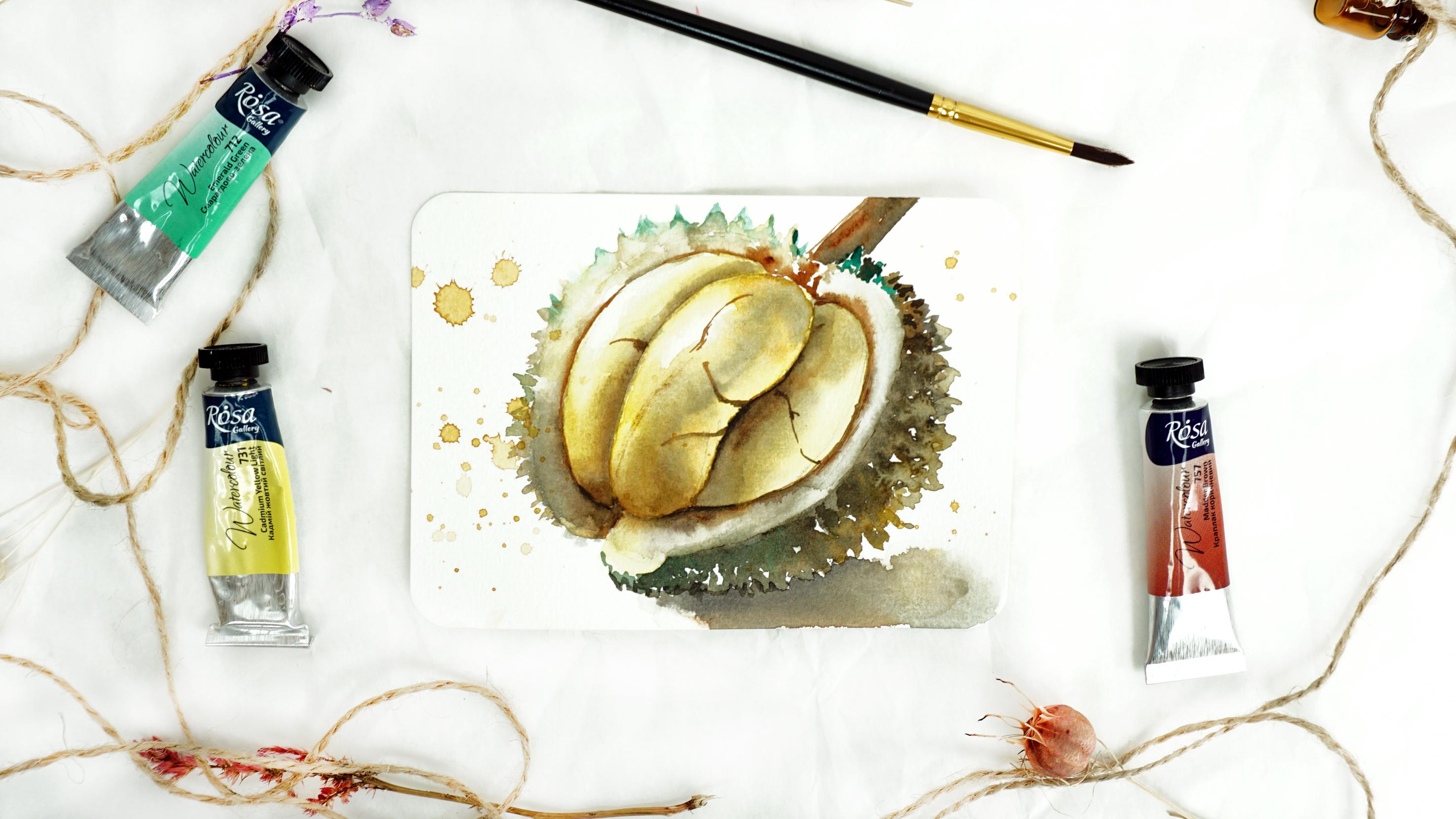
to make it the same. Finally, I will paint
the cracks with a very thin brush very
carefully and the crack here and another one here. Be careful to follow the
curviness of our fruit. If you just make
a straight line, it will make it feel like our
half is flat, not rounded. But because it's rounded, the line, the crack has
to follow the curve. Also, your strokes have to
be pretty dry and thin. If they're not, they
will look a bit diluted and not going to
remind you of a crack. [LAUGHTER] Of course, we forgot the top, our branch. Just brown with some shadow. The shadow will be done
exactly the same way. Mixed blue with
brown to make brown darker and carefully you're
dropping it here and there, not all over the branch. Here we go. Time for shadows and finishing
up the artwork.
11. Shadows & splashes: The cast shadow should be painted here in the bottom because the source of
light comes from here, so naturally, it will cast
shadow this direction. That's what we're going to
do. I take clean water, using wet-on-wet technique
we will add to the shadows. The shadow will be a mix
of blue, green, and brown. As it goes very
close to our spikes, carefully with dot-like
moves I want to integrate the darkest tone, I actually used even a
little bit of black here, close to the spikes, in-between the spikes because
we know that the shadow is the darkest in the area where it's touching the subject
and as it goes away, it becomes lighter and also
here with the semi wet brush, I'm diluting the edge
to make it softer. We can end up with the tissue. Here it is. Now the final touch of our series [LAUGHTER]
in this painting, of course, will be splashes. [NOISE] I will remove the extra
splash from the center. I would like to keep it clean. There we go. Then
last painting of the tropical series is done.
12. Your Class project: I hope you had as much fun
painting durian as I did. It was a lot of different elements that didn't use in other paintings
of the series, but that's the whole
purpose of the series, that you try new things and new techniques or improve
the old techniques that you've already tried in every single new painting
that you work on. Your class project will
be to try and paint this durian fruit and share
your results with me. I will be very excited to see
what you come up with and help you if you
have any questions or you need help or advice. Also, remember that this
is the last course in our exotic fruit series and
painting different fruits. Hopefully, taught you different
watercolor techniques and how you can apply them
for different subjects, and remember that the
next and big final course will be using all the
knowledge you learned, how to paint different fruits
in one big masterpiece. We're going to take
all the fruits you painted and implement them in one big artwork. Stay tuned as I'm
preparing the course.
 Yana Shvets, Professional watercolor artist