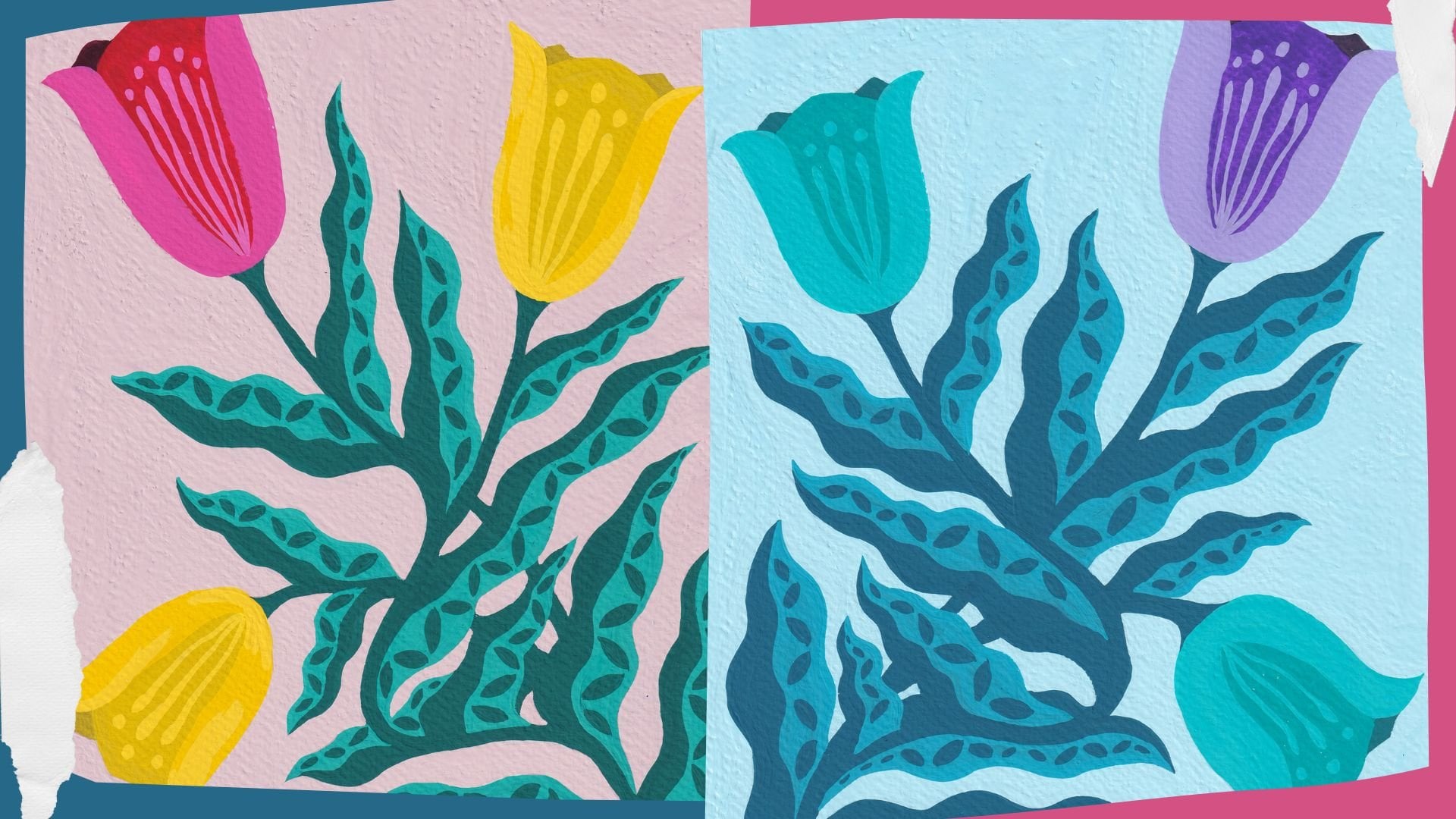
Triadic Color Scheme | Larissa Yeung Fung | Skillshare

Playback Speed


1.0x


  • 0.5x
  • 0.75x
  • 1x (Normal)
  • 1.25x
  • 1.5x
  • 1.75x
  • 2x

Watch this class and thousands more

Get unlimited access to every class
Taught by industry leaders & working professionals
Topics include illustration, design, photography, and more

Watch this class and thousands more

Get unlimited access to every class
Taught by industry leaders & working professionals
Topics include illustration, design, photography, and more

Lessons in This Class

    • 1.

      Introduction

      0:44

    • 2.

      Supplies & Resources

      1:27

    • 3.

      What is Triadic Color Scheme

      2:35

    • 4.

      Preparing a Triadic Color Palette

      2:11

    • 5.

      Painting a Floral Artwork in Triadic Colors

      5:46

  • --
  • Beginner level
  • Intermediate level
  • Advanced level
  • All levels

Community Generated

The level is determined by a majority opinion of students who have reviewed this class. The teacher's recommendation is shown until at least 5 student responses are collected.

3

Students

1

Project

About This Class

Welcome to Part 5 of my Color Schemes Class Series: Triadic Color Scheme!

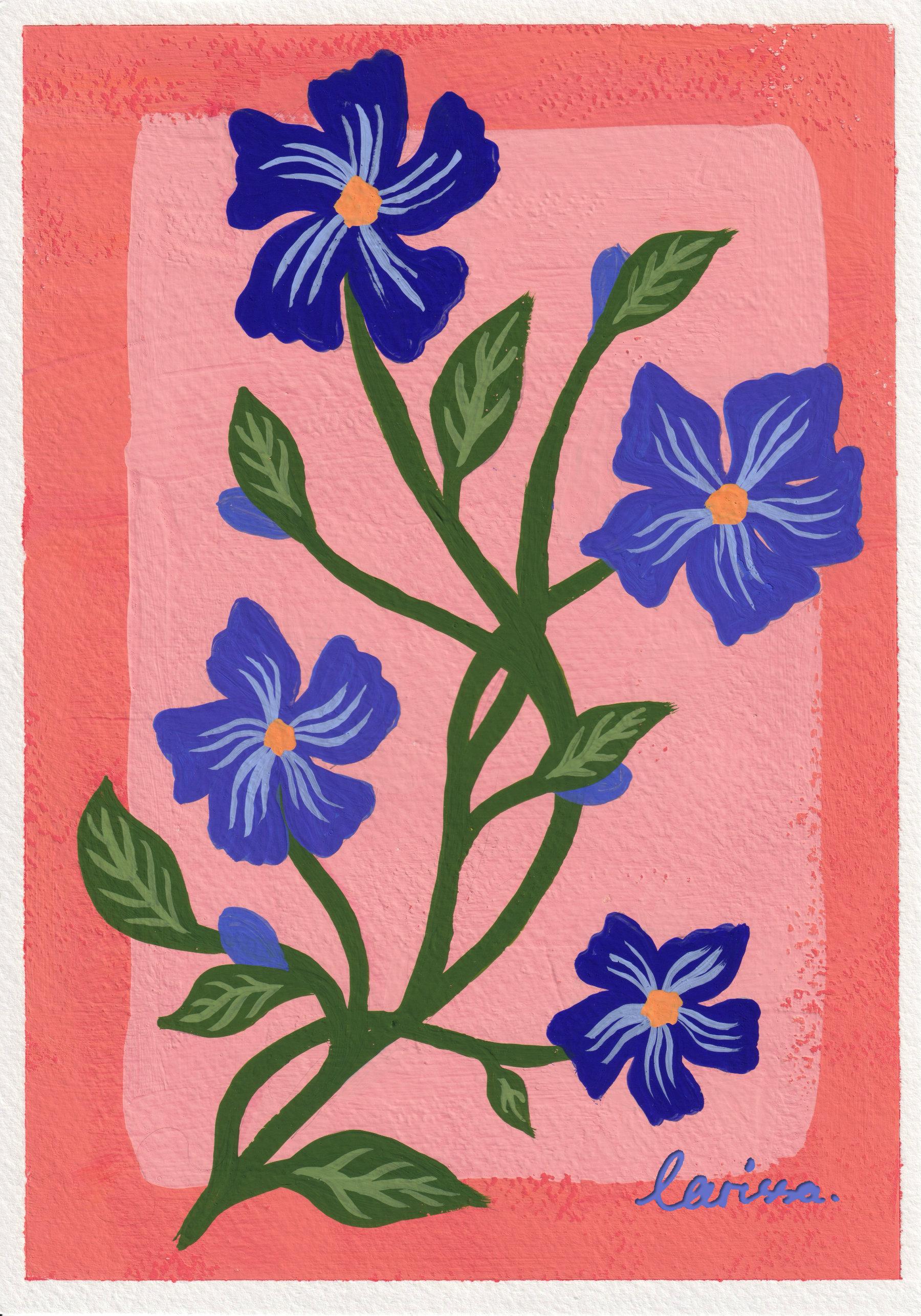
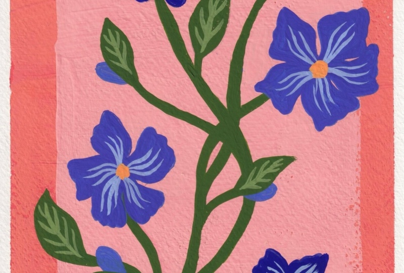
In this short class, we will learn how the Triadic Color Scheme works, and put together a triadic color palette to paint a floral artwork in gouache. 

You will need the following supplies to take this class:

  • gouache paints (acrylic or acrylic gouache will also work),
  • paint brushes,
  • watercolor paper (A4 or A5),
  • a paint palette,
  • a water container, and
  • drying cloth or paper towels

I have prepared the Triadic Color Scheme Infographic to help you put together a triadic color palette.

I have also prepared a Pinterest board filled with images of plants that I took over the years. Feel free to use these images to plan your floral painting.

If you are not familiar with the following terms regarding art theory, please refer to my classes below:

Below are all the classes in my Color Schemes Class Series so far:

Thank you and happy creating!

Meet Your Teacher

Teacher Profile Image

Larissa Yeung Fung

Art Educator | Illustrator | Surface Designer

Teacher

Hello there, I'm Larissa. I am an art educator living in Melbourne, Australia, who is working hard to build up her creative business. I love creating illustrations and surface pattern designs. I started creating art classes here on Skillshare in 2021. I truly believe this is what I am good at: creating classes in a visually stimulating way that helps students learn and develop their creative skills.

Keep on creating art no matter what is my mantra. I strive to find ways to get myself creating work on a regular basis. And I love to share my methods for staying creative with those in need.

You can subscribe to my monthly newsletter to receive a Creative Guide every month to help you stay creative.

Thank you and happy creating!

See full profile

Level: Beginner

Class Ratings

Expectations Met?
    Exceeded!
  • 0%
  • Yes
  • 0%
  • Somewhat
  • 0%
  • Not really
  • 0%

Why Join Skillshare?

Take award-winning Skillshare Original Classes

Each class has short lessons, hands-on projects

Your membership supports Skillshare teachers

Learn From Anywhere

Take classes on the go with the Skillshare app. Stream or download to watch on the plane, the subway, or wherever you learn best.

Transcripts

1. Introduction: Hi, everyone. It's Loiza, and I'm back with another Color Scheme short class. So far in my color scheme class series, we have learned about the monochromatic color scheme, the analogous Cali scheme, the complimentary color scheme, and the split complementary color scheme. I have put links to these short classes in the description below so you can watch them in your own time. Today we will continue the series and look at the triadic color scheme. We will put together a triadic color palette and use it to paint a picture as the class project. So without further ado, let's get started. 2. Supplies & Resources: Same as the previous short classes, we will need the following supplies when taking this class. Gouache, acrylic gouache or acrylic paints. Paint brushes, watercolor paper in a four or a five size, a pink palette, a water container, and some doyt cloth or paper towels. If you want to use watercolor and you know how to use watercolor, then feel free to go ahead. Otherwise, please stick to gouache, acrylic gouache or aclic paints when taking this class. It's only because the methods are used to mix colors apply to these paints, but just not watercolor. You will find these resources under the class, an infographic of triadic colors and the printers board. The infographic shows you all the combinations of triadic colors, which we will do a deep dive in the next lesson. You can use it as a reference when you put together your triadic color palette. The printers board shows you many pictures of florals and plants. I have taken all these pictures over the years. They are part of my inspiration library. Feel free to use these images when you plan your painting later. But if you do have your own sources of inspiration, go ahead and use them. Again, you can find the links to the infographic and the printers board in the description below. Next, we will take a closer look at the triadic color scheme. 3. What is Triadic Color Scheme: Before we start looking at the triadic color scheme, let's go over the following terms just so we're on the same page. We have been using the color wheel as the basis of all the color schemes that we talk about in this class series. It contains primary colors, secondary colors, and tertiary colors. We have also been using the term color family when we do a deep dive on each color scheme. It means a group of colors that all have the same hue on the color wheel, but in tint, tones and shades. For example, if we pick the color purple from the color wheel and add white to it, it will become a lighter purple. If we add black to it, it will become a darker purple. And if we add gray to it, it will become a muted purple. And all of these colors are a color family because they are all from the color purple. If you're not familiar with these terms, please refer to my last few classes on color theory. I have linked them below this class. Now let's move on to the triadic color scheme. Based on the word triadic, I believe you can guess there are three colors in this color scheme, but not just any three colors. They space evenly on the color wheel that forms an equilateral triangle. A famous example of this is the primary cals, red, blue, and yellow. There's an equal distance between these three calles, and they constitute a triadic color palette. And in the same way, we can identify all the other combinations of triadic colors. So why do we use the triadic color scheme on our work? To answer this question, I need to reference the Dutch painter Pete Montrein's artworks. He famously used a color palette of red, blue, and yellow and simple geometric shapes on some of his paintings. The imagery became so iconic that you can see its influence on other design industries like fashion, architecture, and furniture. It is undeniable that the triadic color scheme is bold and vibrant and somewhat playful. It's so eye catching that people just cannot ignore it. So if you want your artwork to have a strong presence that grabs everyone's attention, you may consider using a triadic color palette. Now that we know how the triadic color scheme works, we will put together a triadic color palette for our painting in the next lesson. 4. Preparing a Triadic Color Palette: To prepare a try the color palette, I would like you to bring up the infographic that I have attached to this class and pick a colour combination first. For example, I have chosen this color combination for my painting, red orange, yellow green, and blue purple. After you've picked a color combination, I need you to decide which is the dominating color or the dominating color family. As I said in the last lesson, the triadic color scheme is very bold and vibrant and eye catching. We really need to work on the balance and contrast of the palette so that the three colors don't clash. In my example, I have chosen the blue, purple color family as the dominating one in the palette because that's the color of the flowers in my painting. I want them to stand out. And that means the yellow, green colors for the stems and leaves and the red, orange colors for the background need to be tamed. They can't jump out of the painting like the flowers. That's why I made the blue, purple colors on the flowers very bright and saturated so that they can stand out from the stems, leaves and the background, which are less saturated by comparison. The colors of the flowers are also darker comparing to the rest of the painting because the colors on the stems, leaves and the background are pretty light. I need the darker color to balance the whole thing. So I made a couple of dark shades of blue purple for the flowers. So please take some time to put together a triadic color palette for your painting. I would like to remind you to think about these general rules when preparing your colour palette. Try to limit your palette to about eight colors so you don't get overwhelmed by the number of colors you need to do with. In an ideal situation, your palette should have some saturated calles, some muted callees, some bright calles and some dark colors to make sure your work is visually balanced and there is enough contrast in it. When your ala palette is ready, go to the next lesson and see how I use my tried calla palette on my painting. 5. Painting a Floral Artwork in Triadic Colors: I will now show you how I paint a floral artwork using the triadic color palette I put together. I will use this image from my printers board as a reference for my painting. You will find a link to the printers board in the description below. Before I show you my painting process, I would like you to know that you will see me adjusting my colour palette throughout the whole process, and that's normal. That shows I'm thinking about my artwork while painting it, and I encourage you to do the same. Assess the use of colors in your artwork at every stage. You may think a color should be a bit darker or the other color should be a bit warmer or whatever you feel necessary, then you can adjust your color palette accordingly. And that's it for this class. I hope you will enjoy painting network using Tria de Calis. Please share your work in the project gallery so I can give you some feedback. I can't wait to see it. Thank you again, and I'll see you in the next class.