Transcripts
1. Introduction: Are you an artist? Ever finished the subject of
your artwork and love it? But what you don't
love is that blank, white, void of space around it. The indecision, the
fear, the possibilities? What if there was a
crystal ball to see how options look before you
commit them to your art? Bring back the excitement of
possibilities and transform your art using
masks in Procreate to try on creative backgrounds. Hi. I'm Jill. A lifelong and
self-taught artists working primarily in watercolor. As many of you know, I'm a huge fan of
sketchbook work and trying out ideas before
diving in full force. My path through the fear
of adding backgrounds, naturally utilize
this with the help of a digital crystal
ball, Procreate. But I don't do digital art. I hear you. This class
uses Procreate as a tool to composite and modify artworks and thumbnails
done physically. By taking advantage of non-destructive editing
to play with your ideas, you'll see more satisfying
results back in your real art faster
and with less anxiety. Art work without fear, who knew. Sharing this process on
my Instagram last summer, I received so much
interests that I knew I had to share it
with you in a class. Don't have Procreate or an iPad? This process will
work with any app or software that has
layers and masking. This class is perfect for any level artists
using 2D media. By the end of the class, you'll learn how
thumbnails help you sort through ideas
and come up with more creative and unique
solutions that photographing and editing an accurate capture of your artwork provides
more helpful mock-ups. How to create layer
a clipping masks and procreate and
when to use each, how to fully utilize layers
and layer effects to see possible combinations
of ideas and allow you to proceed
with confidence. If you've got ideas
you wanted to try, but that white paper and inner critic told you
they were too risky. I'll see you in the first
lesson to show you how daring doesn't have to
mean scary. [MUSIC]
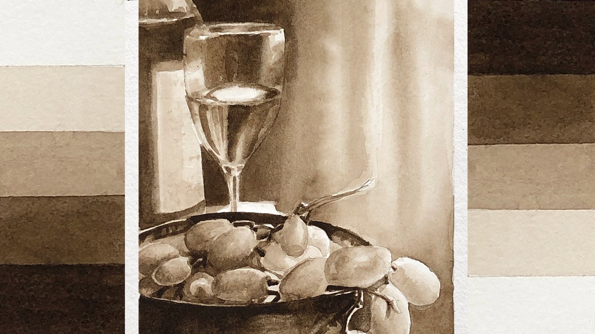
2. Class Project: The best processes are the ones who can instantly apply
to your own work. Using an in-progress
painting of your own, you'll explore options for
adding paint using thumbnails. You could choose to explore
background like I do here, additional elements or whatever you'd like
using this process. If you don't have a work
in progress right now, feel free to use the image provided of the
painting I'll be using, just to go through the
steps in the class. Referencing your
work in progress, brainstorm ideas
using thumbnails in whatever media you
choose to work in, photograph your thumbnails
and work in progress. Edit the files and import
them into Procreate. You can also use Photoshop if you don't have
Procreate or an iPad. Using a layer mask, we'll isolate our subject, revealing any layers below. Explore how each
potential background changes the painting by
hiding, adjusting opacity or using layer effects
to create new ideas. Use a clipping mask to add
additional edits on top and help plan out
your next steps. Export your creation and
use it as a reference to recreate the magic
on your actual artwork. It's also great to remember
that the process is not here to enable
perfectionism. But rather to help
you brew ideas and help you find a way forward that you're competent
in and satisfied with. Be sure to share
any of your steps and of course, your
final product. In the project gallery, I'd love to see what
you guys create and how you'll use this project
in your own art practice. If you're ready to get started, let's dive into
the first lesson.
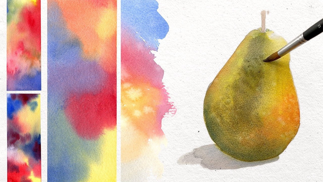
3. Creating Analog Options: In this lesson, we're going
to be going over creating our options in analog format
with your thumbnails, so you're using whatever media that you're using for
your work in progress. I have a watercolor painting, so I will be doing some
watercolor thumbnails, exploring some
various backgrounds. This is a really important
step in terms of expanding your creativity because
I encourage you to use whatever ideas come
into your head, good, bad, just get
them down there, and that way it gives
you some material to work with once you
get into Procreate. The process tends to get easier the more you do
it and also becomes more creative and
your solutions become more authentic to your
own artistic tastes, the more you start to
refine what you like and what you don't like. Without any further
delay, let's get started. This is my demo project here. I'm going to be
keeping this nearby, so that I can reference
any of the colors that I might want to play-off of or include in my thumbnails. I'm just going to have
this just off screen. Here I have my sketchbook, which has cotton
watercolor paper on it. I have a 9 by 12 part of it, and I'm going to create
my thumbnail sections. You can do these as small
or as large as you want. You could do a full sheet. You could do the
same full size of the painting for every thumbnail
if you really wanted to. I'm going to be doing quadrant approach to
the sheet of paper. The templates that
I frequently use I have one of my business cards that I use are small ones and coasters and some
cardboard cutouts. This won't fit on four times, so we're going to
use this coaster and equates to being
equivalent to a three by four, which is closer to an
8 by 10 proportion, but this is just fine for
these background markups. I'm just tracing these
because like I said, these thumbnails
aren't going anywhere. These are going to
stay in sketchbook. I'm just going to take a photo and edit it to
capture each color. I don't care if the paint goes outside of
this pencil line. You can always use masking tape or painter's tape
to tape them off so you get a nice crisp edge if you have a preference for keeping your sketchbook
looking little cleaner or you just like that look. You can do whichever. I have four thumbnails here. I've rather large brushes because we're
working backgrounds, so I wanted to get them
in quickly really utilize maybe some paint
granulation techniques. The first one I'm going to do, I'm go to pull off some
previous experience of mine with a background I didn't
use in another painting. Here I'm sealing
the comfort zone because I know what it's
going to look like. I know what to expect out of it. I like to start with
something I'm comfortable unless I have a very clear
idea of what I want. Looking at these colors, there's a lot of red and orange. Maybe I'll work with compliment. Compliments would
be green and blue. I have some cobalt teal here that I'm just going to
put some splotches down. Then I want to play that
up with maybe some green. I have some cascade green
here from Daniel Smith, which does really
well in wet on wet. Then clean my brush, and then I might also
add a little lavender just because I really
like that color and it'll be a more
analogous color to use against the
red and stuff. This looks very tight for
being the background. What I have planned
is to loosen it up. That's my first swatch. Let's see, my second swatch. Maybe I'll play something
a little more realistic. What I'm doing is just mimicking what a background behind
it would look like. Like I said, the more accurate your thumbnails are to
what you'd like to do, the more accurate your markup will be in portraying
what you want to achieve. But like I said, don't feel like you have to
get it perfect in the markup because it is just
an idea generator. We'll just see how that goes. Remember these are thumbnails, so I may not even need to be tied to putting this
behind my painting. It could be like, Oh, I
liked this transition or maybe just the colors or
you're just looking for ideas. I'm just going to
lift out from here and then we'll move
on to the next one. Here we go. Let's say maybe
we'll do something a bit more another
abstract-ish one. A lot of times my backgrounds also reflect just what
I'm feeling at the time. Colors highlight. If it's the beginning of spring and there might be
some brighter colors if we're getting into winter, that might be some dark
or more dramatic colors. All of that plays
into my choices. As you explore more, you'll get more ideas. Ideas might be slow
to come at first, but get more creative
the more you explore. Then move on to the last one. I want to try something. If I get to the point where maybe I want to
do for thumbnails and I'm getting to the point
where I'm on the fourth one, I may have it really done
anything super bold. I usually like to try and make
this one the most dramatic or off-brand just to
see what happens. I'm just giving this
a quick pre-wet. I want to go dark. I don't want it to be fully
dark behind these because these are supposed to
be somewhat light. I do want to make sure I have some points in the
background that are lighter. Remember to be bold. Try any idea, because no one has to see
these unless you want them to, because nothing here
is final product. Remember you have all the
freedom in the world. If you get stuck
trying alternatives, try switching your color
and either your brush or your brushstroke or
your application method. Maybe if you did one wet on wet, maybe the next one
is wet on dry, or maybe the next
one you do with a really squiggly brush
instead of a round brush to give you more loose things. Just see how things change. I think we're done here. These are my four thumbnails. You could see the
progression I went from. This is a background
that I played within a previous
set of thumbnails I didn't end up using in
that final paintings. I wanted to play with
a version of that. Then I went with something
maybe a little more realistic. The way to up leaves and foliage might look at a distance,
maybe a little blurred. Then we did another
abstract one. It's a little bit
similar to that, but then with some different
colors plopped in. Little lavender or a
little like a coral red, which might look like smaller
tulips in the background. You can let your
imagination play with it. We'll see how that
looks behind it. Then something really
bold at the end. I wanted to go really dark
and make them dramatic. We kept a little light
source behind them and then brought some warmer colors out to some darkness and so
coolness underneath. Meaning it'll make it look like it's in front of a street lamp or a nice garden lantern. That might be a cool effect. We're going to take these
and once they're dry, I'm going to move on
into the next lesson. Did you create some great
options in your thumbnails? I hope you at least
tried some new ideas and stretch the boundaries
of your comfort zonal level. In the next lesson, we're
going to capture our art and thumbnails using a camera.
4. Start with a Photo: [MUSIC] In this lesson, we're going to
capture our work in progress and our
thumbnails using a camera. While this process
shouldn't take too long, it is important to
balance efficiency with accuracy because that way our result will
give us a better, predictable outcome, once we get into procreate and
start compositing. We will need to
start with taking a picture of our
work in progress. What we want to do is make
sure it is evenly lit. I am facing a window that's
letting in some cloudy light. I have some nice even not direct light illuminating
my full painting. It's not brighter on
the top or the bottom. My painting is not
worked in any way, so my light is nice and even. What I want to do is take a photo and I'm
actually going to use this phone's telephoto option because what it's going to
do is allow me to not get so much warp to the perspective. If I were to use the regular wide-angle lens here and make it fill the frame, I'm going to start
to get some fish-eye warping and it's not going to give me an accurate
depiction of my subject. What I'm going to do is use the telephoto option and make sure my subject just
fills the frame. It's okay if you need
to crop some out. I also want to make sure that
the phone is pretty level. I have the grid lines
that show up on my phone, so that helps me with the
square object to line it up. I want to make sure it's level. It's filling the page as
much as possible without any distortion and then I always like to take
a couple of photos. Double-check that you're
focused on the right area, and just have a couple options. But that is how
you would capture a photo of your
work in progress. The same principles apply to photographing
your thumbnails. You would like to make
sure that the page is evenly lit and you
want to make sure that your camera is far enough away that it doesn't
cause distortion. What we're going to
do is once again, on the whatever telephoto
setting your camera may have, or the most distant blends, we're going to make sure that our thumbnail mostly
fills the screen. I'm not going to
able to get quite as close because this
is fairly small and the camera will
be so close it will still cause distortion. I'm just going to get till
it fills most of the screen. Then once again, checking my focus and taking
a couple images. You want to make sure you take a couple of images in
case your hand shakes. You also want to make
sure that your phone is level when taking
your photos as well, to reduce any sort of warping and just make sure you capture
each of your thumbnails. Now feel free to review the images that you just took to find the best one of each one. But other than that, once
you have all of your photos, we're ready to move
on to editing. [MUSIC] Capture pictures, be sure that they are
at least evenly lit. Because then the next step, this will make editing
smoother and quicker. Once you're ready, let's
move on to the next lesson. But we're going to
edit these photos to reflect our ideas as accurately
as possible. [MUSIC]
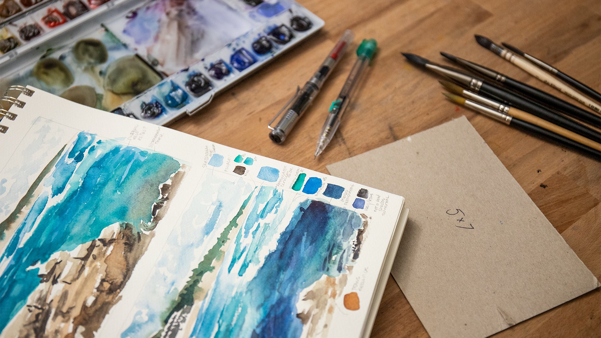
5. Editing for Success: [MUSIC] I'm sure
you've all edited photos on your phone before, but let's review a few
quick edits we can do to turn our photos into clear
and accurate images. We're going to balance accuracy
with quickness in order to create a reliable
mockup of our ideas. We're going to start with
editing our work in progress. You can see here I
have this image pulled up within my photo editing app. I have an iPhone, so we're in that general layout and set up. But you could edit this in Photoshop with whatever
photo editing app you like. So you see here I
have it pulled up, so I'm going to go into edit. The first thing I
always do when editing any photograph is to crop
it to just the artwork. We're going to go into crop. If I see any glaring issues
having to strain it, I will do that first. Just a little bit
underneath one degree here and then bring in your crop
bars so that is just inside. I can tell I did clip
a little bit of it. Just bringing it just inside
the masking tape there. Then just doing
that with each one. I don't like to use
the corners because I find with my finger I cannot
be quite as accurate. Although this doesn't
have to be exact, I'd like to get as
close as I can. You can see here we
have our cropping done. I'm going to go into edit. But before I start
changing anything, I'm just double-checking
the image to make sure there isn't any little bits of masking tape showing, although it won't
be a huge issue, because what's going to happen is once we get into Procreate, we're just going to remove
the background completely. Not a big deal, but I do want to make sure
there isn't any on the tulips or anywhere
near the subject itself. When editing your
work in progress, what you're basically doing
is just making sure that the subject is
accurate and clear. We don't really
care too much about the background because like I said, we're going to remove it. I always start with auto just to see that does help
us a little bit. Then I'm going to also go to exposure and I'd like to bring it until I lose something, and then I bring it back down to where I find I'm not
losing information anymore. What I mean by not losing
information is it means that some of the highlights
maybe have blown out, so you can see if I jack
this all the way up some of the actual tulips
turn to white, which is not accurate. So I bring it down
so that it's lit. At the same time, I do have my actual work
in progress next to me. I can tell if maybe I'm being dishonest or overly ambitious to how well maybe
the brightness was. But I can tell because
it's just right next to me that this is great. This is fine. I do not think this needs any
contrast adjustments. I think this looks good. If anything,
sometimes I actually decrease the contrast
on a photograph of my paintings because I
find the camera actually amplifies it to a
not accurate degree. Then continuing down, the vibrance and
saturation look good. The one thing I'm going to do is looking at my
work in progress is I actually want to
make it just a touch. I'm playing with making
this cooler or going to tint and making it more purple. I do know it needs a
little more purple because my tulips are more on the pink side than on
the orangey red side. I think I will play with a little in both of those sliders,
and that looks good. So that's all the edits that
I'm going to do for this. You don't want to over edit this image because that won't
give you a good mockup. Because your painting
is your painting. By changing the
edit on this photo, it's not changing your painting, so you want to make sure
you're working with the most accurate version that you can while
you're editing. So let's move on to
editing the thumbnails. Here we have my first photo. What I'm going to do
first is crop it. So I'm going to just
bring in each of the sides so that it's just
inside the pencil line. This is why I didn't worry about painting outside the lines. Then I'm going to
go into adjust. I always like to try auto
to see if it helps me out. This one does not help me out. We're going to have to
do everything manually. We're going to exposure, which is usually where I start. Where I start is I
just bring it up or down until I start
to lose information. So you can see right about here in the upper left-hand corner, my highlights are blowing out. So I'll bring it back
to where I don t think I'm losing any information. Then I'll go on
to the next step. I feel like going positive
with the brilliance here is evening now a lot of my tones because this is a
very delicate thumbnail. Then same thing. If you're not sure what
each of these does, you'll start to get
a knack for it, but you can go back
and forth to each extreme and just see
if it's helping you out and then fine tune it. I don't think actually
I'm going to be doing anything in highlights. I don't think this helps me out too much
with the shadows. I normally on a painting bring down the contrast
because it tends to look too over corrected by the phone. But here I'm actually going to, because it's a design
against white, I am going to bring
it up a little bit just to make it stand out a bit more so it's photographs
with a little flap. Our brightness here, sometimes I will bring
this up if I find that exposure wasn't
quite doing it. I'll bring it up a little bit because that doesn't
clip out as much. I don't think I need
to do anything with black point on this
particular photo. I will bring up the saturation a little bit because it lost
some in the photographing. You can play with, if you like, brilliance or vibrance
or saturation more. What I do need to do is
make this a little warmer, this is photographed a little
cool. That looks good. Then you can play
with, if it needs to lean towards green or
purple in the tint. I can do a little bit of green. That one is good.
So I'll hit Done. You can also see
against whites and then you can get a better idea
if it's done or not. I'll just do one more and then we'll go
through everything. So editing the cropping first. Because then it'll show you all the other
distracting information. Now this one is pretty close. What I'm going to do first actually is edit the first thing that I see that bothers me or I need adjustment,
and that's the warmth. It definitely needs to come up. I definitely think this needs
to go more towards green. Then I think maybe
between exposure, that actually looks
pretty good right there. I might play with
the brightness and see, a little bit of brightness. Right there, that was a much
quicker edit because it was photographed a little bit
closer to what it looks like. I'm going to go through
the other two thumbnails and I will catch up
with you at the end. [MUSIC] Editing should be fairly
quick and painless, but if you find yourself unable to come out with a clear image, I do recommend going back to
the photography lesson and emphasizing trying to get a
clear and evenly lit photo. Because more likely than not, the lighting is at fault. If you're ready to move on, let's go onto the next lesson
where we're going to import all of our images into
Procreate. [MUSIC]
6. Importing into Procreate: [MUSIC] A change in workspace is always exciting
and it's amazing how fast the project will come together once our files are in Procreate. Once you have your edited files of not only your painting, but also of your thumbnails on your device that
you edited them on, whether it was your phone or your computer or your
iPad just makes you those files get to your iPad or wherever you're
using a program, whether it's Procreate
or Photoshop, make sure they get
to the device. You need them on of course. I have all my files in
here in my photos app. My next step is to
open, Procreate. Then instead of clicking New, we're going to click Photo. We're going to open our
photo of our painting. Our next step is to go to the wrench and click,
Insert a photo. slowly we will add each
of our thumbnails. You can see it's a
little bit smaller than my canvas just because
of the way I cropped it. What I'm going to do
is I'm going to pinch the whole canvas, the whole board to be
smaller than my view. On uniform with the
arrow selected, I'm going to pull the
corners just past, I'm going to use our pencil just past the edges so that just overlaps everything and then just
click on that to set it. [MUSIC] Now as you
go, you can go up to your layer file and rename it. I'm going to name this
TB for thumbnail or for thumb [LAUGHTER] one. Then going back to the wrench, we're just going to repeat
inserting our photos. [MUSIC] You can see here
because I had the pen up, it wanted me to write
the description. Just by putting the pen back
and hitting the keyboard, I can bring that up. Because I like this much better, it tends to not come
out when I write it. [MUSIC] Once you have all of
your thumbnails imported, you can see them all here
in the Layers panel. What I'm going to do is just drag my original painting up
and I'm actually going to rename that painting original. We're just going to
leave it like that. The next step is going to be to add some sort of sort mask so that we can visualize
these behind the things. We're going do that
in the next lesson. [MUSIC] Now that all of our
pieces are in Procreate, we can use its tools to create a composited image
that's flexible, fun, and 100 percent
stress-free. In the next lesson, we'll learn how to
use a layer mask to isolate our subjects. [MUSIC]
7. Layer Masks: [MUSIC] One of the most
fun ingredients of using any composition software like Procreate is learning
how to use a layer mask. What a layer mask does, is just tell the
program what parts of the selected layer
you would like to see and which parts you
would like it to hide, not erase, but it's much
easier to show you. So let's get started. Picking up where we left
off from the last lesson, we are going to now create
a way so you can see all of your thumbnails
underneath your painting. If you really want to be picky, you can reorder these because
that's just the way we will see them and this
keeps your numbers in line. So with your painting, original painting
layer selected. If you are nervous about accidentally
modifying that layer, what you can do is scroll
over, hit "Duplicate", then maybe drag one of these duplicates down
towards the bottom, and not only make
it not visible, but also lock it so
that's not touched. We're going to back
up to this one here and we're going to click "Mask". What that does is
creates a layer mask. Now, initially your
layer mask is all white, and layer masks work in gray-scale so anything
that is white, is visible in this
layer, it's applied to. If you apply black, say with your, so let's have
a round brush selected. We'll just make it large, and I have black selected
from a basic palette here. If you mark it, you can see everything
underneath from this one. If I turn this layer off, you would see that one, so you see where I'm
going with this. What you need to do now is basically paint
around your subject. Now, you can do that with a larger brush far farther away. Just getting close. You can see the best
part is you can undo. We're getting close. Then slowly start
making this smaller. You can change up
whatever brush you like, whether you like
using a flat brush, round brush, whichever. I tend to think this one
does a pretty good job, and I like the nice crisp
edges because I want a nice crisp outline
to my front subject. You can make by
pinching outwards, you can make and drag
around, make this larger. So I'm just going to
go ahead and do this, and I'll catch up with you
once it's all outlined. [MUSIC] Now you can see that I am rotating my
canvas and that's just so I get a nice smooth natural
movement of my wrist. Because there's always
a chance I'll put my hand down on the iPad, and I know they do
make gloves to prevent your hand from moving
things around, but this just makes it easier, and I can just get a nice, controlled line of my brush. [MUSIC] Another thing I do want to note, especially if you're
working with watercolor, is if your original
sketch, it was very loose. This one was actually
was very loose for me. You can see the stem isn't
completely straight, there's some stray marks here. Even if I cut this out
of my layer mask here, if I were to put in
this light background, that green would not go away. I cannot actually
delete it in real life, it would actually be there. Now, if you were doing this with one of the
darker backgrounds, you could paint over
it so you could, in a sense practice what it would look like
without it being there. But just to remember that, just because you can
delete it in digital, you cannot always delete
it in your physical art. [MUSIC] Also, don't forget to
get any small areas. If you have a very
complicated picture, this might take a minute but sometimes this step really
is very important and getting it where you want it to be because
it could actually change how you feel about how something blends
with the background. So you want to make sure you get the mask in nice and tight, but not too tight, where you're deceiving yourself with what the actual
result will look like. Like I said, with like that
green spot I had over here, I cannot actually magic
that away in real life. You see, I've got
all my little spots and it looks like
I'm about done. Now, a good way to test, especially since this
one here is very light, is to throw in, say, let's change the
background color to black and then hide
all those layers. You can see right here
everything I missed. Just makes sure we're
on our layer mask still with our black paint. Let's clean this up just a bit. Now this may not change
how you feel about when you're popping in
backgrounds, but it might. So say you missed
an entire area, you would be able to see
that by checking this. That's pretty good for this. Like I said, this is a
rough and tumble way to check out backgrounds. We're going to go
ahead and to start turning on our backgrounds. You can see that's how
the layer mask works. The layer mask, it hides part of the layer
it's applied to and lets you see the
layers below it. In the next lesson, we're going to go over
how to now change up your layers so you can
really explore your options. [MUSIC] Probably not as hard as you were
thinking, right? Just make sure when
adding or subtracting areas to the layer mask that the actual layer mask layer is selected and not your
original image layer. Once our subject is isolated, let's play with our layers
in the next lesson. [MUSIC]
8. Layer Properties: [MUSIC] Playing with
the possibilities of your thumbnails is the fun part. Not only can you explore
the different possibilities from each of your individual
imported thumbnails, but you can also find new variations by turning
layers on and off, changing opacity or changing
the layer properties. Now that we have our layer mask, that is hiding a good portion of our whitespace so we
can see our layers below, let's flip through
our thumbnails and just get a sense
for what we like and play with some of the layer properties to
explore them a bit more. Right here, you're
going to see that I'm going to keep the
layers panel open. What I want to do
is pinch and drag so that my Canvas
is on the side. If you're holding
yours in a portrait, I recommend doing
it in landscapes. You can have both of these
visible the same time. Initially you can see
our Thumbnail 1 that really delicate one
is behind it now. I'm just going to flip through. I don't love this one
actually right off the bat. I feel like it does
not match with the strength of the
color in there, which you wouldn't know
maybe until you saw it. Let's go to the next one. That's really pretty,
that's more realistic. As I mentioned when I was doing the thumbnail looks like
you're just focused in on a flowers in the
foreground and you can see some foliage
in the background. This one, same thing. I think it would need
a bit more work, but it has that
same perspective. I actually really like this one. This one is that,
I think I said, that it reminds me
of like if there was a garden lantern or
something behind it. But I'm also getting little ideas and glimmers
of inspiration that maybe I want to do like the sun rising in the
background or setting. That could be a
really cool idea. Let's play with this one
a bit more and see what other fun edits we
can make before we go and jump back into analog. Because there's much
more you can do to stretch your inspiration. For example if I didn't
like any of these, I could always turn on a previous one and
change the layer style. By clicking the little n there, it opens up my
layer cell which is automatically or
defaultly set to normal. You can set it to multiply, which mean a glazes over
whatever is visible below it. Adds the colors without any of the whites and none of the lighter colors
really show up. Some of your colors themselves
will glaze over as a hue. Darken, just adds the colors that are darker than
the layer below. As you can see I'm
just getting colors in that layer area and then you can just scroll through and see what each of these do. There are definitions what
each one does online. We're back to normal and then
these are the lighter ones which really aren't doing
anything. That one's cool. Overlay sometimes a cool and
just check out what it does. Do some of the light ones. None of these are really
giving me anything different. That one's cool colors, but the composition of it doesn't really work there
with it being inverted. Subtract and divide exclusion, these ones here tend to give
you some really interesting, really bold ideas because a lot of people paint later
and these tend to flip it. You get really dark effects. Let's change the hue,
which is interesting, not in love with
that saturation. You can see how
this changes that. I didn't love any
of those really. We'll go back to normal
and just turn that off. You can do the same thing
for each one of these. Just play with that; that's cool. I'll multiply here. Just looks there's a background
that has that color. You can see how
this would create new ideas as you flip through. It's interesting color,
a lot more analogous. That's not bad either. But we're going
to turn that off. This one I think, is going to not do too much for me here. No. Turn that one off
and turn that one off, and actually will just
reset these back to normal. In that same thing, you
can play with the opacity. Just drag that. Remember, I do want to just
have this as the base ones, so we turn this visibility
off of the other one. That's without, and you can see, I like some of that. Let's do that and some multiply. Just to suggest a
little bit there. Although I'm always curious
to see what overlay does and nothing
much. Multiply this. This is my idea at the
moment and as you can see, it doesn't necessarily
look a finished painting. Even if I got this to replicate
itself at full-scale, like I mentioned in
thumbnail thing, this is not the
same size as this. When I go to replicate this, some of the granulation
patterns may be different. This is always taken
with a grain of salt. It's a guide. In the next lesson, what we're going to do
is explore how to use this one step further to
plan our path forward. [MUSIC] Was there a thumbnail that suited your
tastes perfectly, or did you find some new
magic hidden in the layers? The best part about working
digitally is that we can try out every idea to see
which one we like best. In the next lesson
we'll learn about another mask in
Procreate that lets us add paint and foresee our next steps after adding
the background [MUSIC]
9. Adjusting & Adding Paint: [MUSIC] Even if we find
the background we love, we might still see
that our subject isn't maybe 100 percent
harmonious with it. In this lesson, we're going
to add some paint in order to foresee what our
next steps would be once that
background is added, do we need to add paint
to the whole page? Do we need to add paint
to just our subject? We'll also touch on how to use a clipping mask in order to make it easier to just add paint
to that subject layer. We're going to select our top layer and click
the add layer button. Now we're going to explore adding a clipping mask to this. We say we like our background, we might make some
tweaks to it later, but we're going to
turn Layer 8 here, into a clipping mask. What a clipping
mask does that is different than a layer
mask because you remember, a layer mask either hit or shows parts of the
layer it's applied to. What a clipping mask
does is restricts what you're adding in this
layer so layer eight. Let's rename that
to Added Paint. Anything I add to the
Added Paint layer is only going to show
up on my subject. If I alter my layer mask, it may show more of
this, which we'll see. [MUSIC] What I'm sensing here is that my subject looks flat
on this background. It looks like it's backlit, which does not really look like lighting I
have on my subject. Because we're working
on adding shadows, since I really can't
add highlights and watercolor, this works great. What I'm going to do
is actually decrease the opacity and what I'm also going to do in under
paint file is change this apply mode to Multiply. Hit the N and then scroll up
so that it says Multiply, because I'm working
in watercolor, and any color I add is more of a glaze than a layer on top. If you're working in oil
paint or acrylic or gouache, you might be able
just to keep it on normal because you can add, say, a white on top and it will
show up versus in watercolor. I can't do that.
Multiply gives me more realistic sense of
what I can and can't add. Actually looking at my color, this is like a soft
lavender color. What this is going
to do is give me some nice dusky shadows and you can see
I'll just do a big. That's how my
clipping mask works. As you will undo that and
do it in a full opacity. You can see it only
shows up on the tulips. Then working on my tulip here, I would want to maybe see
if adding some shadows. You remember this is
like a thumbnail sketch. You are doing this
for experimentation, you're not trying to
get it to be exact. Just like the other
thing though, there's a fine line between
too loose or too tight. If it's too tight, it's
going to take you too long, and you might actually lose motivation to finish
the painting. Too loose and you may not get the right show of
what you will get. There's that balance
which you'll find. Here for each flower, I'm just adding where I think the light
will come through. Now, my knowledge of
where to paint just comes from my experience painting
these multiple times. You may need to play around
a bit more reference, some more photos, to see how and where to estimate this as you would
with a regular painting. As you can see, I'm
leaving this not shadow because the light would
stream through just that one tulip versus any of
these areas where there are multiple tulip petals that the light would
be coming through; I'm going to darken. Same here. I don't like that.
That's the thing. It's when you're working
digitally to flush stuff out, you can see where your brushstrokes will need to go before you
go and add them. Before you dive back in and then overdo it by adding
in too many places, you get to try it out here. We're going to increase. As you can see,
increasing opacity right now in this area
isn't doing anything. If I change this back
to normal because if I change this back to normal, it has reached full opacity. That's the color I picked. That's as bright or dark
is it's going to go. Now, if I wanted to
make that even darker, what I would need to do
just like to multiply, is go to this and select a darker color,
and then go back. You can see now it shows up. I just want a larger one. I Just want to create
a bit more depth. That was a little too much. Make it smaller. With each time I make it darker, not that this pertains to
the procreate process, but I'm just doing additions in smaller
and smaller areas. That's where I border on the
how much makes a big impact. Getting an idea of that
crisp contrast is important. But getting it in exactly the right spot, not so important. That's why I'm
being a little bit, not sloppy, but
loose with my marks. But at the same
time I want to go the extra mile and add
that extra contrast. If you want to see
where you are now and take a step back
from your painting, pull open your layers
and just click it off. You can see that's
the difference. If you're like, wow, I got
a little too carried away, you can simply erase things. Or if the best part and the worst part of
our extra layers is you could always duplicate. Here you can see that
I actually created another clipping mask and it basically doubled
up what I did. If you think you
need to go darker, you could really
quickly see that. Or you can see if
you want to do half. Maybe some of these
do need that, but some of them do not. Actually we are just
going to delete that and we're going to erase, so get brown brush and
bring that nice and down, nice and soft there. Little bit here. I want this to be lighter
because the light will be passing over the tulip. I think that's pretty good. I want to lighten
up the top of this. Say I wanted to explore my idea of making
this more a sunrise. Underneath my painting, I'll create a new layer. Let's rename this Added
Paint Background. There we go. I don't need to
add any mass or anything. It's just going to
show up in there. But we are going to change it to Multiply because it would work on the lower layers
where I want to start. What we're going
to do; let's see. Let's go with a bright orange. I want to go with bright, because as you can see,
if I paint across, it's going to show up as if it was like a
watercolor paint. Make this a little larger. At this point, unless
I want to work very blocky I do want to think there should be
a watercolor brush here. We'll just check that so
we can add in our marks. Trying make this look
like a sunrise or sunset. But I think it doesn't really
need stuff in the sky. Now that I'm trying this out, maybe what it needs
is a dark green. Make this larger. No that's a weird tangent. Once again, you can
work things out. There, cut that out there. Maybe there's something.
That's too big. Let's make a brush smaller. You can see this is how you can also adjust
your composition. Say we did pine trees, you could finesse this
however you would like to whatever degree makes you
comfortable to move forward. Then once again, like I said, sometimes it needs the contrast to really look like
if it works or not. Adding the extra contrast. Maybe splitting up
the backgrounds so that there's some more. That's a little too much. Let's back that up. There we go. You can play with whatever
shapes look good to you. You could see that's how
it would look in the back. Let's just use this smudge tool. Make it nice and soft. It's like I'm on
a Bob Ross show. I think that's a really
cool composition. I think that's what I want
to move forward with. You can see in this
particular lesson, what we did was we used the clipping mask to
add paint on top. We also use the layer below to address any adjustments
to our background image. [MUSIC] Already knowing some of
the steps ahead once we apply paint to
paper is very helpful, and being more confident
with the choices we've made. Not only do we know what our background may look
like with our subject, we've also already gotten a few steps ahead
of ourselves in knowing how we need to harmonize our subject with
that background. In the next lesson,
we're going to export our finished image to
use it as a reference in creating this plan on our
work in progress. [MUSIC]
10. Export and Apply: [MUSIC] Now that we
know what we'd like to do with our work in progress. We're going to
learn how to export that image from Procreate in
case you'd like to share it, or in case you would
like to print it out for working in your studio. Then if you have a
work in progress, now's the time to
execute your plan. Now that I have an idea
that I want to move forward with on this on this unfinished work
in progress painting, for example, there's
really nothing more I'm going to do with it digitally. But if I want to
reference it and don't want to have to
have my iPad open, running its battery down
with Procreate running. What I will do is go
to the wrench and hit "Share" and for example, I will throw it out as a JPEG. If I wanted to do more work on this or say you wanted
to make art this way. You can also export
it as a PSD, etc. You can export it
any number of ways. So I'm going to
export as a JPEG. I'm just going to save
it to my camera roll. Now you can save any
of your options. Say you wanted to look at them or send
them to someone else. Say you're doing a
commission and you want to have them
overlook some ideas, if you give them
that much freedom. You can export each one
of these and just say, "Hey, which one do you like?" I'm thinking all of
these are great. Which one do you like? You can export any number
combination of layers. You can export with and
without example being there. But this is the one I want do, so I've got the exported, and now I can jump into my own practice and adding
this to the painting for real. [MUSIC] I ended up
covering the edges of my working progress with
some masking fluid in order to be able to do more
fluid strokes once I put in the background and not worry about being
too careful. [MUSIC] The best part about having that mockup
is I can just sit back and enjoy putting
paint on paper. I know that this background is going to work
with my subject. At the same time, don't
be afraid to alter that plan that you made
once you start working. The mockup is a guide,
not a rulebook. Don't forget that if
you did some tilting in the thumbnails to recreate
that in your work in progress. You can also choose to add paint that you maybe
added later on in Procreate now in the actual background wash.
here you can see I'm adding those dark colors
that I added on an additional layer while my background wash is still wet. That way the colors
are very soft and the edges blend very well
with the background. [MUSIC] Isolate and only view the added paint
layer in Procreate in order to stay focused while adding shadows to your subject. [MUSIC] As you work on adding paint to your subject on your
actual work in progress, keep in mind you may find areas that evolve
and require you to lighten some areas of paint in order to make
the composition work. [MUSIC] Now that you know how to export your
image from Procreate, definitely be sure to share that within the project gallery. I'd love to see what you guys
kind of came up with for ideas and how your
finished project looks. Then if you have a
finished work in progress to actually
apply it to in real life, I would love to see how your digital mockup translated into your media in real life. Now it's time to move
on to our final lesson, which is our wrap-up
and conclusion. [MUSIC]
11. Conclusion: [MUSIC] It's always
fun for me to see how just little thumbnails
and playing around with creative ideas turns into more authentic creative
choices in my work. I know this process has
definitely helped me come up with more creative
ideas in my own work. I really hope that you
find a place for it in your art practice,
however that looks. In this class we use the process to come up
with background ideas, but also in ways to modify the work in progress we already have to fit with those ideas, to know that there isn't
a right or a wrong, those things are
always flexible. This is a great process and
a great space to try out ideas without that anxiety
of things not working. Remember this
Procreate process is a tool to help you
work through ideas. You don't have to see it as something you
have to get right. There is no right or wrong
within this process. At any point during the class
if you have any questions, please post them in the
discussion forum below. I love helping you guys out and nerdy now about this process. So I will be definitely
there for you if you have any questions or get stuck. Along the way please
share any steps or your final project posting
in the project gallery. I'd love to see what
you guys do with the process and how it
fits into your work. If you enjoyed the class or would like to leave
me some feedback, please consider leaving me a
review here on Skillshare. If you want to know when I release new things
here on Skillshare, follow me on the platform. You can see there is a
little Follow button under my little profile pic. If you want to know what I'm
doing outside of Skillshare, you can either follow me on Instagram or Facebook
just @jillgustavisart and/or go to my website which is jillgustavis.com and sign up for my studio insider
mailing list. This is just an
e-mail newsletter. It goes out about once a month with any
opportunities that I have, any new classes I
have published, whether that's
in-person or online. That's usually what
I share along with little studio insight and such. But as always, thank you so much for taking the
class and I really hope that this process
helps you become more creative in whatever way your
art practice needs. [MUSIC]
 Jill McLean, Artist & Creative Explorer