Transcripts
1. Skillshare Intro: [MUSIC] In this
world of abundance, there's no lack of inspiration. But do you still find yourself overwhelmed when it's
actually the time to create? Today, let's get rid of
that sense of overwhelm. Hi, my name is
Garima Srivastava. I'm an artist and illustrator
based in the Netherlands. After a busy corporate
life in my late 20s, I suddenly found myself
lonely and homesick in a foreign land and that's when I turned to my creativity
for comfort. Over the years, navigating through life and art mediums, I've realized one
thing that is to enjoy the creative process entirely without too many
must do's in there. I love experimenting the
supplies, subjects, textures, and paint every single day
out of my home studio, where I create art for
personal projects, but also for fashion, home decor, and
stationery products. I love sharing my
art process through my social media accounts and
teach here on Skillshare. [MUSIC] I often get asked, how do I come up with the
ideas for my paintings? While the answer
that inspiration is all around you is
theoretically correct, the truth is, for a beginner, it's hard to understand. While today, resources for inspiration are easy to find, it can still be a bit
tricky to interpret and express that
inspiration into your art, be it beautiful photographs on social media or print media, the world around you, or a still life right
in front of you. The question remains,
what do you paint? Especially when painting exactly as your reference is
not what you want. To make this easier, I've created this class
where I share with you my entire process of
creating illustrations, which are based on snippets of inspiration and are
built on imagination. [MUSIC] This class can be
divided into two parts. The first one containing
primary lessons, where you will learn my process of interpreting inspiration, using imagination to brainstorm ideas for conceptual sketches
for your illustration, how to find color palettes
for your projects, and plenty of tools and
resources to help you with that. The second part of
the class contains four individual projects with fruits and flowers
as a common theme, where I take you from
the very first step of the thought process to the
very last painted detail. While the might look
lengthy at first, please remember that
you have a choice of four projects and you can
pick any one of them. They all use same
skill level and had been arranged by
the time duration. For these four projects, you will learn how to take
a rough idea and turn it into a detailed drawing
with series of sketches. You will learn how to
choose and work with a color palette and how I navigate to a
watercolor painting while working in stages. By the end of this class, you'll feel more confident in adding your own imagination to your illustration and painting them in eye-catching colors. This class is best
suited for those who have painted with
watercolors before. But I do welcome all skill
levels to this class. For a beginner the tips and the resources I've shared
in this class will come really handy when you're starting with your watercolor
illustration journey. If you are an
experienced artist, I do hope that you
enjoy watching my creative process just the way I like watching
other artists. If you're ready to
add more of you to your illustration and enjoy
painting with watercolors, do join me in this class. [MUSIC]
2. About the Class & Project Overview: Hello, welcome to the class. Before we get started, let's have a quick look at
how the class is framed. The first part of
the class contains primer lessons
where I talk about art supplies,
watercolor techniques, inspiration
interpretation, we will do exercises to brainstorm
conceptual sketches for our illustrations, along with discussion
about color palettes, and tools and resources
to help you with that. [MUSIC] Following this are for individual projects
arranged based on the time duration which you
can follow at your own pace. While you can directly
dive into the projects, but I recommend watching
these primer videos first, because they will help you
better understand how to incorporate your
inspiration into your work, and use imagination to add
something unique to your work. Each project contains five to
seven parts with sketching, color mixing, and the entire
painting process included. Your project for this class
is to use the tips, tools, and exercises from this class
and create an illustration. You can also follow
along and paint any one of the four projects I
have shared in this class. In the next lesson, let's
look at the art supplies.
3. Supplies: Let's talk about
the art supplies I'm using in this class. Let's first start with paper. So for all my rough sketches
and concept developing, I use the simple printer paper. You can use it freely. Don't have to worry
about wasting the paper. You can put the wastepaper
into the recycle bin. After my sketch has
been finalized, I like to use a tracing
paper or vellum sheet to transfer my sketch
on watercolor paper. You can also use your lightbox. Now, when it comes
to watercolor paper, you have plenty of options. You can choose
between hot press, cold press, or rough
and textured paper. Cold press paper also comes in smooth and textured variants. For this class, I'll be using Fabriano's hot press
watercolor paper, 300 GSM in weight, an 8 by 10 inch in size. Hot press paper, as
the name suggests, goes through a hot roller which results into a really
smooth surface to paint. It doesn't absorb
water that easily, so you have plenty of
time to modify your work, and it's also really smooth
for any fine details. If you do not have easy access to hot
press watercolor paper, you can use a cold press watercolor paper
which is smooth. Canson XL is a good
example of that. It is a cold press paper, so it's not entirely smooth. It has a bit of texture, but it is relatively smooth when compared to other textured
cold press papers. Here's a quick
comparison of how a wash looks on all of these
different papers. You can decide which
one you prefer. Now let's look at the colors. For watercolors, I'll be
using my tube colors today. But you can also use little
band sets like this. They're easy to carry and you can mix the
colors right here. I've squeezed out these colors onto my color balance like this, and I'll be creating my
color mixes in this tree. Let's look at the colors I've
picked out for this class. For yellows, I've got
Permanent Yellow Deep. Arlen, Quinacridone Gold. For pinks, I have Permanent
Rose, Quinacridone Magenta. For reds, I have Alizarin
crimson and Perylene Maroon. I have dioxazine violet
here, sap green. For the blues, I
have serene blue, cobalt blue, Taylor
blue, indigo. I have a little bit of burnt
umber here and although you do not need to have a
black in your palette, I do find it handy to have it so that I can quickly make some of my favorite shades of green. I've got a little bit of
lamp black here as well. Here's the entire list of
colors and their brands. Now let's talk
about the brushes. For color mixing, I'm using
an old number 6 round brush. It's a damaged brush. I'll simply mix colors on
my mixing tray like this. Now let's look at the brushes
I'll be using for painting. So I'll be using for bigger areas to create
a uniform vash, a number 8 flat synthetic brush. Let's look at the
marks it makes. You can also tilt the brush
to create finer lines. I will also be using
number 4 round brushes. These are also
synthetic brushes. You can also make fine
lines with their tip. If you press the brush down, it makes a bit broader marks. For detail work, I've
got a triple zero brush. It's also a synthetic brush. With this, you can make
really fine lines. So with this brush, you
can add fine details. Apart from my watercolors, I'll also be using a
bleed-proof white. You can also use whitewash
for little fine details. For sketching on my
printer paper and for transferring the final sketch
on my watercolor paper, I prefer to be pencil. I like its level of
softness and darkness. You can make really dark marks. But if you want to
make lighter marks, don't put pressure
on the pencil. You can very easily erase these marks from
your final sketch. For my rough sketches to be
visible on camera today, I'll be using a
watercolor black pencil. I will only be using
this pencil on my printer paper
for rough sketches, but not on my watercolor
paper because it cannot be erased. For eraser. I like to use needing
gum eraser like this, which I can gently press on my pencil lines and lift
any excess graphite. This leaves me faint guidelines, but if you want to
remove them completely, you can also use a
dust-free eraser like this. I like to minimize my use of eraser on the watercolor paper because every time you vigorously erase
something from the paper, it does damage the
surface a little bit. Apart from these art supplies, you will also need a sharpener
to sharpen your pencils, a spritz bottle to
activate your colors, a ruler, a compass, some kitchen paper roll to soak up excess moisture
from your brush, and let's not forget a jar of clear water to
rinse your brushes. Here's the entire list of art supplies I've
used in this class. You can find this list under the resources and download
section of this class.
4. Watercolor Techniques : Now let's look at some of the watercolor basic concepts we'll be using in this class. For that let's make some color, I'm just picking some
color from my palate, adding it to my mixing tray, always keep a kitchen
paper towel with you to soak up excess moisture
from your brush, and a piece of watercolor
paper to test your color. Here's my color, if I want to make this
color a bit lighter, I'll simply be
adding more water, if I want to now
darken up this mix, I'll add more color, either in a separate mix
with little less water, or to this mix itself, a bit more color. Always test your
color before you apply them on your
final illustration. When it comes to
application of watercolor, we'll mostly be using
wet on dry technique, what that means is, I'll be applying wet
color on a dry paper. It can be a first
wash like this, or it can be another
wash on top of a dried layer of color. This application of layer on top of each other is
also called glazing. You are adding
transparent layers of colors on top of each other. It can be used to
deepen up the color, add some value to your color, or shift the color a little bit. I've got a little
block of yellow here, I'll add a transparent wash, so quite a bit of water in it, of red on top of this yellow, so here you can
see how it changes the color of my
little block there. It was originally yellow here, and now with a little
watery wash of red, I was able to create
an orange here. We'll be using the
wet-on-wet technique only at a few places
in this class, what that means is you
have a initial wet wash, say a flower shape here, and while this
wash is still wet, I'll add another
color right in here, and depending on the moisture and how the two
pigments interact, these two colors will
bleed and blend together. We'll also be adding
lots of details, so on top of a dried
layer of color, I'll be adding fine lines, so you can see how these
lines are quite harsh, I have not tried
to soften them up, but at a few places you
will need to soften up the new spot of
color that you'll add, so I'll add this color here, and now if I leave
it to dry like this, it will create a hard edge, but now I'm going to rinse
my brush better dry, and then quickly run it
along the edge here, so this will create a
much softer look here, it will not dry with hard edges. You can soften it further, rinse your brush, better dry. These were some of the
basic watercolor techniques we'll be using in this class.
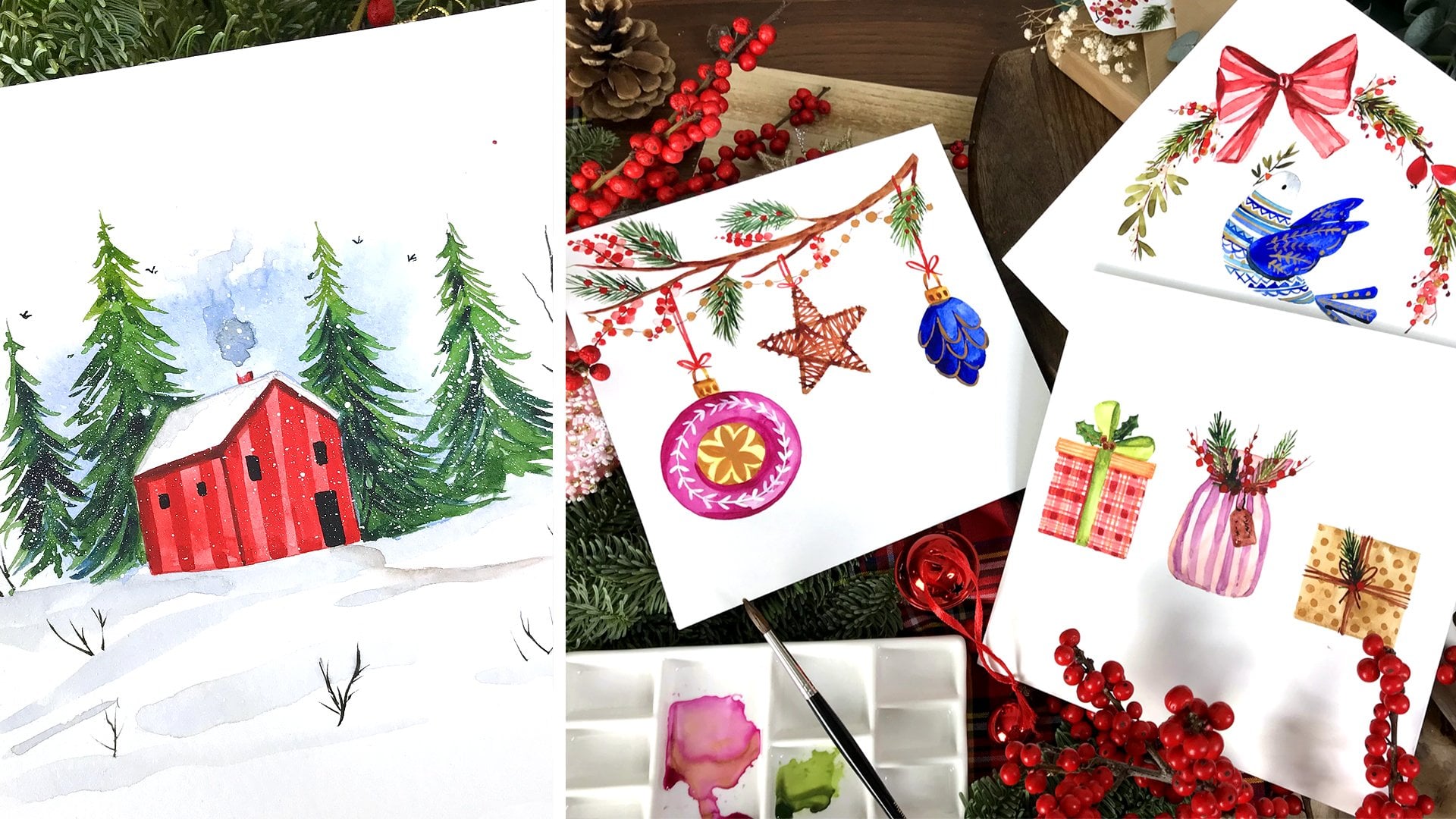
5. Inspiration: In today's world, our senses are constantly bombarded by
sources of inspiration, whether it's the
world around you or the beautifully curated
feeds on social media. Let's not forget, print media
continues to inspire us, so there's no lack when it comes to sources of inspiration. But let's be honest, do you find yourself taking lots
of photographs, saving posts on Instagram and Pinterest or folding
pages in magazines for future inspiration
and still find yourself overwhelmed when
it's actually time to create? In this lesson, let's
take that sense of overwhelm out of our
sources of inspiration. Before you start a project, you often have a thought
or a theme in mind. It could be your own or a client might have
provided it to you. You might have already
researched some photographs or a client might have provided you with something
called a mood board. For those of you who are
new to the term mood board, let me explain a bit about it. It's a design term used
to refer to either a physical or a
digital board which contains sources of
inspiration that define the theme of
the design collection. In a mood board, you will
find lots of photographs which might refer to a
certain type of design. You will find some samples
of fabric or photographs of it where you can
see the textures. In some cases, you
might find a font. Most of the time you will find a color palette
already mentioned. All of these elements
will define this theme that will bind your collection of illustration or designs. You're never meant to copy a
design from a mood board or a reference photograph
because of copyright reasons. But what are you
supposed to do then? At this point, my
suggestion is try to spend a little bit of time with the mood board or a
single photograph. Start with a single
photograph and ask yourself, what is it about this photograph that you
are liking or noticing? Write down the
answers that come up. Is the color palette
that's appealing to you? Write a mental or a
physical note about that. It could be a warm
color palette. You can even mention the
colors that are part of it. Are you noticing certain
types of textures? [NOISE] What kind of design
elements are you seeing? Are they geometric or floral? Write that down.
[NOISE] What kind of floral designs are they? Are they tiny ditzy florals or big inky flowers?
Write that down. By the end of this exercise, you would have picked up certain hints about your
reference photographs that will help you define or complement the
theme for your project. Now, let's do the
same exercise with the photographs that have inspired me to
create this class. Here's a beautiful photograph. What did I notice about it? I loved how that Queen Anne's lace was hanging
over the fruits here. Lemon and lime in this case. You cannot help but notice
the beautiful chinoiserie. You can very easily
write those things down. Fruit and flowers. Do write down the little
design elements that you see. You're never meant to copy them but you can write the term. [NOISE] What else do I notice
about this photograph? I love how these grapes
are hanging from the cup and how that lemon wedge is
sitting right behind them. You can write those
things down as well. [NOISE] Hanging grapes, lemon wedge. Let's look at some
more photographs. What do I notice here? I notice a bowl full of
grapes stacked up on these beautiful plates on something similar here
but with flowers. You can make a note about it. Let's see some more.
Here's a gorgeous print, and you can very easily
get overwhelmed by so many elements
here when you're searching for inspiration
but try to concentrate. When I try to concentrate here, my attention goes to this little vase here
with wild flowers. Now, let's have a look
at this photograph and let's see what do
you notice about it? If you had to make a
mental note about it, what would you write? I would write that
it's a hanging basket, rusty with a vintage
floral design and some hydrangeas in it. Let's write those down. Vase with wildflowers, basket with vintage floral. Let's see another photograph. Here's another beautiful but overwhelmingly
beautiful photograph. You can get lost here if you
want to find an inspiration. But try to concentrate. What do you like about it? Again, based on certain
things that you often like, your attention will
go to that thing. For me, it's the vases
with flowers in it, so my attention
goes directly here. I will write down a rusty old vase with a beautiful collection
of flowers in it. You can even make a mental note of what flowers are there. What do I like about
this photograph? Apart from the gorgeous
flower in the little teapot, I like how they
have been arranged. How certain things are
ahead of the teapot, and this other teapot is
actually slightly behind it. You can make a mental note about a certain
arrangement of elements. Here's the last photograph. Apart from it being
utterly gorgeous, what I like about it is these beautiful
flowers covering most of the teapot and this
butterfly sitting inside a cup. You can make a mental note. Something about a tea set. You don't need to write
too many details. Just write little
things that you're picking out of these
sources of inspiration. Tea sets, creamers with flowers, teapots, and overlapping
composition. When I'm creating
the illustration, I would know that
instead of just placing things next to each
other leaving gaps, I should create a composition
where some things are ahead of something and
a few are behind. Now that we have looked at some photographs and made
some notes about them, it's time to put away my
source of inspiration, and in the next lesson, we are going to let
our imagination take the lead in this
creative process.
6. Brainstorming Concepts: In the last lesson, we looked at some beautiful
photographs that have inspired me to pick a
theme for this class, and we wrote a few
notes about them. For example, the
beautiful chinoiserie on these ceramics here, so we wrote that down. At this point, we
are going to close and put away our
source of inspiration, and we are left with these few words that
we're going to put aside and use them as a
small reference later. But this is now the time to let our
imagination take the lead and create a
few conceptual sketches. For that, I will
give you a tool. In the center, write your theme
fruits and flowers. I will divide this
into three sections. Here, you will write fruits, flowers. For fruits and flowers, you can add the ones you like to paint or you pick them out
from your reference images. For flowers, I
often like to paint quite generic flower shapes. But you can also write
your favorite flowers, daisy, sunflower, poppy. It can go on as many flowers
you want to add here. For fruits, the same exercise. Just add the fruits you
can think of like to paint or you've seen them
in the reference images. For example, grapes, you can add blueberries, apples, pear, and let's not forget the citrus
fruit as we had seen a wage of lemon in one
of our reference image. We can write citrus. Now in this section, try to write few things that
you often like to draw. It is important to draw your favorite objects multiple times with different
themes in them because then it
becomes a part of your style and your work
becomes quite cohesive. I often like to draw
teapots, kitchen items. I love painting houses. I also love painting little cute animals,
butterflies, bugs. Now you have this
section with flowers, fruits, and some of your favorite objects
that you like to paint. What you have to do
is pick one item from each of these sections and
create something together. Say, for example,
I pick a daisy, from here, I pick blueberries, and from here I pick a teapot. I would like to create an
illustration with the daisy, blueberries, and a teapot. But the question comes, how do I create
that illustration? How do I make it unique? For that, it's important to know how two things interact
with each other. We have an item A, which can be a
flower or a fruit, and we have another item B. Let's make it another shape. B can be any of these objects. There are a few ways in which item A will interact
with item B. Item A can be sitting
on top of item B. Item A can be sitting
ahead of item B. It can be hiding behind item B. It can be as a print on item B. It can also be inside item B. Item B can also be in
the shape of item A. For example, a pair, empty pot. A teapot can also be in
the shape of a pair. These are some of
the ways in which two items interact
with each other, and you can create
some unique ideas, having these as a
compositional reference. Before we get started
with conceptual sketches, let's have a quick
look at some of the ways in which you can
present your illustrations. One of the way is using
a list or a grid. This is a uniform
grid where I have created few different patterns on similar sized strawberries, and I've placed them
in a grid form. You can create a list which
is not in a great form, so items are also
different sizes. Some are painted quite
large and some are smaller, and they have been placed
a bit more randomly. You can create a decorative
design like this, whether in a placement
designed form or as a read or a semi-read. Here, I've tried
to make sure that instead of placing
items separately, I've put a few items behind
the others and a few ahead. You can also create
something from still life, whether it's imaginative or
something from reference. In the next lesson, let's create a few rough conceptual sketches.
7. Thumbnail Sketches: Now let's use this tool to create some conceptual sketches. Let's put it here. We're going to pick
one item from here, one from here, and
one from here, and create a few sketches. For the first one, I would like to start
with kitchen items. It can be cups, plates, mugs. Let's pick a bowl of fruit
which can be any fruit. At this point, I will not pay too much attention what
fruit I'm picking. Just some random
fruit in a bowl. There can be a floral
print here on the bowl. That's one sketch for you. We can start with a coffee mug. It can have a fruity
and floral print on it, so say a strawberry
with some flowers. You can even write
some lettering. Now let's see what
else can we create. I love painting coffee
mugs and tea cups, so let's explore a
few more designs. Something with flowers and
then another one behind it with a citrus fruit wedge on the ring. We can create something
with some patterns on it. Say for example, if you had written geometric pattern here, you would add some geometric
pattern on the cup here, some flowers in here, and you could place
a fruit here. I'm just creating quite
a few quick sketches, keeping the three
objects in mind. Some kitchen item,
flower, and fruit. At this point, don't go
into detail what flower, what fruit, just create
some rough sketches. For this one, we can
add some fruits here. Remember if we had added
these hanging grapes, so we can add some
hanging fruit here. We had seen in that same one
a lemon or a lime wedge, so you can add
something behind here. You can add some flowers
here or around it. Some design on a cup. At this point, I will not go too much into detail what design, what shape of a cup. For me, this much is enough. You can keep on adding
as many items you like, but for now, let's move on and
create some more sketches. This time, let's pick a
teapot as our object. I love painting all
different teapots, so we've got a teapot shape. I love seeing flowers
inside a teapot, so that's always one
of my go-to designs. Some flowers in here. You can add some berries. Make this a bit more seasonal. Some pattern on the teapot. You can create a still
life with the teapot, say pomegranate here, and some flowers
placed right here. You can also create some reed and place flowers or
any fruits in here. You can also add some code or some hand lettering
in this design. Now, let's move on and create
a few sketches with houses. We can right away start with a small house with some fruit
sitting right behind it. Say an orange and some
flowers around it. One thing that I always
like to play around in my sketches and in my
illustration is varying the size. For example, a thing
that is in nature small, I like to enlarge it, and something that is large in size for example big trees, you can start making them tiny, shrink them a little bit. Flowers which are usually small, you can make them really
big as if they are trees. Let's get a bit more
creative and start with a watermelon slice here. We can put a little house
on top, some trees. Try to create interest
in your illustrations. If you'll just
simply paint a house of flower and fruit next to it, it won't look interesting
so try to bring a bit more interest and uniqueness in your
rough sketches, and then later
we'll refine them. Another way can be a house with some floral print and some fruit sitting
right outside. A house can also be in
the shape of a fruit. For example, let's make a pair and let's turn it into a house so a
door and a few windows. Then we can surround
it by flowers. Here you can keep on adding
more designs but for now, this many are enough. Let's move on and create a few decorative designs
with butterflies, bugs, or any kind of animals. For decorative designs, I
will give you a small tip. Especially if you're creating a placement design is
try to put your items in the shape of an S that are this way around or the
mirror image of it. It gives a nice flow to
your illustration and it becomes handy when you're
placing it into some pattern. We can start with some fruit. Say pomegranate here, we can add some leaves. We can add a
butterfly or a moth. You can also start with a strawberry twig. Add some flowers. You can add any kind of
insect or a little bug here. I'll add a little moth. You can also create some great, so say a bird and some reed
or a semi-reed around it with some fruits, flowers. You can carry on
doing this exercise and create more
sketches but for now, this many are enough. Now, out of all of
these stuff sketches, let's pick a few
based on which we are going to create the
projects for this class. Later in the individual
projects sections, we are going to refine
these sketches. Out of these kitchen
items sketches, I really like the
idea of this one. A cup with fruits, some hanging fruits here, a lemonade because it
uses some of the hints that we wrote down from
my reference images. Among the teapots, I like the idea of the street. We can do quite a
bit with the reed. We'll paint a teapot
with some reed. Among the houses, it's quite a tough decision but let's be a bit more
creative and unique, and pick this pair as our house. For decorative designs, let's pick the first one. We haven't finalized yet
what fruit will be in there. We might add some other fruits. But for now, let's pick this
simple decorative design. At this point, these
sketches look very rough, but I want to show
you that it takes quite a few iteration of sketches before you find the
one that you will paint. Here I have some rough sketches that I did for an illustration. My main idea was to start with the blackboard that was a
protected to a household. I've made it bigger than the
house right from the start. The house is on an island
with some flowers around it. From here onward, I move to
a bit more detailed sketch. The bird is still bigger
and behind the house, but I moved the
flowers into was here. I've added trees, some flowers
behind the bird as well. From this sketch, I modified it further
so you can see the size of things is
changing a little bit. Flowers have become much bigger. Some more change. You can see how I've
added a pathway in here. I've changed the shape
of the trees in here. Some flower shapes are
getting a bit more refined. This led me to the final sketch. This is the one that I traced. Here is that final illustration. You can see how
much difference is there from an initial sketch
to the final illustration, but the concept is the same. In this lesson, we created a tool with which we
were able to create few reference sketches
using little hints from the words we wrote
from our reference images. Before we move on
to the projects, let's talk a bit
about color palettes.
8. Color Palette Methods: When you've been
painting for a while, you have some colors that
you gravitate towards. It can be certain kinds of blues or greens or some other colors. Although you do change them
from time to time, over time, people start to associate
those colors with your work and it becomes
a part of your style. But when you're a
beginner, it can be a bit difficult to decide
which colors to use. When you've been
painting from reference, you already had some colors
that you can directly pick. But what if you've added certain elements that were not there in your
reference photograph, for example, a bus or a ribbon. It can be a bit
difficult to decide what colors to use
for these elements. For this, I have a few tips and a few resources to help you. Before we get started, let's have a quick look
at the color wheel. You can get a simple color wheel like this from any art store. On the color wheel, you
have your primary colors, red, blue, and yellow. When you combine
two primary colors, you'll get a secondary color. Red and blue combined is violet. Red and yellow
combined is orange. Blue and yellow
combined is green. Violet, green, and orange
are secondary colors. When you combine a
secondary color, say violet, with
a primary color, say red, you get
a tertiary color, which is red-violet here. Red violet is one of
the tertiary colors. You can rotate the wheel to
see more tertiary colors. If you combine violet and blue, you will get another
tertiary color, which is blue-violet. On the outermost part of the color wheel are
your key colors. When you add white to the
key color, you get tint. When you add gray, you get a different
tone of that color. When you add a bit of
black to the key color, you get different
shades of that color. Let me explain a little
bit about neutral colors. These are really muted
colors that seem to lack color intensity
and saturation in them and they don't really
appear on the color wheel. They can be pure neutrals, which are black, brown, gray, and white, and they can also
be near-neutral colors, which are created by mixing these pure neutral colors with a primary color that gives
them a slight underlying hue. Some of the examples are ivory, porcelain, khaki, tan, or taupe. Now there are different
ways in which you can pick harmonious colors
through the color wheel. The first one is a
monochromatic color scheme. What that means is you pick a key color and then
pick a different tint, tone, and shade of that color. You can pick these
three colors or even different colors
from a gradient of red, different kinds of red, pinks would be in there. The second method is an
analogous color scheme. What that means is
you pick colors that are next to each other
on the color wheel. You can pick from
two all the way up to five colors that are
next to each other. Say blue-green, green,
and yellow-green, these three will
look nice together. The next method is to use a
complementary color scheme. What that means is you pick two colors that are opposite to each other
on the color wheel, say red-violet and yellow-green. You can use this arrow to find different combinations based on complementary color scheme. Now let's look at
split complementary. What that means is to
start with one color, find its complementary color, and then two colors adjacent
to the complementary. We started with red,
complementary is green, but the two adjacent colors are blue-green and yellow-green. Red, blue-green, and yellow-green are part of a split complementary
color scheme. You can rotate the wheel and pick another combination
based on this. The next one is a
triadic color scheme. What that means is it
picks three colors that are at an equal
distance from each other. It's an equilateral
triangle here and it gives you three colors which are at equal distance
from each other. Red-violet, blue-green, and yellow-orange will form
a triadic color scheme. A tetrad color scheme uses two sets of
complementary colors. Blue-violet, yellow-orange, is one set, the other side is
blue-green and red-orange. These four colors together are part of a tetrad
color scheme. Again, you can rotate the color wheel and pick
another combination. When you turn this
color wheel around, you are able to see that the colors have
been divided into warm colors and then the other
half is the cool colors. From violet, all the
way to yellow-green are your cool colors
and the warm colors are from yellow all
the way to red-violet. You can make a color scheme
based on all the warm colors. You can make one with
all the cool colors. You can also make
a combined one. It is a bit balanced
color scheme where you have
certain warm colors, but you try to balance it out by adding a cool color in there. This way, with the
use of a color wheel, you can come up with a set of colors that look
harmonious together. Now let's see a few ways
you can pick colors. The first method is to go with the color scheme
as it is in nature. Your blueberries will be blue, pomegranates will be red, and your leaves will be
different shades of green. For the imaginative elements that are not there
in your reference, you will have to use your
intuition to pick a color. In the beginning, you might make mistakes and pick colors
that actually clash. But over time, with
the knowledge of the color wheel and
some experience, you'll get better at this. It's an easy method and it
helps build a color memory. I still use this
method quite often. Another method is to pick two
colors that are harmonious. It can be two analogous colors,
two complementary colors. For example, analogous colors would be blue and blue-violet. I would start with
those and make one lighter version of those colors and
one darker version. Here, I started with
this color first, made a lighter version,
a darker version. I started with this one, made a lighter version. I did not make a darker version, but you can very easily do that. Then I add a neutral
to this color palette, which can be a light neutral, but also a dark neutral. After this, if your color
palette is too bland, it's missing a
highlight excitement, you can add a
popping color to it. Here was the scheme with
blue and blue-violet. Similar way, I created
another color palette with pink and orangish
yellow colors. Added a lighter version,
a darker version. For orange-yellow, I also
added a lighter version, and then a few neutrals
that will work. I tried to add a light
neutral and a darker neutral, and then a popping color. With the understanding of the color wheel and
some experience, you'll be able to come up with eye-catching color
palettes yourself. In the next lesson, I will share with you some
resources that can help you decide on a color
palette for your project, especially when you do not
have time to experiment.
9. Color Palette Resources : In this lesson, I
want to share with you a few resources that I use to pick a color palette when I do not have the
time to experiment. The first resource
is this small book called A Dictionary of
Color Combinations. At the beginning, you will
find color schemes with two colors that are working
really nicely together. Later, you will find color palettes with
three colors in them, followed by a section
where you will find four colors in
a color palette. Towards the back of this book, you'll find the
color palette index; it's based on all of
these colors here. [NOISE] You can decide
on one particular color, say pomegranate
purple, and here, two color palettes that
contain this color. So 220, you can go back. Here are the color
palette numbers. Here's one color palette which contains that
pomegranate purple. [NOISE] This little book
comes really handy. When you are running
out of time, need a color palette
that's looking nice, you can simply pick
one from this book. Another great source of color
inspiration are magazines. Especially in home
decor magazines, you'll often find a
color palette that is associated with the collection
they are showcasing. Here's a color palette;
here's another one. But you can also simply go
through the magazine and find the photographs that are
visually appealing to you, especially in terms of colors. For example, in this photograph, I was really liking the combination of
this pastel green, the charcoal black, and the shade of
champagne in there. I've marked more
pages like this; so here's another one. [NOISE] In this photograph, I really like the combination of this dusty pink
with pastel brown, and this blue in there as well. Try to go through some of
the magazines you already have and pick a few
nice color palettes. There are lots of websites
where you can search for trending or eye-catching
color palettes. You can be quite specific video searches for
color palettes. You can search for
summer color palette, or a color palette
with sage green, or one with purple
and orange in it, and you will get plenty
of results to pick from. One of my go to
place is Pinterest, where you can find color
palettes based on a photograph, or individual color
palettes like this. [inaudible] often come with
a color palette you can use, but there are plenty of
websites that can help you generate color palettes
based on a photograph. Some of these websites also have color palette
generating tools. These tools use artificial
intelligence and color theory as their logic
in picking color palettes. The first one is Adobe Color. Here, you can decide on what color scheme
you would like to choose, say for example, we pick complimentary, and it will give you a color scheme based on
complimentary colors. You can pick split
complimentary, and it will give you a color scheme based on
split complementary. You can move these dots around and it will modify
the color palette for you. You can pick the hex codes
from here to use digitally. It also has a tool where
you can add a photograph, and then it will
pick a color palette out of that photograph for you. Another handy website
is coolors.co, that is C-O-O-L-O-R-S.co,
where you can explore trending palettes. Here you have lots of
trending color palettes. You can pick one by clicking
on these three dots; open it in the generator. Here is one of the trending
color palettes we chose. You can see the hex codes here and also the
name of the colors. If you want to add another
color to this color palette, simply click between
the two colors, and now you have six colors
in this color palette. If you want to modify
this color palette, but want to keep one or two
colors that you're liking, you can click on
this "Lock" button, and it will lock that color. Say I like this
color and this one, but I want to see what other combinations it comes up with; simply press this
"Generate" button, and now you have
another color palette, which also has the two
colors you had locked. You can press it again, and it will do the
whole calculation one more time and give
you another combination. From the homepage, you can also start the generator
by this button. It will give you a color palette that it has already
come up with. If you want to see
what logic it is using to come up
with color palettes, you can click on
these three dots, it will give you
Generate Method option, where you can decide which
color scheme you want to pick. Or if you want to leave that decision to
their own algorithm, just simply pick Auto. If you want to pick
monochromatic here, and press "Generate", it will give you a
monochromatic color scheme. I usually leave it to auto. Another use of this
color palette generator is when you already have
one or two colors in mind, and you want to
find a color scheme based on those colors. If you have a color in mind, you can simply click on one of the colors'
hex code here, delete that hex code, and write the one you
already have in mind, so say 43516D; press, and now the color
is called independence. I'm going to lock that
color and press "Generate", and it will give me
a nice color scheme, which has that color in there. I'll press "Generate" again, and I get another
color combination. You can do that by
fixing multiple colors. This way, I'm able to come
up with color palettes, starting with one color
that is already on my mind. You can also find
trending color palettes on places like Canva. They have quite a few trending color pallets which
you can easily use. Apart from these websites, you can also use designing
tools like Adobe Illustrator, Photoshop, or Procreate to
come up with color palettes. I've got Procreate here, and it has got a nice
color palette tool. If you're new to Procreate, there are plenty of
online resources where you can learn the basics. In the color palette
tool of Procreate, you can create a new
color palette based on a photograph or something which you can right away
click with a camera. I'll use the photograph option, New from photos, and I'll pick a photo
from my library, and it right away gives me a color palette based
on that photograph. It picks up very slight
variation of colors as well, so there are plenty
of colors which look almost the same so you can click on one of the colors and delete a duplicate color. This way, you'll be able to reduce the size of
the color palette. You can also use
the Harmony tool to decide on the logic
behind the color scheme. You can pick complimentary, split complimentary,
analogous, triadic, tetradic, and it will
give you bubbles based on that particular logic. Let's say analogous, and it will give you
three colors that are close to each other
on the color wheel. You can move them around, you can change the brightness and the intensity of the color. With the help of Procreate, or even Photoshop, you can come up with a nice
color palette. For each of the projects, I will individually share what color palette
I have picked, and my reasoning behind
picking certain colors. In this lesson,
we have seen how, with a little bit of
understanding of color wheel, you can create your own color
palettes and use some of the resources if you are
a bit short of time.
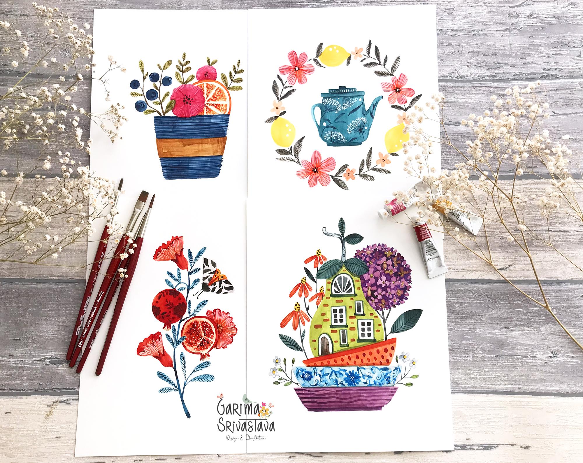
10. Project 1 Sketching : Let's get started with
the first project. In this project,
we are going to be creating an
illustration based on this little rough sketch
we created during the concept
brainstorming session. During this process, we'll be modifying this sketch
a couple of times before transferring
the final one onto a watercolor paper and
then later coloring it. Now for this rough sketch, the basic idea was of a
coffee mug or a teacup with some fruits hanging over the edge and a slice
of lemon in there. We'll also be adding
some flowers. Now let's get started
with the sketching. The first step is usually
for me to draw a base. You can draw a delicate teacup
or a sturdy coffee mug, it's entirely up to you. But before I draw
anything above, I like to give a nice
base to my composition. Now, instead of the
hanging grapes that we had seen in the reference
photograph, I would like to add
a twig of berries. Hanging grapes would
look much nicer with the more delicate, ornate teacup. But for a sturdy coffee
mug that I am visualizing, I think blueberries
will look nice, and that too on a twig. We also need to add a
slice of lemon or orange. [MUSIC] At this point, I have to decide if I
want a flower ahead of this orange slice or behind it. I think I'll keep
the flower ahead. If I keep the flower behind the lemon slice or
the orange slice, it will get hidden too much. This will be the flower shape. I can add a little
one behind as well. Then maybe a few
more leafy twigs. Now for the flower shapes, we have to decide what kind of flower we will add in here. We can add multi petal flower, something like a daisy, or a more generic
shape like this with some center or we can also create
something like a buttercup. It's up to you what kind
of flower shape you want. I usually go for something
generic like this. We can also add the
flower from a side angle, so something that
is standing up. Since you're looking
from the front, you'll be seeing it at a side angle so a profile
view of the flower. It's important to add flowers in different sizes so
that they don't clash. This one will be slightly bigger and I'll see how
big I want it to be. Then this little one
will be a bit smaller. Now for the cup, let's see if we want to
refine the sketch more. If you want, you can
add a handle here. On the cup, you can
decide to have patterns. Some kind of scruffy
toe patterns or something a bit
more delicate, with some floral design. [MUSIC] You can also add different
kinds of textures, some circular lines all around the cup. I'm keeping these aside
so that I can see them. You can also add some ribbons, say a bow in the center. [MUSIC] At this point, I'm only thinking about the bottom part and not
too much about the top. I do have the idea
what I will put up there and based on
that, I'm deciding, but I don't need to sketch
in every sketch of this mug, all of the elements. I'm just right now concentrating
on this coffee mug. You can also create band. Then you can add a texture or simple base color on the cup. You can add some
lace design here or you can leave
it simply plain as a craft paper color,
brown in color. Among all of the ideas here, I think I really
liked the idea of combining this texture along with this band of craft paper. Now let's combine the
two of them together. The band is wrapped
around the cup. It will be slightly outside
the edge of the cup. Then let's add the lines, the texture on the cup surface. [MUSIC] [MUSIC] This looks good. Give it a bit more depth, raising the height a little bit. Now I'm sketching the
slice of the orange. Let's make a big flower here. Compared to the slice of orange, the flower should be
slightly smaller. So I'll increase the
size of the fruit slice. Then we can add twig of
blueberries here in the corner. Another little flower
here, some leaves. Or we can make this
twig of leaves, and here we can add some berries that will balance out the berries
here with the ones here. I'll sketch it one more
time to refine it further. Every time I create this sketch, I'll keep the last one right next to me so
that I can refer to it. At this point, I'll
simply be redrawing this sketch so I'm
slightly speeding this up, but feel free to change the playback speed from
your viewing panel. This time, I will draw
the flower first. [MUSIC] Maybe add another leaf here that is slightly
ahead of the flower. Instead of adding elements
all separate from each other, try to make sure that a part of one element is either
ahead or behind the other. I think I should skip
the berries because we want the attention to remain on the blueberries and
the citrus slice here. I can add another
twig of leaves. But first, let's add
the second flower here. Always try to step
back a little bit. Try to tilt your head
around to see if you're liking the
composition or not. [MUSIC] You can add a handle here, but I don't think I will. I think I prefer it as simply a mug
without a handle here. We are getting
closer and closer to something that we'll
be able to trace. I will do one final
sketch that we'll further trace onto our watercolor paper. So I'm just going to
refine the lines, finalize the leaves, and
then we'll trace it. I've got a piece of tracing
paper or vellum paper here. You can also use your light box. But this is quite
handy for me so I'll simply trace
this final sketch. Now my trace is ready, and now I will put it on
the watercolor paper. I've got my sheet of Fabriano hot pressed
watercolor paper, and now I will carefully trace this almost in the
center Of this paper. Now I have traced the sketch
onto the watercolor paper. I will create the missing lines just in case if there are any. Now with the help of a
kneading gum eraser, you can remove the
extra graphite since we used a 2B pencil. In this lesson, we created a few rough sketches and transferred the final one
onto a watercolor paper. Before we start coloring
it in the next lesson, let's look at the
colors we'll be using.
11. Project 1 Colors : Before we get started
with the painting, let's decide what colors we'll
be using for this project. I want to keep it
simple and go by the color scheme as
it is in nature. We have got blueberries
and leaves, which will be blue and green. We've got a flower here. We can paint it pink. We have an orange slice here, which we'll paint with
yellow and orange. Now, the remaining parts are this little cup and a band here. I wanted the band to look
like kraft paper band, so we'll paint it with brown. Instead of introducing
another color for the cup, I'm going to pick
one of the colors. I think blue will look nice. I'll paint the cup
with a variant of the blue that we'll use
for the blueberries here. Now, let's make
some of the colors. [MUSIC] For the blueberries, I'm sticking to indigo and adding a touch of
Taylor blue to it. [MUSIC] This is indigo plus Taylor blue. I'll make another mix for the cup so I'm starting
with Taylor blue. Adding some indigo to it. I want this mixture a bit
lighter so adding more water. [MUSIC] It's a bit too light. I'll add a bit of indigo. [MUSIC] Now, let's pick the orange
we need for the orange. I'll start with
permanent yellow deep and add some permanent rose. Let's try it. We
have a nice orange. [MUSIC] For pink, let's see how our
individual pink looks. [MUSIC] Let's try magenta. Now, let's try
combining the two. [MUSIC] I like this color so I'll combine my permanent rose with a touch of
magenta for the flowers. [MUSIC] For the green leaves, I'll pick some sap green. Add a touch of alizarin crimson, some more sap green. [MUSIC] I like this green. Let's try another green. For that, I'll start with black and a touch of permanent yellow
deep to this. It doesn't look very
different so we'll stick with this mix of sap green
and alizarin crimson. For the brown of
the kraft paper, we'll pick some burnt umber. Add a touch of alizarin crimson. Test it out. Some permanent yellow in it. I've got burnt umber,
alizarin crimson, and a touch of permanent
yellow deep in this. These will be my colors. With these mixes, I
have enough colors. But if I need, I can mix them again
a little bit more. In the next lesson, let's get
started with the painting.
12. Project 1 Painting I: Now let's get started
with the painting. I'll first start with
the blueberries. I'm just adding one first layer. Now let's go over the flower here. I'll first erase the pencil and move on to this one here. At this point, I'm just
adding that first layer. I'll wait a little
bit before adding the color to orange here, else it will bleed into
the flower here or here. I'll wait a little bit. For this orange
here, orange slice, I need a little bit of yellow, so I'm just picking just a little bit of
permanent yellow as well. A very watery mix. I'll use that to first
paint the whole shape here. This is a flat number 8 brush. Now I'll wait for this to dry. In the meantime, the
blueberries have dried so we can add the base
coat for the leaves. Just be careful you don't
touch the wet part here. Now we can add the base
coat to the cup here. Just carefully around the line. The top edge. Don't worry too
much about creating a very smooth wash
because we'll be making texture marks or adding
the lines we had decided. I'll leave this to dry, the bottom part. Now we will have to
wait for this to dry. In the meantime, we can
color the orange a bit more. We'll first start with the rind. Now, for the segments, I'll pick a finer brush, and with that same
orange mix for the bulb, I'll create little dots. I might speed up this part because it's just
repetitive brushstrokes. I'll add a few darker bits to the segments here to
give it a bit of variation. Now, another layer to the right. I would like to darken up
the blueberries a bit. I've got my mix here, but I will add a
touch of indigo to it and add it to a corner and blend it out a bit. I'm not adding the new color all the way to blueberry shape, just do a little edge and
then spreading it around. Now let's add the
craft paper strip that we had added in our design. I'll mix a bit more mix of this burnt umber,
Alizarin, Crimson, and permanent yellow and start with a very light mix. It's wrapped around the cup, so bring it out just a little bit outside
the edge of the cup. Add a bit more color. This trip will not have
too much texture on it, so adding a little
color variation in the whole strip will help, else it will look too flat. In this lesson, we have added a base layer to most
of the elements. In the next lesson,
let's continue adding more colors and details.
13. Project 1 Painting II: Now that our first
layer has dried, I'm going to add second
layer to a few elements. For example, this flower here. [MUSIC] I'm trying to be a bit careful just around where it
meets the other elements, like the cap here
and the orange. [MUSIC] I'll do the same for this one. For this, you can also
use your round brush. [MUSIC] Now let's add a little bit
more color to the leaves. For that, we have our green mix, but I would like to add
a touch more of green, so I'm just picking my sap green and let's see, layer it on one of the leaves just a little
bit around the corner, and then blend it out. [MUSIC] The leaves were looking
just a little too dull to me and this brightens it up. [MUSIC] I'll speed up this part. [MUSIC] Now while these
leaves are drying, let's add some details
to the blueberries. For that, I'm going to
pick a little bit of indigo and create the little
small flower shape, not complete. I'm trying to add it on the lighter part so that
it's a bit more visible. [MUSIC] Now I'm going to add another
layer to the cup here. Just a bit careful
around the edge. [MUSIC] Now let's wait for this to dry. Let's add the little stem
part to the leaves here, so I've got my triple zero brush and I'm using the same
initial green mix to add the stem here. I'll be a bit
careful around here because this area is still wet. [MUSIC] Now that this area has dried, I will start to add
the stem part here, so same green mix. [MUSIC] You can make the stem a
bit broader at the bottom. [MUSIC] Now with this same mix, I'm going to add a
touch of indigo to it, to darken it up a bit, to draw the veins in the leaves. [MUSIC] I will speed up this part. [MUSIC] You can use a vellum sheet
like this to put on top of your already painted part so that the moisture
of your hand, you don't smudge any color. [MUSIC] I'll darken up the stem
part a little bit more. [MUSIC] In the next lesson, let's add some final details.
14. Project 1 Painting III: Now that the leaves
have been done, let's add a little bit more
detail to the flowers. I'm thinking to add some radial lines coming
out from the center. [NOISE] I'll make the same
mix a bit thicker this time, less water, so permanent rose
and quinacridone magenta. I'll start with my triple zero brush and from the center, pull out these radial lines. [MUSIC] I'll make them a bit
more denser here. At this point, we're
basically just adding texture marks on top of our first two layers. [MUSIC] I'll refine the flower a little
bit more around the edge. [MUSIC] Add a little bit of
color around here. Let's add a few darker
bits to the orange slice. I'll add a touch of
alizarin crimson to the orange mix and
just add a few places, add these darker bits. [MUSIC] Let's not forget the lines
for the little flower here. [MUSIC] If you're not careful, you'll end up making
a thicker line. But that's okay. [MUSIC] Now let's add a little bit of
shadow right here and then right underneath this
strip of graph paper. After that, we'll add
the details on that gap. [MUSIC] With my number 4
brush and the same mix, add a touch of indigo
more just around here. Make it a little darker here and right underneath here. [MUSIC] I will add it just a little
bit up on top as well but much more thinner
than the bottom line here. After this, the lines that
we had thought of adding, I want them to look
as if a twine has been wrapped around the cup. We'll pick some pure indigo, mix it a little bit
with the base color of the cup and start just a
little outside the cup. [MUSIC] Try to make a few that
have crossed over. [MUSIC] Try not to go
too far from the cup. [MUSIC] I think this looks nice. Let's add a little
bit more detail to the craft paper part. I'll add a little
bit more color. [MUSIC] Let's also add some
center so we can pick some indigo or you can also
pick lamp black if you like, so a little bit of indigo
[NOISE] mixed with burnt umber and quite a thick mix and add a few dots
in the center. [MUSIC] To the top one as well. It's smaller, so keep the
dots relatively smaller. [MUSIC] Now just add a few finishing touches. I'll use the pink
that we used for the flower and mix
it with that gravy created for the little
centers here and just create a slide
border around here. Just to give it a slight shadow and smoothen that out
towards the inside. [MUSIC] I'll use that pink
mix and simply add it to the veins again. This is our craft paper. If you want, you can add little details like
crisscross marks. I'm just adding a few
texture marks [MUSIC] with a burnt umber mix. [MUSIC] You can keep adding
more details. If you want to add more texture or you can also leave
it just like this. Once it dries, we're going
to erase any pencil lines. I think our
illustration is done. In this project, we started with the draft sketch and transformed it into
this illustration. I hope you enjoyed this project.
15. Project 2 Sketching: Let's start the project. In this project, we
are going to take this rough sketch of a
teapot surrounded by flowers and fruits wreath and then create an
illustration out of it. For that, we are
going to re-draw this wreath and the teapot
a couple of times to decide on the details and
the positioning of elements before
we finally either draw or transfer our
final sketch onto the watercolor paper
and then paint it. Now, let's start with
the teapot shape. Teapots can be quite tall ones. They can have side
handle like this. They can be round, a bit more rounded form, and it can also have a
top handle like this. It can have a flat
top like this, or curved one like this. You can look in your own kitchen
cupboard to find some of your favorite teapot or
tea kettles and use them as a reference to
draw the teapot shape or look on Internet to find
some interesting ones. You can draw quite delicate ones or even modern shapes
like this one. This teapot is one of
my favorites to draw. For a shape like this, you have to first draw and then paint to make sure you
are evenly painting it, but for shape like
this and this, you can very easily directly paint without
a reference sketch. I'm happy with this sketch. Now let's think
about the wreath. Let's redraw the teapot quickly. You can decide on what
kind of spout you want, something longer and
straighter like this, or little bit more
curved like this one. Now for the wreath, right now I'm just drawing a rough circle just to
decide what to add in it. You can use your tool here
to decide on which fruits. Say for example, if you
had added peaches here, and poppy then you
could have added a wreath of poppy and peaches. But you can also look
at the hints that you wrote out of your
reference photographs. If you remember, there
was this photograph of lemon lime with
Queen Anne's Lace. I want to take that as a reference and create
something which has Queen Anne's Lace and
some lemons in there. Lemons are always a good
idea to add near teapots. Let's start by adding a
few lemons on this wreath. A few bigger flowers. Again, for flowers, you can decide on a
particular flower or draw something generic
like I am drawing right now. Some circular shapes or some
very fixed shapes like this. But for now, let's first decide
where the lemons will be. We can bring this one
down a little bit. Now let's add some
generic flowers first. This is just very
rough placement. We'll refine it later. We can add some pattern
on the teapot here. We can include the
Queen Anne's Lace in the wreath itself. Or if the wreath is
getting too busy, we can even add the pattern of Queen Anne's Lace
on top of the teapot. Instead of a repeated print, we'll create a print
of Queen Anne's Lace, because I think if we
add generic flowers, Queen Anne's Lace, and also lemons in there, it might get too busy in there, so it's a good idea to move
the Queen Anne's Lace here. That way we are using both
the hints from our reference. Apart from these
generic big flowers, we can also add tiny
flowers, lemons own flowers. It gives a nice
interest to your image if the flower shapes are
varying a little bit, instead of simple,
same size flowers all around the wreath if you have
some smaller, some bigger. Now let's re-draw
this one more time. Again, starting with the teapot, for simple illustrations
like this, you do not need to trace every bit onto your watercolor paper. You can use simple sketch like this and trace
only the parts you want to be very sure about. For example, the
shape of the teapot. You can trace that onto watercolor paper
and for the rest, you can finally draw directly
on the watercolor paper. Let's draw a circle. Lemon here, one more here, and another one here, and a bigger flower here. Some smaller one
closer to lemon, another bigger flower here. You can draw this wreath
as many times you like to finalize the
positioning of elements. You can even add little twigs of berries
like this in here. For the pattern of
Queen Anne's lace, I'm not going to
draw it right now. I'm just creating some
reference positions where I want the Queen
Anne's lace pattern to be and that much is enough. If you want, you can add
some lettering here, a small quote or something
simple like tea time. I'll think about that later. But for now, we can
either trace this with the tracing paper or directly drawn to our
watercolor paper. I will use this little
sheet of tracing paper to finalize the
shape of the teapot. If you want, you can
trace the positioning of the fruits and
flowers like this. This is just very rough guide. Now, let's transfer all of these elements onto
our watercolor paper. Now, let's trace
the teapot first. I'll add the handle and a spout, and also add a base. Now, let's roughly
trace the wreath, keeping the teapot
in the center. You can simply draw the circle and a few important
elements and for the rest, you can redraw it
directly on the paper. I've just traced the
positioning of the lemons, and I'll also trace
the bigger flowers. Now, that I have transferred
the final sketch onto the watercolor paper, I'm going to refine some of the lines and add a
few filler leaves. Now, my drawing for
the wreath is ready. I'll just press
kneading gum onto the watercolor paper to
remove any excess graphite. Now, our drawing is ready. In the next lesson,
let's look at the colors we'll be
using for this project.
16. Project 2 Colors: Now let's decide the colors we'll be using for this project. I'm referring to
Pinterest this time to find the color palette
for this project. I really like this one
with yellow, orange, pink, a darker green, and
a blue in there, and a similar one
is here as well. Now I'm going to put
this right in front of me and mix my colors
similar to this. [MUSIC] I'm going to activate the colors
using a spritz bottle. Now let's mix the colors. There is yellow in there so for that I'm
picking Aureolin. Just test it can add a little bit of
permanent yellow deep to it. I prefer this one better. It's a mix of permanent
yellow deep and Aureolin. [NOISE] For the orange, let's pick permanent yellow
deep and permanent rose. [NOISE] Add more water to this. It's a mix of permanent yellow
deep and permanent rose. Now let's mix the pink. For that, we can
probably use directly the permanent rose mix. This was the orange. Here's the pink. Now let's mix that
dusty teal color. For that, I'll start with phthalo blue add some sap green. [NOISE] It's quite bright. Initial mix was
quite bright so I'm adding a little bit
of indigo to it. A little bit of phthalo
blue, sap green and then add some indigo
to it. Test it out. It's a bit too dark. Just take a little bit
of it and test it out. Now, for the darker green, almost close to black, I'll take sap green, add some indigo to it. Test it out. I'll add a touch of Alizarin
crimson to it. Yes, it's getting closer. Little bit more indigo. Here is that really dark green. It has sap green, indigo, and a touch of Alizarin
crimson in it. Let's increase the mix
a little bit more. [NOISE] Now the only color
that is left is a white with a very slight
hint of a blue in there. I'm just using some
of my blue mixes, here is indigo and phthalo blue, and with lots of
water I'm picking that mix and just
testing it out. This will do. Now our
colors are ready. In the next lesson, let's get
started with the painting.
17. Project 2 Painting I: Now, let's start painting
the teapot and the wreath. The first thing I will
paint is this teapot, so I've got my flat number 8. [MUSIC] We'll start with that darker teal color. [MUSIC] I'll start with a light wash first. [MUSIC] For this you can also use a round brush if you
feel comfortable with that. For now I'm just blocking the shapes with a solid
wash here, very light. Now, we'll wait for
this wash to dry. In the meantime we can
start coloring the lemons. For that, I'll pick
my round number 4. Just have to make sure
that the teapot is dry. Now, while these are drying, let's give some color
to the flowers. For the flowers, I
want some of them pink but some of them orange. Just picking that pink mix. [MUSIC] Now, let's color this one here. [MUSIC] At this point we're just
adding the base layer. Now, for the little
flowers here, although lemons
flowers are white, so you can color these with a very light blue
color that we mixed. But to create some
interest I'm going to use this orange and color these little flowers
in this orange mix. [MUSIC] Now let's use that
really dark green mix and color the leaves. I'll start with a
lighter wash. [MUSIC] I'll use the same mix to
add little visible tweaks. [MUSIC] Just step back and look around
if you think a few more are needed at a couple of
places, just add them. [MUSIC] Our first layer is done, when it dries you can
erase the pencil lines. In the next lesson we are going to add more colors and details.
18. Project 2 Painting II : Now let's continue. Now that our first
layer is almost dry, I'm just using an eraser to gently erase the pencil lines. Now before we add another
layer to the teapot, let's add some more color
to the writhe here. I'm, again, starting
with that same mix of pink and giving a
little bit more color to the petals here. Just glazing the color on top. While the center is still wet, I'm going to pick that
yellow and just drop it in there and let it blend. I'll do the same for
the rest of them. If you like your flowers
to be really light, you can leave them like this. I forgot to add some yellow. Little bit more
yellow in the center. Let's add another layer
on top of the lemons. But I'm going to pick a touch of permanent yellow deep
and then add the layer. Just make sure you don't
smudge any wet part. Let's pick that orange mix, darken up the flowers, the little ones here. Now I'm going to
create a mix from permanent rose and
permanent yellow deep, a deeper orangish color. I'll use this color to add little lines on the petal here. A little bit wavy
from the center. I'll speed up this part, it's just repetitive
brushstrokes. I move between the
different parts of the painting based on what parts are drying so that I don't
accidentally smudge them. Now let's add a
little bit of centers to the orange flowers here. For that, I'm going to take that really dark green mix and maybe also a little bit more indigo to it and just
create little dots. They are really small flowers. I don't want to add too
many details to them. I'll just leave them
simple like this with a few dots in the center. Now with our number 4 brush, I'm going to take that
dark mix again and just add a few darker
spots on the leaves. I'm intentionally
not blending it out. I want some harsher lines. I'll do the same with the
little stems that are visible. The circular twine. Now, let's add the center
to the bigger flowers. Our really dark green mix. Just another layer of details. I will speed up this part, but if you would like to
see it at a slower speed, please adjust the speed
from your viewing window. Now that we have added almost final layers on
all other elements, let's add some more
color to our teapot. I'll shift to my number 4 brush for the second layer to the top. We'll wait for this to dry now. In the next lesson, let's
add some final details.
19. Project 2 Painting III: Now let's add some
finishing touches. [MUSIC] Now that the
base layer has dried, I'm going to take my
Number 4 brush and just add a few darker spots. For example, I'm darkening
up the base a little bit just around the curve here. Rinsing my brush,
drying it a little bit, just softening the edges. [MUSIC] Also adding a bit
of shadow right underneath the lid here. Darkening the lid a little bit. I'll shift to my
Number 000 brush and darken this little
border bit more where the top meets
rest of the teapot. [MUSIC] I want to refine the shape
of spout a little bit so I'm just using my 000 brush, and just refining the
shape just a little bit. Now, at this point, for the Queen Anne's
lace that we were going to draw on
top of the teapot, you have two options for it. One is to use a darker variant
of this color or indigo, a deeper color to draw them, or use something like
white gouache or bleed proof white to draw or you
can even combine the two. I'm going to use the last option that is to combine the two. I'm going to start
with some indigo. So I've picked some pure indigo. With that, I'm going to draw a few Queen Anne's lace motifs. [MUSIC] A few leaves. I'll refine the top
a little bit more. Now with my bleed-proof white, I'm going to use my
Number 000 brush and with quite a thick mix, instead of drawing the
full shapes of flowers, I'm just going to add little dots to represent the
Queen Anne's lace flowers. You can also use white
gouache for this. I'll add a few more white dots. To the top, a simple design like this. While I have my white out, I'll add some more to the
center of this flower here, to this one as well, a little bit to this one, and few dots on the lemons here. With these little white dots, I think we are done adding
details to the project. Here's the complete painting, a bit more closer. We've reached the
end of this project. In this project, we started with a rough idea of a
wreath and a teapot, we sketched it a
couple of times, transferred the
final sketch onto our watercolor paper and then colored it in these
beautiful colors. I hope you enjoyed the project.
20. Project 3 sketching : In this project, we
are going to take this rough sketch and create a decorative
illustration out of it. In this rough sketch, I have a pomegranates here, some leaves, flowers,
and our little moth. You can use the
tool we had created earlier to decide on what kind
of fruits, flowers to add. [MUSIC] You can also use some of the hints from the
reference photographs that we had written down. Now we're going to modify this sketch a couple of
times before we reach the final sketch that
we will later transfer on our watercolor paper
and then later color it. Now let's get started. For a decorative design like this you have
lots of options. You can try to paint your
motifs in folk art style, which can be symmetric
or non-symmetric. You can create a design here and then replicate
it on the other side, either manually or digitally. You can create your flowers and leaves quite stylized or you can create the design
quite organically. For that kind of
decorative style, I like to start by
drawing a guideline for myself in the shape
of this little wave here. It just gives a nice flow. Now let's add the pomegranate. Our fruit is pomegranate here. We'll add one here. For flowers, instead of
adding some other flowers, I'm going to be painting
pomegranates on flowers. Let's add one here. [MUSIC] Right now I'm drawing
just by my memory, but you can find reference
photographs online to help you draw fruits,
flowers, and leaves. Let's add another pomegranate. This time, to bring
some interest, let's paint one
that has been cut open so you'll be able
to see the seeds. Let's add one more
flower up here. [MUSIC] We already have
two flowers here, but I would like to add
another one because odd number of things
look much more interesting than even
number of things. Let's add one flower here
hiding behind this fruit. For an illustration like this, you can pick any
fruit of your choice. You can add peaches or apples. It's all up to you. You can also decide on
adding different flowers. We're also supposed
to add a moth here. Right now I haven't decided
what kind of moth it will be. I will look at some
reference photographs to define the shape of the
wings and the pattern on them. Let's add some more leaves. I'm pretty happy with
the design here. I would like to redraw it one more time and finalize
the design on this moth. Also I would like to add few special touches to
this pomegranate here. We can look at some of the reference photograph
hints that we had written. One of them was this basket with vintage floral print on it. I'm thinking I would also add some design on the
pomegranate here. It doesn't have to be vintage, but some solid design here. At this point, I will not
finalize this design here. I would like to directly
paint it at the very end. Now let's catch it one more time and finalize the
pattern on our moth. [MUSIC] Now let's think about the
moth that we have to paint. On this Pinterest board, I pin images of
butterflies, moths, and bugs to use as a reference
for my illustration work. Among all of these moths, I really like this one
and this one here. So it has two sets of wings. First one has black marks
or a darker color marks on it and the bottom one is a different color with
some more darker marks. So we'll be sketching this one. No need to finalize the
pattern right away. We can add a few more leaves. At this point, try to step back, tilt your head around a little bit to see
where you would like to add a few more leaves or
any other extra touches. Let's not forget the floral
design we want to add here. But that's just to remind me I'm not sketching it or
finalizing it here. I'm pretty happy
with this design. At this point you can directly redraw it on your
watercolor paper. But I like to trace the final design just so that the positioning
is right and I do not have to use the eraser too many times
on the watercolor paper. Here is my sheet of
tracing paper or vellum. You can also use your light
box to trace this design. For circular shapes like
this and the flowers here, you need the trace just to
decide on their position. You can redraw them on the
watercolor paper directly. I've got a sheet of Fabriano
Hot Press watercolor paper here and now let's trace
this little design. Now let's refine
some of the lines. I'm happy with the design. So I'm going to use my kneading
gum eraser and just pick excess graphite so that I'm
left with just faint lines. Now our sketch is ready. In this lesson, we took our
rough concept sketch and then transformed it into
a final drawing that we have transferred
onto a watercolor paper. In the next lesson,
let's look at the colors we'll be using.
21. Project 3 Colors : Now, let's talk about the colors we'll be
using for this project. Like I showed you earlier in
the color palette lessons, I want to start with two colors that work
nicely together. The first one is
this rich orangeish red and the second
one is this dark, a dirty or teal color. Now, we're going to start with
these two colors and then add a lighter version of them and a darker
version of them. To start with the red first, I'm picking some
alizarin crimson. We need quite a
bit of this color. I think it would look
nice on the pomegranate. Some alizarin crimson and then some Quinacridone
Gold in it. Let's try it out. A little bit more
alizarin crimson. [MUSIC] Let's make a swatch. [MUSIC] Now, let's mix a darker
version of this color. For that, I'll start
with alizarin crimson. [MUSIC] Then to darken it up, I'm going to pick a little
bit of burnt umber. [MUSIC] You can also use a direct color
like Perylene maroon. I'll add a little bit more
of burnt umber to it. Now, for the lighter
version of this color, I can add water to this mix, make it simply a bit
more watery mix, but I would like to add some
interests so I'm picking some permanent rose and
then add some of it here. [MUSIC] Now, let's mix that teal color, the darker version of teal. I'll start with Phthalo blue, add a touch of sap green to
it and then some indigo. [MUSIC] I can add a darker version and a lighter version
of this color, but I will just use
this main color first. After that, let's
darken up this mix, so I'll add a bit more
indigo to this original mix. Indigo, Phthalo Blue, and sap green, just
a bit more indigo. Now for the lighter
version of this color, I'll just pick this color and add a little bit of water to it so we have a lighter version, the original and
a bit darker one. Now, to all of this, we need to add one
neutral color so you can pick any of the lighter
or darker neutrals. We need a grayish
shade for our moth. For that, let's mix a gray. You can also use binds gray
if you already have it. I'm picking some cobalt blue. To mix any grays, just pick your primary colors
so blue, red, and yellow. For yellow, I'm picking
some permanent yellow deep. Keep testing your color. Let's try this. Here's our gray. To this, I want to
add a popping color. For that, I will mix
a bright orange so some permanent yellow deep and then a touch of
alizarin crimson. We'll also be needing a
darker color for the moth. I've added a spot of lamp black, but you can also use indigo
or burnt umber for this. This completes my color palette. I started with these two colors, this red and this blue, added a lighter and darker
version, a neutral, a color pop here and this lamp black
extra that we'll be using just for the
details on the moth. Now, our colors are ready. In the next lesson, let's get
started with the painting.
22. Project 3 Painting I: Now let's start the
painting process. I'll first start
with the red mix in my number 4 round brush. I'll just add it, on
this pomegranates. [MUSIC] Now I'll pick some of
this orange color, add lots of water to it. [MUSIC] I'll use this
watery orangish mix, and uncolor this
pomegranates in here. [MUSIC] I do not want to leave the inside part
of pomegranates just white. I'm just adding this little
orangish watery mix. [MUSIC] I'll wait for this to dry. In the meantime, I'll add
some color to the leaves. I'll start with that
very light blue mix. [MUSIC] We have a leaf here, but I'll wait with it
because it might bleed into the area which might
still be a little bit wet. [MUSIC] I'll now add this leaf. [MUSIC] I'll pick that
same initial red mix and add a little border
around this pomegranate. [MUSIC] This leaf is still wet, I'm being a bit cautious. Now with that same red mix, I'm going to add some seeds. [MUSIC] I'm just adding some dots, and some circular shapes with
some center left in them. I'm painting this quite loosely, but you can take your time
and paint them in detail. [MUSIC] While all of this
seeds are still wet, I'll pick some of
these orange mix, and just drop it
at a few places. Now we'll leave it
alone and let it dry. In the meantime, let's color
the base of these flowers. I've picked that same red mix. [MUSIC] Let's pick that gray. I'm watering it
down quite a bit, and color the wings, of this moth here. [MUSIC] I'll let that dry. Now we'll pick some
of that pink color, and then we'll create
some petals here. [MUSIC] I'll pick a little bit of orange in between. Then, back to pink. [MUSIC] I'll drop a little bit of orange in the center here. Let this dry. [MUSIC] Now, let's add the petals here. I'll do the same.
Start with pink. [MUSIC] Add a little
bit of that orange. Just changing them
mix at a few places. [MUSIC] Now we'll wait for this to dry. [MUSIC] We can pick
that same orange mix, and add it to the
bottom set of wings. [MUSIC] While all of this is still dry, I will add another layer
to the leaves here. I'll start with the
original Blue-mix. [MUSIC] I'll just add another glaze. Just not on the whole leaf in one corner and then
just soften the edges. [MUSIC] I'll speed up this part. [MUSIC] I smudge this color
a little bit, but I'll leave it right now. I won't touch it. [MUSIC] Now our base layer is done. In the next lesson, let's add some more color
and some details.
23. Project 3 Painting II: Let's add some more
colors and details. I'm picking that
initial red mix, and I'll just add some
color over the edge here. [MUSIC] Now, let's add
this same color at a few places on this
flower as well. [MUSIC] I'll add some more color to the outer edge of
the pomegranate here. [MUSIC] Now, let's pick the darker red color and with
my number 4 brush itself, I'm just adding it at a few places at the
base of the flowers, just softening the edges. Instead of coloring the whole
bottom part of the flower, I'm just adding the
color at a few places, [NOISE] rinsing my brush, patting it dry a little bit, and then softening
this edge right here. [MUSIC] Now, with our triple 0 brush, I'm going to pick some lamp black and let's
work on the moth. First, I will paint
the top fuzzy part. [MUSIC] Now, let's create some
marks on the wing. I create one mark and then replicate it on the other side. If you want to be very precise, you can obviously draw
them and then use tracing paper to
trace the other side. [MUSIC] [NOISE] Now, with our red I'm just going to create
a little shadow here. [MUSIC] Now, with some red, I'm just creating the center, the body of moth, going back to the black, adding a few spots on
these bottom wings. [MUSIC] Now, let's add the center stem. I'm picking that
darker blue mix, and with my number 4 brush, I'm painting the stem. [MUSIC]. I'll have to be a bit
careful around here. The matte is still red. [MUSIC]. Now, with the same mix, this darker blue mix, I'm going to add the veins. I'll speed up this part. [MUSIC]. Now, we're going to pick
that darker red mix, and I'm going to create
those seeds again, just at a few places. Just some dots and some circular shape with a little bit of
center left in them. Not everywhere. Just at a few places. Now, with that same
initial red mix, I'll add a touch
of orange to it, and with this color, let's add some lines. These radial lines from the flower flower. [MUSIC]. I'm varying my mixture
between the original red and sometimes adding a
little bit of orange to it. [MUSIC]. I'll add a little bit more red in the center here. In this lesson, we added
some more color and some details on top
of the first layer. In the next lesson, let's
add some final details.
24. Project 3 Painting III: Now let's add the final
round of details. I'll create the same
mix one more time. Some Alizarin Crimson [NOISE] and some quinacridone gold tested quickly. I'll use this mix to add
another layer to this one. [MUSIC] Now we can continue
on these flowers while this pomegranate dries. [MUSIC] Instead of drawing
straight lines, I'm just making
them a little wavy. If you've been following
the rest of the projects, you might notice
I'm trying to keep the flowers almost similar, and also the leaves. To stay consistent
with this style. I'm picking some of
that darker red color, and just adding at a few places so that we can
see a bit of demarcation. [MUSIC] I'll add this darker color, just add a few more places. Now I'm going to take my number 4 brush with
a touch of that orange. Then I'm going to just add
it on top of the seeds. Rinse my brush dry, and then spread it just a
little bit onto the outer part. [MUSIC] Just touching with my wet brush to let the
color bleed a little bit. I'll pick some of that
darker red color, and just adding it at a few
places on this pomegranate. [MUSIC] I want to add a few ampers. Now with my darker red mix, I've just added some ampers to this pomegranate
and the one here. [MUSIC] Now for the design
that we wanted to add in here, I'm going to pick
my number 4 brush. Pick this really dark red mix, and create some
floral shapes here. [MUSIC] Create a few leaves. [MUSIC] I do not want it to
attract too much attention so I'm not going to put
any white in there. Just a subtle design. [NOISE] Now I'm going to pick some of my
bleed-proof white, and add some yellow to it, some permanent yellow deep, and then add it in the
center of this flower. Also to the enter dots here. [NOISE] I'll mix that darker
red mix one more time. The design isn't coming
out very evenly. I'll just add another
layer on top. [MUSIC] I'm pretty much done
with the painting. At this point just step back, and try to tilt your head
around to see if you need to add some
details anywhere else. [MUSIC] With this, the
project is finished. In this project, we started
with this rough sketch, and transformed it into
this rich illustration. I hope you enjoyed this project.
25. Project 4 Sketching : Let's start another project. In this project, we are going to create
an illustration out of this rough sketch that we had created during the earlier concept
brainstorming session. During this process, we'll be modifying this sketch
a couple of times before we'll transfer
the final sketch onto our watercolor
paper to later color it. This concept of houses in the shapes of fruits and
vegetables is quite common. But what can you add to it to make it unique and a
little bit different? This is when your
reference photographs and the little hints that you
wrote will come handy. Have another look at your list and see what
stands out to you. For me it's the blue chinoiserie on the ceramic and stacks
of plates or bowls, something about a tea set
are some of the hints that I want to somehow incorporate
into our illustration. Now let's get started
with the sketching part. Before we get started
with the sketching, have a quick look at the tool
you have made and decide on the fruits and flowers you will use in your illustration. Now let's get started. First thing is I
will draw a pear, so here's a pear shape. We can create leaves like this so that they look like
the roof of the house. This can be the little
stem up on top, can be the chimney. Now let's think how can
we incorporate some of the hints from our
reference photographs. We can create a little
tea set behind it. Turn it into a creamer or a tea pot with some flowers. Some flowers here. We can add the blue chinoiserie
designs on the cups here or we can even add
it on the house itself. Let's think a bit more
differently this time. I'll again start
with the pear shape and this time, let's put it in a stack
of plates and bowls. Then, we can add
some flowers here and maybe we will include
the blue chinoiserie on one of the plates
or the bowls here. You can decide between
the two of them. I will go for this one, so now let's sketch it in a
bit more detail this time. Now let's first start with
the stack of plates or bowls. To add a bit of interest, we can tilt this
one a little bit, and now, let's add the
pear house on top. Let's add a few windows. These are the leaves that
also look like the roof, and then the chimney
or the stem. We can add some
flowers on the sides. At this point I have
to decide on flowers. I would like to paint
some cone flowers. So here are some echinacea. you can add your
favorite flowers here. I want something behind this house that
looks like a tree. But instead of a tree, I want it actually
to be a flower. You can either paint
a giant one flower here or paint something
like hydrangea in here that can look like
a little tree in itself. Add some more leaves. I also want to add
little flowers here. But I want the flowers to
be a little bit smaller in size so let's go for
a little chamomile. I also want to include
the Queen Anne's lace, but I think that would make
this a little too busy. Let's also add little
doors to these bowls. I'm really liking
how this is looking, but I would like to modify
where the windows are placed. Now let's sketch
it one more time. I'm pretty happy
with this sketch, but I'm not going to
finalize the shape of the flowers here
or the designs on these stacked up
bowls because I want to draw the directly on
our watercolor paper. Now I'm using my
tracing paper or vellum and I'm going
to trace this design. You can also use your lightbox. I'm not going to trace
too many details. For example, for
this hydrangea here, I will just trace
the rough shape. Even for these little flowers, I will not trace them. I will draw them directly. Now I will transfer this sketch
onto my watercolor paper. Here's my sheet of Fabriano
hot press watercolor paper. I'm going to trace
this drawing here. You can also draw directly on the watercolor paper but to
minimize the use of eraser, I like to trace my drawing. I'm going to take my 2B pencil and refine some of
the lost lines. I'm also adding a few
details that I had not traced like these little
chamomile flowers here. I'll be painting this hydrangea
quite loosely so I'm not going to draw every
little flower in here. I'm quite happy with this now. I'm going to take my kneading
gum eraser and gently press it on the drawing here to
take the excess graphite off. Now we have transferred that drawing onto our
watercolor paper. In the next lesson, let's
look at the colors.
26. Project 4 Colors: Let's talk about the
colors for this project. I want the bear house to be in this recognizable
light green color. So I search on Pinterest for color palettes with some
light green in them. I really like this one with quite a few different
kinds of greens and some oranges and yellows
in there and this one, which has a bit light plum and some lavender
in there as well. Keeping my project
drawing in mind, I'm going to combine
these two color palettes together and mix some similar
colors for our project. Now let's mix these colors. I've got two little rough sketch here just to test
out the colors. I'm first starting to mix
the pear green color, so for that, I'm starting
with some sap green. I'll add some
quinacridone gold to it. Let's test it. We also need a darker green, so for that, I'll start
with some sap green again. Add some indigo to it. We also need even
darker color than this, almost close to black. For that, I'll start with some indigo and I'll mix some burnt umber to it. Since we already know that
we want to add some of the ablutions as re-design on one of these
stacked-up bolts. I'm going to make
some tailor blue. Now let's make some orange. I'll start with some
Alizarin crimson. Add some quinacridone
gold to it, will also be needing yellow, so for that, I'm picking
permanent yellow deep. Now let's mix the
colors for hydrangea. We'll start with that
light plum color, so for that, I'll pick
some permanent rose. Add a little bit of
Taylor blue to it. Since I already know
that I'll be using this light plum color to
create this hydrangea here, I need a darker version of this color or any similar color but in a bit darker shade to give a bit more
depth to the hydrangea. For that, I'll start
with Dioxazine violet. I'll add some
permanent rose to it. I'll be wearing this mix by adding a little bit more blue, or a little bit more
pink from time to time. But for now, this mix is enough. Let's also add the swatch
of our Taylor blue. You can mix a little
bit of indigo in it. For addition as
redesign will mostly be using Taylor blue but
from time to time, I will add a little
bit of indigo to it, or sometimes cobalt blue. Now our colors are ready. We can get started with
the painting process.
27. Project 4 Painting I: Now let's get started
with the painting. I've got my number 8 flat brush. With that, I'm going to
add color to the house. You can also do this part with a round brush if you're
more comfortable with that. Just a bit carefully
around the edges. I will let this dry. In the meantime, I
will mix a little bit more of this same color. While this is drying, we can get started with the
little starter balls here. For the bottom-most one, I'm going to pick a lighter
version of this light plum. I let this dry now. In the meantime, we can add some color to the leaves here. I've picked my number
4 round brush. I'll pick that really
dark green mix. Let's give some
color to this gap. I'll pick that orange, add some water to it. I'll let this dry now. Coming back with my
number four round brush, I'll take just a tiny
bit of that really dark, close to black color, add a bit more water to it. With this color I'm drawing
this stem up on top here. I'll take some yellow
in my brush and add some to this echinacea
here, the cornflowers. I'll again pick that darker, really dark color,
close to black. But I'll add lots
of water to it. With this really watery mix, I'm going to paint
this middle bowl. We want this bowl to look like a white ball with blue ocean
[inaudible] design on it. So instead of leaving it
completely paper white, we are adding this watery mix which barely has
any color in it. Now we'll wait for this to dry. In the meantime, we can start working on the hydrangea here. I'll be painting the
hydrangea quite loosely. I'll first start with the light plum color and I'll
make a four petaled flower. I'll add a few more. Trying to leave a little center in them. I'm intentionally leaving
some gaps between them. As I'm coming close to the outer guideline I
had created for myself, I'm just making little petal
shapes, so little dams. While some of these flowers are still wet I'm going
to use some of our lighter green mix and
add it to the centers. The little center that we had left and some
of the flowers. Now I will let this
dry a little bit. In the meantime, I'm
going to take some of that orange color and add some
color to the petals here. I'll pick the darker green mix, add it to the leaf here. I'll also pick that same
color for the leaves here. Now my first layer of color is done on most of the elements. I'm going to wait for them to dry before I add any more color.
28. Project 4 Painting II: Now, let's continue. Now that the hydrangea
has almost dried, I'm going to take that darker
purple color in my brush, and I'm going to add this color in between the flowers
we have already painted. I'm being a bit careful
around the house here. If you want, you can vary. Just mix a little bit you can sometimes add a little
bit more blue to it. I'm pretty happy with how
the hydrangea is looking, so I'll leave it
to this for now. Now, let's add some color to the windows
and the doors here. For that, I'm going
to pick that really dark close to black color
in my triple zero brush, and add some color to
the little windows here. I'll use the same mix to
add to the door here. I'll shift to my number 4 brush. I'll let this dry. In the meantime, let's
add another layer to the bowls here. Let's add some color
to the stem here. I'll pick that really dark
close to black color. While this area is still drying, I'll paint these
little chamomiles. For that, I'll pick some yellow, add to the centers. Now for the petals, I'm picking tiny bit of
cobalt blue and mixing it with that really watery mix I used for this middle bowl. I'll continue with
the windows now. I have to be a bit
careful because here the colors are still
wet so I'll wait a bit. In the meantime, let's add some blue shinasri
design on this bowl. I'm picking some of that
paler blue we had mixed, and I'll create
some floral motifs. For a design like this, you can look at some
references online. Try not to copy any
particular design. If you want to go quite simple, you can just create one
motif and then repeat it all over or you can create simple, delicate floral motifs like
I'm creating right now. I'll leave it to that. In the next lesson, let's
continue adding more details.
29. Painting 4 Painting III: Let's continue. Now let's add some more color to
this little bowl here. [MUSIC] I'll pick my triple zero brush, and that lighter green we used for the pear and add some color to some of the leaves
here for the chamomile. [MUSIC] Now I'll continue with
rest of the windows. [MUSIC] Now that the windows
have been colored, let's add some color to
the little stems here. [MUSIC] I'll add another coat
to this leaf here, so some of that
darker green color; adding it at just one spot, rinsing my brush and then spreading that
color a little bit. [MUSIC] Let's add the stems here. I'm picking that almost
black color mix. [MUSIC] I have to be a bit careful because the windows
are still wet here. So I'll wait just a
little bit longer. [MUSIC] Now that the base layer has
almost dried everywhere, I'm going to start adding some details right from the top. In my triple zero brush, I'm going to pick
that really dark, almost close to black
mix and just add some marks on this
little stem here. [MUSIC] I'll pick some of
that really dark, almost close to black mix and create some veins
on these leaves. [MUSIC] I'll mix a little bit
more of this color. Burnt umber, and then indigo. [MUSIC] I'll add the stem here. With some of that
orange color I'm going to add a touch of red to it, Alizarin crimson to it, and create some fine
lines on the petals. [MUSIC] You can leave these
flowers as it is, but I'm trying to
add these marks to keep the star consistent throughout the project
of this class. Now let's pick that
really dark color mix and add some veins
to the leaf here. [MUSIC] Let's add some buttons to the
bolts in the next lesson.
30. Project 4 Painting IV: Let's continue. Now, let's move on to
these two cups and add some patterns on them. The first one, I'm just creating
little border here. I'll just add these dots to it. [MUSIC] You can add any pattern
to these or you can even leave
them simply plain. For the bottom one, I want to create fine lines,
but not straight. [MUSIC] For this middle one, I do not want to add
any color to it, but I'll just pick some of that really light watery
mix that we used for the base coat and I'll just go over the edges a little bit. It will make that should not really the
bleed a little bit. But that's the effect I want it softens the
design a little bit. [MUSIC] I'll continue adding
some more details. Some more of that
darker green color. [MUSIC] I'll pick some of the
darker color close to black adding just
a little detail around the center
of this chamomile. Now, I'm using that
same dark color mix and adding these little dots to
the echinacea heads here. You can leave them
completely plain, but this adds a
nice touch to it. [MUSIC] We'll wait for this
to dry before I start adding details to the pair.
31. Project 4 Painting V: Let's add some finishing
touches to this project. I'm picking that
really dark color mix, almost close to black, adding a little bit
of water to it. With that dark color, I'm going to create just
a little line here. [MUSIC] With some of that
red orangish mix, I'll create a similar line here. Now, let's add some shadow
to the windows here. With that really dark green mix, I'm going to go around the
border of the windows. [MUSIC] With my triple zero brush, I'm going to pick that
reddish-orange color and create some vertical
lines for this door here. [MUSIC] Back with my number
4 brush [MUSIC] I'll pick that original
green mix that we used for the pair and add a
touch of this darker color. [MUSIC] Now with that orange-red mix, we're going to create
little spots like this to show bricks, so some smaller, some bigger. [MUSIC] With that darker close
to black color mix, I'll add a little bit of shadow right underneath
the leaves here. [MUSIC] I had initially decided to add some doors to these
little boats here, but I think I'm going to
leave them like this. I'm taking some of
my pale green mix, and I'm just redefining some of the centers of the florets here. [MUSIC] We are almost close
to the end here. I'll just add a few
more darker spots to this chamomile here. It's the same watery mix. [MUSIC] I'm almost done
with the project. I do want to soften up the rest of the design
here on this bowl as well. [MUSIC] I'm having another
look just to see if there's anything I would
like to add or change. I will take some of
that really dark, almost close to black color, and add it to the edge here just to demarcate
the two bowls properly. [MUSIC] I'll do the same for
this top edge here. [MUSIC] Now, I'll take that orangish-red color and
I'll just add it to the edge here right where
the two bowls meet. I'll pick a tiny bit
of indigo in my brush, mix it with the
Taylor blue mixture and just add it at
a couple of places. [MUSIC] With this, I'm now finished
with this project. In this project, we started
with this rough concept, and with the help of
some of the hints that we had written from our
reference photographs, we were able to add more
details to our sketch, sketched to it a
couple of times. After that, we transferred this final sketch onto
our watercolor paper, and then we painted it. I really hope you
enjoyed this project.
32. Recap and Closing: We've almost reached
the end of this class. Please make sure to
upload your projects under the project
section of this class, and if you have any questions, please feel free to post them
under the discussion tab. You can also tag me on
Instagram to share your work. Let's recap what we
learned in this class. We looked at the
art supplies and watercolor techniques
I've used in this class. We saw how to get
the essence out of your inspiration and how to build a tool to brainstorm
ideas for your illustration. We generated quite a
few rough sketches. I talked about color veil, and we looked at a few methods, tools, and resources to help you paint color palettes
for your projects. Following this, where
for individual projects, where we started with
a very rough sketch and converted into
detailed drawing, we picked the color palettes and mixed the colors
for these projects, and then painted them. I really hope you
enjoyed this class. I can't wait to see
what you create. Thank you so much for watching. Until next time, stay creative.
 Garima Srivastava, Artist and Illustrator