Transcripts
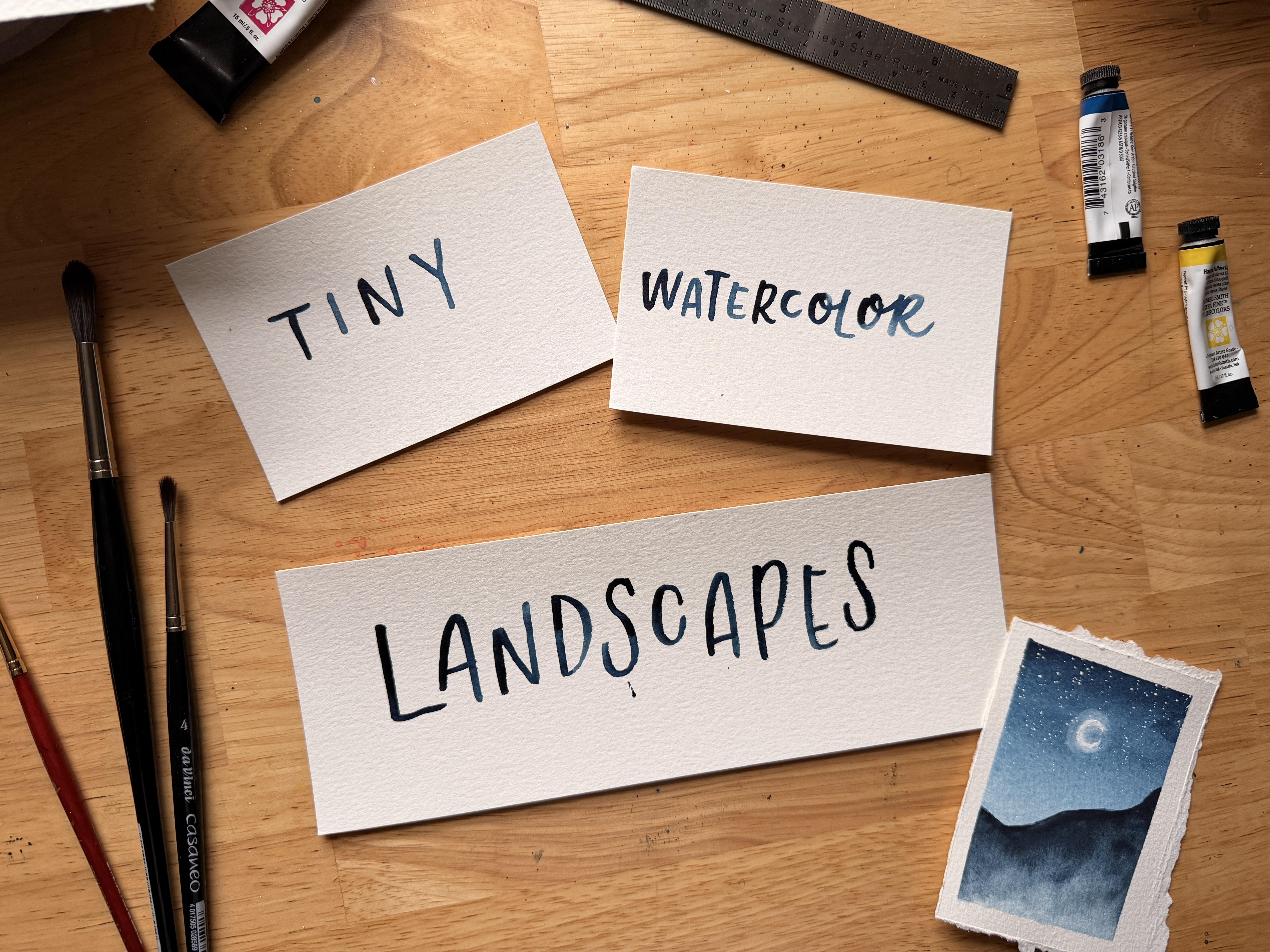
1. Tiny Watercolor Landscapes: There's just something
about painting tiny masterpieces that
feels magical, you know? Hi. My name is Colby Bloom, and I am an artist, author and top teacher
here on Skillshare. I am also a mom with ADHD, so I know how hard
it is to carve out creative moments and
really stick to them. That's why I love
painting tiny landscapes, because with just a few strokes
and five to 10 minutes, you can create some
watercolor magic, regardless of what skill or experience or how much of
a busy schedule you have. In this class, we are
learning about one of my very favorite beginner
friendly watercolor tools, a landscape recipe. Basically, we're talking about how any landscape painting, especially tiny
landscape paintings, can be split into three
simple parts, the background, the foreground, and some kind of accent element to make things
a little more interesting. Over the next hour or so, we are going to talk about all of these parts and use them to make four tiny
watercolor landscapes so that you can get
some practice in and also so that you
can take the concept of a landscape recipe
and turn them into your own unique
watercolor ideas. My hope is that by
making the steps to painting tiny
landscapes so simple, even on your busiest,
most frazil days, you can carve out
some moments just for yourself to make something
really beautiful. Remember, you're not a camera. You're a painter, and your paintings are allowed
to look like paintings, and you are allowed to
be messy and creative, even if you only have 5 minutes. You in? I'd love to take you along for the ride.
I'll see you in class.
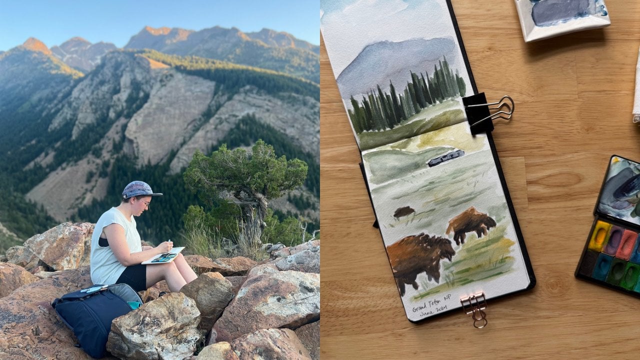
2. Projects: Hello, my friend. I'm so glad you decided to
watch this course. It is so much fun
to paint teeny, teeny, tiny landscapes, and I want to paint
them with you. So let's take a look at what we're gonna
paint in this class. The most important
thing to remember about these projects is that we are not really focusing on the
correct way to paint anything. We are making it simple by
turning it into a recipe, what I like to call
a landscape recipe. So in this class, we're going to learn how
to break down a teeny, tiny watercolor landscape
into really simple layers, the background, the foreground, and some kind of accent in order to put the
whole thing together. For our first project,
we're going to do exactly that by making
three teeny landscapes on one spread of paper using tape to section out the
teeny landscape sizes. Then I'm going to
show you how to use a metal ruler to
create your own teeny, tiny landscapes with
teeny tiny papers, instead of having to use
a spread on a sketchbook, and that will be one
last teeny landscape to round out the class. Remember, the point of
these projects is to remind yourself that you can
make a scene so simple, like, as simple as possible, making it so small and doable
and still be a painter. In fact, some of the most
beautiful paintings and some of your most beautiful moments might come from the
most simple projects. And so let's dive in.
3. Supplies: Before we can get
started painting, we need to talk about supplies. The most important thing to
remember is you don't have to use what I'm using in order to have a great
time in this class. That said, if you want to know what I'm using,
let's check it out. It's pretty basic
watercolor supplies. So we're using watercolor paper. This is cold press, 140 pound, 100% cotton watercolor paper. As long as you're
using paper that says watercolor paper on it, it's probably going to be fine. I will say that with
all of these supplies, these are all artist
grade supplies, you don't have to use the
exact supplies that I'm using. And also, even if
you're a beginner, sing really good
supplies, I promise, is going to help your
watercolor exploration feel a little easier. And so I encourage even
beginners to invest in themselves and
get good supplies along even at the
very beginning. And you can be successful even with really inexpensive
budget friendly supplies. That's it. Paper. This is 100%
cotton watercolor paper. It's on a block, which means
that the paper is like, all these papers in this
block are glued together, which keeps the paper ted. And if you don't have a block, I definitely recommend having some washi tape or masking tape so that you can tape down your paper on all four
sides to your desk, and that helps to keep the paper tat when you're painting on it. Next, paint brushes. You just need some round paint brushes. All the paint brushes,
all the supplies that I'm using are linked
in the supplies list, so you can check those out. But as long as you have
a round paintbrush, like around number two
and around number six, this is around number eight
and around number four. But, it really doesn't matter
that much which brand. What matters for these
specific landscapes is that you get a
round paintbrush, and that's relatively small because we are painting
tiny landscapes. Then we are moving on to paint. I'm using primarily
Daniel Smith paint. This is professional grade
watercolor paint in a tube. So I usually take the
watercolor paint in the tube, squeeze it onto my palette, and let it dry. You
don't have to do that. You can use watercolor
paint from a pan. So if you just have,
like, a set of watercolor paint and you're not using the exact watercolor
that I'm using, that's totally fine because
what we're practicing here isn't really
the exact projects. What we're practicing
is putting together landscape recipes
in order to paint a really fun, teeny,
tiny landscape. So whatever paint you're using, I'm sure, is going to be great. Then just make sure that
you have a palette to mix your watercolor paint
on. This is ceramic. You could also have
a teeny palette. I have lots of palettes
hanging around. But if you don't have
a ceramic palette a dinner plate would also work. Plastic palette would also work. Um, and I'm also
using a metal ruler, and this is to create the teeny tiny papers for teeny
tiny landscapes. And I'm going to
talk about the teeny tiny papers for teeny tiny landscapes in a different video. But this is optional. The metal ruler is optional. You don't need it in order to be successful in this course. And then last, I do use white Guash in at least one of the teeny landscape projects. So this is doctor PH
Martin's bleed proof white. It's really good white guash. So that's something that I also recommend having
on hand, as well. Then aside from all of this, very typical watercolor
supplies, right? So have a cup of water. I usually have two cups of
water so that one stays clean. Definitely make sure you
have, like, a towel. You can use a paper towel. I use these terry cloth towels
so that you can, you know, wipe your brush in between, and that about wraps it up for all the supplies
that we're going to use. So remember, last reminder, you don't have to
use exactly what I'm using in order to
have a really good time. So gather up all your supplies, and let's get started.
4. Landscape Recipes: Hello, my friend. Let's talk
about a landscape recipe. What is a landscape recipe? Essentially, it is all of the pieces you need to make
a really simple landscape. You need the background, which in landscape paintings
typically means the sky. You need the foreground, which in landscape paintings, typically means the landscape, and then you need
some kind of accent. So either some birds or some trees or a pop
of color, like, some kind of extra detail to either add movement or to add color or something that gives a little extra oomph to
your tiny landscapes. The most important thing
to remember that will help you in your tiny
landscape journey is that you don't have to be super precise or accurate with whatever it is
that you're painting. You just have to know what
the background is and what the foreground is and
whatever kind of accent is. So whether you are
coming up with landscape recipes from
just your imagination, or you are following
a reference photo or something or doing a
combination of the two, learning which pieces go where is going to help a
lot as you're painting. So as we move forward, and we're going to put
this into practice, right? Think about what's
the background? What kind of sky am I painting? Am I painting a night sky? Am I painting a sunset? Am I painting a blue sky? Am I painting a rainy sky? Am I painting a cloudy sunset? Am I painting, you know,
you get the picture. So whatever the background is, you are feeling in the blank with whatever color sky
that you want to use. Then you're going to pick whatever landscape
you want to use. So is the landscape trees? Is the landscape grass? Is the landscape mountains? Is the landscape a
seascape, right? Are you doing a lake?
Are you doing the ocean? You just have to pick
one, and figuring out which one goes best with the sky that you've
chosen with the background, a lot of factors can
play into this, right? If your sky, for example, if your sky has a lot
of texture to it, so, like, you have a lot
of clouds in the sky. You have birds maybe in the sky. Your sky has a lot
of texture to it, then maybe consider
that your landscape, in order to provide contrast, doesn't have a whole lot of
texture to it or vice versa. One of the really simple tools to use to make any
watercolor landscape, no matter how, like, beginner friendly it looks like, to make your watercolor
landscape pop, you want to intentionally
add contrast. So you're making your sky. If you're making your
sky really soft, if you're making
it really, like, blendy, it's not super textured, then maybe you want to make your landscape more textured, right, more pointy, more detailed, whatever it is, you're
providing contrast. Along the lines of contrast, one really simple
composition technique is to use a really simplified
version of the rule of thirds, which is essentially you are
either going to make the sky be two thirds of your
painting or you're going to make the landscape be two
thirds of your painting. So you don't want
them to be equal because it will just look like you're cutting
your paper in half, right? So choose one. Either the sky takes
up the majority of the painting or the landscape takes up the majority
of the painting. Typically, for these
tiny landscapes, I make the sky take
up a lot of it, but you can do both and
it will look great. And then finally, the accent. The accent is definitely along the lines of adding
contrast to your piece. So you have if both your sky and your landscape are
like, really horizontal, then adding some
kind of accent that moves in the vertical
direction like birds or, like, a big tree in the foreground
or something like that, whatever your accent piece is, that little something
extra you add at the end, it can help tie everything together by adding an
extra little something. So we can add birds. We can add a pop of
color somewhere, right? So flowers or some color to the sun or some
color to the mountain. Whatever it is, whatever
little accent it is, it's going to add a
little bit more detail. It's probably going
to be the wet on dry technique, so
painting it last. So it pops it pops out somewhere either
in the foreground, just against the background. And it doesn't have to
take up the whole thing. It's called an accent because we just need a little bit of it. We don't want it to
overtake the whole scene. We just want to add
something a little extra so that your
pieces don't look flat. And that's all it takes. That's what this
very simple version of a landscape
recipe looks like. In the project videos, we are going to practice
this step by step. So let's get started.
5. Prepping Your Paper: Before we paint, let's
make our tiny papers. So there are going to
be two methods here. We're going to use
tape in a sketchbook for the first set in
case you are like, I don't know if I want to
make teeny tiny papers yet. You don't have to actually make small papers in order to
paint on a small surface. So we're going to use tape in
order to put that together. And then in a later video, after we finished
our first project, I'm going to show you how to use a metal ruler to cut
your own teeny papers. Before we start painting, we need to prep the paper
with tiny landscapes. You can do that by cutting
your own tiny landscapes, by taking some watercolor paper and cutting it
into small pieces, which I will show
you a really fun way to do that later
on in the course. Or you can take a big sheet of watercolor
paper like this. This is on a watercolor
block, which is just, like, a bunch of paper all glued together, so
it's nice and taut. Or you can get a
sketchbook, and use tape, regardless of what kind of big pieces of paper you're using to portion out the
size that you want. And especially because
in this class, we are going to paint three
tiny landscapes at a time. Using tape is a really handy way to have all of the landscapes, your collection, if you
will, all in one spot. So I'm going to use I'm
going to use washi tape. You can use any kind of
paper friendly tape, just tape that's not going
to tear your paper like painter's tape or masking
tape or washi tape. And I'm going to use it to create the space that
I want for my landscape. So I'm starting basically by
creating a border, right? Like, I want about the
same amount of side, about the same amount
of space on all edges. And so I'm starting
with the sides, and then I'm doing the
top and the bottom, and I'm just eyeballing it,
right? I'm not measuring. You can use a ruler if you
really want to measure. But I'm just
eyeballing it about. And then because I want
this to be in thirds, I'm just going to
eyeball that, too. So here's one third. And then some of these
landscapes might be slightly bigger or slightly smaller than other ones,
and that's fine. It doesn't really
matter that much to me. But the main place
where I'm going to paint is in these three squares. And then when I
take off the tape, it's going to look so nice
with the border all around it. And that is how you prep either just like a plain sheet of paper of watercolor
paper, right? This is 100% cotton, acid free watercolor paper. Or you could do it in a
watercolor sketchbook. And this is a really fun way to paint landscapes
and tiny landscapes, and it's going to
be so effective for the first project that we are going to start in
the next video. So I will see you there.
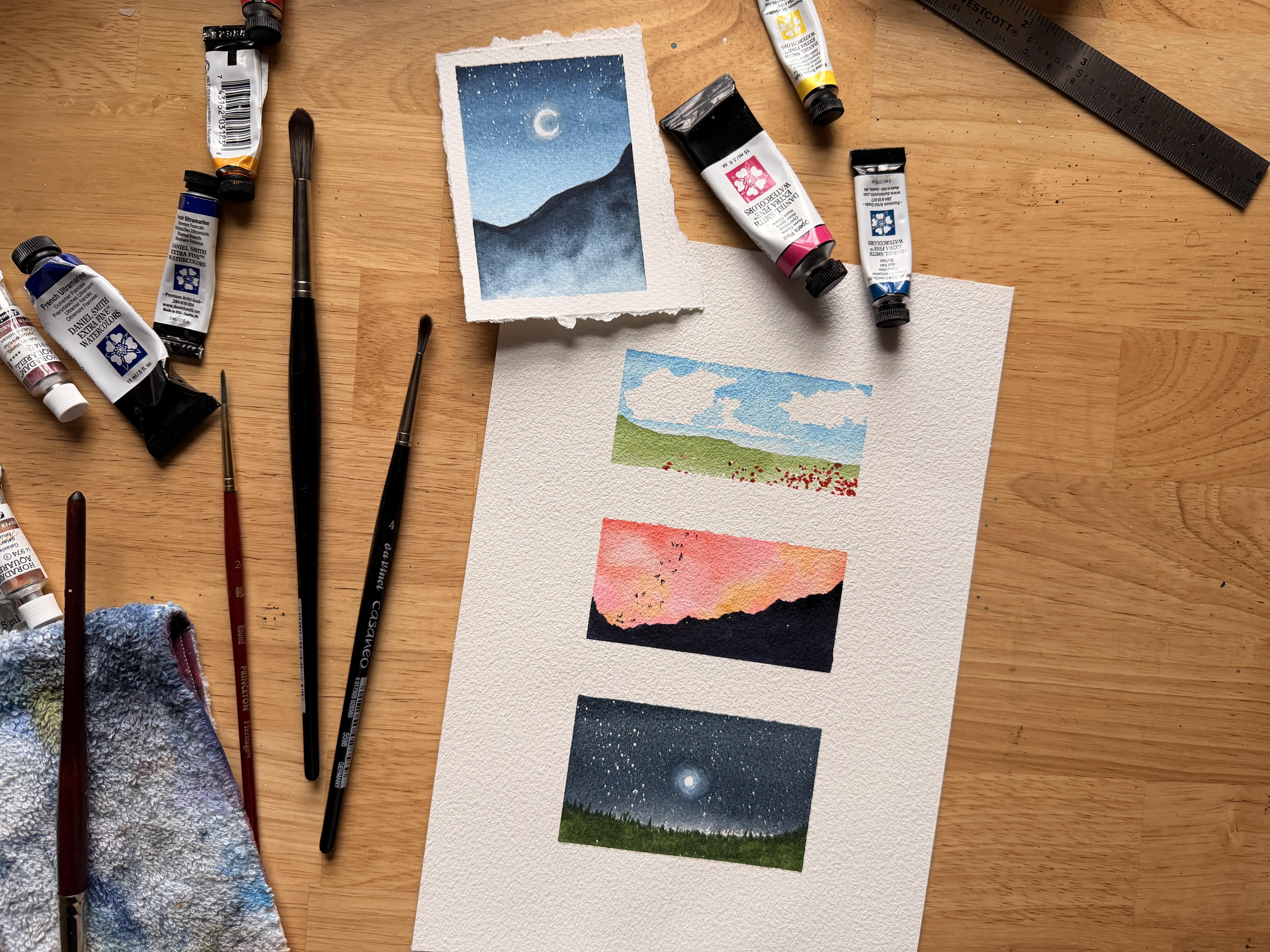
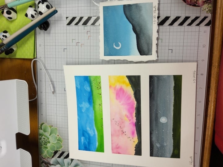
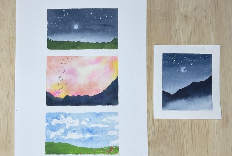
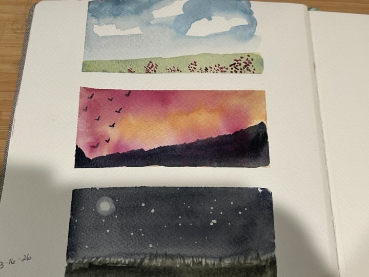
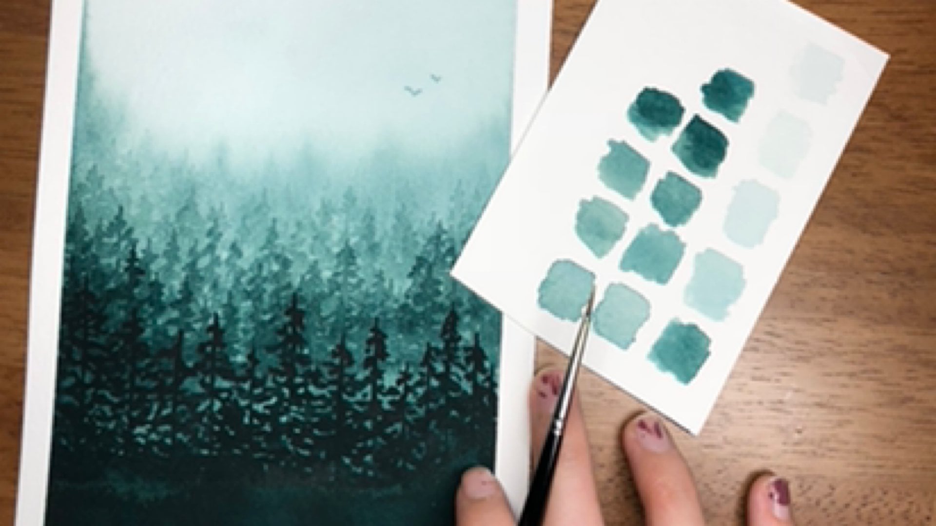
6. Project: Background: It's time to get
started on the project. So this is the first project, and we're going
to paint a set of three tiny landscapes
all on a spread. In the previous video, we put together the spread
with tape on watercolor paper. And now let's dive into what it looks like to
paint the background. According to the
landscape recipe that we learned in
the previous video, the first piece of these tiny landscapes
that we need to figure out is the background. Now, for most landscapes, especially simple
landscapes that you are going to try
to put on a teeny, tiny piece of paper,
the background is going to be the sky. And you have so many options for what the sky is
going to look like, which is one of the
reasons why I really love using tiny
landscapes to experiment and to kind of expand your repertoire because
you can try out experiment with so
many different colors and so many different
sky options. So, for our project
and for this video, we are going to paint
the sky on all of these, and basically, there's
no wrong answer. You can paint whatever you want. And so we're going
to do one night sky. I think I'm going to
do that one down here, one sunset sky in here, and then one blue sky up here. And especially if you're trying to learn
landscape elements, like skies, like trees, like mountains, like
composition, right? It's painting with
tiny landscapes is a really fun and accessible way to do that because it's such a tiny little
piece of paper, right? It's not that much paint. So we're going to practice. What it looks like to not really know ahead of time
what we're painting, just making decisions on the fly with these
tiny landscapes. And so I'm going to start
with the night sky down here. And I'm going to actually, so usually when I
paint landscapes, I get the paper wet first and for the background
for the sky, and put and then I
put paint on it. But for these tiny
landscapes, instead, because there's
such little space, like, there's not a whole
lot of space, right? Dry space is a hot commodity, and so we're going to
try to paint still using pretty watery paint with I'm using Pain's
gray right now, still pretty watery paint. But in order to maximize possibility for texture and in order to maybe even, like, save time or
be able to paint some of these in very quickly, just in, like, one
or 2 minutes, right? I'm going to knock
get the paper wet first and just paint
directly on dry paper. Now, that's just preference.
You don't have to do that. So I'm doing a night
sky for this one. Then I'm going to
bring it do I want to? No, actually, I think I'm going to leave it
just like that. But I put a tiny
little bit of water underneath that night sky
right here just so that I could blend it out a
little bit so that it's not quite a harsh line
where the night sky ends. And that's going to make it when I paint the landscape
underneath it, that's going to make it look just a little
bit more natural. So I am going to add just a
tiny bit more pains gray, like, dark pines
gray right on top. And then and I'm leaving about This is
more like a fourth maybe, but I'm still following
the two thirds, one third rule we learned
in the lesson video, right, where a very simple, easy to remember rule, if you want your composition
for these tiny landscapes to look good is with the sky. Either it's two thirds
of the whole scene, so it takes up most of the scene with the landscape
having a little bit. Or the landscape
takes up two thirds, and the sky has a little bit. For all of these ones,
all of the skies, I'm going to have the skies be two thirds and the
landscape one third. I'm going to dry this because I want to splatter some stars on it before I move
to the other ones. Okay, this is dry. I just spent like
maybe 1 minute, maybe even 30 seconds drying it with my little hand dryer. And then I'm going
to take doctor PH Martin's bleed proof white, which is white quash, and just splatter a few stars. So I'm getting my size
toothbrush with some water, and I'm putting
water just, like, directly in here to get it a little watery with guash when you want
to splatter stars. You don't want it to
be, like, super watery, but you also don't want
it to be too thick. Otherwise, the stars
aren't going to splatter. So I'm going to splatter, but I also I'm going to grab a sheet of paper
off to the side. Just cover up the
paper I want to paint on later so that it doesn't
get guash all over there. And then I'm just tapping on
my paintbrush directly over the top of the night
sky to splatter on a few stars, just like that. Okay. And there
is our night sky. So that is one tiny landscape or the background of one
tiny landscape done. Now the next background that we want to do
because remember, we're doing a landscape recipe version for this project, right? So we're focusing
on the backgrounds and all the different backgrounds
we can do for the sky. And this one where I'm
going to do a sunset. So for the sunset, I am there are so many
variations of a sunset, right? You could do a twilight
sunset, which is, like, violet and blue and
a little bit of pink. You could do a fiery sunset, which is more like yellow
and reds and oranges. And it really just is up to you. But I think that I am
actually going to get the paper wet this
time, just do I? Yeah, actually, I think
I am. I'm going to get it wet all the way down. So this is often how I paint
larger landscapes, too. But I'm going to get
it wet all the way down because I think one of the most fun and
accessible ways to paint sunset colors on any landscape, really, but especially
a tiny one like this is to just have a big mix. So we know that the
wet on wet technique makes colors blend and
blur together, right? So I'm going to
specifically choose colors. So, like, this is opera pink, which is like a neon pink, and I'm going to just
tap it right along here. Maybe just in kind of like a little circle or a sea curve. So it kind of looks like clouds. It doesn't have to be
perfect, kind of, you know, I'm just generally creating kind of some kind of movement. Ifever you want to create natural movement
in a landscape, taking trying to do some kind of s curve or some
kind of S curve, right, like a swoop or a
zig zag is going to be one of your easiest and most effective
ways to do that. So I started with pink and actually think I'm going
to go the yellow route. So this is gold ochre. I'm just tapping it right along
on the edges of the pink. And then last but not least. Honestly, these colors
don't have to be exact, they don't have to be perfect. They can just be
an approximation or just any colors that you find really fun and interesting. So I'm going to do Scarlet Lake. And I'm going to tap
that scarlet lake right on here in this space, maybe even along
some of the edges. And the key with the sunset
colors is you don't have to, it's okay to cover up
some of the colors, but you do want there
to be a mix, right? I do want to see lots of
different colors here. So I am using now that I've
got paint all on the paper, I'm going to use a brush with clean water and
just kind of, like, tap in between the
colors to encourage blending without washing
all of them away. And that's kind of
why I started with, you know, the colors
in individual spots. Then I'm going to add more
specific colors if I want. Like if I want some more yellow, maybe I want some more pink. This one can just
be for fun, right? It's not again,
none of these are. We're not looking at
reference photos here. We're just using this basic
landscape recipe idea and then having fun with it. So that is the
sunset background. And now let's go to the
blue sky background. So for the blue sky, we want to try to make a
blue sky with a few clouds. Remember, in tiny landscapes and with watercolor
landscapes generally, we don't need perfection, right? We don't need the sky to
look exactly like a sky. We don't need the clouds to
look exactly like clouds. So what I'm going to do is I'm going to take some cerulean, and with the paper dry, I'm just going to kind of, like, paint around and leave
a few shapes to be clouds. Dress like that. And I don't want the clouds to be like I want them to look
like they have, like, organic edges, right? Meaning it's not like
super geometric. It still looks kind
of random and cloudy. But it's also it doesn't
need to look perfectly realistic because I'm a painter and I'm allowed to
make a painting. So I have just, like,
a little wisp of a cloud here and some
little clouds here, and that is pretty much all I'm going to
do for that right now. Um, similar to this
night sky background, I'm going to take
a clean wet brush and just kind of blend, blur this down
just a little bit, activate it just a little bit. I still want to keep this
white for the landscape. But that just makes it so that the edge of the sky
isn't quite so stark. And there we have it. There are the three backgrounds. So this is step one in our
landscape recipe process, and I look forward to painting more with you
in the next video.
7. Project: Foreground: Backgrounds done. Now let's take a look at how to
paint the foreground. Alright, let's paint step two in the landscape
recipe process, which is the foreground
or the landscape. So there are a few different
options for landscapes. We can paint some kind
of grass or hilly area. We can paint trees. We can paint flowers. We can paint combinations
of those things. We can paint mountains
layered on top of each other. So I think that what
I'm going to do, and again, I did not plan
any of this ahead of time. It's more I know that I have, like, a roster, right? I have a roster of
elements that I can add in order to
make a landscape. And generally, especially for very simple
landscapes like this, I generally choose
between grass, trees, and a mountain or a lake. So if you want to do water, that would also be instead of a landscape, it
could be a seascape. For these projects,
I'm thinking, just looking at this,
I think I want to do, like, some kind of layered
mountains here for the sunset. And I think I'm
going to do grass for both the night
sky and the blue sky, but we'll have different
elements for the accent, which is the next video, right, because it's
background, foreground, accent for these very
simple landscape recipes for our tiny landscapes. So let's start
with the night sky again because I'm just
going to do green grass, but because it's dark, I want to make sure that my
grass isn't super bright. So I'm going to take
some sap green, and I'm going to
make sure that it's pretty it's pretty dark. And I'm also trying to make
it look kind of swoopy. So I'm not just going
straight across, I'm doing little swoops
and painting with this, like, relatively dark sap green. And if I want, I can even make it look like
it's grassy and so just kind of like have little strips
of grass coming out the top. Honestly, the little
strips of grass could also look like
tiny little trees, like almost as if this
is a tiny little layer, like mountain layer, right? We're going to do different mountain
layers in the next one, but it kind of looks like that. But I think it adds just, like, an interesting element
to this foreground. It could look like grass,
could look like tiny trees. Who really knows what
it is. But that's what I'm deciding to do in
front of the night sky. So just a really simple
layer of relatively, like, dark value grass right along the bottom
of this landscape. I'm going to add a few more
darker strokes to the bottom, just to kind of blend in some of those textured ones we did
at the top, and all done. Honestly, it does look
more like, I think, like, a faraway mountain layer with, like, trees coming out from it. And I think I like
that idea better. So changed my mind. Change my mind.
This isn't grass. This is trees. So that's done for that
landscape portion. This landscape portion, I'm
going to do mountain layers. And I think I'm going
to do like three. Do I want to? Well, I kind of want it to
be simple, actually. So what I'm going
to do actually is take some really
dark value indigo, and I'm just going to have it come from the side,
like, at an angle. So this is just a
mountain silhouette coming from the
side at an angle, kind of swooping down this way. So it's uneven, a little bit
off kilter, but very dark. So it's like a silhouette
against this sunset sky. And there we go. There's that landscape.
And this one does it take up two thirds? Like, it's interesting
because down here, it stops at the one
third cut off, right, where the sky I would argue that the sky still takes
up most of the space. It's just distributed a little bit unevenly, which
is interesting. When you do things
in an uneven way in some kind of varied, like, it's not
symmetrical kind of way, it's almost always more
interesting to look at. Okay, so then the last one, I am going to do grass again. But this time, I'm going
to do maybe a little bit lighter green or even just
like a lighter value green. Meaning it has more water in it. And I want to intentionally use, do kind of a slow
stroke and get. I want to maybe not quite
so straight across. But what I do want is these
little dots right here. You see these white little dots. That happened because I
used dry paper, right? And I just kind of carefully
pushed my brush across, and then it created
this dry brush texture because the paint skipped
across some of the page. And I can use some of these dots later for when I get
to the accent portion. I'll probably use them
as little flowers. Okay. So that is the
foreground. Pretty simple. All we had to do was decide, do I want it to be a mountain? Do I want it to be trees?
Do I want it to be grass? Do I want it to be the ocean? Do I want it to be rocks? Like, there are zero
wrong answers here. You can choose for the
landscape to be anything, just so long as it takes up
the correct portion, right? So, like, for these ones, we want the sky to
take up most of it, and then the
landscape to take up a portion of a smaller
portion of it. And I think we succeeded. So there we go. That's part two. And let's move along
to part three, which is the accent piece.
8. Project: Accent: Almost done, my friend. We
have the background painted. We have the foreground painted. And now let's take a look at
what painting the accent on these paintings will look like and how it kind of ties
everything together. And we're back to
paint the last step in our landscape recipe
for tiny landscapes. We painted the background, which was the sky
for all of these. We painted the foreground, which was the landscape portion, and now we're going to
paint some kind of accent, some kind of extra
something to add movement, to add texture, to add contrast. That's the idea here
is we want to kind of bring our attention
even greater, add more depth, add
more interest to the scenes with just tiny
little pieces of contrast. So for the night sky, one of the easiest ways to add contrast is to add some kind
of celestial element, right? We've already added stars. But one way to contrast against the dark sky is to add
something light, right? So I'm going to add a moon. And I'm going to, especially because the
stars already kind of feel like they are I don't know, sharp, you know, like, the tops of the trees are pretty sharp. The stars are pretty speckly. So I'm going to have the moon be just a circle right
in the middle. And maybe I'm going
to have the moon. I'm going to have
it be like down. No. Up here in the middle, in the middle, I
guess. I don't know. There's no real wrong answer, but it's just kind of up to you. So I'm going to do a circle
instead of a crescent. It's not a perfect circle, obviously, because I'm not a
robot, and neither are you. But I'm doing a circle and
not a crescent because a crescent kind of has more
sharp points to it, right? And so I want the contrast to be softer this time because I already have sharp
points everywhere else. So I'm adding something
different and interesting. And I think it looks really cool and definitely
different and interesting. So one other thing you
can do with the moon here is instead of
you could leave it as it is and just
have it be really bright up against the
sky or with guash, with white guash,
the way I'm doing this is I can kind of, like, blend this
out a little bit. So I'm taking my size I painted the moon
with a size to brush, but now I'm just kind
of using clean water. On my size two brush
to just kind of encourage the paint to blend
a little bit into the paper. And this is going
to kind of create, like, a glow around the moon. And I'm doing circle strokes so that it looks like a ring. Like if I can see the dry, if I can see the stroke lines, because sometimes when
you paint, right, you can see where
your brush is gone. And so you want to
make sure to move the brush in the direction
that you want it to go. And to make it
look like there's, like, a ring of glow around it. Then I'm going to
dry this really quick and just very fast. And then I'm going to paint
another moon on top of it. And that way, so
I have this glow. And now I'm going
to paint, like, a smaller moon on top of it. And so it looks like the moon is kind of glowing in the sky. Yeah, I definitely think that
adds an element of interest that makes this tiny
painting unique and fun, and I love it. Okay, that's the first one. That is the first accent, so you can add some kind of
celestial sing to the sky. That could be if this
was not a night sky, then it could be a sun, right? You can add, like, a yellow sun or an orange sun or a pink sun, even, like, some kind of
interesting thing like that. Or, like, a shooting star
would also have been fun to do in the night sky. And now let's move
on to this one. So we have the mountain. We have the sunset. The mountain is in a silhouette. And so whatever we
want the accent to be, it probably also will
be in a silhouette. And I think one of my
favorite accents to add, especially with
mountain paintings or big sky paintings is a flock of birds because I think you can add so
much movement to it. And so what we're going to do is because the
mountain kind of, like, already is swooping
side to side like this, I'm going to do a flock of
birds that kind of, like, starts where the mountain is, like, where the
valley is, or just like the smallest
peak of the mountain. And for the flock of birds, I'm going to paint
tiny little dots to give myself a little
bit of an outline. But I want the dots to be kind of going up instead
of going across. Sometimes you have birds, like, swooping all the
way across, right? I want the birds to be
going up to add a contrast, like, a vertical almost line to contrast against
the horizontal one. So I'm just adding a few tiny
little dots in clusters, we don't want the birds to look like they're evenly spaced out. That's one of the big things
about painting anything in nature is your brain is going to want to
space it out evenly. And so one of the
ways you can kind of prevent that is by painting
things in clusters. Instead of thinking
about painting like individual
birds one at a time, think about painting the birds
in tiny little clusters. Then what I'm going to do
is for some of the dots, not all of them, but
for some of the dots, I'm just going to put a
little V right on top. And the V can be
pointing sideways. It can be pointing down,
it can be pointing up. Uh, it doesn't having more variation is
going to make it look cool and interesting,
as we've been saying. And so you don't
have to paint all of the dots because some of the birds can be
really far away. And especially because this is a teeny, tiny landscape, right? We want some of the
birds to look far away. We want this to look
varied and have depth. And so only painting
some of them with wings is going to
be a good call. I would say, like, maybe two
thirds of them put wings on, and then the other one third
leave leave as little dots. So there's my accent for the sunset mountain
picture with just, like, a little flock of birds coming out
from the mountain. And then finally,
the last accent, you can add movement, which is kind of what we
did with the birds. You can add contrast, which is what we did with
the night sky, right, where we did, like,
a soft white and then just a big white
moon right there. You can also add
color to contrast. And so, one thing about
especially if you're trying to add some kind of accent or contrast to
a really clear scene, like a blue sky scene, um, one thing I really like
to do is to play with color. So the opposite of green or rather the
compliment to green is red, which means that red is opposite green on
the color wheel. And when you have two
complimentary colors together, if you use them
in equal amounts, they can look like
they clash because they are far away from
each other, right? They're not similar
to each other at all. But if instead with
complimentary colors, you use it, so there's, like, a lot of one
complimentary color and only a little of another
complimentary color, similar to the two
thirds one third rule for the landscape
composition, right? Um, if you use a complimentary
color as an accent, then instead of making it clash, what it does is it adds
a lot of interest. It makes it look bold, right? And so, adding tiny little dots, tiny little red dots, this is with scarlet lake, just like a scarlet color. Like maybe it looks like
there are poppies here. Adding tiny little red dots to this green grass,
brings it forward. It creates more depth
because it's like, Okay, this is definitely
in the foreground. This is the midground,
and then the background. And so it kind of puts more layers and more
texture into the piece. And especially because we're using red as opposed to, like, yellow or blue, it's really the colors are
really contrasting against the scheme
that already exists. So that is one other
really effective way to add contrast to a scene
as the little accent. I'm also going to add just a
few tiny little black dots. So this is actually Pain's gray, but tiny little black dots to make it look like
these are poppies. Only in a few of
them. We don't need to make all of them look
like they're poppies, necessarily, but it is going to just add another
layer of interest, and there we go. There we go. Those are
our tiny landscapes. So I think that one important
thing to remember about tiny landscapes is especially
if you're just starting, especially if you
think they're so cute, but you get really
overwhelmed by them, is to break them down to be really simple layers and to remember that
you are a painter. You're not trying to
make a photograph. You're trying to
make a painting. And it's okay if the shapes that you make
look a little wonky, it's okay if to you, these look more like dots
than they look like flowers. Like, they are dots,
and that's okay, we're not trying to like we're not trying to imitate exactly, we're trying to imply so
that we can have fun, so that we can make
painting doable and fun and whimsical and give you just a little bit
more joy in your day. So, to wrap up this last
for our first project, I'm just going to take the
tape off because that is often one of the most fun parts is revealing the tiny landscape
that you've created. And especially putting it, whether you've put
it in a sketchbook, your tiny landscape spread or you've used a sheet
of paper like this, looking at them with all of the fun borders that you
created with your tape, it looks so distinguished. It looks like you really curated a set of paintings
because you did. You're a real artist,
and you painted these. And you intentionally
used, you know, techniques to make
your paintings look even more I don't know if
formal is the right word, but just look like,
nice and curated. And you could easily
snap this in a frame, and it would look so
wonderful on any wall or, like I said, keep it
in your sketchbook, and it's such a
fun page to open. So I hope you had fun
with this project, and I have one more variation of tiny landscapes
to paint with you. So I will see you
again very soon.
9. Creating Tiny Papers: Okay, we did our first set
of mini teeny landscapes, all on watercolor paper and a nice little spread
using washi tape. Now let's take a look at painting just one
more tiny landscape. But this time, we're going
to cut an actual teeny, tiny piece of paper
using a straight edge. So this is a metal
ruler that I'm using. Any kind of straight edge, metal is probably the best, but any kind of straight edge is
going to help you with this. Okay, let's take a
look at how to use a metal ruler to cut a teeny, tiny piece of paper. So this is like a scrap paper. It's already pretty small. It is watercolor paper, but it's one that
I have I just had, like, in a pile of extra
watercolor papers that I had. And so instead of just
not really using it, I'm going to make it into an
even smaller piece of paper. So basically, all I'm going to do is I'm going to use
the straight edge. I'm going to flip it around
so that I know that I'm using the nice sharp
metal piece right here. Then I'm just going to tear. And tearing, using the
straight edge like this means that I
get a really cool, kind of, like, almost
like a decled edge. You can also use sometimes you can get straight
edge rulers like this that actually have
perforations or things like that, so it looks even more decled. But I'm just going to do this on all four sides so that I get a really fun decled edge
and just like this. I'm kind of eyeballing it,
but you can measure it out. I'm just pulling against them
straight edge so that it tears all the way
across like this. And I want it to
be pretty uniform. So I'm also going to tear
the edges like this. So I'm leaving the
paper that I want on, like, this side of the ruler. And then I'm tearing off the
pieces I don't need anymore. And look, that one even
looks super decod and, like, really, like, textured. And that doesn't have
to look like you just, like, made a mistake or tore off the paper when
you didn't mean to. It can be kind of like an artsy, aesthetic kind of style. So doing this to your papers
can be a really fun way to, you know, use up all of the watercolor
paper that you have. I even think that I want
to do that too this side, too, and make the paper
just a little bit smaller. So I'm going to that's
exactly what I'm gonna do. And maybe I just even
leave it like that. Like, it doesn't have
to be super uniform. It can just be a really
fun little tiny paper like that, and there we go. That is my teeny, tiny watercolor
paper that I used by taking just like an old
piece of paper that I had. That was in my pile of Oh, I cut this from a
larger sheet of paper, and I want to make
it smaller to be more just a teeny,
tiny landscape. So in the next video,
we're going to paint this.
10. Bonus Project: Alright. We have our
teeny tiny paper. Now let's paint a
little landscape on it. One of my favorite ways to paint teeny landscapes,
especially just, like, a lot of landscapes, is to take the landscape recipe, but then also mix and match. So this is the landscape recipe, you know, ones that we did
in the previous project. We did a blue sky
with just, like, a green hill and
some red flowers, we did a sunset sky with a black a mountain
and some birds, and then we did a night sky
with a forest right here. So I'm going to mix and
match this and pick a sky and pick a landscape
and pick an accent piece, and to make them each a
little bit different. I think that in order
to make it, like, as easy and cool as
possible for this teeny, tiny little landscape, I'm
going to pick the night sky. But instead of having it be
like, really, like, uniform, I'm going to have more
of a gradient because one of my favorite things about nightskies is when it's like, dark, dark at the top, and
then light toward the bottom. So I'm going to
try that again and really emphasize it
a little bit extra. And I also think that
maybe I'm going to make my landscape
vertical this time, and I'm going to do a mountain. So I'm going to do the night sky and then a mountain
for the foreground. And then we'll see what
I do for the accent. Maybe I do, like, a big tree,
maybe I do birds again. I'm kind of playing it by ear. So the first thing I'm
going to do, though, is I am going to tape this down to my desk so that
it's nice and taut, and it has some crisp edges. I could also paint
up until, like, just paint all up to the edges
of the paper if I want it. But I'm going to use tape just because I think it's easier. So here's the tape. One side. It's going to be super fast. Here's the other side. And I'm just kind
of eyeballing it. I do want the tape, as we
kind of talked about before. I do want the tape to
kind of be uniform so that the edges
are about the same. But it's also okay if it's, you know, if this
is made by hand, because I am literally
making this by hand. So this is all taped
down, my teeny, tiny little landscape, and now I'm going to start by
painting the background. So I decided that I
want to do a night sky. So the first thing
I'm going to do with the night sky is actually, I am going to get
my paper all wet. Sometimes with tiny landscapes, I talked about how you don't
even need to use the wet on wet technique because dry space is a really hot commodity, right, which is true. But I think I am going to get
it wet this time because I want to make a gradient
kind of from top to bottom. So I'm going to get
my whole sky wet, and then I'm going to grab
some indigo and starting from the top I'm going to paint all the way maybe,
like, to the middle. And then I'm going to
rinse off my brush so that I can use just clean
water to kind of bring this all the way down and make this night sky a lot lighter toward the
bottom than this one. This one is using Pain's gray, which has a little
more black in it. And then this is indigo, which is definitely a
little bit more blue. So I'm going to paint
that all the way down, rinse off my brush
so that it doesn't get too dark toward the bottom because I'm going
to do a mountain that maybe the mountain is
gonna go across this way. We'll see. I don't
know. Like I said, I'm just kind of
playing this by ear in terms of what do I
want and what do I like? And by the way, this is
also a skill that we're practicing with the
landscape recipes and these tiny
landscapes, right? You don't always have to
know exactly what you're painting or why you're
painting it to begin with. You can just go and say, like, the most important part of a landscape is to
remember the recipe. As long as I have a background, that's a great first step. So I'm going to dry
this with my dryer, and then we're going to
move on to the foreground, which is going to
be the mountain. This is all dry, so, oh, got a little bit of
paint on the side that I have blurred over here,
and that's totally fine. Actually, this is a
really interesting. What do I do here? I'm
just going to take my brush and just kind of
blend it out like that. And if I get more dried paint
marks on here, no worries. That's just extra texture. So this is happening
in real life. I did not plan for this,
and that is just fine. This is dry, and now I'm going
to paint the foreground. So I think what I want to do, especially because
this is really light. I want to paint a mountain. So it's a dark, dark
mountain silhouette. I want to paint a
mountain silhouette. But in order to add
even more contrast, instead of just
having it be dark, I want there to be some fog along the bottom
of the mountain, which works because
this is really light. So one way to make fog is I'm trying to decide if
I want to do it like this or if I want to do a
mountain that's like this. And I think maybe maybe we do kind of a similar thing that we did before where it's
kind of like this, right? So I'm taking some Paine's gray. But then instead of
going all the way down, I'm going to rinse off my
brush with the Paine's gray and make it and still I can see some of the paint line
underneath the mountain. This is drying really
fast, which is okay. But basically, what I'm doing is I'm rinsing off my
brush after I paint the mountain to create some fog underneath here
by having a wet on wet, like, blurry separation between the top of the
mountain and the fog. So we could also
have started this by painting the mountain
just with water first, and then painting the top
of the mountain dark. So because that's essentially
what I did, right, is I started painting the mountain ridge and then it kind of dried
really quickly. And so now I'm painting over it again by getting
all of it wet. But then I'm making the
bottom be watery and having this really blurry wet on wet layer between the
top of the mountain, which is dark, dark Pines gray and the bottom
of the mountain. So this is the wet
on wet technique. The wet on wet
technique happens when the paper is wet and watercolor, instead of staying in one place, it kind of blends into itself, and it blends into the paper. And so this is a really
fun way to create fog when you're using kind
of neutral colors like Paine's gray is you use fog to essentially feather out or, like, make the paint
kind of gradually disappear so that only the white of the paper is showing
underneath here. And then it looks like there's fog creeping up
into the mountain. This is now dry, and initially
I was maybe going to do, like a tree that
goes up like here, but I actually think
I'm going to use the white gouache again
and paint a moon. But instead of
painting a full moon, I'm going to paint
a crescent moon because there's a lot of
soft things happening here. We painted a full moon
instead of a crescent moon before because there were, like, splattered
stars and really, like, sharp points to the trees. And so we wanted the
moon to be softer. This time, there's a lot of soft fog and soft,
like, mountain ridges. And so we want the
contrast to be sharper. So painting a crescent
moon and having it just be maybe right
in the middle again. So for crescent moon, I'm
just taking my white quash. It's barely coming off my page. And so that means I want to put a little more water into it. So I'm taking my white quash, and I'm painting a C, like, a nice rounded C. And I'm actually going
to This is doctor Peach, Martin's bleed proof white. I'm going to use the
lid as a kind of palette so I can get more
paint. It's a little. It's it's skipping right here, and, like, it's really dry. And so I'm using a
little more water. Just to smooth out some of
the paint a little bit, and then I'm going to create the crescent by painting
the other side. And we could to make
this more realistic, we could wash out
our brush and use, like, a clean brush
to kind of, like, blur the edges on this
crescent a little bit. And just make it look like
because a crescent moon, the moon isn't actually
disappearing, right? It's just the amount of light we can see. It's
always a sphere. So you could do that, or you could just leave it a crescent. That would also be okay. I don't even really know what
I'm doing at this point. Just like, filling it in. Okay. This is so much fun
and happening in real time. I am going to mop up
what's happening here. And actually, that
kind of works. I can still see the
crescent underneath. So I'm going to take my paint brush again
and just kind of, like, tighten up this, like, crescent point right
here. And then this one. Oh. A lot of watercolor, especially when you
have more experience. It's not that you never do things that you don't like or you always know exactly
what you're doing. It's more like you have
enough confidence in yourself to know that even
if you make a mistake, there are still so many ways
that you can keep painting that I don't even like to say that we'll salvage
whatever you're painting, but that will continue the fun, right, that you can keep going with whatever it
is that you are doing. So my crescent moon is kind
of blurry around the middle, and maybe I'm going
to make it kind of blurry around the edge, too. So with guash, one nice thing is that even after it's dry, you can kind of reactivate it. And so maybe I'm
just going to make the crescent edge be blurry generally, which is kind of fun. I'm just making sure that it
has, like, circular edges. Like the strokes I'm using
are kind of circular, similar to what we
did before with the full moon. Do I like this? I'm not sure. I'm not
sure if I like it, but I do think that, like, the blurry edges kind of
matches the mist a little bit. And I think that it can
be a really cool effect. It just maybe it looks
like the moon is behind a cloud, you know? And then maybe I can go
back in with a little more white and just brighten it up. And then at some point, I'm going to say, I'm
going to leave that alone. And the crescent was
supposed to be more to, like, add some kind of sharp
accent. Now it looks soft. So I am going to add
just a few more stars. By splattering some stars with some white squash just
right over the top. Some of the stars got onto the mountain a little
bit, which is fine. You can leave them there or you can use some water
and just kind of, like, blend out those stars because, again,
it's white squash. So it's going to reactivate
even after it's dried. There. And there we go. There is our teeny, tiny landscape with using just a slightly
different variation of another landscape
recipe we did with the night sky and the
moon and a mountain. And so now I'm going to take off the tape and see how it looks like with
those decal edges. And if you don't like the edges, you can always cut
around the landscape, or you can say, Wow, that looks really
cool and imperfect, and I love that this is
handmade and I made it. So thank you so much for
painting this with me. I have one last message for you, and I will see you again soon.
11. Mindset Check: Before we close out the class, I want to do a
quick mindset check because I know that you
might be painting along. You might be watching
this and thinking, there is no way that
I could do that. And I want to remind you,
painting is for you. Your painting practice is for you to find more
joy in your life, to find more wonder, to exercise more curiosity, to discover exactly how much
mess you can make beautiful. And how you can take even the most
complicated things and simplify them so that
even you can put them onto a piece of paper and
revel in that experience because your life is not about proving that
you are the best. Your life is about living. It's about experiencing it, and it's about using things
like a little teeny, tiny piece of paper to give
yourself a moment of peace, to give yourself a moment of magic that you can create with your own two hands to
know that even though you are one of billions of
people, even though you you know, in the grand
scheme of things, your life is like a small blip. It matters, and you're
allowed to make it matter with things
that matter to you. So if ever you start to think that your creative
practice is small, or that you are small, because you are
painting small things, because you are
painting simple things, because you are just a beginner, because your work is not hung
up in museums or art shows. I ever something thoughts
like that start to creep in, remind yourself,
painting is for me. This is for you, and
you get to enjoy it, and you get to make you get to decide what it
means to you and you get to decide how to
prioritize it and what you want and how you feel,
those things matter. Those things matter a lot. And whatever it is
that you're making, it's generous and
it's beautiful, and it's making the
world a better place. So thank you so much
for painting with me. And I have one last thing one last reminder as
we wrap up this class, but in the next video, but I just wanted you
to know, I see you. I see how much you're
putting into this. It does not matter
what your results are. It does not matter if yours
looks like mine or not. In fact, it's never
going to look like mine because I painted this. You didn't. You
are going to paint something exactly perfect
and right for you. And I'm so glad you're here.
12. Thank You!: And that's a wrap. Thank you so much for painting with
me. I had a great time. I love painting teeny
landscapes because I think it's so helpful
for painting on the go, and I hope that you really got out a lot out
of this class, too. If you have any
feedback or you want to share any of your
experience with me, I would love to hear from you. My email is Colby at
this writing desk.com. And if you want to share any of your projects that you've made on Instagram, I would
love to see that. Just go ahead and tag
at this writing desk, and I would just love to see what you've painted and to be your biggest cheerleader. So thanks so much once again, and I hope to see you again.