Transcripts
1. Introduction: Hello, everyone, and welcome
to Tiny Paintings Big Magic. I'm Denise Love, an artist
who loves exploring texture, color, and creative
play in the studio. And I'm so excited you're here. In this class, we're
diving into one of my favorite ways
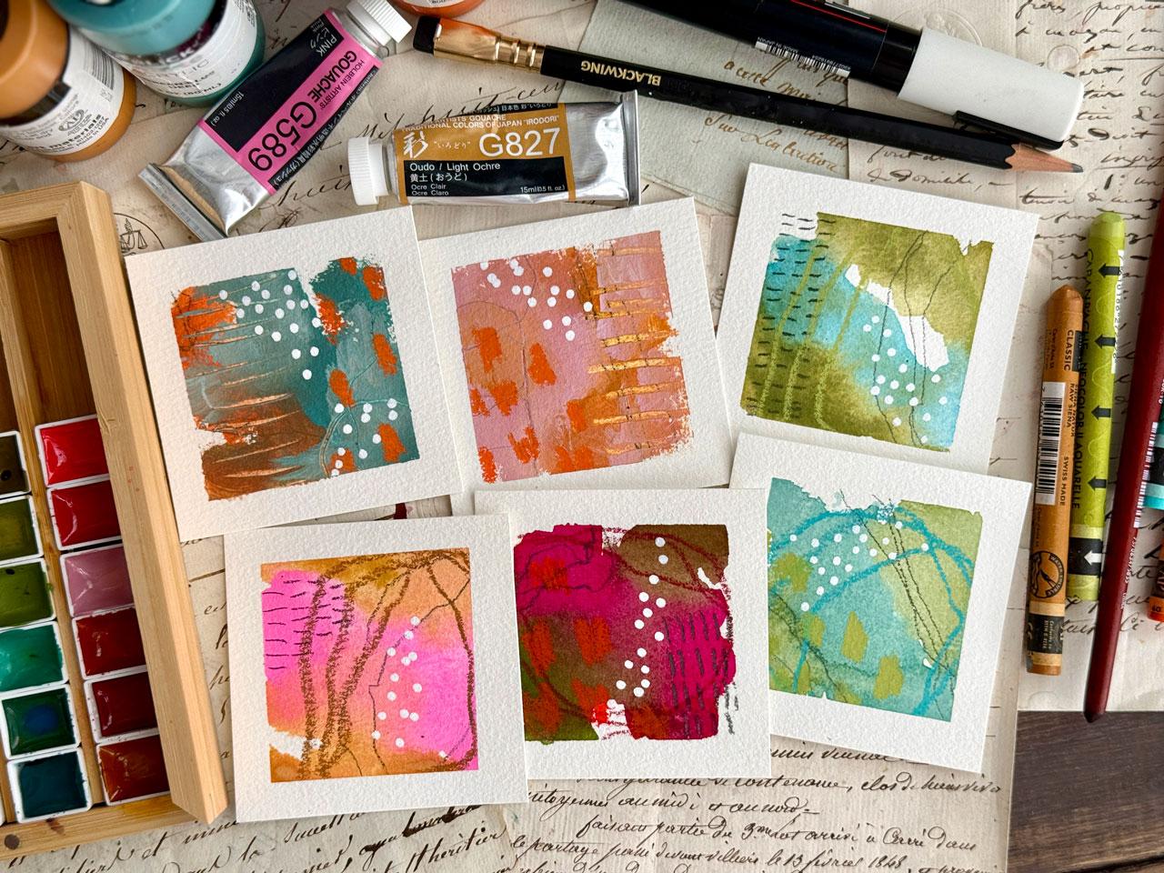
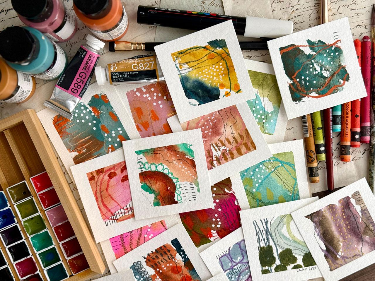
to build a joyful, low pressure art practice. Many abstract paintings. These tiny three inch by three inch pieces
are quick to create, endlessly fun to
experiment with, and perfect for starting or
reigniting a daily art habit. Whether you're brand new to painting or a seasoned artist, looking to loosen up and play, this class is designed to spark inspiration and help
you create freely. So grab your supplies, and let's start painting
small and dreaming big.
2. Class Project: Class project, you'll
create a series of three to five mini
abstract paintings on three by three paper using a combination of
watercolor or pastels, pencils or any other favorite mixed media tools
that you love to use. These tiny paintings
are meant to be quick, expressive and low pressure. Focus on play, mark making, and exploring color
without overthinking. You can create them
all in one session or spread them out as
a daily art practice. When you're ready, upload a
photo of your finished minis or even a work in progress
shot to the project gallery. I'd love to see your
creative flow in action.
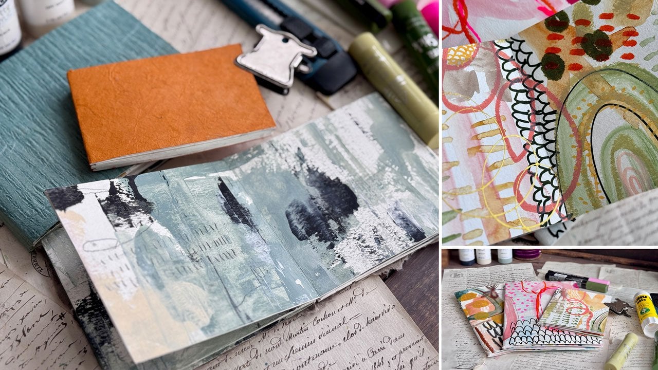
3. Supplies: Let's take a look at the
supplies that you might consider doing in this
fun little mini project. I want you to consider
this type of project for a daily practice or
something that you could sit and do when you only have
a few minutes and you want to be creative and you want
to test out some supplies, or maybe you have some
precious supplies and you want to experiment with them and play and figure
out how to use them, but you don't want to try
to do a great big piece that's then disappointing
when it doesn't work out, so this is a perfect project for all of those or
just to get you back on a creative streak if you've
not been working on stuff for a while and you're trying
to get creative again, this is the type of project that can spur that creativity. I've done a whole bunch of these little bitties
with the goal of just being creative
and experimenting with color and testing out
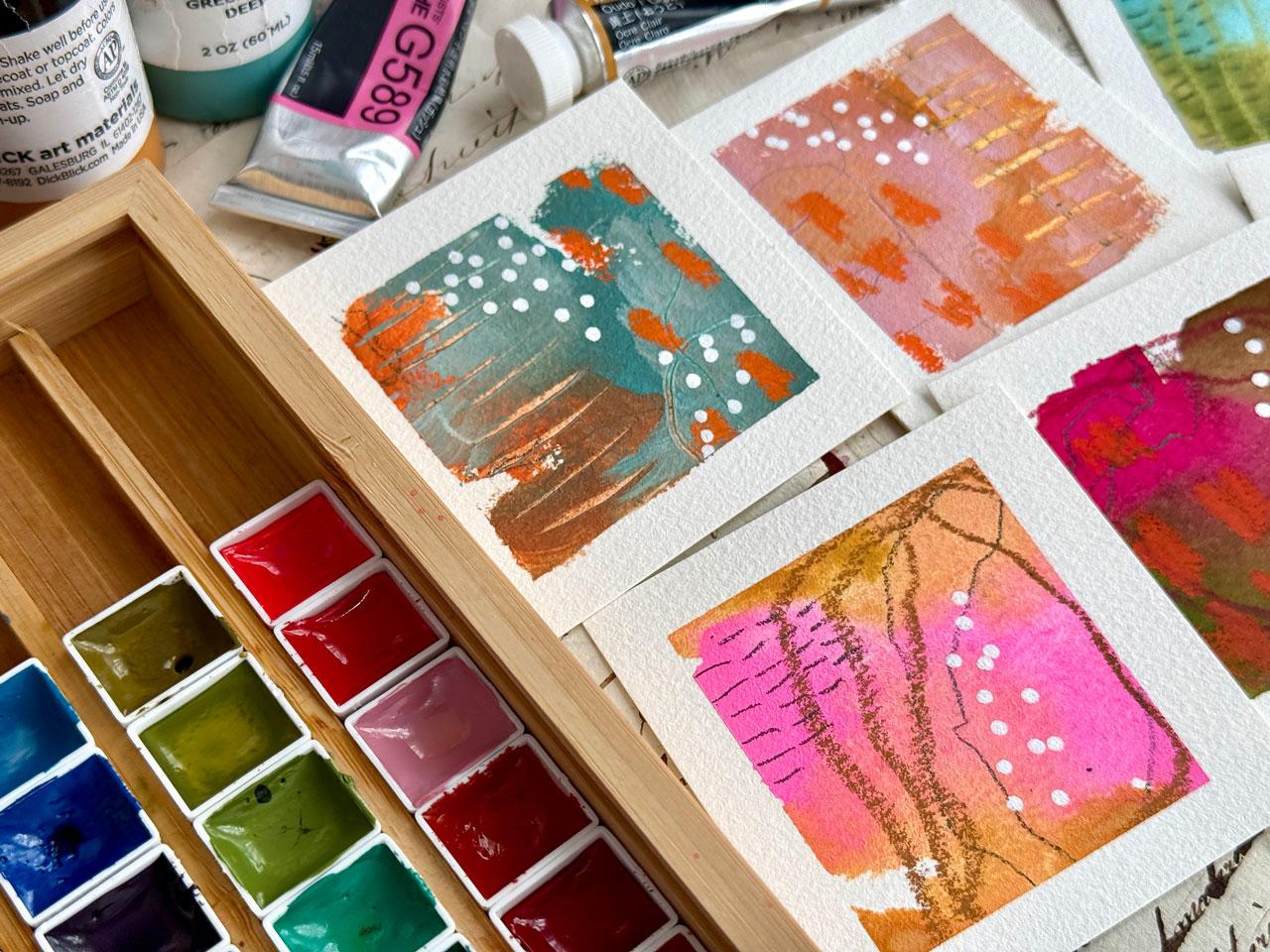
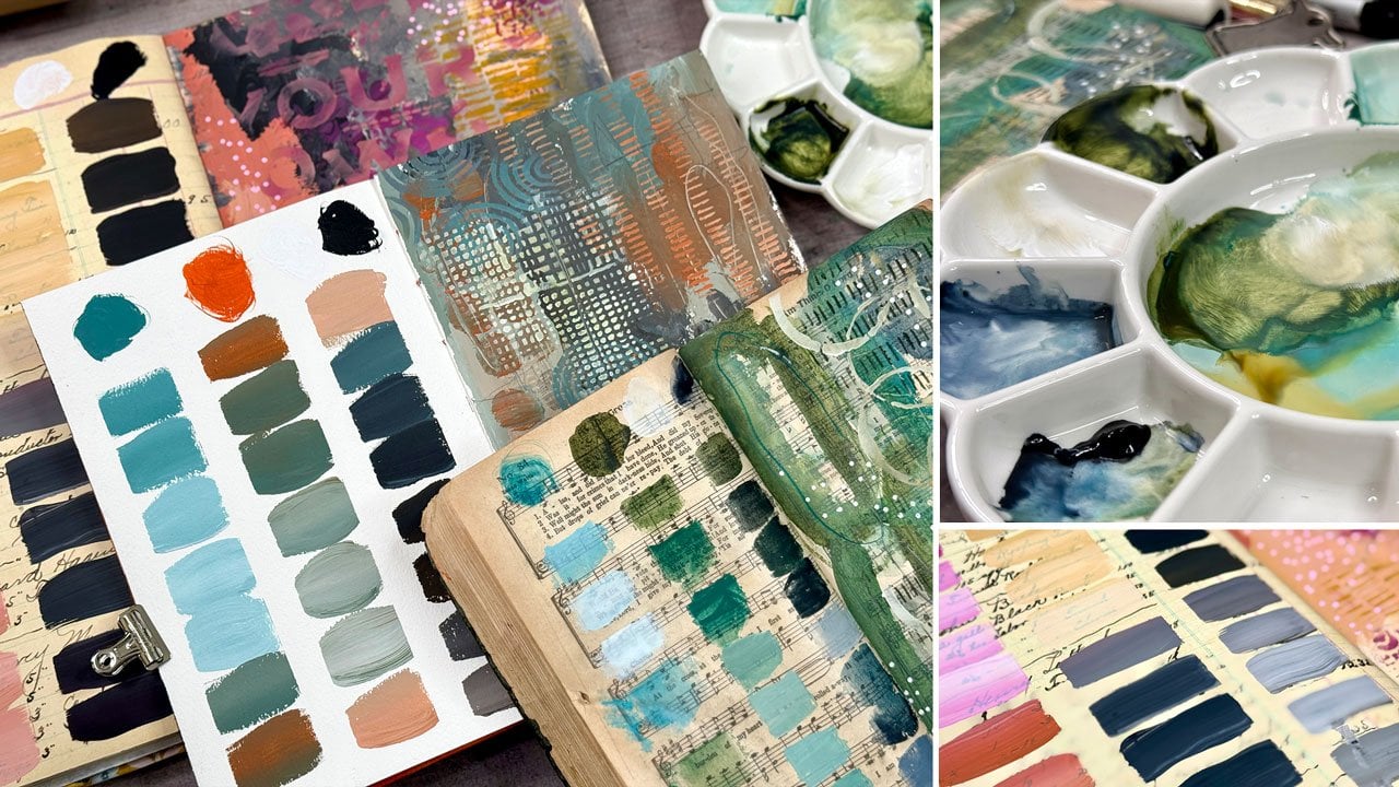
different supplies. I've tried to limit
what I was using. On these, I've limited it to two colors and two to three
mark making materials. I want you to consider
the paper that you're using and we'll cut those
into little squares. I like paper that doesn't
tear when I tape it down. I'm using the whole
buying tape on these projects because I wanted to give it
a good test out. But my go to tape is usually painter's tape from
the paint store, I usually want a
paper that won't tear when I'm taping stuff down. The ones I'm showing you
today are the ones that generally don't tear for me but use whatever paper
you've got on hand. If you've got the
Canson Excel paper, it will tear with the tape, but you can use a heat gun to heat up all the
tape edges and then peel the tape and you then will be less likely
to tear your paper. So my paper choices on these, I happened to get a little
Strathmore travel pad, and I loved it. I'd actually like to
have some more of these, and this was three
inch by nine inch. I just took all the paper
out and cut little squares. This was a whole
sheet that just cut into three and I had
12 sheets in there, so I got 36 little squares. So I loved the Strathmore. It doesn't seem as easy to get as some of the other
papers, but I did love it. It did not tear, it was
a dream to work on. I also like the Bao
Hong Academy paper. It is 100% cotton. The Strathmore is 100% cotton. I do think that you
should try working and experimenting
on your good paper, whatever paper that is that's the good paper that
you want to do your fancy projects on
or the projects that are going to be real pieces
that you want to do. You need to practice and
experiment on that paper, this type of project
would be perfect for that because you could
get a whole bunch of these out of one sheet, and then you don't feel like you're wasting the good paper, but you are learning
how it works because all the papers
work differently. So if you practice on, say, the Ks and XL paper, then you go to do a good piece on a good piece of
watercolor paper. They do not react and work the same with your
paints and you're going to be disappointed with the good
paper because you haven't learned how to use it compared to the other paper you've
been practicing on. I do like the Bao hang Academy
paper for budget friendly. These have 20 sheets of paper in them and
they're on a block, but I usually just take them
off the block and that's my good budget friendly
cotton paper that I like. My regular paper
that I love Love is the Hanaule hundred percent
cotton. Watercolor papers. I'll probably be using one
of these for this projects, probably the Bohong because that's the papers I like and
practice on what you like. I'm going to for all of these, I did watercolor and
No Color to pastel and some PascaPen and
some graphite pencil and maybe even some
temper sticks. I want you to pick
out your watercolor and I want you to pick out
three mark making tools. My mark making tools on
most of these are a pencil, acrylic marker, maybe
a temper stick. Then in the acrylic
markers, you've got pasca. I like the Artix ones because
there's lots of colors. You do have choices that
you could go with there. The other thing that I went
with was neoclor to crayons. So depending on the piece, there may have been
one extra goody there. But these were my
mark making choices. I want you to pick three or four main mark making pieces that you're going to
use for all of these. You need a paint
brush. I'm using a Princeton Neptune
number ten round. That was a good size
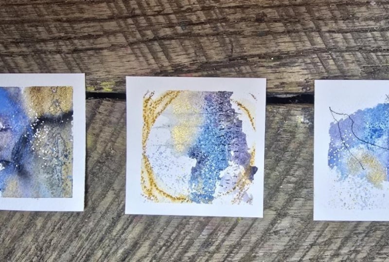
for the size I created. These are three inch by three inch with a
taped off border. The piece itself ends up
being around 2 " by 2 ". Two and a quarter by
two and a quarter. I have all the tape down, so I'll tape some of those down. I would consider these micro little pieces that you
could frame up and you could bring a mat all the way to the piece and you could
have a bigger mat. Maybe your frame around it. These could be card pieces that are on the front of a card. These could be business cards. You could stamp
your information on the back and you can
give these out as little original pieces of
art and business cards. They could be little
micro pieces that go with a larger collection in the
same color way or theme. Lots of stuff that you
can do with these. I use them for inspiration. You could glue these down
in a journal and make a grid of six or
nine in a journal, so many things you
could do with these, and they're just lovely. You could sell them just as
they are if you wanted to. Pick out whatever it is that you're going to do
on this project, pick three or four main
mark baking, goodies. These were my main ones, the No Color tube, pastels, the pencil and the
pascaPen then I came in with some other items if I
felt inspired by something. You can do this project
with watercolor, any watercolor that
you happen to own, if you want to try
something special, like say Daniel
Smith, for instance, or my favorite, which is
the Mashs watercolors, you could get some
dot cards from your favorite brands to give
out colors of test to figure out what colors that you love because a few colors is
going to be way less expensive than
buying an entire set from Daniel Smith or Mash's or whatever
brand that you like. So these dot cards usually provide plenty of paint to
do this type of project on. So if you've got a special paint or handmade paint or something that you want to
give a test out, dot cards are a good way to go, and this is the perfect
size project for that. You can do your project
with watercolor, you can do a gouache, you can do it with
acrylic paint. I'm just giving you some
choices here because there's no right or wrong way
to do this project. It's all about picking what you want to experiment
and learning how it works and picking
colors and playing with the mixing of those colors and figuring some stuff out. And testing out your papers and just showing up for your
art practice every day. And that is the basics of
what I'll be using in class. I wanted to keep it
easy and simple. Pick out your main base
thing, pick out two colors, pick out a few
mark making items, and then we'll be ready to, you know, play and
experiment here. So I will see you
in the next video. Oh
4. Prepping Your Paper: Let's prep our paper. So I was working on
three by three squares, which was perfect because
of the watercolor pad. The Strathmore travel pad
was already 3 " on one side, so I did 3 " on the other. You can make these
any size you want. If that's too small
and you want to do 4 " by 4 ", then
you could do that. I'm working on a piece
of the Bohong today. And this is not exactly
perfectly nine by 12, like my honeymll paper. I'm going to have a little
tiny scrap leftover, but I'm going to stick to
personally the three by three. I'm going to prep
my paper by going ahead and cutting
three inch strips. This is my FSC's paper cutter. You can get these anywhere
that sells the FISCer stuff, fabric stores, craft
stores online. You can get replacement blades
for it, which is handy. I'm just going to cut these into three inch strips because I'm going to stick to
the three by three size. It was perfect. It
was low stress. I enjoyed how these turned
out when I was done. Start off your project, prepping your paper squares so that you're ready to go when you are feeling inspired
to sit and create. If three by three is too small and you want
to do four by four, that's a perfect little
mini project size also. So just experiment. I cut that one the wrong size, 'cause I was talking
thinking 4 ". Alright, so maybe that'll
be my leftover piece. Um, so go ahead and get
your paper prepped. And then the little
pieces aren't waste. Don't throw these away. I keep little pieces
of paper handy on my desk for testing stuff out, a little scratch piece of paper, some sample I need if I need to get a pen started or whatever. I save all the
scraps. I need those. So if I need just a little
test sheet, those are perfect. So nothing goes to waste. So if you're using a
perfect nine by 12, you'll use all the pieces
to make your squares, and if you're not,
save your scraps. Then once you've got your papers prepped, we're ready to go. Prep as many as you're
wanting to create. I like having as many to create as whatever
project I'm doing. I did these for a reels
project so that I have for the next 35 weeks, I'll be posting these
on my social media, which is a nice little 1
minute video of painting these little pieces
and then showing the finished piece at the end. Depending on when you're
watching this class, you could go over to
my socials and watch little mini pieces being
created as a little real. That's the perfect
way to grow some of your social medias is to create some little
mini pieces of art, do a cute little
mini video and post that rather than just all art all the time, which
is what I tend to do. If you want to do 100 day
project, this would be perfect. Show up every day,
paint a little piece, and then you're ready
for the next day. Go ahead and prep
100 pieces of paper. Do all your prep work upfront, so it makes it low stress when you show up to
actually do the work. Alright, so in the next
video, we will get started.
5. Taping Down & Getting Started: All right, we are ready to
create some little minis. If you're doing one a day, then tape down one piece
a day and create and then you can be ready
to come the next day. I eyeball it. I'm not trying to get perfect. You can mark these
with a piece of pencil if you want to mark
it out and get perfect. But I eyeball it because I'm doing little abstracts
and you're welcome to do any type of art that
is your favorite art, I like little mini abstracts
because I like playing with color and I like
playing with texture, and I like experimenting. I don't like to paint
specific stuff. Took all the drawing classes in a when I was younger and did all the
different mediums and all that kind of stuff. I just know that creating specific stuff
is just not my thing. I have an aunt that's
a painter and she does amazing realistic type
paintings and stuff. My mom was a stained
glass artist. I have another aunt that was a yarn artist where
she did lovely um, amazing artistic yarn pieces. And so all the ladies in my family seemed
to have had or at least my aunts and my
mom seemed to have had some cool artistic talent. My grandmother was sewer, so she made she was
like a master tailor. She was amazing. My mom had all handmade clothes growing
up when you kill for that. And she said she
didn't have a store bought shirt until she
was in high school, and she had to beg
for it because everything was made
by grandmother, at the time when that's how
all your clothes are made, it's not nearly as cool as everybody else getting
store bought clothes. I thought that was pretty funny that she begged for
a store bought thing. And now, we'd kill
for handmade clothes, custom cotur so I thought
that was kind of funny. So yeah, everybody in
my family, my ladies, on my mom's side,
seemed to have had some kind of a lovely
creative talent. I've tried all of them. I did stained glass with my mom. I've done all the different
little art classes. I did photography
professionally as a business. And now I'm back to what I kind of love the most
because even in photography, I liked abstract
textures to add to my photos and made
abstract textures to manipulate photography in Photoshop to make it more
like a piece of art. So I just know that I
love color and texture. And shape. I don't
like specific things. Tape them down. There we go. We've got six to
experiment with. I thought we would do I would do six different play with different mediums and stuff
to give it a little go. This is a perfect
way if you wanted to test out all your
acrylic colors, if you wanted to test out
all your watercolors. I did all of these
using my Masias handmade watercolors just to really get a feel for
what all the colors did. This is one color. That aqua is one
color that granulated and separated out into all
those other yummy colors, not the orange obviously, but the color underneath it. This is the project
that's going to let you know and see
that kind of stuff. If you've got
granulating colors, I have the holbin granulating watercolors that I
haven't had very long, so maybe we'll do one in that. Let's just do six
different mediums and just see what we get. I've got some gouache out here. Got some acrylic paints. Maybe we'll do
acrylic paint first. Because I'm just going to do one of those and I'm just using the Blick Mattacrylic because
these are good quality. Got one that didn't have
and it wasn't open. But yeah, they're good quality. They're they're artist great, but I've been super
happy using them, and they're not shiny,
which is what I love. And for the price, they've been my favorite to play and experiment with. That
was way too much paint. So to get started on this, you can start with a blank paper and put your paint first, or you could start
with some mark making, and I like doing
that with a pencil. So I've got my black
wing Matt pencil here that I'm just
going to get started. And this is a really good
way to kind of get past the white page paralysis that
we get stuck in sometimes. So just going to
go through all of these and we may or may not see the marks underneath
when we're done, but I do like maybe getting
started in this way. You can use whatever your
favorite mark making thing is. Doesn't have to be a pencil. I happen to love graphite
for some reason, a lot of things
that I do tend to start with a graphite
just because I like it. Whatever your thing that
you like, you go for it. We'll start four with
marks and two without. Even though I was using
this for the watercolor, I tend to use the these
Princeton umbrella for my acrylic paint. A lot of times with
acrylic paint, I'll actually mix them with some gesso because it
tends to make them, this is clear gesso, tends to make them more mixable. I like that. I'm just going to get started with a color and pull
in maybe a second color. I want you to limit
yourself to just a couple of colors and just see
where can that go? What can I do with
that? Then if you want two colors in black
and white, black and white, I do consider to be neutrals
and two colors in black and white is a super popular thing
that I do in my journals. I might grab a little white here and just pull a little of
that white back in there. And that's about it. Then I would let this dry. I could also, while we've got it right here,
do some mark making. I could just come through with any kind of
tool that you want. This is just a rubber
spatula thing. Yeah, we can come
through with any kind of mark making that
we want while it's still wet might come through
with you know, shape. This is a time to
experiment with all your tools and just
see what can I create? Let's let that one dry. Then we can do a little mark making on top and
that's basically done. These are what I would call
three minute projects, and I got some paint on
that, but that's okay. I don't even mind. We could do a second acrylic one
since I got paint on that. We could do let's do one more, and then we can
cover that paint up. I'm really messy when I paint. Blue and orange, if
you're thinking, what colors do I use? We could pull out our
color wheel and you'll see that blue and orange are complimentary colors
on the color wheel. Then if you think, well, what am I going to
put on top of that? We could turn that into orange, blue, and teal. We could
do something like that. You try one of the tried and true
color combinations complimentary split
complimentary, triad, tetrad, and just see what colors go with each other and play with
the color wheel. You could pick out a um, color palette and pick
two colors off that. Then any other colors that
are on the color palette, you could then play
with experiment. Okay, so I'm picking? I'm personally just picking out weird combinations.
Look at these. They appeal to me and I'm like, oh, what would this
do if I did this? I like playing with
color palettes because then I pick out things I definitely
never would have done. That was way too much paint.
My favorite color palettes are the color cube,
color palettes. If you have color anxiety, which I do, I like
too many things. This is a way to get
past some of that. I pull a color palette. I can pick any color that's on the cube. I don't
try to get exact. I try to get close that
sets me in a path in a direction so that I don't get stuck right up front
going, Oh, no, what color. What I like about these is you're going to
pick two colors, doesn't matter what
the colors are, and you're going to come back
and just start creating and mixing and playing like this and then you'll be able to say, I like that or I
did not like that. So we're going to
do a couple here. It's not about trying to
figure out for me for me. It's not about
trying to figure out composition at this point. I do tend to start
in the corners or color from the
edges coming in, just because that's how I naturally tend to do
stuff with photography, I'd start center something and then push it to the side so nothing was actually
centered with painting, I tend to come in
from the edges, so I don't start in
the center and I'm naturally creating a flow Just randomly, and I like that. It's all about putting
a little color down, maybe coming back with some
art making on top before it's dry and then sitting back
and letting this dry. I've got some of these that have little marks on the edge. I think. Oh, yeah, these are some little old
Ranger texture tools. You could do a palette knife. We can come through and just
get some lines in there. You can do that with
a knife or a brush or anything, credit card, anything that's got an edge that you could drag
through and let that dry. Then let's go ahead. We'll come back and
mark make after these have a chance
to dry for a minute. This is a good way
to keep you going. Let's try one of these. Holbein granulating
water colors, which I had tubes and I put them in a little palette here
and a little palette. You can get these little
palettes on Amazon. I'm just going to wet this down. And I feel like blue and
green because this color is talking to me and this color is talking to
me or even these two. How about these two?
Let's do those too. I'm going to get my brush. Let me get a clean
water over here. I don't mix my water for my
acrylic and my watercolors, I do pick a different water when I'm changing
mediums like that. That one, I started from the edge and went at an angle, and that's
what I want you to do. Start at an edge,
maybe go at an angle, maybe do something
like that with something giving
you some movement through the piece so your
eye has somewhere to go. Another little fun
abstracte cheat, basically, go add some movement as you're coming or
come in from the edges. I've got some aguash. This is the um, Uh Holbein. Holbein gouache. I'm going
to do pink and ochre. I've got G 827 and G 589. The gouache to me is basically a watercolor
and that's how I use it. It's made the watercolor gouache is made the same
way as watercolor, it's the same binder and stuff, but usually it's a
difference in pigment sizes, and that gives you some differences in opacity
and stuff like that. Gouache to me is basically a nice gateway between
watercolor and acrylic. Then there's that. What else do we have up here? I've got some just to
give you let's see. I've got the Holbein. That's wholbn. I do have the HbinGh
in a container, not just the liquid, even
though I just used the liquid, but I do have those
that I've put in little metal
containers that again, I've gotten off of
Amazon in the past, and I just labeled
them, Oh, core. Let's try the core. The core is a different kind
of watercolor. Let's do magenta and tell
because or magenta and green. This is why I use
color palettes because I get distracted with
all the yummy colors. I want them all. Sometimes they don't actually go together in the same piece. Okay, so are we doing the teal and are we doing the green? Kind of feel I'm feeling green. We'll activate those. This
is the core watercolors, QR. When I did the
project originally, I picked my little set of
what I was going to go with, which was the
Mashas watercolors, and I did that on
all the pieces. There was no picking and
choosing where we were going. I already knew,
and I just had to sit and pick my
two colors and go there wasn't a lot of
extra thought process that we had to go with
to even get started. Look at that. All right,
so that's the core. I picked these are some handmade Japanese paints
that I made years ago. Yeah, why not? Let's
just use these maybe. So these are ones that
I handmade myself. You can just use, anything that you want to
experiment with. I don't know. That's
not grabbing me. Is that grabbing me maybe
it is. Let's do this. Let's do this tell. Yeah, I picked one set and
I went with it. If your one set
is, for instance, Daniel Smith and you
want to play and experiment and really learn what Daniel Smith
will do for you, perfect exploratory
type project for that. So these were just
some Japanese pigments that I just made into
watercolors myself. So you can play with
pigments and handma your own colors and just see what can you
get and how they work. And did you like them and
just get a good go there. Similar color to
what I did up here. Was that I don't even
remember what that was now. All right, so we're
going to have to let all these dry and I'm
going to go ahead and let them dry naturally
so that they can do whatever tricks
they want to do, and then I will be right back.
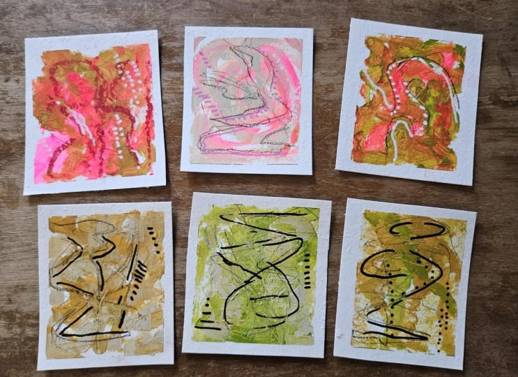
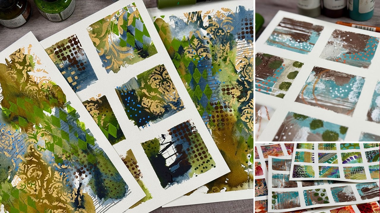
6. Mark Making: All right, now I
have walked away for a moment and I've come back, and now it's time
to mark make you can do any kind of mark
making that you love, but I have some favorite kinds of mark making that I personally love and just to maybe get
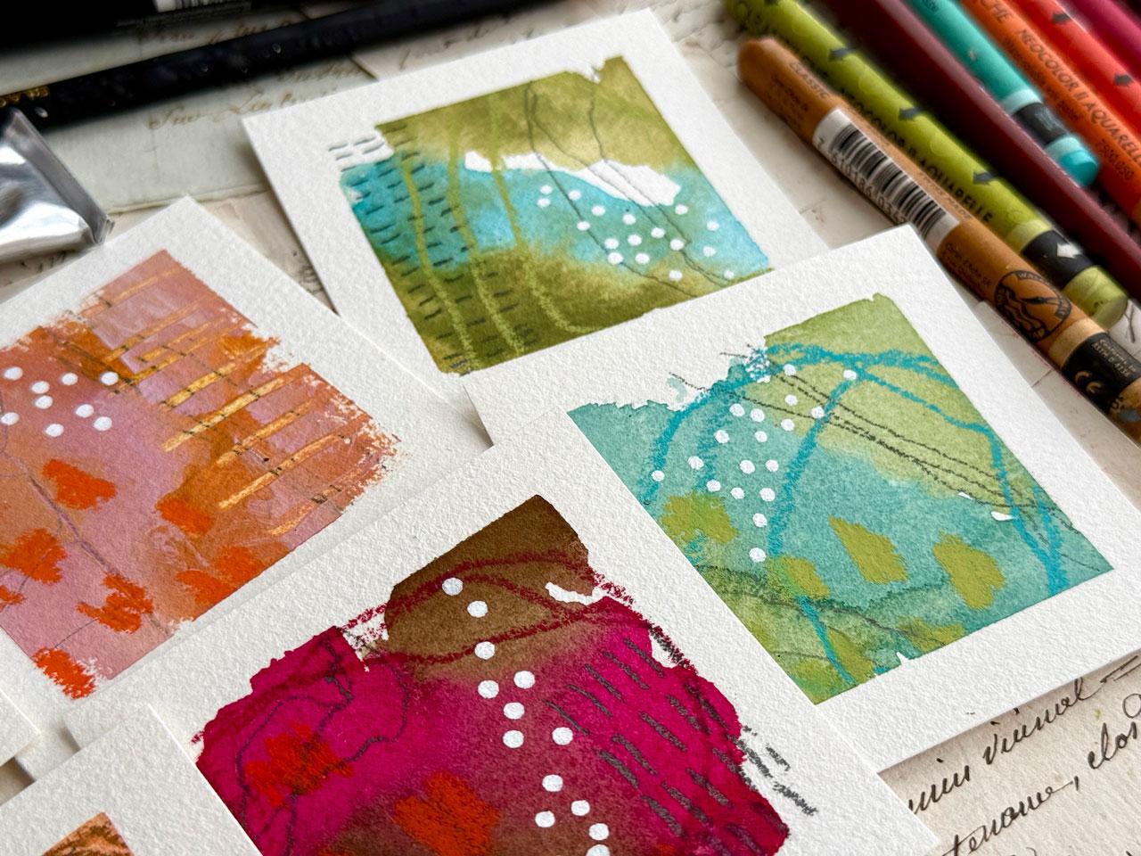
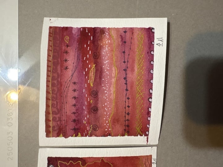
out some of our samples here. I like to do crazy lines just because that works
for what I like to do. You could do it with
your non dominant hand if you're getting your lines too perfect because the goal for these lines are to
be not perfect. I also like dash marks
lots of times in rows. So that's another favorite
thing that I like. Another thing I like is like a wonky rainbow
kind of mark. Um, sometimes little
marks like this. Sometimes I like
little swirly marks. It's a preference for whatever
your favorite marks are, but these tend to be
some of my favorite. I also like dots done
with paint markers. So that's kind of the marks
that for this project, I have stuck to. So I recommend you do some
of your favorite marks. If you don't know what those are then look at a lot of art on, say, Instagram or wherever and start making yourself
a little book of marks. I've got a sheet of
marks that I've made, which for the moment,
are hiding from me. But these are some of
my very favorites. The mark making sheet that
you could make for yourself, you could grid it off
and in each square, do a different mark
and hang that on your wall behind where you're working so you can just
look up and be inspired. I also like studying
the old Masters. I have a whole clemp
study that I did. With all the different marks and different things that Clemt
did in his paintings. That's another way
to add to your mark making library study
some old paintings. If you see a mark or
shape that you like, go, I like that and repeat it. One of my favorite ones in the Clemt study looks
like a coffee bean. It's a shape like this
with a line in it. I call it a coffee bean. I don't know what
his thought was, but I do particularly
like that shape. And that's a shape that
I would have pulled from a masters study and added
to my mark making library. This is my mini mark
making library for these. You might do yourself maybe
some samples like that, and then you come
back and be like, Okay, now I'm ready to
do some mark making. Some of these I marked underneath and you
can't really see it. You can't really see it
under the acrylic paint, but you can definitely see it on these other
pieces that I did, and now I can add to it. So these I did not mark
make under at all, so I'm going to
add some to that. It's interesting that the whole bin granulating water colors and my handmade colors
are very similar, but I actually like
the whole bind better. It's richer, it's deeper,
there's more color there. You can tell. That's a pretty
granulating color in there. And again, I'm not
paying attention to composition at this point. I'm not putting
anything in the center. I'm putting things kind of on the edges and maybe
moving through the piece. That's my personal
way that I kind of guarantee it'll be more interesting when
I peel the tape, even though I'm not thinking
too hard about that. Okay, so we've basically got a lot of loveliness
going in here. If you're like, where do I
start and stop the lines? If you don't want to go
through multiple colors, you could pick a
splotch of color and let that determine where
you put the lines. That's a good way to
determine mark making also. I've got some neo Color
two crayons over here. I'm going to come back in
here and maybe do some type of mark making on the pieces
also. I like the orange. With this, again, maybe some bigger element rather than
all tiny mark making, maybe something a little larger that pops off and goes, wow. I like the orange. I might
just use the orange again. And again, you can pick
a shape for that, too. I'm going with a scribble
blob, basically. But any shape you
want to do is fine. These are just fun
to create and see. You can pick a color
that's in there to kind of come back and do something
like a big abstract something. You can pick a contrasting
color to give it a pop. I want you to put some kind
of mark on each of these in whatever that material is that you've picked as
that next material. So I'm kind of thinking,
what about this for? Oh, yes. Look at that.
Oh, I like that. I need that green.
I need a green. So on the No Color two crayons, this is the bigger set
that I have just put into a vintage tin that I found
at the antique market. It's just pretty got
a pretty top on it. Might not be old, but it
seemed like it was old. And it fits my
crayons perfectly. I'm like, Oh, yeah, perfect.
Okay, so there's that one. I'm going to come
through here and I am going off the edges
onto the tape. When I peel the tape, that mark kept on going and your imagination is
like, Oh, where did that go? It extends the view in your mind past where it
actually stopped. I like that. I like that you can extend and let the viewer imagine
where else did that go? I like this yellow here. Comes out a little
more of a brown. You don't have to
reinvent the wheel here. It's just about
picking a few marks, playing with your colors and saying, Okay, what can I create? I like white pascaPenT is why I like having little samples
so we can shake it up. And then get our paint started and then we can
move this out of our way. Yeah, with something like a
lovely little dot like this, I think dots are
whimsical and fun. Again, I don't put
it in the center. I offset it somehow. So it's part of the piece without being
right in the middle, which is usually the least interesting way
to compose something. I'm always thinking
offset somehow. And whatever your
mark making is, whatever your
favorite colors are, whatever you decide to do in this particular
mini project, maybe you like Zentangle. Maybe you like drawing
actual things. This can be any type of project
that you need it to be. It doesn't have to be
an abstract project. It can be a miniature
drawing project. It could be a little miniature let's put
this orange in here. Can be a miniature
illustration project. I mean, it can really just can go the gambit
of amazing things. Okay, now I feel like
I need the fun dot. Could have done the.in orange, but we're doing a white dot. Kind of being a
little bit consistent here, but that's okay. It doesn't have to
be complicated. I want these to be
about 3 minutes. That's usually my goal there. So now I feel like we're there. Doesn't have to be complicated. So let's peel the tape. The reason why I picked the
papers that I picked is because the tape does not
tear the paper generally. So nothing worse than doing a piece of art and then
tearing your paper, and it was the best
thing you ever made. And look at that. Oh, my gosh, first one. That was the handmade
paints that I did. Perfect test to see
how those worked. Super fun. Super fun.
I'll try not to. There's a little wet watercolor
on some of this tape. I'll try not to
mess anything up. The thing too, once you peel it, you can then decide, does
it need anything else? Did I get enough contrast? Do I need something coming out of there that
maybe I didn't get? Because this one it could have maybe used some more contrast. Everything is very dark and then you have that white and it was like, Is there
enough contrast? These are fun to re evaluate after you've done
these little pieces. They're not meant to be
perfect. Mine are wonky. Exploratory and experimental. I'm not trying to create
some masterpiece here. I don't want to get stuck on
that one didn't work out. Why I like doing more
than one piece too, because there's always several that work out and maybe one that doesn't the one I did was the
one that didn't work out, I'd be discouraged and upset
for the rest of the day. Now I have five others
that might work out and it makes for a really fun paint
day. Okay, that one I like. Let's peel the holebn. I love the holebn
granulating colors. Those are new to me. When
I'm making this class, I haven't had them
all that long. I love the richness those
colors have in them in comparison to these Japanese pigment ones I
made because look at that. That's basically the same
painting, give or take. But look how much
deeper and richer those granulating
colors are than the one single pigment
ones that I made. Isn't that cool, to be able to then look at that
and be like, Oh. If you have several
different kinds of paints, but you have the same
color in those paints, you could even do a whole
series and be like, oh, that's the one I like. That's why I love doing
projects like this. I'm always about exploring and
experimenting and playing. That's the part of art
making that I enjoy. I'm not interested in selling. What, look how pretty that is and just to be acrylic paint. If that's what you
want to work in, look how gorgeous those are. Oh my gosh. This one, I'm already loving that one. Then, this is now a good idea of what you
might do for a larger piece. These are your test
pieces and how might you expand that into
something larger? Look at that one. Oh, my gosh, this one's the best today. These two are my favorite
for today. All right. So that is our lovely
little pieces. I want to encourage you to not
get hung up on perfection. Play, pick out two
different colors and a few mark making
tools and just experiment and see what can I create as far as a tiny
little art practice might go? Then this would be
really good if you set yourself up for
the next 30, 60, 90, 100 days and you did some every single day or
one every single day. Because then you could
end up like me and have a lovely collection of
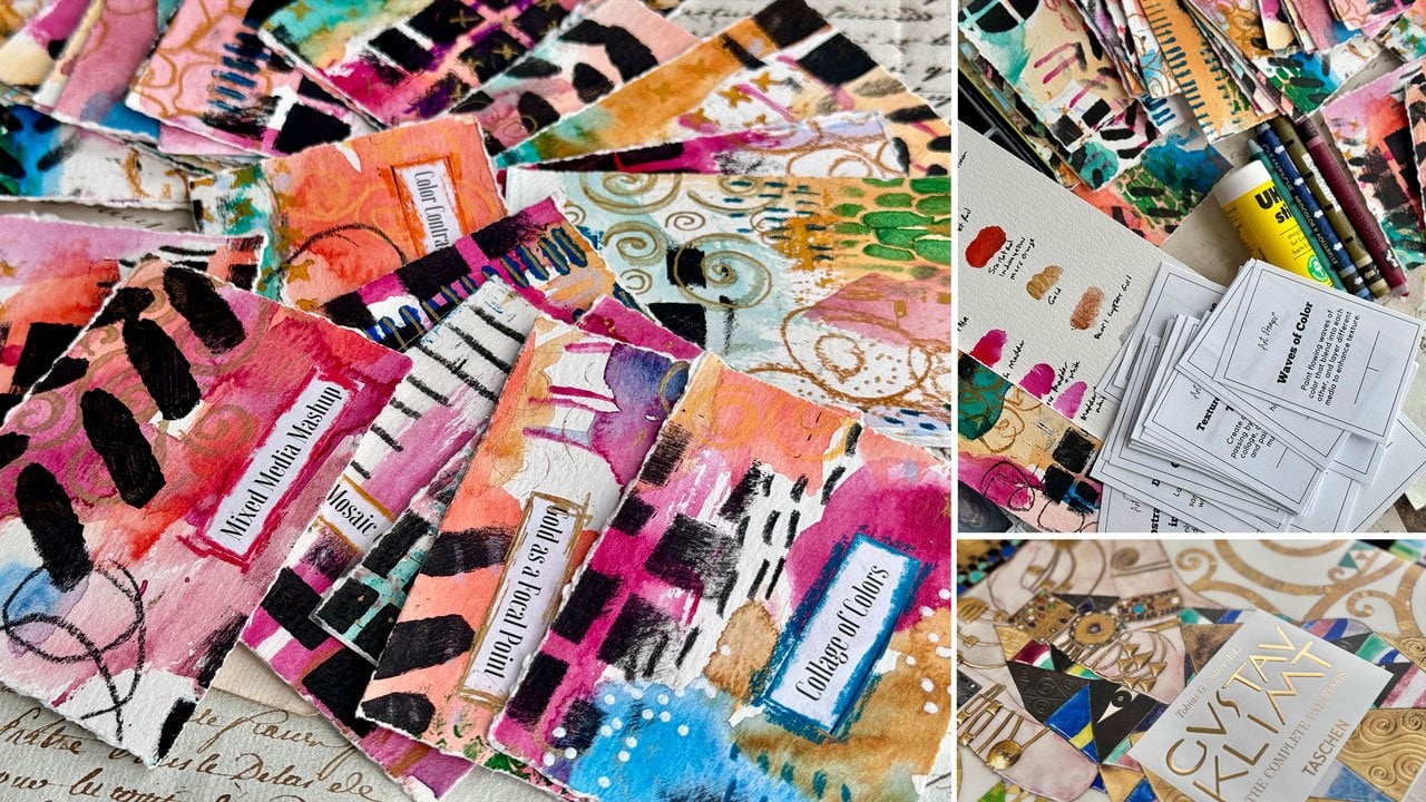
miniature art that you can then come back and look at and explore and get excited about. I love these colors, which is basically like brown
and maybe a deep purple. Love that. Now you have a whole bunch of inspiration because you can come
back and be like, I love that or I love that idea, or I love some of the
marks that I did. This is super satisfying to me. I just show you the rest
of these that I created. You can see I did
basically the same stuff. A few of these I added gold to, so gold is always fun. Didn't get the gold
out for this for ours, but we could definitely go back and add some gold in there. Some of those might
need a little touch of some gold dot or
something like that. But you can see how fun it is to pick different
colors every day. Those are some I was
experimenting with there. When I came up with the idea, I did one and I'm like, Oh
my gosh, that was so fun. I need to do a whole set, and then I did another
one and filmed it, and then I filmed all these. So if you want some ideas, you can go back and
check my socials. I'll be posting these every week or they may have just got
started or they may be done, depending on when you
watch this class. This is my favorite
one out of all these this teal and
orange. I love that. Yeah. So these are super fun. And what can you do with these? You can make them into cards or business cards or micro
pieces of art or inspiration. I don't feel like I have to do anything with them
other than admire them and come back and go through
and be inspired by them. So these are more of
experimenting and play for me rather than anything super serious, but it
gets you to show up. You get some satisfaction and some fun out of the
pieces you created, and then you've had
a great paint day. So I hope you enjoy giving
some of these a try, and I'll see you back in class.
7. Finishing Your Pieces: How do you finish these? Somebody will
always ask me that. I do have a video about preserving art that I talk about how I finish
different pieces of art, but I don't finish these. If you frame it under
glass, they're just fine. If you don't use something
that smears like oil pastel or soft
pastel, they're fine. You could fix it
if you wanted to. I've got oil pastel and
soft pastel fixative, but there's also a
general fixative. I did not use anything on
these that would smear, so I generally don't fix that. But if it's a piece
that you're trying to uh, be important about. You could fix it with
a standard fixative, and then you could put a
layer of cold wax on there, like the Dorlans cold wax, if you wanted to put a
layer of coal wax on there, and that would seal it down. But I would do more research
into that and just see what and these are the perfect pieces to test that on
because they're tiny. But if it's a piece
that you love love, like, I love love this one. Don't test it on that one.
Pick your least favorite. Like, pick this one. And test it on that
one before you do any type of finishing
on a bigger piece. I specifically
picked things that would dry and not smear on this project because
I knew I would not be finishing them because they're
basically finished to me. So I won't finish them. If you use a oil pastel
or a soft pastel, then get the pastel
fixatives Bisnela, they make one for soft pastels. They make one for oil pastel. If you need a regular fixative, you can use the crylon
fixative if you need to. But for the most part,
I don't fix mine. That's a personal
preference there. But I just wanted to
address that cause somebody will definitely
be wondering. Alright, I'll see
you back in class.
8. Evaluating Your Work: Now that we have
finished our pieces, I want to talk about
evaluating what you've done, what worked, what didn't work, what you liked, what
you didn't like. These would be
perfect to maybe have in a journal and have the
piece of art and make your notes by the art if
you want to keep track of things you've already
tested and played with versus things
you'd like to try, colors that you liked
or didn't like. I want you to look
at these and think, what did I like or not
like about the color. So I learned on the two blue
green pieces that I liked the deeper granulation
and variation in the colors that I got versus the single pigment
ones that I made. That's an important
distinction there. I also learned that this one, I can look at it
and evaluate and I can see that there's not
enough contrast there. Everything's dark and on the same level and then you have the white
that popped out. On this one, I would either consider different items
that I could have. I might make more squares, take down some more
and try again using the two colors and maybe
other mark making elements. Or consider changing
the colors that I did. I might look at that and think, the colors, there's not enough
contrast in this piece. In this piece, I
like the movements. I like pink and ochre, so that color palette
works for me. This one, I like
the pink and ochre. Did the orange work as
good as the orange? I'm talking about the big dots. Did it work as good as
they worked on this one? I think the orange
dots worked better. On the blue. So it
just stands out more. Do I like this? Yes.
Do I like this better? Yes. So there's a lot
to like about this one. I like the contrast. I like
how the orange popped off. I like a little bit of white. Out of today's art practice, these two pieces
were my favorite. That's just how I would look
at these going forward. Do I like them the
way I painted it? Do I like it a different way? This is one of my favorites, so this is one that I would
try to come back to and say, Oh, I like all the
color in that. I like the paint I used. I
like the contrast I used. I like the marks
that were in there. And everything about
that works for me. I would just do that
with each piece. What worked, what didn't work? Do I like the colors that I use? Do I like how they
work together? That was an interesting
malachite color in with that orange. I pink and yellow ochre. I love it. This one,
I love that a lot. Here's where I would
sign the pieces. If I were to sign it, you can sign it in pencil at the bottom, maybe put a year on one side and your name on the other side or name a year
there on the side. The reason why too, if this is something you're
going to have framed, or you're going to give away
or sell or what have you, the reason why you want
to sign it is so that then everybody knows
what direction is up. Because I had some
abstract pieces framed hanging in my house. When I got them back, I thought, those look upside down to
me and they're abstract. Are they upside down? Is there one way better than another? I might like it this way and
you might like it this way. Whatever way you determine
is the right direction, sign it and then
everybody knows, that's the right direction. Um, and I don't usually sign my pieces that I have
here because I'm making them in a video and I make
things to explore and play. Signing it is not
as important to me, but I have a friend who
also does a lot of art. She signs every piece, whether she intends to keep
it or throw it away. Just fun preferences there. I really love what these
colors did. How fun is that? Orange. Those are super fun. There are several that
I've already painted. These will be coming out as little mini videos
throughout the next year. If you're watching this class when it's new,
they're still coming. If you're watching this class
after it's been up a while, you can go and check out all the little mini videos
that I've hopefully posted, but these are all the
ones that I have ready. To share every week. I'm going to share one a week. Yeah, some of these are just gore and I'm glad I filmed them because now
I look at it and I think, how did I make that? That's
what I do with these. That's how I evaluate
it. What did I like? What did I like? What
worked? What didn't work? What would I do again? What did I What would I not do again? I'd not do the yellow again. I'm like, not my color. Um, this super fave fave, you know, if you didn't
do something like this, you're not going to get to
some of these discoveries. And I love getting to those
discoveries and figuring out why did I like this watercolor better
than this watercolor. Why did this not work as Why did this not work
as well as this? Like, different things to look at and evaluate
and consider after you've created a nice little
stack of these lovely minis. So I can't wait to
see what you create. Definitely come back and
share those in the gallery and show us what you worked
on with this project, and I'll see you
guys back in class.
9. Final Thoughts: Thank you so much for joining me in this mini abstract
painting adventure. I hope this class reminds
you that your creativity doesn't have to be complicated or time consuming
to be meaningful. These tiny pieces may
be small in size, but they're powerful tools
for building consistency, exploring your artistic voice, and reconnecting with the
simple joy of making art. Whether you continue
this as a daily practice or you return to it whenever
you need a creative reset, remember, there is no right or wrong way to
show up for your art. Give yourself permission
to experiment, make a mess, and
follow what feels fun. Can't wait to see your many abstracts in the
project gallery. Don't forget to
share your work and let me know how the
process felt for you. Keep playing. Stay creative, and I'll see you
in the next class.
 DENISE LOVE, Artist & Creative Educator