Transcripts
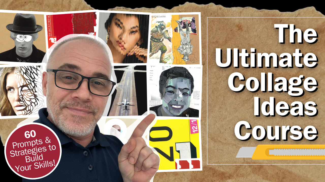
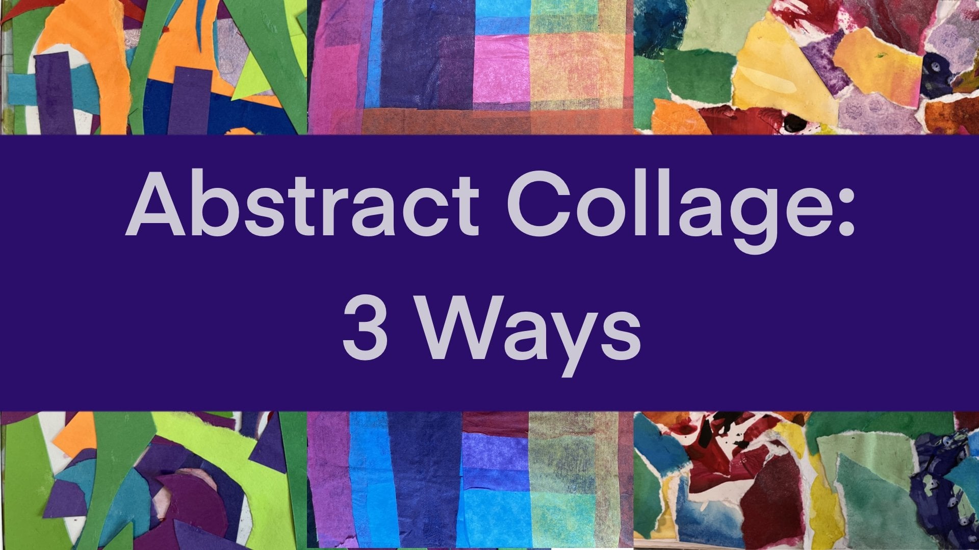
1. The Ultimate Collage Ideas Course Intro: Have you ever wondered how
a collage comes to life? You two can unlock your collage creativity with expert guidance. Collage is a fantastic art form that's accessible to everyone. It's quick, affordable,
and incredibly versatile. How do you elevate
your skills beyond the basics and improve
your confidence? I'm Frank Kerkhovk, and
in this dynamic course, I'll show you how to
take your collage artistry to new heights. With over 20 years of teaching experience from kindergarten
to high school, I've curated and tested a range of collage
ideas just for you. Join me as I reveal creative
techniques, strategies, and prompts with unique
composition ideas designed to transform
your approach to collage. You'll learn to rethink
your materials, master new arrangements, and
refine your compositions. By the end of this course, you'll have a wealth of
ideas and a portfolio of captivating collage work ready to showcase your
newfound skills. In this course, you'll explore over 60 inspiring collage pomps. We'll dive into things
like surrealism, juxtaposition, abstract
art, color, and more. We'll view over 250
collage examples with engaging critiques and some time lapse video footage. You will learn to
implement the elements and principles of design
to improve your work. At the end of the
course, you'll submit your best collages as a portfolio to share
and receive feedback. Whether you're a beginner, eager to get started or
an experienced artist looking to refine your craft. This course has
something for you. Let's embark on this
creative journey together and elevate your collage
art to the next level.
2. Materials Needed: The size of your collage
work is entirely up to you, and this may depend on the
sizes of your source material. For the activities
in this course, I often started
with smaller pieces around ten to 15 centimeters. You can work on loose
cards or in a sketch book. While sketchbook paper
is generally fine, be aware that I can curl or
warp when glue is applied. T remedy this, simply
flatten the page afterwards by placing
it under heavy books. Here are some of
the essential tools or materials that you will need. Obviously, you're going to need some scissors or exacto knives, and I have three different
size scissors here, like a large medium and a small, but I usually just use
these ones most of the time as they're more
comfortable for my fingers. I got two kinds of
exacto knives here. You just see there's
slight variation with the size of the blades. I tend to use this
one more frequently. I tend to mount my collages on like a craft paper like this. You see it's 250 grams. It's a little bit thicker
like cartridge and I usually use this A
five size or A four. You'll also need some glue, but I prefer mod podge, and this is the gloss one. This also comes in a Mt. Another option is
to use gil medium, and they work the same, but I find that the mod podge, it might be because
I'm in Singapore and it's a lot more humid. But after The collage
is completed, I'll sometimes put a layer of mod podge on to give it a shine. If something is stacked on top of it like another collage. I find that after some time, they could stick together. Probably think of it as if it's like melting and
attaching to another piece, and it has damaged some
collages in the past. It hasn't happened to me
with this brand so far, but since it's happened
with this one, I'm not going to try and experiment to see
if it does happen. Connected to that,
I will often place my collage work in
these k sleeves. I'm using the
really cheap kinds. They're really flimsy,
but I find it just helps protect the work a
little bit more securely. With the gel medium
and the mad page, I also just pour some into a
little container like this. You could also use
a yogurt container, but I find that's quite large. For the sizes I've used, this has been more
than adequate, and I'll just use a cheap old
paint brush to apply it on. I'll often have a scrap piece of paper down where
I can dip this in and make sure that I go right to the edge of the cut
pieces that I'm using. One mistake I often find students doing is
that they apply too much glue or the mod podge and they don't apply it
directly to the edge, or they apply too little and
they get some air bubbles. I make sure to cover the entire piece of the
cut piece that I'm using. I also use a metal ruler
for obvious reasons. If I'm using the exact knife
against a plastic ruler, it could cut into the plastic
and damage the ruler. I find that this is better. Some other optional tools I use. Obviously, one I use quite frequently is
Posca paint pens. These come in different sizes. Recently, they've been getting
a little bit expensive, but I like them because they cover other colors very well. Another alternative
could be sharpies or any type of oil based
or permanent marker. Colored pencils are another
things that you could use to make some scribbles or decorative elements
within your work. I also find this paper
cutter rather useful. It's just for faster cuts, especially if I'm using a
magazine image and want to trim that down to the size of the mounting paper
that I'm using. It's a lot more accurate
and a lot more faster. I also have this circle cutter, which I'll demonstrate an
activity in the course. Basically, you can adjust the length and it just cuts
a perfect circle for you. Not essential, but can
sometimes be useful. It's useful when you need it. I also have this rotary cutter, works like a pizza cutter. No super essential, but I
think I got it for around $15. With thick cardboard, I find
that this works quite well. This little thing here is just a cheap thin
piece of plastic, it's called a bone folder. No super essential,
but I find when I'm gluing larger pieces
of images down, sometimes you'll get some
air pockets or air bubbles, and I use this to squee or
push those air bubbles out. You could do the same with
your finger like this, but I think I picked this
up for $1 or dollar 50. For your collages, you'll need a variety of source materials. These can include
naturally magazines, newspapers, children's
storybooks, junk mail, ephemera, like old books or
envelopes, tissue paper, tracing paper, Origami paper, colored paper, wrapping paper, and any type of
product packaging, like cardboard or plastic
wrappers that you find attractive can all
be used within collage. As you create more collages, consider setting up some type of storage system for
your materials. Initially, a simple
box may be fine, but as your collection grows, organizing with a filing system or storage boxes can
be a game changer. At first, I would store all my collected images
in these plastic sleeves, but then they just kept
growing and growing. Then I move to these
plastic boxes, which I also bought
at DSO, I believe. I have lots of different
categories for these. I'll collect images
from magazines that include people or
humans, animals, patterns, typography,
places, plants, et cetera. You just collect what
you find is interesting, and then as that
collection starts to grow, you find yourself buying
a lot more of these. Enjoy the process of gathering and organizing your materials. It's all part of the
creative journey. Let's talk next about
the creative process.
3. The Creative Process: Before we dive into
the activities, let's talk about the
creative journey ahead. Remember, the creative process is exactly that, a process. Not every idea will hit
the mark, and that's okay. Every attempt is a valuable
learning experience. Throughout the course,
I'll guide you through the key skills and
composition strategies. As you explore, you'll gain a deeper understanding
of how to use the elements and
principles of design. Embrace the process,
experiment boldly and enjoy each step of
your artistic development. Next, let me briefly
explain the elements and principles of design and
some composition strategies.
4. Composition Strategies: Might be wondering why the video intro had someone baking. It should hopefully make sense by the end of this
video segment. As you explore collage making, you'll gain a deeper
understanding of how to use the
elements of design. These are line, shape, texture, color,
value, and space. Think of these as the
essential ingredients for your collage creations. We'll also delve into the
principles of design, balance, proportion,
emphasis, unity, and rhythm. These principles act as the recipe for
structuring your artwork, helping you create visually compelling and
cohesive collages. When it comes to
creating great collages, composition is key. Instead of placing
elements randomly, you'll learn to use strategic techniques to enhance
your artwork. One of the most effective and popular methods is
the rule of thirds. Imagine your frame divided into nine equal parts by two horizontal and
two vertical lines. Place focal points where
these lines intersect. Our brains naturally find these
spots visually appealing. Other simple, yet
powerful composition techniques include
the centered rule, where you place the
main element in the middle, as well as vertical, horizontal, symmetrical, asymmetrical,
cruciform or L shape, radial, All over compositions, which basically means
that stuff is everywhere. Each approach offers
a unique way to organize your elements and
create engaging visuals. Layering is a cornerstone
of collage art. Think about incorporating
background, middle ground, and foreground, to add depth
and balance into your work. Experiment with contrasts,
such as big versus small, light versus dark, versus torn, to create dynamic
tension and interest. However, simple
collages can also work when focused through an
element or principle of art. Sometimes a collage may
also celebrate a technique, such as de collage or an
approach such as color. The goal is to
experiment and explore various collage techniques to expand your personal
visual vocabulary. Blage allows us to
deconstruct materials and reassemble them into
fresh innovative creations. Ready to transform
your ideas into art, let's dive in and start
creating with the activities.
5. Collage Idea 1: Nifty Fifty: For our first activity, we're going to start
off really simple. It's called 50 50. This simple composition strategy will force you to realize the relationships images can have when montage
next to each other. All you need to do is find
two images to collage together and cut each image
to take up 50% of the frame. In my first example here, you see I've used two
side profile portraits and divided it vertically. I've done the same thing with
this other example here, you see I've arranged it
a little bit better by aligning the chins and the top of the head more effectively. In this third example. Again, I've used two portraits, but I've divided
it horizontally. Bases are probably easiest
to get started with, but you can utilize and explore whatever
you have available. Source material
can be portraits, animals, objects,
or even patterns. Sometimes things
that are completely unrelated can make
striking compositions. Our brains will often make their own connections
and create stories. With this fourth
example I have here, I've used these two
architectural structures. You can do something similar
with patterns or fashion. You can also get more creative
with this in the future, as in this example, where two images were
divided with circular cuts. We'll explore this in
activity 20, circle cuts. Feel free to
experiment and place random images together or
even play off opposites, complimentary colors, or
explore themes such as gender, identity, wealth, et cetera. In the next video, we'll
slightly adapt this.
6. Collage Idea 2: Shifty Nifty Fifty: The building off
the previous task will do something similar, but expand it slightly. Again, find two images
to collage together and cut each image to
take up 50% of the frame. These images can be portraits, animals, or objects, et cetera. This won't greatly matter as you previously discovered
in activity one. Our brains will go ahead and
make their own connections. The difference with this shifty Nifty activity in
the previous one is that you will place
one of the images upside down. Here's an example. I didn't do a very good job
at centering the images, as you can see,
they are too much off to the side, both
of them actually. In the second example,
it's a little bit better. I started to find my
way a little bit more. I cut along the actual figure here and turned it upside down, and I'm pretty happy
with how it turned out. In the next example, I repeat this strategy
as the previous one by cutting out this
whole entire figure, and added some pencil
scribbles and co or colored pencil and some
other papers as well. And it's much more interesting than say from the very first
one that I showed you. As you start creating more, this technique starts to
become more ingrained. In this last example here, I've placed the image of
the boat sideways instead. This quick collage
tactic forces you to reconsider orientation
as a collage strategy. In the next module, we'll
take a look at thirds.
7. Collage Idea 3: Thirds: Composition strategy
in this module will explore montage as a clash tactic that
can create a narrative and help build your artistic
awareness and ability. This activity is called thirds. Building further from the
previous two activities, now you will find three
images to cash together and cut each image to take
up one third of the frame. Contrasting images
with verticals and horizontals can
be more interesting. Let me show you. To understand this, look at this example. The first image is
considered a horizontal. The second has vertical trees, and the third is
again horizontal. None of the images were
initially related, but a story is emerging. The second section
also contrasts nicely with the two
others through color. Here's another one
and the images are a little bit more connected. We get this feeling
of the open space in a sense of travel or escape. This next example is
a little bit more thematic as it delves
with colonialism. I tried it vertically this time, dividing it into the thirds, but I'm not sure it's as
effective as the other examples. To recap, find three
images to collage together with each taking
up about 30% of the frame.
8. Collage Idea 4: Partners: For this partner's prompt, you'll actually create
two collage pieces, so you'll need two frames or two boards to mount
your collage on. This activity demonstrates
that collage works can have connections and relationships
through theme and imagery. First, find an image that can fill your frame and
then cut it in half. We will use each half separately
on each collage frame. In this first example here, I had this image of
a plane had and a half with each taking
up half of the frame. I then added secondary pictures, and you can see this uses the cruciform or L shape
composition strategy. My secondary pictures
are connected as I've used images of
black and white birds, and then a blue
image and a pattern. This next example had this
image from a children's book, and my secondary images use origami paper and
scientific illustrations. I played a bit more
with the sizing of the secondary images, as opposed to the first
example, which were even. Th, however, still use the cruciform or L shaped
composition strategy. Your secondary images
can connect thematically or be united through color
or completely random. In this next example, the same strategy was used, but you can see instead, I had a picture of
an embrace couple, and I split it in half right down the
middle of their embrace. In this last example here, I've worked horizontally
instead of in portrait mode. I also added this blue band
at the bottom of each one, modifying the cruciform
approach slightly, and I also found two images
which I cut in half. To recap, find a
main image to use that will fill up your frame
and then divide it in half, creating two collage works. Fill in the remainder area with secondary images that
connect thematically, connect by color, or
be completely random. Try the cruciform or L shaped strategy to
get yourself started.
9. Collage Idea 5: Black & White: Welcome to Activity five. This activity has a creative constraint by forcing you to go monochromatic and
consider your use of contrast, value, and tone. We are going to try and make a collage using only
black and white imagery. Your source material could
include images from magazines, coloring books,
old encyclopedias, and whatever you have available. It could also include patterns, numbers, and text, et cetera. Remember, you could
also go and print personal photos as
well if you desire. Here, we will further consider
how we frame and structure our collage as outlined earlier with the
composition strategies. Experiment and move things around before committing
them to glue. In my first example here, a cruciform composition was used as outlined in
the previous activity. I use this torn band here to give it a
little more texture. In the second example here, you see there's been some
damage to the collage. This is what I was
mentioning before about storing them in plastic sleeves. I had this one
sitting on top like this and because of the
humidity here in Singapore, the stuck together and removed the paper
from this collage. But this one almost does the same thing with the
cruciform approach. You can see I have one
image here at the bottom, which is placed sideways. Then I just use this
small number piece to create an anchor and to hide the edges of the images and just to add
another layer to the collage. Here in this next one, I've done something completely different. I've gone more abstract
and used typography with a vertical composition strategy or horizontal depending
on how you look at it, and we'll explore typography further down in the
course with activity 29. Then here in this last example, the composition is asymmetrical, meaning it's heavier on
one side than the other. It also uses this
black circular motif here and some other
hand drawn elements. What I did with these is I just first drew on tracing paper. Both for this circular
thing and this I just traced another
scientific illustration. And when you put the glue on
them and mount them down, it becomes almost transparent. For this activity, you're
going to have to start making decisions on your own on how you wish to arrange
your composition. Refer to the earlier video if you need some
further guidance. It might also
depend on what kind of source material that you
have available to yourself. I look forward to
seeing what you create.
10. Collage Idea 6: B&W With Colour Accent: This activity will force
some unity in your work through handmade expressive
marks or through a solid band or block of color that can add a new dimension to your work in a striking way. Just like in the previous
activity five, black and white, we will make a collage using only black
and white imagery, but include an element
of color as well. This can be done directly with magazine images or
by using paints, crayons, or markers to add a few accent marks or
a band of solid color. In this first example here, I kind of have a
cruciform composition and have this pink letter B. It's placed near the
Rule of thirds area. This example has elements of two portraits and they are separated by this big red band. The scale of the portraits
are also a little humorous as this one is
larger than the other. This example also has a red band here and it runs
vertically on one side, acting like a
composition divider. You notice these three examples all have an element of red. It, and that's a nice little trick design
trick when you're using with black and white imagery because it can be quite
visually striking. This next example uses more of like a graphic
design approach. The collage uses just this one black and
white image here. What I've done is I cut along
the building edges here and then tuck this colored
paper circle just behind here. I don't know if you can tell but you can see a little bit of a bulge where that paper
has been inserted behind. Then I just remove this one car through a cut
out hole or a cutout window, giving it that more design
approach to the work. With this next collage, the black dots were done on tracing paper first
and then glued, hence, a little bit of transparency with
the paper as well. They were just done
with permanent marker. You can see it overlaps
the other images as well. These red marks were then placed last on top and they were
done with Posca paint pens. Again, you're going to
have to start thinking a little bit more on a
composition strategy. Again, that will
depend on the type of images that you use
within the frame itself, but feel free to experiment and play and see what
you can come up with.
11. Collage Idea 7: One Colour: Activity seven forces you to consider your use of color
to create a collage. You will create a collage using various shades
of one color. You can consider
using old book pages, envelopes, tissue paper, and, of course, magazine images. To start, gather all your source material
first into a pile. In my first example here, I love the minimalist approach and the negative space
that's been used. H papers like this look great
in a collage in my opinion. You can also try mimicking
this effect by pouring coffee onto some of your papers to kind of give
it an aged appearance. But I'm not sure
it would work well with glossy magazine pages. Here in this next example, here I used a singular page
from a magazine and cut it up into rectangles to
mimic a mosaic effect. I'm not sure how effective the end result is
for this, though. With an abstract approach,
you can be much more free. We will explore this
later in the course, but you can create
different textures by deciding if you wish to cut with scissors or by tearing your pages for
a textural effect. In this example here, you can see I have a mix between cut papers as well
as torn papers. It's using a vertical
composition strategy, which are contrasted with
some rectangular blocks. I really like all the red with some of the elements
of white text. This one is similar, but it uses a stacks approach and we'll explore this later
on in the course. But it basically
it's a series of square or rectangular cut pieces that are mounted on
top of each other. This next one is similar, but uses more pieces
and is considered an all over approach
covering the entire frame. And we also have this
number three here, which is aligning on
the rule of thirds. This is just colored
in with a posca pen. This next one here
uses a bunch of blues and has a horizontal
approach for the composition. You can see with
the torn papers, it's much more textured than the other examples
we've looked at. These examples utilize
colored papers and not many images were used. If you plan to use
colored images, check an experiment to
see which image could be a main focal point and build the other
materials around it. Play an experiment with
your layout before committing to gluing
the images down. So in this example, I use some images as well as
the colored papers. Before gluing, I
experimented and played around with where
to put certain elements. I often start out filling the background areas
with color and then use the main elements afterwards experimenting and deciding
on their placement. This last one is less abstract. I remember finding this
image of men with guns, and it did have this kind
of purple effect on it. So then I looked for other
source material that could match through
the purple color. He gets weighed down
or anchored down by this black polka dot
pattern at the bottom here. It was a semi translucent
origami paper. So consider your use of color
to create your collage. Gather all your source materials first and experiment
with your layout. Try also experimenting with the torn paper versus cut paper.
12. Collage Idea 8: Colour Scheme: Previous activity
explored one color, and now we're going
to take it further and explore different
color schemes. This activity will
build your awareness on color schemes and implementing them to create harmony
within your work. First, go ahead and have a
look online at a color wheel. On it, complimentary colors are located opposite
of each other. Using complimentary colors is an easy way to create
harmony in your work. Alternatively, you can also
think of analogous colors, which are three colors next
to each other on the color. Look through your
source material for solid blocks of color or
images with certain colors. Utilize a selected color scheme to start creating a collage. This can be done abstractly
or through colored images. In my first example here, the focus is on pale colors
with gray, white, and yellow. The sculptured bust here is placed near the
rule of thirds, and in this next example, an analogous color
scheme was used. Here we have warm colors with
yellow, orange, and red. This next one, a somewhat complimentary color
scheme was used. Remember, this means
opposite on the color wheel. Blue, a cool color, is contrasted with
the warmer colors that are used in the collage. Finally, a complimentary color scheme has been used again, but here with like
a red and green, as well as the des
collage technique, which will be explored
in activity 30. As we start working
further into this course, increased independent
decisions will start to be made more by
you. Keep an open mind. Start gathering colors from your source material with
a color scheme in mind. Think warm, cool,
complimentary, or analogous.
13. Collage Idea 9: Pattern Fillers: Indy nine pattern fillers forces you to examine your
source material in new ways while developing
your awareness on composition through
the principle of pattern. Gather some patterns
from wrapping papers, origami paper,
wallpaper, or magazines. These can make attractive
collage pieces. Use these creatively
as a focus for your work or to fill empty
areas within a frame. Your work can also
be a patchwork of patterns or lean
towards abstraction. Consider contrast, line and color schemes as strategies
to incorporate as well. I have some examples
here that all utilize line as a pattern
that I'll share with you. This first one here is
an image of address, and I believe the red
one here was also a fashion fabric
that I've cut out, and I like the color
combination within it. The next one here has a
complimentary color scheme with the red and the green. And it's divided by one
third and two thirds. And we also have this one that kind of has a
horizontal approach, but then the line
work on this one goes a little bit more vertical creating a contrast
within the work. And in this one, it was
just some wallpaper design that I think was from some type of
architectural magazine, and then just contrasted with this pcadat pattern and then
a color accent given here. So this next example here is where this activity
can be fruitful. I have two portrait
images here that we use, and I love this bright
pink background. The lower two thirds is filled
with this blue pattern, which was the same
from this one here. So the challenges to use
pattern in a creative way, whether as working
with pictorial images or as an element on its own. Feel free to also
create your own hand drawn patterns to
utilize within the work. If you decide to do this
on glossy magazine images, make sure that you're using
permanent markers such as Sharpies or Posca paint pens. If you use water
based markers on those glossy magazine images, it'll probably just wipe off. Up next, we're going
to look at texture.
14. Collage Idea 10: Cardboard Texture: Uh me to activity ten
cardboard texture. This activity will
involve manipulating your source material as
a textural technique for artistic effect and will
help you to re examine the use and possibilities
of your materials. Technically, this collage activity is
fairly straightforward. Gather different
types of cardboard and manipulate them
for artistic effect. This can be done through color and lettering that appears on the packaging or the type of
cardboard and its texture. Use these different
elements to build a composition. So
have a look here. Nice thing about cardboard
is that it can be peeled, exposing the corrugated
area in between. It could also be torn or cut, highlighting texture that is not evident with normal paper. This collage uses
a complimentary color scheme of red and green. The red here was packing
tape that said fragile. I also played with the
direction of the arrows here with one going up
and one going down. Overall, this
composition is using a cruciform or L shaped
composition strategy. This next one is using a
horizontal strips approach. It is anchored by the band
of black at the bottom here. The thick lines of the barcode here also add some
medium weight. For some of these, I use this
rotarary cutting tool here. It works like a pizza cutter, as I mentioned in
the materials video, and it's nice to have, not super essential, but I think I only paid maybe
about $15 for this. It comes in handy
when I do need it. One thing to keep in mind with this activity is that it
would work better if you use gel medium or
mod podge instead of the glue due to the
thickness of the cardboard. The Mg podge and the gel medium will hold much better
than normal glue. I haven't tried
it with PVA glue, but that could be
another possible option. Go ahead and create a cloge
at a cardboard and see how you can incorporate the element of texture into your work.
15. Collage Idea 11: Negative Space: This useful technique will
force you to pay attention to negative space and how it can be used as a collage technique. This negative space
activity will explore cutout silhouettes
or negative space. This can be used with an
image cutout and leaving the negative space blank
as in this example here. In this next one, the
same thing was done, but the image was cut
out on the reverse side. In this next third one,
the same thing was done. We have a cutout here, and
then another cutout here, which was on the other
side of the page. These three examples
are the most basic to illustrate the
point of the activity. Here in this one,
the same thing was done with only the
hands being removed, and since the hands
run off the frame, it also makes it look
a little more graphic. If you cut an element out, you can also fill it with
another image placed behind the window cutout
as I've done here. And the same thing was
done in this example just with the lenses
of the sun glasses. Using negative space can be a good tactic to have in
the back of your mind. Here, I had a figure cutout and I use that for
another collage, and then I use this
scrap cutout piece as part of this collage. Give it a try yourself. How can you creatively
make negative space work? We'll look at this further
in the next module, but with a slight twist.
16. Collage Idea 12: Shifted Space: T We're going to further explore our use of
negative or empty space by simply cutting and shifting an element to reveal
the negative space. Find an image of an object
or a person to use. Cut the person or object
out and slightly shift it over either to the left or
right or even up and down. Leave the empty space showing or place another image or
colored paper behind it. Let's see some examples. Here, the figure has
been cut out and placed slightly behind
the cutout window here, creating a slight
sense of mystery. You could also decide
to do this with a single element
within an image, like in this example here. Here, the eyes have been cut
out in a horizontal band. And slightly shifted
to the right. And then I just put
this little image behind the window cutout here. This next one, this one has been cut out and placed behind the cutout area on a diagonal to make it appear like the figure
is peeking out of the cut. The blue paper area was added to help show some depth
and color variation. Here in this next one,
the figures were cut out and colored paper was then
placed behind the cutouts, and the figures were then
mounted, slightly shifted over, and these two figures could
also have been placed on opposite sides or
even upside down. With part of an image
being cut and moved, this technique will
force you to utilize negative space and create a sense of mystery or
humor in your work. Don't forget to explore.
17. Collage Idea 13: See 'scapes: In this activity, we will
experiment with space and implementing a torn
or cut paper technique. Each have their own
personality and texture. We're going to create a
landscape or a sea scape, hence the prompt
title seascapes. There are two ways
to approach this, either by tearing paper
or cutting with scissors. You can see the difference
in these two examples. This one here has
utilized torn papers, whereas this one here has
been cut with scissors. With your source material, you could try and find a similar color combination to use, especially if you wish to
create a mountain range. Meaning if I plan on using red, I need to find
about four tones of red ranging from a
dark to a light, and this will mimic
atmosphere perspective. With atmospheric perspective,
the color generally lightens as we move further back creating the
illusion of debt. But to be honest, finding
these colors can sometimes be difficult depending on how much source material
you have available. You can also experiment
with where to place your horizon line to
highlight the use of space. You see in these
two examples here, one is placed low, and the
other one is placed high. The low horizon line
emphasizes more sky, and the high horizon line
would emphasize more land. This activity is a
simple experiment to get you thinking
on how to divide your frame and whether to explore clean cuts
or jagged tears. These jagged tears
can have personality and add to your collage
as in this example here. Where tearing the paper actually helped create the wave surf. Using cleaner cuts is another option as I have
in this example here. Here, a simple colorful landscape
collage what's created. Another option is to mix
images with colored paper. The sky and water is
colored paper with the mountains and boat
being cut from magazines. So try creating a
landscape or seascape, experimenting with
clean cuts or tears. Consider where to place
your horizon line, either low to highlight the sky area or place a
high, to show more land.
18. Collage Idea 14: Stacks: This approach is a technique
I use rather frequently, and it's called stacks. It's going to help you develop a strategy on how to
layer or stack your work using squares or
rectangles instead of accurately cutting
individual images. So we're going to utilize this composition
strategy to fill our frame and use an
all over approach. First, you're going to find a
main image you wish to use. You may also have secondary
images related to this as well or have colors
that could also match. Here, an image of
an animal was used, which was then supported by other papers that
also had green. As you can see, it was created
by stacking and rotating the cut squares and
rectangular pieces as the main element
of the composition. It's a more abstracted approach. With this next one, I use
chewing gum wrappers, cutting them into
various strips. Repetition and the element
of color has been utilized. And with the next one here, Various images were cut and then stacked or piled on
top of each other. As opposed to the other two, this one is much
more lose and has a completely different feel than precisely cutting out
individual images. This strategy can help
create semi abstracted work. It's also useful creating a background layer
if you wish to pursue mixed media work and
superimpose something on top. Give it a try by
cutting your papers into squares and rectangles
and stacking them up. I usually use emptier pieces first to fill out the
background areas.
19. Collage Idea 15: Arranged Grid: This activity develops a simple compositional
strategy by using a grid. At times, repetition can
also be incorporated. This grid approach
can have advantages. It can help create
a graphic approach or add stability or
structure to your work. Here, a series of
camera images we organized creating
repetition in the work. A narrative can also be created by having images that
link with each other. In this example, an equal horizontal and
vertical grid was first created by
drawing it out on the mounting board to
assist with the alignment. The theme of travel
exploration was pursued. As your work progresses, you do need to keep a
sense of balance in mind. Here's something that's
a little bit different. A grid was first drawn
out over the image. Each squared section was
then further trimmed, a few millimeters
around each square. These pieces were then
reassembled, and as you can see, some areas of the image have been removed for
artistic effect. In this one, we have a more
of a graphic approach. One image was used with repetitive circular shapes
added in a grid format. Similar to the third example, using a grid approach over an existing image is another possibility as
a decorative technique. However, if you look at
this collage example here, it could use more
contrast between the overlaid animal
pattern paper and the background image. As designers, we need to keep
things like this in mind. So go ahead and try giving
an arranged grid a go. Arrange various
images into a grid, creating a grid narrative, or overlay a second image
over another image, or create a grid, and
then trim the edges further or take more
of a design approach.
20. Collage Idea 16: Strip Slips & Flips: This activity allows you to create an experiment
with cutting strips and altering their
position for artistic effect. We're going to cut an
entire image into strips. The first thing
you want to do is find an image you
would like to use. As in this example here, we cut the image into
equal strips and then glue them down on a
smaller piece of card. As you glue each strip, slightly slide each one
of the strips up or down. It's important to note that since each slip is
moving up or down, the mounting paper or board needs to be smaller
than the image strips. Otherwise, your mounting
board will be exposed. However, this could also
have an interesting effect. In this example, a
secondary image was cut horizontally and then mounted
over an existing image, which has a different effect
than the other example. Another thing we can do is place a singular
strip upside down. Here's a simple example with one image and only one
strip, which was flipped. We can take this a
little bit further. Here, various strips
were made with each second strip
flipped upside down. Note, I also didn't create strips across the entire image. The same was done
in this example, but with a diagonal cut. The image was originally
a Mexican wrestler, and the result is
rather more abstract. Have an exploration with these strips by
sliding them up or down or superimposing them
over other existing images. You can also try vertical, horizontal, or diagonal strips. How could this technique look if you altered the
thickness of each strip? In the next activity, we're
going to take this further.
21. Collage Idea 17: Alternating Strips: Welcome to alternating strips. We will build on the previous
exercise by subtly morphing two images into one through cut strips
for artistic effect. We will need to
use two images for this task and we alternate
between the cut strips. There are two ways to do this. First, select your
two images and cut them so they have
the same dimensions. We will then cut one of the
images into even strips. These cuts can be done
vertically or horizontally. You will get better results if the images contrast or
have different colors. Let me explain by using
this first example here. Once the strips have
been cut for an image, place them in order
off to the side. We will take the
second uncut image and mount the entire
image down onto our card. With pencil, mark out the strip measurements
onto this piece. Meaning, if your strips
are 5 millimeters thick, you will mark out a dash every 5 millimeters
on your image. We will then glue
every second strip on top of this image. Since we are using
every second strip, don't forget to
leave a blank area. We are then only using
half of our cut strips. With the leftover strips, you can find another image with the same dimensions
and do the same thing. Therefore, we've created two
collages using three images. For the second approach, we will again need two images that
have the same dimensions. We will evenly cut both
images into equal strips. We create and mount the
collage by assembling alternating image strips
from the two cut images. Meaning you glue a
strip from image one, then the second strip
from image two, and then the third strip
from image one again, and so on and so on. You will be able to create two collages if you
use two images. If you want to try, you
could also create three collage works if you
use three images. As an extension, you'll be introduced to circle
cuts in activity 20. Here, an alternating
circle cut between two images has created two
partnered collage works. Good luck, giving these alternating strips
approach to try. Coming up next, we'll
try rearranged mosaic.
22. Collage Idea 18: Rearranged Mosaic: Continuing with our CuT
strategies approach, this activity will
demonstrate how to build a collage using only one image and how to repurpose it through a rearranged grid
or mosaic approach. Take an image and cut
it into equal squares. It may prove easier
to start off with a basic grid as in
these two examples. Once cut, place them in
order off to the side. Using a piece of card, reassemble and mount
the cut pieces into a new arrangement. It is easier if you draw
this grid onto your card and start mounting in a corner and work along an edge first. This will help keep
the other pieces aligned and straight. After that, you
could try working your way up to something more
challenging as in this one. This one followed the
same steps as before, but you can see I have left
some parts of the image in the same place as I still
wanted it to be recognizable. Here, you can also get an interesting effect by
using the same technique, but only apply it to
certain areas of an image. As an extension, feel free
to explore different shapes like triangles or diamonds instead of squares
as we have here. This one was a little
bit more difficult, and I did have to
Google a cube template, which I traced
with tracing paper and then transferred it
on top of the image. As a reminder, this activity demonstrates building
a collage using only one image and
how to repurpose it through a rearranged
grid or mosaic approach. What I'm doing first here is
I'm just measuring to make an accurate grid over the facial section that
I plan to cut out. I'm just doing this with pencil. I. Now I'm just going in, I'm
cutting that square out, and I'm going to mount this
magazine page onto my card. And then I'll begin cutting
out the mosaic piece. Now I'm just going to cut
out the mosaic pieces, keeping it in order
off to the side. Now I'm just mounting them in and playing with the
rearrangement of it. And I'm just applying the
eel medium directly onto the card and then sticking the
cut piece right onto that. And then put a layer
of the gel medium on top just to act as a sealant.
23. Collage Idea 19: Decorative Cut: Building our cutting
strategy approaches, this activity will
allow you to use the actual cuts as a creative strategy and
decorative technique. For this, you're going to
need a singular image to use. Once found, use a
sharp blade and cut into the image revealing
the negative space. Here, my cuts are patterns
cut in relation to the image. Here I'm just using
some organic shapes that kind of follow the
contour of the face. You can also ignore
the image and use the decorative cut as the
main focus as I've done here. Both of these examples have just left the cut areas empty. It is a little tricky to
then glue these down. I suggest taking
some care and start by gluing an edge
or one side first. Here's another example, but a red magazine image has
been placed behind the cuts. Here, I have used more of an overall shape inspired
by butterfly wings. Your cuts can be patterns, shapes, symbols, or even
letters, et cetera. Note that if you plan on
using a smaller image, it's a little more difficult to create these smaller cuts. Here, vertical and
horizontal cuts were used with colored
paper placed behind them. Here, I tried a
chevron pattern using a stencil and I won't lie. It was a little more difficult than I
thought it would be. Try creating something that uses cuts as a
decorative technique. Note that some magazine
cover pages are a little harder to cut
due to their thickness. Good luck. So what I'm doing here is I'm just taking
my magazine image and trimming it down to the
size of my mounting board. And I'm just removing
the background here, and I'm starting to go in with my exacto knife here,
making these cuts. And I'm trying to
observe the contour or the direction of
the face itself. So some of my cuts will
reflect that curve, for example, if it's in the
chin or in a cheek area. And I find it a lot easier when cutting shapes
like this that you rotate your source image so that you're kind of
cutting towards yourself. And you'll notice
with my index finger, I kind of hold an area
down right next to the area that I'm
cutting so that the paper doesn't buckle
and perhaps tear. Then I just take my gel
medium here, mount it down. And I'm just putting
this on top, just kind of act as a sealant.
24. Collage Idea 20: Circle Cuts: This activity will allow you to repurpose an image and use your cuts as a creative strategy and decorative technique. You can also alter the
orientation for artistic effect. This activity will
conclude using cuts as a decorative
collage strategy. Here I have a circle cutter. I bought it on Amazon
Japan for maybe about $17. The price I guess can vary
as here in Singapore, I've seen it in
stores for about $30. It has a tiny blade on the underside here and comes
with this plastic guide, which helps you
find the center for placing over your image. You simply just unscrew it
like this to adjust the size. And I'll give you a demo
cutting with it now. You just put it there, put
it on top of your image, you can adjust the size,
just tighten it to hold. You push down here and just rotate like
this. There it is. It's not an essential tool, but it does speed up the
process more accurately. For this activity, find
a singular image to use. Using my circle cutter, I created a series of
circular cuts here, and I place them
off to the side and first glue down the main image here, which is the outside. And then as I added
the circular cuts, I rotated them or changed
their orientation. If you do not have
a circle cutter, you can draw the various circles over your image with a compass, and then carefully cut them out with scissors, as
I've done here. You circles can be
equal size cuts or can vary in thickness as I've
done here in this example. I've used different
magazine pages, which also takes an
abstract approach. In activity 17, where we
alternated cut strips, you can do something
similar here, bind two images
to use and create the same measured
cuts for each image. As you glue them down, alternate the pieces
from each cut.
25. Collage Idea 21: Face Off: This face off activity
is fun and will re examine identity
and negative space as a creative strategy. Using a portrait image, you will cut out the face. In this example, I simply
cut out the contour, leaving the hair in place, and I also remove the ears. I then used origami paper and glued it behind of
the window cutout. You could also try
out leaving it completely blank or use
a solid colored paper. Once done, I then mounted
it onto the card. In this example, I've
done the same thing, but experimented by leaving the mouth, eyebrows, and eyes. Personally, I prefer
the first one, leaving the facial elements out. With this one, I removed Wonder woman's face and substituted it with
polka dot paper. I also used pattern paper
in the background here. Feel free to try what
you find interesting. The approach of removing or hiding parts will be
again utilized in upcoming activities 25
Gestalt and 27 Persona.
26. Collage Idea 22: Renegades: This playful activity
transforms an image into a mysterious
mass figure or rebel. These massed rebellious
portraits are an extension from
activity 21, face off. Go ahead and find a portrait
image and cut out the head. It's better to cut along the
head instead of the hair. This example here, cut
along the long hair, and the result is not as good. After cutting around the head, use this to trace the
outline onto black paper, and then cut this out as well
as if it was a silhouette. On the actual portrait image, draw out the eye
hole shapes as if a ski mask was being worn
and then cut these out. Using the cut head
with missing eyes, trace out eye holes
onto the black paper. This will help place the cut
eyes into the correct place. Finally, mounted onto
white or colored paper. Have a look here
at this example. I didn't mount onto white card, and you see the result is not
as good as the other one as there isn't enough contrast between the figure
and the background. As an extension,
feel free to try bright colors or pattern paper instead of a black silhouette. You can then decide
if it's better to mount on a light or
dark background.
27. Collage Idea 23: Hybrid Creatures: Hybrid creatures
utilizes mashing as a reminder to have
a sense of humor. Not everything has to be
so serious all the time. Let's have some
lighthearted fun. We are simply going
to mix heads and bodies with animals,
insects, and humans. I particularly look
at scale to see if an animal head could match the proportions of a human body. That's what I've done
here in this example. When attaching
different body parts, I usually mount behind. For example, for this
one, I've cut here, and then before I
glued the figure down, I've glued this animal head on the inside of the
shoulder area here. Here's some other examples. I like this penguin one as a human clothes are
black and white as well. This one plays with the
hunted as the hunter. I also cut along this
tree line here and tuck the figure behind it
to create a sense of depth. This next one is quite Simple. All I've done was simply add
sheep heads to the figures. You can also go more
silly or more humorous. Here I've added human eyes and lips to this
image of a gorilla. In this next one, I added human arms to this baby giraffe. You can also try adding food or plants to human or
animal parts as well. Here we have a
walking hamburger, a donut fashion show. These are all fairly
simple collages. Have some fun with it, and
don't worry about being silly.
28. Collage Idea 24: Mirror Mirror: In this mirror mirror activity, you will pay attention
to symmetry, negative space, and possibly repetition as a design tactic. We are going to use symmetrical balance as inspiration here. Symmetry is where we have equal parts balanced
within our frame. Find an image of someone
doing something active, such as exercise or playing
a sport, et cetera. With my first example here, I first cut out the figure, and then use the
remaining scrap cut piece to mirror against
the cutout image, and you will have
to flip this paper over to create the
mirror effect. I filled my cutout window with blue paper to match
the man's blue paddle. Glue them down next
to each other. I added this band at the bottom, just to create a little
bit more interest. You see mine takes
up 50% of the frame, similar to the very first
50 50 activity we did. Alternatively, if you have duplicates of the same
image as I have here, you can also play
with repetition and reflection as I've done. I've not glued them down
as a perfect mirror, though, as you see it's
not perfectly aligned. I could maybe in retrospect, tried putting it more in a
perfect alignment like this, but I would probably have to trim the images a
little bit further. Then I added these basic shapes just to decorate it further. After doing some of the other activities
and doing this one, your brain will start to store these strategies as
a bank of ideas, and you may start employing diverse ideas into
a singular work. Here I've used the mirror mirror strategy with this figure, which I've cut out
from this piece and then have it flipped over. Then I also added
some of these circle cuts just as a
decorative technique. For this activity,
you could also print your own
personal photos and mirror or flip your second copy of your photo to
achieve this effect. It could produce some
interesting results. Reflect on your process
after completion. Just did a joke there,
Mr mirror reflection. Never mind.
29. Collage Idea 25: Gestalt: This activity
demonstrates Gestalt, which allows a viewer
to see a whole, though only certain
parts are visible. Humans naturally
create a sense of spatial relationships
between images, even in the absence
of visual cues. Gestalt theory attempts to
make sense of how our brains process visual stimuli or
create meaning out of chaos. For this activity, create
a clause using a person, but only use the head
and limbs of the figure. Let the negative space be highlighted as in
this example here. To help assist with the
correct places of the limbs, use the cuto area to mark where
they should go in pencil. L eave your petal areas blank on the mounting card or feel free
to make marks with pencil, markers, or paints, as in the last two examples
here that I've shown. Our brains still connect
where the body should be, even though it is
not fully visible. Here, some empty space
has been left blank and some substituted with
solid blocks of colored paper. I've substituted the clothing
here with colored paper, and this is an extension of
Gestalt and illustrates how the process can be adapted
and applied in other ways. Look at some of the
screen prints of British pop artist Gerald Lang, if this is something you like. So I've gathered my
source materials here, and I'm just taking
this image of a woman, and I'm going to
remove her face, as well as her forearm. And I'm using the original
magazine page here, and I'm just tracing out the
cut area just so I can get the measurements correct for the relationship between
the head and the arm. Using some of these
old scrap pieces of paper to layer
into the background, and I'll just make
some pencil marks to decorate the
mounting board further, and just ripping some paper here just to create
a bit more texture. I've marked where I'm
going to be gluing, and I'm just applying
that gel medium there. Using the bone folder
to squeeze out any air bubbles and mounting the other two pieces of the
figure in and we're done.
30. Collage Idea 26: Fashion Passion: Building on from the
previous activity, we will now substitute clothing with this
fashion passion activity. This activity asks you
to reconsider elements of your collage through
substitution and pattern. Fashion passion is a
fun and relaxed way to alter or transform
individuals. Using pattern paper
such as Origami paper, we will decorate new
clothing onto people. To do this, cut out
the clothing from your image and substitute it
with pattern paper instead. It is more effective to
glue this on the backside, showing through the window
cut that you just made. Here I've changed the jacket, the shirt, and the
bench she's sitting on. In this next one, I've done
the same thing and just change the shirt and the
pants with the Oregami paper. In this next one,
I've substituted the entire clothes with a
single piece of Oregami paper. Feel free to also create your
own figures as done here. We will explore something
like this further in activity 45 designed graphic. This activity is a
simple little process similar to some of
the other activities, but involves a bit
of substitution. So I gathered my patterned
Oregai paper here, and I'm just going
to first start off by cutting out the skirt area. And it's always good to rotate your source image and always
cut towards yourself. And I'm just testing out some of the different patterns to see how it matches with the figure. And I'm applying the gel medium behind the window cut
and then just cutting out the rectangle of the Oregami paper to glue
behind the window cut. Now, I'm just repeating
the same process as before for the jacket, testing again out
different patterns of Oregami paper to see
which one looks best. And finally, moving
on to the boot area. Cutting that out and testing which color
would match better. And you see gluing behind the window cut is a
much faster process. And I'm just putting
the gel medium here or mod podge onto my mounting card and using the bone folder to squeeze
out any air bubbles.
31. Collage Idea 27: Persona: This activity 27 is
one of my favorites, as there are so many
possibilities to do. We will use creative
strategies such as eliminating,
hiding, substituting, and combining to help
build techniques to recontextualize
existing images. We are going to
consider different ways to use the face or persona. There are so many
different options for this, and it is useful, as many of the
images you find in magazines will revolve
heavily around portraits. One strategy that
is fun to use with good results is
the anti portrait. This is where we
hide or eliminate parts of the face or
the face entirely. I got lucky with this one as this glass cup match the size
of the head rather well. Here, I just place a simple
square over the face. I was inspired by David Bowie's album cover for the next day. American artist John Baldasari, was well known for
his dot artworks. He played circles over faces. We can easily do this with
collage as illustrated here. In these next two examples, I've completely
removed the head. I added these colored circles as a graphic element that I
feel work relatively well. Another idea is to take
your image and slice a thin section out to create an abnormal portrait
as done here. Look at the work
of John Steseker, if you find this interesting. With these next two, smaller
face has been aligned and placed upside down over
another face, which is fun. The only difficult
thing is finding two portraits that are
both facing forward. With this next one, I cut out two heads on this
first image here. I drew a line down in pencil, paying attention
to the contour of the shape and the nose in
the mouth, and then cut it. I place this second head in
between the two cut pieces, so it looks like a second head is emerging out of
the first head. Gathering several portrait
images to use first, you can also take
the facial elements from the different
photos and create an entirely new person by mashing the several
parts into a new hole. I remember this
one was pretty fun to do and was
rather spontaneous. You see, there is
so much you can do with people's faces, hide them, eliminate them, substitute them, combine them, or even
eliminate them completely. Experiment with this activity
and try several ideas out.
32. Collage Idea 28: Number: Number is another one of my
favorite collage activities. Obviously, you will create a
collage that uses numerals. This activity will force you
to apply design elements and principles while
it's reconsidering your use of forms and layout. You will need to
think about how to arrange various elements
within your frame, especially if your
source material has varied weights
or font styles. The element of scale
or size and or color can be a focal point
as in this example here. This is still one of my
favorite collages due to the color and the large
graphic numeral elements. You see, it's not very big, it's a rather small work of art. I often start with
an aspect I like. For example, here, it was
this yellow paper area. I'll then rummage
through my folder picking pieces that
could possibly match and then play around
with the composition moving different parts around
before I glue them down. I'll sometimes photograph
these different arrangements to review which one
looks the best. In this next piece, I took
an all over approach. Here, the numerals were cut into squares and
rectangles or stacks, which was outlined
in Activity 14. I had to take care
as I didn't have enough numerals to
fill the frame, so I also use some neutral
colors to fill the space. If this next one, I really
like the large numeral three. It's the focal point and was placed on the rule of
thirds within the frame, surrounded by mostly white and a few complimentary color accents. This last one uses mostly
warm colors and started off by using the L shape or
cruciform composition strategy. The red number eight
was done with marker on tracing paper and
super imposed on top. The orientation of the numbers
were also played with. Before gluing, remember to
experiment with orientation by rotating elements
and having sections run off the frame as
a creative strategy. You can approach
this literally by highlighting the aspects
of the numerals or take a more abstract approach
where you focus more on using the form or
shape of the numerals. Next, we will do
something similar, but focus on typography. So I've gathered all
the source material that I plan to use. And the first thing
I'm doing is to quickly figure out how can
I fill out the background. So I'm just testing some
of the various papers and trimming some down
to size if needed, trying to think how to create balance within that
background as well. And I usually tend to
do this with scale or size of different elements
as well as through color. Playing with the orientation, turning some upside down, some sideways, and now just layering in some parts
with different numerals. And here, I'm just
using tracing paper, tracing over this number eight, I'll glue that down, and
it'll come a bit transparent. Usually there's a little
bit of cloud left over, but I'm okay with that. Now just trying to think how
to fill in other elements, taking into account
again, color. This is a plastic stencil, and I'm just using
a sharpie marker just to add a little hand
drawn decorative element. And trimming off any excess
parts, and we're finished.
33. Collage Idea 29: Typography: This activity forces you to
apply design elements and principles while
us reconsidering your use of forms and layout. Similar to activity 28 number, you will instead
construct a clause using found type from
magazines, et cetera. Think how to arrange the
elements on your frame, especially if your
source material has varied weights and fonts. Color, contrast, and space can also be considerations
to experiment with. You can approach this
literally highlighting the characteristics of
the individual letters or take an abstract approach. Let me show you some examples. These two, letters were cut into squares and
rectangles or stacks, which was explored
in Activity 14. When this is done,
you focus more on the element of form and color while it's
creating your work. Here with this one, a minimalist and symmetrical
approach was used. We have this orange E at the top and some Japanese
text at the bottom. The torn white band adds some texture and is unified
through the use of color. Here's another one of
my favorite collages. I love the bright use of
color and the fonts included. If you look closely, it spells. In this next one, here's something a little
more subtle with type. Only one letter is used
here in the corner, but it's bright and it's
complimentary with the blue. Two thirds of the composition is taken up by two patterns, which was explored in Activity
nine pattern fillers. Lastly, we have
this one which uses text directly taken from
a cardboard package. It's also a nice polite
manners reminder. So, do look through
your source material, pulling out all the type
you find interesting. You can be literal
and actually create words or work more abstractly, focusing on forms and
stacking elements. You can also find
secondary elements to use that complement through
color, scale, or contrast. Do explore and try different
ideas and arrangements out. So here, I've gathered the papers that I plan
to use in the collage, and I've looked for things that are basically yellow and black. And I just start
cutting out sections and just trying to consider
balance as I move along. And the first step is I'm just trying to basically
fill out the space, checking how each
individual letter might interact with that space in
the other collage elements. And I also cut shapes in half to kind of fill in
maybe blank areas or to create some type of variety with the line
that's being utilized. And as the collage grows, I'm constantly thinking about
balance within the work, unity, the contrast between the yellow and the
black as well. I don't do any
planning with this. It's just kind of a piece
of work that evolves. And then I just trim off the excess pieces
here along the edges, put a layer of gel meetum on top to kind of act as a
sealant, and it's done.
34. Collage Idea 30: Décollage: This activity demonstrates
that ephemera can be an interesting
textural technique that can communicate
the passage of time. In French, de collage
translates to unstick. For this de collage activity, we're going to create by using the process
of destruction. Sounds so dramatic, doesn't it? Let's start off
simply by looking at this first example which used
pages from a coloring book. It uses three images and started off with a shifty
50 50 arrangement, like all the way we did at the beginning of this
course in Activity two. As this is being built up, and while the glue
is beginning to dry, begin tearing and
ripping parts away. This will create
texture in your work. Try reattaching some of
these torn pieces as well. This next example follows
the same instructions, but started off with
the stacks approach. As it progressed, I kept adding and removing
different elements. You'll have to trial and
error to see how long to let your paper sit
before tearing them off. I didn't have to wait too long, but it also varies depending on the type
of paper as well. As the work progressed, I then started looking at adding colors and different
paper types. Thick glossy magazine
pages are a little harder to do this with as the glue
takes longer to bind and dry. Thinner papers tend
to work better. Imagine viewing years of display boards around your
city that have been removed, weathered, torn, and
layered with new ads. This activity aims
to replicate that. The collage also makes a good textured background
for other collage works. If interested in other textures, try crinkling your image or sending them down
with sandpaper. So I've collected
the materials that I will use here,
focusing on color. And the first step I'm doing is just filling in
the background, using the stacks approach, and sometimes using
the bone folder to squeeze out any air bubbles. I start to decolage
some elements, I do this as they begin to dry, and I just keep adding
additional pieces, paying attention to how
it fits in conjunction with the other pieces or
other colors around it. I just keep building
it up, decolaging, and reattaching some
of the rip pieces back on just to kind of create some
more interesting textures. Also throw in some additional
color with the purple. Now I'm kind of
using almost like a triatic scheme with the
purple orange and green. The newsprint paper tears a lot more easier as it's very thin. And I keep all those rip scraps, as I mentioned
before, reattaching them in different places. And I'll just add these
other pieces that are in black just to kind of
create some visual weight. And I'll go and trim off
those excess along the edges. And we're done. A.
35. Collage Idea 31: Child's Play: Well, congratulations, we have reached the halfway
point of activities. You will now begin making more independent decisions
regarding your compositions. This activity will allow you to focus on specific content or source material and
to independently consider ways to structure
your layout in composition. Children's literature, such as comics, storybooks,
coloring books, and even encyclopedias, can be excellent source material
for collage works. Utilize aspects of these
to create a collage. Gather what you
find interesting. Consider your composition
ayo and some of the other techniques
utilized up to this point. With this example, we have
a rather simple layo. It's reminiscent of our
very first activity, 50 50. Some pencil marks have been
added with some scribbles. These three examples all have similar composition
strategies with some variations to the L
or cruciform strategy. Experiment further by
considering the rule of thirds symmetry or an all over composition arrangement,
as I've done here. It utilizes the stacks
approach in activity 14. Some previous strategies
could also be applied, such as utilizing
only black and white, a color accent, or a
color scheme, et cetera. Refer back near the
beginning mastering composition to review compositional
strategies if needed.
36. Collage Idea 32: Abstract Garden: This abstract garden activity
frees you from the worry of precision and instead offers a playful,
illustrative approach. You can use bright
colored papers or colored pages from magazines. We'll be inspired by
plants or your garden, and we'll make it
more abstracted, so we don't have to
worry about realism. Let's look at some examples. In this first one, color paper was used with a focus on color. If you don't have any
plants around your house, you could use an online
reference photo as a guide. To make something like
this, you'll need to start from the background and
work your way forward. Here's another one inspired
by a potted plant. Some of the leaves are
from magazine pages, some as well are
from Oregami paper, and the pot is also
Oregami paper. Here again, we
work from the back and move our ways forward. Don't worry about
precision or realism. Instead, create shapes that can fill and
decorate your frame. Here's another one inspired
by a potted plant with decorative elements added
with all of these circles. It's very flat and
more abstracted. This piece here was made from
the scraps of this collage. Don't forget to save some
of your scrap pieces as you may need them towards
the end of the course. So instead of worrying
about realism, create playful illustrative
collages, focusing on plants. Imagine you're illustrating
a children's book and focus on
composition and color. So I gathered all
my various types of paper and colors
that I plan on using. And I've sketched out my image first on this sheet of paper. And here with the
black orgami paper, I'm just kind of measuring and marking out how big to make it. I'm pressing down hard
over this magazine page here with my drawing as I'm just tracing the outline
of the shape. So it kind of makes an
indent in the paper, so it's easier for me to see
and faster for me to cut. I'm not super worried
about the accuracy for it. As long as it's
just close enough, that's fine by me for this task. And I'm just
comparing the sizing here just to see if
it matches well, and I'm also doing
it to compare to see the visual weight and the
balance of the color. And you notice I've kind
of started off with the darker greens moving
to the lighter greens. And I'm just tracing out
the whole of the pot here, just for its placement because I'll add this piece on top, so it actually looks
like it's coming out. And I just start
attaching the pieces. Some of them, I've done
half light green and half darker green or a different pattern
just for the variety. And that's all there was to it.
37. Collage Idea 33: Hands: Utilizing hands can be an interesting aspect to
involve viewers in your work. This simple tactic
allows you to create an anchor point or visual focus in your work
through a hand motif. It could be a singular
hand, a pair of hands, or even repetitive, multiple
hands filling the frame. This activity, you will
make a collage that incorporates a hand
or hands in some way. You can make considerations
to the age of the hands, their gesture, or the style or type from your
source material. Meaning you may have hands
from art history works, or even cartoon
hands, et cetera. You can think how
these can create a mood or atmosphere
in your art. This first example
is rather simple and somewhat political connected
to the M two movement. In contrast, this next
one is much busier with various hands filling
the entire frame coming from two directions. If doing something like this, the larger hands are in the back and the smaller
ones are in the front, which helps show
depth in the work. You could try it in reverse, but the larger hands may
cover all the smaller ones. Let's call this next one
a bit more artistic. The background has been layered with black and white text. We have the pair of hands
here in the top right corner, balanced with the blue
and red at the bottom. The asymmetry of the work is
somewhat counterbalanced by the torn brown segment
here in the bottom left. The colors placed towards the bottom create an
anchor in the work. You will probably encounter a lot of hands in
your magazines, and they can be good visual
motifs in your collage works. So I've gathered all
the materials that I plan to use within
this collage. And the first thing I'm doing is just cutting out
the hands that I've decided to use and just cutting around it
accurately at this stage. Next, I'll think about how
to layer in a background. And here I'm just
thinking about black and white and just using
some scrap papers I've had playing with the orientation and the
positioning of it as well. And I'm just kind of
looking as I do this, how it interacts with the
other pieces around it, and, you know, the balance
between the black and white. And here, I'm kind of looking at what pieces could
work within it. And sometimes I
base that on color. Sometimes I base it on texture. I'm also adding some
de collage techniques in here just to build
up some interest. And since the hand had
that corner piece, I've decided to leave
it in the corner. And I'll have to think
about what to put in the lower space to try to create further interest or
balance within the work. Red always looks good
with black and white. So I have that little band
there and connected with that, blue should make a good match. So I'll just put that
in and it's finished.
38. Collage Idea 34: Cartoon Parts: As we progress in this course, you may notice that things are becoming a little
more open ended. We are moving away from the
techniques to strategies, and some may depend on the source material
that you gather. This cartoon parts activity mixes real world with fantasy in a playful manner by substituting in
jxtaposing cho elements. As mentioned earlier in
child's play activity one, children's books can be a great source of
material to work from. What happens if we mix them with the images from
the real world? This juxtaposition can be an interesting strategy
or even humorous. You will have to find
and gather images of people or places
from magazines, Browse comics, coloring books, and children's fiction to see what can match
in a playful way. This could include using singular body parts
such as limbs, eyes, or objects as in
this example here, where sponge bobs
eyes have been added. Then I have another example here with pretty much the
same thing being done. The challenge is to
consider the size and scale of the mixed images to
create a unified hole. In these two examples, fine art reproductions were used with elements from
a children's book. Have the potted
plants and the birds, as well as the eyes
here on this character. The same thing was done
here with this fashion ad, with the head and
hands being replaced. The two butterflies
are stickers. Juxtaposition can also be used
as with this example here. Here, elements from a Star Wars coloring book have been added. I like the mystery
figure approach here hiding behind the wall. Here we have something
similar with a Power Puff girl
head being added. If you look closely,
the storm trooper is reading the Golden Girls. I added color pencil to
make it a bit more subtle. Ramage through your
old coloring books or storybooks and see what elements you can
pull out of them. Mix these fantasy elements with real world pictures to see
what you can come up with. We'll look further at Juxtaposition
in the next activity.
39. Collage Idea 35: Scale & Juxtaposition: This activity will
show you how scale can be used as a creative
strategy and will demonstrate that
juxtaposition can be used to play with
viewer expectations. This activity is
also connected to the following
surrealism activity. Try creating a cloge that plays with size for
dramatic effect. This would mean pairing
images that have different scales
into a unified hole. It is easier to begin by
finding a wide long shot image, such as a landscape to use as a background and have your secondary images
interact with that. The easiest way to tackle
this would be to make people appear as giants as we
have here in this example. Only two images were used. This landscape one and
this figure walking. As you can see, it was
done in my sketchbook. Here's another where I found
a desert landscape and added this worker sweeping
or raking the sand. Here in this next one,
it's a little hard to see these small little
people, but the boy, this dinosaur animal, and the Star Wars vehicle were
added into the landscape. These two examples continue
with the giant approach, but in both examples, you see the children are all turned into hunter
type characters. Connected with this
could be juxtaposition. Juxtaposition involves placing two things
together that are not usually associated with each other or
contrast each other. This could include time periods, art styles, et cetera.
Be playful with it. In this next one here, the
giant role is a little reversed with this baby
fetus here being large, and the secondary image security guard here
being smaller. Here in this next one, we have Miley Cyrus
approaching into the landscape with
some figures here from a children's social studies
book in the foreground. Last, we have this one with a giant figure and a giant bird. It reminds me of Alfred
Hitchcock movie, the Birds. I particularly like
this casta shadow here, which is caused by
the steeple here. However, it looks like it could also be casted by the bird. In this one as well, I've played with these
three images of children, which were from an old national geographic
magazine playing or something I can't
even remember, but the angle matched this
city landscape quite well. I've just added these
with paint and marker. Dry using scale as a
creative strategy and or jx to position to play
with viewer expectations. This activity is
also connected to the following
surrealism activity. So for these type of collages, I usually pre select what I possibly will
include within it. And the first thing
I've done here is just select kind of like
a background layer, and I've just cut it
to the same dimensions as my mounting board. I've then taken the
secondary images of the boy and this creature that I've cut out precisely
along the edges. And to make it look like it's coming out of this
hole or this crevice, I've just sliced along
one of the edges and just squeeze the image of
the creature through that. And then I've just
wondered, you know, to maybe to fill in
the space further, it needs something in
the top right corner. So I just put this
image from Star Wars. Just to add a little bit of a surrealist element
to it as well.
40. Collage Idea 36: Surrealism : Growing from the data movement, Surrealism was an
art movement in the early to mid 20th century, which sought the
creative potential of the unconscious mind
to create ilogical, dream like and bizarre scenes. Look further at the artworks of Salvador Dali and Renee
Magrit from this time period. Here in Activity 36, you will reconsider the context
of particular objects and settings and to use them in
surrealist and creative ways. For this surrealism activity, think how you can
use images out of their usual context or setting. Substitute body
parts, locations, and specific functions
of particular objects. Scale and juxtaposition from the previous activity will
also be useful to incorporate. Very simple and fun
one is a blind car. And when I mentioned
replacing body parts, this here is an example. Note the head was replaced
with an upside down house. Here, scale was used where instead of
reclining on a pillow, she's on a mountain range. I trimmed along the edge of the mountain here and tucked
the figure in behind it. Scale was again
used in this one, and it was almost like a
perfect fit and match with the woman sleeping in the bed as if the
children have found her. I just painted in the
speech bubble by hand. If you Google cereals collage, you'll see a lot of examples that pop up with outer space. Here, I cut out a landing strip and superimposed it over
this moon image here, which makes it appear like
some type of floating ship. In this next one, this image here was a woman coming
through plastic curtains, and I trimmed along the
waterfall and tucked the figure behind it
to make it appear as if she's peeking
through the waterfall. For this surrealism task, use images out of
their usual context. Change expectations, B weird. Scale and juxtaposition from the previous activity will
also be useful to incorporate.
41. Collage Idea 37: Absurdist: This absurdist activity
asks you to further recontextualize objects and
settings in a creative, strange, or playful way. We're going to continue and build from the previous
two activities. Activities 35, scale
injxtaposition, and 36 surrealism, as
there is a lot of overlap. With this activity, we will go further extreme by
mixing things together that normally wouldn't
be associated together and hopefully
get weirder. Similar to the
surrealist activity. Here I have a car that's
simply replacing the eyes. And with this one, the
jaw or chin has been cut, lowered in a figure
placed in the mouth. I like the red contrasted
with the black and white. In this one, cutting along
the man's jacket here, I added this woman creeping out by tucking it
inside of that cut. Her hand here really
adds a bizarre element. Using scale and surrealism here. I've juxtapose this
girl and aligned her removed head with
one of the eyes. In this next one, I have
this poor elderly woman who has two new arms and two smaller figures
on her shoulders. Reminds me of the cartoons
where you would have an angel and devil whispering into the character's ear
to influence them. In this next one, it was also influenced by John Stesaker, that we mentioned
earlier in the course. But instead of
combining portraits, a different arm here has been added to the original image. I like the torn element here and left it exposed
in the colage. This next one is a
little bit similar. Reminds me of the
collage work of American artist Deborah Roberts, who does this with child images. Here again, you see
this is one piece. This jacket here
is a second piece, and the head is the third piece. As in the prior mentioned
activities, scale, juxtaposition, and
surrealism can play roles. Try mixing limbs,
substituting eyes, and disregard
normal conventions. As an artist, you'll have
to decide your layout, composition, and
whether you wish to collage simple or be busy. Nothing has to make sense. Your weirdness is what
will set you apart. So I knew I wanted to keep
this collage kind of simple, and I have this black and
white image of a man, and then this smaller image
of a woman in a red dress, and I thought the red could play off the black and
white rather well. So I'm just cutting
out the image of the woman here precisely. Not really sure
what to do with it. I was thinking about putting
it in his chest pocket. Then I thought it
might be interesting if I lower the man's jaw. So I'm just cutting
that out here. Having a look to see what
it would look like and just marking out where
the placement would be, attaching the woman
into the chin, and then onto the picture
of the man itself. Here what I've done.
I've just traced out the window cut of the mouth, colored it in black, just
so it looks like it's solid when I put it onto
the mounting board. And just using the bone
folder here to squeeze out any air bubbles and trimming down the
mounting board here.
42. Collage Idea 38: Geometric Combos: This activity rearranges
images into geometric forms, either individually or through a combination of two images
for artistic effect. In activity 17, where we did alternating cut strips,
in activity 18, where we did rearranged mosaics, we'll change gears and do another cutting technique
with geometric combos. You will need to
find two images to combine into two new collages. You will cut each
image following a certain pattern as in
these four template options. Each template has been assigned a letter for
illustrative purposes. Draw out these patterns on the back of your image
and then cut them out. To illustrate this,
let me start off simple by showing one image
with the first template. On the back of your found image, draw diagonals like an
x from the corners. Draw a line down the middle
horizontally and vertically. Then draw diagonals connecting the middle horizontal
to the middle vertical. Once drawn, cut
along your lines and place the pieces off
to the side in order. On your mounting card, draw the same pattern
lines as before. Start gluing your pieces
into a mixed arrangement. W. This second example follows a similar
procedure as before, but uses template D with
two alternating images. Now, let's do the same thing
as the first pattern before. But make it a little more difficult following
this pattern, and let's use two images. Make sure you cut
your two images so they have the
same dimensions, and then draw the pattern
on the back of both. Cut this pattern and arrange them in order off to the side. On your two mounting cards, draw the same pattern
lines as on the images. Start gluing by combining
and alternating the pieces between the
two images onto the card. It's easier to start in the corner and work
along the edges first. For example, you'll
take a piece from image one and then take another piece from image two and so on and
so on and so on. You'll end up making
two collages like this. Here's another example using
template C. As before, there are two images creating two collage pieces as the
pieces are divided and shared. This one appears more
abstract and graphic, due to the orange bands
and limited color palette. This technique requires some careful planning
and patience, but can produce some
very cool results. So I've selected the two
images that I'm going to use. And on the first image here, I've turned it over to draw the pattern out
in pencil on the back. And I first just start off with the grid and then put
in the diagonals. And then I just repeat that process with
the second photo. And I just do this on the
back so the pencil marks don't show on the
image on the front. Start cutting them
into the verticals. And then I'll go into
them and cut out the horizontals
and the diagonals and put them in order
off to the side. I'll do the same thing
with the second image. And I've drawn that pattern
grid onto the paper here, and I'm just taking
pieces from image one and image two to combine
them into this collage. You'll notice I am alternating
every second piece. But sometimes I mix it up. And on my second mounting card, I do the same thing using
the remaining pieces. And because it has a
limited color palette, as I mentioned
before in the video, and because of the
diagonal cuts, it looks a little
bit more abstract.
43. Collage Idea 39: Architecture: This architecture activity
asks you to consider forms and possibly locations within architectural elements
to create a collage. You will need to first
collect various images related to buildings,
homes, and structures. You will use them to create a collage considering
the arrangement that may also focus on
scale, color, or textures. Try rotating elements to put individual items out
of their context. Let me show you some examples. In this first one
here, this collage uses contrast and juxtaposition, which was explored
in Activity five. These black and white buildings here are actually
pencil drawings, and I've placed them over
a landscape painting, completely changing the context. And in this next one, here I've gathered a few Asian buildings
to create this piece. So this activity
could also include specific elements
such as staircases, walls, countertops,
cupboards, flooring, et cetera, as I've done
here in this example. Here, I've continued
using different elements such as stairs and placed
some images sideways. Had origami paper was also
used as a decorative element. These organic cut
shapes contrast with the angular
architectural aspects. If this really isn't your thing, you could even take a playful
illustrative approach and create your own building. Here, a child like castle was created using basic
shapes and colored paper. Take a chance. Good luck. So I've gathered all the images that I plan to use
in this collage, and they've all been pre cut. And I'm just playing around with a possible arrangement here, making any adjustments to the
pieces that I plan to use, experimenting with some rotation and testing out layout ideas. And I use this
pencil here just to draft out onto the
mounting paper where I plan to put
the pieces that will assist me when I glue them down. And using the pattern
Origami paper, just tracing out the outline of the shape that I plan to use, and I marked this
placement down as well. I have some of the
pieces going in the background and some in
the middle ground area. Then I just take my gel medium and start mounting all
the various pieces, kind of starting
from the background and working my way to the front. And then I just take
my eraser and erase all the pencil lines I had
before, and we are finished.
44. Collage Idea 40: Still Life: T. This activity asks you to consider a
compositional arrangement for still life objects, either through cutting
actual object images or creating objects
through colored paper. Start off by gathering
various images of objects to create
a still life collage. These objects can
be anything ranging from food to personal items or appliances that you may find in store advertisements
or junk mail. In this collage here, images of food were gathered through a supermarket
advertisement. So the paper quality of
the ad was rather cheap, almost like a newsprint, and I think it
matches the dull blue background paper
here rather well. In this next example, it's a little bit larger, but
we have something similar. Various objects
through time periods and cultures have been assembled with the larger
objects placed in the background to assist
in showing depth. The bright yellow colored paper helps create a pop artifact. And this next collage is
a little bit different. It was done with colored paper, and I took inspiration from an online image and first
drew it out on tracing paper. Doing this assists
in transferring the shapes onto
the colored paper. Using the tracing paper, you can simply place it over the colored paper and
trace over the line so it makes an indent on the colored paper, which
you can then cut out. Naturally, I started
working from the back and moved
my ways forward. Different colored paper was used to show the different
tones and shadows. So give still life a try using real objects or create your
own through colored paper. So I've gathered all the
paper that I'm going to use, and I've drawn out the
still life arrangement here on tracing paper. And first, I'm just
working out on the background here and kind
of like a table surface. And I just mount those
down onto my card. And obviously, that's going
to be the background. So what I'm doing here is I'm just tracing out the outline of my drawing with a soft pencil
lead and turn flip it over, so it's kind of
mirrored so that when I cut it out, it's
in the right way. And as I trace it over
that second time, that lead transfers
onto the paper, so it's easy for me to see. Then I just cut it out. And I've worked on the shadow area
here with a darker yellow. Glue that on top. Do the same with the next
bowl object here. Same technique,
draw on one side, transfer the line onto
the colored paper. Do it with the shadow on
the bowl as well here. Now, I'm just cutting
out the oranges and making this slit here, so it looks like it's actually
sitting inside the bowl. And just using the red to create a different tone or
shadow on the orange. Now doing the shadow
on the surface table. Doing one more fruit with its shadow tone and just
mounting it onto the card. And I'm doing this
starting with the images in the back and working my way forward to
help show the depth.
45. Collage Idea 41: Empty Space: This activity asks
you to carefully consider composition
by utilizing the rule of thirds or
asymmetry to develop negative space in your
work. Less can be more. This empty space
activity celebrates negative space or the rule of thirds as a
compositional tactic. Here's an example of
using the rule of thirds. The rule of thirds is when
you divide the frame into thirds either vertically
or horizontally or both. Placing elements at
intersecting lines will create interest
in your work. To start, you may wish to find a large main image to use as a focal point
for your collage. Consider placing the main
element on the rule of thirds. Other elements can be placed
around in your composition, but the main element is
caught by the eye due to its size placement and the
other areas being more Mt. Here again, I've collaged
a textured background with some torn pages and placed the main figure here
on the Rule of thirds. These three collage pieces
were all created from a Japanese magazine I
found from, I think 1967. Another option is to take an abstract approach as
in this example here. This could include
images or not. Here, I don't have any images, but instead focus on
using different papers. I've used negative
or empty space to create interest in the work. This next one here has a similar asymmetrical
arrangement strategy as the previous collage with elements being placed
off to the left. I crinkled the image
of the woman here, give it some texture and made
her head run off the frame. The blue area is actually acrylic paint over
the magazine image. In this last example here, I use typography as
explored in activity 29. I focused on
contrast between the black and white and
the letter forms, cutting them up
and stacking them. I've left the top right
area here all black. Use the rule of thirds or
divide your composition in half with one side
being left more empty. This approach is the complete
opposite of the all over composition approach
where the frame is completely filled and busy.
46. Collage Idea 42: Small Against Big: This small against
big activity asks you to reconsider your
use of space as we looked at in the
previous task and how your images can relate or
interact within the frame. We are going to use
smaller images we find interesting and arrange
them within a larger frame. It's similar to the
empty space activity 41, but instead, you will consider the overall use of
scale and space. Let me explain by
showing this collage. It's rather large, so it won't fit properly
into the frame. I'm going to turn it
sideways and then I'll adjust it in editing. Here, I've cut rats
and mounted them into this larger paper and leaving
all this space here empty. In this next one here, this one is a bit of nonsense, but I use the images
sparsely with lots of space. If the paper was half the size, the mood of the collage would
probably be very different. This next example shows the real purpose
of this activity. I've created this beach scene
here with this craft paper, I have this torn blue
colored paper here, and these people cut out, and it looks like
they're on the beach. These people are also placed here along the rule of thirds. What I like about this piece is it really shows the vastness of the beach with
this small element against a big wide open space. With this task, note how a
different atmosphere can be created by having a large frame with smaller collaged elements.
47. Collage Idea 43: Culture Jam: Culture Jam. This activity will mix elements
of popular culture. With it, you can make social or political statements,
if you wish. Culture jamming is a form
of subversive protest to media culture in its
domination in mass society. Culture Jammers critique
companies, products, and trends. Tactics include rhetoric,
irony, or satire. They often use what is
known as advertising. For this activity, you can go full political or simply
mash and jam images that juxtapose against each other to create new
transformative work. My first example here is a cultural mash up with
no political overtones. We have this large
sculpted head with a pink flower in the hair
against blue circles, set against a coca cola package. In the foreground, we have a red vintage car ad
and off to the right, a retro female figure
in a red dress. I also added these
bend dots pattern with a stencil in marker. This piece is unified through its color palette of
white, red, and blue. The next one uses
a background with a shot of Osaka City in Japan. In the foreground at the bottom, we have various characters
in a matched up setting. At the top, this
header was added to make it look like a
comic book cover. This next example shifts gears
and goes full political. The figure relates to the
prisoner mistreatment scandal at Quantao Bay that
occurred in 2002. This is contrasted against the backdrop with the
Louis Vuitton pattern. Here's another one that
deals with the same issue. The prisoner images set
against a Bulgaria ad. These prisoner images are juxtaposed against
high brand ads. If this is something
you are interested in, do check out the work of artists Martha Rossler and
Barbara Kruger. So I've gathered all
the materials that I'm thinking of possibly
using in this collage. And the first thing I'm going
to do is just start off with the different
various images and try cutting
them out precisely. At this stage, I don't have
an idea for the layout. I'm just cutting out the
various elements that I'm planning on possibly using. And I know the only thing
I knew that I wanted to do was to mount it on this Coca Cola packaging background. And I kind of just
experimented a little bit, thinking of a main image as a focal point and using the
other elements to support it. And I kind of like using the
circular motifs in the work. And here, I'm just
using a stencil to kind of create some visual
weight towards the bottom. And just placing the
circles in the background. It's a little bit tricky
to glue these down. Should take care with
it. Put that portrait in the foreground here
was the main element. And that was pretty much it. Y.
48. Collage Idea 44: Narrative: T The various activities
throughout this course, have demonstrated that through combining and montaging
images together, new images or stories
can be created. This activity goes full
storytelling mode. Here we will recontextualize
images to create new stories or narratives by combining
various images or parts. It may prove useful to first
gather various images you intend to use and then experiment with the layout
of the composition. We'll use these various
combined images to create a new
story or narrative. Once your possible
images are gathered, it's helpful to
consider background, middle ground, and foreground. In this collage example here, an outer space or science
fiction story has been created as I collected
the images thematically. Before gluing, I do
play around with the arrangement to see
what could work best. I also consider the sizings to see if they can help
at a sense of depth. In this collage,
imaginary characters have been created by utilizing cartoon parts as
done in activity 34 and elements of
hybrid creatures, as done in activity 23. In this third example, it's a mixed approach
between the previous two. It also plays with scale as
done in activity 35 and has some surrealist and
absurdist elements as done in activities 36 and
37 respectively. If you like this approach, do check out the collage
work of Lou Beach. What kind of stories or narrative can you
make with collage? I look forward to
seeing your results. So I've gathered all the
materials that I plan to use in this collage and have pre
cut some of them already. And the first thing
I'm doing here is just working out the background, middle ground and
possible foreground here, seeing how things could
possibly fit together. And with this building, I'm just cutting out some of
the negative space. I'm testing it on this
white paper because that's my original plan
of how big to make it. But the sizing of the
pieces that I have, I've decided to go a
little bit smaller. And I'm just experimenting with the layout with some of
the secondary pieces, and I'm just beginning to mount the background middle
ground and foreground here. Marking off where to place the building and inserting some of the other
elements into it. Just trying to
have some fun with this collage and not
necessarily worrying about it, making sense. And it's done.
49. Collage Idea 45: Designed Graphic: T We're going to switch gears for those that prefer more of a
design approach. In this activity,
you will simplify figures and reconsider
how you use color, shape, and incorporate design
principles into your work. First, find an image of a person or an object
that you plan to use. Here I have three
simple examples that only use one
to two images each. The colored elements were
done with acylc paint. This one here was done
with colored paper and a small figure here in
the bottom left corner, utilizing the small against big strategy from activity 42. It's a lot more graphic
than realistic, but still communicates
the same thing. Now, switching more
to figures here. Colored paper shapes have
been used to create the body. With this approach, think
as a designer utilizing composition and minimalistic
design elements. I have one more following
the same style. When using a person, feel free to take it a
step further by creating new stylized bodies with these design
blocks of color. You do not need to follow correct proportions
while it's doing this. Feel free to add further ornamentation,
should you desire. Take these real life people or objects and modify them into new transformative
compositions with the design elements
of shape and color.
50. Collage Idea 46: All Over Repeater: This activity focuses on a specific image motif and repeats it across
the entire frame. Looking through
magazines, you may encounter advertisements
that continually repeat. This could include ads for
products and foods, et cetera. You may also have a
series of comics or children's books that have certain characters
repeated throughout. Collect these images and
create a collage that has this repeated element and fill your entire
frame with them. Just so you know, it's
also possible to print multiple copies of your own personal photos
for this activity. You can decide whether
to print them at a repeated same size
or vary the sizes. To do this activity,
collect all your images. Precisely cut around
the pictures, as in this example I have here, which I've collected
from my son's book and it's quite large and it's not going to fit
the frame very well, so I'll have to squeeze
it in in editing. For this one, I
started at the top and worked my way down to
help show the depth. In the magazines
that I collected, there were loads of
ads for watches. Here in this example, I
cut around each watch and filled the composition with some of them
running off the frame. I usually start with
the bigger ones to help fill the
frame more quickly. This next one is a little
bit more of a variation. It repeats birds, but they are all different
types of birds. I precisely cut around the birds and then place
them off to the side. I then created the
background layer first by adding different
images of trees. I then added the
different birds, taking size and scale into
account to show depth. This last one uses squares
and rectangle cuts as an activity 14 stacks and the junk mail activity coming
up next in Activity 47. I am repeating the bicycles
throughout the composition, focusing on the wheels. Using repetition and filling the frame is a fast strategy
to create a collage.
51. Collage Idea 47: Junk Mail: Collages can be created from
any type of source material, and it is in fact
the artist that creates the beauty in the
work through design elements. Here, we will create a collage using materials from junk mail. You can also try and
limit yourself by using materials from
just one advertisement. You will have to
carefully consider a use of balance with this. Do you prefer layered torn
papers for added texture as here or clean cuts with squares
and rectangles as here? When creating, ignore
the text in the ad. Instead, treat them as
shapes and blocks of color. P textural effects. Here, Day collage was
utilized as done in activity 30 with an all over approach
in an abstract manner. We mostly have warm
colors with white. When doing something like this, we need to consider color
balance in the work. As the collage builds, it will be a push and
pull where you will adapt and modify the
work as you progress. In this example, we have
a stacked approach of cut squares and rectangles
as explored in activity 14. The frame is entirely
covered as in the first example with color balance also
being considered. These are two very different approaches with
different results, and as the designer, you will need to
consider the placements of the various pieces. I'd suggest giving both options a try to see which you prefer. In the next activity, we'll do something different and
move into portraiture.
52. Collage Idea 48: Portrait: This activity demonstrates
a technique to access and utilize a portrait process without worrying
about measurements. So here's an example of
what we'll be creating. The first thing you will want to do is print a personal photo of a person or an animal that you would like to
create into a collage. Printing the image at least 10 centimeters is recommended, but 15 to 20 centimeters
would be better. You could also go A four, A three, or even A two. Sometimes going larger for this activity is
actually easier. Once you print this image, glue it down onto your
card, board, or wood. You will clodge directly
onto this printed image. With this example here, I've done black and white, so I look through magazines
and junk mail to find the colors or values that I needed for the printed portrait. It doesn't need to
be super exact. We're doing this to create
the different tones for the shadows and
highlights on the face. You can decide whether to
tear or cut your papers. Do this into varied
small pieces and mount them down over the photo
to create your collage. It is recommended
to start collaging from the background and
work your way forward. You see I've started with
the white background and then move to the top
outline of the hair. The mouth was a little
challenging due to its size. I use tracing paper to capture the basic shape and then transferred it to
my magazine page. As mentioned in
Activity 13 S scapes, Torn papers can create a different effect than
cutting with scissors. Here's the example
with torn papers. It follow the same
procedure as the first one, starting with the background
and moving forward. You can also feel free to substitute certain
colors to your liking. If this is something you like, look at the work of Dereck
Gores for further inspiration. Take the time with yours. The result can be pleasing and you don't need
to worry about accuracy since you are
gluing on top of a photo. So for this collage, I've
gathered all my papers, varied by tones from a
light tone to a dark tone. And I've printed out my photo, which I've mounted on
the painting board here. And starting off the background, I'm just using pages that are white just to fill in the space. And then I'm moving
on to the shirt, which is kind of a dark black, and then going into the hair, and then the hair areas where I kind of
clean up the edges, covering some of the white
that was overlapping. And I'm moving on to the face, looking at the different
tones and filling in possibly with a light medium and a dark tone for the skin. And with the mouth
area here, you see, I've traced it, flipped
the tracing paper over, transferred the shape onto
the paper that I needed, and I've put that out
and mounted it on. I've done that with the
teeth and the lips. And then I'm doing the same with the eyebrows and the eyes. And I'm not doing any
details with the eyes. I'm just looking for
the black spots. Then I flipped it over
here using my cutter and just trimming off some
of the excess papers. And that was all to it. I think the whole thing took me around an hour and a half.
53. Collage Idea 49: Organic Shape: We are now going to start
moving into abstract work, but we will do it slowly with a few exercises to
build knowledge first. This activity will demonstrate that compositions can be created abstractly or through
narrative approaches using only organic shapes. As the activity title suggests, we will create a collage using
only cut organic shapes. This means cutting elements
into curvy shapes instead of cutting out actual objects
or using angled corners. You can approach this
task abstractly, paying attention to color as
practice in activity seven, one color, and activity
eight color schemes. So let's start off simple. Here I found two colored
magazine pages that matched well and just cut out these yellow curves to
mount it on top. This one was inspired by the paper cut works
of Henry Matis. I divided the frame into
these different sections with different color combinations,
shapes, and patterns. Alternatively, you
can also approach this activity through picture
narratives as we have here. We can still see
what's occurring, but the scene has
been simplified into these basic shapes instead
of whole elements. This strategy also frees up
some time and accelerates the collage making process
as you don't have to worry about precisely cutting
the different elements out. Just for clarity, we
have this other example, but this one uses
design elements a little more than
the previous one. Through this
activity, we can take a fully abstract or
narrative approach through organic shape. You can also use your
images symbolically as well as for decorative
purposes. Go get cutting. So for this collage,
I've gathered the papers that I plan to use, going for warmer colors, and I knew I was
going to be doing something relating to
the artist Henry Matis. And I've decided to break up my frame into
different segments. Each of those segments are color coordinated or following
a color scheme. And then I'm mounting
these down just so they don't move out
of place naturally. And I'm then going to start adding some other
layers on top of that, trying to create some
contrast as well as some harmony with the
color and the unity here. Fairly straightforward
and just using kind of, like globs or circular
shapes to fill in the space. And I just put a
layer of glam on top to act as a sealant
and it's finished.
54. Collage Idea 50: Sharp Shape: This activity asks you to create abstract compositions
through the use of sharp angular cut shapes. So we're going to create a cloge using only sharp angular cuts. This task contrasts
the previous activity where you use soft
organic shapes. You will need to pay
attention to color and ways to organize
your composition. Feel free to take inspiration
from the artworks of renowned abstract painters if you're not feeling confident, developing your
own arrangements. This first composition here
is a little bit primary, though there's nothing
wrong with that. You see it's simple with
just squares and rectangle. It was done more as a trial in this blue and red section here. I use color paper
and I wanted to try making it appear layered
with translucency, meaning the pink section
is not part of the red, it's a different piece of paper. The next one uses
more warm colors, but gets anchored by the
use of this heavy black. Ever since I've made this, I can't unsee a boat. In this one, colored papers and magazine pages have
been used with the composition taking
a vertical strategy with some of the shapes
overlapping the others. And similarly, this one uses
only bright colors with both vertical and
horizontal elements with triangular
shapes used more. For this task, just remember to create forms with angular
cuts in your work. Use the elements of color to assist in organizing
your composition. Keep up the good work. We
are in the last stretch now.
55. Collage Idea 51: Art History "isms": This activity shows that historical art and
design movements can be sources of inspiration
for creating our own work. It is possible to
take images from art history and rework them as I've done
here in this collage. I have the bust of this
black and white statue with some ornamental
pieces as decoration. In Activity 36, we
explored surrealism. Now let's have a look
at design history, starting with the work
of the modernists. This movement began in
the early 20th century, where designers broke away
from the previous styles and relied on structured grid
systems and negative space. They created strong
graphics with clear type. Some designers to review are Sal Bass and Massimo Vignelli. In this example here, I've been inspired by the
work of Sal Bass, who did a lot of
modernist movie posters and particularly with the striped red pieces
that I have here. Constructivism was
an art movement that originated in Russia in the early 20th century that
used sparse geometric forms. Look at the work of El Lsitski
and Alexander Rochenko. This collage example here takes inspiration
from this movement. Do online image searches of these two art and
design movements to get inspiration for
creating your own work. Some other movements to consider are abstract expressionism, which inspired this piece here. And you can also
check out cubism, suprematism, and minimalism. There's a lot of
contemporary designers that you could also
take inspiration from. In this example that I have here was inspired by the
work of April Graman, and I'm not sure
if I'm pronouncing her last name correctly. And in this one here, inspired by the graphic design
work of David Carson. Here with this one,
I was inspired by the graffiti work of street
artist Shepherd Ferry. And I have these
collage elements here, and this white
flower drawing and this skull drawing were
just done on tracing paper, Marker and Posca pen. So go ahead and check out your art and design
history books for sources of inspiration. So for this collage, I'm just gathering some of the
materials that I plan to use. I know I wanted to
use some bright bold high contrast letters, and for the background areas, I'm kind of using
more neutral colors. I knew I kind of wanted
to make it on an angle, just so it looks a
little bit more dynamic. Starting with the slight
areas in the background, building up in some
layers or some stacks. Thinking about how the pieces relate with each other
and how the color balance the overall unity as a whole is starting
to shape out. I don't have a plan. As you can see, I'm
experimenting with where some of the pieces could go before I'm gluing it down. And for this type of collage, that's usually the type
of approach I make. I don't really plan
it out beforehand. And I put a layer of gel
medium on top to act as a sealant, and it's finished.
56. Collage Idea 52: Abstract Structure: This activity forces you
to utilize balance within your collage composition
with no overlapping parts, considering your use of
shape, space, and color. This abstract structure
activity is for those that like a little bit
of order in their lives. Using basic shapes, create a collage with no
overlapping parts. Arrange the pieces
within your frame, considering your use of
balance in the layout. In this first simplified
example I have here, Oregai paper was used with thought placed on a
unified color scheme. This next one does
the same thing, but it's a little bit bigger, and you can see the pattern paper origami paper
that I've used. I did put a lot of
thought and effort into trying to match
them through the color, as well as with the background mounting cartridge paper
that I've used as well. So go ahead and try out
using basic shapes in a balanced way to create
structure in your work. So for this one, I've gathered all the Origami
paper that I plan on using full of patterns and colors that match
into a color scheme, which also connects to the
color of my mounting board. So I've just kind of created
a border lightly in pencil, and I'm cutting out
these basic shapes. Starting with the corner area, just so it's easier for
me to see the border, and I feel it helps me create kind of more balancing
within my work. I usually tend to start off with somewhat larger pieces and then use the smaller
pieces to fill in any of the empty blank areas. Here, with the black and the white also helps
kind of create an additional element
into the collage and adding more visual
weight to the piece. And once I've added
all the pieces, I just erase my pencil
lines and finish.
57. Collage Idea 53: Abstract: This activity involves creating an abstract collage
with emphasis on developing your use of space in a
compositional strategy. Some people find abstract
art challenging. Review the practice activities six to eight that
involved color. Naturally, including
this element of art in your abstract
work will help. In activity 13 C scapes, we also looked at the effects
of cut paper versus torn. Texture thus could be
another element to include. More importantly, consider
a composition strategy. Some strategies are simple,
such as horizontal, vertical, and diagonal as outlined at the beginning
of this course. Other strategies
could include grid, rule of thirds, symmetry, asymmetry, and
radial, et cetera. You can also use a
central element or focal point with other
pieces supporting it. Some of the other previous
tasks such as pattern fillers, cardboard texture, stacks,
number, typography, de collage, junk mail, organic shape, sharp shape, and abstract structure, all possibly ventured into
the abstract realm. Utilize various scraps
and types of papers. The key is to experiment. Before gluing parts down, experiment by moving them around to see how
parts interact, contrast, or support each other. This first example here was inspired by the artwork
of Mark Rothko. In this collage, emphasis
has been placed on color and space with an
asymmetrical balance. These age papers give a good textural element along with the
matching color scheme. This example uses torn papers
for artistic effect and a horizontal
compositional approach through the various
colored strips. Obviously, it could be a vertical approach if we
rotate the orientation. This one here does the same, though it differs by the size
or thickness of the strips, which also has a more muted
or natural color scheme. This one uses a vertical
strategy with torn papers again, as well as a hidden or
covered image of a face. Consider your use of elements
such as color, shape, and texture, along with a compositional strategy to
assist you when starting out. With practice and
experimentation, your abstract collage work will become more sophisticated.
58. Collage Idea 54: Abstract Packaging: In this activity, you will reconsider your
source material and compositional
strategies to create an abstract collage
relying on color, shape, and texture of
packaging materials. Building off the
cardboard texture collage presented in Activity ten, this activity asks you to reconsider other possible
materials for collage. For this idea, gather various packing materials
such as product packaging, wrappings, delivery boxes,
and envelopes, et cetera. Examine their qualities and consider how to create
an abstract collage. Depending on your
source material, you may have to work
larger or smaller. Consider your composition
strategy and the use of color, texture or any lettering that may be evident
as starting points. In this example, I use plastic wrap from a
Japanese crackers, chips or crisps
packing material, depending on where you're from, it might be called differently. Because of this
wrapper material, it takes longer for
the glue to adhere. If you're trying
this, you may get areas that pop up after
gluing them down. Just apply more glue and hold it down for a
little bit longer. You could also try
sanding it down with some sandpaper to see if it
adds more grip for the glue, but I'm yet to try that. I found gel medium tended
to hold a lot better. In this work, a stacks technique was used to build
the composition. The same thing here was
done with this next one, but with a horizontal
composition strategy. I like this next one because it highlights the
materials so much. It's a fairly simple composition
in a vertical format, but I really like the
texture of the cardboard, the repetitive white lettering
here, and the red arrow. This next one, use
the packing folds on the product boxes to produce
a geometric abstract design. Gather some packaging
materials and have a try at creating an abstract collage
based on those materials.
59. Collage Idea 55: Graffiti: Inspired by graffiti, this activity utilizes
layers of texture, images, and mark making, asking you to carefully consider compositional
balance within your work. For this task, gather
various images to use. These could include
images of people, advertisements, fonts, numbers, pieces of
color, et cetera. Using some of the previous
strategies such as de collage, or eliminating parts such as
faces or eyes, et cetera. Build up your collage
in overlapping layers. This may involve a push and pull strategy where you
will add elements and then tear or remove ones to create balance and
effects in your work. It's completely fine to add
hand drawn elements to with a curl paint pens like Posca
or a permanent marker. I like this example here. Simply because of the two heads that come into alignment here, it reminds me of
activity 27 persona. I sometimes start
off just making some scribble marks with
markers on my paper first. Psychologically, it feels better working over a mess than
a clean white area. I then look through my scraps and build up some layers
in the background. I don't really do any
planning for this technique, but just let the collage
evolve to what's being added. Often add some marks throughout
the process as well. These marks can be
simple doodles, but you are welcome to add graffiti tags or
drawings if you wish. Here's another example that
follows the same procedure. Another thing to keep in mind is that as the colage builds up, don't forget to
experiment by rotating elements and letting some
of them run off the frame. In this third example here, same thing done as the
previous two examples, but I like how these hands work a little bit in alignment. In this next example, you see it's much more abstract
with less visual cues. Bakage is very useful
for this prompt. I often rip pieces away and then reattach them in
different places. You may decide to
use a certain image as a starting or focal point. Utilize design elements to assist in placing items
within your frame. Scrap pieces with blocks
of color or text, can also assist in filling the frame and building
your composition. Go ahead and add some
drawings, doodles, marks, or scribbles into
your works as well. Imagine adds pat it
to a city wall that I've been removed and
added to over the years. Go get graffiti in. Graffiti, graffiti in. And for this activity, I'm just dirting up my paper first, going through my scrap box here, pulling out anything that I find interesting to fill
in the background. This could be the shape of the scrap cuts or the
scrap pieces that I have, as well as the possible colors. And I'm just layering
in the background just to build up some layers. Adding certain elements,
see how they fit in relation to the other pieces. Kind of always thinking about, like balance and unity
within the work. Feel free to also
use des collage and add additional mark
making to your work. And here, I kind of like this piece, as
I mentioned before, as the foreheads of
the man and the woman come into somewhat of
a strange alignment. And then, using my
posca pens and markers, I just add some doodle
marks to it as well.
60. Collage Idea 56: Extravagant: This activity will allow you to implement the various
strategies and techniques previously covered
to create your own fully developed and
elaborated collage. Hence the title Extravagant. Here we up our game. We are nearing towards the end. It's time to expand, elaborate, and create a fully developed
collage independently. Looking through your
collection of images, select something
that could act as a focal point in your collage. Gather secondary images that you find interesting as well. These images could play off of a theme color or be
completely nonsensical. Is there something you
wish to communicate? Is there a main item
or element you want viewers to see or something
that you want to stand out? For this activity, I tend to
usually work a lot larger, and I don't think these works will fit well within the frame, I'll properly add them
in post production, but I do want you to see them to get an idea of sense of scale. First cut out all your collected images that you plan to use. Have a play experimenting
with your layout, trying various arrangements
before gluing them down. It's useful to photograph these various arrangements to compare them with each other, as well as having the
final plan for reference. When ready, start gluing
your images down. It has suggested you start from the background and
work your way forward. You see this next one is larger, and I like using
the circular shapes with colored paper in mine. I feel they add a graphic
element to the work. For these examples that
I'm going to show you, you'll notice that they all
start off with me gathering an image of a person and then using secondary elements
to play off of them. These secondary elements,
as I mentioned before, don't necessarily
have to make sense. You can see this evident
in the third example here, where a lot of the images
appear to be completely random, for example, the hammerhead
shark or this old war plane. But the colors of pink and
blue work well together. I like this big hand here at the bottom that looks
a bit like legs. When arranging these pieces, I will often mark out in
pencil on the paper to assist where their position is to help me when
I glue things down. These marks are then covered
once the element is glued. So go gather some elements you find interesting to include. I call the activity extravagant as I couldn't think
of another name, but the clog is clean, and I don't use any
torn papers in mine. However, you're
welcome to in yours, if you wish. Good luck.
61. Collage Idea 57: Creature Feature: In this activity,
we'll be reminded that facial elements can be created through the
act of tearing, layering, and
disregarding proportions. This activity was inspired by the work of street
artists mysterious Al. So gather a collection of colored magazine pages
or colored papers. And in this first example here, I've torn shapes to
create a face or a mask, and I usually start with
the large head area, the ears, the eyes, the nose, or so and mouth. Ignore correct facial
proportions and layer them up to create
the face or mask. Naturally, the face does not
have to be human and could take inspiration from
animals or insects as well. I like the exposed white
areas of the torn papers, and I added these yellow
stickers here that I bought at the Dollar store at the end just as an afterthought. Here's another example
with torn magazine pages. With this next one,
I thought I'd try colored paper and scissors
instead of tearing. You can see it creates
a different effect than the other two examples. Personally, I prefer the
torn paper approach. Have some fun with this one and experiment with tearing
versus cutting papers. So I've gathered all the
papers that I plan to use, and I'm going to go
with this orange one for the basic
shape of the head. Thinking of what colors
could also possibly match. I'm tearing out the ears here and I'm going
to mount that down. I have the ears up
obviously tucked behind. Looking at some of the
other color combinations. I'm going with these
large kind of gold eyes in this large pink
nose or snout. And then once you add in the, a black ris or
something for the eyes, it really brings out some
contrast to the work. Next, moving on to
the mouth area, and I've gone all kind of with rip papers just because
I like that texture. I'm thinking it needs something else to fill in the space, so I'm adding these
kind of whiskers. And the little white
ris for the eye area is just those like page
reinforcements for your binders. The other dots are just
the circle stickers that I've mentioned
before in the video.
62. Collage Idea 58: Tribal Notans: With tribal Notans, we'll create stylized facial elements through design in the use of
positive and negative space. Notan is a Japanese
design concept involving light and dark. For this activity,
we will create a contrasted tribal
portrait design using a square or rectangular piece of paper as in
this example here. This one was made
a few years ago, and I do remember
using PVA glue, which you can see
is now beginning to show here in this area. First, get a square or
rectangular piece of paper. You can use colored
paper or magazine pages. Begin by drawing
a stylized space on it, starting with the eyes. You need to adhere that
all the facial features must start from the
edges of the paper. You will only be drawing
half of the eyes. These will then be
cut and mired or flipped over to the outside
of the central paper, exposing the negative
space and then glued down. Therefore, you will need a larger secondary paper
to mount your work on. Two different colored
papers may prove beneficial allowing contrast
with the cut areas. Here's another example,
and I use the nose here flipped over to
create like arms. And with this next one, I thought I'd give using a
round piece a try instead, and I've used an additional
colored paper here. The harder thing with using a round piece is that you
see in this eye area, we have this gap due to
the angle of the circle. So one thing to be aware
of is the color of the other paper that you decide to use or the mounting card. For example, you
see in this one, I have a white background. I have this red paper that
I drew the design on, but on the other side of
the red paper is white, so it doesn't contrast very
well with the background. And just one more
final example here, it's a little bit more geometric than compared to the others, and I've just played with a square eye and
then a round eye. So this activity is a
little bit different, but it's a pretty fun craft
activity to think how to further push the use of
positive and negative space. So as I've mentioned
previously in the video, I usually always start
off with the eye area, and I'm just going
along the edge here, creating this big nose
because I know I wanted to flip over to add another
dimension into it. And then with these horns and kind of some of the
other elements in the work, just trying to think
of the balance between the positive and
the negative space, and just cutting them out here. Had to move on to a larger piece of paper because of
that large nose. And as I mentioned, possibly not a very
good choice using the white paper because
my original paper is red, and when I flip that
over, the reverse side is also kind of like
a creamy white. And I don't think there's enough contrast showing between them.
63. Collage Idea 59: Doodle: This activity transforms
and recontextualizes an image through different
doodles with hand drawn media. For this doodle activity, you will add some hand drawn
elements into your work. This activity was inspired
by magazine Doodle bombs, where artists draw or doodle over existing
magazine covers. Try doing an image search
on it for inspiration. You can use a single image or create a collage using
various images as well. For this to work, you will
need permanent markers, which are oil based,
such as Sharpies. If you try with
water based markers, the ink will simply wipe off
the glossy magazine pages. Posca paint pens are
another excellent option. These are very good as colors are able to cover other colors, and they come in
different sizes as well. Some drawing skills may
be required for this, but it's also possible to
just work on the photo, coloring in sections with solid blocks of
color or patterns. It's a doodle. So as long
as you have the confidence, almost anything is possible. Start with what you
are comfortable with. In this first example here, I've only collaged
this image of a man, this sm little pony here, and this little poke up
pattern at the bottom. This has been colored in
with colored pencils, and the rest was done
with Posca paint pens. If drawing makes you
a little bit nervous, this is what I mean by
simply coloring in blocks of color and perhaps layering
it with different patterns. Only a singular image
was used of the person, and then the Posca paint pens, filling in the clothing
with this pattern, making the hair more circular, and then adding some
other flourishes and decorative elements. In this next one here. It's
a little bit hard to tell, but you see there's this image is collaged. This
one here as well. This one, the background
layer is collaged, and this is collaged as well. Just the drawings here
were added as well as adding the different
patterns within the work, and they were all done
with Posca paint pens. In this next one here, it's
a little bit different. The only thing that's
collaged is this one head. And the neck here, it was cut around this edge here and around this edge here. Then with the poscapens, drawn to make it look like the neck is cut and
being torn apart. In the next one here, I just collaged some people
removing their heads. I then used black poscapen for these areas here and added
some white highlight lines. The red circles are stickers
from the dollar store, and you can display this
this way. Or this way. I haven't decided which
one I prefer yet. In this last example here, you could also go very simple. It's just this coag
image of a woman, and then we have
splatters of ink here, and then some smears
or drags of ink. These last few
activities slightly moved away from
traditional collage, asking you to pursue
craftsmanship more and possibly expand your views
of what a collage can be. Next up is our last practice
task. See you there.
64. Collage Idea 60: Scraps: This scraps activity
acts as a conclusion and tests your creativity with
you creating a collage, utilizing all your
leftover scrap pieces from your previous
collage works. So I have my box of scraps here. This activity can
go in any direction depending on what type of scrap pieces you have remaining. Utilize a series of
scrap images or go completely non
representational or abstract. Consider and implement
your use of color, typography, number, orientation,
de collage, et cetera. Be reminded of the compositional
strategies available in the previous techniques explored throughout this
course. Good luck.
65. Conclusion: Congratulations on
completing the course. Thank you for sticking
with me to the very end. In this course, we went
over 60 collage prompts and strategies to expand your
ideas, knowledge, and skills. A prompts went over some compositional strategies,
cutting techniques, and themes such as surrealism, persona, art
history, and others. All of these
activities were taken from my book, collage as, prompts and strategies
to build your skills, which is available on Amazon. There's one thing I
want you to all take away from this class,
it's to experiment. Try out new things. Not everything has
to be amazing, but it will all be a
learning opportunity to grow and improve. Don't forget to post your projects to the project gallery. You can do this by uploading your best collage or a series of collage works you're proud
of in portfolio format. Thanks again for joining
me on this journey, and I look forward
to seeing your work. Keep cutting and gluing.
 Frank Curkovic, Art Educator