Transcripts
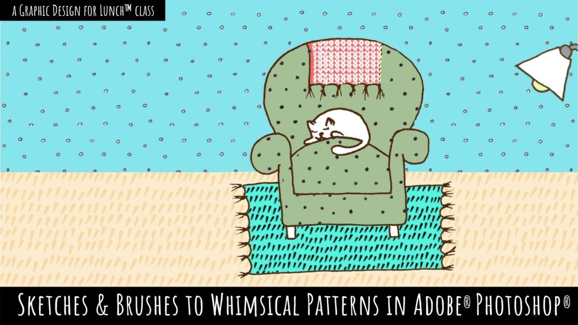
1. Introduction: Hi, my name is Hannah Grace and I'm a print designer and illustrator based in Bristol in the UK. I create fun patterns and illustrations inspired by the natural world. I've been working as a textile designer for the past five years. I've created some very fun patterns for a lot of different people. I've had a lot of practice in that time, and this is the best way I know how to create a repeat pattern with photoshop. Being able to create a repeat pattern was a game changer for me because it suddenly meant that I could apply my designs to things like stationery and clothes, which is just quite fun. We're going to start the class by setting up our design environment together because that can also be slightly confusing if you haven't done it before. We'll go through the repeat process and you will be away. There's an option for you to use artwork they've already provided, which will be available in the projects and resources tab, along with some hints and tips that I've documented along the way. Let's get started.
2. Class Project: To complete this class, you'll need to have Photoshop. If you don't already have it, you can get a free trial for it by downloading Creative Cloud. This will give you plenty of time to practice. Other than that, you just need things to be able to draw with or somewhere to get the artwork from. I also have the option PTs and artwork that have already provided. If you just want to follow along using that, that's completely fine too. You can find this in the Projects and Resources tab.
3. Setting Up Your Design Environment: [MUSIC] To begin with, we're going to set up our design environments. Open up Photoshop and let's get started. We're going to start by opening up Photoshop so that we can set up a new Canvas. If you go to "File", "New", you'll be able to set our settings. The size you're going to choose, depends on what you want to achieve. In textiles, the aim is often to create a flowing repeat where the seam of the design is not visible. This usually means that we would create a large sized Canvas than if we are going to be designing some stationary, for example. For the purpose of this design, I'm going to set the Canvas at 45 by 60 centimeters, which is a typical size I would design. You can do this by going to "Custom" and then changing to the size that you want. The size you choose can also be dependent on the printer you're using, but the great thing about the repeat design is that once you have the tile, it can be applied to a larger surface as it will be endlessly repeatable. Next we choose our color profile. This also depends on the printer you'll be using for your design. For patterns intended for digital use, it is common to use RGB as the default color profile. When printing on to garments or stationary is typical to use CMYK, although it does depend on the printer that you do use. Don't worry about this too much at this stage because it can be changed later down the line. You can select your color profile here. We're going to start with RGB.
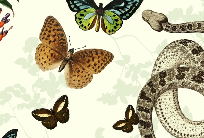
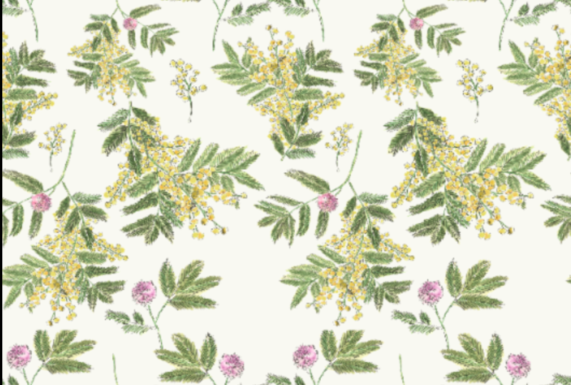
4. Gathering Imagery & Selecting Colors: In this lesson I'm going to show you some of the ways in which I gather inspiration for my designs. A lot of this comes from me just walking around and taking a lot of pictures of plants. I have a huge archive of images of plants because I'm forever photographing them. I use these as a big part of my inspiration along with a number of botanical books I've accumulated. I look at imagery for two different reasons. Firstly for content of what plants or person I want to create and secondly for the color palette. I love this part of the process because it gives us an opportunity to add our creative spin to a design. For the design that I'm working on today, I was inspired by [inaudible] most are popping up around the city. This is an actually quite a colorful and vibrant plant, so it doesn't need much help color-wise, but I will still be using some my usual methods to edit the color of my design. Color palettes don't necessarily have to match the form that you're drawing. For example, I've often been inspired by the pastel houses that are dotted all around Bristol [inaudible] and apply those to the plants that I'm drawing. You can use the color picker tool on Photoshop to extract these colors from your own images. For more inspiration, I also keep boards on Pinterest full of colorful things. I love this because it can show you how to translate color from architecture and other unexpected things and also helps you to build a sense of how colors go together. If you're still looking for some inspiration, you can also use apps like Coolors which help you pick more coherent color schemes. Now that we have our work on color palette, we can clean up our work a bit and it's ready to go.
5. Preparing Artwork: Once we've scanned in our artwork, the next thing to do is to get rid of the background so that we can make a repeat with it. If I untick the background here, you can see that there's still the paper behind what I've scanned in. To get rid of this, we're going to use levels and the Magic Wand Tool. Using levels helps to change the color of the paper behind. To do this, we go to Image Adjustments Levels. If you pull down the lever from the right side, take the middle one side into the right and the bottom one up a bit, you can now see that the paper behind is more white. This does however, change the color of the artworks. You need to be careful about how much you do this. This then makes it easier for the magic wand to pick up. You can see it's recognizing all of the white here. This also is dependent on the tolerance that we use. If we use a tolerance that's too high, say 90, it will pick up too much of the artwork. If we were to cut that, it gets rid of a lot of it. If we use a tolerance that's too low, it won't pick up enough. So we need to go somewhere in the middle. This is a bit of trial and error, but it seemed like 30 was about right. If this button up here is unticked, the Magic Wand will select all of the whitespace. But this can mean that we pick up things that we don't intend to, such as the white inside of the leaves. To avoid this, we can take this, which will only pick up the white in a joint space. So we'll not get inside of this because there is a barrier. This does however mean that there are some patches left. If we change the background color to a darker one, we can see all the other things we need to clear up. Make sure you've clicked on the image that you are wanting to change. What I'm going to do is just go through the whitespaces and get rid of the ones that I don't need. Next, I'm going to get rid of some of the stray paper marks that were left after we tried to extract them. If we use the Lasso Tool, we can just select an area and press Command X to get rid of it. In this way, you can cut off sort of the design that you don't need. These are also useful to make straight lines like this if you want them. Once you're happy that you've covered everything, To double-check, use this tool at the top. As you can see, the border is bigger than where the artwork stops, which is here. This means that there are some stray marks, which we might not be able to see that clearly. To get rid of these, just do a quick cut close to the body of the artwork. Again, using Command X. That looks about right. Now, I can change our background back to white. I will now do this with these other two pieces. Now that I've got rid of the background of each of my elements, I can recolor them. To do this to all of them at the same time, I'm going to merge them together. If I select every element and then press Command E, This puts them all onto one layer which I can edit at the same time. I've made sure not to merge them together, overlapping them because then I can still separate them again. To change the color, I'm going to use a reference from earlier. I'm moving it into my new files that I have in front of me. I want to make this green a bit more Seiji and a bit less saturated. To do this, I'm going to click on the layer, go into Image Adjustments and replace color. Then I'm going to pick up the green. Just like we did earlier with tolerance, you can select the fuzziness, which is how much of the green that you want to pick up. Then you can play around with the hue and the saturation of that color. So I want it to be a bit less saturated and a slightly more Seiji green. As you can see, it's not picking up too much. If you just up the fuzziness a little bit, it will pick up more. That's about the color I wanted to go for. I'm going to do the same with the yellow because as you can see, they've taken on a bit of a luminous color. I just play around with it until it matches Y1. I want to slightly orangey tone but not too much. Then the orange is behind I don't really like. So I'm going to replace that and make that more yellow.
6. Single Side Repeat: Repeat. Every time your element touches their sides, it needs to be duplicated. I'll show you first how to do this on a single side. Now that we're happy with our artwork, it's time to start repeating the design. We're going to start with a single side with one of the elements that we've got. To do this, we're going to use the Transform tool. First of all, we need to check the size of our repeat. If you remember, we set the file size to 45 width by 60 centimeters. But if you're unsure of this, you can check this by going to Image, Canvas Size, and it will be there. We're going to take this element and move exactly 45 centimeters across, so that is repeated exactly at that point. To do this, we're going to use the transform tool. First of all, we need to duplicate the layer because the two will become one. To do this, click on the layer, hold on out, slash option key, and drag the layer up. This will create a copy. We're going to transform this copy. To do this, press "Command T". This will bring up this up here, with this little arrow, on the x and y axis. If you press the arrow, it will reformat it to zero, which is what we want. We need to start from zero. Then to move it 45 centimeters across, and the x-axis, put in 45. As you can see, that jumps across, and now these are exactly 45 centimeters apart, which is the size of the canvas. To keep this together, we need to merge them, so select them both and press "Command E". Now if we move one, the other one moves, and they remain at 45 centimeters across. To check that we've done this properly, I'm going to create a new bigger files so that we can see where the repeat line would be, so File, New, our canvas size is currently 45, so we're going to set it to 50. I go back into our file, Select, All. This will select the whole canvas, then go to Edit, Define Pattern. We then go into a new file, press this circular tool, and go down to Pattern. If we drag our guide to 45, which is where the other pattern ends, we can see there's a seamless repeat down here.
7. Corner Repeat: The techniques we've used so far work perfectly for a single side, and for corner repeat its not that much more complicated. We effectively just have to do it twice. I'm going to demonstrate this for you now. Now, to do the corner repeat, I'm going to show you of one element to make it a bit clearer so you know what you're working with. What we're going to do, is first do a sideways repeat. If I duplicate this layer as we've done previously, Command T, reset the values, move it along 45 centimeters, which is the width of our canvas, merge those two layers together, they are now 45 centimeters apart. We've done one side of the repeat, so we just need to do that again from top to bottom. If I move it down to the corner, which is where I'd like it, I'm just going to duplicate that layer which has two elements on Command T to transform, and this time on the y-axis, I'm going to move at minus 60 to move it 60 centimeters up the page. Now when I merge these together, they'll be on the corners. If I just show you the full canvas outside of our own, then you can see how the repeat works in this sense, so they pick up from each other like this. Now that we've repeated our element on both sides, it should be working absolutely fine, but we're just going to check that. What we're going do is create a new canvas which is bigger than our original. Our original is 45 by 60 centimeters. We're going to make this one 50 by 65, so that we can see the scene. It's five centimeters bigger on each side. Then we're going to go back into our pattern, select All, which selects the whole canvas, edit, define pattern, and that will make a pattern which saves itself of what you've got on your screen. We're then going to use this pattern, by using this button here and pasting our pattern, which will be our most recent one. You can see that the canvas here is 50 by 65, but we want to check that it's repeated properly on 45 by 60. If we drop some guides to those values, that's our original canvas size. Then what you do is just zoom in and you're basically just checking that this is lined up properly. That's confirmed, and you can just go back to your old pattern now and keep going. Now that we've done a corner repeat, we're going to test in the same way that it's worked. If we create a new file, its bigger than the one we've currently got.
8. Checking Your Work & Fixing Mistakes: Sometimes it feels like you've done everything right, but you still get a mistake like this. Which just means that it's misaligned. In order to get rid of that, what I would advise, is that you start again. Get rid of the other one. Get rid of the duplicate. Go back to having a single element. Make sure that when you duplicate it, its in exactly the same place as you left the first one. If it's here or here, or here, or anywhere that's not exact, it won't work. Make sure that you don't move it before you do the transform.
9. Conclusion: Thank you for joining me in how to make a seamless repeat in Photoshop. I hope you've enjoyed the class and please upload your projects so I can have a look.
 Hannah Grace, Print Designer & Illustrator