Transcripts
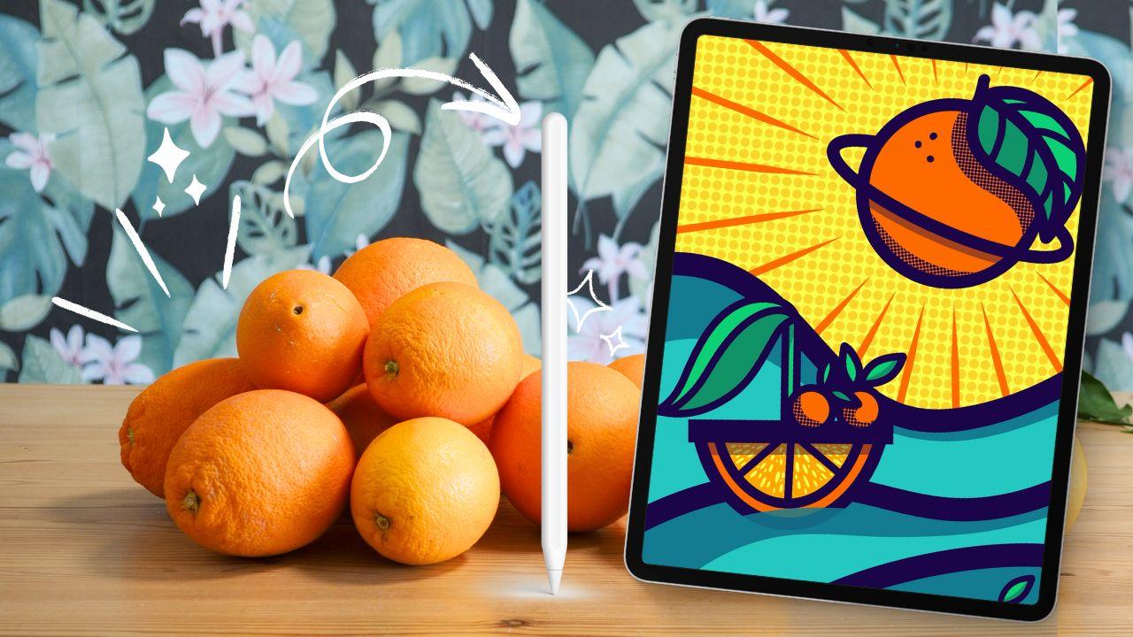
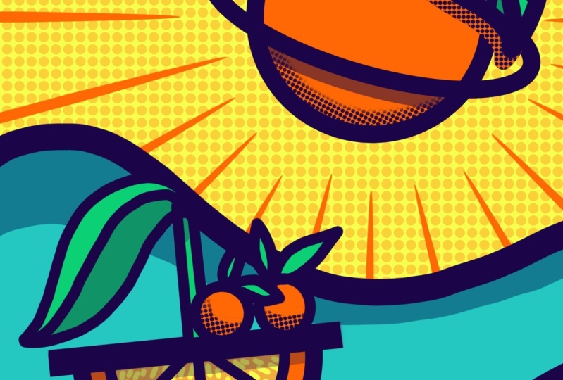
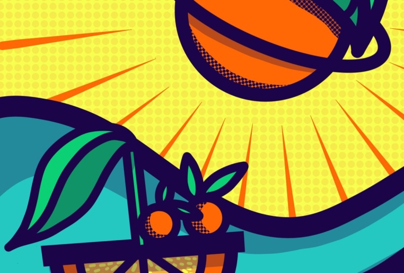
1. Orange Wonderland - That’s the Class: It's the land of
orange superplanets, vibrant colors, and
experimental shapes. Welcome to Orange Wonderland. My happy place for creativity. In this appropriate adventure, we set sail for a
playful graphic journey. As part of Skillshare
appropriate playbook, I'm taking your learning
one step further today. Instead of mastering
the steps on your own, this class brings
the Ebook to life. Together, we will cover every step of the
illustration from creating a rich background with half tones to achieving
consistent linework. You learn smart coloring with the support of masking
and reference, shading with half tones,
empresise drop shadows, plus advanced techniques like modifying your digital brush to easily draw a graphic sunburst without needing
expensive extra gear. Hi, my name is Erika
from Text and Tulip. As a top teacher on Skillshare, I believe taking you
behind the scenes of my Procreate workflow
is essential, so you can maximize
the app's potential and express your
creativity more easily. I'm a passionate digital artist. All my work is created with
Procreate and eventually transforms into wall art for large companies
and supermarkets. Today, we are diving headfirst
into orange wonderland. Yes, it's all about
oranges again because this class is also
the final prompt of the creative Jueries. We explore the creative process from sketching to incubation, ideation, doodling, and having fun with creative prompts
to unleash your creativity. If you are unfamiliar with
a class series, no worries. You can watch them all
on Skillshare anytime. If you're passionate
about Procreate and ready to dive into the secrets
of a neat graphic look, this class is for you. Grab your iPad and some oranges. I look forward to
seeing you in a second, as we download all the great free resources
for the class. Let's learn and
let's draw together. I can't wait to
see you in class.
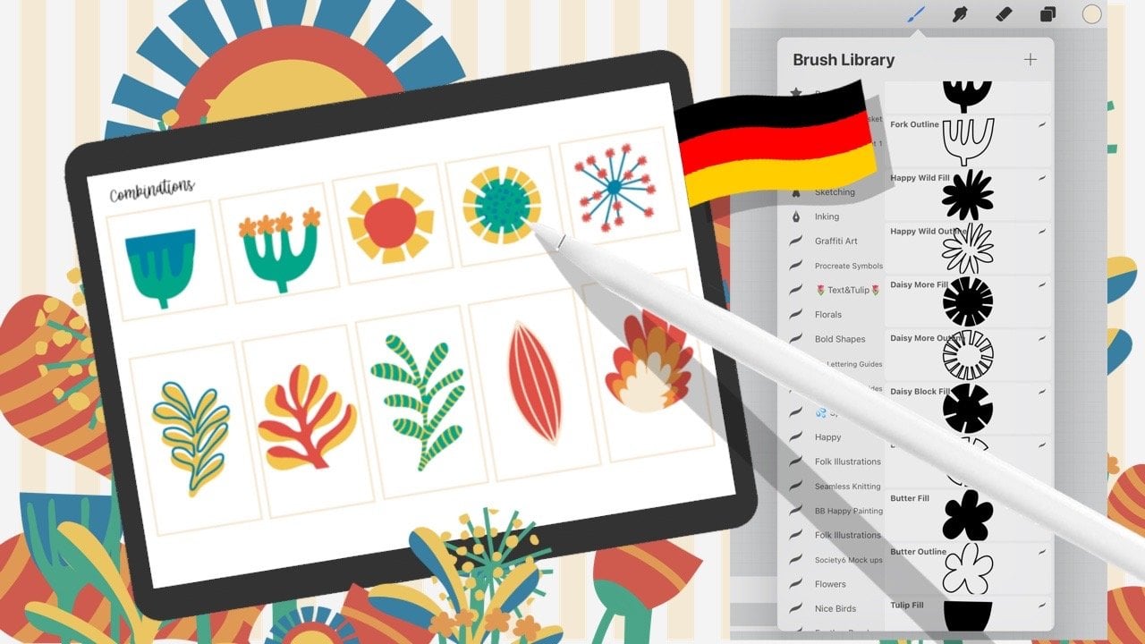
2. Your Tools & Your Project: Hello, and welcome
to our new class, where we dive into
the orange wonderland and create this beautiful
graphic together. What you'll need for
this class is an iPad, a matching stylus, and, of course, the Procreate app. To help you get started, I've prepared some fantastic
resources for you, which you can find
on the class page under Project and resources. Let me show them to you. We are now under project and
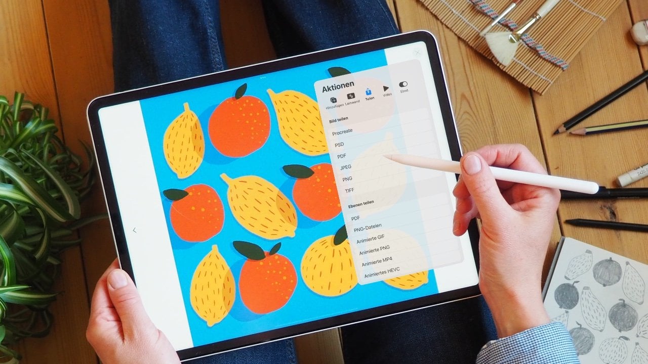
resources of the class, and you will see four
different files. The first is the original
artwork as a JPAG. Tap on it, then go to Downloads. You can use it as a
reference during the class, so it's best to save it
to your camera roll. The second file you can
download is the grid. I've provided it for you as
a PNG without background. So let's have a look at that. Okay, here it is. And again, it's best to save it
to your camera roll. Wonderful. If you
need or want a ready to go setup and procreate,
this file is for you. Here you'll find
a procreate file with a canvas in the
correct size and resolution with a sketch and
the grid already in place. And finally, your color swatch
makes coloring super easy. It will download as a ZIP file. When you tap on it,
it opens a file with a small procreate
icon. You see it here? When you tap on that, too, it doesn't go into
a separate folder. It opens automatically
in Procreate. You'll see importing, and now you have the colors
watch available. I'll show you exactly
where it is in our next lesson when
we create our canvas, choose brushes, and
talk about colors. Your project is easy. Draw with me and
upload the artwork you created in class to
the project gallery. If this is new to
you, no worries. We will do all the
required steps together in the last lesson. But now download everything, prepare yourself
nicely, and then we'll see each other in a
second for the next step.
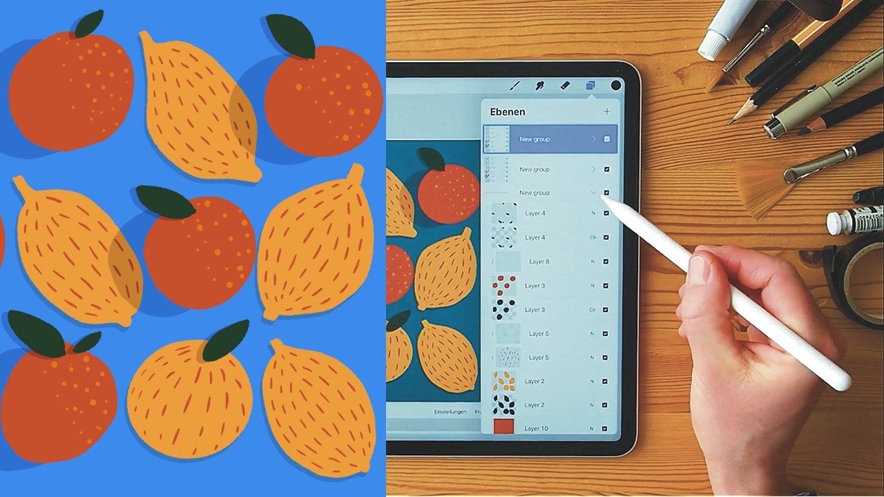
3. Your Canvas, Brushes and Colors: So glad you're here. What we are going to do now
is to set up our canvas. We'll also look at the
right brushes and colors. But first, the canvas. To create a new canvas, tap the plus sign, and then to customize
the canvas, tap the other plus sign here. Now we can make our settings. We'll use 1,800 by 2,700 to get a lovely
vertical portrait. 300 DPI in case
we want to print, and we have a
generous 211 layers. Our color profile is
RGB a RGB. All set? Okay. Tap create at the top. Fantastic. This is our canvas. Our goal now is to create an image with a
neat graphic look, and there are a few
tricks to get there. A dedicated brush set is
one of your must halves. Tap on the brush icon up here. Now, let's create our own
brush set for the class. Tap on the blue plus sign, and you will create a new
set ready to be named. Let's call this one
orange wonderland. This set will be your toolbox, a fast and easy access
to the brushes you need. Can find all the
brushes we will work with in Procreate's
built in brush sets. And the first one is from the calligraphy set,
the monoline brush. Tap on the brush, hold it until it separates
a bit from the row, and drag it onto the
name of your set. The set opens and you
can drop it inside. This little icon tells you that it is a brush from Procreate. If we return to the
calligraphy set, you'll see that the monoline
brush is still there. So it has only made a
copy in your new set. Pretty cool, huh?
The other brush we need is in the
Procreate texture set. Let's tap on it. Mine
has a weird name, but it should be called
Decimals texture brush in your English set. Again, tap, hold, and
place it in your new set. So these are the two brushes
we need for this class. Okay, got everything. Fantastic. Our last
step of preparation, we need the perfect
colors for the class. Click on the color dot at the
top to open the color menu. No matter your chosen view here, I want us to open the color
palette view together. Now scroll all the way to the
end of your swatch library. At the bottom, you will find the orange wonderland color
palette we imported earlier. I'm working with the
Apple Pencil Pro, and it's really sensitive. It's funny, isn't it? So, if you want our color palette
at your fingertips, tap the three dots
and tick default. Now, it's always visible
whether you are in disc, classic, harmony or value. Wonderful. Okay. Now, let's summarize what we
have for the class. We have our canvas, our brush set, and our
wonderful color palette. We are off to a great start. In the next lesson, we'll create the background. See you there.
4. Set a Background With Halftone Texture: Okay, let's do this. First, we want to add a rich solid color
to our background. Tap the icon in the
layers menu up here, and then tap background. If you tap on the thumbnail, you can choose the color. We'll take the bright
yellow from our palette. In the original artwork, we have this beautiful orange half tone
in the background. So let's add that together. We'll create a new layer, and I'll call it half
tone background. So it's easy to find in our
list. Okay, are you ready? Then let's move on to
the color settings. Here, we switch to orange. And now we need a perfect brush, the decimals texture brush. I've set it to 50%. Have a look. 50.
Yeah. Okay, right. When I draw, you can see that
it responds to pressure. If I apply very little pressure, it becomes a little faint. And the more pressure I use, the richer the
color dots become. Another thing to
remember is that as soon as you lift
the brush or finger, the line is interrupted and
there will be overlappings. It won't be a continuous
half tone filling. So remember first, create one line without
lifting your stylus in between and try to fill the entire area with the
same amount of pressure. Also, do not rotate your
canvas while drawing. If you do, you also rotate
the pattern within the brush. If I move my canvas in different directions
a few more times, you can see how quickly
the lines overlap when I lift my brush and
how the pattern changes. So let's erase this
attempt and always remember to keep your canvas
straight while drawing. Okay, let's go. So
this may take a while. Take your time and stay focused. Try to be consistent
with the amount of pressure and use only one
stroke to fill the page. It's okay if it looks textured. You can go over the drawn areas again to make them
more saturated, but don't lift your
pen or finger. Excellent. This is our
beautiful background now, and I suggest reducing the visibility to 50% to
make it easier to work. Yep, okay. Next, we
need this sketch. Go to the action menu and tab
ED and then import photo, which will open
your camera roll. Choose the PNG with our sketch. There it is. Excellent. We have it above the background now. Here, too, I recommend reducing the layer's visibility to
about, let's see, 30%. Okay, that's good. Now
rename the layer to sketch. That's it. Wonderful. I also recommend using the original
artwork as a reference. Go to the act menu, tap on Canvas and
toggle on reference. By default, you will first see a reflection of your canvas. Whatever you draw on your canvas will appear in the
reference frame. Even if I zoom in very far, you can see the
entire canvas here. Super handy. But today, we want to use our
original artwork here. So switch to image
and now tap on Import Image and select the orange Wonderland original
from the gallery. There it is, and you can
revise it here at the site. Now we can refer to
it whenever we want. Fantastic. We are all set. See you in the next
lesson where I will introduce you to the secrets
of consistent linework.
5. Secrets of Consistent Linework: Consistency is key. So we will use one color
for all our line work. It is this lovely dark blue
from our color palette. Let's clear the color
history so as not to get confused. Great. In addition, we use
only one brush, the monoline brush from our set. There it is. And we
will stick to two, a maximum of three
different brush sizes. This slider on the left here
or maybe on the right in your settings is where you set the size of the
tip of your brush. So let's give it a try. Yeah, the monoline brush is
just a pretty neat brush. First, we decide on the
thickest line for the waves. Let's see what the maximum
line thickness is by default. Okay, that's not bold enough, but we can still increase the maximum size in the
basic settings of the brush. Let me show you how. Go
to the brush library, tap on the monoline brush, and the brush studio will open. Go to properties, and
under brush behavior, you can adjust the brush, maximum and minimum tip size. If you move this
slider to the right, you create a thicker line. I'll increase it to 110%. Okay, done. Now, let's see the difference. Wow. This is now
the thickest line compared to our previous
maximum line. Well done. Now we are good to go finding a great size to draw our waves. Let's see what 60% looks
like. Could be a bit smaller. Now we set a brush size memory. Tap the plus sign in the
little preview. Well done. The second brush size is for our outer lines like our planet. Let's try with 30%. Okay. That looks good. Now set the second
brush size memory. Tap on the plus sign
next to the brush size. Okay, let's see how it looks
next to the wave. Brilliant. Now we need to set the size of the thinnest brush for
details and inner lines. Let's try 12 first.
That's a bit too light. Now, unlike the eBook, I share this entire process with you here in
class because finding the correct linewidth for your graphic elements is crucial to your
image whole look. I it's quite a tedious process of try and erase and
repeat but necessary. Now, let's try 25 for
the middle line size. Okay, that looks good. And with that, the 50% line size for the inner
elements and lines. Mm. Now you can set up to four
different brush sizes within one brush. If you need to remove a mark, tap on the mark and tap on the minus symbol
that you see here. Okay. Once you're all set, then let's quickly
summarize what we've done. We chose the monoline
brush for our outline. We increased the maximum size in the brush studio
under properties to 110% to get the
large maximum tip size. Then we decided on three
lined within the image. For the largest tip size, we chose 40%. That's
for the waves. For the outer lines
of the elements, like the planet, we chose 25. And for the small
extra elements, we will draw with a
brush size of 15%. Once you're ready
with everything, I will see you in
the next lesson. Then it is time to
draw. See you there.
6. Drawing the Outlines: Now, let's draw the line work. You'll see the work flows easy now that we are
so well prepared. We start with the waves. We stick to the monoline brush, then simply tap on the memory marker in the
slider to get the right size. Create a new layer between the
sketch and our background. Great. Let's lock the background and the sketch so we don't
accidentally draw on those layers. Are you ready? All right. I start my line slightly
outside the canvas to get a super clean line
entry. Easy PZ. I recommend naming
your layers and creating individual layers
for different elements. That makes it easier
later on when we work with masking
and color filling. Okay, next step, new layer. Now let's move on to our beautiful orange
planet. There it is. We had already set the outline
for the elements to 25%. If I tap on the
second memory marker, I have the 25% as my
brush size immediately. The shape itself
is easy to draw. Draw a circle, then hold
two fingers on the canvas. That activates
procreate quick shape, and it creates a perfect circle. Now tap the arrow at the top, put a transform tool, and move your circle to
the position you like. As the next step, we go
back to the layers menu. We create a new layer
above our circle. On this layer, we draw
the planetary ring. Simply draw an ellipse,
close the lines, and hold your stylus
on the canvas until quick shape locks in and
balances the line perfectly. Beautiful. Okay. Let's move
it a bit to the right place. Yes. Like this. To show only the part of
the line that appears in front of and around the
planet, we use masking. So go to the layers menu, tap the ellipse
layer and tap mask. Now we select pure
black as our color. The value is significant. All settings must
be at zero so that masking has the effect
of a clean eraser tool. That allows you to erase without actually
erasing, like this. So it is a non
destructive way to work. If you return to the
colors and set pure white, so the hex code
below shows only as, you can simply restore the line. Essential later on when
we work with color drop. It will still
automatically recognize the whole shape.
Another shortcut. If you simply tap and hold
the color dot at the top, it will automatically jump
back to the previous color. So back to black, and we can now shape the
ellipse the way we want it. Okay. Great. And now let's create another
new layer above it. Next step, the leaf. First, we need the little
stem that the leaf sits on. Alright, that's
enough. It looks like a little antenna and a new extra layer
for the leaf itself. Draw it with a nice curve. Right, number one and
number two. Great. We don't want this part of the planet's outer line to
be visible in the leaf. Go to the layers menu, go to the outline of the planet, select mask and remove the part of the
planet we don't need. Wonderful. That's it. Go back
to the leaf layer. Alright. Here, here. And now we can move it to the correct position. You can adjust this to your
own taste just as you like. Now we draw one smooth arc and we will have the
middle line of the leaf. Now it's time for
the small veins, and we use our smallest
line size of 15%. We put these on their layer
above the leaf's outer line. I rotate my canvas a bit to make it easier
to work for me. Et's see if I like it. I'd like a small
vein at the bottom. So let's undo everything, and then I'll do it that I
have three veins on each side. Okay, cool. Let's see how it
looks without this sketch. Okay. I'd like the ellipse
a little higher. Great. Now we create one
more layer so we can add some little details
like these little dots. One, two, three. If you're working with
the Apple Pencil Pro, you only need to
pinch the front of your stylus to
create a new layer. Then this more menu opens
and you can tap new layer. See? Here it is in
the layers menu. Now that we have
finished our plant, let's create a group with all the layers
that belong to it. So drag the layer slightly
to the right to market, then tap group at the top. Of course, we still
have to name it. Of course, we call it
planet. Okay, done. The third prominent
element that is still missing the final
element is our boat. Check the layers
menu to see if you are on a new layer,
an empty layer. Now we switch our brush size back to the middle size of 25%. We don't start with a half orange slice to get
this nice orange shape. Drawing a whole slice is easier. So first, a big circle. Then we let quick
shape help us again by pressing two fingers
on the canvas. And with a transform tool, I bring it to the
correct position. Great. Now, back to the layers menu, we need a new layer for the inner circle and our
smallest brush size of 15%. Now the same procedure again. Draw a circle, wait
for quick shape, and then center it within
the circle. Fantastic. And again, a new layer that
we need for the boat's plank. Now I take the
thickest line with and drag a straight line. Like this. Okay, that's cool. Since we are not making any more significant changes
to our orange shape, I can now merge the
big and small circle by simply pinching
the layers together. Super easy. And now we erase
everything above the plank. Oh, I had said the soft
brush for erasing. Let's use the
monolim brush. Okay. So why not use masking here? With masking, you
also use a layer that counts towards the maximum
number of available layers. Because I'm sure I
don't want to make any more changes to
the orange shape, I have saved one more
layer with erasing. Again, I squeeze my Apple
pen, creating a new layer, and now we can draw
the inner elements of our boat with the
smallest brush size. So if I hold my
stylus on the canvas, a slightly wobbly line
turns completely straight. Draw, hold, draw, hold. Okay, done. Next, we
draw our ship's mast. If I press one finger
on the canvas, Procreate automatically
aligns the line at an angle. But since my boat is a bit
tilted, that doesn't help. Now attention. All your shapes must be close when we work
with color fill later. So connect the two lines
at the top of the mask and also at the bottom.
Let's check it again. I make only the boat
mask visible and see, I need to add
something down here. Go to the new layer and make
all others visible again. Now we can draw the leaf or the soft sail of
our orange adventure. Oh, that was easy, right. Now, let's select all the
layers of the boat elements, then tap group, and, of course, we rename it to boat. What is still missing
are our passengers. To draw them properly now, we will create a new layer and hide the visibility
of the boat. Now we simply draw
a circle again, but we need to ensure
that the lines connect perfectly without any slight
imperfections like this. So make sure when you
draw that you go a tiny bit over the starting
point of your circle, then hold two fingers
on the canvas, creating a neat circle. Okay? And now let's draw these leaves. Yeah, okay, this is better. Next, we need another layer
for our second passenger. This one could be bigger, but they have the
same line width. And now the leaves and they can also be slightly
differently arranged. So draw like two little
bunny ears here. Now group these two and
name them passengers. A Okay, let's take a look at
the whole situation. We have many overlaps now, but we will handle that later. So let's see what we
have. So let's see. We have our background, and we also finished
all our outlines. We have the passengers, the boat, the planet,
and the waves. If you have completed
everything, I'll see you for a
simple and fun part in the next lesson where
we move on to coloring. See you soon. I
7. Smart Coloring and Simple Shading: Welcome back to the next
step, color filling. The process is simple
since we are working with flat colored areas
for our graphic look. The most flexible
workflow is to separate linework and color and using
reference and color drop. Let me show you how to do this, and let's start with our planet. Open its layer group so we can see all the planet's layers. We start with the body. Create a new layer and make sure it sits below the outline layer. Now we select the outline layer, tap it again and
select reference, and switch back
to the new layer. Pick orange and drag the color dot to the
area you want to fill. That's called color
drop. How easy. Now you can see how
effectively reference and masking work together. The fill behaves precisely
according to this outline, and thanks to
masking, the outline remains continuous
like a closed line. Let's try this with our
leaf. We'll use green. Okay. The reference is still turned
on for the planet outline. Tap on the layer of
the leaf outline and select reference,
create a new layer. And now you can fill the
areas with color drop again. So one and two. If you look at our
original artwork, you'll see that the leaf
displays two shades of green. To ensure a consistent
shadow value across the different use, we apply the same degree of
darkening to the base color. So let me explain you
how to achieve this. First, we create a new layer
above the color fill layer. Next, we take the
dark blue we used for the outline and fill in the areas where
the shadow should be. Okay, once you're ready, reduce the layer's opacity to
30% using the slider. You can apply this technique to any color you wish to shade, whether it is the
blue of the ocean or the orange cast by the shadow
under the planetary ring. See, super easy. It's
great to know this, especially if you want to
continue working on your own. If this method
feels too advanced, you can always use the preset I created for you in
the color swatch here. First hero element completed. What's next? Let's move on to the waves or
rather our ocean. To do this, let's go
back to the Layers menu and turn off the layers that
are currently in our way. Deactivate the
visibility checkbox of the layer group for the boat
and for the passengers. Now, create a new layer and
have turquoise as your color. And don't forget to make the linework layer of the
waves your reference layer, and then go back to
the empty layer. This to reference. Okay,
and now the empty layer. And now we can simply use
color drop again. Super cool. In the original artwork, you can see that we also work with shading within our ocean. Therefore, create a new
layer above the color film. Now you can choose.
Either you use the darker turquoise
from our color swatch or work with the
original dark blue of the outlines and reduce
the opacity to 30%. Feel free to design
however you want. You can use color drop or
color in the area by hand. Yet it's important not to
draw beyond the outline. If that happens,
it's best to use an eraser directly to
clean up any mistakes. I also recommend correcting unevenness in the
waves immediately. If it's not smooth
enough like here, now it's a good time to fix it. Are you ready? Then let's group the color layers with the
waves line layers. Once you organize everything, we can turn off the visibility and activate the boats
group visibility. The boats blank and the boats hull are two separate layers. Merge them to create one closed form that
we can easily fill. Ah, and another correction. I want a clean cut edge
at our boats plank. The easiest method is to
use quick shape to erase. So hold the stylus
on the canvas until quick shape transform
your erasure stroke into a perfect line. Okay. That looks excellent. Now we continue as usual. We create a new layer, which is below the line layer. And set it as a reference. And don't forget to switch
back to the empty layer. Yes. Okay. Now select orange
and use color drop. Then let's switch to
the yellow orange and fill the inner
part of the orange. Super fast, isn't it? Now onto the sale. Here, too, we optimize first by merging the
must and the leaf. Now we can set it
as a reference. Create a new layer below, and then we switch to
the lighter green and fill the individual elements
with color drop again. With this example, we
practice once more how to create the shadow
using the dark blue. We create a layer
above the color layer, choose the outline
blue, and draw the areas that should
serve as a shadow. Now, do you remember by how many percent we reduced
the visibility? Exactly to 30%. Okay. I think the leaf also casts a shadow on
our orange boat mast. So I'll draw a
little shadow here. And now we switch to our
two little passengers. We fill them separately. I believe you're already quite
familiar with the process. So I will stop
talking for now and will instead let you
enjoy your flow. But last thing, don't forget
to enable the reference. Okay, are you ready? If you need to adjust the
position of an orange, select the orange layer along
with the outline layer. Now you can move both layers simultaneously with
the transform tool. I'd like to bring the smaller
one to the foreground, so I move his layers above the layer of
the other passenger. Now that they are
marked, we can also move the smaller passenger so he sits nicely on the
boat. That looks good. You may have noticed in our original artwork that
we have more drop shadows, for example, beneath the plank. For this, we need a new layer above our color
fill layer again. We'll switch to dark blue. And now we draw a really
bold stroke. Fantastic. Now, let's reduce the
opacity to 30% again. Great. And that's the whole
magic trick for shading. Our planetary ring should
also cast a shadow. To do this, we first switch
to our planet group, so open that, and I'll share another tip for a
precise shadow with you. In the layers menu,
select the ellipse, swipe to the left,
and hit Duplicate. Click on that and reduce the visibility of
the layer to 30%. Now we move on to
the transform tool. Move the layer a bit down. Fantastic. Do you see
how our shadow appeared? But the small areas here probably wouldn't cast a
shadow in the universe. So we go to the
masking layer above, and pure black should
automatically activate. Now remove all the
areas you do not want. Mission completed. So these were our color
fills and simple shadings. In the next step, we'll
go one step further. We create precise drop
shadows with half tones. See you soon.
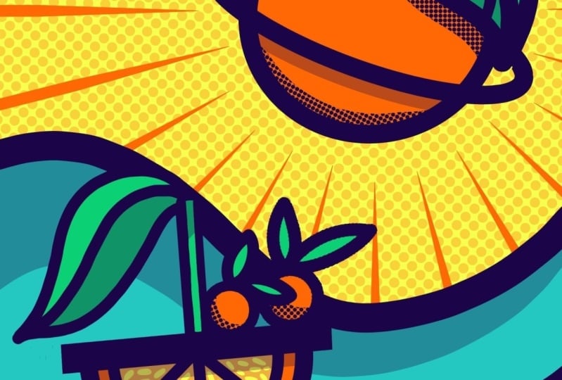
8. Shading With Halftones: In this lesson, let's focus
on the shadows created with halftones because they add great visual interest
to our graphics. We want the shadow
in precise forms, just like you see
in the original. The trick is very simple. So let's start with a
shadow for this leaf. Open the layers
menu and also open the group with your planet
and select the leaf. Now duplicate the layer. Now we want to
fill it with blue. So we use color drop. Okay. There was still a
reference turned on somewhere. So let's fix that. Now we can fill it nicely. For the shadow effect,
we need this area to be precisely the color
of the area it's on. So if the shadow is
on the orange planet, then the foundation of the half tone shadow
must also be orange. So one wipe to the right, and we put our layer
to Alpha lock. Now we select the color orange, go back to the layers menu, tap fill layer, and it's orange. Wonderful. Now move this layer
below all the leaf layers. Anything that's
still in my way now, I'll turn off by
deactivating the visibility. And the planet two. Now, we use the
transform tool to move the leaf a bit downwards
and to the left. The sketch below helps
you with positioning. Now, create a new layer
above the orange leaf. And in the color menu, we switch to blue. Don't forget to switch within our set to the decimals
texture brush. Let's see how it looks. So I don't want to work
with these giant dots. So let's change the size a bit. 20% might be
excellent. Let's see. Fantastic. Set yourself
a little memory marker to jump back to
this size quickly. To ensure we only draw
on this orange area, we turn on clipping mask. Now your drawing is linked
to the layer below, and we won't be able to
draw outside its shape. That looks fantastic.
Let's complete the magic by making all layers of our
planet visible again. Now we have to
erase all parts of our shadow we don't
want in the picture. I'll merge the halftone and the orange leaf layer to make this next step
more manageable. Reduce the visibility and take the shadow layer to the
bottom of your planet group. The advantage is now that all
the outlines are above it, and you don't have
to worry about precisely erasing the edges. That's how easy it is. Once you're ready, bring the
visibility back to 100%. And that's it. We use the same method for
the planet's lower part, but with a bit more freestyle, create a new layer above the planet's orange fill and
make it a clipping mask. Now, make sure blue
is selected as a color and also switch back to our decimals texture
brush at yes, 20%. Now, draw a nice bold arc. A erase the edge with
the monoline brush. You can decide how big the
shadow is on your own. You see, even here, I use quick shape while erasing. It automatically locks
in when I erase and turns a possibly wobbly
line into a smooth arc. Wonderful. Now you know how our precise half
tone shadows work. You can now draw the
remaining shadows in the image on your own. Use the original
artwork for guidance. But if you prefer to pull the
last two shadows with me, then let's move on
to the passengers. We'll create a new layer above the color fill of
the first passenger. Tap the plus. Okay, let's
see if it is the passenger. Okay. Now make
sure you have blue selected and our half tone
brush chosen. Okay, great. Now I'll draw another
bold half tone arc and use the eraser
tool to shape it. This can naturally take some
time to get it just right. So don't rush it. Okay, don't overthink it. Next, we need another new layer above the color fill of
the second passenger. You can also use clipping mask here to make it
even more precise. Now, check again that
you are drawing on the correct layer and that
you're using the proper brush. Now, draw and erase. Fantastic. What's still
missing? Let's see. The little extras
inside our orange, which suggest a pulp. It's best to open the layer of the boat and select
the color fll layer. Above that, we'll
create a new layer. Now switch to the lightest yellow and select
the monolim brush. I leave the choice of
brush size to you, but I'll work with
our tiny brush tip. Simply draw the inner elements of your orange as you like. You can play some music and add the last
decorative elements. I get the best
playlist from Macho, also known as Masholand, who not only has
great taste in music, but also a beautiful and
unique illustration style. As a top teacher on Skillshare, her classes are a must watch. Why not start with this one. But after we finished
here, right? Okay. You can see I always
rotate my canvas a bit, zoom in and out to make
it easier to work. Fantastic. And the last segment. Okay, don't overthink
it. Wonderful. The last bit are our
super duper sun rays. We will use a fantastic trick in a brush library for this. Stay curious. See you there.
9. Create a Graphic Sunburst: Welcome back. Now
we will elevate our background with a super
graphic rays of the sun. To create it, we will
need a very sharp tip. But don't worry, we won't need any extra gear for our stylus. Instead, we will use one brush from our
orange wonderland set. Let's quickly look at
the original artwork. We want to draw these
ultra sharp tips with the monoline brush. But you can already see
in the preview that the monoline brush has
rounded ends on both sides. So let's change that with
a straightforward trick. First, we go to
the brush library and select the monoline brush. Then swipe left
and tap duplicate. Tap on the duplicated brush, and the brush studio will open. Now, we go to taper. Taper controls how your brush behaves at the beginning,
end of the line. If you change the first settings here and move the slider
slightly to the right, you can see that the
tip tapers forward. If you now maximize the size, you can see how the sharp tip appears as your line
tapers forward. Try it out right away. Those settings refer
to using a stylus. But when I draw with my finger, you can see that the
tip is still round. So let's go one
step further down to touch taper and
repeat the steps. Move the slider to the
middle to create a tip, and then set the size
proportions to maximum to get an ultra sharp
tip. Yes, great. So whether you use your stylus or prefer to draw
with your finger, you are now well equipped
for our graphic sunbeams. All set, then congratulations
on your custom brush. Now we have a monoline
and a monoline with a sharp tip.
Let's get started. First, we need the right
color for our sunbeams. So we switch to orange. We will also use a
special tool to create these exactly radial lines
reaching from the planet. Open the action menu and
select drawing guide. Then tap Edit Drawing Guide. That will open the
drawing guide menu. In the bottom menu bar, click on the third
option perspective. And now we need to tap to
create a vanishing point. Ours should be in the
middle of the orange. If you now tap and hold the
point with your stylus, you can still move it within the image to more
or less the center. So let's ensure we get a different color
for the guidelines, one that contrasts
better with the yellow. If I increase the thickness
of the lines a little, the guidelines will
be even more visible. Watch out, ensure that
assisted drawing is turned on. That way, the lines will
only follow the guides. Now tap done and
return to our canvas. Back to the layers menu. We now deactivate this sketch
and create a new layer. Now tap assisted
drawing for this layer. Recheck the brush menu to ensure you selected our brand
new custom brush. Great. Okay, let's
draw the first line. Let's see if you like the size. Oh, that looks great. So
the brush size is 15, the same size we used earlier for the
smallest line width. It's essential to keep the distance between the
sunbeams proportional. You should always draw on one guide line and leave
the next one open, and then draw on
the next one again. If you enable drawing assist, you can try to draw next to
the line, but it won't work. Procreate will always align
or dismiss your stroke. It's a good idea to
rotate the canvas several times until you are comfortable with the
guidelines position. The pointy part of your line is always at the
beginning of the stroke. So to create those
beautiful sunbeams, you always have to draw
away from the planet. Remember, always to
leave some space, so leave one guideline empty
and then draw on the next. For the moment, you can just draw over all the
other elements. We will deal with that later. How far or how close
you start the lines from the planet can
be judged by eye. But if you love
precise geometry, I recommend drawing
a circle around the planet to guide where
to start your line. Two or three more strokes,
rotate your canvas. I One more here. Okay, great. Now for some housekeeping, move the layer
with a sun rays to the very bottom of
your layers menu. Turn off the guidelines by unchecking the blue note
in the action menu. Yes, here. Okay. And
it looks fantastic. Now let's turn on our
half tone background. Oh, the half tones
are too saturated. Remember, we locked
the layer initially, so we must unlock
it to make edits. Now, you can see the
opacity slider again. We should lower it to about, let's say, 25%. Oh, gorgeous. Of course, you can still adjust the sun rays
and make changes. I might even do
that, but for now, it's okay because we are getting closer to
the final stage. We still need these little
extras here on the wave. And I'll explain you how to
do that in the next lesson. See you there.
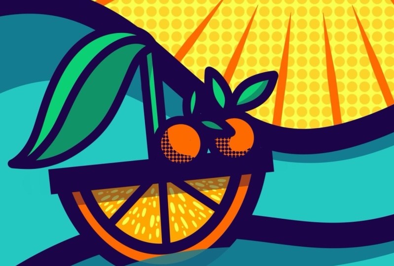
10. Create a See-Through Water Effect: Okay, now it's the finale. In our last lesson, we want to draw
this little extra, the illusion of seeing part of the boat's hull
through the wave. To do this, let me turn
off the original first so we have more space
to work. So, okay. We start in the layers menu
and open the boat group. We want our wave to cover
a part of the hull. Therefore, we group
all the layers that belong to the hull. So all the outlines
and the color fill, tap on group, and now we
duplicate this group. Tap on flatten in the
small layers menu. That will merge all
the layers into one. Now we create a new layer on top of it and make
it a clipping mask. Take the same blue we
used for the waves. And of course, grab
the monoline brush. Now the magic begins. We draw a wave shape. Because the clipping mask is on, you can only draw
on the boat's hull. Finally, reduce the opacity
of the wave layer to 80%. Yeah, now the water effect
is starting to appear. Fabulous. Let's balance
the wave a little. Create a new layer to have a bit of breathing space
for experimentation. You just go with your own flow. When you're ready,
look at your image to see if you can add
any fun extras. I'll show you mine in the last lesson where
we will also summarize everything we've
learned and upload your project together.
See you there.
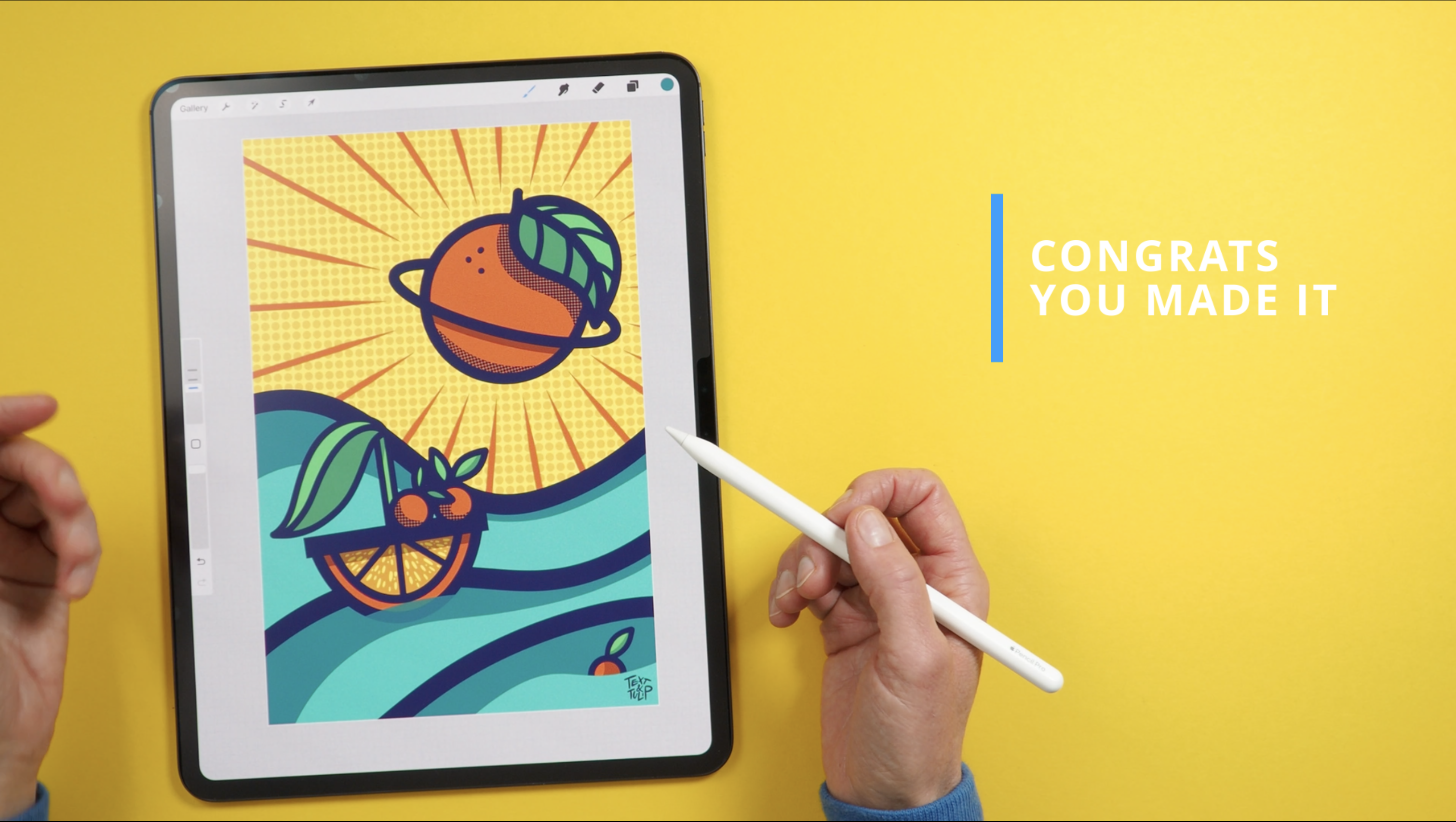
11. Final Touches, Thoughts and Your Project: Congratulations. You have mastered our
graphic adventure. To spice up your image and
add more visual interest, add a few more details like this little orange down
here as part of your story. It might be the captain,
but hopefully not. Of course, do not forget
to place your signature. If you enjoyed the class, please leave a review. Before we submit your project, let's quickly summarize how much you have learned
in this class. You now know how to create a background with
a solid color and a halftone texture on top with the decimals
texture brush. Second, you learned how to
achieve consistent linework. We used only one color, only the monoline brush, and decided on only three different linewidth
for your image. And, of course, we
set memory markers. Number three is coloring, which is super easy now
that you can work with color drop, masking,
and reference. A limited color palette
supported our neat graphic look. You also learned three secrets
of consistent shading. First, we used one color to tint your base colors and
reduce the opacity. Another trick you have now at your fingertips is
precise drop shadows, and we confidently mastered
half tone shadows. Well done. Your super
skills in this class, we're creating a brush in the brush studio and drawing our super graphic
sunbeams with that. Bravo. And finally, as
an extra super skill, you now know how to create a through water effect and how to make
some final touches. Now that you have added your unique extras
and your signature, it's time to upload
your masterpiece. So let's do that together. To submit your project, you will need your
artwork as a JPEG. Go to the action
menu and tap Share. Choose JPEG from the list. Now, tap Save to
your camera roll. Let's go to the class
page on Skillshare. On a project at resources, you will find the blue
button to submit a project. Now the project page opens
and tap upload image. Choose photo library and
your camera roll will open. And here you can
choose your artwork. That is also the picture everyone will see on the
class project gallery. So this is why your image is a bit cropped. But don't worry. You will see it in full size
on the project page itself. Now you can add more details. Start with a great title. It could be something as dull as Wonderland final
or very creative. Leave a few words and tell me whether you
enjoyed working on your project or whether
you face stormy waters. Once you're ready, tap, publish and your project will be added to the
project gallery. Here you can see my
page on Skillshare. And here you will
also find a link to the amazing Procreate
playbook from Skillshare, which was initially the
starting point of teaching you all the secrets of our
incredible graphic Adventure. If you tap on the link here, you will see access to
the playbook itself, which contains the artwork
and step by step guide of nine amazing talented artists who are also teachers
here on Skillshare. All you have to do is
submit your email here, and you will get access
to the eBook immediately. I can't wait to see your amazing
projects in the gallery. If you love this part of the creative juice
and want more, join the other prompts. And, of course, I hope to see you in my procreate
classes, too. Now, while I prepare my
studio for the next class, tap follow, so you
won't miss any. And leave a review to
let your fellow students know why you would take the
class. Many, many things. See you soon. Choose.
 Ulrike Text&Tulip, Digital Art in Procreate