Transcripts
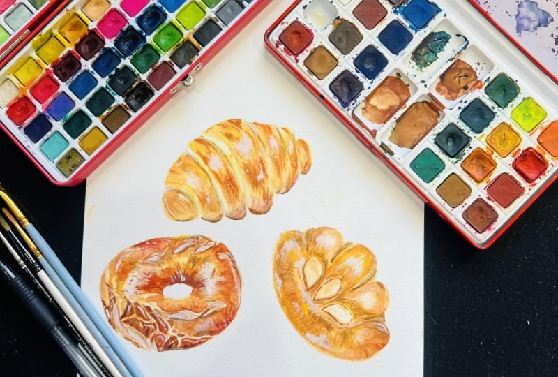
1. INTRODUCTION: Hi, everyone. My name is theon. Today I'll be sharing with you might go to watercolor palette when it comes to painting. The perfect golden brown bread I know have shared something similar in the pause before where I painted my realistic pastries. But back then I used my koi water. Cold pallets of the color is slightly different since today I'll be using my whole by paints as well as a couple of Windsor Newton, and I'm also going to be showing you how I'm going to apply to a couple off bread paintings . I have here three types of breads, the 1st 1 being the dinner roll, which is shaped similarly as a Cristante, the bagel and also a custard bun. I'll be showing you how I'm going to be painting these two breads in detail on. As for the custard bun, I decided to turn it more into a speed paint so you can apply the techniques you flirt and the colors that you flirt. In the previous lessons for this painting, I'm going to be showing you how I'm going to draw those three breads. But if you're not interested in drawing, I'm also going to share with you the outline which you can trace from anyway, before we start, let me just go over the outline quickly for you. So you know what to expect off this class. After this introduction, I will show you all of this place I used to paint, so you'll be well equipped. Then I will show you my method off during the breads if he choose to. But I will also provide you with an outline where you can also trace. Next. I'll show you my color palette that I'll be using, including the mixes that I mostly used for the paintings. And now we're going to get to the painting. First they were going to pay the but a role, which I'll be referring to as the dinner roll in the class. And I was separate this painting into short and lessons. So it's been easier to follow along, and after that I'm going to show you how I paid the bagel. This one is a little bit more complex as there are new techniques which weren't included in the previous painting, but again, I will break it down into smaller lessons for easy understanding. I am also going to show you a quick speed paint off the custard bun. I thought that I'd give this outline for you as additional exercise free cheese. The techniques you flirt in the class as well as the color palette paint independently. But of course, you can also use the speed paint as reference. I'm going to leave a few reference images just so you know what the breads looked like in those shapes. I only took a very rough idea from them, so I'm not going to refer to the pictures and the lessons. But I think it's just a good idea to get acquainted with the object itself that you're painting, so at least you have a good visualization of it in mind. You can also search on Google or Pinterest to get extra images as reference. So, like my other costs is, I'll be skipping through certain parts of the painting where my hands are out of the frame so I might paint a little bit quicker than you are. So if you do want to follow along, I would suggest for you to watch the full costs or individual essence. So you know the progression off each lesson, and when you do decide to paint along, I would suggest for you to pause in between each step and continue on at your own pace. So there's really no rush. This class is geared. More tours, intermediate students who has a fair understanding and using the medium. But if you're new and you would like to give it a go, feel free to do so you'll never know what you can create. So with all that said, let's begin this class.
2. LIST OF SUPPLIES: in this lesson, I will quickly go over the supplies that I'll be using for this class. Firstly, here I have my watercolors here, the colors that I'll be using for this painting. But I'll go over the colors in detail in the coming lesson. All the pains that I'll be using us from the brand hold mine. Except for the cadmium orange, which is by Windsor Neeson. I will also be using a wide wash for the finishing touch at the end. And for this I use permanent white, also by ones were needed for the paper. I'll be using watercolor paper by the brand are to this as a 300? Yes, Um, cellulose paper. Something like Hanson Excel is what I also often use. It is suitable for these types of paintings, too. The size of my paper here is 20 times 20 cents meters, but obviously you can adjust the size if you were during it out yourself next year, I have my palate, this one I go from die so but you can also use things like plastic or porcelain plates. If you don't have any palace available, I would just like to suggest to have white colored pallets, so it's been easier to see the colors that you're mixing for the brushes. I'll be using two sizes. The black one is by Art Media, which is a local brand, and this is a size two mixed hairbrush. But you can also use synthetic brushes if that's what you have. One hand. The next one is my small detail brush, and this is the sector gold to size zero by Windsor Newton. You will also need either to shoe or a clean towel or paper towel to clean and up your brush to take off excess water or paint, and also clean jar, which can hold a good amount off water. In addition, if you would like to paint along as I switched the colors, I'll be using a 200 yes and paper by arto and size A four. And I would also suggest for you to have a scrap paper next to you when your paintings this watch the color Steve mixed on your palate before putting it on your painting. If you want to trace this out, I'll have the sprint out. Available on the resource is section, where you can download the file. I'll be tracing from my outline, So I'll also be using a masking tape and also my tracing tablet. But you can use any form off method to trace image and to draw. Or Tracy, you will also need a pencil and and razor, and that's it for the supplies. I will list them down at the end so you can take a look in case you've missed certain information.
3. COLOUR PALETTE: So in this lesson, I will basically go through the color palette that I'll be using. All the paint here are from the brand whole bine, except for the color cadmium, orange and also my white wash, which are by 10 Newton. I'm just going to quickly run over the colors, and I'm going to start from the lighter colors at the top. So the 1st 1 as Queen Oprah, then I have a couple violet, light lemon, yellow, cadmium orange. This is the one by Windsor Newton. Then I have shown real it. Permanent yellow, deep yellow Oakar, burnt sienna, great number, roast better and mineral violet. And then for the shadows I have here cerulean blue. And here's my white Quash. This is designer squash by Windsor Needs in and the color permanent white. Let's begin by going over the colors that I'll be using for the highlights for the highlights. I like to use a warm pink tone. This is just what I like to do personally. But highlights didn't really depend on any colored object that is reflected and the surface . So for this, I'm going to use Quinn, opera, cadmium orange and John Brilliant I'm going to show you how I mix them all together. And as you can see, you can create different colors by just changing the ratio. The cadmium orange makes the color warmer. The John Brilliant makes it a bit softer, and the Queen Opera gives it a pink toned. As long as you understand what each color is for, I think he can adjust that your liking. So here I'm just watching the colors in different ratios. The colors here, as you can see, are only slightly different from each other. On top of that, if you adjust the consistency, you can also create different values. This color is going to be the highlight, so I'm going to paint this in a very light consistency, and I'm also going to follow this up with a light purple. This color is called cobalt violet light, and the reason why I chose this is because I find that purple is quite a common reflective color from light, and I'm going to use this purple together with the pink tones from before. And as you can see, the colors work really well together. You only want to use a thin consistency of this. And because of that, the purple doesn't look as distinct. And it's just a very subtle Hugh that I'm going to try to bring across. So hopefully you're able to see through the switches here and the midsection off where the colors come together. Out of all these colors, I personally like the 3rd 1 where it's the most pink. But as I mentioned before, you can switch it up or even use other Hughes if you want to. Moving on, I'm going to swatch the colors for certain under baked part off the bread, even though we are painting a perfectly golden brown bread. There are always those parts off the bread near creases, which are a little bit under baked realistically, and though they're cooked through, the color isn't usually golden brown, but more of a yellow brown tone. So for this, I'm going to be using the colors John, brilliant lemon yellow and also yellow joker. Again. I'm going to do the same thing here by mixing it all together, and I'm just going to switch them, using different ratios for you to get a new idea off the different brown tones. Thes colors can create so the 1st 1 here. As you can see, there's a lot of showing brilliant and yellow ogre from looking at the results off the color. So I'm going to keep adding more lemon yellow and you'll see the color will shift to more off, Ah, golden yellow brown color. And here I'm also going to add more shown brilliant, and the next one I'm going to add more yellow Oakar. The color that I would consider as ideal for this case is probably the second and the third color, where it's more off the golden yellow color. But this means that you can also use this color combination for a slightly more big part of the bread. If you were to add been more yellow Joker or John brilliant. Now we're going to go slightly darker and tone. I've added cadmium orange and permanent yellow deep in the mix with again the same yellow Oakar. As you can see, the base brown is the same, but this time I added darker tones than before, with the lemon yellow to the permanent yellow deep and also the cadmium orange. So you can either mix yellow Oakar with permanent yellow deep or yellow Oakar with a cadmium orange and create different tones off brown, or even mix all three. So because the cadmium orange is darker and value compared to the permanent yellow deep. If you were to add the cadmium orange, you'd be able to create a slightly darker value than if you were to mix the yellow color with a permanent yellow deep. Or, if you would like something in between those values, he can add all three colors together, moving on to the mid toned brown. Now we're going to use the exact same colors. But this time we're going to change the main brown color to bump it up and value. So here I added burnt sienna. And like the previous one, you can mix every single one of the color, which are yellow. Oakar permanent yellow deep on can be orange individually with the burnt sienna to create different tones off Brown's or even makes three colors together, or even all four. The option is really endless, and from here on, from the mid tone to the darkest tone, you will have a huge range off colors that you can just mix and match as long as you know what the color will bring into the mixture. A lot of times when I'm mixing my palate are not always clean, so I might just add on certain colors to adjust the tone to the colors that I already have prior on my palette. But this is why it's very important to understand each individual colors and how it will affect the mixture brother, than to just memorize each individual color mixtures. Personally, I like the more golden brown, which is a mixture between either burn Santa with cadmium orange or burnt Santa with permanent yellow deep because off the color vibrancy. But this may change depending on the mood or lighting off the painting that you're going for moving on to the mid dark tone. I'm going to be using the colors burnt sienna, cadmium, orange and roast matter with burnt sienna still being the main brown color. But we're taking it up a notch by introducing the roast matter in the mix, which is a very rich, dark red color. So here I'm first going to mix the cadmium, orange and burnt sienna together, and I'm also going to add more cadmium orange along the way so you can see a bit of range off what the colors can do when you play around with the ratio. And I'm also going to do the same with the burn Santa and the roast matter, while adding more, was better in the mix slowly as well, because Rose better is darker in valley, you will see that the brown is darker as it's mixed with a roast. Better, but because of the richness off the color, the Browns doesn't lose its vibrancy. And, of course, you can also mix all three just like before and also play around with the ratio. That way, As you can probably tell, I use a lot of cadmium orange and such a huge range off value. This is because the cadmium orange is what I find. The key to creating such a mouthwatering golden brown color as any other tones I find would make the Browns look more murky. But the cadmium orange is so vibrant, bright and pure that I find that this is a great addition to all of the browns. This is also why, instead of adding blue or purple tones, I decided to add Rose Matter instead because this rich red color as a great follow up to the cadmium orange undertone, whereas the purples and the blues would dull the color slightly because it's the opposite temperature. So it will create more off a burnt look, which is what I'm going to add later in the darker brown tones for the dark brown, I'm going to introduce a second brown color, which is burnt number, and I'm also going to add mineral violet in the mix. So here we have to win Brown's, which is Prince Sienna and burn number with the additional colors, which are roast matter and mineral violet. So, like before, I'm just going to show you examples off a rough mixture off roast matter with burnt sienna and also mineral violet with burnt sienna. As you can probably tell, the mineral violet makes more of a burnt color because it is darker in value, and since purple is made from a mixture of red and blue and the blue being a cool color compared to the warm brown, it's only natural for the brown to be toned or muted down. I'm also going to do the same with the burnt number and as you can see here, biggest burn number as the darker brown, then burnt sienna. The colors are going to also be darker and tone. You can also add both gross matter and mineral violet to the burnt sienna, or both those colors with the burnt number to adjust to the tone that you're looking for for the shadows were only going to introduce one color. And that's really in blue, as I mentioned before off the browns here are warm and temperature, and even by darkening the value of the brown, I still choose warm tones to depict the golden brown color. So if I were to keep using warm temperature colors to use a shadows, it'll just blend with the rest off the other tones. Which is why I'm using this cool blue color, which I can mix with any off the brown tones, from the lightest to the darkest to mute the colors and separate it from the warm palette. So here are all of the colors that I'll be using. Remember that you can change up the ratio at any point toe ad variations to the Browns. You may also try different color combinations if you feel like the color needs several adjustments. Just play around with the switches first before putting it down on paper, though, in case you're unsure on another note, as he can see, there's a huge range of colors here, and some breads are probably not as baked as others. So, like for the dinner rule and the custard bun, the colors are not as dark as the bagels. So for this, I'm going to use most of the colors at the mid range, or maybe even add a touch off the mid to dark brown colors. But even with those, I'm going to be using them very sparingly. Whereas for the bagel with the darker brown color, I'm going to use all of the colors at full range, and the vast majority would be around the men to dark brown colors as I build on the layers . This will very depending on how you want your breath. Look off course. You can even make it lighter by restricting yourself to even a lighter range off Brown's, except for maybe a few spots for the shadows. I will also be leading you step by step with the colors as I paint the bread, so there's really no stress on memorizing these colors or combinations, but it should serve more as a rough guideline that you can work with. I will also create a color chart as a downloadable, so you're able to use it as a rough reference when you're basing along.
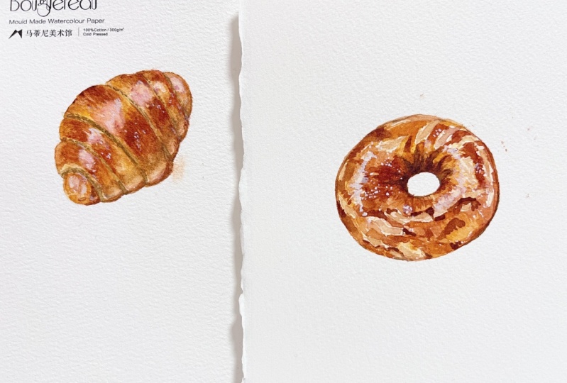
4. SKETCH/TRACE: for this class, I'm going to be painting three types of breads with sort of like a brioche texture. And do you have the choice off during them yourself? Or to trace the outline that I've provided in the resource section? So the first spread is basically like a dinner roll rolled in a similar shape as a Cristante. Let's draw this. I started with the football shape as the overall form of the bread. Then I section out the folds. I always like to start in the middle so I can make the rest of the fools look more even. And depending on where the bread is facing, like as an example here, minus facing slightly to the right, you're able to see more off the depth along the side off the folds. And to do this, I meet those fools a little bit taller than the base football shape, and I try to create a curve at the end off each fold, with the centerfold being the tallest. You can also play around with how many folds you have, so as an example, you can make it with less folds or more folds for the next bread. I'm going to make a custard filled bread. This is a common shape for custard bun in Japan from the research that I've done, and this one is a little bit simpler to drop. For this, I start with half circle shape as the main form, but make it look more chubby. I like to curve the top slightly and also soft in the edges by making them nice and round. And for this particular bun, it is embellished with some cuts, which I will show by during triangular shapes, which are slightly curved inwards. And where those Custer I'm going to add a little bit off indentation, and I'm also going to curve the rest up so it exaggerates the pump. Look, I also like to finish with some almond slices in the middle, but you can also add other garnishes or keep it plain. If you would like to. For the 3rd 1 I'm going to paint a bagel. I know that this isn't a Rio Stowe, but it has similarities and the golden brown color, depending on how it's baked off course, there are many varieties, but I just want to keep this one similar to the rest for this one. I like to begin by during a doughnut shape where I start with an oval shape with another over at the centre. Depending on the angle, you can also make it look more circular, and I always like to make it look a little bit more plump like before by making the hole at center smaller and ratio as each bagel is hand rolled. There would also be some slight imperfections, so you can add this by adding some uneven lines along the sides. And since I'm going to be painting this without garnish, I want also add some cracks along the surface, which I find gives it a nice additional texture for the cracks. I like to still follow the contour of the curvature off the bagel to further enhance the form, and this might look a little bit flat for now. But after adding the texture and highlights as we paint later, this should give more off the volume to the bread. If during is not your thing and you're only interested in the painting, you can also download the outline and trace it on your watercolor paper. So here I just printed out the outline and used this to place under my watercolor paper, and I trace it with my tracing tablet, or you can also trace against the window or use any other tracing methods that is most comfortable for you. The shapes are very basic, as we will add all of the details later while painting, so it shouldn't take too much time to either draw or trace the outline.
5. BUTTER ROLL: Mapping out the highlights: for the first painting. I'm actually going to start by mapping out the highlighted area first. So here, as example, the highlighted area should be placed at the highest point off each fold, as well as the secondary like reflection of the bottom part off the bread. You can start by just during a full curve to select the area and then draw the individual highlights on each fold. I'm going to place mine at the top like this one, but you can also painted a bit lower if you would like to, as long as you follow the curve. Once you've plays the areas off the highlights, you also have the choice off making. The lines have been more complicated to further enhance the texture, but if you want more off acute, see cartoony style, you can also use the simplified shapes, so let's begin to paint this first bread. The highlight can be different hues that you would like, but I find that pink or purple is look really nice because it's common color to bounce off the pastry. So here I'm going to start with a like consistency off pink, which is a mixture off can be um, Orange Quint Opera and young. Brilliant. I added lots of water into this, and I am just going to roughly place the highlights, and I find that this makes it easier to avoid the area when you paint later. And this way you also have any pencil marks to worry about. But the main importance for this is for you to keep it very light at this point because you don't want the color toe. Ashley overpower the color of the bread itself. I'm also going to paint some secondary like reflections at the bottom. This won't be as bright as the main highlight at the top, but I just want to map out the area so I know which parts avoid when painting leader. Don't worry if the highlight is the same lightness at this point to the ones at the top, because it will be easier to build the color rather than to take off the paint with this medium
6. BUTTER ROLL: Painting the 1st layer: Once I've painted the positions off the highlight, I'm going to paint the lightest color for the base off the bread. And for this I'm mixing lemon yellow John, Brilliant and also yellow Kerr. And again, I'm going to use a fairly thin consistency because I want the color to be quite light for this, as this will represent the more uncooked part off the bread. I also made a light brown color using a mix off burnt sienna and cadmium orange and also a make sure off yellow ochre and cadmium orange to add to the color. And I'm just going toward prayer section for this, so there's no pressure to work too fast, and it's a bit easier to focus on an area as MP tingle at yellow color. I'm going to also avoid the pink area from before, and this is why I mentioned that this will be much easier to visualize and work around. You can also start to define this shape off the highlights if you want them simpler or more randomized, as I'm going for a more illustrative approach with a semi realistic style. I actually wanted to look a bit more complicated and you can really define the shape by using the lighter brown color for the start off the golden brown for the golden brown colors, I'm going toe only pain at the top areas off each of the fold. So as an example here, hopefully it's a bit clearer to see the areas where the fools are connected and because those corners doesn't really get, it's much of a direct hit from the heat in the oven. It's often less bait than the top surfaces, which is why I decided to let that area state as the light based color while I built on the golden brown color while also avoiding the highlighted area. Be mindful that certain parts like the left side because it's more visible to the eye. The uncooked areas would be slightly larger than the one on the right. I'm just going to continue to paint the light golden brown color from the previous mixture , and since the ground is still quite light at this point, I'm also going to soften Lee. I just like the so it blends well with the less baked area on the side by just using a clean, damp brush and using the dampness from the brush to soften the edges. And because I still want those sections to be separated, I'm still going to build up on the darker tones off brown by mixing and burnt sienna and cadmium orange to make the color darker. You can add a higher ratio off burn Sana compared to the cadmium orange, and I like to swap between the colors to make it more believable and realistic. I really try to avoid Onley using one tone are one color all throughout one section because it'll tend to make the painting look more flat. So just remember to switch around, and while the paint is still wet, it should slightly blend nicely together. If you also want to add a slightly lighter yellow. Tony can also add some permanent yellow deep. But I tried to not use too much of this color and stick more to the Browns and oranges and reds to give the perfectly baked look for the ages. I'm also going to soften it, using a slightly damp brush, and I'm doing this very carefully this time so the Brown doesn't run too much to the lighter section, and to do this I tried to use less water in my brush, and I also clean my brush quite often. Whatever, it takes up too much paint to add additional color. I also used a dark mixture off roast matter and burnt sienna. You can also add burn number. If you wanted to look slightly over baked, it can give it more character. But for this one, I'm going to keep the medium golden brown color. While painting this, I'm only making small markings or strokes, which will create more texture. I tried to avoid larger strokes with more pressure because that will give you more of an even wash. And for this particular painting, that's not really what I'm looking for. Instead, the small strokes will help to pick the texture of the bread a bit more at the same time, While painting this, I also tried to follow the curvature off each fold, and this is going to enhance the contour and therefore the volume off the bread. If you are unsure off how to follow the lines, he can always try to draw on the lines on the downloaded outline or on the sketch that you've made this way, it will give you a better understanding off the curves, as this is very essential to giving the three dimensional look for the bread. As I'm painting the textures with the darkest tone noticed that I'm painting it quite sparingly, leaving lots of negative spaces so the medium tones are still a bit more dominant. And once I'm happy with most of the placement, I also like to soften some of the edges slightly using my clean debt brush. But I want to also leave out some lines, which are clearly indicating some off the textures. So those were basically the steps on how I paid the first layer of this bread, and I'm just going to repeat this for the rest off the folds for the darker, more baked areas. I tried to mostly place them around the top part off the bread because I feel like that's where it will receive more heat, ideally in the oven. But remember that on evenness also gives character to the painting, so you can also imagine as if the bread wasn't placed in the middle off oven. But maybe if it were placed near the size and it was baked or cooked a little bit unevenly . Maybe one side would be darker than the rest. So I think that it's a good idea to have a visualization off what you want to paint from the first year, so you can just keep building it up for the site Fels. I find that I tend to put a bit less detail because it is smaller, then the center and the main focal point is the largest area right at the center, in my opinion. So I tried to focus a bit more detail in that area, so the rest can be a bit easier to paint way for. The highlights noticed that I tried to play some specs off the bread color near the edges to slightly softened them, and I find that this also makes it look a bit more natural instead of it being too bulky. But I tried to really limit touching that area too much because we will still be building on it as be progress. But don't be intimidated by the negative space, because we can also use the White Wash later to clean up any mistakes towards the end. For the end piece, I tried to include a little bit off imperfection where the bread looks have been squished by painting some lines so the crest look softer and more delicate. This is only an interpretation, though. If you like this, I D can also apply it to other sections. Or you can also skipped the step and just painted like the rest of the folds. Now, as we move on to the other side off the folds, this area, as you noticed, doesn't have the large, visible folds where you can see the layers off the bread because it is covered by the one in front. So for this part, I try to still pay the lighter tone off brown as the base, but only on the left side's and on the right side off each section. I tried to make the bread look a bit more baked by using the darker turn off brown, and I find that this gives a better contrast, which also gives a nice definition to the folds after finishing the first the year. You can actually stop here if you want a looser approach, but I'm Ashleigh going to add additional legal details and slightly darker tones in the coming lessons, So it's really up to you. How much detail in color intensity you want to include in your painting. You also have the choice off painting a lighter golden brown by limiting the darker tones. So as an example, you can skip using the rose better and burnt sienna mixture and just stick with the burnt santa and cadmium orange as the darkest tone. Or you can also use a fitter consistency if you would like. I just provide you with the color mixtures, but it's still up to you and your own interpretation so you can paint what you like.
7. BUTTER ROLL: Textures: Now that the first layer is completely dry, you'll probably notice that the colors are now slightly faded or lighter, which is very normal. So firstly, I'm just going to intensify some areas with the lighter brown tone. And then I'm going to suffer in some of the edges. Whenever the lines looked two distinct. I like having a soft transition between the areas, which are less baked to the golden brown parts off the bread. Then, once I'm done, I'm going to add the darker tones again, using the mixture off burnt sienna and rose matter in a medium to thick consistency. And then I'm just going to build on the darker areas. Meanwhile, I'm going to paint each stroke that I make according to the contour of the bread itself, as I mentioned in the last lesson as this would not only enhance the texture but also the William off the bread. I'm also going to soft in the lines again whenever I feel like the strokes are Ah but two distinct since I am painting on a dry surface so the edges would be more crisp than if the surface were to be a bit damp or wet, and I'm just going to apply this to every single fold. This is actually a technique that I use a lot of my paintings because I find that this gives more control than blending using a wet on wet technique, and you get to choose which lines you want to blend and which strokes I actually want to keep. I don't want to blend every single stroke because it will lose the texture. So I think it's a good idea to leave a little bit off some of the lines, which shows the William off the bread. I like to actually go back and forth on the colors. So once I've touched upon the darker brown textures, the light brown might look out of balance compared to what you've just painted. It might look a little bit more faded than the drug brown, so it's always a good idea to touch up on certain areas, so the bread has more balance in testy of colors. Next, I'm going to go back to the highlights again since we've left it for a while now, and for this I'm going to use the pink color again from earlier, which is a mix off Quinn, Operation Brilliant and Touch Off Yellow Poker, and I'm going to use a light to medium consistency, and I'm going to play the same way as I have for the rest of the bread by making short brush strokes following the contour of the bread. I also want to leave out a fair bit off negative space, so the highlight can still remain the lighter part off the bread and near the edges off certain highlights. I also like to add specs off the bread colors, so the shape off the highlight becomes a little bit more complex in some areas where the highlights look very contrasted with the rest of the bread. I also like to soften the edges slightly, but this is just my own preference off working. If you like the strong highlight, look for more often exaggerated effect. You can also leave edges nice and distinct, and I'm just going to apply this to every single one off the folds for the last bit of color. I like to also add a bit of cobalt violet light to the highlights, so there's a slight gradation of color as the highlights might reflect different lights and objects around the area, so I'm just going to apply this very lightly at the bottom portion off the highlights.
8. BUTTER ROLL: Additional shadows: in this lesson, we're going to go over the shadow color and how to separate the dark baked areas to the shadows. And the key is basically to mix cerulean blue to any off the brown tones that you already have. I'm going to apply this to the bottom part of the bread, and for that I used a mixture off cerulean blue with some burnt sienna and also the light brown color that I had left of my palette. I'm going to work on this and a thin consistency so the color of the shadow won't overpower the rest of the bread, and I'm going to play it the same way as the rest of bread by following the curvature. And I also like to make the strokes a bit uneven, moving along to the sides off the bread. Now I want to start adding the visible layers on the side of the bread, which helps it to rice. And for this I just added more cerulean blue, and this time I also mixed in some yellow Oakar. Since the base color off where I'm going to paint. This is very light. The area that I'm going to paint later our raced areas, mostly on the left side. As you can see a corner being formed from the top fold to the one under and for the race side, I like to add a bit of texture, using the shadow color to depict the layers off bread texture and to show you enduring. I like to use lines as well as small ovals to suggest the texture on the side. Getting back to the painting. Now I'm going to first apply very light glaze off the color and the race areas, and for those parts it will be the area which I'm going to create the layer texture. For this, I switched to my small brush so I can make sure that the lines and ovals will collect puddles off water and the paint can be controlled easily. I also used the same texture to separate some off the folds on the right hand side, so there is a clearer distinction, but I'm going to paint this on very sparingly as an outline instead off the painted area for the ovals and the lines. Since now the base color is slightly darker. I added a touch off insanity. The previous mixture, so it would still be visible even in a thin consistency. And I'm just going to paint the textures by drawing out the lines as well as that, then ovals on those selected areas for the bottom highlights that with left from the beginning. Since this isn't going to be as bright as the main highlight at the top, I'm going to glaze them with some of the kobo fell at night in order to tie the highlights together and because I feel like the purple will look to flat by itself, I end up using some of the lighter brown color to glaze on top of it again, and I'm only going to do this in limited areas just to introduce a slightly different color to the area. Then for the middle fold. I just added an extra dark brown mix because I feel like the value of the shadow in that area kind of flattened at a bit. So I'm just going to adjust the volume again
9. BUTTER ROLL: Highlights and Finishing Touches: here, you'll see me using the light. Brown tones helps often the edges of the highlights again, and you'll see now that the highlights are a bit too dark after glazing it with the pinks and purples. So I'm going to brighten it up again. Using freshly squeezed white wash, I would suggest to not use dried whitewash as it usually loses some off the opacity. So if you want to bring back certain parts to white again, treaties a fake consistency with his touch off water to help it glide a little bit easier. If you feel like some of the white is too glaring, you can also softness the same way as you do with watercolor by just using a clean, damp brush and help spread it around. And, of course, by doing this, you will lose some off the opacity, and you can always pile up more watercolor on top. It just acts as on opaque water color, so you can always adjust the colors if you want to put a bit more brown or a bit more off the pinks to suit the level off brightness you want for the highlight. This is also a good chance for you to paint final touch ups for the texture. Here I use some off the letter brown bricks off cadmium orange and yellow Oakar to add more off the texture on top. But if you want your bread to look smoother, you can also skip this step and make the colors look a bit more even next. I mixed and a thick consistency off burnt sienna, cerulean blue and roast matter, and I'm going to use this to line the bottom off the bread and then slowly softening the edges to create distinct shadow. You can adjust the color with more cerulean blue if you would like to, but I personally don't like to add too much as it can sometimes muddy the color if it's overused as a final highlight, I like to give speckles off, highlight on random parts off the bread by painting dots on ovals. I like to paint them and small Bunches in a very thick consistency Whitewash and my favorite places to put them are on the doctor surface, so the white becomes very visible and contrast with the dark background. If you do want to follow the step, I would suggest to also place them within the contour of the bread to help enhance it. And I feel like thes white specks give a slight, whimsical feel, which I enjoy. Remember that you can always correct the white wash, so if you feel like you've placed too much in certain places, we can always take it off using and clean that brush and then painting the area over again with the bread color. And after that you can take a final look at your painting. Adjust anything that you personally need to, and this is the finish bread.
10. PLAIN BAGEL: Mapping Highlights and Textures: Now let's paint the next bread here. I'm going to be painting a plain bagel, and since I think that a completely plain bagel would be but boring to paint, I decided to add a few cracks to give the simple shape a lot of texture, which I'm going to break down for you. So it's been easier to follow here. I'm going to start to paint the lighter cracks, just so it's clear for me to separate those areas. And for this I used the same light mix as my previous bread, which is a mixture off young, brilliant yellow joker and lemon yellow. But this time I added a higher ratio off showing brilliant so the color is a bit warmer. And what this color I just paint in the larger cracks that I really dropped. The next thing you need to remember while painting this as the contour of the bread, this oneness simple as it's only a donut shaped. However, with that simplicity, your accuracy would be very important, as three eyes will just those stakes easier because it's such a simple object. So if you're fair leaning to drawing or painting, I think that this is an important thing for you to get used to, because this is the key on giving the look off volume to any painting. So I would suggest for you to try to draw multiple lines to depict the contour lines before painting. Just so you understand the risk movement and also the curvature that you need to make as you paint. I suggest to do this and pencil to the printout that I've supplied you with. So if you make any mistakes, you can always erase and redraw the contour lines as practice. Next. I'm also going to indicate some textures that I might forget while I'm painting. So I'm just going to paint some off the lines in the middle because as the dough come together in the middle, sometimes it creates a bit of creases. So I'm just going to paint them with Mischer off burnt sienna and cadmium orange. This is only an indication similar to what you would do with pencil, so I tried to not go overboard at this point. Next, I want to start during some cracks around side where the bread expanded too much, and for this I want to draw them as rigid, disconnected lines, which are mostly geometric and shape. And I'm only going to apply it to one side of the bagel just so I can include a variety of textures on the simple shape. Now I'm going to indicate some cracks along the side with the same color as before, which is a mix off burn san and cadmium orange. I'm still using a fairly thin consistency so I can paint over this later, and it won't become much of a distraction. I'm keeping the lines nice and simple at this point because we're going to leave your the rest off the smaller cracks on top of it later and the coming lessons. You don't have to follow the exact pattern that I have here. In fact, it will be much easier to create your own as long as you understand the concept off the method. Next, we're going to paint the highlights, and for this I want to place it at the simplest part of the painting, which is at the top. If it's a bit hard for you to visualize where that would be on your drawing, you can imagine the contour line and place it where the curve is at its highest point, and that's where I'm going to roughly place mine. I want to create a glaze effect with this, so I want the lines to be uneven. But it's still nice and flowing, and I'm just going to place this the same way. With a previous bread, I'm only going to use a thin consistency of a mixture between cadmium orange, Quinn Ah brah and John. Brilliant. Mine is a bit murky here because I did clean my brush properly, but it doesn't matter too much since I'm still painting this in a very thin consistency. And as an addition, I'm also going to add a second re highlight, which is going to be very subtle in the end. And I'm just going to place it at the back, off the bagel and also a little bit on the right hand side. So those are all of the prep that I do before I start painting this as a whole. That's move onto the next step
11. PLAIN BAGEL: Mapping the Base Layer: I'm going to approach this one quite differently to the first meeting. In a way, I'm going to make several colors as the base straight away, so I'll be working in sections off the bagels. So different parts of the bagels get different to himself. Brown's to make it look like it wasn't cooked evenly, and I think this also makes it look a bit more natural. The first color that I use is a mixture off yellow grand cadmium orange, and this time I'm painting and a medium consistency straight away, because I want this one to have the darker golden brown color overall in comparison with the first bread. Even when I'm painting this perception, I try to always direct my strokes to follow the contour of the bagel. So even when the colors blend together, there might be a slight texture, which follows the contour and therefore enhances the volume. I want to also switch between colors. So after I've placed the light brown near the middle, I continued on with a light yellow color, which is a mix off lemon, yellow and cadmium orange. Or you can also use permanent yellow deep if you would like to. And as for third color here, I used the mid brown tone, which is a mix off cadmium, orange and burnt sienna. While doing this, I'm always mindful to avoid the highlights and cracks, which is why it's so much easier to paint them in small sections. If parts of your colors are drying already, so it's not blending as well with each other. You can always use the technique with a clean, damp brush and just rub the two colors together until it has a soft blend. However, if you can work fast, you can always use a wet on wet technique. But I find that this way as much more controlled, and you won't be too stressed out trying to paint things too fast. The next darker tone that I'm going to use is make sure between burnt sienna and roast matter with also a little bit off cadmium orange, which I'm going to continue to paid until it reaches the edge off the bagel. I also decided to use the same color near the large cracks. I'd like to place the darker tones, mostly near the cracks, so there's a clear contrast between the light brown and the dark brown. And then I continued with the mid tone brown again that's already on my palette to paint the rest. Ah, the bottom part of the bagel. This isn't the darkest tone of brown, but we can always build on the color. Later. I just like to have a clear understanding which sections I'd like to be less brown or more baked with the darker brown tone for this layer, so I can continue to build on the colors and the next layer with a better visualization from the base color. Here I've reached the area with small cracks, and I have only colored to 20 sections. And then I decided to move on to the top part, just so we can paint the similar sessions together first, and then we'll get back to painting the small cracks. So here I went back to the mid tone brown again with the burnt sienna and cadmium orange. And in areas near the highlights. I always like to create a rough outline, so those parts that I should avoid painting would be more visible, and it's much easier to paint around it. Once I've outlined the highlights, I continued with thicker consistency off the same color with a slightly higher ratio off burnt sienna. So it's a bit darker and tone, but it's still very subtle for the creases at the center of the bagel. I like to use a darker brown mixture, and for this I mixed in burnt sienna and roast matter together, and I really like how dark and warm this color is. So here. I'm just going to play some curved lines to enhance the texture at the center. With that color, it's also better to play around with the length off the girth lines to make the texture look uneven and more realistic. Here I changed my mind a bit on I decided to place the same dark brown color near the highlights, so I'm just going to layer it as the previous layer is now completely dry. And at this point I'm just going to switch around my colors. It's just matter of intuition and playing with the color placement for this part off the painting. You don't even have to exactly follow how I've placed mine, especially if he decided to change up the positions off your cracks. - So once I've painted the rest off the area. I'm going to move on to small cracks, and for this I switch some off the colors between the mid tone brown and the dark brown. For this part, I want to keep the cracked lines white while painting in the sections, but I want to keep the white lines nice and fine, so it doesn't look two out of place. And to separate those cracks even more, I also like to create a soft gradation between each section. So one side of the shape has a darker brown, then the other side and I just play around with this. There are two ways off approaching this creation. You can either use the pulling method like how we've been blending the colors together by placing a medium to thick consistency off paint on one side and then cleaning my brush with clean water than using it to pull parts off the pain across or another way, as by wet on wet technique. By coloring a light consistency off brown, then adding a slightly thicker consistency on one side and then helping the paint blend across with my brush well, it's still wet. This will create the illusion that all the cracks are angled slightly differently to each other, and it gives a very interesting texture and effect to the painting. So I'm just going to finish painting the rest off the cracks and we'll move on to the next step.
12. PLAIN BAGEL: Textures: Let's build on the textures with second layer of paint now, and for this I want to start introducing the dark brown tones so we're able to increase intensity of the colors. So I'm going to add a new color to the palate. And this is mineral violet that I mixed with burnt sienna with a little bit off the roast. Better that was already in the previous mix on my palette. Already, I use this color to start building the darker tones on the bagel, and at this point, following the contour line is more crucial as we're going to start adding the texture and intensity. And here I just added some of the creases towards the center and build up some colors on the side. With a start pronto, I followed the same method off painting the streaks and then using a cleaned up brush too soft on the edges to create a soft transition and also to create the slightly uneven texture. Now I want to start building on the small cracks. This is the fun part and makes a huge impact to the painting. So after making the cracks at the beginning while leaving the white lines were going to layer on. Smaller wants to make this more believable. So we're going to follow the same method as before by dividing those cracks that we've painted to even smaller ones. And for this, because the base color is now different tones off Brown's from degradation that we've made previously, I'm just going to paint the smaller cracks with a flat wash with the base color peaking as subtle outline from the negative space. For this, I'm going to use the dark brown from before, but I added a bit more. Roast matters, so the dark brown isn't as murky but more of a warm, dark brown. I'm using a medium to thick consistency to paint this, and I'm just going to keep painting the cracks until the paint runs out, to which the color will slowly fade into a lighter consistency. Naturally, you can still play with the color by also adding some cadmium orange to the previous mix. If you want to create ah lighter, more subtle crack color. I use this lighter mix to paint some of the cracks along the edges to make it snow. Lee blend with the smooth texture of the Babel. Next, I'm going to increase some off the intensity off certain areas, and for this I want to use saturated colors. So whenever there's cadmium orange in the mix, I add more cadmium orange. And whenever there's a duggar brown that I need to add, I just at a high ratio off roast matter to increase the warmth. So these parts here I use a mix off burnt sienna cadmium orange to increase the saturation in those areas. When I see as looking a little bit too, doll years might look different at this point, so adjusted according to your needs in terms off intensifying the colors. Here I'm making the darkest brown off the whole painting, and for that I use the previous dark brown mix with the mineral violet. With this time, I also added a bit off burn number to the mix. At this point, I only want a medium consistency off this so I can still play around with the colors and the different ratio and consistency to make the tone even darker for the shadows for the finishing off the painting. So for the middle section here, even though I'm using the same color I use the higher ratio off roast matter, which is why the color is slightly lighter, and I also used a thinner consistency. So even with the same color mixture, you can play around with the ratio to create different tones off broths. And with that in mind, I added some of the dark browns in small sections off the painting, toured to find some textures and increase the contrast.
13. PLAIN BAGEL: Exposed Cracks: for the larger cracks. I want to use a mixture between roast matter, mineral wallet and burn number, but I only want a thin consistency. So I took some out to the clean part of my palate and I added a lot of water into it. I'm going to pay the color very lightly, and I'm only painting the center area of this part of the crack so you can see a little bit of an outline from the base color. You can also separate some of the shape slightly, like what I did at the front of the crack is a bit too big. It's very crucial to use a very thin consistency at this point because the largest cracks exposes the interior of the bread instead of the crust, so it's much lighter in color. I like to vary the color slightly, so for the smaller sized ones. I used the same mixture as before, but I added a little bit off permanent yellow deep to lighten the color slightly, and I'm still going to use it in consistency to depict parts off the bread, which are less burnt after I've placed a light lier off those colors on all of exposed interior of the bread. I then want to start adding a very subtle texture on those areas. So I used a light mixture off burnt sienna cerulean blue with a little bit of the darkish red brown mixed from before to create almost like a gray, brown or warm great color. And use that to paint some small markings and weekly lines to represent small holes in the bread. You can also change up the ratio between the color or even at maybe elect consistency. Off can be, um, orange as long as this part is still kept very light and subtle, because if you paint this too dark, it'll look a bit odd, as if there's a huge deep hole in the bread. But if that were to happen, you can also take off the excess paint. Using a dry brush well is still wet, or you can also use a little bit of tissue to absorb excess paint. Then I'm just going to go over some of the smaller cracks again and fix some of the edges to create clear and warned to find lines. Then, after that, we're going to move on to the next lesson, Then I'm just going to go over some off the smaller cracks and fix some of their just to create clear, more defined lines using a mixture off burn number, mineral violet and Rose Matter. Then, after that, we're going to move on to the next lesson.
14. PLAIN BAGEL: Highlights and Final Shadows: on this final lesson, we're going to pay the highlights as follows the shadows. And as for the color, I used cobalt violet light with some bird santa and cadmium orange innocent consistency to paint around the edges off the white highlights. This should, at the same time soft in some of the edges, so the paint should be very limited, or else the highlight will look of a too dark. Then, after that, I used some white wash to paint some lines according to the contour off the bread to give it more off distinct highlight. This also helps if you accidentally made some of the highlights a bit too dark in the previous step. Then, like the first bread, I also added some white specks or gods in certain areas, and the placement still flows the contour to enhance the volume off the bread. My favorite places to paint the dots are on the darker values, so the white makes more of an impact due to the nice contrast because, gosh, acts like watercolor C can always paint over it or soft in it. If you've made him steak or if some highlights are a bit too large just add more if the brown color to fix it personally, I like the base off. The highlight to be well blended with the color of the crust finished off with more of a distinct highlight on the top layer as final shadows and touch ups I like to add some trillion blew into the darkest brown mix, which is made out of burnt number, mineral, violet and Rose Matter. And I use a very thick consistency to enhance the creases off the bagel, as well as fixing up elements like the cracks at the bottom part off the bread to enhance the doctor color. I also use this color to subtly clean up some off the edges off the painting as a whole, and once I like the balance off the colors, I can call this one finished.
15. EXTRA EXERCISE: Custard bun speedpaint: in this lesson, I'm going to be painting the extra custard bun as a speed paint as I use the same techniques as what I've mentioned in the previous classes for the breads. So I hope this extra bread serves more as an additional practice, where you can try to apply the techniques learned with the color palette that you've used on your own paintings. Thes techniques should serve more as guides, but I don't really want it to hinder from your own creative styles. So I hope that you can still apply the techniques with your own artistic liberties with the colors that I've switched out for you in the beginning off the class. I hope that you can also mix and match the colors yourself so you don't have to follow the exact mixtures. I think it's better to experiment because some paints might also react differently. On top of that, if you don't have the exact same colors, you can also try to find something that is similar on your palate to adjust to what I have . I think that way it also gives you better flexibility and helps you to problem solve with color mixing because the idea off color mixing as not to memorize the mixtures, but more about understanding how each color reacts and what certain colors add to the mixtures, like what I've explained in the beginning. So with all the information in mind, I hope you guys can apply the techniques with your own style and capabilities and to this one as well. And I will get back to you again near the end where I will be painting the almond slices. I'll just let you know what color mixtures I used, since this is a different element to the rest off the breads before way for the almond slices. I want to start with a peachy pink mix similar to the base color of the highlights, and I'm going to apply those to certain spots and then clean my brush and use the damp brush to spread the pain to the rest off the surface, leaving certain areas lighter than the other. And I'm going to do this for all of the three slices. Next, I'm going to mix in some roast matter with burnt sienna, and I'm going to use a thick consistency off this paint and also switch to my small brush to paint the skin or outline off the almonds to a play the paint. I want the lines to be a little bit uneven and sometimes even disconnected from each other , so it has varying weights. In one of the tips. I'd like to also create a thicker weight, as sometimes that area tend to look a bit more brown than the rest. Next, I'm going to build up on the value for the arm skin, and for this I want to create a thicker consistency. Paint, as well as introduced her number to the mix to create a darker tone off reddish brown. And I'm going to use this to line certain parts to enhance the differing wait for the almond skin. Theun as the base color off the arm and spices are now dry. I want to add a bit more value to some of the more bait slices, so I used the same mix as before, but I add a little bit more cadmium orange this time to give it more off a baked color, and I'm on Lee going to apply this to the darker areas and then softening the edges. I want to still paint this quite light. So if you accidentally please too much, you can take the excess off with tissue while the paint is still wet. Then for the shadows along the side, I added burnt Sana and certainly in do together and use it and within consistency to paint one side off the bread next to the almonds. So it looks like there's a slight lift, and then I'm just going to finish off the bread like I did with the rest.
16. CLOSING: congratulations and completing this class. I hope this cost was fun and helpful for you For the class project. I would love for you to paint along to the breads that I painted, including the custard bun, if you would like to. But as an extra challenge, you can also drop your own breads in different shapes and applied the color palettes as well as the techniques that I discussed in the class. And once you're done with your projects, I would love for you to post it in the project section so I can take a look at your beautiful paintings. I really love seeing that one painting can look so different and the hands off many people . If you're interested in seeing more art by Neek and follow me on my instagram at a i g underscore Nanny, nanny Or if you would like to see shorter tutorials I post weekly on my YouTube channel Neon Yanni. I hope you guys enjoyed this class and I wish you the best of luck for your attempt off the bread paintings. I hope you guys enjoy the process of painting it and I'll see you at the next class. Bye.
 Nianiani, Watercolorist and Graphic Designer