Transcripts
1. Introduction: Using a mixture of
mediums to create your artwork makes it a
whole lot more exciting. I think painting is
quite difficult, but if you add in
another element to the process like collage, it gets a whole lot easier. I'm going to show you my way
of creating a mixed media, semi abstract picture
using go ash and collage. I'm Kate Cook, artist
illustrator and top teacher here on Skillshare and I'd like to help you
make some great art. I've been creating
stuff for years. First as a textile designer for the fashion industry and now as an illustrator
and teacher. Because of my textile
design background, I think I'm really
drawn to pattern. Whenever I travel, I'm always
taking photos of pots, tiles, textiles,
anything with pattern. In this class, I'm
going to show you how I use these references to inspire my artwork and how collage and paint are a great
way to illustrate it. This is the third
class in my series, the Gouache Vals, where I aim to prove the brilliant
versatility of gosh. I'm going to show
you how I combine the collage process
with painting in Go. This class includes techniques for making your own
decorative paper, paint and collage exercises, inspiration, tips, subject matter ideas,
and color advice. It's aimed at anyone who wants to experiment with
paint and collage. You might be an experienced creative or just starting
out on your art journey. Either way, the exercises, tips, and advice will
hopefully inspire you to try this interesting
union of materials. I'm so excited to show you
this creative combination. And by the end, you'll be ready to create
your own artwork. Plus the bonus
lesson will show you how to use these
techniques to make a greeting card.
Let's get started.
2. The Class Project: The class project. For
the class project, I'm going to ask you to create your own gas and
collage composition using a vase or other pattern
ceramic as inspiration. You can use the same photo I use in the class
if you prefer, it's in the class notes. Or you can find your
own reference photo. Or maybe you have a vase that
you'd like to incorporate. Once you've followed
the class and seen my process for
making the artwork, you'll have all the
inspiration and method you need to create
your class project. I'm going to take you through my step by step plan to
retrieve a great picture. I'll share with you what
materials I like to use, the different methods I use
for making collage papers, where I get my inspiration
from for my subject matter, how to plan a color scheme, the exercises I make in my sketchbook using
paint and gouache, and finally, how I actually
produce my finished artwork. I'll be giving you lots
of tips along the way. You'll be totally guided
throughout the class. By the end, you'll be
confident and ready to create a wonderful mixed media picture using gouache and college. I love seeing what
you produce from the sketchbook exercises
to the finished artwork, plus your comments and thoughts
about how it all went. Please upload everything
to the class project page. I'll do my best to give you
feedback as soon as I can. I'm here for you if you have
any questions or concerns. I love helping my students. Don't be shy. Now, I'm going to share with you the
materials I like to use. See you in the next lesson.
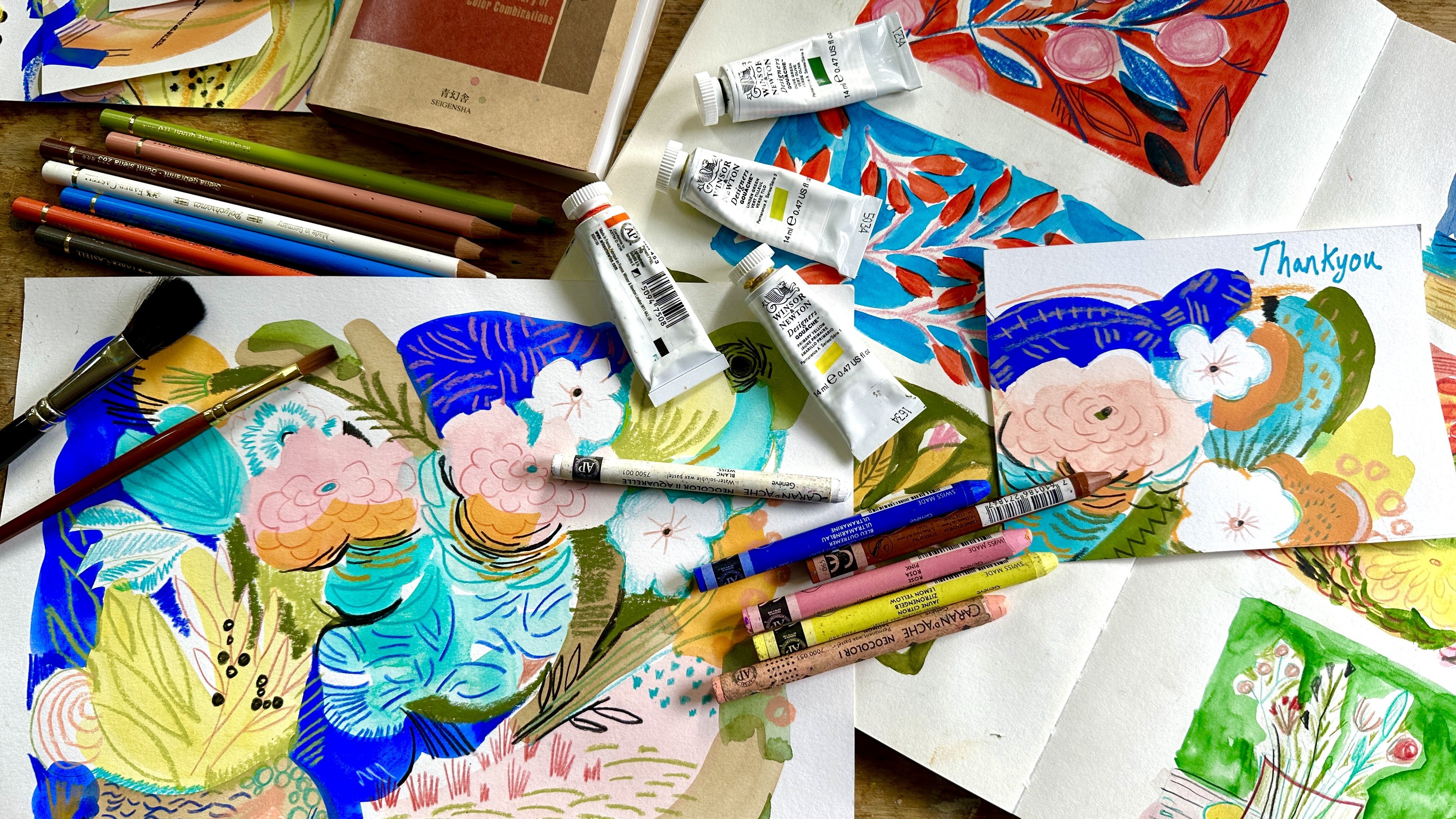
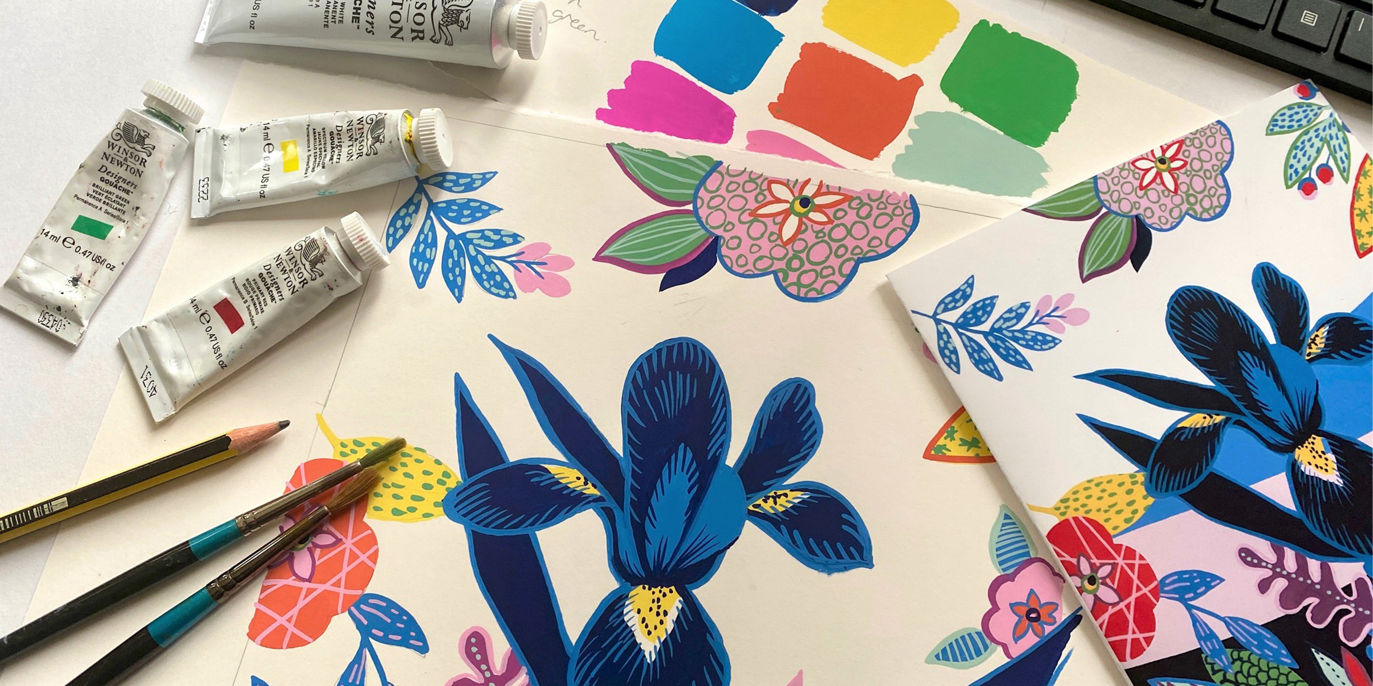
3. Materials: The class materials.
In this class, we'll use quite a few
different materials as there are a few processes
that we'll be going through. However, there are always
alternatives to everything. A lot of the mark making tools
are just household items. Please don't feel
daunted at the list. First of all, I'll talk about
the mediums we will use. The main one being gosh. In this class I'll be using
acrylic gosh as opposed to the standard water based
gouache because it's acrylic. This type of gosh
is plastic based. Therefore, when
it's dry, it won't budge and you can't
reactivate it. We will use the acrylic
gosh for both making collage papers and as the
paint in our finished artwork. The fact that it doesn't
reactivate is useful, especially when
making collage paper, which you then want to
glue to your picture. Using acrylic type paint
proves far less messy. You could also use
standard acrylic if you prefer. If
it's all you have. I just prefer Gage because it's a nicer consistency
to paint with. I find it gives a more
flat matt finish. I use the Liquitex brand, but there are plenty
of others available. We will also use acrylic inks for making some
of our college papers. The ones I use are by Lorne as I find them easy to
purchase in the UK. But again, there
are plenty of other brands that just as good. I will also use some pro marker pens by
Windsor and Newton. I love the fact
that they're double ended and come in
some great colors. However, you could use whatever marker pens you have already. I'll also use a
white Uniball pen for the detail in my artwork. A small Posca pen
would also work. We will also make
some paper paste. In one of the lessons For this, you'll need plain flour, water, a saucepan, a whisk, a sieve, and access
to a hop to heat it. On paper, we will use a couple of
different types of paper, copy paper for the collage, and smooth watercolor
paper for the artwork. I like to use quite a nice
heavyweight paper for this. It doesn't buckle. I've got a smooth hot pressed
paper which is 140 pounds or 300
GSM from cas art. But anything similar is fine, or a heavy weight colt
paper would work too glue. I use a matt medium by
Windsor and Newton as it dries matt and is relatively
easy to apply with a brush, but any clear glue would be fine brushes for making
the collage papers. I use a flat wide brush,
like a varnishing brush, or you could use a
household paint brush, just something with
stiff bristles that you can get some
texture into the paint. I will also use various
flat edge brushes, mostly a three eighths, but use whatever you have. Also a round brush
in a size eight, a roller, also known as
a Breyer, a jelly plate. The one I'm using is a size
eight inch by 12 inch. This prints nicely on
an four piece of paper, but you can use whatever
size gel plate you have. You don't have to have a jelly
plate or a roller to make the decorative paper
as I'll be showing you other methods that won't require this
expensive equipment. Washy tape for masking
out your artwork. Scissors, a plastic palette with wells for mixing
the paste, paint. A palette pad for when
we're making our artwork. Baby wipes, paper towel, water jar tools for
making textures in paint, such as craft tools,
paint scrapers, palette knives, cardboard rolls, bubble wrap, et cetera. Anything that you can find
that makes a good texture, that's our materials covered. Next, I'll show you some ways I make decorative
papers for collage. See you in the next lesson.
4. Finding Inspiration: Finding inspiration. I want to talk about how I
look for inspiration for my artwork and how my tips can help you find things to
inspire making a piece of art. My first port of call is
always other artists. I really like to see what's
going on in the art world. And I look at art all the time in books, online,
and exhibitions. Probably the easiest way to access art is online and
through social media. My favorites of the website,
Pinterest and Instagram, I follow lots of artists
and I'd like to share a few with you that have
influenced the way I make art. One of my best
recommendations is to have a look at the work
of artist Mark Held. He's a long time
favorite of mine. His use of college and
pattern is amazing. And it was on his
workshop that I learned how to make paste
paper for collaging. He has a couple of books
I highly recommend. One is his workbook and the other is called
Raucous Invention. Unfortunately, the
latter is out of print, but I think there may be another print run
in the pipeline. There are loads of
artists out there that I really think you should
take time to look at. Not necessarily
specializing in college, but artists whose use of color, pattern, semi abstraction,
really make my heart sing. One of the best places to do this is looking on Pinterest. Just search up their names and you should find lots
to inspire you. Here are some of my
other recommendations. Lt and Marine and Color box, a couple who have an
amazing way of working together on the same
canvas and produces a fabulous colorful
still lives with a wonderful use of pattern
and mark making and color. Anna Hims uses lots of pattern and also love
her use of pots. A subject matter I'm
always drawn to, I'll be using it in this class. Hope Olson, again, love her pots and the way
she paints flowers. Robert Kushner,
just an amazing man whose color choices always astound me and the way he constructs the layout of
a painting is genius. Mary Feddon painted the most gorgeous still
life compositions. I love the way she puts the selection of
objects together. Of course, Mate, water, joy. The way he paints
a Vs of flowers. Just wonderful. Visiting
our exhibitions is another way I find
inspiration and ideas. I really recommend you going
to your local gallery. Go and see anything. Even
if you're not convinced, you might be surprised.
I love to travel. Visiting other
countries and cities is something I
really enjoy doing. I make sure I take plenty of photos so I can use
them for reference. With my love of pattern
and especially ceramics, I'm always snapping
pictures of pots. I have quite a collection
which gives me a really good
library of ideas for shapes and designs to
use in my paintings. I'm also obsessed with
buying art books. Often I find them in my
local charity shops. I love being
surrounded by books. I can dip in for inspiration
anytime I've even got my own scrapbook where I stick anything I
come across that I like, Cards, tickets, flyers,
packaging it, et cetera. It's a file of creativity
that I find ever useful. I hope my tips help point you in the right direction
for some inspiration. The best advice I can give is reach out to anything
that lights up your day. And try to keep a record
of it so you can access it again when you need a brilliant idea to
motivate your art. Now I'm going to show you
some different techniques for creating collage paper. See in the next lesson.
5. Creating your own collage papers: In this lesson, I'm going
to take you through some of the techniques I like to use for creating
decorative papers. I don't like using paper
that's too thick as it makes it less liable
to stick on the artwork. I tend to mostly use copy paper, or sometimes Chinese papers, it's just the right thickness. The main aim when making
papers is to cover all bases with color
and shades of color. You have a big
library of papers to use when creating papers. Be sure to cover
your dark shades as well as the light shades. You could be really selective about the colors you
use and just make a range of blues and greens
or maybe pinks and reds. But I tend to get carried away
and make the full spectrum so I have a big pile available to use for
lots of projects. The first method
I'm going to show you is to make paste paper. This is a method I
picked up when I did a workshop with
the artist Mark Held. He uses paste papers in his collages all
the time as he can get some really
interesting patterns and textures in his paper. Make the paste, I use six parts of water
to one part flour. Standard plain flour is fine. You'll need a saucepan and a whisk and a hob to heat it on. Put the flour in the pan and gradually whisk
in the water. Trying to avoid
getting any lumps, put the pan on the hob and
bring it slowly to the boil, simmer for a couple of minutes. It should be fairly thick
by now, a bit like custard. Then pour it into a
jug and let it cool. You can sieve it if you're worried about any of the lumps. When it's cold, you
can pour it into your palette or a cup and
add paint to color it. I like to use acrylic ink, but any fairly liquid plate is fine or you could
use powdered pigment, just something that
will blend in. Well, add a few drops of the paint to the
paste at a time. Mix well and test
the color strength. Then use the paste to paint
on the paper fairly thickly. I use a household
paint brush as I want the thicker bristles to
show up as a texture. That's the beauty of mixing
the paint with the paste. You get a nice thick paint, then you can use tools
to work into it, scrape or draw into the paint, finding textures,
marks and patterns. I'll experiment with
all sorts of tools. Cardboard, rolls, the end
of paint, brushes, sticks, bubble wrap, whatever I
can find in my studio. The key is to mix up plenty of different colors and use
that to paint lots of different papers
that you end up with a varying degree of colors
and strength of shade. You want a good variety so that you've got
lots to choose from. The only downside to this paste is it takes quite
a while to dry. It also doesn't
keep for too long. After a few days it goes a bit weird and
starts to separate. So you'll want to make it
and use it fairly quickly. The second technique
I'm going to show you is making papers
using a jelly plate. This is a mono printing
method and it's great fun to do,
quite addictive. Actually, my jelly
plate is just under an four size perfect for
printing on copy paper. We will also need some paint. I like to use acrylic, either medium bodied or gosh, acrylic is best, but you
can try it with any type. It's best to stick with acrylic based medium that when you come to
collage with it, the glue doesn't
reactivate the paint. It can get rather messy. Otherwise, we will
also need baby wipes, as these work really well
for cleaning the pad, but you could use just
tissue and water, a roller or a brier, and some tools to make marks. These can include things
like cardboard rolls, blunt sticks, block prints, old brushes, bubble wrap, and bits of cardboard. I'm going to start by
using some palo turquoise. And I've got my pad ready and my roller ready next to me with a piece of paper to
clean it off on. It's trial and error, really how much paint you use, you don't want to use too much, otherwise it will slip and
slide all over the place. But obviously if you don't use enough, it
won't cover the pad. If you see what I do
there, I just roll off the excess onto that piece
of paper and I've put an A four sheet of copy
over and I'm pulling off a print and that's just
a simple one color, it picks up everything
you can see on the pad. I'm not going to clean this pad, I'm just going to carry on using the next color,
which is a yellow. And you'll see that
it will combine with the original turquoise in
quite an interesting way. This is when you start to
get some more textures. I'm just rolling out the paint, cleaning off my roller again, and taking another
print of the jelly pad. This time you can see
it's a bit more text, a bit more patchy in places. But I really love the
textures that you can find. I think this is a pains Gray decided that I wanted
to go a bit darker. Remember, you want to keep using lots of different
colors and tones. So they end up with papers of lots of different
shades and tones. This is ending up quite dark. I'm just going to use a
cardboard role and see if I can press into the pad and
make some circular shapes. I've got a smaller one as well. You can use anything
as long as it's blunt. You don't want to use
anything sharp because you really don't want
to cut your gelpad. I'm going to take a
print off this one. See how this comes out? As you can see, I've picked
up all the circular shapes. You'll see there's still
circles on the pad. Now I'm going to use a gray. This is just, again,
an acrylic gray. Quite a pale gray, and I'm going to roll that onto the pad. This should end up being quite an interesting
print, I think. Clean off the roller. Again,
another piece of paper. You do need a bit of space
to be doing this because obviously every time
you pull a print off, you've got to put it
somewhere to dry. It's good to have quite a
lot of floor space I find, and I just line them all up on the floor around me.
That's a lovely print. You can see all sorts of weird and wonderful
marks in that. That will be a really
interesting collage paper. Now I've got a magnesium
blue hue and I'm going to see what this one will pick up with the greeny
colors underneath. Should be another quite
interesting print. This time I'm going to
use a paint scraper. These are things
you can pick up in the art shop quite easily. They make quite good tools
for working into the paint. I've got another
one. This one is actually something you use
when you make clay pots. I think you could just
use the end of a pencil. Anything that's not going
to scratch into the pad. Let's see what this does. It's always a surprise
that looks quite nice. Picked up some of the marks, we're left with quite a
few interesting marks on the pad still. I'm going to go
back to that gray. It's actually a natural
gray, they call it. We'll see how that works out. That's quite nice, isn't it? It's not as light as I thought. It's still pulling off
quite a lot of the blue. I'm going to use a
mixing white this time, see what happens here,
because I feel like I need a few lighter, paler sheets of paper as well so that I've got a
good selection of tones. Yeah, that's nice. That's
a good one to have. Pulling off another
one this time. I used the brush on the right just to paint
the paint onto the pad. It's left some brush
marks on there Still, I'm going to use a bit of the Prussian blue and I'm going to mix it up with some of that paints gray as well. You can use as many
colors as you like. Really, There are no rules when it comes to
printing with a gel pad. This time I'm going to
try some bubble wrap. I'm going to press that into the paint should make quite
an interesting texture. Looks quite nice.
Colors going on there. Petrol colors, blues and dark
grays. That's quite nice. I'm still left with some of that print from
the bubble wraps. I'm going to keep
using it this time. I'm using one of those tools,
paint tools, spatulas. Just drawing some lines
across the jelly pad. Using that clay tool again, now that looks
quite interesting, quite blobby and stripy. Let's see what we get. If I put some pines gray down against, if I can do a dark print, the paper on the right
that I'm rolling off onto is going to be
quite useful as well. Obviously you get some
really lovely textures going on. I shall
be saving that. That's a nice dark tone that
will be useful when I want some dark papers you can carry on for as
long as you like, using different color
combinations and tools. You can also reprint on top
of the previous print papers. It's a very organic process
and highly addictive. I really recommend buying a
jelly pad and having a go. The third method
I'm going to show you is the simplest
and most accessible if you don't want
to bother making paste or buying a jelly plate. I'm simply going to do some
painting and mark making with different brushes
and tools using acrylic paint and marker pens. You could also use
inks and anything else you have in your art box here. I'm simply using a big
brush and some acrylic. Gosh, I've started off with green and now I'm
going to use some yellow. I'm just relying on
the brush to make some interesting marks because
it's quite big, bristled. Yeah, Just playing around
with the brush marks, really for this one
I've just done a bit of a wash in the green and the yellow that was
already on my palette. Now I've got a probably
size six brush, and I'm just using
some blue and doing swirly circular patterns and having fun with a bit
of a squiggle really. Now this one I'm using
quite a dry brush. I've gone back to
that big brush that's got lots of texture
in the bristles, and I'm using a bit of yellow
and green together and just looking to make nice
marks with the brush, not any water combined with it. So it's a very dry texture. Now I'm using that brush again. This time I've added in
some white and I'm going to use bubble wrap to
print on top of it. Just move my palette
out of the way. Put the bubble wrap
down and I'm going to use some darker blue. I'll paint the paint
onto the bubble wrap, then use it to make a print. Turn it over, make
sure you've painted on the bubbly side rather
than the flat side. That should make quite an
interesting mark on there. Yeah, that's quite
nice for this one. I've got some blue on my palette and there's still
some green on my brush. It's all mixing in making
quite interesting color. I've got some water
as well to make quite a nice wash. Then I've got various
different little stamps that I've bought from the
craft shops over the years. This one's got dot on it, I just a big flathead brush and paint the paint onto the stamp. You can't really
see it that well, but it is making a nice texture. It's quite a nice one to use. Now I'm going to use, I think
this is a yellow acrylic. Gosh, again, another craft
shop by just a scraper, but you could use cardboard. By pulling the paint
around over the paper, it makes quite nice marks. I'm using some of the green that is still on my
palette as well. Now I've got the
large flathead brush and I'm just playing around
with what marked I can get with the brush and
the paint that's still on the palette will just muck
about with that for a bit. Maybe add some other colors in, There's some blue on my palette. So I'm going to try that. Remember this is, you're
going to be cutting this up into bits for collage. Any mark is useful now some
pale blue gosh acrylic. And I've got a spatula again, and I'm just scraping it on. Now I've got a bit
of darker blue. I'm using the end of the palette just to find
some interesting marks. That could be quite a
nice collage paper. This is paints gray. I shall do the same. Again, pull the paint
around with my spatula. This time I'm going to use
a round size six brush. And I'm just using it
to make squiggles and circular patterns to add a bit of interest
into the paint. Then I've got a tube that
I'm just going to dip in some white paint and
print with it to get some interesting
circle shapes going on. I've also got that stamp from the craft shop
with dots on it. I'm going to try that too,
with the white paint. Next, I've got one of the ones I did earlier
with the dryer brush. And I'm going to use some
of these marker pens to see what marks I can do over the top of the acrylic
paint, which is dry. Unfortunately, that color
is a bit too similar, so I'm going to try
a darker green. Let's see what quite like the marks that
I'm getting on top of the paint works better
as the dark green. So I'm going to keep
going with that. This is also one I did earlier, the yellow, which is all dry. Now, I'm going to try
the marker pen again. I've used one that's
a bit too light. I'm going for a
darker blue on top. And just making
some circle shapes, sing interesting patterns
I can come up with. Once I've made a load of papers
and they're all bone dry, I like to sort them
into color categories. If you're really organized, you could put them
in order of shade, but that's being
really organized. Now we are ready to start
creating with our papers. See you in the next lesson for some collage and
paint experimenting.
6. Collage and Paint Play: In this lesson,
we're going to look at collage and
painting techniques and have some fun making experimental squares
with our collage papers. I think it's sometimes
referred to as grid journaling when
made in a sketchbook. Anyway, it's a great way to
play about with collage and ease your way into combining textures,
patterns, and colors. I've been enjoying
making some of these square collages
in my sketch book, but you don't have to do it in a book. Just some good quality. Four water color
paper is fine to, we're going to try a
couple of methods. One involves starting out with some gersh paint and
then collage on top. The other is the
reverse, Starting with collage and then ending
up with paint on top. I found a useful way
to draw the squares in my sketchbook is to use post
it note to draw around. It's the perfect size. You can fit six squares
on an A four page. If I'm starting with paint, I quite like to use
masking or washi tape to mask off
around the square. But you don't have to do
it. Just gives Anita look. You can decide on a few
colors to work with or you can just go for it and
use whatever you feel like. In this set, I use turquoise, ginger pains, gray
mauve, and bright pink. But in this one,
I was a bit more random and just went with the flow a bit. It's
entirely up to you. Maybe you could try
both approaches. For my first set of squares, I'm going to start with
some acrylic gouache. You could use the water
based type if you prefer. I'm going to select some papers that I want to use together, decide on a color scheme, and then choose some
paints to match. I've just made a load
of papers that are mostly greens,
yellows and blues. I'm going to stick
with them and add in some dark colors with dark
gray and black for the paint. I've got a selection
of blues, greens, yellows, pale gray,
and paints gray. Got a selection of
brushes at the ready. All of them are quite large, as I find it easier to make
nice marks with a big brush, and I don't want
to get too fiddly, I've masked off the squares. I'm going to start by using
paint and a big flat brush. I like to just go with an
instinctive approach and not overthink things.
Try different shapes. Maybe quite a dry brush
to find a nice texture, you can switch around
with the brushes, I tend to use each color and
make some marks all around the different
squares rather than working on each
individual square. That way I find the marks
and patterns flow better. Here I'm using a big wide brush that's got quite
a rough bristle, it makes quite nice marks. I'm using a pale gray. It's called neutral gray seven a Liquitex
acrylic gouache. I've just switched brushes
now to a flat brush. This is just a size, I
think it's a size of four. I'm just thinking up all the
shapes I can possibly make, really circles, arches,
stripes, and getting some gray. Because this is quite
a neutral color, I might use it in
most of the squares, but you don't have to
use them everywhere. And I'm just having a play, really seeing what marks I
can make with the brush. Next I'm using Serilian blue hue and I've got that
flat edged brush. And again, I'm
just having a play now for some primary yellow. I mixed a bit of that yellow and blue together to create
a green as you can see. And now I'm going to
use a bit of pains. Gray. I'm pulling off all the tape that goes around the squares now as it's
going to be easier to collage without that there I've got some Mac medium
ready to use as glue. And I'm just going to squeeze
a bit out onto my palette. And I've got an old
brush to use to paint it onto the paper, and some scissors and
my collaging papers. I'm just going to have a shift to see what I'd like to use. I really like this one
with the circles on it. I'm just going to cut
the edging I can. We'll figure out what
looks nice with what. Sometimes it's easier if you
just cut it down and then you can play about with
it more successfully. I'm going to do a
strip of it, I think. Yeah, that looks quite nice. It's just a case of finding a color that you want to use
and a pattern that you like. The look of, you don't
really have to overthink it, just pick a square
to use it with. I'm using a ruler
here to tear it. But you can use scissors or you could do a rough
edge if you want. It's just a bit
easier with a ruler. She says, making it
look really wonky, then sticking bits down. As I said, don't overthink it, just go with the flow. Do whatever you feel like doing. You do wavy lines,
straight lines, circles, triangles,
whatever you fancy. The beauty of it is you can cut a bit out if you
decide it actually doesn't work very well in
that particular square. And another square. I stick with this paper
for a little bit. I will see which other square I fancy using
it in as well. Jot an than. I finished that page of squares and I'm quite
pleased with the effects, I've found the
different patterns. Now I'm going to try in the next method and
start with some collage. I've still got all
my collage papers next to me and I'm going to cut out bits and play around
with different shapes. Just use, again, a
instinctive organic approach to filling in the squares. Again, not overthinking it. I've decided to stop
there with the collage. There's plenty of the sketchbook
paper showing through. I'm going to move
on to using paint. I'm sticking with the
same colors as before, but this time I'm
going to use this mid, limey green color and
a flat large brush. I'm just going to play around
with filling in some of those gaps with
interesting marks, responding to the shapes
that I've done in the collage and just adding
highlights with the paint. I'm using this green in
a few different places. Probably won't use it
in all the squares. And once I've decided I've
done enough with the green, I'll move on to another color. Now, I'm going to use some marker pens to add
a few little details in. I've got a Windsor
and Newton Pro marker here in olive green. It's just a way of adding a few more details with
a different medium. You could use pencils, you could use Pos, you could use anything
you like, really pats. I just quite like
these marker pens. I'm pleased with all my
collage and paint squares. There are lots of nice patterns
and textures going on, and it's going to
be really useful to refer to when I make
my final artwork. In the next lesson, I'll
show you how I prepare my inspiration and color
plan ready for this artwork. See you in the next lesson.
7. Colour and Layout: Color and layout.
In this lesson, I'm going to show
you how I choose a color palette
for my picture and then how I take
the subject matter I want to use and
design a layout. There are lots of ways you can approach a color plan
for your artwork. I tend to use a more
intuitive method. But there is a way we can use in this class to simplify and plan a color scheme that should
make things a bit easier. I'm going to start off with the main color as the
anchor for my scheme. I find it easier to start with my collage papers and then add in paint colors after
I've chosen my papers. I've also found a
picture of a pot that I photographed in
a museum in Seville. I love the pattern on both the pot and the
tiles on the wall. I'm also drawn to the
blue in the photo. I'm using this picture as a
reference for my artwork. I'm not planning to copy it, I'm just using it to
influence my decisions about the color and the
layout and pattern. I'm going to use that bold
blue as my main color. I found a couple of papers
I made which are similar. Now I'm going to decide
on a complimentary color. This is a shade of color opposite to the main
color on the color wheel. In this case, it's orange. I've had a look through
my papers and I've got these which are all
predominantly an orangey color. I'm also going to choose
a lighter version of my main blue color
and darker color, in this case a more
neutral gray black tone. Finally, an accent color, something that will add
another dimension to the color scheme and
enhance the other colors. I'll only be using small amounts and in this case I'm
going to use move, it's halfway around the wheel between the blue and the orange. I'll pick out the
paint colors now that correspond with
my paper choices. This blue which is
like an ultramarine, some white to use with it, for a lighter blue paints gray, for my darkest color, orange, and some prism violet. I'll use these as the
basis of my color mixing. I might find I want to add
in another paint color as I'm feeling that the orange will need something added to it. I have some marker pens in black and blue that
I might use too. Now for the layout, I have
my reference photo here. I like the pot and its pattern, but I also like the shapes in the brown woodwork and some of the pattern
in the wall tolls. I'll try to include
this in my composition. I've taken a scrap of paper and I've drawn
a few rectangles. And I'm just going to do
some sketches in each one, roughly to see what different
potential layouts I could use and what I think work
best in each rectangle. I'm having a play
around with the layout. I know I want to include the vase and some
of the pattern, as well as the
tiles on the wall. I'm using a marker
pen to draw out very basic ideas of what
could go where no detail, just shapes to see what
layout works best. I think I like the top right, but I might use the pattern
idea from the bottom right. And I quite like the tile layout from the bottom middle one. So it gives me a rough
idea of what to aim for when I draw out
my final layout, which I'll be doing
in the next lesson. See you there, and.
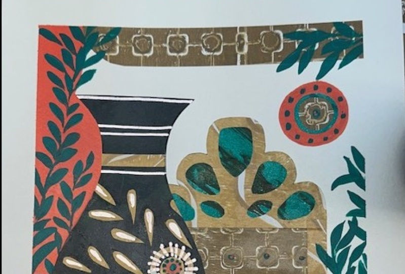
8. Creating the Picture: I'm ready to start
my painting now. I've got my reference picture. I've got my little
thumbnail sketch of the layout. I've got some paper. I've got my selection of paints
that I've chosen to use. I've also got a paper
palette next to me. We've got a selection
of brushes, one of which I'll
use for gluing. I've got a nice wide brush that I might use
for some texture, A pair of scissors ready to cut all my papers
that are beside me, and some map medium,
which is what I like to use for gluing
the collage down. First of all, I'm going
to take some of that blue and squeeze a bit out onto my palette along with
a little bit of white. I'm going to use
this paint color and a medium sized
flat head brush. I'm going to mix a tiny bit of that white in with the blue just to make it a
little bit lighter. I'm going to draw out roughly my layout in
a very simple form, using lines to get my
bearings with that vase. I'm going to start painting
in the vase shape. It's fairly simple shape. I'm not going to put
all those details in. I literally just want to put
in the shape of the vase and then I'm going
to think about the other elements that
could influence the picture. I'm just going to put
those lines in so I know where to put some
pattern on the Vars. And I'm going to put in
the background as well. I like those tiles that
surround the Vars. I'm going to just
suggest a border of tiles because it's
set in a recess. I might put a couple of lines in to suggest the background. Going further in. I love that plate as well, so I'm going to do that
semicircle at the top. I think I might put
this rectagonal in. I'm not quite sure I'm
going to put in it, but I'll come to that a bit later when I've
started with some collage. Next I'm going to take, this is the lightest
blue I'm using, I think I want to put it
across the top of the vase. To do this, I use a pencil and
place it over my painting, and draw round where I think the vase is going and
then cut that out. So I'm just going to. Yeah, I'm not convinced
that's quite right actually, but I might recut that. I'm also going to do
a bit of pattern. I'm reflecting that pattern
that's in the vase and I quite like that shape,
what you call it. I'm going to just the outline
of it out and place that. They've got quite a few shapes
like that around the vase, but I don't feel the
need to put them all in. I just like referencing
that one shape. And I think I'm
going to cut a few more little bits out of this blue and put them in some of the areas just underneath that
main bit of the vase. Another bigger bit, I'm
going to have two of those. You can see how simplified I'm making it really
not getting bogged down with lots of tiny
detail yet you just use a instinctive
approach to this and look at the shapes that you
like and then cut them out. Obviously with
collage, it's quite difficult to get very
intricate shapes. I'm not going to attempt that, but we will use paint on top of it to suggest more detail later. I'm just getting a rough
idea of some shapes that I like from the original
and cutting these out, sticking them down on
my collage initially, obviously you can go back to paint and then do more
collage on top of that. There's no rules
to this making of a still life picture quite
like the look of that. I'm not convinced
about that bit. I don't think it's
quite big enough. I see too much of the paint
coming through underneath, so I'm going to just
use it as a template, cut round it, slightly bigger. And that should, I think,
look a bit better. Yeah, that's better like that. I'm using just an old
to put the glue on. It's quite thin glue. It can be a little bit tricky, but I prefer this
kind of glue because it's matt so it doesn't leave any sort of gloss
on the picture. I'm sticking all
those bits down. Next, I'm going to use
some of that orange paint. My plan is to just paint
in the background. I think to suggest
where in the picture, you'll see that in the recess, it's a yellowy color. But I'm going to choose
to use the orange. I'm painting around
everything at the moment, quite sure what I'll do in
that strip behind the bars, but think I'll suggest some
more orange down the bottom. I might leave a square
to put something else in onto that purple color. I think I might use this big wide textual brush and just do a swipe of purple down the
length of the painting. Like the, the stiff brush
gives a nice effect. It's quite a nice contrast
to the flat orange, I think. Now I'm going to put a bit
of detail in the vase. Going back to paint using
that same brush, again, I've just look at the
picture and pick out some areas of pattern that I quite like and
I'll just copy them. There's, there's so much
pattern on that vase. I'm not going to
try and do it all. I'm just using the brush to get some interesting
areas of mark making. I do quite like that shell like area at the
top of the vase. I am going to replicate that. I quite like the
way the texture of the paper underneath
shows through. I like spiky fronds with
leaves on the end of them. I don't quite know
how to explain them, but I do quite like those. I'm going to put those in next. I'm going to use a bit more of that collage paper in pale blue. I think I want to do a little tile using that same shape that
I've used on the vase. I'm going to reference
it in this tile. I quite like tying things
together in a picture by similar pattern or imagery,
but in a different way. I've cut out that tile shape. I quite like the way it
sits over the top of the orange and partially
shows through. I'm going to stick that on. It's always good to save
those bits that are cut out in case you can use them in another area in the collage and keep
those references going. And it gives it more of a cohesive feel to
the end artwork. You've got a bit of white
there and more of that blue, just to give a bit more
detail into the tile. And I've got a pale
of blue that I've mixed to give a little
bit more detail. Now I'm going to use some
of the darkest colors. And I've gone for this, I
think it was a pain gray, but it's a dark navy color. I feel like I need
some darker areas. I'm going to start by cutting a strip out to
go up the side here. And what my plan is, is
to replicate or reference those tiles that are around the alcove with
the vase in the picture. I quite like the way they look over the top of that purple. But again, I'm going to cut
out the middles of them. They'll just be quite
geometric cut out squares all the time. I'm just looking for
imagery that I can slightly alter and use in my pecture
in a more simplified manner. I'll glue them all down. I've saved the centers of them just in case I want to
use them somewhere else. I quite like that
really geometric look contrasted with the more
detail in the vase. Now to put something in
that oblong that I've left. This is quite a similar purple to the one I've used
behind the squares. My plan is to stick a
column of purple there. And then I'm going to
use some orange paper and use geometric shapes, This time a circle that I'll
join together and cut out. I quite like that
rather retro shape. I feel we're getting
somewhere with this picture. I quite like the feel of it. Now I want to represent those little blue oblong tiles that are in the reference photo. I'm just going to use paint and paint them in behind the vase. I want to leave white
in the picture. I like that contrast with
the paper showing through. I'm not going to
fill it in totally, maybe just reference one to reflect the others
at the bottom. I also want to get
that plate in. Obviously, I've left
a semicircle at the top quite like the effect of that plate of hanging there. I've got a paler blue and
I'm going to just reference that shape again in the middle
of the paint plate rather, And a few more little details. Now I feel that one of those squares could sit
up in the far corner because that's a
bit empty then that keeps that square
reference going. Yeah, quite like that. It's
quite interesting layout. Now I might put a little
bit of detail in with my white Uniball pen just to make things show up
a little bit better. It's up to you how
much detail you want to get into when
you do these things, but I quite like the fact that that vase is
got quite a lot of detail. I'll just make those squares a bit stronger down the side. Yeah. I feel like we
need something just a bit stronger in that
dark blue across the vase to balance out the depth of
color in the picture. Just a couple of strips I think will do so. That's my picture finished. I'll recap on some of the
things that we've covered. Use the patterns and shapes from your reference photo,
but simplify them. Echo shapes and patterns so your artwork has
a cohesive look. Contrast paint with
collage cut paper against brush marks. Use a variety of tones, lights through to darks, and let some of that
white paper come through. Keep the shapes left over
from your cutting out and try to incorporate them
elsewhere in the picture. Don't go right up
to the edge with your design and leave a border. There's the painting finished. In the final lesson, we're going to have a
look at what we've covered and what we've
made. See there.
9. Final Thoughts: Well done for watching
the whole class. I hope you've enjoyed it as
much as I have making it. I'm really pleased with
my finished artwork and it's in a frame
on my studio wall. The small square
sketchbook exercises I show you are
really fun to make. How about using the
same idea to create small square artworks
that you can mount on a card and
use as greeting card? I make these quite often and use them to send to
friends and family. It's a great way to give a very personal card as well
as sharing your creativity. Watch my bonus lesson after
this and see how I make them. Let's recap on what we've
covered in the class. I've shown you the materials, I use, the different methods
to make collage papers. I like subject matter
and inspiration, how to choose a color scheme,
some method exercises. Finally, my process for
creating a piece of artwork. I want to encourage you to go at your own artwork in
college and gouache. Please feel confident enough now to try the class project. I'd love to see what
you can produce. Once you've done
it, don't forget to upload it to the project. This class is part of a series
I call the Gouache Files. If you've enjoyed this one, take a look at the other
classes in the series. Please hit the follow
button here on Skill Share and you'll be notified of any new
classes I make, as well as my
newsletters I send out. You can also follow
me on Instagram, Pinterest, and visit my website to see what else I'm up to. Thanks for watching Happy
Painting and see you next time.
10. Bonus Lesson: In this lesson, I'm going
to show you how I use the same method for making
the exercise squares. But this time I cut them out and mount them
on a greeting card. It's a similar intuitive process using gouache and collage. So have a watch, and I
hope you're inspired. What's a bit downward
step this way? Chasing stars and holding. I can't see it again,
but we'll see it. Dangerous times, don't fly too fi Sure to keep
the loud in sight. Fly for hand, to keep it tight. Love the well to keep the sky.
 Kate Cooke, Textile Designer and Illustrator