Transcripts
1. Introduction to Landscape Photography: Photography is such a creative
and fulfilling hobby. It feels amazing
when you can capture the beauty of this world
in a single frame. But when you stand there high on a mountain looking
at the beautiful, stunning landscape
around you and snap a picture of what you see,
you feel disappointment. This picture doesn't
represent what I'm seeing, and it's easy to blame
the idea that it's impossible to capture this
environment and a photo. Well, as of now, we're
going to stop doing that because it is
possible. In fact, right techniques, we
can make our photos look even better than
the real deal. Hi there. I'm Jordi, a professional
filmmaker and photographer, but chances are you've already
seen my face on YouTube, where almost 3 million
people subscribe to me to learn about
this creative world. Now, for the past years, I've been traveling
around Europe, seeking out the most
beautiful landscapes to capture those
moments with my camera. If you're getting started
with photography, landscapes are the
best to get into because it's all about
creative skills. This means that you can follow this course using a
professional SLR, an old analog camera with one of those film roles or just
your phone because 90% of landscape photography
is all about finding the right angle and creating
an interesting composition. You can do that with anything
that captures a picture. That's why in this course,
you're going to see many examples where I used
my professional gear, but also just my smartphone. We're going to take a
look at a lot of examples and learn about
framing, composition, techniques like the point of
interest and leading lines, but most importantly,
visual storytelling. By the end of this course, you'll know exactly how to
frame that beautiful landscape in front of you so that you can be proud of the
photo that you took. So join me into the world of landscape photography where you don't need to worry about
the technical stuff, but focus purely on
the creative site. I am super excited to share my professional knowledge
and experience with you, so I hope to see you
soon in my course.
2. The Rule of Thirds Composition: Oh, hey there. I am so excited
to see you in this course, and I can't wait to
teach you everything I know about landscape
photography, which I've been doing
for over ten years now. And what started
out with me taking a large and heavy
backpack shirt into a single camera and very
often just even my phone. So I recently went to Austria as I wanted to make photos of
some really unique angles. The best way to do
that is to put on your climbing gear and
get into the mountains. So all I was able to take
with me was my phone. However, I took some
gorgeous photos, and that's all
because I'm applying a creative set to my
landscape photos. And once you understand
these creative tricks, you can make great
photos with any device, and those great photos start
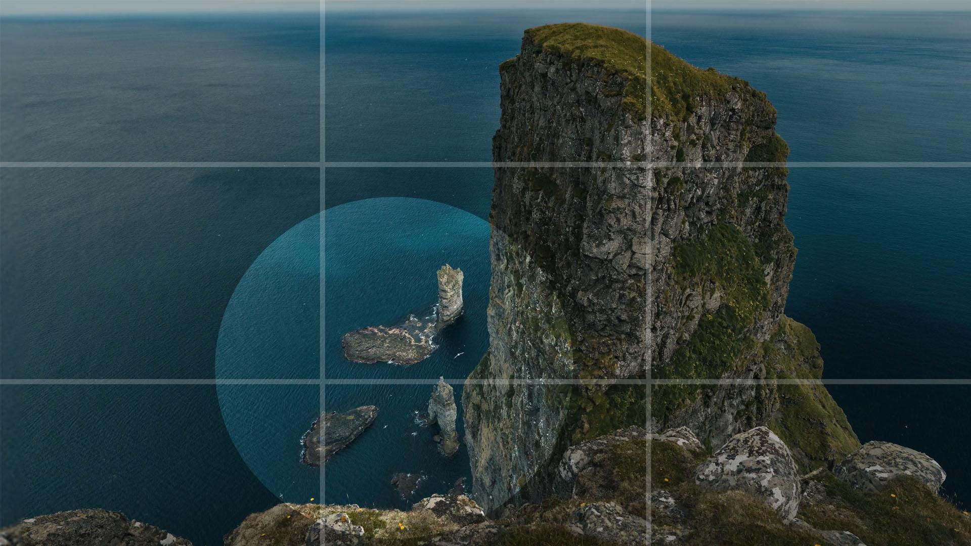
with a rule of thirds. You want to take a picture
of a big rock in the ocean. You know, you can place it in
the middle of your frame on the side or you can tilt
your camera up or down. But where is the best place
to take this rock from? Well, let's divide the
frame into three parts, both horizontally
and vertically. You'll see this grit, which
you might be familiar with. It's a grit that you can overlay on most cameras and
even your phone. Just go into the camera app
settings and look for grits. When you're just
getting started, it's best to keep
this grid enabled. The more you get familiar with
the rule of thirds and it basically becomes autopilot,
you can disable it. The idea here is that we look for elements within
the photo and align these to either
the guidelines or where the guidelines cross. So for this rock, which is the main subject or the thing
that I'm trying to capture, I'm looking at one of
the vertical lines because the rock is tall. This is by the way, shot in the Faroe Islands
beautiful place. Now, what site is it going to be on the left
side or the right? Well, let's look at what's
happening in the empty space. Here we can see both examples. I think we would all choose the photo where the
rock is on the right, and that's because we still have something going
on on the left side. We got these small pillars
coming out of the water here, while on the other photo, it's just empty and we can see that we're cutting something
interesting off over here. So that is the first question that you need to ask yourself. Which side of my subject
is the most interesting? Alright, now the
horizontal alignment, and this is exactly the same. You want to show the big rock. So obviously, we're not
going to give the space to the sky unless there is something really
interesting going on, like a cloud formation,
the northern lights. But it's not in this case. So I'm going to
align the peak of the mountain to
the top guideline, and you don't have to stick it to that line. You can
move it a bit up. Make sure that there is still
some space above the rock. I'm looking here at the top of the mountain that I
can use to align. This entire plateau here is
the top and there we go. This is a balanced photo now
or better set a composition. As a photographer, you're
always creating a composition. Now, throughout this course, we'll look at a ton
of more examples because every photo is
a little bit different. Now, for instance, this one, also shot in the Faroe Islands. Now, we're not really
seeing a tall object. Everything is more stretched. This mountain bank
is pretty long. We got the waves on the water, which are stretched as well. Now, we do see these rock
pillars again in the but they're very small
and it's really hard to make it the main
subject of the photo. So let's start with the
horizontal lines this time. Now, this photo actually
gives me a great opportunity to align the horizon on
the horizontal guideline. I mean, it shares the name. That way, I'm using
the bottom part of my frame for the ocean waves, the middle for the mountain, and if we frame it
so that the peak of this mountain aligns with
the top horizontal line, we have space for
the sky, as well. So we're using that
grid to nicely divide the different
elements in the picture. What I like as well, is this vertical slope
in the mountain. We can align that to the left vertical line
as that still gives enough room for the
pillars here and fills up the rest of the frame
nicely with this bank. We got some beautiful
sunlight on it, so it gives the viewers
something to look at. This is a photo
where you can really take the time to look at. There's so much diversity going. Let's have a look at another
photo, this one right here, which is one of my favorite
photos which I took in a Lava desert
in East Iceland. It's a very simple picture. Looking at the grid,
we're going to start with the
horizontal lines again, and there is not much going on. So the only visual we can
use is the horizon itself. And now we got to ask
ourselves the question. What do we want to show? Or it's the dramatic cloud? Then we align the horizon with the bottom guideline or the empty vastness
of the lava desert, then we place the
horizon on top. There's no right or
wrong answer here. But as the photographer, you got to ask yourself,
what am I trying to capture? And as you visit these places, it's usually going to be what
you're experiencing there. I was stunned by the black and
white view of that desert. I had to rub my
eyes for a moment as I thought I'd lost
color in my vision, but it was that moment
that I wanted to capture. Alright, and now the
vertical guidelines, there's not really
something that stands out, except for this hill
in the far back, but the hill is not taller
than anything else. There's nothing special going on on the left or
on the right side. So here we can opt for
a center composition. We just ignore the
vertical guidelines. So even though the
rule of third splits the image into both
vertically and horizontally, we don't always have to
use every guideline. Alright, one more photo before
we move to the next one. This is also from the
same Iceland trip a bird. But there is so much more
going on than just a bird. We also have this slope of
the mountain over here. What I absolutely love
about this photo is that both the seal and the slope
are parallel to each other. And as I talk about this photo, we start to realize
what the subjects are and the way that
we want to frame this. Now, the bird will be placed on the intersection of the
top horizontal guideline and the right vertical guideline because I want to make room
for the mountain slope, both vertically
and horizontally. In fact, I'm actually
going to align the slope on the
opposite intersection, and doing this creates a
very balanced composition. And of course, I was
not able to align these elements so
perfectly on the spot. I took about 1,000 photos here and only two
came out great. Afterwards, I had
to crop and move the picture around to align it better to
the rule of thirds. So if you're into
wildlife photography, know that it's
something unexpected. Look at places where you have the ability to shoot
hundreds if not thousands of photos because unlike a big rock in the ocean, you cannot control
a flying bird. Thank you so much for watching, and I'll see you back
in the next lesson.
3. Breathing and Viewing Space: We've seen how we can use a grid to align different
elements in the frame. And although that rule of
thirds is a great tool, we shouldn't always
follow it so strict. Let's have a look at this photo. This was actually
another project that I was doing in Iceland. The idea was to shoot on
black and white film. Now, unfortunately,
the development of the film completely failed, and I think it has to do with
the Xray at the airport. I'm not sure. Now, luckily, I also took a whole bunch
of photos with my phone. But to stay in that same feeling of the black and
white photography, I also took away the colors of my photos in post production. But that's for a
different course. Let's have a look
at the composition. When following the grid, there are a couple of
things that we can do here. We can place the horizon
on the upper guideline, which, in theory,
should be correct. But as you can see,
this rock formation just touches the
top of the frame. This is something you
always want to avoid. Either cut off a good chunk from an object or you leave
some breathing space. This is some empty space
around the object. You give it space to breathe. So this photo is suddenly
much more balanced, even though we're not making
use of the upper guideline. Now, the same thing
occurs on the sites. Again, in theory,
we should place the left guideline on
the tall rock formation. Now, this cuts into
the rock right here. Luckily, the rock
doesn't stick to the frame as we had
with the big rock. It actually cuts
off from the frame. So this is not really a problem. Now, in fact, this is
considered a good composition. However, and we'll get into the point of interest in
one of the next lessons, but leaving breathing space
on the right side and not following the guidelines
exactly is also good. Now, there's one last
thing that I want to do, and that is look at
the bottom guideline. By theory, we place the bottom guideline to the end of the
rocks in the front, you know, kind of following
the horizontal shape. But we got to ask
ourselves if we need to show more or less
from the bottom. It's all rock. There's nothing to
give breathing space. So we could place the bottom
guideline on the horizon, but that cuts into
the bottom rocks. We're showing it barely. Like, either show
an object or don't, but don't try to do
both at the same time. So in this scenario, placing the bottom
guideline on top of these rocks is the
best thing to do. Alright, let's look
at another example time, we're in Normandy France. It was 80 years ago
that D Day took place. So I thought this was
a great opportunity to go there and capture some
photos for this course. And I know it's a
little bit different from landscape photography, but if you're on a trip and
there's some events going on, you probably want to make
photos of that, too. And you can still try to
utilize the landscape, which I did over here,
both a beautiful location. Plus, we have all of these
silhouettes that present the soldiers that gave their lives during
the Second World War. With a photo like this, we're already stepping into
visual storytelling, which I've got a
lot to talk about, but that's for later
in this course. So back to this photo over here. For starters, we want to cut
off a piece from the right as we don't want these cars in the back to be on the photo. Now we're left with
a couple of options. Do we place the
upper guideline on the horizon and cut off
a bit from the bottom? Perhaps align these
with the wheels? I love that we can place this intersection
on the front wheel. The front of the car then
aligns with the left guideline. This all here makes sense, except maybe for
the big empty space we have in front of us. We're learning about
breathing space, and we have that all
around just a bit too much on the front, or is it. You see, we're dealing
with a moving object that clearly has a
front and a back. Even if it were to stand still, we would still know
where it's facing to. And whenever a person or an object is facing
to a specific site, we can give more
breathing space. We also call this
the viewing space. So this makes a lot of sense, and we end up with
a nice composition. Within the same photo, different compositions
are possible. There are wrong ways to do it, but there are also multiple
right ways to frame. I eventually went to
crop my photo like this, and we we think it's wrong, too much space on top, but I did follow
the rule of thirds. I placed the horizon on
the bottom guideline. I put a prominent front wheel
on the right guideline and made sure that we had viewing space in
front of the truck. The space above is a choice that I made to tell a visual story, but that's going to be for later when we'll come
back to this photo.
4. Center Composition: So we've been learning that
there are tools like the rule of thirds that help us
make a better composition, but it's not something that
we should limit ourselves to. We don't have to make use of every single guideline,
as I said before. Sometimes things like a bigger breathing
space takes over, and that's what
photography is all about, understanding the basic rules and knowing how to
bend those rules. My favorite lesson is
all about storytelling, in which we'll explore
this a whole lot more. But first, let's talk
about center composition. So why do we place our subject in the middle
of the frame? Very simple. And yes, it's going
to be a short lesson. Well, it's to draw all the
attention to the subject. This right here is Kim. My wife and she also
helps out in my business. And I asked her to stand here in the lava desert of Iceland. It's a very cliche photo, which you'll see everywhere. But as a beginner, it's
important that you do try out these cliches because they
work it's a good photo. It's not great because
of the cliche. Everyone has made such
a photo, but it works. Now, looking at the
rule of thirds, we got the horizon on
the top guideline, and Kim is standing
perfectly in the middle. Now, she doesn't look
to a specific angle, so there's no viewing space. She stands there
looking in front of her to the landscape around her. I'm already getting into
storytelling a little bit here, but seeing that she is surrounded by the
barren landscape, we visualize that by placing
her in the center way she's literally
surrounded equally by both sides by the landscape. Here is another example of a
photo that I took in Norway. And again, it's a cliche. Definitely professional
photographers will say it is not creative, but the biggest mistake that
you can do as a beginner is going too fast and try
to step over these cliches. Are there because they work. So make sure that you've
taken your set of cliche photos before you're
going to try and avoid them. You can see a clear
similarity here. We again have a
very vivid subject surrounded by more
neutral colors, and it's that idea why we
place the canoe in the center. All the attention
should go here, and the rest is just
background, nothing more. One more example. This
time we're flying back to the Faroe Islands
and look at one of my favorite photos
from that project. Now, there's a whole
lot more going on in here than just a
center composition. But let's only focus
on that for now. So we're looking at the
mountain in the far back. That is the element
in the center, and as we've learned by
placing object in the center, we draw attention to it. We did that before with two
very prominent objects, but this time, we're
doing the opposite. The rock formations in the front are not just
background elements. They are stunning to look at. They draw atten what I
wanted to do with this photo was draw attention to a faded
rock in the very far back. You can barely see it, and by placing it in the center, you're forcing people
to look at it, but their eyes are kind
of pulled away from it because of the other cool stuff that is going on around it. By making such a composition, we're letting those that look
at the photo wander around. This is a photo you
tend to look at for much longer than something
that we've seen before, because we're doing
a contradiction, placing a vague object in
the center of the attention, surrounded by these
amazing rock formations. Alright, the next one, we have a beautiful landscape here. I wanted to draw the
attention to the Segel first and haven't me
surrounded by these cliffs. The idea here is
the same as before. This time, we're
actually placing it in the perfect
center of the frame. So a center composition isn't always perfectly
in the center. It depends on what's going on in your photo and whether
or not it needs to be placed more on the top center or on the bottom center
or in this case, in the middle center. And I want to show you
one more example back to my Iceland project where I wanted to shoot
in black and white. Here is my dad at the beach picking up
pebbles and stones, and I really like this one. I opted for a center composition here because I again wanted to surround him by the beach
that has millions of pebbles. My dad is there in the center looking for a needle
in a haystack. I thought it had
something wholesome, but that's the reason why I opted for a center composition. With every photo, you need a reason why you're framing
it the way you are. Now, center compositions
is not the only trick in the book to draw attention
to a specific object. There is more, but that
is for the next lesson.
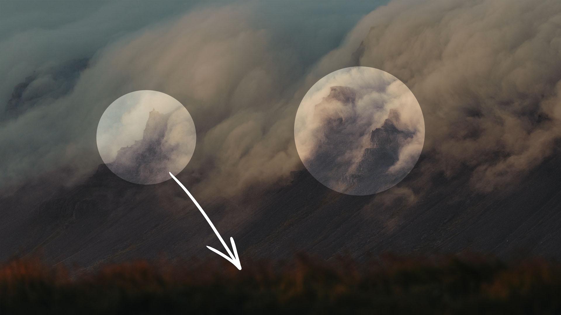
5. Point of Interest: Point of interest. Now, we're
already creating a point of interest in a center
composition as we've seen before. It's the point
where the interest lays the point that
draws attention. And starting off with
this example right here, it can be done very simply. There's not much going on. We got the dark ocean, a wave, and a bird. Bit stands out because it is much brighter than
the dark ocean. So it draws attention. This right here is my point of interest. It's that simple. So use your background
and your subject to see if you can make it pop out
and be the point of interest. Now, that point of
interest doesn't have to be a small object. Taking this idea about contrast, we can apply it to
something much bigger. Now, in this photo right here, the rocks in the front are so dark that we don't
even look at it. All the attention goes
to the back where the sun is hitting the
slopes of these mountains. That is my point of interest, or we could say
region of interest. Just like with the mountain in the far distance that we've
seen in the previous lesson, we can obscure the point of interest to make the
photo a bit more fun. And in this photo, right here, we are literally covering
up the point of interest, but it still works, and it's all because of detail or texture. The clouds are soft. They got generally
the same tone, just as the slope of this hill, which is also just
a dark smudge. Definitely, the grass in front
is out of focus and dark. And a contrast occurs where the bright clouds collide
with the dark slope, and we can see some of those rocks sticking
out right here. This is our point of interest. Because of that contrast, this is the exact same idea as the bird flying over
the dark ocean. Now, that grass in front
has another purpose. We can feel that we have
two different layers, the grass in front and everything else that is
going on in the back. I took a different photo
from the same angle, but it doesn't have
that same depth as the previous one because it's missing that layer of grass. Having soft out of focus
objects in front of your lens helps the viewer to look at what's in
focus in the back. We are guiding the eyes of
the viewer to the point of interest using that
very simple technique. And this here is another
example of that. The branch here out
of focus in front of the lens helps to guide the eyes to the
point of interest, which is the sunlight
breaking through the clouds, lighting up the rock
formation over there. General, there are things that just draw attention regardless. Contrast or an object with vivid colors is
one of those things. But another one are faces. Us humans are instinctively
drawn towards faces, even if it's from an animal, like in this picture, I love how the one in the front
is the point of interest, as it's the most prominent. But as we look around, we
get drawn by a second face. So a very fun photo. It could have been
better if the faces would line on the rule
of thirds better, but in moments like these, you got to be fast. Now, what if we want
to draw attention to something that doesn't
really stand out? There is a great
technique for that, which is going to
make our photos stand out professionally, and I'd love to talk about
that in the next lesson.
6. Leading lines: Leading lines, an amazing
composition technique to lead the eyes of the audience
to the point of interest. And this is a technique
that can be applied on top of the rule of thirds
or cener composition, but we'll look at a
bunch of examples to understand this better. Alright, we're back in Iceland, and we're looking
at a photo where we see a power plant in the back. They are making electricity from the geothermal
activities there. So this water is
actually pretty hot, and the fumes in the back
are pure water vapor. But it is very small. It wouldn't really
draw any attention. However, we have some
leading lines going on. Shoreline here is a
clear wine with lots of contrast and leads
to the power plants. So even though this foam here might draw
attention at first, it will lead the ice to where
I want them to look at. And as you can see, we follow the rule of thirds, as well. I place the factory on the left side because the
water plume goes to the right. Therefore, I wanted to
give some space for that. We could say viewing space to and here is another example. The waterfall in a distance creates this very small river. I'm using that river to draw
a line to that waterfall, and this is a very playful photo because it's not just
a straight line. We guide the eyes
of the viewer over the entire photo as
we zigzag through it, eventually ending up
at that waterfall. Which is hidden in the
back behind these clouds. This over here is a photo that
I took in Normandy France. It's the Mont St. Michel, if I pronounce that right
with my best French. And we went there hoping to snap some great photos,
and fortunately, it was very crowded there, so I wasn't able to shoot
that much or anything. Anyhow, there's a long bridge
leading to the castle, something perfect to make use of for creating leading lines, especially at a
distance where you can't really see the
castle in detail. And here is another one from
Normandy that I really like. I'm using this
wall right here as a leading line towards
the sculpture. I guess we understand the idea now behind
the leading lines, a visual line that leads towards the main
subject. So look around. Do you see any
cracks in the floor? Maybe that can be used as leading lines,
as in this example? Great, then use that. Or
is there a nice texture on an object that you can use for leading lines
as in this photo there aren't many lines, but
they act as leading lines. You know, even the
star of the sun right here helps with
those leading lines, they are in the same direction. Now, perhaps there's
something bigger going on, requiring you to climb up to a rock to find that
specific angle, which lets you see an
interesting leading line. Leading lines are everywhere. You just got to look around.
7. Creating Depth: Someone looks at your photo
for longer than 5 seconds, it means that you did a
great job as a photographer. You were able to
capture their interest and let them explore your photo. Eventually, that
is the goal that we have as a photographer. And so far we've
learned that there are several tricks to do that. A well balanced photo, aligned to the rule
of thirds is a start. It gives the photo a
thought out composition which makes it more
pleasant to look at. Playing around with the point of interest using techniques like center composition
or leading lines is another great trick. We can use a leading line
that crosses an entire photo, we help the audience explore. And that's what you want to achieve that people
see your photo, explore and find interesting
elements along the way. So that's why I want to talk about creating depth
in this lesson. It's another one of
those techniques that lets your audience explore. And I'd like you start off with a very simple example,
this photo right here. We've already seen this monument
in the previous lesson. This photo is just from
a different angle. And I also encourage
you to do that. If you're at a certain location, see if you can take
different kinds of photos from various angles. Anyhow, we have two elements
in this photo right here. The sculpture in the back and the grass in the foreground. We have a very prominent
foreground object. It draws so much attention. You're not only looking
at the sculpture anymore, but also at the grass and the wind that is
going through it. I love how this grass field
is so dense and green, and that's what makes
it interesting. If you were to crop
the foreground off, you'll only have the sculpture. In a couple of
seconds, you've seen a photo and you swipe
to the next one. With the added foreground, you look at it for a
little bit longer. Alright, this here is
another photo from my failed black and
white film photography. So I took this one with my phone and turn it into black
and white afterwards. We have two distinct
areas or elements, the hill in the back
and the rock in the foreground that sits in this lake at the
bottom of the crater. Even though the photo is
about the backgrounds, the foreground is so
prominent that it gets your attention and you're
exploring the photo. This one right here is
similar shot in Norway, and I love how this little
waterfall in the back is so subtle when your eyes
eventually do get drawn to it. We got two distinct
areas in the photo. Now, I also want to
show you a bad example. Take a look here at this photo. Unfortunately, a glacier in Norway that is melting
at a rapid rate. You know, this
might be one of the last photos ever taken of it. But you see these
rocks in the front, I could have made a
much better composition if I were to stand a
bit more back and in the water so that they'll have more breathing space and better aligned to
the all thirds. Then those rocks would
have been more prominent, and we would have gotten a bigger difference between
foreground and background. Alright, here's a photo where we combine a few
techniques together. Starting off, we have a center composition
on the subject. Kim, my wife, we're climbing
a mountain in Austria. Anyhow, she stands out because she's wearing
a red helmet, a color that doesn't
come back in nature. I specifically chose this color when I bought our climbing set. I knew that in a lot of photos, she would be in the back, small, so I needed something to make
her pop and draw attention. Now, we also have a leading
line going on here, which is this art, but also
the rock formation itself. I leaned the ice to the subject. This whole area here acts as a foreground element
at the same time. But as we look further back
and explore the photo, we can find a small
church in the woods. That's a fun surprise, and this makes the audience
look longer at such a photo. By the way, I took this picture with my phone as well because obviously I didn't want to take my heavy gear with
me on this now going back to the Faroe Islands, I came across this
incredible opportunity where four cliffs
aligned together. And just to give you an idea, this is where I was standing, I found that spot
by walking around. So always do that if
you're at a cool location, walk around as much as possible to find that holy
grail position. Anyhow, we have a foreground, but also a background that
draws a lot of attention. And as we look around, we see a bird in the sky, a small detail that adds
so much more to the photo. Nothing near is
photoshopped, by the way. I don't ever do that
with my photos. Not that I'm against it, but I just want to
show a moment in time that I actually
experienced myself. It would be cool if we had two Eagles fighting in
the sky over some prey. And you can photoshop that in and have an incredible photo. But it's up to you
if you want to bring out a photo that captured a moment in time of your life or a photo that tells
a fictional story. Side story, we actually shot a movie here in
the Faroe Islands, and on that same location, we had a model standing
in this cliff and a bird came by just
flying around her. It was an incredible
epic moment. With that story, I want to jump into the last lesson
of this course, which is all about storytell.
8. Visual Storytelling: One of the biggest
differences between photography and video or
film is that with a photo, we only have one still frame
that needs to tell a story. When watching a video, you have multiple actions,
sound and music. Basically, so many
tools to tell a story. And you might think
with photography, it's almost impossible
to tell a story, but in fact, it is not. The way you set
your composition, the angle you shoot from, lighting and whatnot,
tells a story. I want to start off with
a relative easy example. Taking a look at this photo, we don't only have a landscape, but also a person. Adding a person into your
landscape photos helps to tell a story because we
can use their body language. This is Kim sitting
in the grassfeld on top of a mountain. And I'll just describe
what I'll see here. She is relaxed, maybe
resting after a long hike, because I can see that
she's wearing a backpack. She's also looking
into the distance, gazed by the beauty
of the landscape. There's a subtle
bird in the back. Where it lives, and Kim
is visiting that place. As I just described what I see, you can already tell that
there is a story going on. It's very relaxed and with
a lot of respect to nature. That relaxed feeling is all because of Kim being
in that photo. Now, I want to show
you a similar photo. Again, a landscape Kim. This time, she's standing up, wearing gloves and a
cap over her head. Her arms are a bit spread showing that she needs
to keep her balance. This setting is an interaction
with the background, which are these mountains
and especially the clouds. It's also darker. So immediately we understand
where the story is going to. It's not as relaxed. We're visiting
unknown territory. We might not be welcome here, and the hike to this
place was not as easy. We're unbalanced in this place. At age person is a great way
to help tell your story, but as you can see, it are subtle things that
help tell that story. And to show you
how a subtle thing can change the entire
mood of a photo, I want to look at this one here. Again, the hiker
is going forward. He's holding his backpack tight. This tells that he needs to stay focused and keep
on going forward. It makes the surrounding
seem more dangerous. Now, I took a bunch of photos
from that same action, so I could pick out
the best afterwards. But here you can see
the exact same photo, but instead, this person is now facing the rock
formations in the back. He is standing more relaxed, and we can't really tell, but he is armed up indicating
that he might take a picture or is holding
some binoculars. Anyway, the surrounding
is immediately less dangerous because of the way
that the person is standing. So adi language is an interaction
with the surrounding, and the way you make
your subject react to the landscape defines how
the audience perceives it. I want to show you one last
example with a human subject. I took this one with
my phone in Iceland, and before I talk about skin, let's first be aware of the
perspective of the photo. Shooting this from
a very low angle, trying to capture both
a foreground rock and the top of the waterfall. We're looking up
to the waterfall, both literally and figuratively. Looking up to something or somewhat means that the
subject is important, is great, is amazing. Even though this waterfall was not as imposing as most others, I made it a lot bigger and wilder because I shot it
from a very low angle. And again, I added Kim in there. She covered her head and
is wearing a backpack. She's crouching down, so
this all indicates that she needs to protect herself
a bit from the waterfall. However, she's able to come close like she's taming a beast. Even though the
waterfall is deadly, she did find a way to make
it friendly with her, but she has to be cautious. Kind of reminds me of the
beauty and the beast here. And I have a similar photo where she isn't
wearing a backpack. She isn't covering her head. She stands strong with her
hands close to her body. And even though we perceive the waterfall as something mighty because of the low angle, she stands really strong in
front of that waterfall. This tells us more about the person rather
than the waterfall. So the focus here
is very different. Again, subtle things
and body language, which could turn
around the story. Now, of course, you
don't always need a person to create an interaction
with the surrounding. Looking at this
photo, it might take some time to notice this
small house right there. Now, because I shot this with a white angle from far away, the house appears small, almost unnoticeable
within this landscape. That's an interaction. The house now appears as in a remote place overtaken
by the landscape, which is beautiful, but also something to be careful with. The clouds help to
make it more dramatic, but if we live
here, we got to be careful and obey the
rules of nature. You can see how the roof of the house is even
covered in grass, as if nature lays her hand
on the house to conf no, it goes very far, but this is the story what
the photo tells, and it usually translates
into a feeling that we get a subconscious that
tells us that story. When I showed this
photo to my friends and family, they all
said the same thing. Their first reaction was, Wow, what a beautiful landscape. And then they noticed
a small house, and they would all
say the same thing, like, Oh, wow, what a
cute, tiny house there is. The surrounding nature is so, much bigger, has such a big
impact on that tiny house. It's that feeling that they get. The story that I wanted
to tell has come across. I've got a similar
photo right here. I specifically chose
to have this fence in the foreground in
focus and background, even the house out of focus. And because of that,
we are at a distance. We are locked away because of
that very prominent fence, like we cannot help
the house anymore. It's completely
overtaken by nature. And that's not
always a bad thing. People that love
nature see this as a calm relaxed photo where
human is one with nature. If your viewer also wants that, they might have a
jealous feeling because they're locked
off by that fence. City people might
feel more safe here as they are scared to be
taken over by nature, a story that can differ depending on the background
of the audience. So what should we do
as a photographer? When you come to a place and
see a beautiful landscape, stand still for a
moment. Look around. What emotions does it give you? What does the
landscape tell you? Are there elements
like the weather? Maybe something you see in the distance that can
add to the story? Think of something that you want to tell through your photo. Now, go and find the right
angle to tell that story. Can you use foreground objects that have an interaction
with the background? Maybe at a person. What body language do you need? Take some time to
think that through and just describe what's
going on in your photo. So in Normandy, I took
these two photos, which are quite similar. You can see that
the breathing space on top is way too much. However, I chose to keep that in because it helps
me tell a story. Even though re enactment, let's assume that
these are soldiers, sergeants, generals, veterans. They have a status
that we respect. They fought for our country, and that's why I
want to give them a lot of space above their head. It's space that
they used to think. These are smart people. Achievements are high,
as high to the sky. The rules of
photography are there to help us create a
balanced picture, but they can also be there to unbalance a photo
and tell a story. We've learned that we
should place our subject on the rule of thirds and have some viewing space
in front of them. So this photo over here
seems to be wrong. However, I've broken the rule because I wanted to
tell a visual story. Kim here doesn't have
any viewing space. This means that she doesn't
know where she's going, or she has trouble
going forward, and that makes sense
in a photo like this. It makes the climb harder
and more challenging, and we show on the left
side what's behind her, the paths that she already took, which are the rural mountains. Framing it this way helps
me tell that story. On top of that, I focus less on Kim and more
on the landscape. Keep in mind that
she's already standing out because of that red helmet. Now, here's another one
that I absolutely love. With her back to the large
space, the rocky slope, the fog that is setting
in from behind, she needs to be fast, but she's struggling
the way she poses. Now, it's different
from this one, where her body language
is more confident, which, again, reflects
on the environments. We show an open, large area. She is surrounded by the
dangers of the mountain. Again, different from
a photo like this, here she's also struggling, but we're closer to her. She doesn't seem to be alone, so there's less danger. Plus we don't emphasize as much on the mountain,
the landscape. Whereas, here, she is far back, more alone, more surrounded
by the mountain. So again, some great
examples that show how subtle things can make
a very big difference. Similar to this one, her body language shows more struggle as she
leans towards the wall. We got a nice
foreground going on, a leading line
going towards her, framed on the rule of thirds. We could have broken
that rule of thirds, but you don't want to use the same technique
over and over again. Sometimes the story
is already told by a few techniques
you implemented. Keep it subtle and don't implement every
trick in the book. Alright, I know this
is a long lesson, but hang on, I just want to
show you a few more examples. It's by doing analysis that you understand more how
storytelling works. Here's something very different. I found this boat in
Iceland on the shore. It was abandoned, and I framed it in such
a way that I cut off a piece from the front and show the sea
behind the boat. You can already tell where
I'm going with this. It's a broken boat once at
the ocean, but not anymore. It's history that
lays behind it, literally, the way that
I framed this photo. And now it's broken,
and I even cut off a piece from the
front to visualize that. Furthermore, it follows
the rule of thirds, a hostile and
dangerous environment, which is emphasized
bird who needs to fly over and between under
these rocks to get through. It's a bumpy road. I chose to have
the background and the foreground in here as well as that says something about the environment that the
bird needs to live in. Very different from this one, which is at the
exact same location. So it all depends what angle
and framing that you choose. A lonely cabin in the field
and a lake in the back. There was a path
going to the cabin, but I framed it in such a way so that you could
not see that path, which makes it more lonely. It's far away, lots
of space around it. And lastly, this one right here, it was about to storm. Winds were extremely fast, and I wanted to show
that storm a bit, but towards this side, the sky was still clear. Behind me, it was nuts. I love the look of these cliffs. It reminds me of impacts they had from the
waves on the ocean. You can also see
that there's lots of movement on the sides. And then we've got
this small fisher boat all the way on the left, small and surrounded
by the ocean. The rock formations on the shore are spiky and look a bit hostile as if the boat is not welcome
a silent before the storm. You can see how all of
these clips right here wrap around the boat
trying to grab it. That's why I included
the foreground. We get a large claw going
for the fisher boat. I love this photo,
and with that, we've learned how to tell
a story in a picture. Do you always have to
do that? Of course not. A photo like this might not
immediately tell a story, but it's a nice composition. There are enough
playful elements that makes you
look at the photo. I've got one more
conclusion lesson left in which I'd like
to share some advice for the future and some
things that you can do to keep improving
your photography.
9. Conclusion: You've reached the
end of this course, and for that, congratulations. With all this new information, it's important to
start practicing. And please don't wait
until your next holiday. Just take your camera
or your phone right now and try to implement the techniques that
you've learned. And what helps is that you
re watch every lesson and try to apply the tips and
tricks to your new photos. Then watch the next lesson again and practice
those techniques. Take this step by step until you work on autopilots,
but give it time. Landscape photography
is a journey. A photo that stands out
usually has a story behind it, how you were able to
climb up that mountain. Finding that right
angle, spending hours, if not days for that one
photo. So don't rush it. Explore nature and
with enough patience, it will talk back to you. I want to thank you
so much for watching. I hope you enjoyed the course, and I wish you all
the best of luck in your photography
journey. Stay creative.