Transcripts
1. Simple, Intuitive Color Discovery : Hey, lovely. Okay.
This is one of my favorite quick ways to just jump in and
create a new sketchbook. It fills up the
sketchbook. It's fun. There's no pressure. You
learn what could be better, and it takes as much time as you want or as little
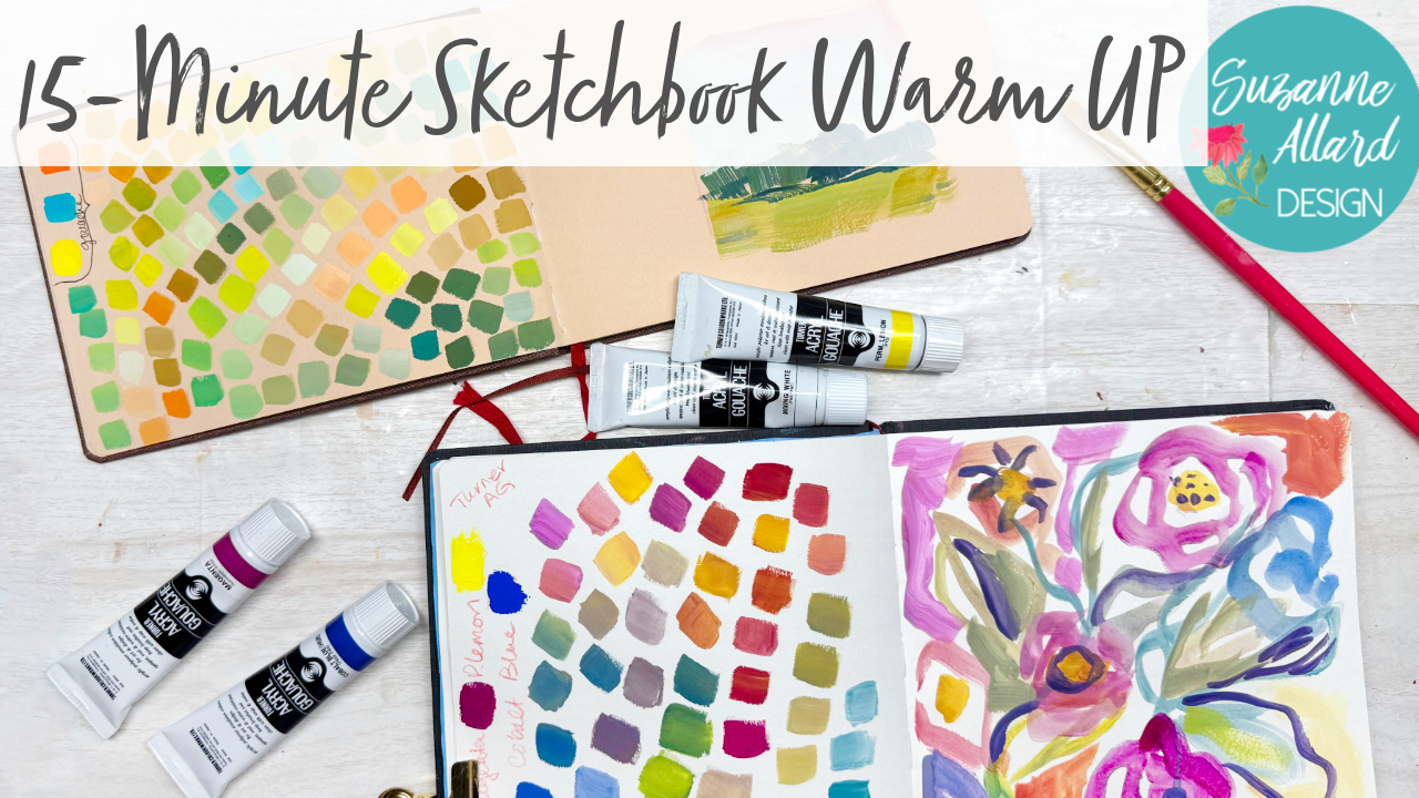
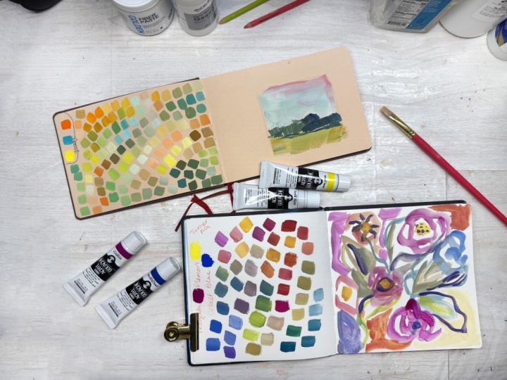
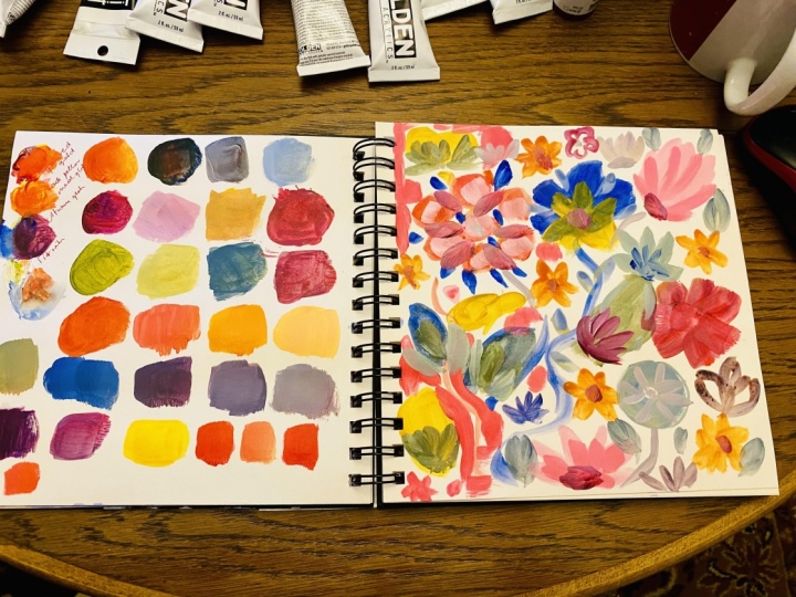
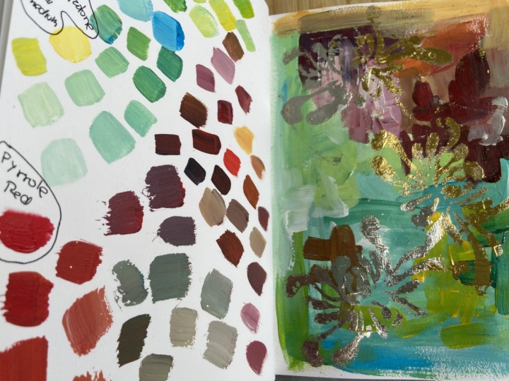
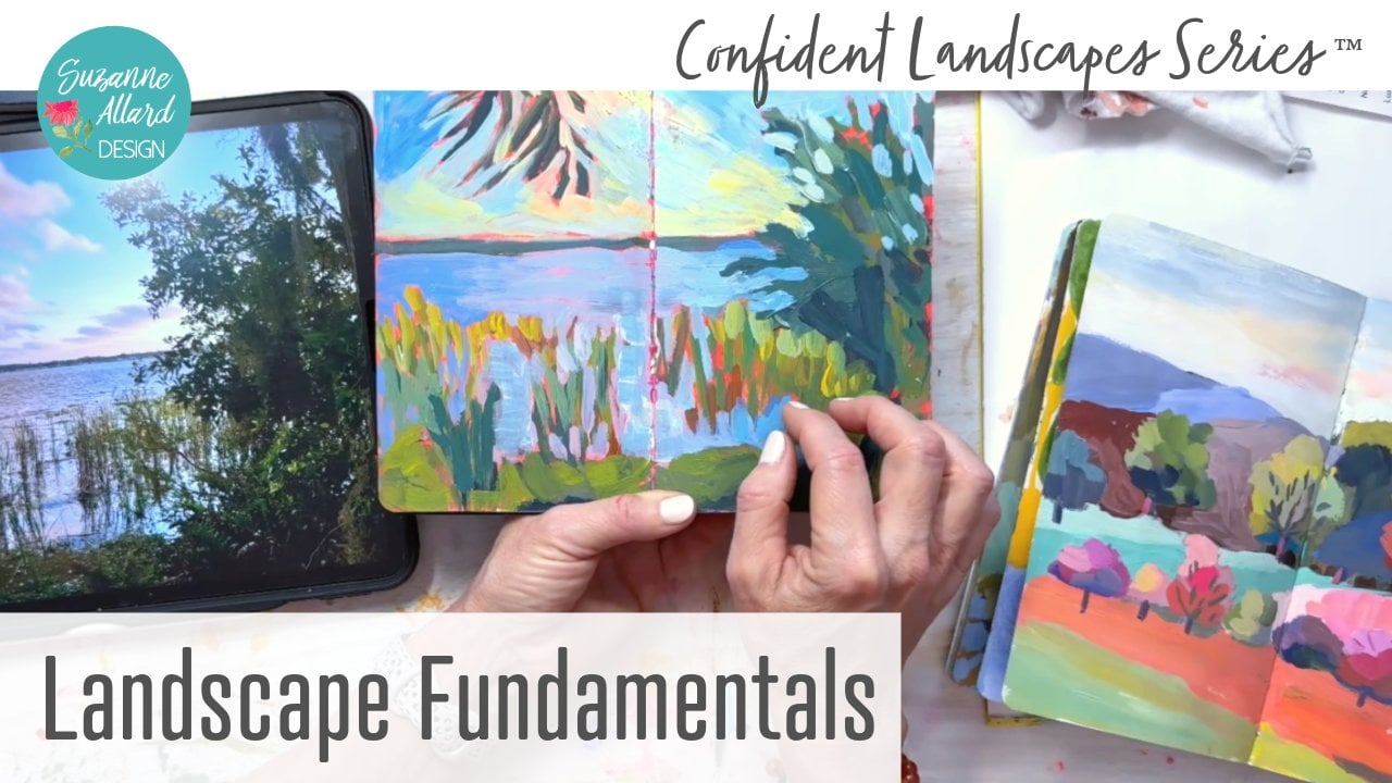
time as you want. So I'm going to show you how to take your sketchbook, any page, play with three colors, and then just doodle something. So we did florals here, but you can do landscape.
I'll show you that. An example of where
I did that in another sketchbook.
And who knows? You're just exploring
and you're just taking a few minutes with very
limited materials. So there's no getting
on a bunch of stuff. And I love doing this really
several times a week, but as a warm up or on those days where you just
don't feel very creative. You just don't even
know what to do. You could just do the colors on that kind of day.
I've done that. I'll make just color sheets. And it's just good
for your brain. It gets in there. It helps
you learn about color. And, you know, one day I created this thing that ended up being this pattern
on this kimono, which is why I put
it on the show you. But you don't know
what's going to happen. So you just play and no
pressure quickly, easily. Every day if you want
and have fun with it. So I can't wait to show you.
Let's get in, get going. Alright, I'm so
excited to show you this wonderful way to just take a few minutes and get
something in the sketchbook, loosen yourself up, get
some momentum going. It works even if you don't feel well,
especially this side. I always feel
better, and then you can do this side another
time if you want. But the concept is quick
the quick overview of this project is on one side of our sketch we pick three colors, and we make a bunch of swatches. That is just in itself, so instructive and so fun. You learn so much about
color by doing this. And on the right side, you
just do a simple sketch. You can see how
simple this landscape is just to play with the
colors, to get something down. And that's it. That's it. So like I said, you could spend if you didn't
want to do this on one day, you could just do
this on one day and then take those
three colors. But literally, you
could fill pages and pages of three
colors plus white. And here's another page where
I did these three colors. These are halo, blue, permanent rose, and yellow
ochre. These are acrylics. And all of these were made, and I could have just kept
going and going and going. And then for kicks, I tried just two colors,
always plus white. This is Burnt Sienna and Teal. And again, I could
have kept going. But so that's what
we're going to do. We're going to just pick three. Now, the only guidelines I would give you for your three is try to pick a bluish
of some kind, a redish of some kind, and
a yellow of some kind. Here, at least they're
complimentary opposites. If you pick colors that are too close to each other, like, say, a magenta and a warm red, you're not going to
get much variation. So I have three piles
here to show you. I'm using Turner acro guash, but you could literally use any painting
you want with this. You could use squash.
You could use watercolor acrylic oils.
It doesn't matter. And but, you know, look at your piles of
your reds, your yellows, and your blues and
pick one and just make it you can close your
eyes and pick one. It doesn't matter. And then, you know, it's helpful
to identify them, so we'll do that. And then as far as
what you can paint on, a plastic plate or a piece of palette paper, either one works. For the brush, I do like using
a square or they're called flat brush just because
it makes such a nice and then I can do my
quick sketch on that as well. So let's go to a new page. Let's pick our three. You know what? I'm just
gonna close my eyes. Well, I kind of know this
one's bigger. The magenta. I've been wanting
to play with that. And then let's try
this dandelion. This will show you that really the only three
colors you need to make something are
a kind of a magenta, a lemon, yellow, and some
sort of blue or turquoise. Turquoise, by the way,
is in the blue family, so that could have been
in this pile, as well. Alright, so let's let's do let's go ahead and
do the permanent lemon. And I'm going to pick
just for the heck of it, a lighter blue, this
cobalt blue. Alright. So we're going to make
our little piles. Less white and
start color mixing. I will write down my three might need more paint
than that. We'll see. I probably shouldn't put
them so close together. And white. And let's see here. I'm going to write
down that these are Turner hackle Gush and
I've got the magenta. Oh, I'll put them here.
You can do it anyway you want Magenta, permanent lemon. And the t's, I'll put that here. Here. Let's do the cobalt blue. All right, so first
thing I'm gonna do is get the pure color in there. And my cobalt. Okay. Now, the fun part. I've already got some magenta on my brush, so I'll
grab some white. And sometimes when
I'm doing this, I think, Okay, let's start with the lighter colors
and then move dark. But then you'll see
sometimes I'm like, No, I don't I want
to just move around. And I'll just add maybe
a little something, and this is how quick it is, and maybe back to the white
exploring your colors. Oh, something on there. Piece of dry paint. And taking them in
different directions, I haven't even touched the
blue yet, but we will. And this way you can see you don't want to mix them so you don't have a bunch
of mixed up colors. But you can see the infinite
number of possibilities. That one's too much
like that other one, so I'll just add
a bit more white. And let's go ahead and
dab into the blue, which immediately gives
us some lovely greens. We can go backwards
to get a more subdued green backwards into the magenta because it's a
it's a compliment, so it's going to
neutralize the green. We can darken the
green a little bit. You see how fun this is?
You can just keep going. I don't like to use colors from the two because
they're not yours. Think of it like
your handwriting, your colors or your handwriting. So exploring them in this
way, it's a little darker. Maybe a little bit. Let's go back and add
some of this blue to the magenta and white and
get some different blues. And And people worry
about mud, making mud. Well, first of all,
some mud is beautiful. Some really nice neutrals
should be part of your it's too much
like that one, so's lighten it a little bit. I like to just make them
a little different. Let's grab some of
that magenta and go in a violet direction. So anyway, your neutral should be part of
any composition. So mud gets caused. I'll show you by going
to the complement. And so you might consider
that mud right there. Wipe my brush off. I got
too much stuff in it. But that can be a really pretty gray in
something, right there. I need more of it. You
want to be intentional, right, about your neutrals. But I can guarantee you
that if I take that color, which might be a nice shadow
somewhere and add some white or yellow or take
it in one direction, we're gonna get some really
lovely variations of it. You see. And even to one
of my favorite colors, which is like a light, well, you can make
like an ivory. I love ivory, so you can take
some of this quote mud and add some white and get
some lovely neutrals. Then we can go. You can just see how you can go in
so many directions. You might have to
wipe your brush. You don't need to
rinse it, though, as long as you're paying attention to what color
you put it in next. Oops. Then you can kind
of build from that. So like we're in
magenta right now. I haven't mixed magenta
with the yellow, so let's go in that direction. We're gonna get
some nice oranges. So warmer kind of
magentas. Keep going. And yeah, wipe your brush
when it gets too filled with the previous colors and can go, like in a mustardy
direction now 'cause there's a few of each
of these in there now. And then we can
pick up some white. I guess we already
have a light mustard. So maybe I'll add more magenta. And sometimes as
you get further, you'll say, Oh, that's a
repeat, but that's okay. You're still learning. Let's add some blue now to this mustardy color and see what that does. Hmm, that's pretty.
Almost a turquoise. Oh, let's add more yellow. We're getting kind
of a limey color. And let's add even more. I love a good lime color. Lighten it a little bit more. And let's add some white. So pretty. Let's see. What direction do we
want to go in now? I want some more reds. So
I'm looking at it going, I have a fair amount of
blues, some nice greens. Well, let's get a couple more greens
before we leave the green. So you can get really
interesting greens by taking the greens we already
have and then adding some of the magenta. So you get kind of these rich and interesting olive greens. Isn't that amazing? You really don't need more than
these three colors. Every time I do this,
I'm reminded of that. We just, you know, there are things called people call them
convenience colors. You know, if you have a
color you really love, like, let's say let's say
you just adore this. I'm trying to get that
lighter. This olive green. Well, you know, so you don't
have to make it each time. If you really love it, then
you buy that color, you know? That's what people do. But you
don't need to is my point. And I think you
shouldn't do that until you learn this kind of thing, because this will teach
you so much about color. All right. Let's go
make some more reds. I'm just grabbing
what's already there. And taking it further and see what kind
of reds we can get. And if you find,
see how much color is piled up in my brush. I've got green in there. So part of that's great because
you're getting harmonizing. But if you find
that you're getting your colors too blended, then you can just excuse me, be more intentional
about wiping the brush. Mm. And if you really
want to and if you feel like things are
getting muddled too much, of course, you can
wash your brush out. You don't have to wash a ton, but you can get some
of that paint out. So let's see if
that helps us get more reds and oranges that are a little less maybe
a little more saturated. That's a bright orange rid. Let's add some
white to that one. I haven't even made many
pinks. Can you believe it? Me. Okay, so now we've
got a lot more reds. Did amount of blues. I feel like I just want a little
more of a warm green. Let's see. What we can make. That's pretty. So I
took a little bit of all of them in that the warmth
comes from the magenta, because if we just
do the straight, um, blue and yellow
that we have, I can show you that, but
it won't be super warm. So the magenta gives
it that warmth that kind of yeah, like that. Well, the warmth technically
comes from the yellow, but the magenta gives us a deeper Let me see.
Think how to put this. A more interesting green. I'll show you if we just
mix with a cleaner brush, the blue and the yellow, we'll get some really
vibrant greens. It's kind of what I have here. Let's see if we can make a
turquoise with these two. Sort of a turquoise. It will look more turquoise
if we add some white. White actually
cools down a color. We aren't going to get too
much into temperature here, so if you want to
warm it back up, you'll need to add more yellow. These are some pretty
turquoise colors coming. Okay. Well, we have a
really nice range. Now, I think, we'll just remember this is a no
pressure quick thing. So you could have done
just a few colors. You could stop now and do
this part the next day.
2. Quick Sketch with Color Harmony: Okay. But let's just play with got some of these
colors here already. Some sort of loose you know, just like an abstract floral. Keep it really
loose and playful. That's if you can
think of one word here in this warm up exercise, remember playful because that helps us keep and even
keep your arms loose, move playfully see
I'm holding this. Try not to do what I
was doing over here. Hold it this way, like a
pencil, hold it this way. You could stand up to
make your movement flow. Better. You just, you know, you can see how you can
use any paint in this. And I'm just taking some
of the colors we made, and let's see what else? This one's turning out to
be kind of watercolory. Use some of that
pretty warm green. Let's do a little bit
more of that bright here. I want to get some more of
those pretty reds. See. So you can play in this way and try to keep
from using, you know, challenge yourself to not use the colors straight
from the tube, but to use the colors that you've explored
and played with. Like, there's that
magenta, and I love it. But I'm going to mix it
here with something else so that it's not too much. Let's see. Maybe a
little more yellow, that orange color we made.
We go in the center there. Maybe over here, too.
Maybe some white with that down here and
do kind of a background. Backgrounds are fun. You can change the color
anywhere you want. Let's get a little more white. Maybe some more blue.
Mixing this in here. Maybe you'll grab some of that lavender we made down here. So see I just kind
of move around and play, play with the colors. If you make a color you
don't like, don't use it. This helps you discover
colors you do like. There's a pretty orange.
It's a little white to it. My make it a little more red. What else? What else? I feel like I want to do
more of this olive green. So let me grab some
more of the yellow and the blue with this magenta mix. Darken it a little bit. That's kind of pretty. And I'm almost done playing, but I thought I'd just put
a few more I don't know, accents on some of
these flowers, maybe. Maybe we can take some blue and magenta and make some little making it
like a dark plum color, so I added a bit of yellow,
so it looks like that. So we have just a few details. I don't know, painting
always feels like to me, without just a few details,
it's missing something. As long as we don't go too far, which that's why we're playing. We learn those things
when we're playing. And we get a value
contrast that way, too. So we're getting a
little dark in there. Okay, I think that's fun. So yes, that's the idea. Isn't that quick and easy, and you can just fill
your sketchbook this way. And you have a great reference. You have these three
colors, and then you learn, you say, Well, I really like the palette I came up with
with these three colors. So maybe I'll use them in
another painting, or maybe, you know, maybe I
don't like them, and so I'll not use them. And you learn like I learned with this one
because I challenge myself. I used an orange, and you do
get some beautiful colors. You don't get a red. And so you're forced to have to make, you know, if you
want sort of a dark, then you have to kind of go with a dark orange like this or this. But you get these lovely
corals and worms. And so as a result, your painting will be unified. There is no way that
it can't be because you're forcing yourself to create just these three colors. So I hope you enjoyed this.
I hope you do it a lot. I bought this
sketchbook actually intending to do
that on this one, but I'm famous for
I'm not famous, but I tend to have an idea of what I'm gonna
do in one sketchbook, but then I just grab
the nearest sketchbook. And so they all end up having
a little bit of everything. But that's it. That's the ten minute warm
up and to get you, you know, creating momentum
to get you engaged, to get you creating when you maybe don't feel like it or don't
have much time. And by the way, doing this in a coffee shop
is a great idea. You can just take three colors, one brush, a little paper plate, and get a cup of water
from them, and that's it. And you will have so much fun. You might want to take
two sketchbooks so one can dry while you're
doing it in the next. And then you'll have
this wonderful reference of your color explorations. Okay. Enjoy.
 Suzanne Allard, Landscape, Floral, Abstract Painting Teacher