Transcripts
1. Introduction: Welcome, My name is Martina Flor and
malaria in artist and educator and I'm extremely excited to have you
in illustrating. Before we get started, I want to tell you a
little bit about me. I've been learning, doing, and teaching lettering
for the bath 12 years. You may also know
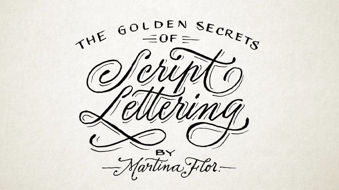
me as the author of the book The Golden
Secrets of Lettering, which was printed in
six languages and sold over 50 thousand
copies worldwide. With this book, I got
to positively influence the life and work of many lettering artists
and creatives. You may be one of them so much so that they call it
did bible of lettering. This makes me extremely proud, but also entitled
enough to create the Ten Commandments
of lettering. And so this is what
this training is about. Ten principles that
will guide your way at a lettering artists to
create great lettering. I'm sure that you are here because you're
Offered Rate great. Throughout the next few lessons, I will break down
the commandments and open your eyes to the
world of drawing letters. After this training,
you will know exactly what to do to take your lettering
to the next level. So you already are you
because I am live birth.
2. I. You Shall Have A Message To Convey: Number 1, you should have
a message to convey. Literally use frame merrily
a communication tool. What makes lettering such a fascinating discipline
is how content. So the texts you're
drawing and it's achieved, the actual form of
these words are counterparts for
the same message. So it is not about illustrating
a text in any random way, but it's about being
intentional with what you want to say and in
which way you want to say it. So for instance, I could say
love in a very bubbly way, like I love you so much. Or I could say love in
a more delegate way. I love you. Can you see that the shape of earth can even sometimes contradict
the actual texts, or I can say a
really bad word in an elegant way like that. If the power of
lettering to communicate much more than the literal
meaning of the word. So remember, you have a story to tell beyond the actual
texts that you're drawing.
3. II. You Shall Prioritize Readability: Number 2, you shall
prioritize readability. We have learned
that in lettering the message is important. So it's equally
important that we are able to read that message. If there's something that
lettering apart from other artistic disciplines
using letters like street art, is that the message is the
actual heart of the piece. We start with the letters
and because of them, and we build around them, not the other way around. And so effect Illustration decorated elements
and fluorescence. You know, I love all of it, but they should always be
put in service afterwards. And the story you're
trying to convey and never get in the
way of readability. So when it comes to adding,
decoration and effect, I have a personal rule
which is bring them in, but don't let them mess around.
4. III. You Shall Not Letter Statements You Don't Agree With: Number three, you shall not literal statements.
You don't agree with. You literally statement, you're putting your craft and skills in service of promoting that message and
giving it a voice. Especially if you're working as a professional letter in art, if you will often be illustrating texts and words
that are given to you. And so before committing to it, make sure you double check
whether it might have political and religious
connotations that may not align with your
values and beliefs, with your art, better support messages you believe
in and agree with. I have a personal
story around this. I was once commission
to create a series of lettering pieces for a
coloring book for teenagers. After the contract was signed, I was getting ready
to work and he started going through the
text I had to illustrate. And among them, while there were some statements that I
didn't personally agree with, they were not aggressive
or offensive bad. I thought that they picture a vision of what a
girls should be. That to me was old and outdated. This experienced Dogme that
as a lettering artist, you should always
read the text before committing to the assignment
and signing a contract. Your art is just too valuable to contribute to causes
uterine and laneway.
5. IV. You Shall Not Use The Term "Lettering" In Reference To Calligraphy: Number 4, use or not use
the term lettering in reference to calligraphy with the right of lettering as
an artistic the fifth limb, there has been some confusion
around what lettering AFM, what's not, which
is totally normal. Let's throw some light on it. Accurate definition, Larry
is about drawing word. Why? Calligraphy is about
raiding, works great. And I know what you will
see that there's a lot of calligraphy out there under
the category of lettering, especially when it comes
to brush calligraphy. But this is still calligraphy. Most likely if it's done
with a calligraphic tool, you're looking at calligraphy if it's drawn, so for instance, done with the pencil, then you're most likely
looking at lettering. They're both
beautiful disciplines and they influence
each other greatly. Well, to be honest, lettering owes a lot to
calligraphy and this is why we have an entire
commandment research for it.
6. V. You Shall Acknowledge the Role Of Calligraphy In The Shape Of Your Letters: Number five, you
shall acknowledge the role of calligraphy in
the shape of your letters. Calligraphy is the mother
of all letter shapes. In the past, it was very
important to reproduction tool. In medieval times,
books were written by hand and therefore various
cars and expensive. Luckily, things have evolved
and we live in a world where books are a commodities and accessible to all of us. So ileal area. However, the impact of
calligraphy on letter forms is still apparent in the structure and shape of our letters today. You can see it in
lettering pieces that become inspiration from path, historical eras like this one
inspired by medieval books. A more modern lettering pieces, you will see a strong imprint
of a calligraphic tool. Now, I don't think
that you need to be an expert calligrapher
to rocket a lettering. But that in calligraphy and understanding how
tools work will help you understand the shape of our alphabet and find
solutions to your own design. As I always say, a
smart literary and RDs, or we pass a set of
calligraphic tools at hand.
7. VI. You Shall Give Consistency To Your Letter Shapes: Number 6, you say give consistency
to your letter shapes. Consistency is everything. Remember that the first
one is consistency. Can reach dictionary
defines consistency at the quality of always behaving or performing
a similar way, or of always happening in a
similar way in literal signed distance plays into creating letter forms which
share features. This means that in order to make a set of letters or words look like they belong together or they belong to
the same family, they need to have
some common aspect. The contrast, for instance, which is the difference between the thickest and
thinnest part of your letters should
be consistent. The spacing that is
the space between military should be
consistent as well. And that applies to all
aspects of your letter forms. The weight, the x-height, this time, the
calligraphic origin. The reason finding the
patterns that make your letters belong together is paramount in
lettering design.
8. VII. You Shall Consider Negative Space: Number 7, you said it
consider negative space. We have been talking quite
a lot about letter forms, but they are not the
only important aspect of letter making. Like with a yin-yang, you can identify substance thanks to the lack
of substance and in lettering letter
forms exchanged with and because of the white
space around them, so to speak, around
the letter is also something you to take into account when drawing
letter forms. The space inside the letter, influenza to space outside
the letter and vice versa. A word that is a
space to tide looks overall heavier than a word
that is based to loosely, therefore is the space has an
impact on the perception of your letters and should be taken into consideration
at all times. Even when designing
black and white, that you version of colors can cause the letters to
look very different. Look at this letter e, Bs on black background and the same in black on
white background. Letterforms on the
white background look thinner and overall less consistent because of how the negative space is perceived.
9. VIII. You Shall Not Fear Ornaments And Flourishes: Number eight, You shall not fear ornaments and flourishes. Or you know me, I go crazy when it comes to the grade
of elements and fluoresces. And I loved them for
a couple of reasons. One of them, because they
can really compliment your lettering and even help you solve balance and
competition issues. So for instance, in
a lettering piece, we're strong capital letter
that is causing this balance. Flourishing can help
you balance that out. You could even sustain your
lettering piece and create a frame around it that
reinforces the meaning. The other thing
that I love about the correlative elements
and flourishing is that they can create a sense of wonder than makes a
mark on the reader. When use wisely
decorated elements can be a great addition
to your piece. Don't be afraid of them. Instead, make them your friend.
10. IX. You Shall Care For Detail: Number nine, you said
care for details. Details are not just detail. They just make the
whole different. Always go that extra
mile for that detail that other non-trained
eye might not know this. So often that curb move that anchor 0.1 millimeter
to the left, make the optical adjustment in the cross stroke
of that letter, if you can see it and you know how to improve
it, go for it. That often make the difference
between good and amazing.
11. X. You Shall Create Something Unique: Number ten, you said something and they know what you're thinking
here or yeah, As if it's that easy to
create something unique. And on top of that, there's so many other artists
out there doing great work that he feels almost unattainable to be able to
create work that stands out. I get it, but I want to tell you that it's
possible for you to create work that is unique
and it stands out in a crowd. For this, you will
need to acquire tools that allow you
to understand what you're doing so that you
don't need to check on someone else's work
or scroll through your social media feed to find solutions for your own
work because this is when your work starts looking like someone else's work and you
certainly don't want that. I know because I was there too. And it wasn't until
I quit this pattern that I started taking
off with my work. Instead of investing
my energy there, I dedicated myself to learning the foundations of letter
design and acquiring efficient techniques and
seeking guidance from mentors and feedback from
creative communities. I believe that this
is what allow me to focus on my own
game and developed skills to finally get to the point where I
was creating work that no one else was creating work that I
was really proud of. I know how much of a game
changer this can be, and this is why
every year I take a limited number of students into my lettering
seminar program. This eight week seminar
is the closest thing to a full-blown university
education on hand lettering.
12. Take The Ultimate Lettering Quiz: The ultimate letter in Greece. Find out just how
much you really know about letters
by taking the quiz for free on Martina
flor.com slash quiz. Enjoy.
13. What's next?: Now that you know what the Ten Commandments of
lettering are all about, It's time to take a vow
of loyalty to them. Below, you will find wallpapers and printables to always keep his commandments
near you as well as stories for you to share
your vowels with the world. You are now one of us. And with great power comes,
great responsibility. Is it likely come with
quite good, right? How do you think I was? Yeah.
 Martina Flor, Lettering Artist, Author & Educator