Transcripts
1. Intro: I love a clean digital artwork, but what I love even more is that human warmth that we get by adding textures. My name is Josephine Skapare. I'm a Swedish illustrator and artist working mainly with editorial and pattern design. I've been searching for that perfect textures since I started my illustration journey almost 10 years ago. In this class, I will walk you through how I create seamless textures to use for backgrounds or as the grain for textured brushes. We'll make our own custom shapes and build our own brushes. I will apply my textures to a pattern, but you can choose to use any flat design you have laying around that you can work your texture magic on or just make a sketch and follow my steps that I will make in the last lesson. I will be working in Procreate but some of these techniques can definitely be used in Photoshop and similar apps as well. This is not a beginner Procreate class, so it's good to have some prior knowledge of the app before you dive into class. I hope this sounds exciting, let's create some texture magic.
2. Class Project: For the class project, I would love to see a brush you created, a textured repeat, and of course, the final piece of art or pattern that you have texturized using any of the techniques that I showed in class. As I said, you can choose to use any flat design you have laying around or just make a sketch and follow my steps in the last lesson. I look and comment on every project and I just can't wait to see what you create.
3. Find inspiration: Before we start creating our textures, it's great to find some inspiration and what textures you're into. The possibilities are endless. Play around and see what soothes your work and the feeling that you want to convey. When I was a kid, I used to count all the rusty objects in my dad's house, he had a lot. I was truly fascinated by all those old things and I can still remember that textured feeling when touching a rusty surface. What a life those things must have had. Ever since I began my illustration journey, I've been obsessed with finding the right textures for my work. I've been scanning in handmade stuff. I've been playing around with the brushes for hours and lately, I've been making my own digital brushes. It's actually not that hard, especially not in Procreate. Go and find inspiration wherever you like to find it. It may be Pinterest, Instagram, outdoors, museums, books, magazines, find the type of textures that you are drawn to. Do printmaking textures such as screen or block printing. Perhaps you like old stuff like me, or simply organic structures and textures found in nature. Look at how other artists are applying textures. Do you like it when motifs are flat and the texture shines through in just random places? Or do you prefer it when it's used as a shading technique? Texture style does not end there. How do you like your edges and shapes? Flat graphic shapes with clean edges or hand-drawn, more organic shapes, rough edges. Every choice you make, build up your own unique texture style. Play around and see what you prefer, and don't hesitate to change it up from time to time and explore other ways to work. Texture is so versatile and you can work with it in so many different ways, both analog and digital. In this class, I will show you the different ways I work with textures in Procreate, mainly with using brushes. Hopefully, you can apply these techniques to your own work. In the next lesson, I will show you quickly how I make my favorite inky liner brush that we will use in various ways throughout the class.
4. Make a Quick Inky Liner Brush: Let's start by creating my rough inky liner brush that is really good when we are going to create these speckles for a speckled background that we can use for our actual pattern or you can use it also as a grain for a stippled brush. Let's begin by creating a new document, a 3000 by 3000, that's good when we are going to create our textures. Let's just hit "Create" and I will save it to the preset. This brush is really simple because we don't need anything else that's already in Procreate. We're just going to hit the plus sign to create a new group of brushes, and let's name that texture brushes. You can name yours whatever you want. Here we have an empty space to fill up with brushes. As you might know, you have a bunch of texture, and fun brushes that you can use, but it's so much fun to create your own brushes, and textures to use in your own work to make it truly unique. Let's click this plus sign to create a new brush. We actually don't need anything else on this round shape, and this flat ring, and you can of course make this more rough with adding some grain. But I like to keep it at this. For the first part on stroke path, I like to keep the spacing around 33. You will see how this affects the whole thing later. The streamline is good around 18, I figure. The streamline makes it just a bit smoother, and not so shaky. If you're shaky on your hands, you can put this streamline up if you wanted even more like flowy, and you don't have to be worried about shaking on your hands, but I like to keep it at around an 18, so some of my hand shake does shine through. Also, I like to keep the jitter up at 19. You can see this is not such a fun brush, but we will keep working with it. We're not going to do anything at the taper, and the shape, and we are not going to do anything with that either. We will use these presets a lot later when we create other brushes. But for this, we're just going to keep it simple. Also grain, we're going to work with later. But now we're going to go to Apple Pencil, and there I like to keep the size at about 60, I have this really specific numbers that I have worked to make perfect for me, but feel free to work this as you like to. Then we're going to put the opacity down to zero, and this really makes a fun brush to use on the edges because you get this irregular rough outline. You can of course also use it as a liner. Lastly, you can actually work with the minimum size, and maximum size, but that doesn't really matter that much. I just keep it to the default. Let's click done, and we can try this out. You can see that if you press, it gets thicker, and if you lighten your pressure, it's thinner. It's really nice when you have it at a smaller size, and you can really create these inky key strokes. We're simply going to use this now to create this speckled seamless texture.
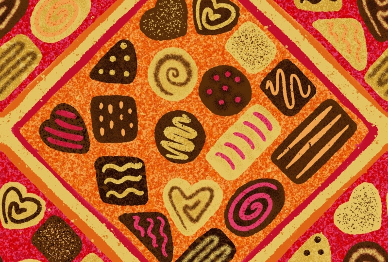
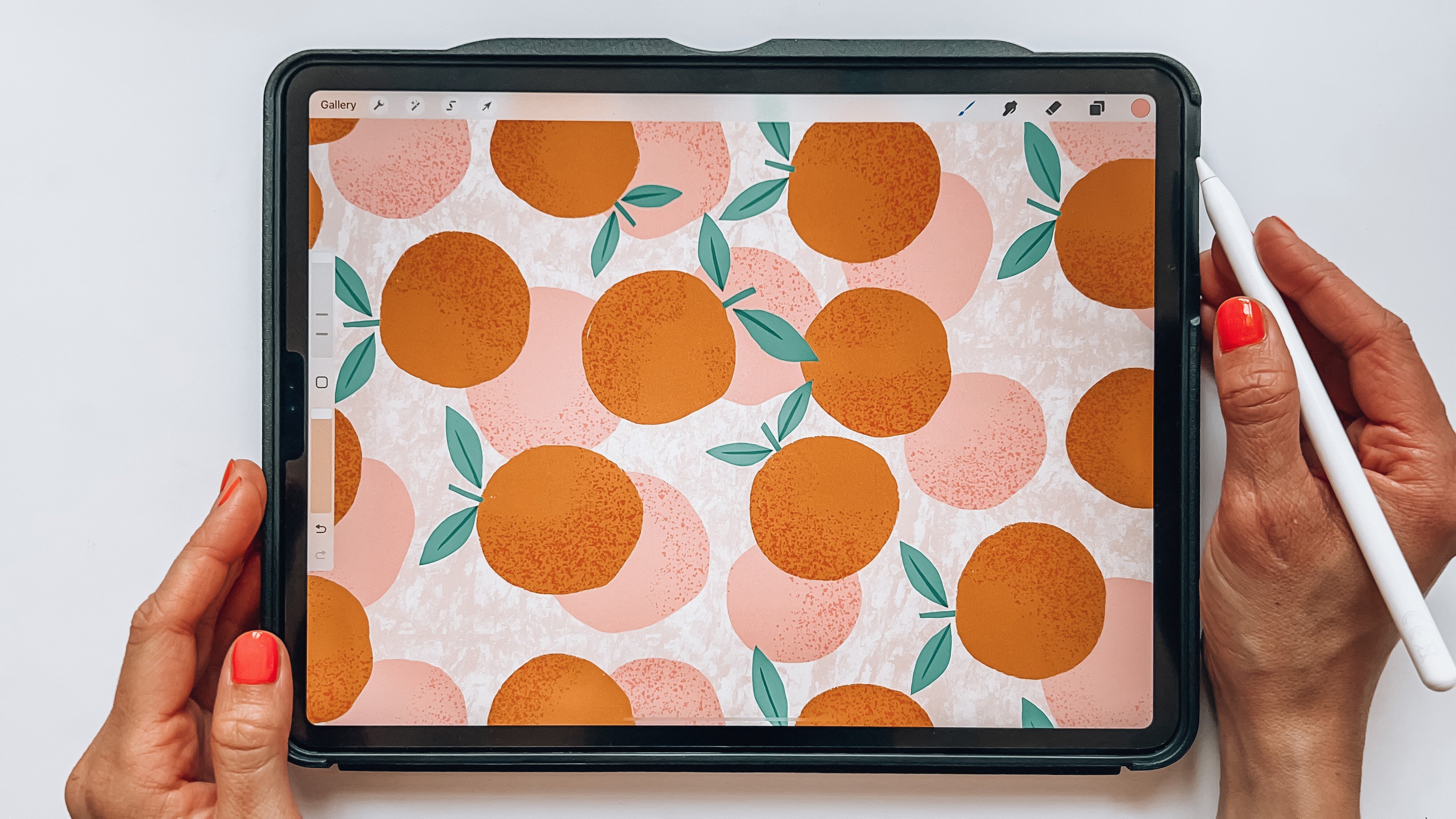
5. Create Your own Seamless Textures: Let's create this speckled seamless background texture that we can use as a grain source for a texture brush or we can use it as an actual background to our patterns. We are going to use this ink brush that we created and I like to use this because it gives more irregular shapes. If you want perfect circle, you can actually just bring up the size of this brush and then you can just dab with your finger and there you will have this more perfect circles dots. But I like these more irregular shapes, I will keep it down in size and I will try to create these round shapes by myself. We're just going to create these evenly over the canvas and about the same size is good and we're going to create some smaller ones also. Just make sure you have this even and now we're going to move this to the corners and create this repeated texture. As I said, my first class here on Skillshare, it was all about making seamless repeat patterns in Procreate and it's both half drops and basic repeats. We will create a basic repeat here but if you are interested in the other techniques and how to do this more in depth, go and check out that class. We're going to add a new layer here and drop the color, you fill it up and let's just lower the opacity a bit. It doesn't matter how much and mark these two and group them together. Then we're going to duplicate this group and we're going to choose this arrow here so you have chosen the whole group and then make sure that you have snapping on. This is a great new feature that you have in the latest version of Procreate and this really helps the pattern creating technique a lot simpler. We're going to put on both magnetics and snapping. I'm not really sure what these do but you can play around with them, but I just keep them both to max since I'm just using it for this feature. Let's just take one of these groups and move them to the right. You want to move it until you see this orange line appear because that means that you're in the middle and then we're going to do the same with the other group, but to the other side till the orange line appears and let go and there we just take away these opacity fills. Of course, you wouldn't necessarily need these opacity fills, when you have these snapping points, but it just makes it easier to see if you perhaps move it too much or too little because then you'll have a line appear where they cross over. I just like to have that as a security check. Then just collapse these to groups, you have this on one layer. Then let's see here in the center, you can see that there is a bit more gap here, it's like a white line here. Let's just move a few of these that they don't looks spaced out. We're actually going to just select a few of them and then choose the arrow and here you have the snapping on. If you want to move this, it's really hard to move it where you want, so just turn the snapping off for this and you can move it more freely. I think we're fine here. We're going to do the same thing and move it up and down. What I like to do to see how this is repeating is to share it as a JPEG and then open it up in Adobe Capture and just click "Post". It will open it up like this and then just hit pattern and click this one below here and then like that, and here you can see how it repeats and it looks good. We're back in the same document and I have just imported two concrete background textures that I just took a photo with my phone outside. I think this is some regular walking her road and this is some wall I think. These are perfect for creating these speckled background textures. Let's start with this one below here. What you want is you want it even so I have just cropped it to where I found it quite even. The most important thing is you don't have too dark on one side and too light on the other side and this is even. Here you can see these dots here. You can choose to save these if you want these a bit more random, but I wanted to be a bit more like the small ones and then you can really easily just select a part of the texture and just duplicate it. Then you can just drag it down and you can't really see that because it's so rich in textures, you don't really see where this ends. You can use this inky brush that we have and just drag around the lines here that it gets a bit more irregular and then just add up this size and you can work with it like that. I'm happy with that and that white one I want to get that away. Then can do the same thing for these other ones if you want to. I'm just going to collapse them and just duplicate it. Seriously you can just duplicate this one and drag it on top of the other ones that you want to cover. I think these are fine, the smaller one, we can see if we want to change them later. Let's create this and make this to a seamless repeat. If you repeated it now it will be really clear that you have this line in between. We want this black and white to make it work. We're going to drag the saturation down so now it's all black and white. Then you can use the brightness to choose how light or how dark this will be and that means how much speckles that will actually show through. When you see here, I think this is good because this also takes away these white dots. I'm going to drag it up quite a bit and then release and then we're going to go into the curves. What we want is these speckles to actually be black but we don't want the white to be gray, we want to be just right there in between and here we go. We have this speckled. This is really rough so it's not really a speckled perhaps but it will shine through like that when we create the brush, I think. It's a really good grain source. What we can do is now to create a new layer and we will do the same technique as before and I will speed this up so you don't have to see the whole thing. Now we are back here. You can actually, perhaps you can't even see where it's going here together. That is because we made these really black and white. We changed the color so it's more like this textured surface. Because if you would have kept the stone version, you'd really see where the edges were meeting. But here, you can see if you look closely. They have some lines here and you can really easily just select a white and just paint over that. But I think this is not even necessary in this pattern because it looks actually quite good already. But if you want to make it perfect, perhaps you want to sell these brushes or backgrounds, then you can really work with it. Then we're going to do the same thing again up and down. Here we go. This was a really simple texture to create, a repeat from, because it was so even all over it. But you still have these fun variations throughout the pattern. You can really just look if you want to do the same here and just take away these liny things. You don't want to create a line like that, like I just did. Actually, what I can see here is that it's not completely white so we're going to change that as well because we do want it to be all white. Otherwise the grain feature and the brushes won't be as good. Like that. I'm just going to make this the last adaption with the curves and just to make sure that it's all white. Like that. There we have this texture. We're going to also, of course, make it from this one. This is a bit more irregular, but I like that and I think it will be great as a speckled texture. We're going to do the same thing here. We're going to lower the saturation. I chose the wrong one so make sure you're on the right layer and go to these adjustments. Choose use saturation and layer and just lower the saturation here. Then we can go up and down. I think we're going to make it darker this time. We just have these few speckles shining through like that. Then we're going to go back to the Adjustments and go into Curves and make these areas white and the black areas more black until you find a balance that you like. You can see that the texture gets rougher and rougher. That doesn't matter at all. It's just good. If you go that way, you can get the other color. It doesn't matter if it's black or white or the other way around because when you create a texture brush in ProGrid, you can just switch those easily. I think we're just going to keep it at that. Let's go back here. This one is just a bit annoying, I think. Because if you have one of those that are really in your face, then it will show through and it won't look as good in the pattern. We have this one, and now let's repeat this on all sides to see how it works together. This was actually quite good as well. You get that when you really work with the dark brightness or darkness in the photo and when you make it black and white because all these different variations that you get on the corners really disappear. It makes it easy to create these kind of textures. Here, I can't actually find where it's coming together. That's a good thing. Let's just do up here. Just a tiny, tiny, tiny bit. You wouldn't have to fix that even. Let's do the last one. Here we go. Here, we can see that it's a bit darker here in the middle so it creates this black line here. Again, you could just choose a part of the texture and duplicate it and move that like that. Another way to do it is if you have this selected and you go to Select, just choose Automatic and Add, and then choose the black. Something like that. It doesn't really matter, but what you can do is just cut and paste. There you have this white texture, which is actually what we want. If you put the background to black, and then you have this on the separate layer. That means that you can move them more freely, but it doesn't really matter at all what way you do this. But what you can do here is that you duplicate it and then you can turn it. That way you can get a few more variations that you can just fill it up with so it doesn't repeat exactly the same way. Now what you can do really easily is just to select parts again and duplicate it and just move it around over here. It's the same thing, but you don't cover the other speckles around it with black. It's more integrated this way. Then you can just duplicate it again and again. It doesn't really matter and you can just turn it. I prefer turning it with this one so that it jumps because otherwise, it tends to be more pixelated. I don't know why. But I think this is enough. I'll just do one last here like that. I think it looks good. Here, we have this more speckled texture pattern that we would use perhaps as a background for our actual patterns but at least we're going to create a texture brush with it. We're just going to saving this out as a JPEG. I'm just going to save it as an image. Then I'll save this one as well. Also I'll save it as an image on my iPad. We have this last one that we created by hand. We'll just save that as well.
6. Make Your own Brush Shapes: What we need now is some brush shape and what I see many do with this stipple brushes, is that you have some round textured brush. But I really like to keep the edges clean and not to fade it out. I just like to create my own spec, textured brush. You want some bits shining through because this will make it more random and you can make something like this and just paint with this ink liner that I showed you before that I like to use. This is really random. I haven't done exactly this before, but I think this will work. But you can also use some texture that you have since before, perhaps some paint brush strokes that you have. Let's do this one. We'll make a few shapes that we can play around with. I don't want these lines here, so I'm just going to make it a bit thicker in the center. It's always good to make the brush shapes a bit more thick in the center and a bit thinner, like more spaced out in the outer corners here, like that. We have this first brush shape. We're going to say this is a JPEG and we can also use some brush that I told you and we can all see what we can do with that. I have a bunch of different textures saved that I just like to work with. That one looks fun, but I think we will use this one and what we can do with this one first, I'll just take away these edges here like that and then we can just, this is just a texture brush. It doesn't at all have to be perfect and it's going to be moved around and stuff like that. We can really just bring it in and add it on top of each other so it gets thicker. But make sure you don't get these lines like that. I think I made this texture with some rice thing. I don't know. But it was a lot of fun. But I think this might not be thick enough, so I'm just going to add a new one on top and I have this different one here that's thicker. Yeah, I think it's good to add these two together and I'll just erase these corners. You can be really messy with creating these shapes. It doesn't have to be perfect. For the grain source you really want the repeat to be repeating. Like these shapes. You can create a lot of different kind of brushes by playing around with these shapes. Because the shapes, I would say that they are the most important thing in a brush. But the grain source is also really important of course. But this really makes the whole brushing the edges work in different ways. I'm just going to bring this in. You can see how you can just play around with maybe you have some old splash things that you have from painting. You can really do whatever and I'm going to bring these two together and just make them even more like that. I think that's good. Were just going to delete these and I'll just take away these loose ones on the edges as well and just cut and paste and take away the background and erase a few more like that. You'll see how these work just in a bit. Like that. I think that's good. As I said you can create all these different kinds of shapes. But we'll just try these out for now. Let's just save these shapes to our iPad as we did with the textured patterns. Is just save image and also this other one.
7. Create Your Own Texture Brushes: Let's use these shapes and the grain and textures to create some stipple speckled texture brushes. We're going into the brushes, into our folder here, and create a new one. Let's just start by choosing our shape. It doesn't matter which one you take of these. I'm going to go with this one, I think. If you would like to try out this first with the different shapes and grains that are already in Procreate, you can find them in here in the source library. Here are some different shapes you can play around with and here you find grains. Of course, you can just use these. Especially if you want to just try and learn how to create your brushes. But while you're at it, it's really fun to create your own from scratch. I will use this as my shape, and I'm going to use two fingers to invert that. Let's click Done. Here we have it, this very beautiful shape, and it looks awful like this, but we're going to work with that. I think we will start with a smaller grainy texture that we have here. Let's hit Done. Now you can see that I did not invert it, so it doesn't look like speckles like that. We are going to invert this one as well, and now we have more of a textured brush. I like to keep the spacing for these brushes somewhere around 15 and 20. I think 17 is fine. Then we'll just go down to shape. I like to keep the scatter up for this. You can keep it at 100, or I just keep it at max, or we can just try it out and see how this brush looks now. It's quite small, so we're going to bump up the size, but it already looks good, I think. This is perfect for giving your illustrations a bit more vintage or handmade feeling. I'm just going to take these away, and we're going to work a bit more with it, even though you can definitely use it like that. It looks good I think. When we go into grain, we want the movement set to rolling. The scale, I like to keep it somewhere around 25, 35, 30-ish is fine. This zoom choice here, if you keep it a cropped, the texture will remain the same size no matter what brush size you use. If you keep it down to full size, I can show you this. When you have a small brush, the texture will be tiny and when you have a big brush, the texture will be bigger. I think it's good to keep it at cropped, especially if you want the same texture over the whole illustration, but you want to perhaps go into detail in some places. But you can play around with this. Sometimes I have it somewhere in the higher percentage, and it's really depending on the brush, what fits. You can play around with that. This will always be covering itself up because the textures will be in different places every time. But if you would choose the textured one instead, it will just paint out the whole texture as it is. If you lift your pencil, it will keep just filling the pattern in. This is perfect if you would have maybe made some dot pattern or something that you want to use on top of, I don't know, textile like pants or something, and that would be a perfect way to use that. But when using this more shaded, grainy, stippled brush, I like to keep it unmoving. Also shape, what it can do is that you can rotate it to follow stroke. In this sense, it doesn't really matter that much because the shape edges are not that visible, but you can keep it at follow stroke. Also, I often check randomized. I forgot that before. Because then it starts in different ways. It never goes down in the same direction. Let's go to Apple Pencil here. This is my favorite thing that I always do with my brushes. I drag the opacity down because I don't want the brush to fade in and out. That makes the texture the same opacity in the beginning and the end. Here we can play around with size variation. I think that can be fun. It can be handy when you work in different areas at the same time. It may be sometimes you just need a smaller, thinner texture, and sometimes you need the bigger one. Here under properties, I like to keep the brush behavior to minimum size to none. You can keep this all the way up to max, but I don't think it's necessary, but at least maximum size like around 500. One thing we can actually do as well is to work with this rotation here. That will take away any square. Notions that you could get if you just repeat the texture. Sometimes it's visible, even though it's seamless, sometimes it's not. But I like to just do this rotation, keep it up just a bit, or just to follow stroke. As we have this one, I thought we can actually just create another shape with this tab as an option when we create a more stipple brush with larger speckles. This is a typical shape that you would use for that. But I like to keep. You can use any of the other shapes I showed you as well. Let's just save this. We can erase that. Now we have this great basic brush, and we can actually just duplicate it, and then we can change other sources. Let's try by choosing this other, this more large speckled texture and hit Done. Here we have this already working quite well. Let's try it out here. I think actually that looks perfect. That's exactly what we want. I'm just going to drag it down a bit and here you have that. We have this next to it. Then I think we're going to create another one. When you have this good brush with these presets, you can really just change these shapes, and you don't have to mess around so much with these other properties. We're just going to edit, and we can use this one that we had. As it's thicker and more even, the whole texture will show through. If we use that between here, you can see that it's thicker, and it just works in a bit different way and the larger speckles shows through more. It's really just a preference. But I want to show you that it differs in that way. Let's duplicate this last one now, and we can keep that shape. Let's edit this to see how it looks with the handmade speckles that we had, and it looks like this. I think I want to change the shape back to this. Let's see how that looks. Actually, I think we're going to try this one. I think it might be fun. Because then you get that texture, both from the speckles in the shape and also from the textured speckles. You can see here that we get more speckles when I press down and the whole brush gets thicker, but the size of the actual pattern is still the same. That's because we have it too cropped at zoom, which is great. We can just keep this one as well, and now we're starting to get some great brushes to work with. I think I'm going to try new, you can get as many brushes as you want. I love to have a lot of brushes to work with. I'm just going to try to see how this looks with that pattern. It's a bit thicker, and it's quite similar, but the edges are different. But yeah, it wasn't too much of a difference, so I'm not going to save that one. We have these speckled brushes and I think we might want to have one that have a bit larger grain for this. I'm just going to drag that up, not to max, but to say around 50. Then I'm going to try to take the rotation down, and then we have, yeah, that's what I wanted and more of a textured stippled brush. I think these two are the ones I'll use the most, but also that one. This is good if you want to do more of a thick shading kind of thing. I like the grain to show through even more. But in the next lesson, I'll show you how to do these inverted. It's more of a block textured brush.
8. Make a Block Texture Brush: Let's go back to this inker brush that we made in the beginning. I'm going to create some large shapes here. We're going to create this blocky textured brush that I like to use because sometimes I just like to build up the textures directly when I create my shapes. I don't want to always have to add the texture afterwards. It's more like when you do a block printing or something like that. When you can make a few of these ones, I think this will work. Let's just save this. Take this way. We can duplicate this one and work with that. We don't need the other settings that we made for the other ones. Let's import the shape that we just made and invert that and hit "Done". Here you see that it looks strange. First we're going to keep the spacing down to none and also the jitter we can keep to none. Streamline you can use it if you want. Now, what we want is go down to the shape here. We want to rotate this just a tiny bit here and then I want to keep the rotation I think to follow stroke. We will get back to that in a moment. But we'll just use, I think we'll use the smaller grain for this one. Now we're actually going to keep it as white. We want the grain set to rolling and then we're going to bump up the scale. I like to keep it at somewhere around 70 and zoom, I like to keep it at somewhere around 95. Now you can already see this grain shining through and we're going to go back to shape here. You can see here that you get both these like lines. But also I like to see a lot of lines I think like that. You can also just play around these and to see how it works in different directions. I think randomize is good. Let's try this now. Let's just turn this on again and we can see how this looks. Now you get this textured brush already has some speckles in it. I really like that because then you don't have to think about so much about adding texture that you can actually just paint out a whole shape and it's already textured. Also I like it that the background color would shine through and that's really a preference of mine. I think we're just going to see if we can play around with the shapes just a tiny bit more. We have that. Do we want it to scatter? No. I don't want it to scatter actually because then this line disappears. We don't want that jitter. Perhaps just a tiny bit of jitter might do this. Yeah, that's better. Exactly. That's what I was looking for. Now, when you paint this out, you get both these blocked textured thing. You all already have this kind of irregular edge. I think that will be perfect for what I want to do in my pattern. Now we have the background picture that we can use and we have a lot of different kinds of brushes. We also have this liner brush. Now in the next lesson, I'll show you how to add these and work with textures when creating your art. In this, case an actual pattern.
9. Add Texture to Your Art or Pattern: Now, let's use our different textured brushes and our textured background to actually create a pattern or you can use any art illustration that you have. I have prepared this pattern tile and it's already repeating, but we just want to make these first shapes so we can repeat it afterwards. This is a half-drop, as you can see, and you can learn more how to do this in my previous class, parents on the goal, but I'll show you when I find nicer pattern. What I would like to have is some background, and I think it will be perfect to use just one of the different ones that we have. I think this looks good. It's already 3,000 by 3,000, the same as my document here. I don't know, we'll see when I have finalized the different Brussels sprouts, which is what I'm illustrating, but I'll just keep this down as a textured background in the meanwhile so I just remember that. You can really play around and make repeated textures to use in the background of your patterns, which I think really brings the pattern to life and it makes it more than just icons that you have. We'll just keep it down at blue opacity and leave that be, and then we go up to this group here and create a new layer. I like to have my sketch on top, and we're going to lower the opacity and go back to this layer. I'm just going to choose a green here because I think that fits well, and I'll just show you four different ways of these four different Brussels sprouts, how I like to add texture to my work. First, I usually go with my inky liner, which looks like this, which you remember, and I'll just outline my illustrations. It doesn't have to be perfect at all, I just play around with it and then I just fill it up like that. Here, we have this really clean shape, really digital looking, and, of course, we want to get away from that, and I'm just going to do the same with some of the other ones as well. Then I will use one of my favorite brushes, which is this new then textured brush that we have, and I will just use this. Now, I'm going to do something that I call paint and erase. I like to just work out the texture before to precise about the shape, and I think that looks good. Then you can use the same brush that you had and then you will get some. If you use the same one with the green in it, you'll actually have some of these lines left, which makes it look like when you do line a cut block printing, and I really like the texture of that. It doesn't all have to be clean. When you do this erase, then it's a bit like when you cut with paper or if you do line a cut block printing and I just think it gives it a nice feeling. See, this already looks a lot more alive, and we're going to do this for the last one as well, like this more paint and erase thing. What I do sometimes is just to control how much texture we have on different parts I dislike to use one of these speckled brushes. Of course, you can do that with this shape as well, but I like not having this specific shape when I do the texture, does something with my brain, just keeps it a bit more free. Then we have these for different shapes basics that we can work from. We're going to put this one up again, and we have our textured brushes, which I will show you in a bit, but what you can also do, except from using these textured brushes, of course, is that you can use really any texture, and just add that on top and make some overlay texture. I have this old roller texture that I made a while back, and you can really just bumped that up and you can clip it. You press that and use clipping mask, and then you actually clip that to the illustration below, and they can use these different overlays. You can put it on Multiply or I think we would need to change color to get a more effect on that, but I think you get the point here. I just take two fingers and I drag it to the right, then it's Alpha locked and it doesn't have any white in it, it was already made into a PNG, I think. I'll just hit that and fill layer, and then when I put it to Multiply, you can really see this texture shining through, and you can do that with any kind of texture really. I'm just going to choose a random nature check texture, which could be nice like this Brussels sprouts, perhaps. This is some stone that I found outside my summer house with my family last year. Again, you can just put that on, Multiply, and you can lower the opacity. You can clip it to the illustrations, and then, of course, you can also go into this, which we did before when making our pictures. If you put the saturation down, you can control this a bit more. You can also, of course, work with the curves to make it stand out even more as a texture, and I think we might save this for one of them or perhaps all. No, we'll just use this one I think. What we can do is here, we can just put on a mask, which will mask it out and just keep it on that one. Perhaps, we want to lower the opacity just a bit, but now, let's go back to our different brushes that we can use. We're going to continue using clipping masks, so I'm going back to my flat green layer and I'm going to just hit plus sign to get a new layer and everything that's in between here will be clipped as well. We can try our first brush, this large speckled brush, and let's put this layer on Multiply as well, and here you have that. You can use it to just covered all up and you get this with different shades of green. I think that looks nice, but you can also, of course, make it more specific to the different leaves on top of it. We can try that with this one and I'll just use another one. Do I want that one or perhaps, this one? Not that one, this one I think, yeah, we can use this one. Then we can use this painting of base thing also here. I think that Brussels sprouts tend to have different shades of green on the leaves, you can use the inky liner or simply this more textured blocky brush and just take away the texture that you don't want. That looks more like a Brussels sprout and you can do new layer for each different texture that you want to play around with. I'm just going to keep going with this one. I'm going to try and see how this looks as liner. I'm going to make another layer and I'll put this up again, and I need to put this at Multiply, and then you get multiply over multiply, which is nice, then you get the different shapes shining through. Here, you can see that it gets one green when you're on the lighter one and then you get an even darker green when you go on the textured one. That's really it about how I work with texture. I use overlays in different ways and different brushes and different things from nature, just photos and whatever. Then I add it on top of this flattened layer so you get much more structure and human warmth. I'm going to use it on this last one as well. I think these darker ones, I think they are a bit too flat. I'll actually just do another one on top here and just see how it looks when we take a larger one to fill it up and create even more texture here. I think that would be good. Now we can take away this one and just see how it works. Now you would get this texture on the whole Brussels sprout. Even though as you get the multiply effect over all of them. I think that looks fun, definitely more textured and has some warmth to it. When you add more texture in parts, you get more of a dimensional look to it and we can do that. Like so. I think that's done. I think for this one, I will try and just use my regular inky brush and we'll just keep with the same green, so we just keep the same color scale and we can use the same layers that we already have assets on different Brussels sprouts. I'll just use the line layer for this one. I'll just put on the sketch so I can see what's happening. I really like this ink liner because you get the variations in thickness. You can really make it look quite natural. Like that and let's see how this looks. It looks quite fun. I'm not really happy with this one. I think it looks a bit too gray. But here we go. If we go down to screen and dodge and overlay, usually I use multiply or overlay. Here we get this light texture, which was really nice for this one. We'll keep it at that and I think I want to add some more of this dimensional grain. Let's see how this looks. I think that looks fine. As you see, you can just really play around with this. I don't usually add this much texture to my illustrations, but I just thought it might be fun to go over the board with textures and really play with it. You can really just use as much texture as you want. I hope you find it fun to make your more, perhaps, clean digital designs come alive a bit more. I think I'm happy with that one. These really have different looks already. I'm going to keep creating some lines now. If you want even more textured feeling to the linework, I would really recommend going to the sketching brushes here in Procreate. I personally like the 6B pencil and that definitely has more texture to it. We can test that one for these ones. Let's see what happened with that one. I think that looks good too and we can use this to just create even some more dimension for this one because it's quite dark so you don't really see what's happening. Which could be okay if that's what you're going for. Let's see if this one is good. Yeah, I really like this really speckled texture brush. I'm just going to paint this over and I'm just going to erase this square, I don't want it. Let's do the last one. I think this is actually more of the style that I'm working right now, that I'm like this really really flat but textured surface, but I really do like these. I might add these styles a bit more into my work again, it's more what I did before. If we're using this clip layer, again, this will really keep the texture. If we want that, we can keep it. But I think we're going to just create another layer. Again, put it on multiply and then I'm going to paint over that because I don't necessarily need the texture to shine through the different lines that I'm creating. Let's just do these middle ones thinner. Here also, it doesn't matter if we go outside. I mean, it just looks more handmade. This is really a flat one. But I do like this look of it as well. I think we're just going to keep that as it is, but we're going to work in some texture over the line work and I'm just going to choose one of the speckled brushes as an eraser and I'm just going to go over that. Here you see that you get this more textured line work. Just to make this more of a cohesive pattern, I think I will add some dimension to this one as well, since it does look a bit weird otherwise. I'll just add some shadings to these and I will erase. Also what you can do, you can paint with a texture brushes now you can erase with another one and you can just really play around with these. It's so much fun that you can use the same brushes for the pencil, like for the brush and for the razor, because then you can really combine them. Now, this actually looks a bit also it stands out because there's so much white in it. I will probably just fill it out in a bit. Let's create a pattern out of this. I'm going to duplicate this whole group. Just in case I want to change anything, I'm going to try the last one off and take away the sketch and I'm just going to flatten all of this just to make the whole process easier, but you can keep all the layers if your document allows it. I'll just duplicate this and I turn this half-drop thing on. I will duplicate it five times so I have five of them. I will just turn these off. I have the first one and then we go to the second one the arrow snapping. We want both these orange to be visible and we take this away. Here we have our pattern. Of course, we can work with this background if we want. You can keep it really clean like that. But I really like when you have this textured background and we could use actually just add the other one as well and put that to multiply and also lower the opacity of that. Of course you can change color this. The easiest way to do that would be actually to go back and grab where we made our textures. If you remember, we had this one that we made and we made that too a separate layer. We can actually just take that or we can just copy it and then we go back here too. For some reason, when you save images to photos on your iPad or iPhone, you don't get the transparency saved. That's why you would have to do this. If we just take these away and just Alpha lock this one and perhaps make it green and then we have more of a coherent pallet. Yeah, I think we're done there and let's just see how this looks also in Adobe Capture to see how it looks like a pattern. As we did before, let's go here. Here we go, here we have a pattern.
10. Final Thoughts: Thank you so much for joining me in class. Let me know if you have any questions and make sure to follow me here on Skillshare to be notified when I have new classes coming. Make sure to post your work in the project gallery. I'll always look and comment on every project and I just can't wait to see what texture magic that you create.
 Josephine Skapare, Illustrator and designer