Transcripts
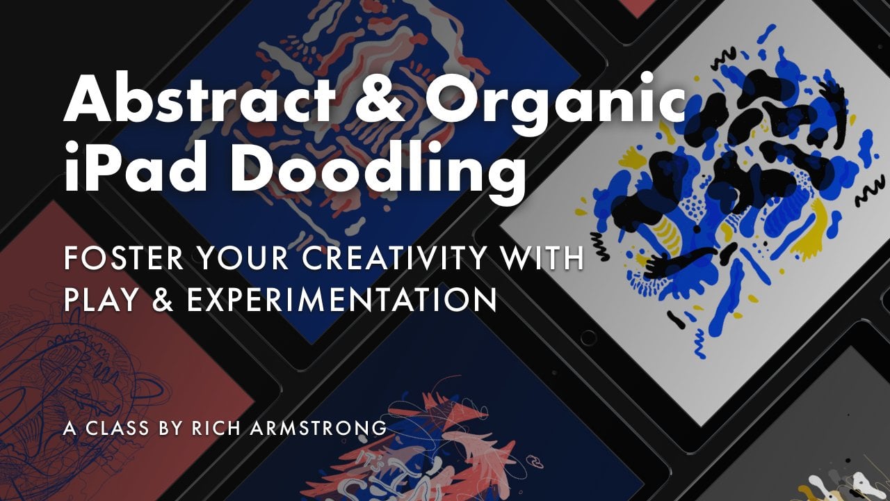
1. Intro: Okay, so how do you make your digital illustrations
feel handmade and authentic? How do you add character and personality to your
digital artwork? Well, that's what this
class is all about. My name is Rich Armstrong. I'm a multi-hyphenate
artist who loves digital art that feels handmade. I love character
imperfections and warmth. My art starts with
simple shapes, simple doodles and flat colors. And then I turn them
into illustrations brimming with personality
and character and life. How? With texture. And that's what I'm
going to show you how to do in this class. During the class, I'll
be using Procreate on my iPad and an Apple Pencil. But you can apply
what you learn to other drawing
and painting apps. If you've never used
Procreate before, don't worry, you're not
going to get left behind. Now, what exactly does
this class cover? We're going to cover how to use the brushes that come with Procreate to create
texture, grit, and grain. We cover how to use
clipping masks, Alpha lock and the select
tool for texturing. We go over using blend modes to quickly give
your artwork depth, and I'll show you how
to smudge and add noise to give your artwork
more of a handmade feel. Of course, there
will be a bunch of tips and tricks about texture, art, and working in Procreate. We'll be covering a ton of
examples during the class, and at the end, I'll
take you through three start to finish
examples of my own. So if you want to add character and life into
your illustrations, using texture, come
take this class.
2. Start Here: Hey, welcome to this class. I'm pumped that you are here. It's all about texture
in the digital world, and we're going to be
working in Procreate. But sure, you can use this
in photoshop or Adobe Fresco or any of the other
drawing and painting apps that you use or that you have. Wow. It's gonna be awesome. But the first thing
that I want to do is kind of define texture. Like, what does
texture actually mean? So, for me, in a simplicity, texture means like an
inconsistent, rough appearance, and perhaps we could
describe it as blemished or distressed or
analog or dirty, even handmade or authentic. There's tons of
words that we could use to describe texture. And I think the biggest
thing for me is that texture in the
digital world on an iPad, in photoshop, it should mimic
texture in the real world. Like, that's what we're used to. We're used to feeling things. We're used to looking at decay. We're used to looking
at distressed things. Things that have
texture in the real. World. And so that's
what I want to bring into the digital world. I want to make things
feel characterful. I want to make things feel like they belong
in the real world. So that's going to be
the point of this class. We're going to make
things feel real. Feel like they have character
and personality and, you know, texture
and life in them. Okay. So what I've done is I've compiled a checklist full of tools and techniques and processes that we're going to be going through during this class. So as you go through each one of these techniques that I
teach you, check it off. It'll feel really good to check something off and
you'll be like, Whoa, there's actually quite a lot of different ways to go about
adding texture to digital art. Yeah. Some of them are
going to be basic. Some of them are going to be
a little bit more complex. Now, in the rest of this lesson, I'm going to do some really, really basic procreate stuff. I'm going to show you how
I creates a new document, how I creates a new template, what color profile I use, how big my document is. If you create whizz, just skip on to the next lesson. If you're like, Well, I really want to know this,
then stick around. The first thing
I'm going to do is switch my cap around
so that you can actually see what's happening
in the overhead camera. And now, procreate. I'm going to press on
this little plus button, and I'm going to go for
this button over here. But before I do that, I want
to remember some numbers. I'm going to go
for a screen size, but I don't want to use
this P three color mode. So 2732 is my screen size and two oh four
eight is the height. But I know that one pretty well, 2732, and then I'm going to press on this new
template button. And 2732 by 20048. The DPI dots per inch, doesn't really matter
in digital art. What matters is pixels. And here we've got a
width and a height. You could change this to 72, you could change this to 300. It doesn't really matter. So I'm actually going
to change mine to 72 to remind myself that this is actually a
digital document. Now, color profile, I do
not like display P three. Well, it is actually
pretty cool on an iPad. But when I bring it into
photoshop or export it, sometimes the color
starts to act a little bit weird like
washed out or just not as vibrant and I like
vibrant saturated art. So this is the one that
I'm going to use as SRGB IEC, etcetera etcetera. I do not like CMYK. RGB for me all the way. Seriously, like if I
can do anything and everything in RGB,
that's my preference. Even if I'm going to print it, I do it in RGB first,
send it to my printer. It somehow deals with it in CMYK and it comes
out beautifully. Other times, I need to
convert later in the stage, sometimes I do need
to work in CMYK, but definitely not
my preference. So that's what I'm working
with Time lap settings. You can have fun here. If you want to use time
laps, canvas properties, you can change your
background color and your background hidden, just means that you
won't actually see a background color
on your stage. Then name this screen size. It's going to prompt
you for a space. I don't put a space,
but let's just do that anyway and then create. It'll go straight
into the document, but your template will exist at the bottom of this
little pop up here. So you could drag
that to the top, like so, and then you can
also delete it like so. Once you've done this,
you will have a canvas, or if you've already got
something like this setup, or you don't mind using P three, then just tap on
your template to create a new screen size
template that you can then use. Okay. In the next lesson, we're going to start
exploring brushes, and Who there's a
lot to explore, but we'll cover that there.
See you in the next lesson.
3. Textured Brushes: All right. So at the
core of illustrating with texture our
textured brushes, and now procreate makes
it really easy to duplicate and tweak and manage the brushes
inside of procreate. And it comes with a whole bunch of awesome
textured brushes, which we can use as starting
points or just as is, for texture and brushes
inside of this class. So what I'm going to do in this particular
lesson is show you how I tweak and duplicate and manage my brushes
inside of procreate. So let's open up our
brush panel here. And on the left hand side,
we've got our brush sets, which are like
groups for brushes, and inside of each brush set are a whole bunch of brushes. If it's got a nice
little icon next to it, it means it's a default
procreate brush set. And if it's got one of these paint brush icons next to it, it means it's either
an imported brush set or it's a custom brush
set that I've created. So what I'm going to do is
create a new custom brush set. I'd like you to do the same
and call it textured brushes. And we'll put all of the
brushes that we find or that we create inside of this
textured brushes brush set. I'll drag this down here just above sketching to
make that easier. And now we go looking for textured brushes or
brushes that we're like, Oh, that looks awesome, either as is or as
a starting point to tweak and further create
more textured brushes. I'm going to give
you two examples here of how to do this. The first thing that I want
to do is I want to try and find a brush that makes it
feel like a fine liner, but I don't want it to
be like silky smooth. I want there to be
a little bit of texture in the linework. Let me have a look at inking. Inca could be pretty cool. I think there's
probably a little bit too much texture there. Pandani. Yeah, that
doesn't look right. Syrup could be interesting. I'm looking inside of inking because that's
what I want to do. I could have a look
inside of drawing. These all far too textured. I love Blackburn, but it's not really what I want right now. Let's go back to inking.
That's not really a fine tip. What about a studio pen? Studio Pen could be pretty cool. This is like silky smooth, but it could be something that we're very close to
what we're after. Let's duplicate this. Because we can then put this duplicated
studio pen inside of our textured brushes
folder or brush set. Just make sure that it
actually goes in there. And then once it's in here, you see it's got
this little icon, which means it's not
a default brush. Fantastic. So tap on that, it opens up the brush studio. And inside this brush studio, there are many different
things that we can do. It's crazy. I'm not going to cover all of them,
certainly not. I'm not even going to try
to cover many of them. Maybe just one or two. You can have a play with all
of these different settings. But it open up on stroke path, and this is exactly
where I think I can make this into a
textured kind of line. So if I increase the spacing, you can see that, Oh, this is actually how a
brush is made up. It's just a whole
bunch of little dots. Yeah. And you can see the shape. It is actually a
dot and the grain or texture on it.
There's nothing there. So dot and then the spacing, if we increase that, becomes really interesting how a
brush is made up, right? Yeah. If we decrease the spacing again all
the way back down, it becomes this really
nice silky, smooth brush. I'm then going to
increase the jitter. And as I do that,
you'll see that mm, there's a little bit of texture. Yeah, that's really cool. And that's exactly
what I'm after. But now, you can see
that as I press harder, the brush gets bigger, and as I press a little
less hard, it gets smaller. I don't want this. This is not really accurate to a fine liner. So, Where do I change this? Well, under Apple pencil, There's as I change
the pressure, the size is then affected a lot. The opacity is not, the flow is not, neither is the bleed. So I'm going to reduce
the size to around 14%, 20% somewhere around there, and then I'll clear this. Yeah. And that
feels a lot better. Okay. So I'll go to
about this brush. I'll call it a Dedle brush De. So first brush is done. And if I increase
the size a little bit. Yeah, that's great. Also, if you're like, Oh, yeah, 27% or 28% is great, maybe let's go for
something like 20%. Just tap there and press plus. It then creates a kind
of bookmark for us. So if we change the size again, we can just tap there and
it snaps back to 20%, which is really, really cool. You can also change
the capacity, which I hardly ever do. Okay. So we've got this
really nice brush. We can draw, you know, all
kinds of little things here. I could probably
continue testing this, making sure that it is
exactly what I want. But I'm pretty sure that it is exactly what
I want right now, and we can always tweak
it further in the future. Now, if you're like,
Oh, I like this, but what if we'll
check this out. You can tap on this
doodle brush again. And where it says here, create a new reset point, this is like, Hey, this is the default brush that I want it to become now. So you go, bam, create a new
reset point. There we go. If you go and change
things again like that, and you press done, you're like, Oh, actually, I don't like
that, you can go back, you can go to about this
brush and reset bruh, reset, and it goes back to
the reset point, which is really,
really handy. Okay. So from here, I
might be like, Oh, actually, I want a little
bit more texted one. So let's duplicate that. We can then rename this to
Doodle brush number two, and then go to stroke path, increase the jitter
a little bit. Something like that,
even more texted. Maybe we can put a grain on. So let's go for a grain. Here, you can import
your own brushes, your own grains or use the
procreate source library. And yeah, let's try
something like this, paper macro or sketch paper. Mm. You can see how it's really, really textured now, and increase the rotation
a little bit. Sometimes these things
are very noticeable, sometimes they're
far more subtle. There's a lot of
different things that we can choose from here. Let's go to the path
and reduce the jitter again. Increase little bit. Okay. You can see that
it's slightly more texted. We haven't changed that much
about this particular brush. So if we're happy with
that, then we can go and create a new reset point. There we go. I got Doodle
brush two, Doodle brush. Maybe we can call this
number one. There we go. That's really example one. Now, example two is I'm after something that's going to
give me a lot of texture, maybe for erasing or to use with masks and clipping masks
further down the line, really something that's
textured and that can almost maybe I
can just stamp it or sponge it on and it
creates a nice texture feel. Maybe like a bit of distress is the best way to describe it. Inking, nothing much like that. Drawing Maybe Blackburn could
be something like that. Maybe copperhead too. Let's go under painting. I know I like stucco. Stucco could be the base or damp brush, similar to stucco. I'm going to go for stucco. Let's duplicate this one. Can see here it's
already pretty texted, which means that it's a
really nice brush to use, and let's move this to
textured brushes here. I'll call it sponge. Okay. Now, right now, it still feels a
lot like a brush. I want to make it a
lot more textured. Such a weird word, right? Textured. I want it
to feel distressed, a lot more bitty. So let's go to Apple pencil. Let's maybe decrease the flow for now, increase the bleed. Yeah, that begins to look
a little bit interesting. Go to the grain, increase
the rotation a little bit. The stroke path, it's
increased the jitter. You see how much
more grainy that is. Maybe that's the
right word grainy. Sometimes you will struggle
to explain what you're after. That doesn't really feel
much like a brush anymore. It feels like sponge or
something like that. Maybe increase the jitter
a little bit more. Okay let's go to rendering. And here, I'm just kind of basing what I'm choosing
on past experience. You really need to experiment
with what you're after, what all of these things do. Decrease the flow,
maybe, wet edges. Wet edges makes it, you know, a lot more contrast
between black and white, burnt edges, doesn't
really do much. Wet, no dynamics. No. Oh, that becomes
really interesting here. What about some flow. Okay, increase the
bleed a little bit more this like an
interesting curve because if I start
with no bleed, it's pretty bleedy If I
increase it a little bit, it becomes less bleedy
then as I continue more, it becomes more bleedy again. I just weird there's
a sweet spot that I'm after about here, I think. I'll clear this. Let's see. Okay, I think that could be
something I really like. Cool. So create new reset
point D. So sponge, I'm going to change this
to white just because we're working with black
and white right now. Maybe it feels like
there's I don't know, too much of a picture in there. Maybe it's because I'm working
with this arrays tool. So let's go back
to the sponge one and I think that was right. I'm not quite happy
with it just yet. Let's go into here again. It feels a lot nicer here. Let's go back to rendering. I'm going to take
away the wet edges. There's some more rotation
that I can do here. The grain is rotated quite a. The shape. I'm going to
change that rotation. Yeah. Let's see if that works. Changes back to Black. Okay. I think I'm after a
little bit more contrast. Let's change this again. Let's go to rendering, increase the wet edges again. Let's get apple pencil, increase the bleed a little
bit, increase the flow. All right. Let's
see if that works. Yeah, that feels a lot. Increase the size a little bit. Okay. I really like that. That looks great. It's a
really nice spongy brush. I wouldn't be drawing
with it that much, but I would be adding
a little bit or a few pockets of these
texted areas like that. Then I can go into it and
create a new reset point. D. So I've created
three brushes, the doodle brush with a
little bit of texture, the doodle brush with a
little bit more texture, and then this sponge brush, which is really, really nice. So there we go. That's
how I go about exploring, how I manage, how I tweak, how I duplicate, man. And you can just
keep on adding to this over and over
and over again. And you don't have to do this
for like three or 4 hours straight as you're wanting
to find a particular brush, go after it or spend, you know, ten to 20 minutes
exploring onee brush, seeing what the settings do. And then meaning like, Yeah, I like that. That looks good. And then you create a new
reset point, you duplicate it, and then you continue to explore and play and experiment
with that particular brush. And then you might get
to a point that you have five or ten brushes that you want to
share with the world. There might be these
awesome textured brushes that other people can
use in their workflows. Or maybe you're like, I don't want to create
any of my own brushes. I just want to use
awesome texture brushes. How do I get it
inside of procreate? Well, in the next lesson, I'll be covering importing and exporting brushes.
I'll see you there.
4. Importing & Exporting Brushes: Okay, let's jump
into importing and exporting brushes
inside of procreate. So in the last lesson, we created these cool brushes. If you just hold down
on the brush set and then release,
you can then share. Once you've shared Shawn,
something like that, you can send it to your computer with air drop or
you can upload to Dropbox or some other cloud
service really, really cool. And then once you
have exported it, how do you get it back in, or if you've downloaded or purchased somebody else's
brushes or brush set, how do you get them
inside of Procreate? So let's open up our files app. And I've got this
texture brush set. You should just
be able to tap it and it imports into procreate. And then at the very top, You should then see the different brushes
that you've imported. Really, really easy. Then from here,
you can rename it. You can then start tweaking, duplicating that kind of
stuff with your brushes. It's really easy. If that doesn't work,
what you may need to do is open up your files app on the left and then just drag
and drop into procreate. Here, you should see now
two texture brush sets. I'll just delete that.
All right. There we go. In the next lesson, I'm
going to be covering filling with texture.
I'll see there.
5. Filling With Texture: All right. Now let's talk
about filling with texture. What I've got here is
this really cool brush. It's inside of inking
and it's called dry ink. Okay. I'm going to draw a
quick little car There we go. I want to fill this area. Maybe let's do that. I want to fill this area. At the moment, there are a
couple of different options. Maybe let's move you down here. The first option is
to painstakingly color this in bit by
bit. That's one option. The next option is to drag and
drop this color over here, which you might
be like, perfect. Amazing. Yeah, but
it's not texted. I mean, look at the stroke
or the line around it, and then the fill
is just it's plain. It's like vector.
It's just like there. No textured at all. Sir, how do we go
about doing this? Well, in a quick way, right? That's what we're after. So inside of our layers
panel, we've got layer one. I'm going to tap that,
and tap on referencia, which makes this layer
a reference layer. That means that on this layer, we can just drag and drop, and it uses the layer that is selected as the reference as the outline to use for when you were
filling and selecting. I can put this at the bottom. Okay, but still, that doesn't really help us.
Yeah, it doesn't. I'm going to tap
on that and clear, but we have set ourselves up to use this layer
as the reference. So now what I'm going to do is press on my selection tool. I'm then going to choose
automatic and tap here, and that selects
this whole area, which is great, but it
doesn't select it super well. So I'm going to try again. This time, I'm going to hold down and drag to the right and increase the threshold
all the way to 100% and then drag it
back just slightly. So it selects this area
as much as possible, and we'll see what happens now. Okay. So we've got this
layer two selected, and you might be like, Whoa, what are all these lines? Your lines may not be
as intense as mine. So if you tap on
this wrench icon, go to your preferences, you can then change
your selection mask visibility down or up. I'm going to keep
mine quite high so you guys can see what's
selected and what's not. Okay. I think I just didn't
select anything now. Let's try this again.
99.9, that should be good. And then I'm going to press on my brush button and make sure I've got my dry ink selected. And here, I can now begin
the coloring in process. You might be like,
Yeah, but how is this different from that first
version that you showed us? Well, now I can kind of color in a little less painstakingly. I can increase the brush
size a little bit. It's almost like coloring in knowing that you're going to be cutting the
piece of paper out. It's like you don't have to color within the lines because, well, it's already selected, and then you tap on
your selection tool. Okay. Sum in a little bit. And that looks
perfect. There we go. That is a very easy way of filling with texture.
It's not the quickest. It's not like you're dragging
and dropping. No, it's not. But it's pretty epic, and it still gives
you that satisfying feeling or for me
anyway of actually coloring in and
illustrating drawing and illustration rather than just like cheating
my way through it. In the next lesson, I'm
going to be covering masks, and masks are really cool for texturing. I'll
see you there.
6. Using Masks: In this lesson, I'm
going to cover how to use masks for adding texture. So what is a mask? It's a gray scale layer
that tells the layer directly beneath it what to
hide and what to reveal. Black means hide and
white means reveal. The mask layer starts off white, which means all of the content on the layer below is revealed. This is super cool
because the content of the layer beneath
remains intact. Masking is a non
destructive process. So let's get into
an example here. I've got this sheep artwork PNG that you can find in
your class resources, and let's go into procreate, and I will import and let's go iCloud
Drive, sheep artwork. There we go, and I'll
zoom out a little bit. Now, what I want to do here is to make this little
sheep guy into a circle, but using a really nice
textured brush to do that. What I'm going to do is
go to my layers panel, tap on this layer, and then tap on mask. You'll see that the layer
mask appears above it. That means if I then use
dry ink, for example, with a black brush selected
or a black color selected, as I brush, it then era but
non destructively erases. You can see if I tap that on and off the layer beneath it, which is really cool. I can also just hold that down
and it switches to white, and then on layer mask, I can then basically restore it. Which is pretty cool, right? I can also hold down here or tap and fill there with white, which makes it all white. There we go. Ready to go again. I'll go back to a black color, which means I'm erasing. And the brush that I want, let's have a look if we've
got any nice ones here. Sponge brush maybe, doodle
brushes, probably not. What I'm going to
go for, I'll go for painting again and
I'll go for stucco. I'll duplicate that one. Let's put that into
textured brushes. Tap on that, we'll just call
it stucco again. All right. And here, make
that a bit bigger. Okay. We can actually
start changing this. Okay. You can also see
outside of this area, there's some really
nice green parts or flex that are still
available or still visible. Just a really nice way to add life and character
into an illustration. Because it's non destructive, you could even set this
up as some kind of template or a preview that the illustrator
is still working with, and you're just doing the textr so you could always
update this layer or copy and paste this mask
to another piece of artwork. It's really, really powerful. Okay. And here, if I do some strokes that
aren't quite so heavy or hard, some really nice like textured brush strokes here and there. Okay. That's looking
really nice and that is just with
one stucco brush. What I'm going to try now is this sponge brush that
I created earlier. Let me make it a
little bit bigger. Remember, this is also
based on the stucco brush. Okay. Okay. And if I wanted to try put a little
bit more texture into here, could try that too. Because this is a mask and
we're not actually painting or raising layer one. There we go. If I am happy with
this at any stage, I can tap on this and
merge down. Can I do that? Or tap on this one, or merge mask
there. There we go. Or I could just go, pop
with my fingers together, and now it's just one layer. But it's really nice to
have the layer mask there. It always means that you
can then update layer one. All right. That was layer
masks with texture. In the next lesson, what I'm
going to cover is creating imperfect shapes that kind of still retain their
geometric integrity. Really important for things
like triangles or circles, things like that.
I'll see there.
7. Perfect Imperfections Needed: So this lesson isn't
really about texture, but it is about making
things feel imperfect. And sometimes we
need perfect shapes, but we don't want
them to be perfect. So I'm going to show you how I balance these two
needs in this lesson. So one of the things that I
do is I create happy suns. They are these like circular
creatures that are suns, but I don't like them
to be perfect circles. So how do I go about
actually achieving this? Well, My brush, I've got
doodle brush number two. I create a circle, which is clearly not circular. I'm not good at drawing circles. Then I hold down
while I've still got my pencil held down on
the screen of the finger, so creates a circle, then I can make it
bigger or smaller. I let go, and then with
my selection tool, I can then reposition it. This now is a perfect circle. I then go into my layers, press on the layer itself
or the blend mode, and then I can
decrease the opacity, and then create another layer. And now I trace this. And when I trace it, it's
not going to be perfect, but it's going to be pretty
close to being perfect. Here, I can then create
a near perfect circle. Sometimes I can redo it or just erase bits and
redo certain bits. And I put two little
eyes and a happy mouth, and that is the base
of my happy sun. I can then create all the rest
of the rays going around. And then I either delete or hide that layer that I used to
trace the layer on top. Pretty easy, right?
Okay. Another example, I love creating rockets and rockets are
pretty symmetrical. So what I do is I tap
on this old car icon, go to Canvas, turn
on drawing guide. Now, there's a lot of things you can do with
the drawing guide. So I go for edit drawing guide, and then go to symmetry. And then my guides, I like them to be
pink for some reason. Capacity up thickness
up, and that is great. You could have it horizontal
or quadrant or radial. But for a rocket,
vertical is perfect. So press done. Then I draw
that line and I hold it down. It becomes a straight line, and then I do the
same thing like that. Now I have a triangle, and then I have my
two rocket boosters, hold that down, hold that
down and hold that down, and then two little wings. Here we go. And hold
it down to make it like 90 degrees
or not 90 degrees, zero degrees or 30 degrees, I think, or 45, et. Okay. There we go. You'll see that this has an assisted little word
underneath layer three, and I can take off
drawing assist. When I do that, there's no more drawing assist
on the other side. If I tap it again, turn
on drawing assist, then as I draw on one side,
it draws on the other. I can take that off again
and draw a circle here. And make that the little
window in the middle. Then again, I
reduce the opacity, and then create a new layer, and then I trace this. Just that it feels perfect but also not
perfect at the same time. So something like that, I
got some fire coming out of these guys. There we go. And I can hide that layer. And yeah. This works really well when I use texture
when I'm coloring in. I've used a texture brush,
when I use masking, clipping masks, a whole bunch of texturing tools and processes. So again, it just makes
it feel authentic, handmade, it works really
well with texture. In the next lesson, I'll cover
using texture with color, which is probably one
of my favorite things that I've discovered in recent
years. I'll see you there.
8. Grainy Gradients: So there actually isn't an easy way to do gradients
inside of procreate. Not like you can in
photoshop or illustrator. So when I was faced with this
problem, a few years ago, I discovered a hand way of doing gradients
inside of procreate, and it has now become one of the recognizable
elements in my style. So let me show you how cool this is and how textured
it is. It's awesome. So I finished the
outlines of my happy son from the the previous
lessons example. What I'm going to do now is I'm going to set this
as a reference. I'm going to create
a layer beneath it. Then I'm going to go for one of my lovely colors, like a yellow, and I'll pop this in
here and a threshold, 100% is pretty good. That means it goes
all the way to this line and a little bit
further, which is fantastic. Then I can start doing a
little bit of gradienting. And with which brush? That is a good question. Let's go to sketching. And there's this thing
called Bonobo chalk. I don't use Bonobo chalk, but I may have started
with it when I started creating this really nice
textured gradient film. I'm going to duplicate it and put it into
textured brushes. Tap on that one. By chalk. There we go. Then I'll
go for, you know, maybe kind of like a red color, almost like an orange color. Pump up the size a bit. Yeah, that's pretty good. And now I don't want
to do that just yet. So what I'm going to do is I'm going to create a selection. So let's undo. I'm going to create a new layer, and then tap on this
layer and select, which then selects this layer, and then I can go and start painting or
drawing on layer six. All right. Maybe make
this even bigger still. Yeah. That's great. So far, I'll go a lighter
yellow at the top. Something like that.
Yeah. Then at the bottom. Very, very cool, and then
a little bit smaller. I'll think just for
the cheeks over here. All right. And then I'll tap
on the selection button. You'll see here how
grainy this gradient is. It's beautiful. I love it. That's how you create a grainy gradient inside of procreate. Now on to learning about Alpha in the next
video, of course.
9. Alpha Lock: What Alpha Lock does is keep areas in your illustration
the same opacity. This means you can't paint
where there is no paint, and if the paint is
semi transparent, the new paint will
be the same opacity. I'd like to see
using Alpha lock as a fancy way to color
within the lines, and we can do it without
needing to create a selection, but it means we need to draw on the layer that
has the Alpha lock. Let's get into it.
So what I have here is my happy sun drawing
from last time, and we've got our two layers. But now I want to
replicate this. Okay, so instead of creating
a new layer and selecting, what I'm going to do is I'm
going to create a new layer. Let's go for pink
in here, fantastic. And now I'm going to turn on
Alpha lock for this layer. So I can go in Tapia and tap
Alpha Lock, which is great. But if you need
to do this a lot, what I find is quite easy is assigning it to a
quick menu action. So I've set my quick menu
up with this little button, Tapia, and I go, Bam. Alpha lock. And here you
can see that Alpha lock. It's no longer on. So
I'm going t Alpha lock. If you're like, Yo,
I want to set one of those quick menu things
up. How do I do that? Well, go to your wrench icon and then go to preferences,
gesture controls. Then there's a whole bunch of things that you
can set up here. But go to quick menu and I set mine up with a tap of that
little square button. But you could change
how that works for you and you press done. So now you press. There we go. And then here you've
got quick menu one. I've got quick menu two
and quick menu one. You can create new quick menu. And if you don't see an Alpha, you just hold down on one
of the buttons and you then set an action for
this little button. There we go. Alpha. Alpha is off, and now
Alpha Lock is on. Great. We've got
Bonobo chalk selected, I'm going to increase
the size of that, and I'm going to go
for a red color here, you can see that as I'm drawing, there is nothing outside here and there is no
selection present, which is really cool. I find that this
is really helpful. If you're more confident
with your brushwork, I find that needing
to use selections and multiple layers is probably most likely when I'm not so
confident with what I'm doing or I need to
play around or experiment. If I know exactly
what I'm doing, then I just use an alpha
lock on a layer. Okay. That looks pretty
cool. A little bit of light of pink
at the top here. Okay. Okay. That looks good, very nice and textured. Okay. Now, some little cheekis. Let's reduce the size here. That looks good. Okay. And it's all on this one
layer. Fantastic. Now, when I'm not using Alphas, what I often use are clipping
masks, which are amazing. So that's what we're
going to cover in the next lesson.
I'll see you there.
10. Clipping Masks: Okay, it's time for my favorite
tool, the clipping mask. A clipping mask is very
similar to an alpha lock, except that we can interact
with the individual layers. When a layer has the clipping
mask option turned on, it means you can only see content where its base
layer is visible. The base layer is usually the
layer directly beneath it, but you can turn
several layers on top of each other
into clipping masks, and they'll all use the same base layer to know what to show. If you draw, move or erase
parts of the base layer, this will affect
what's visible in the clipping mask
layers above it. Let's jump into an example here. Okay, so I've got my Happy
sun example here again, and this was the
Alpha Lock version. This was the selection version, and now I'm going to show
you a clipping mask version. I'm going to create
a new layer here, I've still got layer two
as the reference layer. Let's go for a blue
color, fill that, you might be like, Yeah, suns aren't blue.
Well, check this out. I'm going to create a new layer, and let's go for
perhaps a yellow, and I'll tap on this
and fill this layer, and now everything's yellow. But if I tap on this again
and I select clipping mask, it's just going to show what is visible in the
layer beneath it. Layer eight is now essentially our clipping
mask base layer. If I turn that off, you
don't see any yellow. If I turn that on,
you see yellow. Now, this is a very handy
way to be like, Oh, well, I'm going to select this
as a clipping mask, and then let's go
for a peach color. Then I will fill this layer. Peach could be cool.
Yellow could be cool or maybe not peach. Maybe let's go for a red, let's fill this layer. It becomes a very
quick way to prototype different colors and
different effects. Okay, so I think I'm going to start with
this one this time, and then going to
create a new layer, make it a clipping mask. And now I get a bit irritated having to
do that all the time. So I like to create a
top clipping mask and then on this clipping
mask, create a new layer. And because it sits in between, a clipping mask and
another clipping mask, it automatically becomes
a clipping mask. It says clipping mask
and you also see this little arrow that
makes it a clipping mask. If I don't want that to be
a clipping mask anymore, that layer and the
layer on top of it also don't become
clipping masks. Let's make it a clipping
mask and clipping mask. Let's go for Bonobo chalk again. I'll go for a red color,
make this really big. Here, it's like, Oh, yeah. Let's do this again. You'll be familiar with
this gradienting process. Now here, instead of
working on the same layer, if I'm a little bit uncertain, this is a great way to
experiment and play. I'm going to create a new layer, which is a clipping mask, and then going to select pink. Go for pink up here. Okay. What does that look like? Maybe we need to change that. I'm just going to hide it. I'm then going to
create a new layer. Let's go for a lighter pink. Oh, that maybe looks a
little bit too light. Hm. You see what I'm doing here. It's just very easy to
play to experiment. Explore and experiment,
create a new layer. Let's go for a peach color. Yeah, that one is much better. Reduce the size a bit. Okay. It also makes it
a lot easier to erase. I'm going to hold
down the array to and I'll have Bonobo chalk
selected as my raised to. Here, I'm just erasing
this particular layer, not worrying about
all the other layers, which is very handy. Something like that,
that looks good. Then I could use this layer
or create another layer. Make this a little bit smaller. Let's go for this go for a little pink
for the cheeks here. Okay. Let's go for another one, maybe peach color again. Depending on what
I wanted, either of these would be pretty good. You see here, I have a ton of different layers,
and short here, what I can do is
just select them all and group them
as one happy sun. But you can see that I've got a whole bunch of different
experiments here. I've got these different colors, maybe, different pinks, peaches, and so it becomes
really flexible. I can also move these
layers really easily. So this, for me,
when I don't know exactly what I'm doing
becomes immensely valuable, and I use it all the time. When I do kind of know what I'm doing,
and I'm like, Okay, this is exactly
what I want to do, then I switch to
using Alpha masks. It means I can just not an
Alpha mask and alpha lock. It means that I can just use one layer and do
all the coloring on that one layer and not have
to worry about bulking up my layers and running
out of layers to use. So clipping masks are
awesome and powerful, but so are masks and
selections and alpha locks. When and where you use
each of these tools and how you combine
them is up to you. For me, it normally depends on how confident I am
with what I'm doing. If I'm experimenting or unsure of exactly what
I'm doing or wanting, I'll use clipping masks. And if I'm using blend modes, I'll use clipping masks. But we have not covered
blend modes yet. So that's what we'll be covering in the next lesson.
I'll see you there.
11. Blend Modes: Now let's talk
blend modes and how they work really well
with clipping masks. So, what is a blend mode? A blend mode changes
how the colors of a layer interact with the colors of the
layers beneath it. Each blend mode applies a different algorithm to the color information
of the layers, which can get you some
pretty cool effects. The two blend modes I use the most are multiply and screen. I'd like to think of
multiply as layering a sheet of colored plastic over
another piece of paper. It's useful for creating
shadows and dark areas mostly. The screen blend mode is used
for creating lighter areas. It's like blending
two lights together. Now, there are tons of
blend modes to choose from. So I recommend playing
around with them and seeing what you like for what particular artwork
you're creating. When we're using clipping masks, we can change the blend
modes of individual layers, much like we can
change the opacity of an individual layer. And this means we can access some really nice color effects to go on top of our base layer. It also means we have access to a really
nice color sheet, which I'll show you
in this lesson. Let's dive into it. So there's this robot flat
procreate document that you should find in
your class resources. I'm going to tap
that and open it up. And in here, you'll see
that you've got some lines. Get your black bits, blue bits, red bits, and gray
bits, and also the sky. What I'm going to do here
is I'm going to work with the gray bit, especially, and I'm going to create a
new layer and I'm going to go for this gray color. And let's go for bonobo chalk. Let's see if it is actually
the same gray color. No, it's not. I'm going to go
for a lighter one. That is the same gray color. You might be like,
what are you doing? It's a good question.
So what I want to show you here is
what multiply does. To access all your blend
modes, you tap on this n, which stands for normal, and you can see all of your
blend modes over here. Currently, it's on the
normal blend mode, and if you scroll down, you can see what's
happening here. Multiply, it's really
nice effect, right? It makes everything beneath
it a little bit darker. Pretty cool, and you can
change your capacity. Okay. Okay. That looks
really interesting. If I tap on this and
select clipping mask, it now only applies
to its base layer, which is this base gray layer. Now I'm still using the same
gray color as this layer. If we go back to go to normal, you don't actually
see any difference. If we go for lighten, that
should change something, or if we go for screen, now you can start to
see what I use it for. Let's go for multiply first, and I'll tap this, select clear, and then increase the
brush size a little bit. And then do a bit of
Brush, gradient brushwork. This is the cheek because I'm not selecting a
different color gray, I'm using the same color gray. I've just used a
multiply blend mode. I'll create a new
layer clipping mask, change this to screen, and then do the same thing over here with a screen blend mode. There's a weird blur over
there for some reason. Maybe it's because I
changed my pencil angle. Maybe this is a
little bit too light, so I'll adjust the opacity. Yeah. Something like that
begins to look really nice. I'll do the same
thing on the blue, clipping mask, and then
I'll go for this blue. Right now, you can't
really see anything because I haven't
changed the blend mode. Let's change that to multiply. You can begin to see And then I'll create a new layer clipping mask and
change that to screen. I could use a different color, but I'll use the same one
just because we're cheating. I use the size a little bit. Okay. You see it just adds a lot of depth to our pieces now using
these blend modes, and it's really quick. For red, let's try this
out clipping mask. I'm going to change
this to a multiply Over there, use the same red. This may not work as well. You may not be able to
see it because red is tricky when it comes to
multiply and lighten or screen. So I'm going to clear this
and I'm actually going to up for a slightly
darker in color. Here we go. Now here, if you didn't want it to
come through onto the mouth, what you could do is use
your selection tool, make sure it's an automatic
and select that color. No, that color, not that layer. Go to the lines up
here, this layer, and then select There we go. Then go back to this layer
over here and do some drawing. We can always reduce the selection mask visibility
if we need to. Okay. Something like that
looks pretty good. It might be a little bit dark, now the beauty of having
this as its own layer, and as a clipping mask is that we can then sect adjustment, go for huge saturation
brightness, bump up the saturation
a little bit, maybe bump up the
brightness a bit. And, maybe you can't see
it so well on this angle, but for me, it looks
a bunch better. Then we'll go for a new
clipping change to screen, and then I have
two of these now. Interesting. I'll
go for this color. Well, and pop this up here. Okay. Go back to this one over here. Make this a little bit redder. That is how I use blend modes. Again, there are so many
to choose from here. Maybe I can quickly show
you with the blue one. Just watch here how many
different versions there are. A play and experiment
with all of those. I'll for multiply for that one. What you can do here
is you can start to use a mixture of techniques. What I sometimes like to do is select individual panels
and then do a little bit of multiplication at the bottom
and some screening at the top and do it for each
of the single panels. Just so it makes it feel like a little
bit more patchwork. Okay, so blend modes
are fun and powerful and especially when you use
texture and clipping masks. If you're new to blend modes, experiment and have
fun with them, and then the next lesson, I'm going to cover adding dirt and black shadows
to your illustrations.
12. Shadows & Dirt: Sometimes I like making my
illustrations feel dirty or as if they've been processed by a photocopier or
something like that. Other times, I like
adding shadows, specifically black
shadows, either at a semi transparent value or
as a fully opaque black. Shadows add depth
to illustrations, and doing it with texture is a lot of fun. So
let's get into it. So what I've got here is
my robot illustration from the previous lesson. And I want to start adding a little bit of grit and grime, some dirt on top of it. And I'll go for this gray layer and add a new layer on
top of it clipping mask, so it's only going to be visible where there are gray bits. And I'm going to go for a black. Then I don't want to
use Bonobo chalk, but maybe the sponge one
that we created earlier, and maybe I can change
stucco into something else. And I think that this dry ink brush would
be pretty good too. I'm going to duplicate that. Take that into textured brushes. Let's give you an
updated name, dry Ink. Should be perfect the way it is, let's go for stucco
stucco rotate. And then under grain, I'm going to change to rotated. And yeah, I wonder what else
we can do here to make it a little less like a
brush and more like a grungy splat of sorts. Change the rotation of this guy. Yeah. That might be pretty cool. Mm hmm. Grain behavior, texture. That's not what I'm going for. Okay. What about some
Apple pencil, Bleed. Okay. Yeah. That looks pretty good. Let's increase that. I'm
really happy with that. That looks good. Stuck a rotate. All right. What I
like to do here is literally just go crazy. This is really, really fun. I'm just going to work
on the head for now, and then s the same brush
to do some erasing. Increase the size a
little bit, not press. Basically create my
own texture here. Yeah. I like it. Okay, so that looks really,
really cool, right? I think so. I think so anyway. So I'm going to create a
new layer clipping mask and do the same thing
with this dry ink. Perhaps I can just
do it on one panel. You start to see how this works. Current brush, dry ink. Pressing really softly here. All right. I've got these
nice little spots there. Really nice subtle texture. Then I'll create a new
layer clipping mask, probably also with dry ink. I think that's pretty good.
Change the size here. Here I'll add a
little bit of shadow. Something like that, and
beneath the mouth too, it might be protruding, and then I will decrease the opacity to actually
make it look like a shadow. This will also be
slightly textured, even though you
can't really see it, but if you zoom in, you see
it's a little bit bumpy. So, that adds a lot of, like, life, a lot of, you know, texture, grit, grain, makes it feel
like this dude is an actual robot that's
being, you know, recycled. Maybe it's a post
apocalyptic dystopian world, and they've salvaged the
parts and made this robot. Yeah. That's what I'm
going for, you know? This technique for me is very therapeutic
and a lot of fun. And it means I don't
need to use or find ready made textures
to do this with. But that is another way to
add texture to your artwork. And so I'll cover this in the next lesson. I'll see there.
13. Make Your Own Textured Background: If you're working
with big files or you don't want to create
texture using brushes, you can use photos or
scans of textures. What I want you to do now is to take a photo of
something texted. Then I'll show you how to
bring it into procreate. If you don't want to take your own texture
photo, don't worry. I've provided a few
for you to use. Let's jump into our
files app here, and I've got texture
photo number one. This is photo number two. It's just of my genes. And this is like a really
subtle paper kind of a texture. So let's going to
procreate and I'll go to my cog icon add insert a file. I drive texture
photo number one. That's cool. I'll
rotate it 45 degrees, and then fit to Canvas. Fantastic. Sometimes what I'll do is I'll start with texture, and then I'll create the
artwork on top of that. Other times, I'll start
with the artwork and then add texture on top
of that or into it. In this case, I feel
like it's going to be an abstract piece or more
of an abstract piece, so I'm going to start
with the texture first. So I've got my texture. Now you can actually
just use this as is. So I'll create perhaps a little geometric
kind of drawing. And let's go for maybe black, maybe green because it's quite different from the
background elements. We've got a new layer,
so I'll just start creating and I'll pop some color in there and
what kind of brush is this? It's a marker brush. All right. Let's go for texture brushes. I'll go for my doodle
brush number one. I'll add a couple more
little circles in here. Pop that in there. Just holding down on the screen to make it a perfect circle. A here. I can say continue filling. There we go. This is the
start of an abstract piece. I can then use a clipping
mask or the other way around. I can bring a layer one above this and use this
as a clipping mask. Okay. And you begin to see that this becomes really interesting. And with this layer one, I'm going to duplicate
it and hide it. And we can remove the
clipping mask feature. Now we've got this, the colors
are pretty interesting, and what we could do is we could change
this to something like multiply already and that becomes really cool
on this green color. If I wanted to change the
green color to a blue color, let's fill this layer
becomes really cool, Darken Look at those greens
in there, zoom in here. And, This all looks
really interesting. Screen and color
dodge look really cool too. Take off that. Wow. So you can see
how texture starts to play a really cool role
in some abstract artwork. Now, what we can do too is
I will duplicate this and I'll change this to us
go for normal for now, and I will hide this layer one. Now, what I'd like to do
is I'd like to change the hue saturation brightness and just bring down
the saturation, so it's black and white. And once I've done that, I'll go and s curves. This is basically
increasing the contrast, so I'm going to
decrease the blacks, so make the blacks blacker or the dark rays darker
and the lights lighter. So I almost get this
really posterized kind of effect between black
and white. All right. So once I've done
that, I can then use this multiply effect a lot better or the screen effect or the lighting
effect, a lot better. You get these really nice
textures. Super super cool. And this is an example
of one kind of texture, and on top of this, what I could do if I wanted to
make it pretty fun. Let's go for black as I could
start adding in some legs, some arms, that kind of stuff. And as a creative exercise, this becomes very fun. Shape plus texture,
doodled or drawn bits and pieces on top of
that. All right. Let's put there, there. Hello. Stuff like that, and
it becomes really fun. Now, let's get onto
another example. On top here, I'm going
to insert a file, and we'll go down
to the bottom here. This texture photo number two. I'm going to rotate it
and then fit to Canvas. Maybe even extend
it a little bit. So all of that kind
of texture comes through and I'll do the same kind of thing here,
hue saturation brightness. It's already like a black
gene or black denom, and then I will increase
the the contrast. Where you decide to put these curves or how
you decide to change this will then change your
texture and how it looks in your artwork. That
looks pretty cool. Then on top of this, maybe below this, I'll
go for a clipping mask. I can then start to do some
drawing with my razor. Okay. There we go. That becomes a
really nice piece of texture to work with. All right. Then on top of
this, we could then mask this perhaps we could use the Bonobo chalk with black to just make some
of that texture go away. You begin working with brushes
along with textures that you've brought in
and you get these really nice,
interesting textures. Now, the final one that
I want to show you is adding this really
subtle one of file. Let's go for texture
photo three, rotate and fit to Canvas. I'm not quite sure if you can actually see what
this looks like. Yeah, I think you can.
It's pretty bobbly. Right now it doesn't
really look like much, but if we put this multiply, in feels like there's
paper on top of everything or that everything
has been drawn on paper, which, again, it just
makes it more authentic, feels like it's been
handmade or hand printed or it's something
from real life. So let's go for hue
saturation brightness, drop the saturation, and then increase the curves
or play with the curves. It's not too much. Otherwise,
all the detail is gone, but maybe something like that. I'll just bring it back a
little bit so you can see. Something like that
looks pretty good. Now, you could save
this particular image, and all of these particular
layers you could hide. Let's group those
and just hide that. You could save this as a standard texture
piece of paper image. It's a lot better than the
one that I brought in. But I'm just showing you how to work with the textures
that you bring in. T. You could also put this one at the bottom or
the group on top. Although some of these things
would now not work so well, it doesn't feel like they've
been printed on the paper. So I'll just undo that. You can see here because of that multiplication blend mode, it looks really, really
nice on the paper texture. So adding your own
textures can be super fun and a
great excuse to get outside and into the
real world and take photos or at least get
off your chair, you know. But now, talking
about the real world, let's talk about actual
paper and actual printing, which we'll do in
the next lesson.
14. Paper & Printing: Adding your own textures can be super fun and a great excuse to get outside and into the real world or at
least off your chair. Now, if the purpose of
your illustration is to actually print
it on real paper, then things get really interesting because
paper can be textured. Years ago, I made
greeting cards. The artwork was super
simple line drawings, printed on thick fleck
paper, and it looked lovely. If you're printing
your illustrations, consider the paper
you're printing on. You can have flat colors and no texture in your
artwork at all, but when you print
on textured paper, it becomes textured. The life blossoms there. It makes a world of difference. All of a sudden,
it comes to life. So sometimes you don't
need to add fa texture to your digital
illustrations because you're going to get that real
texture with your paper. If you're not going to print or you're going to print
on plain white, untextured paper,
keep the effect of a nice texture in mind. In the next lesson,
I'll show you how to use the noise
effect to create an overall texture and to texture specific
layers. I'll see there.
15. Create Texture With Noise: Another way to create
texture is with noise, especially if you're
wanting a subtle texture. This often gives your artwork this imperceptible,
warm feeling. And when I'm creating
digital marbling pieces, adding this noise can even
make it feel like velvety. So that's what I'm going
to show you how to do now. So in your class resources, you should have a marbling
flat procreate file. So let's open this app. And if you're like, Whoa,
how did you do that? Well, I have a whole class on digital marbling in procreate.
You should check it out. Marbling is super fun, super
therapeutic, relaxing. It's just really awesome. So
now we have this one layer. I'm going to create a new layer
and fill it with a white, and then I'm going
to change this to a multiply blend mode. And we can change that
a little bit later on. But for now, it's pretty good. White with a multiply blend
mode just means nothing. But when we go to our
adjustments and go for noise, we can now add a bunch of
noise to the whole piece. And we just drag our finger across and the noise increases, and you'll see this flex or
noise starting to be added. And it's just like
this really nice subtle texture or effect. You could go overboard
and then change the opacity on the layer. Let's try that. And you'll
scale octaves turbulence. I don't normally play
around with that too much, but you can if you want,
and then tap over there. You can see there's
quite a nice difference. If we change the opacity, we can then change
how intense it is. Now, we've got this
multiply blend mode, let's have a look at
what darkened does, and maybe let's
bring up the opacity again, or color burn. Color burn may be pretty cool. Let's have a look at that.
Maybe reduce it a little bit. There's just like Zoom in here. It's slightly
different to multiply. I think that looks pretty cool. It adds like velvety feel, adds a lot of
texture and warmth, but it also makes some of
the colors pop a little bit. So noise is pretty cool, right. I often use it in
the last few steps when adding finishing
touches to a piece. You know, to add that
extra vibe to it. It gives it so much
warmth and I often feel like touching it,
like, Oh, yeah. Now, in the next lesson, we're going to cover smudging, which is not a normal
thing in digital art, which is why I love using it. So I'll see you in
the next lesson.
16. Smudging: So you know when you're
drawing on paper and you smudge your drawing by
mistake or your writing. Well, that doesn't
happen in digital. Right. Well, it can, actually, if you want to. But even if you didn't, when you're drawing on paper, smudging is still something
people do on purpose, and we can use this
technique to make our illustrations
feel more handmade. So, let's get into smudging. So what I've got here is the marveling pieces
from the last lesson, and I'm going to
hide them for now, and I'm going to show you
how to do some smudging. So let's go for a doodle brush or doodle
brush number one, or maybe even dry ink. Just do some squiggles and
then select our smudge tool. Over here, perhaps we
can start with a stucco. I really like stucco when
it comes to smudging. Looks pretty cool. Let's
do some more squiggles here and there just to see what the smudging
brushes look like. We could also go for
let's go for drawing. Maybe a Blackburn, t's
see what this windows. Well, I do make that
a little bit smaller. It's really a smooth feel. Let's go for painting. Let's go for turpentine. Reduce the size again. Yeah, that's quite nice.
Let's go for artistic, maybe something like
whatever that says, Tara not such a fan of that one. Let's try old Bleach.
That's pretty interesting. Cool. So you can really see how the different smudges start
to work out really nicely. What I do like doing as
well is being able to do some drawing and then use my finger to smudge
instead of to draw. So how you set that
up is you go to your cog icon or
your range icon, then to your preferences,
gesture controls. And then on smudge, you turn that on. Then I'm going to
turn this one off. Let's see on general
enable paint with finger. Yeah, that probably had an issue with that because
that was turned on, and that would be like,
Hey, this is actually going to do something else.
I'll turn that off. It's got to smudge
and turn that on. When I touch, I'm
going to be smudging, which means I can do some
drawing and then some smudging, which I find really cool. If we go and change
this back to stucco, I can then draw and
smudge, draw and smudge. This also means that
if you're drawing and you by mistake,
do some smudging, it's a little bit more
lifelike and, you know, anti digital, which I really like kind of leads
to happy accidents. So I made a good mess here. How I like to use this is in
this digital marbling world. I'm going to create a
new layer over here. I'm going to hide those smudges. And what I like to do is
I like to hold down and select a color and then do
a little bit of painting, and then Just smudge, a little bit of
painting, smudge, a little bit of painting,
and smudge that. You might be like, but I can't really see any differences, or you just start changing
the color a little bit, do some smudging. All right. Over time, you add this like little Vanier to your artwork. And so maybe you can't
see it too much now. But if you take that
off, you begin to see, oh, it makes a big difference, although it's quite subtle. So that's how I like to
use smudging in my work, especially with this
digital marbling kind of technique and especially
with abstract kind of work. So, I usually use smudges at the very end of my
illustration process, or I embrace the happy accidents philosophy by setting my
finger as the smudge tool. But if you did want to use it at the end of your
illustration process, there are a few more things
that you may want to consider adding at the end of your
illustration process. So, we'll cover those
in the next video.
17. Final Grit Grain: Okay. Okay, at some point, you need to decide that
your artwork is finished. Something that only
you can decide. What I'd like to do before
I decide is completely 100% done is add some
finishing touches. We've covered smudges or
smudging in the previous lesson. And in this lesson, I'll
cover adding final grit and grain so that it feels like it's been through some kind
of analog process, maybe that's been photocopied or printed or I don't know,
something like that. What I've got here is a piece from my
Doodle verse series, and I wanted to add a little
bit of grit and grain on top of everything just to feel like it's gone
through that process. So I'm going to go for black. And then my brush, go for this sponge brush. And I've also got some really cool brushes
inside of my rat brush set, and it is this grainy
kind of a brush. So I can also use bonobo. So let's go back to texture brushes and use the
sponge one for now. And you see it like on this
white guy, for example, just want to add a
little bit of texture. Okay. Just so that it feels like it's been through this process. So here and there, I'll just add a little bit
of this process, especially at the
edges looks really nice and it doesn't take away
from the art work at all. You can see I've already done
some in the b over here. So we'll continue in the black over there
with a white brush. And it's just really subtle, you know. Okay at here. Places where there's
a lot more detail, I can actually put a lot more of this grittin grain
looks really nice. Not too much, but we can see that I just adds
quite a lot to it. In my opinion anyway,
I like texture. Now let's go all
the way down here. I'll add a new layer, which is a clip layer
or a clipping mask, I'll change this to white and then do the same thing here. Okay, so that just feels like it's
further out stars, but also makes it feel like
it's really nice and texted. This process pairs really well with smudging
and adding noise, adding paper texture,
and that sort of thing. They are all the
things that you do at the end of your
illustration or artwork. In the next video,
I'll chat about your class project.
I'll see there.
18. Class Project: Okay, now it's your turn to create an illustration
with some texture. Maybe you have an
existing illustration that you can apply texture to, or maybe you want to create some smaller illustrations
to test texture out with, like playing an experiment. Whatever it is, I want
to see it from small to big from experiment
to finish clin pieces. I would love to see it.
So, please share with me. If you're stuck and you can't
think of anything to draw, there's a PDF with ideas of things to draw in
the class resources. So, create a project and
upload your illustrations. You can also post them on
social media and tag me. I'm Rich Armstrong with an underscore before
the ON G at the end. And at this point in the class, I would love you to leave
a review of the class. It means a ton to me, and it helps other students know whether to take
the class or not. In the next few videos, what I'm going to do is create some illustrations of my own. I will be using texture. You'll get to see the
complete beginning to end process of drawing and planning, adding texture,
finishing a piece off. Then to end this video off, here are some ideas
of things to draw. All right. I'll see
you in the next video for my first start
to finish piece.
19. Example 1: Abstract Doodles: All right. So in this example, what I'm going to
try to do is to create an abstract illustration. There's going to
be some marbling, there's going to be
a lot of grit and grain plus some
doodled elements, and those doodled
elements are going to be made with
textured brushes. So, let's get to it. I want to create an A three
size kind of artwork. I'm hopefully going to print it. So A three is good. And here, I'm going to create
a black and white piece. I really like black and
white, white paper, black frame or maybe
a white frame, depending on what happens here. So I'm going to change my
background color to white. And then I'll change
my pen color to black. And then what I'm going to
start with here is a bunch of really nice kind of paint. So turpentine and oil paint are normally pretty
cool for that. So like so, I cover this
in my marveling class, but I'm really going
to apply texture to this and not just create
a marveling piece, but use marbling in the actual
creation of this piece. Then I go to adjustments
and liquefy this guy. Should be good, a little
bit of distortion, make it a little bit smaller. Get something like this going. Yeah. Okay, so that looks pretty cool. I like the look of that. Maybe I could add a little
bit of white in here. So let's just add a little white there and there liquefied again. Yeah. All right. That
looks pretty cool. Add a new layer here for
a bit of grit and grain. I've got inside of
my rat brush set. I've got this grain brush. I've also got the
splatter brush. I'm going to try to use
splatter brush. Here and there. Add some of this grainy texture. Feels like spray paint. That's the point.
Then I'll add white. Feels really liked painting. It's looking good. Like settled gradients, grit, strains, that kind of stuff. Have a quick look at
with it on and off. That's really good. A new layers for
sketching or drawing. What I'm going to do here
is I'm just going to try a bunch of different
brushes, see what it works. It's really cool. I don't really mind it being consistent. I'm just going to add
a bunch of doodles, a bunch of different
shapes, forms. Some of them are
going to be abstract, some of them will be shoes or
clouds or stuff like that. Let's go and evolve one,
see what this looks like. Yeah. So I'll start at the back.
So I'll start at the front. So a new layer for the back. Just put that behind. Yeah. You can feel how gritty this feels ready. This brush is really gritty. Try Eagle we what
this feels like. I go for white too. Okay. Crown maybe, maybe a little bit of a mixture between street
art, graffiti, doodling. One of my favorite
things to do is draw a bird big fan of birds, so let's have a look at what
Oberon maybe a bit smaller. Okay. These birds in various forms are pretty signature to
what I like to draw. I guess they represent
some kind of freedom or represent people seeking
freedom in some way or another. I really like this Oberon brush. It's. There for white now. Okay. Okay. Yeah, I really like it. I don't think I've ever used it before or intentionally
used it before. What I'm going to do is add
it to my favorite brushes. I'm going to add it to my
RD brush. There we go. All right. Let's go back to
I was a drawing, Oberon. Clouds are another thing
I just love to draw feels dreamy and also when
they rain feels cool. Okay. Yeah, things are looking
really nice here. I don't want to spend too
long on these pieces. They can be fairly simple. So I guess I'm
nearing the end now. So let's see if this
makes any difference. That was pretty nice.
Perhaps another one over here. One more. Sometimes I like to draw a new layer,
sometimes not rarely. Depends on how
confident I'm feeling. In this case, yeah, just
feeling pretty confident. Then there's a nice six pencil that I'll try out to add a
little bit of smaller details. I always like to put
my name somewhere. I go. And here under sketching
is a six B pencil, which is a really
cool brush to use. Really nice and textured. Kind of feels like charcoal now. I guess I was going
to say pencil cran, but it is a pencil. Maybe rainbirs or
something like that. Maybe a bird here. Let's go for a white again, draw an eye or two. Eyes are also things
that I love to draw. Maybe just three eyes. Should we good? Yeah, I think that looks pretty cool. What I'm going to do
now is group it all, I'll duplicate that and
then I'll flatten it. Then what I'll do is
I'll create a new layer, drop in a white and then
use a clipping mask, set it to multiply. Then let's go put
some noise on here. It really does add
quite a bit to it, especially the white
bits, like a lot. And once you've done that, I'm going to merge them together, like so and then go to curves and just increase
the contrast a little bit. All right. So
Something like that. Then what I'm going
to do is mask this, and then I'm going to use that really cool
sponge technique that we had earlier just to roughen up the
edges a little bit. I could feel like there's even more grit and
grain going on. Btress maybe it's been through a printer or
something like that. And then vice versa, I'm going to add a little
bit of black and there, just like a little
bit of gritting grain, final gritting grain. Yeah, good. I think I like that a lot. At this stage, I
reckon I'm done. There we go. That is a really abstract piece
that uses a lot of texture, a lot of the techniques that we've covered during the class. If you have any questions about this particular piece or this technique or the
combinations of them, just drop a comment
and I'll respond. All right. S in the next one.
20. Example 2: Happy Sun Rocket: What I'm going to do in this
example is draw a rocket, but in my doodle verse style.
It's got a lot of color. It's got a lot of grain actually in the
gradients and color, and I've also explored the finishing touches
with you in this class. I'm going to create a two
four square as a base, and then increase the
size a little bit. I go to Canvas and
crop and resize. Settings. What is 2048
plus half of 2048. Let's do some quick mai, 2048 plus 1024, 30723072. Something like that.
Cool. That looks good? Maybe I can reduce it a little
bit. Something like that. What happens if it's
2048 plus 512, 256256. I really like just working in round numbers or in this case, it's all divisible
by two, I think. Yeah, that looks pretty good. I like that. Great.
Then I'd like to start these sketches with this blue color and
a six B pencil. Six B pencil is over there, and I'll turn on
my drawing guide. Turn on symmetry, increase the opacity and thickness,
and go for pink. Just because I like pink. There's no real other
reason for this. Something like this
in the middle. Yeah, maybe they can be a
happy sun in the middle. Something like that.
These can be a bit bigger. I like that. Drop the opacity, turn on
drawing a cyst for this one, make some perfect lines here so that I can
trace it. Okay. Okay. Just try that one again. Okay. These ones don't have
to be too perfect. I don't think, although
maybe let's try. The mounts a little
bit more perfect. Okay. And then I'll take off the drawing a cyst so
I can do a circle here. And then pop it in
the middle or select it my free hand selection tool and then pop that in the middle. Maybe a little bit below.
Yeah. That looks good. I can turn the opacity
on that one down. Then what I'll do here is go for this doodle brush number
one, how big is that? Maybe a little
bit, let's try 30. Yeah, that looks
good. Go for black. I'll save that size. What I used to do
before there were these little bookmarks is
actually remember 30% or 27%, sometimes I'd write them down in the template files
that I would use. Okay. So we can begin
here or I can begin. I'm not going to
use any snapping. I'm just going to try
draw these perfect lines. So it feels authentic. So if I double tap it
switches always does that, but sometimes I don't
realize I'm double tapping, double tap just switches
between your tools. It's a little bit
frustrating if that happens and you don't know why. Okay. The line
work for me always comes first in my doodle
verse kind of style. There we go. I can fill in or color in
once the line work is done. Okay. It's a little bit weird
there. Let me try that again. A little bit weird again. Let me rub out with
the same kind of style of brush and
try that again. There we go. A bit era there. Okay, I'll draw a happy sun. There we go, and
perhaps I'll draw. Perhaps I'll draw. Might be beneficial to actually create a circle for that
or a reference circle. But let's try this
free hand. Okay. Something like that
looks pretty good. I'll also draw some fire. It's probably one of
the main reasons I draw it because I
like drawing a fire. It's not the best fire. Okay. And here, I'll draw some rivets because the wings need to be connected to the body somehow, and it's pretty fun
drawing these kind rivets. I'll do the same thing here. Yeah. That looks good. I'm going to take
off the planning. I'm going to take off
the drawing guide. Now I set this as the reference layer and I
can begin coloring here. For each particular
color or section, I might actually use
a different layer. Maybe before I can actually do a little bit of these panels. Panels are fun. Maybe I'll raise this one. Okay. Okay. The p over there. And finish off these
rivets over here. Yeah. Maybe we can just
add a couple more in here. Or maybe that wasn't necessary. Then one at the top. Maybe this one also needs
a couple of rivets. Yeah, and we can maybe
put some rivets in here. Guess this is how I
illustrates yeah, let's start the coloring. Oh, no, before I
start the coloring, let me finish this
or finish that. Sure, I can actually add to the line work while I'm
going, so I might do that. But I think that sets
us up pretty nicely. Cool. Let's open up this color panel. It's my doodle
verse color panel. I'll just pop in some gray here. I think that will be a
different kind of gray. Let's go for a darker gray
on the wings and over here. Then at the bottom,
I'm going to add maybe not red, maybe lighter red. Something like that. Yeah, I think that looks pretty good. Then we'll add a little
bit of black there. We'll add a little bit of
blue there and for the sun, some yellow, and then for
the flames down here, so maybe a bit of yellow
and a bit of red. That's the basics, and I guess the background
color can be black. Okay, we've got our
rocket started here. I'm going to use an alpha mask
or an alpha lock for this. Then let's go for Benbo Chek What size is this. Let's
go for about that size. Just a little bit of gradient
over here. Fantastic. Here I'll do pack again and do some gradient
from the bottom. Then a bit of light at
the bottom of the flames. The bottom of the tires to
the bottom of the flames. Cool. Happy sun. I'll alpha lock you. You can see how it's
getting pretty gritty and grainy here. I love it. I'm going to create
a new layer and use a clipping mask here
just to do the cheeks. It's a little bit smaller. Yeah, not really the right size. On the right color, I mean. All right. He looks cool. I'll the sky. Okay. That looks lovely, all
of these red places. I'm going to alpha it. I don't know if you
can quite see that, but there is some grit
and gradient there, and then I'll
create a new layer, make it a clipping
mask and change it to screen blend mode, and also change the color to make it a little bit lighter. A bit here and there and
I'll drop the opacity. Just to give it a
bit of highlight. The the dark gray, I'm going to create a new layer, make
it a clipping mask, turn it into multiply, and do some multiplying here. Really gives it some volume. I'll just select the same brush
to do a bit of a raising. Okay. And I'll decrease the opacity a little bit, add a new layer, turn it into a clipping
mask and turn it into screen blend mode and
using the same brush, not raising add a little bit of highlights to these darker
wings and darker areas. Just a little bit.
Just a little bit. Yeah. Then you can't really
see what's happening here. Let's go for a clipping mask
and I'll create a new one. Make this a multiply blend mode, make this one screen blend mode. Then with the darker color, maybe with a lighter color, but I think the
darker color is good. And the lighter one now, just at the top of the rocket. Make this a little bit lighter. Okay, that's looking pretty good. Then I want to add some stars. Let's go for Doodle brush again, go for white and stars and moons They're really simple
kind of shapes. Nothing too fancy here. And do you like drawing
stars behind my shapes, though, makes it feel like this rocket is in motion
or the sky is in motion. It's not just an
artist doing accurate. Maybe not accurate. Super unrealistic
view of the stars. The stars are never in
the perfect place, right. Okay. Something like
that looks pretty good. Little happy sun in its rocket. Then I'll create a new layer
and go back to bo chalk. Let's make this a
little bit bigger. Here, I'll add in a bit
of background stars. I'll select the same brush, make it a little bit,
do a little bit of. Just adds a little bit of grit and grain or
introductory grit and grain to the background, so it's not so stark black. Then a new layer, and then this new layer, we'll go for that sponge
brush that we made earlier. Yeah. You can raise some of these bits. Okay. Okay. So that's
looking really good. And then I guess the last
thing that I'd like to do is add some
grittin grain on top. I'll go for black, and there's this sponge one that I have been using, but I'll
show you another one. It's not the splatter one, it's this grain brush. It's pretty similar. Adds a last little
bit of grittin grain. I'll erase some of it, so it's not so intense. Yeah. There is my final illustration. It has a lot of grit and grain. The gradients are grainy. The colors are grainy. There are finishing effects. Maybe we could do
some smudging now. Let's give that a
quick little go. Let's go for
something like this. I'll do some smudging
with a stucco brush. Let's see what that looks like. Maybe let's try screen
blend mode. Yeah. Okay. Okay. Perhaps
we can also put it on to the happy sun guy
too. It's like shining. Yeah. It actually
works really nicely. Over here, what I'd like
to then do is mask this. Then let's go back to
our textured brushes, use stucco rotate and Just put
a bit of texture on top of the bright lights that
we created. All right. So, this is a very
different kind of style and technique
to the last one, and the next one will also be slightly different. I
hope you've enjoyed it.
21. Example 3: Mr. Lippy Lips: Okay, so this is the
third and final example. I'll start to finish example
that I'm going to show you. And it's the style that I
came up with when I did my 100 day projects all
around web characters. They're really fun,
really simple, but full of texture. So, let's create one of these. I'm going to go for a two
oh four eight square. So 2048 is 2048 pixels. There we go, and I'll go
for my blue color again. Let's go for sketching
six B pencil. Here I have this idea of creating this character
that's just like a mouth. That's all he or
she is maybe with a bunch of teeth too. Like that. Maybe also a ton of sorts. I don't know, teeth
could be pretty cool, and then some eyes on top, like that, and
some little shoes. Boots, Aarms probably not
just lips teeth and eyes. Something like that. Just
like really simple fun. You could use this
on something like a greeting card or a poster, maybe on a website as a
character, something like that. So let's reduce the opacity. And then there's going
to be no outlines. There are no outlines
in this style. So I'm actually going to draw
with something like this, doodled brush, but going
to then fill them in. Okay. So I'll go for this color. We can change that
later if we want, or I can change it
later if I want. I'll just pop that in there. And if we put this on top, we can always see the planning, and then I'll create
some white teeth. And one of the reasons I
use this beige color as the background is so that I can actually use white as a color, and I don't have to then hide the white or change
the white background. Okay. Something like that. I will do the same on this side. Doesn't seem like the most
visible teeth on the side. There we go. Pop that in there, pop that in there, and then put the lips on
top of the teeth. Then, because that's white, I guess I can put some
white eyes up here. There we go, and some eyebrows. I'll just make these black. But there was that really cool brush
that I saved earlier. The bro Let's see if we can. What is happening here. Use that a little bit smaller. You see that nice
bit of texture. It's a little bit
inconsistent, fantastic. Then something like that. Okay. Legs now. Go for the same
color for the legs here. Set. Let's go for Doodle
brush number one. There we go. I'll fill
these on top of this, I will create a little
bit of black boots. Something like that.
Fill these up. There we go. Now, it looks like a pretty
cool character already, but now I want to
add some texture. Let's do the legs first. I'll use a clipping mask. I'll go for a red color and make this multiply or I could
actually use the same red color. I'll go for stucco. Maybe a little bit smaller. Maybe a little bit bigger now. That looks pretty cool. I'll add a little bit more clipping mask. Let's go for a bit of
sponge here. I use black. That looks pretty cool. While we're on the sponge mode, I'll go clipping mask
on the white layer a black here bit of
black over here. Okay. Then I'll add a new layer in
between the layer and the clipping mask layer or the base layer and the
clipping mask layer. I'll choose this dry ink one and maybe change the
opacity to around 30%. Then I'll give this
guy some te shadows. Maybe that's a bit too. 20% looks pretty good. Then some on the eyes here too. Yeah, that. It's pretty cool. Maybe make it a little
bit thicker so and then use a layer mask with a sponge to fade it
out or texture it out. Maybe Yeah, I think that looks pretty cool. It gives a shadow like
a nice little texture. All right. Let's add that
in a little bit again. Yeah, that looks cool.
I think what we could do here with this Oberon brush. Let's add to little nostrils
or something like that. Yeah. Then a clipping
mask here for multiply. Use the same one, and then
go for texture brushes, go for stucco rotate. Let me increase the size
here a little bit. Okay. Creates a new
clipping mask layer, changes into a
screen blend mode. At the top all out. Something like that. Let's
go to the layer beneath it. That looks pretty good. I think this bottom layer could do with some desaturation desaturate
that a little bit. Yeah, that looks pretty good. He is a very fun character even looks like a
little bit paly maybe. Then the last thing
I want to do here is clipping mask
and let's go for the sponge black Give him a little bit of gritten
grain here and there. Okay. So yeah. That's good. Now, the
boots clipping mask there. Let's go for a
little bit of white. Okay. Don't need to
do too much there. I don't think. Then finally, like the bottom layer, a little bit of a
shadow, I reckon. Here I'll probably use
stucco or stucco rotate. Let's go for black. Something like that use the
same brush to erase with. And then we can
reduce the opacity. There we go. It's a really nice and textured. That is our character.
Perhaps we can change the background color now to
something like a blue or. Yeah, I think that
looks pretty good. Then we can do a little bit of work on the background adding a
little bit of texture. Stuck rotate sounds
good and changes to a multiply layer. Okay. Yeah, something like
that. Due the capacity. Maybe increase the
capacity of this one. There you have our
little character. He's really cool. Maybe we'll call him Lip or
something like that. Okay, so that is
example number three. I hope you've learned a lot
from watching start to finish examples of the entire
illustration process and three very different styles. All right. Thank you
so much for watching.
22. Conclusion: All right. We've covered
a lot in this class. Texture, texture, texture
and more texture. But not everything
needs to be texture. Not every style, not
every illustration, not every part of
an illustration. Sometimes all you need
is some subtle texture. Other times, the more
texture, the better. So what I suggest doing
is trying texture, a lot of it, a little of it, have fun with it and combine and experiment with
all the techniques we've covered in the class. And then use them
with other styles and techniques that you've
got in your tool belt. So, it is now the
end of the class. I appreciate you watching it. So thank you. It
means a lot to me. And I hope it means
a lot to you, and I hope it's been fun and that you've
learned a lot too. Just know that I love teaching, I love creating and
that I'm extremely grateful for what I get to do
and how I get to help you. I love you to leave a
review of this class. Give me some feedback and help other students decide whether
to take this class or not. If you'd like to stand
in touch with me, my work, and the educational
content I create. Sign up to my newsletter on rich armstrong.net and follow
me on social media. I'm at Rich Armstrong with an underscore before
the last ONG, Alright. By phenomena.
 Rich Armstrong, ADHD Artist + Designer