Transcripts
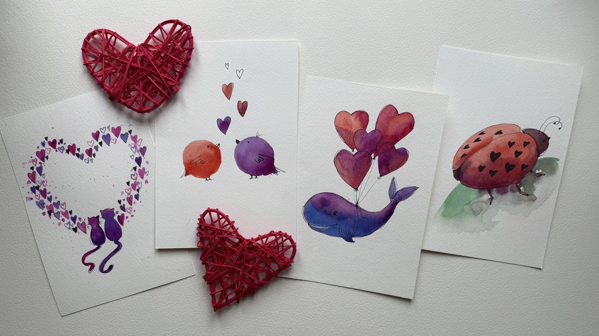
1. Intro: Welcome to our watercolor
sketching class inspired by the sweetness of fruits and the spirit of
Valentine's Day. In this session,
we'll be creating five simple and colorful
postcard designs featuring fruity sms
with a romantic twist. Was reads playful cherries
or vibrant kiwis. These sketchings are designed to be fun and beginner friendly. Perfect for adding a splash
of love to your art. By the end of this lesson, you'll have five
unique cards to share with someone special or
brighten up your place. Let's dive in and make
something beautiful together.
2. Materials: I want to show you the materials we will use for today's lesson. We need watercolor paints
and sick watercolor paper. You will also need tip and
a board to fix the paper. If you're drawing
in a sketchbook, you don't need the board. You will need two brushes, one bigger, and one smaller. I have a big soft squobush
and a smaller synthetic one. You will also need it
a eraser and a pencil. A liner is also helpful, and the best size
is 0.3 millimeters. Don't forget some tissues
and a cup of water. If you want, you can use a hair dryer to dry
the paper faster. So let's start.
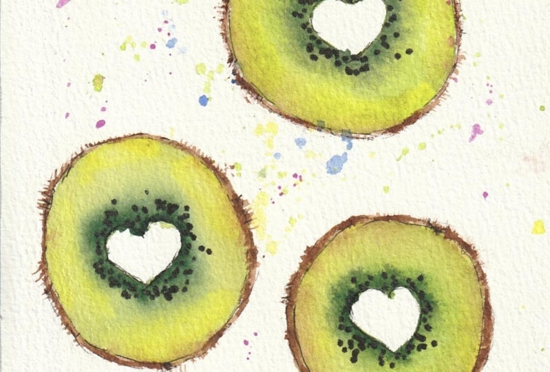
3. Lesson 1: Kiwi Love: Now we're going to paint keys
with heart shaped centers. First, let's catch with the pencil where
they will be placed. At the top, a bit
lower, and even lower. Make sure they're positioned at different distances
from each other. You can also slightly
shift one to the side. And let's get the centers. Now, erase any
unnecessary pencil lines. Now we move on to watercolor. We need a green lettuce like
shade and pay attention. The color gets deeper
toward the center of the kitty and more
yellowish toward the edges. We'll keep this in mind. No. Let's start filling in. Use plenty of water, so the colors blend beautifully. Begin there with green, gradually adc she to the center. You can add a little
yellow along the edges. Use a fine brush to outline
the brown kiv skin. In some areas, trees
along the edge, in others, extend slightly
beyond the watercolor shade. And don't make
everything uniform. By the way, you can
use the same brush to lightly add some
tiny hairs to the Kivy, making it look more natural. Not along the entire contour, just in a few spots and repeat the same process
for the other Kivas. If you're working quickly, you can play two kiwis at once and then add the
color variations. Don't forget about the hat. Add a little yellow
around the edges first. Then move on to
reach green shade. Let's a brown color. Apply brown carefully. Use the side of the brush or fluff it up slightly to
create soft textures. To some brightness,
lightly splutter a mix of the green paint we've been using this will create
beautiful textures. Okay. In some areas, make
the splashes larger. So let stand out. The rest of the splats
should remain small. If the colors turn
out too intense, you can lightly blot them. Now the water coal bes is ready. Let's dry it and the
details with a liner. Lightly outline the shaves, intentionally
skipping some areas. Draw the saves all
around the center. Mm hm. Leave some spaces empty. The most important
sine is to preserve the hot shape inside while
placing the seeds around it. Creating a beautiful silt. So our loving Kiwis are ready. Now you can remove the
tape and enjoy the result. I look forward to
seeing your artworks.
4. Lesson 2: Cherry Romance: So next, we are going
to paint cherries. Let's position them on the paper so that the branches
cross form in a hot. You can draw one cherry slightly higher and the
other a bit lower. If you prefer, you can make the hot shape less pronounced
and slightly smaller. Erase any unnecessary lines. Don't forget to add highlights. You can place a couple of small bright spots here as well. Now, let's start
filling in the color. First, use light red shade and carefully paint
around the highlights. Okay. Next, create a red cherry t. And feel in the
rest of the shape. Find the right duck Find the right dc tone. The very bottom can be made slightly darker with
a few brush strokes. And you can also deepen
the shadow in the center. To enhance the volume even more, rinse your brush, and softly blend the
loa pot with water. This will create beautiful
drips and make the cherry look like it's resting on the surface instead of
floating in the air. Now let's draw the branches. I also suggest adding
some rad splashes, but first slightly with the paper so that the splashes
appear soften diffused. Apply a little water. And then add the splatters. Some of them can be gently blended or blotted to
soften the effect. This will create an
interesting background. Around the highlights,
I want to carefully lift some paint to
emphasize the bright areas. All done. Now we can let it dry. Let's add details with a liner. Carefully outline the shape. And they have another
romantic postcard is ready. Thank you for your attention.
5. Lesson 3: Watermelon Crush: Now we're going to paint a
bright and juicy watermelon. But instead of regular seeds, we will create hot shaped ones. First, let's catch a slice. Lightly mark the dark
pot of the rind. The seeds are arranged
in a circular pattern. So we can outline the
placement right away, either schematically or
just with small mac. Now let's move to watercolor. To achieve smooth
watercolor traditions and the beautiful effect, start by filling the entire
area with clean water, and then we will add the
paint to the wet surface. You can mix a little scarlet
in certain areas to make the watermelon look more
dimensional and natural lid. This technique can
also be used to subtly indicate where
the seeds will go. Now take green and carefully pin the rind. Here, you can slightly
blue the edges, allowing the pain to
flow and mix softly. At the very bottom of the rind, add a touch of dark blue
to enhance the contrast. Use clean brush to gently
blend the tranditions. Add a few juicy splashes on top. Observe how the pin
beautifully mixes and try to preserve the drips to enhance
the watercolor effect. Now, let's dry the
paper and the details. Of course, the main
detail the seeds. Take a liner and first of all, draw the hot shaped seeds
in the most utable spots. Trying to maintain
a rime without placing them at tec
distance from each other. The hots can be slightly elongated to resemble
real watermelon seeds. Some of them can be left empty. Like the light colored
seeds in a real watermelon. Let's have a mix of filled
and empty heart shaped seeds. Now, we outline the shape, carefully trace the edges, but with making one solid line In areas where the dark paint has created beautiful blends, I will only lightly
define the edge with the liner while preserving
the natural watercolor drips. And there you have it another
fruity postcard is ready. Such a vibrant and juicy result. I can't wait to see
your watermelon too.
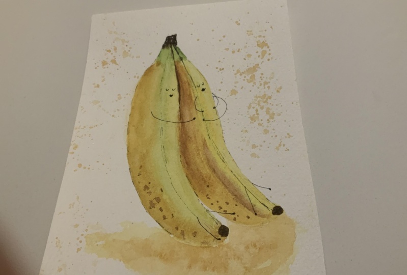
6. Lesson 4: Banana Hug: Now it's time for
the loving bananas. Let's sketch them with a pencil. First, outline one banana. For now, just lightly
mark the shape. Add the stem and the duct tip. The bananas will have
a shared base here. You can also indicate the
bananas ridges, one at the top. And not the lower down. The sketch is ready. Now let's move on to watercolor. Take a warm yellow shed and
start with the light seas. The stem has light green tint. But you can make
one side yellow. Now at a richer yellow tone. And to create depths, mixing a little brown. The area between bananas is Daco enhance this by
shading the ridges. And at the bottom, gently blend the edges. You can add a few dark
spots for a natural look. And now let's paint the
dark sterias, banana stems, tips, and the place
between them. Extra vibrancy, add a
slight touch of green. I also want to include some small spots on
the auto banana. As banana ripen, they develop characteristic
ducks, peckles. You can also slightly enhance the bananas texture to
make it more expressive. And as usual, let's add
a few waterglassplashes. Then blow them and
let everything dry. Now let's bring the bananas
to life by adding details. First, carefully
outline the contours to define the shape. Now, let's draw their faces. The first one. Its legs. One banana will have
short little arms while the other will have long arms
for hugging its partner. We can also add a few
lotnhts about them. On the peel, we can
draw some leg petals. And that's it. And as a durable
postcard is ready, you can add your own details, personalize the style, or
make any changes you like. The most important thing is to keep drawing and
enjoy the process.
7. Lesson 5: Berry Kiss: Now let's paint strawberries
in the shape of hats. One will be slightly bigger
and another one next to it. Let's add a stone
with some leaves. We can also draw another
beautiful strawberry leaf here to fill the space and
create a balanced composition. I'm using light pencil stroke so that the lines won't be so
visible after painting. Now let's move on to watercolor. We'll start with light or shade. On one side we live lights. We need to leave some
places unpainted. While beautifully filling in
the rest with watercolor. This is how I create
the first layer. Now we'll introduce a
more saturated color alining gently
with soft strokes. Taking a darker, deeper
shade to define the shadows. Take brown color. It in a bit of eat at the
top, under the leaves. And using the same
color will make a few vibrant splashes
along the edges. As usual, we can blow the darkest ones while
leaving the rest there. And now let's paint the leaves. Strawberry leaves have
an interesting shape, especially along the edges. So we'll create them using brush impressions to
achieve a natural effect. You can rotate the sheet
to make it easy to draw. If the shape turns out uneven, you can always adjust it later. Add some water in certain areas, and then no introduce decatons
to deepen the shadows. With a fine brush
or the same one, we carefully outline
the strawberry stems and the small top leaves. Using a clean brush, we can add a few soft
highlights to create beautiful effects and hansa
paintings liveliness. Now we'll slightly blue the lowa pot from looking
they're floating in there. This way, they will appear to
be resting on the surface. You can also blend in a hint of the color for a
more dynamic look. I also want to place a rich dark accent on the side to balance
the composition. And now it's time to
let everything dry. First, we'll emphasize the hot shape. Senza, the main idea
of this painting. Now let's refine the leaf. We don't need to outline them
the same way all around. Some areas can have more defined lines while the others can be
left soft and water. This will make the painting look more lively
and interesting. Now let's move on to the most exciting part,
drawing the sets. They give the strawberry
its recognizable character. The seeds are arranged in rows, but you can slightly break this pattern to make
it look more natural. You don't have to draw
every single one. Just highlight the
most important ones. Now let's at the final touches. Enjoy the process and
take the finished result. We've created beautiful
juice strawberries. Feel free to paint your own atm strawberries or
arrange them differently. Take this idea, bring
in your creativity, and add your own unique
touch to that work. And, of course, don't forget
to share your results.
8. Conclusion: Amazing W. You
have now completed five delightful fruit seamed
Valentine's Day postcards. Each proston with
color and charm. These wet designs are wonderful way to spread
love and creativity. I hope this class has
sparkled your passion for watercolor sketching and given you ideas for future projects. Don't forget to applaud the oc creations in
the project gallery. I'd love to see your
artistic take on these fruity designs
until next time, keep painting and
sharing the joy of art.
 Natalia Nikitiuk, Capturing Life's Beauty