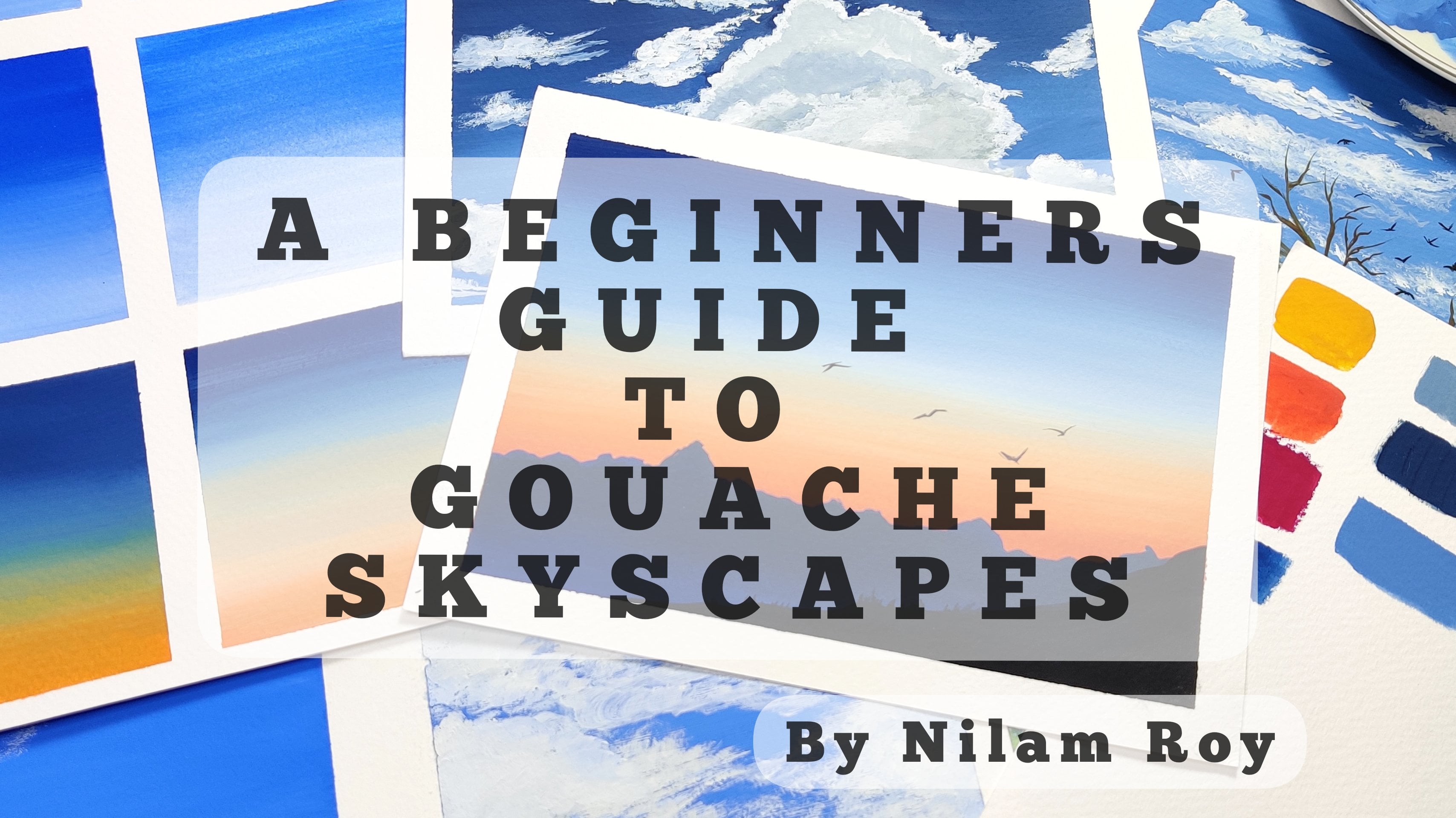
Transcripts
1. Welcome Back & Class Overview: It's almost impossible to
watch a sunset and not dream. Rightly said by
Vaughan Williams. Why is it that when
our eyes fixed onto the warm colors
of the setting sun, we are transported to
an enchanted world. Have you ever noticed that? We have that one thing
that makes us feel warm inside for that
moment, life is good. For me. That thing is the sunset. Sunset has always been
there no matter what. It is, my peace and comfort. We all appreciate
different things in life. But sunset makes
you realize that there's always a hole
for a new beginning? That's why I never miss an opportunity to
enjoy the sunset. Take photographs no
matter where I am and get inspired to paint
this beautiful moments. I capturing them on my
paper or on my canvas. Hello everyone. I am the limb Ryan, artist and an art educator
based out of Bangalore, India. I go by the handle
name and the red, Neil's artsy underscore
Cove on Instagram, where you would discover my
passion to paint nature. You could also find me on Pinterest, YouTube and Facebook. The link to virtues given
on my Skillshare profile. I am someone who is
absolutely obsessed with sunsets and is never
tired painting them. This very obsession of
mine led me to explore sunsets with a totally new and
fun medium called gouache. And I was instantly
in love with it. The rich, vivid colors and the opaque matte finish
really caught my attention. So here I am with the
seven day challenge, exploring the beauty of sunsets over the
course of 14 days. This challenge will
not only make you get into the habit of
painting everyday, but also get rid of the overwhelming feeling when getting started
with a new medium. This squash challenge
is designed for all. You need not worry if
you are in a mature, but the medium I am
here to help you out. In this class, we will learn
what is squash and why it is currently the most
trending medium that artists community. I will take you through the supplies needed
right from the paper, colors, brushes, and
other accessories needed to get started
with our main class. I will be discussing in great detail about
the properties of bars that makes it such a
versatile and forgiving medium. Give a detailed
overview about some of the basic fundamental techniques such as gouache
consistency, mixing, layering, and blending in the form of some
practice exercises, which will help you to understand this
medium much better. Using all of these techniques. We are then going to
start our class projects which are going to be about
30 to 40 minutes long. To not make you feel
overwhelmed during the class, I will be uploading each alternate day a
new class project. This would allow you
to relax and paint and catch up with me in case
you were lagging behind. So if this is something
that interests you and want to grow with
me in your gouache journey, then join in this
class right away. I'm thrilled to invite you all in the seven day challenge, hoping to see you in the class.
2. Choice of paper for gouache: For a big nerve, the
very first question that pops out in their head is, what kind of paper should
I start with for gouache? Do I need to go for
expensive watercolor ones? Are done. Squash, have any other
specific requirements? Well, in this section, I'm going to address
all of your questions. Washes, also known as
opaque watercolor rate. So by that sense, if you think all
watercolor papers should work for gouache, but not only on those kind
of watercolor papers, you could work with gouache on your toned papers or tinted papers such
as yard this tone, gray papers, your craft papers, or even your black sheets. The only thing that you
should keep in mind is that the thickness
of the paper. That is what matters a lot. So you are this craft paper or your tinted sheets will be somewhat similar to that
of hot pressed papers. That meaning it has this
smooth finish to your surface. But nowadays there are a lot of variations available
in the market. There are some now a little textured black sheets
also available in the market when you paint
with gouache on this kind of black or craft or any toned paper for
that matter of fact, the opacity of the
gouache is enhanced more beautifully and it gives a beautiful finished
to your painting. For gouache, you need not
worry about splurging into very artists grade a 100%
cotton papers with practice. And when you get a
grasp of what kind of consistency of gouache you
like to work best with. Your paper choices can
also vary accordingly. For example, the blending
is much more easier on, you know, a 100% cotton
hot press paper. Now this hot press
paper that you see out here is from Lana. And as you can see, the paper will be very
smooth like here. Can you see there is absolutely no texture on
the surface and hence, gouache will lie
beautifully as soft and smooth like butter on this kind of hot press
surface or paper. Now, when it is made
up of 100% cotton, the paper will try
to absorb more of that paint and
the pigment for you. Okay, So that's the
only difference. Now see here this paper, the sketchbook that I'm
showing you are curious, made up from 100% cotton paper, 300 GSM, but it's cold pressed, but it has a matte finish. That sketch book paper is very similar to that of
this honeymoon phase. Cold Press matte finished paper. Here, take a look at
the paper surface. Can you see it has
little texture to it, but it is not so prominent. Now when you compare these
two papers side-by-side, you would see here for example, this Arches paper is
cold press paper, right? Wearables. This
honeymoon phase paper, as you have seen, is not so textured. It has a very subtle at extra
to the surface and that's why I have been loving to use this paper for my
gouache paintings. Now that is totally my
personal preference. There is no restriction as two, you cannot no use. Rough are very coarse. Textured paper for
gouache you can use, but you have to play around
with the consistency of gouache that you are
using while painting. Now, here in this kind of paper, you cannot be varying
thicker consistency of gouache because those will get trapped into those grooves. Hence, you have to
walk around with the consistency of gouache, which we will be discussing
later in the lessons. Okay? So as a beginner, I would recommend you start
with cold press surface. You can use your
cellulose papers also, which has little texture to it. Or rather start with paper which is absolutely plain or smooth, such as your hot press paper
or something like this. Okay. So you're also, you
would be getting similar matte opaque
finish to your painting. Just that, remember
to use a paper which at least is 200 GSM or of-of. Preferably, I would
recommend you to always use to 70 GSM or evolved
people, even for gouache. Best results, I have found that you use a 100% cotton paper, which is of at least 300 GSM, but it is absolutely
not necessary too. Always go for a
100% cotton paper. It is just about experimenting, getting to know the medium, and working with some
different consistencies, of course, that you
would find your way. For example, in this
Canvas kind of paper, you would notice that
you would need more of the wash paints to really
cover those pores, open pores of this paper so that you get
results like this. So here you will be
consuming a lot of your gouache paints and the consistency
has to be perfect. It should not be to take or
it should not be too thin. It should just be perfect
so that the pores are blocked and you'll get this opaque, beautiful
matte finish. And because it is so textured, the effect and the detailing that you would get on this paper will just
blow your mind. So I have been
experimenting quite a lot in this paper and so far, I'm really loving the results
that I have been getting. But if you're an
absolute beginner, I would not recommend you to absolutely start with
this paper because it, it has to do with lot of understanding about the
correct consistency of gloss that you would need in to work on this
kind of paper. So basic things, getting it
right is as a big nerves you should either or for this cellulose paper which
has little texture to it, so that it's easier for you to bring out the details
onto your paintings. Or you use a normal
hot press paper which is very smooth surface. It need not be a 100% cotton. You can go for even
the cellulose ones.
3. Gouache Overview: What is squash? Squash is a water-based medium and is made up of
natural pigment, water or binding agent, which is generally gum
arabic, our deck stream, and some propylene glycol to keep the paint moist
and not written. When dry. Gouache is similar
to watercolor, it can be activated using water. Rv wetted just like watercolors, but when dry, it gives a
mad, beautiful finish. It also allows you to paint
with an opaque painting style and can form superficial
layer by using the Spain, just like how you would do it with acrylics or oil paints. This is the example
where you can see the layering technique
being used with gouache and the effects
are so beautiful. This is one of the major
reason why cautious, known as the left child, between acrylics and
watercolor because it exhibits properties
from both the mediums. Because making it
such a versatile medium to work with
this very nature of gouache was loved
by illustrators and hence they were widely
used in comic books, posters, or any
design-related work because they're way
easier to print. Washes very similar
to watercolors, but it is modified to
make it look opaque by the addition of a
white fill up like substance such as jock or body, which turns the gouache heavier and does not allow
light to pass through. Hence the name
opaque watercolors. I like watercolors. The particles and gouache
are typically larger. The ratio of pigment to
binder is much higher. And filler, which is added, gives the matte finish to the gouache and
renders it opaque. Since the pigments
used in gouache are much larger or coarser, it typically sits
on the surface of your paper rather than being
absorbed into the paper. Just like how
watercolors would do. When you dilute the
watercolors with water, it would give you the
transparency rate. But with gouache, you
won't be able to attain that transparency even though you turn it down with water, they would still be some
amount of paint redeemed. So when it comes to
painting with gouache, we always use our white gouache
to tone down or lighten, are colored and get a lighter version or shade
instead of adding water, which we do for watercolors. This technique is also very
similar with acrylics rate. Even in acrylics, we use
white to lighten our colors. Once done, you let
the layer dry and you see that it dries
into a very matte finish, unlike acrylics, which gives
us shine or sheen to it. And the resultant outcome
is water resistant, unlike gouache, which can
be easily reactivated. Now let's take a look
at the different forms, of course, that are
nowadays marketed. These are available in tubes, this little jars and the famous jelly cups
from me or hear me. Now there is another type, of course that is
available in the market, which is known as acrylic wash, which is very much like gouache, but when it dries, it dries to be water resistant, just like how acrylics are. All of these are going
to give the same result. That is the matte finished
look to your painting. But you may want to watch out the vibrancy of the
paints for some brands. That is sometimes
the inexpensive ones where more of the chalk filler is added and less
of the pigment, you would get some
dull colors which will not be so vibrant
after finishing. This can be understood by when your brush rinsing water
turns to muddy too soon. This means that your gouache is loaded with pigment
to binder ratio, as it should be. One important thing
that you must keep in mind is that always use freshly squeezed
squash to give you that perfect velvety finish
that you are aiming for. Or if your gouache is most enough to get reactivated
using little water, you may do so, but remember to add a dollop of freshly squeezed squash
so that there is no difference in the
vibrancy or the gouache is not too diluted when you are
reactivating with water. In this way, your
vibrancy will be intact. Now that you have a brief
understanding about the nature of gouache and
it's versatile properties. Let's get to know a little bit more in the next
section where I will be showing and discussing with you some basic foundational
techniques of gouache, which we will be putting to practice in our class projects. So get your supplies
ready and join me in the next section to begin
our practice sessions.
4. Gouache Consistency: In this section,
we will be talking about and discussing the most
frequently asked question, what should be our
gouache consistency be like consistency of hogwash when it comes out of
tubes will depend on number of factors
like the pigment, the brand, the age of the wash. But ultimately whichever
gouache you may have, the end result will have to be a creamy velvety makes
dropping from your brush. If you have the paint sticking
to the tip of the brush, it means that the consistency
of the gouache is to take. This thick gouache is
generally used to apply finishing touches or highlights at the end of your painting. For example, maybe to add
certain drops off flowers to create some petals or to create some strokes are dry brush
patterns for mountains. When you squeeze squash
fresh out of the tube, you get the highest
capacity possible with it. However, this may
be difficult to spread it when used
on a textured paper. Hens. Consistency not only depends on the amount of water that
you add to your gouache, but also the type of paper that you would be using to paint on. Let's take a look at
the example here. I am freshly squeezing
out the gouache from my tube and with my damp brush, I'm just going to pick some of that paint and we'll start
spreading across the papers. Since my brush is damp. Initially for this smaller area, I will be able to spread the
paint nice and thoroughly. But in case of
larger surface area, I will be getting some dry brush patterns and my brush will not be
able to move along. Now, let's move to the next case where I
rinse my brush thoroughly with water and then dab it dam on a tissue paper
or tissue Darwin. Now I will be squeezing some of that fresh squash all
over again on my palette. And I'll be loading my
brush with this thick paint and start to glided
on the paper surface. Let's see how it works. So here I'm facing difficulty to lead this paint on my
paper nice and evenly. And as a result of which, I'm getting dry brush marks. This will be even more
difficult when you go and start layering it on a very
textured surface like that of a
rough grain paper. Now let's add some water to it. Actually, lots of
water to it and make the consistency almost similar to that of watercolors. See how thin the
paint is, right? You can clearly see the palette visible underneath
that paint mix, right? So this is the thin
consistency of gouache layer. So when you start
layering on the paper, it would lead very
smoothly on the paper. But you can see that you are able to see the
underneath of the paper, write the paper white
is getting exposed and so are your
brushstrokes, right? So here it is. This kind of thin consistency
of gouache is mostly used as a base coat for
your underpainting. So you would have this question, what would be the perfect
consistency then? Here is it cure the gouache
right now is to take, I'll be adding some little water with the help of
my brush and I'll try to mix it into a
creamy, velvety makes. Can you see I have
mixed it to be creamy and it is nice and
buttery consistency. And I cannot see the
underneath of my palette. Now applying the paint on paper. And you can see right, it is not too thick, not too thin, but just
the right consistency. And it is opaque. My paper white is not visible. Now let's see a couple of
scenarios where I'll be adding water to my gouache mix and
turning them into thin. This is for your
visualization purpose so that in case you have
something like this, you would know that
you are prepared. Consistency of
gouache is too thin. I will keep on adding water to this existing wash
mix that I have on my brush and reach to the stage where it will be
the most thinnest. Okay, just like how it
would be for watercolors. I would try to reach that stage. This is just for your visualization
purpose because when you see it and do it, you can get the feel
of it and hence, understand which is
the right consistency for you that works
best on your paper. So now you're, it is the
first one that you see. The first layering is
the perfect consistency. The second one, it's too thick and you get
those dry brush marks. The third one, I have
directly squeezed out. Wash and started applying
with my damp brush. And hence you can see those brushstrokes
underneath, right? So that is not a
proper application or that is not how your gouache
consistency should be. Now let's check the fourth one. So when right, can you see the patch that is seen
underneath the paper? My paper white is visible
showing there as a patch. So here is the
other applications. When I've added, again
water to that consistency, my gouache has ten
down considerably. Now let's take another
scenario where you want to reactivate your old gouache
that is left on your palate. So the trick is here, add some freshly squeezed squash to your existing old
wash on your palette. But make sure that
if your gouache is cracked or has
dried out completely, then it is better to discard then to try
to reactivate it. But if it is still not cracked, you can easily reactivated, just like how I have
reactivated using little bit of water and my
freshly squeezed squash, it has come back to its
original form and vibrancy. So again, here, this trick
will depend on the brand, of course, that you are using. Most of the inexpensive brands always add more of
the binding elements or the filler elements
in it so that your gouache will have the chances of
drying out too soon. So in that case, when you try to reactivate
them with water, it so happens that
the gouache becomes already diluted and its
original vibrancy is lost. Not only vibrancy, but also
your opacity will be lost. And in that case, you may want to
add little bit of your white gouache to it to
give it that extra body. But in that way, you will again
allow your gouache. Never try to
reactivate your craft. Gouache, which is already
dried out completely. This is because in that way you will have certain
impurities are particles and head to the tip of your brush and on
layering it on paper, there might be some uneven
strokes or application, so you need to avoid those
kind of reactivation. Now reactivation of gouache
might be a little tricky, especially the brand
that you are using. I am here using Shanahan
Art designer gouache. Now this squash is very creamy, soft and super-rich
and pigments. But if you are using some other
variants of gouache where it is more of the chalk fillers and it
tends to dry out too soon, then the reactivation process
might be getting hampered. So in that case, I would always suggest you to go for freshly squeezed squash. Squash, which is
brittle and dry. Doubt produces powdery substance which might interfere with your lettering or
blending process. So it is not recommended to use those kind of dried out gouache. I hope this section
is cleared and I have addressed
to your question, what should be the
right consistency of gouache did not already, in the following few lessons, we will be going ahead and creating some mixing exercises, which will give you a
better understanding of having wash at the
correct consistency.
5. Gouache Technique 1: Mixing Part I: Let's get familiarized with
the very first technique, which is the mixing technique here I have created this grid. And now with the help of
my permanent black marker, I'm going to place a dot or a so-called right at the
center of the paper. The purpose of this black
dot will allow us to notice how opaque paint is even
after addition of water. The main objective
of this exercise is to get yourself
familiarized with how little water gouache
needs and how by increasing the amount of
water it affects the medium. To fill in the
color in the grid. I'm going to squeeze
out some fresh gouache. Make sure that you are squeezing
out quite a good amount. Because in that way, you will be able to note
how much water you are really adding into
your pool of paint. Let's get started First, I will be just dipping
my brush in this water, making it damp and wet. Now, I will soak up all that extra water with the help of my tissue
paper or tissue tau1, load my brush tip with
this paint mix and start letting the
paint mix on my paper. You can see right? When the brushes getting dried, my brush was creating
some dry brush marks. Make sure to add no water in this first grade because
with this grid you will be comparing the rest
of the others how opaque your paint is
by addition of water. The people that I'm
using here is not fully very grooved or
too cold press paper but of mode of matte finish. But if you are using
something like this rough green paper, which is a 100% cotton, you would get those kind of dry brush marks for your
first grid and that's fine. Try to lead the gouache
as much as possible. Now, I'm just going
to dip the tip of my brush into water and get
that thick paint loaded. Once again on my brush, I will start layering this paint on the paper just
next to that grid. Now you can see here, you would automatically
feel that the application of the
paint is little smoother as compared to the earlier
one where we had directly use the moist paint straight out of the tube and started
lettering on the paper with that **** dry brush tool. We are doing the same, but here we have added
a little bit more of water from our brush
into the paint. And as a result of which, it is still opaque, but the application is still smooth on the surface
of the paper. Okay, So this is
how it would look. Again, I will clean the brush in water and with the damp paper, I will load the color one
more time on this paper. Now as a result of which
you can see that this time the color is a little lighter as compared to the
before one's, right. And you can see in
somewhere doze, brush marks coming
up on the paper and the paper weight
getting exposed rate. This is because we have added a little
bit more of water into our existing paint mix
as a result of which the concentration of the
paint is getting diluted. For the fourth-grade
do repeating the same step by
adding just with the tip of my brush
that water onto the existing paint mix and
smearing it down on the paper. Now, able to gauge what
this exercise is all about. Just by increasing the
amount of water into your existing gouache paint mix. What you are trying
to observe and see is how opaque the
gouache was when you started using it
and how it is losing its opacity once you start
adding more and more water. So this last grid is the perfect example for that
because now your gouache is to tend to watery and
hence the black dot R-squared that we had
placed at the center of the paper is just so vivid. Rate it is clearly seen. It has become transparent, almost like
transparent variables. The first two where
still opaque. You can see it's hidden
behind some what also when you add too much of water into your gouache paint mix, it will obviously take
longer time to dry, but when you see the
first two application, it has dried out
instantly because this had we're sitting
on the surface, there was less amount of water
added into the paint mix and hence it dried faster
as compared to the others. Now from this exercise, the inference drawn is that grid 23 are the gouache consistency
that you should aim for depending on the type of painting that you
are aiming for or the soda inference
drawn is that for the perfect gouache
consistency grid 23 is your perfect fit. Another way to practice this
exercise is to add white, which not only increases
the opacity of your paint, but will also affect
the color itself. The more white you add, the more paler the
color would turn into. Okay, So this is what we're going to do in the
next exercise.
6. Gouache Technique 1-Mixing Part II: Let's continue with
our mixing exercise. So similarly, I'll be squeezing out some fresh
squash out of my tube. I'll squeeze good amount
out on my palette. Now, the trick is to add white, instead of adding what? I chose to do this
exercise on white paper, thinking that many
of you may not have black or tinted
or toned paper. But if you have a
black or toned paper, you might carry out
this exercise on that, you would have a better
clarity on how opaque your gouache becomes on adding incremental values of
white into your paint. First, starting with my guar straight out of the tube here. I have not added anything is
just the guar that I'm going and starting to smear on my paper surface
using my damp brush. Since the squash is
straight out of the tube. So it is the most purist and the thickest form
of gouache hints. Layering might be a
little tricky on paper. If you have chosen a
very textured paper, you might have some
difficulty and letting your gouache on the
paper do not try to add water in this
because this will be your reference to the
last grid that we obtain, like how the gouache is opaque when it is
straight out of the tube, when it is not
diluted with water. Versus when you mix your incremental values of
white into the same paint mix, what is the opacity obtained? Okay, so we are going
to do this exercise. You'll find that you have to do this exercise to get a
feel of the medium rate. Just by merely seeing
this on the screen, like I'm showing you out here, will not help you until
and unless you really get the feel of the medium
and get the feel of what I am trying to
relate to you out here. In the next grid,
what I have done is I have added just a
little tiny amount using the tip of my
brush and mixed it with the existing
paint mix yard, you will not be able to see much of the difference out here. But in this paint mix, as we gradually start increasing the amount of white
into the paint mix, you will see that the vibrancy
of the original orange, the pure pigment orange, will start reducing and it will start turning into more
of that lighter tone, you know, the pistol
kind of shade. Okay. So this is how light the color
will turn once you start adding increasing quantities of white into your
existing paint mix. I'm just going to repeat
the same exercise and fill the entire cell or the grid using this mix
of my gouache with white, makes sure that you are
not adding any water. Use just the damp brush and
your white gouache as well as your mixed orange gouache with white and just keep
layering it on the paper. The main objective is
to see the opacity, the increase in the Opacity as you keep adding white to it. Now, every time that you
completely fill the grid, always make sure to rinse
the brush with water and the extra water
on your tissue paper. Grab some of that
white adding, again, bite into the existing
paint mix and keep on letting this paint mix until
you reach the last grid. The more gradually progresses, the more better you will
understand how much water in your paint mix and your white in the paint really affects
the opacity of the course. And as you can see, as I'm adding more and more
white into the paint mix, the black squares
that I had created, it's almost hidden behind right? So this is the main
objective that I was trying to demonstrate that
by adding white, you can turn your
gouache paints opaque, but too much white will reduce
the intensity of the PR, pigment that you have. So let's hear out
the final inference. In the first mixing exercise, we started with the gouache
straight out of tube, and then started adding incremental values
of water until we reach the most diluted form
of gouache consistency, okay, where the people
white is clearly visible. Grid 23 is the example of the perfect consistency
by adding water, we start the second exercise by going with guar
straight down through the tube and add little by little white into the
existing paint mix. Increasing the value of white
into the paint mix results into the most opaque
form of gouache. But you can see the
vibrancy is lost. The vibrancy of the
pure pigment is lost. Dog washes now toned down to a very pistol form as compared to what we had
initially started with. Hence, I would
suggest you to really practice this mixing
exercises and the next coming exercises
because that will help you to understand
gouache in a better way.
7. Gouache Technique 2: Layering: Starting with our
next technique, which is the layering. Layering is one of the
most trickiest techniques when it comes to gouache. Gouache reactivates
quite easily. That means you may ruin your
piece by just overworking, creating a muddy mix. Washes, not infinitely variable, just like how you would
do with acrylics. So there comes a point when adding layer after
layer makes it worse. So you need to know
where to stop and not overwork trying to fix it. Hence, understanding
layering and getting a feel of gosh is
very, very important. Now in this piece, I have overworked it by
going with multiple larynx. And now it is at a point where
it is beyond any fixing. Now, let's try to
understand this process of layering with the help
of few scenarios. First, I'm starting
out with wash the most tickets form of bar
straight out of the tube. Now, I'm going to let it
with a complementary colors. Here. The color is too
dark as you can see, but it has formed already, or shade of purple as it
reactivated the base code, I will show you the
same exercise with this light blue color and
you see that the color, the base code has been reactivated
with that of the blue. This is because the more
take your base coat is more of the paint pigment sits on
the surface of the paper, hence more easily
the paint will be keen to reactivate since
that's the nature of quash. But now when you
do the same with more diluted version as the first coat of your
gouache on your paper. You will see that the paint is enmeshed into the
paper and as a result, it will reactivate very less with that of the
subsequent learning. I think the difference is
very much evident rate when v Hughes take coat,
the layering process, reactivated the base
code versus when we use this thin diluted code, the layering process did not
reactivate the base code. Now let's try out
our second scenario. Now let's start smearing my perfectly thin
wash consistency as the very first code. And I have lead and
other same one, but the later one
is still fresh. It has not yet dried. Now, what I'll do is
using my damp brush. I'm just going to start the learning process on the
one which is not yet right, that is the second one. And as I keep doing that, you can see that it instantly form that
purple make sense. The base coat was
not dry enough. Now, when I go and do the same thing with my
lighter shade of color, you would be able to get a
better understanding here. I'll be letting my lighter shade of blue over this
rose pink color. And you can see right, the bottom layer is not
getting reactivated since the layer has already dried nice and
smoothly on the paper. Now in this scenario, I go and create this first, initial layer using my perfect
consistency of gouache, let it dry completely. Now with the help of this brush, which is loaded with water, I'm going to pick up
some of that paint from my palette and start
the layering process. The more water is there
in your paint brush, the more likely it is that your bottom layer
will be reactivated. So have a control on
the amount of water you have on your brush and
painting when layering. Now, let's take a look at the fourth and the last scenario. In the fourth scenario, I'm applying a fresh coat of paint as the first
initial base coat. Now let it dry. And on top of that, I'm going and creating
too much of to and fro brush movement and
putting too much pressure on my brush and look
at the result here. The more you brush your new layer into your old
layer with more pressure, the more likely you are to
reactivate your old layer. And sometimes in that process, you might also ruin some
parts of the paper. So try applying quick and
decisive strokes without brushing too much
into your old layer. And you would see that your results are much better
when you give some space and time for the first
initial layer to dry before you go ahead and
start it with a second layer. So just keep following
in this example here, I will be going with
multiple larynx, but I will be spacing them
and letting them dry so that I can go ahead and do the same layering
process one more time. So I have started with a
light pink shade over that blue and giving some gentle
strokes with the brush, not going to and fro. I'll let this layer dry up using a hot air gun or your hairdryer. And then again, I will start layering with some
white gouache. And as you can see, I am not exerting too much
pressure on the brush, but going slow and gentle. So in that way, I'm not reactivating any of
that base layer. So make sure that
you get a feel of this layering
technique practices with your gouache straight to see with different
consistencies and different times
what really happens when you let your lead dry up, use your take thin
consistency of paint because this exact layering
process is what I have included in some
of the class projects, which we will see in
the course of 14 days. So do not skip this lesson. This will come and really
very handy in understanding the applications of
these techniques when we kick-start our projects. I will see you soon again in the next lesson where we will be looking at the very most
important technique of quash, which is the blending exercise.
8. Gouache Technique 3: Blending: In this exercise,
we are going to see the very most important
technique which is blending. And here I'll be showing
you blending with a simple gradient wash and
a variegated wash blending. So I have squeezed out the
colors from my tube and I have chosen to
complementary colors that is blue and rose pink. So feel free to choose any of the two complimentary
colors that you would want. I am here now starting
with my first grid, where I am just
going and smearing the paint with the
help of my damp brush. The paint that I'm smearing is the freshly squeezed out
gouache from the gouache tubes. Okay. Here, I have not
diluted it with water. It's just a damp brush and the pig wars that
I'm spreading along. Okay, so keep
following the process. Now. I have cleaned the brush, rinse it with water, and similarly with just
the tip of my brush, I Lord it back again with the pigment
and start to let it. Here you can see the layering of the
bottom part is lighter. This is because we
are going to go and apply a thick white
gouache on top of this bottom layer and
start to blend it into the darker shades of blue. Okay, just like this, using to and fro motion of
the brush at this point, because we are going
with the application, you might feel some
resistance while moving the brush because there is
too much of paint pigment on, sitting on the
surface of the paper. Rinse your brush in water, start back from the top using
your dark shade of Prussian blue and blended into the
whites that we have just lead. This will give you
the transition of the dark to lighter blues. Here. He would observe
that as you keep on layering your thick
gouache on the paper, there comes a point when it becomes difficult for your brush to smoothly move along
the surface of the paper. This is because
there is too much of paint sitting on the
surface of the paper, and hence, it makes
it difficult. Now I have started mixing little water just with
the tip of my brush. I added little water to
the existing paint mix. And now you can see my paint
has turned into very smooth, creamy consistency and it is easier for me to spread
the paint on the paper. The consistency of this
paint is just perfect for me to go and do
this blending process. Here, my paint is
neither too thick, it is needed to thin, it is still opaque and
hence you would get very good results when using this perfect
consistency of gouache. But bear in mind that
this course will only be effective
when you do not want to go for multiple
larynx starting from the bottom with the similar
white gouache consistency, I start blending
the colors back and form a smooth transition of
dark to light the colors. You would observe that
your brushes able to glide along the
paper much more freely. This is because
there is not to take paint pigments sitting on
the surface of the paper. And hence you are able to glide smoothly with
your just damp brush. Whenever you are transitioning from one color to
the other color, always remember to rinse
your brush in water, dab it clean on a tissue,
paper, tissue towel, and then go back
blending it again, something similar, which
we do in watercolors. Always remember to go with soft, gentle strokes when blending, such as this to and fro motion, do not go to vigorously
with your brush in that way you will spoil
or ruin the paper. Now starting with
our blend three, which is by adding a little
bit more water to it, precisely to say just one drop using this tip of my brush. And in the same
existing paint mix, I have added the water and
blending the colors together. So this is the
resulting consistency. This tort blend
that you see with this ten gouache consistency is generally my
most preferred way of blending the gouache. The reason being it has just the perfect amount of paint pigments
sitting on the paper. And as a result of which, I can go with multiple
larynx if need be. For example, in this background, if I want to go and paint
clouds after it has dried. I can do so very easily without reactivating
my base layer. Now for this last exercise, I will be showing you how it is if the gouache
consistency is too thin. So I have added too
much of water such that it almost is seeming
like watercolors, right? So it is so transparent that
the paper white is exposed. Now similarly, with the same kind of
consistency of my white gouache, I'll try to create
this smooth blend, but you can see my
brushstrokes are clearly visible on
the paper right? Now let's start with
our variegated blend, meaning using two or more colors to create a transition
of background washes. I'll be first starting
with the Prussian blue, starting from the top
end of the paper. Okay, I'm here working with the thickest gouache
consistency that you get when it is freshly
squeezed out from the 2s. Can you see how opaque the
layer is because we are using the ticket squash
consistency that it can have. As soon as I reach the
center of the paper, I stopped with that and I start with the thicker gouache of my, another color, which I'm
using as the rose pink color. Here too. I will go and
stop somewhere right beneath that blue
leaving that the space of band of white there, I will start layering
with my white quash. Observe this tape out here, how I'm going ahead and
creating the blend. The moment I go and
touch the pink, I do not go up. I'm just trying to
get the transition of that light pink than white, then light blue to darker blue. Okay, so keep observing my brush movements and the process that I'm
going ahead and doing. The main disadvantage of using two takeoff
gouache consistency is that there is too much of pain sitting on the
surface of paper, which eventually will make
the people polled saturated. Once that happens,
your brush will no longer be able to freely move around the paper because
there is too much of saturation of paint on
the surface of the paper. At some point, you will be starting to lifting of the paint rather than letting the paint next starting with a grid to, with the perfect gouache
consistency like we had done earlier for that
single gradient background. I have just used a
little diluted gouache, but it was not too diluted. It was just perfectly opaque for my paintbrush to start
layering it smoothly. You can see the paper, why it is not visible underneath
that layering of color. Okay, So this is another
technique of blending. Now they're at the intersection between the blue and the pink. I'm going to lead with
the gentle stroke width, my white quash like that. Now using just the
tip of my brush, scrub off the, any other
color that is there. I will start blending the pink and then I will move
towards the blue, come back again and
blend the pink. So this is how I'm
going to blend it to keep your
transitions clean. Always rinse your brush and then dab it on or
tissue paper to shoot our will and start
from the solid colors. Like you're, I have started with my Prussian blue from the top, blended down into the
transitioning colors of the lighter blue, white, and then
the pinks, right? So similarly, I will
repeat the same step with the pink to starting
from the bottom, blended all the way up into
the intersection areas. Observe you're at the bottom
section because I was going with too many times with
this gouache consistency, I started to lift off so thin
areas around that section, the bottom section where the pink is transitioning
into violet. Around that section, I started
to lift off the colors, so I let the color
of that area dry out completely and start the
blending process all over again. But makes sure that you are
not going to rough with your paper or your
brushstrokes try to go with small gentle strokes, but makes sure that your initial layering
has dried completely. Starting with our next blend with our tin gouache
consistency, it should be ten to spread onto your paper surface
very smooth and evenly. Look how beautifully my brushes able to glide on the paper. Yet my colors are still kind
of opaque as compared to the ones which is too diluted where my people white
will be extremely visible. This layering is actually the perfect way to
blend the colors, since there is not too much of paint settled on the
surface of the paper, you can easily achieve, though, blends much
more beautifully and give the transitions
are beautiful look. This blending exercise
is for you to practice. Only with practice you can get the feel of the
gouache consistency, the resistance that
I'm talking about that your brush faces when you led to take off gouache paint. Or if your paper
is too textured. So if you don't practice
it on yourself, you will not be able to understand all these
important things, and hence will not be able to workout or understand
gouache as a medium. Now starting with
the last grid by going ahead with the
thinnest consistency. That is, the gouache
is too thin, too diluted with water, and it's looking like
watercolors, right? So this is how it
will appear to be on your paper and there will
be inconsistent layering. You can see your
brushstrokes are clearly visible through the layering. And also the paper white is visible even after layering with white with generally makes
the layering opaque. It is still inconsistent and your brush marks are still
very clearly visible. And I have forgotten to mention here another thing,
never in-between, go with water loaded brush, in-between blending and
start blending the lead. Whenever you are blending, always have at least the tip of your brush loaded with some
amount of paint pigment. Unless your paper is already too thickly coated
with gouache paint. In that case, only just the
slide dam tip of your brush would able to reactivate the
base layer and allow you to, again, blend through the areas
that you need to retouch. I hope you practice these exercises because
only with practice will you get a feel of all these consistency
of the guards, the blending and
layering techniques.
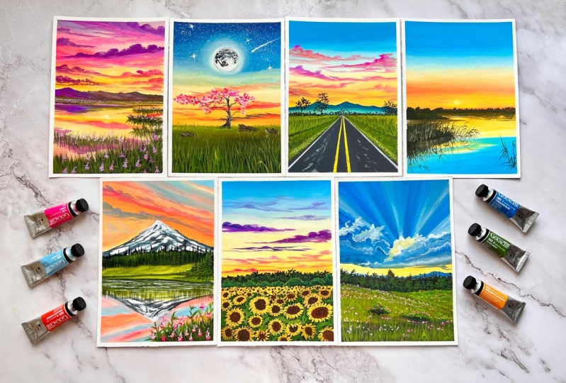
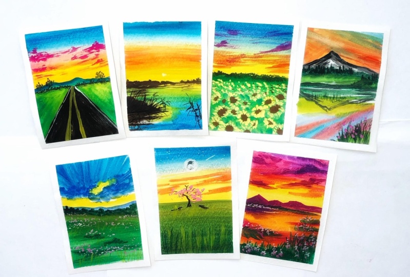
9. Supplies You'll Need: Before we begin
with our projects, let me walk you through
with the list of materials that we will be needing for
creating a class projects. First will be our paper. So the paper that we
are going to use for our projects is going to
be this honeymoon paper, which is a 100% cotton. And 300 GSM is the
thickness of the paper. Now here I have cut my
paper into this A5 sheets so that I'm prepared for all the seven days that we
are going to paint together. So this paper is, you can see, of A5 size and it has
this matte finish. I'll show you an example. So here is the sketchbook which
has this kind of texture. And I really loved
using this paper for my daily gouache practices. So this is the paper
and you can see how very similar
these two papers. So this is cold press, but matte finished
paper, gouache, it is not necessary
that you need to use a 100% cotton
paper if you are fine and if you know to
handle the medium when you could go ahead and use
any paper of your liking. But makes sure that it should be at least 300 GSM and thickness
for seven days challenge, you could use either
this kind of cut out pieces of paper or you could
go ahead and use sketchbook. If you are using
this cutout pieces, you would need board to
fix your paper firmly onto the surface so that you can paint using
your masking tape. You need to fix your paper onto your board or if you want
to have those crisp edges, always remember that whenever you are selecting
your masking tape, select your masking tapes based on the type of paper
that you're using. In case if we're
using handmade paper, then I would always
recommend you to go with low tack masking tapes, which has lesser adhesive to it. The next supply is obviously
going to be our paint. The paint that I'm going to use here is the medium gouache. You're using branch in
Han Arts Designer wash. So this is the gouache
that I'm going to use. This is from Shanahan
professionals designer gouache, but there are various
other alternatives which are available
in the market. It is not necessary
that you need to use the same words
that I'm using here. But TR designer gouache is
a professional gouache. And when you use them, you know the difference and the outcome
that they produce. One of the most popular
and trending words that I have seen and used is he may wash its
budget friendly so you could go ahead
and give a try to them. Now, here are the colors
that I'm going to use. These will be the
basic primaries, mostly that I'll be
using for the projects. But as in when we progress
with our projects, I will be separately
listing down all the colors that I'm going to use for the respective projects. So you can have this
primaries handy with you. So the first is the
blue and then you can have this yellows with you. Now here you could use warm yellow and a cooler
shade of yellow. For blues, it is not necessary to have your warm
blue are cool blue, just big Kiara,
bright blue color. That would do. And then here is this orange. Here. You can always make orange when mixing your scarlet
red with your yellows. Okay, So if you have a
read that should give you the alternative to orange
when mixed with yellow right? Next you could have some rows, or purple or violet
handy with you. Here, I will be using
this bright pink color, which is known by
the name of Para. Not many brands have this color. But if you can go ahead and use your roles as
the alternative, next would be your olive green. This is almost like Sap green. Now instead of this, you could also go ahead
and try like grass green, which is there in hemi
guage or permanent green. The names vary from
brand to brand, right? So pick a green which
is closer to sap green, or this brighter
shades of green. Now we will go to
some earth pigments, which is your browns
and some black. Okay, so these will
be really handy. These are the darker colors
that we will be using. Last but not the least, we will be using
this white quash. Now, I have this bigger
tube from rostral. But shouldn't happen. Also has this white, which is titanium white or
your it is permanent white, which is almost closer to
that of titanium white. Always try to go ahead
and use your titanium white because that's brighter
white that you have. Now that we have discussed
about the colors. So next what we are
mixing palette rate, you would need a pallet to
mix your gouache paints. So here I'm going to
use a ceramic palette. Go ahead and use bigger ceramic palettes
that would give you larger surface area
to mix your colors. I am here using ceramic palettes because they do
not leave stains. But if you do not have them, you can go ahead and use your plastic pallets or any lids are containers
that you have God, you could use them also to squeeze out your
colors and mix them. Now let's take a look at
next important supply, which is a brushes. For brushes when you
are using with gouache, always remember that they
should be of synthetic fiber. They should not be
hog hair brushes are natural hair brushes
because natural hair brushes hold more water and also when you are selecting
the size of your brushes, make sure that you
are choosing the size of the brush in respect to
the size of your paper. For example, this three
by four inch brush will cover larger surface area, so it is better
suited when you are going with larger paintings. But for our projects, we are going to use these smallest size brushes because our pupil
size is smaller, which is a five. So I'm going to use
this filbert brush, which is of size
eight from Mia hemi. If you do not have
filbert brush, you could go ahead and use
this half an inch flat brush. Now, this one is from Princeton velvet touch series
that red handled brush. Okay, Then other
brush that I love using the most is my
angle shader brush. It has a beautiful
angular shape to the tip. So I love them using for
my clouds are covering areas where I need to draw
some specific shapes or lines. If you do not have angle shader brushes,
you're not ready, you're filled with brushes
or your flat brushes will do the job of blending the colors
and creating the cloud. The next would be
R, round brushes. Here I have got this size
and before long round brush, same from Princeton
velvet touch series. It has a very long
and pointed tip. I generally use it to paint little fluffy clouds or use
them to paint grass blades. And here is another brush. This is a little
short round brush from Mia hemi size and
before the others, round brushes are
size number two from silver black velvet
and liner brush, which is size number
two from Princeton. And here is another
liner detailing brush, which is from a local brand stationary that is
of size number 0. These are the brushes
that I'm going to use mostly to create all
of our class projects. To rinse your brushes, you would need a jar of water. I would recommend you to
keep two jars of water, especially if you're one jar has gotten dirty or muddy
by continuous rinsing, I would recommend you to have another clean jar of water
handy or instead of that, use your spray bottle. Keep them handy so
that you can just pray Whenever you
feel that your colors are drying out and you need little bit moisture needed
to be added into your pain. So either use a spray bottle, use this fresh clean water
with the help of your brush and reactivate your gouache into a creamy lather, a mixture. Have your other
stationary such as ruler, a pencil and an eraser handy
by your side to go and sketch out some basic details
or to get the outline done. So that's all about it. And do not forget about your tissue paper to soak up the extra water
from your brushes, you would need a couple of tissue papers or tissue
travel also would do. And that's all I think
I have covered pretty much everything that we need to get started
with our project.
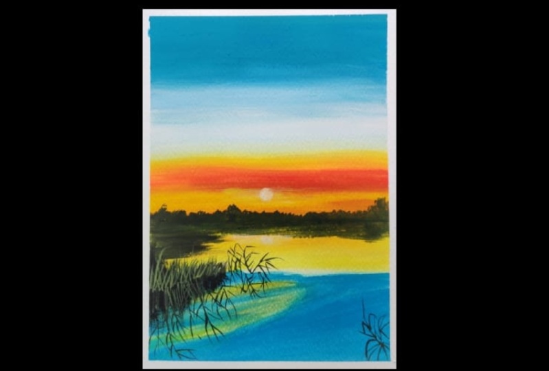
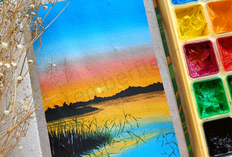
11. Day 1: Soothing Sunset Part 1: Hello, welcome to day one. Today we are going to paint a very beautiful sunset with some very primary basic colors. So before we begin, let's tape down on
paper with the help of our masking tape, washi tape. I have here a piece of paper
to swatch out our colors. Now in case if you are using a cutout paper
like I'm using, you could use this method of
swatching out your colors. I'll be taping it down
just above that paper. Okay. So you're always
watching out the colors. You could do the same in
your sketch book as well. Use the reverse side of the
sketchbook and swatch out your colors in that page where the other page
will be painting. So it will be easy for you to refer to the colors
that you are using. I have already squeezed
out the colors from the tubes onto
the ceramic palettes. Now with the help
of my spray bottle, I'm just going to
spray it wise to make these colors reactivated with water so that when I
start mixing them, I get a beautiful creamy mix. Now I'll be just sketching
out the horizon line. So around three fourths of
the paper will be a sky. So I'm creating a
horizon line out here. And just above
this horizon line, I'm going to go and create this rough shapes
where there will be those midground shrubs or
the background shrubs, okay? And there will be the
reflection of the same which is getting
reflected in the lake. You could start
sketching out once you have watched
the entire video. That will be easier for you to know what exactly
I'm doing here. That's all I'm done
with the sketch. Now it's time to start
mixing your colors. So UIUC, I have this
**** dry brush. I have soaked up all
the excess water in this tissue paper
or tissue towel. Now, I'm going to
mix my aqua blue, which is my light blue with
the blue that I have God, and turn them into a
creamy buttery mix. This is very essential. So you're trying to
observe and also, I had already shown you guys, right, what should be your gouache consistency as for the people that
you have chosen. So depending on that, go for the gouache consistency
that you would prefer, it should flow out from
the brush onto your paper very smoothly and not have any dry brush
strokes in-between. Okay, So this is the perfect consistency that
I would like for this paper. And you can see it is
blending beautifully and not leaving dry brush marks. The moment dry brush
marks start appearing, that means the brush tip is exhausted of all the
pain that we had. So it's time to scoop out
some of the mixed paint again and start layering and to
and fro motion for guage. Whenever there is this, this kind of blending involved, it is always preferable that
you choose flat brushes are your filbert brush
or your angle shader brushes because this gives
really good blending. Also, you could go ahead and
use chisel blender brushes. Makes sure that you have the brush tip loaded
with the paint mix. Every time that you load the brush tip with
your paint mix, the paint mix should be
creamy enough for you to go smoothly onto your paper without creating too
much of friction. It should not be
too watery as well because the paper
white will be exposed. So that way you would
understand that your wash is your observed my
brush movements, gliding the brush very
smoothly and gently, not applying too much of
pressure on the brush. Now, I'll be going
on and creating this gradient until I have
reached almost half here. I'll be stopping here. Now. I have washed my brush, I'll be washing it off in water. Makes sure that you clean your rinse your brush thoroughly
and water there should not be any blue
remnant in your brush because we are going to start
layering with white now. Okay. So post you have
cleaned your brush, use a damp towel to take off all the extra water and
residues of the color. Now start with the gouache, like this white gouache. I have started right around one centimeter
below that blue line, and I'm going in and
blending though. Last blue line where we had
the dry brush marks, right. So with the help of
the tip of my brush, which is loaded
with white gouache, I have gone ahead and
created a beautiful blend. I have loaded my brush once
again with the white and I'm slowly gliding it over the areas where I had
already led the blue. So this will give us the transition between
the dark to light blue. I will have to go over the
top one more time with the civilian blue one more
time and bring it down to the bottom where I need the blue to be transitioned
from dark to light. Now this is how
exactly you need to have this smooth
transition of colors. And this is what is
the perfect blending. I'm really happy how my blue is transitioning to lighter
blue and then to white. Then we will be starting from the horizon line where we're
going to paint with yellows. Two, I'm going to
mix my little bit of cool yellow with
my warm yellow. I have yellow orange and
my permanent yellow light. I will make a little
bit of orange and white to tone down the colors
are lighten the color. So here we go. I start layering just
above the horizon line with the tip of the brush
and start layering. It makes sure that you
go with straight streaks to and fro because you need the horizon line
to be straight, right? So that's how you need to do. If you feel that
this is too bright, you can always go ahead and
tone it down with white, but I'll be adding yours some
of that orange just above the horizon line because
the sun is setting down so that area of horizon line
is generally the warmer. So I'll go and create some
orange-ish hue and there, just with the help of few long horizontal streaks
over there, just like that, to give a little bit more of drama and vibrancy
to us and said, I have added in a little bit of opera pink into my yellow. If you want, you could add in a little bit of
your quinacridone, crimson, rose red into yard yellows and
create the same color. Okay, and I'll be just going ahead and using some
of that warm yellow, that is a yellow orange and
mix it into that overlapping. It creates a beautiful,
lovely coral, orangeish pink color, which I love to use for my sunset skies. I'll be toning it down a bit, bit because I feel the
vibrancy is too bright. So I'll just use some of that white quash to go
over those areas. Light gentle strokes and try
to blend in where we will be creating the transition of
that yellows to the blues. Now I led that transitioning
area to get dried a bit. In the meantime, I'll be
swatching out the colors, whatever we have used so far. So here goes my yellow orange. Now, yellow orange mixed with a little bit of white to get that lighter shade of
that yellow that we have used near to
the horizon line. And in the transitioning colors, a bit of orange
over there, okay? So we have mixed yellow and orange to create a
brighter orange. There goes my opaque era. You can see right, how opaque the
colors are, right? So this is why you
use gouache and acrylic techniques because you work with a medium
which is opaque, not like watercolors, which is transparent or
semi-transparent. Nature. Year the blending is done just like how you do it in acrylics. At this point, it is
looking that I have two distinct bands
of colors, right? So I'm trying to blend
in those colors, that streak of coral, pink, orange, along
with the yellow. So I'm loading my
brush with some white as well as with
some yellow going over those areas
One more time with the same horizontal
brush movements to blend them together. Using some of that white quash and little bit of yellow
that I have mixed over here. I'll be going ahead with the
same horizontal strokes just to create that proper smooth
blend and the transition. Now I'll be dipping the tip of my brush and loading it with
little bit of white gouache. So this here will be a thinner white
chords that I'm going to create the transition
all over again, going up the blue here you see, I'm not going up to the deeper
end of the blue, right? I'm just leaving it up there. Now. I have washed my brush
and I have gone ahead, loaded it up with
that lighter blue and going up, I'm blending it. Now it's time to
take some of that darker blue and start
blending it again. Going right up to the top and
from top to bottom again, I'll be blending it back. So this is how you can create this beautiful transition
of colors which will look very beautifully
blended if you follow the steps exactly
like how I'm doing. Now, over to that center area, I will be going ahead with
little bit of opera pink, blending it into the white, but that band is
still looking so prominently standing out, right? So I'll have to go ahead and use a little bit of
thinner consistency of white gouache and blend it out uniformly just like
that seeing here now, it has toned down and
it's not looking so evident that there was that
huge streak of pink, right? We have blended
it well together. So I'll be just blending
the colors back. Now between each blending, I'm leaving some time and you're just very light handedly
with the tip of my brush, I'll just go and read, blend those areas
and that's all. Rinse your brush
thoroughly clean water. I'm going to meet
you at the next part where we are going to
start with the reflection.
12. Day 1: Soothing Sunset Part 2: Time to start with our leg. So for the water, I'm going to use the same colors that we
have used for this guy, the same blue mix that we have
created for this guy here. I have mixed my light
blue with that of civilian blue to obtain
the shade of lighter blue. And you can see, I have gone ahead with little thinner consistency
of gouache over here. This is because if you use too thick paint while
covering this area, later on, you might be having some
difficulty and your brush might be facing some resistant while
blending with whites. That's why I'm going ahead with little thin consistency of
guar so that later on I can come and blend out
the areas again using my white or using
little bit more of my blue pigment so that
the layering process is done right just
below the horizon line. I'm going to go ahead with the same mixture of my
yellow, orange mixed with a little bit of opera
pink to go ahead and create the same
reflection in the water. You're, I'm feeling that this paint mix will
not be sufficient. So I'll grab my spray bottle, spray some of that water. And I will be going ahead and creating this mix one more
time with those three colors, or para orange and
my yellow orange. Okay, So now we're good to go. My paint is creamy and smooth. I'll just go underneath that horizon line and start
layering the color like that. And straight horizontal
smooth lines. I have gone here with
a thinner consistency because we will be starting
with layering of yellow. Yellow is a very opaque color, especially this
permanent yellow light. So once we start
layering and going over that orange areas, it will automatically be opaque and the consistency
will show right, just like how it is looking. And I'm going to
blend the color to tone it down a bit with
the help of white, using to and fro
motion of the brush. I'm going to go and
cover the areas right there and leave those
grassland areas that we had already marked. Because there we are going to go ahead with a
base coat of black. So if you already have
a base coat of yellow, when you start going with black, it might reactivate
the yellow and turn it into a very muddy
mix over there, which you do not want to leave those areas to be white as such. Now, in-between
though transition of yellow and blue start with DR. white blend together so that there is a uniform
transition of yellow to blue. Just like how we did
it for this guy. Now, in-between
those white patches that we had left
surrounding the blue, I'm going and filling with this very light shade
of yellow in there. Now the edges, I'm
going to start blending them with pure white. Just like that, to give that streaky look of
that clouds in the sky. Main emphasis of this
D1 project is to show you the right way
of blending the colors. So if you get this
right automatically, the journey with
gouache is going to be really very easy for you. And this technique is going
to be the basic foundation for all the other upcoming
projects in the coming days. So if you'll get this right, the journey with me in this seven days will
be much, much easier. So keep following along Me and keep observing
my brush strokes. Now it's time to get started
with our grasslands. So for the grassland, I'll be using my
black mixed with little bit of my burnt umber. Okay, so here is the swatch off my Black Sea here it is the most opaque color that
you have gotten gouache. I'm swatching out the
colors first and then comes here my burnt umber. Okay, so I'll be also using this sap green or
olive green over here. So this is how the
consistency of your guage for the base
code should look like. Now, I'm going to mix in a
little bit of green into my black and brown
mix to turn them into this very dark brownish color. And I'll just let the horizon line over there with
the straight line. So I have used my angle shader brush and
with just one stroke, I have created that. So if you're using
a round brush, you need to be little careful. Your hand should be steady and go ahead and create
a straight line. Now with just the tip of my
size number four round brush. I'm going ahead and
creating this foliage like shrubby patterns
above the horizon line. Now, with just the
tip of my brush, I'm going to go ahead and create this horizontal line above
the horizon one more time. And I'm feeling that over
there the color is lightening, so I'll just go ahead and
use dabbing motion of my brush to fill in
the black over there. You need to be careful
out here because we have underneath
yellow in here. So if you use too much
of watery paint mix, the underneath the
yellow will be getting reactivated and it will
look very shabby and weird. So be a little careful. Use optimum amount of water in your gouache mix and try to go with a thicker
consistency of gouache. Now, with the help of
my angle shader brush, I'm going to go ahead and
create these small strokes of horizontal straight
lines to indicate the reflection of this
foliage into the water. Okay, Now with some
law vertical strokes, I'm going to drag
them down to indicate the shrubby growth getting
reflected in the water. So this is how you can go ahead and paint
your reflection. I have switched to
my round brush size number four once again, and I'm going to start with my grassland area over this art. So just with my dark black and
with little thicker black, I'm going ahead and creating
the same foliage like patterns that we have
done for the midground. We will paint the reflection
of this part later. We will go ahead and start
with the bigger chunk of the grassland over
here. Same process. I'm going to repeat the
same steps all over again. I'm going ahead with some
long vertical strokes. As you can see here, I'm not going with horizontal strokes if you would have noticed this is because I want the grass leg structures
to be out there and to give the illusion of it once we start creating different layers with different colors of greens. Okay? So this is why I'm going
with long vertical strokes. To create the reflection of
this grassland in water. I have switched to my
angle shader brush and look how I'm creating
the reflection. First, I'm going
and you're fixing the areas by creating some
taller grasses in there. Now, mimicking the same, I'm going to pull down some
long vertical strokes. Dab your brush on tissue
paper or tissue towel if you feel that your brush is loaded with too
much of paint. And just like that, with some dry brush strokes, you'll go and
create those blades of grass in the reflection. Now, one thing you must always remember by creating reflection. This reflections are always larger than the object, right? So go ahead and create
the illusion of that by painting some taller grasses
for the reflection part. Now I'm going to go with some horizontal straight
lines to create the reflection of the
earlier grassland, something like this. So go ahead with the little dry brush
technique over there and create some longer
and shorter lines in between. And that's all. It's time to add some depth into our grasslands so far
that I've switched to my liner brush and
I'm mixing my green with a little bit
of brown in there. Okay, So it will be
like greenish brown. So I'm going to go and create some tall grass like
shapes over here. So these are like
wild plants that are growing over this water. Okay, so use the
tip of your brush. If you do not have
a liner brush, go ahead and use your fine detailing brush
which has a sharp pointy tip, or use your round brush
size number 01 or two, anything that you are
comfortable with. And create this long grass like wild grass
shapes over here. Going ahead and replicating the same thing for the
reflection as well. We'll be adding in a few more cleaner blades of grass in there, just like this. Okay, so use your pointy end of the brush and create this
long blades of grass. Time to do the same here too
and this reflection part. So I'm first going and creating the reflection of this
glass-like shapes. Now around this right
side, it's looking empty. So I have decided to go
ahead and pin this grass like plant over here to
paint one or two of it. Do not overcrowd this area. It will look very clustered. Time to get back to our
grassland onto our left. Now it's time to replicate the same glass-like shapes that we have for our reflection. So I'm just going to go over and create this
taller grass shapes with the same color mix of green mixed with a
little bit of brown. So it would be like very similar
to that of almost black. Now to create some highlights in between those darker shades, I'll be mixing my green
with a little bit of my white and create some
strokes like this, vertical strokes,
just like how we have painted the grasses,
something like that. Repeating the same for
the reflection as well. So just the little offered
do not overdo this area. If you want, you can
go ahead and create a lighter brown mix by mixing your brown,
that is your CNR. I'm bored with white and go ahead and create the
same. So that is all.
13. Day 1: Soothing Sunset Part 3: Once you are satisfied with the highlights in
your grassland, we can move on to the next step, which is to paint our setting sun right at
the center of the people. So we're going to
paint the sun where it is the most warm and yellow. So here I'm going with
my size four round brush and creating this circular shape of the sun using
my white gouache. Now around that
white Guangxi area, I'm going to go ahead and
create a ring or a hallow of the warmer yellow also to give that glowing effect of
the sun, just like that. So I here, I'm using
some streaks as one long horizontal streaks around the sun to create
that shape or effect. Going with the hallow with
the mixture of my yellow, permanent yellow
mixed with white. And here we have, if you feel that the color
of the sun has dulled out, you can go ahead and drop in
some of that white gouache again in the center of that sun to give that
more glowing effect. But I like it this way. G2 and the water, I'm going to go and create
the same kind of effect. I'm not going to
paint the full sun, but just a little
ripples would seem of light cream mix that I have
got using white and yellow. And that is all we
are done creating this simple and beautiful
sunset by the lake. And gouache dries very quickly, so it's time to peel off our masking tape from
all the four sides. And here you see how beautiful
it is already looking, especially the blends
in the sky, right? So this is how you can create astonishing sunsets or any
landscapes with gouache. If you get the techniques right, Do practice this project and upload in the project section, I would love to see them. That's all for day one. I'll meet you tomorrow
with day two.
14. Day 2 Color Palette: For the two color palette, these are the colors
that we would be using.
15. Day 2 Scenic Sunset View From Road Part 1: Hello guys, welcome
back to the two. Like always, I will be first
steeping down my paper on all four sides using
masking tape and get started with a
basic pencil sketching. Before I get started with
the basic pencil sketching, I will first quiz out all
my colors in this palette. So the colors that
I'm using here I have already described
in the separate section, which is the color
palette for our project. I hope you guys have followed through and gotten
your colors ready. If not, you can squeeze
the colors along with me. I have squeezed
out my upper blue, followed by turquoise blue. Now, I'll be squeezing
out some of my yellow. The yellow that I'm
using here is permanent. Yellow, orange, deep
from Shanahan Art. So the colors are
the gouache that I'm using is from the
branching and a heart, but you do not have to worry if you do not
have the same brand, you could use any brand of gouache that is
available with you. Next, I squeezed out some of that cadmium yellow deep now, followed by this
rose pink color. This is one of my very favorite
pinks from this brand. And I will also squeeze out some of that Oprah pink that I have. This oprah pink is a
bright and beautiful pink which blends really well
together with yellow. So I use it mostly to transition my colors of yellows and pinks and make it into a
coral peach pink shade. Now, next, last
but not the least, is our white quash. Okay, so once you have
this basic colors ready, we will now moisture in it
using our spray bottle. This is because I do not want to add too much of
unnecessary water. Spray full of just two ounces
is more than enough to re-wet your paints time to get our basic pencil
sketching done. So using my ruler and a pencil, I'm creating a horizon line. The three fourths of the paper will be a sky
followed by a road. Okay, So here we're painting a scenic road view
and the horizon line. I'm going in marketing
the center point. So that is going to be
our point of perspective. And from there, we're
going to create this two slanted lines
to create the road. Once done with the road now
just above the horizon line, I'm going to go and create
some midground mountains. I would recommend
you to first watch the entire sketching process and then pause the
screen out here. When I'm done with the sketch, then you could go and create
your own pencil sketch. I'm done with my pencil sketch. Now let's grab our brush so
the brush out here is damp. I'll just watch
it one more time. Dab it on my tissue
paper towel to soak up all the excess water
that might be present. Now with the help
of this damp brush, I'm going to mix
my colors so that my colors are already
reactivated with water. Remember, I had sprayed or moist indeed using my spray
bottle and I'm mixing my turquoise blue
with my aqua blue in case if you do not have
aqua blue, do not worry. Just go ahead and
use your white into your turquoise blue or any bright blue shade and tone
it down to a lighter blue. Now observe the consistency
that I'm creating. The pigment should not
stick to your brush. It should be very smooth
and soft and buttery. I'm going with the
third category of consistency of gouache that we have seen in the
blending technique. Remember, look as I'm smearing
the paint on my paper, it is flowing so
smooth and softly. The moment I am running the
tip of my brush, exhausted, that's the time when I'm
grabbing some more of that paint and I'm
smearing it along, spreading it across the
paper as smooth as butter. So this should be the consistency of your
gouache and you can see the underneath of the
paper is not visible. That means my gouache is just about the right
consistency that I need. I'm smearing the
paint using to and fro motion of my
brush here I would always suggest you
whenever you are creating such kind of
gradient blends for gouache, it is always
recommended that you use a flat brush because it has more surface area and
it will help you to cover larger surface
area more easily, meaning it has more coverage than that you would get
using a round brush. Okay, so I will leave that
blue layer just still there. Okay, now I'll rinse my brush nice and thoroughly in water, dab it on my tissue,
paper tissue. Now, I'll grab the all
white gouache and I will. Get it back to the
same consistency that I had applied. The blue. I'll get it towards that
perfect consistency of gouache. It should be smooth and
buttery and around here, I'll start spreading
it and then move across with the same
to and fro motion into the blue part. So I'll be doing
that step very soon. So keep observing,
but I'm feeling that the white gouache
consistency was not correct as I was not able to smoothly lay down my
paint over there, so I just moistened it
using some spray bottle. Now the consistency
feels perfect. Yes. Now my brushes able to flow much more
freely on my paper. Now, I'll be very soon
blending it into my blue part. Can you see how I'm blending? So as soon as you
touch the blue, now you have to just
work it upwards and slowly bring it down
into the whiter areas. Okay. Here you have now two separate bands right? Now, I will blend it
smoothly by using my turquoise blue mixed
with the same aqua blue. What we have started painting the sky layer it one more time, used to and fro motion
of the brush from top, I will be blending it into that wide band that you
are seeing over here. Okay, so as I touch
down that white part, I'm starting to blend and I'm
transitioning the colors. At this point, my brush
tip is drying out. So what I'll do is I'll just
do a little bit in water, dab it on my tissue paper
towel and then yes, Now see how beautifully
it spreading it is because there is already a
layer of gouache on my paper. It's not too thin guage. It was the perfect consistency. So using just the dam
tip of the brush, you can easily try to blend the colors smoothly if the layer of your
gouache is too thin, when you try to do this step, you will observe
that you will be thinning out your
gouache even more. So be watchful about this step. Your gouache
consistency should be absolutely perfect and opaque. So that this ****
technique of brush works. The **** technique will work only because
your brush tip has dried out because you were using more of the paint
and less of water. That is the reason I will not try to work on
the upper layers anymore. It's time to mix our yellows. Before you mix your
yellows always makes sure that you have rinse
your brush thoroughly. There should not be any blue
residues left on your brush, or else you will turn your
yellows into greenish hue. So always be mindful of this. I will start with
the same consistency of gouache like we had
applied for the blue. And I'm starting
from the bottom. Keep observing the steps, how I'm going to blend. So till here I'll be
loading the paper with this PR concentration or
pigment value of yellow. And I'm mixing a little
bit of my opera pink into my yellow mix and
mix some white as well, turn it into a very
beautiful coral pink shade. See I'm here using
some freshwater and turning the mix
into soft and creamy. So that's when my brush was easily able to spread
the color on the paper. So I'll wash the brush now, take some of that white
and start blending it. Can you see how beautifully the lighter shades
of yellows are created because
it is mixing with that previously
existing white layer. And hence that
lighter transition of colors is coming
to effect right now with washed brush and some
more clean white gouache, I have started blending
it back to blue. Okay, and now I'm just
using to and fro motion of my brush tip and blending
it again bottom. Now using my clean brush
and I'll be loading some of that white gouache
and paint over those areas where we had
sketched out the mountain. Now, here it is a
totally optional case. I want you to show the
process of layering how you can layer your paint without
activating the base colors. That is what I want
to show you when I will be painting
the misty mountains. But if you feel that it might be little
difficult for you. So what I would suggest
you do is first watch the process and then decide if you want to go ahead
and paint this area or just leave that area out where your mountains
as sketched. Okay. So just let your yellows of-of the areas of the mountain
and you would have the cleaner areas for going ahead and doing the misty
mountains more easily. I'm pretty satisfied how my
blend is looking right now. Okay. I will not overwork
this area because we will be painting
some clouds over it. So I'll let this area dry.
16. Day 2: Scenic Road View Part 2: So I'll be starting out
with the pavement parts where there is lush greenery
along the sides of the road. So for that, I am going and
reactivating my sap green. So this sap green, I have used a separate palette, but if you have separate mixing wells are mixing palette and your palette
is quite big enough, you can create this
mixes out there. Since my palette is very small, that's why I have to use several smaller palettes
to mix the colors. Now I'm turning my green into a darker shade of green
by mixing it with black. So this is the shade I have got. Now using my angle shader brush, I'm filling it along the direction that we
had painted those lines. Okay. And you can
see I'm going and creating this vertical strokes. And as I'm approaching
the point of perspective, my strokes are getting smaller. So this is the point of perspective effect that
when it is towards you, the objects seem bigger. When it is farther
away from you, the objects become smaller. So that's the entire thing
of pointer perspective. I'm going to repeat the same process for
the right side as well. Here. I'm just
going and giving it some kind of strokes out here. You can see half seeds
out here, right? So this would give
that illusion of depth into the lush greenery that I want to paint
along the sides. Okay. So observed my brush
movement out here. I'm just trying to flick my brush strokes from
the base to the top and creating those glass-like
blades already, right. So do not worry, we'll have to go with consecutive or
subsequent layering with different tonal values of
greens to create that effect of depth and sense
of realism into this large greenery fields that we want to paint by
the sides of the road. To the most farthest part of our left where we have
left those empty spaces. Now I'm trying to mix my green with some of
my burnt sienna, just a little bit of burnt
sienna and turn it into a very greenish or green color, like little bit of
muddy green color. And just around there, I'll just layer it with some yellows as well
to turn it lighter. So along the sides I have
used the browns and then blended it in into lighter
color with the yellow. Okay, So this is something which I'll do for the
right side as well. So it's basic, simple. Whatever you repeat on
your left the same, you'll be repeating on
your right as well. Now, I'll squeeze out some of my Prussian blue for
going and creating the misty mountains
because I'm giving some time for the greener
layers to dry out. And then we will be starting out with detailing
of the grasses. So this is why in-between
your lettering, it is important that
you give time for your first base layer to dry out so that you can start working
with your second layer. For the misty mountain mix. You can see I have
gone ahead and use a little bit of thick consistency of gouache
to outline the mountain. Okay. Now, using just a
little bit water, that is F dip the tip
of my brush in water and I'm layering
this blue out here. And you can see the more I brush my brush against
that yellow base code, it is getting reactivated. So I let that area dry out. In the meantime using my round size them before I'm going ahead and with consigns definite
strokes with the same color. I'm just going and layering the color on the
mountain over here. I will not do too much of
brush movement over there. Now, I'll be mixing
some of my PR, white quash into that lighter
blue gouache mix that we had and create this transition of
this misty mountains. That is, there will be kind of misty light colors right at the base of
the mountains, right? And I'll try to blend it with the mountains using
my size four brush. I'm just going to drag
the colors a little down into the white course so that the blending looks
uniform out there. Now it's time to come back
to our sidewalk ways. So I'm letting it
with black to give it a distinct sharp
outline over there. The same. I'm going
to go ahead and do near to the sideways
of the road as well. Observed the strokes that
I'm creating out here. It is kind of slanted. So keep observing this
the same I'm going to repeat on the right
side of the pathway. Also. Your strokes will
become narrower and thinner as you reach to
the point of intersection. The same will follow for
the right side as well. So keep following me. Okay. Now let's do the
other part of the roads, the exact sideways
next to the roads. Okay. So for that, I'm using my black mixed with a little bit of my burnt
sienna over there. And just with this landed
strokes of the brush, I'm just going and filling
the areas roughly. Now I do not have to lead
to a thick paint over here. Just go with some little
light pin consistency of gouache like this and follow the strokes like I am
creating our tier. Now, we will lead this
area's get dried out. Our sky has
completely dried out, so we will start
painting our Cloud. So for clouds, I'm mixing
my opera pink With little bit of white into that
yellow mix that we had got. Remember here my brushes, absolutely damp and dry. You can see right with the
strokes that I'm getting. So I'll just need to spray
water over there into that mix and using just the tip of my brush and grab some more
of that, right? I will go and create this fluffy client or
shapes of the Cloud. I'm here using slanted
motion of the brush. And because my brushes angle, That's why I have an
advantage over it. The same. You can do it with the
help of a flat brush. Just use the tip of your brush to create the same exact steps. Now always remember that
during this layering process, do not be too vigorous with your brush on the paper in
if you are to vigorous, then you will be reactivating
the base underlying layer. So we do not want that. So go with very soft, gentle strokes with your brush. The paint mix should
not be too thick because if you use
too thick paint mix, you will have more resistance from the paper and your brush. So try to go in-between with that perfect consistency
of gouache yard. Brush tip should be damp
enough for you to create this stroke smoothly
on the paper without having to
reactivate the base code. Here for the clouds, I have chose to be stuck with blues and pinks and some violet. But if you have any other color combinations
in mind or do you have any references where
you would like to try out some different
color combinations. Feel free to go ahead. This color combination is
one of my most favorite. That's why I love
using this yellows, blues and pinks and
corals in my sky. During this process of
layering your clouds, if you feel that your brush tip is loaded with too
much of water, you can always dab it on tissue paper like I
had done and give you a brush that dryness that you want to have by
creating this dry, light and smooth dry
strokes like this, I have mixed my aqua blue, which is the light
blue with some of that rose pink to
create this color where I'm going and creating these clouds
near to the mountains. We're done with the
sky in the meantime, are these fields
have also dried. So I'll just go and use my sharp pointy tip of my
brush size number four, and create this long, thin strokes indicating
the grass blades. Here the stroke
should be thinner and the color that I'm using
here is sap green. I'll just go and use
small dabbing motion of my brush to create smaller grasp patterns
there behind that. Now, can you see
that black marks? So I will hide it out using the damp tip of my brush
loaded with this green. Now with the same brush, I will just elongate the grass blades strokes so that that area
gets covered up. So give some time in-between
this layering process, okay, your layer should be first dried in order for you to start
with the second layering. Now here with just a little
thin consistency of gouache. I'm going and creating this lighter grass blades
using the tip of my brush. This would give the depth
that I want in this feed. This lighter mix I have
created by mixing more of lemon yellow into my sap green. So the more yellow you
add into your sap green, it will turn into more towards the lemony yellow side and the color will
be much lighter. Now with just the
pointed tip of my brush, I'm just going to go and create some shorter dabbing
strokes to create some grass textures on the idea behind this front area
of the field as well. Quite happy and satisfied with the way this is
looking right now. So I'll let it dry off. In the meantime,
I will start with the side of the road yard. I'm using my sap green. I have not used too much of
water just with a damp brush. I have just created
this strokes, the long slanted strokes, using the tip of my brush, the same I'm going to do
for my right side as well. While doing this portion to not cover up the entire black parts. Keep some of that Blackboard visible
underneath that green. Because that would
really help us to create the smaller green grass textures that we would be
adding later on. Now I have started creating the background foliage just at the base of the
misty mountains. So for this I am
using my black and just with the dabbing
motion of my brush tip, I'm going and creating
the foliage patterns. Please do not go here with
two watery paint mix to go with perfect gouache mix or the perfect consistency
of the gouache. It should be just take so
that you can smoothly led this dabbing motion of
the brush and create this foliage patterns instead of the shrubby, bushy patterns. You can also add in
some pine canopy also, that's totally up to you. Whatever you decide
to go and fill your midground near to the
base of this misty mountain. Feel free to do so, but makes sure that you are not covering the misty areas of the mountain because
that is very essential to retain the beauty
of this piece. Now, I'll be going and adding in some taller trees
in-between those foliage. Now the placement of these
trees are totally random. And now as I'm done with the, making thinner lines
for the branches, I'm going with the
dabbing motion from my tip of my brush and creating
this foliage of the tree. And that's all for this part. I'll meet you again
with the next part.
17. Day 2: Final Details Part 3: Continuing with the
same upward strokes for the grasses as well. Once you are done
and happy about it, we will move on
to the next step. Now it's time to create
this small dress like structures with just
dabbing tip of my brush. Makes sure that your
brush is dry in order to get this smaller dabbing
strokes from your brush. So this is how we are going to create this sidewalk
of the pavement. While doing this step, make sure that you do not
fill it out completely. Keeps some of those
darker areas too. I'm going to repeat the exact same process at this right side of
the road as well. Once you are done filling
in this dabbing motion with the brush and it looks
quite completely textured. It's time now to create some smaller grasses just
around the sides of the road. Make sure that you
are using thin brush, most probably your size number
one or number two brush to create this thinner
lines of grass. So let me show you this is
the brush that I'm using. It has a very nice
sharp pointy tip. And for the grass, I'm using this color combination
of lemon yellow, this is leaf green, but you could mix the
same color by using your sap green and lemon yellow in the ratio of two is to one. Make sure that the color
combination that you are using for this graph should stand out from the background. That is why this process
is known as Letting. We are going with multiple layers to denote
the depth in the grasses. I'm going to continue this
grassland structures until the end of that point
where it meets the road. Okay. Make sure
that your strokes go shorter and shorter as you go towards the intersection of
that road right towards you, the grasses are going to be
much longer and sharper. Look here, I'm filling it
up with some lighter colors now because the background
color when it dried, it was almost similar to that of the background
color, right. So that's why I went for
some more lighter tone. I'm going to repeat the
exact same process towards the right as well to denote that sense of
realism in the grass. So keep observing
the brushstrokes that I'm going and doing a head for the grass
when I'm going and creating the upper grasses, I'm using this long curved
strokes for the grasses. And then at the bottom, I'm just dragging it out,
something like that. So this is how I'm going to
complete this entire stretch, just like how we had
done for our left side, once done with this part. Now we are going to
start our roads. So for the road, I'm going to create a
mixed off my black, blue, and white,
creating a gray mix. Mixing all these three colors. I'm going to take a
fresh palette and mix all these three colors
to make my shade. I'm going to make the
shade once and for all so that there is no difference
in the shade later on. Here is the process of how
I'm creating my grade. Keep observing once
you have reached the final concentration
and you are happy with the gray mix before
applying it on your paper, swatch it out on a
separate piece of paper. As I have already said, I forgot to include a swatch sheet for this
particular project, but do not worry. You can also go ahead
and repeat the same kind of swatch sheet that I have
done in first project, or use the side, the other side of
your sketchbook to swatch out your colors. Okay, so this is the final gray mix
that I'm going to use. So you can swatch it
on a separate piece of paper and see if you
have got the same mix. And then if you have, start out by painting the road in this long slanted motion, just like how I'm doing here. I'm using my angle shader brush, but you do not have to
use the very same brush. You could use your
chisel blender or your flat brush as
well to do this step, observe the mix that
I have created. My gray mix is not too watery, neither it is to take, right? It's just that
perfect consistency of gouache that I'm
using are tier. And remember here,
I'm going to let just once for the road there will
not be any multiple larynx. So you can hear work
with this unit, perfect gouache
consistency, which would be little thick
so that you get. Better coverage
area. Quite nicely. The road has come up, right? Nice, beautiful,
smooth, dark road rate the perfect roads
that you always crave for. Such long drapes right here. Anyways, keeping
the jokes apart. Once you are happy and
satisfied with your road, It's time now to create this grasses one
more time because the bottom grasses remember
that we had painted earlier would have got covered when we were
painting the road. So I'm just going ahead and creating the bottom strokes
of the grasses One more time. And we are done. I will add little more
highlights with my lighter mix. So I have mixed
little bit of white into my existing leaf, green, that is my lemon yellow
hopeless sap green mix. I have mixed little white to create that highlight
in the grass. Now the grass looks
so beautiful, right? It's highlighted
very prominently and it's standing out
against the dark background. So now using my white
Jelly Roll pen, I'm going to create the
markings of the highway. So you could use your Jelly
Roll pen, audio Posca marker, or you can use your white
gouache and your liner brush. You feel confident to
have that perfect stroke. You can always go
ahead and do that. But just if you are a beginner. So here it's an easy
way of doing it. Use your Jelly Roll pen
or your Posca marker and create this two lines running along the
direction of the road. And out there, if
you feel it has crossed the boundary
of the road, use just the tip of your
brush and blend it out. Will rub my ruler on
this tissue towels so that I get off all those
stains from the ruler. And we'll repeat
the exact same step that I did for the left
side out here too. Now once you have created
those white markings, you could now use
your liner brush, audio round brush,
size number 12, and fill out these gaps that you see in
between these lines. So you need to have
really steady hands. You do not want to
ruin it by wavy lines. That would look really weird. So go get a grip, put your little finger
on the paper as a support and keep the hand
steady and fill this lines. Or you could use Posca marker also to fill out these gaps. Once done with the sidelines. Now I'm going to
repeat the same drill for creating this center
mark things as well. Here, you can either go for this continuous line marking that I'll be doing or you can use the shorter broken
markings on my right eye was not very happy with that
line that I had drawn, so I decided to go and lead
my gray mix all over again. I will wait for this
layer to dry and then we will come back and
create the white lines. Again. That area has dried completely. You can now let's do this. I'll just create the
line marking out here. Once done. Now I'm going to use my cadmium yellow instead
of cadmium yellow. If you have lemon yellow, you could also go ahead and
use your lemon yellow to fill out the lines
in-between, okay? But make sure you do not go and create some wavy
lines out here. It needs to be straight or the realism from the
road will be taken away. So here, just be patient, take your time and try creating
this in smaller sections. We will be following
the principle here, divide and rule so that
it's easier for us to create this beautiful
straight line. Okay? So that's the trick. We'll do the same at the other end or the
right side also. It's the same thing, but I'm going with
just one stroke. I am pretty much confident with this one stroke because I have been doing
so with practice. But if you are not sure, just like a hallway I had shown, break it up into
smaller sections and continue doing that. Okay. Now here I'm
creating this smaller, thinner lines
in-between the road to create the impression that the paint is peeling off or wearing out and to create
some dirt on the road here, I'm using absolutely
dry brush technique, using my dry brush
and just letting my white gouache in some
random areas just like that. And here we have
our final painting. It has already dried
completely and now let's peel off our tapes
from all the foresight. If you would have taken
my other classes, you would know that I always emphasize on peeling
the tapes out with, with patients because
if you are too fast and you are
not really careful, you might rip off the entire painted part
as well with your tape. So be gentle and patient. And I totally love how are these beautiful scenic
view of the road is. I will see you again
on Sunday with this beautiful pink and
purple sense it for D3.
18. Day 3: Color Palette: You're on screen, you can see
the colors that are listed. We will be using the very same for creating
our class project.
19. Day 3: Magical Pink Sunset Part 1: Welcome to day three. We will quickly begin
first by taping down your paper on all four sides
using our masking tape. Now with the help of
my pencil and ruler, about two-thirds of the paper, I'm going to demarcate the area where we will be creating a sky. Below that demarcation, I'll be creating
our horizon line. That demarcation is nothing but where I'll be
going ahead and creating small hillock or mountains in the
distance midground. Before you begin with
your sketching process, I would recommend
you first go through the entire video and
then come back and pause the screen out your create your own pencil
outline or sketch. I will be also going anti
marketing or outlining our smaller grassland areas
here at the foreground. So that is easier for us to get the proportion
rate of how much we want the sky and the water reflection with
the help of my spray bottle, I'm now going to
moisten my paints. These are freshly squeezed paints straight out
of the tubes. Okay. That's why I have used
the spray bottle to moisture in them so that
I have water control. Make sure you just go ahead
and spray one or two sprays. Not more than that
because more than that, you will make the
paint's too watery. Before I load my brush
with fresh paints, I'm ensuring that there is no previous residue of pains stuck in the
bristles of my brush. That's why I have rob did
thoroughly on my tissue paper. Right now, I'm loading the
brush with fresh paints. I have started with my
cadmium yellow orange. If you do not have this
cadmium yellow orange, you can go ahead and
use your yellow, mix it with little bit
tinge of your scarlet red. And you can create this
yellowish orange shade, mix it with little bit of
white to give you the opacity. If you feel that your
colors are too right here, try to observe the
consistency of gouache along with
my brush movements. I'm going ahead and using
not to very thick wash out your neither the perfect
gouache consistency here I have gone with a little
thinner gouache consistency, but it should not be that thin that your paper
white is visible. The opacity should still be
there in case if you are not understanding what
I'm referring to as ten gouache consistency. I will suggest you to go
check back to the sections where I have explained it all
regarding wash consistency. By now, if you wouldn't have noticed the sky that
I'm painting here, I'm going with a
different approach. I'm not letting the colors like a straight flat
to and fro motion. I am going ahead with slanted strokes and also
making sure that I leave certain white gaps in
between where I'm filling in this lighter shade of white mixed with little
bit of my yellow tinge, denoting this is the brightest and the
glowing part of the sky. Now, I'm mixing a little
bit of my opera pink into that same white and yellow
mix that I have guard and meet this very soft
pastel pink shade. Now, if you do not have this
opened up in, do not vary. You can go ahead and use
any rose pink shade, or any pink shade that you
have gotten your gouache set. And you can tone it down
by mixing white into it and come to a similar color
value that I have used here. Now, observe that
the rose pink mix that I have used out
here was little tin. Can you see the paper white at the top section of this guy, which is being visible
through that color LED. This is because I'm going to go with multiple larynx in the sky, especially when making clouds. That's why I'm making sure that these layers are
thin so that multiple layering as possible
without making the colors turning very
muddy on the paper. I'll be no applying my
medium tin consistency of white gouache from right towards left blending
into the violet. Here. I'll be trying to
blend in that valid, trying to create this smooth
transition of colors, giving it a very soft
pistil look to the sky. I'll be washing my
brush and creating a lighter value of my yellow by mixing a little bit of white into that yellow mix here, I have this creamy yellow mix watching it on the paper here. See, this is how I'm
going to go and blended here because I wanted
to go ahead and build multiple
layers in the sky. That's why I'm going with
all little medium to ten consistency of gouache so that
when I start the layering, my base coat is not
reactivated to easily. Now keep observing
my brush movements. I'm not going too
harshly on these areas, but saw very gentle motion and using just the
tip of my brush, which is loaded with medium valued consistency
of my white gouache mix. I have went ahead and blended. Now that pink area is. Looking to ten, right? So we're going to go with
one more layer using the colors pink mixed with
a little bit of my yellow, orange and give this area a little bit
more brighter look. A word of caution out here, if you do not have
this color, pink, but have rose pink
color and rose pink, do not go ahead and mix
your yellow orange. Instead, just apply your
rose pink directly, or apply a little bit of
white into your rose pink and keep layering the colors because rose pink reacts with yellow, orange in a weird way and gives you a very muddy, dull color. So you want to avoid that color right now at
this moment in the sky. So if you have rose pink, just go ahead and turn it
down with little bit of white into it and
blend it together. Now here, keep
observing the blending. Do not go with too harshly on the paper and also do not use
too watery paint over here. If your paper is not taken off, this will not allow you to go with multiple larynx
like how I'm doing. So your paper should be
at least 300 GSM and thickness to allow you to go
with this multiple larynx. Now over here, it's just
all about blending, allow your layers
to dry in between, and then using soft, gentle strokes with the tip of your brush to blend the colors. Always when going and
blending the colors, have some amount of your
paint loaded at the tip of the brush or else you will be lifting of the paints
instead of letting them. But also remember that
in-between the larynx, you should let the
base code get dried, then go ahead and
layer on top of it. Pretty much satisfied with the initial appearance
of this guy. Now I'll be just going ahead
and quickly swatching out the colors in that piece of paper that I had
kept for swatching. Now, I had forgotten here
to swatch the colors, but you do not do this mistake. Go ahead and before
each lettering process, when you are mixing your colors, go ahead and swatch your
colors before you start out. Now here at this
part of the paper, I'll just go and grab my white quash and with
my just dumped it, I'm just going to go and blend
this areas one more time. This area, I want to
make it look very soft, soothing and yet bright. Looking like the sun is
shining through this areas. I will be going ahead and
preparing a mixed for my Cloud. For that mix, I'm mixing my Prussian blue with my rose pink, blending them well
together so that the resultant violet that I
get is a very bright violet, swing towards pink,
rate, a purple shade. Now, I'll be dabbing off
all that extra amount of water or dampness
that I have in my brush. Nice and very clearly and with the tip of my brush and
with very soft light hand, I'm just going to go and create this swirly movements
with the help of my brush tip to
create these clouds. When you start with the clouds, your paint mix, again, should not be too perfect. It should just have appropriate opaqueness and
not too much of water in it. Because for the clouds
to be going and creating multiple layers with
different tonal values of my paint pigment mixes. Okay, just like this, I will be sometimes going
ahead and using bold shades of purple on the top of the clouds denoting the extra
moisture to it. And the lighter areas will
be at the base of the cloud. So like this, I'm going to build the letters to denote
realism in the clouds. Near to the horizon line. I'll be going ahead
with brighter mix of my rose pink with
my **** dry brush. Okay, so here I have switched
to this angle shader brush. My brush was to do dry. So I'm just dabbing
it clean with the help of my tissue
paper or tissue towel. And just with light
gentle strokes, I'm just going and creating some random shapes
tip of my brush. Okay, Now for that
bigger chunk of cloud, I'm just going to use my Oprah pink with little
bit of rose pink and fill out those white gaps that you can see through, right? I'm just going to go blended
with this dry brush tip. Now. I will be going ahead
and adding Prussian blue onto top of this mix to create
some depth into the clouds. Do not ready. This might look
very rough at the moment, but we will be using
are damp and dry, flat, round brush to
blend it through. So now it's all about
blending process with very soft, light,
gentle handedly, always go and use
just the tip of your brush and try to blend
the colors, mood and evenly. Okay, So this is how I'm
going to go and create some more streaks into the sky with just
the tip of my brush, you can see I'm going with some Fred dry marks
for the clouds. So this will give this
guy a different lose, will speak loud appearance. Okay, I will let this
area dry and then get started with the sky
reflection in the water. So I'm starting with my
lighter shade of yellow here. I'm using cadmium yellow
mixed with white. Now, I will be layering it
with some of that yellow, orange that I have in between. So keep observing the
brush strokes here. I'm not fully
blending the colors. I'm using the streak
methodology or approach to give a rough streaky
look to the sky. Now in-between we will be
adding some brighter colors, just like how our sky is
above the horizon line. We are going to mimic the same. Now, just above that
demarcated line where we will be painting
the grassland, right? So above that, I'll be starting
to lead this yellow layer for this guy and will be blending in with the
rest of the layer.
20. Day 3 Magical Pink Sunset Part 2: Now with my damp tip
loaded with white gouache, I'm just going to
go and very soft handedly blend the
legs of that yellow. Now I'll be sharing some of
that Oprah pink right at the corner left of this
bottom part of the sky. And observe the brush
movements out here. I'm not completely
blocking the yellow. I'm leaving certain parts
in-between as yellow. Now with that tip loaded with my purple or violet and with
the slanted strokes I'm going and creating this
cloud shape makes sure at this point your brush
is not too damp here. You should be working with
kind of semi dry brush. Now we will just keep adding
layers of different colors. For example, here,
at the top end, we will be using some of that rose pink mixed with a
little bit of white. And in-between, we will be using some of that
concentrated or pigment and values
of your rose pink as well to give this
ploughed a more depth, just like how we have painted
above the horizon line something similar to that we are going to
mimic out to you. We'll stop working at
the sky reflection in the water for now and go
ahead and paint this. He lock reflection in
the water for that, I'm using my Prussian blue mixed with my rose
pink mix here. Remember, the reflection should be a little bit
more violet shade. So here it is, and go with long and short
horizontal strokes like this. With just a little bit of
pure pigment of rose pink. I'll just go and use the dry brush strokes for creating some more
depth in those clouds. Nava Just this **** tip of my brush and I have loaded
it with slight yellow. I'm going and filling out those whiter areas that we're seeing through
the reflection. Now, it's time to go ahead
and lead the reflection one more time with my little
bit of rose pink over there. It's time to start with the small he locks above
the horizon line. So you're, I'm going with a round brush size
number four and smearing my purple first
and followed by rose pink. Here I'll be working with
layers of different colors. I first went with purple, then I have lead rose pink, and then I'll be
sharing some of that green mixed with a little
bit of brown as well. I'd be going ahead and repeating the same steps for the
other he locks also, but here I'll work with little
bit more peaceful shade, meaning little bit more
lighter shades of purple. So here I have lead first
lighter shade of purple, and then with some
strokes of green, I'm just going to
blend them together. Just a little bit
rough blending. And I'll be going
along the direction of the mountain slopes
that we have sketched out. Adding in a tinge
of my burnt sienna into this lettering mix
of the mountain slopes. And just blend it along. Now to add in little bit more
texture to the mountains, I will just go and using
just the tip of my brush, I will just let along the slopes of the
mountain some white. We'll be just
blending it together with very soft, gentle strokes. This will give the realism that this Mountains are a little
behind and distance from us, and hence it is
lighter and shade than the one which is
at the left corner, which is little closer to us. For that base of the
mountains where we have left that
whitespace, right? We will be going and mixing
green with a little bit of buoyancy and not turn
them into greenish color. And just go with the
long horizontal strokes over there with just the tip
of the brush and try to. Create a patch over there
which will indicate the pasture land or the sum Greenfield's underneath
the base of the mountain. And with just a
little bit off my black loaded on the
tip of my brush, I'll just go and create a straight horizontal line running along that
base of green, which will kind of separate the reflection and
the horizon line. In the meantime, my sky
has dried completely, so I'm just going
with my damp IP of round brush size
number four and going and creating the
shapes of the clouds one more time because those
when looking little patchy. So I'm just going to go and add some depth using
this purple color. Here at the base of the mountains where we have
painted the reflection. I'll be going with
shorter vertical strokes to denote the grassland
beneath the mountains, okay, which is getting
reflected in the water. It's time to paint the grasslands you're at
the foreground for that, I'm creating a mix of green mixed with little
bit of brown and black. And we'll be going with this
vertical strokes like this. So if you have a fan brush, this step can be done easily
and you will be able to cover larger surface
at a quicker pace. Okay, but here with this angle shader brush
also you could do the same or you can also do the
same with your flat brush, but makes sure that you
are using a brush size. Number two, that is, a smaller sized flat brush, will be repeating the same
step for the other grassland, which is closer to
the horizon line. So as you move closer
to the horizon line, your strokes will
get shorter because those grasslands will be
at a distance from us. Okay? So this is how we
are going to work. The sense of perspective. I'm going to quickly go
repeat the same step for the reflection of
this grasslands as well. From the base, just go with the same kind of strokes
that you have created above. I'll be going and creating
some more longer grasses here at the bigger foreground,
grassland. Okay. Here you go. Make sure that you are not
using too watery paint mix, nod your brushes to
laden with water. It should just be ******
for you to create those individual
strokes of glasses, meaning that tough turf grasses arising from the base rate. I'll be going ahead and
creating a cluster of loose grasses growing
in-between that leg over there. And I'm going and painting
the reflection at the same time using just
the angled tip of my brush. So if you have a flat brush, you can use just the broad
flat tip and create the same. The clouds in the
sky have dried. So I'm just going in
and painting the sun, the setting sun right at the center of that right
area that we had left. I am first filling
the circle with this lemon yellow or cadmium yellow mixed with
a little bit of white. And then on top of this, I'm going to add a little
circle using my white gouache. Will repeat the
exact same process for reflection part as well. But here, the reflection part, I will go and create some long
and short horizontal lines because it's reflection
and the water is moving. So that's why I'm going to create this bloody lines
for the reflection. Once you are happy and satisfied
how your reflection of the sun is looking in the water
and how it is in the sky. Start with their glasses. If the base coat of that underlying black
has dried so far, the layering of the grass first, we will start with a
darker green shade. I have mixed my sap green
with my Prussian blue and created this darker shade
of green grass out here. You can go with
multiple larynx of the grass if you want them to look more and more realistic, but you're just going
with this three layers. First is the black, then I have used my
darker shade of green. On top of this, I'll go and add some lighter shade of green, preferably sap green mixed with your lemon yellow
and a little bit of white will give you
that bright yellow green. This is the most satisfying
part of the painting. I love creating this grasses. I don't know why I get
such a satisfaction and pleasure using
this long strokes. If you have a liner brush, you will get
beautiful strokes if you have control
with your brush. To add more depth
into this grasses, use longer and shorter
strokes and create some leaves or grass blades
longer than shorter ones. Use just the
vertical strokes and keep swinging them
in left to right. You will be pretty
much good to go.
21. Day 3: Final Details Part 3: Once you have completed
the layering of the foreground,
prairie grassland, move on to the ones which are closer to the
horizon line and use the same steps of
the larynx that we had done for the
foreground grassland. Whenever you are going and creating these grasses
through the layering process, always make sure to, not to cover the entire of that black which is
there underneath. Keep, you know, keep
the strokes far apart, a little distant
from each other so that little bit of black is still visible through
those layers of grasses that will give the sense of depth
into the painting. The foreground grassland
layers have dried, so now it's time to add
some flowers for that, I'll be using some lilac. That is, I have mixed my
purpose with little bit of white and rose pink into that mix to create it
into a lilac shade. So this is how I'm
going to go and use just the tip of my round
brush size number four, and create these small dots, shapes broader at the base and
narrowing towards the top. So this is kind of
lavender field that I'm trying to create out
here at the foreground. But if you want to paint any other shape of
flowers you can paint daisies are cosmos that
is totally up to you. You are free to paint any
flowers of your choice. Now near to that base of the mountains with
just little dots, I'm going to fill that area
with this little dots so that it looks like even there're some wild flowers
growing in here too. I will go with lettering
first day added with that lilac shade that
I had for the darts. And now on top of that, I'm going ahead and
adding little bit more of a pasty lilac. That is, I have added
a little bit more of white into that
existing lilac mix. And I'm adding these
dots over here. And I think I'm
pretty much done. Now here at the foreground, I'm going to go and adding this lighter shade of
light, iliac as well. Adding in a few more flowers
here at the foreground. But this step is totally
optional if you are satisfied with the
flowers in ER, grassland or, or just
leave it out there, no need of filling it again. But make sure that you are
not overdoing or over filling it with flowers so that not a single blade
of grass is seen. So in that case, it will look really weird and the entire beauty of
this painting will be gone. So make sure that you are
not overdoing this process. If you wish. You may
also add in some floated in the other
grassy areas as well, but it is totally
up to your wish. If you like, you may add the smaller dots like
how I'm adding in here or else you can just
leave it to be just grasses. Are you going pain some longer grasses as well
such as those cans grasses. So you can just go and
add those kinds of grasses also in the
other grasslands as totally up to you. Going and creating
last finishing touches for the reflection part. Using this longer than
shorter strokes in between, finishing off the reflection. Paper has dried out completely. Now it's time to take off the masking tapes from
all the four sides. I'm quite happy with how
this painting is looking, especially color combinations,
the sky and the clouds. You'll give it a
try and do not miss the other important sections of gouache consistency because that is very crucial out here, we have painted this using thin gouache consistency
as the base layer. And I have showed you how using multiple
layering techniques, you can create this
beautiful, stunning piece. I will see you again
with it for tomorrow.
23. Day 4: Autumn Sunflower Meadow I: Welcome to day four. And as always, I have taped down my paper on all four sides
using my masking tape. Let's get started with our
basic pencil sketching. Around three-fourths
of the paper. I'll be going ahead and creating a horizon line with
the help of my ruler. Now, if you want, you can go with free hand straight line
also for your horizon line. Here, I'm marking out the areas where my midground
vegetation would be. So I'm just going ahead
and creating the same. I would suggest
you that go ahead, check out this entire
video and come back to the place where I have finished the sketching
part so that, you know, or you can expect what likely changes will be
there in the final sketch. And you can go ahead and
create your own sketch. In this project, we
are going to paint sunflowers in our middle, right? So I'm going ahead and using
this circular pencil marks, I'm going ahead and
blocking out the areas where our bigger
sunflowers will be. If you have masking
fluid with you, you can use your
masking fluid to mask out this areas so
that you can later on come back and paint on this areas after you have
peeled off your masking tape, orange, you can go ahead and
do negative style painting, like the way I'll be
showing you out here. I'm going ahead
and squeezing out all the colors that I'll be
needing for this project. The color palette
has already been discussed with you in
the previous section. So I hope you guys have taken a note of all the
colors that I'm using. I have already reactivated my paints using my spray bottle. Now it's time to
paint a sky for that. I'll be using some of
that white gouache, mix it with my
turquoise blue color to get it to a very
light blue shades, basically the sky blue color
that you would call Here. Take a note at the
consistency of my gouache. I'm going ahead with slightly
thin wash because here we are going to do
multiple larynx and we are going to
paint some clouds. You guys have already gone
through D3 you would buy. Now know that the process of letting requires
you to go with first thinner consistency of
gouache to help you build layers or else there will be too much of pain sitting on
the surface of the paper. And after a point, you will not be able to blend the colors anymore on the paper if the paper surface gets too
saturated with the paint. So I would request
you all to, please. Now, do go ahead check out
the previous lessons of my gouache techniques
where I have explained in great detail about
the wash consistency, mixing, layering and
blending techniques, practices out with
your own hands to get the feel of this medium. Only then you will not be
having any more issues with the consistency of
gouache you are using and the blending
that you are doing great. So those exercises will really help you to
understand this medium. Hence, I would really
ask you guys to do not skip those sections
because those are your vital basics for gouache. Here you would have observed
that I'm just going ahead and blending my white, just pure white
into the paper and transitioning into the areas where my blue has
started, right, so that I get a lovely gradation from my light blue to the fetus, most blue that is almost
towards the yellow, which we are eventually
going to start from bottom. I have cleaned my brush. Now. I'll be starting from
the bottom using my yellows. Here. I'm using my yellow deep and a little bit
of cadmium yellow. If you do not have
cadmium yellow, you can also use a
bit of your lemon yellow and mix these two
colors along with white to turn into the shade that I'm using are tiered and with very light soft handedly
start blending using to and fro motion
from left to right. Now, I'll be going ahead and mixing some of that
white gouache into my yellow damp my brush and turn it into a light yellow mixture. So this is the transition
that I'm doing out here. And I will gradually
start moving upwards into that white layer that we had created earlier. Remember, this is how I'm
going to go ahead and create this blend or transition between our yellows to lighter yellow, then to our lighter
blue, then blue, right? So this is how I'm going
to go ahead and blend. This is the most easiest
way to blend rather than to get the blue and the yellow layers
too close to each other, where you might risk of
creating a greenish mix because blue and yellow gives a greenish
kind of mixed rate. So in order for you to avoid
that greenish mix color, this is the best way of how
you can create a transition. By using a layer of white
and then going ahead and you're not
transitioning from your base colors to
the lighter shades, and then so on. So this is the most easiest way that I thought I could
explain it to you guys. That as a big note, you do not go ahead and
create the greenish mix, which is very easily created when you mix blue and yellow. Now here we again blending the area because there
I have that blue layer, so I need to create a transition
rate so I'm blending it. Now here I feel that my
paper is becoming little saturated with paint and my brush is not able
to flow easily. So I may go ahead
and dip the tip of my brush and little
water so that this blending process
becomes little easier. So here I will wash or runs it very nicely
and thoroughly. I'll make the squash
little watery so that I'm easily moving or gliding
along the paper. Read blending those areas, make sure that you
are spacing out or giving each subsequent layer some time to dry out in-between. Because too much
of friction will again cause your paper
to start wearing off. So it'll be a little
cautious and be careful. Now, I'll be rubbing off some of that extra paint that I had. So I'm going ahead with
some orange streaks for our sky may lead
to depict the clouds. Make sure that you do
this step only when your layers have dried
out or else you will run a chance of reactivating your base layers and
creating a muddy mix which we want to avoid for making our sky look bright
pretty with this clouds. For the clouds here,
I'm going ahead and using my purple if you want, you could go ahead and use
something clouds as well. I will be going ahead
with very soft, gentle, decisive strokes and
don't try to press your brush against
the paper too hard. Here, the layer is still wet, so I'll wait for it to dry. In the meantime, I will
start with the background of creating a middle for the
background color of the middle, I'm going to go ahead and use a mixture of my burnt
umber mixed with black. It would be so
dark that it would almost look similar
to that of black. And as you can see, I'm going around
those circle shapes, filling in the empty spaces
around those shapes. Okay? This is known as negative
painting and watercolors. We mostly use it, right? So this is how I'm going to go and fill this entire middle with this base coat and then wait for this layer to dry to
start the next process. Now, I will be starting
back with the sky and let our base coat for the middle
to get dried completely. Okay, now, when I'm going
back for the clouds, make sure that your brush is
not too loaded with water. Always dab your brush on
your tissue, paper, tissue, towel and soak up all the extra amount of water
that you would have here. My brushes dam,
but dry like this. I'm soaking up all the extra
water that I would have and with the existing
paint mix now, your paint mix should not be having too much of water in it. It should be just in that
perfect consistency to allow you to get this
precise strokes. Always remember that
whenever you are going for this read layering process
makes sure that you do not brush your brush against
the paper or the layers too hard because that would reactivate the
underlying paint, right? So using just the
tip of your brush, go and brush very softly and
start layering the colors on the paper in directions of the Cloud that you would
want your observed. What kind of clouds
that I'm creating. I'm sometimes going with
swirls of the clouds to give that cloud deformation
or streaks as well. Now, this you could do
with your round brush. Here I feel more comfortable
with my angle shader brush. Hence, I'm using this brush, but this very steep can also be done with the help
of a flat brush. Also, if you notice
my brush movements, he would observe that
I'm using just the tip, dabbing it on the paper
and releasing it as such, I'm not putting
any extra force or pressure to get the
colors blended here. We're not going for
that blended look here. We just want it to look like
some clouds in the sky. So just go very gently and
just try to let some colors on your paper with the
help of some slanted or streaky horizontal strokes
like as I'm doing here. For the clouds in the sky, I have used the
colors Prussian blue, purple, some violet and some opera pink mixed with
little bit of orange. And I have placed them in
analagous Chrome order.
24. Day 4: Autumn Sunflower Meadow- Part 2: It's time to get started
with the midground. For the midground, I'm
going to go ahead and use the same color mix that
we had used for painting. The base code for our middle, that is black mixed with a little bit of
brown and sap green. So you would ultimately
get this very dark shade. Just go ahead and lead this gently creating
the horizon line. If you're comfortable creating this horizon line with
their flat brush tip, go ahead and do so. If you're comfortable
with a round brush tip, you are feel free to use whatever brush you
are comfortable with. I'm just going to go color block this
area on top of this, we will start the
learning process now using my size number
eight round brush. And just with the
tip of this brush, I'm just going to dab
the brush tip along, creating this small foliage
like patterns to indicate the bushy growth for this midground shrubs that
we are doing out here. Whenever you go ahead and create this kind of shrubs
or any vegetation, always remember to play with the highlights
because in nature, not everything is symmetrical
rate all the bushes and shrubs have their own
distinct size and shapes. We are going to play around
with different sizes to give the sense of depth and
realism into the painting. Realism, we will be
shortly achieving it through the help of
layering process where we are going to use different
tonal variations of green and start the layering process
of this foliage or shrubs. Here I'm preparing the mix for our very first layer
of our foliage. That is, I've mixed a little
bit of viridian along with my black and turned it into
this darker green shade. Now, you can also
mix Prussian blue into yard, this viridian green, sap green and turn it into this very dark green mix so that it stands out from
that black and gouache. Always remember your
light colors dry, darker and darker colors, dry, lighter. Interesting right? Now with the same dabbing motion from the tip of my brush, I'm going to create
this foliage pattern. This would not be
visible right now, but once the layer
starts drying, you start layering it
with lighter colors. This background is going
to get more and more beautiful and the depth will be brought out very beautifully. So we will be creating this with the help
of this smaller, shorter strokes do not go with very bigger dabs of the brush. Keep it very medium-sized
or smaller size to give the sense
of realism into it. Now it's time to lead with
our lighter pigments. So for the lighter pigments, I will be using my
pigment sap green, mix it with little bit of lemon yellow to turn it
into a lighter shade. But always remember,
whenever you are going ahead and letting it
with your lighter shade, wait for the initial base layers to dry out or else
you will reactivate the base layers and
turn the color into darker because it is
going to mix, right? So your lighter colors will eventually start looking darker. So there would be no point. Wait for the layers
to get right and use water judicially
in your paint mix. Here, just keep observing my brush movements and
the way I'm trying to create this shrubby patterns in the background rate with
different layers of green. So just keep observing. The greens that I
have mixed here is viridian sap green and a little bit of white to turn it into a lighter shade like this. And whenever you are
going and letting it start layering with
your lighter shades, just add the fringes
are at the corners and let the base of your shrubs
bead of darker shades. So that would give the
sense of depth and realism. Now I have switched to my
size number two brush. This is a liner brush, but you could also
go ahead and use your round brush size
number 01 or two, totally up to you, whatever you feel
comfortable with. And the one which has a very
good sharp pointed tip. You can use that to go ahead and create this foliage with
the lighter colors. So just remember that
you're underneath layers, needs to get right
before you go ahead and use different colors of
different tonal variations. So once I'm pretty
satisfied with how the background shrub
is looking right now, I would stop there and then move over to creating
our sunflowers in the medieval time to move on with us and flowers
for the sunflowers, I'll be using a mix of my lemon yellow with that of yellow deep. So if you do not
have yellow deep, you can make it a little bit just a slight tinge of orange or scarlet red into your yellow and turn it into a yellow
orange-ish mix. Okay. So I'll just go with the round first and then just
with the tip of the brush, I'm going to go and
create this strokes of the sunflower petals unit to go ahead and create these
petals in a very sharp, precise way, because
you do not want that background
black color to get reactivated on the tip
of your brush, right? So for that, just go ahead. Use the tip of your
brush to lay down the paint paint and
lift it off slowly. Now, I will be starting to go ahead and create
the illusion of sunflowers just below
the horizon line where we had left that
white blank space, right? So I'm going to go ahead and create some circular
shapes like this, leaving the center of
this shape to be white. There we are going
to go ahead and fill brown shade later on once
this layer has dried. So I'm going to go ahead and
completely fill this area, especially the white portion
that we have left out using this round circular shapes like this and covered
this entire portion. Now it's time to
fill the center of our sunflowers with this burnt
sienna shade that I have. So if you have any brown mix, you can go ahead
and use the same. I'm going to go ahead
and use my burnt sienna mixed with a little bit of burnt umber instead
of burnt umber. You can also go ahead and
use a little bit of black, mix it with the burnt
sienna and do the same using just the tip of
my size and before brush, I'm just going to fill the
center of those sunflowers. Once you have filled the
centers of the sunflowers, if you see around those
sunflowers that we have created, if there are any blank whitespaces
which you can observe, you can just go ahead
and fill them with the same dark paint mix that we have painted the middle
with the base code, right? So adding some greens into your black do not
make it so dark. Give the green it's colored, but make it a little
dark and just go and fill the areas where
white gaps are present. So that would indicate
that there is the leaves are the branches
of the sun Florida stem. Okay, So that is
how you will create the illusion of the sense of
realism into your painting. Once we're done with the part
near to the horizon line, now it's time to move on to our foreground where we are painting the biggest
and flowers. I'm going ahead and
filling the center of the sunflower with the brown
mix that we had created. Burnt sienna mixed with
little bit of burnt umber, make the center of the sun
Florida little darker and the other periphery areas
little lighter brown, just like how we have
done right here, I have switched to a
size number two brush, but feel free to switch to any brush that you
are comfortable with, as long as you create the
petals of the sunflowers, nice and crisp without
disturbing the background layer. You are good to go. Now here
in this part of the process, it is all about creating
these petals of the biggest and flowers that we have already marked, right? So I'm just going to go ahead
and create these petals. So use different
variations of petals rate just the way I
am creating out here. So keep observing my brushstrokes
and brush movements. Take a note of the
color observation. Here. I'll be first starting
with darker colors. That is my deeper yellow. The yellow deep
that I'm using are tiered and then I'm going to let it with a
lighter yellow color once the layer has dried up. So first, I'm going
to go and paint all the petals are
the sunflowers using this darker
shade of yellow. And then go ahead and fill the rest with
the lighter shades. So this will allow
you some time in between the layering process. So keep watching this
step and observe how I'm creating different types of
sunflowers which are tilted, some are tilted
towards the Sun and some petals have
drooped inside, right? So use different variations. Google out some sunflower
reference pictures or sunflower middles. And then take those
references as you inspiration and you can create your own
sunflower me do so far now, I'm going to go take my time
and create these petals. I'll be repeating the
same process of creating this petals until I have filled the entire meadow
with the sunflowers. Okay, I'll meet you again in
the next part of the lesson.
25. Day 4: Final Details- Part 3: After you fill the
middle with the petals, now it's time to bridge
the gaps that you can see. That is the black portion of
the media that you can see. We are going to fill
it with our green. So I'm mixing my sap green with a little
bit of viridian green to create the foliage of the sunflowers stock
and the leaves as well. So just go ahead and create the shape of leaves
and stocks wherever you have placed the
sunflowers and in and around wherever
you find this blank, empty spaces of the
background color, you can go and fill it
up with this leaves. So I'm going to repeat the same process
until I have filled the entire area with the
smaller and bigger leaves. Here, I'm trying to give you a closer look of how
I'm getting this done. So have a look. Keep observing my brush
movements and brush patterns. This is quite repetitive steps, so I have forwarded this part, but if you wish to see it
in its original speed, then I would request
you guys to adjust the speed through your
browser settings of Skillshare and get it to 0.5 x so that you can see it
in real-time version. So this is how I'm going to add details, tours and fluid-filled. And the more details
you add into it, the more realistic the
field will start appearing. The medial is already looking so colorful
and bright rights, especially with
those of sunflowers. We are almost towards
the end of a painting. I'm just going and doing the last finishing touches by creating some more
stocks and petals, using lighter tones
of my green to create some highlighted leaves
over their urine there. Okay, So this is how I'm
going to fill it up and I'll stop out here. Right now. The sky that we have goddess
very soft and soothing rate. I'll show you another
example where I had painted with the
same color combination, but this guy over there
was much brighter. So if you want your sky
to be much brighter, use your turquoise blue in
its full concentration. When you just start layering the first coat with your blue and then transition it
didn't to light the sheets. It same to peel off our masking tape from
all the four sites. Do this only when the layers have dried out completely, okay? Or else you might run a chance
of ripping out your paper. Peeling off the last step. Let's see if we
get it perfectly. Yes, it is absolutely perfect. We have got all four sides
into crisp, clean edges. Okay. I'm really
loving the look of it. I will be meeting you
soon with our day five, where we are going to paint a beautiful pastel sky with some mountain ranges and
reflection and water. See you soon again.
26. Day 5: Color Palette : Here is the list
of colors that we would be requiring for
our DeFi projects.
27. Day 5: Pastel Sunset Part 1: Hey guys, welcome to D6. You can already see
that I have taped down my paper on all four
sides using masking tape, including the swatch card. So if you are using
people like this, you could do the same or use the reverse side of
your sketchbook page. Swatch your colors. Now, I'm going to start with basic preliminary sketch here with the help of my
pencil and ruler, I'm going ahead and
creating this horizon line. You can see almost
three-fourths of the people I have left and then
created this horizon line. Now, just above
the horizon line, I have went ahead and
created this high land, which will be at the base of the mountains where
there would be some vegetation or pine
trees growth over there. Okay. There might be
lots of changes that I make while creating this
basic pencil sketching. So I would recommend
you first go through the entire video
once and then come back and pause the screen where my pencil outline is ready
to make your pencil sketch. Now we'll be creating the reflection part of the
mountains in the water. So I'm just going to go and create this peak
of the mountain. And that's all for
the pencil sketch. Now we will be starting
out with this guy. For this guy, I already
have some cadmium yellow deep and cadmium
yellow in my palette. I'll be squeezing out some
of my Oprah pink into the palette to create
a mix of that coral, orange, pink that I love using for most of my pistols
guys that I create. So I'm just going ahead and
squeezing out the colors. The color palette has
already been discussed in the previous section
prior to the project. So go ahead and check out the
list of colors that I have used and you can squeeze out all the colors in
your color palette. But here always remember that if your palate does not
have designated wells, I would recommend you to
squeeze out the colors first that you are
going to use your e.g. I'm first going to go ahead and mix my colors to
create the coral pink. You can see I do not have any other colors squeezed
out in my palette. By this way, you would also
ensure that the colors in your palette or fresh without forming any other intermediate, muddy mixes which you
generally want to avoid. Here I'm showing
you how you can mix your own coral pink mix by
mixing your cadmium yellow, a little bit of orange, and a little bit of
opera with white. Mixing it in the ratio
of one is to one, and creating your
desired coral pink. Now, observe the consistency of the paint mix
that I'm going with. My paint mixes, not too watery. It does not do think that it is sticking onto the
bristles of my brush. It is just smooth and perfect. So here I'll be working with perfect gouache
consistency using my **** brush so that it spreads beautifully on my people
without forcing it. Here observed the brushstrokes
that I'm going with. We are going to go
ahead and paint this slanted streaky sky today with this
piece till colors. That's where I'm going
with the slanted strokes, blending the colors together. Now observe you're
just dipping my tip of my brush in water and loading my brush with a little
bit of white paint. I'm going ahead and toning down the gouache into this
thin consistency. As you can see here, I'm playing around with the different
consistencies of gouache. First I laid my paper with the perfect
gouache consistency, and then I started using this thinner values
of my gouache mix to create this perfect
blend so that the pink and the oranges blend
harmoniously together. Another reason why I went with different quash consistencies
is that I'm going to leverage this with some
blue clouds in-between. That is the reason I did not want the areas where
I'll be layering it with blue to be too much
with the paint like I have already discussed in the gouache consistency layering
and blending exercises. When you layer your paper or
saturate your paper with too much of paint and
start layering on the. Top of that layer, you have high chances
where you can reactivate the underlying layers quickly and turn it
into a muddy mix. So that's why I have played with different
consistencies of gouache. Now, I'll stop here for
the main part of the sky. I'm going to repeat
the same process for our reflection using the same colors that we have painted the top part of the sky. Okay, for the reflection to
go ahead with the same color, but try to go with some
thinner consistency of gouache here so that it
is easier for you to blend. And also because this
part of the reflection, your areas are much
smaller and constricted than you had when you
had painted the sky. Those area is bigger. So that's why in order to have keen and smoother transition
of colors go with little thinner consistency
of gouache so that even when you do or go
ahead with the layering, you still have nice, fresh, clean colors over here. Now, I'll be squeezing out
my aqua blue out here. Your app for blue maybe
named with a different name. It could be sky
blue or acid blue. So just go ahead
and select blue, which is very light and
paste still kind of color, or turn your blue into
pistol by using your white. So this is the color that I'm
going to go ahead and use for creating the streaks are the cloud
streaks for the sky. Just go ahead and create this
kind of slanted strokes. And in-between the transition between blue and orange leave that white Apache area
because there we will be using white and blending
the two colors together. Okay? So this is
how I'm going to go ahead and create the same
for the reflection as well. Should be very careful when
you are layering your blues. Makes sure that your
initial base layer has dried out completely. If it has not dried out, go ahead with a very
damp and dry brush and start layering your
blue so that you do not react with the base layer and turn it into a very
muddy, unwanted mix. Okay, so go with very
soft light handedly. And to have some
fresh, clean colors, do not blend the blues too
much into the oranges. Use more of whites in that areas and blender
to transitioning layers. I'm going to repeat
the same process here for the reflection as well. I'm working the two areas
of the sky simultaneously so that there is
no mismatch with the color combinations
that I have. Remember I had this left corner. I told that I have gone
with thinner consistency because I'll be going with layering there with
some other color. So I'm going ahead with the thin consistency of
my cadmium yellow mix. Now, observe that I started
this layering process only when my initial layer of that coral pink had
completely dried out. Okay. And then using just the damp and thin consistency
of that yellow mix, I slowly blended
into the background. We will let the area of the
sky dry out completely. And now we are going to
start with our mountains. For the mountains, I'm going
to prepare grayish blue mix. Okay, so here is the process of how I'm making my
grayish blue mix. I'll be squeezing out a
little bit of Prussian blue. And I also have squeezed out
some of the turquoise blue, mix it with white. And now if you have little bit of your violet or
purple in there, makes all these three colors
together with little bit of white and create
a blue gray mix. You can see the more you add your Prussian blue
into this gray mix, it will be some
resulting into something like that darker shade
of that slate degree. So this is how I'm going to go ahead and outline
my mountains. So keep observing. For outlining the
mountains here I'm using the angled end of
my angled brush. But if you have a flat brush, you can use the flat
tip of your brush to do the same or switch to find the pointed round brush and create this outline
of the mountain. Now, I'll be switching back
to my angle dagger brush. Instead of this brush, you could also use your
flat brush number size two or three and do
the same process. This step to create
the texture rete, ridges of the mountains. Okay, since our paper is not too textured as how our cold
pressed watercolor papers are. Here. We'll have to put
in some extra effort with our brushstrokes to denote the
textures on the mountains. And that is the reason
I'm going ahead and using my angle shader brush with
some dry brush movements. I'm creating this kind
of zigzag crisscross lines on the mountains
to create the textures, as well as leaving some white
gaps in between to denote the snow cap or the deposition
of snow this Mountains. So I'll be repeating
the same steps are the same process until I am satisfied with the
look of these mountains. Then I will be meeting
you at the next part where we are going to
start with the reflection.
28. Day 5: Pastel Dreams Part 2: Going to paint the reflection. Now, I'm going to repeat the exact same steps
what we had repeated to create the snow-capped peak
out there above the water. So further reflection
in the water. I'm going to repeat
the same step using a mixture of
my dry brush stroke. Now you would have
noticed or observed that before he started with
the reflection part, I have tilted the
board so that it's easier for me to create
the reflection in the exact same way that we have created one mountain peak
above the water, right? So I'll be filling
it back because I'm done with creating the textures on the mountains
for the reflection. Now, using my **** brush, I'm going to go and mix purple shade with little
bit of my grayish or that light aqua blue
shade on it into a purple gray mix and start
with some streaky clouds. Makes sure that the mix you
make is not too watery. Or if your paint mix has
turned out too watery, what you can do is load
your brush with that, Use your tissue paper to squeeze out or DAB all the extra
water that is there. And with very light soft hand, use the streaky motions with your brush and
create the clouds. Now, mixing little bit of my white into that
purple grayish mix. I'm going to go ahead and create a little bit
more lighter or pasting this purple mix
so that it is brighter. And I'll just go and start layering in between those
gaps that we had left. Now using my Oprah pink
and with just a damp, dry tip of my brush, I'm just going to
load the color like this and start layering and blending it out smoothly
into those layers, okay? But makes sure that you
are doing it very soft handedly and not applying too much of pressure there
should not be too, like your brush tip
should not be too ****, or else you will reactivate
the base code easily. Now I have changed my angle shader brush
into this filbert brush, dab the all extra water from the brush on
this tissue paper. And using just the
tip of my brush, I'm going with this
random strokes. Again, rub off all
the extra paint that is there on the
brush and just smoothly blend out though
layers like that and just let that ADR get
dried out completely. In the meantime, I'll
be starting to work blending the colors for
the reflection part. I have used a little bit of
white on the tip of my brush. And just using the dam tip, I'm going and blending
the area smoothly. Following the same steps, I'm going to create some more fluffy and
wispy clouds here at the left corner near
to this mountain range, okay, using some dry brush. Once you're done with this guy, now it's time to squeeze out our greens into hard
palate because we will be soon starting to work with the forest growth near to
the base of the mountains. So for that, I have used sap green and squeezed out
some of that leaf green. So instead of leaf green, you can also go for lemon
yellow and mix it with sap green to create a color
similar to that of leaf green. Now for the background
darker colors, I will be using viridian
and Prussian blue. Now instead of Prussian blue, you could also go ahead
and mix your black into your greens to
create this darker, blackish green for
your background. So I'm going to use this mix
and start letting my colors. Before that, I'm
swatching it out. So this is the
darkest mix of green. And now using just the
pointed tip of my brush, I'm going to go and create the shorter and longer
vertical strokes, creating this illusion of
background pines growing. Now once you have done with this first Background
layer of pine, now we will be
mixing our sap green and create a second
layer of pines, where this will be with
some lighter color. So I'm going to go and
prepare this mixing a little thin
consistency and start with some longer
vertical strokes. I'll mix little bit of. Lemon yellow to, in this mix, just disliked with
the tip of my brush. And use this color to
go ahead and start just beneath the areas where
the darker mix I had lead. Now here I'll be using this
mixture of sap green mixed with a little bit
of black and with creating vertical
strokes over there, I'm going to create
another layer of pines just right after the darker
background of the Pines. Okay, so here we are trying
to create a depth or an illusion of depth using different tonal
variations of green. Now we will lead that
background layer get dried, and now we will
start layering with the lighter color that
we were already doing. So I'll just use this
vertical strokes and lead this area completely until I wrap it around with
this lighter shade. Once you are done
with that, now, either use your flat brush or if you have an angle
shader brush like this. So go with some slanted
strokes like I'm doing out here and blend the
greens like this way. Over here, it's very
important that you go with the slanted strokes
to create the sense of depth and realism into this forest that we
are creating our tier. Because if you go to, go with some horizontal
flat strokes out here, this would make the
painting look very flat and not add any
dimension to it. Hence, this long slanted strokes now just underneath that
lighter green area, with the help of this tip
of my angle dagger brush, I'm going to go and create this darker outline
which will demarcate this land above the water and also create the demarcation
of the reflection as well. Now we're going to start
for the reflection part, and I'm going to start with the lightest shade because
that is closer to water. So hence that part will get
reflected first in water. Hence, I'm just going
with the layering, this lighter shade of green. Pause this, I'm going
to start again with the area above the horizon
line of the water, right? So here I'm going with a
darker shade of green and just around 1 cm
above that line, I went ahead and laid
it with that green. Similarly, I'm going
to do and repeat the same step here at the
reflection part as well. So keep watching this
step to follow along. Now I'm mixing my darker
shade of green to start with, creating the background
pine forest. So we waited for the
background base coat to dry, and hence we started
layering again with the second coat of
our darker green. And here I'm just going
to go ahead and create shorter and longer
vertical strokes to create the illusion of different
heights of the pine tree. Here, observe the consistency
of the course that I'm using and the
dampness of my brush. I'm working with very
damp and dry brush with just the perfect
gouache consistency. And similarly, I'll be
walking the same and creating the background
pines over here as well. Now to create those thinner
lines of this pine trees, you could either use
a brush which has a very nice long pointed
tip or switch to a round brush size
number one or two to help you get this
tenor lines of the pints. I'm going to use this
long vertical strokes and fill this entire area. Since this step is
a repetitive one, I have fast forwarded this area, but if you want to slower down, you could do so by
adjusting the speed in your Skillshare browser to
0.5 x and you could watch it. It's this original speed. So keep repeating the step
until you have covered the entire area with
this layer of pines. Once you are done, we will take it forward
to the next step where I will be meeting
you in the next part.
29. Day 5: Pastel Sunset Part 3: Now with the help of this
lighter color mix that is mixing my lemon yellow
with sap green. I'm going ahead and filling in this lighter colors in-between the two darker color transitions that we have in-between, right? So to make this layer
more prominent, I'm going ahead and filling
this lighter tone of this greenish yellow mix that is mixing my lemon
yellow with my sap green. Just go ahead with this long
vertical strokes to fill it. And now right here at
the right corner I'm going and creating
this bind like shapes. Whenever you are creating this pine trees always remember
to switch to our brush, which has sharp pointy tip. And the pine shape was always to note at the top
and broader at the base. So I'm going and creating
the shapes accordingly. Now for this background, I'm going to go and use this
darker mix off my green, which is almost towards black, and fill it with
this bind shapes. So here I'll start
from the top and use this dabbing strokes
with the help of my brush tip and create
this pine shapes. So go ahead with shorter and taller
strokes of Pines, okay, to create this variation
of height in the trees, I'm going to go fill up this entire area with
the spine shapes. Now remember to have the
variation in height. Use some taller and longer
strokes go with the same of flow that you have
initially created the pines. And just to create a
more realism Intuit, just go with some detailed fine strokes
in the background. Now using this **** tip
of my angle shader brush, what I'm going to
do is there can you see those lines
that are visible? I'm just going to blend
it out using the dam tip. Remember that your tip
should be just damp. It should not be loaded with
too much of water because if you have too much of water in your brush
at this point, you are going to lift off the colors rather
than blending it. Yours, you would see, I'll be constantly
going to and fro to this background areas that I'm going and creating
the layering process. Now, I started again with
some darker tones for this right side
background that we are going and creating this
pine forest, right? So the base coat of the initial pines that we have created with lighter
colors have dried, and hence I started again
creating the same strokes. But here I'm using
the darker mix of green to create the sense
of depth and illusion. Now we'll be going ahead and
creating the reflection. For the reflection,
I'll be going with some darker colors and go with vertical strokes to give the height of the pine trees getting reflected in the water. Later on above this layer, once the layer has dried, I'm going to go use
my damp dry brush and create some horizontal
lines on top of this. So that would give the sense of the reflection in the water. Once this layer is done, I'll be using the
same **** dry brush and take some darker colors and lightly fill out
this darker colors in-between the lighter
colors like this, okay? This would create
the sense of depth, just like how we have on the ground above
the water, right? So I'm going and replicating
the same but makes sure that yard paint
mix is not too watery. Use perfect consistency of gouache and use your
**** dry brush. Your brush should
not be too damp. It should just have the dampness to just pick the colors and
let it on the paper. Okay, So this is
how I have built the darkness or
the layers, right? And on top of this, again, I'm going ahead with
this long horizontal, some shorter and longer strokes. Using the lighter color. Now, I have rinsed my brush now using just a little bit of white and just a tiny bit of
that yellowish green mix. I'm going to go and dab off all the extra paint
that I have on the tip of my brush
on the tissue paper. And go ahead and create this very short and long strokes with the help of this color mix, make sure that your
paint is not too watery. It shouldn't be just perfect
to go and create this sled. We will let that reflection
part get dried up. In the meantime, I have started layering my
background color onto this foreground land area where some wild florals,
shrubs growing. So here I'm just
going ahead and using this dark mix of my green and black and create this grass
like shapes over here. Now once this led rise, we will come back to
it and start painting more leaves and flowers as well. In the meantime, using my white gouache
and I'm dry brush, I'm going to go and create some dotted lines over there
in the reflection part. Now it's time to start
with our foreground. Since the base layer
has dried already, I'm going ahead and
using my sap green mix, I'm going and
creating this grass shapes with just flicking
motion of your brush. Go and create this grass
like shapes over there. If you want, you can make these
grasses even more longer. So when you are towards
the bottom of the paper, go ahead with some
shorter strokes. And when you are
almost, you know, going with the
reflection part, there, go with some longer grasses,
something like this. So if you want, you can go ahead and paint
some stems and leaves. You can also add some
floral bushes out here, just like how I'm painting. The more you use combination
of darker to lighter colors, the more realistic
this middle or this patch of this grassland
will look like. Okay. So go ahead and create this long flicking strokes with your brush to create
some grass like shapes. Or if you want to paint some
patterns and fully ages, you can also go ahead and do so. Now with just dabbing
motion of my brush, I'm going and layering this pink opera pink
I'm here using. So with that Oprah pink, I'm just going and layering
in-between those grasses, this lavender like shapes. Some dots which are broader at the base and narrowing
down at the top. So something like this. I'm going and creating
on top of this, I'm going to go
and leverage with white once this
layer has dried out. Non layering it with white. Now here I have chosen
Oprah pink as my color, but instead of oprah pink, you can also go ahead
and use rose pink. Or if you want to add some
lavender of purple color, you can go ahead and do so. When you are layering on top of your base color with white dots, makes sure that you
are not covering up the entire of
the base colors. Okay. Go ahead and
leave some gaps in-between for that
base color to be visible through the white
that you are layering. And this is how it
is going to look. Once you have completed
your foreground area, it's time to go ahead and
create some more depth into that midground pine forest near the base of the mountains. I had left that area
to dry out completely. Now I'm just going in and filling in with shapes of pints. Just like how we
have done initially. Once you are done
unsatisfied with creating these spines
here at the midground. For this, we will move
on to the next part of creating snow onto the
top peak of the mountain. Okay. So I have used here thicker consistency
of white gouache, like the freshly
squeezed out gouache straight out to the tube. And just go ahead
with just the tip of your brush and start the
layering process like this. Okay? So go ahead and create the same way for
the reflection as well. This is the last final touch
that we are doing out here. Who's this? We will be done. Let your paper dry out
completely and then we will be filling out the masking
tapes from all four sides. Like I always say, whenever you are filling out your tapes from your
final painting, always be patient and
fill it out at an angle. Healing out the last
and the final site. Yes, that's perfect. I have got perfectly clean, crisp edges and I'm really loving the end result of
our beautiful painting. Do try it out. And if you have any doubts, feel free to post it in
the discussion section. I'll meet you again
tomorrow with this project.
31. Day 6: Dreamy Evening Part 1: Welcome to day six projects. And like always, I have
taped down my paper on all four sides and we are ready to get started with
the pencil sketch. The pencil sketch for this
project is pretty simple. I'm just going to use my
skills and my pencil and draw a straight
horizon line leaving two-thirds of my
paper for us sky. And that's it. So let's get started with our painting first and foremost, I'm going to reactivate
my gouache paints, which is already
present on my palette. I'm going to make this consistency into a thin consistency
because you would already know that
I like to go with multiple larynx when going with the sky with different colors so that the sky is
bright and beautiful. The color that I'm
using for creating this bottom layer of this guy is a little bit of yellow deep. Now, in case if you do not have this color, yellow deep orange, you could always go ahead and use your cadmium yellow
and mix a little bit of scarlet red into it to
create colors similar to this. Now, once you are done with
layering with your yellow, now create another layer of white and then
start blending it. As I'm doing it out here. As you keep approaching from the bottom to that
white section, you would see that
you are slowly blending the colors
and make sure that at this point your
brushes just dumb for you to go ahead
and create this too. When for brushstrokes, if your
brush starts feeling dry, go ahead and rinse your brush
and little bit of water, dab it on tissue,
paper, tissue travel, and start blending
the colors again. I am done blending
this lower part. And as the color
is dry ink and you see the colors have
dried out darker. So this is a thumb
rule of gouache. Your light colors
always tend to dry a little darker
and darker colors tend to dry a little lighter. So this is kind of interesting, but it gives out very nice, beautiful contrast and vibrancy
to your final painting. Now, let's start mixing
our colors for a middle. So here I'm trying to go ahead and prepare a very
dark green color, which is almost close to black. So for this, you
can go ahead and use your viridian
and mixed little bit black into it to turn it
into this kind of went icky green color that you would call for your
watercolors, right? So you can create this kind
of dark black mix or use your just black and then create another layer of green and
try to blend them together. So that is another way
that you can create this beautiful transition of
darker to lighter greens. Now as I'm getting
closer to the horizon, can you observe
that I have started using lighter greens
for the contrast? Here, I have used my sap green and I'm slowly blending
it with to and fro brush motion with my
darker green layer that we had already created to create smooth and seamless
transition of these colors. Right now, I'm
going to stop over there and let this layer dry. In the meantime, I have started
preparing my sky colors, which will be Prussian
blue and my aqua blue. So instead of aqua blue, if you have any follow, which is similar to
that of cerulean blue, you could use them time to get started with the
top part of the sky. And you can see I've
started letting it. But here I had already forgotten to create
shape of the moon. So using yard, any
circular object, you can go ahead and create
the shape of the moon here I have used the inner
radius of my washi tape. You can do this step
at the beginning of your pencil sketch itself. And if you want, you can mask out the
area of this moon because the moon area needs
to be preserved in white. Here. I'm going to go ahead and fill the rest of the
areas around the moon. This is known as
negative painting. So I'm going to adopt negative
painting approach too. Fill the sky with this
darker shades of blue and then try to create a transition from
yellow to the blue. So keep watching. Now I'll be very
carefully filling the colors around the moon. So I'm just using the tip
of my brush and going around the moon in
this half semi shapes. And when I am closing in towards the yellow transition
layers, there, I'm going to go rinse my brush
nice and clean with water and then get the transition
by blending it with white. And as I keep
approaching the blues. I am making sure that
I clean my brush properly with water and go back and create the
same transitioning mix with my white as well
as with the yellow. So every time that you
go and touch your blue, do not drag it down
into your yellow. Every time that
you do this step, rinse your brush with
water so that you do not end up in muddy color formation. So from here on it's all
about the blending process. Just keep observing
my brush movements and the colors that I'm going ahead where I'm trying to go and mix white
into my color mix. And the way I'm trying to go ahead and blend the
colors together, these are all very
important and crucial. So more than me talking, if you observe my
brushstrokes more keenly, you would have a
better idea on to how to proceed with it. Here. Try to observe one thing. The more I'm trying
to go and live my paper with this perfect
gouache consistency. Can you get the feel of that continuous pasty kind of layer which is getting
formed at this top section. This is because I have used
perfect gouache consistency. This is not wrong, but as I have already discussed, the problem associated
with this kind of perfect gouache consistency
in multiple layering, which I have discussed
in great detail in the previous lessons
of Gouache technique, especially the
blending exercise. So if you have practiced it, you would know that with perfect gouache consistency when you go with multiple larynx, you have to watch
of pain sitting on the surface of the
paper every time that you try to build
layers on top of another with this perfect
gouache consistency, you end up saturating the
paper with so much of pain. There would be a point
that your brush will have resistance and will not allow you to blend
the colors smoothly. So this is one of
the demerit of using perfect gouache consistency for multiple larynx that you
would want to go for. But there is also a
way, in this case, use just the dam tip of your
brush when you see that your paper is loaded with too much of paint on the surface, use just the tip of
your brush and try to blend the colors very soft
handedly in that way, you will be achieving the soft blended look
very easily here using my soft **** tip of my brush and with
some white gouache, I'm trying to create this glowing area
around the moon, right? So this part of the Moon will be glowing than the rest
of the other parts. So either you can do
it in this way or made the top layers
of your blues to be much more darker so that this lighter area gets
highlighted more vividly. Transitioning between blue and yellow is always very tricky. Hence, to get this
transition right, always try to go with soft, lighter strokes and try to use more of your whites in your
paint to turn them into a very pistol kind of look so that the blues
do not react too sharp and vividly to create that intermediate green mix that you want to
avoid in the sky. Now with a little bit of my
white coercion **** tip, I'm going and creating this glowing hallow
around the moon. Now here, can you observe that the paper is
starting to wear out because of multiple larynx and multiple to and fro
movements with the brush. So I will not disturb
this area anymore. And I will start
working with my median. For the middle, just near
to the horizon line, I will be going with much
more lighter shade here. I'm using my leaf green. But in case if you do not
have this leaf green, you could mix your lemon
yellow into your sap green, Antonio green into a very
light greenish yellow, which I'm going and layering
it near to the horizon line. Now here I have started letting a new layer and our initials, layers for the middle has
completely gotten dry. But the moment I use
my damp brush and pick little bit of my color and
start blending them together. You see how beautifully
and easily the legs start to really blend with each other and gives a
transitioning layers, right? This is the beauty of
working with gouache. Now I will be starting
working with them middle, but I will start
right at the bottom of the media because that layer
has dried out completely. Now with this long flicking
strokes of my brush, you can see I'm
creating this grass. Shapes, right? So these are going to be our
grass blades at this stage, when you have already created
some of the grass tips, you would observe that
your brush tip is frayed. This frayed brush
tip will help you to create more number of
grasses at one stroke. Here in this case, I would always
recommend you to go for a fan brush if you have one, because in that way, you wouldn't be able
to create number of grasses together at once. But if you have something
like this round brush, you can use predictive
technique and create more number of grasses
and just one single stroke. Now here, just at the center or in-between that lighter
and the darker areas. I'm going and using
a little bit of my burnt sienna into my greens and blending
them well together. Now I will lead this part of the medial dry out completely. In the meantime, I
will go and clear out any bubbling that had formed when we were painting the sky because of the to
and fro brush movement. So this guy has dried completely and with the
help of my tissue paper, I dusted away all
the extra bubbling that I had got over there. We'll start back with my needle because the area has dried out. I'm going ahead and creating more thinner strokes
for the grasses. As we'll be approaching
the horizon line, my glasses will become much
more thinner and thinner. You're always observe that the background for
this middle is darker. Hence, to bring up the contrast I'm using the lighter colors. That's the rule.
Always try to add highlights to your painting by adding your light and
your darker tones. Now, I'm going to
repeat the same step of filling the middle with
this grass shapes. Okay? So use a brush where you can have this sharp
long pointed tip, which will facilitate you to create more thinner blades
of the grasses, right? As you approach
the horizon line, your grasses will be much
thinner and much shorter. Okay, So this is how I'm
going to fill the middle, use wedding strokes and in
different direction to create your grass blades
that would give more sense of realism
into your painting. Now using my brown
and black mix, I'll be going and creating
some rock shapes using just the tip of my
angle shader brush, something like this. Okay. So I'm put
you did rocks out. Also shapes. I'll be going ahead and switching back to
my detailing brush, filling out those base of the rocks with
some grass shapes, some short grass shapes with the help of the tip of
my detailing brush. This would give more sense of depth and realism
into the painting. Hence, the step as you go and
approach the horizon line, your grass blades will tend to become
shorter and shorter. Pause this, I'll be meeting you at the
next section where we will be starting with adding details to our sky and middle.
32. Day 6: Dreamy Evening Part II: Now I have loaded just little
corner of my brush tip, but a little bit
of white gouache. And I'm starting to lead
at the corner protruded edges of those rock-like
structures with the whites, like something like this and
just leave it like that. Now, you can go ahead and start layering your
grasses one more time. But this time with even
more lighter shade that you had created the
first layer of grass. Here I have mixed little
bit of white into my pre-existing mix of
yellow plus sap green. Hence stoning the color into even more lighter shade to add realism or depth
into the middle. So this is the
color that I'll be using to layer it for the grass. Oops, The her stroke when to take over
there, don't worry, you can try to cover
it with grass blade, those longer grass blade over there and fix those areas up. Okay. So remember to create
some blades like this urine, they're in-between the middle to add more sense of
depth and realism, like I have been always telling. Now it's time to start back with the sky because the sky
has completely dried out. I'm starting with little
bit of opera pink. But if you do not
have overlapping, you can use any lighter shade
of pink available with you. Or maybe if you want to
add little bit more drama, you could also add little
bit of orange into your pinks and create
a more vibrant color. Or add little bit of purple or violet into your sky
that is totally up to you how you want to
make your sky look more dramatic and which color combinations that
you want to go for. Google or some
dramatic sky pictures. And you would have an idea of the different color
combinations that you can use, especially for evening skies. So Google it out and you may use the color combinations
from those references are mix-and-match and
create your own sky. Now I'm going to start
outlining the moon. For the moon, I'm going to
go ahead and create a mix of bluish gray by using my black little bit of
my aqua blue and white, turn it into a grayish mix. And now, with the help of
your fine detailing brush, go ahead and create the outline for this
circle shape of the moon. You will have to be very careful to do this step because you do not want any coffee or crooked lines when outlining
the shape of the moon rate, it needs to be very sharp, precise, and very
steady strokes. So for that, you could use your little finger for the
support to create the outline. For creating the
craters in the moon, use the same grayish dark mix and just randomly
go ahead and fill certain areas along
the round edges of the moon and leave certain
white spots in between, okay, something like this. So keep observing the way that I'm creating the
craters in the moon. Now for the other remaining
part of the moon, I'll be filling that area out with little bit
of my white gouache. So for this step, I'm using my round
brush size number four and using just
the tip of my brush, I'm just trying to go ahead
and fade out the colors, especially the white
lines and lighten out, smoothen out the edges
that we have created. Feeding out little craters
over here with the help of just the dam to blending it into the waves just like that. Now to add little bit of dreamy and imaginative
effect into this landscape, I decided to go ahead and
add a cherry blossom tree. For that. I'm mixing or dark brown mix by using my
burnt sienna and black, combining them into
one is to one ratio. I'm going ahead and using just the tip of my round
brush size number four, I'm going ahead and creating
the shape of this tree. Make sure that you
do not go ahead and create a very
strange shape of a tree because that would not give any kind of dramatic or
musical effect into it. So try to go with
the shape that I'm going to create this thinner
branches of the tree. I am comfortable using my size number four
brush because it has a very nice pointed tip. But if you feel that you need to switch to a detailing
or liner brush, please feel free to
do so and create this thin lines for
the stems of the tree. I think that's all that I'm
going to add branches to this tree now it's time to fill it with some
cherry blossoms. So I'm using my
Oprah pink and with this sharp dabbing strokes
with the tip of my brush, I'm going and filling the
stems of the tree with this strokes going ahead randomly and with varying
shapes and sizes. Oops. Okay, So before I start
filling with more blossoms, I would like to go ahead and splatter some
stars in the sky, so forth that I have switch
to my size number two, brush and diluted
the Guassian bit, but it is not too watery. It's just with some
perfect consistency and tapping it with another brush to create this
smaller splatters of stars. Now here always remember
if your brush is loaded with too much of watery
paint mix for the stars, you would get bigger blotches. So if you want to have sky
full of smaller dots of stars, you could use the technique
that I've used here. Go with this perfect
gouache consistency and tap your brush with another brush or even your fingers and try to create this stars
and in-between you can add with just the tip of your brush some
more bigger stars. Create some things like this or add shooting stars
that's totally up to you. I'm going to add
some of this, right? Twinkling stars. You're at this guy. And maybe add one or
two shooting stars. Once I've finished adding starch sure sky and
I'm satisfied with their data will be
going ahead and filling the tree with more
of this cherry blossoms. Now, if you want to add different colors to your
blossoms, you could do so. I have here, I've gone ahead
and used a bit of pink. But if you want to go ahead and use purple, you could do so. But always try to go ahead with first darker tone and
then lead the top of this blossoms with the lighter
tone here I'll be using a mix of white mixed with a
little bit of opera pink. Now I will try to add
little bit of details onto the branch or the stem of the tree by using the
dry brush technique, just grabbed it off your brush along the
sides of the lines. Okay, something like this. And that's all we are
done with the painting. It was simple and easy rate. I chose this because this
project had the blend of all the techniques
that we have learned from day one to day five so far, so that it is easier
for you now to go ahead and try some complicated blends
with the sky, e.g. how to go ahead and blend
the areas around the moon. I hope you have
enjoyed the project. I will see you again
tomorrow with this D7, which is our last
and final project.
34. Day 7: Silver Lining Part 1: Welcome to day seven, the last and the final day of our seven days
gouache challenge. And like always, I have
taped down my paper on all four sides using this
washi tape or masking tape. Now it's time to get started with our basic pencil sketching. Your sky is our
main focal subject tends to create
the horizon line. I'm going to leave
two-thirds of my paper for the sky and create
the horizon line. The rest of the part. This is going to be the demarcation between the
sky and the foreground. I'm going to create
another lines and inclined lines to create the ground or the
slopes of the ground. If you would have followed
along my previous lessons, you would always know that. I always recommend you to
first go through the video because there might be fewer changes in my
pencil sketching. So I request you guys to first go through
the entire video, then come back to
the place where I have completed the sketching. So that in this way, you are aware of what is
coming next and accordingly, prepare yourself or prepare
your basic outline. I think that's all for the
basic pencil sketching. It's time to now get
started with our colors. First, we will be
starting out with a sky. The sky over in this project is going to
be little complicated. But I'm sure that with
the rigorous practices of blending that you have been doing so far from day one to D6, this would be
comparatively easier. And now I'm here to guide you with all step-by-step process. So first, I am spraying and reactivating my
gouache on my palette. Now these are freshly
squeezed squash. I would always
recommend you to go ahead and create
your color mixes with freshly squeezed
squash because that would give you
better results. When the gouache
dries on your paper. I'm going to squeeze out my suddenly in blue
shade on my palette. Now yard blue can be named in different ways because the brand that you might be
using maybe different. So it can be acid blue cell in blue or any other
shades of blue. But make sure that
whenever you are using the blue swatch out and if you want to use the color similar to mine
swatch or the color, compare it with the
shade that I'm using, and then go ahead and
select your blue. First. I'm going to start
ahead from the bottom of the line that we have created
for this guy right here, I have gone ahead and used
my yellow deep color. So this is a color
which is having a little bit of orange
shade into my yellow. So you can mix a
little tiny amount of orange into your yellow and turn it into the
shape that I'm using. Now using my white little bit of white with my damp brush. I just went and blended
into that yellow. Right. So I have lighten the
color down. Can you see? And remember that I'm using try to observe
the consistency, of course that I'm
going ahead and using, I am going ahead with perfect
consistency of gouache, which is neither too
thick, not too thin. And now I'm going to create this long slanted strokes with the help of
my filbert brush. So this rays are going to
represent the rays that are emerging out from the sun which is hidden
behind the clouds. So just go on, Create thing this slanted strokes for the rays of the sun. Now, observe that
I am making them converge into a point where all the razor
emerging outright. So that would be the point where the sun is hidden behind
the clouds to not worry, this intersection will
be totally hidden once we start painting the
clouds against this layer. But right now, your
main objective should be to blend
the colors well for this slanted rays and leave this certain white
gaps in between. Because later on we're going
to go ahead and create more blending process
with little bit of white to create the rays of
the sun more prominently. Okay, So right now, go ahead and create
this slanted strokes. Remember that here, your brush should not be
loaded with two water. Work with yard, perfect
consistency of gouache and with just the dam tip of your brush to
create this wreath. Now I'm going to cover those horizontal strokes with
the same slanted strokes, but I'm not going to
completely fill them up. I'm going to go and
leave them halfway, something like this that
I'm doing out here. So here later on we can use white gouache and with
the dam tip of our brush, we can start from the center of that intersecting
point and fan it out towards the top portion of the paper to create
the whites Andres, the rays of the sun, which will be managing out
from the clouds, right? So this way, the blending process is
going to get much easier. At this point, you would
have observed and notice that my brush tip is
running dry and hence, I'm kind of getting this dry
brush marks on the paper. Do not worry. Do not go
ahead and read it out. You're the tip of your brush because this areas we're
going to go over and blended with the layer of thin consistency
of white gouache. So when we start doing that, this areas will all be
getting blended and you will have lesser time
also to dry them up. Can you see the way
I'm trying to go ahead and create the white race,
something like this. Either you can use the
brush that I'm using, that is the angle shader brush, or use the tip of
your flat brush to go ahead and create
the strokes at one go. Observe my brush movements. I'm going to repeat the
same step of blending the whites into the
blue that we had lead. Now, here we go
little carefully. Do not try to bring the blue tube down at
the center of the paper because that's the area where humans retain the
pure white color. Okay, So this is the way
that I'm going to blend. To not worry if the Blending right now seems to
be a little rough, ER, little patchy
over here right now. We can later come back to
it and blend these areas with the help of a little
damp tip of our brush. So right now, you just
have to concentrate on just blending
the areas roughly. Later on we can come and try to have a smooth blended sky. Now to even out the areas of
this white and blue strokes, I'm going to go over with my **** tip loaded with this
blue color and we'll go over the blue strokes all over
again so that the demarcation between the white and the
blue strokes or even doubt, or it is smoothened out, okay, something like this. Now in order to achieve
smoother blends between this blue
and white race, I may be going ahead with multiple times switching between my whites and blues until I'm happy with the blends
that I have got. So unless you are
happy with this, you may continue
doing this, but yes, Do not overpower or do not overdo this area because you
might end up spoiling it. So when you are happy with it, leave it and let it dry. In the meantime, you
can prepare a mix of your blue gray by mixing black with little bit
of white and blue and turn it into
this grayish mix. Observe the consistency of
the gray mix that I have got. The mixture is just perfect. My palette is not seen
through this mix. Hence, I'm ready to
go with the clouds. I started by applying the clouds and sharp
dabbing strokes. Just read the intersection between the yellow
and the blue is. Now I have left in between the
blank space between there, I'm going to cover
it with little bit of white gouache and start blending in-between
the two layers of gray. I'm using my size
four round brush. This is a synthetic brush. Hence, I'm just using the tip to blend the areas of gray
and the white together. Blending in the topmost part of this gray cloud along
with that white. And I will just leave
it at that to dry out. Then we are going to come
back to it later on. In the meantime, I'm
going to go and create some more loose
fluffy clouds here at the bottom part
using the gray mix. Time to start with the
main part of the sky, which is the clouds here I'm using little bit of yellow mixed with white because this is the part where the sun is
hidden behind the clouds. So this area will
have little bit of yellowish or
that golden tinge. Hence that yellow mixed
with a little bit of white. Now around those areas, I'm going to go and create
some darker clouds as well to highlight
though lighter clouds. Okay, So this is how
I'm going to go and fill these areas with
lighter and darker clouds. So keep observing my brushstrokes
and brush movements. So here I'm just trying to
create the Lakers sandwich. Remember, when you
have two breads, you spread out some butter or jam in-between those breads. Similarly here, I'm
trying to sandwich between two layers of darker colors with
the lighter colors. So something like this.
35. Day 7 : Silver Lining Part 2: Here are the left
corner of the sky. I'm going to go and
continue the same process with the gray mix and create
the shapes of the clouds. I'm going to let
this area get right. In the meantime, I'm
going to start walking at the center piece of the
flowers with my white quash. I'm going and blending
the colors over there, creating this Cumulus clouds. From here on, I'll be
switching between sides and switching between colors to create these shapes
of the clouds, I have started with
the left corner, creating some more bigger
shapes of the clouds here. And I'll be blending them with the initial layers of the clouds that we
have created here, the blending process
is going to be rough. I'm not going to completely
blend them together. I want to have some rough, patchy blending so that
the highlights are the clouds of darker
and lighter colors can be brought out easily. Here are the left corner. I'm going to go with a lighter
mix of my gray and just go ahead and create
the shapes of the clouds with the
help of the brush tip. Something like this. Now I will let this area get
dried out and on top of it, I'm going to go again
with a darker mix of my gray and create the highlighting
shapes of the clouds. Once you have done this, now it's time to rinse
your brush and switch to a brush which has a very
nice sharp pointed tip. And load the brush tip
with little bit of white quash and start highlighting the
shape of the cloud using just the dabbing strokes
with the tip of the brush, something like this that
I'm doing out here. Carefully observe the outlining
that I'm doing out here. My outline is very, very thin and it is just with
the dabbing strokes going around the shape of
the clouds that I have already created
with the darker clouds. Now this process, she
requests a little bit of patience because every
time that you create, you might need to have
another brush handy with you. **** the tip of that
brush and try to re blend the areas where you feel that
you need it to be smooth, okay, see here something like this that I'm
doing out here. Then repeating the same
process of creating the silver lining using the
tip of my size four brush. Make sure that you go with this very thin dotted lines are the continuation of this
shape of the clouds. I will let those cloud
areas get right. In the meantime,
I'll fix the rays of the sun by going over
them with my damp brush. Once the area has dried out, I will come back again
to it and create the same silver lining strokes with the help
of my brush tip. Now whatever that area
of the darker cloud, I'm going to go ahead and
create some wispy clouds using my damp dry brush here. I'm going to go with the
dry brushing technique. Can you see my brush tip is
so damper and dry that it has created that
beautiful texture to the clouds over there. Just very rubbing the tip
of your dry brush would ensure that you have
this kind of loose, wispy clouds on two-year sky. Now I'm going ahead
and re blending the areas just with the
dam tip of my brush here, my brush is not loaded
with any colors. It is just ****, I'm just kinda
reflexing those areas, repeating the same process, but this time with this
darker mix of gray. Now I'm going to create a
darker outline of the clouds, something which
similarly we had done to create the silver lining for the darker clouds
with white gouache. I'm going to do the
reverse of it with the darker color of my gray mix. I'm going and creating
the outline first. And then with my white gouache, I'm going to read blend the green little gray
areas with the white ones. Rinse my brush in water. Now with this **** tip of
the brush, I'm going to You know, lightened down or
tone down the white with the existing background
gray mix so it will become lighter and
tone down like this. Now, towards the left, I'm going to go ahead and
create with my white quash the silver lining for our
darker outline shape of clouds. We're going to learn a little of this lighter gray mix here at the right-hand
corner of the Cloud and blended into the background. So once I complete this lettering process and
blending the areas out, I will lead this area get dried completely before I start
working on it again. Now, I'm just going ahead and with the damp
tip of my brush, I'm blending this radius over
here, daring with gouache. Always remember that
you need to let your base layers get dried completely before
you go ahead and layer on top of that
with another code. That is why every time
that we are going and blending or retouching
the cloud areas, we are letting each layer
dry out completely. Then we are coming back to
it and redoing the process. Once we're satisfied
with the clouds, it's time to start creating
a mid dose for the middle, I'm going to prepare a
mix of my darker green. So I'm going to mix my burnt sienna with
a little bit of sap, green and black to turn it into a very dark greenish black mix. Once you have created
the color mix, should not forget
to swatch it out. I have forgotten here to
swatch out the color. And as I started the layering
process, so in-between, I'm going ahead and using the tip of the brush,
color blocking it, basically urine, they're
at random places with my brush tip loaded
with sap green mixed with little
bit of burnt sienna, I'm blending the colors
with the darker tones. For the areas closer to
that of the horizon line, I'm going to go ahead and
fill those areas with lighter shades of green here
I am using my sap green. You could prepare your own
sap green by mixing tinge of your lemon yellow
with your existing green and turn them
into the sap green mix. As you move closer towards the foreground area where you
had led the darker colors. Now, try to blend the
two layers together. Every time that you start
blending the areas do not go ahead and dip
your brush in water. Rather, use your
paint mix and try to blend them together so
the paint mix out yours should be a little bit of thinner consistency
so that you are not saturating the surfaces for your paper with too
much of wash paint. As I move further closer to the horizon line at
the right hand corner, my green has turned out to
be much more lighter here. I'm using the shade, leave green from Shanahan Art. But if you have any similar
looking neon green shade, you could use that to create
our mix it with tinge of sap green and start layering
or spreading the colors. Now, observe the
brush movements or the angle at which I'm
spreading the colors out. I am going along the shape of
the initial outline that we had created because
that would give the sense of realism and
depth into the painting. We'll let this area dry
out completely then proceed on to the next
part of our project.
36. Day 7: Silver Lining Part 3: To get started with
them midground element, where we are going to paint some pine forest or some
illusion of forest out yours. So for the background, I'm going ahead with
the color mix of black. You could make a
little tinge of brown into this black mix as when. And you can also go
ahead and create this shrubby areas or the background with
DR. round brush. And it's not necessary that you have to use a flat brush or angle dagger brush
since I am more comfortable using this
brush and I'm using this. But if you feel you are more comfortable with a round brush, size number six or four, go ahead and do so. Once this background layer
has dried completely, I'm going to start
the learning process with different tonal
values of green. First I'm going with a mix
of little darker green, mostly like when the
ikea green shade here, I have used this existing
color mix of black mixed with brown and add it in a little bit of sap green
to create this color mix, you can see it is
almost closer to black, but it has little bit of
greenish undertone to it. With just the dabbing
strokes of my brush, I'm going and creating
this foliage like pattern. Over you're at the
right corner with the sharp pointy
tip of my brush, I'm going to go ahead
and add some illusion of pines are creating some
smaller and taller finds. Here instead of pints, you can go ahead and add in
any shapes of the trees that you want to have in your landscape that
is totally up to you. Just make sure that
you go ahead and do the shape of these trees are fewer choice at
varying heights. This process is somewhat
similar to that of project number five for the day five projects that
we had created. There also, we had created
this midground element where we had painted
forest shrubby area. At the base of this midground, I'm going to go
ahead and leverage with the darker values, such as black over here. Here, at this point it
is looking like they're just too sharp,
distinct colors, right? That is the black and the greens that is starting
at the foreground. So I'm going to go ahead and let it again with
little bit of green underneath the black and try to have this long
slanted strokes along the slopes of the foreground
that we have created to get the look of smooth
blended transition. Now towards the bottom
of the paper and using my mid values of green, that is sap green mixed
with a little bit of brown. I'm going and creating this long vertical strokes
to create the grass blades. Now, this is going to be the first layer of
the grass blades. And I'm here using my
angle dagger brush. But here you could
also use fan brush. Using a fan brush to
create the grass blades. It's very effective
because you can get multiple strokes of your grass
blades at one single goal. If you do not have a
fan brush, not worry. You can also go ahead and use
your **** dry round brush where you can free the
tips of your round brush and create this longer
strokes of grasses. There you will get four to five strokes at
simultaneously at the same time. So using my this
angle dagger brush, I'm going to go and fill
out the entire time he do with this longer and shorter
strokes of grass blades. The grass blades will
grow shorter and shorter as I keep
approaching the horizon, like near to the horizon. So near to the horizon I will
just be going and creating this dabbing strokes with the tip of my brush
loaded with the paint to indicate the growth of the smaller grasses
here in the middle, which are closer to the horizon distance
from our perspective. So in that case, you can go ahead and create this smallest molar stubs of grass using your tip
of your round brush. Something like how
I'm doing out here. Now. You could also go ahead and create some darker strokes of grasses using your
black and brown mix and around at the center. You could also go ahead
and create a tuft of grasses using
the same color mix. Now I'll be going
ahead and letting the middle with
another name of grass. But this time I'm going
to go ahead and create the grasses with the
lighter tone of sap green. So the more lighter and
darker color combinations you add to your
medial or landscape, the more realistic it
will start appearing. I'm going to
continue the process until I fill the
entire middle with this grass shapes for generating or creating
thinner blades of grass. Human switch to a thinner brush, that is size number one or two round brush or even
your liner brushes would complement
greatly when you are creating this thin
drought split strokes. Now around this
area where we had earlier created the
tough turf grass, I'm going to redo this
area and layer it with my darker mix
of black and brown. I'm going to let
this darker color as the background to create
a small shrub over here. Now over the top of that darker mix I'm
going and creating foliage like patterns
with my sap green color, keeping the base of the shrub with the darker color
because that is the atria or the
part of the shrub which does not receive
ample amount of light, and hence the shadow is cast it. To denote the shadow we are
using the darker color mix. Now to add highlights. Shrub, I'm going to go and
use my lighter shades. So here you can use
your lemon yellow and mix it with the
sap green to turn it into a lighter shade or mixed little bit
of white also in your sap green and turn it
into a lighter shade of green. And start layering it with
dabbing strokes of your brush at the peripheral edges using
the same lighter color mix. I'm going to go and add some more grasses here at
the bottom base of the paper and create some more of that smaller grasses closer to that of the slopes
of the middle. I have here fast forwarded
the process because this is going to be the
same repetitive step. In case if you want to watch
this at the original speed, then you could adjust
the speed settings from your Skillshare browser and
going it down into 0.5 weeks. Now it's time to add
flowers into the middle. So for the florals, I'm going to use my
mixture of opera pink and little bit of white to add some highlights
to this floating. I'm going with just
the tip of my brush, loading the color and putting it down on the paper with
certain dabs of the brush. So you can go ahead
with any color choice. But remember, it should be
little bit vibrant that it, it comes out vividly from the dark contrasting
background that we have. Now it's time to let the lighter pink over
the darker pink. So for that, I'm mixing my
white along with Oprah pink, turning it into a very
light baby pink shade. And starting to layer
it on top of the areas where we had initially
lead with our Oprah pink, not covering the entirety
of the dark pink. So just go ahead and keep
just like in-between areas. Another easy way of
covering this middle with the florals is to go with
the splattering technique. So just like how you would
splatter star into your sky, you could use similar kind of technique for splattering
flowers in your floral fields. Once you are done
with the middle, now it's time to go
ahead and create the shape of binds with
some lighter colors. So we are starting
to go ahead and create more reality and dipped
into our middle ground. Here I have mixed my
mixture of viridian sap green together to create
this layer of pines. I have fast forwarded this section over
here because it is the same repetitive step
that we are seeing, just like how you had created the initial
dark background. Similar thing. We're
repeating just that. We are layering it with
a lighter color and with just the dabbing stroke
from the tip of my brush, I'm going and filling
out these areas. That's all I have completed the painting and it already
looks so beautiful. It's time now to remove the masking tape from
all the four sides. I hope you have enjoyed
creating this class project. As I have enjoyed, I cannot wait to see you upload your projects in the projects
and galleries section. And in case if you
have loved this class, please do consider
leaving a review for me because your reviews
make me motivated and inspired to create new things that you might
want to learn in future. So I will see you again
in the next class. Until then, stay
safe and buh-bye.
 Nilam Roy, Art Instructor