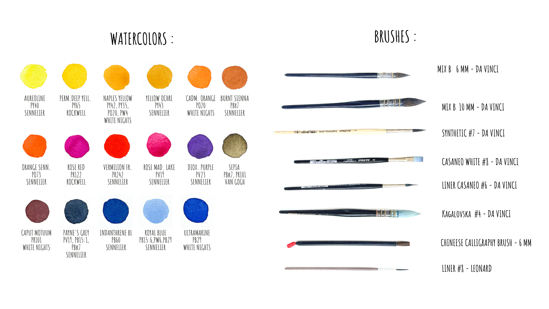
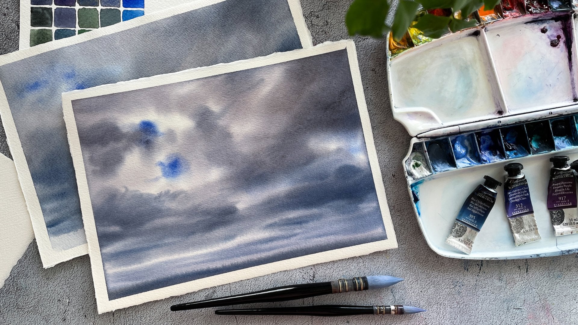
Transcripts
1. What is this class about ?: Imagine the warm lights passing through autumn
leaves rustling in the wind. Does it inspire you? I personally can't resist taking the brush and
painting a picture. And what if we could change its palette just like
leaves during the fall? Hi everyone. I am Maria, a watercolor
artist and instructor. Welcome to my new class, where you'll
discover how to find your perfect autumn
palette and how to fly it for painting,
assignee, cityscape. Whatever your level is here, you will find doable
and useful exercises. We will start by
generating color palettes, and I'm already waiting
for your results so we could share even more color
combinations with each other. Next, I'll show you how simple tunnel modifications can make the picture even more shining. After that, we'll adapt
this logic to apply one of our new pallets in
the quick 15 min sketch. And of course, I'll show you a step-by-step process of a
bigger watercolor creation. Paying attention to all the
details and techniques. So after this class, you'll not only make three
paintings and a color chart, but you also learn
an approach that you will be able to use
for any future painting. Join the class and
enjoy watercolors.
2. Color Palettes Exercise: Welcome to our class. Let's start right away
with the first exercise. For the first exercise, you will need a piece of paper. I will use cotton paper, but cellulose paper
will also work. And I will use a small
synthetic brush. You also need paper
tape or you can just line up the paper was
a pencil and ruler. And of course, just take
your favorite ballots. You probably know
that I very often use photographs as references
for my watercolors. In the original picture, there are dark and
light areas that will have different
lightning and tone. And they are also
different objects, so they will also have
different colors. But what to do? I don't like the color scheme
of the original photo. I could of course, try to use filters and color correction. Or we can actually make a creative
process. I would do it. Sometimes I do colored
tests like this to four new variations and learn this method myself during one of the online
classes a few years ago. And I keep using it
from time-to-time. So let's try to test
different cargo skips. Next in this video, I will show you all
12 schemes I made. Of course, with
the color formulas with which they are made. The first video will
be at normal speed, so you can see the
process as it is and the rest will be sped
up. Let's get started. As the first exercise for you, I suggest you to do at least six variations
of different palettes, or better yet, more. You'll sit at. The first
few will be easy to find, and then you will have to sink a bit and look for new
color combinations. Perhaps even take
color that you rarely used or mix it in
unusual blends. And the more variations you
said to herself as a goal, the more complete effective
they exercise booby. I want him and
taking new colors, I'll just use the existing
balance that I normally use. And you will see that you
can get a huge number of variations based on
the same colors. So here I have prepared 12
sections for this exercise. Please don't be lazy and make at least six different
color schemes. Experiment, and don't forget to share them in the
project section. That way you can help
each other to find new beautiful color
combinations. All right.
3. Commentary to the exercise: So less than what we
have is our color tests. And I've already
spent quite a time thinking about what
colors I prefer, what pellet I prefer the most. So I'm honestly satisfied with the most of the
colors schemes I created. Some of them are
really unusual for myself, e.g. this one. And I really love it. It's a very, very nice
dark autumn mood here, or this one is very like my balance with some
bees and blues. Although it doesn't feel
like this place at all. I really feel as autumn. So it will be there is
tiled here, e.g. I. Also like the mood, but I don't think that it will work for
this picture for me. So it's really very
subjective thing and you will choose
for yourself. Hopefully you will do this kind of a color chart and
you will have this choice. And really spend some
time thinking about it. What I'm adopting now, two options that I chose for myself is this one and this one. Well, no surprises,
I guess also, I think it works for
me because I added some contrast here in
these pictures as well. So they really capture the
mood and the lights already. And this is probably the
why they take my attention. What about these pictures? Here? I love it
because it's more red. It's less common for
my personal palette. It's very warm as well. And I think it will be
nice mood in this picture. This one also works well and
I really loved the color, warm and cold contrast here. So this is why I'm adopting, but this seems
pretty classy to me, so I don't really know
what's picture to choose. What I think that I will go to this option and I will try it. And if it won't work, I will do something more, contrast in cold
and warm colors. So we'll see. So what I'm going to
do now is first I'm going to work a little bit
on black and white version. Well, I'm not going
to use black color. I'm going to save it here. So we will have a kind
of a old style postcard. Because here if I take black and white
picture, it looks nice, but for me several shadows are missing and I feel that
we can actually work on, on Caravan is here as well. Even though I already
worked with this picture in my Lightroom application to work with some
contrast, et cetera. But I really feel that it
can be beneficial for us to, to test it in monochrome
version first and then to try to
make a colorful one.
4. Sketch exercise : Drawings: So let's do a very
quick drawing now. I really don't need
too much for this. I only need to edit very simple sketch
and take my B pencil. Here. I really want to do only a tonal sketch to
see what it may give. So I don't really even need the marginal proportions here. Just to test. Here will be, yeah, Let's say it's more or less
proportion will be the tree. I really want to make it
going out of the picture. And our windows which are here. No, I don't really
paint details. Here. There will be people. Your body's, I can already tried to draw them because I
want to make some shadows. Casting, casting
by those people. Here are rooftops
of the streets. Don't forget about
perspective here. So the first one and I will
do right away the second one. So the roof here actually
they are not equal. Just noticed. Cathy. This first
window, second window. So it's a very quick
sketch. I made it. So here will be people walking. Alright, the first plant, I'm not going to touch it. So let's try first
the simple version. So I have a sepia color. I will put it here
on my palette. I actually already have it here. I will take and I will prepare the color in this,
in this place.
5. Monochrome Sketch : Part 1: I'm ready for the first test. I will do it here, and then here I will test
my, my colorful version. Well, I really want to
take to test this one, so I will see how it will
work for the second option. And if it worked, I will maybe just take those
colors for a bigger version or I will change some
things so we will see. But first this, this picture, what I would recommend you
to do for this exercise, to take a bigger brush that
you would normally take a for this size of a sketch like this, you will be free from details and it will
be easier for you to really just to try
to see bigger spots, bigger watercolor
fields, and just to work with them without thinking
about lots of details. Of course, next, if you, if you prefer to work really detailed picture,
feel free to do this. But I really
recommend you to use this picture as an
exercise to try to test, to get some information
from your picture. What I'm doing now, I'm only
working with setback color. It's the one by Vanguard, the very simple one. And let's see what do we have? We have the sky. Don't forget about
your color paper. So we have our, our sky, we have some clouds. Of course they are on, on wet. You already know the
technique. I hope. So. They are very soft, so normally they are on on wet, paint, them on wet. But this guy is
night is not White, so we add some colors, some color to our clouds. This guy is quiet, clear anyway. Especially in this spot. I will prefer to keep it white because here we will
have the lights going right. And then everything
else is darker. The only roof here on the
the cafe will be lighter. I actually already can cover
everything here. Some color. So could wash right away some
color from future sunlight. Maybe two leaves, a few
highlights here on the ground. And the rooftop. It's not like white
quiet light anyway. So there will be color. Here probably we will have a
very, very nice highlights. First layer, I'm
going to make it dry. Was a hairdryer to
make it quicker. Alright, now it's a little bit drier so I can already paint on dry technique just not
to have too much running, running color spots
here and there. So what I'm going
to do next is to, well, actually I need to
determine all the elements. Then going to have
in my picture to see how dark or how
light they will be. So here is for my rooftop, there will be some
details on it like that. Basically everything
here is darker. Then the rooftops there. They actually will
be even darker than my my coffee so I can
actually do them later. Here we have some lighter spots. He details on the ground. What I would do is I
would make, of course, the foreground a little bit darker here to have a
perspective effect. And the last thing
is we already have some light coming
here and there. And I will remove it with my brush just to keep
the lights going. Here and maybe here. And now, let's
switch to the tree. Here you see around
the tree we have some, we can see some leaves, but they are,
they're very light. When we see everything yellow, it actually seems very light anyway because the
yellow color is light. But what we need to notice
for our future work is that here yellow
and here this yellow, they are not the same tone. So here, this exercise will help
you to understand actually that your leaves
are a lighter and darker in some, in some areas. And like this, you will
notice and will apply your color more correctly
in your bigger work. Here it's lighter, almost
transparent color. The further from the sun we go, the darker it will become. You see, using the
bigger brush helps me to avoid excess details. Here I can have some branches. The tree itself also
will be lighter in the light area and
darker and darker one. I'm doing those leaves
there very schematically, I don't really follow now
the drawing of the tree. Just to test the idea, you know how it will work in general for the
further color values right here, it's
a little bit wet. I want to really touch
this area at the moment. Light, dark. This is the only thing I had to, to capture in this
in this sketch. Of course, if I want, I can do some lights. If my paper's still wet. I can try to remove the color
and to make a light effect, but really don't
think about it a lot. Even the fact of using different color
values will help you to create a nice contrast and the light effect in the end. What do you need to do for that only to take more pigment. It's not even about
the color yet. It's only about the
color value and tone.
6. Monochrome Sketch : Part 2: Okay, We can go back to the, to this building here. We will have some
health windows, some very dark details. Comas, black details here. Well, here in the background
is printing because of the because the color was
still wet in this place. It's funny because it's even
created a light effect. And what we need is to see some details here and there maybe they
will be really dark. In this point. Some shadows here. Very dark. And trends of the cafe. There is actually a person here. There's a shadow. So the idea of this
exercise is to test color values to see
what you need is a color. So here we have people going. Actually can be darker. I feel the trunk of a tree is darker
here because there is no really light next to it. And why do you can
do this to try some shadows coming from people. Cannot forget it
shouldn't be really dark. The way to entering the gushy. Once we have dark shadows, we will have the light effect. Yeah. Then there will
be some details. I'm asking myself
if this building shouldn't be a little
bit darker as well, or if it feels okay Here and there will
be something darker. Maybe. See some buildings. 3d is something very technical. But it helps to feel
better the picture. So I'm pretty happy
about the tunnel. Tunnel proportions here. Maybe the only thing I would make the background
a little bit darker. Of course, it's not their
precise as a drawing. But I think you see
the idea, right? So this is how I'm going to, to work with this picture here. Maybe there will be
also some shadows. So now I see more or less
how it will work for me. And I can try to transfer now those color
values into colors. Let's draw our picture first. I hope that you can see that
this version is a little bit more highlighted
comparing to this one. It's just because I added more
light spots on the ground and maybe my
highlights here are a little bit more intense than
in the original picture. We will see how it
will work depending on our color scheme. So now it's time
to maybe to try. Finally one in this place.
7. Color Sketch : First Layer: So let's try now
the second version. And this time I'd really like
to try this color scheme. I actually use quite a lot of different colors and we will see how they will work together, applied with different
color values. Which is very interesting
because here, here I don't really
have colors of dark tone on the tree or
on the building here. So only some shadows
in this part. So I'd really like to see
how it will work for, for different color
values. So let's go. I propose the same, the same approach,
no pressure here, it's just a test. So I will prepare my palette. I will clean up a
little bit like this. And here we go. I'll begin with this guy. This guy was royal
blue and drop-off. Payne's gray, if
I remember well, and let's add a drop of orange for having some highlights. Also can make the sky a little bit warmer
closer to the sun. So here. Why do we need this second sketch is to test colors before
we will begin the, the bigger painting, that's it. So if you feel that you're
already ready for that, you can do it
without the sketch. But this is small one. It will take just
some time from you, like 10 min or so. And then you will be able to You will know if
you like it or not. And like this, it
will be easier for you to create a
better picture later. Like to be sure that
your color choices okay, and you can confidently
paints your maintain. So I will add now
a little bit of Oreo line for the background. Remember we had some. And then light for
light for my roof. For the cafe is actually orange and a drop of
red, if I remember, well, I wanted to
make it very light. So let's add more water into it. Then we can go up with the same red because there's
a light reflection from like sand goes here. And then we have the
light coming through. Make sure they have some sun
came from my window as well. Now, let's take again
the same colors. Blue and a drop of Payne's gray mixed with
this orange and red today. I used for the bottom part, I will take one turmeric, just like we did
here in this part. You see, okay. Here. Make it lighter in some places between people
that can make it lighter. Future shadows. And we drive.
8. Color Sketch : Details: You already know the
whole set of colors. So if you see that the
color has become more red, then I use the red
that we already added. I sat with a translucent leaves of the tree around the sun. You remember, it should be
lighter and warmer in color. Depending on the shape of
the tip of your brush, the leaves may turn out
different than so before I started this part practice on
a separate sheet of paper. Make prints of your brush and see what kind
of marks it leaves. Here I've added Payne's gray to make the
color even darker. The trunk of the tree
should be also dark enough. So I'm increasing
the contrast here. And then I switch back
to translucent paint. And then let's add some more
contrast to the background. Here. I'm not really interested
in the technique itself, but more in what tone and color my watercolor
response will be. I led a little more translucent yellow to an Hayes,
the glow effect. Now it's time for
the darker details. Remember in the
monochrome sketch, they were almost black. So don't forget to mix
the paints thicker. I'm removing the color
in some places to create the effect of some beams
and shadows on the street. Of course, I only can
make it while the paper is still wet in this place. Switching now again to almost black or very
dark and dense color. And even for such dark spots, you can still change the color. I'll take it more
red in some places. Of course, I only add
colors that I already used for this picture to
keep the color harmony. Let's continue with shadows now. Posteriors creates such
a nice conscious here. I increase the contrast
in some places. Adding details at the same time. If you final touch, and we're almost done here. If you want, you can paint
a tree on the background. I really love to see how this
picture is becoming shiny. So actually that's it
for this second sketch. So now it's your turn to create your two tries or
maybe even more, don't forget to share them
in the project section, maybe even in picture, so we can discuss them altogether and see
you in a big project. Next. Good luck.
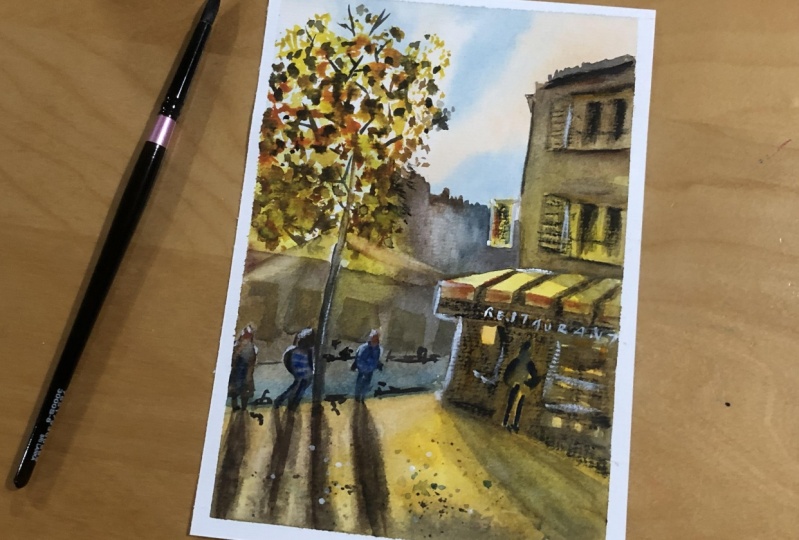
9. Main Project : Drawing: So let's begin as this
time drawing itself. All the rules of perspective, how to construct the image
is not our main topic. I decided to go easy way
and I just transferred my printed photograph to my watercolor paper
using a light table. So you can do same as well, is if you feel that
you really want to have a precise
drawing without, without putting a lot of effort
into the drawing process. Or you also can make your drawing on your drawing
paper if you want to exercise your drawing
skills and then transfer your drawing to
WaterGuard paper. Why I recommend to do
it in a separate paper? Because by erasing a lot you can damage the
paper surface. So to avoid it, you can do a transfer even after
making a transfer drawing. Of course, if you feel confident with your
drawing skills, go for it and make a drawing by your hand directly
on watercolor paper. You can find a photograph of my stanza in glass materials. So feel free to use it as
your guidance for drawing. Don't forget the
drawing we need just to help us to create watercolor, but not for drawing itself.
10. Main Project : Commentary: So let's begin painting. And after all this color tests and simple drawings,
sample paintings, I decided finally to make
it simple and just to do a original color scheme that
we have on our photograph, I think it will
be easier for you to be guided by the
information from this photograph and to create your watercolor picture using the colors that you
already have here. Of course, if you already found your favorite color palettes during all this
sample exercises, of course, feel free to use it. And in this case, I
recommend you to use the black and white printed or digital picture as a reference. But for me, I guess this
will be my reference. And I will also try to create a little bit more light
in these environments, as I had in my sample paintings from
the previous exercise. So let's begin.
11. Main Project : First layer - Light: You can see the list of all the materials I'm going
to use in this class. Of course, feel free to replace those supplies with materials
of your favorite brands. Just think about
quality of paper. This time I'm going to use
cotton paper, 300 g density. This will allow me to
work in nuclear technique commonly in several
zones of my painting. Alright, let's begin. I will try to do it one or
less in the same manner. Like a quick sketch,
but a bigger format. So I'm going to use
bigger brushes as well, especially for the beginning. And I'm going also
to try to reproduce, to follow several
technical effects that we can find in
this, in this picture. So first of all, I'm going to moisten
them the background where the sky will be because
our clouds are very soft, which means for me in watercolor language,
painting on wet. So this is what I'm going to do. I'm going to moisten
those surfaces. That will be lights. Yeah, Let's moisten everything
on top of the painting. You can also spend
more time by preparing the paper surface if you prefer. But my goal for the first layer will be just
to add light everywhere. And I will begin with my Skype. For this, I will take
first some colors. I will pretty
moisten my pellets. I see some yellow, orange, and blue in the sky. This is what I'm going
to to try to reproduce. So let's begin with
orange and maybe drop off Naples yellow or
something like that. This guy is not the main
subject of this painting, so I don't spend a lot of time trying to paint clouds
or something like that. If you want to have more color, don't forget that's drying your watercolor will be lighter. And also, I need to
keep white areas. White. Switch directly to the blue. I'm using royal blue for that. Everything is on wet. You can play more with color, with cloud shape if you want. But as I said for me, it's not at all The main
thing in this painting. I keep in mind the fact
that drying my watercolor will lose by brands. So we continue. I will right away put some color to the
background here as well. To begin this yellow story in
the bottom of the painting. Here I will completely term
because now it's still wet and I am wanting
to run too much. Of course I keep whitespace
here in the center, in the place where
the light will be. And now I will switch my
switch to the smaller brush, the one we just clean. Now we'll take
some yellow to put this slide to my future cafe. And mixing two yellows for that. Here I have another yellow and also I want to make it run. And we'll get to this upper part to the
building because we have sort of a reflection on the wall because lights goes to, from the sun goes to this
roof and it reflects to this to this wall and it will
have some yellow undertone. We continue putting
lights everywhere. There will be some
lights and highlights. I'm not sure if I'm
going to put them now or if I'm going to use them. White gouache. In the end just to
highlight them. Here we will have called
color of the road. We'll just make sure that my
yellow still shining here. Once you let the color
flow to this yellow bar. And we're going down
for the street here, for the cafe as well. Here we have some orange. You see those menus and
different like chairs inside. They can be they can have a little bit of
a warm color in it. Even though the light
and the shadow that I'm going to put over it, I will make probably more cold. And I will keep with yellow
for the, for the road. This person will also be dark, actually in the end. Now I will let it
dry the first layer two and later. Meat tones.
12. Main Project : Second Layer - Background: So now my first
layer is almost dry. I say almost because it's
a little bit called myTag, but it means it's just some
liquid state in the paper, but normally it's almost flat. So it means that I can work on and in dry
technique on my paper. So I will switch the
brush to something more pointed as a pointed tip. And I will begin adding
Midtones to the painting. I think I will start first with the buildings that are
in the background. I will use the mix
of colors I already used to keep the harmony
of the painting. Always keep a piece of paper for color tests to see what I have. And I will begin adding
my mid tones. Here. I'm working with
quite wet brush. So it allows me to create a nice backgrounds which will look as a entire
watercolor spots. And right away a little bit of a yellow for my feature tree. Because you see here we
have some leaves that goes into this background. So why not to try starting
adding them to this place? I will mix both yellows I have. For this purpose. I take them more or
less transparent. The main purpose of this, the main role of this
background is to create the contrast for my roof. For this yellow spot. It's fine that I switched
again to this pressure anyway. As this ball is
quiet, wet still, I can connect everything
into one spot. Basically it logically
will be to make it colder. The further eat from us. Also called her
background will be even more contrasted to this yellow. Try to measure some
buildings or, or so. Yeah, Also drop-off yellows for for the trees
in the background. Somehow I got them
lighter and darker, lighter than the saids, but it should be the fault
wall is normally a little bit lighter than the rooftops so
I can work on it like that. I'm asking myself if I shouldn't add a drop
of blue somewhere. To emphasize this yellow story. Basically, I want, I'm not going to draw to paint any cars. Same for people first, I guess I will just cover that
voice that was the color. Let's move on. Click here for this edge, I can make it a
little bit warmer. I also can work
this place already. Any once again, some yellow
to the feature tree here. Mixing as usual both yellows. What else I can do
at this stage is to try to add some sunbeams. I think this could be
nice to do here, e.g. I need to make this effect while the paper is still
wet in this place. Here it won't be white
because they are already was a embed grounds. Here. It's still too wet
to begin with. Maybe here in this place. I guess. After every touch I need to wash and squeezing
my brush. Once again. Here, there will be also
the leaves of the tree. Some freshmen, my brushes isn't clean, so this is why I have
I don't have whites. I will leave it like this
without any excess detail. I'm asking myself if I
don't want to add something to rooftops and took a drop
of Payne's gray for that.
13. Main Project : Second Layer - Building: Let's move on to, let's move
to our building. Finally. Take the same colors, yellow, orange, drop of blue, which are marine blue. Don't be afraid of a
little bit dirty colors. You will see that you actually
need such dirty color to create the contrast
for your white ones. White and clean ones. And I will begin maybe
was a little bit colder for the roof. And then I will move on to two, the volume part with
lighter and warmer tint. Same story. I will
take it quiet, wet to have time to
adjust the color, to maybe add some color details. While it's still wet. Here. Remember, I wanted
to add more yellow. So why not to keep this logic? Now to make this part of the
building even more yellow. And continue in the
same way to Create. Now, here I will wait until it's dry
to add more details. And I will add that First details to my cafe. I remember that I wanted
to add some menus and details. A bit too late. The waiter entering start adding darker color right away. And I will move on directly to the bottom parts, to the road. Another that seems quite a
lot of work at the same time, but you can split it into
different parts if you feel so. So do firstly the cafe and
then add a shadow here. If it's, if it feels more
comfortable for you. Now I'm going to make the very foreground
a little bit darker. A little bit time
minutes, of course. And remember about the shadows. While the paper is still wet. It's almost dry brush. I'm going to do
the first layer of shadows for my pupil. Here. For the tree as well. Make it first word too late to add some darker central parts. You will see my brush
is still quite wet. I'm always using napkins to control the amount of
water on my brush. Notice that closer
to your objects, shadows will be more precise and more smooth further
from the figures. Masking this off. It shouldn't be a little bit colder here. Maybe we're not. There will be other
shadows in the background. Further roads, cars there. And I was tired from
ten to remember that we had a building. So I still can add some details, e.g. some color highlights. It's really time for some for
some details on wet if you want to know so that we
like period in the future. I also could add maybe a few
details for the foreground. And I'm asking myself if I
shouldn't do more details here or to work
on my background. Can be darker shadow. The paper is still
wet so I can use this chance to to work on it. And you also remember
that will be much drier and much later once
it's dry, excuse me. And I wanted as well to add shadows to the window right away. Remember here we have
what's up with that? And with lighter colored, still quiet, dry because
paper here is dry. Hi, I'm adding some details, not trying to draw
them very precisely. I just need an impression
that something is some architectural
elements, windows, etc. Are there? Just to have an impression that yeah, there's a building
has something, some structure and elements. Alright. What else? I can also make
this man a little bit darker as it will be later
in much darker shadow. You will see. For the next step,
next two steps I left. We need to create our
tree and darker shadows. I think it's alright so far. Light blue elements
here and there. Let's see. Later what we will have
maybe some structure, some texture to our streets. This now looks too dark, but I hope it will be
lighter later once it's dry. So let's try it with
a hairdryer, right? I didn't drive too
much because I only interested now in this, in this part and this
will be a dryer soon, so I will have time
to work at this spot. At first.
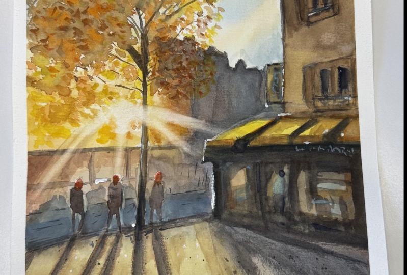
14. Main Project : Tree: One of my favorite tools
for painting trees is such calligraphy,
Chinese brush. I'm going to use it
that this time as well. You can take
whatever you prefer. I like it because it's very precise and it gives
very spontaneous spots. So it helps to create
natural chaotic or shapes without bigger for it. So let's begin. I will just do plenty, plenty of such random movements to set up those,
those leaves here. And there will be more yellow and more
transparence closer to the sun. And of course, we
will have some yellow in the upper parts. But we also need to
make those leaves darker in the upper
parts of the tree. I'm going this time to
draw every element here. If you feel so, of course, spend your time doing
all those prints. You, you can actually
do something like this. And to try to create the texture of the tree
if you really like it, I will do it in more simple way. So I'm just painting
sort of a random tree. If I had the sun
ray coming sour, I need to keep this area lights. And we'll work quickly to keep all those sports wet and
to have a chance to, to create all the shadows and the light effects on the tree. I'll say tree trunk is here. At this point I start to introduce to add burnt
sienna to the mix. Because we can have very dark yellow without
adding anything. And we can go either
into warm colors or to add other colors, but like blue, even
blue can be added. But in this case, we will
have the color more muted. And I starts with
very vibrant dance. Feel free to stand up, to make a step back, to have a distal to your work to see if anything is
needed to be added. Now I'm starting to
add blue color to this warm mix is becoming more
neutral and darker. Which helps me to create
shadow effect on the tree. I will take liner, brush these
or they can do this job. And I will now will
make branches. First one is the same color. You've even lighter in some
places that are closer to the sun and with darker
color. Here on top. Notice that your branches, they are not laying
on top of the leaves. They really go somewhere in-between of those
who those leaves. Let's move lower. Maintenance, tree trunk. Johnson can be much darker here. Black. You see we're now starting, ending super dark shadows. So I'm switching to
the Payne's gray. Maybe with a drop of the rest
of this brown that I have. I'm using now, almost dry brush. You see how it leaves? Leaves the brush strokes. They bring immediately
the contrast as well to our painting. Window details. So very contrasted should maybe make it a little
bit darker. First. Let's move on to details. Here. Let's add some vertical, horizontal elements, imagining that the
cafe and such details that maybe inside a waiter.
15. Main Project : People: So now it's time to
finish the painting. Let's do final details
and last final touches. I think that I'd like
to finish the tree, maybe to add a few
more leaves here. To feel more this space and also cheer to make the shape of the tree a little
bit more natural. So once I have this
tree trunk done, it feels like the tree is
now not very symmetrical. So I would like to to maybe fix this
impression a little bit. And also a few details
here and there. To reinforce the
effect on delight. Feel free to stand up to get your painting from the distance. I will add a few
leaves here and there. If there are some names, I will remove the paint just to keep the effect of obliques and you keep the
shape of the tree going. Alright. I think I
like it like that. Let's move on and, and few more details. First of all, we need
to paint people. So let's do this. Dr shadows. So I will take a darker color, but I'm not sure if I should
make them very dark though. So maybe a few details. Them can be like here. There are some details
on the clothes and maybe this can be something
interesting to paint. I have a shadow here, so normally I needed
person to be done. What else I will do is
I will paint the face. You know, that people looking at us normally we paint
them with red faces. Like this. We have an impression
that there is a person walking here and looking
at us like that. I'll do a few more
darker details. There is another
person walking here. Let's keep doing the same way. I will probably take something, maybe I'm asking myself, it should be warmer or colder. Is a figure probably. Something natural would be nice. Quiet, dark anyway. We have this finger here. And I will add He's
fence as well. I wanted to be little
bit more dry gesture, maybe a little bit darker
in the upper parts. And same for the face. I'll do it. Well, Fred, I mean, my orange color. Normally it should
be around as a face. Be afraid to do
some corrections. It's totally okay. We have the last figure here. I'll try not to do too dark. This time this person is looking another direction so she
will walk away from us. Let a few details
for the shadows. Because now as figures
are more defined, I would be happy to see better. Remember I told you
that the shadows, they are more defined
closer to the object. Like that. It's probably
add a few dark details. The road, maybe this man feels a little
bit too dark to me. I'll probably try to change
a little bit the color.
16. Main Project : More Contrast: So let's go back now to Chile
details for the building. There are some things
that I would like to add, maybe two, to have a
more, more shadow here. Like this. I will have
the impression of detail for the window without painting them too many. No size suggesting that this
part can be a little darker. Now I wanted to make
this less reasonable to, to contrasted for, for
such a detailed. I feel. Also here we have
sort of a shadow. Really liked to make
it look more real. Leaning more shadows here. I think it looks more
natural like that. Some darker details
here and there. Now of course, the
most tricky part is to stop at the right moment. I want to satisfy their
color and contrast drops.
17. Main Project : Cold Color Accents: Now to really
conclude this story, I'd like to add a few color
accents here and there, and also some, some
white details as well. So let's do this. I'll take first, yeah, I'll take my liner brush. So what I can do is to
try to find a few places where I could add some
I'm colored details, e.g. here on this Windows we can find some something
like bluish color, like something called
here, here and there. There are some cold details. And I guess I will take
some royal blue very, very densely to put a few random details here and there I will
take it also quiet. I'm using my liner brush and I will take it
quite dry as well to have really like dry effect of details. Something like that. Imagine that there's
a text can be solved. Here is well detailed
summary cafe. You know, the person.
18. Main Project : Final Touches: Well, I would like maybe
to add, by the way, the head to this person and maybe a few details
for the road, for the background
somewhere there. Because there are some lines
here on the background. You see there are
edges the road, but I don't paint everything. So of course, if you
feel so you can really try to draw everything you see. But for me it's not the purpose. And here I took the color
very, very transparent. So while, once it's
dry, it won't be this. Present. A few more splatter. I can do it with some color. It can be also nice
because now we're switching to warn details. I will also add some
red the details. Again, I'm using
this orange color. Let's add few warm
details here and there. They're just random details, some color accents that bring some life to,
to the painting. I guess I will add as well a few more details
here next to windows. They're very white ones. The balance of details, it's really your personal thing. If you feel that you want
to make them more detailed, to have to paint every, every, every thing that you see. Feel free to do this, but also you will need to find
the moment where to stop. So I really recommend you to put all the detailing stuff
to the end of the paintings. So asking myself if it's
enough for this part, they want to make
it a little bit too dark and not to
Jack little bit darker because he is actually more in the shadow seat. I will keep it like that.
19. Main Project : Highlights: The very last thing, I'm taking white gouache. I have this one in the tube. And this I will take
you directly to my brush and just make
sure that it's clean. I will take it very, very densely from
the tube like that. What I can do is to add a few highlights here
and there. Here. The point is to, not to make too much, just find the places where it
can be really highlighted. So e.g. I. Can see something here. I can see something
here on the corner, maybe all people and like some details here
and there on the road. So that's it. So I will try to adjust to add a few more details to emphasize the light
of the painting. And they're really just
a very light gestures. I don't do much. So once I touch it, I keep it. I don't really draw. I gave every detail. Just to, just to touch. Here. I put some shadows, some whites on the on people's head and
shoulders because this is the light and so logical
and there will be some, they could be some
highlights here. Now we have more lights on people and I really
liked the effect. So what I can do is just to add a few more light spots
maybe here and there. Just some highlights. I can add some
highlights in the tree. If you feel that
you miss something, you didn't put the light
where you want it. You can really try to fix
it with white gouache, but don't leave too much for this tool because it's only for details because you need
to have it really opec, which means that
it should be very, very dense and thick. So you really can't, you see like how dry it is. You really can't paint
larger areas with it well, unless you want to make
this effect visible. But this will be
another, another thing. The last, the very, very last thing that
I'm going to do, they will take the rest of the
gouache that stayed on my, on my brush and I
will add a drop of something that's stayed here. They have not white but
lights, some white color. And I will do letters here. Not going to write
them all as they are. But you see I'm not painting them, writing them white because
here they are in the shadow. Those letters, even though we understand that they are whites, they are not white
in the painting because this part
is in the shadow. I also could add few, few lighter details if
I want to take a fee, some lines details for Windows. But here, this may last. And I really want to
finish this work. And I think I did good job here. I hope it was clear. Normally this is how I
work with such plots. It's very quick work. And the main thing here
was to capture the light. And I think it worked well. Now it's dry it
and remove masking tape and just checking
now if everything is dry. I think it's the case or maybe some white dots are
still a little bit well, because the color was there, very dense here, so it's time
to remove the masking tape. Oldest pleasant moment.
20. Conclusion: So here's our results. The last thing that I would do, I will take an eraser and I will try to get
rid of this line, pencil line and the white area. Yeah, Now I'm happy. So this is our painting. I hope you enjoyed this
step-by-step part as well as our exercise section, I will be waiting your
color charts and sketches, as well as this big painting
in the project section. And of course, don't forget
to share them on Instagram. Here's the hashtag for that. If you have any questions, don't hesitate to ask
them in commentaries. I hope this class was useful
for you and you enjoyed it. Please feel free to
write me feedback saying what you like
the most in this class. I'm looking forward to seeing
your son is cityscapes. See you in the next class. Bye bye.
 Maria Smirnova, Watercolor artist and author