Transcripts
1. Welcome To The Class!: Hi everyone. My name
is Will Elliston. And today, we're painting a sunlit countryside
scene in watercolor. What I really like about
this subject is how it invites us to paint with
both freedom and intention. The open sky, distant
mountains and broad fields, gives us space to work loosely, while the house, trees, and pathway provide
just enough structure to hold everything together. We'll explore warm and cool
relationships and how to suggest richness in the land without over describing
every detail. I've been a professional
artist for many years, exploring lots of different
subjects from wildlife and portraits to cityscapes
and countryside scenes. I've always been entranced by the possibilities
of watercolor. But when I started,
I had no idea where to begin or
how to improve. I didn't know what
supplies I needed, how to create the
effects I wanted, or which colors to mix. Now I've taken part in many
worldwide exhibitions, been featured in magazines, and been lucky enough
to win awards from well respected
organizations such as the International
watercolor Society, the Masters of
watercolor Alliance, Windsor and Newton, and the SAA. Watercolor can be overwhelming
for those starting out, which is why my goal is
to help you feel relaxed and enjoy this medium in
a step by step manner. Today, I'll be guiding you
through a complete painting, demonstrating a
variety of techniques, and explaining how I use all
my supplies and materials. Whether you're just starting out or already have some experience, you'll be able to
follow along at your own pace and improve
your watercolor skills. If this class is too challenging
or too easy for you, I have a variety of classes available at different
skill levels. I like to start off with a free expressive
approach with no fear of making mistakes as we create exciting textures
for the underlayer. As the painting progresses, we'll add more details to bring it to life and
make it stand out. I strive to simplify
complex subjects into easier shapes that
encourage playfulness. Throughout this class, I'll be sharing plenty
of tips and tricks. I'll show you how to turn
mistakes into opportunities, taking the stress out of
painting in order to have fun. I'll also provide you with
my watercolor mixing charts, which are an invaluable tool when it comes to choosing
and mixing colors. If you have any questions, you can post them in the
discussion thread down below. I'll be sure to read and
respond to everything you post. Don't forget to follow
me on Skillshare by clicking the Follow
button at the top. This means you'll be the
first to know when I launch a new class
or post giveaways. You can also follow me on Instagram at Will Elliston
to see my latest works. So let's get started
and paint a landscape that feels both
spacious and inviting.
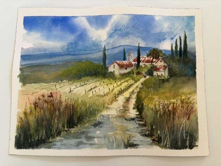
2. Your Project: Thank you so much for
joining today's class. Think of this painting as a journey into depth
and atmosphere. The winding path becomes an
invitation into the scene, guiding the eye from
the foreground into the warmth of the house and beyond to the
soft blue hills. Around that, we have a lovely contrast between structure and natural looseness, neat roofs and trees
against broken grasses, flowers, and shifting sky. This makes it a wonderful subject for exploring
where to be precise and where to let
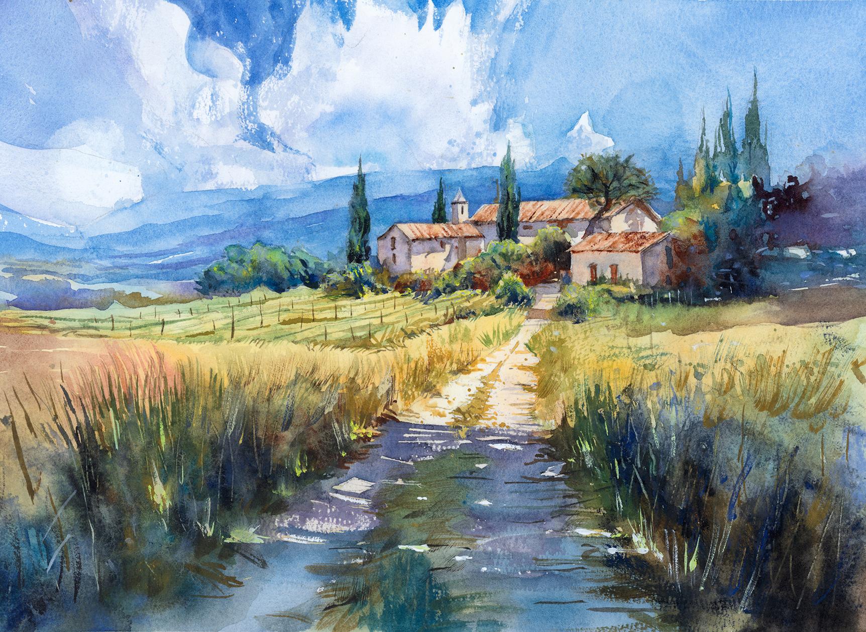
watercolor stay open, soft and full of life. In the resource section, I've added a high
resolution image of my finished painting
to help guide you. You're welcome to
follow my painting exactly or experiment with
your own composition. As we're going to be focusing on the painting aspect
of watercolor, I've provided templates
you can use to help transfer or trace the
sketch before you paint. It's fine to trace when using it as a guide for
learning how to paint. It's important to
have the underdrawing correct so that you can relax and have fun learning the
watercolor medium itself. Whichever direction
you take this class, it would be great
to see your results and the paintings you
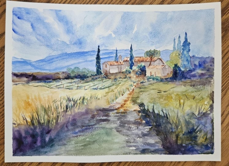
create through it. I love giving my
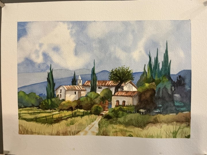
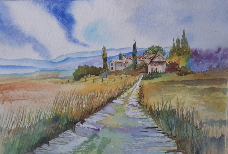
students feedback, so please take a photo
afterwards and share it in the student project gallery under the project
and resource tab. I'm always intrigued to
see how many students have different approaches and how they progress with each class. I'd love to hear
about your process and what you learned
along the way, or if you had any difficulties. I strongly recommend
that you take a look at each other's work in the
student Project Gallery. It's so inspiring to see
each other's work and extremely comforting to get the support of your
fellow students. So don't forget to like and
comment on each other's work.
3. Materials & Supplies: Before we sketch out this scene, let's go over all
the materials and supplies you'll need
to follow along. Having the right materials can greatly impact the
outcome of your artwork. So I'll go over all the supplies I use for
this class and beyond. They're very useful to have at your disposal and we'll make it easier for you
to follow along. Let's start with the
paints themselves. And like most of the materials
we'll be using today, it's a lot to do
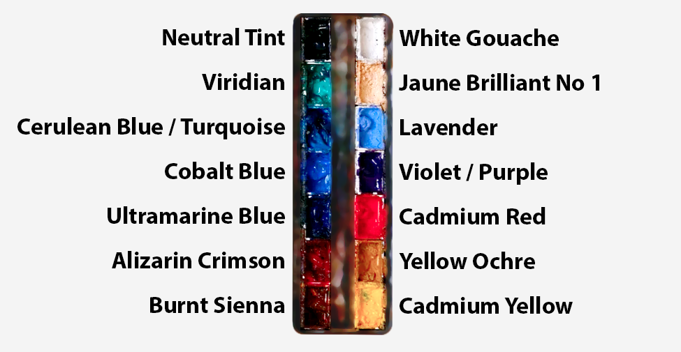
with preference. I have 12 stable colors in my palette that I
fill up from tubes. They are cadmium
yellow, yellow ochre, burnt sienna, cadmium
red, Alizarin crimson, Opramarne blue, cobalt blue,
syllan blue, lavender, purple, ridian, black, and
at the end of the painting, I often use white gouache
for tiny highlights. I don't use any
particular brand. These colors you can
get from any brand, although I personally
use Daniel Smith, Windsor and Newton,
or Holbein paints. So let's move on to brushes. The brush I use the most is
a synthetic round brush like this Escoda Purl brush
or this Van Gogh brush. They're very versatile because
not only can you use them for detailed work
with their fine tip, but as they can hold
a lot of water, they are good for
washers as well. They're also quite affordable, so I have quite a few
in different sizes. Next are the mop brushes. Mop brushes are good for
broad brush strokes, filling in large areas and creating smooth
transitions or washes. They also have a nice tip that can be used for smaller details. But for really small details, highlights or anything
that needs more precision, I use a synthetic
size zero brush. All brands have them,
and they're super cheap. Another useful brush to have is a Chinese calligraphy brush. They tend to have long bristles
and a very pointy tip. They're perfect for
adding texture or creating dynamic lines
in your paintings. You can even fan them
out like this to achieve fur or feather
textures as well. And that's it for
brushes. Onto paper. The better quality
of your paper, the easier it will be to paint. Cheap paper qwinkles easily
and is very unforgiving, not allowing you to
rework mistakes. It's harder to create
appealing effects and apply useful techniques
like rubbing away pigment. Good quality paper, however, such as cotton based paper, not only allows you to rework
mistakes multiple times, but because the pigment
reacts much better on it, the chances of
mistakes are a lot lower and you'll be more likely to create
better paintings. I use Arches paper because that's what's available
in my local art shop. A water spray is
absolutely essential. By using this, it
gives you more time to paint the areas you
want before it dries. It also allows you to
reactivate the paint if you want to add a smooth
line or remove some paint. I also have an old rag or t shirt which I use
to clean brush. Cleaning off the paint
before dipping it in the water will make the
water last a lot longer. It's always useful to
have a tissue at hand whilst painting to
lift off excess paint. Also, you never know when an unwanted splash or drip might occur that needs
wiping away quickly. I also have a water dropper
to keep the paints wet. When you paint, it's
important to have them a similar consistency to what
they're like in the tubes. This way, it's easier to
pick up sufficient pigment. A hair dryer is useful
to have for speeding up the drying time and controlling the
dampness of the paper. And lastly, masking tape. And this, of course, is just to hold the paper down still onto the surface to stop it sliding
around whilst painting. Also, if you plan on
painting to the edge, it'll allow you to create a
very crisp, clean border. And that's everything
you'll need to follow along
in today's class. Let's get on and
sketch out this scene.
4. Preparing The Composition: So before any paint goes down,
we need to sketch it out. And if you're not using
the tracing template, which I do advise you use
because it just saves time and it makes things more accurate for the
painting process. But if you want to do your
own original painting, it's definitely a part of
the process that is worth slowing down for because when people look at a loose
watercolor like this, they often assume the
freedom came first. They see the broken
edges, the soft grasses, the drifting sky wash, and all that lovely open paper. And they imagine that
the painting must have been improvised from
the very beginning. But actually, what allows
the painting to feel free later is that structure that's already been
thought through with care. So that's why it helps to make sure the drawing is
accurate to begin with and why I do advise using
that template in the resource section
if your drawing skills aren't confident or comfortable. Of course, it's something
you have to practice anyway. So maybe you can sketch it out on a separate piece of
paper just to practice. And then use my template
for your main painting. So at this stage, I'm
not trying to produce a beautiful pencil
drawing for its own sake. I'm simply trying to
create a calm map, something light,
something unobtruse. But something clear
enough that I'll not have to question the main
placement later on. So the cloud shapes are there. The line of the distant
hills is there. The village, the cypress trees, the winding path is all
there to help guide me.
5. Building Underlayer: One of the most unique things
about this painting is that we're not going
to start with the sky. We're going to start
with the buildings, which is the focal point. But I'm not starting just
because it's the focal point. It's because the sky is actually much darker
than the buildings. A lot of the time in watercolor
painting, sky is lighter. So I'm following
the typical rule of watercolor of painting
light things first. And this is just a
light underlayer just to get a bit of
texture going on. I'm using a bit of burnt sienna, maybe a touch of yellow ochre, a nice warm color. I'm just lightly touching
in the path there as well. Other times when painting, we start with the
sky and it kind of sets the atmosphere
for the painting. But with this particular
procedure that we're doing, it actually begins with intention
rather than atmosphere. I'm not yet trying to make the whole world feel airy
and expansive quite yet. I'm just painting these
terracotta roofs in using the diagonal lines that match the
angle of the roof. I'm quietly
establishing the place where the eye will
eventually settle. The roofs going first with that kind of warm
terracotta note. And immediately, there's
already a bit of a pulse of life in the
middle of the page. A few pale warm notes where
the sun will be lighting up. We'll add shadows later on. We'll add more
definition later on. This is just a little
bit of an underlayer. Of course, we've added
that very light wash to the path as well just because I don't want
it to be a pure white. I just want it to be off white. Just enough to start connecting the viewer to the village
from the very beginning. It's such a useful thing to remember in
landscape painting. We don't always have to
begin with the largest wash. Sometimes it's more
powerful to begin with the emotional highlight
of the painting, these houses, the
area that gives everything a reason to exist. And in this case,
those warm roofs are just not small details. They're like little glowing
embers in the middle of a cooler space that
we'll add later on with the blue sky
and the cool greenery. So I'm just sticking with
that burnt sienna so far. That's basically all I've used. Maybe you can add a
touch of yellow oak. I don't think I have. Keeping
the covers quite limited.
6. Field Underlayer: As the roof was drying, I just scuffed it up a bit with a brush because
it looked a bit too ordered, so you can see how it's a bit smudgy the
terracotta roofs, and that's
intentional, making it a bit less dine to find. Now I'm mixing some
of the greeny colors, and I'm going to explore all
different types of green. I've got the ridian green mixed with a bit
of cadmium yellow, blotting it out with a tissue
to create a bit of texture. So the top green, the pure viridian on my palette is kind of cool.
It's a cool green. And that green below it, with the yellow
in, that's warmer. So the good thing about greens or the way to make greens look appealing is to create a
bit of a variety with them. And this is just an underlayer. So we're not going too strong. I'm even using pure yellow here. Of course, that's
going to mix with some of the green we've
already got on the paper. So we started off with those light washes for the
buildings and the roof. Now, once we've got them placed, we can start painting that spread outward into
the surrounding land. And what I want here is not
full definition and detail. This is still just
an underlayer. That freshness, that
transparency and a sense that the scene is just
beginning to wake up to ease us into the painting. We don't need to do anything
too difficult at the moment. Got a lot of pure yellows
there, some fuidan green, I said, maybe blending in a
bit of that burnt sienna. Just very light washes, pale yellows, light greens,
nothing too intense. We can start dropping in some soft warm
oranges and maybe to counterbalance that some
light touches of cool blue, just to keep that underlayer a bit more interesting
and varied. The key thing at this stage is that they remain transparent. We don't want to add a lot
of thickness on there. We can still see the
pencil lines underneath. We don't want to burden
the landscape too early. I want the land to feel quite sunlit and open and breathable. That sense of air inside and landscape often
begins with how lightly we can place these
first washes on there. This left hand side will
be a bit more delicate because we've got some vineyards
in the distance there, so I have to make sure it's not too abstract, so it's
a bit more delicate. Compared to the right
side, we'll paint next. That's another reason I
want to keep it light and open because we'll add
more details later on, whereas the right hand side, it will be a bit more abstract.
7. Expressive Underlayer: So now we can move on to
the right foreground area. And this is going to
be a bit stronger, an early wash that's stronger
than the left hand side because I'm trying to get a
bit of asymmetry going on. It prevents the
painting from feeling too evenly organized. This right side begins to
gather a bit more weight, and it's going to be
a bit more blue green rather than yellow
warmth a touch of green. So we're going to have some blues, we're going
to have some softness. I pre wetted the paper to make sure we're
painting wet on wet, and I'm starting off with
similar kind of colors. That yellow is a bit more of a muted green because I'm mixing it
with the burnt sienna. So you'll start to see there's a bit of a contrast between the two sides already kind of setting the stage for
the future values and the layers coming
later on in the painting. Of course, it's not going
to be fully explained yet, but it's the beginning
or it's hinting at the more powerful colors
and expressions later on. Adding this kind of serlean blue into the yellow makes it
kind of turquoise green. So it's not actually
that natural, but it gives a burst of color that we can get
away with in watercolor. If both sides gathered
too much early darkness, the central path, which is
going to be a bit lighter, and, of course, we're going
to have a shadow going over this path in the
very foreground. Then the village
would begin to lose that airy sense of attention and it wouldn't
feel as inviting. And in a painting like this, the fields don't
just occupy space. They're creating this psychological
openness, this greenery. They make the village feel cozy, that summer feeling
approachable. I often think the middle
ground land area in a painting as part that
teaches the eye how to travel. So that's why this path
is very important. It shouldn't stop the
eye, I should carry it. And there's a few horizontal
strokes there as well. So I'm just using
these colors again to do some underlayer for the background trees as well. Again, they're not
trying to become the major display of brushwork. We're just having
fun playing with it. I'm going to preserve
a lot of the path. However, I've got a few dark or broken marks
around the center here, and I like these
marks because they stop the path from feeling
too empty or artificial, and they increase that
line of direction. They're still quite
restrained and abstract. And the path at this
point is just more of a guiding shape than
a textured surface. Again, we'll come back to that maybe at the
end of the painting. What is equally important
is what remains untouched. So at the moment, we haven't even touched the sky. It's still white, and
the distant hills are still waiting to be done to we're still in that fun expressor
stage of being loose and creating that energy.
8. Mixing The Sky Colours: So now I've dried it all, and you can see that we've
got a few expressive marks. It's very organic,
nothing too controlled. And on the left here, I'm starting to imply
those vineyards, just a sense of
perspective and direction, really, using just a
classic green color. I mixed by using Vidian
and yellow ochre. These don't have to
be too clean because, again, we'll come
at the end later. It's all about generating that energy within
ourselves to have fun, loosen up, be expressive, not be too tight. It's still unresolved. It's not a rush
to fill the page. This is one of the reasons why the early stages of watercolor
can feel so beautiful. They carry so much
promise and potential and excitement because they're light enough to suggest
many possibilities, but at the same time,
clear enough to help guide the painting forward with our
colors and the structure. And if we're patient with them, they often preserve
that freshness that later stages can build upon
rather than fight against. So we've now finished with the underlayer for
the greenery in the house, and we're going to
work on the sky. I'm just mixing the colors here, and I'm mixing quite a lot because it's going to
be a very deep sky. Mainly, I'm using cobot blue, there's also serllan and
ultramarine in there, too. So I'm mixing all the blues
I have on my palette.
9. Starting The Sky: Before I actually add
pigment onto the paper, I'm just rehearsing my brush strokes without any pigment on. Sometimes I pre wet
the whole of the sky, but that's if it's a very
smooth, wet on wet sky. At the moment, with
this painting, I want there to be some hard
edges for the white clouds. So it's a bit more of
a dynamic bold sky. I've used my pencil markings to figure out and plan where
the clouds are going to be, but there's still going to be
a lot of spontaneity in it. And even whilst I'm
applying this blue, I'm still going to touch other
colors like this purple, this violet that I've got there. Then I can use a clean wet
brush going back between my water container to create some smooth edges
so they're not all hard, maybe some dry brush techniques. It's being very spontaneous. It's one of the biggest changes in the whole painting, actually, the moment where the sky finally comes in and the scene suddenly gains its
full atmosphere. Because up until now,
everything has been quietly on the lower half
and around the focal area. But once the skywah arrives, especially with those large
preserved white cloud shapes, the whole picture
breathes differently. Suddenly, there's
this immense air above the village.
That sense of height. Suddenly, there's
this whole world beyond the path and the fields. And that's one of the great
joys of adding a sky later in a painting like this because it doesn't simply fill the space, it transforms the feeling. The blue is obviously
strongest at the top, and maybe I'll do it in separate layers rather than one go to get the tones right. Maybe on the upper left, it'll be stronger
because I think that'll be a good choice
here because it helps balance the painting
while still allowing the cloud masses to
dominate the very center. I don't want to just
do a flat blue wash. I want a lot of variation, broken edges, softness
in some places, a little texture in others. Clouds need something around them to make them feel alive. And if the sky were too
even or too polished, the cloud shapes will feel
cut out rather than luminous. Of course, we're cutting away
at the white of the paper, so we have to be
careful to preserve it. It's very easy to go too far, and it's almost
impossible to bring those pure whites back
once we overpaint them. So it's just worth bearing
in mind to be a bit careful.
10. Shaping The Clouds: So the clouds that I'm
trying to paint are not all tiny or even that fussy or not even that fluffy,
really. Some of them are. Some of them are
quite harsh, though. They have broad forms or they're quite
generously preserved. There's a lot of hard
textured edges there. And that's quite
important because large cloud shapes give that painting a feeling
of confidence. They also echo the
scale of that landscape beneath tiny fussy clouds
over a broad rural scene, feels quite disconnected,
not really in harmony. It doesn't go with the main message or
intention of the painting. So I'm trying to use
quite generous clouds, big masses, and I've
dried the paper, and I'm going back in
again even bolder now. So I'm doing the sky in
different layers so that I don't accidentally
overpaint my whites. I wanted to fill in harmony
with the wide fields below and eventually connect it down to the distant fields. Another reason the
sky needs to be quite bold is so that it has enough contrast against the warm land because
especially the building, we're negatively
painting the building because the sky is going to
be darker than the building. If the sky were too faint, it wouldn't give the scene
enough of that freshness. And the blue also
helps establish the cool side of the
paintings temperature range, which then makes all the sunlit ochres
and the yellows and the greens below feel
warmer by comparison. One of the things I find
most beautiful about painting skies is
that they ask for a slightly different mindset from almost any other
part of the landscape. When we paint the buildings
or the tree or the path, we're usually thinking
about form and placement in quite a direct way. But when we paint a sky, we're often painting
something less solid, less fixed, much more
emotional, really. The sky isn't just another
object in the scene. It's part that tells
us how the day feels. It influences the
whole scene, really. That's why I think the
skies in a painting deserve a bit more
patience or thought. It can still be
done very quickly. Not just in a technical sense, but in a mental sense too. Because before I paint one, I like to ask what kind of feeling emotion
should it convey? Is it a still sky where everything feels
calm and suspended? Is it a changing sky, where the light
feels as if though it's shifting all the
time, a lot like this one. Maybe we have multiple different
colors. It's a sunset. It starts off blue, then goes to purple, oranges, cools, It's almost quite poetic, really, thinking of
poetic questions to help guide the way we want
the painting to feel.
11. From Sky to Hills: Now, this is when the painting
the sky gets a bit more ambiguous as we kind of transition from sky to
distant hills and mountains. Course hills in the distance, being so far away
will be blue anyway. So this is the same
color as the sky. However, it's actually a
distant hill or mountain. So as we go down, we're going to be
transitioning them to a more warm color. So we're going to be bringing in some violets and
things like that. Maybe a bit more green blue is the different Blue is the
coolest colour to exist. So even if we go green, it's technically still
getting a bit warmer. And immediately that
perspective comes into play and the village
steps forward a bit. That's what I'm
trying to capture in a countryside scene when depth is not described
through detail, but through colour temperature and value control, the cooler, softer more receding
distance allows the warmer village to feel
nearer without any strain. This is quite a good
moment to talk about atmospheric depth
because this stage starts to show how clearly space can be created in a landscape without relying on
too much detail. When people first begin
painting landscapes, there's often a
tendency to think that depth just comes
from perspective lines alone or from making
faraway things smaller. Of course, that
really does help. But in paint,
especially watercolor, depth often comes just as much from softness,
temperature, and restraint. Distant things tend
to lose intensity. They tend to cool slightly, soften a bit, merge
more into one another. That's why I'm breaking
a lot of these edges connecting the clouds to
the hills of pure water. Nearby things tend to carry stronger value contrast,
stronger edge variation. Of course, we haven't
painted any of those things yet because
that will be later on. We know this
intellectually, of course, but the real challenge
is learning how little is actually needed to make all these
things believable. These hills are a
good example of that. They're not being
over described, I'm being quite loose with them. I'm breaking away
some of the edges, keeping them broad, cool layers. Because they are
actually broad and cool and they recede
in an interesting way, and they don't actually ask for attention or we
don't need to get the small brush out and paint 1,000 trees in the distance
that we can barely see. They simply create a place for the village to
stand in front of. And that's really the secret. Far distance in the
painting usually works best when it behaves
like a stage set. It is there to provide
the context, the scale, the atmosphere, but not
too defined and complete. If the distant hills
become too contrasty, too busy or too richly colored, they begin to
flatten the painting because the eye starts treating them as equal elements
or participants. But if they remain
soft and modest, they can allow the nearer
forms to have more presence. O.
12. Distance Bushes: I also think there's
something deeply calming about atmospheric
depth and watercolor. These receding layers and
those softened distances or the gentle transitions from the cool sky and hills
to the warm land. See, I'm using a bit more purple now as we're
getting a bit closer, creating a distinct
color that's not the same because warmth
obviously comes closer. It creates a kind of stillness
inside the painting, having the atmosphere
behind. It feels still. It feels like even though
there's movement going on, it's got a slow kind of pace to it because
it's a bit grander. It's a bit more colossal. So I have to remind myself all the time about
that kind of thing, especially in a
subject like this, that feeling matters
just as much, if not more than the actual location and the
subjects that I'm painting. Because we're not just painting fields and a few buildings. We're painting open air, the sun, the
distance, the quiet. That's the real message
of the painting. I want it to feel spacious. I'm not just asking myself, what do I need to paint? But also, what do I need to simplify or how
can I simplify it as much as possible while
still conveying that feeling. Because depth is often protected more by simplification
than addition. Most of the time in
this painting is actually correcting
or simplifying things rather than
adding details. I paint something
and I look at it, I think, What can
I edit out of it? Ideally, in an ideal world, it would just be painted
in that simple form, but not all the time. So whenever there's
going back and forth, towing and throwing
in the painting, it's because I'm thinking
of areas that I can soften out or get
rid of details. We can see now that
the left middle ground is a bit darker, too, as it gets closer. It's not as light as
the distant hills, especially with that
deeper blue strip that connects the
foreground field. I like that because
it strengthens that kind of spatial layering. It stops the landscape
from becoming one continuous field
of pale color. It creates a middle note between the village
and the mountains, which is exactly
what depth of needs. It's not just front and back, but a few convincing
intervals in between. I've also started to dabble
in the trees as well. On the left side, there's a subtle cypress tree, which will go a lot
stronger and darker later. I just wanted to add a bit of green for a bit of
underlayer there. And then whatever this
tree is more bushy, more levy, using it as
a design element for that contrast between the roof to find the shape of the roof.
13. Building Shadows: So now I've dried it off
again with a hair dryer, and I'm going to start adding a bit more form to the buildings by painting some shadows on them to increase some
of the contrast. Because the
buildings, of course, are the focal points. They're meant to be the
center of interest, and there's a lot
of guiding lines that lead the eye towards them. A lot of the time, people think the focal point is only about the darkest dark or the lightest light or
the most detailed area. And sometimes it is one of those things or a
combination of them. Sometimes it's all
of them together. But what really makes a focal
point work is relationship. A focal point is not
just a strong area. It's an area made
strong, by the way. Everything else supports it. So in this painting, that farmhouse, the
vineyard house, it works as a
center of interest, not because it is immediately the most
dramatic thing on the page, but because it is placed in the composition in a way
that's supported by the path. It's warmed by those early
roof colors we painted before, and it's allowed enough
breathing room around it. It's like planting a seed in just the right patch of soil. Of course, later on,
we're going to add a bit more contrast to
really make it pop. And these shadows are going to do a lot of that for us, too. We'll also paint in dark
trees that will help frame it that cooler distance pushes it forward or pulls it forward. But the focal point begins with the placement long before it
begins with the intensity. And I think it's really useful to think about this principle
in painting generally. If the focal point
is badly placed, then no amount of
detail will save it. But if it's well placed, even a very simple design can make it feel
quite meaningful. So to work out these designs, I practice drawing
thumbnail sketches every single day as a habit. And it only takes 5 minutes or less to do a
very simple sketch, nothing too detailed or defined, just to work out how to arrange a composition in a
way that is pleasing. And then after a while, doing it every single day for five to ten
years roundabouts. You can come up with
these scenes almost in your imagination and just find odd references just to help guide the details a bit
better or the structure. But the composition can be made or arranged in
many different ways. And, of course, looking
at other artists you like can help form your decisions and help you
plan your paintings as well. If you can work it
out in a thumbnail, the eye can sense
that importance before it really
understands why. You just get a kind
of feeling for it short term before you
commit to a big painting.
14. Dry Brushing Dark Tones: So when I think about
the farmhouse here, I'm not thinking only, how can I make that
the focal point. I'm also thinking, how can I let the whole painting
leads toward that? The path does that, as
I mentioned before, the horizontal bands of
land do that as well. Some of the clouds curve
round to that, too. The open plain fields do that. By making the distant trees
recede a bit, that helps too. Maybe you can increase some
of the contrast a bit later. I can see that around
the roofs of the house, we can make the
hills behind it a bit darker to make
it pop a bit more. With these shadows, I'm just
using a very neutral tone. Gray will do just fine, but you can mix your own
grays using burnt sienna. That's what I tend to do. I use whatever color I've got on my palette to make
a neutral color. But if I feel like
it's too warm, I add ultramarine
in there to cool it down and if I feel
it's too cool, I add burnt sienna
to heat out of it. I don't really use red
because that's just too potent and sometimes
unnatural for a shadow. Brown tends to be
a nice color to warm up shadows
without overdoing it. Now I've got a very thick, pasty consistency on my brush. And it's a very dark brown,
a dark green, sorry. So I'll use ridian
with a little bit of hot marine in there. Just to get that darkness. This is the first time we've got the darkest part of the
tonal range in our painting. Also using a bit
of serlean blue, but it's so thick that
it almost looks like black when contrasted
with the background. So this is how I'm
going to paint the foliage and bushes
around the tree. I'm starting off with
this very thick pigment, and then I'm going to come
back in later to agitate it, reactivate it, create
those nice effects. I mean, technically, it's
still wet on wet the pigment, even though it's very thick
consistency, it's still wet. It creates interesting effects because the particles
and the pigments, the granulation will interact with the water because when we burst pure
water onto this, like we'll do in a
minute, it'll take these thick granules
and they'll go in the little crevts
and textures of the paper to create their
own interesting shapes. So I'm not directly going to
paint the foliage myself. I'm manipulating the
watercolor to do it for me. Painting in this cypress tree. It creates a kind of
vertical punctuation. There's a lot of
horizontals going on. So these cypress trees are
also put more on the right later are a good contradiction
to that, good contrast. There's something
visually pleasing about having clear verticals
and clear horizontals. And eventually the
dark foreground, the shadow will be a
strong horizontal. And in a way, it
works as a frame. We haven't painted it, but you can see
the pencil lines. We've got the
cypress tree coming down on the left hand
side of the building, and it's going to almost connect with the shades underneath
to frame the buildings.
15. Trees & Bushes: So that's why in many paintings, the focal point doesn't have
to be excessively detailed. If the composition
is working properly, it already has some
kind of aura around it. It already has a visual gravity, and the details
become something more like refinement, not rescue. I'm painting this to a level of detail that I
feel I want to express, and I kind of finding
my own enjoyment in it. But it's perfectly
understandable if people have their
own tastes and maybe they don't want to
paint their own details, they can be a bit looser,
a bit more abstract. Maybe they don't want to
commit as much time to it. That's perfectly fine as well. So like we applied some
thick green before, now I'm applying some
thick brown burnt sienna. And now you can see I'm placing some almost pure water on
there. I'm not covering it all. I'm allowing some gaps for that greenness to be preserved. So pure viridian green there, especially at the tops because
if you imagine the light, of course, is being reflected off the top leaves,
not the bottom leaves. So it's always going to be darker at the bottom
than the top. But there's gonna be some
buhes that are layered on top. So we're going to have a few
highlights within the darks, but I'm not focusing on
those highlights yet. I'm just blocking it
out to begin with. Defining the edge of that roof and how it
connects the wall. So we're negatively painting
that wall with contrast. So this area right
now is arguably the dead center
central focal point. So that's why we've got the
sharpest contrast there. Because the whole buildings
are the main focal point. But by increasing that texture and contrast of having the darkest dark with
the lightest light, that makes it super clear that that's where the
eye wants to go to. Building in the cypress tree
as well with more pigment. The cypress trees are more
of the viridian color. So you can see we've already got quite a big range of
different greens going on. We've got more
yellow based greens, some bluish based greens, some more artificial
looking greens. This isn't a realistic
painting at all. It's using the artistic
license quite liberally. Some of it's quite fluorescent. But whenever I use greens, I try to or I like to create
some variety in there. I rarely just use pure viridian. Sometimes I don't even
touch the viridian. I make my greens using cerrillan blue with
cadmium yellow. And often those ones
are a bit more natural. But I'm not going for
natural in this painting. I'm almost inspired by Van
Gogh in this painting. We have the kind
of swirly fields, the trees, the cypress
trees and the clouds.
16. Perspective Lines: Notice how the foliage
and the trees in that middle ground area are
basically one big shape. Of course, there's a lot
of texture going on, and there's a few slight
different dividing areas, but if you squint your eyes, it's all basically connected. And now I'm using
these guiding lines now using the tip of my brush, again, to help lead the eye into the village or the
farmhouse area. You can see now that we've done the building and
trees around it, that it's not super detailed. It's certainly not realistic. It's a good example
of how some people, painters struggle
with the difference between clarity and detail. I do, too. People often use those words as if
they mean the same thing, but really, they're not. Sometimes a passage
or an area of paint can be highly detailed and still
feel quite unclear. And on the other side,
a passage can be very simple yet beautifully
clear and understandable. Of course, it really depends on the subject you're painting. Sometimes it's easy
to simplify subjects, sometimes it's really difficult, and I struggle
that all the time. So we have to break it
down into the concepts. Clarity is about readability. It's about whether the eye
understands the shape, the structure, and the value relationships
or the hierarchy. Detail is simply
additional information. Sometimes that additional
information helps readability, but often it doesn't actually. It's more of a
distraction and becomes a weakness, weakens
the structure. In this village and
the bushes around it, what makes the vocal
area work is not that every building is detailed
fully rendered to its maximum.
17. Expressive Right Side: What makes the buildings work is that the roof
shapes read clearly or the walls have this kind of light and shade structure
that's fairly convincing, but it's not overly complex. The cypress trees provide
that strong vertical accent. And there's some dark vegetation around the buildings
that helps frame them. So that's what makes it clear, not that there's loads
of details in there. If I started adding loads
of little marks simply because I felt the focal
point ought to be busy, it could easily
lose that clarity. The roofs might become a bit fussy or the shadows might get broken into
too many little pieces, and the eye might actually have a harder time
understanding the area. This is why I think it's
useful to ask ourselves, does the passage need more detail or does it
simply need more clarity? And usually, of
course, it's clarity, a stronger shadow shape, a cleaner edge, a more
deliberate silhouette. A simplified group
of darks trying to keep all the shadows pretty much the same
color, for example. One small accent instead
of loads of medium ones. These are the things that
strengthen the focal area. Of course, there's a
temptation to over detail, especially when you start to feel a bit anxious, stressed. Halfway through a painting, you don't know where
it's going to go. You don't know whether it's
going to be a success or not. And that pressure can affect
those kind of things. Again, I feel that too. We worry that a painting
is not saying enough, so we naturally want to
add more information. But paintings rarely become
more convincing just because we're feeding
the more facts. Often become more
convincing when the information that is already
there is well organized. Again, that's why I do so
many thumbnail sketches every day because if you can work it out
on pencil and paper, then you can do it so
much easier with paint. It's all described for
you, simplified for you. I very rarely, I don't think I ever do a painting
without first doing a sketch to figure it out to
begin with. Many sketches. Even now, I have
more control with a pencil than paint and pigment. The pencil helps
design the structure. And I'm not just talking
about the pencil drawing for this
particular painting, talking about the
preliminary drawings, the thumbnail sketches
I practice every day. That's basically explains the maps the whole painting out. And then, of course,
we do with watercolor, what we can't do
with the pencil. We create these fun
expressive marks, especially now using wet on wet, experimenting with
different edges, dropping different
consistencies of pigment, very diluted pigment with extremely thick
pigment or pure water. Using a bit of dry brush marking and then
rotating some of it. So part of that dry brush mark becomes extra wet
and other bits, the water just runs through it, leaving little islands
of paper in between. So that's when I think loose painting really works by having a strong
plan to begin with.
18. Working Towards Foreground: Now I'm going to
continue to build the tones on the
right hand side here. It'll be a very good example of how a dark mass can do much more than just describe a few
trees or a group of bushes. It's not just there to tell us something dark is growing
beside the house. It's doing a bit
of design work as well in the whole painting,
the bigger picture. When we think about
darks and the landscape, it's very easy to think of
them only in literal terms. We see a tree in shade, so we paint a dark tree, or we see a bush in shadow, so we paint a dark bush. But dark shapes are usually
doing two jobs at once. They describe the subject, yes, but they also organize
the painting. They create contrast. They hold the eye
in certain areas. They break up open space. And they give the
lighter passages around them something to push against. And that's very much
what's happening here. The dark shape on the
right that we're painting now is helping contain that light filled center of
the painting, the buildings. Without it, the
whole scene would feel much more open on
that side, maybe too open. The buildings would
still be there. The path would still lead us in, and the sky would
still feel large, but the composition would not have the same
sense of support. It would feel as if the
middle light section just drifted off into
space a bit too easily. This darker passage gives the painting a kind of
visual weight on that side. It almost acts like a
curtain or a backdrop, something that allows the
lighter buildings and the warmer roofs to
sit more comfortably. This is one of the
more useful ways to think about dark
masses in general, not as isolated objects,
but as supports. They support the
painting structure. They support the
lighter shapes and the general mood, the
movement of the eye. And in that sense, a dark mass is often less about detail
and more about placement, because you can see right now, I'm not exactly painting
anything refined. It's quite abstract, indeed. And it's the placement of
this dark, which matters. I wouldn't want to paint
this on the left hand side. If it sits in the wrong place, it can block the movement of the painting or make
it feel too heavy. But if it sits in
the right place, it can create exactly
the right amount of containment and contrast. So here, it helps stop the eye from drifting too far
off to the right. It gently turns the
eye back inward, and it helps keep that
central village area feeling held rather
than exposed. Another thing I like
about this section is that the dark is not
just one flat dark. It's very important to
keep your dark exciting. It's not just a
dead mixture with one color or a generic, dark, green or blue because
that would make it feel less solid or too lifeless. Anyway, that's dried
and we're moving on. We're connecting the road
to the foreground now, the house to the
foreground, using the road. And of course, in perspective, the details will be
smaller in the distance, so they're barely perceivable. So I'm using little
thin horizontal lines on the pathway that connect to the grasses on the
edge gradually getting bigger and more larger
brushstrokes as we get closer. Maybe a few right brush marks on the right hand side, too.
19. Foreground Shadow: Now I'm going to start moving on to the main foreground area, and we're going to apply
that bold shadow that reaches right across the path and the grasses in
the foreground. So I'm mixing some
deep colors here. I'm not cleaning my palette, I'm being so strong with the blue that it kind of
covers everything up. The ultramarne blue, that is. But I don't want it
to be so vibrant, so I don't mind it being a bit contaminated
with other colors. Maybe I'll add a bit of black in there anyway
to neutralize it. Or I added a bit
of camium red and a isarin crimson to make it
a bit more purple or warm. Because I don't want it
to be a flat boring wash. I can dip in some
of the blue areas or some of the purple areas
to make it a bit varied. I'm using a larger brush,
of course, for this. And I want some
gaps of the paper, so I'm using strong vertical, sorry, horizontal brush marks. And I'm achieving a bit
of a dry brush mark every now and again just to allow some of the
paper underneath to be preserved and
in the middle too. I'm just starting to block it out in quite an organic way, quite an abstract way. It might look like
it's quite specific, but trying to be quite
expressive and not overthink it. When I apply a very fast stroke, it encourages the
dry brush effect. And if it's too dry, then I can just go back over it again and fill it
out a bit more. Then in the center, I'm using a nice bold green whilst
it's still wet on wet, so there's no or
not much hard edge. And connecting that to the blue. Up until now, this lower
part has been quite open, but adding this
large, cool shadow wash is where the
path really begins. It's one of the most
important value aspects of the whole painting, actually, because it changes
the picture from a mostly open airy
arrangement into something much stronger a lot more
structural depth to it. This foreground wash is covered with blue violet,
some green tones. So in doing that, it adds coolness
to the foreground. Again, it makes that house pop
with warmth in the middle. Because as I was saying before, cool colors do recede, but also shadow colors are nice, as well with cool colors. So I'm going to add some
warmth to the sides to connect to these cool colors
that we just painted. So that was quite quick to do. Almost immediately, the lower
half gains some substance. It's no longer mostly
white in the foreground. Instead, it begins to
move through shadow with a lighter central strip just slightly preserved there a
few cracks in the shadow. Adds to that feeling
of perspective.
20. Left Foreground: Now that that's dried, I'm going to start painting
little grasses. I'm using a variety
of different greens, starting off with that
classic cerrillan and cavium yellow green, using the tip my brush just to kind of guide the direction
of these grasses at the tips. And then as we go down,
they'll get thicker. And we'll use wet on wet to actually
connect it to the shadow, even though the shadow on the
road is dry at the moment, we'll re wet it and blend
it so that it's seamless, so it's all connected
and flowing. This is a strong part
of the value pattern. We've got those verticals going. That big foreground
wash on the road will connect to these bushes
on the side, the grasses. And, of course, it's more than just as anything
with painting, every element. It's more than just putting a shadow there for
the sake of it. It's reshaping the entire
read of the painting. Value pattern is another
important aspect in any painting because
before we admire color, before we notice texture, before we even properly
interpret detail, we respond to value
to begin with. We respond to how light and
dark organized the page. And in a landscape like this, the value design is what
creates that feeling of being drawn in, held and guided. Earlier, the painting had
a beautiful freshness, but it was still relatively
open in that lower half. Now with this stronger
foreground shadow, there's much more of a
clearer progression. Dark foreground,
light middle ground, rich focal area
and cool distance. That kind of progression
is incredibly powerful because
it helps the eye move through depth
almost unconsciously. And while I'm applying
these strokes, I'm being quite random. I've got the greens in. I've got the blues,
I've got the violets. I just put the browns in, but you can see I'm
going back over them. It looks detail because
I just want to create a little bit of detail
almost as an underlayer, but I'm going over a
lot of it to soften it, so you don't need to match
it at all, exactly as it is. You can look at the final result of the painting and see how it turns from this to that and then interpret
how you want to do it. I often think of foreground darks as the
threshold of the painting. They're like the doorway
the viewer steps through. And that's not
always necessarily part of a landscape painting. I don't always encourage that kind of
composition element. But if they're too weak, the painting can feel a bit
too distant or untouchable. And if they're too heavy, it can even block entry if I
make it a bit too dark. So it's finding that balance. Trying to judge
it well. It takes a bit of back and
forth to get it right.
21. Right Foreground: So the lower half begins
to feel a bit more immersive because
the value structure is becoming a bit
more complete now. Advise you to drop
some pure yellow ochre in there into the darks
to lighten it up. So we've got a mixture of
dark tones, mid tones. But in terms of the whole
painting, it's fairly dark. We've got some turquoise in
the bottom left hand corner. The bushes, of course, are
not yet fully detailed. But the eye already
understands their mass. We've got the spiky
bits at the top. The right side is
still yet to be done, of course, but we're going
to match it the same way. Be a bit more expressive
on the right, I think. This is one of the
reasons I find value so calming to think
about, actually. A lot of people
might get bored or stressed trying to break
down these theory things, but color can sometimes
feel overwhelming, even though color is often the thing that
excites most people, I can actually feel overwhelming when it actually
comes to doing it. But value is much more grounding because it asks
clearer questions. Is this area lighter or darker? Should this passage
come forward or recede? Do I want some openness
here or some weight? Where should the eye rest? Should it rest here or move on or be directed
somewhere else? And once those questions
are all answered, Wow, then color actually
falls into place. It becomes a bit more
liberated because it has a strong structure
to live within. So when placing
this strong shadow, especially the coolness, that's what it kind of conveys to
begin with, that coolness. Once we've sorted out
the value, that broad, cool foreground wash, it's not about simply darkening
the bottom of the page. I'm giving the whole painting
a stronger skeleton. A dimension of light and dark. And now that we've basically
finished the left hand side, it kind of instructs how I want to do the
right hand side. So I don't need to spend as
much time at all, really. I could just match the values. With the left, we didn't
have much context, so we had to do it bit by bit. But I know on the
right hand side, I can go thick with pure
pigment straightaway, and that's what I've done. Maybe a bit of
violet on this side. Because there's little
touches of violet around, and it's still in harmony. It's not allowed pigment.
It's quite muted. So it kind of matches that
shadow that lavender pigment. I really enjoy applying thick dry brush marks and then going over with very
diluted pigment and just seeing what happens. Maybe a few horizontal
flicks there. Just a fun way to
enter the painting, creating a way for
the eye to travel in. Preparing the ground for all
the foreground grasses and texture that will grow in
between here and the house.
22. Foreground Grasses: So now that we've
built up that mass, we can start thinking
about texture, the final part of the
transformation of this painting. And this is where I start to get excited in a different way because most of the hard work's done now and we're
coming towards the end. So it's part of the
process that it starts to feel almost
physically inhabitable. Until now, the foreground, the scene is basically mainly
a kind of value pattern, but now we're kind of creating a bit more atmosphere to it. I'm scratching my
palette knife on there to bring out some of
the lightness underneath. I'm just being very expressive, trying to create interesting
textures, applying splats, trying to turn it
into grasses, bushes, interruptions, those
rich layered textures that make the viewer feel
much closer to the ground. So the grasses and the
bushes on both sides of the painting are trying to be quite strong
and bold on purpose, quite the most abstract part
of the painting, question, because everything else
is a bit more direct. The house has obviously got
a bit more direct detail. Maybe the clouds
are quite abstract, but there's still some
precision in them. The darks in these foreground
areas are very abstract, but Most of them
are upward strokes, of course, but slightly broken
marks and not so linear. They're not super clean. Little strands,
little interruptions, all those signs of life that a big broad
wash can't provide. So you can see I'm really
stabbing and twisting my brush on my palette to
create loads of little points. And I want it to be quite dry, it won't work if it's very wet. I twizzle it around
and it creates, you can see, very little points. And then I can just drag that
along the paper to create that illusion of lots
of strands of grass. I can just build
that up bit by bit. So the left foreground is a bit warmer above the
grass, a bit more varied. So we've got some ochres
in there, oranges, browns. We introduce that over
the cooler darks beneath. It stops the foreground
from feeling like one continuous cool shadow. There's some kind of
separation there. Almost like there's sunburnt or crisp because it's a
summer scene, really. I've got that warm
against the coal, which is always
nice to exaggerate. Then on the right side, the foreground also develops
with a bit more abstraction, but maybe it emphasizes
more into bluish colors, and we have a light
kind of divide. So on the right hand side, we've got the grass and
it goes light patch, and then we've got
a dark patch and then even darker patch. So we've got different layers and levels at different depths.
23. Making It Pop: So now we've basically got
everything mapped out. We just got to tie in or tidy up with a few touches because we're in the
very late stages now. And, of course, the lower half of the painting
has finally caught up in richness to the
rest of the areas. And this is where the
whole scene begins to feel a bit complete without needing any dramatic
new invention. We have the warm and
cool variation going on. And the path edges become
a bit more natural. I'm adding a bit more texture
into the middle as well. A few dark accents,
not too much, trying to get that
dry brush effect to do a lot of the work for me. So just small marks here
and there to help tie the foreground texture into the broader value mass beneath. This is when we step back
and assess a little bit. Trying to make sure that
the whole painting now has a very clear but very
natural structure seeing if anything in particular sticks
out as being wrong. So we have the dark
textured foreground, the pale sunlit middle ground, the stronger attention
seeking kind of focal buildings in
the middle and, of course, the cooler
atmospheric distance and the luminous sky above. And that progression
feels quite satisfying because it's both
visual and emotional. We begin, we enter the scene in the shadow and the texture and we travel through the light. Using gouache here
with a little bit of green to bring out
some sharp accents, some highlights into
that shadow area because even in shadow, maybe there's a little patch of land or grass that's
catching the light. I never thought about
what is causing this shadow because I basically using it as
a compositional tool, but maybe it's a tree and
there's gaps in the tree so little sparkles of light
are coming through it, catching these various leaves. It's something that I'm
only doing sparingly, but these little touches give it a little
bit more vibrance. But I feel like this
painting definitely needed this shadow in the
foreground because without it, it wouldn't feel as immersive. It would just feel quite empty. It would feel somewhat
unfinished, as well. So now I'm going to just
imply some vineyards. I don't know what they
call these little kind of wooden spikes that get a bit smaller and less detailed as we go
into the distance. These are another vertical
element of the painting, small little details to add
a bit more sharpness to it, not necessarily detail, but
clarity. And that's it.
24. Final Thoughts: Welcome back. And
congratulations on finishing this watercolor class on
painting a countryside scene. We explored how a clear
focal point can sit inside a much looser painting and how warm roofs and sunlit fields can glow
against cool distant hills. We also saw how varied edges
help separate foreground, middle distance, and background, while still keeping the whole
piece fresh and unified. These same ideas
can be carried into so many other landscapes wherever you want to balance
atmosphere with design. Remember, watercolor painting is not just about technical skills, but also about expressing your creativity and
personal style. I encourage you to continue
exploring, experimenting, and pushing your
boundaries to create your own unique
watercolor masterpieces. As we come to the
end of this class, I hope you feel
more confident and comfortable with your
watercolor painting abilities. Practice is key when it comes
to improving your skills, so keep on painting
and experimenting. I want to express my gratitude for each and every one of you. Your passion for
watercolor painting is so inspiring and I'm honored
to be your teacher. If you would like feedback on your painting, I'd
love to give it. So please share your painting in the student projects
gallery down below, and I'll be sure to respond. If you prefer, you can
share it on Instagram, tagging me at Will Elliston, as I would love to see it. Skillshare also loves
seeing my students work, so tag them as well
at Skillshare. After putting so
much effort into it, why not share your creation? If you have any questions
or comments about today's class or want any specific advice
related to watercolor, please reach out to me in
the discussion section. You can also let me know about any subject wildlife or scene you'd like me
to do a class on. If you found this class useful, I'd really appreciate
getting your feedback on it. Reading your reviews
fills my heart with joy and helps me create the best
experience for my students. Lastly, please click
the follow button up top so you can follow
me on Skillshare. This means that you'll be
the first to know when I launch a new class
or post giveaways. I hope this class gives
you new ideas for painting places that are
calm and full of atmosphere. I look forward to
seeing you all in future classes
together until then, happy painting and Bye for now.
 Will Elliston, Award-Winning Watercolour Artist