Transcripts
1. Introduction: [MUSIC] Hi, I'm Irina Trzaskos watercolor
artist and illustrator. Welcome to my
watercolor channel. Here you'll find a
big collection of watercolor classes for beginners [MUSIC]. In today's class, I
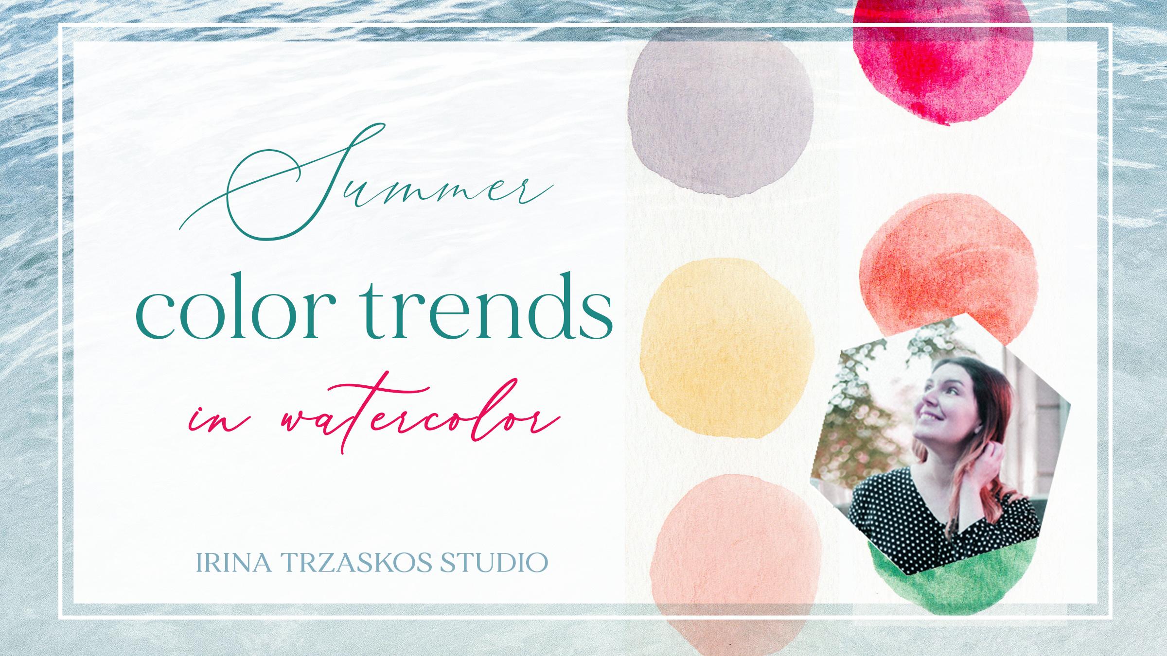
want to share with you some colored trends for this year and how to
mix them in watercolor. All my classes are filmed in real time so you
can follow along. If you're new to this
channel welcome, and thank you for returning. Press the "Follow"
button on top, and let's get started. [MUSIC]
2. Supplies: This is called mixing class, that's why we won't
have too many supplies. However, you will need
watercolor paper and I recommend you choose
exactly the paper you use for your illustration. When I do color research I write on both scrapes of the paper I use
for my illustrations, and when I'm happy with result, I'd add it to my color journal. You can see this little formulas here for every color story. These numbers mean the
number in my color palette because my colors are all numbered by the
factor which made it. If you want to make
your own color journal, I highly recommend
it because if you need a color story
for an illustration, you just open the page and
choose the right mood for your illustration and have
all the formulas right there. Sometimes, I write the
names of the colors too and sometimes I wouldn't. Obviously, we'll need
the color paint. I'm using this color paint. Artistro color paint, I'm really happy with
them, it's a nontoxic. These are the numbers
I was talking about. Before using the paint, I usually spray it from spray model that's
why it looks so wet. When it dries, it'll crack, but it doesn't
matter, it doesn't affect the quality
of watercolor. From these paint, I made my own color circle and I
recommend you to do the same to better understand what colors
you have and how to do so I'm showing in my
color basics mixing. How to make your
own color wheel, I'll show in my basics
of color mixing class, and I highly recommend you to do your own color circle
from the paints you have, because it's very useful. I also need the paint
palette only the clean one. I'll be cleaning it
after every color story. I recommend you to do the
same. We'll need water. I'm using three
jars to make sure my brush is always clean
when I go into the paint. We'll get the brush any
brush you like, paper towel, and if you're taking notes, you'll need a pen or a pencil. Let's get started.
3. Summer Color Story 1: [MUSIC] In this
summery colored story we'll have following colors. First, you'll have
a yellow and to get the right shade
of yellow we want, we'll take some deep yellow [NOISE] and mix it with a drop of its
complementary violet, which is Number 34 here. This is too much violet, make sure it's not
too much of it. If you've got too much like me, just add some more yellow. This is deep yellow,
Number 5, and violet. We get this sand, a beautiful yellow sand color. [NOISE] Let's wash the
brush in, underneath. Again, I'll put
the colors I used, it's a deep yellow [NOISE]
and a drop of violet. [NOISE] The next color is a warm shade of red. For this red, we'll
mix permanent red, which is Number 16 here, [NOISE] clean water, with flesh color. We get this beautiful
orange-red. [NOISE] I have flesh, just a shade of orange in this
palette and permanent red, which is a pretty cold red but mixed together with flesh it becomes warm and soft somehow. Now we need a pink and for that, we easily just add water
to our previous mix, lots of water, and we get
a beautiful pitch pink. This is our pink, like a sunset in summer. Here we have the same
colors and here and water, I usually draw a drop. The next color, I want
to mix a beautiful blue. We'll be using brilliant blue, which is Number 30 here and
it's next to turquoise. Even though [inaudible] spray, my painted water, that's why they're so water. [NOISE] To this blue we'll
add its complementary, which is orange as you know
from color circle theory. We get this gray, purplish gray. [NOISE] Now I need
to bring it back to blue but we'll bring
it with cobalt blue. I have brilliant blue, orange, and cobalt
blue in this mix. [NOISE] As a result we
get a warm grayish-blue. [NOISE] We don't have this
color in paint palette, so it's nice to know how to mix it, [NOISE] very summery. Here we have brilliant blue. [NOISE] We absorb excess of water so you can see
better over here in case you're mixing it
from different paints art. Then we have orange, just a little bit to turn
this blue into a gray, and then we balance everything and bringing
it back to blue, with cobalt blue, this one. [NOISE] Then we need a few more shades of blue and we'll mix
them in different way. [NOISE] Again as basal
have a cobalt blue, which is beautiful on its own, but because it's
color mixing class, I'll show you a different shade besides what you have
in the paint palette. To cobalt blue red a little
bit of orange, not too much. Again, we get the
beautiful warm gray. Now to this gray, you see this gray is
totally different, we'll add some turquoise, which is Number 51. I added too much turquoise so our previous colors got lost, so let's add some more cobalt
blue [NOISE] and orange. We get this beautiful
green gray-blue color. [NOISE] Here we
have cobalt blue, [NOISE] orange [NOISE],
and turquoise. For the next color, we
just need to add water to this shade and get a very
light and beautiful blue. Just like we did
with the pink above. This is our summer story. Here we added to this
color some water.
4. Summer Color Story 2: [MUSIC] Next color we'll be mixing in this color
study is a warm gray. To get it, we'll mix
some brilliant blue with orange and water. Here is our brilliant blue. [inaudible] color orange. Let's add some more
orange so it's warmer , a drop of blue. I need more orange in here. It takes a while sometimes
to get the balance right, but I think we've got it now. First, we have this warm, beautiful gray made of two complementary
colors, blue and orange. Here we used brilliant blue, which looks so much
like ultramarine. If you don't have brilliant blue or you have
different paint, just use ultramarine, which is almost in every
paint palette. We use brilliant
blue and orange. Next color we need is a warm, soft yellow and red. We'll use flash, which is a shade of orange. Add some lemon yellow. Add water and as a result, you get a soft,
beautiful yellow. What if you don't have flash
in your paint palette? Flash looks like some orange mixed with a little
bit of white. If you have white
watercolor or whitewash, you can replicate it from
another orange you have making a drop of white treat and then mixing
it with lemon yellow. So here we have flash
and lemon yellow. Next, we need a soft
beautiful pink. I discovered that in
this pink palette, if we take brilliant red
and mix it with water, that's exactly what we get, a beautiful soft pink which looks very nice with
these other colors. So it's just the number 15 brilliant red and water. Water, I usually just drop
a drop of water like that. Next color we need is a cold red so we'll
use permanent red, which is cold red. We could just use that, but let's mix it into
more complex color. Then we'll take cerise, which is number 22. Make it even colder
like that [NOISE]. Now, because it's still cold, let's add some
flash color change. Now it's too warm,
so let's add some more permanent red at cerise. Yes, this is the color we want. You can see how beautiful
it looks with the gray. Here we have three
colors: permanent red, cerise, which looks like a very bright magenta and flash. Make that. Another color we need is some bright
but warmer red, and we'll just mix flash with cerise. This is the color we get. There're different ways
to mix the same hue. So if you don't have
exactly these colors, don't get desperate
and just make some experiment with
your own paints and mix them from what you have. We have flash and cerise
and now we need a green. For green, we'll
take grass green, which is number 44. That's the classic green color and we'll mix it
with light green. We get this complex, beautiful, almost sage green. Very nice. Again, if you need it darker or
lighter, just add. If you need it lighter, add light green or water. Here we have grass
green and light green. This is our Summer
Color Story [MUSIC].
5. Summer Color Story 3: [MUSIC] This color study feels very breezy
and fresh to me, and I hope you'll enjoy it too. I really like it. First color we'll be mixing, is actually not mixing. Well, it's going to be a
lemon yellow with water. [MUSIC] Just like this. [MUSIC] For my next color to this lemon yellow
we'll be adding cobalt blue to get
a very nice green. I'm adding some more paint, so it's not too watery. [NOISE] Kids are playing
outside if you can hear them. Let's add some cobalt
blue to this yellow. We get this beautiful green. This I'll have to leave this
watery, but it could be. Here we have lemon yellow
[NOISE] and cobalt blue. As a result, is a nice fresh green. Next, we need a
turquoise blue color, so we'll be mixing light blue with light green. [MUSIC] Light blue is 28 when we spread out
and light green is 35. Then we get this beautiful
almost glowing turquoise. [NOISE] Here is light blue and light green. I think my [inaudible] is
getting crooked but it's okay. Next, we need a hue
blues in our palette, not as greenish as this one. Again, we'll be
using cobalt blue. [MUSIC] To make it even bluer, we'll add some
ultramarine to it, which is number 31 here. [MUSIC] We get this beautiful sky blue. [NOISE] Here we have cobalt blue [NOISE]
and ultramarine. [NOISE] Next, I'll mix cobalt
blue with some cerise, put another shade of blue. In this mix we'll have
more cobalt blue, then cerise which is a magenta. [MUSIC] [NOISE] Now we get
another shade of blue, which is a little more purplish
than other blues we have. However, it works great with other colors in this
palette as you see. We have cobalt blue and cerise. [MUSIC] [NOISE] For
the next color, we need to have the same mix but with more magenta cerise. This is got in this
paint then blue. This is maybe too much. Let's add a little
bit more blue. This is beautiful. This is how to [inaudible]
this lavender color and you can see how beautiful it works with all other colors. Nice and fresh. Here we have cobalt
blue and cerise. Always put down the first color, which is dominant in the mix. If it's more cerise
than cobalt blue, then it will stay first, and here we have first cobalt blue because we have more cobalt
blue in this mix. The last color is
a neutral color, which we also need in this mix. It's just brown ocher, which is number 60
with some water. This one is very easy so I'll take it straight
from paint pad, mix it with water, add it here. However, ours should
be lighter than this. [MUSIC] To balance all this
freshness and brightness, we need at least one neutral. I picked the warm one to
contrast the cold shades. Here is our [inaudible]
and brown ocher. This is our another
summer study. [MUSIC]
6. Summer Color Story 4: [MUSIC] This summer color story is almost tropical and it's
very colorful and joyful. For the first color we
need just to mix some flush with water so it's
not much mixing here. If you don't have
flush color just make some orange wave a little
bit of white and if you don't have white watercolor just add a little
bit of gouache. It's still water soluble. This is just flush with water. [MUSIC] Next is green color. For our green, we'll mix some blackish green
with cobalt blue, which is number 49. [MUSIC] We've cobalt blue, which is 27. I get this lush at each color
a little bit more blue. [MUSIC] You instantly can see how beautiful it
is next to our orange. Again, if you'll use more water, it's going to be lighter
and if you use more paint, it's going to be more opaque. You can use it both ways here. What we have is blackish green with a little bit of water
so you can see over here. To me, it looks like
classic green if we mix it with some indigo, that's probably the color
we'd get, and cobalt blue. Next color we'll mix is purple and cherry sear and we'll
get a very bright magenta, because those two are
both bright and vibrant. Here's our cherry sear. However we want
it more purplish, so we'll mix it with purple, and then this side this purple looks almost like
watercolor ink. That bright, beautiful, let's add a little
more cherry sear. Here we have a color. We have cherry sear, I hope I pronounce it right, and purple which is number 22. Next, we need a
very bright yellow and we can use some
deep yellow with a little bit of orange or we can just if you
have a sample add check gamboge and just mix it with a little bit of water and you'll get your color. This is good to use for
middle silver flower. However, you'll need
to compliment it with its darker version. To get the darker version, we'll add to it a little
bit of cherry sear. Let's mix some gamboge [MUSIC] with cherry sear and get almost this orange-red color so this is to add
shadows to this. I'll put it here too. It could be a little
thicker in the paint. Let's add some more paint to see the entire
depth of this color. This is the right one. See looks almost
like blood orange. I have a gamboge here. You could also use deep
yellow and cherry sear. Next color we'll
make it's warm red. We'll just mix some permanent
red with some flush. [NOISE] [MUSIC] Make sure your brush is clean every time I'm
going into the paints. That's why I have a
few jars of water. [MUSIC] This is red which is permanent
red with flush. Permanent red is a pretty
cool shade of red like Carmen and flush looks like
orange mixed with some white. Next, we need a soft pink, and for that we'll just add
water to our previous mix. [MUSIC] It's this mix and water. [MUSIC] The last color we need is very light
green and for that, we'll be using light green. However, it's too
bright so to balance its brightness and make it harmonious and
other colors we have, we'll add a drop of flush, just a teeny-tiny to
neutralize its brightness. I did too much of flush orange so [inaudible] more
light green. This is better. It's summertime
kids are playing. I'm not sure if you can
hear them, but that's fine. We have light green here, and a drop of flush. This is our tropical
summer story. I hope you like it. [MUSIC]
7. Summer Color Sory 5: [MUSIC] This summer
color study is great if you're going to paint a colorful summer bouquet or a composition for some
berries and fruits. Because of how many colors here, which would work great
for such illustration. First color we'll be
mixing is a beautiful deep blue and to mix it we'll be using turquoise and I'll mix it with some
ultramarine [NOISE] blue. [MUSIC] As a result, we get a very bright
and vibrant blue. [NOISE] Here we have turquoise [NOISE] and I took a red and blue maxine
and ultramarine. [NOISE] Our next color is soft violet but light
than that so for that, we'll be using, more which looks like a
violet mixed with white, maybe a little bit of magenta in it, that's how it looks. To neutralize it will be adding a drop of lemon yellow to it. [NOISE] It's softer and a little bit muted
and I'll add water. [inaudible] too much water so let's try to
replicate the mix of the paint so it's not so watery. More with a little
bit of lemon yellow. Don't put too much lemon yellow because it will turn brownish. Here we have more of [NOISE] a drop of lemon
yellow and water. Next color we need
is a muted yellow. It's almost like Mellon. To get it, we'll be
mixing kombucha color, orange and yellow,
which I already have. Once again, we'll use
a complimentary color. In this case, more of because we already used it to create the harmony and
allowed to a drop of that chill-out
kombucha yellow. I said it's out, we get this almost yellow
ocher. We used kombucha. You could all have a tears deep yellow and the drop of morph. Next thing we need a
very bright, beautiful, orange and for that we'll be
using orange and we'll mix it with some lemon
yellow should add it more vibrancy and light. [NOISE] [MUSIC] You see
it looks like an apricot. Beautiful. [MUSIC]
Here we have orange. When you paint
fruits or barriers, feel free for the foliage to use like blue or
this morph color. It doesn't have to be necessarily green
if it's a foliage. It may look very interesting if you're painting apricots, for example, orange apricots
with some blue leaves, it's going to be really
really beautiful. Next we'll be mixing some
greens for this composition. [NOISE] For this green will be mixing is a
mix of three greens, which is the leaf green, [MUSIC] olive green, and peak green. Peak green is for it
to chill so it's here. But it's too much peak green. Other greens got lost so
let's add more leaf green, and more olive will
eventually mix, [MUSIC] and the result we have this beautiful
vibrant green. I have three greens here, leaf green, olive,
and peak green. Beautiful complex green
color as a result. Next, we need a darker green to complement the green we have. For that we'll take
blackish green. The darkest of the
greens we have in the palette and we'll mix it with some
leaf green to make it a little softer
because it's summer. A lot of water in this sum. Here we are. It's a softened
blackish-green because we use blackish green and leaf green and you can see how nice
these two look together. If you are painting a leaf
with this color you can add shadows or veins
with this color. We have blackish
green and leaf green. Also wanted to add some
vibrant color to this palette, so I just used teresa which
is a bright magenta color, and just mixed it with water. You can see how it adds
a lot to this palette. You can use a darker on some
areas and lighter in others. This is simple, just number 22, to [inaudible] or magenta if
you don't have it and water. Also we needed a neutral
color in this palette. We'll be using as neutral Payne's gray,
which is number 61. This one if you need
something for branches or some neutral areas or some
maybe needle summer flower, you can use a darker
or lighter and you can see how beautiful it looks all the other colors
in this color story. This is just Payne's gray, we added water to it, but you can use in dark too. This is our another
summer color study.
8. Thank you!: Thank you for joining
me in this class. I hope you had a chance to
make some colors with me. If you liked the class,
please leave a review about the project or project
section of the class. If you are sharing your
colors on Instagram, please tag me so I can see
your beautiful artwork. I'll see you in the next class. Bye. [MUSIC]
 Irina Trzaskos, Watercolor Artist & Illustrator