Transcripts
1. Introduction: Hi, my name is Martina flora and am a lettering designer living and working in Berlin, Germany. I run a studio focused on lettering and custom photography, and I work on projects for clients and agencies all over the world. In today's class, we are going to speak about the role of storytelling in lettering. I will explain the criteria behind the most popular lettering styles and how to approach them with your sketches. As a letterer, I like to work with a wide variety of lettering styles. I like to think that as a designer, I can use the lettering style that works better for that specific project and connects with a certain audience. I believe that being versatile is sometimes the key to succeed in a certain lettering design project. First, we will create our own personal library of lettering inspiration, and we will work towards finding the right shape for the letter. We will sketch together the most popular lettering style, not by showing templates that you can copy, but by understanding the logic and the criteria behind each one of these files. Although being an independent unit, this is good compliment for my other Skillshare classes, the golden secrets of lettering and the golden secrets of script lettering and it's tailored to designers, illustrators, and anyone who want to improve their set of skills for creating letter shapes. I look forward to see you all there.
2. Storytelling through lettering: Welcome to my class. One of the biggest challenges of those working in the creative arts is facing what I call the white paper terror, which is sitting down, you decide that you're going to draw a lettering piece or you have a brief coming from a client and you sit down and you face a white piece of paper. Something very important when drawing lettering is that you not only have to deal with a certain text, but also you have to have something to say. I always say that lettering has two layers of meaning. The literal meeting that's the text, you have to illustrate and the formal meaning, that is the shape of the letters and what those communicate. Sometimes they go hand by hand and they both speak in the same direction. Sometimes they just have contradictory meanings. That's what makes the piece interesting. But the marriage between the shape of the letters and the literal meaning of the text, it would actually communicate something to the reader. I like to show you some projects that I did, that illustrate a little bit the idea of storytelling and tell you a little bit about the inspiration behind them. I like to show you two book design or cover design projects. I think book projects are really interesting in terms of explaining the idea of storytelling because you basically tell a story or you give the reader an idea of the story that is being told later in 300 pages, in just one image. In one image you have to express everything that is told later in the story. I have this project that I did for Walker books in the UK. This is a series of books of Laura Amy Schlitz, and the inspiration behind them, where basically, the stories were happening in the Victorian time. The art director wanted to have those artwork inspired on the Victorian time. When I usually have to face a project like this, I will go ahead and look for inspiration in that era of time. In this case the Victorian times. What I basically took for these covers was an idea of composition from that historical time. Also, I took inspiration in some of the letter's shapes. Although there's a lot of Victorian time flavor in this covers, there's a lot of shapes that are not necessarily Victorian. I always say that, the great thing about getting inspiration from other or previous or past times is that you can actually take that and have a contemporary take on it. I'm not sure if you can find a M like this in any Victorian time graphic piece. But I'm sure that a contemporary eye, a contemporary reader can actually recognize that M as an M. That's all that matters. Yes, in terms of the style, this has a contemporary take on Victorian inspiration. There's another project that I did for Penguin Random House in Spain. It's a series of books of James Ellroy. As you can see, this is a very different approach than the previous project that I've shown you. In this project, instead of using a certain specific time in history to get inspiration from, I had to recreate a certain mood, a mood that tells the reader that this is a thriller. Yes, and this is not a romantic novel. In this sense, I had to recreate a mood that the reader will recognize and will associate to this, to this story. I did a lot of work in terms of getting the right color scheme for it, and finding the letters shapes that will work for this particular project. As you can see, we tend to associate certain times in history with certain letter shapes. In my TED talk, I explained or I illustrated this idea by showing different ways of writing the word TED. I was proposing the audience. How the TED logo will look like if it will be made in the Roman Empire. You will picture a logo type made with a chisel and carved on stone, and how it will look like if it will be done in the medieval times. Then you can imagine a letter shape that will be merely made by calligraphy and very decorative or how that logo type would look in the 80's. I picture a TED logo type that was very colorful with patterns working with it. It is a fact that we tend to, according to the time to history and the technology existing in those times, that technology had an impact on the shape of the letters. That is something we can use for telling the story, or we can use that in our storytelling with lettering. Of course, there are other things that contribute to your storytelling with lettering, and that is color, texture, decorative elements, structure. All these elements play a role in your lettering piece. It's not only about the letter shapes, but also the marriage of all those elements. However, in this class we are going to focus on the nailing in a specific lettering style. We are going to go together through all the most popular lettering styles. We're not going to copy templates, but we are going to understand the logic behind them to be able later to use it in our creative work. In the next chapter, we are going to look at inspiration sources and how to create our own library of inspiration.
3. Creating your lettering library: Luckily, we count nowadays with the broad library of letters from the past that we can take inspiration from. Personally I like to go look at things that were done many years ago or centuries ago and take inspiration from them. Because it allows me somehow to have my own take on that and my contemporary take on those shapes. Whenever I have to start a project and I need some inspiration or I need to go and look for graphing material of a certain time in history, I like to look at different things. On one hand, I like to collect stuff and I take any chance to go to a free market and get objects, and magazines, and record sleeves that I find that have very nice letter forms. This is a magazine I bought here in a free market in Berlin. All ready from the cover, is a very interesting. This high contrast is really personal from this letter shapes, also how that S is designed. This solution I find also very interesting and new. Also if you go ahead and you look inside the magazine, you will see a lot of different typography that you can take inspiration from. You have on one hand, this script over here, this edgy script, or you have more grotesque looking letters shapes. I really like to look or collect some vintage objects and get inspiration from that. I also have a white collection of letters set. I don't know if you know this, they don't produce it anymore. Those were produced many years ago and they were like transfers. You will use this sheet to actually transfer those letters onto any other surface. They have a wide variety of designs, I think it's also a very good inspiration when you are looking for inspiration in letter shapes. Tin cans are also good containers for great typography. This is one I use myself to have my needs and I think it's really interesting. If you look at the typography is rather decorated. It has those shadows to the letter shapes and it has a use of colors, that is really interesting as well. Tin cans are also great containers. Tin cans or packaging is also a great container for good typography. Physical objects are a good way of getting inspiration for your designs. I also tend to look a lot of other sources on the Internet. Let me show you a couple of places where you can find very good material as inspiration. In archive.org is a library of digitized books that are made public and you can find a lot of interesting material for typography. This is, for instance, one book that I found with chromatic type specimens. It's so great, the variety of shapes and decorative elements that this book features is just amazing. This is online, they have scanned the whole book and it's available for free for everyone. Archive.org, again, is one of the sources that you can get inspiration from or where you can find books of typography or all the specimen books. Another place that I look inspiration is Flickr. Flickr has a lot of users, in this case, this is Patricia is a gallery of speedball lettering. She actually scanned a whole manual of speedball lettering and it's all available there for you to see. You have variations of use of this people lettering and I think it's great. There's a lot of people that are interested in typography and that make all this material available for everyone to see. So Flickr I think is a very good place to find this material. Another one that is one of my favorites on Flickr is this collection of sugar packaging. As I said before, packaging is a very good container for greater typography. This user has this wide variety of packaging that he or she has been collecting with sugar packaging and I think it's really interesting to see the variety of typography applied on the same object. I encourage you to check that out. The last one that I'm going to show you, so you have this archive.org, this is a specific site that makes books available. There's also photo galleries like Flickr that have also people interested in typography, you can find inspiration there, and there's also blogs. I love this blog because it's about records sleeves and it's about typography on record sleeves, so it's called [inaudible].com and I encourage you to go check it out. You have record sleeves from the '80s, from all times in history. It's very interesting to see how different the letter shapes are according to the decade. As I said before, especially in this last site that I showed you, you will notice that the shape of the letters help you tell your story. According to the shape of the letters that each design is using you can communicate different things and you can create through them different atmospheres. That is why I think is very important as a lettering artist or as letterer to be able to work with different styles. In this class, we're going to go through the most popular ones and understand the logic behind them. Let's start by serif typography.
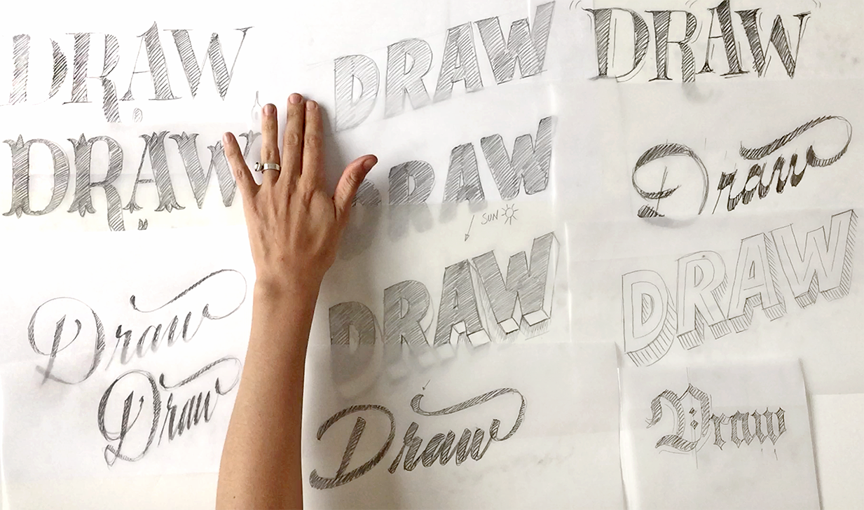
4. Finding a form for a letter: How to find a shape for a letter is probably the most common question that I get when teaching. The truth is, you can basically draw a shape as you want it, the world of letters shapes is open in front of us. You can draw a letter shape with the perimeters you want. For instance, you can draw a letter shape using a Navy as a parameter, or you can use embroidery patterns to draw letter shapes. So there's basically no great rule to draw a letter as long as it's readable. Of course, there are some limitations and there is some rules and that is called the alphabet. The alphabet is basically a convention at some point in history, we decided then that a name should have diagonal stroke between two straight strokes and nor should look rounded. This shapes, it's what we recognize, what makes a letter recognizable for most of us. However, there is shape variations for a single letter and exploring those is what will make your design really unique and personal. Whenever you find yourself struggling with a certain letter shape or a certain composition, trying to find alternative ways of drawing that letter that will probably most of the times help you solve that problem. Remember that in lettering, it's not about drawing single letters. We understand letter shapes in contexts, that is the word. So we understand that an N is an N because it's sitting next to an H and next to an O. If we isolate that shape out of that word, oftentimes we would not be able to recognize it. So keep that in mind. Keep that in mind that letter works in a certain context, in the context of your lettering. So now that we know that we can technically draw a letter as we want it, as long as we can recognize it as such. We will move onto nailing a specific lettering styles and using it for our storytelling. For this, I will use the word "draw" and I will sketch it in different lettering styles. Remember that your first drawings don't need to be neat and pretty, but the opposite, they need to be as rough as they can. The first sketches when starting a project, they need to be very rough. They are about finding the overall look of your lettering and not about digging deep into detail. That will come later on in the process.
5. Serif lettering: When we speak about serif lettering or serif letter shapes, we tend to think of traditional series looking letter forms. However, serif's topography is all those shapes that have some terminal to their stems or their shapes. That means that those shapes, those terminals could be chubby or rounded or spiky and there is a lot of variations to those specific shapes. The serifs play a big role in legibility of texts in small sizes. However, in lettering their use is less functional and more aesthetic therefore those serifs could have much more playful, extroverted shapes, and we should use that. Let's say that I want to draw a serif lettering piece. I will just draw a very regular looking shape. Remember that your first drawings need to be really rough. Is not about working on the shape of those serifs in detail, but it's about obtaining an overall shape that you feel comfortable with. When drawn serif letter shapes use the shapes that you have in your toolbox or in your mind. We are used to use serif letter shapes all the time in our e-mails and when we write, so just referrer to the shapes that you know, and you can also take in this as a departure, you can then later add your own flavor to it. Here I have my first sketch of a serif lettering. I have used, or I have drawn this very thin serifs that come from writing with the pointed nib. If you don't know what appointed nib is, just look it up and check out pointed nip calligraphy. Pointed nip usually creates letter shapes that have very high contrast, and since it's a very thin nib, it creates also this very thin serif shapes. But these are not the only serif I can work with. I can take this as the basis and I can work with more old-style looking serifs. If I made those serifs a little bit thicker, and I add that to all the shape, I can obtain a much more traditional or old-style looking letter shape. If you compare the two shapes next to each other, they now have different serif shapes and they look also rather different, although they are using the same structure. I can also try other shapes. For instance, I can try to use a more slab serif design and make those series very bulky and very thick, and then use it for the whole shape. With a very small decision, you can change the overall look of the letter shapes in a very striking way. Look at how from supposedly serious looking letter shapes we can create actually terminals that are very extroverted, very original and crazy, and make them work within our design. This is all for serif lettering. You can create all the serifs you want and with the shape as you want it as long as it works in all the letters shapes and you make it work. Now after this overview on serif lettering, we're moving onto sans serif lettering.
6. Sans serif lettering: We call sans-serif letters shapes to all those shapes that have clean cut terminals or that have no terminal extending from the boundaries of the stroke. The truth is that there's no real shape that is sincerely, because all the strokes have a certain terminal, even if this terminal is a clean, clear cut. Let's say I want to draw my word with sans-serif letter forms, so I'm going to get to it right now. To start with, I will start with the shapes that we all know as san-serif, which are these grotesque looking letter shapes. As I mentioned before, with serif lettering is that whenever you need to approach a sans-serif letter shape, try to think of those shapes that you already know and that you see everywhere on the streets or in the e-mails you write straight to refer always to the shapes you are used to work with or you are acquainted with. This is my san-serif sketch. It doesn't matter, as I said, if your first sketches are really rough and there's a lot to work on, it's just a basis to build up on later on. I have my first drawing of san-serif lettering. However, I can for instance, make those shapes look a little bit more or have a little bit more calligraphic filter it. I will make them look a little bit more humanistic. I don't want to get very theoretical about it. But the group of humanistic letter shapes are those letter shapes that have been more calligraphic strokes and their shapes. Doing that with my R and I will very subtly change there with a look of that single letter. Of course, I can continue and go on and make the same change on the rest of the letters shapes, but I want to show you a couple of other possibilities you have with san-serif lettering. By doing a very small change in the shape of those of those stroke endings, already changed the overlook of the letter shapes. I can also go ahead and decide to make a much more rounded feel to it, so I can decide to change the endings of those letters shapes and make them all rounded, so just do it on all the letters shapes. Look how by changing a small part of those letters shapes, basically having the same sans-serif letter shapes. How, by changing the corners of those strokes those radical new a feel to how my lettering looks like. This lettering tends to look much more friendly, much more soft and this one is much more impactful and sharp looking. As we have seen, letters shapes can have serifs, extroverted, more control ones, and also can have no serifs. But what if we want to add volume to them? Let's move on to that in the next video.
7. 3D lettering: We call 3D lettering or three-dimensional letter shapes to all those shapes that have volume. We can basically add volume to any letter shape. No matter if it has a serif, if its a sense serif letter shape, even scrape lettering can have volume. Let's look at some principles that will help you add volume and shadow to your shapes. There's two ways of drawing a three-dimensional letter shape. One of them is using perspective. That means having a vanishing points. So you define a vanishing point and you extend all your lines to it. The result is a letter shaped that gets more, the worst, the back. Another way to create a three-dimensional letter shape is the axonometric projection. That means copying or repeating the shape you're using and joining the points. In that away, you create a letter with volume. So I'll just go ahead and add some volume to my previous drawing, my drawing in sensory. So I will just take a layer of tracing paper and I will add volume to this design. I we use the axonometric protection for that. I will basically copy the shape of the letter in another layer, a layer that is sitting behind the letter shade. I'm imagining this layer in the back of this shape. Now I have volume in my letters, and this is how they would look like if I would be looking at these letters from below. But what if my viewpoint would be on top of the letters, on top of the horizon line. Then, the volume of the letters will be not below, but on top, because I'm looking at this letters from the top. I'm just quickly trying that out with this W over here. That's another important principle when drawing 3D letter shape. Is to decide whether you're standing above the horizon line or below the horizon line, and that will define whether you are looking at the letters from the top or from below. I'm quickly trying this out with this W. This leads me directly to the next point, which has to do with shadow. Usually, three-dimensional letter shapes are letters shapes with volume, have a shadow. That means that you need to choose where your lighting is coming from or where your light is located. For this, always think of the sun as your main lighting source. If the sun comes from above, it casts a shadow under the letter. If the lighting source comes from below, the letter shapes tend to look more scary. Here, there's also several ways of casting a shadow, either on the floor, a shadow projecting on the floor, or if shadow projecting on the wall. Again, lighting coming from above, tends to look more natural. Lighting coming from below, your lettering will tend to look more scary. Next, we are entering a whole new world, and that is, the scrape lettering.
8. Script lettering: Now, script lettering is a whole new world and it's a wonderful one. We call script lettering to all the letters that have their origin in cursive lettering and basically our handwriting. Whenever I have to draw a script lettering for a project or a commission, I like to think of a hand that is drawing. When a hand is drawing, using a handwriting and it's drawing, it tends to have the same slant. So the same hand will write every letter with the same slant. It will have therefore the same width. It will have also the same rhythm. If the person is relaxed, it will probably write with a lower rhythm. If the person is nervous, it will write with a faster rhythm. So if the same person is writing your lettering, there is a lot of things that will remain consistent and that's why it's cool to think of a hand when drawing, or when creating a script lettering piece. Whenever I have to do a script lettering project, I like to use my handwriting as a basis. So I will use my handwriting this time. I will just write draw. Using this handwriting as a basis, and I will decide which parts are going to get thick and which are going to stay thin. I'm using my handwriting as the basis, as a basic skeleton and I'm actually adding weight to it consistently. For instance, if I want to make these hand draw faster, I could just go ahead and do the whole thing a bit more narrow. That will make the overall design look a lot more faster written. I'm working very roughly on these sketches. I just want to, as I said before, I just want to get the overall image and I want to obtain the first overall image and decide upon this and then go ahead and work on the details. So now it's about the overall picture. So now by changing one of the parameters, that is the width of those letters shapes. I can have a much more fast written appearance to my lettering than before. It looks like all my drawings go really fast, but they don't really. I bet you have a lot of questions about this drawing I just made and you're wondering how and which criteria I actually added weight to those strokes and not to some of them. As I said before, lettering is a whole new world and it has also its own principles. If you want to go deep in the subject, I recommend you to go ahead and check my class focus on script lettering is called the golden super soft lettering on Skillshare to get a better insight on how to create and how to work with script lettering. From a lettering style based on our handwriting, we're moving towards lettering styles based on the use often a specific calligraphic tool. That is brush lettering and craquelure lettering.
9. Brush & fraktur lettering: Brush lettering and Fraktur lettering are both lettering styles based on calligraphy executed with pointed brush and flat nib respectively. It's interesting to look at them together because they have, I think, very opposite appearance. On one side, the brush lettering tends to look more friendly, more dynamic, and on the other side, the Fraktur or Blackletter lettering tends to look much more bulky and heavy and serious and also very dramatic. They're both based in the calligraphic tool. Let's look at how the brush lettering works or how the pointed brush works. The logic of pointed brush is that when writing, you push the tool down, when you go down with your tool and when you go up, you release the tool. When you go down, you push, when you go up, you release. Down, you push, up you release and it happens as well with the rounded shapes; down, push, up release, down, push, up release. Following this logic, then you get this rhythmic appearance of the thick strokes and you get this high contrast between the thin lines that are those executed when I go up. I release the pen and those thick lines, those executed when I go down and I push the pen. With this tool you get these very visible rhythm where you get the thick strokes next to those thin strokes. The thin strokes are again executed with down-stroke, where I push the pen against the paper and the thick strokes are upstroke where I released the pen and I describe a thin stroke. Therefore using this logic or keeping this logic in my head when I draw, brush lettering is very important. Let me just draw my work with this or write the word draw with a brush pen. There you go. You see that by following this logic, the logic of down-stroke, push, upstroke, release, I get the same rhythm of executing my lettering with the brush pen. I get that feel like in a rhythm. Some of the main characteristics of brush pen is that you have certain stroke endings. You get all this soft stroke endings. They come from the trace of the tool on the paper. The tool defines not only the rhythm of the contrast in your word or in your lettering, but also it defines the shape of those stroke endings. By knowing this or by understanding this, you don't necessarily need to be a great calligrapher and be able to do brush lettering as a master, but by understanding that logic behind the brush pen, you can actually draw it as you want it. You can actually draw it as if it was written by a brush pen. One of the main characteristics are these soft stroke endings. You also get to have variations in shapes of the letters so you can, for instance, draw this A like this. You can also draw it differently because since calligraphy is related to handwriting, you will expect to have variations in shapes because it's a human hand drawing these lettering. You will get variations in shape. You will also have certain speed to your lettering so the slower you write or this lettering is written, the wider you would get, the faster the more narrow. You will have this variable widths according to the speed that your lettering is written with. That's for brush lettering. Fraktur lettering works very differently. Fraktur lettering works with another principle. It's written with another tool which is the flat nib. The flat nib is a tool that is not flexible as the pointed brush. This tool works by placing the tool at a certain angle and this angle determines how thick your stroke would be. You place the tool at a certain angle and what you do is to just translate a tool or move your hand, keeping that tool in the same angle. Fraktur lettering, is called Fraktur because it has those broken shapes. As you can see you have even the rounded shapes as an A, for instance, have this broken angular parts. You can see that here and here. There is of course, many styles of Fraktur lettering or black lettered. According to the time in history, they were using these calligraphy, there were variations in shapes. I am going to write my word with this tool to see how it reacts to it. As you see, I'm keeping the tool in the same angle and I'm just writing, and I'm just shifting the pen while I write. By keeping the tool in the same angle, I create this contrast between the strokes. This is my Fraktur lettering or actually my Fraktur calligraphy for the word I'm working with. Something particular about Fraktur lettering is very decorative capitals. As I said before, this angular shapes over there, over there, and this sharp endings are also very particular, very typical from a Fraktur calligraphy. It looks very narrow and heavy. It tends to look very narrow and heavy and very stiff and it also tends to look very dramatic. These are because I'm using non-flexible nib. The terminals in this case are sharp looking and according to the style of Fraktur calligraphy, you can get those endings a bit sharper with some feature to them. Let's say that I want to draw my lettering according to these principles. Then I can either use my calligraphy as a basis. Let me go back to the brush calligraphy I did before. I can either use this as a basis and since my calligraphy is not very nice-looking and defective, I can use lettering to actually improve the shapes and design the shapes as I want them to be. I can now add a little bit of weight, for instance, to those strokes. As you see by understanding the logic of the brush pen and using my defective calligraphy, I can then draw on top of it and with my sketch, improve those features that are not looking so good or change the weight of the whole lettering. For instance, here where the brush pen is not really defined. I could then decide and design that stroke ending with my drawing. That's really useful to have. First the principle of the tool in your head and if you can also write it, even if it's a respective calligraphy, it will always be a good basis for later in proving that with your drawing. I can do the same with my Fruktur calligraphy. Also a very defective calligraphy, but I can then put a piece of tracing paper on top and change some of the features. I can for instance, decide to add weight to it and make those strokes a bit more flexible if I want so I'm going to add a little bit of dark taste to these strokes. As you can see now, by using again my defective calligraphy, I added some flexibility to those stroke endings. I made the whole thing a little bit more sharp on the edges. I added some decorative, or I started to add some decorative elements to the capital letter, and by doing just a few decisions, this drawing of mine started to look quite different, much more personal, much more fairy taley if you want. By showing you this, what I mean is that for you as a letterer, having calligraphic skills or understanding the logic behind certain calligraphic tools can be really useful. I always say that a smart letterer is up to date with their calligraphy practice, and I think that's very true. You don't need to be a master of calligraphy, but just understand how it works and use it to draw your letter shapes. I encourage you to take some classes, some skin share classes even to actually get a grasp on certain calligraphic tools. Now after this overview on calligraphic styles of lettering, we are moving towards a sign that will allow you to think out of the box with your letter shapes.
10. Funky lettering: Funky lettering is an official term for those letter shapes that look a little bit weird or funky. Let me explain you the concept of funkiness in letter design by comparing letters shapes with the human body. So those letters shapes that have optimal proportions. There's other letters shapes that have short upper body and very long legs. There is letter shapes that have the opposite very long upper body and very short leg and this goes on and on and on. Using this variations is actually a very powerful creative tools when designing letters shapes. So let me just try that by using the first drawing that I did when I was exploring serif typography. So I would just make the letters change some of the features of the letters. For instance, I would do the stems to go from thick to thin. So I will do those changes to the stroke and I will also use, as I said before a shorter upper part and a longer, longer legs for this letter shapes. So as I'm drawing funky letters I'm also going to play around with the baseline of the letters. So I'm just going to shift those letters up and down a little bit. So as I said, I'm doing a smaller upper part and shorter legs. So the bowl of my R is going to be reduced and the down-stroke of my R is going to be longer. So as you see, although there's a lot of things to improve about destroying by using basically the same letter shapes and changing the proportions and changing this baseline. The whole appearance of my drawing is so much different from what I had before. Before I had a much more serious looking look or overall picture with my lettering. Now I have a much more dynamic, funny, funky overall picture with my letter shapes. So [inaudible] proportions can not only affect the body of your letter shapes, but it can also affect the contrast. So let me work this time with a previous sketch of mine that I had before when I was doing a script lettering. Let's say that I take drawing and I work on reversing the contrast. So whereas here the contrast is mostly sitting on the vertical stems, I will make the contrast sit on the horizontal strokes consistently. So I will just do that using the other drawing as the basis, I will just change that contrast. So changing the proportions not only in the proportions of your letters, but also in the way the contrast is working within your letters. These are very powerful tools that you have as the letter and you should use them. So we're moving now onto the last style we're going to see together today.
11. Decorative lettering: This lettering style is about adding layers of decorative elements. Whenever I had to work with decorative letter shapes, I like to think of a cake. In a cake, you have layers of the decoration. You have the chocolate covering, the cream, some things that you will throw on top, the cherry. The same happens with letter shapes. In this case, you work with lines and with shadows and with other decorative elements. I'd like to show you some projects. Two of them, you saw already in previous videos. I like to show you these projects because they work with these layers of decorative elements. I like to think of decorative elements as something that can be within the letter or inside the letter, highlights on the letter shapes. Or even here you can see an inner stroke and you can see that gradient over there. In this case, you see those lines with a point and in maidens, you can see a pattern over there. There's various ways of working with decorated elements within the letter. As I said before, these highlights, you can also work with patterns. You can also work with line work inside the letter and you can also work with gradient. Of course these are not the only things you can work with within the letter, but these are just some ideas for you to get started. I also like to think of decorative elements as things that can replace, for instance, in 3D lettering, I can replace the volume of a certain letter shape by using lines. Instead of having the volume as a flat form, I can use these lines instead. In this case, I also replace the shadow by using this line work over there. Here I actually use the full form of a shadow. As you see here. I've replaced the shadow with just a line and over here instead of having a shadow, I was working on that decorative capital by adding line strokes around the capital and making that capital to stand next to the lowercase letters that are sitting next to it, or the smaller letter shapes that are sitting next to it. By adding more decorative elements to a shape, to a capital, you can create an initial to your lettering piece. These are some of the resources you can use to add the decorative elements to your lettering. Let me just try that with one of the previous sketches that I did in 3D lettering. I would not be adding the decorative elements to the whole word here. But as I mentioned before, I can decide when I'm working, for instance, with 3D lettering, I can decide to replace the volume of that letter shape with lines. Instead of having that, I will have just line work. Here can see that by doing very small decisions, by replacing the volume with lines and by replacing or adding an in-line in my drawing, the whole drawing has already a much more declarative appearance. The whole letter has a much more decorative appearance. I invite you to go ahead and try all the ideas you can come up with. Important is again that the letter is still recognizable as a letter. You can technically use any element as part of your decorative or your decoration or embellishment for your letter shapes. This was the last sketch I will do today and it's the last time we are going to speak about today but let me explain you in the next video. What's coming next.
12. Take The Ultimate Lettering Quiz: The ultimate lettering quiz. Find out just how
much you really know about letters
by taking the quiz for free on
martinaford.com/quiz. Enjoy.
13. Final words and class project: So today we have gone together through several lettering styles. So on one hand we looked at Serif topography, at Sans Serif topography. We also explored 3D lettering and how to do it. We moved on later to script lettering and saw some particularities of script lettering. We later explore certain lettering styles based on calligraphic styles or telegraphic tools. This is a brush lettering, and this is Fraktur or blacklettering. These were other styles we to tried out. The funky, what I call the fancy lettering. We tried that out on Serif lettering and on script lettering as well. Last but not least, we tried decorative lettering and how to add embellishment to our letter shapes. So now we have a wide variety of sketches. Whenever I get a commission or I have an assignment, I start by this. I start by doing very rough, imperfect sketches, and I try out different solutions, different structures. I try out different lettering styles. I see afterwards I look at it all together and I think, okay, what is more fitting for this project? In which direction do I want to continue working? Then I will choose one of these, and I will start solving the main problems of that drawing and improving that drawing farther on. So I encourage you to go ahead and choose a word, a couple of words, and create a lettering for your own sketchbook. This text should encourage you to practice more and inspire you to draw more often letter shapes. To start with, think of what you want to say with this lettering piece. How do you want the overlook to be? So then go ahead and with all those principles we discussed today, try a couple of styles. No matter what shapes you want to draw, always keep these principles in mind. The principles we went through together. So whenever you want to draw, if you want to draw 3D or straight dimensional, letter shape, think of what words the light is coming from, where your light source is or if you're drawing a script lettering, keep in mind that is based on your handwriting, and think how your handwriting works, and how those connections should go to the next letter. So always keep those principles in mind. These are now part of your tool set as the letter. You should make use of them. If you're wondering how to go ahead after your first rough sketches, I recommend you to check out my other Skillshare class, The Golden Secrets of Lettering where I show the process of creating a lettering piece from hand sketch, the refinement of that sketch, and how to take that into a final digital artwork. That class also inspired my book The Golden Secrets of Lettering that also compiles a lot of the contents of this class and my other classes in one book. So I'm looking forward to see your sketches. So please do share them in the project gallery. I will be there to check them out. Thank you for watching.
 Martina Flor, Lettering Artist, Author & Educator