Transcripts
1. Welcome: [MUSIC] For me, storytelling is an inseparable
part of being human. It's what we've done ever since the beginning to make
sense of who we are, and what we're doing
on this planet Earth. We're continuing to do it
in our day to day lives, and especially through art
and pattern design as well. If you think about it, even decorative
floral prints tell us stories that evoke
emotions and memories. But what if we wanted to
use pattern and design to tell stories in a
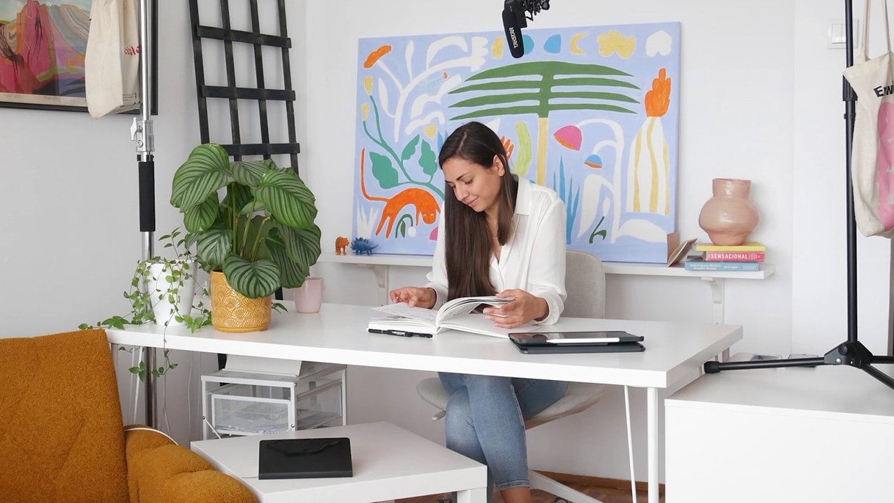
more direct way? Hi everyone. My name is Nina, and I'm known as Di Ujdi. I'm an illustrator and pattern designer
based in Belgrade, Serbia, and this is a class
about narrative patterns. In this class we're
going to cover the two main parts of
making narrative patterns. The first part includes
getting inspired, finding ideas by looking at different narrative
pattern examples, working on our
storytelling skills, and wrapping all those ideas
up in a cohesive project. The second part is about how to make these types of patterns. We're going to cover all
the steps from planning, sketching, and arranging the
elements to using Procreate and Photoshop for
the best final results. This class is designed to cover all the steps you
need to take to create a finished
narrative pattern design ready for licensing, and it's going to be a
solid stepping stone for developing the whole
pattern collection later. I would recommend this class
for intermediate levels, but if you're a beginner with basic knowledge of
Procreate and Photoshop, and you already made
a few patterns, you can give it a go. I'm glad you're here, so let's get started. [MUSIC]
2. Project: [MUSIC] Your project for this class is to create a
narrative pattern design. As you will see,
narrative patterns can be timeless and in trend and
therefore easy to license. It all depends on the story
you decide to illustrate. In the project and
resources section you find a list of possible
topics to choose from. These could be events
or activities centered around a season like winter
or summer for instance. You could go with a
Ski resort theme, a Christmas village, games, kids play in the snow or
perhaps seaside holidays, swimming and activities
by the pool. Or you could illustrate
something related to travel, like traveling the
world by boat, camping, or hiking or everyday activities like planting the
garden or going to school. The most basic but
very useful advice is to go with something
close to your heart. With something that excites you, something that you want
to do in the future or something you did in the past
and have good memories of. Because the best stories are the ones coming
from within you. When you reach that
place and open it, you'll see how many ideas
will start pouring out, not just for this pattern, but for a whole collection that you might want
to develop later. My project is
inspired by my trip to the beautiful island
of Crete in Greece. I went there in December when there was basically no
one around and it was absolutely magical
to get totally immersed in the highland
landscape and scenery. If you have a certain
journey enjoyed, that could be a great
starting point as well. As I always saying, the best way to
learn is to do it. The best thing about Skillshare is that you're not
doing it alone You can document your process and your final design and share it all in the project
section of the class. As you will see, it's
a great way to get motivated and find
encouragement. I cannot wait to see
what you'll create.
3. About Narrative Patterns: [MUSIC] What is a
narrative pattern? If we start from the idea that
all patterns tell stories, how are narrative
patterns different from other types of patterns. The best way to
explain is to show you a few pattern designs from my license pattern
collection called easy life. So in the example of these two, it's very easy to see that the first one is
more decorative. It tells a story by
evoking emotions through colors and
beautiful flowers in bloom. In the other one, we
have some action. These cats are playing
with a toy mouse. They are in different postures. They're looking in
different directions. So there is a sense of
something actually going on. If we introduce a third example, which is a hero pattern
of this collection and a great example of
a narrative pattern. We can see that the whole story is developed and depicted. It's a magical village with
big flowers and plants, colorful houses and tiny humans that live there in
harmony with nature. In this example, the story
is told more directly. It has a developed scenery
and it's showing us one moment from this
magical village so we can get immersed into it. Looking at these examples, we can see that
narrative patterns go more into the realm of
story illustration, like children's book
illustrations or spot illustrations
that you can find in newspapers or magazines. [MUSIC] It's interesting to know that some early examples of narrative patterns are
called [FOREIGN] and they became very popular in the
18th and 19th centuries. As you can see in
these examples, they focused on
depicting stories. They had a very recognizable aesthetic and were
typically monotone. You can see that they depicted
many popular themes of that time like romantic
pastoral landscapes with ruins, love encounters,
scientific advancements, Greek mythology, and fables. I'm not personally interested in this particular style,
but if you are, Beer Bill has a great Skillshare
class about recreating these historical
patterns and I'll leave a link to it in the
Project and Resources. Even if you're not
interested in this style, I do encourage you to take some time and observe
these patterns to see what you can pinpoint and distinguish when it comes
to a pattern repeat. Take a look at how they
organized different scenes, how they arranged the elements, and where they place them. Did they try to hide repeat with floral decorative
elements or they went with a more obvious
and bold repeat. As you might know already, my main source of inspiration is vintage design and illustrations from the 20th century and there you can find many
beautiful examples of narrative patterns as well as narrative illustrations
that have a potential to become patterns. Something I really like are
the works of [inaudible]. This pattern is a
great example of a narrative pattern
that is dense and has a different element
placement compared to the previous [FOREIGN]
examples we saw. But if you'll look at some
of her New Yorker covers, you'll find lots of ideas
regarding the arrangement of elements and how they can tell a story when placed together. These are illustrations, but
you can see that they could be very easily made into
repeating patterns. Also, I love looking at old children's
book illustrations and especially, and paper art. Here here a few wonderful
examples that I really like. By the way, all the images I'm showing are in a Pinterest
board I made for this class and you can
find the link to it in the Project and
Resources section. To make it more practical
and not just inspirational, here's an idea for one useful exercise and
observational learning. You can use your own
examples or some of the examples from my
Pinterest board and find 3-4 different narrative
illustrations or patterns by focusing on how
the elements are arranged. In this way, you'll
get inspired, but you will also start
developing different ideas about what kind of pattern
repeat you want to create. Is it going to be more of a dense pattern that has
certain elements which combined together tell a
story or is it going to be more focused
on a few scenes that are placed in a bowl repeat
or will it be something in-between where
different scenes are connected with filler
floral elements? Look through
different examples to understand what you
like and what you want to achieve and you
might end up combining several different ideas and creating something
completely yours.
4. Initial Ideas & Sketches: [MUSIC] Now that we know
what we're looking for, it's time to choose our topic, develop a story we want to
tell and make some sketches. [MUSIC] As I mentioned previously in the project
and resources section, you can find list of possible
topics to choose from. Some of these topics
are always in trend, which makes them great
portfolio pieces that are easy to license. I personally always go for a topic I'm passionate
about because I can more easily connected the story I'm telling and depicting. Besides choosing a certain
season location or activity, it's good to think about
what kind of emotions you want to convey by
depicting that story. Do you want to make it magical? An utopian, picturesque
and romantic, funny and childish, or
elegant and moderate, etc. This is of course,
not something you have to have
determined beforehand. What works best for me is being interested in a topic
I want to illustrate and then just starting
to sketch and see what direction it takes
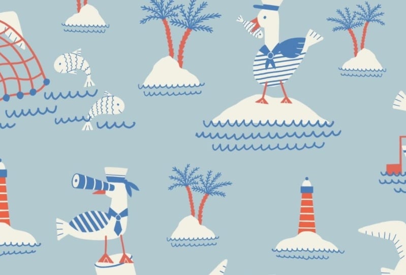
me and what I like about it. The topic I'm going to focus on in this class is about sea, islands and summertime
activities. It's inspired by my travels to create a beautiful Greek island. I have lots of footage I recorded that I'm going
to use as my inspiration. I already made an
initial illustration and I'm going to use that
as a starting point. I find it a lot easier to
visualize my ideas like this before I begin planning and developing
a complex pattern, repeat. In this way. I can tell one small part of the story and also set
the tone and style. As you can see, I'm going with this imaginary theme in
a slightly naive style. It's summertime,
everybody's having a good time and enjoying
this warm, sunny day. Colors are vibrant, but at the same time, vintage
and nostalgic. I wanted to do big that
feeling when you're on holiday and you don't
have any worries, You're just they're
enjoying the moment. At this point you can choose a topic, make initial sketches, and create a draft
illustration that will set the stage for the
pattern planning later. [MUSIC] By looking at
the illustration I made, I already have a
general pattern idea. I'm going to create
different scenes just like this one and arrange them
in a cohesive repeat. When it comes to these
types of patterns, it's good to start by
positioning the elements that are the most prominent,
like these islands. By doing that, you can create a solid repeat base for
the rest of the elements. Now, I can place the human
figures and greenery, which are just
decorative elements for the islands and that leaves me with this vast sea
space that is empty, which I can fill with
different boats. As you can see, this is all
pretty geometrical and bold. Adding birds in flight that are breaking the straight
horizontal lines, will give it a nice
flow and balance. If you're not sure what kind
of repeat you want to create a great starting point is
the Pinterest board I made, where you can see lots
of examples and I will now also show you two different ways of
planning a narrative pattern. I'll be using the topic of the countryside because
unlike the sea, it has a lot of greenery that you can
use as filler elements. For this one, let's do
something that is similar to the first example I showed
you in the previous lesson. A pattern that is dense and has elements that when combined
together, tell the story. In this case, I'm fitting the
elements closely together. I'm drawing everything that is related to the countryside life. I'm focusing on the size of
the elements and determining which ones are the main ones
or the most prominent ones, so I can scatter them
evenly in this repeat. This way of making a narrative
pattern is like a fun game because it feels
like you're solving a puzzle by trying to
fit everything in. The second one can
be developed for more scenes that have
picked countryside life. It's something similar to what I did for the hero pattern
I showed you before. In this case, you can
depict different scenes related to the topic
just as before, start by focusing on how the main elements
can be positioned. In this case, the houses
are the main elements. You want to put them in a cohesive repeat
and then you can start filling the
empty space with additional elements like trees, plants, humans, or animals. [MUSIC] Now that
I have the topic, the initial sketch and the
idea for the pattern repeat, I like to focus on developing the pattern elements
that I'm going to use. By looking at the illustration
and the pattern sketch, I can determine what kind
of elements I want to draw. I'm going to sketch humans in different positions from
lying on the beach, swimming, jumping in
the water and hiking. Then different
shapes of islands, some island flora, many different boats and
also birds in flight. I found that this method
works best for me because I can have more control over how I'm arranging
the scenes later. It feels more flexible and there are more possibilities
for editing, scaling and changing once we start putting these elements
in a bigger picture. In case you're wondering about how many elements
you need to sketch. The answer is the
more, the better, and you can think
of this as creating a visual world for
your hero pattern. While doing that, you're generating material
that could be used for other patterns
in case you're planning to develop
this into a collection. One last thing, you
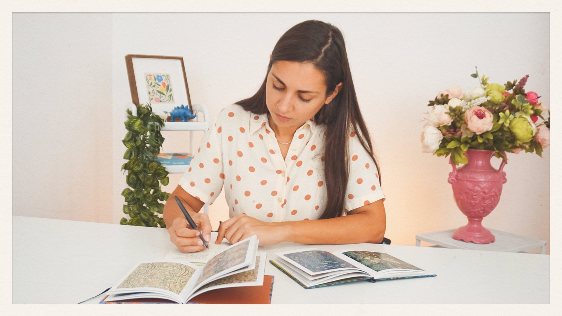
can do the sketches on paper as I will and later
redraw them in procreate. Or you can simply draw them
directly in procreate, the choice is yours. Just go with whatever
is most comfortable. I'm going to start drawing and might take awhile
and I'll see you in the next lesson
where we'll arrange the pattern sketch in Photoshop.
5. Pattern Sketch in Photoshop: We're back. The
sketches are finished. I drew lots of elements
that I can now choose from. I already photographed
them with my phone, added them to Procreate and
sketched them to upload them. As you can see,
everything is grouped, and each element
is in a new layer, so I don't have to separate
that in photoshop, but later when we start
creating a final pattern, photoshop we'll do
things differently. There is a reason why you'll
see when we get there. But for now you can simply open any canvas
size in Procreate, make those sketches, and all you have to
do is send it as a PSD file to your computer. [MUSIC] Now once
we're in Photoshop, let's set up a document
size that we will use for the sketch and also for
the final repeat later. Because this is a
more complex pattern with lots of elements, I like to play it safe and
use a bigger canvas size of 24 by 24 inches and 300 DPI. You can absolutely go for a
20 by 20 or 18 by 18 inches, which is absolutely enough. The only thing to keep
in mind, of course, when working with rasters is that if you work
in a bigger size, you will always be
able to downscale it later without losing quality. On the other hand, if
you create a repeat in a smaller size and you
need to scale it up later, it's not going to be that easy. But I wouldn't stress about that either because even if you make a mistake with the
initial size, it is fixable. Once you build a
pattern, repeat and do the heavy lifting of
arranging the elements, you can remake the same repeat once more in a bigger canvas. Also, I'll go with
a CMYK color mode, because I'm preparing
this pattern to be printed potentially. Even if some printers
work with RGB color mode, in my opinion, it's
a lot easier to go from CMYK to RGB later. But you can of course
choose whatever you need or whatever your
client is asking you for. [MUSIC] I will now open this Procreate PSD
file in a separate tab. As you can see, I have these layer groups
I forgot to name. I'm going to quickly do that
now so I know what is what. I'm going to convert all these
layers into smart objects. Because once we start planning our pattern repeat in
the main art-board, we're going to use something
called pattern preview, which is an incredibly
useful tool for arranging the
pattern repeat. But pattern preview
works perfectly with smart objects and it doesn't work well
with normal layers. Now, since I have a bunch
of layers to convert, instead of doing
the right-click and searching for convert to
smart object, each time. I set up a custom command
that I can use for that. In that way, I just have to
press "Shift Command O'', to convert a layer
into a smart object. If you also want to set
up a custom command, and I highly recommend it because it saves a lot of time, you can go to edit, keyboard shortcuts,
and find layer, smart object, convert
to smart object, and you can type in here the command you
would like to use. It's good to know
that in this way, you can set custom
commands for whatever you like or whatever you're
using very often. I will now just
select each layer, press my custom shortcut, Shift Command O,
and quickly turn all these layers
into smart objects. Once I've done that, I can select all the
groups I have and copy command C and paste
them in place in the main Canvas Shift Command V. It's smaller because I worked in a smaller
art board in Procreate, but that's not important
because this is just a sketch, and I can scale it up even if I'm going to lose some quality. Everything is set
and I can now go to view and turn on the
pattern preview. In this way we can arrange
the elements while having an overall view
of the pattern repeat. I will now start
arranging the elements. We've already practiced this while making a pattern sketch. The first elements I'm going
to arrange are the islands, because they're the
most prominent ones, they're the first ones to
catch our attention because of the size and later because
of the color and contrast. In this way, I can make a balanced and solid base
for my overall repeat flow. As you can see, the
pattern preview tool is incredibly useful at this
point because I can just zoom out and zoom in to check how the overall repeat
looks and make adjustments. Also, once I'm done with
one group of elements, I like to lock it so it
doesn't get in the way. I can now start positioning
the human figures. As you might have noticed while I'm selecting these elements, there is this
selection bug issue. This is something that is
happening when you work with appropriate PSD
file in Photoshop. The bounding box isn't on
the edge of your element, instead it covers the area of the canvas you
used in Procreate. Basically it creates
this huge empty space that is selected. For now it doesn't bother me, but once I started working with a final illustrations that I'll use to make
a pattern repeat, I'll show you how to fix this selection issue and
tell you more about it. I already like how this
pattern is coming along. Humans are in their positions
and now I can place the rest of the elements and fill the empty space
around the islands. Personally, I find it more
fluid and free to work with a pattern sketch
rather than go in with already illustrated elements
because until this point, I didn't have a clear idea
of what I'm going to use. Also, if I'm in
the sketch phase, I don't feel the pressure
to make anything final. As you can see, I'm just
playing with elements and composition and I can make
as many changes as I want. The pattern sketch is done, and once I turn off the
pattern preview mode, you can see that the elements
don't repeat on the edges. We would need to
do that manually, but at this stage we
don't have to do that. Now, if you have a webcam tablet and you do
a drawing in Photoshop, you can start
drawing right away. But if you're like me and you don't have a webcam
tablet and you do your drawing in Procreate
preferably on a cozy couch. In the next lesson, I'll show you how I prepare
this Photoshop Sketch to be transferred in Procreate so I can start illustrating.
6. Pattern Illustrations in Procreate: [MUSIC] At this point, I'll show you my way of combining Procreate
and Photoshop. On one hand, Photoshop has this amazing pattern
preview tool that we use that made planning and creating a pattern repeat so much easier. It has endless layers
and it doesn't cut out the elements you
place on the canvas edges. On the other hand, if you're using Procreate as
your main illustration tool, you have lots of
brush sets there, you can use it wherever you are and you're not attached
to your computer. The Procreate has limited
number of layers, especially if
you're working with bigger canvas size and
bigger resolution. One thing we're not able to
do is just take this pattern, repeat, save it,
and for example, open a 30 by 30 inches artboard in Procreate and
start illustrating right away because that
canvas will probably have two available layers and it will lag and crash right away. But what we can do to make this Photoshop and
Procreate collaboration possible is to Save these pattern elements
as a few separate images and then work on them in Procreate in a few
separate artboards. [MUSIC] I know that if I open an 18 by 18 inches artboard
in Procreate with 300 DPI I'll have 14 available
layers to work with, which is enough for
my simple style, but if your iPad has less
memory and therefore fewer layers or your style
requires a lot more layers, you might consider preparing these pattern illustrations
in a smaller artboard. In Photoshop, I'm going
to open a new artboard in 18 by 18 inches where I will prepare these sketch
images for Procreate. Now in the main
pattern artboard, I want to determine how to efficiently divide the
pattern sketch into a few different compositions
that will fit on this new 18 by 18
inches artboard. This could be the first one. I'm going to copy the selection, Command C, and then paste
it in the new artboard, Command V. While it's selected, I'll group it, Command G, and rename it into
composition 1. For example, this could
be the second one. I will turn off the previous
group and paste this one, group it and rename it
just like I did before. There are just two
important things to note. One is while doing
this makes sure that the pattern
preview is turned off, because otherwise they will
mess up your elements and you won't be able to copy and
paste them correctly. The second important
thing to note is that you can arrange the
elements however you like, you just need to fit them on this new artboard
and essentially get them ready to be
illustrated in Procreate. But whatever you do, just don't change the scale
of the elements because the final illustrations you make in Procreate need to be in the same size as they are on the pattern sketch you
made in Photoshop. Now, I have five different compositions that are in groups on
top of each other, and each group is
now turned off. I'm going to turn one group on, go to file, export and make a
quick export as PNG. I'm going to do the same
thing for all of them. Turn this group off and then turn the other one on
and export as PNG. In the end I have five PNG sketch images that I'm going to
send to my iPad, and I can start illustrating
them in Procreate. [MUSIC] We're now in Procreate. Depending on the
artboard size you used to prepare your
sketches in Photoshop, you're going to open
exactly the same artboard in Procreate. I'm opening a new
artboard in the size of 18 by 18 inches
with a DPI of 300, and I will set the
color to CMYK. Now, I can add my sketch image. Everything is set, so let's start drawing. I'll make a base for each
element in a neutral color. For that, I'm using a roller pen from a
retro supply brush set. I'll leave the link for
all the brush sets I'm using in the project
and resources section. As you can see, I'm working
in separate layers, but I'm not placing each and every element in a new layer
like I did with a sketch. I'm only separating elements
by color and position. One reason is a layer
limit in Procreate. The other reason is a
selection bug that exists when you open up a Procreate
PSD file in Photoshop. Now I'm going to start
adding colors and textures in a new layer
on top of my base layer. I'm setting this layer in
a multiplied blending mode because I wanted to create
subtle print effects later. For this, I'm using a really wonderful
brush sets from True Grit Texture
called chromograph. It has so many
amazing soft pencil, charcoal and pastel brushes. I'm building texture for
the island by tilting the brush and adding different
opacity with pressure. Then I'm adding more texture
with a tip of the pen. I'm going for a more
childish naive vibe. This loose texture
sketch fits perfectly. If you don't have
this brush set, a good substitute could be irregular 6B pencil or chalk hold brushes that
are native to Procreate. Once it's done, I'll select the layer and move it
a bit to decide to create this lovely
overlay misprint effect for the vintage look. By the way, if you're interested
in a vintage design and different print effects that you can add to your illustrations, I have a class about vintage
matchbox labeled design. I'll leave a link to
it in the project and resources in case you
want to watch later. Now, let's address these humans. I decided to keep
them simple and geometric without many details. I wanted to put more focus on their movement and not
on facial expressions. I think if a pattern design
is printed on the fabric, it shouldn't have
many tiny details, but that's just my
preference and style choice. Here I'm also using a multiply blending mode for their swimming
suits and clothing. I'm drawing it slightly
off the edge to get that color overlay effect as
they did with the island. I'll continue
illustrating this sketch and for other
sketches I prepared. I'll see you in the next
lesson where we're going to assemble the final
pattern in Photoshop.
7. Final Pattern in Photoshop: Now that I've finished five different
illustrations in Procreate and I've sent them as
PSD files to my laptop, I can start creating
the final pattern. I already opened these illustrations in
Photoshop and I can now work on some technical aspects to
make everything clean, organized, and professional. As you can see, I
don't name my layers, I just cannot do it. Instead, I later
organize them in groups and name those groups. But since I don't
name the layers, sometimes I don't know
which one is which. Being able to visually see what's in each layer
is very helpful. To make that happen
in the Layer window, I can click this burger menu
and select "Panel Options". Here I can set how my
layers are displayed. I'll set the thumbnail size to medium and thumbnail
contents to layer bounds. As you can see, this setup makes it a lot easier
to see what I'm doing. As I mentioned previously, there is a selection bug
that happens when you open appropriate PSD
file in Photoshop. Here is an example where you can clearly see
what's happening. When you select the layer, the selection doesn't
select only visible pixels, but it selects the
whole canvas area. Since we're going to move or rotate these elements and
also we're going to have to select them together and move them when creating
a repeat swatch, we don't want this issue
getting in the way. I tried ignoring it, but from my experience, this little bug really makes my workflow a lot difficult
and sometimes confusing. To get rid of it, all I have to do is grab the Lasso tool. You can find it in
the menu here or you can just press
"L" on your keyboard. Select the area
around the element and press "Command X" to cut it, and then "Shift Command
V" to paste in place. Now if I select the layer again, you can see that
the bounding box is surrounding just the element and not the whole canvas area. A quick Lasso tool info. In case you didn't make the correct selection
with the Lasso tool, you can always hold
Shift to add to the selection or option to remove a part
of your selection. If you don't want to use it, you can press "Command D" to de-select and it will remove it. Now besides just using
the Lasso tool to cut and paste to resolve
the selection issue, I want to think in advance
and prepare these elements into something I
call logical groups. This will help me keep my pattern file organized
and also give me the ability to easily edit these groups or
move them around. Here is an example. I have these two humans in
the same layer and I want to separate them so each
human is on its own layer. With Lasso tool,
I can just select one "Command X" to cut, "Shift Command V"
to paste in place. I'm going to do
the same thing for their clothing and hair. Now, I can select
this human with his corresponding clothing
and hair and group it. I can call this group Human 1, and I will do the same
thing for the other one. Now if I want to
move them around and change their position
in the final pattern, I can easily do that without grabbing them both
at the same time. On the other hand, I will not separate
each bird from the flock because these birds function as a cohesive unit. All I have to do is use the Lasso tool to
separate all the birds in a new layer and group the white layer
with the black details, and I can call this
group Birds 1. I'm going to continue
doing this for this illustration and
the other ones as well. It might seem like a lot of repetitive and technical work, but it's just a part
of the process. It's also inevitable
if you want to have an organized and
professional file that you'll later
send to your client. Also, it makes the
whole process of arranging the pattern
repeat so much easier, flexible, and less confusing. By the way, I need to go back
to the first illustration, there is something I
forgot to do and mention. If your layer is in a
multiply blending mode, once you cut and paste from it, it will turn back to normal. You'll have to set it
to multiply again. Now let's continue cutting, pasting, grouping, and renaming. All the preparations are
finished and we can now finally put all these elements
together in a repeat. This time I'm not going to use the Pattern Preview mode as they did while making
the pattern sketch, and because of that, I will work with normal
layers and not smart objects. By the way, if you're not familiar
with Smart objects or Pattern Preview tool
and how it all works, here is a super
quick explanation. Smart objects basically protect the quality of your elements. You can move them
around and scale them up and down without
losing the quality, which is not the case
with normal layers. You can turn one layer into smart object or an entire group. But to access it
and make changes, you need to
double-click on it and it will open in a separate tab. If you make some changes, you have to save it, and they will appear
in your main artboard. Also, a good thing
to know is that smart objects can be
converted back into layers. Now Pattern Preview, as I mentioned before, works perfectly
with smart objects and not with normal layers. If you try using the
Pattern Preview mode with normal layers it
might start lagging, especially if you
have a big file. Also if you place
normal layers on the canvas edges while
in Pattern Preview mode, Photoshop will cut
them out into parts, which is something
you definitely don't want to happen
because you want to preserve the possibility of editing and moving
things around. Is there a reason I'm now using normal layers instead
of smart objects? Basically, it's just my
personal preference since I already arranged everything
while creating a sketch, I don't think it's necessary
to go through the process of converting all my layers and layer groups into smart objects. Since the positioning
of elements is not going to change drastically, it makes no difference for me. If you're, for example, skipping the step of
making a pattern sketch, which is absolutely fine, everyone has a
different work process, you might consider using smart objects for
the final pattern, especially if you're going
to move things around a lot or a scale
them up and down. In that case, smart
objects will protect the quality of your drawings and give you more space
to experiment. On the other hand,
I also like having the final pattern file with
normal layers instead of smart objects because I
find it easier to make small edits or color
changes later. I will now merge the sketch layers
in the main artboard. I will select all the
groups and layers by selecting the first
one, holding Shift, and selecting the last one, and then I can use the
shortcut "Command E" to merge. I will now lower the
transparency of this layer, lock it, and set the background
color for the pattern. From each illustration,
I'll copy the group with elements "Command C", and then paste it in the
main artboard "Command V". I will ungroup it,"
shift Command G", and then just place these
elements in their spot. Let's do the second one. As you can see, this one
will not fit correctly, I will position
the Island first, and then quickly
separate the birds with the Lasso tool because two birds need to be placed
in the upper corner, and third one at the
bottom. Let's continue. So far so good. All the elements are
in their position. Let's turn off the sketch
and we can now create a pattern swatch by placing the missing elements
on the canvas edges. I'm going to select
all the elements on the left border like this. By the way, this is the main
reason I had to resolve that Procreate PSD
selection issue because now when I make a
selection of multiple layers, I can make a precise
selection and avoid grabbing unwanted
elements along the way. I will now copy, Command C, and paste in place, Shift Command V. You can see in my layers that these new
copied elements are selected. I can press "Command G" to group them and name the group RIGHT because I will move
it to the right side. This group is selected
and all I have to do is press "Command
T" for transform. Now, in this upper
menu you'll see X and Y-axis which determine where
your element is placed. The only thing you
need to remember or write down on a
sticky note is that X is the horizontal axis
and Y is the vertical axis. By using X we can move
elements left or right, and by using Y we can
move them up or down. On the X-axis there is all ready a number that determines where
the object is placed now. If we type minus and some
other number it will move it left and if we type plus and some number
it will move it right. The same goes for the Y-axis; if you type minus and some
number you can move the object up and if you type plus and some number
you can move it down. There is no need to do
the calculations by yourself because just by typing plus or minus and adding the number Photoshop
will do the math. The number we have to use
to move the elements and create a pattern swatch is
the size of our artboard. I have a square canvas
that is in 24 by 24 inches so both X and Y-axis
will use the same number. But as you can see, all these calculations
are done in pixels and not inches
or centimeters. To find out your
canvas size in pixels, just look down at this left bottom corner and
you'll see the numbers. In my case I'm working with
7,200 by 7,200 pixels. Just to recap, I already
copied the elements, grouped them, and
pressed "Command T". Now, to move these elements on the right side of the
artboard I have to go to the X-axis and type
plus 7,200 pixels. I can just click somewhere
outside the canvas to get out of the transform
mode. That's it. The reason I group
this is so I can now turn off this group and select elements that are
on the right side without these new copied elements
getting in the way. Once more, select, copy, paste in place, and group. I'll name this one LEFT. Now, Command T to transform. To move this group left
I can type minus 7,200. That's it. I will also
turn this group off. I will do the same thing
for the objects that are up and down but this time
using the Y-axis. I will select the
elements on the bottom, copy, paste in place, and group. I'll name this one UP. Now, Command T to transform, and in Y-axis I'll
type minus 7,200. I will also turn this group off. I can do the same thing for
the objects that are on top; I will just type plus
7,200 and move them down. Once this is done I can turn
on all these repeat groups, make sure everything is correct, and then ungroup them. Now, let's test this pattern. I like viewing and testing my pattern repeats
on a new artboard. First of all, I will save
this pattern swatch. All I have to do is go to the pattern window and just
press this "Plus" icon. Now I can open a new artboard, for example, an A4 format. Here at the bottom of the layer window I will
click on this icon to add new fill or adjustment
layer and select "Pattern". I can now find the pattern I saved and scale it down
to have a better preview. First things first, zoom
in to check if the swatch is made correctly and the
repeat is without errors. This is all good and now we can focus on the
visual aspects of it. What I'd like to
do now is look at the overall pattern repeat
to see if the flow is good. I'm also looking to
see if the balance between filled and
empty spaces is good. Is there something
that gets in the way? Or is there something
that seems off? You can also squint your eyes
while doing this because in that way you can blur out the details and focus
on the pattern flow. What I can see is that this
boat is getting in the way. I feel like that part of
the pattern is clustered in comparison with
other parts that have more breathing space. I might slightly move this human because it's positioned
too close to the island. Let's go back to the main
layer and make those changes. I will add this new
pattern repeat in my pattern window and
make another test. It should be in the same scale so we can make comparisons. Now, if I turn it off and on you can see it's
getting better. I'll examine this one
again in the same way. I'm pretty happy with this one, it looks a lot better with
those two small changes. But I might need to move
this sun to the left a bit and make more small
adjustments for the boats. I'll go to the main artboard again and make those changes. One good thing to note is if you're moving
elements that are on the canvas edges you need
to select both of them. If I want to move
this boat I need to select one on the left
and another one on the right and then
I can move them together without messing
up the repeat swatch. Let's test this
pattern once more. Yes, it really looks good now. You can see in these
three examples how those small changes
made a big difference. That's it. This is
the final pattern. The PSD file is
completely done and I can add this pattern in my portfolio and
license it right away, or work on developing a pattern collection where this would be the main hero print. I could maybe make a
class and show you how I'm doing that so if that's something you'd like to
watch you can let me know in the discussion
section of this class.
8. Final Thoughts: [MUSIC] Well guys, we are at
the very end of this class. I just wanted to say, thank you for
spending time with me and following this
pattern making process. Each one of us has a
different art styles, different preferences, and ultimately a
different workflow. My biggest advice is to follow along with my
examples and methods, but always experiment and see how you can take what you've learned and discovered and then reshape it to
fit your own needs. I hope you'll have fun while creating your own
narrative pattern, developing a story, and expressing yourself
through pattern design. You can document
your process and final outcome and share it with us by creating a class project. The section with class
projects always ends up being this wonderful
place where we can showcase our art and
celebrate each other. By the way, I would love to hear what you think
about this class, so make sure to
rate and review it. As always, if you have any questions or something
I was showing wasn't clear, feel free to ask anything
in the discussion section of this class and I'll get
back to you as soon as I can. To get notified about
my next classes, follow me here on
Skillshare and you can also keep in touch with
me on Instagram @diujdi. I'm sending you lots of love, good vibes, and I'll see
you in the next one.
 Di Ujdi, Illustrator & Art Explorer