Transcripts
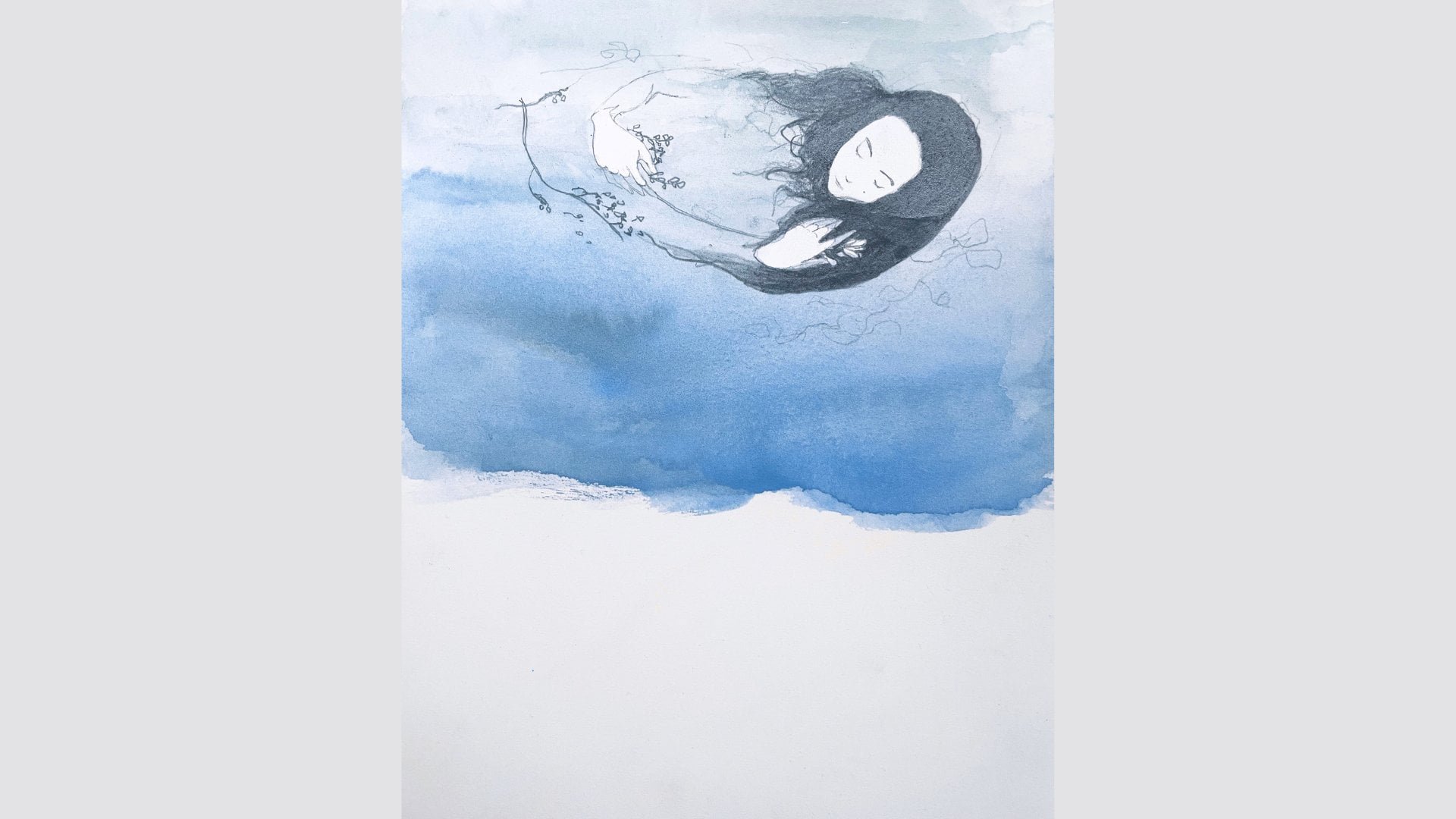
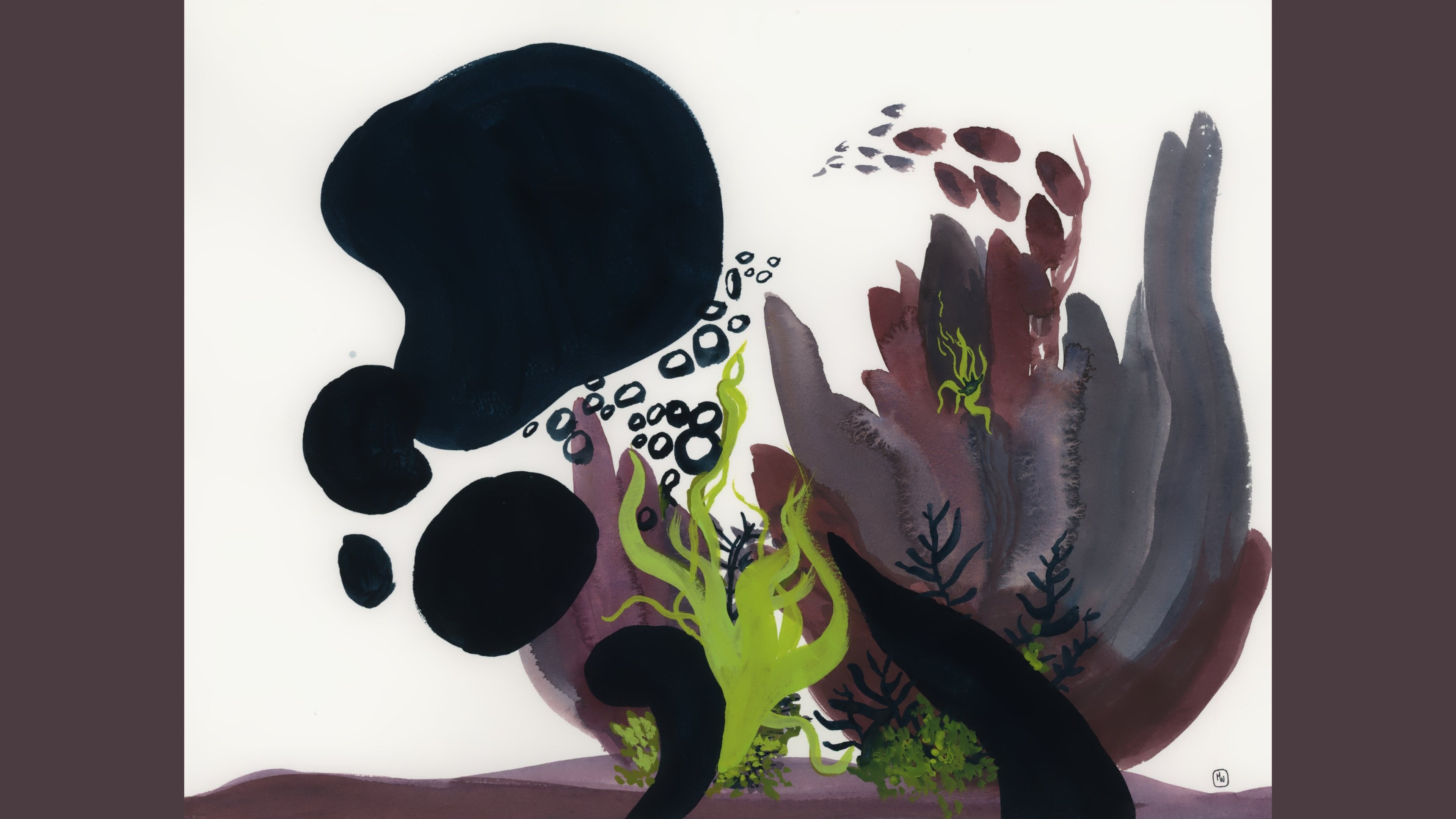
1. Introduction: You don't need a mouse bowl do this class, but this is what I use to do it. Because I love it. Hi everyone, my name is Marie-Noelle Wurm. I'm an artist and illustrator and a top teacher here on Skillshare. In my personal work, I create artwork that is delicate, dreamlike, and a little dark, because I believe that as human beings, we should embrace the entirety of our experiences as humans both the positive and the hard to deal with. That's really reflected in my work and I take a lot of inspiration from nature, which really fills me and reminds me that I'm connected to something bigger than myself. In this class today, I'm going to show you my approach to drawing from observation, using your plants at home, but injecting a little bit of fun and playfulness and creativity into something that has usually a more traditional still life boring aspect to it. Don't get me wrong. It can be really fun, but for me it's also, maybe that's just me. I'm going to give you a few little tricks on how I have found ways of making it fun and interesting, engaging, and creative, all while showing you step-by-step how to achieve a more realistic look if that's what you want to do. This is an approach that you can apply to basically anything that you're painting. We're going to be working with satellites and funnels, which sounds weird, but I'll explain that. I'm going to be using watercolor for this class but you can use acrylic or gouache or anything else that you want to have fun with, but you might also need a little dose of curiosity because that's always a valuable thing to bring along. I'm excited to get started. Let's do this.
2. What You'll Need: Today I'm going to be using watercolor, but you could also use acrylic or gouache instead. I'm going to be working with transparency and building layers in order to show you how to achieve realistic effect if that's what you're looking for. But having said that, you could decide to totally veer off from this plan and make something more bold, more graphical, unrealistic, strange colors, and simply use the principle that I'm going to be teaching you in order to create your piece. The principal is what is most important to me here, but of course I'm going to be trying to give you little tips and tricks along the way if you are wanting to achieve something a little bit more realistic. You're also going to need a planter too, but I'm going to get into more detail about that in the next video. The watercolors that I'm going to be using today is actually a set of handmade watercolors by Stoneworks Mill. I just really love handmade watercolors, but any type of watercolor, or acrylic, or gouache will do. You're also going to want some watercolor brushes. Of course, you're going to need some water, some watercolor paper, and I have a few different ones here to show you. For a long time, I used this paper by the brand Hahnemuhle, which is made from bamboo rather than cotton even though for watercolor, 100 percent cotton is amazing and super fun to work with, but there are other types of papers that work fine as well. This one which is made of bamboo fiber works great. Any sort of paper that is mixed media and says that it works with watercolor will do well, and of course specific watercolor paper. Arches is one of the most well-known brands. They do hot pressed, which means that it's a very smooth surface and cold pressed which has a little bit more texture. Of course, you're going to need some palettes and a rag or paper towel so that you can blot out your brushes when needed. I decided to use one of my favorite sketchbooks; a sketchbook by sketchbookcoshop. This one in particular has very thick-textured paper. There are a lot of different types of watercolor paper, but the fun thing is that when you're working with different types of texture whether that's really smooth, or satiny, or a little bit textured, or very textured, they all have a different feel to them and a different feel for your final piece. You can really play around within those and decide on the one that works best for you. I thought it would be fun to work on the super-textured paper today just because I liked how it echoed the texture of the moss. But of course, you do need to know that if you're using textured paper, the paper calls attention to itself more than if you're using something really smooth. Good to know.
3. Making Still Lifes Fun: For this exercise, I'm going to ask you to find a plant or two that you have at home and that you want to draw from. If you happen to have a bowl of moss lying around, that works too but I know that's not something that necessarily everybody has, but I'm pretty sure that a lot of you love plants. Find one plant, or you could actually just decide on taking some different object that you have at home. When we think of drawing from observation or making a still life, we'll often think about looking at objects from the side. It's true that there's a lot of benefits to doing that. You can get a better sense of depth, of form, and it can be a great way to work on your values. But personally, I've often found still lifes and observational drawing very boring, at least in the traditional setting of what a still life is. First off, I'm going to ask you to gather a plant or two. But what we're going to do is that we're going to place it on the floor next to us. Or a small plant that you can tip towards you on your desk that can work fine as well, whatever is easiest so that you have a different perspective on it. We really want this new fun way of looking at it, which could be a top-down view. Usually, in traditional still lifes, you look at your objects from the side or that kind of thing. But for this class, I wanted to break that notion and really show you that you can play around even with the way that you place your object. How are you going to look at it? What perspective can you take on it to make it a little bit more fun and more interesting? This is one of the ways that I've made it more fun to me, is to take a different perspective on the objects that I'm looking at from above. The second thing is that I chose a subject that I care about. Ever since I was a little kid, I have always had a love for nature and also for tiny things. Moss is the perfect blend of both of those loves. When I chose this bowl of mosses, it was actually just a really special thing for me and I wanted to take the time to really sit down and appreciate it, and really observe the textures, the colors, the shapes, the forms. Plants fill me with a sense of wonder and connectedness and remind me that we're part of something bigger than ourselves. I want you to pick one-year plants or an object that is meaningful to you. I think that's a key difference between finding observational drawing boring or finding observational drawing fun. Find something that you genuinely connect with, with whatever reason feels true to you. Something that fills you with genuine curiosity or fascination for the shapes that it has, something that speaks to your soul. The principle will stay the same, whether you're choosing a plant or some other object. Most of all, it's about taking time for yourself, slowing down to dive in, get creative, and savor the shapes, the colors, and the forms that we'll be exploring today.
4. A Note on Color: I just wanted to make one small note on color. If you look at my moss bowl, the colors are brownish, orangish, not very green. I didn't manage to keep my moss alive. Maybe I'm just a bad plant mama, I don't know. But I don't mind it. I really like the colors of them even when they're not lush and green. But for the sake of this drawing, I decided that it would be more fun and more interesting to bring back some of that green color to my plant, even though my plant isn't green. I want to make that clear about the colors. I chose to have a more realistic take on my colors, even though they're not exactly what my plant is like. But you could choose to use colors that are absolutely not realistic if you wanted, if it sounds fun to you, if you wanted to really bring it somewhere else. Fidelity is not the most important thing. As always, these classes are a springboard for you to get creative and to start questioning yourself, what is it that I want to explore today?
5. Step 1 — Base Color + Shape: In order to more easily visualize the breakdown of the approach that I'm going to be using today, we're going to be imagining that we're a satellite. We're having a bird's eye view, let's say on a river. What you're looking at is really the shape of the river, the way that it goes in comparison to the land. It's this really big, broad bird's eye view. Hop on to your satellite and let's get started. For this part, you're going to take the overall shape of your plant and make one base color for the entire thing, using a lot of water in your water color so that it's very lightly pigmented, a very light wash. In my case, the overall shape of my plant was pretty simple because it was a bowl of moss, so it was a circle. But yours might be a, sort of, blob with pointy things like leaves sticking out. Use this as an opportunity to practice seeing the overall shape of the object that you're looking at and not get too distracted by the details. You can think about it in terms of silhouette. What is the general silhouette of your plant? Without the pot, we'll get to that later. The point here is not to be picture perfect, realistic, so if it deviates a little bit from what you see, remember that it's not the end of the world. No one's going to judge you if it looks slightly different from what your actual plant looks like, you might even want to deviate from what you see to inject your own artistic interpretation. I paused there because I was actually thinking, well, also, plants leaves shifts throughout the day where the leaves will start edging towards or away from the light. You know what I mean? Nobody is going to be like, oh, that doesn't look exactly like the plant that you have at your home. Really don't panic if you're struggling to get it precisely, exactly as it is. Again, this is just an opportunity to learn to observe a little better to slow down and pre-heat the forms that are in front of you. My point is that you want to practice getting at the essence of the overall shape of your plant without getting too hung up on the faithfulness or realism of it.
6. Step 2 — Building Up Layers : Now I want to go in and zoom a little closer. To get back to our satellite metaphor, instead of having just this super far bird's eye view of just a river within land, we're going to really look at the river, and maybe notice, oh, there's a bit of dry land right in the middle of this river that I hadn't noticed when I was looking at it from very far above. Another way of looking at it is the image of a funnel. Before, we were having this really broad surface-level view of what we were painting, and now we're going more into that middle section of the funnel. We're looking close, but not too close because that's one of the mistakes that we do as humans very naturally, is we zoom in too closely too fast. We're really trying to practice this middle range of our satellite, this zooming in, this looking in at the river, starting to see some differences in the shapes, and maybe the banks, and the dry land, and the wetland, and how that shifts, but we're not going into the minute detail quite yet. Once you've captured the basic shape of your plant or plants, we're going to go in and start bringing out some of the basic shapes that you see there. The nice thing with having worked with a quite wet, lightly pigmented watercolor is that it'll probably still be wet. It won't be too wet; but it'll be a little bit wet. What that means is that when you add in little touches of color, you'll be able to give sense of the more individual shapes. It'll blend in with your base color because of that slight humidity that's still there. For this step, you still want to work with very lightly pigmented washes here. This is, again, an opportunity to practice looking at basic shapes, not getting too lost or distracted by the details. Try to think of the basic shapes that you're seeing, the circles, the squares, the triangles, the diamonds, the blobs, and start giving those some added color. Take note of where they're slightly darker on one side than on another. If you're not yet familiar with giving form, like a 3D form to your shape using shadows and light, no problem. You can completely bypass that and decide to make your shapes flat and graphical, and have fun with that. If you do feel like practicing giving a more 3D effect to the shapes that you're seeing, then really start observing where the darker parts of those shapes are compared to where the lighter parts of the shapes are. There's a really great tool that can help you with that, and that's squinting your eyes. When you squint, the colors of the object that you're seeing fall away and you can better see the simplified version of darks and lights. The first time you do this, you might not totally get it. Just practice a little bit and you'll start to see that when you squint, it will really help you get a sense of simplified ways of looking at light and shadow, the simplified values. In this case, you might not want to touch the parts that are the lightest lights because the beauty of watercolor is that you can use the transparency of the water and the paper underneath to reveal your lightest lights. But do go in and start adding some darker areas, the shadow parts. We're not going to the darkest darks yet, but we're still moving towards adding a little bit of depth and tone to our painting. The paint might actually look slightly darker than it is when I place it on the page. But you'll see that as it dries, it dries lighter. If you're not yet familiar with that in terms of controlling the level of pigmentation, just don't panic, maybe practice on a sheet of paper beforehand in order to get a better sense of what you're doing. If you screw up, you know what? That's okay. That'll mean it's an opportunity for you to practice once more next time.
7. Step 3 — Adding Details: We went from a bird's eye view to mid-range view. Now we're going to really really zoom in and pretend we're a child on the banks of the river. If you look at kids, they really observe things very very closely. I don't know if that was the case for you, but when I was a kid, I would often look at things, the textures, how the light work, what the different shapes were. If you didn't do that, that's fine. But that's how we're going to do now. Really tap into your inner child, the fascination that you might find for the different textures, the shapes, the colors that you're going to be observing in your plant. You might want to wait for the layers underneath to dry in order to add these in so you can really get that hard edge detail look. But of course there might be some sections where you still want to blend in with the background so you can still go in with some slightly wet paint. It's not that I'm saying like, oh, your brush needs to be dry or anything like that. But you do want to have a little bit of that hard edge. Something that has slightly less water so that you can really get a crisper detailed look. For example, in these little plants that I'm adding up here on the right. Remember one thing about details, you do not need to add them everywhere. Sometimes that's something that you can get caught up doing thinking that you need to put them all in, but actually our brains are really good at filling in the gaps. If you put details in one section, then your brain will fill in the gaps in other sections. Obviously, this isn't a hard rule and if you want to go ahead and add all the details in, that can be super fun too. All rules are meant to be broken. Just play around and just see what look you're drawn to more. When you do edit out some of the details, that does however, sometimes give you a more realistic look. If that's what you're going for, you might want to do that. In this section, you also want to go in and add your darkest darks where they need to be. That's super important and will really help with the 3D-ness of your plant. Of course, remember to leave some of those white spaces for your lightest lights so that you can really get that sense of shadow and light hitting the forms. At this point, I've only been working on the plant and not on the pots or the thing that's holding the plant. Now is the time to do that if you like. Mine was white, which is nice because it gives it a nice contrast with the plants. I actually decided to use just the white of the paper, the negative space to define my pot. Yours might not be white, but remember you can change the color of the pot that your plants are in if you think the colors are too similar to your plant, for example. You can also like go crazy and make your pot neon pink, if you like, or patterned, or anything else of that nature.
8. Step 4 — Bold Background: This is the final step of our project and we're going to be adding in a bold background. In order to make still lifes or observational drawings more fun and also maybe more modern, instead of having just a complete realistic take on it, you can veer off. I've done it here with the background, but of course, you could imagine other ways of veering off that well-trodden trail of realism. The way that I'm going to do it here, we're going to dive in, make a bold background. I chose something that was quite dark, but you could go ahead and make it multicolored, or a pattern, or something funky and graphical, or very organic. There's a lot of ways that you can go about this, but I'm going to be showing you how I make my very flat background. We're moving away from a traditional take on a still life for an observational drawing and taking it into an arena that's maybe more contemporary, more graphical, more bold, and more fun. You can see me working here on just a section of the background first by defining the outer edge of the pot and then adding darker paint around that. I'm working in sections here because I'm using watercolor and I want to keep an eye out on the levels of water that are at the edge of my paint. I don't want the edges to dry up too quickly because I want to blend it in with the newer sections coming up. Working in this methodical way all around the edge of the pot and the plant helps me make that flatter surface effect. Then I can go in and add in the darker areas all around and also not be as detailed because obviously when I'm going around the plant and the pot, I want to make sure that I'm not erasing any of the details that I want to keep in my painting. I also decided to leave a white border, simply because I thought it would be fun since my plant pot is also white. But obviously, you could go just totally flat as well. I apologize because I realize I forgot to film the last little section of detail where I went in and added a little bit of shadow to my plant pot so that you could get a better sense of the 3Dness of it. That's something you can keep in mind as well. There we go. I've finished my realistic, yet not realistic depiction of a moss pole that I absolutely love. I'm really glad to have spent this time to sink into the moment and learn to appreciate the shapes, the details of this tiny little world of plants.
9. Outro: I hope that you enjoyed this little exercise. If you feel like sharing, please do. I would love to see what you made. Please go ahead and share in the project section where you can also see other people's work, and comment on it, and support each other in our creative journeys, which are these beautiful, vulnerable pieces of our lives that we're sharing with each other. If you'd like to continue the journey with me, I have a bunch of other classes here on Skillshare, so you can go ahead and check that out in my profile or get notified when my next class is out by clicking that "Follow" button. I also have Instagram, of course, where I share more my day-to-day explorations. If you'd like something a little bit more intimate, then I also have my Patreon page where I do live drawing sessions, sketchbook challenges, and Patreon exclusive sketchbook tours. There's tons of ways for us to connect and to continue sharing our creative journeys together. Also, don't forget to congratulate yourself for taking this class, because I don't think that I valued enough the importance of congratulating myself for each and every single time that I show up in front of my sketchbook. When you do that, no matter how small, even if it's just five minutes that you spent on your creative journey, celebrate that. Those are beautiful moments and deserve the love and care that we can give them.
 Marie-Noëlle Wurm, Artist, illustrator, HSP