Transcripts
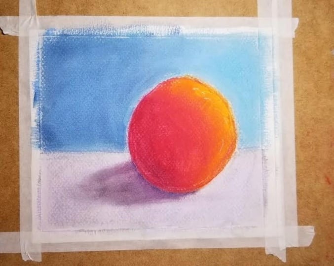
1. Introduction: Welcome to myself. Pastoral class for beginners. This class is for anyone who wants to delve into the wonderful, colorful, vibrant world off soft Castells. In this class, we will go through the dynamics of what soft pastels are. We will also go through some of the brands that you should start with as beginners in the world. Off soft Castells you will learn about brands such as Kant, A. Cinelli, a Rembrandt and Unison have also learned about different surfaces that these some past ALS can be applied on. We will work out how to blend our soft Pastore's on our different surfaces. You will also learn how to dark and cool is using black on complementary colors from the color wheel, and you will also learn how to lax and colors using white on other adjoining shades off those colors. In this class, you will have exercises that you can follow step by step that will build up your technique and skill all the way to a level where you can produce your first soft possible painting on . That is what we will be doing in our class project. You will also receive a full, high resolution reference photograph for you to use if you choose So in your class project . So what you waiting for? Grab yourself a drink. Grab yourself a K Sit back. Relax. Let's get started with
2. What are soft pastels?: Okay, Welcome back. Let's start off this soft pastel course by going through some of the characteristics and designs and looks off soft. Call it past ALS, so let's just talk a little bit about soft pastels themselves on how they are made soft past ALS are basically artist color pigments that being mixed with water to create a paste on. Then a binder is added to them on. Then these are then formed into shapes and dried. And then you have these beautiful little sticks, which are known as soft pastel sticks, and that's pretty much it, so the making of them is quite simple. However, the consistency on the ratio off pigment, pure artist, pigment to binder differs depending on the brand on the softness or the hardness off the past, all itself on. That is the key points, a kind of really mentioned here, especially when you're coming into the world of past ALS as a beginner. And again, this class is aimed at beginners who have got either no experience or just very little experience of fastballs on. They just want to kind of really, really endured into this beautiful, colorful world of past or so on the left here. I've got some full sticks, full side sticks. So again, once they bind it with the binder on their dried out, they're either going to be full size sticks like this or they're gonna be half size sticks like I've got over here. So these are the half size Siris in two different brands that I've got a I'm on the left here. I've got the full size on. What I'm gonna do is I'm going to demonstrate each brand on a different type of surface to give you a bit of an idea off the softness, Onda kind of vibrancy and saturation of each of these past ALS on. I'm sure you've noticed on the right over here, and you're probably thinking, Why has he got these college pencils there? What he's all about? Well, I'll tell you so on the left we had the full sticks over here. We've got them in various shapes and sizes. Then we've got the half sticks over here, and then finally, we've got what we call pastoral pencils yet passed ALS squeezed into little barrels and formed into a pencil. Now these are great for adding detail on really refining your possible paintings on we sometimes refer to past or painting. That's paintings because that's what they pretty much are because you can even add water to them on that will produce a kind of painted like effect. But however, that's a bit more advanced. And for the kind of begin Of course like that I'm doing here on this course is we're just going to stick to the dry stuff. So we have got the pastel pencils here toe detail. And then we've got the half man, half size past ALS and the full size sticks to really add that vibrant seat to our pastoral artwork. And that's about it for the introduction of the actual pastoral itself. What we're gonna do now is we're going to move on to the different surfaces, and we're gonna test out the actual move ability off these past ALS and see what results are going to be formed so that you can make a bit more of an informed a decision on which brand you want to go with to follow this class or if you've got certain brands already, which ones they're going to match with these pistols that were going to go through. So thank you so much for your time. Let's move on to the next one.
3. Surfaces for soft pastels: Okay, let's talk a little bit now about some surfaces that we're gonna be using our past ALS on now past ALS, especially soft. Castells could be used on a variety of surfaces. But the main thing Teoh kind of consider is that the surface needs to a have a good tooth that the past Elkan Groupon because soft Pastore's a dry medium. They don't have any kind of moisture in them that's gonna attached to any surface. This actual attachment needs to come from the surface itself, so you can pretty much divide, you know, different categories of paper into types. I've got two types of paper here for past ALS that I personal use. I mean, I can comment on others, but because I don't use them on a day today basis, I kind of thought that it's best to just We'll talk about the ones that I personally use. Now I do use more than these two main brands here, but the reason I want to go through these are because you're if you're a beginning and an absolute beginner in pastels and you go into an art store, there's going to be so many different types of brands that you're gonna get confused on. I mean, that's why I got had confused on his well, years, years and years ago when I started in the world of hostels on you just end up buying so many different pieces of paper without different textures. I'm really expensive, some really cheap on. Then you find that out of those papers you could have really just bought two different types on you would have kind of made a decision on that. So that's why I'm concentrating on here. There's no point going through every single paper, because ultimately it's convey subjective. That might be a feel of something that you like that I might not like or vice versa. So again, two different types of paper that we have here, this one is by a company called Della Rowny. On the kind of difference in actual naming is that this is an English paper on that what that basically means is that these pieces of paper I'll show you here on the camera This can be seen on the camera properly that the actual paper surface itself, So bring this a little bit closer. That's if it can catch on the zoom and catch the glimpse of white. To show this, I'm not sure if it's very visible. Just get a little bit more of a zoom on there. You can see that the surface. It's got this kind of like corrugated feel. It's like grooved. There's some grooves and that you've got this space that's going on. So that's way to describe it is like if you see corrugated cardboard in some packaging that you you know, if you buy items in its very much similar to that. But it's what it's not like, you know, very heavy on what that does is that creates a surface for the past, all to attach on on. Then you have these little gaps in it. So this is a really nice surface on. This isn't very expensive in terms of cost. I would say that this is pretty much a good beginners surface to start off in. On the next surface is the other type of surface, which is more of a sandpaper style surface, and this is by one of my favorite brands, Claire Fontaine, on This is called past all matte paper. Now this comes in various different grades and sizes. I tend to buy these in the kind of like the sketch pads like this so that you can maintain all your work and keep them in, and they easily remove out. So I'll just show you over here, and this part that I've got here is nearly depleted on. This is a wife's color pad. So with the other paths that this brand had, you can get different colored cards. The ingress pad that I've got here from Dell around me. This has a different college, so you can see over here. I'll just put this. So we've got a lovely, beautiful kind of Navy blue there. We've got some brown dark, dark textures over here, some nice kind of Beijing and cream and gray tones on. This works really, really well for past ALS and really to bring out the vibrancy. And then, especially when you're using light to college on here up got blind quiet over here with the past or Matt paper on. This is quite expensive. It's substantially much more expensive than the actual English paper itself. I'll see how much list was this? I think they usually of the price on them somewhere. But I will do is I'm gonna leave alive the materials I use in this course I'm gonna leave a resource. She where you can have a look at those materials read upon the reviews. But to be honest with you, I would not really recommend that you go for this paper right now. I would go for this paper. Maybe once you've done the course and you had a good birth practice on, Guy would recommend going for something like this. An English paper. You don't have to use Dell around the there, all the brands that you can use. The best thing to do is go into your art store your local art store on Have a look at what brands they have on. What they tend to do is you tend to let you use a swatch to kind of practice on. And that's a great opportunity to actually have a look at different brands of past ALS as well. But you can get really feel for them Onda again. I would recommend that you go for the ingress, but by all means. If you want to go for the past on that paper, go for the past. It's off. Ultimately, I think it's one of one of the best papers you can get. There are other papers that you can get that are a bit more superior to this. However, we're looking at a lot of money and again, so for beginners, courses, beginners, classes. I never recommend spending a lot of money initially that you will eventually kind of do when you become a bit more experienced at it. Eso I leave that choice entirely up to you. I would highly recommend the ingress paper on the possible Matt paper. Maybe when you've completed this course I had a good go up Pastore's go for that one. But if you want to absolutely go for it, maybe get small, kind of like a formats, cause these come in small format. This, I would say, is just a little bit bigger than a force. I'll just show you over here on on the actual camera. So this is the size that I get. This is the middle size of the actual sketchbook. There's a bigger size in this that I also used on. Then there's a smaller size, so if you want to go for this, I would say Probably start off on the smaller size because you just practicing you just a beginner. In this wonderful world of pastels, it can be quite inexpensive world. Um, as I did find out when I started. So I'll leave that decision for you. Which one you want to go for? For the class. What I'm gonna do is I'm gonna be using both papers, and I'm going to use them side by side so that you can get a bit of an idea off what these past dolls are gonna look like and how they gonna perform. So let's move on to actually using these past ALS on these surfaces.
4. Brands demo - conte: Okay. Welcome back. Let's start off with some demonstration off the past. Also, our use of a couple of these brands I up here with the two papers that we discussed in the previous video. So on the left, here I have the ingress paper by dull around and on the right. Have got a sheet off Claire Fontaine past or Matt paper. So we've got the ingress, and then we've got the more sandpaper like paper on the right hand side. So let's start off with one of the brands that I use quite regularly on. That is content. Paris on was probably said content Parry. That's probably how you say it, but it is one of the main brands I use. I would say I use this as more of a sketching past all. I wouldn't use this for finished artwork, and I'll explain why? So let's just get a little bit of a zoom in on here. So we've got contact Paris, but I'm gonna keep referring to as the content Pastore's. These are very good artist quality, past ALS on the in terms of price. They're not very expensive in the greater scheme of things and they are still expensive, as you know, as an art material. But I would recommend these these work as a nice medium, kind of soft brand off pastel. So they come in these full sticks. You can also get these in half sticks backed into by them in full sticks. Especially when the our stores have got the offers on on gas. Say this is probably a good starter kit. I mean, in terms of what number of pastors do you need to start off in? I would say you need at least 20 because with pastels, you don't necessarily. You know, you don't you can't really mix colors. Initially, you gonna be mixing the colors on the papers. We will see in the exercises that we do on. It's always good to have a national range. Eso I would suggest get get a range where you have maybe a light value at mid tone value and a darker value in total. So that will kind of really give you, you know, a bit of scope for, you know, really producing variance in your artwork. Or if you can't get three different values, maybe just get something where you've got like a dark and I like It's like over here I've got dark green and a light green. And if you've got that in all the primary colors, like blue, arrange read on maybe some brown's that would just be great and ideal. It's always difficult to work with something if you just have one of each color on. So I wouldn't recommend you buy like the smallest set where you have maybe five or six, I would say Go for I would say Go, go for at least 2020 would cover you for all the color ranges that you would need to produce. So let's see what this looks like on the actual papers itself. So I've got this lovely, beautiful green here on. What I'm gonna do is I'll just move the paper side by side over here, get the focus back on. Let's make it look really nice for the class on and let's get a bit of a zoom in. So let's test this out on the English paper first. Let's just put the English paper here on. What I'm gonna do is I'm gonna hardly use any pressure. So that's another thing with past ALS. You don't want to be pressing down really hard because these are expensive materials and you don't want them to wear away on. That's another important point that if you don't use the right paper, then what's gonna happen is your pastor is gonna run out very, very quickly on you. Won't be happy because you know you're gonna have to buy more of the same color if you're producing a beautiful piece of art. But again, for a beginner, I would suggest stick to these papers I've got here, especially this English one on. Hopefully it should give you some very good results. So all the minute is just gonna hold the past all like this? Obviously, if you put too much force in on hold it from the back here, it's gonna literally break on. Pastors do break the soft in the past, or that you have the MAWR easily It's gonna crumble and break. So do bear that in mind in terms of thought softness. As I said before, this is just a medium softness so whole I'm gonna hold it from the middle of the past. All here. I'm just gonna put my main finger on the top, and I'm just gonna arrest it against the bottom part of my other fingers on my thumb and just like that, just go. Let that pass stool come off onto that paper in small little emotions and you can see how easily that passed all comes onto these papers. That's beautiful. That isn't it. So we've got the content pastoral here. So just create this little squatch on. Maybe add another color, a dark color so you can see a bit more. So we have the content here again. You see, it comes off really, really easily. So that's how it looks like on this English paper. Now you must have noticed. Now let's see if we can get a bit more of a zoom in. I'll get that much zoom in and we just move this to the side. You can see that you get quite a lot of hostile what we got past all dust. So a lot the past all is coming off. But that highly depends on the paper and you'll see what I mean when I do this on the actual paper over here, declare Fontaine past all my papers. So again with the same stick holding in exactly the same position. I'm going to start lightly in this. Calm down. I don't if you consider some of the camera. But my God, this paper is absolutely brilliant because it has that sandpaper texture. It literally pulls off all that past or from the stick. And you can see that's so much more. Pastore is coming off. Attaching and adhering to that paper is just beautiful. I mean, if you if you just compare it But this one over here, you can see that you've got this past all dust here own over here. You've hardly got any literally got no possible just at all because all of the pastoral is going into the groove on the gaps in between the paper s Oh, it's absolutely beautiful. That's that's just do the same in the dark green. You can see there. Look at that. I'm using hardly any pressure with this at all. So holding in exactly the same position, hardly any pressure on the pastoral is just coming on beautifully. I mean, that's that's the beauty of these fastballs, isn't it's that is the purest thing that you're gonna get a pure pigment because it's a dry medium. Obviously, with wet mediums, you lose that saturation on the vibrancy of the actual pigment itself. So there we have it then. So we've just tested out the Khamtay parts Paris Khamtay past ALS on both papers and you can see they're completely different results. Now, you might not like this type of result, but you've got this kind of gap in the middle. But what we're gonna do is once we just tested out these past or we're gonna go through how to blend these together. This is just a demonstration on the actual surface and how the surface holds up to the actual past all. So let's just zoom back out of there on what we'll do is we'll move onto the next brand
5. Brands demo - rembrandt: the next brand. Let's look at the Rembrandt So Rembrandts again. This is another good medium soft pastoral. I used this quite a lot. I'll show you the box that I've got here for this particular set. So it's Rembrandt by Royal Talyn's and the's 1/2 length past ALS. So these are not for lefties. Just half man on the advantage of half length past ALS is that you get much more of a range , whereas with the full length of you ended to get in this box in a full pastoral set, you'd get a lot less on be probably be a bit more expensive. So in terms of price, I would say that these and the content have very similar in price range. You can get them on special offers and again, all of these brands and these sets I'm using, I'm gonna have them as links on the resource sheet for you to check out. So let's test these ones out. Now. I'm gonna choose maybe a different color here. Let's get this beautiful orange. You can see the actual Pastore itself. There are a lot thicker. The's 1/2 pans, so half half sticks and they were compared to the con. Take half sticks. You can see that these are a lot thicker. That barrel itself is a lot thicker. Just bring this up to the camera. You can see you get a lot more in 1/2 than you would do in 1/2 off a contest. So that's another thing. So you've got a bit more of a grip on. This is a little bit more thicker, so let's just get a couple of goals in this as go for a red and an orange, just move that to the side and again with the Rembrandt, you get really nice boxes. So you've got this beautiful, solid boxing. You get the phone in surgery, can actually put them back in, but want to side using pastel Uriel, you'll realize that the you'll you'll tend not to really keep him in the boxes like me, and I just put them in the box is just for this class to demonstrate. I tend to kind of use. I'll show you right here. Use these pastoral trade boxes where I just keep all of my past als Andi kind of divide them up into colors and that's what. Once you start gained familiar with pastels and using them a lot more, that's what you'll most likely end up doing. So let's test this one out. So again we have the content on top on. What we'll do is we'll just do a quick zoom in. You can see this bit better on the camera on. Let's test this one out so we'll do the Rembrandt soft past or orange here and you can see I'm using exactly the same position, holding it in from the middle with my first finger and just letting it rest on the other fingers and holding it with my thumb here. So should bring that little bit down on. There we go. So yes, so the lay down off this actual color in comparison to the concept is very similar. In my opinion, I think it's very similar. You see, you can get you getting a bit of that dust that hostile just here on the ingress paper on. I think that looks That's quite nice. It's got this nice, creamy effects, creamy feel to it, quite velvety on. I think it's a great starter pastoral to use on again. Do it a dark red. It's like different value there just to give you a bit of an idea on. It comes on really nice. Effortlessly, I would say it's pretty much effortlessly but compared to the Clairefontaine pastel. Matt, let's give it a go here. Look at that. I mean, I can't describe. We'll show you the feel of it because it just feels absolutely awesome. This paper on it really is one of my favorite papers. Eso I would probably say that if if you have a choice and you happy Teoh, you know, go ahead and spend a little bit more money, Go for the class. Fontaine. You really will get that experience on Sometimes the experience just changes everything. So now we're adding in the red on. It's just like it's just like, what is this that I can describe is like you just painting with water. It just comes off so nice and again the Rembrandt brand very nice brand. When we come to actually blending and mixing these in, we'll see how each of these brands performed. So that was a Rembrandt again, a little zoom out and just bring these a little bit closer you can see you've got that English paper. You got that? You know the gaps in between the grooves of that paper on. Then you've got the beautiful passed on that sandpaper stale look over here with that buttery, velvety lay down off Cole s so very similar in collect both of them and consistency. Which one is better? That's entirely up to you. Which one you feel? Which one you like in terms for my personal preference. I use more of the Rembrandt for my paintings compared to the content. A. But to be honest with you, I switch back and forth. I mean, there's no point buying both of them. I would just stick to one, especially for this class. If you want to follow all these exercises on, especially for the class project that we have at the end, stick to one brand again. Go to the art store, check it out, have a feel on deciding which brand you want to go ahead with. So let's move on to the next one
6. Brands demo - sennelier: the next one. What we'll do is we'll look at the Cinelli. A So now, Cinelli A I'll show you the box here. These again come as half past ALS, half sticks. Our you can get full sticks like this that I've got here. They actually come in half sticks, full sticks, and then they come in a even bigger stick. Personally, I only use the full sticks on the half sticks on. The great thing about these are that you can actually purchase these individually from your art stores Are love Art store. Sell these individually so I would check that out again. It's all gonna be on the resource sheet for you to have a look out. All the color range is the box that I've got here I'll show you is the set of these are just the assorted sets. I tend not to, really, by assorted sets, I tend to buy more specific sets of specific colors with the Cinelli A. They do landscape colors. They do Seascape portrait. So whatever type of art you're into, you really will be able to get a nice set from Cinelli A. They do at big huge set which is called the Paris Collection. Andi, I would I would say, maybe not go for that right now because it is quite expensive on SNL. Cinelli A. And I don't even if I'm saying that right all these years been using these, that's probably still can't pronounce it properly. The great thing about these are these are extra soft. So they're not gonna be like the Rembrandt or the content, these extra soft, specifically for the kind of creaminess and the softness off the pastor. And you'll see that on the demonstration now. So let's just do exactly what we did before. What will uses. I'll be use the I'll use the smaller ones. The half sticks to do the demonstration. So let's maybe pick a Let's have a nice pale orange color on have a stronger orange here. So this is what the actual half sticks look like again the very similar to the Rembrandt in terms of size. But the field is just beautiful. This is just like velvet powder in them, and the actual pigment intensity is a lot highest of the ratio of pigment in. These is a much higher, I would say, probably the highest off most of the past all brands that you can get purely because they're designed to be extra soft on. I don't know if you've noticed. I'm just touching that pastoral, even pressing down on it on the pigments, literally just coming off. That's how soft they are. I mean, if you do that with the Rembrandt, you can hold them. Hardly any of the pigment will kind of roll off on your hand. Very hardly. And if you do exactly that, you can see you can. He can paint yourself with these pastors. That's how soft they are. So they are a specialist pastoral. I wouldn't recommend you go with these. However, if you do want to try them out, I would say Try them out. If you can buy a couple, maybe just to start off on, they are an absolute pleasure to work with. They do crumble. They crumble like anything but on the break, very easily bought there in absolute beauty to work with. And I would say these are one of my favorite brands of soft pastel, so well, let's get back to the actual demonstration and another thing. Always keep one of these cloths handy, Teoh. You know, whack away. Hold access past, especially if you're using these extra soft Cinelli a pastel. So let's just move a little bit higher here on the screen on Let's start starting this on so again, remember these extra soft. So they're going to be slightly well, not slightly it very different from the other ones. And you can see already over here you can see a complete difference in the application. Look how soft that is. That's absolutely beautiful of it. I mean, again, I'm applying this by just literally lightly holding the past alone and just applying that corner of it. But you can also just drop the past on its on its like fat side and just drag it down because these air so soft, it's just it's just bottle that So that's why I say these are absolute butter on. You can see the quality because it's so much pigment inside here on the binder is minimal. You hardly get any dust compared to the other ones. If we remember over here we had a lot of dust in these, and, uh, so compared to them, these extra soft ones they had here a lot more. So again, I've got a darker orange it and I'm just gonna ritually that come down on. Look at that. That beautiful, isn't it? So again, let's just go in with this, Andi, Maybe let's just change the actual focus settings. You can see when I always focusing out on. Look at that. I'm hardly pressing this. I don't if you can see this on the camera, but I'm hardly pressing anything. I've got no pressure on this whatsoever On is just going on beautifully, right? Okay, now for the exciting. But now let's look at the past. Oh, my paper. Get excited, Owns. I get excited so easily. So let's just have a look at these soap again. We've got the Cinelli a extra soft look at that. It's like it just wants to just get onto that paper straightaway. Beautiful texture. Just look at that. I'm literally just touching the surface, and it's just coming off in such a high, vibrant fashion. It's unbelievable how beautiful this is on. Let's just do the same with the darker orange, and I'm just going to drag that down on the side. Look at that. Just look how beautiful, that is. Oh, what lovely pastoral work. I'm sure I'm sure you can. I'm sure you can tell eso just, like book out gorgeous. That is vibrant, beautiful. That coverage is awesome on you can just see that this paper is pretty much made for Pastore's, in my opinion again, in our way. Generally say you do get what you pay for on in this is no exception. This is exactly why it's all about So we've had look at three different brands. Let's just get the zoom back out here again. Andi, let's just move this a little bit down. So we got three brands. We've got the cont A. We've got the Rembrandt and we've got the extra stuff soft. Cinelli and you can see there's quite a bit of a difference. I mean, there's a difference in how the actual past ALS are on the paper surfaces. We've got that and a groovy style corrugated feel off the English paper. Then we've got that beautiful smooth surface, fine surface and surface off the past on that, so it's entirely up to you Which one you want to go ahead with? I would personally say if you can get a small swatch or a small book off the past, or Matt go for the past on that. But if you can then just stick to the English paper for now for this class just to get that feel. If you really want to get the you know the beauty of that hostile that you're using on it, regardless of which brand it is, you will get it out of this. Passel may really does make that much of a difference.
7. Brands demo - unison: So finally, let's just to do the last brand I have that I use on this is a brand, but I absolutely love as well. So what we'll do is we'll just switch this around on, turn the paper around to get a bit more room toe work with Andi. Let's give this one a go here, so we need to get a bit of a cleaner. Look here. Don't we need to be a bit more prepared? Eso this final brand here is unison on this brand these air made in the UK on I would say this is one of the most beautiful and luxurious past als that you're gonna ever have an experience with. They are not soft as the actual pastels that we just did. The Cinelli extra soft. They're not extra soft pastels. They're just soft pastels. But the pigments that are in them, the ratio is very, very high compared to the other ones like Rembrandt on the content on these Come in. You can buy these individually, or you can buy these impacts. However, the only thing with these are that they are very expensive. Andi, I would know I would not recommend you buy a set of these or anything like that, I would just say, If you have these in your store in your local art stores, then maybe just get one or two. Maybe just get a couple of blues greens or whatever color you like on. Just give them ago. You really will feel a difference with these ones, but generally as a beginner. Don't buy these. Just use these at something on the side together. Practice on to give yourself a bit of experience off the ranges. Stick to the Rembrandt or the content. Andi. I think you'll be good to go with this class, especially on the exercises. So let's just do exactly what we've been doing on. Let's concentrate on the left hand side with the English paper. So it's just not this on now. Now this is a beautiful, beautiful pastoral as well. Again, I think the quality of this pastoral is huge. It's just so so such a beautiful, buttery consistency. It again. It's not as smooth on soft as the Cinelli A. But it's a lot more smooth and softer than the Rembrandt or the contest. So again, just adding that on really really nice on the colors. A college is beautiful. Look at that. That's come out so nice on the English paper on over here. We've got the dark blue again. Let's just do a little swatch of this. Just give you a bit of an idea of what these past awards are all about and what you can look at. I mean Indian, the end of the day. You might not like the feel of this past, only about like the Cinelli. A. So if that's what you like, then go for that. But again, if you're if you're completely new to the world of pastels, then I would suggest go for a mid range and medium soft pastel. Not super soft or a really expensive luxury style. Hostile because you just kind of learning. And when you're learning, it's it's always best to counted. Do go midway. It's all about maintaining a balance. Like a lot of my colleagues say, it's all about maintaining that balance s Oh, there you go see how beautiful on but buttery smooth that is on the Clairefontaine hostile Matt. And again, it's the same of the dark color. So that's just a kind of a brief overall off the surfaces and some of the different brands of pastels that you can get. I mean, you can even get really cheap brands on. That's what I would completely recommend against. I would not recommend that at all. I would I would say, if you're gonna go for if you're gonna start in the world of art in whichever medium you decide to do. Obviously, we're talking about past ALS here. Don't go for the very cheap brands that you get in the pound stores or that you get in stationary shops because they're not gonna be artist quality. And you will see that as you develop your skills, the quality makes all difference. So I guess I could really demonstrate one of these. I mean, I've got some cheap past ALS that somebody gave to me as a gift. Oh, I wish they hadn't given me this as a gift. I wish that just bought me like one or two of the main brands I used, but they got me this on. This was just some cheap. Do we hate Smith Soft pastel on. The difference is just huge. So what I'll do without show. I'll show you the cover of this. So these were just 24 sets of soft pastels. Now, if you're a beginner and you don't know that, you probably think, Oh, we have getting 24 soft pastels on the you know, the cheap. I mean, this was, I think, probably only about 10 10 or £11 or something like that would be probably even cheaper. What? The difference is huge. So let's just I'll just quickly show you on here what the difference is like. So these these I these air a lot harder than they feel a lot harder. That pigment in them is going to be hardly any compared to the artist quality, so you'll be able to see this on the paper. From initial looks, you might think, Oh, that doesn't look too bad, But when you take a closer look, I mean, you can see how that how it's literally crumbling. It's crumbling the moment you hit its crumbling on, putting quite a lot of pressure on to it. And it's already kind of blending into the groove because the clay or the gun that was used to bind this, it's actually that what's coming off rather than the pigment itself. Eso I really wouldn't recommend this, especially if you're really interested in, you know, developing skills in the world of pop stars, and you can see that is hardly anything coming off. It's just all gone. The pigment, it's so de saturated on with the past. On paper, you you'll get a lot more pigment after many looks. You don't look too bad here, so just get that focus on that side. It's too bad that, but honestly, I wouldn't recommend it because they're not gonna be like fast. But I'm gonna have artist quality to them. So if you're going to do an entire big painting off this, it might not last. And you know, if in the end of the day you get what you pay for, that's what it's all about. Just just look at the consistency compared to the you know, the more expensive ones. So I would avoid the cheap brands altogether. I would go for the cheapest artist quality brands. So again I would go for the content. I'd go for the Rembrandt out, stick to them in your initial kind of experience, off past ALS in the world of soft Castells. So that was pretty much it for the demonstration off the different surfaces and the different brand of soft pass tolls. I hope that gave you a bit of a kind of like an introduction to a give you a bit of an insight so that it makes your decision a lot easier. Easier in your kind of, you know, buying decisions. But if you already got these brands and that's great Oh, if you have other brands, they may be similar. But due to go to your local Astor and check it out. So what we gonna do now is we're gonna move on, Teoh, the more exciting part on we're going to see how these past ALS blend and how to use them on what to really get out of them. So I'll see you on the next one.
8. Blending techniques part 1: Okay, Welcome back. Let's do a quick little demonstration off some blending techniques off soft colored past ALS. Now, I personally only used to bending techniques on the 1st 1 on the most cheapest want. Well, it's a free one is my fingers and this is a popular way off blending Kalid soft pastels. Your fingers work great. The only thing is that yet you think is going to get all muddy, and you're gonna get all chalky pastoral all over them. So do keep a nice cloth with year like a micro fiber cloth or just a cloth like constantly keep cleaning your fingers because you're gonna get smudge marks everywhere. But Cheap. And Jeff all absolutely the primary blending tool in my opinion and the best morning door are your fingers. So well, when it is finished, do a little swatch of color and I'm gonna be using the Rembrandt colors and for the rest of this class on the remaining examples and techniques that we go through, I'm gonna stick to the Rembrandt as the as the middle brand and middle softness off soft. Call it pastoral to really go forward with a kind of like, really recommend this For all my beginner student self, Let's just do a little zoom out. You'll be able to see some of the other tools that I use. Now, over here, you can see I've got a little brush here. This is just a soft brush that you can get cheap soft brush air on mine from like it better now one of these makeup type shop so that they're gonna be looking for makeup. But, you know, he's a really cheap. They're only a pound to bound again. I'm gonna leave this Aled these links for these materials in the resource sheet to do check them out as long as the brush is soft, then it will work. However, I don't really use this that much. I'll only use this now and again if I'm kind of like brushing away some of the dust particles some of the past all particles, pastel dust that I don't want. So that's a tool that you can use. You can also use one of these cotton balls that you can get leader that cheap. I've got the old two year old daughter, so we always have to keep these type of things are and all the time. So this is something else that you can use. I wouldn't recommend it now. Demonstrate why, But it's always happy to have something like this when you're doing pastoral work on. Finally, we've got these cotton earbuds thing. Some people call these Q tips, so you know it tips or whatever. Just these little tips with a cotton at the end. These abuse all the time. So mine two main go to blending tools are my hands fingers on these cotton airborne Q tips on Let's do a quick little demonstration. So just pick a color. Let's go for a lovely purple and move up to the side and to demonstrate its on both the papers as we did before. So let's just have a quick look at the Inglis paper. So on the left over here, just make sure that's our focus. Doesn't focus away. How much would you spoke this over? And let's just do a little swatch of cola. I'm just gonna delete around Swatch on the English paper. Philip Top as much as you can on blending is a key can technique. Or actually, that's a method. When you use a soft colored pastel. Unless you don't want to do any burning and you don't have to. Brenda, you don't. You can go for the full complete impasse toe style. Andi, just have it raw. I've done that in a lot of my paintings in the past as well, but blending really helps, especially if you're depending on the subject that you're, you know, painting or drawing. If you didn't still lives. Landscapes, portrait blending is a great tool s We got nice little Swatch there. Let's just do the same Swatch on the past or Matt Paper, Claire Fontaine and again, just seriously. Once you want to start using these papers and if you decide you're going to use both of these papers, you'll really see that difference, especially in the past. Or Matt. You'll see me going through, on and on about this paper throughout the class eyes. I just can't help, but it's just so good. So there we have it. We've got to it'll round swatches. Onda. Let's use our first tool. Our free tool. Let's use I was thinking he can use any finger is entirely up to you. I use all my fingers. I even use my hands. In some cases, when I'm doing blending, there's just bring this towards the sensor Focus on this, Andi, here we go. So just use your finger on in circular motions. All I'm doing is I'm just blending this out. You can blend in words, so from outside in, or you can bend outwards depending on what type of affect your after you want to spread the color across getting really nice light shade going all the way across evenly spread a pressure wise, I would say on the ingress, I just use medium pressure. I mean, you can go in really hard like this, and it really will get into that groove, and he won't hurt you. Finger. However, when we come to the past or Matt, because the past all Matt is a effectively a very fine sandpaper. I wouldn't recommend using your fingers really hard because he gonna damage the tips of your fingers. And that's the last thing we want to do. We don't want to damage ourselves. Do we? Now A beautiful art, right, So you can see that's a beautifully blended out. You've got that gorgeous soft color. It's like I can tell you local a going all the way around on It's just so effective. But again just give you finger wipe for every time you do this because you don't want you call us two Micks or, you know, start becoming more dick as we just move this into the center, get back on the focus on that one again, just using my same finger, and I'm just gonna go in on what we're gonna do is do exactly the same. And there's a massive difference in the feel of this as well on this on the past. On that, you can feel that the actual pigment is just literally smoothing away. It's already so smooth that it is, and you'll notice that you're not getting much of a spread on this one. And that's because the past on that paper has already taken up most of that pigment, and you don't get that much past all dust eso I'm just using of every light, so chair and you can see it's just smooth out some of that Pastore and some of that pigments just going out into the outer circle. So that's the effect that you're gonna get with pastoral paper, and it's it's a pretty vast difference. I mean, if you look at this, you've got not much of the, you know, a movement in color across the paper compared to, say, the English. So it depends what type of affect your after. I personally use a lot of the past or map, but I use a lot of blending other colors into colors, and again, we'll come to that in the exercises stage of the class. But just from a general perspective, these are the kind of side by side results that you get for like for life, pastoral blending with your finger.
9. Blending techniques part 2: So let's move on to the Q tips now thes Q tips or should saying, You know what we see in UK? These here boots these these work great. I always have a pack of these toe hand whenever I am doing my postal work. They worked absolutely brilliantly. That's cheapest chips using a huge pack for about pound on, you know, happy days. So again, I'm just gonna do a small swatch here using the same color again on the English paper. Andi, I'm just going to show you how the Q Tips or the earbuds work on again exactly the same on the Cliff Fontaine on. That should be about, say, that's pretty much similar amount off pigment on both sides. So all we do is grab hold of you, Q tip or your ear board. Should I say on using the side of it with very light strokes? Just use a circular motion just like we did with the finger. Very like you don't need to press down on this at all, just very lightly. Just use the surface off that tick. That little cotton tip on. All we're doing is we're just moving that pigment across the pigments getting moved across , and it's some of its going into the groove. You got to remember that the pigment is gonna attach to the actual Q tip itself to the actual tip that you can see Ah lot. It's gonna come up on their board. What you can do, you can just keep maneuvering. Get around. That's the advantage of these. You can keep twisting them like this. Twist it to the other side, maneuvering around on you got nasty little spread of color and blend. It's out. Blend it in, you know, smooth an hour areas where you know you've not got enough color. But these really come in handy when you've got tight areas that you want to get some blending that your fingers can't reach. So this is where these become absolutely brilliant So you can see I've just done that. And again, once you've done that, you can go in and go ahead for this. Move it with your finger. Why not? You're mixing matches. No rule saying you can only use one method over another. So again, that's just switched sides off the board and moved to the Clairefontaine past format on again What we're gonna do is we're just going to slowly blend that out, and I think the actual blending off the air board on the postal map it is just so much nice so you can see how soft that is. Money, whatever your subject matter is, you might be doing some fluffy cloud or whatever you want to draw. This is great, kind of really bring out that you know, beautiful, puffed out color on your on your paper to give you the desired effect. Nazis. Gorgeous time and just look at that. You got achieved that in any other medium so easily. That's just that's just a great nature of soft pastels, that pure pigment. It's moving across the pays. Janet works great on this past format paper. So there you have it then. So all I'm doing is again just twisting it around. Teoh, push as much of that pigment across the page and get insert the gaps in between the edges and ridges of the paper itself. On that you have it. So just do a little like when with the finger on top of that side, that side, this is how they look again. These are the only two methods I use all the time. Thea. Other ones. I can mention the cotton ball ball and the brush. I'm going to demonstrate this, and I'm This will kind of make it more clear why I don't use them. I probably wouldn't recommend that you use them. I'm just showing you to just show you that there are other options on in certain circumstances. You might want to use them. So again, let's just keep this similar on the same in terms of what we're blending out or in. That's just it wouldn't have another quickly or round swatch on the English paper over here , a little one on the Cliff Fontaine past all Matt on. Let's test out well, we achieve with the brush. Let's do the brush first, so I just bring this in a little bit more moves to top. Now I'm just gonna lightly with the side of the brush. Just go left and right over, and you can see that already. All it's doing is it's just pushing away that actual past or dust. It's just put pushing it away, so it's not really greater ideal, and it's not really blending in as we did with the others is not blending in anywhere. It's just moving across, which is why I don't really like using this. If we do the same on the past on that paper with the past on that paper, it works slightly differently. I mean, it moves it for because of the nature of that sandpaper past or Matt, you can see again a little bit of a better outward blend on the paper itself. It's not got kind of Granules off actual pigment just floating around. You can get a blend. So if you're gonna use a brush, I would say Probably use a soft brush very lightly on possible map paper if that's the paper that you decide to go with. So finally, let's just have a look at the cotton were ball on. I could actually demonstrate this on on this already, so we've got some dust here, so all we're doing is we're just moving in circular motion. Then you can see that you're getting quite a nice blend, but it's taken away a lot of that color, so a lot of the pigments being attached to the actual con ball so it can work if you want. Rebbe. Very lights effect in your drawings or paintings, but again, I don't usually use this kind of probably I've used. It's more just to clean away some of the dust that I don't want or some of the pigment that I don't want. That kind of could act as a new razor, like a softer raise. If you see like this and if you're going a little bit harder, it's taking it off so you can use this as an a razor. But this will absolutely not work on the possible map because the past format is some paper , and what that will do is it will just pull this off. So I'll show you this. I don't if you can see that, but I can feel it already is just coming off. You can see that on the edge is the actual thing is actually just coming off, and it's hardly spreading anything you can see bits of it is just falling all over the place on this paper's absolute no no for the cotton cotton ball on the past or Matt or the sand paper type papers bought for the English paper you can use them to move away. Some of that dust on That's about it, folks. So the blending tools again there are very specialised blending tools out there. In addition to this, I mean, you can get patent pastoral sponges. You can get small little packets of these beautifully designed tools, but personally, I've never used them because I've never had the need for using them. Because, like I said, I just use my fingers for all the work that I do when I recommend that you use your fingers as well in this initial beginner's level on may be move onto those other more specific, specialized tools later on because they are quite expensive and they're probably not that readily available in our local art stores don't even have them, so you most likely to get them online, or maybe just one or two, and then they just work out. They're just not cost effective, in my opinion. But if you want to try them, go check them out in your art stores. If the selome check them on our online, I will leave references to them in the resource pack. If you want to have a look and read the reviews, and by all means try them out for your blending and your experience. But personally, I don't really use them, so that's about it. That wraps it up for the blending techniques. Now let's move on the rial exciting stuff and start working on some examples on the application techniques off. Pull it soft, Castells.
10. Applying methods: Okay, So I'm gonna quickly go through now is two different types of techniques in applying your soft pastels. Now, the first technique you've already seen on that's basically just a direct application by holding your past or basically so you just take you past all right? Like, just like this on. There's three options you can dio. We've likely covered this before in the previous videos, but we'll go into it a bit more detail off this application, so I'll just do a quick little zoom in on here. We have it. So you have your soft pass till you're ready to start on practicing. Well, we've basically got the edge of the pastoral on. That is what you can use for detail work. You've got this flat side, which we I guess you could call it the tip of the past. Or so you've got the tip here. You've got the edge over here on. Then you've got the side off the past all. So this is just a direct application. So just as if you were gonna use this as a pen or a pencil, you're just going in and you do in a direct application, Get past all. So if we just zoom in a little bit more, move Mr Side on this way, you can see that you can get some really nice clean lines just using that edge. Now, you could use the flat, as I said before that tick, so just go straight down on dragged down and you've got that variance. It's very much like a chalk mark, isn't it? So, again, Just add it as much as you want tow, cover up some of that space and to really fill in the gaps. Or finally, you've got number three. You've got that long barrel side on. All we're doing here is like we did before, just bringing that all the way down. And you can see you can create this really nice effect now if you're not going to do any blending. Using this is absolutely brilliant, especially if you kind of painting peaks or mountains. It works an absolute tree, and we'll do this in one of the exercises that's coming up. So just like that, gone over the whole thing, blend it out, blend it in whatever you want. That's the direct to surface method of using hostile and it's the main one that you would use. So what's the second technique? So let's just move this to the side. This is an interesting technique. I use this in my paintings, but I wouldn't say I use it all the time. I use it whenever I need it. So for this technique or we've got to do is have additional tool. You just need something sharp blade, a knife on. What we're gonna do is looking a spectacle that dust onto the actual papers to just grab hold of your past or whatever color it, maybe hold it quite firm. And be careful with this. Obviously, you don't want to hurt yourself on just very lightly with your knife or your blade. Just scrape the edge off, pointing the past all downwards, and you can see that speckled dust just goes all the way on the paper. Just move it around the hardiest scraped, the more you're gonna get, so do it really lightly on. This adds that beautiful speckled effect. Mix this up with some different colors and you've got yourself a gorgeous array off college speckles that you can actually add to your artwork. Great little technique in C will write a top round the corners, mix the colors up to come up with some beautiful little blends, some lights to darks works really nice on top of all the pastoral workers. Well, you can see I'm working on a very death paper And this is the ingress paper, by the way, I'm going to be using now, on going forward with for the rest of the lessons. So what you can do is because this is just it's just gonna blow away. A great technique is to use some paper. The news wax paper you can use got seen paper. But what I use is I use the paper that comes in between the actual pads themselves. So this is from the Cliff Fontaine path. You tend to usually get in the past or paper. You get a sheet off. Clear, clear, kind of like call got seen style sheets in between each sheet itself. So all I do is I just enter the ones that have not used take them out on fold it up a little bit on on top of these speckles. So I just get back into the zoom or we're going to do is press, not rub it in just literally press let go and you can see it takes off that excess dust and adds this beautiful speckled effect. So again, just president on remove and you've got a gorgeous effect on that won't fly away. So if you blow it off, you can see on Lee the dust particles that we didn't pressing. They fire off, and it just creates his gorgeous, marbled kind of granite effect. And you can use this very effectively in your web. Okay, so now that we've looked at these two simple techniques, we're going to do our first exercise on. We're going to apply these techniques in our first exercise, so let's start with that one.
11. Exercise 1: Darkening - part 1: Okay, Welcome back. So what we're gonna start off with is a small little exercise that's kind of demonstrates a little bit of color theory. We're not gonna go into too much detail because it is a beginner's course. What we're gonna do is just go through how to add dark color values toe lighter color bodies without or with using black. So what I want you to do is get you set of colors and you can follow this. Get a middle green, get a read that you have on a black from your color set on what I want you to. Basically, there is draw some simple shapes. A couple of circles, one on the top, one on the bottom of the page and maybe a rectangle on top. And on the bottom. Use a whatever tools you want to do this. It doesn't have to be perfect circles and perfect rectangles. It's just for demonstration purpose on Lee. So what I want to do is I want you to grab hold of your green soft pastel on. Just go in and color the actual circle in on the top left inside on. What we're gonna do is we're gonna use complementary colors in the color wheel while those are bringing up a holographic of the color wheel on the screen so you can have a look at this airport into a bit more context on what we're doing here is we're gonna just literally just coloring the circle. And we're gonna also color in the rectangle, you know, after color in perfectly, the shapes are only there for a small guide. It's a kind of grasp hold of this concept of how to dark and colors without using black on . What we're gonna do is going to demonstrate this Onda. You'll see the results. And once you do this yourself again, I recommend you do these exercises in this class. Do them after you've seen me doing them or do them along side. It's entirely up to you, but it's always best to have a look at what I'm doing first and then follow again. Just watch that part again to really kind of understand why we're doing these small little exercises. Is it really just to build up a little bit of knowledge for your pastoral work? So all I'm doing here is, and literally just coloring that saying on and using medium pressure using the edge can use the side If you want, likely explain how to lay down. The colleague can use aside buildup, that color. Just use a side of it music edge or used a flat point part tightening up to you. But you can see with in a very short amount of time you can lay down so much color. It's just absolutely brilliant on again. I want you to fill the whole shape in whatever shape it. Maybe you don't have to do a rectangle. We could do a square, Whatever. Whatever is easy for you to do, Andi, that's about it for the first stage. Now what we're gonna do is we can actually add in black onto any parts of these shapes. Too dark and that green. Now the problem with black is that it's gonna literally dim out the value off your green on , really, really make it very, very dark. And you're just gonna literally have a dark pack. So what we're gonna do is we're gonna do that on these bottom wants to demonstrate this, so I would recommend that too dark and colors you use the complementary color wheel with the complementary colors, and they are on the opposite side, off each correct. So if you have a look on the screen, we have green. The opposite color to green is red. Now you might be thinking, if you had read what's gonna happen, that's not gonna dark, and it's just gonna add a bit of red and changing color. Well, let's see what actually happens is using a little over. Zoom in onto that circle on. Let's give this a go. So on the right inside, say, for example, we want to dark and the green on the rights inside, and you only have limited colors in your palette. Just grab hold of a red on a lightly. Just go over onto that right inside and just lay down that color. That's all we're doing. We're just likely going in. We're not pressing too hard, and you can see some of that color is already coming on, but it doesn't really make the green to duck. You can see a bit of that red coming through, and that's because of the Gru's. But don't worry about that. Just want you to go in on may be 1/3 of this circle on in a vertical aspect. Just color in with that red where we were reliably using the edge off the pastel. So we've got that down. You've got a little bit of color down and you can see already. I mean, I don't if you can see this properly on the camera, but the green has all automatically duck and effectively with the red, but you can see a lot of the red. So what we gonna do now is get your fingers your most important tool your finger on. I want you to start blending, not the dark part, the green part. So I just want you to blend in circular motions just like this to kind of really cover up those grooves where you're seeing those gaps off that paper. Use medium pressure going a little bit harder, if you like, just to get a bit of good coverage off the paper. I mean, I'm using this kind of really light skin color. Whatever color paper you use, it makes no difference. This technique will work on, you know, this demonstration will work across all papers. So in, regardless of the paper. Just blend the color into the grooves and you can see now you've got a nice smooth blend going on there now with us with your other finger. So you think of that used with the green. Just use your other finger to stop lightly blending the dark. Decide where we added that red and you can see it's blending in quite smooth. And now the red is actually disappearing because you're blending in that pigment off the green and red together. That red is going on now I want you to do is just come in this way and slowly keep blending in in circular motions and you can see we've got a beautiful blend on. What's happened is the green has duck, and so they have it. You've got that light to dark Grady int on. All we used was a little bit of red, so let's do exactly the same on the rectangle. What we can do is we can just add in a little bit of red on the corner here, like we did before rebbe very lightly. We're not pressing into hard No, not to worry about the actual red showing. It's just about filling in a little bit of color, overlapping the green. So we've just got that red there, and that's about enough. And again we're gonna do is we're gonna blend in the green with our finger to really, really smooth and out and get the pig men and color all the way into that groove on, that's about, Say, See that That's another advantage off Sokol, the past ALS that you could just work so quickly and get quick results, whereas using other mediums, maybe like colored pencils, it would take you a lot longer to be able to produce these results and have to use so many more layers. But again, with soft past or just is that much more easy now what I want you to do here is I want you to continue your blend going in from the green onto the red, and we'll see that will have a very similar results. So instead of blending out the red first into the green coming in, we're going straight from the green to the red on What that will do is that will give you a smoother transition from Dr Green can see already. We've got a nice bit of darkness coming from this side. And then what we did in is with a clean finger. So just get you cloth. Just wipe your finger and now go in with the dark side and start blending into the green and you can see that dark area is slowly, slowly transitioning into that pure green. And we've got self a really, really nice Grady in. So from lights all the way to dark green just using the complementary color off the color wheel.
12. Exercise 1: Darkening - part 2: and you get a really nice rich color variants on this. So what we're gonna do now is we're just gonna do exactly the same. Zoom out over there. You can see both of these shapes on. We're gonna do exactly the same on the shapes at the bottom. But instead, what we're gonna do is we're just gonna have the green and we're gonna use black and said And this way you will be able to see what the difference is off, how to dark and colors with black or complementary cause I mean, you can darken them with whatever quality want. You don't have to use complementary colors to darken. It's just depending on the type of results that you're after. It could give you a bit more of a rich result on what you'll see here with the black is once you've had black, everything literally becomes black, and it's hard to blend away from that dark black pigment because it's again, it's It's just so pure. The pigment in these soft Pastore's. So again I'm doing areas just using the side of the pastel. So just drop in that color onto the paper on what we can do here is we can literally just go in with the edge and quickly fill it up. And that's why I like you to do as well. So if you want, you can just start off by filling all the colors in with the green. Obviously, for this demonstration, I wanted to do this step by step. But go ahead, draw your shapes. Our couple of shapes. Andi, just fill them in with your green and then you're pretty much ready to go. Grab hold of your red complementary color off the green addict in and start smoothing its in and out from whichever corner you like. Try doing it from the right inside just to kind of follow this demonstration. Try it from the left. Try it from the top. Either way, it makes no difference. This is just to give you a bit of an idea so that you can use this in your class project which will talk about in the later video. So don't that with a green? What we can do is we could just smooth and the green out right away Don't need to wait toe at the black, just smoothing that green out with your finger. Beautiful, gorgeous. Look at that. Velvety smooth looks absolutely great on. I'm sure by now if you've started using these, you think in a while. But it's just so much I can do with it. And you're right. But you just need to kind of be aware of some of the techniques. Avoid having to, you know, use up all of your paper. Just engage if you make mistakes. And that's what this class is really all about. Just to introduce you to these simple, basic techniques to get you started off in soft call it past also a little bit of a blow on that to get rid of the residue just to keep things nice and clean. So what we live is, let's just get that zoom in on here Soon it's in if you can see a bit more better on a guess using the black stick, and we're just gonna lightly add the black hair. Now you can see already once you're added the black into really becoming dark, and you kind of effectively losing a lot of that green on. I'm not pressing hard here. A torso just again, like we did with the red, just about 1/3 of the circle just at the black in using the edge. Don't press down too hard on Let's see what happens. So we've already blended the green. Let's stop blending that black and look at that so you can see that's just pure black, isn't it? It's pure black being blended out. We've literally lost all that vibrancy off that green already. And if we just slowly stop blending into that green in circular motions with our finger weaken, smoothing this out. But you can tell straight away that there's just so much dark they're already. So if I just zoom out, combat this with the one on top, you can see that the dark is very rich. We've got rich dark here and over here. It's really flat on that. Purely because of the black pigment, the black pigment has overtaken the green. It's not mixed in and blended with the green to produce like a darker green. It's just literally just duck in the area. Now you might like that. Look in some situations you might prefer using black, then using the complementary color, but that's entirely up to you. It's just to kind of show you that you have two options on how to dark and cool. It's so it's just get another zoom in on there. They're the same with the rectangle on. Just go in with a black really lightly using the edge. And again, if you're going to use black, I wouldn't use it to over heavily. I just use it very lightly because it's gonna stretch quite far. So again we're just gonna rub in the black. Look at that. Look how death that is. It's actually a beautiful dark, isn't it? So, again, smoothing it out into the green with your finger, bring it all the way out as much as it will go and then with just clean your finger. And then if you want to go in from the green side into the dark, you can do that to maybe like to help a little bit on that pretty much about it. So what we've produced here is we've produced two shapes on. We compared them with how to darken with a complimentary color or to darken with black, and you can do this with all the other colors. If you look at the color wheel. You've got blue, you got blue. The opposite is arrange. You have a yellow. The opposite is like a kind of Ceresa pinkish color. Try it out with a few other colors and to see what results you get on now give you some kind of indication of how to blend with colors and outset dark in your college. So let's move on to the next technique on to the next exercise.
13. Exercise 2: Lighten - part 1: Okay, welcome back. So let's move on to exercise to now. In the first exercise, what we did was we looked out of duck and the colors using complementary colors on used blacks. And now what we're gonna do is we're gonna look at how to light and calculus. So over here up got green as our main kind of middle color for these small. The old drawings that we've done Soto lights. And we have two options. We can either number one light in with just white, and you always get set of colors that contains white Well, most of times you will, anyway, So why? It's always a great way to light in your color, however, to add a little bit more death. What you can do is you can add a lighter shade off that bullet. So we have a mid tone green here now, depending on the set that you have on. This is why I said in one of the earlier videos that it's a good good idea to get a set with a range of colors. Have a couple of shades off each color. So on this one, this was a 30 set off the Rembrandt. So over here, I've got quite a few have got, like a dark green. I've got a mid green, which is what we used on here. I've gotta like toe lime green than more Kind of like an olive green and a darker olive. So I've got a couple of options. It If your set isn't a 30 it might be the 20. Settle the 10 sets. Just make sure that you have to at least two off the same color in a lighter and a darker shade on. If you haven't got that not to worry, you'll have white. You can light it up with white. So what I'm gonna do is I'm gonna look at this green here. I've got this really nice lime green, but I'm also going to look at some of the yellows because yellows at parts of the green family off Eliza, the next kind of lot of colors on you can also lighten with a yellow because really to keep things a vibrant. So I'm just going to use this mid yellow here. I've got mid yellow on. I've got lime green to do some lightening effect. So what we'll do is, we'll put the yellows and greens on the side. Let's first have a look at what it looks like with white. So get a little bit of a zoom in on here. We'll do this on this. First bond will do it on the one where we use the red as a complementary color. Makes no difference. Which one You do it on just to get a bit of a practice. It works really great. So just again. Like we started on the rights inside toe. Add the dark over here. We're gonna start on the left on site. So when you walked while I want you to do is use the edge of the color on just go in lightly. I did a couple of lines all the way to the edge. Andi, maybe not as much as 1/3. I would say if you do out into four parts yourself what I would say 1/4 I would just fill in 1/4 off the circle with the whites. Rarely lightly. Don't need to go in hard on. Just keep that to the side. And now make sure you've got clean finger here, so just give you fingers a wipe on go back in And what we're gonna do is we're gonna use our finger toe blend outwards. So we want to blend that white get ever blend going there and just blend it into the green . So in this direction here, we don't want to go this way. We want to go that way. So just blend it out. Circular motions and you can see it started Lightning the areas. You've got this lovely little variance off color from lights all the way to dark in green. And we've just achieved that by adding white. So just do that. Bring it's in a little bit on if you want to, like, add in a bit more white. You say you want a bit of a highlight there. So what you can do is you can just go in, would you white again and is using the edge of that color. Just add in that white highlight on it Looks like you've got nice speckle of light hitting the side of this little object. Whatever it may be, you might be like a little ball or anything, anything that you want it to be. So that adds a little highlight there. So again, let's do this on the rectangle. So maybe add in a little bit more white. So just go in maybe 1 1/4 in a little bit more than the circle because it's the biggest shape on. Just try this out on. You'll see that it's really easy to add variants on one of the major advantages of using soft. Pastore's over other mediums is that you don't have to worry too much about if you have a dark color, will you be able to add in light what you have to use? You know another medium. To get the thing like that, you can literally just go over. But it also depends on how much you've actually laid down on your piece of paper's. If you got in really hard, then sometimes that this can happen that you can't add in any much more color. But if you just using pastels like this, you can you can just use a very light touch like this on the color will literally just go on like water. You can see here. I'm just adding in this very light touch over that blend. I've just done on spending it in again to add maybe another layer off that white really to intensify that white. And then on the end, maybe just with a little bit more pressure, just dio align a couple of lines next to it. Teoh indicate that we have a nice highlight going there. And if you want to soften it out, if you go, you put your highlights in too hard. You want to soften it out? Just dab it with your finger like this. Don't rub it in. Just dab it in like that and it will soften the edge. Safety, given a little blow, get rid of the excess and there you have it. So what we've done here is we've just added in a bit of white to give some highlights to our shapes.
14. Exercise 2: Lighten - part 2: we're gonna do exactly the same as we did with the white with our to a lighter color. So we've got the light yellow on. We've got the light green. So let's go in again on what we'll do is we'll start off with the green. And while there is, I just use a green on the top quarter off the circle. So I just go in about this much. And this is what I want you to do if you have a green. If you haven't got a light green, that's not a problem. Use a yellow instead. So just go in the top half off that quarter. Just probably a small, more like 1/3. So just go in with a you know, a little bit of color in the top area on. Leave that bottom area on, go in with your hand and start blending. It's in. So again, if you see that you've got that gorgeous little blend going in from that light green to the mid tone green all the way to that dark green. Now I want you to do is use your yellow or if you just got yellow, just carry on all the way down on complete the layering off color on this one, a third of your circle and again with the finger. Just go in and blend it in, and you can see when you add yellow, you get much more of a strong highlights, so you've got that as an option. If you want to highlight to be really strung it and you're using green, I would go for a yellow color. Add in some light, but if you want your highlight to just be a little bit less vibrant, then go in with a slightly lights of green and you can see it's created such a great little variance off color. Now, if you've gone in too much with your life and you're thinking, Oh, I've lost all my color And it's just going from light to dark not to worry at all. All you need to do is go in again with your mid green that you had toe layout, the color and just at that mid green in again on what you can do is just at that mid green in on Blend it back out, so blend it back out into that yellow or that like green and you've got the volume off that mid green coming out again and you can see that's added a bit more depth. Even if you go into the dark area Now, you've got a really, really nice transition off color and really adds depth to the piece that you're doing. So let's just move this across. But before removing Scott, we can actually add that sharp highlight again with just do with the yellow. Here, you can see you've got that really nice sharp highlight if you just dab it with your finger . Teoh softening a little bit on may be used the light green for the highlight on top, so you can imagine that this is something you've got the light source coming in from here to a nice, strong light source coming in From here on, it's hitting on the bottom, left inside, very intense, and it's kind of fading away on the top. You could use the yellow to really get that intense, like coming on this side, and then just the green on top on it just works beautifully. So have a play around with that on your circle on do the same for the rectangle, so we'll just start with the yellow here first, go in at the bottom on Britain, take in maybe 1/4 just like we did above and then go in with the green with the lights of green on top complete the quarter with that light color on. Then what we can do is we can even blend the colors in together. You burned the college in together. You get a further variance, a bit more depth going on over there. So you got blend the colors in together, bring them in towards the centre. But you've got that mid green that we laid down and you can see we've got that gorgeous little variance from light all the way to dark and again using the same grain, the mid green. If we add a little bit more made green in the middle, just lightly add it in. And then we blend that mid green back into the light to shade that we just put in it really smooth things out. That transition on Give it a little blow. And how about adding some life's on the end? Little bit yellow, a little bit of like green and just a bit of a dap blow on. There we have it. So that's how to add in some lights onto your main mid color to just add in. Some variants can do it with white. You can do it with lights up Hughes off the color that you using. It works in absolute tree, so try this little exercise out on See how you go. Trey are not only with greens and yellows. Try it with blues, light shades of blues, reds, oranges. Try it with all the colors that you have on. It will give you a really nice, firsthand kind of experience and practice before you actually start doing a proper sketch or a proper painting, which will we will be moving on to in the next lessons. So let's move on to that.
15. Exercise 3: Sketch - part 1: Okay, welcome back. So we've gone through a couple of techniques and some exercises that we've done with soft past ALS. And now it's time in this third exercise to actually put all those techniques that we learned in one small little a simple painting or sketch eso. Let's get started with this. So over here of guard just taken sheet out of my part, my English paper. Andi. Here's another technique. A Nim Porton tip. If you're using single, she's, it's always a good idea to take them down. So I've got my little low tack brown tape. Here. You can use any type of tape that you have. Just just make sure it's a low tax, because if if it's too high, tough on weapons is that when you take it off, it will literally ripped the paper on. You're not gonna be very happy if you do a beautiful little painting and your papers or riff. So just tape down your piece of paper on all four sides just like this on all four sides. Just avoid any movement or kind of like your paper be increased up when using your soft past. Or so that's all we doing care? Just taping down on all four sides. I mean, you could do this in your actual share book itself. If you've got a pad of she's, that's no problem. But I just thought I'll just demonstrate another tip on technique for you to kind of do if you're actually taking out your sheets to draw. So let's quickly just take them up on all four sides. As like I'm doing right now on, then, what we're gonna do is we're going to do a little sketch and try really visualizing on using those techniques that we've learned in the previous four lessons so we could bring it all together in a gorgeous little piece. Right? So you knew little Zoom in on that on. So we don't want to be seen too much of the tape. So we've got, well, lovely little sheets of English paper here or whatever paper you views of using the Clairefontaine. By all means, use that. I've got my lovely set off Rembrandt color pass Stalled up. Also got a sheet off paper that I got in between the past als like we went through before. Just get you want to use the scatter technique and press down the actual particle dust of the colors on. I've got my little right cloth Just watch my fingers on. So these are just a few little tools that you need to do this quick little sketch. Now, we're not going to be using a reference photo for this quick sketch for this exercise. So all I'm going to do is do a small little drawing. And I'm just going to use a standard HB or a to B pencil. Just use any pencil that you have. You can even do this if you have passed or pencils. You can do the sketch revue pastel pencils, but there's no necessity or, you know, that kind of requirement to use pastel pencils, especially at this beginner level. So all the minute is use a little compass. Andi draw myself a little circle cause we've been practicing on circles and squares. I thought it would be a good idea to just do a little drawing with maybe just a nice little circular object to really complete this sketch on Now. The reason I'm using a a tool to draw the circle is because I just can't really be bothered trying to draw a perfect circle, and you get a whole need to either. So we've got our circle in the center, so we're gonna imagine that this is a nice little object. It could be a ball attendee, small or whatever it is. I'm just going to draw some and render lines here. Drawing some detail may be this is like a tennis ball. I mean, you don't have to copy this as it is. You can just leave it as a circle and just doing these lines to make it look a little bit more interesting on to give a little bit of guidance toe. When we do that, call eso could be anything. It could be like a bowling ball again. It's not an emphasis on what we're drawing. It's an emphasis on using the techniques to come up with a kind of completely all sketch. Very simple. At this stage, we're not doing anything too fancy, too crazy. So we just got this line. So it's like as if we had this ball in the centre. It's resting on maybe a table and then we have a the shadow area over here, so I'm storing in this little shadow area over here. And I just want you to copy this on Draw it. You don't need special drawing techniques to do this. It's just a circle with another kind of, like, shape on the side for the shadow on, basically, just a straight line going across. Now we're gonna imagine that the light is hitting in from this angle here. So I've got this little you have to draw this arrow. This is just for indication. So you've got the light source coming in from here. So we're gonna have this side very nice and bright and little. And then this side's gonna be dark on. We're gonna maybe have cast a shadow coming off here on the actual surface itself. So let's grab hold of our colors on. Decide what colors we're going to use
16. Exercise 3: Sketch - part 2: now. It would be good if you could follow this with the colors that I am using. That way you really get the most out of this demonstration on follow class exercise. So what I've decided to do is let's go for some reds, So reviews green in the past. So let's do use Red, have a national red here on maybe a darker value. So we got the darker value of the redhead. We've got their mid value right there on may be a little bit of this kind of bright, pinkish color on then for the highlights. What I'm going to use isn't gonna use my white, and I'm also gonna add in possibly a little bit of arrange for the highlights on for the darks. We've actually got already a dark value here, so we don't really need a complementary color. However, we can use maybe a dark blue. We've got the opposite off blue, which is or in so we can use that to really come up with some interesting variances on. It's always a good idea to have black on your side to use if we really want to add in some dark. So we've got the background here is well, I think what we'll use for that is maybe a night sky, bluish color. We've got sky blue there on the darker value off that is justice blue that I have here on may be for the table. We just go in with basic gray. So we've gotten asked gray hair and if you don't have a great that's no problem Just use that black and white to produce a nice blend and that's all we need. So we've got our colors already and set. What we want to do is really start filling in some of the gaps on the back first. Now you don't have to do the background first on the, you know, the kind of like the background or the kind of foreground you can start off by can kind of really coloring in your main object. But that's entirely up to you. I like to start off with the back because it puts things into perspective, and then you can see your shape a little bit more clear us. So with the background again, I'm going to use the light blue here, so I just got this light blue color If you've got a light blue Great. If you haven't just used any blue on start feeling it 10. So from this side from the top of rights inside here, I'm just going to use the side of the pastoral and I'm just gonna fill it in like we did, using the techniques in the earlier video. So filling it in all the way to the edge just using that side and you can see how easily the color comes on. Absolutely beautiful on again. The advantage of having an English paper is that you've got these grooves on the colors literally just laying on top. And it's just looking beautiful just very, very quickly. I'm just doing a flat color all the way to the top to represent the background off this little made up sketch that we're doing on. If you know, if you want to kind of think about reality and realistic sketches, then notto worry, because we are going to move on to doing a still life sketch, especially when it comes to the class project. So this again, this is just demonstration purposes. There's no point spending time doing a perfect still life drawing It's just for demonstrating all the techniques from being put together. So this was like one of the techniques that we used to lay down the color, and that's what we've done easily. Put that down. We've got some nice bit of color on that little background. You can put that color to the side. Now. We said that we wanted the light source coming in from the top right hand side. So this area should be nice and bright and light on. That means that we're gonna have to have this area to be slightly darker. So I've got this darker blue. So we've got this darker blue That was the light and there's a darker blue. We also have this mid blue value, but I'm not going to bother with that yet. I'm going to use this more on the actual object itself. So I've got this dark above you so again, are we going to do is with our side We're just gonna add in some dark when you can see that just lightly adding in it shows that variance and kind of mode from dark, so light and we're not blended anything in yet. Always a good idea to lay down your color before you blend in purely because that way you can have a nice smooth blamed. So just added in that duck on, we're ready to do some brilliant blending. So just clean your fingers on. Let's start blending in from the like two colors and just like that, pressing in as we did before with the exercises on. That's why it's really important since actually have a go at the exercises before you actually start doing a proper drawing or a sketch, because what you don't want is you don't want to have to, you know, use these expensive materials and paper and then starts. And I think I shouldn't have done this on. You know, I'm gonna be able to know that until you actually practice, you know, doing small little swatches and seeing how they work. So all we're doing here is we're just going across just like that, and you can see we're blending into the actual color that duck Alef just lending and circular motions very lightly. Nothing too drastic here on day. We're getting ourselves a gorgeous little blend, and we're not going to spend too much time on this background because it's not really the background that we're after where more concentrating on the object that's in the middle and that's usually what happens. But in the background does need to be in there. It does need to be filled up. It really adds more perspective to your sketch. So let's just carry on with that on if you find that, like, over here, we have these patches. So while the result zoom in and you can see we've got some patches over here where you haven't got the color Not to worry, all you need to do is add in another layer of color. So there's that layering technique where we just added, adding, in more color on, If you're finding that using the site isn't getting more color in, just use the edge like we did before. So the using that other technique of just using the edge and just adding in that color, that's what we doing all the way to the edge of the object on that looks really nicely filled up on. That's pretty much it. So I'm not going to bother too much about making sure that every groove is filled in on the background because I want to concentrate on my main subject. So done that with the lights again with the dark maybe just add in a little bit with the edge to really intensify that dark color on, give a little bit more pigment on the paper to get into the grooves and just gonna burn that in, Put a little bit more force into your blending and you can see how those groups that completely getting filled up. And it's just that gorgeous, soft, pastoral velvet color that you've got now again, I mentioned this in the earlier videos. That pastoral they're just so great took spread color and you can get the results so quickly and easily, whereas with all the mediums, it can be a lot more harder to blend. And it takes a lot more time to blown Dane, and you can see over here Now, we've got quite hard and harsh lines now with the dark. And the reason I did that was to show you that once you've got what you're putting into darks over lies, if you don't add enough layers, then you get a kind of remnants off the actual lines you can see right over here. We've still got some lines showing said. To get rid of that, all we do is you can add to go in lightly with your life shade. Go over it with the light shade on again with darker shade. Go win with the darker shade softening up. Then with your finger, just blend. That's out and you can see what we've done is we've got rid of them harsh lines, and it's just nice, smooth blend that we've got for the background on. I think that's about it. So we just go over the edge and not Don't worry if your call is kind of going onto the object so that that's enough. But that's a non issue. It's just important to get you background color in first, because sometimes if you do a lot of detail work on the object that it could be a bit difficult to get the background. Call it back in or out, depending on what you're working on, especially if you're just using these sticks. And that's all we're doing in this beginner's lesson. So let's just finish off doing that on that's about, say so. Let's just give that little blow
17. Exercise 3: Sketch - part 3: beautiful. So we got a gorgeous little variation of color for the background. What we're gonna do now is we're going to start working on this actual main object. So let's get the blues out the way. Let's get our colors out that we're going to do. So we have the we've gone orange chair. We're gonna use orange, red, dark, red. So these air the intensities were going to use, so I'll do it from light to dark. We're gonna have the light coming in from this side. So we got orange on that side, then the main mezcal is gonna be read. Then we're gonna have it dark into a kind of maroon color on. Then we may add in some highlights with the pink, or we may darken a bit with the blue or whether black so we'll see how this builds up. And that's a great thing about Pastore's. You never know how something's going to turn out until you actually do it. But you have so many options to actually really start building that beautiful piece of work that you're doing. So what minute isn't in itself with the mid tone first, just gonna have that mid tell in the middle on those lines that I drew, You can see that just drew them for a guy. So I'm just going to kind of follow those lines that drew on. Fill this in just like that. And you can see you've got this little shape forming. So just using the edge, not using the side of the pastor like it did with the background. Because over here, I want a lot of color to come out, and I want it to be vibrant. I don't want to sit to be just a soft blend. I want it to be quite vibrant. So there we go. We've just added that in now. These areas I've left out, I'm gonna have the life cycle here, and I'm gonna have the dark call it has. The light is hitting the object, so but what I'm also going to do so when you add in a little bit of that color really lightly into maybe half the area off where those other colors are gonna be on, what that will do is that will help it give a smooth transition when we go out and blend it . So just keep that read to the side. Now that's it added. Maybe the lights are in shade. And while that will do is that I'll create this variants that we had before as well. And it will make it look really, really good, especially when we're adding in more highlights. So just adding in that color, that orange color there and then we've got the dark. So it's adding some dark and see already you can see without human blending. You can see that the colors really making the form come out really well. So you've got that beautiful form got that gorgeous color and just let me just look how vibrant this pigment is. Absolutely love pastoral pigment. I wish that could Don't you just wish you could have this pigment in all the mediums use? Unfortunately, that's just the physics of the world. You always need a binder toe buying things off. Otherwise, you've just got past all justice, so right, it's just me that decide. Give your hands a little clean. Now we're gonna start blending. So what we're gonna do is we're gonna blend the middle color first. We don't want to be blending out the dark color because and it's all gonna end up becoming dark. So it's always a good idea to start blending the mid tone first. So that's all we're doing lightly or blend looking, really? And I spend it just into that area, and then what we're going to do is give you finger a little wipe, and then we're gonna blend out. So we're gonna blend out into the light of color. So we're gonna blend that mid color mid read into the outer color, and you can see we've got that gorgeous, gorgeous, orangey red being formed like a red orange being formed as we're blending this out and take it all the way to the edge as much as you can. Don't worry if it's no, you know, within the lines were not really worried about that. At this stage, we can tighten those lines off with some actual work towards the end. So let's just carry on with the blending. And now what we're gonna do is clean your finger, go back in with the mid tone value on start blending towards that darker color so really slowly don't need to rush. Just work on this in stages and you can see how beautiful that blend is. Now, I've also done some classes on call it pencils, oil, pencils and wax pencils. And we do something similar in that and you'll see that they take so much longer using pastels and pencils. Eso it just just pencil colored pencils, Competitive pastels to actually get this result. I mean, just look at that. Gorgeous, isn't it? Just looks gorgeous. Result There, quick, little blow on that. And there we have it. Look how quickly we just created a beautiful round shape with some dark mid on. Liked on. It was hardly any effort on that at all. Okay, so what we gonna do now is let's just refine this a little bit. So what we're gonna do is we're gonna use the edge off our colors. So I'm going to start off with the actual orange, which is where the light is hitting and just with the orange. And when they use that to just fill in where I've got the missing color so you can see that gap over there. I'm just filling that gap in so that we have complete color all the way to the edge. off that circle. So there we have a really nice and slowly you no need to worry. Don't need to rush. It is not about rushing out is about relaxing. That's what is all about. So just relax. Take your time filling that color Nothing difficult. Nothing too complicated here. No superior advanced techniques were just filling in color using the edge of our pastel self. There we have it. So we filled in that cooler there where the light is hitting from our Imagine if the light source Onda. We don't a little bit of a blow on that. They can see you've got this little kind of arc, this orange arc. It's quite vivid and it's quite sharp, but we'll fix that later. So what we're gonna do now is in this area here where we have the missing color from the edge, we're going to use our mid tone red and do exactly the same. So we're just gonna fill that scene so that we have colorful the way to the edge, and what we're gonna do is going to bring that color slightly down so that it's covering a little bit of the docks. You can see, we've got the dark. It I just want you to bring that down slightly more so that we have a complete coverage. Now, you know, you must have noticed that we have some missing color from where the background is. But you don't need to worry about that. We will fix that right towards the end and you'll see that we'll be using another tool which we covered in the class to do that. So just adding that will blow Don't. Now, let's just get the dark color. So we got the final dark color here. Just use the edge of the pastoral again. Let's just fill that in and create a nice, smooth, clean line all the way to the bottom of the objects that we've drawn is lovely, imaginary round orange ball could be whatever you want. So on, then, using that same dark, we're just going to go in at the bottom close. It's off. Give it a little blow and they don't on that about it. So what we gonna do now is we're gonna just add in maybe a little bit of color for the for the surface. So what I've got here is I've got the gray. But if you haven't got the grade not to worry about that All we do is you just use whatever colors you have. Just choose a duck. Call it to fill in this area. So with the side again, all I'm doing is just adding in that grave on It's just looking gorgeous, isn't it? So there we go so quickly, We've just created this little imaginary sketch off whatever you want it to be. A So there we go. We're just using the side fill in as we did with the background on the blue. One minute it is. I'm just gonna make sure it's all filled in nicely on that about so without a finger again just going in. We're doing pretty much exactly the same thing, and you can see now that had a little bit of residue of red on that's blended into the color, and that's why it's really important to make sure that you clean your fingers before you actually start off with another color. Otherwise, you end up getting a blend of a color. However, with this I'm not really too bothered because it's actually looking pretty nice as it is because we're not fine. And here's another thing so you can see what I've just done there. While I was talking, my finger just smudged on top of their And you think, Oh, no, what's happened? Nothing to worry about. Let's just get a little zoom. We can easily fix things in past. Or is that something we just robbed? That's out as much as you can. Try not touching the duck darker side on. Just rub in the white area from the front and just bring in right to the edge. On there we have it. So how to fix that? What we're going to do now is we're gonna use one of the tools that we used in the earlier videos, and that's our lovely earbuds and Q tips, and I haven't got any at hand, so I'm gonna go and grab one right now.
18. Exercise 3: Sketch - part 4: Okay, so I've got my two tips Now. It's always a good idea to have all the tools with U. S. Oh, I guess that's a nice little demonstration of what not to do. So make sure you got all the tools with you because past ALS are a messy medium on. You know, you don't want to be holding an opening drawers and getting past all everywhere, So I've got my Q tips in my ear buds in a move into side. Now I'm going to do is using the Q tip. Just zoom in. I'm gonna stop slowly blending that background towards the edge off the shape to really get that refined and clean look. Just gonna literally go in and just keep rubbing that in very rarely lightly, with a light touch movil moving away the Xs on where that line meets the background. Blind from the top lightly just bring in bringing it in. Keep blowing away the excess on Deacon. See its need to mingle. I will work and you can see where that red got mixed in with the gray. All I'm doing is mixing it out blood again on a It's fixing the errors. So these cute again these earbuds thes cute. If you keep turning them around and using the clean side, they are a great tool. And I use these all the time, so conceive that very nice, very nice and smooth. Now, if you want to add a little bit more color to cover off those areas that you accidentally used just to use the same very lightly using the edge to cover up that cooler thus accidentally spread over to your space that you didn't want it to be on. So again, all I'm doing here is we use that a board to clear it, clear it up a little bit and that what we're gonna do is we're just masking it with our great and you can see it's pretty much gone. So that's that's again. That's another beauty of these past ALS that if you make a mistake, you can easily clear it up. Quick. Little blow. Look at that, gorgeous. Looks like it never happened. Isn't saying rights. Okay, so what I'm gonna do is get another one of them airport to clean one go back, ensues. The drawing on what we're gonna do is lightly blend some of that orange into the red, so this is what the process really is. It's just that blending back and forth the colors from light to dark until you're happy with them. So you can see it's just lightly spreading that color right in from the dark every years into the lights and vice versa, just to really give it a nice blend on a nice texture. Now sometimes if you depending on the style of paintings that you like, some some people like to do the impasse toe style where they like to just leave the marks, the rough edges as they are on. That's fine. If that's this type of look that you want to go for absolutely, by all means, go for it. You can just add in more color by using strokes, going up and down heavy strokes to give that in Pasto Feel, and then pastor, look, if that's what you want to do, or you can completely smooth out if you want complete tonal smoothing on with the dark, we're going in here again, just adding the men. Give it a little blow. Go in with your finger, Brendan in or blend them out, and you've got a great little result here. So what when they do now is all them in two days, Clean my fingers on work on the shadows. So we've got this shadow coming here on the table fee. Imagine this is a little table. This great section to got a little shadow coming here. So how are we gonna have the shadow? Do we just add black? What do you think? Well, I would not advise you to just add a shadow in black wide Say is use the value that you had for the darker areas. So we got this dark red, this kind of maroon color and just with that maroon color just adding that shadow very, very lightly, we don't need to go in heavy because it's just a indication of we had a shadow. So we've got that little shadow line here, and if you can see on the camera because we did that with pencil. So we've got that little shadow coming in here, and it just gives it that slight bit of realism that we have shadow from this object clatter. It is. We're just trying to create realism in our paintings on a two D surface and just blend in with your finger. Very, very softly conceive. Got that really nice soft shadow. If you have done that in black, it would have really black and it out. I mean, you can do it with black, but you have to be very careful to use minimal pig men, especially for using black. But you see, what we've done is we've just added that shadow, and it's just given it that little bit of 1/3 I mentioned self. What we want to do now is we want to just clean up the background. So if we just clean up that background, this little sharp edge some using that blew that used for this site so again with the edge while I'm doing is just kind of outlining effectively this area, adding a little bit more color to divide it from the gray table that we've created on. We're just going in with these lines with these left and right movements to create that lovely little. Now you can leave it in like that if you want these lines coming in or you can bend them out. That's entirely up to you so just going in with the line. So this is effectively the second layer that we're working on. So we've got our basically, you don't about the color in got some values in some shades, and that was just kind of doing this refinement stage. And this is a good idea to work like this, like in a book blocking the main color and then start going in with the details and refinement on it. Just craze. It just makes the process a lot easier. So again, that left and right just adding a bit more color on. We're gonna do exactly the same on this side here, but we're gonna go in with the likes of Blue that we are. So we're just going in, just refining going around Now, if you have a little bit of color, that's kind of bleeding out. So what we can do is just go in with that same color on refining out from the outside. So we've just got it, touch it up from the outside, Really go in and clean. It's up. You can see what we're doing here is we're just going around it around that ball to create that clean edge against us that we've got that advantage of just being able to add in a clean edge, even if we haven't got one from the stars. So little quick, mo on with your clean little airboat. Just blend it out lightly. We don't want to move the pigment away. You just wants a lightly blend. It's out so that we don't have too much of an impasse toe feel, or it doesn't feel like, you know, somebody just literally drawn over it, and there we have it. So with this dark area, I'm just gonna lightly blend with my finger so that we have a smoother transition and you can see it's looking great already. You can see how quickly we managed Teoh produce something, you know, Lovely states an imaginary sketch. But if we were doing a still life, for example, if we had a table where we had a settle above maybe a tennis small or any other type of round objects or even a square object, you can see how easy it is to just quickly get the color down, forming the shapes and then in terms of detail. If you want to go in with a lot of the tell you can on. What we're going to do now is you can see this little area here, which is going to go in and just push this blue all the way to the edge so that we don't have any gaps, and it creates that gorgeous little effect like a like a puff cloud effect. It's just gorgeous. You can't so difficult to do that with other mediums again, the the advantage of pastels.
19. Exercise 3: Sketch - part 5: So we've got a nice little during their We've demonstrated a couple of techniques that we've done. We've gone through blending. We've gone through layering on. What we can also do now is we can start maybe darkening some of these areas a little bit. So what I'm going to do is I'm gonna use that dark blue to maybe intensify this area. And now we're not going through, You know, the hard call color theory at this stage because again, as I said, this is a beginner's course. We're just using a little bit of color theory to just come up with darks and lights on. This is not necessarily the complementary color. I mean, we could use a complimentary gullet adopt in this red. So if we if we find a green to have got mid green right over here, you could use a green Teoh slightly dark and that red. But you can also use the colors that you've used in your actual picture. So just get that little blow. So we've added a little bit of green in this bottom area where you're gonna get the most intense darkness and then what we can do is You also added a bit of dark blue. We just want a lightly give the, uh blend and you can see you've got some nice, bitter dark going on over there and we've not even used back. We've not touched this drawing with black on. We've got that gorgeous little color that's emerging from the bottom. So a little bit of a white off the finger Now we can also dark in this area. So if we dark in this area with maybe that same green, if we just lightly that green here, Andi just lightly of that dark green that we add on then maybe that duck blue. And then we stopped blending this out. You can see that adds that kind of extra death to the shadow without using any black Atal on again. I mean, you know, I mean, I've got nothing against using black. I've used a lot of deep blacks in the work that have don't I bought that for this beginner's lesson. I really want to kind of identify other ways of adding depth without kind of really making things to duck. But again, give this a try. Give this sketch try Follow me on all these, like little areas that I've been working on on you will, Really? It will really open up in there. The world Teoh off actually drawing in pastel. So finally will talk to What we're gonna do is we're just gonna add in our highlights. So what we can do is actually we can add in some yellow, as we did with the green before, because again, we've got the similar color family say we've got oranges and yellows that works really nice . If we just add a little bit of yellow hair to intensify our tenders highlights where the light is coming in from. So just gonna intensify that on the top corner, just with the A lightly bring it's in a couple of lines. Eso You can see that that's added that death off color on that vibrancy and we're just gonna top it. So if you just top it with your finger when I'm gonna blend it in completely just topping it in, you can see it's given it a bit more of a three d nous. So a bit of a blow on that looking good. So let's just add in some really highlights like it when I want to say riel highlights. I mean some of very speckled highlights. We can do that with the whites. Whites is always a good idea to add your final highlights in right at the end once you light and up the colors with others. So with this white, all the minute it is just draw in some white lines and then maybe just bring in some highlights speckled on. Then what we're gonna do is with the tip of the actual white, bring that same press down here and then just do this to create some random looks and you can see with your finger Now you can just lightly tapped that in. We're not pressing, were not blending with just having it in, and it's given it a bit more perspective. So finally, let's use another technique that we learned. Let's get our small little blade out on with the yellow. What we can do is we can add in some actual speckles, really, really give this some interest. So with that yellow, I'm just lightly adding in these speckles and maybe adding a little bit of pink that we slept in before. You can see you just at bats on on. Then finally, with just a little bit of white, we don't want to overdo it. Got a little bit of white there. And then we have our sheets of paper, glassine paper or whatever paper you have. Just give that a little press on the top. A little bit of Rob. It will really get into the graves. Lift elf, give it a blow and there you have it. So that was a quick little exercise. The third exercise of the class on. I think it's a really good idea that you try this out, follow each step that we did. You can further on go further on and refine this as as you please. The more details you add, the more it will bring it out. So, you know, if you want to really add into more death going a little bit darker, maybe just add in just a little touch of black. How about just a little touch of black like this, some kind of like loose lines of black And then just with the finger blend, it's in and you've got a little bit more intense intensity in the duck that you've got down here, but very, very likely I would not recommend putting too much black in. And then again, just a little bit on the shadow. Andi. Maybe just a little bit on the edges. Here on you've got yourself a nice little first quick little sketch using colors soft past ALS on. What that will do is that I'll set you up now nationally for the actual class project, so let's move on to that next.
20. Class Project: Okay, Welcome back. Now we are ready to do our class projects. So on. Are you really excited? And you can't wait, So let's get started. So what I've done is I've provided you with a reference photograph for your class project. You don't have to use this reference photograph. This is just as a guide to make your cuts project a bit easier to do so you don't have to think about something to draw or sketch. But if you've got something that you want to do yourself or you want to draw from imagination, by all means, go ahead. Get out your paper, tape it down. If you're just using the single sheet on, start sketching with your pencil. Make sure you've got your cotton airborne's. If you've got them toe, hand your sheets of paper to do any pressing techniques on I Want You to Do is do a light sketch in pencil. This is not about producing a perfect drawing or piece of artwork in terms of accuracy off the lines. As you can see, I'm just doing a very rough, very rough outline sketch and just rubbing out those lines just as a guide to use the pastoral work. The emphasis is to practice those techniques that we learned in the lessons and in the exercises that we've done previously to really bring together everything in a nice, complete peace. So if you're working in your book, that's absolutely fine. We don't need any tape to tape anything down, But if you know if you're doing it on a sheet, then just tape it down from all four sides like I've done. Just create a nice little life sketch on, then start picking out the colors that you want to do. So if you're following the reference autographed I've got here, then just have a look at the oranges and reds like I'm doing here on start laying down that color in layers. So this is a great thing about past ALS, with building layers with different colors. To really add vibrancy on, avoid doing any blending at the beginning, the kind of idea the initial idea is just to get the lay down off color. As you can see, what I'm doing is just adding in the light from the right, and now I'm going in with the dark side. I did read Dark brown orange on a little bit of yellow polka, wiping the hands on. Now you can see that I'm using two fingers to blend. So again, because we've got a big space that we're gonna blend into. You can use to three, or you can use all the fingers. But in the end of the day is just to make the job easier so you can see have blending out really nicely this initial layer off color on then over that I'm adding in a few more highlighted areas and going in with darks on this is that technique of just slowly building up the layers to create that a desired effect that we're after again. So I'm not concentrating on the kind of details that go in the background of this image. This image has got quite a lot of details on it's quite a high res image, so I don't want you to worry about giving every single groove in the background or every single detail in the bowl and the lentils. It's a bowlful of dry lentils and out of this picture myself on, but so I just want you to concentrate on the colors and the values and really get your hands into that blending mode on Really think about how to lay it out that color down into darks and lights and produce a nice, vibrant, beautiful layer of Kulesza. You can see all I'm doing is just in stages, adding in dark and then going in with light and then just adding in a little bit off white . Teoh highlights it, and you can if you notice. I know this is a speeded up video because they didn't want to do this in real time. It would have taken forever. So it's really a case of mixing the techniques that we learned using the side of the past old, using the edge, drawing in lines on. Now I'm working on the kind of service a table where the tablecloth there's and I'm just adding in the pink colors again. If you don't have the colors that I've got here and you've just got a limited palette or a smaller pallet, that's no problem at all. Just try finding a lighter and a darker color off each color that you're using. So, like, over here, I'm just using these two pinks. These kind of flesh tones I have. If you don't have them just layer down white on, then lay it down a little bit of red on top of that, and that will create that desired effect. When you start blending, it's out. And now I'm working on the bowl itself. So just adding in the mid tone on the right and then going over with the dark and overlapping the area that we've got that mixed color in on DNO blending don't yet All I'm doing is outlining the basically just filling in the shapes. And again you'll notice that my sketch here isn't exactly the same as the picture itself. The kind of perspective is slightly different on it. It's like a bit more often overhead view. But that makes no difference, because again, this class is not about doing perfect drawings. Otherwise, we would be a complete separate class. It really is that emphasis on just getting those past ALS used and getting used to this whole technique of using colored pastels. So while we're doing now is which just adding in a little bit of pink to add the highlighted area is just going around, filling in them shapes just using the reference photograph as a guide so that we don't kind of get distracted, you know, with all the lovely colors that we have. And now we're going in with the air boards and just blending out that color really nicely and smoothly, adding in a little bit of finger blending as well, going around the rim off that bowl on it works really nice. So again, just make sure that your air boards and nice and clean and you don't use the same a board over a different color. Otherwise, you just can't have a muddy mess on. Now we're going in and using that technique of using the edge off the past or just go around the actual bowl itself to kind of bring out the sharpness on adding in mawr, vibrant colors a bit more of the orange on, then just going in with the lights of brown on the edge of that bowl. Just to really emphasize that we have lights coming in from the right inside, and now we're adding in the white highlights. So again, I've just added in a couple of highlights, and I didn't a few extra highlights that even on the picture, but that makes no difference. You can just go along and just kind of build and kind of change it as you like, but just to maintain a balance on now, what I'm doing is I'm just filling in the area where I've got the dry lentil started in with the whites went in with the mid yellow and the dark yellow Oka on just blended it out . And you can see that you've got this gradual change of color and I've just done this as a kind of based color, so there's no detail work on it, and it doesn't need to be. You don't need to sit there and draw out every single lentil on. What I'm doing now is adding in the black outlines off only used the black at this point in this sketch just to do outline work. So no blending just outlined just directly applying it with the edge of the actual pastoral itself and you can see on the left inside it quickly dropped in a little bit of shadow using the red on. We just got this, like, slight shadow coming in on the left hand side like you've got in the picture. I mean, on the picture, the shadow is quite deep, but I would avoid adding in deep shadows earlier on on Leave that towards the end. So all I'm doing is I'm just filling in those areas where we have a lot of dark with that black ongoing in back with the pink just to add them kind of muted highlights on now, just finally, I'm just doing these little squiggles that represent the lentil pieces. And I'm doing them in the dark brown that I'm going in with the light brown and as we get to the world's like, I'm just doing the same thing with the white, so that just kind of gives an indication that we've got the light it again on this is just an illustration. So we don't need to worry about the details just finally just touching up with the Q tip with the air board on then. Now the stage is just to kind of bring out some of them darks on the surface. So just adding in the red, blending it in on this is kind of just basically what I want you to do now. If you're not following this reference image, then use exactly the same methods and techniques to add in Gino. Put down the base color in first work on your focal point and then start adding in the shadows on. Then start fleshing out the detailed, using all the different angles of the pastels like I'm doing here and then right at the end , you can really ascertain and kind of think about complement what you want to do by adding in more deeper colors like I'm doing here with the red really to bring out that vibrancy. I mean, you know, you don't want to have everything muted. You want things to be vibrant. That's the whole point of colored pastels on. You can just do it so easily. I mean, I think I spent in total maybe about half an hour on this. During no more than that, it's all Andi. Finally, I've just added in some highlights with the yellow on the right inside to bring out that lights on again. These just finishing touches now, so we're pretty much coming towards the end of the drawing on. We're just adding in more detail. I mean, you can keep going further and further add isn't adding as many details as you like. The more layers you put on, the more vibrant the more interesting and dynamic your piece will be. But do finish the piece, get it done from edge to edge of the paper on the kind of the greatest part during your first painting. Is that you? When you come back to it after you've got a bit more experience, you'll think, Oh my God, is this how I did it right at the beginning on? Then you would have improved so much. And then you just have that as that reference point where you initially started So again on doing is adding some more lights with the white, just as a final kind of touches a bit more dark on the left and then just going in with a final blend with my finger on this kind of pretty much wraps it up on. The best part is when you are finished, and if you take down your paper, it's just such a great satisfying feeling to take that tape off. It's just brilliant. Eso that's pretty much it for the class project due to your class project on a post it on the class project page on Dio sent some comments to on the videos and see how things are going on. That's about it. You've completed your beginner's course in soft pastels, so let's move on to our final thoughts.
21. Final thoughts: Welcome back. Just a few final thoughts have wrap up this class and go through some of the techniques that you've picked up and learned to produce your beautiful piece of work in the soft pastels for beginners class. So we went through different types of brands off self Pastore's some of the surfaces to use . We went through some blending techniques on layering techniques. We also went through a few tips and tricks to learn along the way on. Hopefully, you would have completed all of the exercises that we did in the class on. That would have really gave you up to complete that beautiful first past or painting in most of your cases, or that beautiful painting that you've just produced after watching his class. So hopefully you enjoyed this class. Do follow me on skill share to see my upcoming classes and also follow me on social media on Do post your class projects onto the platform itself on Let's have a nice discussion about what wonderful world off soft pastels do you check out my other classes on skill share on Let's learn from each other. So I hope you had a great time. I certainly had a great time teaching this short little call some soft hostels. And I'm sure you had a good time watching gets and doing it. So thank you so much for your time. Thank you so much for your help and your support. Keep sketching. Keep loving art. Take care of yourself on peace.
 Imran Mughal, Graphic Designer & Illustrator