Transcripts
1. Welcome!: Just a few hours, you're going to go from
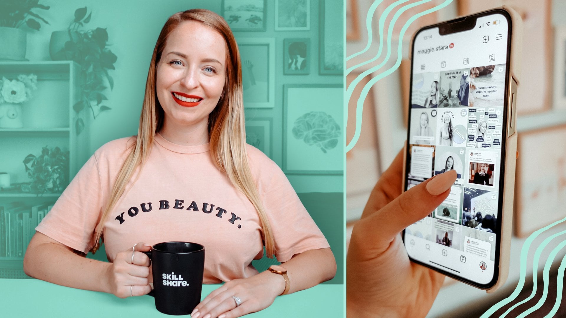
designing things like this and this to this, this, and even this. My name is Maggie Sara, and I've helped more
than 100,000 of my students discover
their passion for Canva, and the course you're
about to take is the course that I wish
I could have taken when I first started
working with Cava for my social media
clients back in 2016. The inside, you're
going to learn everything from the
basics like how to choose the right fonts and
brand colors for your content creation and
where to find videos, images and music
that are licensed for you to freely use
in your designs and how to set up your Canva
workflow so that you can work faster and
smarter, not harder. As we then start creating
content together, you're going to be building
on your Canvas skills with each lesson as
we look at creating incredible graphics
for a variety of fictional and
existing businesses for platforms like Instagram, Facebook, LinkedIn, and YouTube. You will then elevate your
skills by learning to create eye catching social media videos by learning how to layer images and videos on top of each other, how to create
powerful animations. And even how to create
videos that can be used for paid ads on platforms like
Facebook and Instagram. Now, as I've already
said, I love Canva and all of its
incredible features. But unfortunately,
more often than not, its designs are not actually optimized to work
well across devices, which is why I've also
provided you with my own custom tablets
that we'll use throughout the course
so that you can feel confident that whatever
design you create, it's going to look
great on desktop, tablet, and phone screens. But there's so
much more to being a great content creator
than just social media. So we will also be looking
at how to use Canva for business to create
amazing eBooks and how to animate them. How to create professional
business cards, a custom animated
email signature, amazing posters for print, how to create image and video
mockups of your designs, and even how you can
use Canva to create a website that you can
use to conduct surveys, collect emails,
book appointments, and how you can create
professional polls and quizzes. Then together, we're
going to explore the powerful world of AI, where you're going to
learn how to effectively talk to tools like Chat GPT and Canvas dream lab so that
you can start creating powerful images
illustrations and videos to use in your designs, whether they stay digital or you include them in your
printed creations. Finally, we'll then
be moving into the advanced section of the
course where we're really going to step things up a
notch and start creating amazing expert level
animations for infographics, apparel, skin care, and even how to create disappearing gifts
and advanced product ads. And I'll even be covering what you need to know if
you'd like to give your designs away for
free as lead magnets or actually sell them on platforms like Etsy
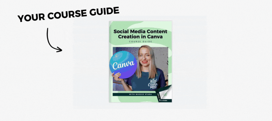
and Creative Market. Of course, you will
have access to your course guide where you'll find all of the resources and templates you need and details about all of the helpful
exercises which we'll cover at the end of each section of
the course so that you'll feel really confident in your skills before
moving forward. I do pretty much live inside of this magical
world of Canva, and I can't wait to show you
around my home and help you make the most out
of the time that you spend with this
amazing software, whether you're using the free
or paid version of CAVA. I hope you're as
excited as I am, and if you're ready, I'll
see you on the inside.
4. Psychology of Colours: Over the many years of
teaching Canva to my students, I've gotten a lot
of questions around colors and color palettes
and color schemes. And so in the next lesson, we're going to get into how to actually select colors
for your brand. But in this lesson, I
just wanted to focus on the psychology behind why
brands pick certain colors. Even though, no, I don't think this is sort of the be
all and end all and you don't necessarily
need to follow this in order to pick the
perfect brand colors. Sometimes the brand colors that you choose
are just ones that resonate with you
for reasons other than the ones we're going to
talk about in this lesson. But I do find this stuff
really fascinating, so I'm hoping you will, as well, and I wanted to share
it with you because sometimes you just
have this idea that you want people to associate your brand with
a particular feeling. You want people to
feel a certain way when they see your content
coming across their feed. And there are, of course, lots of different ways to do that. But colors actually play a really important
part because there's something really primal about how we respond to
certain colors. So I wanted to go over that
with you in this lesson. Okay, so let's take a look at the color emotion guide
and talk about why certain brands have chosen particular colors to connect
with you and their audience. So starting with yellow, which is a fun color, it's
optimistic. It's warm. And brands like
McDonald's and Subway definitely use this because it's playful and it's vibrant, while there are
other brands like Cat who create
construction equipment that also use it because it is also a sign of
safety and caution. Then we've got orange, which is creative.
It's youthful. It's super fun, and it
gets you really pumped up, which makes it perfect for brands like
Nickelodeon and Fanta. Then we're moving on to red. Now, red has actually
been proven to have the ability to raise people's heart rates
when they look at it. So it is this kind
of bold, powerful, exciting color, maybe
even a little bit sexy, depending on the brand. And basically, it makes
it the perfect color for brands who aren't afraid to put themselves out there like
Coca Cola and Netflix. Then we have purple. Purple
is the color of royalty, and it's the color of wisdom. And brands often
use purple's regal, sort of anything is
possible vibe to really draw people in
who are looking for something a little bit
extraordinary because it has that kind of
magical mystical feel, which is exactly why brands
like Hallmark, Cadbury, monster.com, and the Sci fi channel all leverage
the power of purple. And my own brand has a
few different colors, but purple is a
really big part of my color scheme because
of this exact vibe. So I am really a big, big fan of purple
for this reason. We've got blue, which
is a calming color that conveys feelings of
strength and trust. Technology brands like
Dell, IBM, Intel, and Facebook all leverage and take advantage of
this kind of vibe. A lot of tech companies
will often use the color blue for
this specific reason. Then we've got green, which may be this particular
shade of green. Doesn't demonstrate
this very well, but green in general is quite
serene and it's peaceful, and it makes us think of growth, which is why many brands whose products deal
with agriculture and the environment might utilize color like John Deer
and animal planet, but also companies
like Whole Foods, who will take advantage
of the fact that people also associate green with
health and wellness. And you'll notice my own
brand also has a lot of green in it for the purposes of
signifying personal growth. I'm going to go
through my entire color scheme in the next lesson. But for now, just know
that these are some of the decisions that went behind me also choosing
my color scheme. Lastly, we have black, white, and gray, which signify
balance and innovation. Lot of car companies will
use it for this reason, but you'll also see companies
like Apple using white, black and gray, and silver throughout their
brand and products and companies like Nike also getting on board with
this minimalistic look. So they're all sort of using
it for different reasons, but it is kind of this
minimalistic balance innovation, minimalism. All of those kind of vibes will generally be
associated with brands who leverage almost
like a colorless palette. So they're going for this monochromatic black,
white and gray feel. But of course, there
are plenty of brands whose logos and color schemes
are not that clear cut, including my own, which we'll
talk about in a little bit. And not everybody
sort of fits neatly into one color category
like Coca cola, for example, and
that's perfectly fine. But hopefully,
knowing a little bit about the emotions
that we associate with these colors will
really help you in creating content
for social media. For example, if you're going
for a minimalistic feel, you might use light
neutral colors and really simple
fonts like this one. Whereas, if the emotion
you're looking to evoke in your audience is one
of trust and calm, you might use some
more blue hues, light and dark blues, but generally this kind
of blue vibe instead. And if you're looking
for something really fun and playful, then you might actually combine a few really bright
colors together. And in addition to just
the color schemes here, you might start to notice that
across these three slides, we were using different
fonts as well, which help to additionally evoke even more emotions on top of just the color
schemes that we're using. So we're going to
talk about fonts and all of that in
just a little bit. But this was just to sort of demonstrate that it's not
just the words on a page. It really is everything else
that's going on around it. Am I also have a
really great resource here in case you want to look beyond just the meanings
that we were talking about here of loads
of other colors. So I've linked to this
in your course guide. But for now in the next lesson, let's go ahead and
actually look at how to create gorgeous color
palettes, so I'll see there.
5. Build Your Colour Palette: So we've already talked
about this a little bit, but a brand is so much more
than just its colors and its fonts and its logo and all of the other things that
go into building a brand. But brand recognition is a huge part of your
marketing strategy, and colors do have a
lot to do with that. So while I want to encourage you to play around with this and not just sort of stick with the same color scheme
forever and ever, for the sake of
consistency or because someone out there told
you should be doing that, I do think it's important for
you to develop some sort of brand color scheme and learn how to use that
in your design work. Because just imagine that if you woke up tomorrow and
Facebook all of a sudden changed its
signature blue to orange or Coke started using the color blue
for their logo. Or McDonald's arches, golden arches were
no longer so golden, and they just went into
some weird, obscure color. That would be such a weird world to live in because we associate these brands with these very
specific color schemes. But that being said, brands definitely evolve and
change over time. Even really big brands
like Airbnb and Starbucks look totally different
from when they first started their business. And honestly, I
can't really imagine a world in which they'd kept
their original branding, so I'm really glad
that they changed it. And the same is true for me. My own branding has
completely changed from what it initially was when I first started
my business. So we sort of started with this very chaotic brand because initially the
business was more of a travel brand that I was
running with my partner, Nick. So our color scheme
was supposed to symbolize the beach and
the ocean and everything that sort of appealed to digital nomads at the time because that's what
we were doing, and that's who we were
trying to appeal to. And then in 2020 is when I took over the brand
and started running it solo and I toned things down a little same sort
of color theme, but just slightly
different colors and slightly more professional. And then in 2024
is when I started working on the business as my own personal brand
under my own name. And so my color scheme, my logo, my font, even the images that
I'm using are now so much more catering to my ideal student and
my ideal customer. And the brand is bold,
it's professional. It's a little bit playful. Whereas previously it
was sort of all playful. And yeah, there just
wasn't really a strategy in this prior to me actually having a
brand designer to it. And it's also much
more accessible, which is something we're
going to talk about a lot throughout the course. So let's go ahead and find
your perfect color scheme, and we will then add it into our Canva workflow
in a later lesson. But just know that it is absolutely perfectly
fine for you to evolve, your brand, look and feel
as your business evolves, as you evolve as your
brand values evolve. The first awesome free
tool that I want to bring your attention to is
the Eyedropper tool, which is a free
Chrome extension, which allows you
to basically pick any color from
anywhere on the web, whether it's an
image, even a video, anywhere that you're
like, Oh, I love this, and I want to steal
it for a project, or I want to actually build
my color scheme off this. You can continue to pick colors let's say
we're doing this from this website because
we really like the vibes here and we want to build our color
palette around it, and you can start
to see that it's already building out
a color palette, and each color as we hover
over it has its own hex code. So hex code is essentially just a representation
of how much red, green, and blue exists in
this particular color, and it's a code that is a
combination of six characters, so that might be letters,
numbers or both. So this is what you're
going to be able to put into Canva when
you're designing. And if you find a
color scheme that you'll really like or hex
codes you want to save, you can always export it, or you can just copy and paste
these across into Canva. So that's just a really
cool little free extension. But you can also do this
within Canva, as well. So I know at this stage,
you are not familiar with the Canva interface,
and that's okay. We're going to go through just so you know that there is an
option for you to do this within the Canva editor if you're just purely
doing this from images. So the color eyedropper
chrome extension is great because it allows you to do it sort
of from anywhere. But once you're within Canva, you can import an example, color palette or an image like this one and build
out from there. So at this stage, I've
just got black here. So if I was going to go up
top into my color section, you'll notice it says
the document colors are really just transparent,
black and white. But let's say I want to go
ahead and pick some colors from my image so I can use their built in
color picker here, or underneath here,
it'll also say, these are the actual
photo colors. But let's say I want to
actually manually pick these out so I can start building
out a bit of a color scheme. And you'll start to notice
that as I'm picking these, now the document colors
represent those colors as well, so I can use them anywhere
in future designs. Again, you will get to
know this editor so, so well throughout this course. So if you're like, Oh, this looks super
intimidating and I don't know what I'm looking
at, that's totally fine. I just wanted you
to know that even though there are also
external tools that do this, you can also do it within Canva, and then these colors
will show up here so you can continue using
them throughout your design. If we're talking purely
inspiration for color palettes, I love going to
Pinterest and putting in the keyword that I'm
looking to represent. So for example, in this case, it would be a minimalist color
palette because there are actual brand designers
that have put this together because this is
not how my brain works. My brain does not function
in beautiful color schemes, which is why my brand looks so chaotic at
the beginning when I was responsible for creating my own color scheme,
it was not pretty. It did not work. It
was not accessible. It's really just best to sometimes leave it
to the experts, which is why I love
coming to Pintris and browsing and actually
just gathering some ideas. So sometimes you'll
notice it actually has hex codes in the color palettes
and sometimes it won't. So that's where either
the color picker, the eyedropper chrome
extension can be handy, or you could screenshot this
and bring it into Canva or another tool
that I'm going to show you in a little
just so you know, this is a really great way
to just gather inspiration. And then an additional
tool that I want to bring your attention
to is called chroma. Now, chroma is a little
bit design heavy in the sense that it is built
for professional designers, and us mere mortals can
still get value from it, but it's specifically
created for designers. But I do find it really helpful
because it does give you some color combinations that I would just never think
to put together. So the interests and in the
spirit of brainstorming, I did want to just
show you how it works. So, you start off by
choosing 50 colors. That's not necessarily
50 colors that you want to build your
color scheme around. It's just 50 colors
that appeal to you for whatever reason. So
I've already done this. I'm going to go
through this really quickly with you so I can show you exactly what it looks like once you pick
those 50 colors. Alright, so now we're going
to say start training, and it's going to
give us some options. Once you've chosen
your 50 colors, you're going to get
some really trippy and really cool
color combinations here that I would just never, this is not how my
brain works at all. I would never put
these colors together, but how cool does that look? And you can always swap them
around to see what it'll look like with the base
color the other way. And then you can also
favorite some colors and look at the details that'll
tell you the hex codes, and it'll also tell you your web content accessibility
guidelines ratio. So this is something
that's turned off I think by default, but I would definitely
turn this on so you can make sure that
the colors you're being presented with would pass those accessibility
guidelines because you also don't want to
be kind of creating color schemes that don't
work across the Internet. But this is just, again, another cool little tool for you to allow you to brainstorm. And what comes up here is so dependent on the
colors you've chosen. So because I sort of went through it and picked
colors at random, not ones that actually
appeal to me, I would say that these results
are a little bit skewed generally when I do by picking colors that
really appeal to me, I get some probably
better results. But, yeah, it's something
for you to just test out and just have a
little bit of fun with. But then in terms of actually building out your color palette, I would definitely go to coolers and then start the generator. This is one of my favorite, if not my favorite color
palette building tool because it just allows you to be really playful but also really methodical in how you
create your color palettes. So you'll see it says, press the spacebar to generate color palette so we can
press the spacebar, find a color palette
that we like. Oh, I actually really
like this one. And then let's say we like a couple of these colors,
but maybe not all of them. So let's say I like this mint green, so
I'm going to lock it, and I like this mimi pink, and I'm going to lock that, but I'm not quite sure about these. So now, these are going
to be locked into place. But if I keep hitting
this base bar, it's going to continue to shuffle through the
rest of these colors to find other combinations that will work with the
ones I've already chosen. Then let's say I
like this purple, but maybe it's not quite
where I want it to be. Maybe I want to go a little bit lighter or a
little bit darker, or I actually just want to
select the color by hand. So I can go ahead
and do that and I can use a slider
to go more blue, more red, more orange. Et cetera, et cetera. So you can play around with
this so so much. And if you don't
want to go through the process of doing this
manually, of course, you can also upload
your own sort of reference photo just
like you would within Canva and build out your
color palette from there. It's going to give you a
color palette already. But let's say you don't
really think that the colors that it's chosen are applicable to what
you're looking for. Maybe you want it to
be slightly different. So let's say that's my color
palette, I can then say, I'm going to open that in my generator so I
can tweak these a tiny bit because I don't
know what this color is, but I don't love it. Let's yeah, let's go a
little bit more gray. Okay, so let's say I really
love this color palette. Now I can go ahead
and export that, and I can export that
as a PDF or an image. Doesn't really, hugely matter. We just want to make
sure that we are able to actually save the hex codes so that we can use
them later on. Or you can also sign
into coolers so that you can save your color palettes,
which is also an option. Then once you export it,
here's how it'll look. So you'll have all
your hex codes there that you can import into Canva. So that is a really, really lovely way of building
out your color palette. Lastly, let's talk
about accessibility. And as I said, this is
something I'm going to talk a lot about
throughout the course because I don't think that enough people are talking about it in design courses. And I think as human beings, we sort of assume
that other people interpret the world the
same way that we do, and there's a very good
chance that the way you see color is not the same way that somebody else
might see color, which is why these tools exist. So I'm going to show you what my own color scheme looks
like with this checker. So I've just put in
six of my colors, and it will effectively
tell me how I can utilize my color scheme in a way that's accessible for
everyone that everyone can read the text on top of
the colors that I'm using. So it's essentially just
a way for you to decide, are the colors that
you've chosen? Do you have any
kind of green flags here or is it all sort of grayed out because you've chosen some colors that just do not
play together very well? As long as you have
at least a couple of color combinations that work that will allow you
to create content around, that's all we're really
looking for at this stage, and we are going to actually
look at a tool within Canva that's going to help with this when it comes to
your actual designs. But this is just a really
quick and easy way for you to do,
like, a real quick, final check to say, Oh, the color scheme that
I've built is good to go. I don't have to worry about
it not looking good on social media or within emails
or on someone's website. And in a little bit,
we're going to go into how different fonts
and font pairings also play a really big role in establishing
your brand online. But for now in the next lesson, I wanted to go into
something that we should all be across
as content creators, which is all about understanding different licenses and how you can utilize different assets based on where you're
getting them from. So more on that in the next
lesson, and I'll see you.
6. Get to Know Licensing: Okay, so as we go
into this lesson, I do want to say that this
is not designed to make you super paranoid about using
other people's content, and I'm going to be
giving you some awesome free to use websites
in the next lesson. But I mainly just wanted to go over this because I
think it's important for you to know
that there are just some restrictions in terms of how you can utilize
assets from websites online, and you basically just
want to make sure you're doing everything
correctly and legally. But I should also say, I am not a copyright lawyer, so always make sure that you are checking the licensing options. Whatever website you're
pulling images from, it will always have
details about how you're able to utilize
images, videos, music. And all the assets that you need in your content creation. So always do your own research, especially if you're
going to be pulling from websites outside of the ones that I am going to be mentioning
within this course. And yes, those are just some
disclaimers, I suppose. But now let's just
get into it and start diving into the
world of licensing. So the royalty free license
type grants the buyer a determined set
of rights to use content in a few different
ways for a flat one time fee. So that means you effectively pay for the license only once, and you can use
it forever within the accepted ways that it details without any
further payment. Usually see stock image
companies use this term a lot. So you might be able
to purchase an image once from a site like
Shutterstock as an example, and then you can use
it on your own website as many times as you want. Then we have Creative Commons, which is a nonprofit organization
dedicated to building globally accessible
public commons of knowledge and culture, and they help creators license their content according to
the type of restrictions that they want to place on people purchasing and using their
content or in some cases, not actually having to
purchase their content. CC zero or creative common zero is the least restrictive
type of license out there. So it allows people
to distribute, remake, adapt, and build on, and even commercially without actually needing to attribute the original creator
of the work. Of course, a lot
of the time, you will also see a stipulation that'll say crediting is
appreciated but not required. So you can always credit
the original creator, but you're not
legally obligated. The other creative commons
licenses might allow for free use but might require
attribution to the author. They might say, Yes,
absolutely, use it, you don't have to pay
for it, but you have to attribute the
original creator. You have to credit
them with that work. Then we have non commercial, which means something
is not primarily intended for or directed towards commercial advantage or
monetary compensation by an individual
or organization, which is a lot of fancy words, which basically means
that, for example, if you're using this in a lecture presentation
in a class that you're taking or for
your personal projects, then it would be non commercial. So if you're using
that image for an arts and crafts
project, non commercial. As commercial use
of an image would be reproducing it in
any manner that is primarily intended
for or directed towards commercial advantage
or monetary compensation. So examples of that
would be using images or videos or music or any other media that would be used in TV production or in, let's say, advertising on
Facebook or Instagram. The good news is that these kinds of
websites that provide either free or paid assets are pretty much dedicated
to transparency. So they're always
going to be giving you warnings and details
about how you can and cannot use their assets that you're either taking or
purchasing from their websites. So that is making things
a little bit easier, but also as a side note, I would say a fair
bit of the time. I wouldn't say
majority of the time, but a fair bit of the time
if you do end breaching copyright laws and uploading
something that you're not allowed to legally use
for your own purposes, you will just kind of
get a warning from sites like Facebook or
YouTube specifically, that'll say, This has a
copyrighted element in it. It's usually music, but
it can be other things. And it'll just tell
you to re upload it or it'll tell you
you can't monetize it, and there's lots of
other different things. But I would just say yeah, don't depend on
that because other bad things can also happen. So I would just get into really good habits and making sure that whatever assets you're using are either 100% free
for you to use or have been purchased in the right
way from these websites. So essentially, I guess what
I'm saying is do not use Google images because I've seen so many people just, like, a Google man laughing
with salad and just, I don't know why you would
use that as a search term. I don't know. Maybe you're
making a fun PowerPoint. Man laughing with salad. And then there's all
these warnings that say, Hey, this is not
free for you to use. And then people just put
it up on their website. Anyways, and that can
create a host of issues. So just don't use
gibleimages and use some of the amazing websites that I'm about to provide you with
in the next lesson instead. Okay. I'll see you there.
7. Find Free Images & Videos: Good So bigger brands out there will often sick to
taking their own images and videos or purchasing these from more high end professional
sites like Shutterstock for images or story blocks
for professional videos, because these sites also
allow them to be very specific in terms of the search terms that
they're looking for. So what I mean is that if I
was a business owner looking for an image of something
like a woman in business attire shooting
a goatfshO cats having a picnic and reenacting
scenes from the Titanic, then I would definitely
have to purchase these because they're
so ridiculously specific that no one's gonna really give these kinds
of images away for free. But I'd say that
most of the time, we're just looking
for a nice image to put as the featured image of a blog post or in the background of a design we're creating
for a social media graphic. In which case, a lot of the free websites that
we're going to discuss in this lesson are definitely not just going to meet
your expectations, but I'd say they're
going to exceed them because I think
that they just have so many extra capabilities
now that they definitely didn't when I first started designing with these websites. But also, one thing I
would say is that this is especially going
to become key if you're a Canva free user. Because you're so
much more limited with the assets that you're able to access within Canva if
you're not on the Pro plan. But that being said, I, as a Canva P user, actually use these websites
pretty much daily as well, because they have
other capabilities and also much more search
engine functionality than what's available
within Canva. So I think they're definitely
it's worthwhile for both Canva free Campa Pro users to know about these websites. And, of course, I provided
all the links within your course guide as
well as a few extras. So let's just get into it. So let's start with Unsplash because Unsplash
has some really, really gorgeous,
beautiful, very artsy, minimalistic photos that are
perfect for so many designs. So within Unsplash,
you can search for, let's say, in this case,
let's search for a beach. And you will have some that
are on the unsplash plus. So you'll see a
little plus there, which means that is a paid
feature of the platform. You also see some ads, but largely you will find images like this one
that are completely free for you to use and download in various different dimensions, which is a huge, huge benefit, so you can go as large as
the original image size, which in this case is pretty much four k, so that's awesome. Other great option of Unsplash
is if you're logged in, you can create collections. So in this case, I could just create a brand new collection, which in this case, could
be something like a beach. And these are I mean, I could make it a
private collection so no one else can see it. But let's say I'm doing
this for a client, I can just spend maybe a half hour just researching images that I think
they'll like. Time I have an image like
this one that I really like, if I scroll down, it'll give
me related images as well. So I can keep going down these
rabbit holes of collecting related images into
my collection and then maybe go and download
them all at the same time, or maybe even just send the
link to my client and say, What do you think
of these images for our next blog post or our next social media
posts, et cetera. So that's a really beautiful
option in terms of Osplash. If you're ever curious
about their licensing, you can head on over
to License here. Will essentially tell
you that all images can be downloaded
and used for free, commercial and non
commercial purposes. No permission is required,
but appreciated. Essentially, you can do
anything with these images that you want except
to sell them. So you can't just take an image off of Nsplash and
literally just say, pay me 40 bucks for this, and you can't create a
competitive website. Everything else you
can do with them. But of course, always check licenses if you're
not quite sure. Moving on, I did just want to say that whenever
you're in Unsplash, you can actually filter
your search results by the license type in terms
of free or Unsplash plus. So if you don't want to
see any of the Unsplash plus images because
it's a paid option, you can just search by free. I will still have some
random ads for other things, but that way you
know you're only searching for free images. You can also go by landscape
or portrait images only, which is really handy if you are searching specifically for images for social
media posts and you know you want them to
be in vertical format. It's not quite as critical with images as it is with videos, which we'll talk about
in a little bit, but just so you know that that is an option within Unsplash. Nsplash is a really
great option for that. I also really,
really love pexels. I largely use pexels for videos, but they also have really,
really beautiful photos. So we are going to go and
look for a beach video. And in here, I can also
filter this by orientation. So let's say I'm looking
for videos specifically for social media like
Instagram and TikTok, so I want vertical videos only. So that's what I
would use pexels for. It's really, really
beautiful for that, and they do have some very
high quality gorgeous videos. And again, you would want to make sure that you
are logged in, so you can create collections just like you can in Unsplash. And once again, you can download in various
different formats. If you are going to go
through to downloading, it'll tell you you can show appreciation or donate
to the creator. But again, with pixels, there's no attribution that's required. So those are my two go to. There's also Pixabay, which
is a lot more stock imaging, but they've got a lot better
search engine functionality. So for example, with
splash and pixels, you are able to get
so much variation for something like beach. But if you're going to
get really specific, like you want men on Mountain
or something like that, that's a little
bit more specific, you might need something a
little bit more stock imaging. And of course, they're going to have promotions here as well. But then they're going to possibly have a little
bit more variation and a few more options for you for more specific keywords
like man on Mountain. Within Pixabay, instead
of searching for images, you can also search
for music and sound effects, gifts, et cetera, et cetera you can
also find free music from directly within
the YouTube studio, which I'm going to link you to, but within your YouTube
channel, which you will have, even if you don't have an
active channel per se, but once you're within
YouTube Studio, within the audio library tab, you've got a whole range of
all these beautiful music. And when you check
the license type, it'll tell you that there's
no attribution required, and you're able to
use this music, however you want,
not just on YouTube. You can also use it on platforms like Instagram and TikTok. So this is where you can just go through and download some music. That's an easy way to do that. Or the next step up again, is to use a website like Upbeat. Now, I love upbeat because it's $7 a month at the
moment, so it's really, really affordable, but it's got a lot more variation in terms of the tracks
that you're able to get. It's also a little bit smarter. So once you start
downloading some music, it will kind of get to know
what kind of music you like, and it'll start recommending some future music
tracks that are coming out that are similar to the ones that you've downloaded before. So as you're pulling images
from these websites, I would definitely
create some sort of Google Drive, Dropbox system, whatever your preferred
Cloud storage system is, and organize these assets so that you know that
three years from now, five years from now, this is an image you
pulled from Esplash or from Pixabay or from Pexels, so you know it's free for
you to use down the line, and you're keeping it separate from any purchased assets or any assets that are not freely licensed for you to use for any purpose whatsoever. And it also just makes it really nice and easy because that way, things are actually a
little bit more organized. So if you need to
look for images that you've used in the past, they're organized somewhere
outside of Canva, as well. So that's
my preference. I would definitely
put it somewhere in a Cloud storage system. And later, we're also going to talk about and look at what assets are available
to you within the actual Canva
design interface. But for now, in the next lesson, we're going to start
talking about how to find the best fonts for your brand. So
I'll see you there.
9. Do NOT Do This!: So I'm going to be very
honest in saying that this lesson definitely has
a very dramatic title, but I just really needed you
to hit play because this is an important lesson where
we're going to talk about some key terminology, but also some really
key mistakes that I see a lot of beginners
in the design process make that I would
ideally want you to not make and overcome them before we
even start designing. So we're going to get
into all of that. But one thing I did want to also say is that for me personally, it physically hurts me
a little bit to think about my very first designs that I did for clients
back in the day. But it wouldn't I wouldn't
be here teaching you this, and I wouldn't be here
feeling confident in my design skills if I didn't make those early days mistakes. So I think it's really
important to learn the concepts and learn how
to overcome these mistakes, but the real way
that you're going to do that is to
actually make a lot of mistakes and get
better and better and get 1% better with each and every
design that you make. So I think practice is
definitely going to be key, but hopefully we're
also going to be able to kind of allow you to embody these principles
that we're going to talk about because I'm going to talk about them a lot
as we actually design. But one thing I also just
really wanted to point out is, I think it would be really cool for you to save the designs that you're making in the
early days as a beginner, somewhere in Google Drive or in Dropbox or somewhere in a cloud
storage outside of Canva, so that in three years from now, five years from
now, you can look back at those designs
and go, Whoa. I am so much better
than this now. I know so much more and look how far I've come
because I think it's really easy for
us to take it for granted and sort of forget
how much we're improving. And not actually
take time to reflect on how far we've
come and maybe only just get overwhelmed at how
far we still have to go and start comparing our design skills to
other people online. So I think it's really
cool to just keep sort of a memento box of your early design somewhere so that you can really
track your progress. I'm really glad I kept my early client designs because now I can look
back at that and go, Okay, I know what I
wouldn't do there, and I know how we do that
very, very differently. But that's great because
it gives me the confidence in knowing that I'm a
lot better at designing. Let's get started with
some key terms here. You might have heard of both of these file formats
at some point, but just to cover the basics, there will be some quality
that's compromised when an image that's
taken on a camera is converted into a JPEG, but it allows you to have an image that's
smaller in size. And when I'm talking
about size here, I mean, the amount of space
that an image would take up on your computer
or in Cloud storage, not the actual dimensions
of an image because those wouldn't change
depending on the file format. Then PN Gs are
larger in file size, but will allow you to
have the option of having transparent
backgrounds like I have here, and they also tend to handle things like gradients
much better, which when you save a design
with a gradient as a JPEG, sometimes the gradient will
just look a bit funny. So generally speaking, I
always save my designs from Cava in PNG
format because it also holds really crisp lines around your illustrations and contrast
better than JPEG images. But photos you'll
be pulling from the web from sites like
Osplash will generally be in JPEG format because they're already
edited and don't have the complex design elements that your finish creation if you're not trying to
save on space too much, I would just recommend saving your creations as PNG files, and then you can always
use free online tools to compress your images
or change file types, which is something we're
going to talk about later on. But it's important to note
that you can always go down in file size and
also in dimensions, but you can't really take
an image and make it larger without then
compromising on quality. So that's why we try to save in the best quality and
format possible. We have two different types
of digital graphic files. We have rasters and vectors, and I know this is maybe going
to seem a bit complicated, but I promise there's a
reason we're learning this because you will hear this
get thrown around a lot, not just within this course, but also in a lot
of websites where you're going to continue to
upscale past this course. It is important. Arasographic is made up of a grid
of many pixels, whereas a vector graphic is made up of many lines or paths. The main difference between
a vector and a raster is essentially the ability for
you to scale that graphic. Since a raster is made up of a certain amount of pixels
at a certain point, scaling that image is
going to become what we would call
pixelated or blurry, but a vector doesn't
actually have that problem. So because it can be
scaled to any size without losing that sharp edge and
all that beautiful contrast, it's generally the
best option for logos, which often have a
really big range of applications from tiny, teeny, tiny size of a pencil or the side of a pencil to
the side of a building. So that's why we
want to save things in vector format
whenever possible. Camera now has a
feature for you to export in SVG, which
is a vector file. So if this is something that
you need where you need a graphic to be printed
on a poster or T shirt, you'll have the ability
to export it as a vector. But keep in mind that
photos can't actually be made into vectors.
Are some exceptions. There are some AI
tools that do this, but it's not
converted one to one. So if you're trying to
save a photo as a vector, it doesn't just
magically make it into a vector unless it's
converted properly. So that's getting
a bit complicated. But essentially, photos
will come in raster format. Vectors are usually saved for
illustrations and shapes. Other than just
size and the usage, it's also really
important for you to decide whether you're designing
for web or for print. If you would like to
have the potential to use your graphic
for both purposes, then design it for print in mind as it's the higher
quality format, and you can always
repurpose it for web. And the main difference
in using it for web or print is that your
dimensions will either be in pixels for
web or in inches or centimeters for print because of what we talked about
with rasters and vectors. So this is important because
web graphics will normally be at 72 pixels per inch or PPI, while print materials
will have a resolution of 300 DPI or dots per inch. That sounds super jargony, but all this means is
that in web graphics, there will be 72 tiny pixels of color in every
inch of that graphic, where print materials will require 300 little
colored dots per inch, making them a beautiful,
solid color we printed. All you really have to concern yourself with at this point is, does it need to be printed? If it does, then make
sure you're just setting up your design document
in the right dimensions, in centimeters or
inches so that it has all of the things that it needs in order to be printed in the
correct dimensions. And then Canvas pretty
much going to take care of the rest in terms
of your resolution. And it's also going to allow you to export it as PDF for print. So that's going to give you
that nice crisp design. And if that's not really making sense at this
stage, it's okay. We're going to go over
this a lot when we go into the Cava for Business
section of the course when we talk about printing e books and printing business cards. So you're going to see how
that all works in action. I just wanted you to be familiar with the idea of designing for print versus digital because there are some
subtle differences. Earning is not something
you need to know about in terms of the
actual term for it, but it's essentially
just the adjustment of spaces between
characters and in Canva. The reason this is relevant is because you will
be able to play around with this through
their letter spacing tool, and you want to make sure
you're essentially just not squishing your letters
a little bit too much, but you also want to make sure that your letters
are not so far apart that it's really hard to actually read the words
they're supposed to. Much like kerning,
you want to make sure that all of your
letters are evenly spaced out and that their line height is appropriate for the graphic that
you're creating, which again, are some of the tools we're going to
be playing around with. Now, I've been teaching this
course for a long time now, and one of the most
common mistakes that I see my students making is not having enough
contrast between the text and the background
of their graphics. So make sure to
keep your contrast high to prevent this issue, which is something we're
going to practice a lot. And another common
mistake is the overuse of capital letters when it comes to handwritten fonts
or script fonts. Some brands exclusively use capital letters, which
is totally fine, but these are best saved
for sort of San sera fonts, which, as you'll remember, have that minimalistic
or modern feel. Finally, you also
want to make sure you're being careful
with your type size. So of course, it's better for your text to be too
big than too small, but neither option is
great in this instance. And text that's too
small on desktops, if you're designing on
a desktop will often be completely unreadable
on a mobile device. So you really want to
make sure that you are designing with
your type size, your contrast your
capitalization and all of these things in mind, which, again, we're
going to put into practice throughout the course. And let's talk about hierarchy. So this is quite a funny post that I thought I would include, and you can, of course, pause this lesson if you want
to have a look at it. But this is essentially
demonstrating why hierarchy is so
important because your brain naturally works in specific sizes and
in color contrast. There's a method to the madness when it
comes to hierarchy. So within the world of design, this refers to the
arrangement of the visual elements in order
to signify importance. Essentially, the most
important elements are made to hold the most
attention by being bigger, more colorful, or using
a particular font, and the reverse is true for the least important
elements on the page. So just remember that if you're designing a graphic and
everything sort of stands out, then nothing is
really standing out. So don't be afraid to highlight the most important parts of your design for
your audience. Now, a lot of times,
it's really easy to get caught up in your
brand and style and forget who the
actual intended audience is for that particular design. And this is actually really true when you're working within Cava for your own business
or for other clients, and then you have to design your child's birthday
invitation or something, and it ends up looking
super corporate because that's just how
your brain is wired. So that's why I've sort
of used this example here because it's really
good to remember yes, you want your design
to look fantastic. If it's not right for
the people that you're actually trying to communicate
with and design for, then it's just not
going to work. So always remind yourself that you're designing
for the brand, of course, but
you're also really designing for their
target audience. And just like you have
a palette of colors, you should also have a carefully selected
palette of fonts, which is something we
already talked about. But just like colors,
certain fonts definitely have moods or
emotions associated with them, so you probably
use something like Comic Sands to represent
a law firm, for example. So you want to make sure that your fonts not only work well together but really work well with the brand and
their intended audience. And this is perhaps the
most important lesson that I can give you in
the world of design, which is to try not to do too much because especially
when you're a beginner, you have all of these amazing skills and all this amazing
knowledge in your brain, and you just want to
put it all into action. And then you end up
doing way too much, and it ends up being way less effective
than if you did less. And the way I'll put it to you is think about this
particular course. There's a reason why there are so many lessons in the course, and each lesson covers
one or two new skills because these skills don't all
just belong in one design. They each have their own
purpose in different designs. So it's nice to just keep things simple whenever possible. So just remember that sometimes the empty parts of
your design can be just as important
as the ones you fill. Space can really help
to bring more focus on a specific aspect of your composition and let
your design breathe, and it can help to balance
everything out and bring some sophistication to your design a
lot of the time. Let's talk about
calls to action. This is something that's
probably a little bit more common with website design. But even on really
simple graphics, you'll often see companies
who are advertising a sale. They're asking for an email. They're asking for a subscriber. They're asking people to follow. They're giving you
their phone number. They're just doing so
much in one tiny graphic, and it's so much to focus on that people don't really
know what action to take. So you want to limit
each graphic to one maybe at the absolute
maximum two calls to action. Finally, you always
want to make sure that you know what your
designs look like on a phone screen because just because something looks great
on your computer screen, especially if you've got
external monitors and you've got this giant screen
and everything looks great, does not mean that it'll work on Instagram or
another mobile app. So always check, check
and check again. So I know that was a lot of
information, and like I said, we're going to be putting
it all into action, so you're going to feel
really confident in actually using these
tips and strategies. And this terminology all
throughout the course. But I know it's not the most
exciting stuff in the world. I'm just really
grateful that you were able to stick
with me through it. And now in the next
section of the course, we are going to dive into
your Canva workflow and how to make the most out of the time that
you spend within Canva. But first, I want to get to our very first design exercise in the next lesson, so I'll see.
10. Exercise: Craft Your Brand Kit: So remember, at the beginning, I said that we learn by doing not just by watching
other people do stuff. So this is your
opportunity to put what you've learned up until
this point into action. And you can do this exercise for yourself as a
personal brand, for your business or an
existing brand out there, or a completely made up brand that has come out of
your imagination. But either way, actually just doing this for a business
of your choosing is going to allow you to have
a brand that you can create assets for throughout the course so you can practice as we go. Now, I want to be clear
that as you do this, you might find that when
we get to designing, you'll put these colors that you choose and fonts that you choose and all these brand assets. You might put them
into action within Canva and realize that actually they don't really work together
as well as you'd hoped, especially when we get to
talking about accessibility. There's so many times that I've created something like
this for a client and go, Oh, when I put this
into a design, it's completely gibberish
and unreadable, and these fonts don't work
on a small phone screen, even though they look
beautiful on desktop, and you won't really know that until we actually
start designing. The point at this point is to just take action and
create something, and we can sort of tweak
and refine as we go. But at this point, I just
want you to refer to the exercise in your course guide so that we can
outline the following. Identify the brand name
of the business that you're going to be designing
for throughout the course. Again, you can
totally make this up, or it can just be your own
name or an existing business. Anything is fine, just a
brand that you can use to practice your skills on as we go through these lessons. Then I know this is a little bit out of the box in terms of what we're covering
in this course, but I would love it
if you would choose some brand values for your business or your
fictitious business. So you can pick four
to five core values that you think are
representative of your brand. Even if it's a made up brand, you can use this list for
inspiration and just choose four to five values
that you think you would like people to
associate with this brand. Create a color palette
for your brand inside of coolers or a different tool that we've used
throughout the course, and then we'll organize this
later on inside of Canva. If you're a Cava P user, you will have access to as many colors and color
palettes as you want. As a free user, you will only be limited to three colors
in your brand kit, but there are
workarounds to this, and I will be showing you that in the next
section of the course. So still feel free to choose as many colors as
you want, but not too many. Then you want to
choose ideally two, but maximum three fonts for your brand using the
resources that we covered in our fonts lesson and maybe add some links
to these inside of a Google Doc or somewhere else so that we can
organize these later on. But keep in mind that
only Canva pro users can import fonts into Canva. So if your trosen fonts are not within Canva and
you're on the free plan, you may have to find
a font equivalent that is within Canva and
free for you to use. So if you'd like to skip
this step until we get inside of Canvas so you can pick from the fonts that
are available to you, that is totally okay by me. And then gather five
to ten free images and five to ten free videos that you think could be used
in social media content for your brand using the websites that we've discussed so far. And you can just download
these to your computer for now or save them
to a Cloud storage, and I'll be showing you
how to utilize these and organize these within Canva in the next section
of the course. All of this is really
at this point, just an exercise in gathering assets and
getting some inspiration. Then the next section
of the course, we're going to then talk
about how to organize all of this within Canva so you can actually use it for
your design work. So make sure to just go and
gather some inspiration and gather a few assets using the tools that we've already
used in this section. Now the next section
of the course, we're going to dive into Canva workflow and how you can utilize it to the
best of your abilities, which is full of basically
all the tips that I wish I knew when I first
started designing within Canva. I'll see you in the next lesson.
11. Introduction: Get to Know Canva: So now that we've covered
our design basics, consider this my
later this season on insert your preferred
reality TV show here, where I basically give you a preview of what's
still to come, which is that later
in the course, we're going to create
awesome designs like this one and this one, and later even these. To get there, we do
need to understand exactly how Canva works
and how we can use it. For context, I have created over 1,500 different project
files within Canva, and each of those files has
up to 300 pages within it, and that's not even
including my client work. So you can imagine how
messy things would get if you get really disorganized
in a tool like Canva. So you may not be creating
quite that many designs, or you might be creating more if you're feeling ambitious, but I think either way, you just want to make
sure you're getting into best practices from the
get go because otherwise, it creates so much more
work for you down the line. Imagine you're
working with somebody in your Canva dashboard and you're trying to
find a YouTube thumbnail that you created two years ago, and you labeled it
cute kitten picks, and now it's sort
of lost forever because we didn't know how
to properly organize things. So I know organization and workflow stuff is not the
funnest topic in the world, especially for us
right brained folk. But I think we can make
it a little bit fun and a little bit playful and
definitely incredibly useful. So in this section
of the course, we're going to go into
how to navigate Canva, how to organize
things within Canva, how to set up your brand,
how to work with others, and how to find inspiration for your designs so that
you're never feeling like you're starting
from scratch before we actually go into the design section in the next next section
of the course. All right, so hopefully we can find bits and pieces
that are going to allow us to be playful with this organization and workflow
section of the course, and I will see you
in the next lesson.
12. Canva Pro vs. Free: So I'm within my Canva
Pro dashboard here. It is in dark mode, and I'm going to keep it in dark mode throughout
this course, which is a setting that you can adjust within
the settings option if you are on the Canva
light mode option, which is the default option. The reason that I'm
using dark mode for this course is because it is
gentler on your eyesight, and we're going to be going
through a lot of content. So it's a little bit
easier for you to actually watch as we're
going through the course. But also, it really helps your designs really
stand out because nothing that is
not your design is really taking up your attention. So I find it really,
really great for that. Also, with the amount of time
that I spend within Canva, I want to be as gentle on
my eyes as I possibly can, so I really prefer dark mode, but just so you know
that's something you can adjust
within the settings. Then in terms of the
designs that you see here, it will really depend on how
much you're using Canva. Obviously, I use it quite a lot. So I've got, I don't know, 15, 1,600 design project
files within here. It's a lot. And also, I have my students
designs within here. So you'll see there are some additional owners
here of these designs. So I generally have
viewing rights, not editing rights to these. So it looks like it's within
my own Canva dashboard, but actually they
retain the ownership, and I just have permissions
to view that design. So Canva adds it in
here for easy access. Terms of accessing things
like templates within here, there are always
ten different ways to do something within Canvas. So you have the options here to look at things
like social media. You also have the option
to just search for things within Canva and also
within your own library, which we're going to
look at in a sec. And then you have
some options on the left hand bar here as well. So the location of these
things might change, but the general gist
is exactly the same. So Canva has gone through
so many iterations, and you will always be able to access templates in
a few different ways. So we're going to head
on over to templates so we can have a look at
how to utilize these. He has some options
here already, like we did in the home
screen where you can go, or I'm just looking
for Instagram stories, for example, so these are going to be these nice vertical. The actual dimensions of
these are ten ADP by 1920. So these are pixels
because we're going to be looking at
them on a mobile screen. So you'll remember from
a previous lesson, we're looking at these
in pixel format. So that's the format that these are always going to be in. And at the moment, it's kind of showing me a
little bit of everything. And now I can start to
really narrow this down. So I have 20,000
templates to look at, and I can then filter
this down further by looking at maybe
elegant Instagram stories, and maybe I'm looking
at marketing, and maybe I'm looking at
animated stories or I'm looking at all of these different things or maybe I'm just actually
searching by color. But let's say, in
this case, these are the three things that I
want to be looking at, and it's going to give
me some options here. Additionally, I can narrow this down just by a
particular field. So let's say I want to look at real estate Instagram story. So that way, if this
is my industry, I'm not being given
Instagram stories for pet hotels and skincare brands. I'm really just looking at
ones for within my industry. So I'm still at 20,000
templance, which is a lot, but at least I'm looking at ones that are directly
within my industry. So you can browse through and you can start to really see some of these will
sort of be animated. You'll see this
little play icon, which means that there is some sort of animation
or video component. You will also start to
see these little crowns in the bottom right hand corner, which means it's only available
for me as a pro user. You're a Canva free user, as soon as you would
click into this, it would basically say, you need to upgrade in order to use it. If it doesn't have
this little crown, it means it's completely
free for everybody to use. So there's still
lots and lots of beautiful free templates
for anyone to use in Canva. But just because you select a particular template
like this one and we say, we want to start customizing it, doesn't mean that
you're stuck with it. It doesn't mean that you can't still continue to browse
through templates. You just have a little bit less limited screen real estate because you do it here
within the design section, and you still are able
to look for the same. So, let's say, real estate, Instagram story,
same sort of search. But you don't have it across
your whole beautiful screen. You just have it over
here. So it takes a little bit longer to go
through the templates. That's the only sort
of main difference. But you can continue to add some more designs to
your project file. So we can go ahead
and add a new page, and let's say we also
really like this one. So we're going to add it in. And then it's going to give me some recommendations
for ones that are similar to the one that
I have just selected. So I can continue adding
some designs here and find as many as I like
before I begin design. The next thing I definitely
want to make sure we get into the habit of is
renaming our designs. So in this case, I would
say something like Instagram story, real estate. And in my case, I
would probably say demo because I want
to identify that this was for a particular
lesson in my course and not an actual design I was doing for myself
or for a client. But the reason we're doing
this is so that we can really, really easily find our design
a year from now, two years. It can be really messy if this design said something
like funny kittens, and then you didn't rename it. So definitely make sure
you're renaming it. And I would go a step
further and actually organize this within
my folder structure. So I would go to File, and I would move to a folder, and then you could create
new folders within here. But in my case, I know that
I have a particular folder, which is within my Canva course. So for me, I would go my
projects and course materials, Canva course materials,
and lesson demos. And that's where
I would move this so that I know you know, two years from now that this
particular project file was just a demo for
a particular lesson. But if all else fails and you
still really need to find your file and you
don't really remember what you named it and you
didn't put it in a folder, but maybe you remember something
that was on a graphic. For example, questions to ask prior to
renovating your home. You remember that that
was in your design. Another thing you can do is actually just head back
to your dashboard, and instead of looking at
real estate Instagram story, you would just say
renovating your home. And then instead of looking
at Canvas templates for this, we would exit out of that, and we would be looking
at our own content here. And it's going to pull out any designs that
I've created that have these words or similar words to it
within the design itself. So it's the fifth one across. It's over here, and
I can just pull that straight up and
continue designing. Then let's quickly talk about what's in our left
hand sidebar here. So we've got our
project section, which is where you can organize your assets so make sure that
this makes sense to you. It doesn't really have to
make sense to everyone else, as long as there's some sort of method to the madness,
that's all that matters. And you can have
folders within folders, and you can have
different folders for your images and
for your videos. And again, that's something
that we're going to do a lot throughout the course, but just so you know
that when you just chuck things into Canva
into your upload section, here is where we're
going to organize them, and that is something we're
going to talk a lot about. For now, let's take a look
at something that is a little bit different on the Canva Pro and
Canva free plan, which is your brand. So within your brand
kits within Canva, you can have as
many brand kits as you want on Canvas Pro version, whereas on Canvas free version, you're limited to
just one brand kit with only three brand colors. So because I'm on the
Pro version here, I have multiple color palettes, and there is a reason for this. I'm going to show you in
the next lesson as to why I have a few different
color palettes here. But effectively, I can have as many color
palettes as I want. I could technically have
more and more fonts. I can upload my own fonts. And I can have things
like my brand voice. I can have as many brand photos. So I've had a photo shoot done. So my brand photos are in here. I have some brand icons, and, of course, I've
got my brand logos. So you can have
as many assets as you want on the Pro
plan, on the free plan. You really are limited to
only the three colors, but there is a little bit
of a workaround to that, which I'm going to
show you by logging into my Cava free interface. Now I'm logged into my
Canva free interface, and it is in light mode so that I can sort of differentiate
between the two. And obviously, I had it open when I looked at some
student assignments, which is why there are some student assignments
that I don't own, but that have been
opened in here. But really, I don't use this for anything
other than demos, so there's not much here. And so I just wanted to
show you within projects, you can still create
folders in here. As many as you want, and you can organize things,
which is beautiful. But within the actual
brand section, we've got one brand kit, and we are limited to
just these three colors. I mean, not necessarily
these three colors. You can change them
to your actual hex codes, whatever they are. You just put in your hex code. But the problem is you
can't add anymore, and it's going to ask you to upgrade if you want
to add anymore. You can't really
add in your logos. You can't really add in
fonts and do any of that, which can be a little bit limiting when you're
actually designing, but there is a way around it. So you can essentially create
this kind of file that just has your brand kit
within so for example, let's say, my brand for this, my demo brand has
these six colors, and then this is
my heading font, and this is my paragraph font. What I can then do at any time is copy this over
by highlighting everything and just clicking
on Copy or Command, see if you're on a Mac or
Control, see if you're on a PC. Then whenever I
create a new design, so let's just say we're creating a random sort of square design, what I can do is paste
these assets in here by either right clicking
and clicking on paste or just Command
V or Control V here. It's going to bring
in this sort of brand kit from my
other project file, and then anytime I'm
creating any designs here, let's just select a design from Canva so that I can show you
what that might look like. Let's select one that's a
little bit easier to work with. Oh, that's a Canva P. So we
need to make sure we're using a Canva free design that doesn't have the
little crown in the corner. So we're using a
Canva free design. Now, let's say, I want
to make sure that the background color is
one of my brand colors. What I can do is head to
the background color, and I can see all of my
other brand colors are automatically there because it says these are my
document colors. So because my brand kit is
on the first page of this, it means that I can now
really easily access my brand colors as I'm actually going through and editing
any designs like this. So that makes it just
a little bit easier. Of course, it would be
much more convenient if my brand kit was
really nicely here, so I know exactly what
my brand colors are. But that's just a little
bit of a workaround. Same with your fonts, so
you can just say, Okay, I want to make sure that this is my document font
or my brand font. And then in the document fonts, I can see that my
brand fonts are really easily accessible because they are on the first
page of this design. So that's just a little bit of a workaround for
Canva for users. Same when it comes to images. So within the elements tab, let's say we want to
put minimalistic home, and we go to photos. We've got a lot of elements
with the Canva Pro icon. Now, in the filter search,
on the Pro version, you can actually
search and filter by Canva free and
Canva Pro assets. That seems to have been
removed for free users, which is a little bit clunky. So it can be really tough to scroll through and find
the assets that you want. There are some really
great ones here. I mean, this is a beautiful image that
I could easily use. But let's say I can't find
anything that I really like. Can do is I can head on
over to something like Unsplash and find an image that I really like that's
free for me to use. And then I download that. In this case, let's say, I just download it in the
small dimensions. And now I can just bring
it into my design, and it's going to automatically put it into my
uploads folder here, and I can just
make sure that I'm replacing that image
with this one. So color wise, that doesn't
really work for me. I would need to adjust
things a litt bit. Okay, that's not ideal. But anyways, you get the point that you are able to essentially replace any images from within Canva with your
beautiful free Unsplash. Then within your uploads folder, let's say you want to
make a collection of these images that you know
are free for you to use, you could select a
bunch of them and then move these to a folder that you know is really easily accessible for
you for future designs. So as I said, there are some
limitations to Canva free. Of course, you will
continue to have these little crowns everywhere
telling you to upgrade, especially when it
comes to exporting, there are some limitations to how you can download and
export your designs. You'll start to
see if you want to have a transparent background. If you want to download
vectors, like we talked about, so that's the SVG file, and want to make
sure that that's ideal for things like logos. That's a little bit tricky if
you're on Canvas free plan, but there are sort
of external apps that will allow you workarounds
for a lot of things. The main difference
between Canva free and Canva Pro comes
down to workflow. So a lot of people
like myself who are in Canva a lot daily
multiple times a day, it just makes sense to
upgrade because otherwise, I would be spending so
much time just trying to organize things
or moving between different apps to do something that I can do within Canva. It's absolutely possible to
just remain a Canva free user if you're only using Canvas sparingly or for
simpler purposes. But throughout this course,
I am going to be demoing things on my Canva Pro
account and just sort of giving you
workarounds if you're a Canva free user just
because I do think it is quite robust and it
would be a shame to not showcase everything
that Canva has to offer. So hopefully you
can stick with me, even if you're on just
the Canva Pro trial, so you can test out your skills. And in the next lesson, we're
going to take a look at some additional really
cool beginner hacks, so I'll see there.
13. Beginner Canva Hacks: Throughout the course,
we're going to continuously build on your skills
as you go through the lessons because it would be superwhelming to try and
learn everything all at once. But I wanted to just take
the time to introduce you to some really cool areas of your Canva editor that are going to help you with
your design work. So within the
presentation template, even though it's maybe one that you won't use a huge amount, it's something that is going to allow us to
demonstrate a few of the cool sort of hacks that are still going to be relevant
to your other designs, but it's just going to make it a little bit easier for us. So within the design
section over here, we're just going to select a template that we can
customize to our needs. So this is just a
recently used one. So I'm going to say,
apply all 15 pages, and it's essentially going to replicate that for us
in our design file. So now let's take it
a few cool things that we can do with this. So within the
presentation template, you're going to have templates,
layouts, and styles. So you always have
templates and styles. You may not necessarily see layouts in other design types, but for presentations,
we've also got layouts, which is really handy if your brain is fried
and it's TM and you're trying to make and a pitch deck for a client and you just don't
know what's going on. This is really
handy because it'll present you with
a whole bunch of different layouts that you can utilize based on what you
already have on the page. So that is such a lifesaver, and it does present you with
a few different options in terms of what's possible based on the page
that you've selected. So, for example, a heading page like this that
doesn't really have too many elements
on it might have lots and lots and lots of
different layout options. Whereas for the internal pages, it might be a little
bit more limited. But the thing that we really
want to look at is styles. So within styles,
you'll notice that I have my different
brand color palettes. So you will have noticed
in the previous lesson, I've created a few
different versions of my color palettes
and I said that was for a reason and
there was a method to the madness. And
there really is. So this is the reason because what you can do within styles, if you're a Canva pro user is you can then essentially say, Okay, apply my entire color
palette to this design. But let's say, for
me personally, I don't really use this kind of dark black charcoal that
I have in my brand kit, I would never use
that for a slide, or I would very rarely
use that for a slide. So I probably wouldn't make an entire presentation out of it. So maybe I will select a slightly different variation
of my color palette, but maybe I really don't want
to be using my neon yellow. So I would find one that doesn't have my black and
doesn't have my yellow. So you can start to see how this can be really handy because
then you can also say, apply this to all the pages, and it's going to
make the entire deck really beautifully optimized
for my color scheme. And then I can also
do the same thing with my brand fonts here, so I can say change
everything to my brand fonts. Of course, you can do this. If you don't have
a brand kit yet, you can do this with Canvas own either color and
font combinations, which is what they have here. So let's say you really like this particular color scheme
and font combination. You can test it out. Ooh, that actually looks really cool. I really like that. Yeah, I
would definitely use that. So there are some beautiful
beautiful combinations here. Or let's say you
just want to go with color palettes here
or just font set, so maybe just testing
a few things out. This is your way to do
that in a live design. So I really, really
love this option. Then, let's say, you find a template that
you really like, but you don't
necessarily want to take the actual information
from that template. You just want to be taking
the actual design style. So that's where you can click on these three dots in the
upper right hand corner, and then you can say, apply
the fonts, apply the colors, apply the elements, or just apply absolutely everything to my existing design and
make it nice and branded, similar to this
particular template. So that's another
really handy way to use your own information, but get a bit of
a different look and feel based on
what's in here. Let's talk about
elements. So I'm going to add a new page to my design. I can either use
the three dots in the upper right hand
corner of my page and say, add a new page, or I can use the keyboard
shortcuts that are here, and they're also in
your course guide. By the way, both
for Mac and for PC. So for me, it's
command and return, or it would be Control and
Enter if you're on a PC. That allows you to
add a blank new page so that we can have a look at a few different things within your actual
search bar here. So, let's say we search
for something like coffee. It's presented me with graphics, photos, videos, frames,
everything all at once, or I can use the selection
up here to kind of maybe, let's say, just look at photos. This allows me to
look at anything that is within this
particular search term. And then I can add that to
my page either as a photo or as a cutout like is the
case with these beans here, which could be cool
for a flat lay, for example, if I'm just creating a graphic that's
meant to look like a table. If I just want to be looking
at cutout specifically, there's a filter function for
this in the photo section, so I can look at cutouts only. It's only going to show me images that are already
cut out for me. That's really handy when
you're creating, again, flat lays or just scenes with a few different
elements in it, and you already want them to be not just cut out
but actually have these little shadows
that can be really handy because that can be
quite difficult to recreate. Then if we look at
the graphic section, then the graphic section is going to tell us we have nothing to look at because cutouts
is only specific to photos. But within the graphic section, instead of looking at photos, we actually have the option for static or animated elements. We can have a look at just
animated cups of coffee, which is really, really cool and then add these to our design. Now, within Canva, you'll notice two different kinds
of animated elements. Ones like these, which
are called lottis. What lotties allow you to
do is essentially change the colors of these animations
to any color you want. And then there will be
some like this one. No, that's actually
a lottie as well, because we can see that it's got a color up here that's going to allow
us to change it. So let me try and find
one that isn't A lottie. I'm going to say this one is probably not. Yeah,
there you go. So what that means is
I have to sort of take this animation and
accept it as it is because I don't have
any color options up here, which means I can't change it. Whereas with these
two, I can go, Ooh, let's make this nice and brand
it with my brand colors, and I can add it to
my course slides. So that's really, really cool. Lots can be a little
bit tricky to find, which is why I have
workaround to this, especially if you're
a Canva free user and you want to look
for free elements, and you go through the hard work of actually finding
free elements, and you want to organize them in a way that
makes sense to you. So you can, of
course, make folders. So you'll see some
of these will say they're Canva Pro elements, and then some will
be free elements. And you can always right click here and then
add this to a folder, so that allows you
to really nicely organize your assets
for future use. And you can also
look at collections. So if there was an Illustrator or graphic
designer who created these, who has a collection
of these, now, this is a little bit tricky
to see because I'm in dark mode and these
are black icons. So I do apologize for that. I'm just going to
add a new page here, so we can just bring some of
these in so you can see that they're all kind of
created to very similar. And the reason I really
like these kind of collections is because if
you're designing one graphic, you want to make sure
that your elements have a consistent
width, for example. So you don't want to have
one coffee cup that's really lovely like this
and has this thin, beautiful edge and
thin, beautiful line. And then you bring in
totally different, you know, let's say, a graphic
like this one that has really thick lines. That's going to really
throw off your design. So that's why the collections are really, really
handy for that. Not every single design
will have collections, but what you can do is
instead of collections, click on C more like this, and that's going to give
you just designs that are similar to the one that
you've just selected. So now in terms of
organization, of course, we can add these two art folders to use in future designs. But one other thing
that you can also do is just create collections like these. Let me
show you what I mean. I have a design document
that has all of these different collections of both animated and
static elements that I can pull from anytime. So organizing these within
folders would be handy, but having them in little kind of collections like
this allows me to then use my styles option to make them nice and branded
with my brand colors. That's why I absolutely
love doing it this way. And you can have so
many different I've got 25 pages worth of collections
that I utilize quite a lot. So I can make these
nice and branded. So this is exactly how they looked when I was pulling
them from the elements tab, and then instead, I would
go to design and styles. And now I can go through my different color
palette options to basically get these to
exactly the colors that I want. And then I can just copy
and paste these into any future designs when they're already all beautifully
branded with my brand colors. So that's one option. The other option is to actually pull it through from
directly within your design. So I'm just going to switch
back to my original design. Instead, what you can do is you can head on over to Projects, look for the name elements
and find your design in here. And then just copy it across. So I can just click
the page that I want to add into my design. And now I can do the
exact same thing. So let's say it's not
already in my brand colors, I can just go to Styles, find my color palette, and apply it directly. If you are a Canva
free user and you don't have the option here because you would only
have your three brand colors, a different sort
of workaround to this it's a little
bit more manual, but it's absolutely
possible that let's say you find let's go back to
our original template. So let's say you have this template and you
want to make sure it's all nicely branded
with your brand colors. So what you can do
is you can just click the actual color
that you want to change, and you go into either
the three color palettes here or your document colors, as we talked about in
terms of the workaround, and then you select
your actual color that is your brand color. And then at the bottom here, you'll see it says change so you can do the same
sort of thing really. It's just a little
bit more manual. So you just say everything in this entire document that was previously
this forest green, change it to my
beautiful brand color. And you'll notice it's
done the exact same thing, and I would just have to do
the same sort of thing for, let's say, this purple here. I would say, change
it to my brand color, change all, and it's
just done it for me. So, yeah, it's a little
bit more of a workaround, but you absolutely can still find ways to
work around this, even if you're a Campa for us. And one last thing I'll say on the sort of customization front here is that you can do the
same thing with lotteries. But like I said,
lotteries can be a little bit difficult to
find in the elements tab. If you're looking for
animated elements. You'd think that you
could just search for coffee lottery in
graphics and then go to, you know, animated elements, and it would only show you graphics that can have
their color changed. That would be the
most logical thing. Hopefully, in the
future, this happens. At the moment, it's
just not how it works. So I know for a
fact that some of these are lotteries,
for example, this one, I know you can
change the colors to your brand colors of this
but then there will be others like this one that is just basically a
photo that's animated. So it's not going to allow
you to change any colors. So that being said,
I like creating collections of these not
just in static graphics, but also in animated elements. And I've actually
created this for you so that you can use this so I've linked this in
your course guide, and I keep adding
to this collection. But these are essentially
just elements that can have their
colors change. And I've presented them in this kind of format
so that you can go straightaway and apply your beautiful brand colors
to the entire template. So make sure to check that
out in your course guide. It will allow you to really, really easily utilize these
within your designs and already beautifully premade with your own brand colors,
which is kind of cool. So make sure to check that out. And, of course, there
are more awesome, beginner friendly and
advanced Canva hacks to come. But for now in the next lesson, we're going to go into how you
can optimize your workflow if you're working with
other people within Cava, so I'll see you there.
14. Master Your Canva Workflow: So we've already talked a bit about how to master
your Canva workflow, but I've got a few
additional tips that I really want to cover in
this lesson before we move on to the next lesson where we talk about how to work with other team members within Canva because there's a
really cool app that I can't wait to show you. But first, I just wanted to show you a few
cool hacks that are relatively new to Canva that are going to just make your
life so much easier. So within the project section, we've got sort of
a different way of getting to your
uploads folder. Of course, you can
access uploads from within your actual
design project. But here in the upload section, instead of having to
go one, two, three, and click into each
image like you have to when you're in your
actual project file, what you can do here
is you can highlight. And now, if I was to
continue highlighting, you'll notice that this
selection has now gone. So what I have to do is I have
to highlight and then hold shift in order for it to have saved the
previous selection. Now I have 16 images selected, and what I can now do is I
can go to Move to folder, and I know this is going to
go into my student reviews, and I can really easily
organize everything this way. So that is so handy, especially when
you're working on a big project and
you've uploaded 20, 30 photos, and it just saves you so much time. So I
really, really love. The other thing that you
can do is sort of shortcut your way to the most frequently
used files that you use. So, for example, for this particular course,
at the moment, I'm using the lesson
demos folder quite a lot, which is where I've
sort of experimented with different designs
and things like that. So within your folders,
what you can do is, let's say, this personal folder was one that I was using a lot. I can star this,
and it's going to add it to my stared section. So that means whenever I
open my Cava dashboard, those elements will be here. It could be a particular client or a particular
project that you're working with or an upcoming product launch
or something like that. And then you can, of
course, remove the star so that if you're not working with it really frequently,
you can remove that. It's just a really lovely
way for you to get a bit of a now I want to cover, I would say one of the
biggest mistakes that I see people making within Canva, which is that they open up a brand new design file or project file every single time that they're working
on a new template. And what this means is
that you end up 1,000, 2000, 3,000 different files, and it can get so messy. And there's really
no need for this because you can actually combine up to 350 pages within
one design file. So that makes it really nice and easy to keep
things really organized. So you can look at a
few different things. So at the moment, I'm within the Instagram Rails
demo dashboard. What that means is that it's showing me a bit of a
timeline because it's assuming I'm going
to make a video doesn't necessarily mean that that's what I'm
going to be making. I just maybe wanted
these dimensions, which are the same
dimensions for Instagram reels as they
are for Instagram stories. So it's not necessarily that I'm going to be
making an animated video, so I can always switch
this to just be looking at maybe scroll view here and looking at different
pages like this. But let's say I have a design
that I'm working with here. I'm just going to do this
sort of recently used one. And then next time I want to open up another
Instagram reel, it would be so tedious to open up a brand new design file. So instead, what we can do
is we can combine this. So I'm just going to go ahead and we're going to copy this across by heading over
to Grid view here, and then I can just
basically command C or control C if
you're on a PC. Otherwise, of course, you
can use the three dots and just use the button here. And this will allow
me to copy this page over to sort of a
master document. So I know I already
have this in place, so I'm just going to
switch over to it. So this is where
I keep up to 113. I would say, a lot
of the time even more of my Instagram
reels covers. So if I go to GridView, I can see them all here, and this allows me to
basically just have all of these different
designs just in one file. So if I'm ever
looking for a cover for Instagram Reels,
chances are it's in here. I don't have to have it
all in separate documents, which would be so, so tedious. So instead, what
I can do is I can actually just command V
or Control V if you're on a PC and bring in my design here instead of having
it in its own file. And then I would go
back and make sure I'm deleting the original file. And you can do that either from directly within Canva now, so you go to File and move to trash or you can do it from
within your Canva dashboard. It means that you've
got one place for everything and you don't
have to worry about things. And that is just so satisfying. And while you're in here, you can also just make sure that you're labeling
things correctly. So you'll notice that
just by default, you won't have any page titles. But let's say, this would
be sort of spa day. As a page title,
and it gives you another option to make sure that this is a searchable
design for you. So if for some reason you forgot that this is
within Rails templates, maybe you forgot that you had it within my Instagram
assets as a folder, but you remember it had
something to do with a spade. It gives you another
option to search for this, but it also really
helps with exporting. So I'll show you what I
mean. Let me just select. So this one has no page title. This one has a page title. So let's export the first
four pages so I can show you what that looks like
once it gets exported. I'm going to go into
Share and download. And let's make sure we
download is as a PNG. Now, by default, it's
going to try and download the entire 114 pages,
which we don't want. So I'm just going to
download page one, two, and let's just say three. So you'll notice two
of them have names, and one is just going
to be as page three. So now I can go ahead
and download that, and it'll download
as a zip folder, so you have to unzip it. And now you'll notice
that it says spa day, flipbook, and page three, right? So that just helps you
to stay organized. And on that front, also,
if you're ever sharing an entire project file with somebody, whether
it's a client, it's a team member or a freelancer that you've
hired for your business, you've 114 pages
in one document. I mean, you probably
wouldn't be handing over that many assets, but
let's say it's 20. It's 20 different designs. It's so much easier to
hand over one link to one document than
20 different links to 20 different designs. That is super, super handy. And now in the next
lesson, we're going to talk about how to actually work with other people within Canvas. So
I will see there.
15. Work with Others in Canva: So this is where
things are going to start to get exciting. Not because you might be working with other people in Canva. You may not, but there
will definitely be some nuggets of
wisdom in this lesson that you can leverage, regardless of whether or not you're going to be working
with other people. So within Canva, you have
the option to create a team. It's a pretty pricey option, in my opinion, so it's not something you
may ever utilize. But if you do have a team, you're going to be able
to do a few cool things. So I'm just going
to switch over to a different team because I'm obviously not paying for one. I am under the team of
Megatron, which is just me. So I don't know.
It was hilarious at the time when I
labeled it that. But I'm going to
switch on over to a different team so that we can have a look at how things function in a team environment. One thing to be mindful of when you're creating
something within a team, let's say you're invited to
a team or you're inviting other people onto your
team is that technically, you can create as many
designs as you want in here, but they're not necessarily
shared with the team. It's not something that
happens automatically, and that's a good thing because it means that you can practice a lot and do lots of other things other than just the stuff
that's for the team. So whenever you
have a design like this one that hasn't been
shared with the team here, you'll notice there's
no little icons here. Whereas if something has
been shared with the team, you'll notice that there are additional sort of
heads or logos, profile photos here
that will say, Okay, this has been
shared with the team. So if you haven't shared
something with the team, you've just been
working on the design, you're not quite ready
to share it with anyone. But let's see you get
to a point where, Okay, cool. We're
ready to share it. Then we would head on over to
share and you can then say, Okay, these are the
people with access. You would add people
from within your team, or you can use email addresses
to add people manually. Alternatively, you can also just share a link to your design
for someone to view. So this is where this is
something I will be doing a lot with you in the files that I've included in
your course Guide, where I've placed
this on anyone with the link and can
view or can comment, but definitely not can edit
because that can be super messy if you're sharing
this with a group of ten people and everyone
has editing rights. So a lot of the time,
you'll just be sharing a template or a
design for review, but you don't necessarily need
people to be able to edit. On that note, if you have
clients or you've got team members who are not
particularly super tech savvy, I would make a copy of your design and share that
with them and you keep the original without
any share permissions because that way they can still edit, they can do
everything they want. But if they really mess it up, it's okay because you've
got the original. I would just head on over
to File and make a copy. And that way you can still give them access to the
exact same design, but you've got the original. So that's something I
would definitely do. If you haven't done that and
they really do mess it up, you also have the
version history. So it is a pro feature, but if you are working with
team members in Canva, it means you're a
Canva P user anyways. So you've got the
version history, and it will allow you to go back a few days or a few
weeks to a version that wasn't messed up in case somebody does do
something really drastic. Then once you're working with other team
members, as well, something you can
do is you can add comments to your designs, whether it's a comment for
yourself or for other people. So you can obviously
tag other team members, but you can also
leave yourself notes, so you can say something like, Hey, Bank. You're the best. Okay, that's not really
a design design comment. But let's say I just
want to assign this to myself and tell myself that
I need to change something. I can leave a comment to myself, and then I can circle through all these different comments or cycle through these
different comments because let's say this is
a project file that has 100 designs in it and all
these different comments, then it would be easy enough to just go
through them over here. And then once I'm happy that
I've resolved that comment, I would just make
sure to tick resolve. While we're here,
let's talk about how to share your designs
as a template. It is something we're going to talk a lot about when we talk about selling your Canva
templates and assets. But within a website, like creative market here, you will have 108,000
Canva templates. These are just a little bit more advanced than what you
can find within Canva, whether it's Canva
free or Canva Pro. These will be really
customized to be templates in all different dimensions to real estate agents or
course creators or coaches. So it allows you to get
that nice branded look. And in order for you to
do things like this, you're going to need
to create templates, which is also
something that I will be doing a lot with you
throughout the course as well. So in order to create templates, and we will go into
how to specifically do this if you're going to
be selling your assets, but you would go over
to share and see all, and then you've got a
template link here. So I'm going to say
create template link. I'm going to copy that. And now if I was
to switch over to an Incognito window and paste
my Link in, essentially, someone's going to
be able to grab this link and import
it straight into their Canva dashboard and use it as their own without
affecting my original design. So that's a really,
really handy feature that you will likely use
a fair bit, as well. Alright, so now I'm going
to switch back over to my dashboard so that I can also show you that within
the brand section, you have the option
for brand templates. This is not something that
I utilize a whole lot. It's not something that I'm not saying people
don't utilize it. It would be really,
really useful for bigger corporates,
for example, where let's say you have a LinkedIn cover photo
or a LinkedIn banner, and every single team
member is required to have a LinkedIn banner that
looks exactly the same, except maybe with their own
name or something like that. Then you would definitely have
a brand template for this. And every time somebody clicks
into this brand template, it's going to open
up a new design for them to customize
to their needs. So that's something that you
have the option to create, and you also have the option
to look at brand controls. Obviously, I don't have a team, so I'm not utilizing this, and I don't think
it's something you would utilize a whole lot. But if you wanted
to put controls around the permissions
that your team members have in terms of them accessing colors outside
of your brand colors, outside of your brand font
or having design approvals, this is where you
would set that up. Alright, now, I did say that I had one additional
tool up my sleeve, which has absolutely
revolutionized how I do things. And I do love it, not just for working
within Cava, but just working with
other people in general. I have used it for so
many different things, and that is scribe. So scribe is a free tool with obviously upgraded paid versions that allows you to install this little Google Chrome
extension and create these visual standard operating
procedures and step by step step guides for
anyone in your team, and it is just the best thing. So I did want to include that because if
you're working with other people in Canva and you're constantly
repeating yourself, you feel like you're constantly explaining
the same things over and over again. I can just be so handy to have a full library of these
scribe documents or links that people can refer
to at any time to understand how something works within your business and within
your Cava dashboard. Once you're signed up describe, you'll be able to access this
Google Chrome extension, and whenever you
click it, it will pull up a little
side panel here. And then, essentially, as soon
as you say start capture, we're just going
to do this without the voice transcription. It's going to capture every single step of where
you click on your screen. So for example, I would say, let's say I'm trying to create
a document around how to access the brand kit within Canva for client or
for a team member. So it's already going to
naturally say head to canva.com because that's
sort of the first step. Then it's going to say, right, we want to go to brand, and you can see it started
capturing this here. And then, let's say we go to Band Kits and then click
on this brand Kit. And then I can maybe click
on a couple of things on the screen and then add
some further explanations. So I could just click
on logos and click on color palettes
and click on fonts. And then let's say I now say, Alright, complete the capture, and it's going to take
me to a new page where I can then potentially
adjust some of these things in case I
want to add some notes or remove some steps
because sometimes, I mean, things happen. So this is pretty good. Yep, we want to click on the
brand kit. That's right. And then this is
where I sort of just clicked so it would record
a step, but I could say, here is where you adjust logos, and here is where you add your color palettes,
et cetera, et cetera. So you can start to see how
this can become really handy. You can also add
additional steps with images or voice notes, gifts, headers as well to help things be nice and organized,
because, yes, sometimes I've
created scribes that are 20, 30 steps long, so it's nice to actually
have subheadings so that people also
have a little bit of a menu to scroll through. So this is just a gold mine for creating any
process documents if you're working
with other people as part of your
content creation flow. And then, of course,
you would save it, and then you can
share it and copy the link and send that
straight through to people. And you can create your
own little libraries with Inscribe as well. So you can always almost
make this part of your onboarding
document for whenever somebody is joining
your team, for example. And this is where you can
also adjust things like the logo or the profile image for this step and then the name. And you can also see
how many steps there are and how long it took me
to go through those steps. So absolutely a huge, huge help, especially because I'm only on the
free version here. I mean, I'm not sure how limited it's going to be in the future, whether they're going to remove some of the
free features, but I've absolutely
loved this tool, so definitely play
around with it, and I will see you
in the next lesson.
16. Get to Know the Mobile App: So, personally, I
don't really use the Canva app nearly as much as I use the
desktop version, and that's just because I
prefer the bigger screen, and I also much prefer to design using my mouse and my
keyboard shortcuts, as you'll notice a lot
throughout the course, as opposed to using my
fingers on a small screen. But I still think it's
really handy to know a little bit about the Canva
app even if you're pretty much going to be exclusively
designing on your computer. And that's for two reasons. Reason number one is that
at some stage, inevitably, someone is probably
going to ask you to make some small
revision of a design, whether it's a client or a family member or a friend
who's asked you to design their kids birthday
invitation as soon as they realize that you have
skills on how to do this. And it will happen, trust me. So be careful who you tell
about the superpower, but eventually someone's
going to say, Hey, can you make this
thing slightly bigger, and you will be on
a train and not have access to your computer for days because you're
heading somewhere fun. And you just need to be
able to make a small tweak. And for those reasons, it's nice to be able to jump
into the Canva app, make a small tweak.
And send it back off. The second reason and
probably much more important is you
need to know how your designs are going to
look on a small phone screen because largely that's how people are going to be
consuming your content, and it can be really skewed when we're designing on a
big desktop screen, and we think, Wow, this
all looks amazing. And then, you know, ultimately, you want to be able to
download that design, probably airdrop
it to your phone, look at it on a phone
screen, and then go, Yeah, that looks good, and then delete it from your phone
and then post it from. It's a lot. It's a lot
of steps, to be honest. So sometimes it's nice to be able to just jump
into the Canva app, look at the same designs
that you're looking at on your big desktop screen, look at it on the phone
and go, Oh, actually, that needs to be much, much bigger because people are not going to be able to read it. Or that font is actually not
readable on a small screen. So for those reasons, it's much easier to be able to just open the app
and go from there. So we're going to have a
look at a few cool things that you can do with the
Canva app in this lesson, and let's just jump
straight into it. So let's go ahead and open
the Canva app and see what might be slightly
different in this interface. So in the upper
left hand corner, you've got a bit of a menu here, but you'll notice it's
a little bit limited. The one bonus on this is that you've got
your stared folder, which I've starred
on my desktop, and it's also
available on the app. So this is really handy if it is something that you're
working with quite a lot, but you can access your
brand assets in here, your apps, and
dream lab as well. And then you've also
got some options in the bottom panel there. So that's where you can
access your projects. You can access any templates. And then if you click the plus
icon in the middle there, that's where you can
decide to create a custom size image or go through any of
these options here, jump into any of your
brand templates or actually just start creating templates that are
designed for you. Of course, you can
go back to home and either do that
over here as well, or you can search
for it over here. So let's say we want to create an Instagram post that's
not how we spell post, and then you can browse through either your own content here
or Canva templates only. So we have the
same filters here, where we can look at
different categories of post. But for now, we can either select a template from
what it's providing us or just create a blank Instagram post so we can have a look at what's different inside of
the app interface here. So we've got all the
same options here. We've got the design tab, we've got the elements
tab, the text tab. The difference is that
they are placed on the bottom instead of
the left tan sidebar, but pretty much identical. The main difference there is the fourth category
across is camera roll, which makes it really nice
and easy for you to bring in images that you take on your
phone straight into the app. So you do still have
an uploads folder, so you can access all the same uploads that you have
on your desktop, but it just makes it really
nice and convenient for you to really easily access things that
are on your phone, which is also extra
extra handy for editing any reels or any
other vertical videos. You also have access to
your brand assets here. And then you also have
the draw function, which is something we're
going to talk about a little bit later
in the course. But it is one thing that is much easier on the app than
it is on desktop, if you prefer to draw with your fingers than you
do with your mouse. So you can select whether
you want it to be a pen, a marker, highlighter, and
then select your color. And then you can basically just draw and as soon as you're done, you can basically
exit out of this. And this, if you tap on it, now becomes an element, which you can then of course,
use on the desktop app. You can use it on
the mobile app. You can use the circles in the corners there to bring
this in, make it smaller, make it larger, just like you
would pretty much all the same functionality that you
have on the desktop app, except you're using your
fingers instead of your mouse. So that's quite a handy option. And then, of course,
if I then tap on it, and I hit the little
trash icon above it, then it's going to
remove that for me. You also have the
option to access your projects, access any apps. All of that is pretty
much right there for you. So let's go and just drag in a couple of elements here
so we can have a look at how something might work in terms of actually
designing within the camera. So we're just going to bring in a couple of elements here. I'm going to head on over
to the photo section, and we're just going to bring in this image of a mountain. And now I've got some options
in the bottom panel there, so I can replace this image
with a different image. I can crop it. I can adjust it. I can use my background remover, which is a pro feature we're going to talk about
throughout the course. I've got my magic studio, my filters, my effects, all these things that
we're going to utilize a lot in the course are
available to us there. So we can just have a look at one more thing that I wanted to discuss I'm not trying to
make a beautiful design here. I basically just want to make sure I have at least
two elements on the page so that I can show you once you have more than
one element on the page, you'll see the fourth
category across is layers. So instead of this being in the position function that
it is on the desktop app, we now have it in an
isolated layers option. So this makes it really nice and easy because I can now tap and hold and move this just above so that layer is
on top of the other one. This was previously much, much harder to do
within the Canva app, so I'm really glad that
this is now a function, and we can really easily select all the
different layers on the page and use them
within that function. So at this point,
we can also tap on the three dots
above my image here. And you'll notice some
different options here, including the option to select
multiple, which, again, is just one of those
things that is isolated to the app
because it's much harder for us to select
multiple objects without being able to
click and drag our mouse. So we can select
multiple objects, so now we can move
them together. We can size them
up, size them down. We can also select
the group option so that they're
officially grouped, and it's going to be much easier for us to work with
them in the future. The rest of the functionality
is pretty much the same. So everything we're going
to be working with on the desktop app is
something you'll have available to you
on the mobile app. If you also just tap
into the actual canvas, so you're not actually
selecting anything, and you use two of your
fingers to kind of squeeze your canvas in it will then basically minimize
your canvas and bring you into this panel where you can see all the other pages
in your document. So as we'll talk about a
lot throughout the course, if you have 20, 30, 40 pages within your document, this can be a little bit tough to cycle through
on the Canva app. You can, of course, if I hit X, and I'm just in one design here, I can swipe across to
all of the other pages, but it can be tricky if
there's a lot of them. So that's why sort of
pinching your screen with your two fingers and
actually being able to see everything as a grid
is going to be much easier. It'll also make it
easier if you go, Okay, I actually really
want to delete this page. I can go ahead and hit Delete and copy and paste
and all of those things. It's much, much easier if you're able to look
at it as a big grid. Then you also have the
three dots up top there, and that's where you'll
have some functionality in terms of organizing your designs by moving things to a folder or making a copy,
sharing it with people. Potentially moving it to trash, if you think you're
done with it. This is where you
can also resize, which is something
we're going to talk about as a pro feature, and you also have
the option to go to settings where
you'll be able to add guides and a few different options that
we're going to talk about, again, throughout the course a lot when it comes
to the desktop app. But all of those features
are available to you on the mobile app as well. And then once you're
happy with your design, this is not a great design. But let's say I'm really
happy with my design, I can now go to Download. And just save this as
an image to my phone. It's going to
automatically save it, and then it's going
to pop up with options for me to share it. So it looks like it
hasn't actually saved it, but it's already
saved it to my phone, and then it's giving
me some other options of how I can save
it or share it. So that's a little bit
about the Canva app, and now in the next lesson, we're going to head
into talking about scheduling your posts within
Canva. So I'll see you.
17. Schedule Your Posts: So I thought long and hard
about how to incorporate this topic into a different
lesson in the course, but I've actually
decided to make it its own lesson, even though
controversially, my advice is actually
probably at this point to not use Canvas
scheduling functionality. Look, this might
change in the future. But at the time of
recording this, Canvas scheduling
tool is just clunky. It's hard to use, and it doesn't really make a
whole lot of sense. But we are going to
take a look at it because it is something that I get asked about a fair bit, and then we're also
going to have a look at an alternative. So if it's something
that you want to utilize in your business,
you'll know where to go. So let's take a look
at it. Within Canva, you would link your
social accounts first. So within settings, you
would make sure that any apps that you're
planning on scheduling to or posting to
are linked here. And you can also do this within
the actual editor itself. And then in terms of the
actual planner and scheduler, you can also have
a high level view within apps and content planner. This is where Canva
also lists things like special holidays
and things like that. Random acts of kindness
Day, which I really like. So this is where you can go
and add events to calendar, schedule post directly if you're not within your
actual design file. So this is just a
high level overview so you can see what
you have scheduled. But then we can
actually do this in practice by looking at our
file here, for example. So let's say this is
a testimonial that I now want to schedule
to Instagram. So it's my page 27 of
this project file. I would go to share
see all down here, I would go to Instagram, let's say, in this case, and
then I would make sure I am scheduling this to
a business account. It's going to ask me
to choose the account. So if I had client accounts
there, I would choose those. In this case, this
would be a JPEG, and the page we want to select
in this case is page 27. Again, why it's also
really handy to name your pages because it makes it much easier
for things like this. I would then write
the caption Lo. Obviously, I would put a little bit more effort
into it than that. But then I would say, let's
publish this at a later date. Let's put it in the future, whatever the time and
the time zone is, I would say, Yeah,
that sounds good. Then now I would
just say schedule. So what it does at this point is logically Cava locks you
out of this project file. That makes a lot of sense. Basically, you're locked out of it until the post has gone out, which, if you're planning
a month in advance, that can be intense
because let's say you have 40 different images or graphics and videos
within that one file, you now cannot touch those until this has gone
out because obviously, what you could end up
doing is maybe adding an extra page or removing a
page or changing the design, and then your post
goes out and it's the wrong page of
the project file. So that's why it has
to lock your design, and that is just a
little bit messy. So instead, I would
recommend using something like Metricol which I've linked
within your course guide, which I'm on the free plan here, so you don't necessarily even need to be on
their paid plan. If you're on their paid plan, you do have more elevated upgraded access to actually
linking your Canva account. So you could essentially
still schedule your Canva posts directly without ever having to
really download them. They can just come
across straight to here if you're on
their premium plan. But really, it's not that much of a hassle to sort of just go, Alright I want to create a post, and let's say this is
going to be a post, not a real, and then I can just bring in my image or my video. And I've downloaded
it from Canva, and I can just bring
that in here and schedule it as far in
advance as I want. It's going to auto
publish it for me, and there's no restrictions to my actual project
files within Canva. I can continue working on those, and I don't necessarily
need to be restricted as I would be if I was using the content planner
from within Cava.
20. Exercise: Set Up Your Brand in Canva: In the exercise that we did at the end of the last
section of the course, you gathered some assets for your brand that
you want to use to practice on throughout
the course, and now it's time for us to actually organize those
assets within Canva so that we can use these to begin designing in the next
section of the course. So at this stage, what you're able
to do in terms of your organization
is largely going to depend on whether you are a Canva free or a
Canva pro user. You're on the P plan, you
can just go ahead and set up as many color palette
variations as you need in a way that obviously still makes sense
with your brand guidelines. But I would definitely encourage you to do this because
I find it super, super handy for all
the reasons that we talked about within this
section of the course. So set up a couple
of variations. If you're on the Pro plan,
you can add in your logos. You can add in any fonts
from within Canva, or you can upload your
own fonts if you need to. And then you can also add
in some brand images. With the images
that we gathered in the previous section of
the course and the videos, I would actually add these
into your project section into their own folder unless they're
actually brand photos. Unless these are photos of you or your team
or your business, then I would just create
a folder in here, if you don't have
existing folders, then whatever structure makes
sense to you, of course, but you could just
create a folder that's creative assets for now, and then you can always
organize it later, or it could be
background videos, background photos,
something like that, but it's completely up to you how you choose to organize this. If you're on the free plan, I would still go into
your brandkit and add in your three brand colors that
you're allowed, for sure. And then I would go
ahead and create your resource document that is sort of a brandkit like we talked about in this
section of the course, where you can have the rest of your brand colors if you've got more than three
then I would also organize this into a folder, so you know that this would be, for example, a brand
assets folder. So if in the future, you forget where you've
stored this little document, it'll be much easier for you to just go on over to projects, and you know that
anything to do with your brand is going to be
in the brand assets folder. And this is where
you can also keep any brand images
and anything else. But you know if you're
a Canva free user, anytime you're
designing something, you can access this
document and you'll have your brand colors and your brand fonts on that
first page of that. As a reminder, you
can always just open the design and copy and
paste that first page across or within your actual
design doc, what you can do, let's say I'm designing
this and I want to bring my fonts and my colors in, I can head on over to Projects, and I've got it there, but in case I didn't, I could just go to my
brand assets folder. Folders and then find
my design there and then find this very first page
and bring it in this way. So even if I'm a Canva
free user, I can really, really quickly from within
the project section, access all of my brand colors and then they'll be
there for me to use. And just like I would,
if I was a Canva P user, I would make sure to add in any images and videos
that I collected in the last section of the
course and add it into Canva into a folder of creative assets or
something similar. If you're at a more
advanced stage of your business and you've got additional assets that you
want to organize within Canva, I would definitely encourage you to do that at this point. You can do that by
creating folders and subfolders and
categorizing things in whatever way works for you. So, for example, I have a folder called creative
assets, and within that, I've got a folder
of videos that are just Bro videos of me
working with no audio. It's literally just
me on a computer, so that I can use that in the background of
reels, for example. And then I've got a
different folder that's just neutral background that
I can use for videos and things like that that are
all within this sort of creative assets
folder that I can tap into anytime
for my creations. So definitely just continue to organize things in a way that work for your
beautiful brain. But I would also encourage
you to try and think of a way to create a
system that works for someone outside of your beautiful brain
because you never really know when someone's
gonna need to find their way through
your Canvas system. For example, one of the
first clients I had, I was in charge of scheduling her social media
posts and creating them, and I had to find
images of women working on laptops for
social media graphics, which was inside of a
folder called flowers. And it took me 4
hours to find it, and I nearly I think I did cry. Actually, I would say I cried, but I was way too embarrassed to ask
questions at that point. And I would just say, from
the previous Mg version, who's crying at her laptop, looking at a folder
called flowers that contains images of women
working on their laptops, please just find
a way to organize things in a way that work
for other people, as well. Doesn't really
matter what it is. Whatever works,
as long as it has some sort of logic
and then lastly, I would love for
you to just spend 20 to 30 minutes
gathering inspiration for your designs using some of the strategies that we use in the previous lesson
in this course. Doesn't have to
be superwhelming. Just pick one to two platforms or one to two tools
that you can use to gather some inspiration and just start gathering assets. Anything that speaks
to you at this point, just really the point
of this exercise is not necessarily to gather designs that
you want to replicate. It's mainly to get
you to start thinking like a producer on social
media rather than a consumer. Because if this is
the first time you're creating social media content, there's from a
business perspective, not just sort of posting
photos of your dog online, which could also be your
business, in which case. That sounds like an
awesome business. But let's say this is
the first time you are kind of creating content
for business purposes. It might be the first
time that you're looking at social media through this lens of a creator and a producer rather
than a consumer. And it's a different part of your brain and you need
to kind of train it. So really just start gathering a little bit of inspiration,
putting it aside, organizing it in a way that
works for you so that you can hopefully tap into some of these designs as
we go into create. But again, largely
it's just to get you to really start thinking
about, okay, you know, this is a viral reel of a baby and a goat who
have become best friends, and all these people
have liked it, and it's just gone
absolutely bonkers. How hilarious is it? To
then you going, Okay, well, how do I get a goat
and a baby to come to my real estate office so
we can sell some houses? Okay, not, maybe not.
Maybe that's that is an obscure example,
but you get the point. You're just going to start
thinking so differently about the content that you're seeing
because you're going to start to see it from a
business perspective. So while I'm not
encouraging you to acquire goats and babies for
business marketing purposes, I think it would be a really good exercise for you to just gather some inspiration and
have time dedicated to this, as well, which is something
we all have to practice. It feels almost unnatural
to give yourself permission to just scroll
Instagram for 30 minutes. But that is kind of the perk
of doing this for a living. So definitely take some time, and then I'll see you in the next section of the
course where we begin creating these kinds of
amazing social media graphics.
21. Canva Interface Update: In this section of the course, our main Canva dashboard
look a little bit like this. Now, Canva has since
made some changes, and the interface looks
a little different, especially as Canva
is now placing greater emphasis on
AI capabilities, which is something
we're going to chat through a little later on. But in this lesson,
I just wanted to discuss a few changes that you might want to keep
an eye on as you're going through your
content creation journey. But just to be clear,
this course is still very much up to date and
relevant with its material. These are just some cool
changes I wanted to point out to you as things might look a little different
on your screen as they do mine as you're
going through the lessons. So the new dashboard
looks a little bit like this where your search is in a slightly different spot and includes your designs, templates, as it did before, but it now also
includes Canva AI, which is something
we're going to talk about a little bit later. But in terms of how it works, it's still very much the same. Left hand side bar might also look a little
bit different, but largely the
functions are the same. Instead of seeing
Dream lab there, you're just going
to see Canva AI. And again, we'll talk about
it a little bit later on. Then in terms of
the editor itself, there aren't huge changes
to really point out. There are just some additional features that have been added. So you may see some additional
things as you're going through the course
on your dashboard than what you will
see on my screen. But the one major change I really wanted to
point out to you, is the fact that now, let's say this is an
Instagram post in the dimensions of
ten ADP by 13 50, I can add a new page in
those same dimensions. But I've also got this really
cool arrow here that says, add a page type, and I can add a different type of page with different
dimensions all in one document. This is huge because
it essentially means that I can plan let's say, in terms of my YouTube content, I can plan out my
YouTube thumbnail. I can have my YouTube script here because I can
create a doc, as well. Then I can add in my
social media assets, and I can add all of that in to one document instead of having it across five or six
different documents. So that is huge.
Every time you can even actually add custom
sizes, which is really cool. So every time you go in to
add a different dimension, you can either search for
it here or you can just go, Alright, let's do an Instagram
post for the first page, and then let's do a real for the second page or for
the third page here. This is huge and
it's something I've been waiting for Cava to
do for quite a long time. So I'm really, really
excited about this feature. It still doesn't really
change everything that we do for the rest
of the course because we're demonstrating
different dimensions for different platforms. So I would still try and
keep things separate, but this can be super handy, especially if you're working
on a seasonal campaign where you just want to update all of your
assets across the board. You want to update
your LinkedIn header, your Facebook cover photo. You want to create a
quick Instagram post, you want to do all of that all in one document, you
can do that now. And lastly, as we
talk about resizing throughout the course,
this is still a function. It's still a pro function, so it's not available to you
if you're a Canva free user, but the resize option
is still there, and it's still the
most useful way to resize documents in bulk. So if you have a
document that has 30 pages in it of
all Instagram posts, and you want to
resize them all to be different dimensions for
a platform like LinkedIn, this is still the
best way to do that. You would come in here, choose the dimensions that you
want to resize for. So let's say we just want to resize it as an
Instagram story ad. It's going to resize every single page in that
document for you in bulk. But as you can now have different content dimensions
within one document, you can do this
individually as well. So let's say I have
a design here. Let me just make a design here so we can actually
have a look at it. So let's say I have this design. It's in Instagram
story dimensions. I can now click on
these three dots here and use this
resize page option, which is perfect for resizing
just individual pages. Again, it is a pro feature. If I was a free user, I could still do this
with NOI document, but I'd just copy and
paste everything across. But if you are a pro user,
you can just say, Oh, I am going to take this real or story and turn it
into an Instagram post, and it's going to copy and paste that within
the same document. But once again, not
a huge hindrance. If you are not a pro user, all you would do is you
would highlight everything, copy this across, and
then create a new page with the dimensions that you are looking for and
just paste it in. So it's just a quick and
easy way to do this. If you're a pro user, it's
really cool functionality of this new interface
that allows us to have different dimensions all
within one document. So definitely play
around with it. And now with that in mind, let's just get into the next
section of the course, so I'll see you in
the next lesson.
22. Introduction: Canva for Social Media Graphics: Now that we know a
little bit about Canva and how to use it, it's time to actually
go in and create some cool stuff. So
this is a fun bit. But before we get
into the next lesson, I did just want to say, I feel like I always have so many disclaimers where I'm like, Oh, I've just got one thing to say before
you get into the lesson. But I promise this
one's really important. I mean, they're all important, but this one's really important. I would say that as
great as Canva is, and their template
library is so beautiful. Their designs are not really optimized to work across
devices, unfortunately. So while the dimensions are mostly correct with
a few exceptions, they're not really designed
to work across desktop and mobile and iPad interfaces
and tablet interfaces. So a lot of the time you'll
find a beautiful design, and you think, Wow, this looks awesome, and
I'm going to design it. And then if you were
to actually put a design like this
one on YouTube or better yet on the YouTube app and located on a mobile,
it just doesn't work. So for this reason,
I have made you some customized
templates that you can download from your course
guide and download them all in one go
so you can upload them all into Canva
into one folder for really easy access to
use in your creation, so you can always make
sure that whatever you're designing is going to look
great across devices. And you'll see me using
these throughout the lesson, so you're going to get the hang of what
I'm talking about. But I've included two
of each template, one with text and
one without text to make it much easier for
you to design on top of. And we'll be making sure to keep the important parts
of our designs within the lightest areas of
these templates to make sure that they'll be
visible across all devices. And, of course, I've also
given you the option to download a copy of each of the finish designs
that we create in the course as well if
you'd like to do that, so you can reference
it in the future. I'm also a really
big fan of cutting out fluff and being
respectful of your time. So in that spirit, I do also just want to say that
sometimes you might see me speed up my screen if I'm covering something that we've already covered in
a previous lesson, but I will always make sure
to slow things down whenever I'm covering a new skill or something that's
really important for you to actually see. So, for example, in the lesson where we talk
about creating eBooks, it would have been
an hour long lesson, maybe even longer if I
didn't speed up my workflow, and then you just have to
watch me kind of go, Oh, do I want this red or do I want it blue for, like, 7 minutes. And that's not a good
use of anyone's time. So there will be times when I actually speed
things up so that you don't have to watch me
make those nitty gritty, tiny decisions that are really not that important while
they are important. But not important
for you to watch in slow motion. That's one thing. The second thing is, whenever we introduce a new
function within Canva, I'm always going to show
you how to manually find that thing within Canva by clicking and looking somewhere or right clicking and
finding it there. And then from that point on, I may use a keyboard shortcut
to get to the same place. And that is, again,
just because it's going to save us so much
time in this course, but it's also going to save you so much time in your workflow. And I know it can feel really intimidating when you're
learning a new skill, and then on top of
it, I'm telling you to then memorize
keyboard shortcuts. I have put all of them
in your course guide, but what I will say
is that you really only need to memorize
a handful of keyboard shortcuts that
are going to save you hours and hours and hours of
time and also keep in mind, every time I'm using
this keyboard shortcut, I'm always going to
put it on the screen, so you know exactly what the keyboard
shortcut is that I'm using in both Mac and PC format. So no matter how you're
designing within Canva, you'll know exactly
what I'm doing, whether I'm clicking
and manually finding something or I'm
using a keyboard shortcut. Okay, that's pretty
much all I wanted to say to preface this particular
section of the course. And now let's get into
everything in the next lesson.
23. Inspo for Inspirational Quote Graphics: So the reason we're
starting with inspirational quote graphics for this section of the
course is because I think these are a
brilliant first exercise for any creator to get into because you're really
taking away so much of the complexity by really only focusing on a
couple of key elements. You're selecting a
couple of fonts, maybe a couple of
colors and an image. Or maximum two images. You're really not overcomplicating
the design process. But by doing this, we're going to be able
to really look at how just making a couple of little tweaks by
changing a couple of fonts and maybe an image
in the background, you create a completely
different vibe to your design. This is where we start
to really kind of come back to the design
principles of keeping things really simple and also
understanding how the fonts and colors
and images we choose create a completely
different vibe for the design. So we're going to have a look
at a couple of accounts on Instagram that do these kinds
of graphics really well, and then we're going to get into Canva and start designing. You can see how marketing
agency King Kong are using occasional motivational
graphics and slightly dimming
their background and using this big bold text
on top to create this sort of in your face impact that is such a big part
of them as a brand, they're quite masculine,
they're bold, they're ambitious, and this just works really well for them. And they also helps
to differentiate their text graphics and their quote graphics
from other types of content on their account. Then as a different
example, we have Boss babe, which, as their name suggests, you know, is quite feminine. The fonts are very
sort of slight. They're minimalistic. They're quite condensed,
and the colors are, yes, very feminine,
really beautiful. And they are still using
quite large fonts. So it's still kind in
your face, impactful, but in a very different way because the vibes are just
totally, totally different. So I really love their
occasional quote graphics. On the odd occasion, they do sort of go outside
of their brand as well. But largely speaking, either
they have these kind of dimmed backgrounds with
this beautiful font or then they go for
slightly more colorful, but really kind of large text that makes an impact
sort of feel. Then as a completely
different example, there's Mel Robbins who a lot of the time
she's quoting herself, where she's featuring
her own quotes or quotes from people that have really made an impact on her. So she's keeping it really minimalistic with a
white background, simple quote, and a little
bit of her signature yellow. Then she also has these kind
of more cutouts where she also includes some bolded
text, which I love. But still, it's
quite minimalistic, but still allowing her
to make that impact, and it does stand out on her feed against
her other content. Let's now talk
about how to create these kinds of
beautiful graphics. One of my favorite tools for
this is called momentum. Of course, if you've
got quotes of your own that you've maybe said or that you're pulling
from your blogs and things like that,
of course, use that. But I love momentum. It gives you different
images every day, and it gives you a different
quote at the bottom, and it allows you to set
things like your goals. So I can say, I'm going
to kick some butt today, and then I get to take
it off when I do it. It gives me a little bit of a dopamine hit when it tells
me I've done a great job. Then you've also got your past photos and past quotes that have been
featured on momentum. So you've got the entire history of quotes that have
been shown to you, and you can always favorite these so that they appear
in your favorites, and you can start to make
these little collections that you can then turn
into quote graphics. So I love it for that. It is completely free for you to use. Of course, it has
upgraded versions, but I've linked it in your
course guide if that's something you want to use for your content creation process.
24. Inspirational Quote Graphics: So let's now jump into Cava and actually talk about how
to create one of these. So we're going to be making an Instagram post in
portrait format, which is a four by five or 1080 by 13 50
in terms of dimensions. And that gives us a little bit more
real estate than just creating a plain
square graphic. And, of course, we could use some of the beautiful
templates here. But let's just start from
scratch with this one and talk about how we can actually utilize some of the different
things within Cava. Just going to start
by renaming this. This is going to be
my Instagram post four by five or portrait post, and it's just going to
be inspirational quote. So I know what it's
about. And I've already selected sort of pre selected the quote
that I want to use. So I can either go to
text over here and add a text box or I can just
hit T on my keyboard, and that is going to bring
up a text box for me. So that's a nice little
quick workaround. But yes, of course, you
can always just head on over to T and add
a textbox instead, and it's going to essentially do the exact same thing for you. So this is the quote
that I want to be using. Let your days fill up
with small moments that work together to
achieve big dreams. The reason I like it is
because it's impactful, but it can suit so many
different industries. So let's have a
look at how we can customize this for a
few different purposes. So I'm going to
start with a bit of a feminine sort of vibe in
terms of a quote graphic. So I'm going to look at
something like woman at Le or woman in nature and
see what it comes up with, if we can find I like this one. Yes, definitely
really like this one. So anything that's, you know, a woman sort of sitting I
really like the look of that, but this one just kind of has that vibe that
I'm looking for. So now what I can do is I could either stretch this
out all the way to the edges or I can just right click and go set
image as background, and it's going to
automatically do that for me. Now, there's going to
be times where you need to adjust
things a little bit. For example, this moon image here is maybe a little
bit too close to the edges or not
quite close enough. In which case, I can double
click into my image, and it's going to
allow me to move around within the
scope of my canvas, I can then use the Zoom
option here and maybe stretch it out if
I wanted to get a little bit closer to the
female character there. But in this case, I actually
think it works pretty well with the original
dimensions that was given to me, so I can just hit
Enter or hit Done, and that's going to allow me to just snap back into place. So now we can tweak
this a little bit, and this is where
things get really fun. This is where you
can play around with a few different fonts. And when you have
your textbox here, as well, you will have noticed that I did that previously, and you can use
these kind of arrows that pop up at the
edges to make your text smaller or larger and then
use these horizontal lines to bring your text box in a little bit more
narrow or bring it out. So there are a few things that you can
play around with there. Alternatively, if you prefer to use these options up here, you can also use this to increase or decrease
your font size. And if you ever
were to, let's say, space down so that this author's name essentially then becomes a brand new line. It doesn't treat
it as a paragraph. It will then allow you to
make your font smaller or larger or change your font style independently of the
other paragraph. So I'm going to highlight
my little paragraph here, my little quote. And let's use a really nice font here. That's quite feminine. And whenever I have
this little arrow here, I can drop that down and see the different styles of
this particular font. So I think for us,
regular is totally fine. We can test out heavy. I think it needs that
really light feminine font. So I think we're going to stick with regular for this one. But just so you know,
if you ever see a font that has
this little arrow, you can always drop it down and see different boldnesses or if it's pretty much really
just the different weights, I should say, not boldnesses. That's not a word. It's the different
weights of the font. You can tell that my coffee
hasn't kicked in yet. But yeah, that's a really
beautiful thing about a lot of fonts that you're
allowed to you're able to kind of see
different versions of it. Okay, so then for
our author font, we're going to go with something
a little bit different. I really like using these
kind of handwritten fonts. Or author names. So it kind of almost looks a
little bit like a signature. And, of course, you can
go through textiles and also go through the
different categories here. So we talked about
Sarah, San seraps. You know, they're modern, they're bold, they're
elegant fonts, and that will give you a really good range of
the different fonts. As you're going through the
different fonts as well, if you start really liking
some of them and you almost want to make a
collection of fonts, I would really recommend making a Canva document that has
those fonts within it, especially when it
comes to font pairing. So if you think, Oh, this is
a really good font pairing, I would start saving that to an individual Canva
document so that you can always refer to it if there are fonts
that you really like. Of course, if you
have a brand font and you continue using
your brand fonts, then that's not as relevant. But if you're maybe working on a few different
design projects and you're able to play around
with fonts a little bit, then I really love saving little font combinations and sort of making my own
little collection within a project
file so that I can always refer to that one for fonts that I know I've
liked in the past. So this is already turning out to be a really
beautiful graphic. I think that works really
well with the quote. Then we can also
move this textbox around and you'll start to see
some pink lines coming up, both on the edges there and
also in the middle here. So that's Canva's way
of saying this is the center of the graphic and
you can move up and down, and it'll align
it to the center, so that makes it really
nice and easy for you. It kind of snaps into place. Alternatively, you can always
right click and go to Align to page and make sure that it's in the center
or on the left, right, top, middle, or bottom. So in this case,
middle, I think, would not be quite
right because it gives us a lot of
empty space up here. So I think this graphic
works better up here, but we want to make sure
that it's in the center, so I would make sure
that that is ticked. So that's already
looking really good. And now let's talk about
how we can change this up a little bit by changing up the background image
and our font styles. So I can right click on this
and duplicate the page, or I can just hit Command D on a Mac or Control D on a PC, and it will duplicate
the page for me. This means that I can snap images back into the
background here, so I don't necessarily
need to go through the process of saying
replace background. I can just kind of pick
an image and it'll automatically snap into place and replace that image for me. So that's a really
handy thing to do. But in this case, we
don't necessarily need to do because I actually
want to create that sort of King Kong look of that nice big
masculine image. So what I'm going
to do is actually change my background
color to be black, and then we're going to go
ahead and go to elements, and I'm going to select a
photo of a businessman. So I would like him to be
in action, if possible. Maybe this one, a bit
of an action shot. So now if I do right click
and replace the background, what I can do is I'm going to double click on it so I can
move it around a tiny bit. So he looks like he's
walking towards the quote, and now I can adjust the
transparency a little bit to dim this down. So
that's quite nice. So he's there and visible, but the quote that I'm going
to turn into a white quote is really going to help me sort of pop out of this graphic. So instead of this font here, I'm actually going to go
with a font called Impact. That's nice. And for
my author's name, I could actually leave this, but I like this particular font, which is still bold. It does have that kind
of handwritten feel and that script feel, but it's actually
really, really bold, which complements that
impact font really well and gives it that nice sort of masculine vibe
that we're going for. I would probably make sure that this quote is a
little bit bigger, and maybe I would play
around with some of these options here
like this one, which is my line spacing option. Bring that down just a tiny bit because I think
those gaps are a little bit too big
and then it fits in really nicely with
the rest of my graphic. Now, of course,
if we were to use the accessibility
feature at this point, it would tell me
that the contrast is not high enough, for sure. So we want to make
sure that this is white on top of our
nicely dimmed background. Then for extra bonus points, in terms of accessibility, I could use my
shapes over here in the elements tab
or just hit R on my keyboard to bring in a rectangle and do exactly
what we did previously, which is to dim this
into almost like a gradient to really help
bring that white font. Out even a little bit more. So I would make that black, go to add new color gradient and make sure the second color
is black but transparent. That's going to
give me that nice gradient look that I
can then stretch out, and it's going to help to bring that text out even
a little bit more. So now I can adjust the
transparency to be maybe a little bit less transparent
because I've played around with that top bit, so I know that that has
that nice high contrast. So you can already
start to see how the same quote by
the same author in two different formats in
terms of the font style and the background image that's there has a completely
different look and feel. I'm going to do
this one more time, and I'm going to speed
this up a little bit because we're going
to essentially do exactly what we just did, but I would do this for a travel and tourism
brand, let's say. So this would be something
like maybe tourism Iceland. And I can use the same quote, but maybe with a
more subtle font that has that inspirational, motivational look
and feel to it. And I would also change the
name of the author to match this font because obviously they need to kind
of match together. And I would probably keep the background gradient there because I think it
works pretty well, but maybe adjust the
transparency a little bit. And now we can head on over
to our grid view where we can see how three different
graphics with the same quote, but style slightly
differently can give us a completely
different vibe. Now, lastly, I'm just
going to head on over to my Canva
app and make sure this design looks good on a
small phone screen because, yeah, I've definitely
made this mistake plenty of times where the fonts are a little
bit too small. In fact, for this
one, I would actually say the author's name
is a little bit small, so I would potentially
stretch this out. It's definitely readable, but I think it's tiny bit too small, so I would potentially
adjust the size of that. I think this works really well, and that would work
especially well for something like LinkedIn,
not just Instagram. And, yeah, I think that
works really well. It's got a little there
because I'm also open. I've got this design
open on my desktop, so it's sort of telling
me that there's someone else in the design,
which is actually just me. But yes, so I think these
look really, really well. You could go a step
further and actually save this to your phone
if you wanted to by pressing this icon in the
upper right hand corner and downloading this
to your phone and making sure that it looks
good there as well. But generally, I find that just looking at it on
the app is enough to really determine is this something that's going
to post well on Instagram? On LinkedIn, on X, and across all the
other platforms. So that's a little bit
about our croque graphics, and I'll see you in the next lesson where we
start talking about some other quite easy
graphics that you can create for social media by taking some cool screenshots.
So I'll see you there.
25. Easy Tweet (X Post) Graphics: So let's talk about
how you can create really beautiful
and simple graphics or screenshots that you
take from other platforms. So girls that
invest do this with their own tweets or
posts like this, but you can also utilize
content from other people. So that can be a really powerful part of your strategy like
these guys do, where they take collections of tweets or poms from
other people and then feature these with
their own branding as part of the graphics on their
Instagram profile. It can also be really lo fi. Like, it doesn't have to be
this beautiful branded thing. Justin Welch does
this on LinkedIn, where he takes a screenshot
of something that he posted on X and then talks
about it on LinkedIn. It's also a nice way
to sort of cross promote your audience across
the different platforms. And then I've taken this
a step further by turning these into reels with just a quick little animated
background and some music, which you can't
hear at the moment. But effectively, it's just
a nice way to kind of, yeah, bring these to
life a little bit more. There are lots of different
things that you can do with this, and for now, we're just going
to look at how to make these inter nice
simple graphics. But later on, we can take a look at the different
skills that would require you to then
turn that into an animated post, as
well, if you'd like. So first, we're going to
create our design in Canva. Let's just use our Instagram
post dimensions as well because these would work
really well on LinkedIn. They would work
well on Facebook. I don't anywhere
else. So I think these dimensions are
relatively friendly, and we're going to be starting
from scratch with this. But if you actually look
for a keyword like tweet, it will come up with some premade designs
for this already. So if you're thinking might
potentially want to take a bit of a shortcut with this and don't really want to
have to design it all, then this is a really nice way to start with something
you already have. But again, for our purposes, we're just going to be
starting with something blank, so I can just show
you how we would go about creating
this from scratch. So I'm going to be doing
this one for my own brand. So I'm going to be using
my brand color here. And then I need to bring in
a rectangle, which again, I could do from
within the elements tab within my shapes here or just hit R on my
keyboard and bring this in. I won't know exactly what
dimensions I need until I take a screenshot of my tweet
and bring that in. But for now, let's
just make that white. Again, you would
make that black if your interface is dark and maybe that's part of
your branding as well. And then I want to make
my corners rounded. So this is an optional step, but I quite like that
kind of rounded look. And then what we want
to do is create a bit of a shadow underneath it
to make this really pop. So in elements, I would put in shadow and then we want to be in the graphics section
and we want to find one. I know these are a little bit
tough to see at the moment, but we want to find
one that's got a straight edge
like this so that it will work really well
underneath my post here. I would line that up
just with the edges here and bring that like that. So that's looking pretty good. But I'll take this one step further and make that a
slightly different color. So this is an entirely
optional step, but it really bothers
me that this creates black shadows on
colored backgrounds, and my preference is to
take this and go to edit. And in the effects panel, I would head to duo tone, and I would make this purple. So I would just make
it a dark purple to match my sort of
light purple here, and I would just
copy this hex code by hitting Command
C on my keyboard. Or Control C if you're on
a PC and Command V here so that the highlights
and shadows in this are the
same sort of color, and then you can adjust
the intensity as well. But that just makes
it look a little bit more natural because if there was an actual shadow of an object on this background, it wouldn't be black. It would be a darker
version of this color. So that's just me being a
little bit of a perfectionist, but I do think it gives you
a much more natural look. Now I think it's nice to add
a bit of a texture to this. So I do use solid
colors or I use my actual branded elements that I have directly
from within my brand. So in my little icons here, I often use fun little squiggles that I had a designer make for me that are
part of my brand. So I would just make
that in the back, and then I can always right
click and send this to back or use this keyboard shortcut to bring
this back as well. So I'm going to be using
these shortcuts a fair bit, but for now, we're just
going to send that backward. Then I can change
the color of this to match this graphic
a little bit better. So I can go maybe a little bit. Let's go a little bit darker. Yes, I think that
looks pretty good. Alternatively, of
course, you can just add a bit of
texture to it instead. I'm just going to
hit Command D on my keyboard to
duplicate this page, but always remember
you can right click and duplicate
here instead. Instead of using this
kind of squiggle, let's call it a squiggle, what I can do is head to
elements and look at texture. And I could either
pull this in from the graphic section
or the photo section, but I quite like the photos
of versions of this. So it's just going to give me a little bit of a light
texture to my background. So I'll rotate this around,
bring it all the way back. And then, again,
I'm just going to bring this to the back
here, sent to back, and then adjust the transparency
down so that it gives me just a tiny bit of a
texture in the back there. So it's not a huge,
huge difference. You can also instead
of looking at texture, you can look at
something like grain. So that's going to
give you actually, let's swap that out. I think that's going to
give us a little bit more of a grainy sort of background, so we can just right click, replace background,
click on it again, and let's adjust the
transparency down. Yeah, that's a little bit nicer. So we've got a bit
of a textured post. We've got one that's
got branded squiggles. And in terms of my brand, I could also add my watermark, which is this smaller
version of my logo. And that's just
something that people do either add in their logo, add in their Instagram handle or adding this
little watermark, which is kind of a
symbol for their brand. And I would probably just
make that a bit darker. So it doesn't take away from
the main point of the post, but it's just there to make
my post nice and branded. Now that's all that's left to do is actually bring
in our screenshot. So for this, we're
going to head on over to our phone screen, and I'm going to
head on over to X. Now, I have mine in light mode just because it
works well for this purpose. But if dark mode is
suitable for you, then make sure to switch
yours to dark mode, and I'm going to go
to girls that invest. And you always want to
make sure you are actually tapping into the
post that you're looking to screenshot because screenshotting as it is in its current format,
it has the date. It has all the reactions.
It's a bit messy. So I would just tap into this and then take
my screenshot. And I would just crop that down to really only include the information that
I want to be including. Now at this stage,
I don't actually necessarily need to
save this to my phone. I can actually just go and send this straight
to my Macbook. So that's always an option. Otherwise, you can, of course, save it and use it within
the Canva app as well. So we can do both. Let me just go ahead and save the two photos just so that I
have it saved if I need it. But now because I
was able to just airdrop this to myself
through my phone, of course, it does depend on if
you're on an Android, it might change things slightly, and you can work
with the Canva app so easily for things like this. So you can always just
adjust things within the Canva app instead of
switching back to your desktop. But I'm able to just bring that image straight
into my design, and I will just adjust
things slightly. And you're going
to have to do that every time because obviously every post is going to have
either more or less texts on. And then if you want to make sure that everything
is nice and centered, what I would do is I would
just select the elements that you want to make sure are perfectly centered
in your graphic. So you can do this by either
clicking and dragging, but it's probably
going to occasionally select elements that you
don't want to select. For example, it might select
my background element there. So instead, I can just click
and hold down Shift and it's going to just
select the elements that I want to select by again, holding shift and clicking, and then Canva is going to say, Do you want to group this? So now I can say, Yes,
I want to group it. And now, if I try to align it by right clicking and
going align to page. So I can see it's
already in the center, but it's not in the
middle of my graphic, it's going to align those
elements all at the same time. So it was really slightly shift. Obviously, it was already
pretty much in the middle. Let's just do that
from here so I can really see it a
little bit better. So now it's in the center, and now it's back in the middle. So if you weren't to group those elements and you were
aligning things to a page, it would just get
really, really messy. So it's nice to group
elements together. You can always ungroup them afterwards once you've
aligned things, but it can just be a really
handy way to do that. So now you have your
beautiful graphic, and again, we could just select our elements so they're not grouped together at this stage, but just by selecting them all, and I can command C so that
I can just copy these across and then Command V to
paste them across to this graphic and I already know it's beautiful
in the center. So that's a really
nice and easy way to create powerful graphics
that you can now post across a few different platforms and also potentially share a
little bit more information than you otherwise
could in a graphic by adding all this text
in a more dynamic way. Last thing I will say
before we move on, though, is to always make
sure you're crediting the original author
whenever possible. So, of course, their handle
is in the graphic itself, so it's a little bit murkier
than it would normally be, but I always try
to make sure that I'm crediting the
original author. I'm finding them on the
platform where I'm posting it, and I'm crediting
them there as well. So that's a bit of a fun one, and I'll see you in the
next lesson where we dive into Facebook banners.
26. Set Up Your Facebook Cover Design: So your Facebook cover is your opportunity to sort of tell the world a little
bit about who you are, what you do, any offers
that you might have. And in this lesson, we're
going to focus on how you can do that in a way
that's mobile optimized. Because, for example,
when you look at my cover photo here,
it looks pretty good. And then you can see that if
I look at it on my phone, on my Facebook app, it
still is nice and readable. But if we then switch over
to the desktop version of seeing cover photos like this that have quite
a lot of text on it, which is really nice. And if you actually click into it, it's a beautiful photo. But then if you look at
it on a mobile screen, you can see that the text is blocked by the profile photo. The text is also slightly
off to the side, so it just doesn't quite work, and that is the danger
of using the built in cava dimensions that they provide for Facebook
cover photos because they're
actually not correct. They look good on desktop, but then they don't
look good on mobile. And the truth is
that most people are looking at your
stuff on their phones, so you want to make sure that everything is mobile optimized. I will be giving you my own
premade templates for this, but I just wanted to show
you that within Canva, if you were to search
for Facebook cover, it gives you the dimensions
of 16 40 by 924. Problem is that these designs, much like with a lot of the other designs that we're going to be creating
in this course, there's no thought given to the actual mobile optimization or optimization across
devices in these designs. A lot of these creators
are just thinking, I've created a really
beautiful design, and it sort of stops there. And I would say that
some of these might actually display
fine across devices. Like this one in terms
of actual placement, I would say is correct. Accessibility wise, I would say, probably not all that usable, but in terms of
the actual layout, I would say that's
probably going to display fine across devices, whereas something like
this is definitely not going to be able to be
seen on a phone screen. So I would still utilize
this for your inspiration, but then when it's time
to actually create, I would create a design with
the dimensions of 1,200 by 674 pixels and click
on Create a New Design. Let's get started
by renaming this. So it's going to be
our Facebook cover, and we're going to be doing
this for a fictitious cafe. And the first thing
I would do is bring in the template that
I've provided you with. So I'm just going to bring up my folder where I keep all
of these images stored. I would recommend
that you do the same, so you create a folder within Canva where you
have all of these so that you know when the
time comes to design, you know that you
can pull from that. And you always have two
variations of each template, one with a lot of text on it. That looks very confusing, but I promise there's
a reason for it. So I'm just going to
right click and set the images background so we can see it a
little bit better. But effectively, all this means is that with all of the templates
I've provided you with, you want to make sure
you're designing within the white area, which will mean that all
of the elements that are in the white area are going to be seen across
all the devices. The rest is basically
just explaining that, on desktop, you'll see
this white rectangle, and there will be
nothing actually blocked because your profile photo is
somewhere around here, so it's not actually going
to be blocked which is why a lot of those designs do look really beautiful
on desktops. But then on a phone,
you're going to have this big profile photo
in the way on an iPad. Likewise, it's going
to be just here. And then also the
actual dimensions of the cover photo are different
for iPhones and for iPads. So if you're designing
within this area, then you can be sure that it's going to be seen
well across devices. And then I've given
you some numbers to help you kind of just
get your head around it. But I would bring in
your blank image that I've also provided you with
so that you don't have all the distracting texts
and arrows in the way. And that way, you
know, Okay, I'm designing within this wide area. Of course, you're going
to create a cohesive design all the way across, but you want to make sure that any texts and critical elements, any calls to action or anything
like that are just placed in here so that you know it's going to be visible
across devices. So that's a bit of a
crash course on how to set up your
Facebook cover design, and in the next lesson, we'll actually start
creating. So I'll see
27. Create Your Facebook Cover: So before we start
designing in Cava, I did just create a little
collection of images within splash that I think
will go really well together. I'm not sure which ones I'm
going to use quite yet, depending on how they sort
of work within the layout, but I really like these because they're not just sort of
related to a particular theme, but they also have
similar editing styles, which makes it really
easy because it means that you don't then
have to go through and edit each photo to be
warmer or cooler or more saturated or less saturated because that's when things
get a little bit complicated. So I think these will work
really well together. Going to head on over
to my uploads folder, but you don't actually
need to do this. You can just drag images
onto your design, and it's going to automatically bring it into your uploads. Then I would select
my images and make sure I'm organizing
them, but for our purposes, I'm happy to just keep things a little bit disorganized
for the time being, and I'm just going to select
a couple of these images. So I know I want to talk about
the coffee at this cafe. So I'm just going
to maybe select three images that
feature coffee. I'm not sure about
this one. Actually, I think this one is going to
work better for what I want. Here. Keep in mind, at the end, we're going to
delete that template or we're going to make sure
that it's not visible. So it doesn't necessarily if it's sort of bothering
us at this stage, it doesn't hugely matter. And I would just make
these a little bit more narrow so that I can make
some more real estate. I can double click into this, so it adjusts the crop, so the coffee is
nice and centered. You can bring this over here, and then with this
one, I can make it a little bit more narrow. Oh, I didn't actually need to go that
narrow. There you go. Okay, so I'm not sure how thick I'll keep the lines
in between these photos, but I do like that sort of look. Obviously, that line is not
going to be weird like that. It's not going to have
that purple and white. If you want to make sure that you're designing it
exactly as it should be, then you can always hit R on your keyboard and bring in
a rectangle into the back there so that you can make sure that everything looks
nice as you're designing. So I think I will probably
use a black rectangle, and I'm going to use
my keyboard shortcuts here by using Command and my left square
bracket and again and again to bring this
behind my photos. But as we talked about,
you can always right click at any point and go to layer, send backward or send to back. Alternatively, you can
also go to position, and you've also got that
option there as well. Always 1 million ways to
do something with kava. So that's looking pretty good. Obviously, we haven't placed any really crucial elements
on top of anything yet. So I'm just tidying
things up a little bit because there's kind of a glare on the edge
of this photo, so I would just want to
clean that up a little bit. So what I would probably do
is just stretch this out. So that the photo is
a little bit cleaner. And then I would move
this around until I see those nice little pink
lines that tell me that there's nine pixels in between
that photo on either side, so I know it's perfectly
in the middle. Because these photos are not necessarily the same dimensions, I didn't really need them to be, but it's good for them
to be the same with a part in terms of the
gap that's between them. So as we mentioned, this photo
is a little bit too warm. Compared to these ones. So
what I would do is I would go to edit and adjust. And now we can adjust
the temperature slightly to bring it down just a little
bit and bring it in line with the other
ones. Same with contrast. I would say that this is
a little bit muted here, and you will
obviously get to know the edits here a
little bit more. But when you play
around with the Blacks, it'll allow you to go
really high contrast or slightly more muted. So I'd say it's just
a little bit muted, and that gives you
a very similar look and feel to these photos. Alright, so now
I'm going to bring in some text just so we can play around with the actual
mobile optimization element. So I'm going to hit
T on my keyboard, and let's say something
like our coffee, your way or something like that. Let's say that's
their cafe tagline. Now, obviously, we want to make sure that we're
able to see this, and then we'll check
the dimensions based on our template
that's in the back there. So we'll do a couple of
things to make this standout. I'm going to just
make this white, and we're going to
change the font. And let's just go by their
little categories here. So let's just go for bold. And find something that would work pretty well for a cafe. I'd say that's
probably a bit much. Yeah, I like that, actually. I can see that working
for a coffee shop. That's quite quirky. Obviously, it depends
on what their brand is. We're making it up as we
go. Now at this stage, still not all that visible. So we would go to FX, and either you can use the lift function and
adjust the intensity. That's one option. The
second option is to go for the shadow and adjust the blur. Of course, we need this
to be black not white, as it gives us a little
bit of a lift in a very similar way that
the previous function did, but potentially a little bit stronger because you
can play around with how far away your blur is or if you want to
have a blur at all, because you don't necessarily
need to have it blurry. So it just gives you a
little bit more depth. But I would say that's still not quite enough from an
accessibility perspective. And of course, we can
continue checking that with our
accessibility checker. But first, I would
go to elements, and I would look for shadow. And in this case,
we're looking for something like a radial
shadow like this. So that we can place that just behind and make it really
nice and stand out. If you feel that it's
still not enough, you can always
Command C, Command V, and copy that across and
then use Command and our square bracket
just to move that behind to really
help it stand out. I don't think we
necessarily need two of them because we also have
the shadow behind the text, and then we can do our
little accessibility check and make sure that that
contrast is enough. All right, so from a contrast
perspective, we're good. And now we need to check it from a design perspective and see if things are
in the right place. So what I would do is
take all of our elements. And it hasn't really grabbed
the black element there. So I would just hit Shift and click on that to make
sure it's also grab that, and I'll adjust the
transparency so we can see our little area there
in the back so I can see, Alright, my text is in a spot where it will definitely
be seen across devices. I could then grab
the font and just make sure that it's
in the center. It doesn't necessarily
need to be in the middle, but definitely in the
center of the graphic, I think would be good as long
as that makes sense with where it's positioned
on the photo. That looks pretty good. I could move it up or down or potentially adjust
the text size, but I think for our purposes,
that looks pretty good. So now what I can do is
just select everything again and adjust the
transparency back. Of course, you could at this point, delate
the background. So what you can do
is head on over to position at any time
and go to layers. So now you can see all of the different beautiful things
that are on your canvas, and you can see the image
in the background there. You could delete
it, but either way, it's not actually going
to show up, regardless. When you export it, you'd
need to unlock it first, and then we can delete
it if we needed to. And then that means that the
background is just white, and you could always
change that over here. But again, because we've got so many elements
on top of it, you wouldn't be able
to see it regardless. So it sometimes is nice
to just leave it there. So I'm actually just
going to go back. So in case you ever
want to adjust your design or you put this
on Facebook and you realize, Oh, that actually doesn't
really look all that good. I want to change it,
then you can come back in here and play
around with it some more. So now we're going to go on
over to share, download. And I'll just download
the first page as a PNG, and then we'll head
on over to Facebook and create our Facebook page.
28. Optimise Your Facebook Cover: Good So on Facebook, I've just created a test page, and I've just popped a
photo from Unsplash as a profile photo that is sort of cafe related
just for our purposes. And then we can go to
add a Cover Photo, and let's go upload a photo
because for this one, we don't actually
have anything yet, and we can bring in
our cover photo. Now, on desktop, you'll be able to move things
around a little bit, so you can see that it says drag or use your arrow keys
to reposition the image. So on desktop, you can
adjust it however you want. So only that area that we
talked about will be visible, but you actually adjust
where that appears. So especially because we've
got this beautiful photo of the barista making the
coffee and this coffee here, I would probably want to make sure that we can see as much of that as possible and just
adjust it a little bit more. But I think that looks
really, really good, and now I can have a
look at it on our phone. So here it is on
our Facebook page, and I would say, yes, it's visible, but actually, it doesn't look all that great because the phone
is really small. So I think we're going
to head on over to Canva and just adjust
this a little bit. This is why it's handy to keep that template in the back there, so we can do all of this again. I'm just going to create
a duplicate of it so we can sort of
compare and contrast. We're going to make
sure we're highlighting everything, adjusting
that transparency. So I haven't quite grabbed that rectangle
in the back there. I'm going to adjust my
transparency again. And so we can see where
that little white area is, and that's going to
allow me to hot down shift, and that way, I can adjust the size
of the font and make it really nice and
big so that even on a phone screen, it's
going to look really good. I can see my little pink
lines there that are going to tell me that everything
is nice and centered. I would say that the shadow there is skewing
that a little bit. So I would actually grab my text and align that
separately because, yeah, that wasn't
quite in the center. I think this shadow is throwing
things off just a touch. So we'll align that
to the text instead. Let's see how that looks now. We can just grab a
few things here, hold down shift and make sure we're bringing the
transparency back again. Yeah, I think that looks much better. So I'm
going to save that. I'm going to update it
on our Facebook cover, and then we're going
to have a look whether that's better
on the mobile screen. So this is why we always want to make sure
we test things. No matter how many
times you do things, things just never quite work out the way you think
they're gonna work out. And that is the true
beauty of doing this because you just never know what you're gonna
get, and that's okay. Alright, so that looks pretty good. I'm going to save that. And let's pop over to our phone screen and see
how that looks over there. Yeah, that's much better. Obviously, on a phone
screen, potentially, I would play around with
the placement a little bit, so maybe that text is
even further down. But I think that
looks pretty good, much better than it did before. Obviously, nothing's obstructed. We can see our barista, we can see the coffee. So that looks quite lovely. With the profile
photo, in this case, I would probably
bring that into Canva and adjust the
contrast on that as well to bring it in line with the other images so that it's nice and
heavily contrasted. But of course, this is not
a lesson in profile images. So in terms of our cover photo, I'm really happy with that, and I will see you in
the next lesson.
29. Repurpose Your Design: So let's now briefly
talk about how you would repurpose your design
for other platforms. So let's say you've
created a design you love your Facebook cover. It's so beautiful and you can't wait to share
it with the world, and you want to create it for other platforms in
exactly the same way. So Twitter Header dimensions are ones I actually
agree with on Cava, but much like with the
Facebook cover photos. Look, the designs are beautiful. Are they mobile optimized?
Absolutely not. So don't pay too much attention to the things that are on them, but use them for
inspiration regardless. There are two
different ways for you to essentially
repurpose your design. One, the first one
I'll be showing you is easy enough for everyone
and anyone to do, whether you're a Canva
free user, Canva fro user. A Canva free user or Canva
Pro user. Anyone can do it. And I will also show you a
little bit of a shortcut if you're using Canva Pro
now or in the future. So we've got a little
Twitter header, so this is going
to be our Twitter or next header for our cafe. And now we can essentially bring in the
elements of our design. But first, I will
bring in a template. So much like for our Canva one, we've got a Twitter
one or a X one, depending on what you prefer. We're going to refer to
it as both, I'm afraid. So this one is a little
bit more confusing, and I'll show you why once we
get onto our phone screen. But look, it's a
lot. It's a lot. But effectively,
you want to avoid putting anything into
the darker areas. And then these lighter
four circles essentially represent this sort of semi transparent icon that people will see on their phones. So they're not
entirely obstructed, but they're still
pretty obstructed. So you want to make
sure you're trying to avoid them the best you can. So this is the blank
version of this template, and we're going to be
designing on top of it. So essentially, what we
would do is we would come on over to our original design,
highlight everything. You can also do this from within the Layers
panel, by the way. So if you're ever not sure if you're actually
highlighting everything, you can go on over to position, go to layers, and then that
way, you can do it this way. So I can click the
bottom layer, hit Shift, and then click basically all the layers just
like you would in your desktop folder or if you're ever organizing
things within downloads, that's the same way
you would select things within layers, and then you would
hit Command C, if you're on a Mac or Control
C, if you're on a PC, and we will head on over to our design and paste
it straight in. And now we can
adjust everything. That was probably a little
bit too big. There we go. We adjust things
down. Obviously, we would have to play around with where our images are sitting to make sure
everything looks good. We would want to make
sure our beautiful Brista has enough real estate there, and our coffee is on full
display. So that looks good. I wouldn't really
bother changing the plants because we've got
a bit of text there anyway. I would just make sure that those edges have the
same gap on both sides. So we've got 11 pixels between
both. That's pretty good. We may need to
adjust our text size just like we did with our
Facebook cover photo. We're not just quite
sure so what I would do is I would just
select everything again, like we did before and just
adjust the transparency down. I haven't quite
selected my background. Adjust our
transparency down so I can play around with
my text a little bit. So I would say the text is
kind of on the edge there of being just obstructed by the top and just
obstracted by that icon. So what I would probably do is I would make it a
little bit smaller, and then I would
just right click and make sure I'm aligning
it to the center here. So that gives it a little
bit more room to play with. Additionally, or
alternatively, what I could do is just not have it
centered at all, but just have it
as large as I can make it without obstructing
any of the elements. So if you're not too fast by the symmetry of
the whole design, then this can be a
really great way to do that because you can be pretty sure that nothing's going to be
instructed if you do that. So, you know what? Let's just have a little
bit of fun with it. Let's do it this way, just
for kicks and see how that looks once we
put it live on X. So I would potentially
swap some of these images around
in this case. Yeah, I will actually do that. Because I think I don't want our beautiful barista to
be obstructed too much. So I'd probably pop her at the end and then
pop our coffee down here and make sure that my gaps are the same.
That looks pretty good. Yeah, I think that looks
a little bit better. And then it gives her a
little bit more real estate. I can adjust this.
Little bit more. Yeah, I think that looks good. So I'm going to go
ahead and save that, but I will show
you how you can do this in a bit of a shorter, you know, shortcut way if
you are a Canva pro user. So instead of doing the
whole copy and paste thing, you can utilize the free
resize feature here, and you could go with
custom dimensions if the design you want to be making is something
totally custom, or you can actually
just look for, in this case, Twitter header. And then it's going to copy and resize your design
for those dimensions. It does get a little
bit out of whack. So I would say that
sometimes the copy and paste feature is actually even better than
the resize feature. I utilize both, even though
I'm a Canva pro user just because I'll show you
what it looks like once we now move this into
the new dimensions. Everything is out of
whack in terms of the actual sizing of everything and the dimensions
and the proportions. So it means that you have to
play around with things a little bit more in order to get them to where
you want them to be. But effectively, you're doing the same thing in
two different ways. So just so you know, that's a little bit
of a shortcut there. Alright, so now I'm
going to go a little bit rogue and actually
do this live on my existing profile
because even though I do actually have fake accounts, but I thought, you know what? I could be a cafe for
5 seconds, who cares? I have I don't know. The
60 followers on Twitter. Like, who cares? Anyways,
that looks pretty good. Let's refresh that and
see how that might look. Yeah, you know what?
I don't actually mind that it's a little
bit off to the center. It's a little bit quirky. It'll definitely look better on phones than it will on desktop. But you do want to sort
of be largely catering to your phone audience because that's where most
people are coming from. And, of course,
you still want to make sure it looks
good on desktop. So look, me being
a perfectionist, I would say that the asymmetry of this would
probably bother me. Long term, and I would
probably stack the text. So what I would probably do
is go our coffee your way, and then that way,
it's all nice in the center rather than off
to the side like this. And then that way it's
still not obstructed. But anyways, just
as an exercise, I think that looks pretty good. And now let's just
have a look at how this looks on
my phone screen, if I update. My banner. Right. So that looks really
good on a phone screen. So it's sort of sacrificing the desktop view for the
mobile view in this case. But again, I think I could stack it in the center
photo on top of each other, and it would then look
really good on both devices. Alright, I've just done
a really quick redesign of it in this format, and I'll just adjust
my profile photo just so we can have a look at
this because honestly, I just think it's going
to make my brain happy, even though I know
this is not something that's going to be
permanently on my profile, but I just need to know
how it would look. So, yeah, I do think that the
symmetry is the way to go, even though people
are not really going to be looking at it
on your desktop screen, but, yeah, that just
makes me happy. And that does look really nice on the phone
screen, as well. So I'm happy. Hopefully,
you're happy, and I'll see you in the
next lesson where we talk about YouTube
channel banners.
30. Gather Your Brand Assets: In this lesson, I thought we
would take a look at how you could approach your design work with a brand that
already exists. This is a brilliant way to practice when you're
first starting out because it can be really hard to come
up with ideas of, like, I'm going to
design for a plant cafe, and I'm going to design for
a wedding photographer. It's nice to just look at
existing brands and think, is there a bit of
room for improvement? Is there somewhere
where I can add some value and just
recreate it for them. Whether you decide
to share it with them or not is
totally up to you, but sometimes that can
be a really fun way to lend clients, to be honest, where you can I designed this just for fun and for me to
test out my own skills, but I thought it might be
nice to pass it on to you, PS, if you're ever looking for any design work, I'm available. So I used to do that a
lot at the beginning, and sometimes it works,
sometimes it doesn't, but it's just a
nice way to build your portfolio and just build
up on your design skills. So this particular brand
here in Brisbane has some really beautiful branding
and lovely thumbnails, but their YouTube
channel banner. Could be tweaked slightly, so I thought it would be a nice one for us to take a look at. So in this case, I
would probably do a little bit of research on
who their competitors are. So because they're mortgage
brokers here in Brisbane, I will look at other mortgage brokers like Hunter Galloway here and other brands that I
can draw inspiration from, maybe do a little bit of a
mood board within Canva. But for us, I think I'm just going to actually
use the designs from their website to
allow us to kind of get some inspiration for what we want to
design for their banner. So this is their
beautiful website here. We can see some really
lovely color combinations, lots of lovely photos. And then you can
do a few things. You can take this
website and you can put it into something
like relevance AI, which is going to give you a little bit more
information around their visual and brand identity. So if you're completely
starting from scratch and you have no
idea who this brand is and what they're all about and you don't want to have to go through the entire website to figure it out, this is a really good way. I know we're not talking in
full AI mode at this stage, but if you're ever
doing this, it's a nice way to kind of get to know the brand without having
to go through the website. So we'll come back to
that once it's loaded. But for now, let's head
on over to Brand fetch. Brand fetch is brilliant when
it comes to bigger brands, and actually they
have an app plug in directly within Canva, where you can access logos
and colors of bigger brands. It can be a little bit trickier for smaller brands
like this one, but still be a good
way of getting some logos and some
colors and fonts, but it hasn't quite
picked up on all of the different
colors that I would want to look at
from their website. So I'm going to do that manually
with my eyedropper tool, but just so you
know that you app can go through brand fetch, especially when it
comes to bigger brands. Coming back to relevance AI, we can see that our
brand tone is friendly, helpful, reassuring, it's
warm, it's personal. We're helping Australians reach financial freedom through
mortgage services. So this just gives us basically anything that they're
pulling from the website, they're not coming up with
anything revolutionary, but it summarizes it
in a way that is very specific to who the brand is
and what they're all about. So that's a really handy
tool when you're looking to design for a client or you're designing for a
project or what have you, and you just need a
really quick summary of what it is that
you're designing for. So now I'm just going
to quickly pull some assets from directly
within Google Images. I know I said never to
pull from Google Images. And you know what?
I stand by that. But when it comes to
this particular thing, because obviously we're
sort of either assuming that this is already a client of ours or we're
assuming, you know, this is almost a personal
project to build our portfolio, but we aren't actually going to be using this for our own commercial purposes or anything. So let's just kind of tweak
the system a little bit here. Then in terms of our colors, I'm going to activate
my eyedropper tool, and we're going to
make sure we're picking all of the colors. So we want to be picking this beautiful green and let's pick a couple more just
so we've got some options. Obviously, we want to
make sure that these would be our actual
brand colors, but assuming that, you know, they're presented
on the website, so they probably are, I
think that's pretty good. I will probably leave it there. They do obviously
have this black, which is on their shirts,
as it colors well. I wouldn't want to take a guess as to what
exact hex code it is, but let's say for our purposes, we're just going to
that's just pure black. Let's just say it's sort
of a dark charcoal. Again, we want to make
sure that we confirm that with somebody if this was
for an actual client. But in this case,
we're happy with that, and I'm just going to bring
these hex codes into Canva.
31. YouTube Channel Banner: So within Canva,
we want to look up the YouTube Bnner dimensions. And these are correct
because YouTube actually wouldn't
let you publish anything that's outside
of these dimensions. But more than any other design, I can guarantee you that these would absolutely
not work on YouTube because YouTube is probably
the most strict out of all the platforms in terms
of what actually shows up, especially on a phone screen. None of these actually
work for anything. So definitely make sure to use my template
because otherwise, nothing will be visible
anywhere anywhere on YouTube. So we're just going
to go ahead and use our SM templates and add in our super beautiful and super confusing
template design here, which is very wordy
because essentially, you have to have this
entire design created, but largely it's
for TV dimensions. Then you have this short strip, which is entirely for desktop, then this middle strip is going
to be visible on tablets, and then this white bit is basically what's safe for
all the different devices. So we want to make sure that
any crucial information is in the white bit but also keeping in mind that
a lot of people do use desktop interfaces
for viewing YouTube. So I always make sure to leave almost like
little pomegranates, little nuggets of wisdom or little kind of
fun easter eggs on these side bits because that's something that's going to be visible on desktop, even though maybe this is all
that's visible on mobile. I'm just going to
duplicate this again, just in case we
lose and I'm going to have one blank page that's just going to
have my color palette. So I'm going to hit C on my keyboard and just bring
in a couple of circles here. Oh, I don't need to be typing
C inside of my circle. I think I only did four colors. So let me just check
my color picker. I'm just going to start
with this one here. I'm going to copy that. I'm just going to bring these
hex codes in here. Alright, so, remember
that the charcoal here is one I basically
guest on, really. So we want to make sure
we're arranging these in the order of
dominance, I suppose. So obviously, this kind of
color here on the left, this is locked for some reason. Let's unlock it is our
most dominant color. Then I would say they're green, then this color here, and then our charcoal here. Did also have a nice light
color as their banner here. So I'm not sure if
that's a brand color, but I think that might
work for our design. So I'm going to grab it anyways. And then we can
hopefully utilize that one when we design as well. So let's bring that one in. I'm just going to copy and paste this or you can hold down Option on a MAC or Alt
if you're on a PC, and that's actually just
going to click and drag and duplicate whatever element
you're holding, as well. So that's a nice little
way of doing it. Yes, these have the
letter Cs in them because I just held down the letter C, we're
just going to ignore that. Essecially at this point, all we wanted to do is
make sure that we have our document colors that are pulling in from
this page here. Now we've got our
first page here, and we can start designing, so I'm just going to
go and bring some of the photos that we downloaded
into our Cava library. So that we can start
working with these. So I'm just going
to detach my image from my background and change
my background color to their brand color
and then replace it again and just adjust the transparency down enough that I can see where
that strip is. Alternatively,
something you can do, which is really handy
and something I use quite a lot is heading on over to file settings and
show rulers and guides, or you can hit Shift
R on your keyboard, and that brings up these
beautiful rulers here, which allows you to
actually bring down kind of guidelines so that you don't necessarily need to be working with the templates
in the back there. It doesn't work perfectly. I mean, you can bring
in vertical lines, so you could technically
do it this way, as well. So you can pretty much get
rid of this altogether, but it's still good
at the end for you to be able to
do a final check. I do love having guidelines, and at any point, if
these are annoying you, you can just hit Shift R,
and they'll disappear, Shift R again, and they'll come into place
exactly as they were. These are not going to
shop on your final design, so don't worry about
that too much, but they are just
really handy to have for you to design around. So, remember, I said, I like leaving these
little nuggets of wisdom on the side, not
nuggets of wisdom, little kind of
design pomegranates, little easter eggs, just on the sides that are going
to be visible on desktop. They are going to be
slightly visible on tablets, so we are going to kind of blend that edge to not make
that quite as harsh. But I do think that it's nice
to still design the sides, even if they may be only
display on desktop. So I'm going to just
cut out a little bit of this and let's crop
that to our lines. The other brilliant
thing about having these lines in place is that when you're doing
things like this, when you're moving things around or you're
cropping things, your design automatically
does it to the lines. So it just makes it so much easier to line things
up, and I do love it. Alright, I'm going to
bring in the logo, which is going to essentially disappear against
the background. That's okay. We're going
to figure that out. We're going to change
the color on it. But I wanted to make sure that these images here are
just a little bit softer. So we could bring in a
rectangle like we have in the past and sort of make it a little bit more transparent
with that nice gradient look, or we can look at an app
called Image blender, which allows us to do
something quite similar. So we're just going to open that and have a look
at how that works. So we're going to
select our image, but I'm just going
to hit Shift R to get rid of these lines. Before we start blending. And then in terms
of the strength, I don't want it to be
too strong because I actually want quite a
subtle blend there. I'm going to just move this around and let's have it
be blending the edges. A tiny, tiny bit here. I think that looks quite nice. I'm going to save that,
look at the strength, maybe blended a
teeny tiny bit more. I think that looks
pretty good. It just needs to make sure we
don't have that really, really super, super hard edge. And now let's do that
for our other image. And it's good to keep note of the strength that you're
using as well for the blend. In this case, we were
using a lot blend. So now these sort of seamlessly
blend into my design. If I was going to adjust
this transparency, I can sort of check
where that appears. So there's going to be a
portion of it that will be visible on tablets. Whether this matters
to me or not, honestly, I don't
tablets too too much. But let's say if it
did matter to me, I would just move everything
over a little bit so that or I would just adjust the blend
to not appear on tablets. But in this case,
I'm not too fast. It's the tiniest, tiniest
bit. I think it's okay. As long as everything looks good on the other devices,
I'm pretty happy. Alright, so I've prepared
a little bit of text here. I don't have their
actual brand font, to be honest, because it
is quite a custom font. So I've just used
my Montserrat font, which is quite a bold font
and have just gone with a bit of a black and a
bit of a white there. And then we want to do
something about this logo. Obviously, it's
disappeared on us. There is an app that traces it and makes
it into a vector, but you can also just
use duotone for this. As long as it's a
transparent image like this one is, I can
basically say, make all the highlights white and make all the shadows white, and it's essentially just
going to change that into a white logo,
which is brilliant. And I absolutely love
using that feature. And I would just add some
extra elements to this. So I'm just going to hit C
on my keyboard and maybe add in a couple of circles because that's what they
had on their website. And let's look at the colors
that are available to us. So we've got this sort of light color or we have
got this beautiful color. I actually really like this one. I think it stands
out really nicely. So let's go ahead and
use that one instead, and I'm just going to hold down option so that I can bring this over here as well and
hold down option again, and it's going to
duplicate that for me. Again, you would be holding
down Alt if you're on a PC, or you can just use
copy and paste. That's totally fine.
I do actually really like designing the rest
of the graphic as well, even though, yes, it's
probably not going to be visible to most
people, but I don't know. It's just something in me feels happy when
everything is complete. All right, so we're almost done. That's looking pretty good. Maybe I would just add in a couple of extra
little elements. Again, we don't really
know what this is going to look like until we
put it on YouTube, so there's a chance that we might need to adjust
things further. But the last thing
I would maybe do is just really highlight
this call to action. So one of Australia's most awarded
mortgage brokers thing, that's something I got
off their website, and same with their get your free property valuation today. So if we go to their website
and you scroll down, you'll notice it says
that they're one of Australia's most
awarded brokers, and they've got free
property valuation. Those are the things
that I would point out on their banner, and then I'm going to
hit R on my keyboard and just bring in a bit
of a rectangle to potentially just bring attention
to the fact that you can get a free property valuation because it does kind of
blend into the rest of it, and I want to make
sure that this really stands out as our
clear call to action. So obviously, it's not
going to be this color. It's going to be a charcoal, and I would probably just adjust the edges a tiny
bit because I think their brand suits that kind of organic shape look a
little bit better, and I'm quite happy with that. So I'm just going
to go ahead and download that and we can have a look at it on
our desktop and mobile, but I'm going to adjust
the transparency here just to check that everything
is where it should be. So I would say, actually, this is not quite in
the center of this. It's almost there. It's trying to adjust it
to the other elements. I'd say it's around there. But I'm just going
to group this, and I'm going to align it to the middle of my page.
Yeah, there we go. So now it's in the center. I can bring down my
logo a little bit. Perfect. So I'm going to
adjust the transparency, and we can download this as a PNG and upload it to YouTube. I have my dummy channel here, and if I go to customize the
channel on the back end, it's going to give
me some guidelines, and I can upload my
beautiful banner here. It's going to tell me
what part is viewable on desktop and then what part
is viewable on all devices, and then what's viewable on TV. It's a little bit late for
that if you've created a not so great design,
but that's totally fine. I'm going to pop their
logo in just so it feels complete and then we'll
publish it and take a look. So that looks really
nice. Obviously, I would change the
name at the moment. This is just my dummy
channel with nothing on it. I think the circles
look pretty good. I would actually adjust
things a little bit. I would maybe move one over here just for a little
bit of symmetry, possibly move this down a tiny bit or make
that logo smaller. I would play around
with a few things, but I think it's
looking really nice. And then if we look at
it on our phone screen, it does obviously
look very empty because we don't have
any videos here, but I think that
looks really nice. It's all nice and branded. That is also not their actual
logo on their channel. It's a profile photo, so that wouldn't necessarily
clash at the moment. It looks like it's a
little bit too much blue. I just wanted to sort of put something there for consistency, but I know that their
actual channel would work really nicely with the
profile photo that they it's all about
channel batters, and I'll see you
in the next lesson when we talk about thumbnails.
32. Clickable YouTube Thumbnails: So, when it comes to
YouTube thumbnails, there are so many
different options, but more and more
people are going down the path of somewhat more
natural looking thumbnails. For my own personal brand, I used to use these kind of cut out thumbnails a fair bit, and I would say that
they work pretty well. I have some videos
that have, you know, 44 50,000 views that use
this exact structure. Wouldn't go directly
off of views, though. I definitely look at
click through rates because that is
where you can really determine whether your
thumbnail is actually attracting the right people and it's getting them
to click through. So even though I
have some videos that I've published
more recently that are a bit more
natural looking and they don't have
as many views, the click through rates
are often much higher, which is how I sort of know that the landscape of YouTube in certain industries is definitely
shifting to a much more natural but it's
always good to test. So you can AB test or
split test on YouTube. If that's a little bit
too jargony for you, I've provided some resources around this in your course
guide, but effectively, what you can do is you can
design various types of thumbnails for your video
and run a test where YouTube is going to show the same thumbnail to the
same number of people and basically determine a winner in terms of the best click through right
for your thumbnail, and then that's going to be your thumbnail moving forward. So there's nothing
wrong with just kind of identifying a few
different thumbnail styles, especially if you're
just starting out, and testing out what works because you often
just have no idea. And if you're only creating
one thumbnail for each video, you don't really know if it's the best performing thumbnail because you're not testing
out a few different designs. But the brilliant thing
with thumbnails is you don't have to
worry too much about mobile optimization because your thumbnails will generally appear relatively the same
on desktop and on mobile. The timestamps in the
bottom right hand corner will be slightly
larger on mobile, so you de want to place any
text in the left hand side, and then any images of you
on the right hand side, just for this reason so that everything is
nice and readable. And you also want to kind of limit the amount
of text that's in your thumbnails and
make sure that it is unique from the actual title. Because if you're just repeating the title in your thumbnail, it's a little bit of a
waste of real estate because then you're
giving the same information to people twice. So you want to kind of go for something that's a
little bit more intriguing. I do have some videos
where I do kind of do sort of the same
thing in my thumbnails. That's just because these are
kind of my staple videos. But I would say for 80, 90% of your videos, you want to make
sure that what's on your thumbnail is
very different from what's in your title or potentially have thumbnails that have no text on them at all. That's also an option. So if I was you, I would
definitely get started by just looking at some thumbnails
that are out there, and gathering some information like we do for every
other kind of design. But then when you're ready
to create within Canva, these dimensions are actually
perfect for what we need. And I'm going to be creating
this one from scratch, but Canva do have some
really great options here, much like with every
other type of design. I would just really recommend going for a consistent
look and feel. So don't sort of pick a brand new template
every single time. Yes, it's definitely
good to test out a few variations
of your thumbnail. But you do want to have that nice consistency
across YouTube, like you do on every
other platform so that people know that it's you coming across their feed for your
regular subscribers. I'm just going to
upload a photo of myself or bring in
this photo of myself, and we're going to be
using a pro feature, which is the background remover to sort of cut me
out of this photo. Is a Canva Pro feature. In the next lesson,
I'm going to be giving you a free tool that
does this for you in case you're on
Canvas free plan and you don't have access to
this. It's completely fine. So there are ways around this, but I do utilize this a heck
of a lot within Canvas, so it can be really handy for
you to have access to this. Once you're in Canvas
background remover, look, isn't perfect. So occasionally,
it'll kind of miss things like my glasses
here if I were to zoom in, you can see that it kind of
missed a little bit here, so we can always erase more or restore some of the
original image here, and I can bring
down my brush size, and I could very
painstakingly try and get that little bit back and
maybe a little bit over here. I would say that that's a little bit difficult, but in this case, I would actually
just go back and erase the bits around it here. And we're looking at this in a very difficult way because we're kind of
going pixel by pixel, but keeping in mind that it's not actually going to
be all that visible. So I'm quite happy with
that for the time being, and I'm just going
to exit out of it, and it's going to
update that for me. So now I'm just going
to edit my image. But first, I want to bring
in some background images. So what I'm going to
be working with for this particular thumbnail
is it's going to be a video for a plant
management channel or a gardening channel. It's gonna be essentially for an audience that's
all about plants. So we want to bring in some beautiful plant
elements in the back. So I'm just going to go
ahead and search for something like I've got a few of these search
terms in here already. So I think I came up with Boho indoor plants Room or cozy. These are just random words
that I've stringed together. And it came out with some really lovely
photos that we can utilize for this purpose. So I quite like this one
here, that was quite cool. And then I really like
this one, as well. So they're quite warm. You know, they have those nice terracotta
pots in the back there. And they are square, so they're not going to take
up the entire thumbnail. I'm actually just going to
kind of piece these together. And have them behind me. But we're going
to look at how to sort of bring it all together. So I will bring
these to the back. So again, I can do it within
the layers panel here. I can use it by using
the arranged panels, but within the layers panel, I can also just bring myself
to the foreground here. And obviously, my
photo is totally different in terms
of editing style than the background photos. But I don't mind
that at the moment. So what I would do with these is I would just edit them
slightly to give them a bit of a blurry sort of background to separate
it from the foreground. So I can use this blur
option in the effects panel. And instead of blurring out
just part of the image, I can go blur the whole image, and let's bring the intensity
to, maybe let's go nine. And then let's do the same
thing on this side here. So we're just going to
bring it to edit and blur. And remember, it was at nine. So we want to make sure that
that's nice and consistent. It's really, really slight, but it just means that I am
going to end up looking much, much crisper kind of in
relation to the background. Much nicer than my
original background. If you'll remember, this was
the original background. It's a little bit boring,
a little bit plain. So it doesn't mean that this is what's
going to be in my video, but it does reflect that
being the theme of my video. So we can tweak things
a little bit like that, and now I'm going to go to Edit. And this is the point
at which you kind of need a little bit
of practice to figure out how to edit things in a way that makes it consistent with the
other images around it. So, for example, I can
see the background images are quite nice and warm. The brightness is really nice. It's got quite a lot
of contrast there. So I could play around with
it here, or alternatively, I can use some of the filters
that Canva provides for me. So I know for me
the fresco filter is one that I use quite a lot. It does mean that I'm really heavily saturated at this point, so I would probably tone
that down a little bit and then use my adjustments
after that point. To then just play
around with things a little bit and bring it in line with
the rest of the image. So I would bring up my warmth. I would probably leave the
highlights as they are. I think the vibrance is what's throwing it off a tiny bit. But that's looking pretty good. And I would probably just yeah play around
with a few things here to make sure that it looks really good with the image,
but that's behind it. So that's already looking
really nice and consistent. And then, of course, it's
completely optional for you. If you want to add some text for me, I would add some text. So again, I can go to Text and Textbox or hit T on my keyboard. And then I would say something
like you can't kill these, which is very sort of
attention grabbing. I would maybe be
making a video about some plants that are really low maintenance for people
to have in their house. So I'm gonna be using a font
that's really fun over here, and this font in particular, works best in all caps. So I would just go to
Appercase here and use that, and I'll just bring down my line spacing a
little bit here. This is quite hard to
read at this stage, so we are going to use a few of the tricks we have up
our sleeve in order to bring this to life and
improve the contrast here. So remember, we've got the
Effects panel where we can do a little bit of a lift and
bring up the intensity. So that's already looking good. But yes, I would bring in those gradient
rectangles as well. So I'm just going to
hit R on my keyboard, and we're going to make
this a nice gradient. So we're just going to have
this as black and gradients. So this is something that
I utilize a fair bit. So you would have seen me
do it in previous lessons, so that's why I'm going
through it quite quickly. But then what I would do is I would actually
put this on a bit of an angle so that it's kind
of just off to the side. And it just gives me a little bit of a sort
of nice shadow there. That makes it a little
bit more interesting. Yeah, I just really like that, but you need to make
sure that the corners of your rectangle are
all the way to the edges so you don't
get that sharp line. That you do otherwise. That looks good, and of course, I would need to bring
myself into the foreground. So I'm just using my
keyboard shortcuts here by doing command and the right square bracket or the left square bracket to
bring myself back and forth. Now, I would probably
even this out and go Command C and Command V, and do this on the
other side as well, just so it's nice
and consistent. I think that looks pretty good, and I can just bring that down. Transparency, I can
adjust a little bit, so it's not quite as intense
as it is here on the right. So you just need to play
around with it a little bit. But I think that's
already looking good. This font is quite bold. It's captivating, and it's on the left hand side so that the timestamp fits really neatly in the bottom
right hand corner. But now we want to make
this a little bit more interesting because what
am I talking about? You can't kill these. I'm obviously talking
about these plants. So what I would do is go into elements and put in an arrow. So I would go to graphics
and maybe go with this one, which looks almost
hand drawn, I suppose. And I would just twist
that a little bit. So now people know I'm talking
about the plants here, and then you can utilize the draw function if you're
feeling extra fancy. And you can actually just hand draw some elements
directly on the page. So I'm just going to be using the function here and
changing that to white, and I could change
the actual weight. Let's see how big this is. Oh, way too small. Okay. So we want to go and
that looks a bit too what? So somewhere in between.
So now what I can do is maybe do a little
underline here. No, that is messy. Hang on. Let me try again. Woohoo. That looks cool. And then I can draw some little handwritten
elements around here or hand drawn
elements, maybe over here. I would say that's probably
a little bit too thick, so I would probably change that down in terms of the weight and just make some
really slight elements here to make myself pop. Maybe one over here. Again, it's just a few different
things you can do to bring a bit of dimension
to your thumbnails. Then I can exit out of this. I can move my arrow
down a little bit, and I'll say that this is now a little bit too
close to my face. I can now grab this as
an element and actually just tidy that up for
myself a little bit, which is really, really
cool as a function. That's already
looking really good. And I would just go to
share and download. And I'll download that as a PNG, and we're just going to put this through a sort of a check so that you can see what a thumbnail like this would look like on different platforms. And we're going
to drop this into this tool over here so we
can see how that thumbnail would look on the homepage
in a small version. I don't have a title for it
yet in the sidebar over here. So you can see how it'll
look in various placements and just make sure that you
can still read the text. It still looks really
nice and dynamic, and I'm really quite happy
with how that's turned out. So that's all about how to make some really lovely natural
looking thumbnails, and I'll see you
in the next lesson where we're just
going to quickly go over a free background
remover option if you're on the
CAFA freak plan.
33. Free Background Remover Options: So let's talk about what
happens if you can't use the background remover
function because you're not on a Canva Pro plan or if you can't use the transparent
export function. So if you can't use
background remover, then you likely wouldn't
have an image like this one. But let's say you've got
an arrow here or an image like this one that requires
a transparent background, and you want to export that for your website or an
email newsletter, and you want to head to share, download and PNG with a
transparent background. So you essentially
are just exporting the arrow or just the
little cut out of me. You can't do that unless
you're Canva Pro user. So for those reasons and a few others that
we'll talk about, these tools can be really handy. So we've got remove dot BG, which didn't used to be
as good as it is now. I think it's improved a fair bit since the last time
I was using it. We're just going to import the same image that we've
already worked with. So it will remove
your background, and it will allow you
the same functionality as the Canva background remover feature where you can
kind of tidy things up a little bit because it
might make some mistakes. And then you can export it
as a low resolution image, or you can sign up for free and download it as an HD image. So it's pretty good, and it's a little bit blurry
because this is just a preview, but we can go ahead and erase, just a couple of
things that I think it sort of made a
mistake on over here. Maybe my hair up here, I would probably tidy
that up a little bit, and then potentially just
restore the little bit of hair here that I think it's taken away and it
maybe shouldn't have. Or it's probably because
it was a wall behind me. So it's trying to
kind of cut that out, but I think that's
going to make it look a little bit unnatural. So I would just put that yeah, so I'm quite happy with how that's working. I
would remove that. And then we could just
download that as actually has done a better
job on my glasses than the Cava remover. So it can be really
handy for that. I will just download it as a low resolution image because I'm not signed
in at the moment. And this is how that then looks, and we could import that into Canva and continue working with. Other tool I really
like is Pixeler Editor. So you would just open an image. I've already got mine open, and then it kind of
has the same vibe, same feel as Photoshop, if you've ever been
inside a Photoshop, and it has some more
advanced functionality beyond just removing
backgrounds. So within the cutout
and mask option, you have the AI auto option, which will remove
your background, same as the other tools, and it will allow you to
tidy it up actually in a much better way than what the other tools have
done, including Canva, this might change in the
future, but at this stage, Canva doesn't allow you to change the softness
of your brush, which means you're
always getting really hard cuts like this. And that's not
always appropriate. So I love the fact
that you're able to do really soft erases
and soft blends. You're able to
really purposefully change the size of
your brush as well. You can do so many
little things in here, and then it will give you
this nice soft blend. And, of course,
similarly to Canva, you can add to your mask
and remove from your mask. So if you've made a mistake, you can just add it all back in, not being very detail
oriented about this. This is just for us to
see how this tool works. And then you also have
this hint removed function so you can see what
you've already removed. You do also have
a gradient mask. You can do this within
Canva with the Canva apps, but you can't then export with
a transparent background. So that is a little
bit of a tricky thing. So within Pixeler,
you can basically, in this case, we're
adding to our mask, so I'm just going
to remove that. We need to be removing
from our mask, and now we can do our gradient
mask and then basically just draw a line up and
probably draw a line down. There we go. So it's going
to remove this bottom, and it's going to give
me this nice soft edge. And then you would just
head on over to File, Export and then a
quick Export image as PNG because we
only have one layer. And then the other thing
I wanted to also mention, we're going to use
this image for demo purposes is
that you can also do a few other things here that are similar to what you
can do within Canva, but only if you're
a Canva pro user. So you can do a
little spot heel. This is a really big logo. It's much easier to do this
with much smaller objects. Let's say I want to
remove my earring, that's much, much easier. But let's just see how it does
with a big logo like this. If we just brush over it, eventually, if you
keep pressing, it will remove that and blend it into the
rest of the image. So this is something that
is available within Canva, but again, it's a pro feature. So if you want to use something
like Pixeler for this, it can be a really nice way to easily get rid of a few things, you would have to probably spend a little bit of time making
sure you're finesse. But if we're looking at
something, like I said, if we are looking at
something quite little, if I just zoom in, let
me zoom in this way. Big wig version of my ear. Okay. I need a smaller brush, and let's say, I just want
to get rid of my earring. It's much easier to do that, or if I'm just getting rid
of a couple of beauty marks, it makes it much
easier to do that. Bigger logos are obviously always going to be
much, much harder, but you can utilize a few different
advanced functions within Pixeler as well. Of course, you are
limited to the amount of images you're able to do
per day on the free plan. But generally, it's something
that I use sparingly, so you don't always
have to be in Pixeler. Just know that it exists if you really want to do some
more advanced tactics, and something like remove dot
BG is just not enough for. That's how I would
remove backgrounds from my images if I was
a Canva free user, but definitely feel
free to explore, especially Pix even if
you're a Canva pro user, and I will see you
in the next lesson.
34. LinkedIn Profile Banner: Within Canva, you have a few different options in terms of the dimensions
of LinkedIn banners. So you'll see these taller ones and then these kind
of shorter ones. We want to be looking
at the shorter templates or just putting in the custom dimensions
of 15 84 by 396. So you can always just
start from scratch, as we will be doing anyways, but I'm just going
to go to customize this template so we can
get the dimensions right, and I'm just going to go to add a new page and move that up. So I'm just going to
get started by kind of creating our design
and then we'll bring in our template so that we can make sure everything
is nice and optimized. So these are just a couple
of circle elements that I thought I'd bring in
just so that we can streamline and speed things
up a little bit so you don't have to watch me do the same thing over and over again. But I think with this purple, I think a nice orangy tone
would go quite well with that. So I think that looks
pretty good so far. We might have to move
things around a tiny bit, but now we want to
bring in our template. And as soon as you open a folder or an app
or anything else, you'll notice that it starts adding it to your
left hand side bar, so you can always exit out of that if you don't want to be
using that in the future. But it just makes it really
nice and easy for you to quickly access the things
that you use a lot. So I've already got my
social media templates in here because I've used
them for previous lessons, and then I can just use the blank version of
our template here. It is a bit confusing because the area we don't want
to be designing in is the same color as these
images that I've chosen, but that's okay.
We'll make it work. So we're going to
replace that background, and really the only
area I don't want to be designing in is this
big circle here. So I'm just going to adjust
my transparency all the way down and we'll just adjust
it back up at the end. Alright, so I'm going to
hit T on my keyboard, and I'm going to write, Let's make this your best year. Yet, because this is going to be a demo LinkedIn
profile banner, for a business coach for
Black female entrepreneurs. So we're switching from a
more male dominated industry like mortgages and finance, and we're going to go to
something a little bit more nice and feminine
with a nice feminine font. So I really like
this one, which is the archetype Byer type, which is, yeah, it's
quite minimalistic. It's quite thin. I really like the gentle look
and feel of it. But because it is
quite thin and gentle, you want to make sure that
it's large enough to be seen on a phone screen when this is placed as your banner. So it might mean that
you have to adjust things a tiny but for now, I think that that's big enough, and I'll just check it before we really finalize everything. Alright, so now I'm going
to bring in some images. I have dragged these
over from Pexels, so I made a little
collection within pexels, and I'm just going
to bring these in. I am going to be using my
background remover Pro feature, but you know how to do it if you needed to do it as a
Canva free user now, but I am also going to give you a little bit of a workaround if you don't want to be using free tools to remove
your background. So in the elements section, if we go all the way down here, we've got this frames tab, and that is such a
beautiful way to get your photos to become different shapes without you having to really
manipulate them. So you've got sort of basic
shapes and then you've got really quiet advanced
shapes down here. And you'll notice that basically anything that has
this kind of green hills, blue sky, this cloud, it just means that this is
an opportunity for you to drop any image into this frame, and it's going to
snap into that shape. So I'll show you what I
mean. If I take this image, I place it on top of my frame, you'll notice it's already
snapping into place. And then I can adjust it
by double clicking into it and moving things around
to the point that I think, yeah, that's pretty much
where I want it to be. So obviously, I've placed
this sort of outside of the frame because I'm
going to be using a slightly different
sort of pop out feature. But if you didn't have the
background remover option, then you can also just
use frames and not really worry about going the step beyond that we're also
going to do in this lesson. Alright, so I'm going to
have another frame here. Just going to copy
and paste my image over and snap that one
into place as well. Alright, so I'm going
to copy this as well. And now I can right click
and detach this image because I forgot
to copy this one over before using the
background remover, and now I'm going to remove
the background from all of my images so we can play
around with them a little. Alright, the one in the
right hand corner here, I'm going to leave because
this is essentially going to be my business coach. So this is the person
whose linked in profile this banner would
be getting created for. So I really like that she's
already kind of naturally looking at the text here. So I'm going
to leave that there. And with these, what
we can do is we can kind of manipulate
it so it looks like they're popping
out of that circle. What I want to do is I want
to adjust the transparency of this image down just a tiny bit so I can see what's
underneath it. And then the unfortunate thing is that as you're playing
around with this, you'll notice that the image will naturally be trying
to snap into place. So to overcome this, you can hit Command on your keyboard as you're
dragging things around, and this will allow you to
place elements on top of each other without them trying
to snap into place. So that is quite a handy little
trick because otherwise, it can be quite a tricky
thing to line everything up without it trying
to go a bit rogue. Alright, so that's pretty close. I'm just going to
zoom in and maybe use the arrow keys on my keyboard just to shift
things down a tiny bit. And now I can bring my
transparency all the way up and then kind of use my cropping features here
just to get the part of the image that I want
to have popping out. So it's pretty good.
It's almost there. It's a tiny, tiny glitch, so I might need to go
down a teeny, tiny bit. I think it was actually
good the way it was up, but we might just need
to make it a teeny, tiny bit larger.
That's pretty good. There we go. So it does
take a little bit of finssing until you
get to a point where everything is
nice and aligned. But the end result
then is that you have this nice pop out feature. So I'm going to do the same
thing with my second image, and then we'll
continue designing. Alright, so that's
looking pretty good. Now what I would
want to do is either highlight these and group them, or I can just hold each of them down and hit shift and
then do the same thing. So I would just bring this to the edge here and make it
a slightly bit smaller. And I think with this one, I'll bring it to
the bottom here. And I think maybe overlapping
with this circle. I think that's looking good.
And now I would maybe just want to highlight the most
important part of this text. I'm going to hit R on my keyboard and just
bring in a bit of a rectangle element
and place this behind the most important
part of my text here. That's looking pretty
good. And go down. Now I'm going to just
hit my command and the left square bracket so that I can bring this
just behind my text here. And I'm going to adjust the corner rounding
so that it fits in with this round shape theme
and then adjust my color. And now, obviously,
this black text doesn't quite work in
terms of accessibility, so I would just adjust that
to our background color. I think that's
looking really good. So I'm not quite sure
where things are placed, so I'm just going to adjust my transparency of my background. Alright, so my text is just on the borderline of
where I'd want it to be, so I'd probably
bring it up a teeny, tiny bit just so that it's not quite in danger of overlapping
with my profile photo. And otherwise, I think
that looks really good. I would also want
to make sure that this image here is not going to be competing with my
profile image here. And I think there's a little
bit of an error that I can see there's a little
bit more of the cutout, so I'm just going to ungroup, and now I just need to
adjust this so that the crop removes that tiny bit of an edge there.
That looks better. Okay, cool. So I
quite like that. I'm going to adjust
my transparency again so that we can
export this and have a look at how it'll appear on our desktop version and the
mobile version as well. So on desktop, we're just
going to go to adjust our background photo and
we'll change the photo. As a reminder, this is only going to be live
for a little bit, so it's not super dramatic. We just want to see
how that might look. And that looks pretty good. So this circle element is
popping out a little bit. I'd say that this is overlapping with my profile
photo a tiny bit, so I would maybe even make
that a little bit smaller, but I don't actually mind that too too much for the time being, and I think the rest of it looks really quite nice on desktop. And in terms of mobile view, I think this works really well. I think the text
is not too small. And obviously the pencil icon that's in the right
hand corner image, it wouldn't be there. I'm just logged
in at the moment. That's why I can see that.
No one else could see that. So I think this
works really well, and I think the colors
play together really well. So that's a little
bit about how you can give things a little
bit more of dimension, even if they're two
dimensional images. So hopefully you enjoy that one, and I'll see you
in the next lesson when we start to talk
about carousels.
35. Set Up Your Carousels: So when it comes to carousels, you have some different options. You have the option
to create a carousel that just kind of it
still has a good flow, but everything in terms of the background and
the colors and everything is individual to
each slide in your carousel. Or then you have the option
to create this kind of continuous flow of information where the images
are interconnected, and you might even have
some overlapping elements that kind of give you this nice, cohesive look where it just feels like it's all
part of one big story. So, for example,
these two images have different backgrounds
and different elements, but this image of
me on the bottom there is the nice little
overlapping element, which makes it feel
nice and cohesive. So I really like this style, so that is the style
I'm going to be teaching you in this lesson. But we'll take a look at how you can do both within Canva. So within Canva, if you
look for carousels, you'll know it's a
carousel because it will have a page one of four, one of eight, one of six. So that means there
are several pages within that design for
you to look through. Some of these will almost actually have that overlapping
look and feel to them. The problem is that if you adjust anything
in these designs, even the tiniest bit, it's really going to
throw things off. So if you're going to use
the carousel designs, I would go with some
that are maybe like this where each individual
image is its own thing. There's no sort of need or
desire to overlap elements. I think these kind of templates are really quite
tricky because yes, if you keep everything
in its place, there's a good chance
that the designer who created it has put
a lot of thought and effort into making sure that elements line up really well when someone's
swiping through. So, for example, the tail end of this arrow will match perfectly with the
front end of this one. Same with this wave will match
perfectly with this wave. But as soon as you start messing around with
anything in here, it all of a sudden is no
longer in perfect alignment, which makes it really tricky, which is exactly why
we're going to be doing this in a little bit
of a different way. So what we're going to
be doing is creating a custom design with
custom dimensions. At the height of 13 50, and the width is
really dependent on how many actual
individual images or tiles are within
your carousel. So this is good to figure out
before you start designing. Of course, you can
adjust afterwards. It's just a little
bit more tricky, so it's easier if you
already know I'm going to have six graphics or ten
graphics or what have you. So for me, I'm going
to go with six, and the actual width of
each individual graphic is 1080 because one Instagram post that's vertical
is 1080 by 13 50. So what we want to do is
take that 1080 and multiply that by the amount of images we want to
have in our carousel. So in my case,
that's 1080 by six, so it's 6,480 is my actual
width of my design. And at this point, it
could be really tricky to figure out how to
actually design things. So there is a way around this. We would go to file and go
to settings and add guides. So now we can go to
custom and basically say, we want six columns with no gap because we don't need that
and add these guides in, and that's going
to tell us where each individual image
is going to be. So we can design this for our first image, this
for our second image. But we can have this nice,
cohesive look across. So if we have any elements that overlap at these edges
or these borders, we know exactly that they're
going to match perfectly. It also means that if we were to not saying you're
going to do this, but let's say if
your background is a gradient instead of a solid color like
it would be here, it means that it will
export perfectly and it will perfectly go
towards that darker shade. As opposed to you trying
to line things up and see if it might or might not work if each of these
was an individual page, like in the previous example. So for now, I'm just going
to adjust this color to a kind of a light orange. We'll see. We'll play around
with this a little bit. But I'm going to be designing this carousel for an
online plant retailer. So it would kind of be an informational carousel about the types of plants that
are easiest to care for. And the inspiration for
today's design comes from a student who actually
submitted this exact design for her course project for this particular Canva course in a previous version
of the course. So I'm really grateful
that she gave us the permission to look at her beautiful design
and use it as inspiration for what
we're creating today. So I'm just going to
make this carousel. Plant, demo. And before we start
adding things in, one thing that is a little bit
tricky with these designs, and there is a
workaround to this, which is that if we hit T on our keyboard and we've
got a little bit of text, it makes it really
hard for us to actually get these nice, beautiful lines in that tell us. Okay, so we know exactly where the middle of our graphic is, but we don't know where
the center is here because it doesn't recognize
this as an element. It just has the guides in, but it doesn't know
that you're trying to design perfectly in the center of this graphic or this graphic. So for that reason,
what I like to do is hit R on my keyboard and just bring in a rectangle for each tile within my carousel. It doesn't actually
matter what color it is. We're just going to make it
completely transparent here. But this will allow me to I'm just going
to remove my text. This will allow me to
basically place things on top of it and align
them really nicely. So I'm just going to
copy actually no, I'm going to hold
down option, that'll make it much easier, and then we can
quickly do this for all six tiles so that we just have that
there as a guide for us. So I'm just going
to highlight all of these and lock them in place. So now if I hit T and bring
in a bit of text again, you'll see that I can move this within this
particular image, and it's snapping it
into place in the middle of that transparent rectangum. Alright, so now that we've set up our design and our template, we can now move into actually creating our carousel
in the next lesson.
36. Design Captivating Carousels: And now we can start designing. So I'm going to say something like these will be
the four plants. You won't kill, maybe
with an asterisk because I am not the best
at caring for plants, but I know the plants that I'm gonna demo in this carousel, and from personal experience, I can say, you know, I've done a good job of keeping
these guys alive. So I'll say something
like, unless, of course, you move to a new house, and that's a spell House
and forget to take. I am with you. Alright.
That's something I would write in a carousel
if I was selling plants, and I just left align
everything so I can align things
nice and clearly. I'm not a huge fan of center aligning things in carousels. I think it makes
paragraph fonts, especially really hard to read. So I'm a big fan of left
aligning whenever possible, as long as it doesn't
kind of kill your design. In terms of the fonts, I would choose a really
thick font for my top, just so that it really stands
out as a heading font. And then I would pair this with a really nice,
subtle script font. And this is when the sort
of opposites attract. Thing comes into play
sometimes when you think this is not a likely duo that would
work well together, but somehow it just does, and I really like the look
of these two together. So I'm going to choose these. I've adjusted the line
spacing a tiny bit, and in terms of color,
I'm going to be placing a lot of really bright
colors in this design. So I don't want to be going
with a completely black text. I would go with almost a
slight kind of an earthy, I guess I'm going
for almost like a terracottai kind of color, a little bit darker than that, but I would maybe just go for an even
darker version of this. All right. So I think that's shaping up to look pretty good, and now we just have to start placing some plant elements. So it does depend on
whether you're Canva free or pro user as to
whether you're able to maybe utilize the
cutout function here. Or actually use any photos and use the background remover to get the look that you want. So I really like a lot
of these guys that are part of these kind
of bohe interior shots. So for that reason, I would probably just gather a couple of photos and then use
background remover to bring these to life. But you can, of course, also bring elements in
from elsewhere. So if you've got something that you really like on
something like Unsplash, you can bring that
in, of course. So totally, totally up to you. And then you can also use
elements like rugs or tapestries or anything like that that really help to bring
this to life even more. So I quite like the
look and feel of this. And that's something
that we can use to kind of overlap with
this next graphic. I would just use my command in left square bracket to
bring that to the back, so it looks like my plant is actually sitting
on top of that, and I'll just adjust
it a teeny, tiny bit. I think that works pretty well. Alright, so I would
make sure that my text is kind of moving
around the plant here. So I would probably just use my return function here
or Enter if you're on a PC and possibly
just scale this down a teeny bit because I don't think it needs to be
quite that large. Now, keep in mind on
Instagram, specifically, you won't have your image displaying exactly
at these dimensions, so we can bring in my
social media template for Instagram here. I'm just going to go to images. And the safe zone we're really working with is just
it's very similar. It's super, super close. So you probably
wouldn't be designing anything that wouldn't
fit on the edges. But basically, on
your Instagram grid, this middle area is what you're going to see on your
Instagram grid. So the tiny few pixels
on the edges here won't be visible until somebody
clicks into the image. So not super dramatic, but just so you know that
that is the new dimensions that is going to display on
your actual profile grid. And now, before we add any
super distracting elements, I would probably focus on the text first and then
look at the design, especially because I
want to actually look at what the plans are
that I'm going to be mentioning and then also any additional elements that
need to go around here. So if you're going to
have a little arrow, just tell people to keep swiping or if you're
going to have your Instagram handle or your website or
anything like that, I actually add those
elements in first and then any kind of additional aesthetic
elements in afterwards. So I'm going to just copy and pase this because this is the font that I
want to be using, and I am going to be
mentioning these four plants. So I'm going to go with one and hit C on my keyboard to bring
in a bit of a circle here. Of course, once you
bring in a circle, by the way, you can just
type into it as well. So I could do this instead. I can just highlight this, make this into my font that
I have already selected, which is here, Alpha slab one, and then just bring the
size all the way up. And then that way, I know
it's perfectly in the center, but it does adjust the shape
of the circle sometimes. So I mean, my preference is to have them as two
separate elements. It's completely up to you if that's what you want to
do, but just so you know, anytime you bring in a circle by hitting C or a
rectangle by hitting R, you can type into them and just have your text directly
within them, as well. It's probably just a little bit of personal preference, I'd say. Alright, so this is
going to be number one, and I'm just going to
use the arrow keys on my keyboard to bring this
perfectly in the center, and it's not going to
be this crazy green. We're going to change it to maybe a darker version of my background color here,
something like that. Yeah, I think that's quite nice. So this is going to
be the first plant, and then I'm going to just
maybe group this together. But we'll see depending
on the number, it might have to adjust this, so I'm just going to
hold down Option on a Mac or Alt if you're on a PC. And you'll see that because
this is one big design, it's sort of saying, Hey, place this right here because that is where this
previous number was. And again, that is
such a big benefit of doing this is that you know exactly where other elements in the
design are placed, and it allows you
to adjust for that. I think that actually is almost
perfectly in the center. I think the two needs to
go over a slight bit, but I think that's
pretty pretty close. And then we would just
also go for number four. I'm not sure which corner each
of them is going to be in, but I just like to vary
things up a little bit. I would just ungroup and move
the four around a tiny bit. So that's looking
pretty good. Also, if you're ever not quite sure
if these are on line, you can use your rulers here. So you'll remember from
our previous lesson, we went to settings and
Show Rulers and guides or hit Shift R. This will allow us to bring
in these extra guides, and that will basically allow you to line up any
additional elements. If you're not quite sure
if things are aligned, this is how you can
go and do that. And then you can always
hit Shift R again, and it's going to make
them either appear or disappear or you can
just move them around. So I'm just going to copy and paste this across and
bring in some text and then work on the additional
elements on our page. Mm. So that's already
looking pretty good. Now I'm going to use
the same functionality that I did to find these two to find some additional
plants and then maybe bring in some
extra elements, some circles in the back there, maybe even some
textured circles. So in the elements tab, maybe I would look for a circle, texture circle
line, circle dots, something that is
still a circle, but maybe slightly more
textured funky version. So I think this could
work for our design. Or something like this where it's still in that shape and we can use that to overlap with our solid color
circles as well. So I am just going to speed
things up here a little bit, so I can be respectful
of your time, but we are just
going to be covering exactly what we just covered. So nothing new is being covered. I'm just going to copy
and paste and throw in some plants and really pretty much exactly
what we just did. So I am going to speed
it up so you don't have to watch me painfully
do this for 20 minutes. And then we're going
to pause again so that we can chat
about some next steps. M Alright, so this is already
looking really good. I've added in last slide
here that has a bit of a call to action to learn
more in an epic eBook, so I could say
something like comment the word plant in the
comments and get my eBook, and then I could have a marketing automation
setup to do that, or I can just say, you know, share this, save this,
comment something. I just really like having a call to action at the end of this. So for our purposes,
just for demo purposes, I've created a dummy
version of an eBook, and we will go into
how to design eBooks, how to design eBook covers, and all of that later
on as well as how to do mockups and some more
advanced mock up techniques. So we'll go into this in
a deep dive way later on. I just wanted to do this for now just so you
can see it in action. So yeah, I just made an eBook called How
Greater plays and other Important
Questions because I could not come up with
a better title than that. But again, it's
just demo purposes only for the time being. And if I wanted to
make this a little bit more dynamic and
showcase this ebook, I would go to Edit and
then in the app section, I would go to Mockups. Now, you could put
this on an iPad, for example, but I actually
like seeing this in print. And yeah, it's
entirely up to you. But yeah, I really like the print functionality
where there are actual hands holding
these books. Of course, they're eBooks, so they're probably not
going to be printed, but it just makes it a little
bit extra special, I think. So I would have that
on my last page, and then I would just make sure to tweak
things around that, so it all sort of fits in where it needs to
just like that. So it's a little bit plain. I would potentially
grab an element like this one and move my Zizi plant right
back to where it was and then maybe
bring this over. Just like with our frames in the previous lesson where we talked about
Linked in banners, sometimes when you put
elements on top of mockups, it'll try to snap it into place. So to avoid that, you can
just hold down command on a Mac or Control on a
PC, and then that way, you can place
elements around and behind your mockups without them snapping into the
place of the eBook. So now I can use my
command and left square bracket to bring
that behind my element, and that makes it look a little bit more
nice and dynamic. So in terms of the
overall design, I basically just layered things on top of each
other a lot of the time. I put a few elements behind it. Sometimes I combined two
elements like I did here, where I looked up
the word stool, and then I looked up
a nice potted plant, and I put them together. Or sometimes it's nice to put things on a
bit of an angle, so it's a little bit different. And then I just made
sure to kind of curve my text around the
elements on the page. This is entirely optional, but I really like doing this. It just sort of brings the
graphic to life even more. Now, you'll notice that each of the individual plants that I'm talking about
in each graphic aren't really
overlapping much with the images next to them or with the
graphics next to them, except for maybe
this paths here. But then there are some elements like this one up
here and this one up here that do overlap as well as my solid
color elements. So that gives you that
nice cohesive look without making it
look too chaotic. And that's my preferred way
of doing these carousels. So hopefully you
enjoyed that tutorial. And in the next lesson, we're going to talk
about how to split up this image so that we can
post it on Instagram. Then we'll also talk
about how you can do that and export it
as a PDF so you can utilize it for a platform like LinkedIn.
I'll see you in the next one.
37. Post Your Carousel on Instagram: Before we go into
splitting our image, I just wanted to go to File accessibility and check
the design accessibility here to show you something. So my topography is all good, but there's an issue
with the color contrast, and it's actually
not really an issue. What it is is this plant is probably too close to my text. So if I just adjust the size of the plant and then I can use my arrow keys just to move it slightly away
from this line here, it'll then say, that's all good. So that's why I always
make sure to use the accessibility tool
before I export a design because sometimes it's little things like that
that you wouldn't really even think to check or at least I definitely wouldn't now, Canva do actually have an image splitter app here
that you can look for. I just really don't like it. You can basically add any file of yours or you
can export this design. So I'm just not
going to worry about the export options here. And then it's going to
ask you how many rows or columns you want to split
this into, which is great. So we want to have no rows. We want to have six
columns, in this case. Yes, we want to split the image. But this is where
it starts to get to be messy because
then it says, Do you want to add
this to your design? Do you want to add the
images as new pages? You can't actually you don't have an option
to save these, which is really irritating
because then you would have to make them part of your
design and then save L, it just it doesn't
work for my brain. For that reason, I'm
just going to hit Share, Download, and then
download this is a PNG. Of course, if you've
got other designs, it's good to know that you
can split images within Cava. It just doesn't quite
work for this purpose. Instead, I would encourage
you to go to pine toools.com and then
look for split Image. I will give you
the direct link in your course guide, so
don't worry about that. But then you can put your
beautiful image in here. And then you can
just say, we want this to output the
same as input, and this is a little
bit confusing, but we're actually splitting
the image horizontally, which never quite
makes sense to me. I always thought it
would be vertical. But anyways, it doesn't matter. It should just say rows
and columns, but whatever. So it's got six blocks, and then we split the image. And then I'm just going
to download this as a zip file and then unzip it. So then I can transfer
this across to my phone, and then we can look at how we would post
that on Instagram. But you can also download
each image individually. Then heading out
over to Instagram, in the upper right hand corner, I'm just going to
hit the plus icon, and then the second one
down, I'm going to say, I want to create
a post and then I can create this sort of
multiples icon or tap on the multiples icon so
that I can be sure that I am selecting all of my
beautiful carousel images. And of course, I would
be starting with the four plants you won't kill and then going through and making sure I'm selecting
them in the right order. So that's all of my
six beautiful images there. Then I would go to next. And then I just would cycle
through and make sure that's correct. That
all looks good. Go to next. Now I'm not
going to have a caption, and this is a private account, so no one's actually
going to see it. I'm just going to share posts. Perfect. And now I
can see it there. So now I can see my
beautiful carousel that is seamlessly aligned and everything looks
absolutely flawless, similar to if it was done in Illustrator or a different
kind of professional software, but it was all done in Cava. So hopefully you
enjoyed that one. And in the next lesson,
we're just going to take a look at how to do things slightly differently
if I was doing this for Linktn. So
I'll see you there.
38. Post Your Carousel on LinkedIn: So in terms of LinkedIn, you don't quite have the same flow on the app
as you do on Instagram. So this kind of seamless
pattern is maybe not quite as necessary as it is on a
platform like Instagram, but it's still really cool. So let's say we're
using the same design. Now, you do have the
option to export as a PDF directly
from within Canva, whether it's in this case, it would be PDF standard. If you have a printing,
it would be PDF print. But then you would have to
go through the process of chopping that in
a different app. But because I have the images
from the previous lesson, I'm actually just
going to convert those into PDS using PNG to PDF, a tool that I have linked
you to in your course guide. Now while we're waiting,
let's head on over to LinkedIn and just see how
people are utilizing Carousels. Obviously, on the mobile app, you would just swipe through, but on desktop, I will just
have to click through. So the difference is
that on LinkedIn, any of these kind of
carousels are actually uploaded in as documents
as opposed to PNGs. So that's a little bit
of a different format, but this is an entrepreneur
called Justin Welch, and he does some beautiful stuff with Carousels on LinkedIn. So you'll see him kind
of going through, telling a bit of a story and then potentially showcasing
some results and then talking about his solutions to the problems that people
are facing and then possibly having some
sort of call to action for people to purchase his program and work
with him further. That's the kind of
stuff that works really well on LinkedIn. So this one obviously has
a lot of pages to it. I think it has 18 pages. So this is definitely longer
than something I would publish on Instagram
where, you know, quick, short, sharp things are a little bit more worthwhile than something
that's quite that long. I do think that
carousels are really, really worthwhile on a
platform like LinkedIn. Even if maybe the industry
that we're talking about with our plant retailer is maybe not quite the right
industry for this platform, I still think it'll make
for a really cool PDF. The thing you want
to do is you want to make sure that these
are in the order you want them in before they get exported and they're exactly
in the wrong order here. That's not frustrating at all. But anyway, as you can see it says column one, two, three, four, five, and six, so you can check
whether that's correct. Then we would download
that as a PDF, and then I'm going
to head on over to a dummy company page that I've created on LinkedIn because you can't really create
a fake personal account, but you absolutely can create
a fake company account. So that's a little bit of fun. Then in the post section, I would just say, post
is going out to anyone. That's fine. I'm just going
to add this as a document. I'm going to choose my file, and then I can cycle
through it and make sure everything looks good.
I'm going to hit done. I'm going to post this
and I'm just going to post it without any
kind of caption there. And then we're just
going to have a look at this on the
mobile app as well, because that's sort
of what this is more designed for rather
than the desktop app. But of course, it looks
good on both, as well. So here's how it looks
on the mobile app. And this is also why I said that that cohesiveness in
your carousel matters a lot less on
LinkedIn because you have gaps between the images. So it's not this kind
of nice, cohesive look. I still think it
looks really cool, but it just means that it does break it up a little bit more. So it's not quite as
critical to have that flow, but I still think it
looks really cool. So that looks good on both the mobile app
and also on Desktop. The text is really easy to read. The contrast is
definitely there, and I'm really quite
happy with that one. So hopefully you enjoyed these lessons on how to
create captivating carousels, and I'll see you
in the next one.
39. Exercise: Fix My Mistakes: So we've gone through a lot of different designs in this
section of the course, and rather than asking you to actually
create one of these, I'm going to do
something a little bit different and
actually ask you to have a crack at fixing a
design that isn't quite right. So in your course guide,
I've provided you with a link to a project file
that has a few issues. I'd like you to copy this design into your own Canva
account and help me fix it by applying the things you've learned about
text hierarchy. Contrast accessibility,
creating space in your designs to make sure
they stand out, et cetera. So in a second, I'm going
to tell you to pause this lesson and go and
tackle this exercise, and then I'm going to show
you what I would do with this if I was going to
recreate this design, knowing some of these principles
that we talked about. And I just want you to
know that the beauty of this particular exercise is that I could ask 100
people to do this, and they would probably come up with 100 different versions. In fact, if I had to
do this exercise, I would probably come up with at least 15 different versions. So there is no one
way to do this. The point is really just to put your thoughts and your skills up to this point into action and really start practicing
and also to recognize just how much you've actually
learned because the thing is, I think, as much as I've learned by practicing and doing
and creating designs, I've learned just as much, if not more, by actually
helping my students fix little tweaks within
their own designs and actually helping others. This is such a key thing in our learning process and
how we learn as adults is we learn so much by helping others solidify their
learnings and their skills, and that's how we
acquire new skills. So hopefully, by
helping me sort of fix this design through
what you already know, it's going to allow
you to feel really confident about what you've
learned up until this point. And just to be clear,
you do not have to keep everything in this design. The point here is to also logically think
about if this was, let's say, a Facebook graphic that was coming across
someone's feed, whether it was an ad
or an organic post, which information could
potentially go in the caption and not
in the design itself? And how is it going to appear
on a small mobile screen? Is it going to work if the fonts are these sizes, et
cetera, et cetera. So don't feel like
you have to keep everything in here and try
and make it work in a design. You can also add stuff. All of these are Canva
free elements or pulled in from other
external free resources, so you'll be able to
twist and turn and shuffle things around
however you see fit. So go ahead and pause this
lesson and then come back and we can talk about what I've done with this
version of my design. So I'm hoping you've had a
chance to do the exercise. And now let's talk
about my version of this and a few
choices that I made. So just as a reminder, this
was the original post, and then this is my
variation of it. I'm going to be
honest, this was not an easy exercise,
even for me to do, and I tried to make it a little bit harder
than just making this into a simple Instagram post
with a couple of sentences. I think the information
overload was kind of key here, so it gets you thinking
about what's important, what is and it was really difficult to
think about what to cut out. But I was thinking this
would probably come from a Facebook page called
Maggie's pet sitting service. So I don't think the
name needs to be there. The rates would be quite
obvious that these are rates. So I didn't think that
that needed to be there. I think this quote is something
that would work really well in a caption, so I
would leave that there. Same with the
contact information. I don't think that necessarily
needs to be there, but if you manage to squeeze
it in, I think that's great. And then I think the areas we
cover is really important. Of course, I wanted to minimize the number of fonts we use, so I intentionally put in a
lot of different fonts and a lot of different colors so that you could
practice minimizing that. And I've kind of
just tidy things up in a content
hierarchy sort of way, so the eye sort of
knows what to look for. So obviously, you've got these
big, beautiful pet photos, but then your eye goes
to the actual rates, and then at the
end, you also see the service areas that
we cover as a service. Like I said, there are
million different ways to approach this design, and I'm sure whatever you've come up with is also fabulous, even if it looks totally
different from this. This is just how my brain approached it where
I was thinking, What's the most integral, important information to go into a graphic like
this in a way that makes it still mobile friendly and the fonts
can be large enough. And also the most important part is for it to be captivating. So I wanted to make sure that my beautiful photos of my pets were as large as they could possibly be without
obstructing the information. So that's kind of where
my brain went with this. I also minimized the
number of fonts. So I just went with black
fonts and dark fonts here. And then I tried to play around with it in slightly
different ways. So it's still kind
of fun and playful. So I've added in this marble
texture background because I thought that it being just purely white just
seemed a bit blind, especially if people have
their Facebook in light mode, which I'm not sure
everybody does anymore, but a lot of people still do, so that can just make
it look really plain. So I thought having a bit of texture in the
background is nice. And plus, this dog is obviously getting a bit of a
pamper treatment. So I would say that Maggie's
pet sitting service has quite a boogie pet brand, even though my rates
are actually very affordable because I
completely made them up. I'm not even sure
these make sense, but anyways, that's fine. I think this just kind of goes
well with this fake brand, and then I added in
a slight gradient here to match the
colors up top here. So I think there are a few
different ways that you can still be really
playful with a graphic like this one without
overloading it with too many fonts and
colors and sizes where your brain doesn't
really know what the most important
information is here because everything is sort of
looking exactly the same. Once you create
blocks like this, it makes it much easier
for the eye to go, Okay, these are the rates. And then this is almost
like an afterthought, but to go, Okay,
I like the rates. I wonder which service
areas they cover. Oh, these are the service areas. Yes, that works
for me and my pet. And now in the next
section of the course, we're going to talk about
how you can use Canva to create beautiful
videos like these. So I'll see you in
the next lesson.
40. Introduction: Canva for Social Media Videos: Section of the course,
we're going to start looking at adding animations to your designs,
incorporating videos, layering videos and images
on top of each other, adding some captions, and
even designing for video ads, if that's something that you're interested in
learning more about. But I did also just
want to say that there are some platforms
at this stage that only accept a particular kind of animation or video format. So we're going to be working
with both the Gift format and the MP four format, and there are platforms
like Facebook, X, Twitter, and LinkedIn and the YouTube Community
tab that will accept the gift format as
well as video format. But then there will be other
platforms like Pintrs, Instagram, and Tik Tok that
only accept MP four format. So the reason I
wanted to say that is if you're trying to post something and it's not working and it's not
telling you why, it could be because you're using the wrong kind of format. So we are going to
go through how I would export in
different formats, but just know that
if you're ever trying something and it's not working for a
particular platform, it could just be because
it's in the wrong format. And you will also start to notice as we're going through
this section of the course that there are particular
search terms within the Canva video library that I'm using to find really
cool collections. So I think it can
be really helpful much like with everything
else within Canva, that includes fonts and images. You know, I really like creating
folders for everything, so I can keep things organized. But I also really like to keep a list of the search
terms that I've used in the past for really
cool collections of images and videos that
I've found within Canva. So I have provided you with a couple already in
your course guide, but you may want to start
creating your own, as well. So, for example, these are
just a couple that I've really liked using that I've included
in your course guide, which is Canva natural beauty. And then I've got
work from home, and this is just
blurry background. And this is Canva Health. This is natural aesthetic, plant shadow. And
pastel gradient. So I would then keep a file with these search terms in it, and I would also do the
same thing for images and elements and
anything else so that I can always kind of come back to these
if I'm looking for collections that are sort of similar in vibe to the ones
that I found in the past. But that's just what
works for my brand. It has to work for yours. You might want to actually
create folders within Canva, just full of the images
and videos that you found. Whatever works for
you, it's just nice to kind of keep
organized, honestly, because sometimes you find a really cool collection
and you're like, How did I search for that? And sometimes the search
terms are so obscure. I mean, you'll see it when we go through the section
of the course, but sometimes the things I'm searching for
to find this stuff, I'm like, How did I even come up with that? How
did we get here. But anyways, it's
nice to actually keep a reminder of how you
got to a certain place. Anyway, Look, lots of really exciting stuff coming up in this section
of the course. This is where we get to really, really play around
with the Canva tool. So I'm really excited to
get into everything with the next lesson where we
take the carousel from the previous section of
the course and we bring it into a new light with some video components.
So I'll see you there.
41. Animate Your Carousel: So with carousels, it
can be really cool to integrate some animated
videos like this one. This was made with an
app called Jitter, which has free functionality for you to use because I know inevitably you're going to ask or someone's going to ask
about how this was made, and it's not something you
can make within Canva, but it is a cool thing that I actually was
able to make for free, so I will link you to Jitter. But this was just a
video on its own that I exported and added into
the carousel sequence, but it's not sort of seamlessly integrated into the
rest of the design, whereas something like this is obviously a part
of the design because I've image of myself here on the right and this little
Tesla robot on the left. So that means that it needs to be part of the carousel
as you're designing it, and then be sort
of chopped up and exported in a way that makes it look nice
and cohesive still. So let's take a look
at how to do that. Alright, so let's get into it. I am going to duplicate this
design so we don't mess with our beautiful original and I'm really only going to be animating
this last page because, of course, you can insert additional videos
into your carousel, but it just gets a bit messy
if there's too many of them. So what I'm going to
do is I'm actually going to erase this plant here and potentially
remove this here. Also, my cutou plant here
is overlapping a bit, so I'm just going
to bring that in, so it's not kind of taking up too much real estate on
my last canvas here. And now we can bring in
some animated elements. So I've already got a
couple that I like, but essentially the way
that I went about finding them is I just look for
plant and animated. And then we just would
go into graphics and find ones that
are similar style. So remember, when
we were talking about graphics and
graphic elements, we want to make sure that we are finding a couple of
different elements that still have the same sort of look and feel to
them even if they're potentially created
by different artists so that it doesn't completely
throw off our design. So for example, this
little leaf here, I'm going to put in the
upper right hand corner here, and color wise, it's not really going to match the other element that
I'm going to bring in, but I think the style
suits it pretty well, and I think that they play
together pretty well. So in this case,
I would probably move my text up a little bit, and then the second plant that I would choose is this one. So this is quite
different because it's a little bit
more watercolory. It has a bit more
of a natural look, whereas the first one is
very much a crisp animation. But I do think that these
play together really well, as opposed to if I had selected this one and then I was going to add in
something like this. That's completely different.
It's got gradients, it's bright and
colorful, and these two just do not play
together very well. So that's why selecting
elements that are kind of similar and then also maybe going through the
magic recommendations, for example, this
little leaf here, as well as even a more similar tone to
that blue one here. And at any point, just remember, you can just click on the
three dots and say, Okay, I want to see more like this, and then you can find some
really beautiful collections of elements that maybe are by the same artists or
just look very similar. So in this case, I'm just going to actually
remove this pink one. I do really like it,
but I'm just going to try to keep things
nice and simple. And I'm just going
to use the command and left square bracket to move this behind my design here, maybe adjust the
sizing a tiny bit. So I'm quite happy
with that animation, and one additional thing that we will dive into a
lot more later on, but I just wanted to show
you just since we're here because I do think
it's something that works really well for
carousel specifically, is to make this a mock up video. So instead of this
kind of static image, what I can do is take that same picture and
bring it into my design. And then instead of making
it a static mock up, I would still go
to the same place, so we would go to edit, and
we would go to mockups. Instead of a static image, we like these ones over here, we go to the video function. And then you can, of course, have it on an iPad, for example, as an e book, but I quite like
the physical ones that I think work really nicely for these
kinds of graphics. So I think there's one just down here that works pretty well
with our design as well. So similar sort of tones, it's a little just a hand coming in and
bringing a book in, so we could kind of crop it out. It wouldn't have that
seamless pattern integration like our animation, which is what we're
going to be exporting, but you would export
it the same way, you chop it up the same way. It's just an additional little
feature that I thought I would share with you because I really like these video mockups, and we will play with these a little bit more
later on as well. But I really, really like these. So definitely utilize them whenever you can and
whenever you want to. And you wouldn't
necessarily need to have these as part of this
kind of seamless carousel, because obviously
that's much harder to integrate than anything else. Alright, so I'm just
going to move this behind all my elements
here and just play the video and
make sure that the book is not too overlapping. So I'm actually just
going to move this down. And in this case,
I would possibly change the color or remove that circle element in the upper left hand
corner because I don't think it really suits the style of this
graphic anymore. I think those colors don't
play together very well. So in this case, I
would probably just remove it and then
make sure I'm removing it from this graphic as well before exporting the
rest of the carousel. But yeah, that's just a
nice little easy way to get a video as part of your
lifestyle in your carousel. But keeping in mind, it wouldn't be quite as of a carousel as if we just
use animations like this. So that's a little
bit of a bonus point, but now let's talk about how
to actually chop this up in a way that allows us to make this sort of
seamless transition. So you'll remember from
the previous lesson, we put these kind of transparent rectangles in the back here. So this one's locked, so
we're just going to unlock. Because we're actually going
to use this as a guide of where things are actually
placed in this tile, and then we're going to
transfer this across to a different document
so that we can download this as a
separate MP four. I promise it'll all make
sense in just a second. So we can just highlight
everything that's on the page. It's going to then allow us to just command C or control
C if you're on a PC. And now let's bring this over to a blank Instagram post that's in the dimensions of four by
five or 1080 by 13 50. So this is the exact dimensions that we
want to be looking at because that
is the dimensions that the rest of
our carousel is in. One thing it's not
going to probably bring over is our
background color, so that's something we might
have to bring in separately. But now if we just command V, we can bring everything in, and you'll see this
little rectangle here. That's essentially what
we want to be lining up with in order to make sure
that it's in the right spot. Everything is sort of
exactly where it should be. In relation to where it was
in the previous graphic. So just want to line that up. I know this is a bit tedious. So if you're like,
This is a lot of work, and I'm over this,
that's totally fine. I completely appreciate that. But it does mean that you've got that beautiful
seamless integration. So I did want to show it to
you for the times that you're feeling adventurous and you really just want to play
around with a few things. So the thing that I want to
grab is my background color. So it's a little bit trickier because I have so
many elements on top, each of these has that
transparent rectangle as well. So I'm just going
to go to position, and that'll allow me to go
all the way to the bottom of the layers and choose my
background color here. And now I can just
grab this hex code, Command C, and I
can come in here. I can technically erase this
background rectangle now, so I'm just going
to get rid of it. And now I can adjust my background color,
Command V, Perfect. So now I can actually
adjust this a little bit. I can play around with
it because this is not something that's overlapping
with any other elements. So adjusting this is not
going to make a difference, and now I can head to share. I'm going to download
this as an mp four, and I'm actually
going to post this on Instagram with our new end tile, that is a nice
animated video here. And at the moment, everything looks really good and seamless. But sometimes the MP four does compress a little
differently once it's posted, and the color might
be slightly off. So it is possible
that there may be some discrepancies between
the overlapping elements that you have between
your graphics. You may just decide to remove those elements for
videos for this reason, but I actually
really don't mind. I still think it
gives you that nice, beautiful, cohesive
look and feel. So I really like
using these graphics, and then we're just going to see how this also looks
on our profile. And making sure that
everything looks good. Alright, so this
is our carousel, which is exactly the
same as it was before. And then this is the slight
difference at the end. So you'll notice as I'm swiping
through, there's a teeny, tiny color difference at that green circle
at the top there. It is just literally like tiny, tiny hexo difference there. The background has
blended seamlessly, but that particular
color has maybe exported slightly at a
slightly different shade. So if this really bothers you, it would just come down to removing these
sorts of elements. But I don't think 99.9% of
people would ever notice that, and I think it
gives you a really nice, beautiful, seamless look. Then when we look at it on
our profile, obviously, these are both of
the graphics there, so they are exactly the same. But we can see that everything
looks nice and sharp. It's all displaying exactly as it should, nothing's cut off. And yeah, I really, really like the look of this carousel. I hope you do as well, and I will see you in
the next lesson.
42. Powerful Pinterest Pins: Alright, let's talk
about Pinterest. Pinterest just wants
your love and approval, and I think it's quite
heavily misunderstood. I think Pinterest has so many opportunities
for businesses, for solopreneurs, for freelancers and
everyone in between. And I think that video and animated content on Pinterest is still quite underutilized. Of course, you can just
create static pens, as well. I think these do end up doing really, really
well on Pinterest. So there's absolutely
nothing wrong with just sticking to static pins. But obviously, we're here
to elevate your skills. So we're going to talk about
how to create animated pins. You will often see people re posting their videos
from other platforms. For example, this was
a reel that I posted, and that tends to do
pretty well as well, depending on the context. But then you can create
just really simple, beautiful designs that have just a slight animated element, whether that's an embedded video like this one or maybe
some animated text, and that really helps
to bring it to life. Let's have a look at how to
create something like this. So within Canva, you will notice some slight variations
in the dimensions, but largely the pins
that you'll see will be the 1,000 by 1,500 template, which is the optimal pin size for the time being,
it may change. But then you'll
also see some more vertical posts that are
a little bit longer. There's nothing wrong
with posting this. I would say stay away from any square or just
really short pins because it just doesn't
give you the good amount of real estate on the platform. There's nothing wrong
with long pins. It's just that
pinchers themselves have said that these are
the optimal dimensions. So largely that's the design, size that we will be designing. I know we always
start from scratch in this course,
but in this case, I'm actually going to
start from a template because I want to sort
of shortcut our way to success a little bit and start with something
that's already beautiful and think about ways that we can make it
even more beautiful. Alright, so let's just start by removing a few
things we don't need. And we can say something like trending right
now or in store now, and we're just
going to make this pretty much the
width of the pin. I really like this
font, actually. I think that works really well, I might reuse this
one for something. I really like it.
Mmm. Nice. Okay, so I'm just gonna I'm in my
own little world sometimes. And I'm just gonna adjust the crop here just to give us a little bit
more real estate. And I'm gonna hit R on my keyboard and bring in
a bit of a rectangle. And the website, you'll remember we can type straight
into our rectangle here. The website's gonna be
called my cool shop.com. Let's just hope that's
not an actual website. I mean, it might be,
and that's okay. Free promotion. Okay, so that color definitely
doesn't work for us, and that font style probably
also doesn't work for us. So, look, it's a
little bit funny with rectangles and canvas. Sometimes I like dragging it out to the edges
and beyond the edges a little bit because sometimes
it will give you a bit of a white line if it's just kind of perfectly
aligned at the edges. I don't know why. So I like
having a little bit of a gap there so that the color is definitely all the
way to the edges. And then I would probably
make that color the same as my font and the
actual font inside, I would probably make white. Bold so we can read it, and maybe a little bit larger and maybe
adjust the spacing, a teeny tiny bit to give it
that nice, cool, trendy look. Actually, do you know what?
Let's go smaller fun. I think it works
right like that. All right, so I think that's
already looking pretty good. We would adjust the image
just so that we can have roughly the same gap
between here here, I'm just eyeballing it, so it
doesn't have to be perfect. Remember, it's going to be smaller once it's
actually posted. But I think that
looks really cool. And now we could do a few
things to animate it. So we could add a video
to the background. We could add a video in here. We can do lots of different
things, but in this case, let's play around with the
animation elements here. So we're going to animate
this, and we've got lots of cool options for animations. It's going to give us some really, really
cool options here. Oh ho ho. I like that one. That looks really cool for this. But in this case, I'm
actually just going to have this quite intense movement for both the enter and the exit. So it's going to
kind of jump in, but I'm going to remove the
animation from the top there. It has given me an
animation for that as well. So I really only
want to be animating this here and then making sure there's no
animation at the bottom, because I'm going to essentially
now duplicate this page. So remember, you can
always right click and duplicate the page,
but in this case, I'm just going to hit
Command D and create four different pages so that we can have this photo tumbling in and out and swapping
with a different photo. I've uploaded a couple of
photos of a model that is just modeling a few
different clothes so that it just cycling through. It looks the same because
it's the same person, but modeling slightly
different clothes there. All I think that
looks really cool. Now at this stage, we can go to duration so we can play this
and see how it might look. That's going to be way too slow. Way way too slow for Pinterest. So what we need to do
is go to our page. And just go to the
timer option here, and let's make this
maybe 2 seconds, maybe even like 1.7, and then just apply that to
all the pages and see how that might look we
want it to be nice and dynamic and relatively
quick, as well. It's going to tumble in. So it just gives us enough time to view each photo without
spending too long on it. So I think that
looks really cool. Of course, you could
play around with a few additional animations, but I think let's keep
things nice and simple. And then let's just do
one more pin design here. So I'm going to
duplicate this again, and I'm going to pop
in this other image, which is much more
bright and colorful, which means it's probably competing for attention
with the background here. So it potentially just tone down the background
a little bit. To make it a little
bit less intense. So we're just going to have
a look at some options. But one thing we haven't
talked about yet, which is really cool function within Cava is anytime
you have an element, and you're like, I wonder
how they found that. What do I have to search
for in order to get this? If you right click
and go to Info, it'll say what keywords
this would be found under. So things like
gradient background, pastel background,
grainy texture. That's how we would find
this particular image. And so if we zoom it, you can see that this is
not a clear gradient. It's kind of got that nice
little bit of texture. So that's why it would be
found under grainy texture. And that can be a really handy
thing if you're like, Oh, I really want to recreate
this look for future designs, then you have those keywords
in your repertoire. But we can use the same thing
to look for videos as well. So let's say, yeah, grainy
texture, background, pastel, would be some of the keywords that
I'd be looking for. And in this case, I would
be looking for videos. So because this image
is quite light, I might, Whoa, that's hectic. That's too much. We just want to find something that
is nice and Patti. Of course, it would
have to be on brand for the particular client or business that we're
designing for. I think this purple
works pretty well. And we're just going to twist that and replace the background. I think that's pretty
cool. It definitely makes our photos stand out. If we play that, we can
see is it moving around? It's only a subtle movement, but I don't actually mind that. So obviously, our text now is
not all that user friendly, so we would want to make sure we're changing that to white. And in this case, I'm going to remove the bottom there
because I'm going to change this to be a slightly
different kind of graphic. So we're just going to
duplicate our text here. And I'm going to make it
really, really teeny, and I'm going to say
something like shop now, and maybe two spaces, two spaces, and then shop. Now, again, might even have to be three
spaces, to be honest. Three. Three? Okay. Now I'm
just going to duplicate that and do it as many times. Ooh. That's not
how we spell now. Now, that's also not
how we spell now. Oh. Okay, there you go.
Shop now, shop now. That's also not
how we spell Shop. What is going on with me today? Okay, there we go. Shop now. That looks good, and I want to make
sure that I've got three spaces
at the end there, and we're gonna keep
duplicating it. And now we can make it
really nice and long. Potentially, it can
be a little bit bigger so that people
can really read it. I'm just gonna zoom out. And essentially,
we're going to make this into a nice little banner that's just gonna slide across. Wow, that's gonna be so good. Alright, we want that to kind
of be in the center there. And it's totally fine that it's completely off of the
actual graphic itself. Now we're going to go to
animate and we're gonna be using we're gonna be using
an effect called drift, which is going to make
it just go across. We're gonna go in the other
direction. That looks good. And then we can
adjust the intensity, depending on how fast
we want it to go. It also depends on how long the pin is actually going to be. So at this stage, maybe the
video in the background is going to skew
how long the pin is because the video
is 10 seconds. So potentially, let's
trim this down. Pins only really need to be
kind of let's say 4 seconds, in this case, maybe five. That's all we need. We would remove this tectonic or this tumble animation because I think that's a bit
hectic for a single pin. So we would change that to photoZoom or something
really nice and subtle. And it would probably be scaling in I think that
looks really cool. Alright, so let's go
ahead and play that and just see how it looks. Ooh. Yeah, I really like
the look of that. I think that would work
really nicely for Pintris because it's really
bright, it's colorful. It would definitely stand out against just kind of blend pins, and it has that nice, beautiful subtle animation that
really makes it pop. But now just before
we go to export these and pop them on
over to Pinterest, I would just do a little check with my
Pintrest pin dimension here. So this is not as critical for Pinterest as
it is for other platforms, but technically, there will be a timestamp in the
upper left hand corner, and when the video
autoplays there will also be a little sound icon, whether there is sound
or not in the kind of upper right hand corner
on the phone interface. So that's just something
to keep in mind. You may or may not decide to change your design.
As part of this. You may decide it doesn't really matter because essentially
with Pinterest, it's all about people tapping into the pen or clicking into the so as long as enough is
visible before that happens, I think it's not that dramatic, but just so you
know that that is where certain icons
will be placed, especially on the
mobile version. So I'm just going to
use my blank template here and we'll see that, yeah, unfortunately, that word is going to be cut off by the timestamp, especially on mobile. So I would potentially
adjust things a little bit. So I'm just going
to hit Shift R on my keyboard and bring in some rulers as my
little guides here so I can see exactly where
that timestamp will be. I'm not as bothered by the
little a speaker icon. That doesn't hugely
matter to me. But yeah, so maybe we would just say something
like brand new. And then that way, I
know it's definitely not going to be blocked by
that particular icon. I am going to leave
the other design, as is, I think for now, it doesn't hugely matter. I think let's leave
it as is so we can see how it appears
on the platform. And now I'm just going
to download pages 1, 24 of my design, which will be my first pin, and then I'm going to download the second pin just as
its own page video. Now on Pinterest, I'm just
going to go to create a pin, and I'm just going to
drag my first pin over, and we're just going to
call this a demo pin. Now, if this was for an
actual ecommerce store, I could tag my products in here, which would
be really cool. But in this case, we
don't have any products. The main thing I want you to be mindful of is to always
select a cover image. Otherwise, this is going
to be your cover image. And not all videos will auto play on Pinterest
because that would be Mayhem. So you can't have old animated and video pins
playing all at the same time. So it'll only ever be one or two playing at the same time
as you're scrolling through. So you want to make sure
that whatever your kind of static cover image is
looks really nice. Now, I'm going to put this into a secret Board so no one
will be able to see it. And then I'm just going to go ahead and create one more pin, and we're going to
do the same thing. It's going to be called
demo again because I'm feeling super
creative today. And we're just
going to put it in the secret Board, as well. And we're just going
to make sure we pick a nice cover image
for this one, as well. Okay, that's looking good, so we're just going
to publish that. So because they're secret pins, they're just going to be
in the saved section, not in the created section
because no one can see these, and only one is ever going
to autoplay at once. And you'll see that space is now clear where
the timestamp is, whereas with this one, it's
a little bit overlapping. And I don't think it's
that much of an issue. I think it's just
something to keep in mind. If you want to accommodate
for it, absolutely do so. I have the templates there
for you to use, obviously. But I think with Pinterest, it's a little bit more forgiving than it is with other platforms. But I think that's
looking really good. So hopefully you
enjoyed that tutorial, and I'll see you in the
next lesson when we start to talk about Instagram stories.
43. Intriguing Instagram Stories: For this lesson, we're going to be
once again using an actual brand that exists
out there in the world. So we're going to be using
raw superfood infused beauty, and we're just going
to grab a couple of images from their website
that we can utilize. We're not going
to be as focused. I mean, we weren't in
the lesson when we were talking about
mad mortgages, either, but we won't be too, too focused on
getting obsessed with their actual branding in
terms of the fonts that they use and the exact
colors for this purpose. I just wanted to grab a
couple of images so we can just have a bit of a play around because
Instagram stories, after all, are supposed
to be kind of on the fly, so you're not supposed to be making them too far in
advance, like I am here. So a lot of the time, you
would just be making it from within the app or sharing some behind the scenes content. It wouldn't necessarily be this kind of preplan
thing within Canva. But that being said,
for brands like Raw, who are a pretty
big skincare brand, they might create a lot of really nicely branded
content for their stories. This could also work for ads. It could also work for reels. So I thought it would
be nice for us to just cover a few different
bases in this way. Alright, I might just
grab one more yeah, I'm just going to grab
this image. Okay, perfect. So we're going to bring
these into Campa, and we're just
going to start with an Instagram story template, but you could also start
with reels or what have you. The dimensions will be the same. But the way that you
utilize them, obviously, will be slightly different in terms of the length
of the story. That's primarily what
we're going to be looking at your Instagram
stories will just be much, much shorter than something
like a real would be and a little bit more
interactive, as well. So I'm just going to drag
in our designs here. And now let's have a look at a few different
things that we can do. So the first design is going to be just a flat out
fully customized within Canva design that's
going to allow people to click through and shop a
product on the website. So I'm just going to go ahead
and grab a frame first. So within frames, I'm going to search for something like arch. Yeah, let's go with this one. So that means that
my image is going to kind of pop down from
the top and come in, I can always adjust
this if I need to making sure we're
in the center there. And I would actually
add a little bit of a border to this
because why not? That makes it quite. All right. I like that. We will
just drag in our image. So I think for this
one, I'm going to be using this image here, and I'm going to be
looking for a bit of a creamy kind of texture, maybe cream or creamy texture
background as a video. So ideally something.
Now, this is an oil, actually, oil might work
better than cream here. I think that would
work really well. I'm going to replace
my background here. Now, let me just actually
check the color. I think I'm going to go with a slightly off white for this one. I'm going to just use
my color picker and maybe go with a nice
little subtle beige here. And now I can replace my background and have
that video there, but I'm going to just adjust
the transparency down a tiny bit so that it's
just nice and subtle. Now at this point, I would
just adjust this down to be definitely 15
seconds or less. So in this case, I would
say 15 seconds is fine. And then I can also hit M on my keyboard just to make sure that video is nice and muted. Otherwise, I can go to
audio and mute it here, but obviously, it maybe
didn't have a video. It didn't have audio
in the first place. And in terms of the
product description, I'm just going to
copy and paste it across because I got
it from their website. The fonts that I am using here are called Hagrid
texts for my heading font, and then TT chocolates
for the paragraph font, which are really fun.
I really like them. And because it says
we've got coconut water, we've got avocado oil, I would probably try and look for something like coconut
hand drawn or coconut line. This seems to work
pretty well to give me these kind of nice
subtle designs. And remember that we want to find designs that
are sort of similar. So the lines will be quite
thin in both of the designs. So I don't want to be choosing this image because it
doesn't go with this one. So I want to find one that's
as similar and as close to the one that I have originally selected
with my coconuts. And I think that plays
together really well, so they're not the main
star of the show here. We're just putting them at
the very bottom to give us a little bit of extra little
bit extra fun, I guess. So I think it can be this color, but I would probably
adjust the transparency down to around 80, just so it's not super,
super overpowering, and that's the same color, so we're just going
to go down to about 80 with that one as well. Alright. And now I just want to add in a little
bit of a button. So I'm going to
add in a rectangle by hitting R on my keyboard, and I'm going to say something like buy one, get one free. So this is a customized button, and not a lot of
people know that you can do this within
Instagram stories, which is why I love
showing people this where you can
add it in afterwards, so it's still clickable. And I'll show you exactly
what I mean in just a sec. I'm just going to
make that bulge. It's already uppercase. I'm just going to
adjust the letter spacing a teeny tiny bit. That color doesn't
quite work for us. I think we're going to go with
something nice and bright. Ooh. That's a wacky color. I am going to put a
border around it, so it's not going to
look quite so intense, and I'm going to make that
border nice and round. And my font is gonna be black. Alright, that's already
looking pretty good. I think the font of the button
can be relatively small. It doesn't need to
be quite so big. I just wanted to be a
nice, gentle touch, and I'm just going to
adjust this color because I think I went to lead a bit overboard with it.
Yeah, that's good. Ooh. Yeah, okay, like that. Okay. So here's what
we're going to do. We're going to duplicate this page now that I
know what my design is. This first design, I can download with or
without the button. It doesn't really
matter. But with this second design, essentially, all I'm going to do is actually
add this to its own page, and then I'm going
to download this as a transparent image so I can place this button on top of the link once I'm within
Instagram stories. I promise that will
all make sense once we're in Instagram stories, but that's essentially our
very first design done. Now, let's talk about a few other things that we
can do within Instagram. I'm just going to
select this image here. And remove the
background here and we're going to make our
own sort of mock up. So this already has
a shadow of its own, so we don't have to add it in, but we'll also look at a different image
where we're going to add our own shadow
so that you can get really familiar
with how to do both. And in this case, I would be
looking for something like wall texture as an image to
put in the background here. I think that looked quite cool. And I'm just going to
replace my background here. Wow. Yeah, I quite like that. And now I'm just going to
add in some plant shadows. So I'm just going to
go to Graphics and find some beautiful
palm tree shadows here. And again, we want
to make sure they're not too too intense, but I think that that
works quite well. And that's just a nice little image that we're
going to add into Instagram stories and
we'll play around with it once we're
actually in the app. So we're going to
leave that one there. And next, I'm just going
to bring in an image, and you could
easily just do this directly within
Instagram stories. So you don't necessarily
need to create this within Camma because I'm actually going
to leave it there. But the next story
that I want to do is going to have
some drop shadows. So we've already grabbed a couple of transparent
images from the website, and now we can head
on over to Edit. And we're going
to go to shadows, and let's go drop shadow here. So this is where I want to talk about where to
place your shadows. You can see in this image, there's a light source coming in from over this side because
there's light here, and there's a light
source coming in from this side because
there's light here. So in this angle, we basically want the shadow
to probably be directly behind the product because we've got light coming
in from both ways. And then I would just blur
that and in this case, I'm going to have something a little bit special behind it, so you don't necessarily
need to change the color, but I already know the color in the background is going
to be quite a bluey hue, so I would maybe change
it to just a nice subtle, dark blue instead of that black. And I want to make sure
the numbers are similar for the second object
because they're both going to be on the
page next to each other. So I could either
try and remember these numbers, which
can be tedious, or I can use my little
paint brush icon here to just copy the
style of this image. And then paste it onto
a different image. This is a tool that I use
a lot for pasting over textiles and just general
image editing styles. So you'll see me utilize it
a lot throughout the course. It's something that I
absolutely love using. So definitely play
around with it. And then at this point,
I would just size this up and maybe just twist
these guys around teeny, tiny bit they are essentially going to just
be something that's going to be placed on top of another video that I'm going
to be adding to my story. So I just want to see which
one looks better on top. I think that that looks better, and the background is
just going to stay white. So I'm quite
happy with that. And then I'm just going
to grab another image of, let's say, something like
tropical tropical background. And oh, I really like this one, but maybe a bit too distracting. Let's just go with
the pool here. So I'm going to set that
image the background. And in this case, I would
maybe actually desaturate. There's a teeny tiny bit, so it's not super,
super overpowering. So I just go to adjust
and let's have a look at either the saturation or
the vibrance, maybe both. Just bring that down a teeny tiny bit because I'm going to be placing elements on top of it inside of Instagram stories. So I think we'll
leave it there with our designs, and in
the next lesson, we're going to jump
into Instagram and bring it all to life.
So I'll see you there.
44. Share Your Instagram Stories: Alright, so first, I'm just
going to download these. So this one is a video, so I'm going to
download as an MP four. This will be an image. This will be an image and an
image, and then these two, I'll just download as PNGs
with a transparent background. So number two and number five, I'll download separately as
PNG transparent background. I'll go through and
download all that and drop it to my phone, and then we'll open up
Instagram and go from there. So now switching on
over to Instagram, I'm going to go and
tap on your story, and I'm going to tap
the multiples icon here so we can bring
in a couple of the different images that
we've created and hit next. So with this one, all we really want to be
doing at this site is going over to
Sticker and Link, and I'm just going to hold down paste so I can
bring in the link, and it's a super long link. So I would customize this text to say something
like, click here. I'm just going to make
it a tiny bit longer, but it doesn't matter because it's going to be covered
up by our custom button. So now I'm going to go back to the stickers function
uptop and then add in a photo and I'm just going to bring in my beautiful
transparent button here. So now I can make it nice and large and just cover
that sticker underneath. So that's going to still
make it nice and clickable. I can adjust things slightly, but I think that kind
of works in terms of placement there.
So that's beautiful. I could also click
the music icon if I wanted to add
a song to this. In this case, I can't do
that for licensing reasons, but if you wanted to do that, I would absolutely add some
music to your stories. And let's do this one first. So I'm going to hit the
stickers function again. And instead of images, I'm actually going to
make this a question. So this would be something like what your favorite part
of your skincare routine. And then people can
respond and DM me. Now, you'll also
notice asm in this in the middle of that
upper end of the story. There's a little
color circle icon. If I tap this, it's
going to allow me to circle through a few
different options of colors. But I think for
this brand, white actually works pretty
well for them. And then I can still go back to stickers and take advantage
of the gifts function over here so I can look at
something like black lines and see if there's anything
that I might be able to utilize to just kind of bring
this to life even more. So, of course, I could have done that within Canva, as well. But if there's anything
that's quite cool, that I might be able to just potentially make this
stand out a teeny, tiny bit more. Let's make it. Black arrow. Ooh. Yeah, I like this one. So I can just use my fingers, twist this all the way
around. You know what? I think that squiggly line in the upper right hand corner probably makes no sense there. I'm just going to
drag it and erase it. It's okay to make mistakes, you know? I think
that looks alright. So that's just really
kind of finding a background to the interactive story
that we've got there. And then for this middle
one, I thought that might be a fun little background
for a testimonial. So I'm going to go back
to the stickers function, and I'm going to be
looking at the photo. And I brought in just
a testimonial that someone had from their website that I could
add into this. So I think this is something you could easily add
within Canva, as well. So you don't necessarily
need to be adding this within Instagram stories. I think actually
probably would even be better within Cava because you could add a
little drop shadow, but for our purposes,
let's just leave it as is. And then I can just go back
to the stickers function and add in a gift of five stars, or I can add in a review. Ooh. Fun. Will this
work color wise? Yeah. I think that
works really well. And then I could just
get really fun with it and be like, I don't know, see if there's It depends on if it's right
for the brand, of course. But if it is, I would add in some fun gifts. Honestly, I think that that's just a really fun way
to utilize stories. So those are three stories. We've got a little
bit of a review. We've got some
interactive buttons. I'm going to post these, and
then we're going to take a look at one more
thing that we can do that requires us to actually share content from
within raw beauty. So I'm going to search
for raw cosmetics here, and we're just going
to take one of their reels at random. And look at how to share these our stories in a way
that's nice and branded. So, for example, this reel here, even though the cover for it is actually really
beautiful and branded, the reel itself isn't
is totally fine. Obviously, it's
quite off the cuff. But if we go and share
this to our stories and we click Add to Story in the bottom left
hand corner there, this isn't all that
nice and branded. So here's what we
can do about that. We can hit the stickers icon, go to Photo, and
first we'll bring in our background. Size that up. And now we tap and hold, and you'll see these
little lines and dots pop up in the left
hand side bar. If you kind of
slide your finger, it means you're bringing
it behind the reel and on top of the reel
as almost like a layer. So that's quite cool
because then what we can do is go to stickers again and bring in our transparent
image here that we created within Cava that's got our little bit of a
drop shadow there. Occasionally, you may need
to go back and readjust, so I would now hit my reel and bring that into
my middle layer. But that's a really
nice and easy way to make your reels
beautifully branded, even if maybe the actual
content within them is not. If that's something that you
want to do for your brand. So I'm going to hit,
add to a story, and then we can go
and have a look at our stories all up and make
sure everything looks nice. And branded. So pretend we're raw
cosmetics, obviously. So this is our first story here. I just want to make sure
this button is clickable. It is, which is great. And then this is
our testimonial, which looks really nice. And then we've got our
answer a question. I'm going to go ahead and say
something like waking up in the morning because my
skin caraten is limited. And then we've got
our beautiful real. So I think that those all work really, really
well together. Hopefully you enjoy
that tutorial. And I'll see you
in the next lesson where we continue
talking about how to add a bit more of
your personality and a bit more humor
into your posts.
45. GIFs & Memes: When it comes to
gifts and memes, it has to be right
for your brand. It's not right for every brand. I mean, I would like to live in a world in which it is
right for every brand, but I want to acknowledge
that it probably isn't. But if you can find a way to incorporate these into
your content strategy, it can be such a powerful
way to really connect with your audience on such
a different level because these can
be so sharable. But that's also really key. I think it's really important, no matter what gift or meme you're creating that
it's relevant to someone outside of yourself because this is a
trap I've fallen into where I created a gift post where I
thought, This is hilarious. And then I posted it only
to realize it's actually relevant to me and maybe a very small portion
of my audience. But the best kind of
gifts and memes are the ones that somebody can look at on their feet and go, Oh, my God, that's me, or
that's totally my partner, or that's my boss,
that's my co worker. Yes, that totally applies to my industry as an
occupational therapist. This is hilarious. So it doesn't necessarily, that doesn't always
work out that way, but the more that you can
really think about something that are almost pain points or irritation points
that your audience has. And think about a way to make that a little bit
more humorous for them in a way that people love to laugh at
their pain, honestly. I mean, that's pretty much what meme and gift accounts are all about because everyone
loves to kind of share, you know, this is a
hilarious part of my existence that, you
know, is unfortunate. But let's all laugh
about it. It's really nice to actually be able to
be the person who brings a little bit of humor into also traditionally
quite stiff industries. So if you're thinking, Oh, I don't know if this is
right for my business, I would say, with the
exception of, you know, funeral homes and a couple of other industries
that I can really think about, there are so many, even professional services that could really utilize the power of gifts and memes in a way to connect with their audience
on a much more human level. So just think about
it outside the box. I think it's a very
useful skill to have and understand how you can create
these within Canva, regardless of whether
it's something you want to make as part of
your content strategy, but just know that
these really can be so powerful if
they're used correctly. When it comes to memes, you can either draw
inspiration directly from within Instagram or
within Canva itself. It's got a few different
options there. But for us, I really want
to focus on how to actually integrate some gifts and
create memes of your own. So we're just going
to be working with the Instagram real
template so we can start getting comfortable
with these dimensions and where things
need to be placed. But the first thing I would
suggest is figuring out what your gift or your meme
is going to be all about. What is the text that
you're going to be writing on your design because everything else
will go around that. So all of the images,
all the gifts, everything else that you drag
into this is going to be centered around whatever
the sort of hilarious, humorous aspect of your graphic or your video is going to be. So for me, I'm
going to be making a graphic or a video in this
case that's going to be on the topic of me posting
this to my audience on the topic of new
social media managers because I think this is
something that is so real. When I was first
becoming a social media manager, it
really thought. Social media is not going to take over my whole life
because why would it? Because I'm going to be
different or something, but either way, it
definitely does. So me as an experienced person
in the social media space, I would then be like, Oh, yeah, you're definitely
not right on that, so we need to find a gift
that represents that. But before we get into gifts, I did just want to cover
one more technique, which I think is really cool. I thought we could
incorporate it here, which is a glass effect. So I'm going to show you
what I mean by that. If we go to elements, because this is going to be on the topic of social media management, I would look for a cafe
or co working space because that's where new
social media managers will often be looking
to work from. So I think something
like this could work. Wow, that's a nice loft. So instead of just
right clicking and setting this image as a
background, for this effect, I'm going to actually stretch
this out myself and crop it exactly to the dimensions once I'm happy with
the placement. So I'm just going to
use the edges here. And take that all the way in. And now I'm just going
to command C and command V and
duplicate this on top. This will allow me to create this kind of glass
effect on top of this. So I'm just going to
head on over to Edit, and I'm going to
blur this image, and I'm just going to
blur the entire image. And let's see how blurry we
want it. Let's go with that. You might sometimes see this on social media where
people kind of place this image on top of an image or part of
the image is blurry. I really like this
look and feel, and I think it kind of
works for our purposes here. So I thought
we could cover it. And anytime you need to adjust this image that's on top
of the background image, just make sure you're not moving it because then it'll
get out of place. So instead, anytime
you need to move it, just use your cropping
functions here and here in order to sort of
kind of move it around. We'll adjust the blur effect, and I would also
adjust my corner rounding here, probably. I can't see it very well, so I am going to add in a bit of a border yeah, that looks good. Maybe a white border,
in this case. Yes, so I can see
where my corners are a little bit better now. I think that looks really cool. I think the blurring is
a little bit too subtle, so I'm just going
to go and adjust it and make it a little
bit more intense. That's really cool. So
I'm going to just command and left square bracket to
move that behind my text. Obviously, the text is not all that readable at this stage. I am going to have to adjust it. But first, I'm going to go
ahead and find my gift. So within the app
section of Canva, you can head on over to the Giffi integration and
find a gift that's suitable. So in this case, I
might be looking for a search term like
awkward or yikes or dreaming or something like that because that's
really kind of on point. I think this one could
work really well, but I don't know if it
suits the design exactly. So oh, I like this one, but I don't like the
text on it exactly. So I think we're going to
go ahead with this one. I think that works really well. Yeah, I think that
works for our purposes. And I could also put a border around that just to kind of
make it pop out a little bit. I think that works well, and then maybe I would make this white as well just
to bring it in line. That's already
looking really good. I could potentially bring down the brightness
of my glass effect, as well, just to kind
of help separate it from the back there,
just a little bit. And then potentially, I'll
actually make this white text. So I'm going to go with
quite a bold font here. I might actually go
with my brand font and make that white. But obviously, I
think this is not going to be as readable
as I'd like it to be. So I'm going to go to
the Effects panel, and I would either use Lift, which might be a little
bit too subtle for our purposes here or the
dropshadow function. And I will just make sure
that that's set to black. And I'm just going
to make sure that that is a little bit blurred. I think that looks pretty good. I would just do the
accessibility check at the end, just to definitely
make sure that it's all looking exactly
as it should. And then I'll just play
around with this a little bit just to
kind of bring it out. But I think that's turned
out really well, actually. So this is something
that you could just publish as real as it is, or you could add music
to it within Canva. I would prefer to add music to it within the Instagram app. I think that just works better. And these gifts are looping
and they're quite short, so you may want to just adjust the actual duration
of your page. Either by utilizing
the timer function or you can drag it
on the timeline. So with reels, it's right to
just have it quite quick. So you could go
maybe 10 seconds, and that gives it just enough time to
continue to loop and also give you a little
bit more room to play with in terms of the audio tracks that
you want to use, because sometimes if you make
a two or three second reel, then the music is all off. So I prefer to make my
video longer within Canva, and then I can always
cut it within Instagram. So I might even bring
this up to, like, 20 seconds, and then
within Instagram, once I then find the music
that I'm looking for, then maybe I'll
just cut it down to the part of the song that I think works really
well for the reel. Now, before downloading it, one last thing I would do, as we have done with a
lot of our other designs, which is to do a final check using Maggie's
favorite templates, famous templates,
famous favorites. So you've got templates for TikToks and for
reels, as well. So here is the template
I would like you to just kind of use as a final point of check
because in Instagram, here's where you're going
to have a few things covering your screen. So you definitely
want to make sure every important element is within this transparent section, which we good on this front, and then I've got the same
thing for TikTok here, which is just a little bit more restrictive but
still pretty good. So once that's checked, I can go ahead and save
that as an MP four and we'll be able to bring
that over to our reels.
46. Make Yourself Into a GIF: So let's step things up a notch and have a little bit of fun and talk about how you can make yourself into a
gift like this one, or maybe even this one.
Or maybe that one. Maybe a few others. I've got some ideas in mind, so
let's have a look at it. So let's first talk about how you might be able to utilize
these kinds of gifts. Let's say you're in an
Instagram story like this and you tap on
the sticker icon, and you tap on GIF. And then you can search
for, in this case, it would just be under my name, but it would also come up under a few different search terms. And I basically want to pick one where it looks like I'm
saying no or shaking my head, and then I want to
pick one that looks like I'm saying yes
or celebrating. Let's go with this one. I
do have some weird gifts, but these are really
handy because it just brings certain things
to life, honestly. I'm just going to
do it like this. And let's say one would be a no, and one would be a yes. So this would be a no and let's turn this one around,
and this would be a yes. So it just makes your pole a little bit more
interactive in this way. I don't know. I really like using these for a lot
of different things. It brings things to life. And of course, you can
utilize other people's gifts. But if you can bring yourself
into your own branding, anytime you can do that, it's just a little bit of extra fun. So let's talk about how to create these gifts and
also how to make them discoverable so that
you can add them directly within Canva or
your Instagram stories. So let's first talk about
what you don't want to do. You don't want to be recording these kinds of videos
where you've got too many distracting objects in the background and the
lighting's not ideal. This just isn't going to
work for these purposes. Instead, I would say, make
sure you're shooting in a well lit area
where your face is well lit and against
a blank wall. So I would say I didn't actually
do that very well here. I was a bit short on
time, but I would say, shoot against a completely
white wall with no distracting objects
in the background and make sure you're well lit and also make
sure you're wearing a top that has a
good enough contrast between you and the wall. So don't wear a white shirt against a white
background sort of thing. That will be really, really key. And then you might want to make a list of a couple of
poses that you want to do. So generally for me, I like to keep the camera
rolling for a couple of minutes while I do two to 3
seconds of each pose. So if I'm doing a pose
where I'm shaking my head yes and then maybe taking a break, then
shaking my head, no. Just a couple seconds will do, but then that means
you can then cut up this long clip into all the individual gifts
that you want to create, but you don't have
to necessarily take them as each individual video. So I would just make a list
of poses that you want to do that might make
sense for your business. If you're an
accountant, you might want to have one
with calculator, if you're a photographer,
you might want to have one with a camera. So whatever makes the most
sense to you, of course, you can use Instagram for inspiration or Giffi
for inspiration, which we're going to
look at in a little then you want to cut this down. So I'm just going to be using
QuickTime to trim my clip, but you can also do this
just with your phone, you basically just want
to find the spot where you're kind of starting
whatever your pose is. So I did one where I'm just
doing a little thumbs up, and you'll notice it's
just a couple of seconds. So if I play that,
it's me just going, ya and yes, you're going to
feel super silly doing this. Absolutely, you will. But it all works out
in the end, I promise. And then I would just save that and I would
save that as like, ya gift because that
way I know what it was. And then I've got a couple of other ones in the same footage. So I've chopped a
couple of them up, and we're going to
have a look at how to actually make this
into a transparent gift. You're then going to head
on over to unscreen.com, which is a tool
we're also going to use a little bit
later in the course, and then you can
upload your clip. So you'll see that
this is why we want to make sure that we're filming in a horizontal format with
plenty of white space around us because there's
a little watermark here, which isn't visible because this is the area
that's being cut out. But if this was overlapping
with me as a person, then that would be
a bit of an issue. So you want to make sure you've got plenty of white space, and then we can go ahead
and download that one. Then I also trimmed
a different part of the video that I want
to play around with in Cava with you to show you an even more advanced
gift making technique. So within Canva, I'm
just going to bring in a little less than
five second clip that I trimmed from
the same video, which is me just pretending
to take a camera snap. And one cool thing that we
could do with this is actually have a little animation happening when the
camera comes up. So I'll show you what I mean. I'm just going to get this onto duration so we can see
this in all its glory. We're going to zoom into
the timeline and basically put this at the spot where the camera appears when I
bring it up to the lens. And this is where we want to
be bringing in an element. So I would search
for a camera flash, and going to graphics, I would probably just search
for animated graphics here. And then just pick one that
works for my purposes. I think this blue one
works pretty well. And then we're going
to just set it to time in the spot where
my camera comes up. I'm also going to just
right click on this and set my video as my background so that I know exactly
what size it is. And now, you'll notice this is here, but
if it wasn't here, I would just make sure to
right click on my element, and I would say
show element timing so that I can adjust
it to only appear once the camera comes up about there and make sure it's
in the right spot as well. I think it's a little
bit teeny, tiny bit off. And then it's also going to
disappear pretty quickly. So let's go ahead and play that. I think that's about right. Yeah, that's pretty good. It's a little bit
off to the side. I think it needs to move
just a teeny, tiny bit. Let's just play that
again. Yeah, that's cool. Okay, so the other thing
that's cool about Canva is because this
video is unedited, so it's not all that pretty. You know, it's pretty raw.
So I can come in here and use some of the filters to
bring it to life even more, maybe adjust the contrast, play around with a few
different things to really make this gift work for my purposes so that it's not this kind of dull,
you know, blend. I mean, I would normally edit that within my final cut pro, but in this case, I
just thought it's a fun thing to be able
to do within Canva. And now we can just go
ahead and export this and save this as an MP four. And then we can play
around with it in the same way that we did
with our previous gift. Then we're going to
head back to unscreen and remove the background
from this one, and then we can
head on over to a different tool called
Easy Gift so we can crop it to make sure that only the
middle bit appears. So with an easy
gift, I'm going to head on over to gift Maker, and I'm just going
to drag in my gift. And at this point, I
could do lots of things. I could add some text, I could resize it. I could reverse it. I could do lots of things,
but really the bit that we're interested in is
cropping it so that it doesn't that you can't see me actually walking into
the frame or walking I'm just going to
click and drag and essentially just try and
find a box that's as close to the top of my head without actually
cutting it off and starting sort of
when I first walk in and then ending
right when I walk out. So it kind of looks
like a looping gift, and now I can go ahead and up. And I think that
looks really good, so I'm going to go
ahead and save that. And now we can head
on over to Giffi and actually upload our gift. So you'll see my 41 uploads which have gotten
13.7 million views, which is quite
freaky, if I think about that many people
looking at my gifts. But anyway, it's totally fine. And you'll notice a lot of these are quite
well optimized. So as I said, they
will have my name, but always some searchable search charms for other people. So if anyone's looking
up like Yikes or A or this would be me drinking a cup of
coffee or me pointing. All of those search terms
would be there as hashtags. So if you want to
make your gifts really discoverable
by other people, then make sure to put those
different keywords in. In this case, we're
going to go ahead and upload because we
already have our gift, and we're actually
not making a gift. We're making a sticker. So I'm going to go ahead
and choose our file. And at this point, I
would just rename this, not that it really
hugely matters, but that's just my preference. And it looks a little
bit fuzzy in this case, but that's just because
it's quite large. It's never going to
be seen that large. And now I would put in
hash shag, Maggie Star. Hashtag photo,
hashtag photographer. Not that that's what I am, but that's what people
will be looking for. Take a photo. And
then this would just be my website here. So it'd be HPTPS and it's
not a part of a collection, and I can go ahead
and upload that. So it does need to be public
in order to be searchable, but you can also upload
private gifts if you want. Now, even if you have
an active account, it is going to take
a little whilt for these to be able to be seen within the
Giffi integration in Instagram and in Canvas. So just keep that in
mind, it does take a little while for them
to actually show up. And also, one thing to keep in mind when you are signing up for a Giffi account is
that you do have to have a branded
company address, whether that's your own
brand or a different brand. I just can't sort
of be mg@gmail.com. It does have to be a
custom domain address in order to set up
a creator account. But then if you don't
want to make your gifts publicly available
for others to use, there's still
workarounds to this. So if you airdrop this gift
to your phone, let's say, like I have over
here, I can click that little Share icon in
the bottom left hand corner. And copy this photo, and then I can jump on over to Instagram and tap the text icon and tap and hold and paste
this in as a sticker instead. So that is a
workaround on iPhones. This is much harder
to do on Android. So there is another
workaround to this. If you just want to use your
gifts in your Canva designs, so let's go and have
a look at that now. Let's say we have a
design like this one, and we want to add the gift
of ourselves, of course, we can head to the
Giffi app and search for the search terms that
we have under our gifts. So in this case, I would
just search for Maggie Star, but it's not going
to come up with anything because these
are actual solid gifts. And then if I put in
the word transparent, that's when you can see
my beautiful cutouts with the exception of the one we just uploaded because it is not live yet. It'll
take a little while. When you bring in stickers,
sometimes from Giffe, you'll notice that this what background will also come
in, which is unfortunate. Sometimes it's just a little
bit of a Canva glitch. When that happens, just refresh your page, and
that will go away. So let's go ahead and do that. So that's now much better, and this will allow you to just use it straight
in your designs. But of course, every time
you do save something from within Giffi
it's going to put it into your uploads
folder anyways. So you might as well just
upload everything into Canva, and then you can organize
this within a folder that's all just your custom gifts
to use in your designs. So you don't even need to have your gifts publicly
available to use them within C. And so that's exactly what I did with the
gift that we just created, where I can just bring this in as its own independent gift to then use in my beautiful
designs, however I want. So while I know this technique is not right for everybody, I would just encourage
you to think outside the box with your
content creation process and try to bring in a bit more
of you whenever possible. So I hope you found
that one fun, and I will see you
in the next lesson.
47. Easy Tweet Reels: So you'll remember
earlier in the course, we talked about
these kind of moving tweet ex post reels
that you can create. And I've posted these both
on Instagram and also on Pinterest as these kind of
longer, more vertical pins. So these are relatively
easy to make. This particular movement
that I have here. Uses a much more advanced function that we're
going to cover in the more advanced section of the video creation
part of the course. So we will cover that
a little bit later on. But for now, let's
talk about how you can really simply take
a design like this, which we've already created
and just make it into a reel. Nothing super complicated. Let's look at how
we can do that. So as we already talked about, if you're a Canva Pro user, you can directly resize and make this into
an Instagram reel. If you're a Canva free user, all you would do
is you would just create an Instagram
reel project, and then you would just
copy and paste across. So there's absolutely
no harm in doing that. I'm just going to
do it this way, so it's a little bit quicker. Alright, so that's pretty
much all we have to do, and we could actually save this, even though this is actually just an image at this
stage, and so is this one. If we adjust this to, let's say, 15 seconds or so,
much like previously, I would probably go err on
the side of caution and go a little bit longer
with it and then tweak it within
the Instagram app, depending on the audio that
I choose to pair with this. But let's say I make
these into 15 seconds, making sure my shadow
is in the right place. So I could just export
that as an MP four, and that pretty much makes it a real if I add music to it. Ah, if you want to go a
little bit further with it, you want to go a step further and make it a little
bit more interesting. First of all, I would probably highlight this middle bit and make it a little bit larger, so it has a little
bit more real estate. Of course, we will
do our final check afterwards to make sure
that it all looks good. But I would go to elements
and maybe look for grainy, pastel background, maybe and look for a video that has a
similar vibe to this. Yeah, I think that
looks pretty cool. So I just twist this around
and replace my background. So if we play that, it's just a nice little
subtle video clip, and it's now really brought this beautiful tweet or
post to life, really. It's just elevated a
little bit further. Of course, I could add
audio from within Canva or within the free apps or free websites that
we looked at as well. Obviously, it's
trying to look for grainy pastel background
as my audio search term, which is not accurate. I just prefer to add
the music within Instagram and also
for legal purposes. I can't be adding this in here, but I think that that
works really well. So now it's 15 seconds of this beautiful,
beautiful tweet, and it's such an easy way
for you to make reels, a little bit more dynamic as opposed to just static posts. So I would still definitely
encourage you to test out a blend of both as well as carousels
and everything else. But I think this works really well for attracting
new audiences, whereas static images will often largely reach
your own audience. It's a super quick and
easy way to do that. And in the next lesson,
we're going to cover something very similar
with your quote graphics, which we designed earlier in the course. So
I'll see there.
48. Quick Quote Reels: So let's not talk
about how we can transform our beautiful, but, you know, plain static graphics here and turn them
into beautiful reels. So once again, if you're
a Canva free user, you'd have to just do a little bit more legwork by opening up an Instagram reels template and then just copying
and pasting across. But for us, we can
just copy and resize. Now I'm going to do my best to actually not change the font, as I add in videos, which is a challenge for me. I'm not sure I'm
going to be able to stick to that, so
don't hold me to it. But I think that the fonts we've chosen are quite interesting
because this one, for example, I think will present a challenge because it's quite thin and in video format
that may or may not work. So let's just have a
look at what we can do. So we want to kind of keep the theme of this
real or this post, which is woman power,
quite feminine, whether it's for
a yoga teacher or wellness retreat or
something like that. I think let's keep the
vibes there because I think that works really well with the fonts that
we've selected. So in the elements,
we're going to look for woman walking, but you could also
look for nature, waterfalls, something like that. So I think there's a few
really good options here. I like looking at videos
that have a lot of empty space above them where
you can place a lot of text. But then there are some
like this, for example, which I think are a little
bit challenging potentially. So let's select this one just to have a look at how we
might be able to do that. So I'm just going to
double click into it. And move my little model across and see how she's
going walking wise. So the text stands
out a fair bit, but not quite enough. So first thing I would do is
potentially shorten this to just the portion of the video where I finally have
a little bit of text. So I would probably
remove the first bits. So I'll just go ahead
and click into my video, and then we'll just shorten this until the woman kind of moves away from where
my font already is. And I think the rest
I can work with. Okay, I'm quite happy with that. So now, how do we kind
of make this standout? So keep in mind, once we put in our Instagram reels
template at the end, we'll know exactly which parts
are going to be cut off. But chances are we're
going to have to go a little bit more
narrow with this. Maybe not quite that narrow. But depends on how big we
want to go with the font. Because generally speaking, you might want to go a little
bit bigger with it. So we're going to probably
go something like that and then maybe move
that up a little bit. So there might be
some parts where her head is overlapping
with the author's name. It's not super dramatic, but I think one thing
we can do is hit on our keyboard and bring in our beautiful
gradient rectangle. So this time, I
think what I'll do, instead of having it
just straight down, as we have previously, I'll just turn that on a bit of an angle because of where
she's kind of coming in from. So there's a little
bit more lightness to the direction
she's coming in from. And then I'm just going to
make my text nice and white. Now I could potentially
make this bolder, but I think this could
actually work just as it is. So I'm just going to adjust my line spacing
down a little bit, and I would potentially
just Command C and Command V and separate out the author's
name in this case. So I can bring it
down just a teeny, tiny bit because we don't really just want to be adding in a video,
we absolutely can. But I think it would be nice to actually
animate this, as well. So before we go into
the animation stage, let's make all of
our designs first, double check that the dimensions work for Instagram Reels, and then we can make sure
that everything looks good. But I think so far this
works pretty well. And because the
text is now white, it doesn't really matter
that she's sort of walking behind it. So
I think that works. I'm just going to
duplicate this to show you how this would
actually be much, much easier if we had selected a real
video like this one, where the text, obviously, I would have to go with
a darker text here. But this would be
the easier choice where it's just on top of a really nice solid color there with a really subtle
kind of video to it, but this would be a
beautiful kind of reel to make because it doesn't
require any extra finasing. So that's normally the types of videos that I would go for. I was just trying to make things a little bit
more interesting. Okay. And now let's just do one alternative to this kind
of much more masculine, bold quote graphic just so we can have a bit
of a difference here. So I'm just going to
command D so we can keep the text in place, and let's just remove
our background image. And let's bring in maybe
a businessman walking. And in this case, this is a
lot of horizontal videos, so I'm just going to use my
filters here to only look at vertical videos because
it's going to make it much, much easier for us. So once again, I would
look for something where there's a little bit of empty
space for us to work with. I like this one because
he's kind of introspective. I think that could
work, definitely. Potentially even ones where
someone's on the phone. Basically, anything
where we have a little bit more real estate
around where we're looking. I think actually something
like this could also work. Yeah, so let's choose this one because it's sort of the
harder of the two options. And once again, we want
to make sure we hit M on our keyboard
or we're going into the audio and just
making sure that the audio from the video
itself is not actually there. And I would also make sure
I'm moving this behind using the layers function or using my keyboard shortcuts because it hasn't actually made it
my background there. And then I would move
my gradient down just a tiny bit and potentially move that
text up a little bit. So once again, for
something like this, I would probably just squish
this down so I can work with slightly bigger text to give me a little
bit more real estate. And again, I would copy and
paste this across and try to separate out the name of the author for our
animation purposes. So I'm quite happy with
how that's turned out. I'm just going to
remove the author from this first textbox and bring this up here. So I
think that works well. Let's go ahead and I'm just
going to delete this page, and I think we're going to
ignore this last one for now. So we'll just work with
these three that we've got. And then let's bring
in our Reels template. So I've got it
already sitting here. So I can just bring
that over here and make sure that my text is
where it needs to be. So this is why we do this check because essentially this area here is the area that's going to be blocked within
the app a little bit, not hugely, but I
really do like putting any really important elements
underneath this line. So just move things
down a teeny, tiny bit just so we're really definitely
within the space, that's going to be
visible. All right. I'm going to copy
that across and delete it from this
particular reel. I would potentially work with my gradient just to move
it down a tiny bit. I think that looks pretty good. And then let's go ahead
and check this one. So once again, we would
probably have to move things. For this, I would
double click into my video and just bring
it down a little bit. Now I can bring this down.
All the way over here. Alright, let me check
with my template. That looks good. And
let's do the last thing. This is probably going
to be the trickiest. Yes, so that's definitely
going to be cut off. So we'll probably have to do
the same thing here where we make this a
little bit larger, and let's bring all of
this down a little bit. Alright, let me
see where that is. Alright, that sits pretty good. Let me just check
the actual video. Okay, yeah, I think that
works really well, still. So we know that everything is in the space that we want it to
be and now we can animate. With this one,
because it's quite a feminine sort of look and feel, I would probably go with a
really slight animation. I think that the shift
works really well there, and then you can go based on character by character
or word by word. I think word works
really well here. And then deciding on
whether you needed to go on Enter or exit or both. I think, in this
case, maybe just Enter and then we can
adjust the speed, but I think we can go quite light on the speed
because it's a longer real, and I would either do
succession or maybe breathe. I think let's do breathe. And scale wise, I'm happy
for it to go quite large. And go out. The one downside to this is that they're both
coming in at the same time, which I think is a
little bit distracting. This is where we can click into our author name and
right click and go to, in this case, hide
element timing because I've already
got it displaying. But if it's not there, I would
right click and say show element timing this will allow me to basically see when
this is going to come up. This is going to start right at the beginning
of the reel. Then I want this to come in
just after my text animates. I can just adjust this
to basically say, the font above is
going to animate, and then as soon as it does, my author name is
going to come in. Let's play that all up. And element timing is something we're going to work with a
lot throughout the course. So if you're a bit
confused by it, because it is a new function and it can be a
little bit scary, we're going to work
with it a lot. So this is how the
reel is going to look, and then the author
name is going to come in really nice and gently. I think this reel
is almost too long. I think it could cut
at about 12 seconds, maybe even 10 seconds,
and then just loop. But once again, I like
leaving my reels a little bit longer until I know what music is
going to go with them. For my second reel, I would probably actually
copy this across and use the same thing
for my second reel. I would just line it up
because I already know that this spacing works
exactly as I wanted to, and then I would
just remove that gradient because
we don't need it. Now I'm going to
go to position and layers and just remove
the previous text, which was black previously
and keep my white text, which I'm going to
now make black, but it's already going
to have the animation present because we worked
with it in the previous reel. It hasn't taken over the timing because we're in a bit of
a different reel here, but you can see both
elements are selected here. So I can do the same thing where I can go, Okay, at this point, the entire first
paragraph is there, so I can adjust my author's
name to come in around here. So we can play that and
see how that looks. Yes, I think that
works really well. I think those kind of
animations play together really well for these more
feminine reals. And then we can have a look
at our more masculine, you know, maybe finance, male dominated
industry sort of reel. So as an animation, I think we're going
to go for something. Oh, no, that's a bit too hectic. I quite like clarify, actually. It's quite trippy. It gives you a bit of a mystery. But I think for this
particular target audience, we're going to need something that's a little bit more snappy. And I'm just going to say, we want this to animate on Enter, and we would probably
go word by word. And I think let's slow
it down a little bit. I think that works pretty well. And then let's
adjust our author. To go and maybe go a little bit less intense or a
little bit slower. And once again, I would just adjust when that
comes in depending on when the rest of
the real appears. So let's go ahead and just play that and make
sure that that works. So I think those
work really well. I think something like
this would be really beautiful for a platform
like Instagram. I would also check the
Tik Tok dimensions, but because we
haven't actually put anything in these areas, I already know it's going to
be fine for that platform, and you could also then repurpose these for
something like Pintras. Hopefully, you really
enjoyed that mini tutorial. And in the next
lesson, we're just going to go and
look at how these will actually post on Instagram once they're
live. So I'll see.
49. Post Your Reels: So before I head to
Instagram and show you how to actually
post everything, and the reason that that's
important, obviously, we're not going into the nitty gritty of how to post and how to
grow on platforms. That's a whole separate
topic. But there are a few things that I really
need you to be aware of in terms of how
things display on these platforms so that you can incorporate these
into your design. And that's where I also want to talk about some of
the templates that I've provided you with for
Instagram specifically, one that we haven't spoken
about is this one here. So when you create your reel, this is essentially
going to show you what's going to appear
on your profile. So this middle bit
is 1015 by 13 50, which is confusing because
it's not quite 1080. And that's just a Zuckerberg
thing. I don't know. I don't know why they
made it slightly smaller, but we've already covered that. In the previous lessons. It's the same thing for reels. So you are going to have some slight cropping on the edges, and then it's going to crop
it to that 13 50 dimension. So with a reel like this one, what you can do
is you can upload a separate cover photo that accommodates for
this if you'd like. You can do that with
any of your reels also, sometimes people
don't really care if things get cut off,
that's also fine. But you also have the
option to basically select whichever frame you want from your video once
you're in the app, and then you'll be able to
move this kind of, you know, this 13 50 by 1015, it doesn't necessarily need
to just be the center. You can move it up or down. So that means that you
could basically say, Oh, I actually just want
to take this top bit, and I don't care
about the bottom, which means then
you'll have heaps of room for the icon
to appear up here. So it's not that dramatic, just something for you
to be aware of if you're creating a design with a
lot of elements on it. And you don't customize
your cover photo, then just be aware that
there's going to be a little icon there that's potentially going
to block things. So that's why you have
that template here. And then the second
template you have, which will sort of show you
what's going to be visible within the regular profile feed. So not in the reels feed where everything is
nice and full screen, but when you're actually
just on your profile scrolling through posts
and carousels and reels, and it's all jumbled together, this kind of dark purple area is what's going to be
visible in that bit. So that means that if you
have any text up here, that's not going to be
visible unless somebody taps into that reel and
actually sees it full screen. So that's just something
to be aware of. Obviously, we do want to
keep everything within this transparent area here,
but just so you know, I'm just going to
copy and paste this across that I would
definitely just check this and make sure that all of my beautiful
content can be seen. So I would say that
this is actually getting a little bit
too close for comfort. I'm actually going to leave that so I can show
you what I mean. I'm going to leave it
close to the edges so we can have a look
at how this posts. It's not overlapping,
so there's no dramas, but just so you can see
that when it posts, if someone is just scrolling through and seeing this reel, it's a little bit too
close for comfort. So if this was a
real case scenario, I would definitely
move that down. But anyways, I'm going to
go ahead and just download these videos and one beautiful thing that
you can do within Canva, which you didn't used to
be able to do is if you've got multiple videos in
a document like this, you can say, I'm going
to download my pages a separate files if
you're on Canva Pro. If you're not,
that's totally fine. You would just go one, page one, then download that page two, download that page
three, download that. So it's not all that dramatic. But for my Canva Pro users, if you have Canva Pro
yourself, you can do this. And if you've got 50
videos in a document, you can download them all as separate Amp fours, which is. So we're going to go
ahead and download that, and I will also download
my tweet wheels, which we created previously, and we're going to jump into Instagram and see
how it all looks. All right, so we're just
going to go to the plus icon, and we're going to
scroll across to Reel. And at this stage, let's just go ahead
and post this quote reel so I can show you
what I was talking about. So I'm just going to go to next. Don't have any music to this, so I could just hit Next and then add some
music at this stage. I'm not going to be doing that because I can't actually
play it out loud for you, but that would be a
really good option. I'm going to go to next. And then in the
Edit cover option, you can add from your
camera roll if you had a specific cover or
you can just go to Profile Grid and see how
this is going to appear. This stage is actually
showing us that it's not going to
be too cut off, but there is going
to be that icon that's going to cover
part of that text. So what I would do is
I would probably just click and drag it all the way down so that I can
make sure that it's not going to be completely
blocked by that little icon. I'm just going to hit done, and then I'm going
to share that. So that's now posted, and it looks quite
good in the feed. And then if I was
to tap into it, I can see that everything
looks nice and isn't obstructed by that reels
bit and nothing's cut off. Obviously, I would have a little bit more information
because at this stage, I don't have a caption
and things like that, but everything is
nice and readable. So I'm just going
to go ahead and post all the rest of the reels, as well just so we can take
a look at how these work. Now with this one, I want
to make sure I'm editing the cover and choosing a
different frame from the reel, because the one I selected, much like when we
were looking at Pinterest was not
quite right for me. And then making sure I'm sliding that down because of where that text is placed so that it's nice and visible
on my profile. And I would do the same
thing with this one, hit done, and share. And then you'll remember
with our last reel, this was actually
just an image that I exported as an MP four. So there's nothing to it at all. I would have to add some
music because there's no movement at this
stage, but that's okay. And I can always have a look at what that's going
to look like on my profile. I think that looks good,
so I'm going to hit Share. Alright, so these all
look really nice. The text is really
nice and readable. Now with this one, you'll
notice that it's quite high. We purposely left this one a little bit higher
so we can see how that interacts with the
other elements around it, whether it's just in
someone's scrolling on their feed or if someone's actually in
the four screen option, you can see that it's
a little bit too high. It's not actually being blocked by any elements, but I'd say, in this case, I would have if this was a real case scenario, I would have moved that
down so that it could have a little bit more real estate
and it wouldn't be kind of too close to the other
elements around it, but it's not actually being
blocked, so that's good. Alright, now we
can have a look at how that all appears
on our feed. So we can see that
none of the quotes are being obstructed
by that icon. So that's really important. And then in the
actual reels tab, it doesn't matter because we don't have those reels icons. So that's not all that dramatic. And, of course, this
is a private profile, so these reels are never
going to be seen by anybody. But that's just a good
tip for you to know, even though you might
not be responsible for posting your creations onto
a platform like Instagram, it's still good for you
to know that you're design for this platform, so you want to be aware of how that's going to
appear once it's posted. So hopefully that was helpful, and I'll see you in
the next lesson.
50. Layering Images & Videos: In the previous lesson, we talked about how you
can utilize video content and also utilize animations
to bring your reals to life. But let's now also talk about
how you can layer images, just pure static images
on top of some text and videos to also help bring it to life
a little bit more. So this is something that
I think works really well for platforms outside
of just Instagram. Of course, you can
use it for Instagram and Tik Tok, et
cetera, et cetera. But I think this also
works really well for lots of other purposes
and lots of other platforms. So I wanted to cover
this as a skill set because I think it's
really, really useful. So these are images
that I pre selected ahead of time within Canva and made a little
collection here, so we don't have to spend time sort of chasing things down, and I'm also going to be using my background remover
function here. So that I can really beautifully and
easily crop this out, and I'll do the
same with this one. And we can also utilize one additional really cool
tool that we haven't used yet. Now, this white one,
this white image doesn't have any kind of real dynamic
look to the background, so it's not quite as necessary, but we'll still use
it for this purpose, but it's largely going to be beneficial for
this second image, because essentially what I
want to do with this one is I want to stretch it
all the way to the edges, and I want to stretch this
one all the way to the edges and have this kind of white
versus black contrast. But of course, I can't really do much with this
image at this stage. So I can head on over to Edit, and in the magic studio, I am able to go to Magic Expand
if I'm a Canva pro user. And let's say I
want this to pretty much be the entire width here, and I'm going to say expand, and it's going to
sort of make it look like the image was
already this size all along. So that's a really,
really beautiful feature. Again, with the top one, I don't think it's going
to be as complicated. I think you could probably put a solid color in the
back there and maybe just use your gradient blending
feature to get rid of it. But I think with this one, it's going to be really nice
to be able to use. Yeah, so I don't think
it has to be perfect. I am going to be making
this nice and transparent, so I'm quite happy with
that as a version, and then I'm going to
just do the same thing for this one, as well. I'm just going to make
it nice and large. We are going to be adjusting
the transparency here, so it doesn't have
to be perfect, but I think that that's
done a pretty good job of making it look
rather seamless. Yeah, I think that
looks pretty good. So I've got my transparent
image on the top there, and now I'm just going to join these so that they are kind of doesn't have to
be perfectly in the center, but just so that each sort of covers a good
enough space there. Now, I'll probably do it
so that this image is, actually, maybe let's
do it this way. He's reaching out from the top. I think that could
be quite cool. Now I'm just going to use my command and write square bracket to bring
that to the front. I think that looks pretty cool. All right, so we're going
to leave that there. Maybe I'll actually adjust the sizing of this one
just to really bring it. But I am going to be
adding some text to this. I want to make sure that
that works as it should. I'm going to hit T on
my keyboard and we're going to say
something like love. And that's going to be black or let's
just go fully black. And I'm going to be using a font we've already
used previously, which is called
Chinsl or Tinsel. I never know how things
are pronounced in Canva. And let's just go maybe go bold. No, that's maybe too much. I quite like this
one. Okay, perfect. So that's going to go behind my dancer here
somewhere around there, and I'm going to
use my command in my left square bracket to
bring that behind my dancer. And I'm going to copy
and paste that across, and this is going to say dance. Which is going to be in white. And again, we're just
going for that nice kind of contrast between
the two dancers, because one is in all Black, one is in all white, and we're just going to bring
that to the back there. I think that works pretty well. Now, we want to bring that to life even more, I would say. So what I'm going to
do is I'm going to now think about how we
can incorporate any kind of video content. So because this is already
a pretty beautiful image, I think you could
easily post this as is. But let's just bring a
little bit of movement to it with some of the
videos that I have here. Now, the videos
that I've selected are already kind of slow motion. You'll notice with both of them, and I selected
videos that kind of look similar in
terms of vibes to the images that I chose in terms of the dancer here
is wearing black. The dancer there is dancing much more kind of modern ballet style and is wearing white. But now I want to adjust things, but I
just wanted to say, in case you have a video that is high speed and you want
to adjust the speed and actually bring things
and make them slower, you can always do
that with any video. But for this one, it's
already kind of in low speed, so I don't need to
worry about that. Alright, so I'm
just going to go to Edit and I'm going to adjust the saturation here because it's just going to be
playing in the background, but I don't actually need to
necessarily be noticing it. And same with this one, now, I would also want to make
sure these videos are the same length because
this one is 20 seconds. This one is 9.5 seconds. So I'm just going to
bring them both to 9.5 seconds so that it doesn't create this kind of glitch
effect because I want them both to just be looping
at the same time. Now what we can do
is we're just going to bring this to the background, and then we'll adjust the transparency of
our image there. I'm just going to use my
command, less square bracket, bring this all the way
behind this image, and then we can take
this image and adjust the transparency so we can see the video just
in the back there. We'll do the same thing
with our top one here. We'll just bring it all the
way to the back and adjust the transparency of this
image here. Just slightly. Alright, so now we can full screen that and have
a look at how it looks. So you'll notice it's just got a little bit more of a
dynamic feel to it. I really love doing
this effect for layering videos and images
on top of each other. I think it really adds
something extra special. And in this case, something we haven't
done until this point, so I thought it might be quite
a fun thing for us to do, which is to add in a song. So I brought in some
music from Upbeat, which we talked about
a little bit earlier. I'm just going to drop it into my uploads folder into audio. Of course, I could be using
the audio from within Canva, as well, but in this case, I just want to be looking at it, and I'm just going to hit duration so we can look
at our entire timeline. And once that's loaded, I'm just going to drop it
onto my timeline. Now what I can do is I can take that music and adjust
which part of the song actually appears at the front or within the time frame
that I've given it, which is the 9.5 seconds. I can change which part
of the song appears. But I think for this one, because I've chosen
quite a gentle song, I'm happy to keep it as is. So now we can go
ahead and play that and see just how it
looks a little bit. It brings it to life even
more with the soundtrack. So I think that
looks really nice. I noticed a little bit of a
glitch in my cutout here. So I would have to
move that across because I think it's just slightly off of
where it needs to be. So I might just
need to grab it and move it across. Yeah,
that looks really good. So I think that's a
really cool skill to add to your skill set if you are creating things for the likes of
LinkedIn, for Facebook, for other platforms where maybe you don't have assets
that have video content, or you just want to
create something simple, yet impactful, add in a
little bit of video movement, add in a little bit of music. I think that this is a
really great way to go for. And the next lesson, we're
going to continue working on your already amazing
video skills with another lesson about creating beautiful animated
posts, so I'll see.
51. Professional Animated Posts: For this particular lesson, I'm not caring too too much about the actual
dimensions here, so I'm going to go with
this Facebook post, which is 1024 by 768. So this is going to
be a conference. Announcement, and this
is going to be a sort of a gentle introduction into
the match and move feature, which is a transition feature
which we're going to talk a lot about throughout the course in later
lessons as well. So I'm going to be looking
for grainy texture, past, probably gradient, M. We'll see. Let's
see what comes up. So I'm just going to
build my background here. I quite like these images that have a little
bit of grain to them. So I think I'm going to go
with this one. I'm just going to replace my background. And I'm going to
build out my design and then we'll look at the
match and move feature. So I'm just going to hit T, and this is going
to be something like Mint, our amazing speakers. And then I'm going to introduce the individual speakers
with a really animation. I'm so excited about this one. I don't know why I'm whispering. But hopefully you're liking it. It's a bit of ASMR, really. So I really like this bold font here because I think this
background is quite like, futuristic, holographic, and then I think this font
goes really well with that. And then I would add in just one little kind of
animated element here, which would be an
animated audio wave. I know this is not
actually going to be introducing sort of a podcast. It would probably
be more of a panel. But I just really like this. As a quick little
animated element, I think that works really well. Alright, so now we're going
to pop in our speakers. So the first thing I'm
going to do is hit C and bring in a
couple of circles. Now, we're going to use these as a background
for our speakers, but I need it to be a color that works well with the
background we've got there. So I think we're going
to go with a Ooh, maybe quite a vibrant pink. I don't know what
kind of conference this is for, by the way. I'm making this up as I
go. But I quite like this. I think it works well
with the background, so we're just going to go ahead and just going to come in see actually, let's
hold down option. And just bring these guys in. Now one thing we haven't
looked at so far, which is if you have
elements like this where you definitely want them to
be in line with each other, you can always highlight
these elements or hit Shift and then
click your elements. And if you right click on
them, and you can say, Let's tidy this up or let's tidy it up just vertically
or just horizontally. In this case, I'm going
to tidy it up both ways, and that's going to bring
everything nice in line. That way, I can
move things around, and it's really, really nice. So that's a really handy feature that I use quite
a lot, actually. And the next thing
I need is a frame. So I'm just going to
bring in my circle frame, which is going to essentially act as a way for me to bring in my speaker photos on top
of this as a little cutout. So I'm going to use my own
image here for the first one, and then I'll just
recreate it for a couple of dummy
speakers based on photos that I select I'm
super photogenic, so no. I've got some really
ridiculous photos in here. But we'll bring
in I don't really know which one we go with.
Ooh, let's go silly. Yeah, let's go silly.
So the first thing is I'm going to just remove
the background from this. And I'm going to
adjust it to look the way I want it
to look before I actually pop it into my frame. So with these, because
the background is quite colorful already, I'm actually going to
desaturate this one. So I'm going to adjust this
to be just all the way down, bring down my saturation. So I could either do it that way or I can utilize
my filters here. So there's some
really cool black and white filters at
the bottom of this. I particularly
like the noir one. It gives you that really
nice kind of deep look, and you can adjust the intensity according to how you like it. Then I'm going to use
one more little feature. It's going to me
in my little apps here and it's going to
be the screen feature. I really like this
one because it gives you that dotted look. You do have to play around
with it a little bit to get the look that you want.
You can never remember. I think Lino cart is the
one that gives you well, lines and then this one gives you dots, which is quite cool. You can play around with it, and I think that
works really good. Th doesn't actually matter
because that's not there. I think that's really
cool. It just gives us a little bit of
texture on the image. I think that works really well. So I'm going to save that. But you've got all
these different options here, and of course, it has to be right for the design you're
creating as well, which it won't be for a
lot of other designs. And you will have noticed
that in the upload section, it's essentially uploaded
as a separate image for me. So now what I'm going to
do is I'm going to command C and Command and just duplicate these
on top of each other. And then I'm going
to select them both. And as I'm dragging them, I'm just holding down
command so that it doesn't snap into
that frame for me. So I'm just holding
it down a little bit. I think that's actually in
a pretty good spot now. So now what I can do is I
can snap this one in place, and hopefully that
has made it kind of similar dimensions to
where I want it to be. It's maybe shortcut my way
to success a little bit. And you'll remember
from a previous lesson when we were
looking at this, in the linked in banner lesson, you just want to line things up and you can turn down the transparency just
to see where you're at. Oh, that is a perfect
lineup, actually, I think. Let's have a look.
If I crop that. Oh, that's really good. There's a tiny line there, but I don't actually think
anyone would notice that. So I think that
looks really good. That's a ridiculous photo of me. But anyways, I'm
going to recreate that for the other two photos, and then we'll
continue creating. And now, I'm just going to pause here for a second to sort of show you that you can
copy the style across. So because I've already applied the desaturation
in my noir filter, I can now use my paintbrush and copy this style
over to my last image. I can't actually copy
across my effect, but I can copy across any adjustments I made to the image prior to
applying the effect. Mm. H So we now have all of the assets on our graphic that we
need for animations. And you'll notice
with the job titles, I got really creative
with the names and the job titles, obviously. You'll notice that
there's a little kind of transparent line there, and that's really important for the match and move animation. And the reason for that
is because technically, you can now take all of these titles and move them
just out of eyesight, but they're technically
still part of the design because that little transparent
bit is still there. If that wasn't
there and you just moved the text out of sight, it may not actually come
in as an animation. So that's really
important. So we just want to move
it out of sight. This is the initial part of the gift that we're
going to be starting with, and then we're going to
essentially make each of these guys bigger as
we're introducing them. Now, I have grouped these elements together so that they don't
get out of whack, and now I'll go to duration. And now I can command D and duplicate this and create
our first animation. So I'm going to
introduce myself first. So I'm just going to make
myself a little bigger here, probably still align everything, and then I'm going to bring in my job title just like that. Then I'm going to
duplicate this again, and I'm going to make
my job title disappear. I'm going to make
myself smaller again. And a line in the center. And in this case, I'm going
to now make Piper awesome really big and bring in her job title as long as they kind of look
like they're the same. I'm happy with that. And let's
make Gemma nice and big. Now, that's going to
be a bit tricky to line because that circle is not quite the center of our graphic because of
where her cutout sits. So we just need to kind
of guess a little bit. And then we're going to
bring in her job title. Around there. And now we're just
going to essentially end up exactly where
we started from. So I'm going to remove that. We're going to bring Gemma down. I think maybe she wasn't
quite big enough. Let me just see. No, I
think that's pretty good. We're just going to adjust
the timing to be, let's say, 3 seconds across all the pages, and that'll allow us to
add in a transition. If you're not seeing
the transition there, you can always right click and add the transition
there between pages, but we can see it there now. If you can't see it, it's
probably because your pages are not the duration is
a bit too short. In this case, what we want to be going with is the
match and move. So the match and move is a brilliant transition
because it'll allow you to move any elements around
the page on the next page, and it'll smoothly and
beautifully kind of create a transition between
the position of that object or that element on the first page and
the second page. So I'll show you what I
mean if we then say, Okay, let's apply this
between all our pages, and let's have a look
at how that looks. So it's going to make me it's a little bit too long, I think, but it's going to
basically make me bigger, make me smaller, and
that looks really good. So definitely too
long for these pages. I think I had it
right the first time. I think we need to
go about 1.5 seconds and see if it still allows me the transition
at 1.5 seconds. Yeah, that's pretty
good. I think my first and last page only
really need to be about 0.5 seconds because they really only exist as the book ends,
I guess, in a way. So let's go ahead and just play that and see how that looks. Yeah, I think that
works really well. Potentially in the future, I would make those subtitles
or the job titles a little bit thicker because
I think that could be a bit hard to see on
a mobile screen. But I think for our purposes here, that looks really good. And now I can just
download that as pages 1 to five and
download that as a gift. You could also download
it as NMP four depending on the platform you're going for or just personal preference, but I really like gifts. I think it works really
well for this kind of announcement to autoplay across
the different platforms. So I'm going to pop it onto
different platforms for you so you can see how
it would look in action. Alright, so this is how it
would look on Facebook, on the desktop interface. So it's compressed,
the colors a tiny bit, but I think it
looks really nice. This is how it would
look on LinkedIn. So, yeah, I think
my gut feel is that the job titles are a little bit thin and
a little bit small, so I would probably adjust that because I think
on a phone screen, that's going to
glitch a little bit. And then, lastly,
I would say that X has probably the least
amount of compression, but still, I think, yeah, the job titles would probably
have to be adjusted. But I think that looks
really beautiful and works really well
across platforms. So hopefully you
enjoyed that lesson. And as I said, we're
going to continue working with Match
and move a lot. There are the lessons
in this course, especially in the
advanced section, so you're going to get
super familiar with it. If it feels a bit
overwhelming right now, I promise it won't
be by the end. But now in the next lesson, let's take a look at one additional really cool
thing that we can do with avanil before we move into some more advanced video ads as well in the
following few lessons. So I'll see you in the next.
52. Audio Posts (with Cool Captions): So for this lesson, I wanted
to dive into ways that you can create beautiful
customized captions like these within Cava, even if you're maybe not
comfortable jumping on video like this
because these kinds of videos are obviously really
popular on Instagram, but you may also just have a need for
having audio only content. So, for example, even
Amy Porterfield, who was in that Instagram real, has a large part of her YouTube channel
dedicated to audio only recordings of her podcast because she doesn't
actually record her podcasts on
video at this stage. So she just releases
her podcast episodes as audio only with a
little bit of a graphic. Now, this one
doesn't have custom captions because on YouTube, you have audio captions, but I think she could
bring it to life even more with some of the
tips from this lesson. First, I just wanted
to grab some audio, and we're not covering
AI at this stage. It's something we're going to
cover later in the course. But Notebook LM is a free
tool created by Google, where you can basically get it to tell you anything
about anything. And the brilliant
thing about it is that if you wanted to create
a podcast episode for you with two AI bots essentially talking to each other about a topic that
you're interested in, instead of just giving you a bit of a summary
of what's going on. So this is one I just did about the Brisbane property market. And talking about
whether it's a good time for first time home buyers
to enter the market, it then will allow you to
put together an audio, and it will essentially create a dialogue about the topic so you can listen to it
instead of reading it. So I'm not diving into
this tool tube much because there's not that
many use cases for it, but it just has allowed me to create a bit of an audio
clip for us to use. So I was able to save that, and we're going to
bring that into Canva to create our captions. At this stage, Canva has a bit of a limitation
with audio files. In that they actually have
to be in MP four format. So as you can't just
drop an audio file into Canva and create
these customized captions. So that's where you can use
tools like free convert. In this case, it was a different
format to an MP three. If you've got an MP three, it's got converters for that as well. You would basically just
convert it into a blank video to put into your document, and then we're going to
kind of hide the video. So we're really only
using the audio. This is just for the
purposes of extracting that audio but for some
reason, at this stage, it might change in the
future, but at this stage, Canvas not allowing
us to just import MP threes or audio
files to do this. So I've pre created
a design for us to use that's not leveraging any techniques we
haven't already covered, but just know that within
Canva, at this stage, only the social
media templates and video templates
allow for captions. And I'll show you
exactly how you find out whether or not you are
able to do captions. If you're not seeing
that option there, it's probably because you're in the wrong template format. Just created this in the
dimensions of an Instagram post, which would also
work on something like LinkedIn or Facebook, and I've created it using all the skills
that we've already talked about maybe
with the exception of this nice
textured background, and you could find
that by looking up something like texture, grunge, background, grainy
texture, also a good one. And then going into graphics, and you can pull
from any of these. So this one's just the
first one that pops up, but there's lots of beautiful
ones to choose from to give you a little bit of
texture to your template there. And then let's go ahead
and just pull in a couple of images to represent
James Bond here. So I literally just
looked up man smiling and woman smiling
because I'm so creative. So we're just going
to edit one of them, and then we'll use
our paint roller tool to copy everything
over to the other one. And then we're going to get
working on our captions. So just want to
make sure that I'm actually clipping this to just the area that I need
before I go through editing it. Now I'm going to edit that
and let's just go for a filter to make things nice
and easy. That looks good. And the only other thing I want to do is add in a
bit of a shadow, but instead of a shadow,
it's going to be an outline. And instead of a black outline, let's make that a white outline to match the background there. I think that looks quite good and we're just going
to line that up here, and then I could
just overlap it with the name a little
bit just to make it. Interesting. And
I'm just going to use my arrow keys here
to bring this down. Actually, I'll
bring that forward. Now, that looks
better. Okay, I'm going to use my
paint roller tool, and we're just going
to copy that style over to Skipper Jacobs, which is a name that
I came up with. I'm sorry for any
Skipper Jacobss who feel like I've
stolen their identity, I promise that was
not my intention. So I'm just going
to use my arrow keys here to move that around. And that's essentially
all it takes to create a little graphic and
this at the top there, the audio wave is
one that we used in a previous lesson
when we were talking about our conference speakers, where you can just
use an audio wave within the elements tab
as an animated element. Now let's bring in our captions. In the upload section here, if I go to audio and I've got my Brisbane housing
market audio file, if I was to drop this in, I just wanted to show
you what it looks like. When I now go to text, you'll see in the dynamic
text option here, all I have there
is page numbers. So that's not what we want. There's something that's not quite right if that's
what's going on, and that's simply
because we need to save this as a blank video here, bring that into actually don't need to be snapping
that into place. I just need to bring
it into my timeline. And we need to pause that. And now it's also made our graphic the entire duration of the video, which
is brilliant. So you could, of course,
crop it if you wanted to. But in this case,
let's just leave it at 6 minutes and 16 seconds. And all I would do
with this is I would just move it behind an element. So you can use your
keyboard shortcuts, or you can just go to position and arrange and go to back. There's always ten ways to
do something, of course, and that just puts it
nice in the back so that now if we had to text, we can see in the
dynamic text option, it's also got captions here. So now I can say, All
right, give me captions, and the video has
to be selected. So at this stage, it is because we can see
that little play icon. If it wasn't selected, we
would make sure it's selected, but I'm just going to go
ahead and create that. Alright, now it's created
captions for the entire show. Now, what I can do
is just adjust this. I can make it nice and branded. I can adjust the sizing.
I can adjust the color. So I think this effect that
it's got in the back there, I don't think I need it because I think I'm
just going to go with just black probably
or maybe this dark blue. And I'm just going to change this to the same font that I have for
the heading there, which is Mont and perhaps
make that nice and bold, so it's easy to read. I think that looks pretty good. And then I can play around
with the sizing here. So if I only want this to be on two lines, that
works pretty well. I'm just going to
mute this, actually, so we can have a
play around with it. So I'm going to play
the podcast episode, but you're not actually
going to be able to hear it. So you can just see how the
captions work in action. The issue that exists is as soon as you mess with the
captions too much, where, let's say you want
to clip the video or you want to adjust anything
a little bit too much, then as soon as you do that, it kind of all
gets out of whack. That might change in the future. But at this stage,
all you can really do is you can kind of
adjust things in here. You can delete certain lines, but you can't adjust
timings very well. So there are
limitations to this. I prefer to work with other tools outside of Canva
for this for longer videos, especially if I'm doing
a 20, 25 minute video. I would do it outside of Canva
I think for short videos, this is a really, really
handy tool to use. So definitely play
around with it. I think it looks really cool. And I'm just going to
play you a little clip just to kind of end on so that you can also hear
how the AI sounds. But I think that
looks really nice. I think a design like
this would do really well on LinkedIn. It's
quite professional. Obviously, this is
a made up brand, but if they were
doing a podcast on the property market and what new home buyers need to know, I think something like
this works really well. And I think a lot
of people who have audio only content and
don't have video don't end up posting anything on
social media because they think that there is
no sort of in between. And I think something like this could be a really
great way around that. So definitely play
around with it, and I will see you
in the next lesson. But even a single question can give us a ton of
stuff to think about. Absolutely. So let's get
into it. Yeah, let's do it. Buckle up, everybody.
Is Brisbane going to be the next
big real estate boom, or are we looking at, you know, maybe a bubble about to burst?
53. Using Frames for Videos: So for this lesson, we're
going to be designing an ad or an organic video pops for a local gym, which is super fun. So I'm going to start by just adding it a little
bit of text here, and we're going to go
with something like eat, sleep, gym, repeat, maybe
a dot at the end there. Now I'm going to change
this font to yeah let's go with something
a little bit more narrow and maybe bold. Yeah, that looks pretty good.
Now I'm just going to twist that and if you're ever having issues with your
rotation, by the way, you can always head on over
to position and then just type it in here in case
you're ever just like, Oh, I just don't really
want to bother going one degree by one degree
because that just, yeah, it can be annoying. And then we're going
to go and just change the letter spacing a tiny bit to give us a little
bit more real estate. And now I'm just going to hit L on my keyboard to
bring it a line, but, of course, we could
grab it from within the elements and
shapes tab as well. And once again, I'm going to
try to get to 90 degrees. Whoa. Did it on the first try. Okay, and now with lines, at any point, you can hit
shift as you're moving them, even if you're just moving
this way and this way, it'll allow you
to basically move without adjusting too
much because otherwise, it can be hard to try and
keep things straight. So if you hold down Shift, it's going to make
it much, much easier for you to work with
lines within Canva. Okay, so we're going to be
working with the video, but before we do that, I'm
going to go to elements, and we're going to head on
over to frames and bring in some letter frames because people just don't
know that you can use frames for
videos within Canva, and it's such a fun thing
to play around with. So we're going to be using
these letter frames, but make sure you're
grabbing them from the same category
because the ones at the bottom here
are quite narrow. So it doesn't matter
which ones you use as long as you're using
the same ones. And I'm going to be spelling
out the word power. But I just need
to make sure that all my letters are
the same size, same height, so that everything
looks nice and equal. So I'm going to stack these
on top of each other, which means they
have to be quite tiny for me to make that happen. And let's just stack these. Don't have to be super,
super neat at the beginning. We're going to adjust
things a bit obviously, they're a little
bit too big still, so we need to adjust our height to be able to stack everything. Okay, so I am probably going to overlap things a little bit, so I'm just going to
use my arrow keys here, and we won't really know exactly where things are placed
until I bring in my video. But let's just
roughly go with that. Okay, so now I can just
drag that all the way to the edges so that I can be sure that it covers
the entire length, and I'm just going to
bring that over to this side to give me a bit more real
estate with my video. So I'm just going to
bring in a video that I have brought in from pixels, but, of course, you could do it from within Canva, as well. I'm just going to crop my video, and we're just
going to make this nice and stretchy here.
So that's pretty cool. I could actually maybe flip this so that our trainer here has a little bit
more real estate, so I'm just going to
flip him and put him on the other side here and
maybe adjust my crop. So he's just kind of
on the edge of it. Yeah, I think that's going to work a little bit better for us. So let's leave it at that. And we're just going to
crop this over here. So this video is not
the highest quality. So what we're going to do is
we're going to go to edit, and I'm just going
to either I could use some filters,
or in this case, I'm just going to completely
desaturate it and then bring down the temperature
so it makes it nice blue because I think that
kind of works for gyms. I think it's got quite a
Jimmy Jimmy kind of look. So I think that
works really well. Now, I want to make sure that
this video is positioned at the very start of the clip here or at a point that
makes the most sense. I think for me, the start
usually makes the most sense, which will allow me to really easily kind of line up my shots. So now I'm just going to bring that all the
way to the back, just go to copy it over
so we can paste it, but I'm basically going to
crop it until about here. Maybe even go a little
bit beyond that and maybe I'll adjust
things a tiny bit. I'll put my P over here, again, using just the
arrow keys on my keyboard. Okay, I think that
looks really good, but there's a little bit
of an edge at the bottom. So I'm just going to highlight
my frames and make sure they're brought all the way to the bottom there.
Okay, that looks good. My O has a little bit of an
edge there from the video, so I'm just going to bring
in a circle by hitting C on my keyboard and just bringing this to the back of my oh so that it gets rid
of that little edge. And I'm going to hit Command and left square bracket to bring
that to the back there. Okay, I'm quite happy with that. So now what we
need to do we need to align our videos within each of these tiles so it looks
really nice and seamless. Alright, so I'm going
to paste my video in, and we're going
to make sure it's at the right time of the video, which is at the very
beginning here, and we're going to start popping it into
each of the frames. Now if we click into our frame, it's at the wrong
part of the video. So we're just going to have to adjust that a little bit
because it's going to make it really hard to line things up when the videos
at the wrong frame. So instead, we're
going to go to trim. This is a little bit tedious, but it does sometimes happen
when the video autoplays. So we're just going to go
all the way to the front. And in playback,
I'm just going to say don't play it automatically for now and see
if that helps us. Alright, now, I'm just
going to align this. Teeniest, tiniest bit off. Well, it's good. Alright, now let's keep going with
the rest of the letters. Mm Okay, that looks good. So what I'm going to do
is I'm going to export it because sometimes when you
play this within Canva, it glitches because there's so many videos on
top of each other. But I'm going to create one
slight variation to this, so I'm going to hit Command
D to duplicate this page. Just to show you, it can also be a really cool
function to kind of dim the main video and really bring out
the word, as well. So that's an alternative option. I'm going to export both, and we'll take a look
at the final creation. So this is our first video, and I think it
looks pretty good. I think there's a
teeny, tiny, super, super slight issue with the O there because
I can see the frame, the tiniest little bit. If you have a look. It's the
tiniest bit choppy there. So I would probably
adjust that frame. There's probably just, you know, half a millisecond off
maybe or something like. But the rest of them are really, really lovely and seamless. So I think that that
design worked pretty well. These are tricky letters to do. A lot of the time, people
pick really simple letters or pick simpler shapes
or less shapes. I know this was quite a
challenging thing to do. So I did think it would be quite a fun thing to demonstrate because it's a little
bit challenging. But I think that turned
out really nicely, and we'll just have a look
at our second design here. I'm just going to
bring that one over, make it a teeny tiny bit smaller
so we can see it better. And that looks really lovely. In this case, I think the
O doesn't really matter because it's got that
nice distinct difference, so it doesn't need to blend in. So I think this one
works really perfectly. So I really like this effect. I don't utilize it a
whole lot, but when I do, I think it's really
captivating and it helps to elevate your
videos even a step further. So hopefully you
enjoyed that one, and I will see you
in the next lesson when we start talking
about video ads.
54. How Are Video Ads Different?: So this is not a
paid ads course, but I did want to cover this because it is a very
in demand skill, and you may be wanting
to run paid ads, paid video ads for
yourself, as well. So I thought it'd
be really useful to cover the ins and outs of it because it does have some additional complexities to just running organic content. So for example,
if you're running meta ads through
Facebook and Instagram, you might be designing in either vertical format
for reels and stories, or you might be designing in square or portrait
format for in feed ads. And then there are also
some additional placements that require things like
horizontal placements, but that's a little
bit more niche and they're not quite as
common as the others. So what it means is that you have to really think
about what platform am I creating this
video for and also what placement on that platform does it need to
actually work for. So if you're not familiar with running ads and you have someone else actually doing
this portion of the job, then I would just discuss
it with them and say, Where do you actually
want to run these ads? Because I need to know in
order to design it correctly. But effectively, you
want to make sure that whatever you're
designing is able to kind of be a bit
of shape shifting needs to be able
to happen in order for it to work across
different placements. And then the other thing to also consider is the
length of the video, because there are definitely
some placements that have much stricter restrictions on the length of the
video than others. So, for example, if you're
running an in feed ad, it's going to have much
more flexibility than, like, a reels ad
or a stories ad. So these do sort of keep changing because
Mark Zuckerberg, you know, has a moment and just changes everything,
and that's fine. That's just part of marketing. But it's always good to make
sure that you're checking the duration of your ads before
you start designing them. And I say this
because I actually recently had this issue where it's been so long
since I've actually run paid ads for a client
and I had to do it. And I just felt like it was the Wild West and I had no idea
what it was doing. So I designed it with
the knowledge that I had previously from a few
years ago and realized, actually, that didn't work for the formats and the restrictions that are in place right now. It definitely didn't work
for the length of the videos that I was designing
so it just meant that it was a lot more work for me to take the assets that I had created and then have
to adjust them afterwards. But I guess the good news
is that if you can wrap your head around how
metaads are run, which is what we're
going to discuss here, the other platforms
are much easier. Like, much, much easier. So to give you an
example, this is a promoted pin that
I've run quite a bit, advertising this exact
course, actually. And you'll notice that it
doesn't really look any different to any other
kind of organic pin. But then if I were to look at
this Instagram rail design, if I were to then
run this as an ad, it would have to look totally
different because there are different areas that will be blocked by different
ad elements. Plus, I'd have to
make sure that any audio or music tracks in the background are licensed
for me to freely use. So I can't exactly
have Taylor Swift kind of running
in the background of the paid ad because they just don't have
that kind of budget. So I've provided some guidance on this
in your course guard, and we're also
going to talk about this in the following lesson. But I did just want to say that these things
are always changing. So always make sure
that you're checking up on the resources
that exist out there, specifically provided
by Meta, as well, because they keep
those up to date, probably more so
than anyone else. So before you sit
down to design, even if you I'm 100% good. Mag said this is
exactly how I do it. I would still always
just double check that nothing's actually changed
because like I said, our friend Mr. Zuckerberg just likes to change
his mind on things, and things just shift a lot. So definitely make sure that you're keeping an eye on things. And in the next lesson, we're going to start designing an ad for a fictitious
childcare center. Where we're going to be creating a square video ad that's a collection
of videos and images. So it's going to give
you a good blend of how you can utilize both, and we're also going
to start to look at some animations
and things like that. But will allow us to basically create an ad that would work for Facebook feeds. It would work for
Instagram feeds. I would even work for LinkedIn feeds if you're
feeling really fancy. And then we can also look
at how we would then resize this ad so that it would work
for other placements, and then I can show you how I would utilize the templates
that I've provided you with to make sure that none of the elements within
my ad are going to be blocked within an app
like Instagram, for example. So let's get into everything in the next lesson, and
I'll see you there.
55. Captivating Video Ads: So we are going to be
starting from scratch. And if you actually look at Instagram ad or Facebook
ad within Canva, it doesn't give you a
whole lot to go off of. It will naturally try
to get you create a portrait graphic,
which isn't wrong. I think this is a really good
idea in terms of placement, but potentially some of the
placements you might be looking at might require
it to be a square graphic. So we're actually going to be going with the square
dimensions here just to be on the safe side and
making sure that it works for more placements. But, again, it's
completely up to you and depending on how you're
going to be using these ads. So I'm just going
to rename this. This is going to be
let's say, our daycare. And now I'm effectively
going to be recreating an ad that I actually did do recently for a
daycare center, one that performed
pretty well for us, and I think it's a
really good blend of both photos and videos. So I thought that might
be an interesting one for us to cover because
a lot of the time, you might be designing
for a brand that doesn't necessarily have a
lot of video content because not everybody does. And that can be
really tricky when you want to create video ads, but you don't actually
have video clips used. We're going to be creating this as almost like a search bar, which is also quite captivating. It makes people want to
see more because each of the slides is going to have
a different search phrase. So let's start with just putting in a
little video to start. So we're going to look
at let's say daycare. Okay, so we're just
going to bring in a couple of videos
and a couple of photos and kind of overlap them. So I'm going to
right click on this and set my video as background, and then I'll just
double click into it and just move it to a
section that's going to allow me to play
some text on top of it without it being
too distracting. Okay, so now we need to
create our search bar. Of course, you can grab a search bar directly from
within the graphics here, but a lot of these
are pro elements. So if you don't find
one that's suitable, you can just create your own as well by hitting R
on my keyboard, and we're just going to
round out our corners, and let's make this
nice and white. And within elements now, we can look for a search icon and add this in so we can make it exactly how we
kind of want it. I like this one. And then
on the other side of it, I'm going to have a
little microphone icon. And I want to be looking
for a microphone icon that's sort of the same
thickness as my search icon. So these are a little
bit different. So I might need to find a
search icon that's a little bit thinner so that it plays a little bit better
with this one here. Let's go with this one
that's a little bit thinner. And then I'm just going
to make sure to flip that so that it's
in the right spot. I just want to make sure that they're kind of the same size. I'm going to hit
shift and select them both and just bring them down to size to bring them into my little
search bar here, making sure that they
fit now the benefit of actually making
your own search bar is that you can make it
the dimensions you want. Whereas if you pick
an element from here, like a search bar like this one, for example, which is essentially
exactly the same thing. But you can only size it up or down in the
dimensions that it's in, you can't make it
longer or wider. Whereas, if we
create it ourselves, we can absolutely
do it this way. So I can make it less and chunky if I want to. So
that's kind of nice. Alright, now, I'm
just going to bring in a bit of a drop shadow. So that it helps to stand out. Now, we've got a few
different options here. Either I can just bring in a drop shadow underneath
my search bar, which I think I
would do regardless because it will kind
of help it stand out. But then I can also
bring in, like, a little shadow just around the entire search bar so that it helps to stand
out from the video, and I'm going to hit Command in my left square bracket until
I move it to the back. And then I'll just
move everything. Ooh. Let me select my little
microphone icon here. We'll just move
everything to the center. Okay, so now I'll
say that I think this search bar is going to
end up being way too thin, but let's just bring in our text and then we can kind
of widen it out. So I'm going to hit
T on my keyboard, and we can just make that nice and black
so we can see it. We can say something like, find the best daycare near me. And then I'm going to make
that nice and big and possibly go with
a different font depending on how this
looks if it's bold. I think that works
right. Okay, so now I'm just going to go ahead and
widen this out a little bit. So that I can make the
text nice and big, so it stands out when
it's actually in ad form. Just going to make my
microphone a teeny, tiny bit smaller
so that it kind of works with the
search icon there. Okay, I think that looks good, and then I'm just going to
have to make my actual drop shadow a bit bigger as well and move this
other dropshadow. Okay, now, before
grouping my elements, I want to make sure
I'm animating my text. So I'm just going to animate
this probably just on Enter, and then we're going to
just see how fast that is. I probably want it
relatively quick. So exactly, so it sort of looks like somebody's
actually typing it, and I would type it in
character by character. And I think that
looks really good. You could include
other animations, but I think for now, I'm
quite happy with that. I'm just going to hit Shift and combine basically
all of my elements and group these except for that big kind of main
shadow in the back there. Might try and find one that
is a little bit wider. Let's see. Alright, I'm going
to bring that to the back. Yeah, I think that works
a little bit better. I know these are a
bit hard to see, so you always have to
sort of experiment with them because it'll take a little while to
find the right one. And also, if you're
in Canva light mode, you will see these better naturally. So I think
that works really well. I'm going to go to duration because I'm not sure
how long this is. I think it's about, that's 7 seconds. That's
a bit too long. So this is how it
looks when it plays. And then we're going to
go to the next slide, but I definitely
want to make sure that that's not that long. It only really needs to be, I would say just under 3 seconds, and then it'll go
to the next slide. Now we can get working on
the rest of our slides. And I would search for something like toddlers
eating because I'm going to be talking about an incredible onsite chef that exists at the
daycare center. So I'm just going to
choose this image here. Of course, if I was doing
this for an actual brand, I would be using their
specific daycare images, not just the ones from within this library so that the actual daycare center would
be consistent, the teachers uniforms would be consistent, et
cetera, et cetera. But for now, we are working
with what we've got. And I would just animate this as either breathe or photo Zoom
or something like that, that gives it a
slight animation, even though it's a photo. And then I would just bring this down to probably about 2.7, 2.8 seconds as well. And then I can essentially copy and paste across
my search bar. The reason I would do it this way as opposed
to just duplicating this paint and changing up the background is because sometimes when you're putting
in the breathe animations, it tries to apply it to
everything else on the page, and that can be frustrating. So I just prefer
to do it this way, and then that way, when we bring this in, and let's
say, in this case, we want to bring it
down here instead, then when we go to play this, it's going to animate the back, but then this is still going to be a nice
little typewriter. It has. Even then, it's actually animated
the search bar as well, which is just a
little bit annoying. So I'm just going
to go ahead and select our elements here, and I'm going to have to
go to clear animations. So let's try that again. Yeah. Okay, so it's
remove the animations. My little microphone icon
there seems to be missing, so we're just gonna go ahead
and bring that in here. I'm making sure that
that's still part of my search bar. Okay, cool. So now I'm going to
say something like with an incredible on site chef because that's important to me if
I'm looking for a daycare center that I don't
have to cook my kids' food. And then I'm just
going to keep going through and just
listing a couple of things that I would
be searching for as a parent when I'm looking
for a daycare center. And then we will pause again. So I'm going to speed
this up because I'm essentially just going
to be duplicating exactly what I've just done with this photo Zoom or breathing
animation by having a slightly different image in the background and then a little bit of
different text here. And then we'll take a look at how to bring it all together. Okay, so now I just
need to clip some of these video clips because I did add in a couple
of video clips. I would want to hit
M on my keyboard just to make sure that
that audio is not there. In this case, it's actually
completely great out. Anyways, so that
doesn't really matter. It doesn't have any
background audio, but I would want to make
sure that each of these is only about 2.7 seconds. I know that seems like such
an obscure amount of time. But basically 2-3 seconds is what we want to be going
for in terms of our video. So I would just say 2.7 seconds. I would probably choose
the part of the clip where maybe people are smiling
and something's happening. And then making sure that each of these is about
that same length. Now, my last slide says Book your tour of our Center today, and I would probably not make this a type
writer animation. I would probably just
make that a nice breath or maybe a succession as
long as it's quite slow, so I'm just going to
animate on Enter, and I'd probably slow
that down a fair bit. And yeah, I think that
looks really cool. Okay, so now I'm just going to add in some transitions here. And in this case, I
would probably just go for the Dissolve
transitions to make it nice and although you could go with something
a little bit more colorful, like the color wipes,
because that works pretty well for this
being a daycare center. But I think, yeah, let's just go for Dissolve and
apply that between all our pages as a 0.5
second transition. And then let's go ahead
and just add some music. So I found this happy ukulele children's
music on Pixabay, and then you can
always have a look at their content license to make sure that you're
able to use it. But I know this
one, in particular, we can, and it's 54 seconds, and my video ad is only less than 20 seconds
or around 20 seconds. So I think that's going
to work well for us. So I'm just going
to go and head to the audio section of
my uploads folder. I already know that
I have this in here, and I can just drop it
onto my timeline here. And, of course, I
can then use this to kind of drag the part
of the song that I want. But really, at this stage, I probably actually
wanted to start from the beginning of
the song because that's probably going to
work the best for me. So now that's dropped in, we
can head on over to fade. And then, in this case, I
may not need it to fade in, but I would probably
need it to fade out, even just by a couple of seconds so that it's not this
kind of abrupt end. Let me just see how this
plays. Yeah, so that's fine. It can start when it starts, but then I would want
to make sure that it sort of fades out at the end. Alright, so now we can go
ahead and play that so you can see this
in all its glory, and we can also pick up
any last minute errors because I'm sure
there's gonna be something that I pick up. Then I think, I don't
know about this. So let's go ahead and play that. Okay, so super
quick, in this case, I would add in a
little bit about the actual center that
we're talking about, because that's essentially
sort of saying, R center is the answer to
all of your questions. We have all of these things. And in this case, I think that this is a little
bit hard to read. So I'm just going to
hit R on my keyboard, and I would probably bring in my little gradient
rectangle here, which we've done a
lot in this course, so hopefully you're not getting too sick of it as a technique, but I do actually utilize it a fair bit in my design work, and hopefully you might as well. So yeah, I would
probably bring that in just a little bit and
adjust the transparency. It doesn't have to be
too too noticeable, but I think just to make
that text really nicely pop. So if I now play that. Okay, so that gradient
needs to stretch out. Otherwise, when it animates in, or I would just remove
the actual animation, then it doesn't actually
look like it's showing up. Let's play that again. I'm just going to mute this
so we don't have to listen to happy ukulele
music all the time. Okay, I think that
works really well. Perfect. Now in the next lesson, we're just going to
go into how I would resize our beautiful ad for different placements.
I'll see you there.
56. Resize Your Video Ads: Okay, so let's talk
meta ad placements. This makes it seem
so overwhelming, but it's true there are so many different
placements for your ads, and it can make your head spin. But effectively,
these are all just sort of the same dimensions for the most part, if
you look at it, really. Instagram profile
feed, Facebook feed, video feeds, all of these
explore, even marketplace. These can all essentially be square or they could be
portrait format as well, which they haven't
added in here, but yeah, that could get
even more confusing. And then you have these nice
1920 by 1080 or 1080 by 1920 vertical posts that can go into reels and into stories. So you don't necessarily
need to be creating that many different
versions of your ads. You do need to be aware of things that are going
to be blocking them, especially in terms
of reals and stories. In terms of actual in post or marketplace feeds
and things like that, if you have a square video like the one we created
or square image, there's going to be nothing
actually blocking it, so it's a little bit
less restrictive. But if we take a look at the recommendations
from Meta themselves, the amount of space that you
actually have to work with for your vertical videos is very limited,
which is unfortunate. When you look at it
this way, you're like, why can't I design here?
There's nothing there. But it's essentially
saying in some instances, there will be things here
that will be blocking this, not in all placements,
but in some. So when you're designing, you've got such little
space to work with, which can be a little
bit frustrating, which is why I've made you beautiful templates
to account for this. So once again, just like we
would with any other design, we would just resize
this if we're Canva Pro user using the
magic resize function. But if you're a Canva free user, you would just go in and create a different design and
copy and paste across. So I'm just going to
copy and resize this into my Instagram
reels dimensions. Then we'll take a look at some intricacies of that
particular dimension. Okay, so it's done a pretty good job of resizing it for us. One thing I did want to mention is that if you go into apps, Meta does have its
own app within Canva. So it's a meta design checker, which sounds really great except it doesn't do
the very best job. Yeah, I can just be
really, really tricky. So let's say, okay, we want to do a design check basically for our
entire video as it is. I haven't actually
moved anything, so there's definitely a
few messy things because, for example, at the end there, it's screwed up our gradient. I would say the text
is a little bit small. There's definitely
going to be parts like this that would be blocked, especially on an Instagram reel. So it's sort of checking
it, but we'll see. Maybe it will surprise
me this time, but I found it to be not as
accurate as it could be. Maybe in the future,
it will change. Right. So it said my design
is good to go, even though there's going to be parts of this that
aren't going to work. These would probably
actually work for reels that are just
going in the feed, but definitely not real ads. And I would say that even
in terms of actual rails, it doesn't quite work out. It just doesn't don't know. Maybe it'll change
in the future. So I have provided you with some templates for
stories and for reels. I would just go with the reels one unless you're
specifically designing four stories because it's the most restrictive of the two. So this will basically
tell me, right, this is going to be
completely blocked, and so I need to
really move things up. Now, just so that I can
actually have a look at where these restrictions
are across all my designs, I'm going to hit
Shift R and bring in some guidelines here to make it a little bit easier
for me to work with. And roughly around
there, around there. I'm not going to worry too
much about this area here, so I can just delete this, and of course, we'll do a final check at
the end, as well. Alright, so now I'll
be able to see if this is sort of within
my guidelines here. I would maybe potentially
just test this on a mobile screen and see if this needs to be a
tiny bit bigger. But for now, I'm just
going to leave it as that. Now let's have a
look at this one. It's just on the edge, but
it still definitely fits. I'd say that that background
image needs to be double clicked into
and just moved across so that it actually makes sense with what
we're talking about. I will actually
highlight these and just use my arrow
keys to move these up a teeny tiny bit just so it looks a little
bit better as a design. Now my little
microphone icon hasn't really traveled with us. I'm
just going to move that up. Plenty of outdoor spaces. Is that within my guidelines? Yep, perfect, open
on school holidays? All right. That's not quite
where we needed to be. Going to highlight everything, and I'll just use my arrow
keys to move that up. And I would potentially
use this video and actually double click
into this one as well and just make sure that
it looks quite nice. I'd probably bring in
the educator there. That looks good. This
one, I think is okay. Yep, I think that works. I'll double click into this just because of where the
teacher is facing. I think it probably makes
a little bit more sense for that to be the
placement there, and this one's
definitely not right. So, and my microphone little icon has
disappeared off that one. Interesting. Okay. I'll
have to bring that back in because the
perfectionist to me, will not let things
go, and that's okay. Alright, so we're just
going to line that up. Over here, and I'll
double click into this. Yeah, I think that's probably
a nicer part of the image. I'd just bring my
little microphone icon across and copy
and paste that in. But I have to probably
zoom in to be able to place it in
Oh, it was there. I was there all along. Okay, there you go. So
that looks alright. And then my last
frame is probably not within the boundaries or
just within the boundaries. But I would say maybe the text
is a little bit too small and my gradient is definitely not in the right spot there. So I would probably
maybe even put this on three lines and make that nice and large because that's kind of the
primary call to action. The real. Alright, so
that looks pretty good. So now I know that everything is right
where it needs to be. There's potentially,
as you'll remember, from this kind of guide, there's a tiny, tiny, little bit of a square area that's also going to be blocked. So it's going to be blocking
the little microphone icon on this particular slide. But I don't really that's just being a little
bit pedantic. So I don't think
it really matters. And then if we bring in
our stories template, you'll see that
it's not nearly as restrictive. As the reels one. So anything that was visible in the other one will
be visible on this one. But of course, a
lot of the time, you'll be designing a
specific ad just for stories. So, for example,
this is too long. We're at 18 seconds for stories, it would have to be
15 seconds per video. So you could have sort of
multiple stories in an ad, but each of them would
only be 15 seconds. So I would probably
design something really specific two stories, or I would just remove
one of these slides. But I would say I
generally design very specifically for stories
and specifically for reels. But I think that that
works really well, and I would just make sure
to obviously check that on a phone screen to make
sure that the text is large enough and everything
plays as it should. But that gives you an
idea of how I would resize an ad that was sort of designed for the
in feed placement and take it to a reels
or a story's placement. And I'll catch you
in the next lesson.
57. Exercise: Canva for Social Media Videos: So we're at the end of this
section of the course, and it's time for us to put our knowledge
into action once again and really test out what we've learned
in this section. So I'd love for you to challenge yourself and utilize one
of the techniques that we've learned in this section of the course and create your very first or your next social
media video using Canva. So as a reminder, you could create a quick Instagram story, a post with a gift in it, a tweet style reel, or a quote reel, an
audio only reel, or even just a
project where you're layering images and videos
on top of each other. Or if you're feeling
really fancy, you could even create
an entire video app. Choice is entirely up to you. The point is really
just to practice at this point because
later in the course, we're going to get much more advanced with our video
techniques where we start creating videos like
this and this and even this. But before we get there, in this next section of the course, we're going to dive into
Canva for business, where we're going to
start talking about how to create amazing eBooks, print some awesome
business cards, create professional posters, animated email signatures, interactive quizzes,
and so much more. So make sure to pause the
course and go and make your social media video so
you can practice your skills. And whenever you're ready, I'll see you in the next lesson.
58. Canva for Business: So many other elements to presenting a business online and offline that don't involve a social media content strategy. So it's kind of that
experience when you click through a beautiful
pin on Pinterest, and it's so gorgeous
and it looks great. And then you land on
a website that just looks like it's from a
different world to that pin. And it's such a disconnect
in customer experience, which is exactly
why it can be so handy for you to have
these additional skills in creating other forms
of web content that can help so in this
section of the course, we're going to dive
into looking at things like creating
amazing eBooks, also printing your business
cards, designing websites, and designing
interactive quizzes, and so many really cool things, including actually
putting together mockups of things
like your eBooks. And that can be really handy if you're either giving
these eBooks or your designs away as lead magnets to get
people's email addresses, or you're actually going a step beyond this and looking to sell your designs on platforms like Etsy
and Creative Market, which is something
that we're going to cover a little bit
later in the course. But there's so much
beautiful stuff to cover, and a few additional things that I'm going to
keep secret for now, they're not actually
secret because they're the titles of the lessons in
this section of the course, so you could easily
look up what they are. But I was trying to
sound with serious. Anyways, lots of really
cool stuff to cover. So let's dive into everything
in the next lesson.
59. Set Up Your eBook Design: So to get started with eBooks, I would recommend
going to something like creative market
and just looking for either just eBook or something specific
within your industry. If you're looking for
something within real estate, something as a coach or consultant or maybe
a particular vibe, if you're looking for a
really colorful eBook or a really minimalist one. You could search
for all of that, so it narrows it down from
11,000 different eBooks. But it's important at
this stage that we're not necessarily just looking
for Canva templates. It's okay for them to
be in in design or other softwares because we're just drawing
inspiration from these. And then I would go through
a couple of designs that I really like and take
some screenshots. Now, as I say that, I do want to say and mention and
preface this by saying, we're just taking a couple of screenshots from each design. We're not sort of
saying, we're going to recreate this and
not pay for it. If you really like the overall
design, just pay for it. Make sure that the artists and the creators are getting the
credit that they deserve. This is more of a
case of, you know, maybe from this entire design, I actually only like this page, and I'm inspired by something that has really stood out to me. So maybe I will just
screenshot that one, and maybe I want to
create a full screen kind of page like this one, so maybe I'll
screenshot that one, and then I'll move
on to other designs and keep gathering a
bit of inspiration. So it's really important that if you're going to
draw inspiration, you're doing this
from three, four, five, six different
designs and that you're recreating it and making it your own and not just
outright copying. Then what I do is I create a mood board within
Canva like this one, where I just drop a bunch of these screenshots
into one document. They don't have to be
super high quality. I mean, these are teeny, tiny, so they're really,
really glitchy. But it doesn't really matter. I'm sort of just inspired by little elements in each
different screenshots. So, for example, with this one, I really like the arches here. So I thought, Oh, maybe
I would design something with an arch frame,
same with this one. And then this one, I really
like the phone mockup. So I thought that could
be a cool thing to do. This was more of an
inspiration for a list. So it doesn't necessarily need
to be super high quality. And then I like to also
make a separate page where I just gather a
bunch of my images. So just to be clear,
I'm not this fancy. This was a template that I
just dragged my images into. I didn't actually go
through the effort of making these circular
frames and all that. It was literally just a mood
board template within Canva. And then I dragged in all
the images that I want to be using for my eBook design, which in this case, is going
to be an interior designer, E so we're using a
lot of boho kind of home shots and
quite minimalistic, earthy kind of colors. And then I created
a little bit of a color scheme just by
using the color picker and picking a couple of
colors from each image and tweaking them a tiny bit so that they work
for my purposes, and then selecting a couple of fonts that I think will
work well for my design. This is something
I'm going to drag to my other screen
just off the side, so you won't be
able to see this, but it's something I like to
keep open as I'm designing. And with my actual color scheme
here, I would group this, and then I would just
copy this across to my actual e book
design because then I can essentially choose from my
document colors because my document colors will appear as soon as I bring this across. Now, in terms of eBook
templates within Canva, this might change in the future, but right now it's
just so limited. And a lot of the time, you might only get a couple of pages or just a
cover like this one. This one has ten pages within
it, which is pretty good. Sometimes you might get
two or three pages. For example, this one
has four pages in it. I don't know who creates an
eBook with four pages in it, but I definitely don't I
think it does mean that you're a little bit limited with what you can do
with these designs, which is why I'm going
to be teaching you how to create it
yourself and also really important to keep
in mind that we want to make sure we're designing
it in the right dimensions. So we've got the A four format, which is sort of a
document format, but it's really important
for you to know, are you going to
be printing this? If you're printing it, what dimensions are
you printing it in or do you want to give
people the option to print it? In which case, you're
a little bit more limited with how you design it. But A four seems to be a
relatively safe dimension. So that's the dimensions we're going to be going
with for this lesson. Now we can rename
our document here, and we're just going to command V to paste in our
color scheme and our fonts here so
that anytime we're designing this E book and
we're changing colors, it's got my document
colors in here. And anytime I want
to change fonts, it's going to have my
document fonts in here. So my heading font
is the seasons, and my paragraph font is
called glacial indifference. So now we can set up this
project to work for us. So let me just change that back. Where it's going to get
a little bit technical, but I promise it'll be
worth it in the long run. So we want to make sure
we're heading on over to file settings and show margins, which is going to definitely
allow us to essentially not have any text going
outside of these lines, so we can make sure everything
is nice and aligned. And then we want to
do one more thing. We go over to settings and
show rulers and guides or hit Shift R. And now we're going
to bring in our center line, which is going to
naturally snap into place, as you can see at that
105 millimeter mark, and then we're going
to zoom in and we're going to want to go 5
millimeters on either side. So we're just going to
go to 100 here and 110. Perfect. So that essentially gives us a tiny gap
on either side. So when we bring
in paragraph font and we want to have these
two beautiful columns, they're going to
be evenly spaced. And at any point,
as you'll remember, you can hit ShiftR if this is bugging you or you don't
think you need it, you can just make it go away, but it will make it so much
easier for you to design. Let's talk about how to
actually design this. I'm going to hit T on my keyboard and bring
in some paragraph text, which is obviously we too big. We want to be definitely
going at at least 11 points, but we can sort of tweak this
and play around with it, depending on the look and
feel that we're going for. I'm just going to go ahead and
make that font size at 11. And now we want to
actually bring in some paragraph text so we
can design around this. If this was for a live eBook, I would definitely want to make sure I already have all
the content that I need before I start
designing because it can be really frustrating when you make the perfect design, and then you get the content, and you realize it
doesn't fit within your design because
you have way more text than you thought you would
or way less texts than you thought and you have
to change everything. But because this is
essentially for a template, we just need kind of
dummy text at this point. So for this purpose, I would encourage you to
just go to lipsum.com, which I've linked
within your course guide where you can say, Okay, I want five paragraphs, and it's going to create
essentially dummy text. That doesn't mean anything, so people aren't distracted by within your beautiful design. And then you can
just copy it across. So I only ask for
five paragraphs. I don't even think we'll
need quite that many. Let's just copy four across. And then we can head
into our design, paste this in and of course, it's going to be a huge
mess, and that's okay. But now we can
adjust this to where our margins and our guides are. So that's going to make it really nice and
easy to work with. And I would either
love to align this or justify it in terms
of my alignment. But in this case,
let's go justify. I think it gives us
a much nicer look. And because this is
a nonsensical text, we can actually just put line
breaks wherever we want. We can copy the text across
however much we want. We can play around with it so, so much because it doesn't actually matter. I
mean, it's nothing. And then we would just
add in our headings, so that could be a
separate textbox, or in this case, it can just exist
within this textbook. I think I'm going
to bring it in as a separate textbook just so we can always kind of
adjust our placement. So here, I'm just going
to say heading goes here. So people know, and now we can make that into the seasons. And let's make that a teeny, tiny bit smaller
and left aligned. So this I would probably just adjust my spacing a
little bit because I think it gives it a
much more kind of editorial look
with more spacing, and we'll just see
if it sort of fits. And then I would just
bring this down, so my heading and my paragraph font have a
nice kind of division, and they're not too close
to each other there. So that's how I would
easily set up my design for a beautiful eBook with
multiple pages in it. And in the next lesson, we can
actually start bringing in our other creative assets
and putting it all together.
60. Design Amazing eBooks: So now that we have our
general setup in place, we can actually start designing. So I'm going to hit R on my
keyboard to bring in a bit of a rectangle and bring in a
little bit of color here. Obviously, this is not the
color I want to be going with. I'm going to be choosing
my document colors here. So maybe a nice dark
clay color here. I'm not great with color names. I want to be really
honest with you. That's not my jam. But
then I'll head on over to elements and either
select frames or we can just select arch in this case and then head
on over to frames this way. And I might actually create a separate page or just
on my main page here, drag in a couple of
frames with arches in them that I think might be
cool to use for the design, so we don't have to kind of
keep coming back and forth. I think I like this one.
It's good to be careful, though, because a
lot of the time, these will also have some
additional elements like this golden frame here that may or may not work
for your purposes. So definitely keep track of what additional
elements are there. I think that looks pretty good. Okay, I like this short one. It does have a little
line around it, but I could always match that to the color
of my background. So don't mind that too much. And I like this
little narrow one. So I think I'm just
going to bring those in for the time being, and I'm going to copy
this one across to my second page here so
that we can use it. And I would actually probably
move it off to the side. So I'm going to use it in a slightly different
way, perhaps like this. And then I can
bring in my images. So I did make a collection of images for the
specific project, creative assets, and I'm going
to go ahead to my folders, and I've got a lot of different
it's within this folder. So this is going to be within my background images and videos, and inside of images, I've got a collection of kind of scandy
minimalistic sort of images that could be used
for our purposes here. So I can just snap a couple into place and
then play around with the background color and the actual image here
and also the sizing, if I think, Oh, okay, maybe that's stretched a
little bit too far. Maybe I kind of want
to keep it within the margins. I can
definitely do. And now, one thing
that I really like doing is adding in
another rectangle by hitting RMI keyboard and
just making sure there's a web address at the
bottom of each page. This is entirely optional, but I do think
that it makes it a little bit harder for
people to steal your work, and it gives you a little
bit more real estate in terms of promoting
your business. No, not real estate. It's really hard to talk and type
different things sometimes. So I would say something
like really great site.com because at this stage,
this is just a template. Maybe I would adjust the letter spacing to give it a nice, kind of, again,
minimalistic look maybe. And just bring that
down in a tiny bit, it doesn't have
to be super huge. And the color I would probably differentiate from the color in the template itself to
something a little bit lighter. Maybe even that and then just making sure my text
is nice and black. Yeah, I think that
looks pretty good. So I'm going to
hit Shift R so we can see this without our guides. And that's essentially my
very first internal page, and I'm going to replicate
this for the rest of my internal pages by adding in variations of this
exact same thing. So I am going to speed this up a little bit so
you don't have to watch me do this for 30 minutes straight because
it can take a little while. But if there's anything
that's new that we're doing, I'm going to pause and we're
going to talk about it. Mm M Mm Alright, so now we can go ahead and
delete our first page. Like I said, it's
a lengthy process designing this stuff because
I'm always looking off to the side at my
inspiration pages and also just trying to come up with really
slight variations of the designs that
I already have. So I'm just going
to hit Shift R on my keyboard to get rid
of our guidelines here, and then let's go
to Grid view so we can have a look at all
of our internal pages. So I will probably play around
with the colors a teeny, tiny bit because I
think this color here. Stela I don't know, something about it is
really throwing me off. And I don't know if it's just
because I don't actually like the gray as being
part of my color scheme. Maybe we just need to go with a brown. Let's
give it a go. Let's see how it might
look if it's Yeah, it might just look a bit better. I don't know. I liked
it conceptually, but I think in reality, it doesn't quite work. So I have just made slight variations of every single thing
that I've created, you know, brought in those
beautiful arch frames and have a couple
of listicles here. So anyone could take this
design and this template and just move things around to
make it really work for them. I've got things you know,
the first, let's say, this was four tips to something,
so I'd have a first tip, a second tip, a third
tip, and a fourth tip. I have a quote page. I have a couple of
kind of, you know, highlight pages where
they can bring in some author's quotes or
something like that, and then a couple of kind of
listicals things like that. And then I've kept my
title page really simple. But again, this is something
you can actually get a lot of inspiration
from within Cava because cover pages
for eBooks is the one thing that
Cava definitely do really, really well. So just remember, you do have access to all
of these templates, so you can grab the template of this exact E book
that we just designed so you can go through
it and really kind of understand exactly
how everything was done. So you will have
noticed that I had my little guidelines if I hit Shift R. So I was able to
align my paragraphs to these. But then also sometimes things get completely thrown out
the window and you decide, Ooh, actually, you know, I'm going to align things to something totally
different on my page. And that's fine, as well. So it's just there to guide you. It doesn't mean everything
sort of set in stone. So definitely go check
out the template. But before we head
into the next lesson, I just want to show you that
within Cava, at any point, you can hyperlink things
that are going to then make your beautiful
links clickable. So you can always right click and link here or
just hit Command K on a Mac or Control K on a PC and then bring
in a hyperlink. So let's say this is going
to be going to mystar.com. So we can definitely
test it out on page 13, and it's automatically
going to underline it, but you can remove
this, and it's still going to be
nice and clickable. So anytime you click on something that has a hyperlink, you'll be able to see it there. And you can also
hyperlink between pages. So let's say this is
going to be my list page, and of course, you can actually
title things properly. So this is going to
be my fourth tip. This is a really great option if you've got a really long
e book and you want to have a menu at the start and
you want to have things be clickable and people
will be able to jump through to
that exact section. That's a really,
really good option. Alright, so this
is clickable here, and then this heading,
we're going to again, Command K. And now we can actually make it jump
down to our fourth tip. So let's say this was my
menu and I would say, Yes, I want this when
people click here to go to that particular
page in my eBook. So I'm going to remove
the underline here. But when we download this, we're going to check
out how that works. Now, I am just going
to really quickly create a to do list on
the last page here, just so that in the next lesson, we can take a look at how we would make this eBook fillable, which is a really good
option for anyone who is creating sort of workbooks
or anything like that. So I'm just going to
really quickly do this and make it in our exact style so we can take a look at how we would do that in
the next lesson. Okay, cool. So that's
just a quick to do list I grabbed
from a template so we can have a look at
how we would make that clickable and fillable
in the next lesson. And then I would just go
ahead and download this as a PDF standard if you don't need it to be printable because it's going
to make it much, much smaller, and
we're just going to go ahead and download that and I will see you in the next lesson.
61. Clickable & Fillable PDFs: So in terms of having
fillable PDFs, you've got a lot of options. CDA, I'm not sure if I'm
pronouncing that correctly, is the easiest and best sort of free tool that I
found at the moment. I might change in the future. But just bear in mind that
if you're on a free tool, pretty much any free
tool out there, you're going to be limited with the font styles that you can choose for your
fillable fields. If you really want to
change the look and feel of the font styles
as people are typing in, you might need an upgraded
version of these softwares. Now we have some options we
can add in their signature. We can white things out. We can annotate things, we
can add in images. But really, for our purposes, we want to be focusing
on the forms section. And in this case,
it's going to be just a way for us to do text. So this is quite large. I would say, we're
probably going to limit that to about font 12. But in this case, it's a single line textbox. If you wanted that to
be multiple lines, then you would
change that there. And then, in this
case, I also want a check box to be over here, and I would make that the
size of my square there. And then I can just go in and duplicate this for
the next field, and you can see these
lines there are helping me to make sure
that that's aligned. And same with this
one, I would just duplicate that once
I'm happy with it, and these lines will
come in and tell me if I'm kind of
in the right spot. Okay, so I'm only
going to do two for the time being so that
we can demo this. But obviously, you
would do this for all of your lines there. So we're going to
apply our changes. Now, within this tool, you can also compress your PDF, which is something
we're going to talk about in the next lesson. I would just download this
with the fillable fields, and let's have a look at
that and the hyperlinks, and then we'll use a
slightly different tool for this in the next lesson, but just so you can technically compress and do lots of other things within
this tool as well. Okay, so now if I open up
my eBook and roll through, make sure everything looks good, make sure the text is readable. If I decide this is a little bit too small, I
could adjust it. It's really a very good idea to always full screen
things as well, just to make sure everything
looks as you wanted to. Now, we're now on
this page here, and you'll remember that we
hyperlinked things here. So this really
great site.com has gone to my own website,
so that's now clickable. And then when I
click the heading, you'll remember in
the previous lesson, it now goes to page 15 because we interlinked that
within the PDF itself. So that's all working, and now
we can continue going down down and go all the way to the end where
we have our to do list, and you'll already see a few
things are highlighted here. This will allow me
to tick things, and then I can type
straight in here. So, like I said, you don't have many options in terms
of how this appears, but it is nicely fillable. Whether people open that
up in their browser or they actually download
it onto their computer, either way, it's going to make it nice and fillable for them. So that's how I would make
clickable and fillable PDFs. And then next lesson,
we're going to take a look at how to
compress these and also compress our
image files for reasons which I will reveal in the next lesson. So
I'll see you there.
62. Compress Images & PDFs: To kind of test things out, I did actually go through the
Compress function onsta.com just to see how much it compresses and whether I'm
actually right about this. So it says it's gone
down to 3 megabytes. I've downloaded it,
and it's actually 2.6 megabytes down from
our original 10 megabytes. This second eBook is
just the fillable one, so pretty much the
same, and it's gone down to 2.6. So
that's pretty good. But if we go to smallpdf.com and then go to Compress our PDF, if we take our original eBook, which was 10 megabytes or our fillable one, which
was just under that. And compress this even on the
free version of small PDF. I believe it will be much
better than 2.7 megabytes. So we're going to compress it, and then let's talk about why we're compressing
while that's happening. So a lot of the time,
you might be attaching eBooks to emails for your
email marketing newsletter, or you might be
sending it to people just via email from
email to email. The way, there's lots
of reasons why you might want to transfer
across eBooks or just in terms of
actually storing eBooks in something
like your Google Drive, you don't necessarily want to be storing these huge files. And this was only
a 20 page eBook, and that was already
10 megabytes. Imagine if it was 100 pages, try sending that to
somebody over email. It's not going to send
if it's 30 megabytes. So you want to have
these tools at your disposal so that you can compress your files and be able to send them
without any issues. So if we look at
our original eBook, and then we look at this
compressed version, which is 1.4 megabytes, they're identical. I couldn't possibly tell you
which is which. There's no kind of issues
in terms of quality. It just means the
file size is smaller. If you were to print it, possibly you might be
able to see some issues, especially if you've got
gradients in your eBooks. Maybe there might be a
slight glitch here or there, so you might want to check that. But otherwise, it's
actually exactly the same. It's one for one.
It just means that your actual file size
is much, much smaller. I love using small
PDF for this purpose. And while we're on the
topic of compressing, I did also want to talk
about compressing images, specifically images that go onto your website or into
your email marketing. So a lot of the time when
you're sending newsletters, you want to include some images. And if your images are gigantic, whether on your website or
in your email newsletters, it's going to really
slow down your site or it's going to affect the
deliverbility of your emails. So that doesn't necessarily mean you need to
create these teeny, tiny images in terms
of their dimensions, but you need to be
able to compress. For example, this image is
one I made within Canva, and I cut out the background. I add it in this little
squiggle in the back there, and then let's say
I go to Share and I'm going to download this
as a transparent PNG, and I'm just going to be
downloading my current page. I then have an
option. So I can say, Alright this is 1920 y 1080. That's probably
bigger than it's ever going to display on my site. So I could maybe go down
in size and say, Okay, I only really need it to be, let's say, almost half the
size that it started with. And then I could
potentially also use the compression section here
if I'm a Canva pro user. Look, this is something that
might get better over time. As it stands, I don't
think it's all that good. I've just found it to really
glitch a lot of the time. There's just been
times where I really do feel like it affects
the quality of the images. I know it says lower quality, but the actual file size
is still relatively large, but the quality is, it's not a great tool
for compressing. So I use an external tool for this. So I'm just
going to show you. I'm going to download
this so we can see exactly how big it
is in its initial size in the new dimensions, whether or not you choose to change the dimensions,
of course, you could download it in
the original dimensions, and then I would head
on over to tiny PNG. It doesn't just do PNGs, it will also do JPEGs
and other image formats, but it will allow you to
download something that was once 369 kilobytes and now we're
down to 117 kilobytes. And that is without any
kind of loss of quality. If I pull these up side by side, you wouldn't be able
to tell which is which except for the fact
that in terms of file names, you can see that one's
going to have one in it. So that's obviously
the second one, but they look exactly the same. So that's the brilliant thing. Yes, potentially gradients can always stitch you up a little bit in terms of compressions. But I would say that Tiny PNG has never let me down in
terms of compressions. And you can use 20 images
per day on their free plan, which is more than
enough for what you need on a day to day basis. And it will do wonders for
website loading speed. So if you are putting images on your website or in
your email newsletter, absolutely, make sure you're
compressing things first. It will also save you a
lot of space in terms of your Google Drive or Dropbox or wherever you're
storing your images. So it's always best practice to try and compress your
files whenever possible. So I know this is not the most exciting lesson in
the whole world, and I promise we're going to
get back into the exciting, creative stuff in
the next lesson. But I did want to cover
this because I see this being a really big mistake that a lot of people
make where they make beautiful giant designs,
but then it's really not actually working for them in the purposes that those
designs are created for. When it comes to social media, you do not need to worry
about this because the platforms themselves will compress everything for you. So this is much more isolated
business sort of uses, as opposed to designing for
social media specifically. Alright. And now let's get into the more fun and creative stuff in the next lesson.
I'll see you there.
63. Animate Your eBook: So we're not quite done
with the E book yet. I wanted to show you one
cool thing that we can do by hitting Share and
going into CEO, and you can either scroll
down or you can actually find hazing flipbooks and say how many pages you want to
turn your flipbook into. Okay, look, I
probably don't need all of them for this animation, but let's just say
we want to do all of them because we're
over achievers, and then it's going
to create a sort of magazine flipbook for us within an external
app called Haze. Then we want to view this
in hazing flipbooks. Okay, then it's going to ask
us if we want to register. Otherwise, things
are going to delete. We don't really
care if it deletes. It's going to have a
few things that you can only influence if you're
subscribed, which we are not. So we're going to have a
few little elements that we need to get rid
of, but that's okay. I'm just going to go to Page
effect and remove the sound. And then you can also play
around with how things look. In this case, I'm happy for
it to look like a magazine. Let's play around with the
background a little bit. So I'm just going to want it
to be sort of a solid color, and I'm going to just
put in a hex code here based on the hex code of the project that I'm
working with in Canva, or you can just go white
or your brand color there. Then you've got options for
styles and things like that, but I'm quite happy
with how that looks. Then let's talk about controls. So I'm just going to remove
some of these elements here. I don't need the Zoom button, and let's have a look
at the navigation. I don't need this here. And as I said, we can't get rid of the
logo, unfortunately. So that's the best we can
do. Now, I'm just going to zoom out on my
keyboard by hitting Command and minus until my eBook has a nice bit of real estate around it
without the logo near it. So when I then use
my arrow keys, my left and right arrow keys, I can record this and not have the external little
elements around it. That's exactly what I wanted. Then in terms of how to
actually record this, you can either use
something like QuickTime on your computer
or you can use something like awesome screen recorder as an awesome free
chrome extension. So I'm going to go to record. I can only record this in 720 P, which is a bit of
a downside of not being on their paid version, but I don't really
mind, in this case. So I'm just going to go
ahead and record that, and I want to move my mouse far away and then basically
just hit the arrow keys and scroll through my
beautiful eBook at a good pace so that it
records this as a video. I'm probably not going
to make a gift out of all 21 pages because
that would be extreme, or maybe not. Let's see. I'm going to hit Stop. And now we can download
this as an MP four. And we're going to
head to Easy gift and go to video to GIF. But actually, we're
going to crop the video first before we make it into
a gift because otherwise, it's just going to sort of compress it more
than it needs to. So we're just going to crop the part of the video that we need. Again, if you're
using something like Quick Time on your screen, it would be a little bit
easier because you could basically get away
without doing this bit. But I'm aware that not everybody
has that functionality. So I just wanted
to show you a way to do it with your
free chrome extension. Alright, so now I'm just
going to show the part of the gift that I want to include somewhere around
there. I think works. That works pretty well.
Let's just crop that, and then we can
continue working with it and turning it into a gift. So let's go ahead and
make that into a gift. Now, it's not going to start
from the beginning because I didn't start flipping
the page straightaway. So I kind of want to
go to the bit where I start flipping my pages. Ooh, somewhere around here. And then I can say,
use current position. And I think the end is
also a little bit long, so I would end there. So let's see how long that is. Let's give it maybe
about 20 frames. And then let's say we want to optimize for static
background so that it's not going to be as huge a gift as
we needed to be. And let's just see
how that turns out. We might need to play around
with it a little in terms of the start and end times and also the actual
frames per seconds, I don't always get
right on the first go. Now, in this case,
I think there's a little bit more space
here than there is here, so I probably didn't
crop it very well. So I would probably continue
cropping that further, but for our purposes, I think I'm just going
to leave it at that. So I think that actually
looks really nice. And we're going to
import it into Canva, but I just wanted
to show you why I like the idea of matching
the background color to wherever you're going to
be putting your eBook into you may sometimes be putting it just on
a white background, in which case it's
not that critical. But, for example, I have mine in my actual about sections of
my courses on Skillshare, and I really like the idea of matching my eBooks
with the background. So I will just take
a screenshot of whatever the background
is where I know my eBook is going to appear and then use the color picker to
get the hex code from this within Canvas so that I can match this before I actually
make it into a gift. I really like this style
because it makes it much, much easier than trying to remove the background of
a video and all of that, that can get a little bit messy. So this is a much, much
easier way of doing it. So I've made this
sort of template that I would make just
for an Instagram story, and I'm going to
bring in my gift. Now, keep in mind
my gift is huge. It is 17 megabytes. So I would probably compress it with an easy gift if I was actually using it for a website or something
like that or a newsletter. But because this is
going on social media, I don't actually mind
that it's so humongous. And because I
already pre designed this before I actually
created my hazing flipbook, I was able to figure out what my background color
was going to be and then adjust that so that we can get that
nice cut out look. Alright, so we can
pop this in here, and that blends
pretty seamlessly. And obviously, the other
colors that we have within this template also
work pretty well. And now we can just align
that to the center. It's going to be off a
little bit because Again, I think I cropped it
incorrectly, but that's okay. Yeah. And that's pretty much it. Look super, super simple. This design is not
winning any awards, but it's probably relatively complimentary to
the actual design of the E books. I don't mind it. I don't mind super
simple stories designs, especially when the main thing that I want people looking
at is my flip book there. So I think that looks
really beautiful. Then, yeah, I could
say something like, come the word eBook below, and I'll send it to you via DMs, or you could say, click the Link here and we could utilize the strategies that we looked at in the Instagram story
section of the course. But either way, I think that
this is such a fun thing to play around with and so many different use cases for it. So definitely go and play
and just be creative, even if you don't have a huge
use case for it right now, it's just such a
fun thing to do. So go and play, and I'll
see you in the next lesson.
64. Business Cards That Impress: So just like with every other
design with business cards, I would definitely
start on something like Pintris so that you can
get a good amount of inspiration for your design because a lot of the
designs in Cava, I don't know, they don't
quite work for my brain, but it does depend on exactly how much of a creative
industry you're in. If it's something really simple
that you're looking for, then it might suffice for you to work with what's within Cava. I just prefer to
get really funky. If I'm going to be
giving somebody something three dimensional,
something physical, and handing it to them at a networking event or just
over a cup of coffee, then I want it to be really fun. I wanted to kind of take them back a little bit and be
like, oh, that's different. So obviously, there will
be some restrictions in terms of what you can do with the actual style in terms of the paper that you're
using or the shape. There will be some on Pintas that are much more advanced and would require a very
specific printer and would also be
quite expensive. I would say a business
card like this one would probably set
you back a fair bit. Just depend on how
expensive you want to go and who you're
printing through. That's really
important, as well. So for our purposes, I'm
actually going to be printing this through Canvas so I can
show you how that works. And because it's something that's available in my country, it's not all that it's not
available in every country. Not every type of printing is available in Canva
and every country, so it does depend on
what's available to you. But you can always use
an external printer. I really like moo.com
for a long time. I printed my business
cards through them, especially because they have
some really cool dimensions. So they don't just
have the regular standard sized business cards, but they also have
their own sizing, which is slightly
different than they have square ones, which I love. And then they also have
these little mini cards. These are really cool for, yes, adding tags to things or even just having something
that's slightly different. If you just want to
have a business card that just looks a little bit different or you're using
it for different purposes. Either way, you can use
the different dimensions, but just make sure you know who you're
going to be printing through so that you can make sure you're designing
in the right dimensions. So with something
like Mo, they're always going to show you what their template guidelines are based on the
dimensions you choose, and then you can download
it in various formats. So for Canva, you'd be
downloading this as a JPEG and then putting that
into your Canva design, you would create your design
in the highest dimension, that would be 2.91 times
1.26 " within Canva, and then you would
pop this design in there so that you know that the majority of your
most important elements are within this dotted line, but your actual color of your card extends all the
way out to the blade area. But if you're going
to just be designing in Canva and printing in Canva, you don't have to
worry about all that. I just want to cover
it so that you know that it's always an option to use external printers, as well. Main thing is that
we want to make sure that whatever design or sizing we choose that we're doing it in either inches or centimeters, definitely not pixels, so that Canvas sets it up correctly
as a design for print. So any of these templates
are already going to be in the right dimensions for ones that Canva knows
that it can print. So if we just jump
into one of them, you'll see it'll say it's
8.5 by 5 centimeters. And then in here, it'll tell you whether you can
print this with Canva, which I can, which is cool. But you'll notice it's
always in centimeters, might be in inches
in some instances, depending on where
you are in the world. But definitely you
need to make sure that if you're doing
this as a custom design, let's say I'm creating a
design and I'm making it custom because I want to print a square business
card through MU, I would definitely be using
their dimensions anyways, which will be either in
inches or centimeters, but definitely make
sure that you're utilizing these
formats, not pixels. And then we can also export
it as a PDF for print, which is going to make
sure it gives you those beautiful crisp colors. I'm just going to start
with a random design here, and we're going to customize it. And in this case, I'm going
to be pretending to be a copywriter just for something
a little bit different. And I'm actually just going to delete both of these pages
and start from scratch. So because I'm going to be
pretending to be a copywriter, I thought it would be fun for us to bring
in something like a paper texture as a photo, even though I know
as a copywriter, we're not going to be
working with paper, but, you know, it's
just a bit of fun. So we could either
make our brand color the background and
adjust the transparency. But I think that's going to make us lose some of this
beautiful texture. So instead, I would adjust the color of the paper with
our duo tone function, and we're going to be making up our brand
colors in this case. So let's just do the best
we can with what we've got. But it means that you
can adjust sort of the highlights and the shadows and you don't lose any of
that beautiful texture. So I think that
works really well. I'm just going to right
click Set Image background, and I'm just going to duplicate that for the back as well. Now, for the front, I'm going
to hit T on my keyboard, and I'm going to say
something like you're just my type bit of
a copywriting pun. I think it's hilarious. Would I be game enough
to present this at a networking event
to a high power CEO, executive of some kind? I don't know. Maybe this is very on brand for me if
I was a goopy Runner. So I could see me doing this, but maybe I would have two different versions
of this business card, maybe one to give to people
with a cheeky sense of humor. And then one for people
I'm not sure about yet. I think that could work. But you know what? I
think it's hilarious. If somebody saw that as a front, they would be like,
Are you hitting on me? Is this a date?
What's happening? And then, on the back,
we would explain it. So I'm just going to bring in this information that
I've pre designed for us because I don't
want you to have to go through the effort of
watching me design this. But basically on the
back, I would say, Eggy Sara, pun enthusiast,
captivating copywriter. So that kind of
explains the front, and then that tells
you what I do. And then we've got these
icons with all my detail. Now, I also did put in a
little bit of my initials in the back just to give
me a little bit of extra texture and make it a
little bit more interesting. But of course, that's
an optional step and then really what we want to focus on is this
left hand side here. But before I go into
that, I would just say that depending on who
you're printing with, you want to make
sure your type or your font is the right
size for your printer. Some printers will have
minimum requirements in terms of the font size. So always make sure you
know if they have this, if their minimum font
size is seven or five or whatever it is that
you're fulfilling that. Because within Cava, I'm pretty sure they'll just print
whatever you design, but some external printers will require you to do something
a little bit diferent. Okay, so now let's talk about
this left hand side here. I am going to be adding
in a bit of a QR code. So within apps, I
can go to QR code. Either QR code generator. There's a few different apps
that all do the same thing. I would try to not
overcomplicate it. I would just go with
the QR code option, but of course, you've
got lots of options. I just think it can
ruin your design if you're trying to do a little
bit too much with it. But I do like inserting
QR codes into print materials because it then means you actually don't even have to put in your
information here. You can just put in a QR code, and people then just get
the information that they need from the website
that you point them to. But one thing I would say, and this is a mistake that
I see people making a lot is you don't want to
just say this URL or this QR code is going
to my main website or a specific lending page that I can't influence
in the future, because you never know,
especially if you're printing 100 or 200
business cards, you don't know where you're
going to want that to point to in a year from
now or two years from now. So I think it's a really good idea to
have a redirect link, and I've added
resources on this in your course guide so
you can understand a bit more about redirect links. But essentially,
what this is is you set this up on your
website and you say, This is where I want
this QR code to go to, and then you decide
where that points to. So magistar.com forward
slash Business Card. At the moment, points
to my Link in Bio, which is a one page website, I have set up for
my Instagram bio. Because that has a lot of the information that I
want people to have. But maybe a year from
now, I wanted to go to a page where there's
a video of me saying, Hey, it was so nice to meet
you at this networking event. You want to work together,
whatever it might be. So you want to make sure you're not kind of boxing
yourself in this way, and I really like
having the flexibility, and I have seen people
get a little bit stuck with not necessarily
doing the wrong thing. There's no wrong way to do this. I just think it's nice to have the flexibility
in the future, especially if you're printing
a lot of these things, which often people do. Okay, so I'm just going to make my business card something
similar to the actual design. I'm guessing I would probably
need to know my hex codes. I'm just eyeballing
at this stage. I'm not sure if this is even remotely close to what
we're going with, I'm going to generate my code, and we're going to add it to our design and see how we did. Oh, pretty close.
So it blends in, but it still stands out
enough for people to scan it. Now, unfortunately, because this is not a rectangle of its own, I can't actually snap
anything into place. I don't know where the
center of this is. So I'm probably
going to just detach my image from the background and just crop it to the area that I need so
that I can use it. For my guides, and I'm
just going to come in and left square bracket
to bring that back. And now I can see
that nice guideline that tells me that's the center, and that's the middle
and happy days. So that's looking really good. One thing I would say is,
do not put QR codes in social media posts because
people will be using their phone to look at
the social media posts so they can't necessarily scan. Make sure you're
reserving this for print materials,
for YouTube videos. Basically, things that people generally are watching
on other devices. I mean, YouTube videos
are a bit tricky, but I've seen
people kind of say, either hit the link in the description or
scan the QR code. So if they're watching it
on a TV or on desktop, they can scan the QR code. If they're on a mobile device, then they can click the Link. But I think for things
like Instagram, this doesn't work because people are going to
be on their phones, actually looking at the QR code. So you want to make
sure you're reserving the power of QR codes
for placements where people can actually
bust out their phone and actually scan the QR code. So when we go to
print with Canva, you're going to have
some nice mock ups here. If I was doing this
for our client, this is what I would
send them screenshots of so they can actually get a sense of what this is going to look like once
it's actually printed. Of course, I would send them
the actual design as well, but I think that this brings it to life a little bit more. So that gives you a bit of an idea of how it's going
to look once it's printed. And then, of course,
you could print either through Canva directly, or you can head to
share download. And then either PNG, some printers do still
accept PNGs instead of PDF. I don't know why, but most professional
printers will say, I want it in PDF and print form. In which case, you
would do PDF print, either including the marks and bleed if that's
something they want, or I would just flatten
it or not flatten it. It doesn't hugely matter on
that front, as far as I know, and then you would make
sure you're in CMYK, which is going to give
you the best resolution. If you are not a Canva Pro user and you
just printed an RGB, it's not a deal breaker. It just means your
colors might be a teeny, tiny bit different, probably not all that different, really. CMYK just gives you a wide
range of colors for printing. So it's going to be
probably the closest to your digital file
once it's printed, whereas RGB might be a
teeny, tiny bit off. So it's not a huge hindrance, but if you're a Canva Pro user, definitely for print
materials, export and CMYK. And in the next
lesson, I'm going to show you how I've done this for my own business card and what it looks like once it's printed.
So I'll see you there.
65. Print Your Business Card: So because I'm feeling
super organized, I did actually pre record my screen as I
ordered my Canva for print business card so I can show you what the process
of ordering it looks like, and then we can have a look
at the finished design. So I've got the two pages of my business card set up as
the front and the back. And I would go to
print with Canva and then just make sure the
mock ups all look good. I mean, obviously, the mock ups will only take you so far, but it's just nice to see how your product is actually going
to look once it's printed. Then we want to make sure that we select the right
kind of paper. So I'm going with premium
paper and map finish. And then in terms of the
amount of business cards, it's pretty negligible
50-100 business cards here. So I'm actually
going to go for 100, even though I definitely don't
need 100, but that's okay. Then it's going to tell me
if there are any issues, which in this case, is just to adjust the edges for printing. So I might have a slight
issue probably with the element that I have on top of the back of the
card. That's okay. I know it's fine, but I would definitely download
the PDF to make sure that everything looks good
in the actual setup. And then we can open that up and zoom in and make sure
that everything looks good. Everything looks crisp.
It's exactly how I want it. It's got this little bit
of a grainy texture, which I thought might be
quite a cool little feature. And once we're happy with it, we would just go through
to ordering and check out. And then I've obviously blurred
out a few details here, but you'd want to make sure
your address is correct, and the business card you
have on file is correct. And then whether or not you
need express delivery there. So when it actually came and
came in a little canva box, I feel like a YouTube inflencer right now, it's very pretty. And then it's got all my
business cards in it. Now, I wanted to play around
with the idea of having this sort of wrap around effect for the business
card with my design. I knew it probably wouldn't work exactly because of just where the bleed and the actual cut
off of the business card is, so I knew it wasn't
going to be perfect, but you know what?
It's pretty close. So essentially, what it
means is if you put two of my business
cards side by side, the pattern sort of almost
completely perfectly overlaps. So I just like
that. So basically, it's just because I'm
a personal brand, it's a little bit
easier for me to just have a photo
of me and my logo, which also happens
to be my name, so it's not just completely mysterious as a card with
nothing but a QR code on it, like I'm a gentlemen's club. It has a little bit
of context to it, which would also help
if I was actually giving this to somebody
at a networking event. So they're like, Oh, yeah,
I remember this girl. Even though I don't know I look that good at
networking events. Sorry, no, I do. I do. I absolutely do. But anyways, it's got a
little bit of context to it. I I I wasn't a personal brand, I would probably provide a little bit more
context around it, especially if I was an employee working on behalf of a
business or not an employee. I own my own business,
but the business had a different
name for my name. I would definitely make sure to provide a little bit of context. But for me, this works
really, really well. And I'm not saying the QR code thing is right
for everybody, but I'm going to just
show you how it works, and then we're going
to talk about it. So you're gonna get to see
how dirty my phone screen is. No, I've cleaned it, I promise. So I'm going to attempt
to do this this way. Wow. And let's see if
we can scan this guy. So now it goes to my
Link and bio page, which is something that I can definitely change because
this is a redirect link, so I can make it to be whatever. If I was actually
going to be handing this out at networking events, which I will probably from now on, because I
have a lot of these. So I will definitely
change that to a dedicated learning
page where people are sort of guided to take the call to action
that I want them to take. But the point being
that, as I said, maybe a QR code is not the right thing for you and
your particular industry. The reason that I like
featuring this in this lesson is because it taps into something that is
really primal for us, which is human curiosity. If somebody hands you
something that has minimal context around
it and just a QR code, which everybody now knows in a post pandemic world that they can scan and get
more information. It's almost impossible to fight against the urge to
scan it because you're like, What's on the other
side of this? Like, what is it? Is it a video? Is it a website? Is it a
free thing that I can get? It just your mind
starts to wonder. So I can pretty
much guarantee you that whatever the incentive
is for the person to scan it, they're pretty much
go to scan it. And that is so much
more actionable than just a business card
with an email address on it, even Instagram, Facebook. Everyone has that. So I think it's nice to be a
little bit different. And I'm speaking from experience because once upon a time
in a different life, I worked in recruitment, and
then a few years after that, I worked in business
development. And in both roles, I had
stacks and stacks and stacks of business cards
on my desk at all times, and they looked exactly
the same, all of them. And so it was really
hard to actually feel passionate about contacting someone when their business
card looked exactly the same as the other hundred
business cards on my desk. So I just think that it's nice to think outside
the box sometimes. So hopefully you
enjoyed that tip. But I do also know
that the Cava for print option is not
available in all countries, and you may want to print
with a different supplier. So for that reason, I also wanted to show you what it looks like when you print with
someone like moo.com. So this is a design I did for my mum that was going
to be printed by Mo. So I made sure that
it was 2.71 by 2.71 " because that's what they've specified
on their website. And I made sure to bring
in their template in here to give me these rulers and
guides around the side. So I know where was my
sort of safe print area. And then we printed it, and this is what it looked
like when it came, and everything
looks really nice. The QR code worked really well. And then the front also
printed really, really nicely. So we were really
happy with the result. Now the next lesson, we're going to jump
into talking about designing amazing professional
posters, so I will see.
66. Make Professional Posters: So let's continue
talking about ways to make different print
materials with posters. Posters, invitations, fliers. I think posters are just fun because we can make them
a little bit large, and we can work with them in
the following few lessons when we talk about mockups
and video mockups. So I thought we would
just go with poster. Of course, we would want to make sure that we know the
dimensions we're creating for, especially if this
is going to print. But in this case, I think we're just going to fake it till we and just go with the
dimensions that it's given us. And this is going to be a
poster for dance auditions. That's not how we
spell auditions. Dance auditions
for a university. I know that's a very
specific thing, but I thought this would be
a fun one for us to work with because we can work
with a lot of movement, and that will help me
demonstrate how you can utilize these
different functions that we're going to be
covering in this lesson. So, we're going to look
at two different apps and two different
styles of posters. So the first app
that I want to bring your attention to is
called Font frame, and it will allow you to take whatever image
you're bringing in here. This one is from pexels.com and basically make it work with whatever font and text that
you're putting in here. So I'm just going to
stick with Rubik. It's not really a brain font, but I like that
it's quite chunky. So I think we're
going to leave it, and then I'm just going to remove the border around
this for our purposes, and it doesn't really matter if it's left aligned
or right aligned, and I'm just going to
use my selected image. Here, I might have
to adjust the zoom. Yeah, so it's not really
where I want it to be. I want to make sure
that it kind of aligns with what I want
to do for my cutout. I might have to zoom into
it a teeny, tiny bit. Ooh. I think that works. Yeah, let's leave it there. So we're going to add
that to our design, and then we're going
to layer on top of this using our
background remover. Just going to be so fun. So this is what we have so far. Just the word today.
Nothing too exciting. That's okay. We're going
to bring this guy on top, so I'm going to hit Command in right square bracket
to bring him on top. We're going to use our
background remover. Let me exit out of this and zoom in a little bit so you can see it a little bit better. And now we essentially
want to do exactly what we've been doing when
we were looking at our frame cutouts of our
text letters and our videos. But this is much
easier to line up because we're just working
the static images. So it's not quite as complicated as doing
this for videos, and I would probably adjust the transparency down a
little bit just so we can see what we're working with
here and then just try to line it as closely as we can and might
just have to use my arrow keys to
move up and down. I think we might have got
it. Alright, let's see. We're teeny, tiny bit off. I'd have to go down and
touch where are we at. Okay, that looks pretty good. Okay, so this guy's obviously jumping out
of our text there, but that's not
really all that fun. We want to make sure that it
has that nice cutout feel. So I'm just going
to do one thing. I'm going to command
C and command V and pase this on top of my
cutout and one more time. And that way, I can essentially crop around some
of these elements to just bring in little
bits here, for example. So that's just going
to be his foot. My other cutout is going
to be his other foot here, and then my main cutout is
just going to be his torso. So it might be a
little bit tricky here because that Ds quite
in a tricky spot. So we might have to use the brush to just sort
of brush this out. Otherwise, I'm going to have
to leave his butt in place. I don't like the sound of, so let's go to the background
remover and try to get rid of that line there
and see if we can do it. It's a little bit tricky to know exactly where
we're cutting this, but I think around there,
we can always come back and adjust, Oh. First go. Yes. Hey, that
looks pretty good. Think he's a teeny, tiny bit off because I can see
a little edge there, so we might have to
just move him across anyway. That looks good. So everything just has to adjust a tiny bit off. Yeah, cool. So this way, his torso
is kind of popping out, and so is his foot here
and his foot here. So, it gives us that nice
kind of leaping look. I could probably adjust these a little bit just to kind of play around with
it a little bit more. So just depending on the
look that I'm going for, but I'm quite happy with that, as is and now I'm just going to have a
little bit of text around this because obviously, at this point, this is
not really a poster. It's just one cool effect. So we're going to bring
in a little bit of text by hitting T on our keyboard, and I'm going to
say something like. So this is going to make
today count because we're trying to get people to take or go to the dance auditions. We want them on our dance crew. I guess you don't know how
funny that is because you don't fully understand at this point how bad
of a dancer I am, but I am genuine b. Like, I I'm good at
a lot of things, but I am a genuinely
terrible, terrible dancer. So that's why it's a little bit hilarious that I've chosen
this as the design to make. But anyway, it's fine. We all have our
strengths, you know? We really do. And that's okay. This is just not one
of mine. That's fine. I would probably I might go with an even thicker font
here. Let me just see. If we've got a thicker font. Something that matches this? Yeah, that's a little
bit better. Okay, cool. And we're going to move
that behind our dancer here by using command in
the left square bracket. I'm just going to hit Option
and drag this to the bottom, and it's going to say
make today count. Now, I'm just going
to hit Shift R here and just bring in a bit of a ruler because obviously this was much easier to align
because I can see it there. But it's kind of hard to know
where the end of that Y is. So I want to make sure that
these are nicely aligned, and I want that spacing to be roughly the same
as it is here. So let's have a look and
see if that's big enough. I think that works.
I'm going to hit Shift R again and get
rid of my roller there. And I'm just going to
command V and bring in a little bit of extra
texts that I made, which was dance
auditions at Star Hall, 7:00 P.M. On 3 December. Imagine if I actually had my own hall, that
would be pretty cool. So color wise, let's bring it in line with
the rest of the design. And now let's just
bring in a little bit of texture to the background so it's not this kind
of dull bland color. So I do have this particular
image that I like, but I think it's a little
bit of a warmer tone, but I think I found a really cool additional
image that we can bring in under the keyword of white blue
gradient background. So there's a couple
of good ones here that have some nice
dimensions to them. I think let's test out this one. We're going to
right click and set the images background.
Yeah, I like that. It's just a slight
bit of dimension. And I'm going to also look for dropshadow and into graphics, and I think, let's try this one. It's just a really nice, subtle sort of drop shadow. Ooh, or this one. That's already kind of
angled, which we can adjust. But I'm essentially
just going for a drop shadow that can
kind of act to give us a little bit of extra dimension there
to make it look like our dancer is really
popping off the page there. Just going to align it so it just looks like it's
right underwear. He's jumping, and we're just going to adjust the
transparency down a fair bit. It doesn't need to
really be there, just a little bit to give us a little bit more
of that dimension. Now I'm going to hit Command and left square bracket again, just to bring that
behind our font. Might just need to
make that a little. A bit bigger. Okay, so I'm
quite happy with that. I'm just going to basically select everything and just
make it nice and big, so it stands out on my poster, but not too close to the edges, especially if I'm printing. I would want to make
sure that I make this printable and I'm not
too close to the edges. Obviously, I would
double check that with my printer depending on
who I'm printing through. And let's make this nice
and large so people know exactly what it is that we're
hoping to advertise here. Now, that's pretty
good. So I'm just going to make one
slight variation of this in a darker color so we can have a look at
how that would look. I'm just going to
duplicate this page. And then the keywords
that we're looking for here would be
something like stage, spotlight, smoke,
something like that. And in the photo section, there are a few different
options there for us. So I'm just going to paste in one that I already know I like, but lots of different
options to play with both in terms of
images and videos as well. Just going to ra click and
replace my background. Now, I don't need
this drop shadow anymore because I'm essentially going to have this guy kind
of jumping on the stage. So we're going to just
move things around a little bit and
bring this down. Now, I just adjust this text, and I'm going to hit shift
so I can select both of them and just make
it nice and light, so it stands out
against the background, but still slightly
different color than the actual image itself. So now I'm just
going to bring this down and making sure
that's in the center. And I would probably
make that black just to make things
nice and easy for us. I just wanted to show you one other cool app that we're
going to work with. So I'm just going to need
to save this as an image. I'm just going to
create another page. We're just going to
select our dancer, and I'm going to
bring it over here, and we're going to save
that as an image so that we can use this
for a reflection. So I'm going to download
that as a transparent PNG, and I'm just going to be looking at our current page here. And then the app
that we want to be working with is
called Transform. So there is another app called reflections
that works as well. But I think for this purpose for just the actual space
we're working with, I think transform is going
to work a little bit better. So we're going to just select
our transparent PNG here, and now we can use our mouse to essentially transform
this to whatever we want. So in this case,
what I'm going to do is I'm going to
kind of move my mouse down and have it
kind of like that. I think it's probably
going to take a little bit of finssing. Yeah, I think that
looks pretty good. And I'm just going to
add that to my design, and we're going to
flip it so that we can make it look like
it's almost a reflection. So we're going to
flip that vertically, and adjust the size of it, and I am going to desaturate it because if this
was a reflection, it obviously wouldn't
have the same colors because that would be weird. But of course, it depends on what you're doing
with your design, whether or not you decide
to keep those colors. I just prefer to
desaturate things and also make them really
nice and transparent. So it's just a
really, really light, more of a textural thing.
That's about right. Again, I'm probably just
going to hit Shift R, bring in my rulers, so we can see exactly where that T sit. It's just, it's trying to snap into place
of something there. Okay, I think that's
roughly right there. So I think that's pretty good. Okay, so now we're
going to select this. I'm going to go to
edit and adjust, and we're just going to
bring down the saturation, and then I'm just going to
bring down my transparency. So it kind of exists
in the design, but not in any way
that's too distracting. I would play around with
things a little bit. I think that that works a
little better there because the reflection works a bit better on the black
background there. We could also bring in a bit of a drop shadow behind
the word count there so that it stands out a little bit more
against the background. So hopefully you enjoyed
seeing the variation in these two designs and the different effects that you can create within your posters. And in the next two lessons, we're going to talk about how to convert these into
beautiful mockups.
67. Create Captivating Mockups: To get started with mockups, we're going to head on over
to apps and down to mocks. And then we've got all these beautiful
categories, including tech. We've got print packaging, and then we've got additional
categories within these. So yes, you can access the mock section within your actual Canva
project file editor, but you've got 8,000 mockups if you access
it here, which is, let's face it, many, many more than what you can access within your
actual project. So I really like it
for that reason. Also, if you look for
particular search terms, it's going to give
you some options, which is great for
narrowing things down. So you can look for
portrait business cards, US business cards, EU
business card this case, I think we're just going
to go for business cards general and have a look at how these mockups
actually work. So you just select
the scene that you are looking for and
then go to Select, and either you would upload an image file or have
an image file in here, or because it's Canva
and it's super cool, you can also just make
mockups out of your designs. So let's say for this, we've got our business
card design here, and we can basically
skip the step where we would normally be downloading it as a design and then
uploading it in here. You can see these little
white lines on the edges, so that means we need to
go to adjust image and go to fill just so that
it covers everything, and I would probably
save it just like that. So that looks really great.
And now we can go to save, and we can either download it
as an image or we can just go straight ahead and use it in a design if we wanted
to, let's say, adjust this image
and add in our text and continue creating it
into a social media graphic, we could just go and create
it in a design straightaway. Let's do one more for our eBook. We would just look for
book because obviously, eBook, as it stands is
not actually a category. We could either do an iPad or we would just
do it as an eBook. So there's going to be a
lot of landscape ones. We could have easily just
looked for portrait eBooks. That might have saved me a
bit of time, but this way, you get to check out
some nice designs. And I would just pick
one that's going to work with the design we
created for our eBook. So something like this might do because we went for those
kind of minimalistic colors. And that looks a bit stretchy. Let me just select our eBook
and see if that works. So just downloaded
the first page of my eBook as an image. No, that actually
looks really good. So I'm just going to go to adjust and make sure that fits. Ah, that fits perfectly.
That's handy. And now I would just
save that as a mock up, and then I could
essentially add this to my website or a newsletter
or social media and say, Hey, I've got this new eBook. Do you want to download
it? And it makes for a much nicer promo image than if I was just
using the flat image. So that's a little
bit about how to do this for specific mock ups of things that are
pretty standard, like eBooks, business cards. Those are pretty
standard dimensions. It gets a little bit
more tricky when you're trying to
design for, let's say, you find something in
here that you like, and you want to design a label, for example, for a
cosmetics brand. That's where things get a
little bit tricky because you don't really know the
dimensions they're looking for, and that can make it
a little bit hard. So I'm just going to
show you how I would go about doing that or how I
have gone about doing that, and then I'm going
to link you to a video where I
explain how I actually designed the labels in case you want to go dive into
that a little bit further. So I designed a fake
skincare brand called Maggie Skincare which you'll see in the video if you don't
want to have a look at it, it's essentially all just Canva
elements that you already know how to create with the
exception of a fake barcode, which is just an element. It doesn't actually
mean anything. It is just for a mockup. I designed this kind of in random dimensions, to be honest. I pick dimensions, and then I tweaked it based on the packages that I wanted to have a look at. So let's say I had this design, but I want to make it
fit with this packaging. So what I would do
in this case is, let's say I'm selecting
my initial design, and it's not going to work because it's going to
have weird dimensions. I think this looks really off. I would go to adjust image. I'm going to fill it, and I'm just going to adjust
things down a little bit. But essentially, what I would do at this point is I would just take a screenshot of where
the edges of this are. And then I would bring
this screenshot in here and adjust my design to
fit these dimensions. So that's exactly what
I did on page three of this design, where
I kind of went, Okay, these are the
dimensions we're looking for roughly
with this design. I would then hit Shift R, bring in a bit of
a guideline here. And then remove
that image and then make my design fit
within those dimensions. I don't necessarily need
to open up a new project. I just kind of need to
make the top half of this design work so that when I then go to this
original design, I can now remove this image. I've downloaded
that second image, which is basically
just a shorter version of that really long image. And now when we try
to adjust that, we can adjust it to fill and
just show the top of this. So the bottom is
really cropped out. This is a lazy way of doing it. I'm very aware this
is a lazy way of doing but it means that
when you go to save it, you know that it's going to fit the dimensions of that mockup. So that's kind of
quick and easy, quick and dirty way
of making sure that if you're doing this for the purposes of building
your design portfolio, for example, and you
want to show people your skills and you're doing this with fake made up brands, but you want it to
look really realistic. This is a really nice
and easy way to do that in a way that
you can make sure the dimensions are correct
and all the elements that you want within that mockup
are going to be there. All right, and now, lastly,
within this mockup section, if you go all the way to the bottom of a
particular category, which this might take a little while you will get these kind of nice just image only or product only photos that you
can use in your designs. So I'm just going
to go ahead and make one for Maggie skincare, and then we can have a look
at what we can do with this within the cava design space. So I'm just going to
adjust my image just to make sure it looks
pretty good already, but there was just a teeny,
tiny bit of an edge. That's better. I'm going
to save that mock up. And we're just going
to bring it into this project where I'm going to set this image as my background, and I'm going to bring
in my beautiful, new I don't know, moisturizer,
something like that. And this is how you can sort
of create your own scenes. I mean, obviously, it
could just be a graphic. It doesn't necessarily
need to be a photo. The reason I chose a photo
is so I can show you one additional core app within Canva that we
haven't used before, which is called the
reflections app. So I'm just going to type
in easy reflections. And because this is sort of sitting at the top
of the water here, I can say, Okay, so this is going to be
reflecting in the lake, and I'll just up my opacity. That's fine. You can tweak
this and play around with it. So let's say, I'm going to maybe put this on
a bit of an angle. So let's go minus
four degrees here. So that means we need to go four degrees in the
other direction. And then we would
try and light it up in terms of sizing so that it really does look like
it's a true reflection. So that's a nice and
easy way to kind of make your own little
scenes within Canva. And then while we're in here, I'm also going to show
you just an easy, easy way of doing this
when you're within a project and
you've got an image and you just want to make
a really quick mockup. You can also do it within here, which you've seen me do already
throughout this course. But I just wanted to show you. So let's say we've got an image. Let's do our eBook, and we can go to Edit, and you've got your
mockup section over here. And in this case, we would
probably go to print, and we've got our
eBook over here, or we've got other scenes
that we can utilize as well. So you can always
do it within here, which is what we've been
doing within the course, but like I said, just a
little bit more limited with the amount of designs
that you've got access to. Whereas within the
mock up section that we looked at previously, you've got a lot more options. Alright, now in the next lesson, let's dive into video mock ups.
68. Video Mockups: So in an earlier lesson, we did look at the
fact that within the edit section and
in apps and mockups, you do have video mockups. So this is relatively
straightforward. You can basically pick a scene. We're going to pick one for a poster, ideally with people, ideally with young people
because this was a poster for that's a good one for
college campus or this one. Yeah, I think both could work
for this particular poster. So I've just downloaded
this as a PNG and put it in here so we can
use it for our video mockup. And this is pretty
straightforward. So currently, the video mockup
section doesn't exist in the actual main
mock up dashboard with the 8,000 assets
that we looked at. In the previous lesson, it only exists here. That might change. But for now, that's where
this is where we're kind of working with it
within your actual editor. And then, in this case, we would just adjust it to
the size of the graphic, and this could be something
that we put on social media, for example. I think
it's really fun. So that's a great way to really quickly create
these little video assets. Again, just for social media, if you don't just want to post a flat image or even
just a flat mockup, this can be a really fun way to do something a little
bit different. But then I also want to
talk about video mockups that can be integrated
within your designs. So I'm just going to
bring in my main image of my eBook here again, and we're going to go to edit. And we will do a video mockup. But these are a little bit
more of a cutout feel. So obviously, because
it is a video, it's never going to
be truly cut out. But when you scroll
to the bottom, you've got products that are
on a blank background here. So that makes it
really nice and easy to control the scene
a little bit more. And as you hover over them, you'll be able to see
what they look like and pick the one
that suits you best. So let's say I
wanted to advertise this eBook in a Facebook
ad or on my website, and I just want something
a little bit more dynamic. Now, you are a little
bit restricted in terms of the background
color of the video, but as long as that doesn't
bother you too much, this can be a really nice way to create something a
little bit different. So with this, because it is
a flat background color, I can just take my color picker and select the color
from the video and seamlessly blend it into my slide here so that
when this plays, if I actually just go to
duration down here, we play it. It's a little bit
lighter, actually, as it's playing, so I would
probably adjust that back. Yeah, that's better. So it was off just by a shade or two. But now it kind of seamlessly integrates into the
rest of my canvas, and I could essentially now place a little bit of text here, some call to action buttons, and all those sorts of elements, so I could say
something like download this amazing ebook today. I would probably want to be a little bit more
creative than that. And then I can put it
in a little button or put it in a photo of
me pointing at the Ebo, it's getting a bit crazy. But it means that you can kind of integrate it
into your design, which makes it really
nice and cool. You could potentially
also animate your text, which brings it to a whole
different dimension. And that's a really, really handy thing that you
can now do with video mocks. Hopefully, that will
also continue to expand. In the future, you might be able to choose different backgrounds. At the time of recording this, this is probably
the best we can do. One last thing that
I wanted to cover, which exists a little
bit outside of the scope of what Cava has
capabilities for, but it's something
that I've done myself and I really like doing is to create a video mockup out of a static mockup.
So bear with me. Essentially, because we have so many beautiful static mockups, and the video mockups are
still a little bit limited. Whether we do it within
this section where we have fewer options or within
the main section, doesn't really matter
for our purposes. Let's just say we're going
to create a mockup here. So it's going to
just be a scene. I think I would probably go with something without
people because it's going to make it
look a little bit less awkward that
they're not moving. And then we can select this. Obviously, I've just chosen a black image just so we can get the actual
mock up scene. You can also find some mock up scenes within
the Elements tab if you go to photos and you look
at something like MacBook, there will be mock
ups here as well, but sometimes they're
twisted off to the side, which makes it really hard to use them for the
purposes that we want to use them for within
this particular lesson. Okay, now that we
have the scene, I'm just going to stretch
this off to the sides. I think this looks
a little bit fake. I don't know about this plant. I'm sure it's actually a photo, but it looks a little
bit off to me. Anyway. Now that
we have our scene, we can insert a video into this. So let me show you
what I mean by recording a quick video
of my website here. So I'm going to be using Awesome screen recorder for this one, and I want to record
this whole tab. Don't necessarily need to be recording my microphone
unless I want to, but for this purpose, we're
going to remove that, and we're just going to go
ahead and start recording. So we're just going to scroll down that's going to bring in all our nice
animations, if there are any. And now we're just going
to go ahead and stop that. So it's only a
couple of seconds, but it'll be enough
for what we need. So I'm going to convert
that to MB four, and we're going to download
that and then chuck it into Canva or place
it gently into Canva. And I would just have to
crop out the beginning where I was kind of adjusting that thing there and basically just go to the bit where I actually
start scrolling, wherever that is, about there, and then I would probably
adjust the very end. Not sure quite when I stopped. Let's have a look. I
think that's about right. So I'm going to go ahead
and click on Done, so it's only 14.5 seconds. And now I can adjust that down. I might have to play
around with it in terms of where the screen
dimensions are, so it may not be perfect. Oh, it's pretty close, though. That's really good, actually. So that basically turns
what was previously just a static image into a video because of something that you
recorded on your screen. So it doesn't necessarily need to be a website, in this case. I think this is something
that's really cool for website developers or
designers that can kind of showcase
their new creations and use that for
attracting future clients, but it can be
absolutely anything that you record on your screen, and it helps to, again,
bring it to life. And something like
this definitely works really well for ads. I should have probably clipped that video at the end there. I think it went a
little bit too long, but I think that
looks really cool. So something like that is just a really easy thing for you to try out with the static
mockups within Canva, while recording parts
of your screen. And now in the next lesson,
we're going to jump into animated email signatures, which is one of my
favorite things and such a great
way to stand out against the huge crowd
of people who are not doing cool things with
their email signatures. So I'll see you.
69. Animate Your Email Signature: Going to bring in a photo
of me here as a cutout so we can have a look at just a few things that
we might be able to do. So let's say we have a
flat image like this one. We could go on over
to elements and look at something like let's say likes and go to
graphics and look at maybe just animated
elements or just select from the ones that
are already displaying here. So me having worked as
a social media manager, this is quite relevant to
what I do for a living. So I would maybe select
something like this or the actual likes and just change the background to
my brand color, maybe. Maybe something like
that. So that's the easiest way to animate your email signature is just to have an animated element
with a flat image. Then there's kind of the
next level of complexity where we potentially put in a little video
in the background. So let's say we want a
gradient. That's a video. Ooh. That's funky. Ooh. Let's move that to the
back, and see how that works. I think that's
gonna really clash with my sweater, to
be honest with you. Let's pick a different picture. So I'm gonna just go
to my brand pictures, and we might be able to basically pick anything that doesn't have my
red sweater in it, because that would be crazy. Okay, so let's say we've got
me with a black sweater on, and then in the back there,
we've got a video playing. So I'm going to go to duration, and we can just have a
look at how that looks. Now obviously,
that's 20 seconds. I wouldn't have it going for 20 seconds in an
email signature, maybe two, three, 4 seconds. But still, that's
more advanced way, I guess, of animating it. But it can make your
file size quite big depending on the quality of the video and the
size of the video. So it's probably not
my preferred way of doing animated signatures. Preferred way of doing
animated signatures is to create it
with animated text. So if I bring in an
image of myself, let's say this one
of me on my laptop, and I'm just going to
stack an image of me on the couch on top of an image
with the background removed. I'm going to copy and
paste and stack these on top of each other and
remove the background here. Now we can stretch this
all the way to the edges, and we're going to be able to animate some text
on top of this. Yeah, something like that, so that even when it's a
really small image, I'm going to be able
to actually see it. So I'm going to
adjust this or remove this duration thing so we can
see it a little bit better. And now I would bring
in a bit of text. So I'm just going to
write my name, Sara, and I'm going to
use an Interpunt, which is a word I just learned, which is the name for this dot, and then just grab
that off of Google. I did not know what it was
called, just to be clear. If you did, then you're a much better
person than me, basically. And let's just have a look at
some fonts that we can use. So I don't know if this one's
quite gonna work for us. I think it's perhaps
a little bit intense. So I'm going to actually
use a font called TT drugs. I don't know. Don't ask me why people name fonts,
what they name them. They're just a bit
wacky sometimes. Okay. Okay, so now, essentially, what I'm going to do is
duplicate this as many times as I can so that I
can form it into a circle. So I'll show you what I
mean in just a second. And then let's go
to affix and curve, and we're just going to
curve it all the way around until it
forms and I circle. I think this is
going to probably make the font
actually quite small. So I might remove a couple of my maggis there and then see if we can
curve that instead. And we basically just want it to be a nice circle that's
going to be able to spin around and create that animation kind
of around my head. So now I'm going
to use Command in less square bracket to
bring that behind me, I have a nice little
hallo there. Oh. And we're going
to go to animate. And now we can look at these add on effects
at the bottom there. If you use the rotate
add on effect, it just gives you this forever going loop, which
is really cool. So if I click on this page, I can adjust how long
this is going to go for. So at the moment,
it's just 5 seconds. I think that works pretty well. So we can now export this as an animated gift and then be able to use this in
our email signature. Just because we're already here before we exit out of this, I did also want to
just show you there's one more app that you may
find use for if you think, Oh, I really don't
actually want to have a photo of myself
in my email signature. I just want to have a
little bit of text, but I want it to be fun, and I think this animation is
not doing it for me. There is an app called
Motion Type that will allow you to essentially put in whatever text you want, adjust your font, and let's say I'm just going to make this W that's not my name. Maggie Star. And I mean, just for simplicity,
I'm going to leave the font as what it is, but we could always change
in terms of my text color, I would maybe even
leave this and then just change the background
to my brand color. So I'm just going to go ahead
and add that to my design, and then we could
adjust the duration of the animation if we want it to be a shorter gift
or a longer one. So now I could stretch
this out to the edges, maybe move or change the
background to a brand color, and essentially have
this as a logo, even though this is
obviously not my logo, but it's just a fun and quick and easy way to
make an animation. Just as another side note, if you ever want to
make an animation that's even simpler
than what this is here, let's say you just
have an image and you just want to do something a little
bit special with it, you can always just duplicate the image and change
the background color. So let's say, I mean, this
is going to be hideous. I'm going to be really
honest with you. It's just for demo purposes. I would basically allow
this to be, I don't know, zero point probably 1 second
in terms of the timing. Same with this one, it
would be 0.1 second. And then I would just
select these and then hit Command D and duplicate them and duplicate them again
and duplicate them again, and then just say, Alright, pages 2 to nine is what I'm
going to export as a gift, and that will still
make it a nice gift, even though you don't technically have any
moving elements, but because you've
now created this as almost like a stop motion
animation, I suppose, that's probably the simplest
way to animate something if you just want a little
bit of something fun, but you don't really want to use actual animated elements. So this is how that
ends up looking. It's probably a bit too hectic. I would change the duration so that it's not too
hectic for people, but just so you know that
changing the background color, duplicating the slides,
and exporting it as a gift is also an option. So I'm going to go ahead
and export these as gifts, and then we're just
going to take a look at how to put it all together
in the next lesson.
70. Set Up Your New Email Signature: So to actually put
this all together, there are lots of tools, but I like using HubSpot's free email signature generator. There are definitely paid tools that are even more advanced, but for our purposes,
I think I'm just going to leave
it at HubSpot. So I'm just going to leave
the rest of this blank, and oh, maybe I'll put
in a website, actually. Let's make this maggistar.com, and hello at maggistarm.com. And I'll put in my
LinkedIn and Instagram. And then I'm just
going to remove the created with HubSpot section. Now let's go to Styles. And my general theme color, I think I'm just going to
make it my dark purple, and I'll do the same thing
for my actual links there. In terms of my font, I would probably choose a slightly different
font that's a little bit more fun than aerial. And I think font size wise, medium is probably a good
spot for me to be in. So you can create some custom call to action
copy that's clickable. I really like doing
this, but it's completely up to you
whether that's part of your email signature or and then when we head
on over to images, this is where we actually create our either profile
pictures or company logos, and then we can look at templates to see our
different layouts. You'll see if you
hover over this that they no longer accept
Google Drive images, which is a bit of a shame. I've just had to upload
these onto Dropbox instead. It's not super dramatic. Dropbox do have a free option, and I've just uploaded
three of them so we can just have a look
at how they all look. So this is just
going to be a share. I'm just going to basically
need the link here. It's copying. And it says anyone with the link can view
the file. That's important. If that didn't say that,
we would manage that. And now we can pop that
in as our profile photo. So that looks pretty good, and then we can head on over to templates and see
what options we have. I kind of like the first one, to be honest, so I would
probably leave it at that. But, yeah, I just
wanted to show you how the different
images that we created would appear as part of an email signature. So
that's our first one. Then we have our animated
logo text, I suppose. So I'm going to pop
that in instead. That's nice and simple. If I was going to
do that, I would maybe remove my name from there. So that's always a possibility, but I think that flows really well with the rest of
my email signature. But finally, let's
have a look at our animated scrolling text
there or looping text, depending on how you look at it. And yeah, that
looks really good. So now I'm just going to
create the signature, and it's going to ask
me some questions. I'm just going to say, My
sa and confirm and submit. Do we have a number? We do. So you'll notice at the bottom, it tells you how do
I add it to Gmail, Outlook, Yahoo mail, Apple Mail. So you can go through and go through the
instructions there. I'm just going to be
adding mine to Gmail. So within Gmail, you
would want to go to settings and
see all settings. And then in general, we would scroll all the way down until we see our
email signatures, and we would just create new. This is going to be test two. And I would just basically
paste it in there. So that looks nice.
You'll notice that this has now
snapped into place. In our preview, it was kind
of weirdly left aligned. I don't know why that happens. Sometimes it's a
bit of a glitch, but that's looking pretty good. And so I've named this test two. And if I wanted this to become my official email signature, I would just have to specify
that down at the bottom. So where it says signature
defaults for my email address, I would say, for new
emails, use test two. For reply, use test two. It's going to be
hilarious. If I forget to change this. Actually,
it doesn't matter. It's got my correct
information there, so that's totally fine. And now if I go to
compose a new email, it's going to have my beautiful email signature in there for me. But also, if you wanted to change and find a
different email signature, you've also got other
options in here as well. So that's just a quick
and easy way for you to bring new life to
your email signature. And I will see you in the next
lesson when we talk about making beautiful
desktop backgrounds that are going to
keep you organized, but also going to
keep things fun.
71. Brand Your Desktop Background: So let's talk
desktop, wallpapers, desktop backgrounds, whatever
you want to call them. It's probably one of
my biggest pet peeves when you come across
somebody and they've got, like 1,000 screen charts all
filling up their desktop. It makes me so anxious. So that may or may
not be your case, but if you're someone
who wants to keep things nice and
organized and turn on your computer every day
and have a smile on your face because
you know everything is in its right
place, I don't know. It just makes me
happy. So this lesson is for you, if that
sounds like you. This is an imitation of what
a messy desktop might look like because so I sort of disorganized things so we
could organize them again. But within Canva, if you
go to DesktOp Background, they do have a lot of
options for what they call desktop wallpapers,
desktop backgrounds. Either way, you've got options for just
really neutral ones. Then they've got
ones like these, which I've never really
understood because, I mean, yes, okay, let's say it is August, and let's say it's August 11, it's a static image. So then the next day, I guess you have to
replace the image. I just don't really
understand that. You can get calendar widgets that actually update
to put on there, but I wouldn't make it
part of the actual design. I think that's a bit wacky. I think if you want to actually commit to
changing it every month, you could at least
go with just having the actual date there and maybe
not highlighting the day, but just going month on month. I still think that's a
big commitment, honestly. But you can definitely start
with any of these templates. The main thing is you
want it to be 1920 by 1080 unless you're working with different dimensions
for your screen. And same with
something like notes. That's not something
you can update. You can't write it
into this because it's just an image
in your background. So that's a bit confusing to me. Generally, I just like to have little organization kind of boxes for the different
folders that I have, and then also having
a little bit of a box for random
screenshots on Mayhem that, you know, I film videos
throughout the day, and I just want to
check that in there, and I want to feel like
it's somewhat organized. And then I also like to
have this sticky notes app as a reminder app that
I can place in there. So yeah, things like
this make no sense to me because you would have to actually change it every day, which is bit wacky. So I'm going to give
you my template, which looks like this. Obviously, this is nice and
branded with my brain colors, but you can make
it work for you. So I think the main thing to start with is
figuring out what your categories are
and how many of them you have based on the
folders that you have. So it might be a good time to reassess how many
folders you have. Do they have logical
sort of buckets? And if they don't, can you rejig things a little
bit so for me, for example, I have
four main categories. So I've got personal folders. I've got my business assets. I've got things that I'm
working on with courses, and then I've got my
work in progress, which might be client work, it might be random projects, I might be my YouTube
videos, reels, things like that that
I'm actively working on, so I need to access
those really quickly. Then I just genuinely really
like having quotes in here because I life is
just hard sometimes, and it's nice to have reminders of why you're doing
what you're doing. Of course, feel free to
change the fonts of these, change the quotes.
Everything is editable. And then, for me, I
really like having this little reminders
section because that's where I put a
little stickino and that's where I just kind of brain
dump ideas throughout the day. And then I organize them in my project management
app as I go. But I just like having
random thoughts in here. And then this is
my area to kind of brain dam screenshots and just have random
assets throughout the day that I
then organize into my other folders at the end of the day if I'm
feeling extra organized. And then I just like having, you know, this is
like a little shadow. I've popped in here, and then there's a little bit of
texture in the background, but you can optimize it. You can change categories,
however you want. Obviously, I'm not
going to give you a template with my
family photos in it. You're going to
get this one that has neutral photos in it. Unless you want photos of me and my family as
your background, that's okay, as well.
That's entirely optional. But I'm going to
give you this one so that you can be starting with something that I think just
makes a little bit more sense than what Cava have
within their system. But of course, if you prefer
Canvas, that's totally fine. I'm not going to get
offended. In fact, I'm not even going to know that you've downloaded
theirs instead of mine. So that is totally,
totally fine. I'm just going to
show you how I would then basically make this my desktop and organize
all of my folders. So if you were just
working with one screen, you'd be able to go into
your Downloads folder and then just set this
as desktop picture. It may or may not work. It probably Oh, it does work. Yeah, because I've
got a few screens, sometimes that does glitch, so then you would have to
just do it within settings, but that worked
pretty well for us. And I'm just going
to organize things. So I've already kind of
got these in categories. So I know this is going
to be my personal. This is my random
screenshot section and my hard drive here. I've got my little
sticky notes app here. This is all of my
work in progress. These are all of my
business assets. And then this is
my course stuff. If at any point things feel like they're
out of alignment, you can always right click on your screen and
just say, clean up. It's going to make things
really nice and symmetrical, but you might need to
move things around. A little bit afterwards. So it just depends on how much you want to
space things out. But if you're not great at kind of eyeballing
your alignments, that can be a nice way to
just quickly tidy things up. And then if you're not super familiar with the
sticky notes app, if you're on a Mac,
you can just use your search function and
search for stickies, and it's going to open
that app for you, and then you can
select and create new notes and change the colors, the fonts, and everything else. It's not something
that's I mean, it does sort of stay there
unless you close it, but people do
accidentally close them. So don't keep super important information
in these, I would say. It's really just for you
to put in reminders as you go as opposed to having to
put pen to paper, I suppose. But, yeah, that's
something that I really like having on
my desktop background, and this just works
for my brain. So hopefully, it's something that's helpful for you as well. And maybe you can make it nice and branded with
your brand colors. So every time you open your
laptop or your big monitors, depending on what your
work setup looks like, you can be like, Yes, I'm
awesome. How great is my brand? Everything looks
beautiful. And that just makes your day
a little bit better. Alright, and I'll see
you in the next lesson.
72. Powerful Presentations: So let's talk presentations. We're just going to create
a new presentation so that we can look at a few cool
things that we can do if, let's say, by some chance, we kind of know what our presentation is
going to be about, but we don't actually have
any content for it yet. So that's when we can
go into design and use the AI function and say
something like give me the eight benefits
of hiring Aggie to help you create an
amazing online course. Now, of course, it
doesn't know me, so it doesn't really know
what these benefits are, but I'm curious to see
what it comes up with. In the meantime, while
this is all processing, just know that you could always
look for online course or real estate or HR or marketing
or anything in here, and it's going to come
up with templates that are already pre
designed around this topic. This is just in case you're a Cavaprouser and
you want to use the magic design
feature to just go sort of beyond the generic
templates that are out there. So I quite like this. I think it's not
quite 100% my style, but I think it kind of works. As we're going through
this, let's say you choose a slide
deck that you like. You can also just select the media that you
already wanted to incorporate within
your slide deck. So at the moment, it's
using stock images, but of course, it can
just use your images. And then same goes
for your brand. So you can just say, right, just utilize this particular
brand kit and show me all of the
templates that it's created within my brand colors. I prefer to do this
sort of afterwards, not right upfront because I think it's a little bit
easier to work with, but of course, you can do
both at the same time. Okay, so I'm just probably
going to go with these guys. I'm going to say apply
all seven pages. But let's say the green
is quite dark for me, I can always just
head back on over to styles and then adjust
my combinations. Now, sometimes with
the presentations that are generated
by magic design, this glitches, both layouts and styles can sometimes glitch. For example, this
is not actually taking on board any of the
content from the slide, and the styles is not appearing. If that ever happens,
just refresh your page. So we're going to refresh, and now we can go back to design and back to styles
and hopefully, I'm not a liar, and it's
all going to be here. Perfect. So now I've got my main color palette and my
color palette variations, so I can cycle through these and maybe just find a few things that suit a little bit
better if I wanted to have some alternative
versions of these slides. Same with my fonts. If I wanted to change
my fonts as well, I could definitely
do that, but I'm quite happy to keep
it at and then, of course, with layouts, as we looked at in one of the
early, early early lessons, you can look at different layouts for
any one of your pages, and it's going to
give you options based on what's
already on that page. So, of course, it's trying
to incorporate these kind of external elements that are not really
part of the slide, but it really thinks
that they are. They're really just there
for design purposes. So that can be a little
bit tricky if it's trying to incorporate
them in the style. But I think a lot of the time, it does give you just
some little options and tweaks that are a bit different from what
you originally had. For example, I quite
like this one. I think that works really well. Okay, so I would probably
just unlock the elements. So let's talk about some
things you can do with presentations that
we haven't done yet. Let's talk about data. So let's say you've
got Google sheets like these and you want to bring
them into your presentation. You can just highlight part of your sheet and then command C
if you're on a Mac control, see if you're on a PC,
and then jump into Canva. I'm just going to zoom out
because I know it's going to import it really,
really, really huge. I'm just going to command V, and now we're going to need to just work with this a
little bit to size it down. Just a teeny, tiny bit. It's moved it's
moved across slides. That's not what we
want. So it can be a little bit tricky in
terms of the sizing, so you just need
to work with it a little bit and making
sure it's not kind of moving out of
the slide because then it's going to
be kind of lost in the universe somewhere. But once you get
it, and of course, the fonts might be the thing that's throwing it off as well. So, for example, these fonts,
I think are quite big. So I can just command
A to highlight everything and bring the
font size down a little bit, and that'll allow me to kind
of squish this down and bring it to just
the one slide here. Any point, as well, you can use the three dots here to say, Let's size these rows equally. Let's size the columns equally. Of course, in this case, it's not actually something
we want to be doing because we want these
to be kind of quite narrow, so to give us a little
bit more space. But, for example, maybe my rows, I want those to be equal,
but maybe my columns, I don't want these to be equal. You can always test and see what works as long as it kind
of fits within your page. And then, of course,
just like you can within Google Sheets or anywhere else in spreadsheets,
you can just highlight. So in this case,
I'm just going to click Hold down Shift
and then click again, and it's going to select the
whole row and I can say, or make this my brand
purple and then click and hold Shift and click again and make this
purple, as well. So you can customize things,
but just so you know, you can bring in external data that is still adjustable
within Canvas, so you don't just
have to bring in screenshots because
sometimes I see people building or bringing in really ugly screenshots
of spreadsheets, but you don't necessarily
need to do that. While we're on the nerdy
subjects, let's talk charts. So if we go into apps
and we look for charts, got lots of different options
directly within Canva, in terms of bar
charts, line charts, area charts, hierarchy charts, and they're all really
beautiful and interactive. So just go with whatever works for you and
you can always change. So just because you've picked one particular style doesn't
mean you're stuck with it. You can use the same data across a different slide style or
a different chart style. So that's a really nice
option within Canva. And then you just input
all of your data here. You can label your X
axis, your Y axis, and yeah, that's just a really nice way to kind of represent the data. And if you're presenting when you're hovering over things, you can kind of talk
about them there. But it can be a little
stiff. I don't know. I just really prefer to
look at these things in a much more interactive
way, I suppose. So if you are interested in adding any sort of
interactivity to your charts, you can do it with a bit
of a custom animation. So let's have a look
at how to do that. I'm just going to
go to elements, and we're going to look
for a person icon, and you know what? I'm just going to keep it nice and simple. I'm just going
to go with this one. Then I'm going to hit C on my keyboard and just bring
that into the back so we can change the color
there and then command and left square bracket
to move it to the back, and I'm just going to
adjust my color here. Of course, I could
change the actual color of the chart here by
using these colors, but in this case, we're just doing this
for demo purposes. So let's not worry too much. I'm going to group
these guys together. Now we're going to be
creating a little bit of a custom animation here. I can glitch a teeny, tiny bit when you
have a grouped object or grouped elements like this. So if I was to just create
the custom animation here, sometimes it gives you
a little bit of grief. If that happens, just make
sure you go to position and layers and select the
actual layer together. But in this case, it's selected
both of these elements, I think. So let's give it a go. Yeah, it's done really well. So now we want to just go and
make the custom animation. Ooh. And now I can say, Alright, how fast do
I want this to go? And do I want this to happen automatically or do I want it to be after
somebody clicks? Because if, let's say, it was important for the animations
to appear in succession, then I could change that. But in this case, I'm happy
to just go with that speed. I'm going to click on Done, and then I'm just
going to copy and paste this across to this one. Of course, I would probably
change the colors, so I know which one is which, but in this case, you know what? No, that's going to bug me. I am going to change
it. Because otherwise, how are we going to know which
employees doing the best? You know? Okay, there you go. Now we know which one is going to perform
the best for us, and I'm just going to go
and animate the other two. So you'll notice it's
grabbing a few things there. So now if I try and move it, it's not actually grabbing
the second element. So that's exactly what
I was talking about. I don't know why this happens, but I'm just going to go to position and select
the actual layer. And now we can go and
make a custom path. And I'm going to have
to do a new path for this one because it's
a different line. That looks good. And now, same with my last one. I'm just going to probably select a layer just to be safe, and we're going to make it into an original path that's different from the one
that it had to do. Look, it's a rough job, but you get the point. I think it just makes it a little bit more interesting
for people when you're presenting it
rather than just looking at a blank static graph. Another alternative to that
is the Flourish integration. So I'm not going to
go too deeply into flourish because
I also don't have the data to really work with it, but flourish is an external app that you can use for free. Once you have a
flourish account, you can go to Flourish and set up these
kind of graphs and charts that are interactive and move in a much
more dynamic way. And then you can come into
Canva and sign in with the Flourish app and then you can embed these into
your presentations. So I just went and set up a couple of them within Flourish here so that I can just embed these into my
little presentation. So there's just kind of ongoing
movement with this one. And then this one will
allow me to click and look at a few
different elements of F four screen this. Once I go to present,
I can say, Oh, this is what's happening
in Queensland. This is what's happening
in South Australia, and I can sort of
talk about it while presenting in a way that's a little bit more
interactive and dynamic. So definitely give
Flourish a go if data presentation
is something that's really important to your
presentations and your slides. Now, let's talk about
how to make your designs really fun because I think it's such a missed opportunity
when people are not putting animated elements
into their presentations. Of course, it has to be
right for your brand and whatever project
you're doing this for. But I think there's just so
much beautiful opportunity to do some really fun stuff
with your gifts and stickers and other
imated elements. Maybe you have
your brand colors. So in this case, let's say, our brand colors
are something fun. Let's make this into a gradient. Ooh. That's fun. And now I can make it the gift
kind of semi transparent. So I'm just gonna bring
down the transparency, just to give it a
little bit of movement. And then, let's say, just
bring in a bit of text, and I can say something like,
Are we feeling excited? Because let's say this was a very, very long presentation, and people are kind of
getting a little bit bored with everything and listening to the
sound of my voice. That's where I can just pop
in and be like, Alright, we've got this cool thing
coming up. Let's talk about it. I really like doing this, especially in live
presentations, but also in webinars, I wish more people would
actually understand that learning is a state
dependent activity, and people do need to
get a bit of a hit of endorphins every once while we're talking about animations, you can also embed videos
into your presentations. Let's say we've got a video like this one on my YouTube channel, I'm just going to open that up. I can just grab the link from the browser or from
directly within here, and you used to
have to create it from within the actual
embed function, but now you can just Command V, and it's going to embed that video into your
presentation for you. And then you can just play it directly when
you're presenting. You can do the same
thing with music. So let's say we were doing, I'm just going to hit T
and go say something like enjoy your three
minute journaling. Exercise. So let's say
you're doing this as an in class presentation
and you want people to just journal on something
specific for 3 minutes. You can go to something
like SoundCloud and choose a song. Obviously, because I'm talking about this being a
three minute exercise, I would want to choose a song
that's at least 3 minutes. And then similarly
to a YouTube video, you can just paste
it in here and it's going to embed that for you and allow you to play
that when you're going through the exercise. Then when you go to
actually present this, so if I just present
this like this, if I hit any number
on my keyboard, it's going to start a
countdown timer for me. So if I hit the number
three on my keyboard, it's going to start a three
minute countdown timer, and then I can say, e, we're
going to start the timer, and then I can start playing the song just by clicking on it, and then it's going to
essentially give us this journaling exercise and a little timer so people
know how much time is left. So that's a really brilliant
thing if you're ever doing these kind of exercises
mid presentation, which personally, I love to do. Another really cool
thing you can do with your audience is
if you go to share and we're going to share this maybe as a
collaboration link, can say anyone with
the link can view, we can copy this link. And now we can create a
little QR code for people. So let's say you're doing
the presentation and people are scrambling notes and they're not really
listening to you. You can say, Hey, PS, I'm going to give you
a code so you can look at this presentation
anytime in the future, and you can just say scan
this and view the slides. Or alternatively, you could do something like this
with a review at the end. So if you're giving
a presentation and at the end, you're like, I would love you
guys to review me on Google or on Facebook, you can use a QR code at the
end to get those reviews, or you can also do this for polls and quizzes
and things like that, which we're going to talk
about in the next lesson. But this can be a
really nice way to just get people to pay
attention, so you can say, at the end, I'm
going to give you access to all the slides
that we presented today. And by giving them the link to the slide deck and
not just a PDF, it means that any
interactive elements like these are still
going to be there. Any videos are going to be
clickable all of this is a little bit more tricky
when it comes to PDF format. So I really like doing it
this way so that they can really get to full experience once they leave
that presentation. Now, you'll also remember that earlier we talked about lottis. So this is a really good option where you can kind of go in here and let's say I do Command C because I want to bring these into
my presentation. And then what I would do is
I would bring these in as the last slide and make them
the brand color that I want. So because my slides
are all quite dark, I would probably
change these all to be something lighter. So I'm just going
to grab a couple of these and change
these to purple, and then I can just select a
couple of them, copy them, and use them in my
presentation because it can be really nice to have a
couple of animated elements, not too many, so I would never actually have all of
these all on one slide. I would probably only
ever have one or two. And same goes for
elements in here. You know, you can have someone
like, let's say, clicking. As an animated element. So, of course, we could
go into animated only. Let's say you've got
something that you really want to point out in
your presentation, I would just bring
in a couple of little animated elements
to just bring it to life a little bit and
make it a little bit more interesting than if it's
just a static presentation. And now, lastly,
let's talk about how you can actually
present this. So in the presentation section, you also have the option
options to present. You also have the option
to present and record. Don't have my webcam set up
with this at this stage, but if you go through
to present and record, it means you can record yourself talking and going
through your slides, and you can send
that to somebody as a video in case you're
not able to present live. So that's a really good option. Alternatively, I
know some companies are actually quite
strict on this. So within the
presentation section, you can also export
in PowerPoint format. That means that you
can then convert this into Google Slides as well. So if you import your
PowerPoint into Google Slides, it means that if your
company is really strict on you using Google
slides and not Cava to present,
you can do that. I would just make sure that whatever fonts you're
using are also available within Google slides because otherwise things can get a little bit out of whack. So I would make sure you know what fonts you want to
use within Google Slides. Come into Canva, make sure
that you're using those fonts, and then you're going to be
able to export it and then utilize it within Google slides if that's what you want to do. Now, of course, if you are
presenting within Canva, I would also add in
some transitions on whatever is kind of
appropriate for your brand. Let's say for this
one, I'm just going to apply this flow
between all the pages, and I can always go to uration and have a look at how
this is all going to work, or I can just full screen this and test out my
animations that way. Obviously, I haven't
actually updated the original slide deck
that it has there for me, so this is a little bit of a
mess, but you get the point. There are so many different
cool ways that you can use interactive
slides within Canva, whether you're utilizing
your own content or the AI given content that
it's provided for you. So hopefully that was helpful. I'll see you in the
next lesson where we cover polls and quizzes.
73. Polls and Quizzes: So let's talk about
poles and quizzes. If you go into elements and
go down to poles and quizzes, you've got the two
different options there. So there are some slight
variations between them. I'm just going to pull two of these into my design
so I can show you. So this is a quiz,
this is a pole. The main difference
is you'll notice that a quiz will have
a submit button, and it will have a right
and a wrong answer, whereas a poll doesn't
have a submit button, and it's just a general
opinion or statement. So people can still
only select one option, but that might change
in the future, but there is no sort
of right or wrong way. It's just sort of a
feeling people have, whereas on here, you actually testing their
knowledge on something. This could be a powerful thing to add to your presentations to kind of knowledge check people or understand where
people are at. So like I mentioned before, you would have to
create the poll or the quiz outside
of your presentation, which I'm going to
show you in a second, because I've created
this for us. You would create it in
a separate document, and then you would
link that document with a QR code as part
of your presentation. So you would say something like, scan this, let me know your thoughts.
Something like that. Obviously, you
would make it much nicer that's design
wise than this is, but you would say
something like, I've got a quick quiz for you, scan this, and the new design would
pop up on their phone, and they'd be able to submit
their answers from there, and you would immediately
in lifetime, see the stats. So if you're in a room, then obviously that's much easier for you to
have a look at. But let's say you're
presenting this in a pre recorded format like
what I'm doing right now, you could still
essentially get the data. So if I say to you right now, obviously this is
not the QR code to scan because that's the
code to this presentation. If you had a QR code to a particular slide deck that
had the quizzes in there, you could do it,
and I would still get the stats and the data from here until eternity as people continue
to fold us out. So that's a really
good way to just get a sense check
from your audience. Look, it is a
little bit limited. Cava can't do everything. There are other options which we're going to talk
about in the next lesson because we're going
to embed a few things into our live website. So I'll show you some
more advanced versions of this that you can
utilize as well externally, but it is a really
quick and easy way to do something like
this within Canva. You're actually going into this, you can edit the colors. At this stage, you
can't edit your fonts. So I think it's a pretty
good idea to just remove the header so you can have
your own font as the header, and then you would just
put in a yes or no. You would edit the quiz options, and then you would
also make sure you're selecting
which one of these is the correct answer because obviously this one will
have and a wrong answer. You can add additional options. You can add up to
ten, and then you can change the actual button. With your pole, there is
no right or wrong answer, so you won't see
this option here. But likewise, you can remove the header and then just
add in your options. At this stage, we cannot edit the font styles in here,
so it's a bit tricky, but you can edit things
like your borders, and you can edit the
corner rounding. So you can play around
with a few things. You could add in a
little dropshadow, but and it's a
little bit limited. Anyways, I did make a live version of this where
I've got a poll and a quiz. So we would just head on over to share and within the
public view link, we would make sure
that this is the link we're grabbing and turning into a QR code that we put in our presentation or in
a PDF or wherever else, you want to use it to
gather people's responses. It does have to be a
link to the design. You can't just download
the design as a PNG or something like that and then
try to get people to vote. It doesn't work that way because
it has to be responsive. So you can only link to the existing design in
order for this to work. Just going to open this up in an Incognito window so
we can come in and vote. So did we enjoy
today's presentation? I'm going to say, Yes, I did. And because I voted
just as a dummy vote, I can see the percentages of people that voted
in different ways. And then I'm going
to say, which of the following is not true?
Online courses are fun. Animated elements make
presentations more interactive, and adding vacation photos to a corporate presentation
is a fantastic idea. So I can say, Alright, this one, I think is the one
that's not true, and it's going to tell me
whether that answer is correct. If it wasn't correct, it would say that answer is not correct, but it would show
me the correct one. So people can sort of
test their knowledge. There's no dramas if
they get it wrong. It's not like it's not going to let them go to the next slide. It's not that advanced, but it will tell them
what the right answer. Now on the back end,
if I click into each individual poll or quiz, I can see the responses
here in each of them, but that can be a bit
tedious if you've got ten of them in your
entire document. So you can also just go to
your analytics up here, and then you'll be
able to see your poll and quizzes responses all in one go. So I have four responses here, and then one response here. I can't see who
it's from, though. So if I actually go into
each of these individually, and I really wanted to know
who each response was, if they are not
logged into Canva, like I wasn't in my
Incognito window, it's going to show
up as anonymous. If I'm logged in, it's going to actually have
their username there. So that's all about
polls and quizzes, and now in the next lesson,
we're going to start talking about websites,
so I'll see there.
74. Design a Website in Canva: So we do have lots of different website templates
we can choose from. We're just going to jump into
one so I can show you how website templates are different from other templates
within Canva. So we're within the 13
66 by 768 dimensions. Personally, I think those
are weird dimensions, but they do work for a
full screen experience. So that's the only thing
we really care about. The main difference that
you'll notice as opposed to other designs is that you have this full
screen experience. But of course, you
will always have the option to look at
the thumbnail view, just like you do in
all the other designs. And you can keep
switching between them. And when you're in your
full screen experience, because you don't have
the same functionality up here to add your new pages, you have everything on
the left hand side bar to duplicate pages, delete pages, add new pages.
All of that is there. And the beauty of
doing it this way that even though you're in a
full screen experience, each of these is its own page. So when you're aligning
elements within that page, it's going to give you
those guides to tell you you're in the middle
and the center of this particular section. So this is both a pro icon because it means if you're
doing something in here, it's not telling you how that's aligning with
something up here. So that's why I would
say, turn on probably margins because you can essentially use these
to align your elements. But sometimes, especially
with templates, you'll see they're not aligned
to that particular area. So I would just hit Shift R
and bring in rulers instead. So, for example,
if I'm like, Okay, my image is aligned
to about here, and the text is aligned to around there. Yeah,
that's about right. Then I can use this as a guide for the rest
of my template. And I can make sure everything is adjusted to these guidelines, and all the way down, those are the margins
that I'm using. So that's the brilliant thing
about rulers and guides. I utilize it a lot. I've used it a lot throughout
this course, as you know, but I think for websites is when it becomes
really critical. Other thing I will say is that it's really critical for
you to rename your pages, which is something you may
not have done until now, but with websites, absolutely, this is critical, especially
if you're going to be utilizing a navigation menu. So when you're in
your thumbnail view, you just want to make sure that let's say this was a I mean, this is not a services page, but let's say this
was a services page. I would want to
make sure that I'm actually labeling
each individual page. This will allow me to have a navigation menu when I publish, but also it allows
you to interlink. So let's say I want
this Learn More button. To go to a particular page. So if I hit Command K or
Control K, if you're on a PC, we can now go to the pages
in this document and say, earn more is going to go
straight to services, let's say. And just like we did
in our eBook lesson, we can remove the underline, but it functions
exactly the same way. Anytime you have a button
or a link in your website, you can interlink
your different pages, or you can, of course, link
out externally as well. Now, some cool things
that you can do within Canva that are
a little bit more tricky to do in other
website designers would be things like adding in
videos, which is really cool. So because this doesn't
actually load as a website, it loads as almost just
a design document, means that you can play around
with some more advanced, more heavy animated elements
like our videos here. So just turn down the
transparency, and of course, I would want to make sure to hit to mute this or just
turn it down here. And playback wise, I would also say play automatically and play on repeat and maybe adjust the video
speed if it's appropriate. But that means that
when someone's scrolling through my website, I have this nice little
background video there. Now, one thing that
might happen on mobile screens is sometimes because this is going
to stack vertically. If you're using a horizontal
video like this one, it might preview a bit weirdly. So in that case, what
I would actually do is utilize a vertical video. And only showcase a part of
it on the desktop view and then make sure that it will then show up in full form on desktop, or on mobile, sorry. So yeah, this is going to look maybe not as amazing on desktop. It still looks nice. Maybe the other one was
a little bit nicer, but it means that it's going to appear correctly on Mobile. But we're going to get
into that once we start previewing my own website
that I'm going to be giving you a template
to on mobile so I can show you how
you can customize things to here we are in my own template that
I'm providing you with, and I've purposely done a few things, not
necessarily wrong, but I know they're
not going to stack as well as I want
them to on mobile, so that we can talk about how to fix that because I'm here to teach you things
that you can't learn just with Cava templates. So this is my templates, and one thing you'll
notice with this is, if I ungroup this and just
select my little circle icon, if I go to animate,
it doesn't give me too many options for
what I can do with this. That's a little bit
of a limitation of the website interface,
but a sneaky, sneaky little hack is if
you make the animation from a different design and you bring it into
your website template, it will still honor that. So this animation has that
nice rotation aspect. You'll remember we created it as part of our email
signature here. So I was able to
basically just take this, copy it over, bring
it into my website. And if I go to full screen
this and go to the next page, you'll be able to see that that rotation is
still happening, even though technically,
it's not an animation that's allowed inside of
the website editor. So if you do have any advanced animations
you want to make, just make them in a different
document and bring them in. This might be something that
Canva change in the future. It might just be a glitch,
but you know what? Right now, it's just
a bit of a life hack. As you're creating
things as well. So, for example, I made this original sort
of services section. I purposely made
it in a way that I know it is not going to
stack well on mobile, which is, again, a
very big limitation of the Canva templates
within Canva. They are designed for desktop, but they generally look
quite rubbish on mobile. So this is one that
I actually took from a Canva template and wanted to test how it would
appear on mobile, and it just doesn't really
know what to do with it. So I've recreated it in a
way that's mobile friendly. But because I have
the side by side, one cool thing you
can do with in Canva is you can hide or unhide pages. So I can actually hide this
one from once it's published. So we're only going to
see the bad version, and then we can essentially come in here and hide
the bad version, unhide the good one. Twist a few things around. So if you're ever working with a live site and you're like, Oh, I don't really want to be
messing with a live design, you can always hide the pages
that you're working on so that they're not
actually going to be visible for anyone who's
looking at your website, and that is such an awesome
new feature of this editor. So we'll take a look at the
stacking functionality, but I've put in a
few of my services, and I've put in a
little bit of a video into this kind of cutout here, and I've put in some gifts from the things that we've created
within this course. And then I embedded some videos, which is something
we learned about in the presentation section. Again, I've also put these in here in a way they're
not going to stack well, so we can think about
how to fix that. And then I've put
in some reviews. Now, these I actually have adjusted so that they stack
really neatly for me. And the only thing I've
really done is I've grouped them in groups of
three so that on mobile, they just go one and then
this one will go underneath, and this one will
go underneath that. So if I wasn't going to do that, it would essentially
just try and shrink this entire section into
one tiny mobile screen. That's the only thing
that I've sort of done there is just made it
into a group of three. So on mobile, it makes it
really nice and easy to stack. And now let's have a look at the next two sections and then we'll go through to
publishing it and previewing it and
fixing any issues. So this is your chance
to embed a typefm. Now, you don't necessarily
need to be using Typefom. You can use an
alternative because Typeform can be a little bit expensive, but even
on their free plan, this does work, whether you're a free user of Typeform and a free user of Canva,
this will still work. And I do think Typeform is far superior to a lot of the
other tools out there. So I wanted to show
you how to do this. Within type form, I've created this really quick and
easy questionnaire. I've just made it my
own brand colors, but you've also got
a whole kind of gallery of different designs
that you can go off of. Some will be premium,
some will be free. And then you can
essentially just go through and go to ad content
and ask for questions, add multiple choice questions, ask for their website,
ask for videos. Ask for a date and
also embed calendar, which is something we're
going to talk about next. So you can embed that
directly within type form. There's so many options
to this beyond just what's possible with
Canvas pools and quizzes, which is why I
absolutely love it. So I basically just said,
you know, what's your name? Do you have a website? Tell me about your
amazing business. Then I've got some more
advanced sections where I kind of what tools
are you using? And I've also added in
an option for people to add in their own because
I think that's quite handy. People might be using
totally different tools than the ones that I'm used to. And then I've also allowed
for multiple selection here. If I change that,
then obviously, that wouldn't really work for this particular
kind of question. And I've made it a
required question as well, so people don't necessarily
need to answer it. So you've got lots
of different options here, and then at the end, I just sort of ask them what the email address is that's
best to contact them on. So now I can go ahead
and publish that and we can go and share it
inside of Canva. So this time, I can't just copy and paste
that link into it. We're going to have to use
an external tool called Embed or not necessarily
an external tool. It's just a Canva app. And we're going to paste
this link in here, and it's going to
allow us to embed our beautiful type form
straight into our design. So now it's going to be
nice and interactive, and we're going to go
through how that all works in just a sec
once we preview it, and then we're going to go
and talk about Calendly. So Calmly, if you're not
familiar with it yet, is just a booking system that
has an awesome free option, so I would definitely
check it out. On the free option, you're only allowed to have one live event. So you can have other
events if you want, but only one of them can
ever be live at a time. And you can go through all your different settings in terms of when
people can book in. It's also linked to
your actual calendar. So if you've got options where you have booked out your calendar
for whatever reason, it's not going to display
those times as available. It's going to display
in their own time zone. And you can set the duration. You can set notifications that people get before
and after the call. And all of this, you can
get to know a little bit more with the resources I have linked in
your course guide. But for now, we really
just want to link to this particular view
for our website. So once again, we're going
to be using Embed as an app, and I'm just going
to add this in here. And I'm probably going to have
to shrink it down a teeny, tiny bit, and I'll
just pop it in. It's not exactly going to allow it to be all
that responsive. So you might just have to
play around with the sizing, especially once it's on mobile, but I'm going to leave
it there for now. Okay, and then I've
just got a section for people to be able to
connect with me online. So I'm going to publish that, and I've got some options here, so I'll be able to publish it with a navigation
menu or without. So we're going to
publish it with a navigation menu just so
you can see how that works. And you definitely want
to tick Resize on mobile. Otherwise, it's just a mess. Then you've got some additional
published settings in terms of adding in a description
around your website. So that's what would
appear on Google. But you can also say,
do you want to just hide the visibility
from search engines? Because in this case,
I don't actually want people to find this site. And then you can also make it a password protected
site if you wanted. But in this case, I'm quite happy with it being, you know, what's just called
an example site, so it will take the name of your document as the
name of your site. So you want to make sure that that's something
reasonable. But for now, I'm happy
to just publish that. Now, we're going to
look at it on desktop and then I'm going to
actually look at it on my phone instead of using their preview because I find their preview is
not 100% accurate. So you always want to
make sure that you are definitely maybe not as
the first point of call, but you definitely
want to make sure you're checking it on your phone at some point
to see how it all appears. So these are all of the different options
that we have uptop, so I can just click down to all the different
things if I wanted to, or I can just scroll
straight down. So everything's going to
look pretty good on mobile. You can see that
animations are working. You can see that I've only
got the services page here. Obviously, this is
a little bit cut off because it didn't design for a full full screen
experience because my desktop is much larger
than what it designed for, but that's fine, not super
dramatic. This all looks good. There's some slight
animations here. I can type into this. What's my name? You can see that that's
really responsive. At the top there, you can see a progress bar is
happening as well. So I could go through
that whole thing and send that to
myself in this case, and I can book myself in
for a virtual coffee, which is cool, and then I've got ways to connect
with myself online. So all of that
works really well. Now, let's have a
look at it on mobile. So in the upper
right hand corner, we've got a navigation menu there if we would
like to look at it. But for example, this image of me is really close
to the edges there. I don't really like
that, and we're going to find a way to fix that. I think this looks pretty good. That's all stacked pretty well. Our services are a
mess as predicted, so we're going to fix that. This looks relatively good. Obviously, it's not all
that mobile optimized. If I wanted to, I would
move those elements farther apart so that they're
more likely to stack neatly on mobile,
but it's not too bad. And then my videos, as predicted, are a little bit messy, so we're
going to fix that. My testimonial
stack really well. My type form works and
everything looks good. So people can still fill
that out on mobile. People can book into
my calendar there. And this all looks good. So just a couple
of things to fix, and I'm going to show
you some hacks for that. Okay, so we're going to
have to edit our design, which means we're going
to have to republish it if we want things to go
live, that are changes. The thing I would do
with these videos to make sure they stack accurately is group them with the elements
that are behind them. So I'm just going to
hit Shift and click on these elements and shift
and click on these elements, which is going to mean that they're going to
stack appropriately, and one's not going to be
weirdly larger than the other. And this is the way that I
sort of fixed this situation, so I'm going to now
unhide this one. So instead of having
these guys kind of just fending for
themselves, I guess. We're just going to delete that. I essentially made this into a mobile friendly design here. So this is just going
to basically have these either
independently in there or in a group of two. That
doesn't really matter. Anytime you group elements, you have a better chance of them stacking correctly on mobile. But largely, you want to give Canva a little
bit of direction. So for this, I
would maybe, yeah, just highlight a
couple of things here, maybe highlight this, maybe
group these together. So Canva knows, Okay, these are the things that
you together on mobile, and then maybe these guys
will be just above it. So we'll see how that
goes and really, really easy hack of adding some spaces if
you're ever like, Oh, I could really use a bit of
extra space around this, or I just need a bit of
help with formatting it. In the future, Canva might have a separate editor for
your mobile view, but as it stands
right now, we don't. So I would just hit RM, bring in a bit of a rectangle, place it around your image. It's not going to affect
your desktop view at all. We're just going to make
it completely transparent, and then we're going to
position that in the back. So on your desktop, it's not going to change
anything, but on mobile, when we group these
guys together, it's going to try and display it with that transparent
rectangle in place, as well. I think this kind of had a lack of a gap at
the bottom, as well, so I would probably
do the same thing for this one and just kind of group this whole section together. In a way that doesn't actually
impact the text, really, I just would want
a little bit of a gap underneath the button
when it stacks on mobile. So I would just group
these together, and once again, it's
just going to give me a little bit more padding
at the bottom there. So that's pretty much
all I wanted to fix. We're going to publish
our website once again. This time, I'm going to do it
without a navigation menu. I just prefer the look of that, but it's totally up to you. Whatever works, it's going
to look the same on desktop, so we're not going to bother
with that view again. I'm just going to show you
what it looks like on mobile. So those gaps look much better. There's also a nice gap at the
bottom of my button there. My services look
much, much better. And my videos are
stacked correctly. So everything has
been fixed just by grouping a couple
of elements together. And once your site is live, you can check your analytics to see who's visiting your site. And you can, of course, have a custom URL, as well. So the moment I'm literally just using the Canva specific one. So mags dot my
cava example site, but you can also go to adding in either your own domain or buying a new domain from
directly within Canva. So if you do have a domain on your website or
from another host, you can always add it into Canva here if you're
a Canva P user.
75. Make a Link in Bio Page: So I just want to really quickly
cover how you can create something like a Linkn
Bosite on Canva. Because Lincn Bosite this
is something that is often created by
external apps and tools, where it's desktop and
mobile responsive, but on people's phone screens, which is 99% of your Link in biotraffic through a
platform like Instagram. Everything stacks really neat. And there is an option to do this really
easily within Cava. So if you just look at Link
in Bio or mobile site, you've got all these
beautiful options. So they won't look
amazing on desktop, but that's really, really
not their purpose. Their purpose is to
look amazing on mobile. So when people click through something like your
Instagram bio, they will be able to come
to area that essentially just covers their entire
phone screen where you can link them out to different
parts of your business. So let's say you've
got a website, like a Canva website
like the one we just created, you
could link that here. You might have a portfolio
on another website, perhaps something like Behans
if you're a designer or somewhere else or you could completely rename
these categories. This could say
something like YouTube. Or it could say, give me a call and it could
be your phone number, whatever you want
it to be, and then you could include
those links there. So this is such a
really, really, super easy way to
just put together a link in bio. You
would then share that. And instead of sharing
it as a design, you would just click to
share that as a website. So you can actually publish almost anything as a
website inside of Canva, and your URL is then going
to be super super long, so this would just be Link. In Bio. But of course, I could add in my own domain. So this could actually
be maggie dot star forward slash Instagram, for example, and then I would go through the
published settings. I would publish this as
a website and then take that link and put that into something like my Instagram bio. So definitely explore
all the beautiful link in bio options within Canva, and I will see you
in the next lesson.
76. Exercise: Canva for Business: So once again, it's
time for you to put what you've
learned into action. And at this stage, I would
love for you to design a fake product and create
a mock up of this product. And before you say no,
and before you say, Max, look, I run a
real estate business. I don't want to be
designing moisturizer. I understand. But the point of these exercises is not necessarily for you to create
stuff for your business. I know that seems controversial
'cause you might be here learning specifically
for your own brand. But sometimes the skills that you actually add the
most value to your life and to your career are ones
that are completely outside of your industry are totally different from what
you would normally create, and you still learn so much because you're
thinking so differently. So if you can put your fun and playful and
creative hat on for me, I would really appreciate if you just design something.
It can be really simple. But I really, really love
this exercise because this is something that we can then also take in the advanced video
section of the course, and then we're going to
be creating this kind of awesome dynamic reel with
the mockup that you create. So I went with my fake
skincare brand for this, and I've provided you with
links in your course guide to the specific mockup that I use and the
template dimensions, but I've also added
it in here for you. So it's not going
to be clickable. You'll have to actually go to Edit Link to get the link here. I thought I'll add
it in just in case, so you have access in both ways. And then you've got
your template here if you're a Canva pro user. So you'll be able
to download these straight from here and then head to the mockup link I've provided you with and put them
straight in there. So I have adjusted these, so they're perfect
for this mockup so you won't need to
actually adjust the fit. They're just going to
automatically fit, no matter what design you
put inside of that document. And then if you're
a Canva free user, I've also adjusted these for
a slightly different product that will still suit our
purposes that looks like this. And the dimensions of this template are
just slightly wider, and I've also replaced
some elements with Canva free elements, so you'll be able to
download this design and then head to the
Canva free mockup. And then, again, the dimensions are perfect for
this exact mockup, so you won't need
to adjust anything. But you can absolutely
change this up. It doesn't have to be skin
care related whatsoever. It just the only stipulation
I have is that it needs to be a mockup of a product that doesn't
have a background, it needs to be a cutout Mc on
with only the actual mockup showing so that we can
create this kind of beautiful transition
effect with the real. As you'll see, when we get to this particular
lesson in the course, I've created these mockups
in four different colors, which is going to
make it really nice and easy for us to have that kind of slide in and out effect with four
different products. So I would encourage you to just create slight variations
in four different ways. That seems to be kind of
the sweet spot in terms of the amount of
products that we can feature in a real or
in a story like that. But feel free to
play around with these templates in a
way that you see fit. You can make your
own skincare brand. You can just be really playful with it and just
remember to have fun. I want to encourage you
to pause the course, go check your course guide for all the relevant resources and some more detailed
instructions on the exercise. And now in the next
section of the course, we're then going to dive into
the exciting world of AI, where we're going
to look at how to create really specific images, videos, illustrations,
collections of images, and all the other
exciting things. I'm really, really
excited about this one. I know AI can be a
little bit scary, but we're going to get
through it together, and I'll see you in
the next lesson.
77. Introduction: Working with AI: Friends, so this is where things start to get a little bit weird. But exciting as we dive into
the magical world of AI. Hopefully, weird in a
good way, obviously. But, I mean, yeah, AI is a weird space. I'm just going to say it, but
it's also really exciting. And I think that as
creatives and as creators, we can just feel really
intimidated by AI because it does sometimes feel like the thing is just trying
to steal our jobs. But I promise that if you can learn to work with
AI, not against it, it can be such an
amazing tool in your toolbox to make you better
and faster at designing, rather than this intimidating thing that's just coming for your job because there's really no replacement and no
substitute for your beautiful, human creative brain and
the way that you think and put ideas together and your feelings that all
go into the process. So there's just things
that AI can't replicate, but there's so much that AI really can do for
our design process, so I'm excited to dive into
a lot of different topics. We're going to look
into some tools that are only available
for Canva Pro users, and then we're
also going to look at some substitutes that are available to everyone no matter what Canva
plan you're on. And we're going to look
at things like creating images and videos and
collections of images, as well as illustrations
that if you like, you can also put on apparel
and print and maybe make your own line of products that you
then want to sell, which is something
we're going to talk about a little bit
later in the course. There's so much cool stuff
that you can do no matter what your baseline
knowledge of AI is. So we're going to dive into everything in the next lesson,
and I'll see you there.
78. Magic Design & Studio: So why don't we start off
nice and simple by looking at something that I'm not sure you're going
to utilize a whole lot, but it's still good to know
that it's there because sometimes it's just
a nice way to start exploring some ideas if
you're starting with a topic idea and you've got rough idea
of what you want to do, but you're not quite sure what your design is
going to look like. You could search in here, just say something like create
a presentation or create a social media post
on in this case, the five things you need to know before buying your first home. And it's going to obviously
come up with templates. But yeah, I mean, these are not all that relevant. These are relevant to lots of different
things because I've given it too many keywords for the templates to
actually do its thing. But I've given it just enough keywords for
magic design up here to essentially create a
presentation for me on the topic of the essential tips for
first time home buyers. So that's just a nice way to get you started if you think,
Okay, I've got a topic. I don't really know where
I'm going with this. Yeah, again, it's not a feature. You're going to utilize
a whole whole lot, but it's good to
know that you've got magic design there as an AI
tool that you can utilize, so you can put in any
prompt in here you want, and magic design is
going to do its thing. Then you can also continue to customize this and say, Okay, well, make this in
my brand style. With my brand fonts
and my brand colors, I could add in my images. So similarly to the way that we would have done this within the actual presentation editor that we've looked at
in a previous lesson, it can do that all for you without you actually having to create a project in this case. But then let's just summarize a few things that we've
already kind of explored throughout the course a fair bint I just wanted to put
it all in one lesson so you know that these tools
are available to you if you're a Canva
pro user and also know that we've explored some
tools at the course that will allow you to do these
things for free, as well. So these are all in
your course guide if you're not a Canva P user. But effectively, when you
have an image like this one, I'm just going to keep actually, I'm going to keep
it quite small, so we can do a few
little things with it. You can head on over to Edit. And, of course, we've explored the background remover a lot. We have explored some of these other elements,
but not all of them yet. So I thought, Let's
go and sort of summarize what's available
to you within Magic Studio. So we have Magic Grab not a
tool I utilize a whole lot, but it can be really handy when you've got
maybe an image of a person in an image that you want to use and you just really want to remove them, or you just want to
move them slightly, or you want to move
an object slightly. It can be quite handy
for those purposes. So it's something that I do
utilize on occasion because my alternative is to just remove the background with the
background remover. But let's say I want to
actually keep the background, but I just want to move this image slightly off to the left because I want
to put some text here, and this is an awkward spot
for me to be able to do. So I can just click and grab it, and now it's sort of its
own individual image, similar to the way that we would have used it with a
background remover, but we can now place it to a different part of
the image in this case. And then I can clean this up a little bit continuing on with magic Studio by utilizing the
magic eraser in this case. So I'm just going to go ahead and just brush over this area here because it's looking a bit awkward because we removed
our image from there. I could also mess with these
ones at the bottom here, but I actually don't mind
that bit of texture. So I'm just going to
erase that there and yes, this can be really
handy for clearing up any imperfections if
you've got raw images of yourself or of other
people and maybe someone walked in the background of your photo and you just
need to remove them. I use this a lot for travel
photos because let's face it, it's impossible to get
a nice travel photo where no other tourists
have gotten in the back. So I use it a lot for removing people from
those kind of images. But of course, in your
actual designs like these, it can also be really handy for these kind of tidy up purposes. Then we have looked at
magic expand already, but let's say, I just
want to make sure that this image becomes
my whole page. I don't find magic expand to be I don't want
to say perfect. I mean, none of these
tools are perfect. But especially for
textual images like this one that has
a lot of texture to it, it generally does expand out, but it can be quite
blurry or quite smooth. It doesn't necessarily replicate those textures every time, or than it just does
something really weird. Like, add extra
images of people. I think it's actually done
a pretty good job of this. You can see the
outside bits are a bit smoother than that
middle original photo. And that's what I mean
about the texture. It doesn't necessarily always
bring it to the edges. But if that's not
all that important to you, I think a
lot of the time, I use it to expand images
just when I have, let's say, a vertical image of myself, and I just want to play
some text above it. And I just need a little
bit more real estate. So I use magic Expand
for that quite a bit. And generally there's
just a white wall or something there to expand. So it doesn't really hugely matter that there's a
bit of a textured issue. So it can be used for those
kind of things, but again, it does work better with
photos that don't have a whole lot of texture in the background or a lot of
elements in the background. Then we can look at magic edit. Now, I know people on
YouTube and on Instagram are going really gung ho about magic edit and
how amazing it is. You know, you can say, Hey, make me wear a blazer and yeah, that sounds great in theory. I think it still has ways to go at the time
of recording this. I think it's still not quite as good as it potentially
will be in the future. But effectively, it'll allow you to brush over a certain
part of your image, so I could brush over
her shorts and say, make this into a blue skirt, or you can click into
I'm going to click into the whole image
here just because I'm not going to
outline her hair here, but I would normally
probably brush over her hair and say make
this into brown hair. But in this case, I can just say make her have brown hair. Generally, when you click into
the whole image like this, it's also going to change some other elements because
it's going to panic. It's probably not going to
make her into just, you know, cousin it full of hair, but it might also alter
different parts of the image. So if you want to
avoid that, you would just brush over
her hair and say, Just change the hair. Yeah, in this case, it's
changed the color of her shirt to also be a little bit darker
than it originally was. But in this case, I don't
actually mind that. I think that looks really good. So she's now gone from having blond hair to having brown hair. Let's say that's something
we wanted to change. And now we've got her in a totally different
part of our image. Yeah, so it's
something I utilize for just the odd
little occasions. I use the background
remover 20 times a day, but these are kind of little
tools that are just good to know where they're located
and how you can use them. And if you ever have any images
with texts on let's say, in this case, I would probably want to just remove the text, so I could use the magic
eraser for this, as well. But if there is a case where you don't actually want
to remove the text, you might just want to move it. It can be really handy for you to just be able to grab it and move it to a
different part of the graphic. I do actually use this a fair
bit when I have clients or students give me
images that they've created and I want to play around with
the text placement, I will come in and I will grab it and I'll move it
to a different part of the image just to
demonstrate what I think would help
improve the graphic. And in this case,
it's obviously not grabbed this last little bit. So for that, I would just use my magic eraser to
just tidy this up, teeny, tiny bit and make
it nice and perfect. And then, let's
say, I want to add my own word on top of this so I could just type
in a little bit of text and add that on top. So that's magic Design
and Magic Studio. We have covered a lot of those tools throughout
the course, but I just wanted you to
know exactly where they are now that we're in the
AI section of the course, and in the next one, we're
going to start getting really nerdy with something
called prompt engineering, so I can't wait to dive into all that in the next lesson,
and I'll see you there.
79. Effective Prompt Engineering: Okay, so let's get super nerdy down with prompt engineering, which is essentially just
the process of writing instructions for AI models
to produce specific outputs, which in this case would be for it to come up with
beautiful images. And the reason that
prompt engineering is important and the reason
I want to talk about it is because if you don't really know how to ask
for what you want, AI can't really help you out. So Canva has Dreamlab here, which is currently just
in the left hand side, but here, it may
change in the future. But for now, that's
where it sits, and that is now powered
by Leonardo AI, which Cava have acquired, which has much more
advanced functionality in terms of producing
really high quality images, but you need to know how to ask for what you're
trying to create. And honestly, it's not
so easy to come up with the words for especially for things that don't necessarily exist
if you're thinking, Okay, well, I want
to see a photo of a pug riding a skateboard
in Dubai and it's snowing. And there's also
draft. You know, if you're confused about what
you're trying to create, AI is going to create some
very confusing things. So essentially going
to reverse engineer a couple of things to get us ready for the
following few lessons. One of those will
be figuring out how to actually give
AI instructions. Now, I do like dream lab, but we have such limited
prompts here to work with. You will only sort
of have a couple of reference images that people
have created with this where it will give you a
little bit of a prompt there that people have used to create this image,
which is really cool. So we can kind of start
with that and think about, okay, what are people putting in here to create these images? But, like I said, there's
only a few of them. So I would definitely
sign up for Leonardo AI or a different
image AI tool of your choice. But I think Leonardo
is really beautiful. It's a great place to start.
It has a great free option, and it will give you all of these reference images of
people who are creating on the platform in a
public way so you can actually see exactly
what they're creating. And then when you click
into each individual image, it will have the
prompt details there. If they've also used
a negative prompt, which is something that's
possible within Leonardo AI, where they put in a
negative prompt of no crazy hands, no dead eyes, no funny hair or whatever the prompts
are to basically say, don't create any of this stuff, then that will also be
here as a negative prompt, which is really handy to
get to know, as well. So I'm going to
be doing this and then putting that into ChatCPT, which again, has a really
great free option. Now, this is not a course
specifically on AI. We could go into a IPT and Leonardo AI
for hours and hours, hours in separate courses. But I just want to give
you the sort of basics so you know how to create
beautiful images in AI. So this is the Leonardo
AI image that I'm choosing as my prompt here, and I'm going to put this into ChatCPT and sort of reverse
engineer this to say, Okay, I want to create an image with this similar
style of prompt. Can you generate a prompt based on the thing
I want to create? So here's how I
would go about that. So now within chat TBT, once we're signed into
our free account, we can say, want you to
act as my prompt engineer. I'm going to give you an
example prompt that you will use to draft
new prompts based on the guidance I provide Nick about what we want to be
creating images about. And then I'm going
to provide it with our example prompt that we
grabbed from Leonardo AI. And hit Enter. And then Chat CPT is
going to say, Yep, cool. I'm going to give it the same detailed style for your images. Now, I'm going to say
something like this. Don't judge me. I'm just in
a koala phase at the moment. So I want you to create an
image of a koala sitting at a table at a cafe
with a cup of coffee, working on a MacBook Pro and looking outside as it's snowing. The koala has a jacket
and a beanie on, and it's wearing glasses, and the image style
is photorealistic. Then it's going to create this image prompt for me based on the prompts
that I already gave it. Now, I would say that
this is pretty good. It probably doesn't
feature too much detail about the photo style or the focus point or
anything like that. So we'll see in the next few
lessons what this actually comes up with when we put
it into the AI tools. But it's a really,
really great way to just get a sense of how to
actually create a prompt. We will put both prompts,
my original prompt, and this beautiful customized
prompt into the AI tools, and we'll have a look
at the difference. Okay, so now while we're here, we're also going to reverse engineer our brand
voice because a lot of the time you
might be writing slightly longer pieces of content than just
a couple of words, and it can be really
helpful to have your brand voice within
Canva to adjust this for you for those times
when your brain is just having a bit of a day and you just need
a little bit of help. So I'm also going to
say, In a minute, I'm going to provide
you with an example of an Instagram caption that
I've written for my business. I want you to
analyze this caption and write a short paragraph about what you believe my brand voice to be
based on this copy, starting with a paragraph this
brand's tone of voice is. Now the reason that I've
done this is because you can essentially take a piece of content that you've created
that you're really, really proud of, and you're
like, This is amazing. This was my best
work. I absolutely know that this reflects
my tone of voice. This reflects my branding. And I just want to make sure
that every content that I create from here on out is going to have this
similar style. And it just makes it easy for you to not really
have to think about what your brand's
tone of voice is because Chachi Buti will
just do it for you. So now I'm just going
to put in my caption, and then it's going
to say, Cool, this brand's tone of voice
is approachable, authentic, self reflective, with a touch of light humor, casual honesty. It's also going to say, got playful phrasing,
down to Earth feel. We're friendly. You know what? I think that's pretty spot. So now I would take this. And within Canva, if
we head on over to brand and our brand kit, if we scroll all the way down, you'll notice there's a
brand voice section here. So this is where you can
pop in your brand voice, and you can continue to
evolve this as well, so it's not sort
of set in stone. But each of the brand
kits that you have within Canva can have
its own brand voice. And then in the next lesson, I'm going to show
you how you can utilize this in your
beautiful designs. But this is where I would
pop this into so that we can use it for our
social media work and for our business designs. Alright, so I'll see
you in the next lesson where we actually put
this into action.
80. The Power of Magic Write: So let's talk about
magic right in action. This is just one of
my free downloads for my hat GPT prompts, which is very meta to
be talking about at CGPTPmps in a lesson about AI. Anyways, I thought it
might be appropriate. You could do this basically with anything that has
written content, and you can do a few
different things. So let's say you've got a
paragraph like this one, I can click into it and you'll see a little pencil icon with these kind of stars above and
when you have her over it, it'll say magic write. And then you've
got some options. You can either do something with this
using a custom prompt, which we'll look at in a second. You can ask it to rewrite it in different brand tone
of voice, perhaps. You can fix the spelling if
there's spelling errors. So for me, you can
see there's already a couple of little lines
when I have her over it. It's got some red lines,
some blue some yellow ones. This is because I have grammarly installed on my computer
and on my Google Chrome. It's a free Google
Chrome extension. I use it for everything,
and it'll sort of tell me. I mean, I just have
the free version. So if you had the Pro version, it would tell you a lot more. But for the free version,
it'll basically just correct any major
spelling mistakes, and then also just
some other ones that I get free per day. If you don't have
that installed, magic can help to fix
some spelling errors, which can be really handy. It can also shorten things. I can make things more
fun, more formal, sprinkle fairy dust, just
making it more magical. You can also adjust different brand voices if you've got different
ones for your brand, which can be quite handy
if perhaps you want to set up different brand kits and different brand voices for different parts
of your business. For me, for example, I
talk to course creators, but I also talk to
aspiring content creators and aspiring social
media marketers. And those are two very different audiences in my business. So perhaps they
would have slightly different tone of voice. Kind of styles that I
would approach them with. But in this case, let's
say, I just want to apply my existing tone of voice. It's going to give me
a preview of what it's thinking so that I
can decide whether or not I think it's appropriate
before it changes anything. So it's gone real
casual with this. You've snagged this
freebie, kudos to you. This is your one stop shop for all the hat EPD
prompts we've been yapping about in our
YouTube tutorial. Would I ever say
that? Absolutely not. Maybe this has taken more of
a social media marketing, social media caption
approach to this as opposed to a more professional
eBook sort of approach. But if I absolutely had no
idea where to start with, I would start with
something like this, and I would change a word
like yapping to something like talking because it
doesn't really make sense. But, you know, let's roll our
sleeves up and get to work. I would say that. I
think that's quite fun. I think that's a fun way to end that instead of me saying, All right,
let's do this thing. You know, I would
probably say, let's roll our sleeves up.
Let's get into it. So I quite like it
for that reason. But let's say you don't actually have anything that
you're starting with, so we can just add a new
page here and go to brand. And then down here
underneath our front, we've got brand
voice, and I can say, generate in a brand voice. I could say something
like, let's say, give me the benefits
of using AI to run your small business or for your small business marketing or
something like that. And I can generate that
in my brand tone voice. Maybe this is a
paragraph I could add to a course guide or a little freebie like this
because maybe I just want to fill a little bit of a
blank area in the eBook, and I just want to write
something and I just can't quite think of this is
actually quite handy. You know, running a small business
isn't a walk in the park. You know it better than anyone. That's where AI comes in handy. It's like having
a super efficient assistant who never sleeps. I love that. I mean, I would probably
come up with that, but it would take
me like 3 hours, whereas Cava came up
with it in 5 seconds. So I love that it
shortcuts things for me and does it in
my brand tone of voice. And if you think, Okay, yeah, this is good, but it's not
quite there, you can say, create this but make it a tiny bit more formal because maybe this particular audience is a little bit more formal. Okay, now it's gone
really, really formal. It's operating a small business
is no simple endeavor. You are acutely aware
of this reality. I would not say that ever. So yeah, maybe I'll stick
with the first one, but just, you know, you can keep iterating on what it gives you. And that's a really
nice sort of feature that not a lot of people
are utilizing within Cava, especially when
it comes to using the other additional
magic write features where you can get,
Okay, this is cool. This was a good paragraph, but I actually just want
to shorten this and make it a couple of lines max because I don't
have the space. Think this is much better. So you can continue playing
with it with Magic Right. If you don't have the Canva
pro feature in this case, so you can't utilize
this directly within Canva because you
don't have brand voice. That's totally fine. You could just do
this within ChatPT. So you would effectively
do the exact same thing. Once Chat chPT has your brand tone voice,
you would say, Awesome, now that you have my
brand tone voice, can you write me
a paragraph about the benefits of using AI
for my small business? So you would just do the exact same thing
that it's doing in here and do it in hat CPT
and bring that text in. So like I said and said
many times throughout the Canvas pro
features are generally just trying to
condense you using ten different tools to do something into just
using the one tool. But there are always
workarounds to so many things that
you do within Canva. And let's continue the fun in the next lesson when we talk
about AI for image creation.
81. AI for Image Creation: So let's first talk about
what's available to us within Cava in terms of AI images, starting with Magic Media. So magic Media is an
app directly within your project that you can utilize to create
really quick images, and you will actually see some reference images here
that you can take a look at. When you click on them, it'll
tell you what the prompt was and you can try and recreate
it, which is quite fun. But the limitation to this
is if I try to put in a long prompt like the one that we generated
within Chat GPT, it cuts off because it doesn't
really like long prompts. So with this, I would probably have to go
with my initial prompt, which was just a really
short one like this, saying, you know, I want a koala
sitting at a table with a cafe, a couple of lines, that's
pretty much all we can do. We can then look at styles and add a little bit of context to the styles
that we're looking for, and then we can also
look at dimensions. But in this case, let's
just go ahead and generate an image
based on our original. So you know what? I'm actually
pleasantly surprised. I think these have
turned out really great. I think also because I gave
it enough information there. It wasn't a super simple
prompt that I just said, you know, call it
drinking coffee. It had enough detail that
the AI was able to use it. I think that looks really good, especially because I put in that the image style is
photorealistic. I think that worked
out pretty well. There's a few little
awkward bits, like, there's steam coming
out of the laptop for no reason whatsoever. But I think it's done
a relatively good job. So let's now compare that to the other tools that we
have available to us. If we use the same
prompt within dream lab, and let's just say we're
happy with the Oh, actually, let's go square
aspect ratio just for fun. And then we're going
to give it the more advanced prompts that we generated with ChachBT and see the difference
if there is one. So apart from this
image where there is a coffee cup floating
in the middle of nowhere, I would say that these are much more detailed
images because we're powered by Leonardo
AI in dream lab. So when we compare
these beautiful images to this generated
by Magic Studio, I think this just looks a teeny, tiny bit more cartoony
and less realistic. Whereas with Dream lab, we're looking at a really
beautiful and interactive photo almost of this koala drinking a cup of coffee while
working on a laptop. Now, let's go ahead
and put in our longer prompt and just see if
there's a difference. So now we're getting really,
really detailed with it. I would say there's
always going to be some flaws like this
floating coffee cup. And for example, in all of
these images and these ones, it seems to also be snowing
inside and outside. So I would probably have to
adjust my prompt to say, don't have snowflakes inside. The snowflakes are on
the outside, not inside. I mean, I thought I've
sort of done that, but I would maybe have
just tweak things a slight bit to make sure
that it adjusts itself, so the snowflakes
are on the outside. But it's looking really
nice and detailed. So, you know, you
can see the grain in the wood on the table here. So that's why we're getting really, really
beautifully specific. I can see the steam
coming out of the coffee. Whereas if I look at
my original creation, it's still really good. I can see the texture
in the jacket, but definitely look more
like renders and AI generated images than they do kind of more natural photos. I think that's already
looking really good, but I'm going to jump
into Leonardo AI and take the same prompt and show you just a few
cool things that you can do directly within Leonardo. I'm not going to go
into every feature that exists inside of Leonardo AI, but definitely go
and check it out because it's got some
really powerful features. I'm going to go
into image creation either here or here to just use our prompt and just show you a few cool
things that we can do. So we're just going to
put our prompt in here. Then we've got options for,
let's say, photorealism. I think that one
is actually paid. So we've already said it's
photo realistic. That's fine. Okay, now that's popped up. So you'll see this
little V two in certain things that means it's a paid feature if we were
on the paid version. Otherwise, you have
150 tokens per day, and then you can use those, and each prompt takes
about six tokens. If we're generating two images. If you're just generating
one, it's less. But you will not be too restricted if you're not
using the paid features. One cool thing you can
do in here is have transparent images with
transparent backgrounds. So that can be cool if
you're using this to generate any kind of graphics that you want to
import into Canva. You can also decide exactly how big your image is going to be in terms of the width
and the height, which can be really
handy if you're looking for very specific
dimensions for a blog, for example, or for an email newsletter or
something like that. That can be really cool, and the rest would be probably
around the models. So a lot of these
are paid models, but you've got some
options for the free ones. And then a few cool
things that you can do is add in some styles here. So if you're not quite sure how you want this
to be generated, there are some really
cool options here for surrealism and abstract line art and a few
different cool things. So we're going to test that out. But you can also
add negative props, which is what we were
talking about earlier. So that can be really handy. And you can also look up some resources on exactly how to structure your
negative prompts. But that's where you
can sort of tell Leonardo what you don't want to see in the image
in terms of extra hands, extra feet, dead eyes, eyes not looking at the camera, all those sorts of things. In this case, we're just not going to bother
with that too much. We're going to generate our
images with six tokens here. Just to see how it appears, I actually find that
Dream lab sometimes does a better job than Leonardo, with all the default settings, I think Dream lab does a really, really good job of
creating images. So yeah, I would
say I'd actually prefer what Dreamlab
came up with, especially because
it sort of ignored my instructions to give
the koala some glasses, and it's next to this, like, super large cup of coffee. Don't think either of
them have a laptop. So I think it worked a lot
better in terms of dream lab, but Again, if I was to tweak a few things
within Leonardo, we would definitely get there. I just think it's a
little bit easier within dream lab if you're
just working with your prompt. But if you're looking for
some really cool styles, this is where Leonardo
can really shine. So let's have a look at
maybe this glow wave option. A maybe psychedelic. Let's go psychedelic art. Oh, let's not do both. That would be a bit wild. Let's have a look
at psychedelic art, and then you can say
how much of a weight you wanted to put to the
psychedelic art, in this case. I'm just going to say the
default, which is the 0.8. And now we're getting into
some weird spaces, right? I think that's a
really cool image. So you can start generating some really cool
stuff with Leonardo. I think the glasses
are a bit off, but otherwise, yeah, this
is definitely psychedelic. So that's where you can
start to play around a little bit more with
some of the settings. So you just know that this is
available to you outside of just what's available within Dream lab because
within Dream lab, you could still probably
generate something like this, you would have to
make sure you put it inside of your prompt rather than just having a
few little clicks here and there
inside of Leonardo. One last thing I did
want to mention is that sometimes I have
students who want to use images that are not licensed for them to freely
use like this one from Getty Images for Unsplash that has watermarks
and is a paid image. So in this case, what we can do is we can use it as almost like
a reference image. So you can take a
screenshot of it, upload it to ChachEPT, ask it to describe it and
generate a prompt that you then put into something
like Dreamlab or Leonardo. Workaround to this
is then to use a website like No
More copyright that allows you to essentially put in an image or a URL and then say, Okay, create me something like this that is not copyrighted, and it's actually a
license for me to use. It sometimes glitches
a little bit. So I think doing the prompt within Chat GVT might give
you slightly better results, but this is definitely quicker. So it just depends on which
way you want to go about it, but just so you know this is a resource that you can utilize. Of course, the licensing
laws and rules always changing in terms of how you're able to use generated images to always make sure
you're checking this. And, of course, this
was an image of four people in the ocean, walking, holding hands,
but from the back, whereas this is an image
of them from the front. So whether you really needed
it to be from the back, also, they all look like
freakishly similar. I don't know if this is like
siblings who are dating, who are dating
dating each other. Anyway, this is much more complicated. So
this is what I mean. I think sometimes
it just generates very interesting results that you may or may not
have been going for. And you can always refresh
it and continue to generate. But just so you know, that is a resource that exists if you want to create some beautiful I can't get over this image. Oh, no, Luke, it's really great. They all have all their fingers. They've got eyes. It all works. So I will say, for this website, they do generally generate
images of Pep quite well. So it is a resource
for you to explore, and I will see you
in the next lesson.
82. AI for Illustrations: Okay, so let's now talk about
illustrations and graphics. So within the same
magic media app, if you go into graphics, I'm just going to
tell you straight up, most AI tools that I found don't do word
illustrations very well. They might do image
illustrations pretty well, but word illustrations
is where they get stuck. So if you want to have
illustrative text, that can be a bit tricky. So, for example, if I say something like create
an illustration, of the text, be kind to your creative mind in
a bold, organic feel. And I'm just gonna leave
it at that for now. You're gonna get
a mix of results, but none of them are going to be accurate or grammatically correct in my humble
opinion in my experience. They're beautiful, but they just don't really know
what to do with text. So for these purposes, we're going to look
to two other tools. The first of these
is called Idea gram. And it's definitely
the best tool I found for generating illustrations in terms of written illustrations, but it's quite limited in terms of how many tokens
you get per day. So that's just
something to bear in mind that you just
have to be a bit careful with how you utilize it because you won't be able
to go nuts and create ten, 15, 30 images per day. So that's just something
to keep in mind. It does also do other types of image generations
really well. I mean, this is
really beautiful. Felt image. Oh, that's so nice. I never even thought about
creating something like that. So whenever I do come
across images like this, I would just save the
prompt somewhere for future reference because I think that is just such a
cool thing to generate. But people do come here to
also generate illustrations. So that's where I like
to save these prompts, which actually went off of an original image
as a reference, so it didn't actually
have a prompt. I did already find an
image that I like that I copied the prompt of so we can have a look at how that looks. So this is the image I found, and I really like the prompt it made a lot of sense to me in terms of how
it was laid out. And, of course, also diagram, just like with Leonardo, it will give you variations. So when somebody
put in this prompt, it came and created
four different images. Some are better than others. I think this one
was pretty good, but this one's definitely
the winner in terms of what would make for
a good t shirt graphic. So I copied this prompt
across and then essentially just customize it a tiny bit to make it
less dumpling related. And here's what we got.
So this is my prompt. High contrast thir graphic with a playful
brain illustration. The text, B kind to your creative mind is integrated dynamically using a bold, slightly curved or
hand drawn font. The composition focuses more
on the graphic section. The background is solid black, and the elements are white or
light colored for contrast, the style is clean and modern. So it did generate a couple of different designs.
I don't know. Some of them, I don't
know this I mean, I guess, technically, it'll
follow my instructions. But again, this is
definitely the clear winner. So let's try that again
just so I can show you if we just go through
and copy this across, and we can generate it again. Here is where you
can also have a look at some different categories for how you want it to generate. So in this case,
I'd probably say generate this as a design. Also, you can look at
your aspect ratio, whether it's public or private
and some color palettes, which, again, if you are
on the paid version, you could generate through different color palettes if
that's important to you. But I'm on the
free version here, which is a little bit limiting, and if it's something I would utilize a lot in my design work. I would definitely pay
for the pro version, especially because
you're then able to export things in a
slightly different way. So let's just have a look at the graphics that
it's created for me. Oh, I quite like these. I think these are quite funky. This is maybe a little bit too I don't want
to say childish, but too playful depending
on the context. If this was a design I was
creating for children, I think that that actually
works really well. Otherwise, I would probably
go with something like this. So let's look at the
actual export options. We have the option to
upscale our design. We have the option to
remove the background. We have so many
different things, including exporting this
as a PNG and 100% quality. So those are all things
that I'm not able to do because I'm on
the free account, but that's not too dramatic because I can do a few
things within Canva. Even when I'm on the free
account within Ideogram. So I'm just going to go back
to my original creations, and I'm just going to pick this one because
I know it's going to be much easier for me
to work with within Canva. I'm going to download
that as a JPEG, and then we're going
to jump into Canva and have a look at what
we can do in there. So I can bring my design into Canva and I would just remove
the background of this. Now, I already know this is going to be going
on a dark T shirt. If this was going
on a light T shirt, I would change the
design a little bit. And this is a little bit of
the limitation of me having a free version of Ideagram is that there are still
some slight lines. You won't be able
to see them once it's on a dark T shirt, but things are teeny,
tiny bit fuzzy. So I would definitely pay for the upgraded version if I was going to be utilizing
this a lot. Potentially, I would
remove this line here. I don't think that really
needs to be there. In terms of a design. So
you can tidy things up. And then we're going to export
this as a transparent PNG, just so I can really
quickly show you how I would put this
into a mock up if I was trying to demonstrate to somebody what this might
look like on a product. So I'm just going to
put this in as yeah the current page, transparent
background, download. Obviously, these are probably
not the right dimensions because I'm in a presentation
template format here, which is a bit awkward, but
for demo purposes, it's okay. Then I might go to
something like place it to just demo what the picture
is going to look like. I know you can do this within
mock ups within Canva, but we've got thousands
and thousands of different apparel designs and all other kinds of
mockups in here, and you can change the
T shirt color a lot more seamlessly than
you can within Canva. So I just prefer it as a mock up generator for something that's
actually going to print. And yeah, that's just my
sort of personal preference. But of course, you can just go with whatever works for you. And then as I'm kind
of moving this around, you'll see where it
appears on my mockup. I can say, Okay, do
I want this to be just across the entire
t shirt like this, maybe up a bit higher
so we can see it in the mockup or do I just want it to be in the upper right
hand corner of the design, it's going to appear on
the left of the shirt. Whatever works. So, of
course, at the moment, it's going to have the made with place at Watermark there. So for that reason, I would probably make it
as large as possible. But of course, it
just depends on how you're actually planning
on printing it. But let's leave it at that. I think that looks pretty good. And then we could save
this as a mock up. So I'm not saying that
you're only going to use AI for illustrations to
print onto a peril, but just so you know
that that is an option, and it generally
prints pretty well, even if you're using
the free version of Ideagram and going through the
background remover option. Just one other tool
that I did want to point you to is called recraft. I really love recraft because A, it does actually do
illustrative text really well, similar to diagram, and
it also does really cool stuff with image sets and
image generation in general. So if we're just
looking at images and we give it the same
prompt that we gave Ideogram in this case, I would remove the
fact that it's a T shirt design
because otherwise, it's actually going to generate
an image of a T shirt. So I would just say it's
a high contrast graphic, and then we can go into
making that an illustration. So at the moment, we're
in Raster N vector, we can look at photorealism
illustration, vector art. So in this case, we
just want illustration, and let's just go with
the generic illustration, and I'm going to Press re craft, which is their way
of saying, I guess, submit, and it's going to
give you some options. But it does do text
relatively well. It also generates
people quite well. But the reason that I
really like it as well is because it creates
cohesive collections, like what I have on this page. So I've got two options
to choose from here. It's not nearly as good as
Idiagram for this purpose, but it does at least give
you legible text options, unlike a lot of the other tools. This is the other thing
that I want to point out to you that you
can create image sets. So instead of just blank images, you can create an image set like this of up to six images. You don't necessarily
need to utilize all six, but then you have them created
all in the same style. So in this case,
let's just say, Okay, I'm not going to get
too specific with it, so I'm not actually giving
it too many instructions in terms of where are they located? Are
they in the ocean? Forest? Are they
wearing glasses? Are they reading books? I'm
not putting any of that in. At the moment, I just want
to show you the power of just creating them all
in a consistent style. So we're in illustration, and let's say we're
just going to go for hand drawn as the style, and let's do one more. And I'm just going
to craft that. So we just have a
couple of them, and you can see that
they're all going to be created in the
same beautiful style. So if you're looking for a collection of images
like this for social media post or something where you need
that cohesiveness across. So you're not generating
image by image, and all of them look
a bit different, then recraft is a really
good option for that. So I think that worked
out really well. You can also specify the colors. So at the moment, it's
just gone a bit random. I could say, Alright, do
this in my color palettes, this kind of neutral color
palette that I've chosen, and it's going to
do it for me again, slightly different design, but in that particular
color palette. That looks really good.
So all of that is on the free version of R craft, and you've got these
giant canvases where you can continue making more and more and
more collections. You can even copy and paste these across,
so I can just say, Oh, I'm going to Command C and Command V,
paste this across. So I've got the same prompts
already generated in there. But let's say I want to utilize a slightly different
style for this this time. So let's say I want
these in clay form. And that allows me to continue creating more and more
and more variations. Rcraft also does
product mock ups. It also does seamless patterns. So if patterns are something
you want to get into, it still needs a little bit
of work on both fronts. I've tested it on both. I'm not actually willing
to include that in the course at this stage
because it's not perfect. But in terms of collections, I think it does a
really good job. Yeah, I think that's done a really cute job of
putting that together. And it maybe gives you an idea of a few
different tools that you can utilize for your AI for
image generation purposes, and I will see you
in the next lesson.
83. AI for Videos: So there are several ways for us to approach AI for video, starting with the video
section in magic Media. So we're going to say
something like cute orangutin sitting inside of a cozy cafe near a window watching
the snow fall outside. So similar to what we use
for our image prompt, but I thought we would switch
up the animal life because, yeah, I just thought it
would be a bit bit fun. So let's see what
it comes up with. Okay, so that's generated. Let's go ahead and play that. It's only going to show
us a couple of seconds. And then we can always click into it to add it to our design. Yeah, it's pretty cute. I would say I would
maybe adjust the prompt a little bit just to make
it a little bit closer up, but everything looks
relatively good, and the orangutan is in focus. I don't know if it's super
clear that it's a cafe. I would think this
more looks like a pub. So I would maybe
generate that again, but just for our purposes, let's also have a
look at how this does when we try to
generate a video of people. So I'm going to say something
like dream like vibe of a foggy forest and a woman in a pink dress standing
in the forest. Her head is entirely made
of flowers and they're blooming as the camera
pans around the woman, and there's slight fog
movement in the background. Yeah, I think
that's really cool. So that's quite
nice and detailed. It's got a really
good range of focus. I really like where it's
chosen to focus on. I think it's definitely
a foggy background. And the reason that it only does a couple of seconds
is obviously then it gets much more complex if
you start generating 32nd, even minutes long videos. So this is really just for
really quick video generation. That might change in the future, but that's where it stands as of the time of recording this. The second way we
can utilize AI for video would be to
basically go in, and let's say we're creating
a real in this case. And instead of trying to
make the real ourselves, we're going to head
over to design. And where it says,
generate videos instantly, we're going to use magic design to basically create it for us. So I'm just going to
insert a couple of clips here that I've just
uploaded that are short, sort of vertical clips of
me, and I would then say, I'm going to create a video that showcases the reasons why it's tricky to balance running a business with self
care and family time. And generate that. Now, it's
going to adjust those clips, so it's not necessarily going to place them in order, hopefully. It's going to add
some transitions. It's going to add some text. It's going to add some music. So it may not be perfect. It won't be perfect,
I would say, but it will give us a good
starting point that might be well ahead of what we would have done if we had just started
with a blank Canvas. Alright, so let's go
ahead and play that. Okay. Okay. So that's really dramatic. I mean, yes, it was
a video of a pool, but I don't know if I would
necessarily say that. Yeah, okay, well,
anyways, that's fine. It's done a good job. I actually don't mind the text. I think the animations
are really nice. I like that it's used
a couple of emojis. I think if I was talking
about my family, I would probably try and use the video of me and my family. So I would probably swap
those around a little bit. And I think the
music doesn't quite work for theme, but
that's alright. I would potentially
add the music within Instagram anyways. But I like the transitions
that it's chosen. And again, it just would
give me a little bit more to work with than if I was just sort of starting
from scratch. So now I can just go
in and edit the text, make it a little bit
more applicable, but it just means
that it shortcuts the editing process for me
with the help of magic design. It's about as far as Canva
can go at this stage, that might change in the future. But at the moment, if you want to start completely
from scratch, you don't really have
any video clips. You don't really want to
do your own voiceovers. You just want
something to spit out content at you and you just want to give
it some instructions. There's a really great
tool for that as well. In video will allow you to
do a few different things. It does also do
video generation. Through prompts if
you just want it to actually create
videos for you. But it also does
really great things in terms of piecing together content for the
likes of reals and TikToks that are just
it's using stock footage, not necessarily AI
generated footage. So it's a slightly
different section of N video. It does do both. It also has a really good
video editing editor, and a lot of that
is available on their free plan with the
exception of, you know, there's some limitations
as to what you can export, but it does have a lot of really quite cool functionality. If you want to go
down this path, I would definitely recommend
checking them out. Once we're logged into in video, in their free version
at the moment, I can say something like create a roughly
32nd Instagram reel, talking about the benefits
of exercise for new mums. The voiceover should be female
with an Australian accent. The music should be
uplifting but calm. I could also give
specifications on the types of fonts and font colors I want to be using
for the captions. But in this case, I'm just
going to leave it at that, and we're going to
say, we're going to generate the video.
It's really great. It's actually saying
it's researching safe exercises for new mothers,
Australian guidelines. That's very impressive. I don't know I'm like I would
have done that. I'm sure I would
have done that if I was actually making this reel, but that's really great. And then it's going to ask
you if you want to just use stock media or
generative media. So depending on what
you want to do with it. And then in terms
of visual style, I would say realistic if you're going for
generative media, I would probably just go
stock Media for this one and just say, I want
it to be bright. The subtitle style
can be standard. And yes, the platform
is Instagram Meals. But if you do want it to also
generate the clips for you, you can definitely
play around with. Okay, so let's have a look
at what it came up with. If you're a new mum, then
you need to hear this. Exercise boosts your mood, helps you sleep
better, and gives you that much needed
energy boost. Within videos, five
minute workouts, you can start feeling
stronger and more vibrant, even on the busiest days. Join our community of new mums supporting each other
every step of the way. It's not about bouncing back. It's about moving forward.
You've got this, Mama. Okay, so, look, it's never
going to be as natural as if you did the voice over yourself, but it's pretty good. I really like using in video, and I've linked an entire video to how to use this amazing tool and how
you can make sure that you're exporting
without the watermark so you can put in your
own footage or put in footage from pexels and how to customize captions and do all of that all within in video. So if you're
interested in that, I put that all in
your course guide. I know this is not something
that's for everybody. I just wanted you be aware
of this as a resource. And if you'd like
to explore more, check out your course
guide for that, but I think it's done
a pretty good job, especially with an
Australian accent, which is not an easy accent
to do with an AI voiceover. So that's a little bit
about AI for videos. And in the next lesson, we're going to take a
look at one cool hack within Canada that you might not have heard of yet,
so I'll see you there.
84. Bulk Create with AI: In this lesson, I want
to talk about how we can turn one pin into 30, 40, or even 50 pins with just
the click of a few buttons. But you could also do this
for Instagram graphics, for any kind of
social media posts. Really, anything
that you need to replicate in a mouse way, this is a really handy tool for. But I should say this is only a Canva Pro
feature at this stage. That might change in the future. But for now, it's honestly
not a deal breaker. If you don't have
access to this feature, just be mindful
that that might be a restriction for you if
you're a Canva free user. Let's first talk about
how I'm going to design this pin to be suitable
for this kind of project. First of all, I
want to make sure that any text that's going
to be placed on top of it, no matter what that text is,
is going to be readable. So whether that
text has four words or ten words or 15 words,
it's going to work. In my case, I'm going
to be going with interior design quotes. So I would like the images
to stay as they are. And I just placed my little
gradient on top of it, and I also just dimmed
this image slightly with a black background
in there and just adjust the transparency down so that it's a
little bit darker. And then I've just placed
a couple of these lines, and then I grabbed
in a couple of quote elements just around the outside to make it a little
bit more interesting. The font I'm using is
called noto Serif display. But I want it to be
large enough that it's readable but not too large, that it's overpowering on a pin. And the other thing that
I definitely want to make sure I'm doing is heading
on over to spacing. But instead of actually
focusing on spacing, I want to be looking at
the anchor text box. So the moment it's
anchored at the bottom, which means that when we
use this tool and it's going to place different forms
of text in this textbox, because it's anchored
at the bottom, that text is going to go and that doesn't
work for our design. So instead, we actually
want to anchor this down. So that way, any text
that's placed in here is going to go
down all the way down, so that's going to work
really well with our design. The textbook edges are just wide enough that
they're not going to be interacting with
this too much. So I think that this works well. We won't really know until
we do the bulk create thing. But I think so far that design
wise works pretty well. So the thing that we
want to do is we want to actually generate these 30 facts or 30 quotes or however many quotes or
facts you want to be using. In my case, I'm going to go 30. So in Chat GBT,
I'm going to say, generate a list of 30 facts
about interior design. Make sure that each fact
is less than 20 words. So that really depends on how large the font is
that you're using. For me, I know it has to be
quite large to be readable, so I think I don't want
each fact to be too wordy. I think that works pretty well. And I'm just going to
say, remove the numbers. From the list because this is going to be a
bit distracting for me. I'm going to say
the bullet points. Yeah, that's better.
So that's on me. I should have given it more
specific instructions. But effectively, I
just want this to be a clean list of 30 facts. Then within apps, we can
look for bulk Create, and it's going to say we can add our data through an
Excel or CSV file. In this case, we're just
going to enter our data manually because it's easy enough to do that,
but of course, you could do it
through a spreadsheet, and we're not actually
going to have any emails. We're just going to have our
fact and this second column, I can just right click on and delete the column because we don't have that second column. But then you can add
a row for images. I'm not sure if I would entirely do this for this
particular kind of project because I'm talking
about specific things that I would maybe want to
cater to with the images. So, for example, if it's talking about plants,
brightening up a space. I would definitely
want to make sure I'm using an image of plants. But in this case,
you can also just preempt this and add in
your images ahead of time, and it's going to do that
as part of your design. So I'm just going to do
it for art demo purposes, just so you can see
what it looks like. I've already got these images. So I would probably
create a folder that's specific just to my pins
to make this easier. I think I'm going
to leave it that. So we don't necessarily need
to do the rest of them. We could always just add them in afterwards or even actually add in videos if you want
to make a video pin. But let's just leave it at that. And now we just
need to make sure we're connecting our
data as it says. So essentially, what
we want to do is we want to right click
on the text here, and we're going to say connect data and this is going
to be our fact field. So this is where
all of our texts, either our facts or our quotes are going to be prepopulated. And then one step I
actually forgot about is you can't have this
as a background image. It has to be in there as a
frame in order to do this. So we're going to
make this a nice frame and just make it pretty much the
entire size of this. I'm going to disconnect my image from the background,
put it into my frame. And that's the only way it's
actually going to allow me to connect this. So I can still adjust
the transparency down like I had before, and now we can go
back to Bulk Create and just make sure we're
connecting our data. So now we can right click on the image and
go Connect data. And that's going to
be our image field. So if it's just a
background image, it's not going to
allow you to do that, but if it's a frame, it will. All right. So now we can
click Continue and say, Yep, generate all 30 designs. That's now made 30 beautiful
pins that we can continue to customize if we think each design needs to be
a little bit adjusted, and we could add in
some videos into the background instead of our images if we would
want to do that. But it looks really nice. And then, of course,
some of these will just have the generic image in
the back there because I didn't actually specify what image it was going to
have. Looks really good. One thing I did want to
talk about is what happens if you have additional
elements, not just facts. So, for example, if you're
doing this for quotes, I would add in the name
of my author here, and then the problem becomes that the author's name is going to be prepopulate, but the quote is it's
going to be super messy. They're not going
to be in alignment. So what I would do in
that case is I would just select them
both and group them. And then let's do this again, but this time with a
quote and an author. So for Chat CiPT, I'll just
say, now, do this again. But this time with 30 quotes
about interior design with the quote in one column and the author's name in
the second column. So that they are nicely organized for us and we don't
have to do the legwork. So this is really
cool, but I will also tell you how GPT to just remove the quotation marks
because we won't need those, and then go to Enter
data manually again. And now we're just
going to paste this in. It's going to create a
second column for us. So we would just label
this as the author name. I'm just going to leave
the images there. And we're just going
to click on Done. So everything is linked
except the author. So we just right click on
this and say connect data. That's going to be our author, and we can continue and generate these 30 designs.
So that looks okay. I think I had intended for it to have the little
dashes on both sides. So that's been replaced because they weren't
actual dynamic elements. They were just dashes.
So it's sort of assumed that was just
part of the text, but I could easily
just add that in. Otherwise, I think that
looks really nice. So that's just the way
that I would do this if it was for quotes
specifically. But otherwise, the process
is exactly the same. Hopefully you enjoyed
that one, and I'll see you in the next lesson.
85. Exercise: Get Friendly with AI: So hopefully, this section of the course has helped to take some of the overwhelm away
from working with AI, and you're starting to
see the real potential in working with it rather
than against it. I'm going to be
honest, I work with AI pretty much every single day, and even I'm not always
super happy about it. I kind of miss the
AI free world. Sometimes it definitely makes my life easier and faster. But it can it has its challenges. There's no two ways about it, but I do think
there's so much cool creative potential
in working with AI. So for this sections exercise, I would love for you
to just practice using some of the tools that we've discussed in this section, whether you're a Canva
P user and you can utilize the tools within
Canva or you're on Canvas FreePlan and
you can utilize a lot of the free resources
we talked about to create illustrations
or collections of images or just
images and videos. I think the main thing
at this point is just to practice and
also really start to notice how other people are utilizing their prompts to
create images and videos and illustrations
because the more you can really start to tap into how to actually
structure your prompts, the easier your AI creation
journey is going to be. So as a reminder, I have
included all of the prompts we covered here in your course
guide, so you can use the and tweak them to start creating your cool AI generated
images within Dream lab, or you could head to
Ideagram and create some illustrations or create a collection of images
within recraft. Whatever you want,
the sky is the limit. The key is just to practice and get comfortable using
these tools before we move on to the next section of the course where
we're going to cover some advanced techniques
where we create some awesome videos like this one and this one,
and maybe even this one. So much exciting
stuff coming up, so I'll see you in
the next lesson.
86. Canva AI Update: So as I mentioned in
an earlier lesson, at the time of
recording this course, Canva still had its
dream lab integration in the left hand sidebar. But I also acknowledged in that lesson that this
might change, and it has. That integration is now
just listed under Canva AI, both in the left hand side
bar and in your main dash, you've got access to it here, and it takes you
to the same place. So if I just quickly switch
into my editor here, I'll just say magic media still works the same way in terms
of images and videos. The only thing that's
changed is the Canva AI integration that's
in your dashboard. So it does just have much more advanced capabilities
than it did previously. So we can, let's
say, in this case, create an image, and we
can choose the style. So I am going to be choosing
macro for this one, and then we can choose
the dimensions, and I'm just going to go
ahead and click on Submit. So we can do things
like generate images, which we did previously
with Dreamlab, but we can also now
create video clips which are limited to Canva Pro
users at this stage. That might possibly
change, but either way, images that Canva
can now generate are so much better than
they were previously. So they've definitely
stepped up their game. And we can also do lots of
other things in here as well, but we're just going to
have a look at how to demonstrate the creative
video clip function. So I'm just going to
use the same prompt, but I'm going to
say smooth motion. And let's have a look
at the style here. I'm just going to
say photorealistic. Aspect ratio at this
stage is just 16 by nine. And lighting, Oh, let's
go golden as I said, this is limited to
Cava Pro users, and even Cava Pro users have a limited amount
of credits to use. But definitely
keep an eye on it. It's something that
might change over time as this gets
more sophisticated. Now, the beauty of it is that the actual AI model that is used by this
particular area of Cava AI is much more
advanced and allows you to get much different results than what you can get
with magic media. So let's go ahead and play that. So that is super, super elaborate and
really cinematic. I don't know what's going
on with this blue Cloud, but I kind of dig it. So you can see the results are totally different than what we would get within magic Media. Magic media, especially
for video creation, is still quite limited. So it's definitely worth playing around with,
but, of course, there are other
AI tools that you can utilize for video
creation functions. And now, if we jump
back into Canva AI, we can also have a look at
some other functionalities. So in terms of design for me, it can do lots of
different things, but I would say
this is still quite limited in terms of the
prompts that it will take. So, for example, for
social media posts, if you say generate a single
image, it'll do that. If you say generate a carousel, at this stage, it doesn't
know how to do that. So if you say, make
me a seven slide carousel on the topic of
this and this and this, it doesn't know how
to do that yet. Now, that might
change in the future, so definitely keep an eye on it. For the time being, I find this to be a little bit limited, but it can be a really
good starting point. So, for example, if
we say, make me a birthday party invite
for my 30th birthday, the theme is elephants. Starts at 11:00 A.M. And the address is one
oh one Party Avenue. It'll include some
of the details, not all of the details. Is this an invite I would use
for my 30th birthday party? I would say not, probably. And also it's included the fact that it
starts at 11:00 A.M. On, I think one of them, and it's included the party
address on none of them. But you can, of course, keep editing it in the Canva editor. So this is something
that's definitely going to keep getting better. I think at this stage, it's
not something I utilize a whole lot because I don't find it to be all that effective. I mainly use it for creating
images and video clips, but just know that it can definitely do a lot
more than that. I think it's logo
functionality is promising, but at this stage, just not
quite where we want it to be. So you can upload
reference images and say, create me a logo that's
a similar style to this, but include this in this. But again, I just find
this to be really glitchy at the time of
recording this still. So I'm hoping it'll
get better and definitely play around with
it and experiment with it. At this stage, it's just not something I'm
utilizing a whole lot, so I'm not going to cover
it for the time being. Alright, now, with
those updates in mind, let's get into the next
section of the course, so I'll see you in
the next lesson.
87. Introduction: Advanced Techniques: Know, up until this
point in the course, we've had a very logical
section breakdown in terms of discussing our Canva workflow
and social media graphics, social media videos,
Canva for Business. These were all really
neat and tidy sections because I was trying to break
it down by skill level, so we are actually truly moving from a beginner stage
to an advanced stage. But now I'm sort
of leftover with a few really cool tutorials
that I've just combined into sort of an advanced content creation
techniques section of the course where we
do some really cool, very advanced, much more
expert level Canva animations. But I did also just want to say, before you move into this
section of the course, I know that Canva
or just the design, content creation process in general can feel really overwhelming if
you're a beginner, and if you are feeling up to this point that your
brain is so full of knowledge and you
really just want to practice what you've learned
up until this point, and you want to save this
section of the course until you're really confident with the skills you've learned
up until this point, okay. You can absolutely
come back to this. You do not have to take
everything in one big chunk. I will be here
whenever you're ready, whether that's right now or in a week's time or
in a month's time, mainly because this is
a pre recorded course, so it's not like
I'm waiting around. You won't hurt my feelings. You can always hit pause. Also, life gets in the way. Things get busy.
I'm not expecting you to just binge
through everything. In fact, it's definitely better that you are
practicing as you go. So just go at your
own pace and at your own comfort level because I know what we're about to cover. Can't get A to be tricky. We're going to do some
wacky stuff within Canva. But I did want to
cover these skills because I believe that they're so incredibly powerful and I wish that I had
learned them earlier. So I want to definitely share them with you and
show you everything that Canva has to
offer that you can do inside of Canva
because so many people are using Canva for years
and years and years and not using it to its
full capabilities, and they're really missing out on some of its most
powerful features. So that's what we're
going to cover within this section
of the course, whether you're ready for
it now or in a little bit. Either way, we're going to go and cover some
really cool stuff. So I will see you
in the next lesson.
88. Product Animations - Apparel: Oh So we have previously played around with the match and move
transition function in Cava, but we're now going to take it to a whole whole new level. So at this stage, all I've done here is just
popped in an image. Now, this is not set
as my background. It's just a free floating image, and that's quite important for the animations we're going
to do in this lesson. Then I've just got
a little bit of text and the font
is tener Sands, and the effect on that
in the back there is just the background effect with kind of a slightly off black. I don't even know
if that's a word. I know off white off black,
I think, I don't know. It's just basically
not entirely black. And we're just going to set up our duration so
that we can start seeing these as almost
individual video clips so we can start to see how we're going
to move through them. So my very first
slide is going to be just a couple seconds,
maybe 2 seconds. I think I'm going to
leave it at that. And it's just going to say, Look, we've got a
new collection, and now we're going
to start moving through the different
items in the image. So I'm just going
to hit Command D here so I can bring
in a new slide, and now I'm going
to take the image and zoom in on a part of it that I want to highlight in the next slide or the next clip. So let's say, in this case, it would be my dress, so I would say amazing dress. I'm sure the dress would
have an actual name. That's not just I mean, it
might be called amazing. That's also a possibility. But we want to basically grab an element that's
going to allow me to point to the dress, whether it's an arrow or a line. So I've come up with line with dot as a pretty
good search term. Don't ask me why for these
kind of connector lines. And also, there's some really good
arrows and things like that. But I think for this vibe,
this works pretty well. That will allow me to then
potentially also flip this and making sure that
that's sort of behind my text there so that
it just points to it. I think that looks really cool. Okay, so that would
be my first slide, and yeah, we'll keep
that at 2 seconds. Now I'm going to hit
Command D again, and we're going to
duplicate that. And now let's zoom into a
different part of the image. So let's say I'm going to say, actually,
no. You know what? Let's move around a fair bit just for something a
little bit more dynamic. So I'm going to say,
I'm gonna flip this, and this is going
to be cool bangle. And then we're going
to Command D again, Control D, if you're on a PC. And now we're just going to go over here and we're going
to flip this again, and now we can go to this ring. Maybe I could zoom
in even more just to give us even more of
a dynamic movement here. I think that might
be quite cool. I could say groovy. Ring. Okay, let's leave it
at that because we really just want to see how
we're moving through this. It's not I mean, we
could keep going, but I think that
works pretty well. So now I'm just going
to hit Command D again, and at the end, we're just going to go back to the main shot of
the entire figure that's squished down so we can see the whole thing and all of our different
products here. Now I'll probably
delete this and say something like Shop. Now. And just to make it a little
bit more interesting, I think this could
work just as it is. But then, of course, the reel, if this was going to be
a real is going to loop, and you want it to be a little bit more interesting than it was at the beginning. So you would probably
just make it slightly different by perhaps putting in a little bit of movement
in the back there. So I'm just going to bring in a bit of a video
with water in it, and then we're going to
adjust our transparency down and give us that nice
little bit of movement. Ooh. I don't know if it's actually that fast
or if it's No, okay, that's not too bad. I thought it was just
ridiculously fast. Okay, so I think that
works really well. So obviously, she's
by the beach, so I think this works well. We're gonna go to
edit and I'm going to desaturate this because I want the primary focus
to be on my model there, and we're just going to
bring down the transparency. I think that works pretty good. And then I would just need to make sure I'm actually
clipping this to be just a couple of
seconds because otherwise, that is way too long. So maybe think because
this is a call to action, we would leave it at sort
of 3.5, maybe 4 seconds. The rest of the slides
can stay quite short. Now, we're going to
insert our transitions. So we're just going to click
in between our slides, and we're going for the
match and move transition. And we want to make sure
that it's relatively long. So I would say however
long it allows me to do. At this point, it's only allowed
me to do about 1 second. It's probably going to
require me to actually have each slide be a little bit longer in
order for this to work. So we're just going to have to play around with
it a little bit more, and I'm just going to click
over to zooming in on my timeline so we can
stretch this out. I think that might
actually work, I might not need to
be too too fast. Okay, so one thing
that's happening is that because my little
connector is the same, but the text is changing, it's kind of acting a bit funny. So I'm probably going to, and I can see a little bit
of the connector there. So I'm going to
have to just move this with my arrow keys, and I'm just going
to select both of these and just
group them together so that they act as one and they're going to appear
and disappear accordingly. Because otherwise, if they're
kind of solo floating, then it's going to create some weird
animations for us, I think. So let's go ahead and play that. It's 10 seconds, so I think
that works relatively well. And then I'm going to bring
in a little bit of music, and we can see how that
all works together. So we've got the initial slide. Okay, so I would
say way too fast. And then that last slide had no transition at all
for some reason. No, it does. It's all just
a little bit too fast. We're gonna see if we
can make it 1 second, if it's not going to allow it. We're just going to
have to make sure that each slide is at least
sort of 2.5 seconds. That way we can make our transitions a bit
longer because otherwise, it just doesn't
like it, does it? So we can make it,
let's say, 1.3 seconds. Alright, I'm gonna
do it manually because for some reason, it's not liking me
today. That's fine. And then make this a
1.3 second transition, and then that last slide needs
to be a little bit longer. So I'm just going to
stretch that out to about 3.6 seconds, 4 seconds. Alright, let's have a look at it now and see if that's
a little bit better. Yeah. Okay, that's
much, much smoother. It's way less hectic. But that last transitions
really not working for us. It does work when I kind
of hover over it here, doesn't seem to be working
when I'm actually playing it. So I would just have to export and make
sure that it works, otherwise, we'd have to just try and fix it and see what's wrong. But I'm just going to upload
a bit of music as well, so we can kind of get a sense of what this
will look like. I've just grabbed a little
bit of music from Upbeat, which is quite dynamic, and I think it'll work for this particular kind of project. So let's just have a look. If we start at the
beginning here, and we bring it out. Where am I? There we go, and we drop it
onto our timeline. Now, with music, there is
something called beat sync, which you can experiment
with within Canva. That's an AI tool
that essentially is supposed to try and time your clips to the
beat of the music. And in theory, it
sounds really great. I haven't found it to
be all that useful. I generally end up
doing this myself manually because it also
extends out your clips. So, for example,
I know that these work well as two second clips. With beat sync, it
might make them each four or 5 seconds
to make it work with the music rather than
the other way around. So I don't think it has been all that useful
for me in the past, but definitely give it a go
if you're a Canva Pro user, and you just want to play
around with a few things. Same with enhancing a voice if you're using your own
voiceovers for this. But for now, I think we're
just gonna leave it. We're gonna download it and
just have a look and see if that last little glitch has
been fixed just by exporting, hopefully, because that does
sometimes happen with Canva. Don't ask me why.
Okay, let's go ahead and play that. Okay. Yeah, so all the animations
are working really well. I think the audio works
relatively well, as well. I would maybe just fade
this out a little bit, maybe just a second
or so at the end. It's fine for it to start dynamically at the
beginning, but at the end, I would probably like it to have a slightly softer finish if this was a real and it
would continue to loop. You kind of don't want it to
be too abrupt at the end. But otherwise, I think
that works really well. And in the next
lesson, we're going to continue playing
around with Match and move to see what other cool
things you can create. So I'll see.
89. Product Animations - Skincare: So to start us off, I just
created four variations of my fake skincare line of the same dimensions so that
we can replicate our mockup, which we did in a
previous lesson. So I've got my mockups in
my uploads folder here and I can just bring all
of these into my design, and I'm just going
to shrink these down because the one
downside of working with match and move is
that you effectively have to have almost
everything that you need for the entire project
or for at least a part of your project in the first slide for this particular lesson. So that does mean that
things are a little bit messy and bit of out of whack, but that's okay. We can
get through together. So at the moment, I just have a little bit of text
here that is same, great formula for
new, amazing sense. Would we say amazing?
You know what? We're just going to
say amazing new. Yeah, that's better.
Grammatically correct. Okay, so we're going
to have these kind of in a wheel like formation so that we
can spin through these. But first, I'm going to write a little note of
what each of them is. So I'm just going to
hit T on my keyboard here and we're going to
have one that is grape. I'm going to change my font here to coleta and not
have it all caps, just because Oh, it's because
I wrote it in all caps. Okay, that's not
helpful. There we go. So it's going to say grape, which is going to
be my purple one. And then I essentially
need to make this all work in one line. So I'm going to
hit Shift R here, and I've brought in a little
bit of central line here. So if you didn't already
know how to do that, I know we've used it a fair
bit throughout the course, but you would just
essentially click and drag until it hits that
pink middle line. And then I would bring
in all my other scents. So I've got grape.
I'll have ocean mist. Don't judge me. I'm not a
person who names things, so this is not my cup of tea, but let's just say
tangerine and By blast. Perfect. So now I just need
to make sure that the spaces between them will allow them to appear
one at a time. So I'm just going to
space things out, and I'm just going to
make sure that each of them is aligned in the
center of the page, and I'm going to speed
this up a little bit. Okay, so now what I want
to do is I want to bring this out of my vision
just by a little bit. So I did a couple of
extra spaces before the word grape there so that it can just exist outside of here. But if I was going to go
to position and layers, it still exists as
part of that canvas. So now I'm going to hit
ShiftR again so that we can get a little bit
more visibility on this, and I'm just going to
hit my duration tab. So once again, we can just see things a little bit better, and now we can play around with these and twist them
around a little bit. So look, there's simpler ways to do this than the way
I'm going to do it. If you were just doing
these four products, you would basically just
rotate them by 90 degrees. So you'd go 90, 180, 270, and back to the beginning. That makes it really
nice and easy. I'm going to overcomplicate
it a little bit, and I'm going to rotate them in a way that's
going to allow me to have a fifth kind of gap for something
that I want to show you. So that does mean that I'm
rotating them by 72 degrees, which is not as pretty. I'm just actually going
to go to position and we're going to
add it in here, but I just need to make sure that these are in
the right order. So we actually went
grape, then ocean mist, so 72, then tangerine 144. The Berry Blast, which
is actually going to be minus 144 because it's on the
other side of the circle. Just to overcomplicate
it a little bit. But I will actually show you a simpler way of
doing this, as well. I math is not your cup of tea or you just don't want to bother with it,
that's totally fine. There is a way to
do this by just bringing in a shape that's the right number of sides with the products
that you're creating. So for me, it would
be a pentagon. It could be a
hexagon, an octagon, depending on how many
products you are featuring. But for me, a Pentagon
works pretty well. So we just kind of want to
roughly do it this way. And this would allow
you to essentially line it up with the Pentagon
and not have to worry about. It the way that I just did it. But I am still gonna use this so that I
can get a nice gap between these guys because otherwise, they're
gonna overlap. And I also want to make
sure that each of them have a bit of a drop shadow
because for my background, I'm going to use something
like a cream background. So it's going to be
nice and textural, but it's not actually going to be any solid dark
color or anything. So I want to make sure that
I can get that nice color from the drop shadow so it makes it stick
out a little bit. Okay, so we've got our
little cream background, and you can see there isn't a huge separation between
these and the background, so I'm going to go ahead and
add in some drop shadows. I'm actually going to go
with a glow in this case, and I'm going to go with a
pretty good blur amount, and I'm just going to
choose my colors based on the color of the background that each
of them is going to have, which I've sort of
pre thought about. And then I can just use my little paint roller and bring that over
to the rest of them. And then I'm just going
to go in and just change the colors if I need
to. Okay, perfect. So now I'm just going
to make sure that the spaces between them
are nice and wide. About there. I am
eyeballing this, so it's not a perfect science, is it? But pretty close. I think I might have to
go even wider than that, actually. Alright,
that's about right. I'm just going to group
these together and size them up to fit where
I need them to fit. So you'll see that even if
I'm just moving across, I can already see a
little bit of this one. So that's why you want to create a decent enough gap that
that doesn't happen, and it will still allow you to have that nice twisting motion. Now, for each of them, I'm going to be able to actually change the
background color. But first, I kind of
want a generic slide. So I'm just going to command D, and my first slide is
just going to essentially showcase this empty space here and just have
this text here. So that's all I want
for the first slide. And then we're going
to bring this up, and now we can twist
this back into place. And I'm just going
to hit Shift R to make sure that
that's sort of in the center because
it's not going to actually snap into place for me. And now we can
bring in our text. So I'm just holding down Shift as I'm dragging this across, which is going to allow it to
stay in that vertical line. It's not going to move around, so it's going to
allow me to click and drag really seamlessly. Okay, that's pretty cool. And now we're gonna
hit Command D, and again, I'm holding down Shift to bring in
the next scent. Now I need to let go of shift. Otherwise, your actual rotation is going to be a
little bit screwed up, so you want to make sure
we're letting go of it there. I'm gonna have to bring
it up a little bit, and we're gonna hit Command
D again and twist again, and I'm just recreating
it for all of them. Cool. And now all that's left
to do is actually change my little background
colors there so I can change the color to something quiet yellowy I
want to make sure that the actual cream
texture there is going to remain the same
across all of them. I just need to make it a
little bit more transparent. So I probably should
have done that to begin with, but that's okay. So we're going to make
a 40% transparency, and I'm going to
do the same here. So we're just going to
make sure that's 40%. And this one is going to
be like a light orange. So essentially,
I'm just going for colors that are opposite on the color scheme to
the bottle packaging. So I'm going to set
that as my background, and we're going to remove
this background and set it as blueish, something bluish, and set
this as our background. And lastly, we're
going to do a green, which is opposite on
the color spectrum to our red. Perfect. So that's how I also picked
the drop shadow colors. You'll remember,
I already kind of knew that this is what the
colors were going to be. But because now I
knew that these were the colors I was going
to choose for my drop shadow, it makes it look much more neutral and natural that this is a dark blue shadow on a blue background than if
it was red or just black. So that works really
well, especially for a color like yellow. We have that nice, dark yellow shadow as opposed to a black shadow which would
look a little bit off. Okay, so I'm going
to hit Shift A and we're just going to bring in our match and move transition, and I'm just going
to see if I can make this 1 second between all our pages, see
if that's worked. Okay, perfect. And I'm not sure how long
each of these is. Let's have a look
at the duration. So I'd say that these
are a bit long. Let's see if we
can make them 2.5 seconds and see if it's
capped our transition time. Okay, perfect. All right, let's go ahead and play that. Yeah, so I think that
works really well. Obviously, we don't have any background
music for this one. I just wanted to show you how you might be able to do
something like this in a way that you're changing
the background color and changing the products
at the same time. You could go really nuts with this in terms
of how you do it. You could add additional
information about each of them, and those tag lines could
also be coming in and out. There's a teeny, tiny
error that I can already notice in the
very, very bottom here, there's a little bit of the
previous text that's here, so I would probably
just make sure to move this guy over a teeny, tiny bit just so
that's out of the way. But I think that that
works really well. I think these are
super, super fun, and even though that background
color change is really, really sl, I think it just adds a little bit of
something extra special. So hopefully you
enjoyed that one, and we're going to continue working with a little
bit of match and move, but in a slightly
different way in the next lesson where we talk about infographic
style animation.
90. Infographic Animations: For this lesson, I thought it
would be fun for us to look at ways that you can animate some infographics in Canva in a way that's
relatively simple but still powerful for
your video content. So we're going to be doing
this in Instagram real format, but you could do
it in any format or video that you'd like. And my inspiration for
this is going to be the new Happy Co on
Instagram because they have all these beautiful kind
of infographics that people can really
resonate with and share. And they are relatively easy
to also try and animate. So the one that I
thought we would try and animate
is this one here, so it's just a static
graphic at the moment, but we're going to turn
that into a video. Now, if I was actually
posting this on social media, I would want to get
their permission for using this
design in this way, and then I would also
want to make sure I'm actually tagging them in the actual image or
the real and then also in the caption so that they get the credit
that they deserve. But of course, we're
not actually going to be posting this
on social media, so it's just use it as an
example of how we would animate something that is generally posted as a
static image in this case. This stage, all I've done is I brought in a video
of snow falling from the elements tab
that we're going to right click and set
as our background, brought in a little bit of text and brought in some circles. Nothing else has been
done, so we need to work on our animations
at this stage. But before we do that, I'm going to duplicate
these circles, so I'm going to go Command C and Command and place these
directly on top of these. And there's a specific
reason why I'm doing that. Need to make sure that they're exactly on top of them. Not off. That looks pretty
good. I have gone with a purplish shorter color
instead of a black here, I think it just looks
a little bit nicer. And I'm just going to highlight these and bring
them up a little bit closer using my arrow
keys to my text there. Okay, so there was a
reason why I did that. I promise, but I'm going to now command D and
duplicate this slide. So this one is just
free of animations, and I'll show you why
that is injustice sec. But first, let's
animate this one. So I think my text boxes I'm
just going to highlight, and we're going to go with a
really simple animation like R I want to make sure that's
animating only on entry, and then you could
play around with the speed, but in this case, I'm happy with the
kind of pre made one there or the default one, and then I'm going
to animate these either as blur or succession. Not to difference,
always, to be honest. I think it's pretty similar. Yeah, it's pretty similar. Okay, and we want to make sure
that's also only on Enter. Now, of course, this
doesn't quite work because they're animating
the text first, then my circles, and that doesn't really
play together very well. Obviously, I want this
and this to go first, that and that to go second,
and this to go third. But if I group these
elements together, then I can't have separate
animations for them. So that's why I've
separated it out, and now we can right click on this and go to show
Element timing. We would leave these
guys to appear first. Then we would bring these
in a little bit later. And about there, we're just gonna have
to play around with it to see how it works. But I think that's about right. So let's just see
how that plays. Nope, it doesn't work
because these are two spheres on top of
each other at this stage. So I would need to
go to position and layers and make sure that both of the pink
layers are selected, which is a bit tedious. I'm not going to lie to you. It definitely is, so I can
stretch out my timeline here, but I need to make
sure that both of the pink layers are going to be the same in terms
of their timing. So I'm going to align
that here. About there. My purple ones, I don't
have to worry about, but I do need to select
both of my yellow layers. So that one is right, but this
one needs to be adjusted. So it's a little
bit of extra work, but it will be worth
it in the end. I promise. Okay, let's
go and play that now. Okay, so I think this
needs to come in a teeny, tiny bit quicker here. So we're going to go
just about there. Okay. And now the pink lines have to come in a
little quicker as well. The pink dots rather. Let's try that again.
Okay. And then the last ones have
to come in a little quicker than that.
Somewhere around there. Okay, I think that
works pretty well. So I need to make sure that my pink ones go all
the way to the end. And now the reason that I duplicated this first
page to begin with, is because alternatively, I could now duplicate
this and now I would have to go in and remove all those animations for my second slide, and
that's just painful. So that's why now
it can seamlessly transition because this slide actually has no
animations at all. So it seamlessly transitions, and we can just focus on
animating the next steps. So now we've got these
kind of spheres here. So what we can now do is we
can bring them over here and make them larger because as you'll remember from
our original graphic, they kind of go from
small to really big, and then we change some
of the text around. So now I'm just going
to click and hold Shift to bring these
three spheres down, and we're going to
change their sizing. So I'm going to make them just
large enough that they're clearly different
in size difference from the ones above them, but not so large that
they end up touching. So let's just see I've made
this 230.5 very specific. So I can just copy these
dimensions across, and that's good, making sure that this
is locked, by the way. If it's not, it's going to make you an oval instead of a sphere. And I would just make sure
they're lined up with their counterparts up at the top there and lined
up with each other. That's pretty good. Okay, perfect. So now I'm
just going to copy across the text from this section here so that it actually copies over the
animation for me, as well, because as
you'll remember, the animation on
the second slide, there is none, so that
would make it a little bit. Well, it's just an
extra step, really, I just don't want to have to
animate it. Okay, perfect. So now I'm going to go and
just change this text, and then we'll continue
working with this. Okay, perfect. So now, these are going to animate in, and we can add in our
match and move transition. But, of course, it's a
little bit aggressive there because it's
coming down really, really, really fast at us. We don't need that, so
that's going to animate up, and that's going
to animate down. So now we need to just play with our text a little
bit to make sure there's enough time to
read everything and making sure everything is
coming in nice and gently. So this can come in sort
of after the spheres have already come down
somewhere around here, maybe a little bit later. Then this one can
come in after that. And this one after that. Okay, let's test that out. Okay, and I would just
make sure that this is long enough to be readable. So not necessarily
need to be that long. I'm just going to be doing
one more thing with this. So I'll probably go around here and I'm going right
click and I'm going to split this page so that
I can grab just the end of it and actually use this
to animate the elements out. So at the moment, they're
all animating in, but none of them are
actually animating out. And I want the end of the reel to sort of match the beginning, which is just blank so
that when it loops, in this case, it is a reel, so it would if this was for a totally different video
on something like Link In, which I can see something like this working for
LinkedIn really well, then you don't need to
worry about the end bit. But for me because I
would want it to loop and make it really nice and seamless for people to continue
watching this, I would just have
that last little bit where I would animate this out. So instead of making this rise, I'm actually going to
highlight everything here, and I'm going to make sure
it's on blur on exit. And that can be
relatively speedy. Yeah. So that works really well. I would want to make
sure that this is only a couple of seconds or maybe even less
than 1 second. Doesn't have to take very long. And this is maybe
a little bit too long for us to need
to read the text. We'll just play and find out. But I did actually upload a song that I think might work
pretty well with this, so I'm going to try that out. So I'm going to move this
across until it gets to a bit that's got a bit more
of a beat to it. Let me see. Yes, I want that bee to be kind of at that
transition phase there. So let's try that again. Mm. Okay, I think that
works really well, but I'm going to need that
audio to fade in and fade out. Just a couple of not even
a couple of seconds. Just a quick little less
than half a second. Alright, so I think that's
going to work really well. I'm going to export this
so you can see it in all its glory with
the music as well, and then we're going
to check it out. So one thing I did
want to say is, if I was doing this
for a real live reel, I would always want to
make sure at the end, I'm putting in my reels template I've
provided you with so that can be sure that nothing is going to be blocked
within the Instagram app, but if I was doing this
for demo purposes, which I am or for a totally
different platform, then I wouldn't worry
about that as much. Okay, let's go play that
and see how it turned out. Okay, so it's probably on screen a little bit
long at the end there, but it's still only less
than a 15 second reel. So I think that actually
works pretty well. It gives us enough
time to actually read all the texts and
absorb the impact. If I was doing this
again, I would probably make these much
smaller because you can't really go too much
larger with these just due to the nature of
Instagram reels and what's going to be
around here and how it's going to get cropped. I would go much smaller
with these just to kind of emphasize the size difference
between the two topics. But otherwise, I think that
turned out pretty good. So hopefully you
enjoyed that lesson, and it's given you some ideas
to think about in terms of how you can animate some infographics for your business, and I will see you in the
next lesson where we continue talking about ways to elevate
your match and move skills.
91. Quick Intro to Advanced Canva Editing: I wanted to jump on camera
quickly before we head into the next lesson to sort of talk about the
fact that we're about to get really
advanced with this. And I'm not saying that to
be intimidating or scary. It's just that I want to acknowledge that it's taken
me years and years of working in Canva to get
from opening canva for the first time to
creating animations like the ones that we've
already created in this section of the course, but definitely the one
we're about to create. So I just need you to be really kind to yourself
in this process and not expect yourself
to go 0-100 overnight. The reason I wanted to feature this is so that you
know what's possible, but also so that you have access to the template we're about
to create if you'd like it. So that you can
really see how things are done and kind of backtrack by diving into
the finished product and then seeing
the video and how it was done, if that's
something you want to do. But the other reason that I
really want to include it is because I used to do things
like this all the time. So the video we're
about to create is for my favorite Kombucha brand
called RmedyKombuta, and we're actually
going to be taking their existing assets
from their website, including their images, their
logo, et cetera, et cetera. And this is something
that I would absolutely do at the beginning of my
design career where I would go, Okay, look, I've got to
practice my skills anyway. I could make up a fake brand. That's always a possibility. But I could actually
use an existing brand that is perhaps a brand
I would like to work for and just use their
existing assets to create awesome videos that
helps me to develop my skills. But then I can send
this to them and say, Hey, have made this video. I think it really
reflects your brand. It's completely free for
you to use if you like. If you need any tweaks done, make sure to let me know
and I'll be happy to adjust things to your particular
brand style or what have you. So I would say that, you know, at the beginning of my
freelancing career, that's quite a brave move for especially a
really big brand. But now that I'm actually a client and I hire
people for my business, if somebody took the time to get to know my
brand and create a video or some sort of project with my brand and
style in mind and go, here, I made this for you. That would stand out against the sea of emails that
I get about people who have clearly just copied and pasted an email and
tried to approach me not knowing anything about me and just sort of sending
me an email that says, Hey, dear sir, Madam. So I think it's just a really cool way to get your foot in the door with
some bigger businesses, even if maybe
they're not looking for a designer at this stage. I just think it's a
really cool skill to have because you
never know when your design skills can bring new connections into your life. So I'm not saying
you're going to be utilizing it for this purpose. I'm just saying that this
particular skill really helped me develop in my
career as a content creator. And also, I just think that it's such a cool animation that
can be done within Canva, and I wish I knew about these kinds of capabilities
of Canva earlier. So I know it's a longer lesson. But if you can stick with it and actually have a look
at how it's all done, I know it's a long
lesson, in particular, considering the actual end
result is quite a short real, but that'll tell you
just how much work goes into these kinds of things. And hopefully, you
still find it really, really helpful to
understand what goes into the behind the scenes
of these types of ads. So that's a little bit of context before we dive
into the next lesson. The key really is to just
be kind to yourself, not get you overwhelmed if you think this just isn't
the right time for me. To be looking at this kind
of lesson because you don't have the time or the mental
space or what have you. That's totally fine.
Come back to it later. I just wanted to let you know
that I do think that it's a cool lesson to definitely visit or revisit at some point. And I'm just really
excited about it. So I will see you
in the next one.
92. Advanced Product Ads: For this lesson, we're going to pretend that
remedy are our client, and we're going to be working
with their Kombucha range. So I've just gone and grabbed
a couple of these images of their Kombucha cans
and then also grab their logo and pop
that into Canva. So I've just set up an
Instagram reels document here. So we're in vertical format. We've just got the four
Cs and I've also just dragged in a couple
of videos that I think will work pretty
well for our purposes. So the search term I use
for this is colorful Fz, or color bubbles also works, but colorful Fz
seems to be better. I don't know. Don't ask me why. And I've just dragged
in a couple of videos of sort of the most colorful
ones that I could find. But there's lots and
lots to choose from. I just wanted to
have something in the background that complements
the product really well. So we're going to get started
by talking about these as, let's say, new
flavors, in this case. I know they're actually
not new flavors, but let's pretend that they are. So I'm just going to
shorten my videos. I'm going to leave
this first slide in here because I'm going to be using it to
kind of come into it and copy and paste
a few things in. Now I'm going to hit
tea on my keyboard, and we're going to
bring in some text. So I'm going to say
something like epic, new flavors coming, and then we're going to animate
them sort of coming in. Now, we need a cool font. I would love it if we
had their actual font, but it doesn't exist
inside of Canva, and I'd have to
actually purchase it. So I think we're going to go
with something that's quite fun and bold and would just
work for this kind of brand. So I think that
this works pretty well in terms of what would
work for their brand. So we're going to adjust
our line spacing, and I would probably
make that white. But I needed to sort of
stand out against this video here because I don't think
this is all that accessible. So you guessed it. I'm going to hit
R on my keyboard, and we're going to bring
in a bit of a drop shadow. I know I do this a lot, but it is really, really handy. So I just need it to
be slightly dimmed, not too too dimmed. And then I would probably still add in a bit of an
effect where we lift this out of the page so that we don't have to dim
this quite as much. So I think that'll
work. Let's play that. Yeah, I think that
still gives us a nice pop what I'm
going to do is I'm going to essentially
transition from this pink bubble to this
orange bubble here. I'm going to right click
and set this video as my background
and try and double click into it and find the spot that gives
me the most bubbles. Now, I'm going to
essentially have the abuchs flying
in one at a time, so it's sort of introducing
each new flavor. But in order for that to happen, I'm actually just
going to copy these across and bring them
into this page here, and I'm just going
to kind of make them tiny and have them
just off to the side. But remember with
match and move, you want to make sure that
at least a little bit of your object is still present on the page so that it
counts it as a layer, and it doesn't make it
completely disappear. So we're just going
to hide these. That's pretty much
where they are. If we now go into position, we'll still see them
there as layers, but they're not
actually visible. And now I'm going to just
duplicate this page, and I'm actually going to detach this again and
we're going to copy this across and
remove our shadow, paste in our video, and replace our background. Now we have all the
kabuchas on the page and we can erase our little text
and have them flying in. I can't remember
which one goes first. It doesn't actually
really matter. But effectively, we want
to just make sure it flies in and goes
front and center. So that's going to be
sort of the first slide. I don't really know how
long I want these yet, but for now, let's
leave it at that. Then we're just going
to command D. And now, this one is going to go
off to the side here. I'm going to maybe twist it, and the next one is going
to fly in to the center. Oh. Now, if I was really
pedantic about it, I would probably figure out the actual dimensions of
this based on the position. If I go to range, it'll tell
me the width and the height, and I would probably
copy that across to the second one. I'm not
going to do that. I'm going to eyeball
it a little bit because I just think, Well, I don't
know if it's more work. It's probably the
same amount of work, but I'm just going
to eyeball it. Now this is a little bit
distracting in the back. So I would probably
edit this just to maybe be either desaturated or
blurred or something like that. So it's just in the back there. Maybe I just contrast
a little bit. I think that works pretty well. So then this one is sort
of front and center. Now when I hit the match
and move function, we can actually just add
it in now if we want, just to test it all out. So we can add it in here
and we can add it in here. You can start seeing
this in action. So this is how it's
going to look. When this one sort of flies
in, then it goes in the back. The next one flies in, and now we're going to do the
same for the rest of them. So I'm just going to
keep duplicating this and essentially bring one to the back and bring
the next one up. So I'm going to speed
this up a little bit, but we're going to
be following the exact same process
we just did them. Okay, so let's test this out. I'm just going to hit play, and the video is gonna
probably have a bit of issue trying to catch
up with the animations. That's okay. We just want to make sure it
all sort of works. Okay, so that sort of worked. But now we need
these to disappear. So I'm just going to hold shift as I click
into these three. We're going to
animate these out. So we're going to say,
you need to blur on exit. And let's slow that
down a little bit. So that's just
going to blur out. Let's zoom into this, so we can see it a
little bit better. I'm just going to
copy this across, and we're going to right click, set the videos background, and I'm just going
to bring this in. So this is going to just kind
of transition into being the new background
the transition I would probably use
there is Dissolve. So these guys will disappear and the background
changes color. But the Combucha that's in the front and center there
will remain in the center. This slide is only
going to be really quite short as sort of
my transition slide. And then we're going to continue working with this one with the flavor sliding in and actually telling us
what each flavor is. So I'm going to duplicate the slide and we're
going to set it all up. So I'm going to go in and
just bring my cans in again. I'm going to copy this across. These guys can come in here. So this one is going to be the first one that
comes in at the top here, and I'm going to eyeball
this at this stage. I essentially just want these sliding in and out and
just saying, Okay, we've got this
flavor, this flavor, this flavor, and this flavor. And making sure
that they all fit. So I think the size I've
chosen there is going to fit. I'm going to hit
R on my keyboard and just bring in a
couple of rectangles. So I'm going to try once
again to use kind of opposite colors to
the colors of the can there in terms of where they
sit on the color spectrum, and I'm just going to bring
out the transparency there. So now I just need to figure out whether this is going to stack. Well, I'm just going to actually make that a little bit thinner. And I'm just going to hold down option and bring this down. So it's oh, it's almost perfect, but I would like these
to overlap just to not give us too much of an issue. So I'm just going to
actually overlap them. I don't think I really
care if it's off by a couple of pixels there. I think that still
works pretty well. So I'm just going
to actually use my arrow keys and overlap those. I don't need it to be
precise as I sich, so I'm quite happy with that. Okay, so now I need these to be slightly different colors. So for passion fruit, I'm going to go with
an orange because I think that works
really well with the purple, with a blue. I'm going to go with a pink. I think that works quite well, maybe like a soft pink. And for our orange. Oh, I don't know. I
might go for purple. You know, that technically
purple would be yellow on the opposite
of the color spectrum, but I just think that
looks quite fun. So now I think I'm just going to make these slightly larger, just so they're a
bit more prominent. So I'm just going to
highlight them all so they're sizing up at the same time, and then I can kind of
rearrange them a little bit. And then we're going to bring in their actual names as well. So I'm going to
grab my text here and put in all of their
different flavors. So I'm just going to
speed this bit up. M. So now we're going to
group these together. I need to only group
these together instead of this one because I want this
one flying in like this. And if I group it, it's
not going to do that. But the rest of them will
be grouped as a whole. And these are overlapping
with two different slides, and that's actually not
going to work when I group it because
it's not going to allow me to layer
things properly. So they can only really
overlap with one at a time. So I can group this, group this, and group this. Perfect. Now, we do need
to make this longer, and it's not actually
letting me slide anything because 3 seconds is
going to be much too short. So I probably need to adjust
the length of my video. Yeah, the video has
been clipped too much. So I'm just going to
make it quite long. That way, we've got a little
bit of Oh, very long. We've got a little bit
of room to play with, so I can cut this down
a little bit more. So it's got animations
on both sides already, so I can have a look. I only really need it to
be about I don't know, seven or 8 seconds
for each animation. So let's go 7 seconds. Okay, perfect. So I need to make sure that everything
is kind of aligned. This is going to
go to the front, so we're going to
come in and write square bracket to
bring it to the front, and now we're going to
make these guys disappear. So I'm going to hold down shift, so I'm just moving in line, and just out of focus is
where I want it to be. Same with this one.
We're just going to hold down shift so nothing
gets out of whack. Same with this one, holding down shift and bring it to the end. And this guy is going
to go over here. I just realize I made a
crucial mistake with this. I need to duplicate this
slide. I'm going to command D. The second one is
actually going to have this slide coming in. So that's already
going to be in place. I'm just going to
use my arrow keys to bring it right in line. And this one is going to
actually feature the big can. So this slide here already
needs to have all of those little slides that we just created in place in order for
them to animate properly. So that's a mistake on my
part. We're going to fix it. I'm just going to go over here. We're going to grab this can. I'm going to come in see and we're essentially going
to make this slide just a couple of seconds, and it's going to be kind of
an in between slide here. So instead of having
this little can here, it's going to have the big one. So it's just going to act in place of this slide
here, essentially. So we want to have
that nice animation that we initially had. So it probably needs
to be a little bit longer in order for
that to happen. Okay, so let's just
see if that works. So this is going to disappear. And then, yes, this
can should sort of fly in and then these guys will animate in the
next few slides. Okay, perfect. So I'm
going to command D, and we're just going
to bring these all in holding down shift so
nothing gets out of whack. I'm going to just use my arrow keys here to line things up, and we're just going to
do that for all of them. Alright, so now we
can kind of slide over it and make
sure that all works. This one slides in, and this one slides in. That all works. Yeah, perfect. So I don't
know about the timing yet. It'll depend on the
music that we choose. But I know at the end, I want that to animate a
slightly different way. So I'm going to hit
Command D again. This is going to be really,
really, really short slide. So I'm going to just
remove this transition for a second, so
we can clip this. This is just going to
be a couple of seconds. And at this point,
I want to make sure I'm ungrouping all
of these elements. So they're just basically solo, and it'll allow me
in the next slide, which I'm going to
duplicate this, I'm going to erase all of the elements except
for the cans. So I'm going to get
rid of all the text, all these colorful elements, that's all going to go away. And these cans are going
to now get really nice and big and cover pretty much the
entire size of the screen. Now, we're going
to make this slide a little bit longer
because I'm going to put a little bit of
text on the screen. And one thing we're going
to do now is we're going to actually save this as a JPEg so we can just save
it as a JPEgO in this case, I'm just going to shortcut this and take a
little screenshot. But in a professional sense, I would definitely
save it as a JPEg that way we can bring it in
and create that kind of beautiful glass effect that we learned about earlier in the course, if
you'll remember. So we can just stretch it
all the way to the edges. We're going to make
this nice and blurry. So I'm going to blur
the whole image and just cut it
down to the middle, maybe round my
edges a little bit, maybe add in a bit of a border, not too much of a border. Or maybe let's make
the border white. Then I could bring in
a bit of text and say, which one? Are you trying? Now, this is going to have
to be much bigger than that and obviously
in our brand font. Now, I'd probably add
a bit of an outline or drop shadow just so that
it stands out a little bit, but in this case, I think the
outline works pretty well. Now I'm probably going
to make my little glass effect a little bit smaller because I don't think it
needs to be quite that big. I think that works pretty well. I am going to adjust the
timing of this because I want this coming in
a little bit later. So I'm going to just bring this in a couple of seconds in
and same with my font. So I kind of want that
coming in about there. So let's add in the match and move transition
again so I can just make sure that that's worked because it
doesn't always. So these guys are good, and then it kind of comes in. So I think I need to actually animate these out in order for it to work properly
because it kind of doesn't disappear
quickly enough. So I'm going to
animate these out. I'd say probably just the
text needs to animate out. So I'm going to blur
that out on exit, and let's see if that's a little bit better in
terms of the transition. Okay, so I'm going to play
around with this a little bit. I think it needs to be
a little bit longer, and then maybe the text needs to just leave a little bit sooner. Yeah, that's
a bit better. And then these
probably need to have some sort of animation
as they're coming in. So I'm just going to
maybe make them blur in. They can blur in and
out. That's fine. And then we're going to do one more cool animation
with these cans at the end. So I'm going to command D again, and we're going to
remove this box now, and we're just going to align these guys as they
were at the beginning. Cool. So now they're all
the same size, and I can just use my
arrow keys to sort of tide up or I could
use the tidy up feature and just make
sure that they're kind of in the center and
the middle of the page. So that is going to
kind of animate out. I don't need this
to be too long. It just needs to be
a couple of seconds. And then I'm going
to have my logo, which is going to be
relatively simple, I think. I'm just going to set
the videos background, bring my logo in. Yeah, I'm just going
to make it breathe or it could be
succession either way. And the last slide is
going to be a flow. And then I'm just going
to bring in the match and move transition
here as well, so we can test this out so
my red c is acting up a bit. It's not really working in
terms of the animation, so I'm going to
have to fix that. I don't know why, but sometimes it happens with the
match and move function where it doesn't recognize that the object is the same as it
was on the previous page. So let me just test
this and see if it recognizes this as the same
object. Okay, cool, it does. So now I can just
bring it in line. Cool. I'm just going to
bring that to the back and erase the original one and
just see if that works. Cool. So sometimes you just
need to play with it. I don't know. It's
not always perfect. It's not a perfect
system by any means. But I think that's looking
really quite good so far. So now we can erase
the original slide because that just
has our cans on it. So one thing we haven't spoken about yet is the
fact that for these, I'm using a background
video that's moving, but I'm actually using the
same clip at the moment. It's sort of using the very
first second of this clip, then it resets
again, and it resets again because I've just
duplicated the slide. And that can cause a bit of
a glitch in your animation, especially when you have these bubbles that are moving up, and then all of a
sudden, they're back down and they're back up
and they're back down. So when we're talking about these slides where there's not a whole lot of
animation happening, we're going to have to
try and line this up. Whereas with these down here, it's not as critical because it kind of blends in
relatively seamlessly. Those bubbles are quite
thick in the background. So I don't think it's going
to be as much of an issue. Plus, we've got a lot of
animation happening up here. So we're going to
play it and just see if we need to line
anything up there, but I don't actually
think we'll need to. But with this
because there's way less bubbles in the background, and there isn't much animation
happening on the screen. We do need to probably line
things up a little bit. So you'll see at the
transition phase here is where this bubble here, which is quite
thick, is not quite aligned because it's sort of essentially restarting
from scratch. So we need to make
sure that we're lining that up a
little bit better. So the reason that this
is tricky is because these slides are 0.9 seconds. But if we click into the video, the videos 1.4 seconds. It's not as straightforward
as just clipping the video into 1.4 second
chunks like this one, this one, this one,
and then making those the background
of the video. Because we have this match
and move transition, it shortens the
length of our slides. Yes, it's super annoying. It is, but you can do it.
It's really not that hard. Once you find a focal point of the video that you can
cling to that you go, Okay, this is the beat that
we're trying to line up. We can see that
it's a little bit off on the transition there. So essentially, all I
would do is I would put my finger on my actual
physical desktop screen. At the bottom of this bubble
here, so I can tell, Okay, this is where I
need to line it up, and then that's where I would be focusing with the next video. So I'm just going
to do that now. And we're going to go
to the next video clip. We're going to click into it, and I'm just going to
grab it and drag it until that bubble gets
to the bottom of where I'm holding my
finger on the screen. So now, when we play that, it's going to be a much more
seamless transition that bubbles going to essentially
continue floating upwards. So I'm going to do that
with the rest of these, and then we're going
to put in some music, and we'll export and
see how we've done. Oh, and I should say that you can absolutely use
your guides for this, not just your finger. I don't know why my mind
went so old school on this, and I just thought, I'm going
to do this really manually, but you absolutely can use
your rulers and guides to try and align different elements in your videos with
the next slide. Okay, so I think
I'm pretty close. I'm going to leave
it at that because I think it's pretty close. I think this is
one of those cases where good enough
is good enough, and I'm just going
to bring in a bit of audio and we're just
going to line it up. So I might have to adjust my slide duration
to match the music, but hopefully not too much. So I think the bit of the music that I want starts around there. So I'm just going to clip it to that I could just
move this around, but I'm just going
to clip it so I know exactly where
we're starting. I think it's about here. Okay. Yep, that's about right. Cool. And that goes all
the way to the end. So I am just going
to export this, and we're going to
look at it that way because when you have
animations of this size, sometimes Kava just
doesn't like it. And it's especially
glitching because I'm recording my screen
at the same time. If I wasn't doing that, it
would be a little bit better. But when you're creating really complex reels
like this one, then it does not like it when you're running
too many things. But bear in mind,
it's only 12 seconds, so I know that seems
really, really complex, but it's actually
only 12 seconds. So we're going to go ahead and share that and
have a look at it. Alright, let's take a look
at it. Watch out, math. With that das wage that Oh. Okay. It's almost there. I think this is a
little bit too long. So I'd probably
shorten that because it has this slide and
this slide side by side. So I think it only needs to be a couple seconds here
and a couple seconds here. I don't think it needs to
be quite as long as it is. And I noticed something weird when this one
transitions in. There's a little shadow there. So I think that's a layers
problem either on this slide. No, so this one's fine because
the red can is on top. Yeah, it's an issue with
the previous slide. So because the red can
was on the bottom, when it then animates in, the blue one was
kind of blocking it, yeah, that's a
little bit better. So it's just a layers
issue sometimes. I think the rest of
this looks good, and I think this slide is
going to have to be longer, and the text is going
to have to appear for a little bit longer because
I think it was quite short. I don't know why. So we're going to just lengthen
the text there. But I think the rest
of it was pretty good. And I would probably
just make sure the audio fades in and out because we're in
the middle of the song, so I would actually fade it in and fade it out a little bit. Even just a couple of seconds, probably just a little bit on the way in and then a
little bit on the way out. I think that's
going to be better. So let's try that again. Watch out now. Watch out now. We stop. Okay, so I
would say I actually did notice a couple of the glitches on the bubbles in
the back there, just a teeny, tiny bit. It's super, super subtle,
but it's definitely there. So I will probably
take the effort of lining up the background
video for this as well, just so that when you
download the template, if you choose to
download the template for this particular project, you'll have everything
looking really nicely. But it's really, really subtle. I don't know if people
would notice it who aren't super obsessed with
the details of this, but it is looking pretty good. And with this, you
can tell there's some slight variations in
between the transition. So obviously, this bubble here
is not perfectly aligned, but it doesn't hugely matter as long as
the motion is there. Of course, if this
was a video of people walking or
something like that, then I would
definitely make sure the alignment is perfect. But for something like this,
you just want to make sure that everything's sort of
moving in the right direction, and then people won't
generally notice it. So I'm going to
go ahead and line everything up perfectly for you, and I'm going to play the clip one more time at the end of this lesson so that
you can see it in all its glory
once it's all fixed. I'm not going to make you
watch me try and line up a couple of bubbles because this is truly me just being
a perfectionist. I just wanted to thank you for sticking with me
through this lesson. I know it's a very long lesson, and hopefully I managed
your expectations with the previous lesson
to say that this was going to be complicated
and it definitely was. So kudos to you
for finishing it, and just remember if you do want to download
the template, you have the option to do that. I'm just going to show
you the finished product, and I will see you
in the next lesson. Watch out now Watch down don't stop.
93. Video Background Remover: When it comes to the video
background remover function, this is only available
for Canva Pro users. If you're a Canva free user, you could use something like cap cut to do something similar. But in this case,
we're going to be using Canva for this purpose. I've just brought in a video myself that is
currently unedited. So maybe we would put
in a bit of a filter. I really like the Fresco
filter, but it's a bit strong, so we would maybe just bring the intensity down a tiny bit. And now I just copy and
paste my video so that we can use the background remover feature on the video
that's on top, but we still have everything
that's on the bottom video. So now we've got this one
on top that's been cut out, and we can just trim that so that I know exactly
what I'm working with, and now we've got these
layered on top of each other, and we can stretch them all the way to the edges of our canvas. Now with the background video, I would actually maybe bring
down the brightness on this or maybe desaturate it depending
on what we're feeling. Let's check the brightness because it's just going to
make me pop a little bit more. So I think that
looks quite cool. And now if we head
on over to text in the dynamic text option, we've got our captions there. It will say one
of two videos are suitable for this because
they're both on the canvas. But obviously, we're just working with one, whichever one. And then it's going to
bring in our captions, and we want to make
sure we're muting one of the clips so
that there isn't this weird echoy thing that can happen when you've got two
videos on top of each other. And now the captions
are a bit overlappy. So if you hit duration and you go to just a certain
section of the clip, you'll see just the captions for that clip so you can
check how it all looks. I would bring in
our SM templates, which is just what
I've called my folder, whatever you've called
yours, essentially, just the social media
templates and do, in this case, the real checker because this is a
real that I would be doing and just make sure that the captions are
within the safe zone, which in this case, they're not. So I would just squish them down so that they're in
that transparent area, so they're not going to
be blocked by anything. And then I would just double check at different
parts of the video, there's no issues
with the captions. Once I've already
done the text box, it should be fine, but
it's just good to check. And then we're just going
to customize the look and feel if you want to change
the fonts or the effects. So in this case,
I would probably change the roundness here and maybe up the spread and change the
transparency a little bit. But I actually quite like
the text that it's chosen, the font that it's chosen, so I'd probably leave it there. And what I'm going to do is
I'm going to split the clip. But once you split the clip, you can't really adjust how
your captions look anymore. It can get a bit messy. So it's good to make sure you're making any adjustments to your captions before you mess around with the
clips like this. I'm just going to zoom in on my duration timeline so I can
see it a little bit better. And I'm just listening to it on headphones as to where
I want to split it because I want to split it
just before I say the word A. So background remover feature, and just before I say and is where I'm going to
either I could hit S on my keyboard or I can also right click and
split the page here, and it's going to
essentially give me two video clips so I can mess around with the second one and still have my
captions in place. So now I'm just going to
hold down Shift and select both clips and make
them larger while still making sure that I'm in the center of the
video and that there's enough room over my head for me to bring in a
little bit of extra text. So I already have some captions, but I thought it might be
cool to animate some text that's going to come up
sort of behind me in a way. So I'm just going to
hit T on my keyboard, and we're going to bring
in a little bit of text that's almost going to reiterate what the captions
are already saying. So I want to make sure
this is large enough and visible enough
on the background, which is also helpful that I dim the background so that you
can see this really clearly. And we're going to pick
a nice chunky font and making sure that that's in all caps. Now, it is in white. We're probably going to just add a little bit of a pop
to the background, and we'll play around with
the positioning and maybe lift that maybe bring
that over to the left, maybe actually up the
intensity even more. So I think that looks
good. And I can just hold down option and add
in my second word, which is going to be captions. So this is going to
pop up on screen as I say the words
cool captions. I'm just going to
play around with the actual adjustment of
where this is going to sit in relation to my
head because I want it to be really
visibly behind me. So at this stage,
it's all on top, but I'm going to move
that video cutout of me on top of these captions
on top of this text. So I can definitely
just make sure that it looks like it's definitely got a bit of a cutout
feature in there. I am going to just check where I start saying
call captions. Again, I'm going
to listen to it on my headphones so that it's
not too distracting for you. But that's essentially where
I want the timing to start. I want it to come
in when I say Cool, and when I say captions, probably in succession so that it's not coming in
at the exact same time because I'm also
going to animate these and possibly give them
two different animations. So with COO, I would
animate it to be quite big, bold, impactful. Maybe something like stomp, stomp is a good one
because it's huge. And because it's
going to be coming in behind me once I
place myself on top, it's going to be very
clear that I'm on top, so that's going
to be quite cool. And with captions, I would
maybe just go for pop, which is a much more
subtle animation. And then maybe I would have that doing both on
Enter and on exit. And with Stump, I would maybe
play around with on Enter. I might have to adjust
this, but for now, I think, Yeah, let's just
go for Enter on both. Yeah, I think that'll
look a little bit better. And now we're going to go to position and make sure
that that layer is on top of everything
and making sure that my captions are still on top
of that, so they're visible. But this way, the animations are definitely happening
behind my head. So if we now go to the
beginning and play that, it looks pretty good, but it's quite short, and I don't know that that
animation works very well. So I don't know if it's the speed with which
it's coming in, or I might just have to play
around with the timing here. So I'm just going to
speed this up a tiny bit. And that might just need to
come in a little bit earlier, a little bit before I
even say call captions, and maybe it'll go all the
way to the end of this clip. So obviously, this
is a very short video clip where I'm
literally just saying, We're using this clip
for the purposes of demonstrating
background over and adding some call captions. Normally, you would have a video that's much longer
than just 10 seconds, so you could go into a
different video frame that then wouldn't have the
words call captions on it. But I think in this case,
that works pretty well. So now we can head on over to
uploads and bring in a bit of music and drop that
onto our timeline. So just adjust where the music actually starts and making sure it's quite dynamic
from the beginning. Once again, I'm just going
to listen to this one on headphones so that you don't have to hear
it because, also, this is a little
bit different from the other videos we've
done in the sense that my voice is the primary thing
that we want to listen to. So I'm going to fade this
in and fade this out. But I would make sure to
adjust the volume of my music. Quite drastically
because it just needs to be really subtle
in the background. This is something I could add in within Instagram, as well, but in this case, I'm just
going to be adding it in here so we can have a
look at how that plays. I'd maybe go even
softer with this. So it's just really, really
subtle in the background, and I'm going to play
it back for you so you know exactly what it
looks like at the end. Now, I'd say, this is
pretty much there. I would just make
sure that where it actually says cool captions that my reels checker actually
isn't in the way of that, and it's not going
to be cut off, so let's just double check that. All right, so the word cool
is a little bit cut off, but in this case, I
don't think it matters because it's just
an extra element. It's not really
integral information because we've word
in our captions. So in this case, I would
just leave that because it's going to be visible
in someone's rails feed, and that's all that
really matters to me. So I'm just going to go ahead
and download both pages and making sure I'm not downloading those pages as separate files. And let's go ahead
and play that. This is a video clip we're
going to use to demonstrate Cava's powerful video background remover feature and have a look at how it can add some cool
captions to our videos. So I think that
works really well. I like the dimmed
background there. I think that works really well. And I think the animations come in really nicely behind me. It's very clear that
I'm caught out, which is all that I
really cared about there. So I think that all plays
together quite well, and it's really easy to create these kinds of
videos within Canva, but it makes a real
statement on social media. So hopefully you
enjoyed that tutorial, and I will see you
in the next one.
94. Looping Smoke Effect: So you might remember
earlier in the course, we looked at a post that I had screen grabbed or screen
recorded that I was inspired by to create a similar style post that had this sort of breakout
social media effect. Now, I did find out
that that original clip was made with
breakout clips.com, which is this website
that is a paid service, so we don't cover
it in this course. And the one that I made was
made with Final Cut Pro, which we also don't
cover in this course, but lots of people have
asked me how to do this, and is there a way
to do it in Canvas? So we're going to
cover that now. So firstly, you want to grab a video that is going to
be great for you to loop. It doesn't necessarily need to be something that's going
to loop in and out. It could be something
with a green screen like a sticker that you remove the background from and then put on top of your graphic. But I'm just going
to be utilizing this video of paint
underwater from pixels. Just make sure that whatever
video you're using, there's enough contrast
between the foreground and the background that it's going
to make it easy to remove. For example, videos like
this would be a bit tricky because we're
using free software, not paid software
to remove this. So you want to make
sure you're making it as easy as possible
on your tool. Next, I'm just going
to open this up with QuickTime on my Mac and only really clip the bit that I actually
want to be using. So it doesn't necessarily
need to be right at the beginning because
I am going to be able to sort of move it
wherever I want to make sure that it starts
whenever it starts, but I just want to make
sure it doesn't go past the point where
the bottom of this is touching the bottom of the
frame and the bottom of the video because
that's not going to make for a very nice loop. I'm going to save this as smoke. And we're just going
to head on over to unscreen.com and
upload our quick clip. Unscreen is going to make
this 5 seconds, anyway, but it's going to just take the first 5 seconds of your video, and it may not be the 5 seconds that you want to be selecting. So that's why I like trimming my video before
putting it in here. So that's done a
pretty good job, and now we need to figure out a way to
probably speed this up a little bit and
then also loop it so it comes back So for this, we're going to go
to easygif.com. We're going to upload our gift if there were any
glitches with this. So because it's a
transparent gift, sometimes it might take a
little bit of the background. You can always use the
cut function within Easy gift to basically cut a few frames out of either
the beginning or the end. Not necessarily the middle. That's a little bit
trickier, but if it has any glitches at the
beginning or the end, you can always cut your gift
down in Easy gift, as well. So it has lots of
functionalities beyond just what we're going
to cover in this lesson. So I need to be
speeding it up first, and I'm probably
going to go with 175% or maybe 200% of
the current speed. It's going to be a
little bit glitchy while it's rendering,
but that's right. Now, this is where it gets a little bit tricky. I'm
going to save this. Normally, you would just go to reverse and
you would just say, Run this to the end
and reverse back to the start and don't repeat
the first and last frame. And that's always worked
for me really well. Lately, though, it's been
a little bit glitchy. So if you ever have any issues, you can always just reverse it. Instead of doing this, you
would just reverse it. You would save this gift, you would save the reverse gift, and then you would
just go back to gift Maker and upload them both, and it would
basically make you a reverse, a looping gift. If that ever happens, you've got a few different options
to play around with, but it seems to be playing
ball at the moment, so I'm pretty stoked on that. So we can save it and start
designing in Cap Vab. So I'm just doing
a LinkedIn post, which is 1,200 by 1,200 pixels, and I've just got my brand color and just a little cut
ad of me at the moment. We want to head on
over to LinkedIn, and I would go to the section where you have your own
posts and activity. So you can screenshot two of your posts side by
side like this with all the reactions and just screenshoting
this section here. Now, we're going to tweak this a little bit, but
before we do that, one thing when you're in
this section is that there is no difference in color
between your own posts. But if you're on a main feed, you'll notice that other
people's posts will have a little bit of a
bumper there or a divider. So you also want to make sure
you're screenshotting this. I know this is a
little bit tedious, but I promise it'll be
worth it in the end. And now we're going to
bring both into Canva. So we can set this all up
to look nice and cohesive. I'm going to be removing
some of these analytics. These are obviously
back end analytics, and this also shows
that I'm logged in, which someone else
wouldn't be seeing. So I would remove that, and then I'm just going to
copy and paste this across and just look at
the underneath bit here. So I want to make sure that even though this is not the text
I'm going to be using, I'm still going to grab that. And then in between here, I'm going to use my divider. So it looks like a native
post within LinkedIn. I'm just going to
space that down. Now, in terms of the
reaction buttons, you could use the desktop ones, but I prefer to use
the mobile ones. So I'm just going to
bring those in here. And we might just have to move things around a teeny tiny bit, or I might just have to add a
little bit more white space to this so that it looks really nicely,
natively integrated. So that's kind of roughly
how you want it to look. But of course, I may write less than this, I
may write more than this. So I'm just going to hit R
and bring in a little bit of a white rectangle and
move that to the back. And just make that
nice and white. So it gives me a little bit more real estate to write here. Now, in terms of
text in the font, I would say that aerial is about as close as it
gets within Canvas. So if I hit T, I can
use Aerial in here. And that's about as
close as it gets to the actual LinkedIn font. Then I usually write
exactly what I wrote in this caption so that I
can line it up perfectly. So I would say,
like, more than 40 k and leave it at that and then line it up until it
perfectly blends in and making sure that's left aligned so it
doesn't get out of whack. But now I can effectively
remove this and just be writing whatever my actual fake caption
is going to be. So in this case, I'm
going to say something like E learning isn't
the future of education. It's the present.
Let's innovate and shape it together. So fun. Okay. So now I need to obviously get rid of the thing
that says you, the thing that says five months. Those are all things
that I would remove. So we can just use the
draw functionality for this and just go to white. I could also potentially use my spot remover if
I'm a Canva Pro user, but you know what?
This is just faster. So I actually don't
mind using it. Okay, perfect. So these are just a couple of
things I would remove, and that's pretty much it. So now we can bring in our gift and make sure we've
got it in place, and it's large enough. Oh, so it's going
to really nicely overlap with the entirety
of our post here. That looks pretty good. Yeah,
I'm quite happy with that. So I would just make sure that it doesn't appear straight away. Okay, perfect. So it's just
out of frame that way. Alright, so now I'm
going to hit T again, and I'm going to basically write into some disappearing
text here. So I'm just going
to say something like make magic happen. And we're probably
going to put that on two lines and make that font
much bigger and bolder. So this is going to be
formula. Black, maybe. And we're gonna adjust
our line spacing. And, of course, the
color is going to have to match the
background color, so it's kind of disappearing and reappearing text. That
looks pretty cool. So far, we just need to make sure that the gift
is exactly where the text is so that it definitely
shows up when it loops. That looks cool. Okay, so
now I need to make sure my cutout is at the
top of all of this. So I need to make sure
that it's the top layer. Ooh. And we're gonna bring
it all the way to the front. And I'm going to make sure
that that is about there. I could probably move
a lot of this down because now I have this
awkward white space here. So I would probably grab all of this and just move
it down a teeny, tiny bit to give my cutout a little bit more real estate and give the gift a little bit
more real estate, as well. And that's it. I think
that looks really cool. I would adjust the font size and the font placement
to make sure that it's definitely readable
and it's accessible. But now, when this comes across
someone's LinkedIn feed, it would essentially
just look like a native post coming
across their feed. And then we would
just make sure we're saving this as a gift so that it definitely auto loops and isn't requiring them to
actually press play.
95. Handy Canva Apps - Images: So there were a couple of more niche apps that I couldn't really fit within
the actual course lessons, but I thought would be
useful for us to cover. So starting with
gradient generator, you basically pick
a color palette. This one is locked in place, but you can basically randomize it until you find one you like, or you put in your brand colors, and then you lock it in place, and you can continue to
randomize just the patterns. You can adjust the noise level, which gives you that nice
grainy look, which I love. So then you can add this to
your designs as, let's say, a little bit of background
for your social media posts. So it's going to continue
to use your color scheme, but in slightly different
variations of patterns. So that's going to
give you that nice, consistent branded look across. I really love this
app, actually. It gives you much more
advanced features than what you can just do within the actual color
option within Canva. Then let's continue
working with apps, which we found under the
search term of Image blender. There are two apps
that I want to cover, and they both sound
very similar, but do very different things. So we've got blend image which is going to
look like this. So the bottom layer is going
to be this image here, and our top layer is going
to be this image here, and it's going to
essentially combine them based on the settings
that you provided here, and then you can add that
blended image to your design. And there are so many
different use cases for this. I actually utilize it quite
a lot because this is almost a photoshop function as opposed to a Canva function. So there are definitely lots
of times where I need to actually just combine something without just adjusting
the transparency. It needs to be combined in a
much more sophisticated way. To give you an example,
I wanted to create this as my powerful social media
marketing course thumb now, but I just couldn't get
these to not look hideous. I kept adjusting
the transparency, but it just wasn't
working for me. So instead, what I did
is I essentially created these gradients and
my icons as an image, and I exported this as
a transparent image. And then I also exported this as its own image because
it's essentially a few different things
layered on top of each other and we need it to
be a separate image. So then I can upload these in and use the
image blender app. So I'm just going to click
and set the image background. And we're going to
layer this on top. Doesn't actually need to be
because it's going to be creating a separate
image for us anyway. But now, if we use
the blend Image app, we're going to be
able to use that as our bottom image and use this as our top image and then use these kind of
overlay functions. I think the one I ended up
going with with soft light. So it has those icons there, but just really,
really slightly. So it makes it look much more natural than if I
was just adjusting the transparency down
because it actually takes in the background light there
and all the other objects. So that turned out
to be much more useful than me just trying
to adjust the transparency. Alright, so this next to it, we actually have used in a previous lesson
when we were talking about YouTube channel banners, but I wanted to revisit it here because it is so, so handy. So it is the Image blender app, and we're just going to
select this image here, and it's going to
essentially blend it with a transparent gradient. So it's removing the bottom or the top part of our image
using this linear gradient, and then we can make that
really nice and soft. So this can be a
really great way to soften some edges
of your graphics, especially if they have
slightly weird cutout shapes, and you just want to make
that really nice and soft, whether it's radio or linear. And then we can just hit Save. It's going to save it
as an individual image in our uploads folder
when we do this. But this means that it'll
take on anything that's on in the background is
going to be shown through that transparent
section of our image now. Now, our last app for the
image section of this is going to be something that you may
not use a whole lot, but for when you do want to use it, it can be really handy. So I thought I would
cover it anyways. And I'm going to be using my mobile screenshot
of my website here, so I can show you how I tweak this if I needed to shift the perspective of
the screenshot. So you can distort,
you can skew, you can change the perspective. You can warp things completely. And this can be handy if you're making any specific
design, for example, if I was trying to
place the screenshot inside of an image where
someone was holding a phone, but it wasn't
necessarily a mock up, but I really liked
it, and I wanted to put this on top of the phone, I can use this app to
change the perspective of the screenshot so that
it fits within that image. Okay, so those are some of my favorite image
manipulation apps, and in the next
lesson, we're going to cover some text
manipulation apps.
96. Handy Canva Apps - Text: But Okay, let's now look at
an app called Magic Morph, which is very niche
and you may not use it a whole lot, but
it's quite fun. So if you have any
element on the page, whether it's text or a circle
or a star or what have you, you can select it and say, Make this into bagels because
maybe I run a bakery, and I just want people to know that I love bagels
and I love food. So this is quite
fun, and honestly, it's just fun to
play around with, even if you never use it. So go for gold. It's something you may
actually end up using a lot for personal use rather
than business use, but there are definitely business use cases
for it, as well. Then I can choose the one
that I like the most, and then I could
incorporate this into my design now that it's all beautiful and beggarly
and making me hungry. So that's a really
fun one to play with. Then let's look at a few kind
of more designy type apps. So we've got type lettering, which gives you quite designer
looking fonts and style. So you can actually
choose the fonts, but you can't choose the
styles because obviously, these styles are preset. But we could say, you
know, make this into Bay Star then I could make
this into my brand colors. So I'm not going to go
through all of them, but just so you
can sort of change every color in here to
be your brand color. You can change the font. It doesn't have every
single font that Canva has, that can be a bit tricky
in terms of branding, but it can be a fun
thing to just add to your designs if you're looking for something a little bit
special with your fonts, and this is something
that would take a fair while to actually design in something
like Illustrator, it's quite cool that Canva
have a shortcut for it. Then let's look at font studio. I'm going to create a
separate page for us. That's similar to
type lettering. These are just some
additional things that you might be
able to play with, so we could say, Hi there, kiddos, if we're making a birthday party invitation
or something like that. These are very similar
to type lettering, but just slightly
more playful styles where you can change your
colors for the outline, the projection, and you can play around with
some special effects and lots of other things. This can be quite
cool, especially for the neon and disco designs
because I've definitely seen this becoming much more
of a trend when it comes to even the cryptospace
and the IT space, where the designs are quite dark and the text is quite light. So that can be a fun one for
you to play around with. Let's look at Type Extrude. These are named in
such specific ways. Type extrude is a really cool
one because I really loved these designs when I was first
starting on social media, and I never really knew
how people did it. So we can create this
kind of extrude effect. You can see the preview here because I've now scrolled down. I can make it in a
particular angle. So let's say I want to
go somewhere down here, and I want to make
it really long. Maybe I'll change the
angle a little bit. And then I can change
the color to be my brand color or a darker color to make it
work a little bit better. I can change the font
to be probably, again, not brand font
because it doesn't have every font under
the sun in here. But there's lots and lots
of really cool fonts. You can play around
with a few cool things, and then of course, you
can add it to your design. And even though this does show up with a light background, it's not going to be light. It's just going to be sort of a vector image in there for you. So it does have to play with the graphic that
you've designed. Maybe this isn't quite
long enough in terms of the tail I've created for
a vertical post like this. But playing around with it, it's a really fun one for you to use, but just make sure you're
only using it sparingly. Now for this last
one, I'm going to jump over to my example website, and I'm going to copy
this page over so I can show you how the app
works in action, and it's the Translate app. So I've had a lot of students of this course
over the years ask me whether they can have two different variations
of their Canva website. And you definitely can and you can sort of link back
and forth to them. So let's say my website in
the very top could say, read this in English or read
this in Slovak or Czech. Those are the only
languages I speak. So I would have a hard time translating into other languages and knowing if it's correct, but I could say read this
in English or in Slovak, and this could be
the English site. So basically would just say, read this in Slovak and
then on the Slovak side, it could say, read this in English and link to
my English side. So that's definitely
a possibility. And then I can say, Alright, translate this to Slovak
and I'm just going to say, translate the text
from the current page, but you could translate
pretty much all the pages. I don't want to be
translating this. I'm just translating
these text boxes. Now, I've done this before, so I know it's not perfect, so it definitely helps to be
able to speak the language. It's sort of the Google Translate
version of translation. But it will definitely
get you there. So if you do speak the language, you don't have to start from scratch in terms of
translating things. For example, in English, there's no difference between
the way you talk about yourself if you're a woman or a man in terms of the tenses, whereas in a lot of
European languages, there are very big
differences in how words are formed when you're a woman or a man and you're
talking about yourself. So those are just
subtle things that I would definitely
have to change. But it's pretty good. I would say that that's a really quick and easy way
for you to translate designs or translate
websites within Canva and, of course, always make
sure that you have a native speaker of that language actually
checking over your work. But it's a really
nice and quick and easy way to shortcut that. Okay, so those are
some of my handy apps. Hopefully you enjoy that and I will see you in
the next lesson.
97. Sell Your Canva Designs: Before we begin this lesson, I just want to say that I am actually not an
expert on this topic. I am still learning
a lot about it, and it's something
that I really want to explore more in my
business in the future. But I'm not an expert, so I have provided
some further resources in your course guide if you want to go and
explore this topic beyond this particular lesson. Is more of an introduction into this topic where we kind of cover the key things
that you need to know, what you definitely
cannot do when it comes to selling
your Canva designs, then also how to set
up your templates so that they actually
work for this purpose. Then we're also going to be
exploring how to actually present your designs in a visually appealing way so people want to
actually buy them. And then we're
also just going to briefly talk about some
print on demand services. If you do want to explore actually printing
physical products with your designs on them, but you don't necessarily
want to hold all the stock. So if print on demand is still relatively new to you,
we're going to cover that. And let's just start with the things that you
definitely can't do. You can't sell existing Canva templates whether
they are free or pro, and that also includes
any templates you might have purchased
outside of Canva, whether they've been on Etsy, creative market, or elsewhere. You also can't use
any P elements to create your templates
because not everybody has Canva Pro. And if you use P elements, then people are not going
to be able to actually use your designs if they
don't have Canva Pro. So anything with
little pro icon or little crown icon is off
limits for creating templates. So there are two
ways around this. Either you can filter this by only looking
at free elements. Of course, you have to
be a Canva Pro user to have this filtering option, but you can't actually create templates unless you're
a Canva Pro user. So that's kind of
a given anyway, so you have to be Kava Pro user to create templates to sell, and then you can do
this filter option and only use free elements
in your templates. Alternatively, you can
use sites like Unsplash that have all these beautiful
images for you to use. It's a little bit
of a limitation with other kinds of
elements, of course, so it's best to just search for free elements within Cava
to use in your templates. As you'll remember, Unsplashs
licensing will allow you to do pretty much everything you need to do with these images, except sell them because they're giving them
away for free, so you can't just take
this image and sell it. And it's the same
principle within Canvas. So you can't just create a page with this
Canva free image and then just sell this as an image for five bucks because Canvas
giving this away for free, so you can't profit off it. Unless it's part of a design. So as soon as you have
two or more elements on the page and you make
this into a graphic, then it's a template that
you can actually sell. If it's just that one free
element that's illegal for you to actually sell and profit off of because they're
giving it away for free. Now, lastly, this is a
little bit more niche, but don't mess with trademarks. So Disney, TV shows, movies, musicians, anything
that includes phrases, logos, or anything that
can be trademarked, is not legal for you to
create paid templates around. Yes, lots of people are doing it and making lots of money, but that doesn't actually
make it legal or right. So just don't mess with any
trademarked information. So let's not talk about how to actually set up your
Cava templates. Let's say you've got a listing like this one with
this beautiful design, you go through to purchase it, and then you get
given a PDF, usually. So it is a digital file PDF that will give you the link
to this template, which I'm going to show you
how to create that link, and then probably
some instructions on how to actually customize it. That could be a video. It
could be written instructions. The key is to not assume that everybody knows how
to use Cava because obviously the templates
I provided you within this course are designed for you already know what to do with because you're
taking this course. But if you weren't
taking this course, I would definitely
provide really detailed instructions
on how to use each and every template because I don't know what your
baseline knowledge is. Personally, I would record
a quick video to say, Here's how you use
this template. But if you are going to
really seriously get into the Canva
template selling game, I would just go through
and purchase a couple of these so that you can see how other sellers have
done it in the past. Then you'll go and
create your design using Canva free elements or
elements from other sites, and then you to share
and Template link. If you're not seeing
it there, you can also go to C O and Templateink. And then you would go and
create your template link. If this didn't already
have a template link live, it would say, do
you want to create one? You would say yes. And then this is the
link that you would provide in the PDF that
you give to people, which when they click on that link will then
look like this, and it will allow them to
press this button to say, use this template
for a new design. Let's also talk about the
presentation of your design. So you can use some mock
up options within Canva, and a great place to start
is to actually just look at template mockup and then see all of these
different options in here because there's lots of
really good ones that you can utilize to present
your digital asset in a way that makes it seem
a little bit more tangible, and little flat lays like this
are always really popular. But one little hack that I wanted to show you is
if you head on over to elements and you look
at shadow overlay, it will allow you to bring
a little bit more of a three dimensional
feel to these types of templates so they don't
just look really flat. Now, as I move this around, you'll see it snapping into
place of the other images, so you need to hold down
command while you're doing this so that it just places it
on top of your assets, and that makes it
really nice and three dimensional and gives it a
bit more of a luxury feel. Now, lastly, let's
talk about some print on demand options, and I've included some resources around this in
your course guide, but I'm just using Print
full here to demonstrate, and we're going to be using my Bkind to your creative mind, graphic that we created in
the AI section of the course. Of course, this is a bare
minimum version of this. It's not in super high quality. I didn't download it
at super high quality, and I didn't save it
at super high quality because I'm not actually
looking to print this. But just to sort of show you, if you save a transparent design from within Canva or elsewhere, you can essentially use print
on demand options to then sell your designs in a physical format where you don't actually
handle the products. So you can hook up a shop like Printify or Printful
with something like an Etsy shop where the orders come in through
Etsy or through your on site, but they get fulfilled by these print on demand suppliers. So they do all the
shipping and handling and all you have to do is a little bit of
customer service, usually. So, as I said, this is just
scratching the surface. If it's something
you're interested in, I would definitely
do more research, but hopefully that
has been helpful in introducing you to the topic
of selling your designs. And in your course guide,
you're also going to find resources and
tools that are specifically focused on
Etzlistings that will show you how much an Etsy
shop is making. And that doesn't
necessarily mean you're gonna be setting
up an Etsy shop. It just means that if
you're planning on creating a product in
a particular category, even on your own website or
somewhere outside of Etzy, I think these tools can
be really helpful because it'll still tell you,
Is this profitable? Is this something that's actually likely
to make me money? Because if you see an
established Etsy shop that's making $10 a month, then you probably know, Well, this is going to
be a tricky sell, even on my own website. Whereas if you see
one that's making 100 grand a month, you're like, Oh, okay, this is a profitable
area for me to get into. So I love analysis tools that allow you to peek into
other people's businesses. So definitely make sure to check that out in
your course Guide, and I will see you
in the next lesson.
 Maggie Stara, Creative Marketer & Top Teacher