Transcripts
1. Introduction: Hello everybody. My name is Joanne Lesk and
I'm a graphic designer. I come from a small town
in Ontario, Canada. I run my own small
design business with 15 years of graphic
design experience. I've worked with brands, Nature Canada, Margaret Atwood, the Organising Committee of the FIFA Women's World
Cup and Bee Savvy Honey. I'm also a fan of
bullet journaling, sketching, and making
my own videos. If you're interested
in connecting with me. Here's my website, Facebook
page, and Instagram. This class is for
small business owners. Are you planning on hiring a freelance graphic designer to design your business' logo? Are you having a hard
time understanding of logo file formats and what you might need
for your business. Maybe you already received
your logo package from your graphic designer
and you feel overwhelmed looking at
all the different files. In this class, I will
teach you all about the different logo
file format and break down all the different
uses that they have. Some topics in this
class that I'm going to teach, our color profiles, vector and bitmap images, print versus display resolution. And we're gonna walk through
branding guidelines. This class isn't for people looking to design
their own logo. I suggest searching through Skillshare's mini videos
and classes on the subject. They have so many. For your class project, you'll be creating a custom
list for your business. You will have plenty
of opportunities to talk with me
in the community. But any unique needs that
your business may have to. Afterwards, you'll
feel comfortable talking to your graphic
designer about what you need or looking through
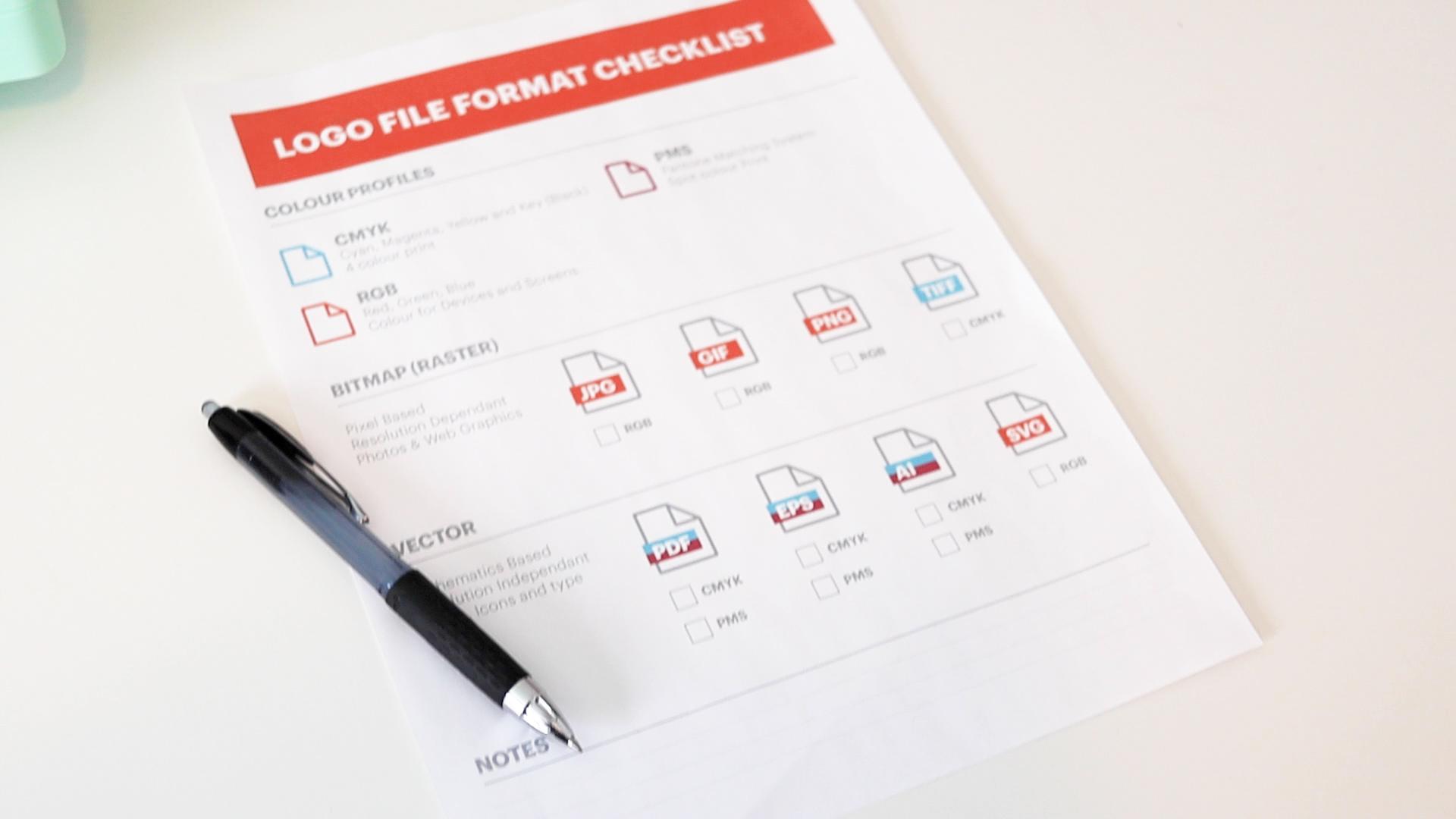
your logo package that you've already received, you only need a pen and the principle checklist
that I provide down below, I'm so excited to teach this class and show you
that you don't need to be a graphic designer to understand the basics of logo file formats. I'll see you in class.
2. Class Project: Hello everybody. Welcome back. In this video I'm gonna be talking more about
your class project. For your class project, you'll be making a custom
list for your business. I picked this
project so that you would have something
to work with. After you are done this class, you'll have plenty
of opportunity to talk to me and the
rest of the community. If you have any unique needs. I provided this downloadable
checklist as well. You can print it out or use
it directly on your tablet. You should only really need this checklist and a pen
completing each part of the project as you
work your way through the lessons will help
you be successful. Afterwards, you should feel
comfortable talking to your graphic designer or looking through your logo package
that you already have. I'm so excited to see
everybody's project on the project gallery
in the class page. And I'll see you in class.
3. Colour Profiles: Hello everybody, welcome back. In this video we're
gonna be talking about color profiles and how important
they are to your logo. There are three main
color profiles. There's CMYK, RGB, and PMS. Each color profile is important. CMYK stands for cyan, magenta, yellow,
and key or black. For those of you who
have home printers, this may sound familiar. The ink cartridges in your
printer use these colours. This is because CMYK
is for printing. In CMYK logos would be
for your business cards, menus, signs, and letterheads, anything that can be printed. RGB stands for red,
green, and blue. This colour profile is
for devices and screens. So RGB logos would
be for your website, your business app, social media, and
PowerPoint presentations. PMS stands for Pantone
matching system. You've may have heard a
Pantone colour of the year. And it's because that's
the same business. Pantone colors or spot colors. And what I mean by
this, is remember how CMYK uses ink
cartridges in cyan, yellow and magenta and
black to create a green, it would mix of cyan and yellow. If it was a PMS color, there'd be a separate
ink cartridge of green ink that Pantone
mixed themselves. Pantone inks may colour
matching much easier. Just be aware that
printing it will be more costly because you're
paying for an extra cartridge, CMYK, RGB, and PMS, please let us know
in your project which colour profiles
your business will need. You can download the checklist pdf I've made available as well. Thank you and I'll see
you in the next lesson.
4. Bitmap vs. Vector: Hello everybody, welcome back. In this video we're
going to be talking about a bitmap and
vector images. The pros and cons of each and why they're
important for your logo. Bitmap images are pixel-based
and resolution dependent. What I mean by resolution
dependent is if you scale up a bitmap image on
your computer screen, it will eventually become
blurry and pixelated. Bitmap images are great for photographs and
Website images. They are also usually
very small and file size. Vector images are mathematically based and resolution
independent. What I mean by resolution
independent is there exactly the opposite
of a bitmap image? If you scale up a vector
file on your computer, you will notice no
matter how far using n, it will always retain its
crispy and sharp appearance. This makes vector images great for using on billboards
and things like that. Definitely you want your logo when you're using it
in a print format, in a very big format, you want it to retain
that sharp crispiness. Vector images are great for
logos, icons, and type. It's always good
practice to have your logo in a
vector file format. It is very easy to save it out a bitmap image from a
vector file format. It is not so easy
to go the other way around and get a vector
file from a bitmap image. The person doing so would
have to probably trace out everything and recreate the
whole logo from scratch. Most vector file formats also provide transparency,
which is great. When you want to place your logo on a different
colored background. You won't have that white
bounding box around your logo. And the design will look
a little more seamless. Please let us know in
your project down below which file format you
think your business needs. I'm going to come out
on a limb and say that 99.8% of businesses are going to need both bitmap
and vector file formats. But if you're having trouble
figuring all that out, please let me know down
below or ask the community. We are also going
to be going more into detail into vector and bitmap images and
the next two lessons. So thank you and I'll see
you in the next lesson.
5. Vector: Hello everybody, welcome back. In this video we're going to
go more into detail about vector images to quickly recap what we learned
in our last video. Vector images are mathematically based and resolution
independent. They also provide transparency
in the background, making it easy to place our
logo on a darker background. They're good for
logos, icons and type. These images are usually good
for things that are being printed and aren't
usually on the internet. PDF and EPS files, usually a vector file format that a printer or a graphic
designer would ask for. It's a vector file
that can be used in large-scale marketing signs
or in other graphic design. AI files are Adobe
Illustrator files. Usually a graphic
designer would be asking for Illustrator file. Adobe Illustrator
is the program that most graphic designers would
use to design your logo. In the last file format
that I have is an SVG, which stands for
scalable vector graphic. This is a file format that
you can use on the Internet. Sometimes you see it
in different apps. If you plan on having an
app for your business, this file type might
be one that you need. Let us know down
below in your project which vector file formats
your business needs. If you have any questions, don't hesitate to ask the
community or me down below. Thank you, and I'll see
you in the next lesson.
6. Bitmap: Hello everybody, welcome back. In this video we're gonna be
going more into detail about bitmap images to quickly recap what we learned
in a previous video, bitmap images are pixel-based
and resolution dependent. This means that if you blow up a bitmap image, it'll
become pixelated. And blurry. Bitmap images are great for photographs and
website graphics. Bitmap images are also
lower in file size, which makes them great
for your website. JPGs are great for using on
your website presentations, or on social media. If you own a digital camera, you've probably used
JPEGs in the past, especially if you've gone to go get your pictures printed. JPGs are also great
for quick previews. They're usually
low-res RGB files. GIFs are also great
for websites, but they are usually
more limited in colours. They are great for animations
and provide transparency. I'm sure most of you have used an animated GIF in social media. I know I have. If you need to
place your logo on a colored background
on your website. GIF could provide this for you. Usually, GIF is a
low-res RGB file. PNGs are great for providing a transparent background and provide more colours than a GIF. You use them on your
website or on devices. They are usually a
low-rise RGB file. TIFFs are a high-quality bitmap. They provide a printer with
a lot of great details. Usually they're large CMYK file. You normally don't need a
logo in this file format. But you never know
when you start looking around in all the
programs that you use, what formats they might need. Let us know in your
project down below which bitmap file formats
your business needs. It's always a great idea to go through your programs
and apps to see what they recommend
you use for logos. If you run into any issues, please don't hesitate to
ask the community or me. Thank you, and I'll see
you in the next lesson.
7. Print vs. Display: Hello everybody, welcome back. In this video, we're
going to learn about print and
display resolutions. We are going to learn about
resolution and what it is, PPI pixels per inch. This is how we measure
digital images. Digital images are used on
your website, social media, and another displace
with a web image, you need a smaller
file size so that it can load quickly
on your browser. The industry standard for a low-res web graphic is 72 PPI. If you zoom in on
a screen image, you can actually see the
individual pixels when the image that we intend on printing is still
on our computer, we still consider
this a digital image. Therefore, we still
measure it in ppi. When you plan on
printing an image, you need a much
higher resolution than the ones that you
would use on your website. The industry standard for a high res printed
image would be 300 ppi. If you were to look at your printed image
under a microscope, you would see a lot
of little dots. These are the dots that a printer uses to
make up your image. The more dots that there are, the higher the resolution. Dpi or dots per inch, is how we measure the resolution of printed
graphics and web graphics. We measure the image
sizes in pixels. We should go through our
applications, social media, and any other places that we would like to use our logo to see what sizes each
application needs. The size that a Facebook
profile picture requires is quite different than the size that a LinkedIn profile
picture is required. Let us know in your
project down below which resolution and sizes of your logo you'll
need for your business. Thank you and I'll see
you in the next lesson.
8. Branding Guidelines: Hello everybody, welcome back. In this video we're gonna
be talking about branding guidelines and how they
can help your business. And if you need them. Branding guidelines
help with composition, brand and the general look and feel of a businesses branding. Branding guidelines can help
with your blog slogans, website advertising,
and other copy. Consistency is very important
for a memorable brand. Branding guidelines
can help with this branding guidelines
or an extra expense. But if you use different
designers, marketers, web developers, writers, this will help them
all stand brand. One thing to note a bit your branding
guidelines is that it's a living document
as time moves on in your business and you refine
your brand more and more, you will have more to add. Let's have a look at these
branding guidelines. This is not my work, but it's available
to view online and I will leave a link
for it down below. We're gonna look at Barre & Soul, Yoga and Fitness,
their branding guidelines. This is not a brand
that I've created. The first page, they
have a little paragraph about why they want you
to use these guidelines, why their brand is
important to them. They've put a lot of money into creating their brand design. And they want to make
sure that it stays that way when they hire
other people to do work. This first page is a moodboard. One thing that you will notice, this is the style
of photographs and colors that they
really resonate with. This is their primary logo. They're showing that
they don't want it going any smaller than this. This is your secondary logo there showing how this
is a stacked one. Then they have symbols, and then they have badges. So you may have more than one different style
of logo for your business. That's something to consider. They are showing how they
want it on different colors. They show how to
incorporate their logo with imagery and they
give a few tips here. This is a specific example
of how they don't want it. So you have the white on the pale background,
you can't read it. These are unacceptable usages
for their different logos. So you can go through
these don't rotate, don't squash or stretch. Just so that their logo
is properly displayed. The topography, they go through, different type that
they would use. They even have body copy here, your headlines,
another body copy. This is how it all
comes together. An example, they have
the color palette, so these have your CMYK codes, your RGB codes, and
your hex codes. Here's a closing paragraph. I'm showing you this example. It does not have any editorial branding guidelines in here. But that is something definitely that you can expand upon. It depends how far and
how deep you want to go. Let us know in your
project down below, if you think your business
needs branding guidelines. Thank you and I'll see
you in the next lesson.
9. Sign Off: Hello everybody. Welcome back. I'm so proud of you. You made it Congrats. In this class we covered
everything from color profiles, vector in bitmap images, resolution to print and display. My goal was to take away
any overwhelming feelings around talking to your designer or looking through
your logo package. If there's one thing
I'd like you to take away from this class. It's that you don't have to
be a graphic designer to understand basic
logo file formats. Don't forget to upload
your project to the project gallery on your class page so that
we can all take a look. I also have a
downloadable checklist available for you to use. If you'd like my class, please leave a review
and follow my profile. Thank you and I'll
see you next time.
 Joanne Lesk, Graphic Designer