Transcripts
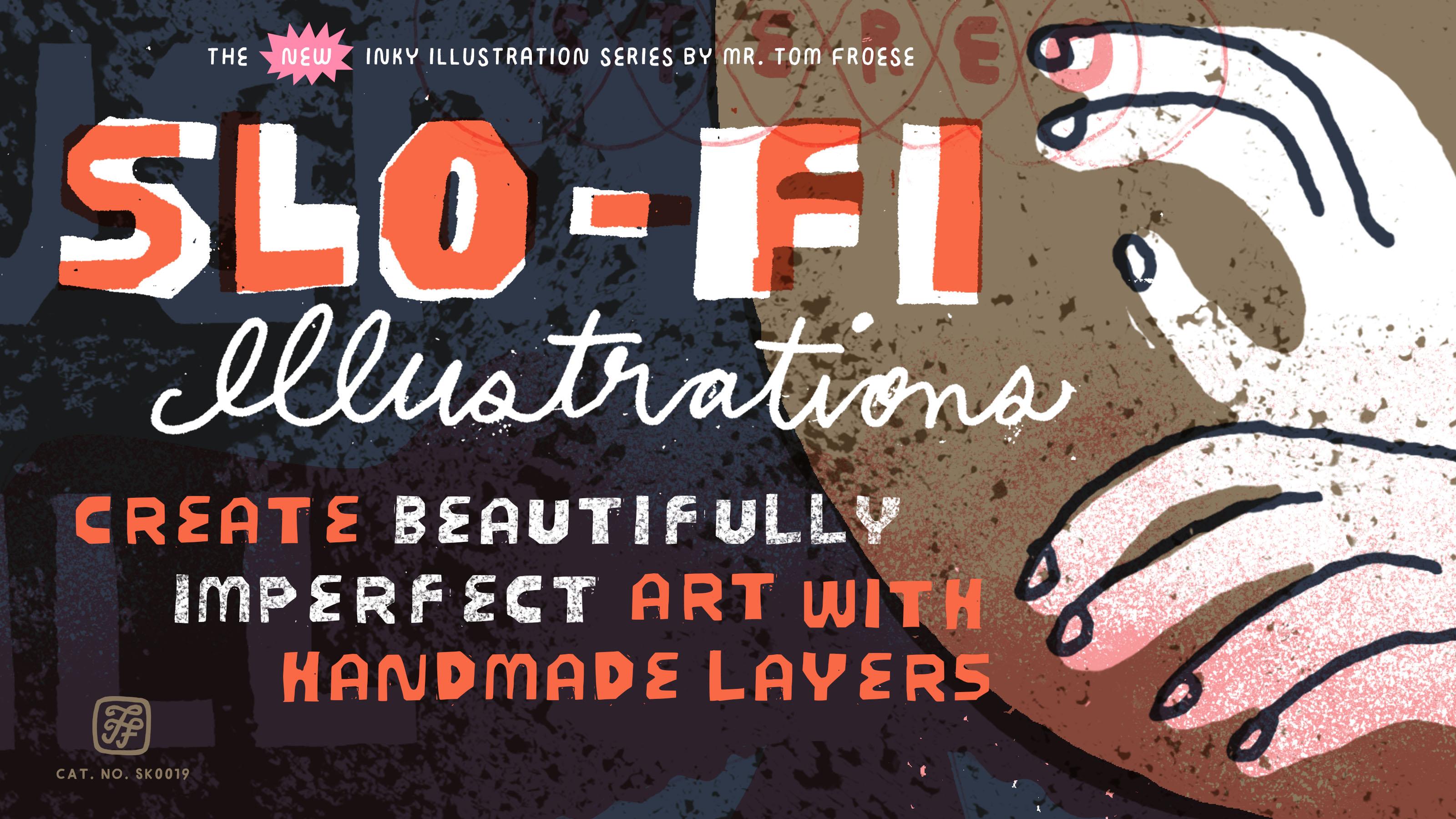
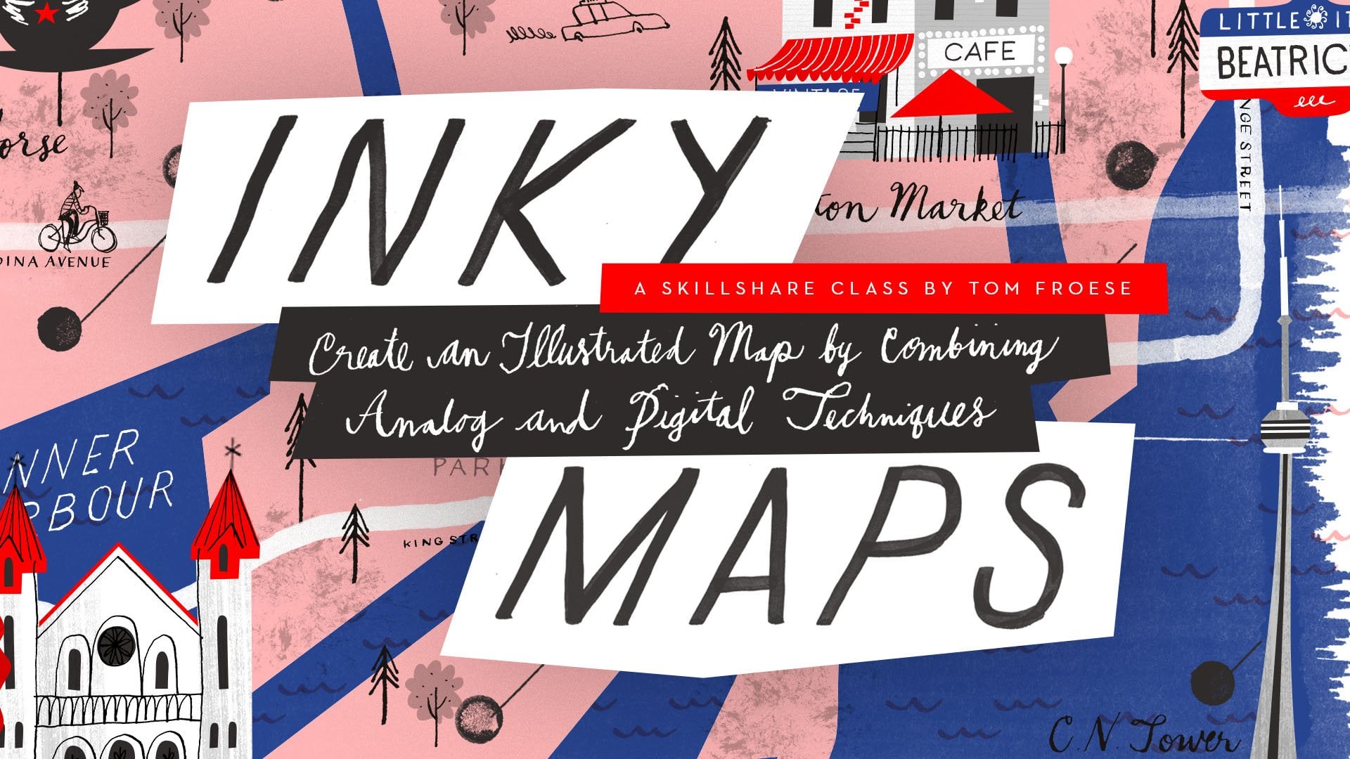
1. SLO-FI Illustrations Class Trailer: It's time to make illustrations
that feel more handmade, more human, and way
more fun to create. Hello, I'm Mr. Tom Froze. I'm an illustrator and a top
teacher here on Skillshare. And in this class, I'm excited to introduce Slo
fi Illustration, one of my favorite
ways of combining analog and digital
illustration techniques. It's much less efficient and precise than working digitally, but it's way more fun, and I think you'll
love how it looks. And you're done. We'll work
with just a few colors, inking them on paper by hand, and then we'll bring
them all together in Photoshop to create
bold, vibrant artwork. If you're hitting a wall with your digital art or
if you're looking for ways to make your work
looser and more energetic, I made this class for you. Join me in Slo fi
Illustration on Skillshare. I'll see you in class.
2. About the Class and Project: Slow fly Illustration
is about slowing down. It's about stepping away from the polish and perfection of our digital tools and embracing a more hands on analog process. It's slower, messier,
and way less efficient, but the results are
undeniably more interesting. I love this process
because it's a chance to experiment and play and
literally get my hands dirty. For the class
project, we'll make custom cover art based
on our favorite album, or you can base it on an album that you make
up in your imagination. But you can use the slow fi technique for any
kind of project, whether it's an editorial
illustration, a poster, a package, or anything
else you can imagine. This class is for anyone
who wants to bring a more handmade human
look into their work. Whether you're just
starting out or you've been illustrating a long time and you're looking for
new ways of working, I think you'll get a
lot from this class. You don't need any experience
working in analog media. I'll guide you through the
process here step by step. You should be familiar
with digital tools, though, especially photoshop. But if you're not, I'll walk you through every step
along the way. In this class, you're
going to learn how to plan and sketch with
limited colors in mind, how to create and ink separate layers for
each color by hand, how to digitize your
analog drawings using a scanner and Photoshop, and how to add color
digitally and make small edits without losing the spontaneous charm
of your handmade art. In terms of tools and materials, you're gonna need plain paper or a sketchbook with easy to
tear out pages for sketching, mixed media or marker
paper for inking, a pencil and eraser
for sketching, color media like markers and pencil crayons for
the color sketch. Scissors or an exacto
blade and cutting mat, a glue stick or clear tape, a fine white paint pen, correction fluid or white
paint for making corrections, green painter's
tape, and a ruler. Of course, all the physical art will be drawing
will be in black. So you're going to need various
black inky drawing tools, including paint pens, markers, micron pens,
black India ink, nib pens and brushes to
use with the India ink. And, of course, a jar of water. I recommend trying
a broad range of types and sizes of these
things from broad tips for larger fill areas to finer points like micron
pens for smaller details. You also need a light box for tracing and a scanner for
digitizing your work. Now, if you don't
have a light box, you can use tracing paper, and if you don't have a scanner, you could use your
camera or your phone, but results will vary. And, of course, you're
going to need Photoshop or an equivalent digital art
app, such as Procreate. Know that's a lot
of tools there. So bring whatever tools you have that make
work for this project. I actually encourage you to just use whatever you
have as best as you can, because I really think that your creativity
shines where you're working with what you
have and working with in constraints and
seeing what you can do without all the fancy stuff. By the end of this class, you'll have a finished
illustration that you can share on the class projects
page here on Skillshare, as well as on social media. But more importantly, you're
going to be able to use the Slo fi method for any
future projects to come. We're going to spend most of the class on the
hands on project, but I always like to give some background information and even a bit of theory to start. I believe that it's
important to understand why you're doing something
as much as how to do it, because this helps
you connect more to the process and know why
it's even worth the effort. I also believe that it will help you apply what you learn in a more personal way rather than just doing what the
teacher tells you. By understanding why
we're doing stuff, not just how to do it, that will make you a
better illustrator. And that's what we're going
to do in the next video.
3. What are Colour Separations?: My inspiration for this class, and for the methods
you're going to learn here is the inventor of the modern record album
cover, Alex Steinweis. Before him, albums were sold in plain sleeves with
basic lettering or in box sets that were nicknamed Tombstones because of how they
were displayed on shelves, like books with only
their gray spines and their plain engraved
titles visible. Steinweis was the first to see the album sleeve as
a creative canvas. He saw it as a way of
making the music look as good on the cover as
it sounded on the vinyl. Columbia Records
was the first to entrust Steineiss with
his innovative vision, and I think it paid off
for them because sales skyrocketed by almost
900% in some cases. And while the rest is
album art history. In Steinweis's day, full
color CMYK printing existed, but it was expensive and
therefore, very uncommon. Most printers in those
days were set up to do simple one color jobs such
as industrial catalogs, and these would be in
black and white only. Rather than letting
these constraints limit his creativity,
Steinweiss embraced them. He designed his covers
using color separations, meaning there was
a separate layer of artwork for
every single color, and each was printed
individually and aligned precisely onto the same surface. There were no half tones
or photographic effects, just bold flat shapes filled
in with solid colors. New colors could be
made by overlapping different layers and areas where no ink went
down would be white. This limitation became a
huge part of the style we now associate with mid
century commercial art. Fast forward to today, and
we have unlimited colors, perfectly aligned
layers, and tools like Photoshop and
Illustrator that do all the technical
heavy lifting for us. Well, this saves us a lot of time and requires
far less skill. It's also the reason our
work can lose its soul because we're not responding to any sort of real
world constraint. We just draw something on
our iPad or in Photoshop, and off it goes to the printer. Whatever artistic skills artists like Alex Steineis probably had, they had to make them work in a very restrictive and very
technical printing process. Limiting themselves
to just three or four colors and working in flat or solid shapes and colors weren't
stylistic decisions. Weren't going for a lo
fi look, but instead, the lo fi constraints
forced them to work in a certain way that
resulted in a certain look. Today, many artists try to recreate this look
by applying filters, brushes, and other kinds
of effects on purpose. But back then, it
wasn't an effect. It was a natural quality or result from a physical process. Now, unlike designers like
Steinweiss who train for years using analog techniques to create highly precise
commercial art, we can turn to analog techniques
for the opposite reason. If we want precision, that's what our digital tools are good at. That's
what they're for. On the other hand,
by intentionally limiting ourselves
to flat colors, a handful of layers, and the corks of
working by hand, we get results that feel
more human and more alive without having to fake
it with digital effects. Why does this all matter?
When I started out, I worked in a mix of analog
and digital techniques, and I love the surprises that
could happen along the way. It was frustrating sometimes as I burned through paper and ink, trying to get the
perfect results. And over time, I actually
shifted to digital tools, you know, thanks to the iPad
Pro and the Apple Pencil. And this overall has helped
make me a better artist. But it's also made the
process more predictable. And to be honest, making work in this way is just
not as fun for me. I found myself less
excited to make the work. There was no longer that bumpy, unpredictable ride
from sketch to final. That's why I came back to
Ink analog techniques. They forced me to loosen up and to let some
accidents happen, and those accidents often make the process and the
piece more interesting. This class is the
result of a few years of what I've been calling
going back to Inky. At a time when computers are increasingly capable of doing
our creative work for us, I believe it's a timely antidote
for others who, like me, are experiencing a similar pull towards physical
elements in their work. It's no accident that
I'm making this class ten years after I launched my first class
Inky Illustrations. And for me, this
is really part of me returning back to these
handmade techniques, and I'm really excited to
share this journey with you, starting with this class.
4. Project Brief: In this video, I'll introduce
you to the project brief, giving you all the details you
need to start the project. So for the project,
you're going to design or illustrate
custom artwork for an album of your choice using the slow fi techniques I'll be showing you in the
coming lessons. We're not aiming for
precision or perfection here, but something more
human and imperfect. We want it to be
full of character. You can work in two to four
colors, including black. To start, choose the album
you'd like to work with. It could be an existing album that you'd love to interpret in your own way or a totally fictional one based on a theme or style that
you're interested in. Or you could even
choose to try to remake or reverse engineer an
existing classic album cover, even one that Alex
Steinweiss himself made. This is a great way to
overcome any creative block. Like, if you have
a hard time coming up with your own idea here, trying to reverse engineer
an existing album cover is a great way to learn the techniques in the class
and still have a lot of fun. Cover art for vinyl usually
has a few key elements, including the album
title, the artist's name, the record label, the
logo, and artwork itself. If you're going for
a more retro look, you also find extra
elements like the LP logo, a catalog number, and, of course, the
artist's signature. And for some reason,
they always seem to make a big deal about stereo
sound in those days. Modern album art tends
to be more minimal. So how many details you
include are truly up to you? Now let's talk about some specs. The final album art should
be in square format, 12 by 12 " at 300 DPI. That ends up being
3,600 by 3,600 pixels. In the real world, if
you were designing for print and the artwork goes
all the way to the edge, you'd have to create
art that extends about an eighth of an
inch or 3 millimeters. Past the edges. This is called bleed. So that means your final art
should actually be 3,675 pixels by 3,675 pixels. Later in the class when
we get to that point, I will show you
exactly where and when to pop in those numbers. To successfully
complete this project, please share the
following deliverables on your project's
page for this class. Image of the existing art
of your chosen album or just a description of it
if an image doesn't exist, your rough and refined sketch plus a color comp
if you did one, scans of your hand ink
color separations, your final album art, and all images should be
posted in PNG or JPG format. And please post your projects to the class Projects page and
not to the discussions page. These, of course, are just
the minimum deliverables. You may share
anything else you'd like, including
additional concepts, sketches you didn't end up using and photos
of your process. For your convenience,
you'll find these instructions in
the class Projects page, and you can also find it
there as a downloadable PDF. You can also look at my
own project example in the class Projects page to see how I structured my project. Now, let's begin the process.
5. Step 1: Planning and Research: In this video, we'll start
planning our album art, and that means choosing an
album to illustrate for, and then some initial
brainstorming and visual research, moving between thinking on paper and gathering visual
inspiration online. And by the end of this lesson, you'll have a good
sense of direction for your project and be ready to begin rough
sketches in the next step. For this step, we'll
be using a pencil and paper to write down
our thoughts and we'll also be doing some visual
research online using our computer or devices
and optionally, we'll be drawing from
our inspiration in some very preliminary sketches
that I call O Md sketches. Let's start off by declaring the album we'd like
to illustrate for. I'll just write down
what I'd like to do. The album that I've chosen is called Everybody
digs Bill Evans, this is an album by the jazz
piano player, Bill Evans. So I'm drawing this all down on a piece of paper
in a star chart. This just helps me get
my overall information down in something that I
can see in front of me. The year of this album is 1958, that just gives me a
sense of the period and perhaps what the look and feel of an album
like this might be. Then the label is
Riverside Records. Then maybe we'll just
talk about what's notable about this
particular album. Say the most notable
thing on this album is the song called Peace Peace. This is the most famous song, one of the most famous
songs by Bill Evans, probably, and definitely the
most famous on this piece. I got the most critical
attention at the time. I'm just going to
start by looking at the original album
cover for this album, the one that already exists, and that will just help
me know what info or elements to include in my
own version of this cover. I'm just over here on my browser and looking at
the original art here. As you can see, it's
this gold color we have the album name. Everybody digs Bill Evans, and of course, that doubles
also as the artist's name. Bill Evans is built into it. I'll probably be more pictorial, more illustrative
in my own version. So I'm just going to
go ahead and write down what those elements
are from my own cover. We have the album name and the artist's name
kind of in there. And then the artwork, whatever that's
going to be for me. In this case, it's
the lettering, but mine will be
more illustrative. And we have the words
stereo and stereophonic. We have the Riverside logo and catalog number
at very least. Then in terms of colors, this one is gold,
kind of a red color. And they have black as well. Then we can just assume the
white is just the color of the paper beneath and so we won't count that
as one of our colors. This is just for
color inspiration. I can use whatever
colors I want. I don't have to go with
what's been done before, but that's just something
to make note of here. Now, we can go back
to our computer. I'm going to head over
to Pinterest here and just look for some keywords. Here. These are very
specific to my album, but you can translate this to
whatever your album choice. Of course, the first
thing I want to do is just look up the
artist himself, Bill Evans and right away, I get a sense of what does
Bill Evans look like? Here's a classic
Bill Evans photo where he's hunched
over his piano, just lost in the music. I would say that out of all the photos that I've
seen of Bill Evans, they tend to be of him in this
hunchy position his piano. What I'm going to
do is just take these and bring them over to a folder I have here on the side and just start collecting these
reference images. Another keyword that I'm going to look up here is Paul Bacon, the designer of this
particular album and just see what his
own designs look like. I'm just going to pop this
over into my references folder as well and gather a
few more of those as I go. I'll also just look
up jazz album art, maybe from the 1950s and 1960s. And look for some
images that inspire me along these lines as well. I'm looking for
design cues that I can incorporate into my work, especially around
this process we'll be using where we're doing
these color separations, so I'll poke around at some of these with
you here as well. What I notice in
these album covers is that there's very
limited colors. Here we have just whatever the background color
is and then we have red and black and
this browny color. We have this green as well, and I think that we can assume that some of these browner
colors are made by overlapping the red
and the green and you can see that right here at
the elbow of the drummer. Now looking at another example that just came up
here in Pintres and this is a very simple red or orange and white and
black composition. Really only two colors
going on here and it's just these abstract shapes with a few little line details. And this is just a
quintessential album style that I can pull from those days and use that
as some inspiration. I'll just keep going down, looking at other
keywords around here that will help further
inspire my own lm, both in terms of the era of Alex Steinweiss or the era
of the album in question. And of course, what kind of design and composition
techniques are they using that work with this kind of slow fi technique that
we're doing in this class. So, of course, I want to look at some art or album covers
by Alex Steineis, the inspiration for
this entire class. And Steinweiss of course, being the pioneer of
the album cover art, as we know it today, he's
a great inspiration. No matter what technique, what album you
happen to be using, I think that it's well worth looking and being inspired by. Now, another keyword that comes to mind is
the idea of peace. This is just another concept
because the song that I love on this album the most and the most notable song on
the album is Peace Peace. I could look up just
the idea of peace on Pintres just to get a sense of what does that
look like as an image? Of course, you see
a lot of doves and peace signs and maybe the peace
symbol with your fingers. All of these are very
inspiring images that I can pull from perhaps in
my own concepts later on. I might go a little further into this piece dove
keyword and just let this show me some
visual inspiration for how I might bring the idea of
peace to my own Alva Mark. Now, what I don't want to do
is copy someone else's dove. I don't want to
spend too much time absorbing other people's
interpretations of this piece Dove. I want to be inspired, I
want to see what's possible, but then I want to
quickly put it away so I'm not overly
influenced and end up accidentally or on purpose copying someone else's
ideas or their style. I'm looking back here
at my brainstorm. And I just want to add another line here and
start thinking about possible ideas in word format or list format that I could explore in my rough
sketches in the next step. There's the idea of Bill
Evans hunched over piano, question mark because maybe I'll put him in something
less expected, just maybe a portrait,
something like that. Another idea or
direction to chase down. Will be the piece Dove being a take the
song on the album, so it's maybe a Dove alone, maybe a Dove plus Bill
Evans in some way. At this point, these
are just words. These are just
jumping points for me to start drawing from
in the next step. I could go even deeper
into my research, go on to Wikipedia, and
read about the album, read more of the background of this particular song
that's interesting to me, and see what imagery
comes up that way. Either way, I've gathered
my inspiration images, mostly found on
Pintrast and I put them into folders in
finder on my Mac. The next thing that I'm
going to do is do what's called O mode drawing. This is an optional step for
you, but I do recommend it, especially if you
have a hard time coming up with ideas or
if you feel yourself getting stuck at this
stage where you start to transition into trying
to draw rough sketches. And so I like to spend a few
minutes at least just going through my reference images
and drawing from them. I'm not trying to come up with ideas. I'm not
trying to be clever. Drawing what I see from my reference images helps me absorb that inspiration more. I like to say that
I'm downloading information into my
brain so that I can actually put that reference
information those images away and actually draw more from eye mode or
imagination mode. And this is where I come up with my own ideas and do try and
be more creative later on. So spend maybe ten to 15 minutes brainstorming and
drawing from references. You can take as long
as you want or set a timer if you'd like to
avoid overthinking it.
6. Step 2: Rough Sketches: This video we'll do
some rough sketches. This is where we
work out on paper, some possible ideas
for our finished art. By the end of this
lesson, you'll have at least one strong
rough sketch to build on and refine
in the next step. For this step, we'll be
using pencil and paper. I usually like to
draw my ideas out as smaller thumbnails around two by 2 " square, in this case. For this, I'll be using
thumbnail template. This is something that you can
download and print on your own from the class
resources page. When I'm sketching, I like to start out loose out of the grid, so I'm not sketching in my
thumbnail squares just yet. This just helps me think
about ideas without worrying about composition in too
much detail just yet. So as you remember, I was thinking of
doing something around a Dove in my brainstorm, as well as something more around Bill Evans himself in
a more direct way, probably something with him
hunched over the piano. I've already done
some O Mode sketches, meaning I've drawn just
from my reference photos, and I've set those aside, so hopefully that will help me be more fluid at this stage. I'm just going to
free sketch out some possible ideas
with the dove, something around wings,
probably an eye in there. I'm not sure if it would just be the symbol of the dove
alone with some titling, but maybe something to do with a dove mixed in with
Bill Evans in some way. That would be a little
bit more conceptual, trickier to do for sure, but it's kind of exploring. It could be something
like the eye of the Dove is also the
eye of Bill Evans. Again, abstract. Not sure if this is exactly
where I want to go, but that's what
the stage is for. I recommend that while
you're doing this, you listen to the music that
you're illustrating for. Get that album on, put on your headphones and just
enjoy getting into it. Once I have a few directions that I've done in my more
free loose sketching, I'll start thumbnailing
in my squares, thinking more about
rough composition. I'll be thinking about
how to fill the space in that square and where things like type and other
elements are going to go. So I'll try six to 12 roughs, working as quickly as I
can without getting stuck. But basically, I
have two directions. One is just the idea
of the dove and the other is the idea of the
elevens hunching over. In my free your sketches, I started thinking about
maybe combining those two. I'm going to try not to
think about it too much, just roughly trying
different sketches. I just like the idea of
this shape of the dove, it's just such a peaceful
shape in itself. It's actually been
a recurring theme in some of my illustrations over the years, especially
Christmas cards. I've often incorporated the idea of a dove, like a peace dove. As I'm sketching, I
am having a mind. I'm thinking about
how I'm going to translate this into the art that this technique is best at, which is shapes and simple
lines and flat colors. I'm thinking very roughly
about my typographic elements. As you go, keep your composition simple and mostly shape based. Avoid realism in overly
detailed elements. The more complicated your art, the harder it's going to be
to make this technique work. T in terms of simple solid
colors and flat shapes. Line based art can work
too as long as you provide a clean enough
background for it to pop. This stage could take you as little as 15 minutes or
you could be at it all day. I recommend sticking
maybe to 30 minutes or less to avoid
overthinking, of course, you can draw as many
roughs as you'd like, but you should end
up with at least one strong rough sketch to take into the next step. So I'm done my rough sketches
and my thumbnails here, and I ended up doing 12. I could have kept going all day, but I seem to have just kept iterating over the same
idea over and again. The dove itself wasn't really
going anywhere for me. I was doing various versions with the idea of the
dove and Bill Evans. There's something
about them that I couldn't quite resolve, and I don't think
it would make very strong art unless
I could do that, unless I could get
this real nice kind of combination of the
dove and Bill Evans. Now, the closest I did come
to that was Bill Evans here, hunched over the piano with an angel wing. I
really like that. It also references one of my favorite album covers of
all time by another artist. His name's Ben Shen, where he draws the composer of that album with angel wings and he's playing a pipe organ,
and I really like that. Other one that kind of seemed
to work, but I don't know. I'm not very confident
it's going to work. It's this guy, or
it's Bill Evans, I should say, playing a dove. So I think there's something
lost in translation there. So I think a more straightforward
approach is going to do best for this
particular album cover. So it's going to be
probably this one here where we have Bill
Evans playing piano, just from the side, and you
see kind of it's pulled back. It's more of a full body shot with a bit of
the piano peeking in. And I included a bit of space at the top for text or,
like, the title. And then a few other
elements down below there. I do like the one that
I was just saying before where he's
got the angel wing, because that's the
clearest representation of the dove mixed
with Bill Evans. And then earlier here, the closest I have to a strong concept is Bill Evans just kind
of peeking in here, and then there's a piano
shaped and some black lines. Those would be like the
black keys of a piano. So I'm playing around
with that idea, and then maybe the
title goes along the side here kind of
sideways and going vertical. Those are my three
chosen concepts there, and I will choose
one of these to go into my refined sketch
in the next stage.
7. Step 3: Refined Sketches: In this video, we're going to be creating a more refined sketch. That means choosing one of
our roughs and redrawing it larger and giving more
attention to the details. We're going to continue
to think about how the art will work with
the slow fi technique, including working in flat
shapes and simple colors. By the end of this lesson, you'll have at least one
larger refined sketch to trace over for the remaining
steps in the project. The tools we're
going to be using are still paper and pencil, but we're going to probably
need a ruler for this stage, as well as an eraser just in
case you want to erase this, I'll also be using my printable six by six
inch sketch template, which you can download and print from the class resources page. We'll also begin
using a light table, which you can see here, which we'll use to iteratively
refine our sketches, basically tracing over sketches to make them even more refined. So refined sketches
often take me a few stages or
what I call passes. In this first pass,
I'm going to start larger because later when we go to do the hand
drawn separations, we'll be tracing
over at this size. So we're going to be using a
ruler to draw that perfect six by six inch square or use the template
provided in the class. Now this is where we're going
to think more in terms of the overall composition and all the things we're going to include in our album artwork, including the main artwork, the album title,
and artist's name. And in my case, the
record label and catalog number and
the word stereo on there as well just to
give it that kind of retro vintage record
album cover vibe. Oh, I'm not going to need
my light table just yet. I'll need this as I get
into my second pass. So the sketch that I
decided to go with my rough sketch is going to
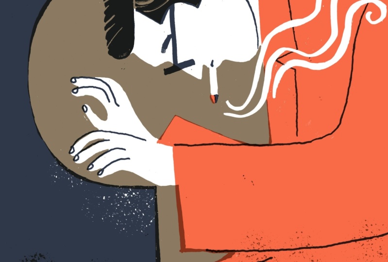
be Bill Evans as the angel. And so that's this
one down here. It's a little bit risky for me. I feel like it may or may not work out using
this technique, but I'm going to give it a try. See what happens.
I'm just going to do my best to copy what I see. I'm not expecting it to
be exactly reproduced. It's just a reference, so I remember what my idea was, and I'm doing my
best to just keep it loose and not get
too tight here. I'm really letting myself exaggerate the feeling
of Bill Edins hunch. I'm making it even
more expressive than what I might have seen in my photo references or
even in my rough sketch. Again, it's okay to be
a little bit rough. I feel like I want this
to come up a little bit. The nice thing about
working large now is that once we move to
our second iteration, we can just trace
over at this size. This is just a nice way
of getting that started. I'm allowing some of my
shapes to just float. I'm not sure I'm
going to be including any of Levin's legs there. And use a smoke trail here to
lead us to the angel wing. Even though I'm not
really thinking in terms of darks and lights
and tones and stuff, just yet, that's the next step. I'm putting it in there just because it's
happening naturally. We're going to get more
straight and probably think about using a ruler or some kind of guide
for the lettering. But to start, I'm just
going to rough it in. This is where I'm going
to put that badge logo and then at the top here, hopefully somewhere near the
center, all right, stereo. Not exactly sure how the
lettering is going to fit here. I'm going to just free ball it here and hope that I find it landing in a good
way in a way that fits and has a nice
feeling to it. I have my first refined
sketch down here. Maybe while I'm at it, I will consider adding some of that herring bone pattern in the photos that I've seen
of Bill Evans jacket. This could add a very nice
expressive element in the work or complicate it and
make it un usable for me. Depends how tight
or loose I want my final composition to be
in terms of the linework. In this first pass, this is a good opportunity to try
the more detailed part. So if it doesn't work, I'll
know sooner than later. I can start ruling it
out of my concept. I'm thinking I kind of like it. It just depends how
it's going to work. Okay. Now it's time to turn on my light table and get a
second sheet of paper over it. What we want to do is
use some masking tape. Painter's tape works
great for this. So I'm securing down my first sketch to the light
table and then putting my second sheet over top and trying to line the actual
pages as much as I can. And because after this, I'll be tracing over
my second sketch. I'm going to get a ruler
and redraw those guides, and I'll use my
mechanical pencil because it's got a finer point. And I'm tracing those guides
that I printed and I'm overshooting bounds or the edges of the square there
so that I have these registration marks here. These intersections
of these lines, I'm going to use
as targets to line up my separations as we go. You'll notice that I'm drawing
things past the edges, and this is where
the idea of bleed comes through because
I want my colors and my artwork to extend past the
edges of this artwork I'll need to be drawing pass less edges so that when I
bring them into Photoshop, I'm not getting a little
tiny gap along those edges. With every pass, I'm getting
more detail oriented, but also there to be a little variation between
each to keep it fresh. Now I'm going to
start using my ruler to measure things like
where the center is. I have my 6 " here. Here's my center mark
and that'll help me align some of my text, thinking more like a
graphic designer here. I'm going to be using some unorthodox materials here
to get some of my shapes. I want a perfect circle here. I'm just using what I have
on hand just for now. That's not quite the right
size. But it will do for now. I'm creating an
area for my type, and I just want to create some
nice even lines for that. I have this interesting
little ruler here that I picked up. It's called an AMS
lettering guide. It's an optional piece
of equipment here. It's just a really
easy way of creating lines that you can create some rules and do your
lettering with it, which I find really useful. You got to be careful. If
you're being too sloppy, you will slip and slide. But something like
this is going to help me just make even
lettering and even spacing between
while this technique is all about loosening up, it's also important
to be accurate to some degree because of how things need to align later on. But also the harder you try to align things by hand
in this analog way, I find the more
interesting the results because we're not going to get perfect
alignment here at all. Nothing's going to be perfect. It's going to look handmade, but I think we'll get
more interesting results if we try our hardest to
be accurate with some of these shapes and lines
because that's where that contrast between loose
and tight starts to happen. This art here is a little bit too fine for this technique. I don't want to
spend too much time doing all those little details. So I'll do some kind
of a badge there, but it's not going
to be exactly like what I see on the artwork on the original
album artwork here, but I can keep going and
figure that out later. I'm just eyeballing
the alignment here. So I've conceded that the lettering in this pass
will just be pretty rough. I'll figure out what
to do in a third pass. I've almost forgot
the catalog number. So you're looking at my
third iteration here. There's not a ton of
evolution from my first, other than it being just
a clear line quality that I'll be able to trace
over more accurately later, and my lettering is more clear. Now, I've done my
best with a pencil to do this lettering the
size that I want, but I'm probably going to want
to use a thicker marker or something to just get the thickness and the even
lines and stuff that I want. And that's just going
to have to happen in the inked separation in
a few stages from now. I think I've taken
this as far as I can, and now in the next step, I'm going to start
trying to figure out how my colors
are going to work. And if I can't think in color, I'll think in terms of tones, like what are going to
be the darkest parts? What are going to be
the lightest parts, and what's that in
between tone as well. So we're going to do
that in the next step.
8. Step 4: Colour Comp: In this video, we're going
to start thinking in color. We'll choose colors
and begin to lay them down in either a tonal
or a color sketch, also called a color comprehensive
or just color comp. This will help us
think more concretely about how our limited flat
colors are going to work, and it's going to make
the next step when we're actually inking our separate
colors much easier. By the end of this lesson,
you'll have at least one color or tonal comp to work with
in the next few steps. In terms of tools, we're
going to continue with a light table and now
add in some color. You can use any color
media you have on hand. I'll be using alcohol
sketch markers and marker paper
for the most part, and I might have to use a few
additional tools as we go, but we'll see how things go just with the
markers to start. So I have my final
refined sketch taped down here onto
the light table, and now I'm going to
get some marker paper. This is a different paper, and this is what
I'm going to use to just start planning
out my color. Again, keep in mind, this
is just to plan color. The art we're
making at this step won't be used in our
final composition, but it still helps to be as careful and accurate
as possible. The marker paper
I'm using here is just karyoka plus marker
paper with a smooth grain, and the Markers I'll be using. They're not the perfect
thing for working at the smaller size because
they're very broad tipped, but I'm going to do
my best with them. These are karaokaPlus
sketch markers. I just got these at my local discount fashion
store called winners, and they were a
fairly good price, and they're actually
good quality. So I'm going to just
work with these. But again, you can work with
any color media you like. Now, before we start, let's just take a look at
the refined sketch here. Thinking about where lights and darks are going to happen. I'll probably want to work in three colors just
to keep it simple. And one of those is going
to be something like black, and then there'll be
some kind of a mid tone. So black will be the darkest, then there's going to be
some kind of mid tone and then something that's
the light tone. I think his hair
will be the darkest. I imagine that this part here, this piano shape will
also be the dark. Other than that, I'm
not quite clear. So we're going to figure that out using our color media here. So I'll put my marker paper down here and use a bit of
tape to secure it down. The nice thing about
the marker paper is that it won't bleed. I'm also going to use some
of my pigment liners here. These are just micron
pens basically, and I can use those for some
of the dark areas as well. Because I know that I'll
be working in black, I'm just going to start
with that color and I'm just filling in those
broad areas to start. I can use my broad tip
on my alcohol marker. For these broader areas. I don't know what the color will be yet and I don't want to have to get distracted by that. I'm just going to use gray
as my temporary mid tone. I'm being careful wherever there's white areas that
I think will be white, I'm going to leave those white and it's going to
feel funny filling in these shapes without there
being any outline to them, especially if you're
used to having outlines rather than
just pure shapes. Elements. Now I want
there to be a difference between his jacket
and his hands. Right now we just
have two colors. I'm going to introduce
another tone here so it's really visual here. I'm going to go with red. I said that the gray was our mid tone, but in fact, right
now it's acting more like our lightest tone. So we'll just call
that a light tone. For now, we'll call
the red the mid tone, and then we have black,
which is our darkest tone. Because these will probably
be flat areas of color, I'll just fill them in solid. I'm not really sure what I'm
going to do with that wing, so I'm just going to
draw the whole back there and figure out what
to do with that wing later. I don't think I want Bill
Levin's shirt to end up being actually red or his jacket to
actually end up being red. In the final art, it's
the wrong feeling. I could almost see the
background being red and his jacket being
either black or gray. But just turning off the
light table for a moment, you can see how his hands and
his face are just a shape. Almost like a white silhouette
and that's going to be a very interesting effect
to work with on our layers. This is where the tricky
part comes with details. How are we going to
work these things out? Now, I'm using my
white paint pen. It's not going to be
very easy to see, but I want to go back over with the white areas
that I think will be white. If this doesn't work, I'll have to use something stronger like actual acrylic paint or even cutout paper
could work here. I want some white
text down here. So that some of that background paper color comes through, it will make the overall
art feel lighter. This is where having a
marker is actually handy for figuring out what do these letters look like
once they're actually thick? I want them to have a presence. I'm not worried too much if they look hand lettered
versus a real font. If I wanted a real font, I could do that in Photoshop and save myself a lot
of time and effort. But for this project,
I'm trying to go more for a handmade look. I'm working with a
thicker tool here. I'm finding myself running out of room between
these ladders. I might have to space those out. I'm finding myself getting
thicker as I go as well. I have to keep reminding myself this is exactly what I want. I want imperfections. This is handmade art here. I'll just take a little
look just to see how it's looking without having
light shining through. I like that he has
a little wing. I wonder if it could be a little bit more expressive somehow. I'm going to just risk
ruining this whole thing. Okay. So now I'm
going to go in with a fine liner or a micron pen and just start thinking about how I'm going to bring in
some of the details. Adding in lines for me is always scary because that's
where you can just put in too much and
you have to start again. I find lines if
you keep them open as much as possible and only add them where
you need them, it keeps you overall
feeling open. Using the broadness of this brush tip to give me the
thickness of these letters. This is just a color study. Nothing here is committed. This is just a way of
planning up my colors. I'm going to go in with my red here and just polish
off the lettering, tighten it up a bit just
by using the red tip to chisel off the ends or the
terminals of these letters, almost like I'm
erasing them away. This is just a nice
way of getting the letters to look a
lot more confident. I'm using my white paint pen a little bit as
my correction fluid, making these thick
lines less thick. Now, I'm starting to
think about maybe where some of my
overprints will be. So I'm going to
carry the red over, but it's going over
that grayer color, that mid tone, whatever
that color is going to be, and it might create
enough contrast. So it's an extra color there. Alright, I have done
pretty much everything that I think I can do
in this color comp. I managed to get it
all done just in one pass or one iteration. As you can see, I've used red just to represent my mid tone, and then I have black, which
will be black in my final. And then some kind
of light tone, which is indicated by the gray. And so I'll just figure out
what those colors are later. But in terms of tones or
values, those are working. I added just the
leg of the piano to create a little bit
of something there to anchor the text because
it was left justified, but I didn't really know
what was going on with the rest of his leg
or body over there. So the leg or the piano kind of creates a
nice break there. And I included the catalog
number just up there, refined some of the lettering as best as I can at this point. And just worked out a few other details,
added his hairline. I also added my border and included my
registration marks there. And that's just in case I want
to use this as a reference for the color separations
that we're going to do next. I did say that we'll
probably want to use our refined sketch for that part for tracing over
our color separations. But I might actually end up just using what I've done
here in the color comp instead because that will
be easier for me to keep track of those color separations once I'm using black only. Another thing that I
might do and that you can do if it helps is just trace over your color comp with
another just line art sketch, and that will just
make it easier to keep track of what your
shapes are in the next stage.
9. Step 5: Inking the Separations: In this video, we're
going to create our color separations by hand. We'll use a light table to
trace over each area of color separately using
whatever drawing or inking tools
you have on hand. By the end of this
lesson, you'll have as many hand drawn separations as you have colors ready for
scanning in the next step. As for the tools we'll
be using in this step, we'll continue using
our light table, and we'll also now start using our black inky tools and water. Now, in terms of
your paper choice, you can use mixed media, wet media or marker paper here to make sure
that it can take the ink or pigment without wrinkling or
bleeding too much. You can also just
use printer paper if that's all you have on hand. So after I made my
final color comp, I took it off my light table, and I'm just going
to put this up here where I can look
at it for reference. But I will be tracing over my refined sketch on
the light table here. So after I made that color comp, I traced over it again
just to make sure that my lines lined up with what I ended up resolving
in that color comp. So this is the most accurate version of my
sketch that I have. I've taped onto the light table. I put my marker paper over
top for my first separation, and I've drawn on my
registration marks here, basically a box that has
these intersecting corners. Now I'm going to carefully go in on any area that will be black. I'll just put a color
reference here as a reminder. At this point, anything dark
or black that goes down here is going to work
certain types of tools, whether it's a paint pen or a paint brush or anything else, even a pencil, if
you draw over it, dark enough, it's going to end up being black
in the final scan. It will just have different
textures and qualities. Really, what I want to
do is just get this as black as possible anywhere where I anticipate the
being black art. So I like to start
by doing the edges, any hard edge as
carefully as possible. I'm free handing it, not
going to use a ruler. You can use a ruler at the stage if you want
to be more precise, but I like to keep
things a little bit more hand made and just
see how that goes. Remembering to extend past the
border for a bit of bleed. Also trying my best not
to make any mistakes. Anytime I am in doubt about what part is
my current color, I'll just look up at
my color cont there. This is a little tricky because I need to keep my
head out of the way of the overhead camera so you can see what I'm doing here. Those are good for now. This is where I really wish I had a fill tool that I could just drag and drop my paint
bucket and fill this, but I have to do it all
manually by hand here. This is where we're
going to break out a few of my more inky tools. I could just use marker
to fill in these areas. I'm going to have a
little fun here and use India ink and some water
and some paint brushes. It's a little harder to control, but it also can be
more fun to work with, a little bit more
unpredictable and we also can maybe get a little bit of extra texture in
there by accident. We'll see what
happens. Also, it's nice that with a brush, you get this nice broad
stroke automatically. I'm noticing just using
this water based media, I can see a fingerprint
that was left by my finger. Marker paper and
the marker paper doesn't absorb grease too well, so like I guess I had a
bit of a greasy finger. This is a little
bit scary because this is very watered
down ink right now. I need to get it thicker. I see a drip about to happen. I'm not sure if I'm
going to be able to prevent it. Let's
see what I can do. I got a little bit
of tissue paper here and I'm going to blot, very carefully this drippy area. Take a corner that I
rolled up with my fingers, like a little corner
here and I'll have to go back over that darker later and remember not
to be so watery. The marker paper
is very good about taking in wet media
and alcohol media, but there is a limit. This would be a lot easier
if I was just using a paint pen or even a
fine point sharpie. I'm going to try using my paint pen for
the lettering here. So I'm going to continue
inking my black here and just stop the
camera here and keep going so that I can just
concentrate on being careful here rather than trying to
talk and ink at the same time. I've done my best
to do as much of the black as possible that I can see on my color comp and now
I'm going to remove this, put it up where I can see it and reference it if I need to, put my second sheet
of marker paper here and do one of
the other colors. I'll do the mid color that I was drawing in as red
in my color comp. Since I used red as my
color in the color comp, I'll just use that as my indicator for the
mid tone separation. Again, the color I
draw down here will be black and I can change this to any color I want once I
get it into Photoshop. I have my border drawn in with the overshooting lines
at the corners so I can line that up to other
layers and of course, to the refined
sketch below here, and I will continue
this separation. I'm going to go back to my
paint pen here and bring in just those areas that
I anticipate will be the midtone or what we're seeing is red right
now in the color comp. This will probably
take a little bit of extra concentration. Now, I'm going to bring
this red a little further into this
black piano leg. This will make sure that when I bring this into Photoshop and align the color separations, they'll overlap and there
won't be a white gap. I'm remembering to
extend past the bleed. I just want to remember that now this area here is
going to be black, not the piano shape. By black, I mean, whatever color this separation ends up being. You can see how it can
get very confusing. The lettering is
definitely going to be a tricky part for me because
I want that to be white. I think the best thing
to do at this point is actually just block
in for now and I'll probably have to go back in with white and then black
and white and black later. I'm going to continue filling
in all those red areas and one thing that I'll
be looking out for is where this wing is,
where the smoke is. That's going to be
white popping out or cutting out rather
of that shape. I'm going to fill it in
with black probably and then draw back in over with white to fill that out or to knock it out so
that it's white again. Lettering, I'm just using boxes as placeholders for
each of the letters. Just because of the way
this technique works, it's going to be easiest if
I just use a certain kind of blocky letter shape
rather than trying to do something a little
bit more refined. I'm hoping the effect
will look great, and we'll see how it goes. Mm. I finished my second color separation. I have it right here and
I'm still letting it dry, but that's about it for
that one as far as I know. I guess some talking
points here are just that I messed up when I was doing the word digs at the end here, and I guess I forgot to make space for
the eye in that word, so I had to go and
white that out with my white paint pen and
then fill it back into black. The lettering is very
blocky and funky, and I think that's okay. I think it's going
to actually work for this. Piece nicely. I'm going to just tape
this up here to dry and then continue on with my
third and final plate, which will be all that
background color. So this is my light plate. I'm almost done,
and as you can see, I use just a crumpled up sponge that I've had lying
around for years. It's a weird looking
thing, but I basically use it as
a splatter brush, I guess, or to add a
bit of a grainy effect. And I just dabbed in some ink to create
a sense of shading. So whatever this background
color is going to be, maybe it's going to be gray,
maybe it's going to be blue. But it's going to fill in
there and almost act like a gradient and fill back
in where the red is. I think that's going
to just soften that hard edge of where
the piano leg is. We'll see how it works, and
if it's really not working, I can do some correcting of the thing I'm
thinking about now and I'm going to have to do this on the previous plate or
separation as well. If I can find my white marker here, and my white paint pen, there is this smoke that comes over this color and I
want it to come through. I've just added it in there. I'm not exactly sure if that's
exactly the right look, but sometimes you just
have to wait and see how things turn out in a later
stage with this process. Same with the lettering,
whatever this color is, it might get too dark
and I'll have to figure out how to
back paddle a bit. But otherwise, that is my
third and final plate, I'm going to just go back to the previous
plate, the mid tone. What I was coloring was
reading I'm going to line the registration marks here
as accurately as I can, and they're not lining up
super accurately anymore because the wet media buckled
and wrinkled the page. If I want to make it a
little bit more accurate, I can try to tape
down another edge. Hoping this is dry at
this point and just get it somehow reasonably in there. Again, I want to get in
some of these smoke lines. Smoke is wispy and inaccurate, so I'm not going
to be too accurate in exactly how they look here. The other part here, of
course, is the wing. I want that wing to be
a lot more organic and wispy than I can get out of
my posca paint pen here. I think what I'm going
to try and do is get just some regular white paint. This is what I have on hand. I do have white ink as well, but it's a little
bit more transparent and this might
actually do the trick. Now the problem with acrylic
paint is it's very wet and it's going to make
my page buckle a bit, but I'm just going to try and be careful and
I'll work with it. I'm going to get kind
of a round brush here. I'm not going to water
down the paint at all. I'm just going to wisp in that, and I'm hoping that
it'll be thick enough. Obviously, it doesn't
need to go up where it's white because
it's already white, but I'm hoping that
it'll be thick enough to carve
out a wing there. I mean, feathery wings are feathery and inaccurate,
kind of like smoke. And so if I were to
create a hard edge there, it might not be as
wingy as I want. I might go over there once it dries, just with
one more coat. And while that's
drying, I'm going to go back to the previous one
that I was working on. This is the lighter plate,
my third separation. And what I want to
make sure I get in, which I forgot before, is
the smoke coming up here. Almost forgot that detail. So of course, anything
over white doesn't matter. I'm going to leave a hard edge here just for a bit of contrast. So the other plate is going
to be wispy and feathery. This one with the
background color is going to have a
more defined edge. And hopefully, I'm hoping
those will play off of each other nicely in the
finished illustration. Now, I'm going to
take the opportunity back on my original
black layer here, the first one that I worked on, line those layers up
as best as I can, line those registration
marks, I should say. On this black plate,
I wanted to see if I could get a bit more
hair lines here. So what I was thinking is
maybe if I dot some wet ink, well, it's wet, go like that. Let's see if that works. And then another thing I wanted
to do with is black hair. I just give a little
bit of an undulation. It's a bit flat. It
seems that I also missed on some parts here on
the Riverside Reeves badge. So I'm going to go back
to the red shirt here. I'm gonna need to go back over that with the white
paint again, anyway. And try and get it aligned. It is really buckled. It's gonna be definitely
come through in the scan. But this is what we
have to work with. I probably could have
used better paper for this thicker paper. So I'll get on one more coat of this white just
to make it thicker. I feel like I've overdone it. And then the part that
I was missing was on the logoe badge thing
here, right here? I'm going to white out
just some elements that I had seen or observed
on the original cover, the actual cover for this. So all that's left to do next is wait for the paint to dry. And I do highly
recommend that once you're done your
color separations, inking them in this way, you do let them dry before we go on to the next
step, otherwise. You might wreck your inky stuff and you might get gunk
on your scanner bed. So that's the end of this stage, and I'll see you
in the next video. Where we're going to
start scanning them in and turning this
into digital art.
10. Step 6: Digitizing the Separations: In this video, we're
going to transition from the analog world
into the digital. We're going to scan
each separation onto our computers and
then use Photoshop to enhance and prepare
the artwork for colorizing in the
step after this one. By the end of this
lesson, you'll have a high res cleaned up and high contrast scan of each
of your analog separations. In my case, I'm going
to have three because I did the three
color separations. This step we're going
to be using a computer, a scanner, and Photoshop. This could work with an iPad and Procreate or Fresco or
something like that, and by using a camera, but the results will definitely vary from what I'm doing
here at the scanner. I have image capture open. This is just the software
on my mac that I use to scan things in
from my scanner. And I'm just going to make sure that we're in black
and white mode. We're not going to
need color, and I'll just set grays to 250 6 grays. If that's an option you
have, that should do. We'll set the resolution to double what we
need in the final. If we want a 12 by 12
album cover at 300 DPI, we'll scan in our six by
six ink color separations at double that
resolution at 600 DPI. I'll just place my
black separation first onto the scanning
bed, try and align it. And we'll just do a quick
little preview here. I will scan in the
entire platin. I'll just select everything here and just scan
the whole thing in. We'll do that with the
remaining two separations. When you've done everything
by hand and then you bring it into
digital in this way, it feels a little bit like
Christmas because you just don't know what
you're going to get when you open these files
and put them together. Maybe just to start, we'll rename our scans so we
know what they are. I'll call one black, know
that one will be black. Then we'll call the
second one color one, and then the other
one color two. Black, color one, color two, and then I will open
those up in Photoshop. We'll go with the first file
we see here, color one. The first thing I'm going
to do is rotate it, so it's the right side up. We'll just go to
Image, Image rotation. And 90 degrees clockwise. Now, the first thing
that we want to do here is adjuster levels. I'm down here in
the Layers panel. If you don't see
your layers panel, you'll find it in Window layers. I'll bring it up here
so we can actually see it closer to the art and
just see what's going on. While I'm at it, I'll
also bring my channels panel up and just create
it as a second tab there. We're in the Layers
panel and I'm going to go at the bottom
here in the middle and create what's called a Levels Adjustment
layer holding option on my keyboard and dragging the white slider
on the very right, I get this very black
and white thing. If I let go of option, I can see the effect happening,
but it's less subtle. By holding option, I
can see a lot more clearly what I'm changing
the contrast with here. That's really what we're
doing with levels. We're making this whole
thing a lot more contrasty. I'm going to stop it
just about there when I start seeing the
white smoke pop out of the body there and I can see some of the wispiness
of the wing as well. Want a little bit that
texture to come in, that black texture, but
mostly I want that white. Then we're going to do the
same on the left slider. By sliding it, you get ultimately darker
black tones here, and by holding option, you can really see that
in a more dramatic way. Just a nice way of seeing exactly where your
contrast is headed. I do want there to
be a little bit of texture in there,
but not that much. I want to have nice
deep black color here. In the most extreme sense, I could do something like this. The other thing is we
want to be able to see our registration marks. That's something that we definitely want
to keep track of. What I think I'll
do here is just pull back my slider bit so I can see those registration
marks just ever so faintly. Once I have things lined
up in the next step, I can go back and
change the contrast so it's more stark again.
That's pretty good for now. Now we're going to do
the same adjustment on the other separation, so we can just save
what we have for now. Just as a shortcut, I'm going to take this levels adjustment in the Layers panel. It's a separate layer. I can just make sure it's
selected and then copy it. I can go edit, copy or I just hit
Command C and then go to my next file here and paste and it will paste
that adjustment layer over this file retaining this
exact same sense of contrast. Of course, the other thing
that I want to do is rotate the image 90 degrees clockwise. I'm at image, image rotation,
90 degrees clockwise. Now looking at this file, I don't see those registration
marks quite as clearly and that's just because the
black is covering over it. I do see the lines extend past where the black
is, which is useful. Maybe what I'll do is just take that white contrast down enough that I can see
those ever so faintly. And those will help me
line things up later. I'll save and go
to the next file, which is the black one. For this one, I'm going to
do the exact same thing. I'm going to go to paste
and that will paste my levels adjustment down
just like it did before, and I will also
rotate the canvas. This one I can see my
lines fairly well. There are some defects here, but we can figure those out,
troubleshoot them later. For now, this is good enough. I'm going to save my file. And that's all three of my color separations that I've inked and scanned
and digitized, and I've enhanced the contrast. And in the next sep, we're
going to colorize them and bring them together in
a final photoshop file.
11. Step 7: Starting the Finished Art: In this video, we're going to complete our artwork
by combining our separations into a
single Photoshop file, and in there we'll add color and align the layers
as best as we can. It's not going to be perfect, but that's just the point of
everything we're doing here. By the end of this
lesson, you'll have your nearly finished full
color digital album Artwork. Now, for this lesson,
the only tool we're going to
need is Photoshop, and I'm going to be just
using a mouse for everything. There's not going to be any
need whatsoever for using a stylus unless that's just what you're used
to using as your mouse. So first, let's just
create a new file. We'll hit Command N or
you can go to File New, and this will bring up
the new file dialog, and I'll just give it a
descriptive name here, and I will make the dimensions 14 by 14 at 300 pixels per inch. You don't need to
fill anything else in here except of course, here, my color mode is
still in Grayscale. I want to make sure that's RAGB. 14 by 14 " resolution is
300 Color mode is RGB. You can leave other
settings as they are. The reason we want 14 by 14 " is that we'll
have some room to align our artwork
before we crop in to our final 12 by 12
" towards the end. You can hit and then go to view guides and
new guide layout, and we're going to just
set up some guides to see that bleed area
and what our 12 by 12 area is as
clearly as possible. We're going to create a
1 " margin all around and you can make sure
that columns and rows is disabled and hit okay. The area within these guides
should now be 12 by 12. The other thing we
want to do is just lock our guides by going view, lock guides, and this will prevent any accidental
moving of the guides. Let's save this file and
then we'll continue. I'm going to start
with color one and just use my Marquee tool here, my rectangular Marquee
tool or hit M, and just select as much of the
artwork there as possible, catching the registration marks at the four corners
and going beyond. But what I don't
want is to get too much of the stuff beyond that, especially not the black stuff
at the very bottom there. I'll just make my selection
and then go to Edit, copy merged or Command Shift C. Now I'm going to head
over to my new file, and we're going to head
over to the Channels panel. If you don't see
that yet, you can go to Window Channels and we're going to hit the little
plus line at the bottom of that panel to
create a new channel, and we're just going to invert that channel by hitting
Command I or Control I, and then we're going
to hit Command V to paste our artwork
in there or Control V. We're going to align those registration
marks in there as best as we can and for now,
this will be fine. The next thing we
want to do is hit Command I while
our Alpha channel is selected and that
will invert it. Our goal here is to
make a selection of the shapes and artwork that we want to fill
in with a color. Basically, when I hit Command on my keyboard and then click
the Alpha channel thumbnail, it will load anywhere in
white as a selection. That's what I've just done. You can see the
Marquee tool there. Now I'm going to head over
to the Layers panel and back to that little menu thing at the bottom of
the Layers panel, I'm going to create
a new solid color and we'll just make that
cyan for now and hit Okay. As you remember, this
was the layer or the shapes that were
red in my color comp. I'm also just going
to do one final thing before we do the next
separation and I'm going to set the layer blending mode
of this color to multiply. That will be important later, even if you don't see it
having an effect just yet. Let's save our work and then go to color two
and do the same thing. I'm going to go to Marque or hit and just select as much of that artwork as possible without going beyond the edge of the
page at the bottom there, and then I'll Command Shift C to copy merged or you can
go to edit, copy merged. Then we'll go back to our file and do the same process again. Now, if you're in your file and you don't
have a layer selected, for some reason,
Photoshop needs layer, any layer selected to
do this next step, just make sure a layer
is selected and then go to channels and we're going to go back to our Alpha channel. We can delete that.
You can make sure it's selected and click
the garbage can and we can say yes and we're going to create a
new Alpha channel. It's just cleaner to do it that way and we're going
to invert it, Command I, and then we're
going to paste from our clipboard and there's
our next piece of artwork. I'm just dragging
it with a mouse so that those
registration marks, as far as the ones that
I can see at least, are somewhat aligned with
the guides in my file. Then once I've done that, I want to invert
the Alpha channel. The Alpha channel is still selected and I'm going
to hit Command I, and then anywhere in white is where the selection
is going to load with this next step by holding command and then clicking on
the Alpha channel thumbnail. Once that marquee is showing, I'm going to go back
to my Layers panel. And create my next
solid color fill layer. With this, going to I'm just
picking an arbitrary color. Something that I like,
at least. I don't know. I'll just choose pink for
now and then hit Okay. Then of course, I want to set the layer blending
mode here to multiply. That's where you start
seeing the magic of these layers overlapping one
another start to happen. It's so satisfying. Right, so now we just need
to do our black layer. Let's head over to
the black separation and we'll use our
Markey tool once again, selecting as much
of that art and the registration marks as possible and then
copying merged. Then we're going to go
back to our art file. We'll go to channels, delete
our existing Alpha channel, and then hit the plus sign to recreate that Alpha channel, Command I to invert, Command V to paste, and then just use I
want to move this, but I'm getting an error and I didn't do what I
told you before, which is to make sure that one of these
layers is selected first. I'm just going to
undo a few steps. I'm going to head over to any one of these layers
and select it. I'm going to go back to channels and create that Alpha channel, I'm going to invert it and then I'm going to paste Command V, and then I'll move that
so that it's more or less aligned and where I need it to be in
the center there. Then of course,
going to invert it. The parts that I want to fill in with black are actually
white here and then holding command
and clicking on the Alpha channel thumbnail, I load that as a selection, and then I'm going to go to the Layers panel and fill this in with some dark black color. Now, I like to use
colors that are not quite black so that when you overlap and
multiply your colors, you can see more of the
colors behind the black and the black doesn't
totally override it. I'm just going to
hit ok for now. This is a dark blue that I
tend to use a lot and I'm going to set the blending
mode of this also to multiply and hit Save. So right away, all
that hard work that I did in my
layer separations earlier is just coming together here and there's
not a whole lot else to do. I could see a few places
where I'd like to correct, but overall, I'm pretty
happy with this. I'll probably want to play
around with the colors, so maybe that's what I'll do. Now is just see what colors
are going to work for this. Okay, so I think I've figured out what
colors I want to use. I have this gold
in the background that reminds me of the gold in the original artwork and I
like having that reference. And then I have a very dark blue that is almost black
and, of course, the red. I actually ended up going with the red for his jacket anyway. I think one reason is that the little coal of his
cigarette was red as well, and that was part
of that layer and I wanted that little
element in there. So once you have your
colors selected, and you are happy with
everything so far. We can do a little bit of
small adjustments here just to make sure layers
are as aligned as possible. I am seeing some areas where
the artwork is really not following what I intended and that might be a bigger
problem than alignment, and we'll fix that in
the next lesson when we do some further
more advanced edits. But for now, let's
just make sure that our layers are aligning. Layer by layer, I'm going to make sure that the
registration marks all line up as much as
possible on some of them I can actually see very
clearly in all corners. The only thing we can do is align one corner at
a time right now and we'll deal with the
gold one a little later. Let's just hide
the gold layer and start with our black layer
or nearly black layer. What we want to do is use
the free transform tool. You can hit Command T or
Control T to call that up and you should see a control box all
around your layer. In the middle, you'll
have a little Target. That's your rotation
pivot point. I'm going to put that
pivot point right exactly where those
guides are in the middle. If you want, you can snap so that'll snap
perfectly in there. And before doing anything else, of course, you want to rotate. I've zoomed out and with my
cursor outside of that box, I can now rotate that entire layer from
my new pivot point. What I want to do is just make sure that top line is aligned to that top guide as
much as possible and that's about as good as I can
get with alignment for now. I'm going to do the same
with the red layer. I've selected my red layer
and the layers panel. I'm going to hit Command
T and just bring that rotational center pivot point up to where those guides
are where they intersect. Again, we're going
to try to align these guides as
much as possible. For now, that's about as
good as we're going to get. Now we can go into
the gold layer, let's just see if there's any
hope of aligning something. We have this faint
bottom layer here, but nothing else other than
a very faint top line. At least I can just
select that layer and move the whole thing down a bit and then over on this side, on the right side, I can try and rotate it so that
it's back up aligned. I can see that it is
quite misaligned. So we'll go back to our
free transform tool. I'm hitting Command T,
and I'm going to move that pivot point up to
where the guides are. I'll just zoom in and then zoom out once I have that
kind of centered to my guides and then zoom in a little bit so that I can see what's going
on on this side. And as I rotate around
that new pivot point, hopefully that line will be aligned all across the top.
And it more or less is. So if I turn back
on all the layers, I'm hoping things
will be more or less aligned as I planned, and anything that's not, we can do some repair work. In the next step. So at
the end of this stage, you should have your layers colorized and a separate layers multiplied over one another, all your colors interacting, and hopefully you're seeing
some delightful results. And you'll probably also
see some quirks that you really want to try and change
at least a little bit. So we're going to do
that in the next step.
12. Step 8-2: Adding in New Elements: So I've made some final touches just using whatever I could in Photoshop without actually
going in and drawing stuff with my hands or
getting my tablet out. But what I ended up doing was creating a few more inky things, including new lettering for spectrosnic and some smoky
swirls and some wing elements. I've experimented with
some lines for the hair. I'm not sure how
that's going to work. And then I've made some
of these blotty kind of spongy splats that I can use to fill in with
grain if I need to. And so this is a little bit of extra step that is totally
optional with this technique. But because I've
come so far with my, I just want to make
it a little more I just want to level it up more. So that's what I'm gonna do. I'm going to scan this in
and then use pretty much the exact same techniques
we've been using to bring this all in
to my final file. So I have scanned in my
new little inky bits here, and I'm just going to
rotate the file and do exactly what we did before. In my layers panel, I'm going to create an adjustment
layer for levels and just make that contrast nice and contrasty as best as I can. And I don't need to be
quite as careful now that I'm not working within
those registration marks. This is going to be a
bit more loosey goosey. Think what I'll do is
do this part by part. The main concern I had
originally was that smoke. So I select the smoky
lines that I made, and I'll just Command
Shift C to copy merged and I'm going to go
over to my final artwork here. Now this is where I'm
going to have to do a little bit of extra surageri. I'm going to make sure that I'm only working
on my gold layer here. I use my pen tool
to quickly create a mask in these two places here, and then I'll hit
Command Enter or Return, and then fill those in with a paint bucket tool
as best as I can. And if it's stubborn,
I can just go in, fill it with a brush
if I really want. So that kind of gets rid
of the smoky swirls. I'm going to do the
same with the red. I'm just going to
on my red layer, create a selection area that will fill in those smoky swirls. They just didn't work out
the way I wanted them to. I'm just going to very roughly create this pen tool shape, close it, command, return, and then just fill
in with that red. Then if any of that's being
really stubborn, again, I can go and just make a big brush and fill
that in like that. I'm going to do the
same with the wing. I'll leave some of
that mess there. I think already it looks better, but I do want to make this wing all around more expressive. I'm now on the black layer
just so we can see it clearly. What I'm doing, I'm selecting around just those wing lines and I'm going to erase that
as well. I'll save my art. I'm going to go to
that scan that I just made and I had selected it. Now I can't remember if
it's on the clipboard, so I'll just do it
again, copy merged, head over to my new artwork and first we're going to
take on the smoky lines. As a separate layer, we're going to just go into channels. We'll remove that
old Alpha one layer and create a new Alpha one, and then Command I to invert, paste that smoke down, and then Command I to invert, it's white, Command
select Alpha thumbnail and that loads the
selection from it. Now we're going to go and create a new solid color layer in white over top, everything else. I'm just going to put
that there for now. Already, that's just looking
so much better, isn't it? I'm going to put
that there, but I do need to go back now and repair this line
that I had edited. We'll bring that smoke over top. I think that's working
out pretty good. I'll just save that.
I'm happy with that. Now we'll tackle the angel wing. I didn't trace it, so it's not really aligning with
anything, which is fine. We're still improvising here, which is exactly
what we want to do. I also want to get it
underneath that black layer. I'm going to turn that into a raster layer the
way we've been doing and make some of these a bit cleaner,
some of this part. I actually don't mind
how that's looking. I like the size as well, but it's not quite fitting.
That might be better. Then I'm going to go
back to my new parts and find some lines
to put back over it. That would probably
be these ones here. We'll see if this
works in the black, might actually work in the gold. Now I'm breaking all
kinds of things here. We'll try different colors. Set that to multiply
and see if that has any promise or whether it was better in a
different color. I think it's definitely
working best in gold. Now, I have to make
all of this work again in my three
layer separation, and I'm going to bring
everything back together. This is a little bit of
an advanced technique that I hope you
can follow along. What I'm going to do is
use this shape to start adding to certain color layers
or taking away as I need. I'm going to first start
with the white wing part. Let's take off the gold wing, and we're going to do this
white wing part first. Basically, this white
area needs to be cut away from any areas where
there's currently color. I'm just going to
load a selection from this layer of the wing
by hitting command. Then hitting that layer. I'm
going to hide that layer. Now we're going to go into
the red and hit Command X. We're also going
to go to the gold and we're going to re
select by going select. Reselect and that will reload that wing shape without having to re select that actual
wing shape again. I'm going to go to
that gold layer that I'm already on and
hit Command X, and that gives us
the white part. Now what we want to do is add in the gold part, this part. I'm going to just
do the same thing. I'm going to use this layer mask as my way
of making a selection. I'm going to hit
command and select that layer mask and
it does just what we did with the Alpha channels. I'll hide that gold layer. What I want to do
is fill back in gold on the original cold
layer, this one here. To do that, I will
basically create a solid color in that
gold and then merge it, merge this new layer that I
made with the original gold. I will now multiply. We now have the single layer. I just need to cut away some of that business that I
inadvertently added. I think I like how
it's messy back there. I want to feather it a bit, and I think one way
I can do that is actually just use my
selection tool and just roughly make a selection there just where it's
overlapping the red. It's a bit janky. So go with that? I'm just using my
eye to see where it seems to most naturally fit. I think it needs to just be a little less precise feeling. Feel like there's
just extra stuff here that I want
to see more wild. I'm just going to take some of this wing stuff here on this
layer and just copy it over. Again, not being too
thoughtful about it. I don't want to
overthink it. I can always correct it later. I just want it to feel
wild feathers are wild and hard to control
and hard to draw. I'll be something
like that. I don't want to get too picky
here, everybody. This is the thing that
I could go back and ink and redraw or I could just treat my Photoshop
brush as though I'm using ink and pretend that I don't have
that much control. Okay. Now what I
want to do is get in and replace that text
that got all cut off. I'm just going to use a
regular rectangular marquee here, select my lettering. I'll start with this
bigger lettering and see if that
solves the problem. I'm going to get it ready
to paste over here. Ideally, if we've done
everything right, we should see all the artwork
here on just three layers. I'm going to delete any of the layers that I don't
need now that I made. The only extra layer
that I have aside from the white background
is this smoke. I'm going to give
myself a pass with that because it seems to
look natural layer. It's fine. I'm going to
work with this as it is. Now, you'll notice that I made this little spongy bit here, a little bit of spice
that I'm going to add in to the darker piano part because it's just
a bit too solid. So I'm just going to
copy that just as we always have been copy merged. We're going to go to the art, making sure that I'm going to be working over this darker area. I'll select it. Go to the channels and do
the whole thing again. In this, I could make this
gold color so that it creates I'm just
copying and pasting here by holding
option and moving. This is just a
quick little test. I could do that, or I
could make this white so that I'm basically
adding texture to this piano shape
just a little bit. Here's just one little extra
trick that I'll show you. I have this layer of white over top the piano, that black layer. If I hit Command Option
G or if I just right click on that layer and
select Create Clipping mask, this basically clips
this white layer only to the shape below. I'm going to play
it a little safe and just do a little sparkle
there and that's it. Just that. It might
be just enough. Of course, if I want to be
strict about my layers, I could just use that Alpha
channel itself to make a selection and then I'm going to delete
it from the layer below and I can just delete
that extra layer that I made, and now I'm back to my
more strict free layers except for the smoke on top. Okay, so there's one
more little thing that I wanted to try with his hair because
I do want to get a little bit of the comb lines, the way his hair looks always so brill creamed or something. And so I made some of these little wavy bits
for that purpose. So let's just see what
I can do with these, again, using the exact
same inky technique. So this is looking
pretty rad already. Seeing it in his hair. I think it has a
really nice effect. So, again, I'm gonna do this
little clipping mask thing and just ask myself, do I like it white or more gold? Let's just go gold. I like that. Adding a bit of texture
here really adds something, adding too much kind of
starts stealing the show. So it's starting to look
a little bit forced. It has some promise, but I
need to work with it a bit. So I'm going to see
if there's a way of just making an accent out of it, right here, keeping it minimal, just like what I did
with that little bit of extra texture over the piano. And if I can't make it
work, less is more. I think that's good. And I will just use a
brush here and cheat. Yes.
13. Step 8-3: Consolidating Layers: Okay, we are almost done
these finishing touches. I'm being pickier than I should be for this
class project, but I'm having a lot of fun
and I'm getting into it. So here we are, and
hopefully you're learning a lot because
of these extra steps. So I want to do two main things. And the first is just getting these backbowd to my
minimal three layers just because it makes me feel good to have this beautiful
art just on three layers. And then after that, we'll crop the art and
make it just 12 by 12. So let's go and do
that first part. I'm going to just do everything that I've been
showing you already. I'm going to use the white layer with that smoke to
make my selection, and I'm going to cut it out
basically out of every layer. So that's done. I'm going to delete
that reference layer now that I have exactly where I want it in all
the three layers. I'm back down to just the three layers plus my background. I wanted to show
you one extra step before we crop just
in case you want to change some of the colors later on
and you can do that. Why don't we just name
our layers descriptively? We'll just call it
one, two, and black. Black can be basically your
dark color, whatever it is. What we're going
to do next is just double click into one of our layers to call up
the layer style box, and we're going to
do a color overlay. That color overlay should be normal blend mode
opacity of 100%. And then whatever
color you want. We'll also just want to
go to blending options just near the top
there and click this little checkbox at the top middle where it says blend interior
effects as a group. That just makes sure when you
set your layer to multiply, that multiply effect
will take place. We're going to do the same
with the other two layers. Double click onto the
layer in question, go to color overlay, change the color to
anything really. And then we're going to go
up to Blending Options, select blend interior effects
as a group, and hit Okay. And then we'll do that with
our last layer as well. Double click into the layer, go into color overlay, choose whatever color it is that you like to
use for your black, even if that's something
totally wild like this, and then make sure that your blending option there is set to blend interior
effects as a group. And you can have
just so much fun experimenting with all
the different colors. I'm going to go back to
something a little darker here. You know, I'll
probably stick with the colors that I had
in the first place, with a slightly
lighter blue there. So I'm gonna save that, and then now finally
we'll do our crop.
14. Step 8-4: Cropping and Sharing: W photoshot if you press
C on your keyboard, you'll get the crop mode and you can set the
constraint for this up at the top bar if you have
it there to one by one square and just
start cropping. Now, if your guides are locked, your guides are going to
follow your crop like this, which I find really annoying. Maybe what we'll do is unlock
our guides just for a sec. We'll go guides and then
uncheck lock guides. Now what we can do is hit C
and then drag that corner in so that it's
perfectly aligned. This is a good place
to have SNAP enabled. That just helps your cropping snap to the guides there
almost automatically. If you just crop from the top left corner in and then from the
bottom right corner in, you should get your
perfect 12 by 12 artwork. It's almost totally cropped. There's just one little extra
step that I'd like to do, which is to get rid of the faint registration marks
along the edges here. I'll just go layer by
layer and clean those up. In the red, we
definitely don't want any of that faint
line at the top. I'm using the selection tool. Making sure I'm in
the red layer and just kind of hit Command
X to get rid of it. Just that little one
pixel or so up and down. Same with the gold layer here, it probably doesn't matter because it's all gold
around those layers anyway. Then on my black layer, I'll definitely
want to get rid of anything too obvious
there around the very edges and certainly what's going
on under the piano here. I'm going to leave in some of these little accidental marks. I think they add a
little bit of character, and now we see it together. There's none of that weird
edge anymore, I don't think. And there we have our perfectly
imperfect artwork that we made through this elaborate, unreasonably
slow process. But I don't think
there's any other way of getting the look that
we're getting here, which is this blend of really
handmade analog parts, but it's also elevated. The digital part helps us make it more controlled
and gives us that flat solid color and those multiplies
and stuff like that. To me, this is a
perfect partnership between analog and
digital techniques. I almost forgot the final step. I'm going to save
this as a JPEG. You can save it as
a PNG, if you want. I'm old school and I like my uh, JPG files, I guess. So I'm just going
to save this out. And now it's ready to share
on the class Projects page, and it's also ready to share
on social media, if I want. I'm really happy with how my
album artwork turned out. I could not have predicted it looking like this
from the beginning. And so I'm pleasantly surprised. I hope that you're pleasantly surprised with how
yours turned out. Please share on the
class Projects page. Please share on social media
and tag me at Mr. Tom Froze. Be sure to share all
those steps along the way from your process on the
Class Projects page. I'll see you in the next video, we'll wrap things up
and then we're done.
15. 13 Wrap up FINE2 1: Alright, you've just completed your slow fi Illustration
project from sketch to hand drawn
color separations all the way to your
final digital artwork. I hope you enjoyed
working in this blend of old and new techniques
as much as I do. Now, if there's one
thing that I want you to take away in
this class, it's this. Understanding older
analog processes can make us better
digital artists. Instead of replacing
your digital tools, this knowledge helps you use your digital tools
more intentionally. All digital tools were originally designed
to mimic analog ones. So the more you
understand the source, the better your
digital work will be. Sometimes digital really
is the smartest choice, but if we rely too
heavily on it, our art can lose
some of its spirit. Now it's your turn to
share your project. Post it in the project's gallery so I and other
students can see it and include a little bit about your process and what
surprised you along the way. If you share on Instagram, please tag me at Mr. Tom
Froze so I can check it out. Now, if you'd like to go deeper, once you finish this class, try using these
techniques for posters, packaging, book covers, or anything else that
you can imagine. Experiment with new subjects, new color palettes, textures, and other analog tools. Thank you so much for spending your time with me in this class. If you found it helpful, please leave a positive review. It really helps other
students discover it, and otherwise, it
just makes me smile. And, of course, keep
experimenting with this technique to find ways of making it more your
own and be sure to share it with the
world along the way. So I guess that's it. I will
see you in the next class. A
16. 12 Step 8 1 FINE2 1: In this video, we'll
look for any areas that need a bit of
refinement in the final art. Perhaps your layers aren't
lining up correctly or there are some really distracting bits that need a bit of taming down. We'll take advantage
of our digital tools now to make those
minor changes with ease while doing
our best to leave in the mistakes that make this
kind of work so charming. So we're still in Photoshop and we're looking
for areas that need further refinement or areas where edges don't
touch or where they should or elements that didn't land in just the right
place, and it's distracting. The trick here will
be, how do we preserve that handmade feeling but also make it just a
little bit more tight. We ultimately want
this to look pro. So I think the worst part for me is the collar just missing
this smoky stuff altogether. I don't mind some of
the misregistration, but I wonder if I can
tame a little bit. Then one of the worst parts I think is just what's
happening where I totally cut off the top and bottom of this
word spectrosonic. I also feel like
maybe the shapes of the letters should come
through the splaty gold. There's a few things
we'll try I think to start I will focus
on the black layer. Let's go to the
black layer here, what I'm going to
do, now that I know it's going to be in this
color, I'm happy with it. I'm actually going to flatten this layer so that
it's easier to edit. To do this, I'm just
going to create one new layer above
it and then select that new layer and
the color layer that I'm trying to edit. Then I'm going to
merge those layers. I can go to merge layers
or just hit Command E. Now this artwork
is just flat. I can set that back to multiply because the blending load changed back to normal. But now I can take
the Lasso tool and just select around the parts of the
artwork and drag them around. I think
that's better. Now, p here, if it was
being really picky, I would take up my iPad and actually draw
in with my Apple pencil this line and make it interact with the smoky lines as
I've drawn them instead. But I'm going to do my
best with my mouse. I'm going to go and select that color at exact same color ba these lines are made with. I'm going to go
to my brushes and just choose a simple brush. Just a very simple brush. This one's called Brush Beauty. It's by Kyle Webster. It's in one of his brush packs
that came with Photoshop. I'll set the pixel size
to something equivalent. It's just a little bit too fat. I'm going to bring
it down to ten and he used my mouse to, uh, fill this in here. It might not look great.
We'll see how it goes. I don't want it to look
obviously digital or edited. I'll just draw the
whole thing in and then I'll erase out. Let
me start again there. I'm just trying to
make it a little bit rough just by wobbling my hand. A little trick here is
if you're in a brush, setting, I'm using brush beauty. If I just hold the tilda key, which is under the escape key, it turns my current brush into an eraser and I
can just use that to take out some of
the bits there and I can go back and forth
drawing in erasing out, trying to be as loose
and organic there, mimicking the quality of
line from my handmade art. Then I can now see where
I want to erase it. Using that tilda key trick and just erasing out where that white is and letting there be a little bit of a
looseness there. I'm also going to use my
selection tool to move the jaw line down a bit and then I'll continue making
some corrections elsewhere. Let's get into this one here. First thing I can do is
align these little circles. These are tape reels
basically in this logo and get them more centered
to the white below. Then this spectrosonic here
it's too unintentional. I'm taking that out. I
have different options. One is to redraw that in a
separate little inky bit, scan it in and just paste it in. That's probably what I'll do. We're kind of at a place where it's tempting to make everything more perfect like I'm used
to when I work digitally. And so one way of preventing things from
being perfect is by just sting with my mouse and resisting the urge to
break out my iPad. But I also need to be
careful not to get carried away with even
what I'm doing now, which is using my brush and the eraser and Photoshop
to make edges perfect. My goal here is just to in a little bit of that
wildness in just a little bit. I can even use my selection tool to improve corners a little bit. I also see that by nine up
here is a little bit deranged, I'm going to px
these numbers a bit. I'm going to go and make my
signature smaller as well. Then I can move on to
some other layers to fix. We'll now move into
the gold layer, and I'll do the same thing
where I'll turn this into a more editable layer. So I'm going to
create a layer just above it, select them both, merge them with Command E, and then turn back on multiply. And now I'm just going to go
in with the gold color that I used and make edits
in the same way. So I want to get some of that white gap between the colors where
it's misregistered, the hair here, I want to see a little bit
richer of a dark. What I'm going to do is
just use my selection tool. If that's proving
a little awkward, actually, just use my pen tool. I've hit P to select the pen tool here and then
I can just start drawing a shape in and I want to get this gold color under the
hair so that is overlapping. Basically, anywhere where
I've just drawn this path, I've just made this path, I'm going to hit Command Return. That will create a
selection out of my path. Then I can just
use my bucket tool and just fill in to that area. Now I got this nice
area of overlap. When I did that, I see
that there's a little bit of a hairline there and I can actually get rid of that just
by hiding the darker layer. I'll go to that gold
layer and I could just draw over or I could also just select a
general area of that hairline. And use my Fill tool again
just to fill in that space. I'll continue to work in some of these areas where there's
a bit of misregistration. There's a bunch of these flaws here as well. I'm
going to do the same. I'm going to take my Pen tool
and just create a selection where I want to fill in a bit more. I'm
using the Pen tool. I'm closing that shape. I'm going to hit Command Return and then fill it in
with the bucket. There seems to be a little
bit of something here. I'll just fill that in by hand. What we're doing is we're
using the digital tool and not to create
the art itself, but just to improve the
art that we made by hand. There's nothing
wrong with digital, even if you make your
art totally digitally. I'm not against digital, but this is just
one way of setting some limits for yourself
in a process to see what's possible
and you might even find that a style
can emerge from it, or just something really cool happens that you're happy with. Now, in my editing here, I seem to have chopped off
this little thumbnail, so I'm going to go back and just select that
little straggler there and reunite it
to where it should go. While I'm on the Black
lay I'm going to move this little bit
of cigarette ash. I'll go to the red layer now. I'm actually going to flatten that as well, create
a new layer above it, select the red layer
and the new layer, Commande to merge
and making sure that my color is set to
red, that same red. I can go in and make
edits on that layer as well and get rid of
this little straggler. I'm not quite happy with how
the wing turned out here. Again, I wasn't happy with what happened with the word
stereophonic there. I'm going to probably make some changes separately
and bring them in. But there's just one
other thing I want to do here before I do that. So I'm going to go
back to my gold layer. I want to clear out so I see that lettering
totally clearly. There's different
ways of doing this. I could actually go to
my red layer and use my wand by hitting
W and just select inside those white areas while holding Shift and I can create a selection from those
negative shapes. This is one way of doing
it. As well do them all and then I can go to my gold layer and
I could just hit Command X or delete
and if I deselect, you can see that
lettering is totally perfectly cleared out based on the selections that I made. I can just delete some of
the little strangular bits here on both layers. One thing that I want to
do with this piano shape is make it a little bit crisper. I'm going to take
my pen tool and do that selection
technique that I've been showing you where
I draw the shape. Now, if you've never used
the Pen tool before, I'm probably making
it look really easy and it takes a while
to get the hang of. If it's not working out for you, you can use the selection tool, draw things in with a brush. There's always so
many different ways of doing the same thing. It might take you a day
of determined practice to get used to using the Pen tool and feel like
you're functional at it. I've closed my shape here. I'm going to create a selection from it and then I'm
going to make sure that dark blue color is selected and that my layer of
that dark blue is selected. Just gonna use my fill
tool and fill that in, and I'll just fill summer in one more time just to
commit to that change. I'm just going to go
to my gold layer, draw in a shape where
I want there to be more gold, more confidently. I don't necessarily
want to fill in the whole thing. So
I've closed my shape. I'm going to hit CmmandRturn. That turns it into a selection.
G to go to my bucket. I hit G, and I filled it
in with the wrong color. I'm going to go back
to my gold color in my swatches and just get that
nice clean edge in there. So I have one clean
edge made by the gold. Where the gold and
the white interact. And then I have one rough
edge made by the red. And that chaos and order, that clean edge and that
messy edge together support one another more
than if they were both clean or both rough. And now, lastly, I want to
fix what's going on here.
 Tom Froese, Illustrator and Teacher