Transcripts
1. Intro: When you first see the
Alhambra from a distance, it almost feels like a fortress, strong walls, solid towers. It looks powerful and
almost untouchable. But then you walk inside. Suddenly, everything changes. You discover delicate arches, intricate details, peaceful country yards,
and quiet gardens. The water light and shadows seem to have
their own conversation. The contrast is incredible. From the outside, it feels
strong and protective. From the inside.
It feels elegant, peaceful, and full of stories. I think that's one
of the reasons why I love sketching
places like this, not because I want to
capture every single detail, but because I want to
capture how a place feels. And that's exactly what we're
going to do in this class. Hi, I'm Julia Henze
an urban sketcher, watercolor artist, and
teacher from the Netherlands. In this sketch alone tutorial, I'll show you how I
approach a loose sketch of one small part of the
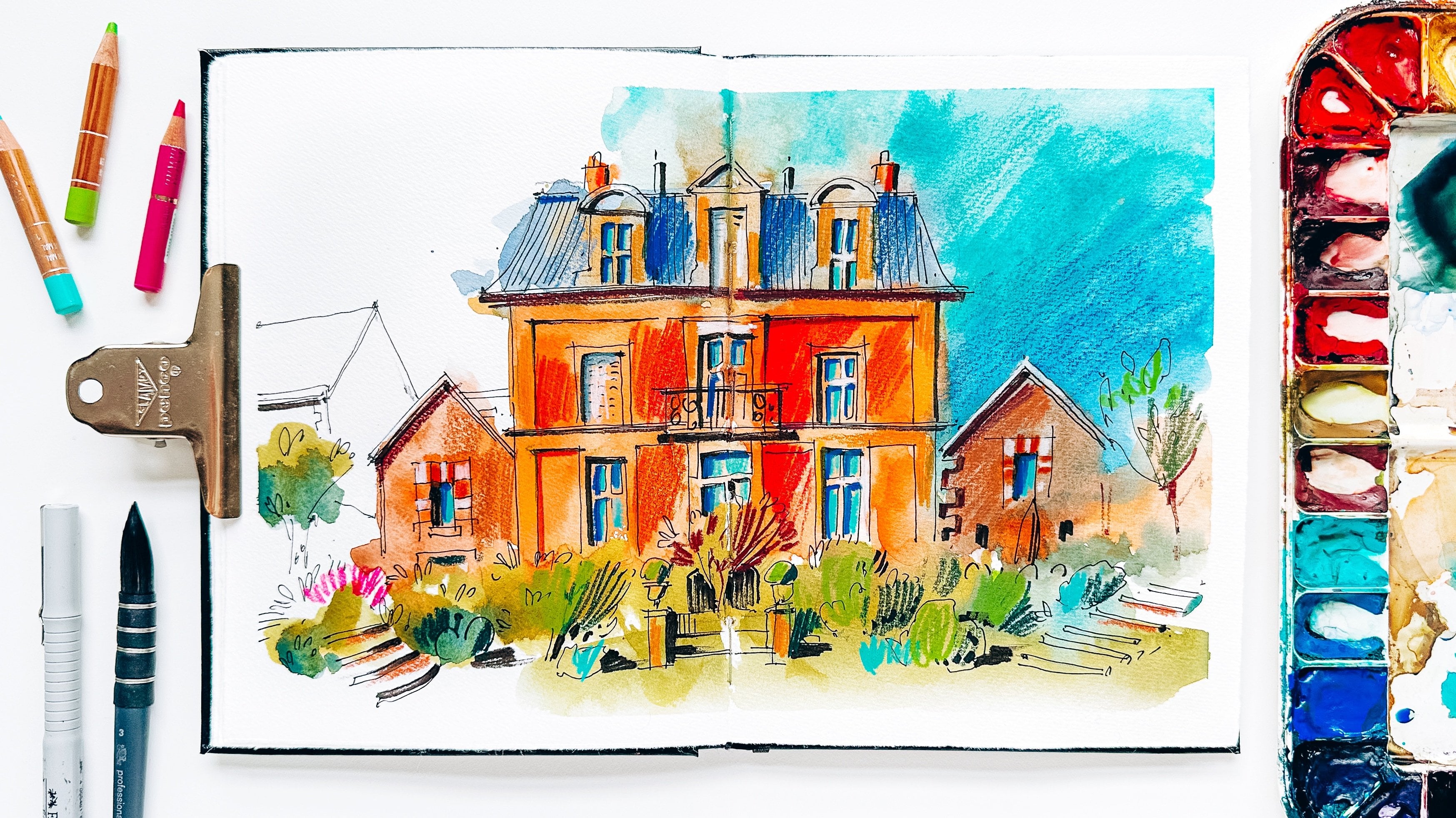
mwor using watercolor, fine liners and colored pencils. My goal isn't to create a
perfect architectural drawing. Instead, I'll show you
how I simplify shapes, suggest details instead
of drawing every book and use colors to
create atmosphere. Whether you are
sketching the lumbar, your own hometown or somewhere, you always dreamed of visiting. I hope this class
encourages you to let go of perfection
and enjoy the process. And if sketching the real lumbar has ever been on
your bucket list, I'd love to invite you to join my sketching retreat in
Granada this October. We'll spend several days
sketching together, exploring this
beautiful city, and, of course, visiting
the lumbar itself. Now, grab your sketchbook
and let's get started.
2. Materials: Okay, but before we
start sketching, let me show you the materials I'm going to use in this class. If you don't have the
same materials as I do, you just use your favorites, no pressure for having the
same materials as I do. Okay, so first of all, I'm going to use
a Cravet pencil. You don't need the
same, of course, just normal regular croht
pencil like this is is fine. I needed eraser. This is because we're going to sketch on watercolor paper. We don't want to damage it. So a needed erasor is a better eraser for
watercolor paper. Further, a sketchbook or just a block of
watercolor paper. You can choose
something like this. Or a watercolor sketchbook. Like this one, it's
honeymll 100% cotton paper. Yeah, I prefer to paint on watercolor paper because you can create more beautiful
washes if you don't have cotton paper, just use any regular
watercolor paper you have. Okay, so next, we will
need a masking tape if you sketch in a sketchbook because we don't want
our paper to buckle. If you sketch in a
block like this, you don't it because it's
glued on all four sizes, and it will stay really flat. Okay, so further, we will
need some brushes, of course, and I'm going to use
these four brushes, a flat brush for
wetting the paper. By the way, if you don't have a flat brush like this,
no worries about that. You can wetting your paper with your largest
brush. It's okay. Just a little bit easier to do this if you
have a flat brush. Uh, a large brush. I have these quilbushes they have a little
bit different sizes. I'm going to use one and three. These are winds and Nuton
My favorite brushes, I really love these brushes, quilt brushes from
winds and Newton. If you have any other brushes or if you have just round brushes, watercolor brushes, of course, not the quil ones. I would suggest sizes like
I think for this one, maybe 12 to 14. And for this one, I think
about size ten will work well. And a small brush, small round brush for details. It's quite stiff brush size two or three will
be really great. Okay, further, we will
need a fine liner. I'm going to use this
one. It's Sepia. If you don't have
a sepia fineliner, you can use any other
color you have. Usually, it's black. If you have a fountain pen, perfect, as well, just use that. Also, actually, one
of my favorite tools, but I just wanted to use a
sapier color for this sketch, and I have a fine
liner of this color. Okay, so the size
of the fine liner, I would suggest 0.3 or 0.5, perfect size for
this kind of sketch. Okay, and further, we
will need a brush pen. If you don't have any, just use a thicker fine
liner, that's okay. It's a brush pen. This one is from tumbo. I really like this one because
it has a flexible nip, and at the same time, it's short and it's very
easy to control. So this will be for adding
extra dark shadows. Okay, and the watercolor, of course, yes, yes, yes. The watercolors, we will need some colors
like these ones. And some space to mix colors. Okay? Mix colors make
big spins with water. So some space for that
would be really fine. Further, last but not least, we will need some
colored pencils. If you don't have any,
that's okay as well. It's not necessary to add them, but for my style, I just really love to use
them for my sketches. A few colors, maybe a
few colors like red, orange, blue, bright colors. Preferably, I really like
to use these two brands. Cornsh luminos are my
favorite colored pencils and darn light fast. If you don't have
colored pencils from these brands, that's okay. Just use your favorites. So that's all for materials. If you have any questions
about the materials, put your question
under the video, and I will try to answer
all your questions, okay? No, let's really get started.
3. Sketching the Outline: Okay, so first of all, we need to create a pencil
skeuge a very simple one, no details, just
the main shapes, the biggest ones, actually,
and some perspective. Don't worry about perspective. It will be very, very easy. I will guide you through
the whole process. Okay, so we start we
always start with ground line so that we know where our building
will stand on. Okay, so let's do
it somewhere here, a little bit higher than in the picture maybe in
the reference picture. Because we need some
space here for the pool. It's also a part of
this beautiful scene, so we need some space here. Okay, now let's
draw the building. The building will be in
the center of our page. It's not my favorite
composition, but for lumbar, it's very important that everything
is symmetrical there. So we will focus on the
symmetrical composition. So I Mark the top of the building here will be
the height, our height. And let's draw the tower. Don't worry about the
right proportions. We will start with just
something we can see here, something that you grasp
at first sight and then maybe we will need to refine it. I look at the building, and I see that this part is a little bit smaller
than this part. I think we need a
little bit more here. Sometimes a razor
is our big friend. Try to raise as less as
possible, of course, to avoid damaging the
paper. Let's see. I think this part
is a bit to white. Let's remove. At this point, maybe we will change the
proportions a bit later, but for now, I
think that's good. Okay, so here we have
these two little towers, and I think they
will be like this. Let's measure the distance If your proportions are not
exactly right, that's okay. As long as your building is
recognizable, it's okay. Okay, so as you can see, I only use very simple shapes, the basic shapes,
especially the Octavo, the square, and here we don't have that many
other shapes, except that. Try to start with the ones. So we don't need very complicated
shapes in our sketch. Okay, so now we have
this little roof here. So space between the roof
and the top of this part. Here is something complicated
happening with the corners. Let's keep it simple for now, we can always try to understand
what is going on there, but for now, it
doesn't really matter. Okay, the arch, there
are seven of them. The middle one is quite large. I don't try to draw the
right shape for now. It will be later. Can refine it later. Okay. And for the lower ones, let's start with just
shapes like this. Maybe a little bit a
little bit less white. Well, a little bit
better a better shape, something like this. And we don't care that
much about the right shape yet because we will
start with watercolor, and it doesn't really
matter for this moment. We only need the most prominent, the biggest shapes
that we see here. Okay, so the next step is a
little bit of perspective. And let's start by
the way, with Pooh. I think this could be the width of the pool
and our vanishing line, so not the vanishing line, the vanishing point would
be here, somewhere here. I just decided that
it will be here. I don't care that much about
the real vanishing point. I think it will be pretty much
there in reality as well, because we see the
heads of people there, the eye level is
our horizon line and the vanishing point. So that's not the
material for this Titil. So just focus on this
little point here in the middle and all the lines all the perspective lines
will go to this point. So we use this point
to draw the line, go back and forth. Let me get rid of the
um, brushes here. So we go back to the to
the vanishing point. I think it's a
little bit too white now for the pollever
maybe it's okay. Okay, so the we don't need to draw it
exactly as in the reference. The main lines, the main
idea will be reading of. Okay, let's let's
draw a point here. We can sometimes rotate paper. Then we need a line
for the hedge? Oh let's draw a line like
this and a line like this. So this will be our points for perspective
and maybe a bit lower, by the way, a bit lower. Otherwise, it will be the
arc quite quite big here. The bushes, but I don't
want to make them. Too big. And at the same height, there will be another hedge, and let's maybe throw
a bit lower as well, like this and like this. So we can remove these lines So we use these three points
to create perspective, the side and the
top of the hedge. Okay. So next, we want to
draw the wall here. Let's look where it starts. It starts somewhere here. So this will also be in
perspective and still, we use the same vanishing point. The same vanishing point
here we have this oh, let me see what is
the best thing to do. I think we maybe even don't throw this
part under the roof, or we will paint it later. And at this moment, we focus only on
the largest shapes, the most important ones. So this is the other side. Uh, let me check
if it's the right. And then we use the
same vanishing point. To throw the other roof. And, of course, we also need the line for the
top of the roof, and maybe a bit higher. Okay, something like this. Do we need to draw the
these little towers? We can. We can just to see
how it goes, how it works. But we also can do
it later if we want to draw a bit quicker, we can also skip this part now. Okay, I already drew
it very quickly. Okay, what is important
for now, again, I think the shape
of the door here, maybe, something like this. Again, I just throw
it at a random place. I don't worry that much
about the exact Proportions, exact shapes here also, just the line for
the ornament on the roof and then the
windows in perspective. The most important part here is that everything on these walls, these two walls is
in perspective. If it's in perspective, then it's already good. Okay, we have kind of W, not a door or arch on this side. I don't want to spend too
much attention on it. Why I actually want to
add it here because the more details
are in perspective, the more depth will
be in the picture, but we don't want to to
make it too detailed. So there should be a balance between too detailed and
not too detailed at all. Just enough. Enough perspective, enough depth, but also
not to mind you, okay? You, the door is a bit too high. I also can try to draw it on
the same on the same height. But if something's not exactly exactly the same on one or another side. It's okay. Do I want
to add something else? Maybe the trees like this? Here we have some details. But I think we
already have enough. Okay, what I want to do now is to remove these guidelines. We don't need them anymore and lighten up my whole sketch. Before we start painting, it's very important to
lighten up the lines. Otherwise, it will come
through through the sketch, and sometimes it's
not very beautiful. We don't need to remove
them completely, of course. Otherwise, why would
we draw them at all?
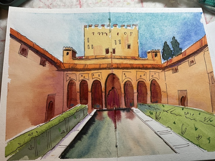
4. Painting with Watercolor: Okay, here is the most
exciting part, I think. We will start painting, and we need to incline we need to incline
our paper a little bit. So that water and
paint will come down and we will create better
washes, more beautiful washes. Okay, we will start with reading our paper. Around the building. Why I like to do
this Because I want the colors in the sky, finish in a kind of very,
very light gradient. So it's important the
wetting the paper. On this side, it's
maybe less important. This side will be
will be courpul, Turquoise, sky I love to paint. Usually my skies turquoise, even when I paint
on a cloudy day. I just like to do it.
I don't know why. It looks so cheerful, I think. Okay. And then I grab my largest brush
and start to paint. Start to paint with
turquoise and cobalt blue. So turquoise is one of
my favorite colors. I don't care about
these trees here. And let's add some Some cobalt blue. If you make your
colors a bit wet. Before you start painting, it's easier to to
get more color. And so I call her the sky here. Maybe they will be a bit
different than I thought. Okay. And on this side, I want to make the color. Or let's first add a
bit more blue. Good. Maybe I'll remove
some water here. And on this side, I want to keep it
very light so I don't need a lot of paint, maybe a little bit here, and actually almost no
paint on this side. And somehow, I think I want to add just a little bit of um, Altraminblue here to make
it a bit a bit darker, closer to the to the building. Okay, now we need to let it dry. Um, we want to add a bit of
blue here. Just a little bit. For the contrast. Okay. And as soon as I think that the color
is already quite dry, I can start painting this part. Let's let's see. I start with a bit
smaller brush. Just because this
part is smaller, it will be easier
for me to paint here and grab quite
a lot of color. This color is very common
for Spain in general, I think, but also
especially for Granada. It's Naples yellow. Of course, it's also a very common Oh, by the way, I don't need
to paint this part. It's also a very
common color in Italy. This is why we call
it Naples Yellow. I don't worry about this
because I think it's beautiful. And Maybe just a little bit of yellow, orange. A lot of a lot of yellow, a little bit of orange. And also here for the towers, I use the same
color and later. C. I will refine. We find everything. Okay. And add other colors as well. I think I need a
larger brush here. As you can see, I don't use anything like brown because
if you use brown here, then everything will be quite quite dark and boring. Maybe not dark. I mean, if you paint it very light
with a lot of water, then it won't be it
won't be light probably, but using colors like Yellow orange we create
better or more brighter, better, maybe also better, but especially brighter
picture for this site. I add a bit more water, maybe even a bit less paint, and remove it here. And for the other side, I will use a bit
more. Let me see. Maybe I will add a bit more pearl and violet
here because this part, let's say the light source
will come from here, the shadow will be
on the other side. So let's say this
is the shadow part. I painted here like this first, and then I just add some water. Here. Spread the color to almost nothing. And add a bit more
darkness closer to the ground so that it will be clear that here
we have some death. Okay, now let's paint the roofs like this one. Let's paint them orange. Also not the color we see here, but the color that
will make our sketch look brighter, more exciting. And we need a bit more water. On this side, I think I
will skip the top a bit, maybe just a bit more color. But I skip the top
because otherwise, I'm afraid that the
colors will who mix. However, I just want to try. I want to take the risk And for the shadow, I want to paint the shadow
right away here under the ofs here with
pearling violet, a dark kind of purple color, but it's actually, if you
don't have a color like this, you can always use a mixture of purple with, for example, Alison Crimson or Brensiana you create a
very comparable color. Maybe here some color and everything is
a dry, I think. A little bit too quick. Because it's summer and
it's very warm, and dry. So sometimes it
dries too quickly. Let's add some shadow
maybe here as well. Mm. I see that here, we also have a shadow
under the roof. This very small roof. Or maybe it makes sense to
make it orange as well. This part should be
also in the shadow. Let's add it right away. And let's do it with pearl
violet or a mixture of purple and orange or
red color or brown and maybe also here
are some windows the shadows under them these little roofs I want to paint
this inament line. And add but suggestions for the windows right
around here for the door and do the
same on the other side, but let's use a bit lighter, bit brighter color on this side because this
part is not in the shadow. This is in the light. And
let's make it lighter then. As you can see, I still don't worry about
the right shapes. We will do it later. No, we're not going
to worry at all. But not worth painting. And let's add a few. Four strokes here. I think that's already nice. Let's paint a few of these
little windows here, not all the same as you can see. I try to keep them different. Not too much the same. Okay, now let's look at
our beautiful arches. And here we use colors. Let's do something like
orange, for example, with pearl and violet or
maybe just with some purple. This is tu in purple. And, oh, let's paint
this one a bit lighter. And the next one will
be a bit darker. Maybe even darker here. I see there is
something that bloom, maybe turquoise here and I
can add it right away in the in the wet watercolor. And then we go back in color. By the way got at the door here. And here we start with a
darker color closer to the top and a bit lighter
closer to the bottom. I think it would be very nice or maybe even even darker. And for the warp, we have a poor here. Let's create some
beautiful reflection here. You can see that it
already starts to flow. I would add a bit of green. So I mix my yellow
permanent yellow with ultramarine blue. And then add some The same colors, actually, as in the building. And by the way, let's add some windows
here before it dries. Oh, no, I forgot to add the
beautiful ornaments here, but okay, we can add it later
with the colored pencil. Uh let's see maybe some
of this color here. Remove some. And here I want to add a very, very dark line with paints gray for for the shadow. Okay, now let's paint. Let's paint the hedges. I mix again my transparent yellow
with Autumn and blue. Um, keep it like this. On this side, maybe
just a little bit darkness here so that we see that it's a
different side, not the top. And here we have the shadow, so it will be much
darker this side. And let's paint the
trees in the background. I can't see them anymore, but they are I know that they had
a shape like this, I think, maybe a bit more. And another one smaller one. Maybe not that dark. Okay, let's let it dry
for a few minutes. It should be really
dry before we start adding more details, se our fine liner brush pen
and also the colored pencils. So we need, I think, maybe ten or 15 minutes before everything is
completely dry, okay?
5. Adding Ink Details: Okay, so everything is dry now. We can go over to the pine
liner and the brush pen. I'm going to use this
Sepia fineliner because I think it sits a bit better
the main colors here. If you want to use
another color, it's completely up to you. What I usually do I start
from at the top and go to the bottom,
just adding details, refining some things and yeah, make everything a
little bit more beautiful but still very loose and absolutely
not perfect. So here we can draw a line in with a stop somewhere. As you can see, all my lines
are just single lines. I never draw something
like very hairy lines that a lot of people draw. I know that you can you can
draw lines like this at once. It's It looks much better
in your picture, I think. So let's add some lines, some details here on the wall. See here is something, you know, we don't need
to draw everything out. It's just to show that
there was something. And it's important
for us to show it. A here, just, you know, it doesn't need to
be anything perfect. We create an impression of
what we see an impression. And I think it's
already recognizable. So we don't need to To do too much to make
it even better. It's just adding some details. Keep it loose and simple. And as you can see, this
Sepe fine liner looks a bit softer than a black one. This is why I really like
to use it for pictures like this where we have a
lot of warm colors. Sepe is a warm color, of course, and so is orange. Yellow and all
these colors here. So, also here, I don't pay too much attention
on the exact shapes. For me, it's more important
that it's clear that there is something happening.
I want to show it. Maybe some little details here. As you look carefully at all the um parts of
the reference picture, there's almost no line that
is perfectly straight. A lot of them are a little bit with some textures or not very, very straight. So don't try to to
make them straight. So I need to go to this point. Sometimes you can
check if everything is steroid in your picture. Maybe we want to add
a few people here. I don't know. Something like this. The ornaments here. No need to draw the exact
ornaments. Totally not. We still create an impression
suggestion or what we see. Something like this. This line this line are
also very important here. Let's see. We have
some lines here. Well, I didn't draw them in the first place because
it only takes time. But actually, it's very easy to draw them now because we already have
everything on paper. And it's a matter of
just adding these lines. We know where they should be. Here. Also, some ornaments. I don't know. Oh, yeah, this beautiful, beautiful door. The ornaments here. Some textures. Just, you know, some random random lines. Just to show that there are some leaves, some some greenery I think it's actually
for the fine liner, let's add some brush pen, and I add the brush pen
only to the parts that I want to emphasize where I
want to add even more shadow, even more darkness, maybe
refine some lines like here, for example, I want to
create more depth here. And we find the beautiful
beautiful lines of the of the arches. They are so elegant. Also some, maybe
let's add a few here, not too many because too many of black will make our
sketch look, look dark. Not very. Not that beautiful. So you should be very
careful with a ph pen. Here, maybe a few a
few lines, a few dots. I want to add some
something here. And I also want to
add this edge of the pool here and maybe also add a line
with a fine liner. On this side, of
course, I forgot it. But we're not done yet, so we can add we
can add more lines of here are just a few lines like this to create more depth. Something like this and maybe just a little
bit darkness here. Not too much. This is the light part. I think Well, maybe
maybe just a few more, and then I think it's
it's already enough.
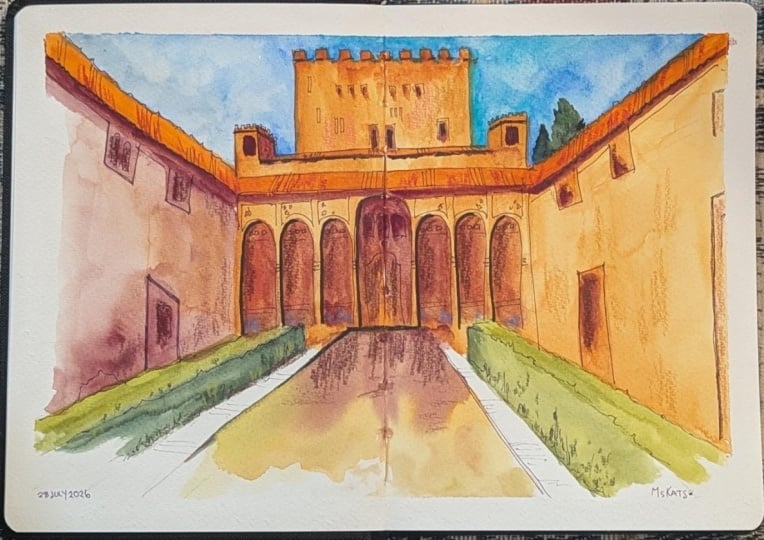
6. Finishing with Colored Pencils: Okay, so the last part. And this is a part where
you can let your heart go and just enjoy
adding textures, adding more depth, adding shadows without worrying
about the right shapes, right perspective, where
to put the shadows. Everything is already
there. Okay, let's go. So like here, for example, I can add a little
bit more shadow and texture at the same
time with a darker shade. And when I do this, you can see that the sketch looks even more interesting,
even more engaging. It's not only one
layer of watercolor. There are many different layers, and this is what makes sketching
for me so interesting. This is why I like to
use different materials, so we can add textures like this to our
sketches using colored pencils. I also want to add
a few people here just a few like random colors. It's not exactly
that these people are there and they wear and they wear the These colors, it's more it's difficult
to see this one. It's, it's just, you know, creating suggestions
of a crowd somewhere, you will notice
that sometimes it's difficult to get
the color on paper, so I think that's already
kind of crowd crowd. Let's Oh, maybe some red. Um, I don't know. Clothes. Okay, so this is all for people. Let's add some textures
to maybe to this part. I have a yellow color, and I want to add
just a little bit of other colors maybe a
bit of this pink color. Should be very careful with it. So not too much, but I see some So
bricks in the wall. So I want to show a
suggestion of brick wall, but not too much, so
not that I have to, like, to draw the bricks. Maybe a little bit. Here, maybe
just a little bit orange. Not not too much. Um let me see. Maybe add a few dots here. Maybe a few here, but the darker pencil, as you can see, I use, like, a light pencil
on a dark surface and a darker pencil
on a lighter surface. This way, I create
more textured, more complicated sketch,
which is I don't know. I like it. Looks
interesting for me. Maybe I want to add
just a little bit of Look, an ornament here. And, um, yes, I wanted to add some blue here
in the background. Again, should be
very careful with it because otherwise it will, like, come closer
to us visually, and this is not what I want to. Maybe a few textures. Here. And of course, when we have people here, they also have some
reflection and maybe here. And I also want to add
just a little bit of shadow here with purple. Somehow I think it's
a nice color here, and maybe we add someone in purple clothes to maybe
just a little bit here. And I think we are
actually done. Maybe I want to add
just a little bit of texture here because I think it's a bit
boring on this side. And bit here. Okay, so I think
we're done here. This sketch looks very nice, very colorful, and I think maybe even
better than in reality. So, it makes me happy anyway, and I hope your sketch
also makes you happy.
7. Final Thoughts: Thank you for joining me. Before you close
your sketchbook, I'd like to leave you
with one thought. Every sketch teaches
you something. So teach you about perspective, some about color, and some
simply teach you to let go. So I would say keep sketching, keep exploring and keep
enjoying the process. Thank you so much, my
friends for joining me, and I hope to see your sketch
in the project gallery. And don't forget to
review this class. It really helps me to understand
what your preferences are so I can provide you with
more interesting classes. Had the sketching, my friends.
 Julia Henze, Artist | Teacher | Urban Sketching Lover