Transcripts
1. Intodaction: Surely you know that to
improve your drawing skills, it is necessary to
know the basics even if you're doing sketching
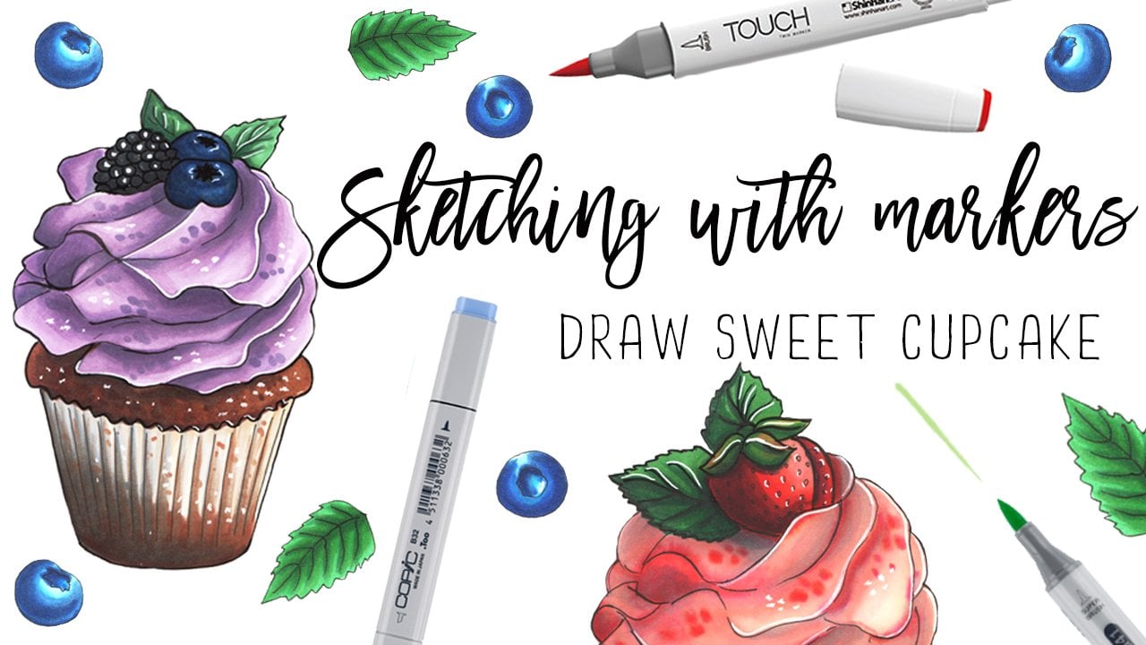
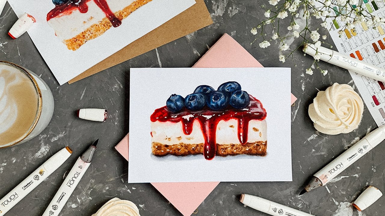
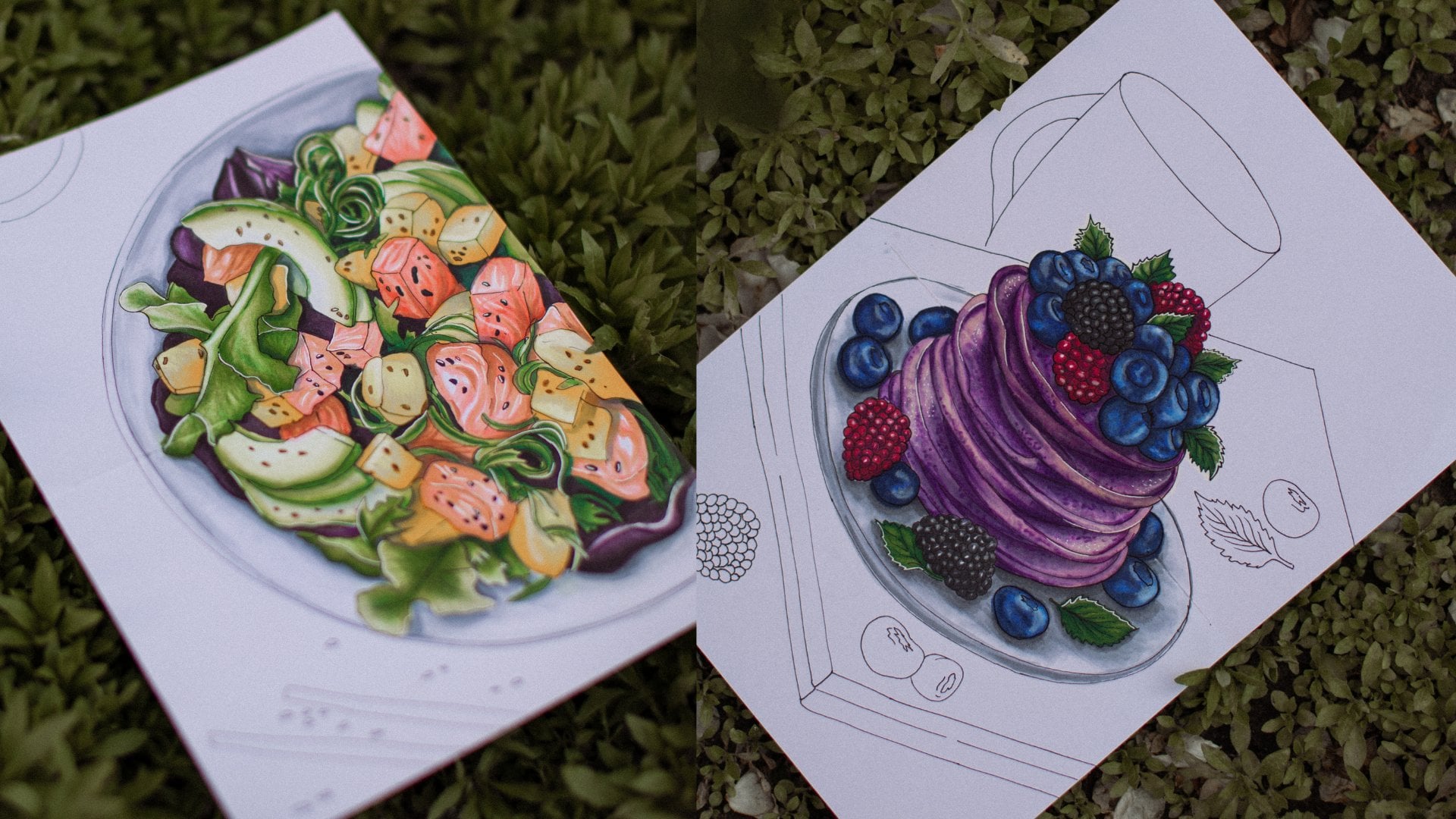
and modern illustration. I'm Morgan, food illustrator
and a graphic designer. In my new Skillshare class, I will show you why
it is so important to understand the basics of working with
light and shadow. All real object have
a certain form, whether it is an object
or even a human face. For example, you want
to draw an apple, the apple is like a ball. If you don't know how to
show the volume of the ball, then you will not be able
to draw a realistic apple. I will give you the necessary
meaning and multi-tool. It will help you
make your sketches voluminous and more realistic. My main goal is that you can start practicing
sketching right away and get good results without getting stuck
in the endless study. I have simplified
difficult terms for better understanding
and application, but at the same time
saving the most important. Also, I created a
full class guide, which you can use as a cheat
sheet anytime you need it. After this class, you
will know what value is, how the relationship
between light and shadow is formed on objects
of different shapes. How to correctly analyze
reference and of course, you will be able to show
volume on real objects. Let's get started.
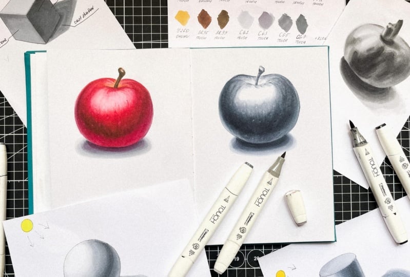
2. Class Project: As a class project, I suggest you sketch
a realistic apple in color using the knowledge you
will gain from this class. But I still advise you to draw monochrome figures with me. If you at least once form the volume on these
figures on your own, it will be much easier
for you in the future. You can upload only a ready
sketch of an apple to the project section or
all intermediate results. We'll study on a
ball, cube, cylinder, a tone analysis of an apple
and an apple color itself. Or just any of these stages you want to share with me and
your fellow students. Of course, I will give you detailed feedback
on your results. Let's dive into the world
of light and shadows.
3. Value, light and shadow, form: When analyzing and studying
lighting on a reference, refills divide image into
two parts, light and shadow. Then we divide each of them into several more
transitional zones. The first thing we start with is understanding the position
of the light source. A little trick, if there is a noticeable cast
shadow on the reference, then the light source will
be on the opposite side. For example, a
shadow on the bottom right means a light
on the top left. Visually, the darkest
areas are shadows because they often appear
most sensitive to the eye. On the opposite side of the
revealed zone of shadows, there will be a zone of light. It has more nuances. It's also important
to think about the color and
surface properties. The lighter and brighter
the surface color itself, the more light it will reflect. Let's summarize what's
encoded in the zones of light and shadow. Light zone. Highlight appears as
the brightest area at the most convex point relative to the location
of the light source. The more glossy the
surface of the object is, the brighter the highlight. If the surface is matte, the highlight is
less pronounced. Light, the path illuminated
by the light source, is the face of the object. Usually, the illuminated face of an object has an angle and locations that is maximized face-to-face with
the source of light. Halftones, the transition zone
between light and shadow. Now to the shadow zone. Reflected light is an area
on the body of an object in the shadow zone on which indirect light from other
objects is reflected. Formed shadow is always on
the body of the object on the opposite side from the illuminated surface
and the light source. It is the darkest
area on object. Formed shadow includes reflected light and the terminator. Core shadow or terminator, is the darkest area
in the shadow zone and the junction with the
light in this part of the shadow that shows
in which part of the object the border
of the shadow begins, where the rays of light lose
their direct influence. Such zone appears to in object
with a axis of rotation. In objects with
orthogonal structure, this contrast zone is
called H contrast. H contrast can be of
different lighting. It appears as the junction
of light and shadow, again. Lightened halftone at
the border between differently illuminated
plants. Cast shadow. Cast shadow falls
from an object, creating a distorted
shape of the same object. In other words, the
cast shadow is laid by the edges of the halftone
and its own shadow. Further, for better
understanding, we will analyze how
the volume forms on the example of
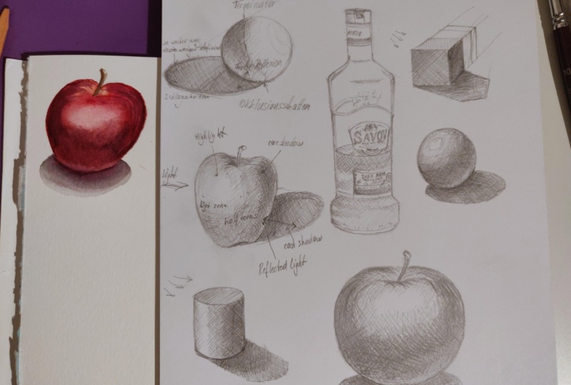
geometric shapes, a cube, a bowl, and a cylinder. Most objects can be
simplified to this shapes. And if you understand how to convey the volume
of these shapes, then it will not be difficult to transfer this knowledge
to any object you draw. For example, many fruits and vegetables have the
shape of a bowl, an apple, a tomato,
an orange, etc. A cube is a book, ice cube, chocolate pieces. A cylinder is a glass, a cucumber, and so on, so on. For the first part
of the practice, we will need markers of gray
shades from light to dark. I will use CG 0.5, CG 1, CG 3, CG 5, see 7, and CG 9. You can use whatever sheds you have, including the colors, but it should be 5, 6 shades from light to dark. Let's dive into the practice.
4. How to analyze references?: To understand how to show
volume on colored object, you need to understand
how to create it using monochrome shades
on simple shapes. The volume of any object
consists of light and shadows. If we remove all the
colors from the air, you would still see the apple and recognize
it as an apple. In other words, we are simply displaying the
values of the apple. Value is about how light or
dark an object or area is. It allows us to see the form. Our visual experience and perception of the
world depend on light. Whenever we see anything, it means that what
we are looking at is being illuminated
by a light source. Without light, we cannot see. Highlights and
shadows combine to create the illusion
of a light source. Technically, without
a light source, we have no illusion. As an object turns away
from the light source, less light can reach it, so it gradually darkens. The object falls into the shadow where light can no
longer reach it. This gradual darkening
of an object turning away from light creates
a range of values. We see form through
these differences in values or differences in
lightness and darkness. When light illuminates form, the combination of lights
and shadows creates a range of values which
creates an illusion of form. If you understand and correctly implements a value
in your drawings, you will immediately
see an improvement. Value is one of the key
elements in drawing. Now, let's talk a bit
about the value scale. Traditionally used a system of nine values ranging
from white to black, called a value scale. The scale consists of
three light values, three halftones, and
three dark values. You may notice that
in the marker set, there are often exactly nine
shades of gray, from 0-9. But to simplify, you can use a smaller number, for example, take shades through one; 1, 3, 5, 7, 9.
5. Volume in monochrome: a cube: Let's start with the cube, outline our cube, and
start with a facet. Here we don't have the task of diving into all the details of the construction in an
academic drawing, whatever. We just need to understand
how the volume forms. Erase pencil lines and now I outline the cube with a liner so you can
see it better. Here it is
approximately our cube. Now let's set where
will be a light source. I will have it here
on the top left. Remove the extra lines and I will show our
light source in yellow. It's always necessary
to understand where the light falls before starting
to work with the color. We need this to understand
where the shadow falls. Let's now roughly
outline the cast shadow. For now, this is a very
approximate shadow form because of the construction of cast shadows is a
separate big topic. Now, we will not analyze
it because for sketching, this is not critical. After all, if you adjust
the shadow from a person or some other complex
object point by point, it will be too long
and complicated. In our case, there will be approximately such a distorted
shape of the object. Again, remove the pencil lines. Now let's see how the light
will be spread over the cube. When the light comes from the top-left at the lightest part, we'll have these in this
upper facet of the cube. We take the light as gray. I have my CG1 and paint over this facet
completely to give it a shade. Fill with the color according
to the shape of the edge. We will have this edge in the halftone zone because the light comes
from the top-left, we paint over it with CG3. Again, we apply strokes according to the
shape of the object. The fill is quite dense this way and now I will add
some CG5 right here at the transition
between light and shadow. The resolve is a sharper
transition along the edges and blue with my
CG3 to make it smoother. This face is all
in the shade and we can completely
fill it with CG5. Try not to tear all
the marker from the sheet so that the
fill will be more even. Now, again, along the edge
here it will be even darker. We add CG7. But don't forget to leave the reflected light zone and we soften this
transition with CG5. Once again, here we
have light zone. This is a halftone and
this is the shadow. Let's move on to
the cast shadow. I outline it with my CG3. Now we add CG5 closer
to the object. Add CG7 even closer. Under the cube itself, we can add a bit of CG9, something like this, and blue it all with CG3, making our shadow more even. Here we can still soften that transition with
CG3 a little more. Let's look what we have. Here is our light source. This phase will be in the light. Here will be a halftone zone. Here is a form shadow, reflected light zone,
and a cast shadow. Our cube is ready. Let's move on to
the next object.
6. Volume in monochrome: a sphere: Now let's see how the light and shadow are spread
across the ball. We outline the ball itself. The ball is a body of rotation, but now their construction
details again, are not important to us. Our goal is to understand how the volume of
the ball is formed. Here is our ball. Again, I set the light source
and place it on the top left similar to what
we did with the cube. I'll show it in yellow again. Now, I will outline
the ball with a liner so you can
see it better. Here it is. Roughly outline
the falling shadow. The light is on the top left, so the shadow will be
on the bottom right. I remove the pencil lines. Just leave a shadow
a bit so that we can see where it is and
remove the rest. Now let's form the
volume on the ball. Let me start by outlining
the highlight with my CG1. For now, we simply leave
this place unpainted. The highlight is the
brightest place on the ball. It is noticeable on
glossy figures and can be blurry and not very
apparent on mod objects. Now is the same CG1, we begin to form a zone of light applying strokes
in the shape of a ball. Next with CG3, I show the halftone zone. Again, we apply strokes according to the
shape of an object. Something like that. Now mix a bit with CG1. I want to mix the
highlight with a blender a bit so it is not so bright. Here it is. In general, we can paint with CG3
over our entire ball. Now we'll start to
form the shadow area. For this, I will
really use my CG5. Don't forget to leave a place for the
reflected light below. It will be lighter
than the shadow. Now bluer a bit we CG3 to make
their transition smoother. Once again, I go with CG3 on
the reflected light zone. Imagine that our ball
lies on a white surface, and therefore our reflected
light zone is light. For example, if the ball
lay in a red surface, the reflected zone would
behave a reddish tint. Here we will have a line of refraction of the
light and shadow, the darkest place on the ball. Showing in to a CG7
and mix with CG5. I will darken the
reflex a little more and soften that transition. Now a blue transition with my CG1 a little more
in the light zone. Here, I still mix a
bit with the blender. While the ball is drying, let's move on to
the cast shadow. We outline the cast
shadow with CG3. Cast shadow the
closer to the object, the darker it is. Therefore, closer to the ball, I add my CG5. In the place where the
ball touches the surface, I add CG7, just a bit, and blend
it all with CG3. We can soften the
shadow a little more using our CG1 at the edges. Let's look what we have. Here is our light source. Here's the highlight. Here is a zone of
light, a halftone zone. Here will be a form shadow, reflected light, and of
course the cast shadow. Well, we understood how
light is spread over the surface of the ball and now we can move to the cylinder.
7. Volume in monochrome: a cylinder: Now let's look at
how the volume forms on another geometric
shape on a cylinder. We begin to outline the
cylinder from the ellipse, then lower the vertical axis of the cylinder down from it. Draw the lower ellipse. This ellipse in our case, is more open than upper one, because it is more distant
from the horizontal line. Remove the top layer of the pencil and now outline
the cylinder with a liner. Again, we're not dealing with all the inter-cases
self-construction. We are not diving into
academic drawing. Our main goal now
is to understand how the volume forms
on various figures. Make sure that the edges of
the ellipse are rounded. The light source is
still on the top-left, and as I did it before, I mark it with yellow. Now I want to outline
the cast shadow. Again it is a very
approximate drawing because the construction
of cast shadows is a separate huge topic, as I've told you before. Something like that. Remove pencil lines, and let's look how the light and shadow will be spread here. The light falls
from the top-left and it means that this
part will be mostly in light and I just give it
a little shade with my CG1. Here it will be a little darker, and we can show this
slide transition with CG2 darken a bit
and blue away CG1 to make this
transition smoother. Now with the same CG1, we begin to form the volume. Let's show highlight. It will be here, next, it will be the light zone. Next, with CG3, we show a halftone zone and make a dense feel over
the entire shape, including the
reflected light zone. Strokes as always, I
apply it in the form because with them they
also form the volume. Now mix colors using our CG1. Now with CG5 add a shadow zone, and again, don't
forget to leave a room for reflected light on the edge. Soften the transition a
little more with CG3. With the help of CG7, we show the darkest part of the cylinder and blend
it a bit with CG5. Softens the transitions a
little more with our CG3. Also, we can make our
highlights not so noticeable and blow it a
little with a blender. The brightness of the
highlight depends on the material from which
the cylinder is made. We can light on the reflected
light zone a little more. Something like that. Let's move to the cast shadow. I showed with CG3. As we can see, the shadow
expands a little upward. Now I add see closer to
the cylinder itself. Even closer I add my CG7. In the place where the
cylinder touches the surface, we can even add CG9, and blend it all with CG3. The cast shadow is darker
than the form shadow because it absorbs
many shadow nuances. The marks will dry and the
color will not be so dark, and all transition
will be visible. Let's look what we have
here is a light source, here is a highlight zone, here is a light, here
are our light zones. Here is a halftone, here is a form shadow, reflected light zone, and the cast shadow.
8. Practice 1 : Apple value study: Well, it's time for
practice in this path to consolidate and practice
the knowledge we gained, we will draw an apple
using only gray shades. Our main goal here will
be to show the volume. Let's get started. I chose this reference let's
take a closer look at it. As I said, first of all, we need to understand where is the zone of light and
where is the shadow. By the location of
the fallen shadow, now we can suppose that light falls on that apple
almost from above. This part of apple is the most eliminated and here's
an apparent highlight. There will be a
health done zone. Here we see a core shadow
and a form shadow. Also on an apple we can see a rather noticeable
reflected light area from the surface because we have an apple on a white background. The cast shadow is
almost under the apple, it's not very big. Now we will try to show all of these with the help
of only gray shades. To begin with, we outline
the shape of our apple. Apple is the same ball
but not perfectly round. In the previous part, we looked at how to show
the volume of a ball, and now we will try to apply our knowledge to a real object. Here is our apple, now let's outline the stalk. It can be simplified
to a cylinder form. Here it is. We outline the cast shadow. Now with a soft eraser, I remove the top layer
of the pencil so that it doesn't interfere
with our work with color. I will outline an
apple with a liner. Again, an apple cannot
be a perfect bowl because and it wouldn't lie on the surface but would roll. We start working
with gray shades. I take my lightest marker, CG1, and outline the highlight. There will be also
very bright place, and piece by piece, I move on to the
formation of light zone. We apply strokes in
the shape of an apple. This way we'll also
form the volume. I want to blur the
highlighted bit with the blender to make
it a little subtler. I'll take my CG2 and
edit in darker places. But you can use here CG3, I took CG2 just for a
bit smoother transition. My CG2 is running out, so I'll switch to CG3
and continue with it. We continue work with
halftones still in this area. In general, we can paint all the rest of
apple with our CG3. With CG1, I will blend this
transition a little bit. Working with such strokes we can show the texture of the apple. I think later we will addition the highlights
of reflect zone with a white pencil because
now it's too dark. While the marker is
not completely dry, with the help of my CG5 I
begin to form shadow zones. We look where the
shadow zones are on the reference and
approximately repeat. Similar way again, it's such strokes to show
the texture better. Now we mix colors together with CG3 so the transition between the
halftones will be smoother. Here we already see that the volume of the apple
is beginning to appear. We show the shape
of an apple not only by the relationship
of light and shadow, but also by the strokes
with which we work. Pay attention to it. Now at CG1 a little more to
get a smoother gradient. Again I work with such strokes. This way we continue to create the shape and the
volume of our apple. Now in the darkest places, I want to add some CG7. It will be the core shadow zone and now I mix colors with my CG5 and again
add some strokes. By saying that I want
to work on the texture of the apple with my
CG5 a little more. The main thing here
is to stop on time because this can
continue indefinitely, but I will still work a little
on the shape of the apple. Now I work a little more
on the highlights with a blender to mix all
these shapes together. Now let's bend the
stock with CG3. The top part on the
stock is in the light, so we can cover it
with CG1 or if you have CG0.5 it will
be even better. Here I have my CG0.5
in a format without a brush and also we can add
it here in light areas, but it is just an option. Now with CG5, I darken the stalk
and shadow areas and then the CG3 mix colors a little bit. Now it's time to work
with a cast shadow. We outline its shape with CG3 and we can bloom the borders
of the shadow a little bit using CG1 so that there
is a smoother transition. Closer to the object, we begin to darken. We add CG5 and now we said the dark is CG7, I outlined the base of the
shadow right here under the apple and using my CG3 mix it all together. Remember that the cast shadow is darker to the object
and lighter from it and also we can [inaudible]
the edges with a blender. Now let's use a white pencil
to show the reflected light. We highlight the reflected
light zones because the zones are very clearly
visible on our reference. Note that we'll also put
the stroke in the form. I blew a pencil a
bit with my finger. You can do it with a soft eraser or with a piece of paper,
whatever you like. As an option here, we can use an even
softer pastel pencil. Now with a white gel pen, we can slightly correct
the places where the market has blown
beyond the outline and with the same white gel pen, we can add these spots which are seen here in the reference. This will add even more
texture to our apple. Of course, we will not
leave this spot so bright. I take my CG1 and
color them on top, [inaudible] them that way. I'm going to darker the
[inaudible] area a bit more of a CG3 because the marker
gets lighter as it dries. Therefore sometimes
after drying you want to add more saturation
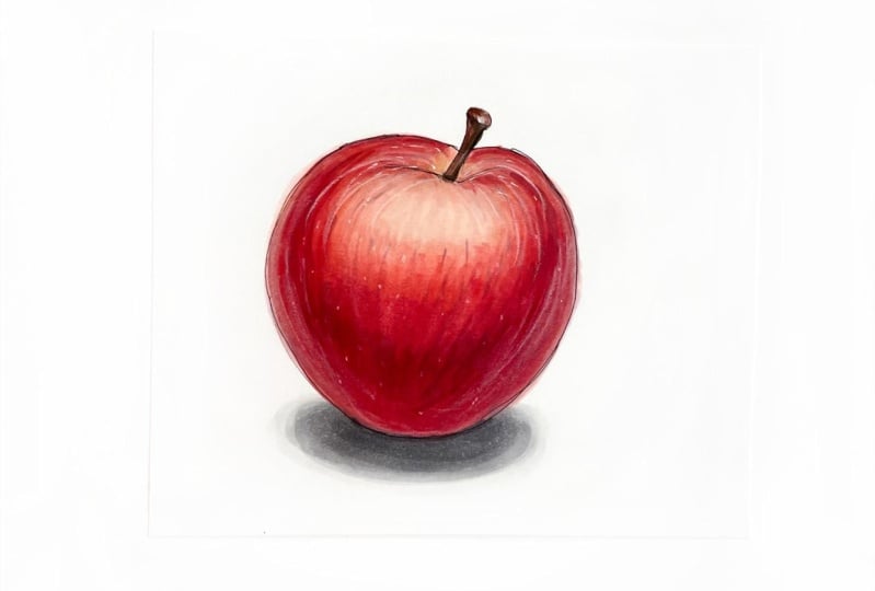
to the shadow nuances, and it's absolutely okay, so we can stop here I think. Well, we showed the volume on the complex shape of real
object, not just on a ball. Let's see our apple
has a highlight, it's the light zone. It's a halftone zone, has a core shadow, form shadow, reflected light zones
on the sides of apple, and a cast shadow. Now, let's try to complicate our task a little and
practice with color. See you in the next part.
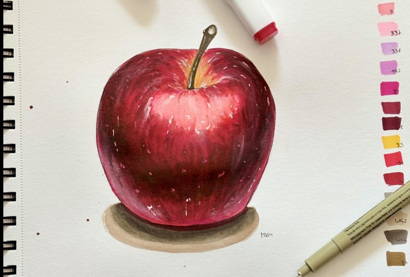
9. Practice 2: Working with color: Now we're using the
example of the same apple. I suggest you try to convey the shape and volume with color. For the apple, I
chose this palette, several colors from light pink, two dark red, yellow, purple, two browns, and gray, which we have
already used before. I will be using a combination of touch and
[inaudible] markers. Shades can be taken a little less or a little
more, for example, here you can use
either R3 or R5, because my R3 has dried up and
I will replace it with R5. You can pick up
any similar colors from those shades that
you already have. Or if you are drawing
from your own reference, choose colors based
on your reference. You can find these color
palette in the attached files. Let's take a closer look
at our reference again. As we have already
found it out early, outlet false almost from above. Here is a highlight. Light, halftone, core shadow, and reflected light from
a light background is clearly visible here and
of course the cast shadow. So we start drawing. Again, we outline an apple, just like we did in
the previous section. Then pull the ball [inaudible]
of an irregular shape. We draw an approximate shape, but we try to repeat the shape of an apple from the reference. Notice that at the bottom, apple is not perfectly round. It's basically slightly fled. If the apple were
perfectly round, then it would roll
off the surface. Outline a cast shadow. Here it is, and now remove the top layer of the
pencil with a soft eraser. I will outline the
apple with a liner. Here it is. Now we're ready
to start working with color. I take my lightest pink R136 and mark bright places with it. Not forget to leave a
place for highlight. For now we're just making the first colored layer as if we're making a colored underlay. Then we can paint over almost entire upper part of
the apple with this shade. Now at a yellow tint, my is Y260, where we have yellowish
spots on the apple. I take a darker pink. My is RV270, and darker the
apple a little bit. Again, it's important to apply strokes and shapes
because again, resembles a form the
volume of our apple. In this shade, we can color the entire
bottom of the apple. We just keep walking with color spots until the
apple looks strange, but later the
volume will appear. Now mixing a little
with my R136. With the blender, I've removed the highlighted areas so
that it becomes more matte. While the blender is not dry, we can add R136 to the highlights so that
it has a pinkish tint, and we can add purple RV160
to the sides of an apple. I even want to add a
cooler purple P146 here, because in the reference it
is very noticeable tint. Now I take a warm red R14, add then just a little bit of
it on the top of an apple. I think we can add R11
here and work with it. You can not add R14 at all. It just gives a
slightly warmer nuance. Now with R11, I feel all the half-tone
done shadow zones, which are on the apple. With my pink RV270, I make the shades while
the marker is still wet. We're still making the first
colored layer an underlay. Then on this background, we'll already create volume. Again, don't forget to apply strokes in the
shape of an apple. When working with markers, often red shades are
printed on paper like this. So you have to be
careful, not like me. Of course, later we will
correct the reason why gel pen, but it is better to pay
attention to it in advance. Add again, my purple shade P146. Fill in the reflected
light zones. Now I take R3 and already begin
to form the shadow parts. My marker is almost dry, so I will replace it with R5. It's a similar shade, but a little more pinkish
and a little lighter. Then we'll go again over the entire shadow zone,
working with strokes. I take my R2 and now I will
show the shadow itself. It's already most
iterated wine shade. Do you see that the apple
is already getting volume? We work with strokes
because we also show the texture of
the apple with them. Now, this R5 or R3 blurs a
transition between shades. Now I take my pink RV270, and Here I also blend
it in highlighted area. Then do it with
the lightest R136 and mix it all with the blender. When marker is dry, the highlight will
become lighter. Also, we can walk a
little with a blender on top of the apple to lighten
these areas a little more. We don't have the goal of 100% repeating the
shades on the reference. We work with the colors
that we have and the main thing is to show the volume and
shape of the apple. Now I take my darkest red R1 and deepen the shadow even more
in the darkest places. This is a very deep shadow. And with R2 blue retreat. Now I add R5 to make the
transition smoother. Also add some small details
like stripes and strokes, these adds volume and
texture to our apple. Now I blue with my
light pink RV270. The lightest pink R136 and lighten the color
transitions a little more. From time to time, we clean the tip of the
marker on paper when we work in light on dark
because it gets dirty. Now I'm going to add some more yellow Y260 just to give a slightly
warmer undertone. I take my purple P146 and once again go through the bottom of the apple and the
reflected light zones. We will highlight the reflected
light zones later with a white pencil
because now they're not as apparent as
they should be. We can add a little purple
even here on the top. Now, I add texture to
the apple using R2, applying all the
strokes in the form. Again, some way you can add dots which will also given
an additional texture. Think now I'll go with a light pink RV270 on
the bottom of our apple. With the lightest pink R136, I mix the highlights zone again. Now once again I go
through it with blender. I take my R5 and bloom the
shadow area a little bit. When working with details, it's important to stop in time because it's really
endless process. Let's move to this stark. For the bottom part, I
take BR95 and paint it. I leave the unpainted
part on top. At BR99 in dark places. On the top, I mix a shade
a little with a blender, and slightly correct
the shape with BR95. Now I want to add a little
more purple shade, P146. Again, to the
reflected light zones. Forget about it. [LAUGHTER] Let's move
on to the cast shadow. With the help of CG1, I outline the main
shape of the shadow. At my CG3 close to the apple and even closer, I add CG5. On this apple itself, I add CG7. Note that the reddish hue of the apple is reflected
in the shadow. To show this, we add
R5 to the shadow, and mix it all with CG3. Also, we can blur the contour of the shadow with
CG1 a little more, and even soft on the
edges with a blender. Now, just as we did
in previous part, we add some spots to the
apple with a white gel pen, which gives it an
additional texture. Now we will tint all
these spots on top with R5 so that the doughnut
stand out like that. In the light areas, we cover them with our light
just the pink shade, R136. We can brighten a
little more shear too. The marker will dry
and we will highlight the reflected light areas with
a white pencil even more. For now while marker is drying, we can fill the light in
the highlight a little, and the pencil in the highlights to get the effect as
it's in the reference. I blur the pencil
directly with my finger. As I said before, these can be done with a soft
eraser or a piece of paper. We begin to highlight the reflected light zones
with our white pencil. Well, our apple is ready. We managed to show its
volume. Let's see. Here are highlight zone
and the light zone, a half-time zone,
the core shadow, and a form shadow, and the reflected light zone. Here is a cast shadow. Reflected light could be shown even more strongly
with white pencil. Now you understand how to form a volume in color
on a real object.
10. Final Thoughts: Congratulations, you
have reached the end and dealt with an
important part of drawing, how to form volume on objects
using light and shadow. I hope you have
learned something new and now you will apply the knowledge gained
in this class in creating your sketches. Keep practicing, draw
different objects and you will see how your skill
improves every day. In the attachment section, I have prepared references of various objects on which you can practice and a full class guide with main points
and definitions. If you liked my class, I invite you to leave a review. It will be useful both
for me as a teacher and for other students who
chose which class to take. If you have questions or
want to share something, you can do it in the
discussion section. Thank you for your attention
and see you next time.
 Olga Sh, Sketch Illustrator | Master Coach ICI