Transcripts
1. Cat intro sketch: Sketching is often a vital part of the process when creating. It's the foundation and
underlying structure of a piece, whether you sketch using
pencil, ink or paint, and the ability to
sketch accurately can also be a great help for
improving your painting skills, especially when working with
a medium like watercolor, where any stroke you put
down will remain visible. Hey there, I'm Tanya Amata
is based in Denmark. In this class, we're
going to practice sketching animal portraits, focusing on cats
as our references. Not going to create fully
rendered portraits, but rather practice capturing the proportions and
likeness and build that underlying structure
which can then be used for something like
a watercolor portrait, which we'll be working
on in my next class. So if that sounds like
something you'd be interested in,
let's get started.
2. Cat materials: For this class, you're going to need some paper to sketch on. I'm going to be
using sketchbooks. The main one I'm going
to be using is this one, which is one I got off Amazon. And then I'm also
going to be using a Canson graduate mixed
media sketchbook for the final sketch because I'm going to be adding
some watercolor. But whatever paper you have is going to be perfectly fine. You're going to need
something to sketch with depending on your
personal preferences. I'm going to be using
mechanical pencil in 0.2. I'll be using a six B pencil in order to achieve Daka values. And with these, you may also
want to include an eraser. I'm going to be using
a normal eraser as well as a needed eraser. Finally, and this is optional, I'm going to be
adding water color to one of the sketches. You only really need one color. I'm going to be
using Pains gray, and with this, I'm going
to be using a brush, which is just a
cheap brush I got off Timo. Let's
get right into it.
3. Warm-up Exercise: When sketching a portrait, what we want to do
is find likeness, and we do this by breaking down and recreating
our subject in a way that's recognizable for those who know that person or animal. And although there are
many ways of getting that initial outline
onto your paper, I personally think it's
so worth it to practice freehand sketching because this is not just going to help
you with the outline, but also help you understand the form of the entire
portrait a lot better. If I gave you this
picture of a cat and I ask you to draw it,
there's a chance, especially if you're a
beginner that you're going to feel intimidated by it
because where do you start? It has so much detail. If I give you this
picture of a rubber duck, you'd likely have a much
easier time turning this into a recognizable figure on the page because
unlike with the cat, here, it's much easier to see that the duck
consists of two pots, a head, which is somewhat
of a circle shape, and a body, which is either
an oval or a rectangle. And just by eyeballing it, we can fairly easily plot in some features and
details as well. And even if this duck is not a perfect replica of that photo or a perfect
representation, it is at least
recognizable as being a rubber duck, we
are halfway there. Let's go back to the cat. So instead of looking at
it like a cat or a face, we want to try and figure
out what we really see. So instead of a
nose, as an example, we see a triangle, it has a line down the center. And then it has a curve or a half circle coming
in from each side, something like that, leaving a flat foot on either
side of both of these. And although this may still need some adjustments in
order to look accurate, that's a pretty decent
representation. So let's move on and try and do a couple of warm
up sketches where we try and sketch what we see without worrying too
much about accuracy. Let's try and sketch this cat. We're not going to
worry about all the teeny tiny details, so don't be intimidated by the fact that it's a
full body picture. There are barely any markings. We've got no stripes, no spots, but we do have some pretty
clear and defined shapes that are fairly easy to see. We're going to sketch it twice with two different approaches. The first one being loose and
more intuitive sketching. This, the goal is
to just loosen up. I want you to try and
capture what you see, but don't worry and don't
stress about the details. Try to follow the
different lines and curves and let the pencil feel its way through
the form of the cat. Don't worry about going
over the same area two, three, five, eight times.
It doesn't matter. Keep the lines light, and as you begin to
see the right shape, you can go a bit
heavier with the lines. Going to see if I can add
in some facial features. And for this, I'm looking for the approximate
placement that I see, but I'm not worried
about the accuracy. As long as I end up
with something that represents a cat,
that's good enough. We are not looking for pretty. We just want to loosen up. I'm not worrying
about the proportions of the head in
relation to the body, and I'm not concerned with whether or not the neck
is a bit too long, it does not matter. Instead, we just want to
get a feel for the shapes. There is also nothing wrong with using this method for
creating a sketch that you're going to be turning
into an actual portrait because we may all have slightly different
preferences when it comes to which methods we prefer for
breaking down a subject. So if you prefer this method of starting hub or loose and
gradually building it up, please feel free to do so. You can always combine
this technique with some measuring to find
more accurate proportions, but this is a
perfectly good method for starting portrait. If it starts to get a bit too
messy or difficult to see, we can just go ahead
and erase some of the lines or at least
lighten them up a bit. Exercises like this are great if you're a perfectionist
and you need to loosen up or if you're someone
who's nervous when it comes to putting down those first
initial lines on your paper, but it's also just great as a simple warm up to
loosening up the muscles and getting ready to actually
start drawing or painting. And even if the result is not great or even particularly good, it still helps to exercise muscle memory and eye
hand coordination. So even simple sketches like this can help you
improve in the long run. Once you're happy with
it or feel okay with it, let's move on and approach the same picture with
a different method. For this one, we're
still not going to worry about the
teen time details, and we're not going to be
doing any measuring as per se. What we want to do is really try and forget
about the fact that it's a cat and just focus
on the basic shapes. Really look for
those geometrical shapes within the figure. I'm going to start
with a rectangle to represent the front
portion of the body. And a lump type shape just to represent the
back or hind portion. This is mostly in order to have an idea of the
placement on the page, but it will also
already give us an idea of the size comparison between the front
and hind portion. As I mentioned before, the head almost fits
into a box shape, so I'm going to do exactly
that and just draw a square. I'm going to build onto that
with the fur for the neck. Then below that, we've
got kind of like a triangle shape before we
get down to the leg itself. And then the leg kind of
sticks out like this. Gonna add a small paw, as well. For the hind portion, I'm going to go back and define the shape. It starts right below where the head is on the
line for the head, so they are not quite level, and then it comes
down like this. Back and up,
something like that. If looking at the face, there's a pretty
distinct diamond shape. So I'm going to roughly
sketch that in. Now on the reference, it doesn't go all the way
to the top of the head. But as long as we
are aware of this, we can add it in
however we want. Then there's a space between the diamond shape and the ears, and the ears themselves
are two triangles as well. This is already a pretty
decent starting point if we wanted to draw
this cat properly. Going to add a line
down the center of the face and a
horizontal line as well. This one is going to sit
above the center point. From here, we can try and play some of the
facial features. Maybe add in a few more
of these sections of fur. And the second leg and paw. Now, this is far from
perfect at this stage, but I'm going to stop here, but you can keep going
for as long as you want. If you want to try and
break it down even further and get more and
more details in place, definitely go ahead and do that. These two methods are so quick but also so good for practicing. And we can also combine
them by, let's say, starting with a geometrical
skeleton, so to speak, and then building onto that with those more loose lines or start super loose and then
add in the structure. It all depends on
personal preference. And with that being
said, let's move on and do a few sketches
where we're going to focus more on actually measuring proportions
and angles.
4. Measuring Angles & Proportions: I already have a couple of
sketching classes which include not only a few
slightly more simple examples, but also a few different
exercises that can help you improve your sketching
and drawing techniques. So definitely feel free
to check those out, but I do still want to
go over the very basics, which is how to measure
angles and proportions. If we were to draw a
portrait of this cat, one way we could approach it is by drawing using
the grid method, basically putting a grid
over your reference and then having a matching grid on your paper or painting surface. And you can actually
get different apps for your phone that will allow you to place different types
of grids over your photos. Will help us more easily
get the right proportions, since we can see
that as an example, the head of the cat takes up about one third of this grid
or one third of the height, and we can also
focus on just one of these rectangles at a time,
right from the get go. You can use a smaller or
larger grid depending on how much help you need getting
those right proportions, and it's generally speaking, one of the fastest and
probably easiest ways apart from tracing to get
accuracy in your drawings. But in this class,
we're going to be focusing on freehand sketching. We'll go a few different
references with varying degrees of difficulty
starting with this one, which is a fairly
straightforward portrait with very clear and defined
shapes, angles, and lines. We also only have one
eye to worry about to slightly less detail in
general. Let's get started. Let's say we wanted to sketch
this cat in order to make sure that the lines we put down on our paper have
the right angles. What we can do is take
our pencil and hold it up to our reference
and then use this as a tool to help transfer that exact angle onto
our sketch or paper. This can be super helpful not only when putting down
the initial lines, but also after completing
your sketch and you might be looking at it and
comparing it to the reference and
something is slightly off. This is a great way to try and search for what that may be. We can also use a pencil
to help find proportions. So in this case, if we
measure the size of the head, the head actually happens
to be the same height as the space above the head and the remaining
portion of the body. And so we can use this to help find those basic measurements, as well as help
break larger shapes into smaller and smaller,
more manageable sections. And breaking your
subject down into those smaller and
smaller portions is really all portrait
sketching is about. So let's try and
sketch this cap.
5. Example 1; Cat Basic Sketch: If using a grid, obviously it's completely up to you
how you want to use them, but if you want to use them to help practice
your drawing skills, what I would
recommend is to maybe start with a grid that
doesn't have too much detail, just enough for you to
capture the right shapes, the right proportions,
et cetera. And then as you move
forward in your journey, you can use grids with less and less detail or larger and larger
rectangles or squares. That way, you're training
your eye, your muscle memory, and your use of these
techniques to capture more and more detail yourself without
the help of these tools. Let's try and look for some
of the more obvious shapes. Now, the way we look
at something and perceive something may vary
from person to person. So the shapes that
I see show you here on the screen may not be the same
shapes that you see. There's never just
one right answer, so feel free to go for completely different
shapes than the ones that I'm using for
this demonstration. Okay, so I've not
been brushing up on my vocabulary when it comes to geometrical shapes in English, but I think the first shape here is going to be a trapezoid. Maybe. Either way, the base for the head is going to
be something like this. Just get an approximate
shape onto the paper. Maybe slightly longer here and
less landed at the bottom. Feel free to measure the angles of your reference
to check and make sure that the angles
that you've sketched out are somewhat correct. It's better to make these fundamental adjustments
fairly early in the process rather than
waiting till you're almost done and can see
that something is off, but you have to change
a whole lot more. You can then add on another shape which
is going to be the remaining
portion of the face. And for this one,
I'm really trying to look at that angle
following the bridge of the nose and also
following the upward angle of the chin and then
connecting those like this. Already, if we wanted to check to see if we're
on the right track, we could take this distance, and on our reference, this distance should
fit just over two times in that first shape if we go in a straight line from this angle. We can then add the ears, something like this and start to build the
shape of the body, and we already
know that the head is one third of
the whole picture, which means that the
body is going to be about the same
height as the head. Again, if we want to check
the proportions for the ears, we could see if the height
matches up with how many times it should be able to fit into the main portion of the head
according to our reference. We can also measure
the angle between the two ears or the angle between any
other point on our sketch. Even if I'm not measuring
the proportions or angles in this class at any
point throughout the process, if you're ever unsure if
you have the right angle, shape, et cetera, feel free
to measure on your sketch. Then we can begin
placing the features, starting with the
I, I'm going to use this point on our
sketch as a guide. Go in a straight line and
see where that hits on the e and then place that
approximately right here. And then going again in a line, I can see where the eye and the nose lines up and places
that somewhere around here. We're still going to
be doing a lot of refining so it doesn't
have to be accurate. And then down here,
we have the mouth. So at this point, even though we may not be able to recognize this as a portrait of that
specific cat at this stage, at least we know we have
fairly accurate proportions. I'm going to lightly
lift these lines a bit and then we can begin
rendering some of the details. Hopefully you can
still see them. I'm going to start here with
the bridge of the nose, following the ankle
down and with a small bump on the second
half piece of the nose. And if you want,
you can check to see if the proportions match up. So this divot right here
is going to be just under halfway from the point on
our sketch to this point. Go to follow the
shape of the nose itself and then down
closer to the mouth. And the im. Getting a bit more
detail on the ear. Again, right here,
where the ear ends or at least a portion of the ear is going to line up with
the corner of the eye. No matter what you're drawing and what your
reference looks like, there's always
going to be shapes, lines, angles, and angle
points that you can use to help judge the accuracy
of your drawing or sketch. I think one of the keys
is to start simple. Learn to break a
subject down into these smaller and more
manageable portions and build that confidence. You don't even have to
necessarily just sketch portraits in order to improve
on your portrait sketching. You can sketch anything
that you see in front of you and it's going
to help train your eye. The more you do
this and the more you draw, the easier it'll get.
6. Example 1; Cat Render: Once we feel confident
with the proportions of our sketch and we check
to see if things line up. So as an example, we can check to see by going in a straight line if the corner of the mouth lines up with the eye the same way it
does on the reference. We can slowly begin
rendering more detail. I like to start with the eye, but you can start
anywhere you want. Because a lot of this
cat is in shadow, it can be difficult to see
the details in form of lines. So for certain areas like right here near
the inner corner, where we have a lot
of dark values, it may be easier to go in with solid shading and look for
shadow shapes instead. Before moving on to rendering the details we may want
to fill in this area, just follow the shape of the head and then clean
up the lines a bit. No matter where you start, you just want to zoom
in on that area on your reference and really
just focus on any shapes, lines, and angles you see. I'm going to fill in
this shadow shape, making sure that we have the
right angle at the bottom. There is a lot of
shadow in this area, so seeing the exact
shape of the iris or eyeball may be a bit difficult,
but just try your best. It does not have to be accurate. This is just a sketch and
we're just practicing. If we were to use this reference for an actual painting
and we want to finish it, we obviously want that
shape to be more accurate. And so what we could do is just use Photoshop or
something similar, or if you have the
reference on your phone, use the build in editor and turn up the
exposure to better see these shapes that are otherwise quite difficult
to see properly. I'm also going to go
up here and fill in some of the shadow shape
above the eyeball itself. We've also got shadow
within the eyeball or iris. And even though the eye is not necessarily
the larger shape, adding this shadow is
still going to help divide this into smaller more
manageable portions, which may make it easier
when placing the pupil. We've got the shadow right
here near the outer corner, which doesn't go quite down
to the corner at the eye, so slightly above, and it's
going to sit right here. There's another very clear
shadow shape on the nose. So let's go over here. Again, really try and look to see if we have
the right angles. G to go up here and then
fill this in like that. Going to add some shading
to the side of the nose. We can see another
shadow shape right here along the wider portion
of the bridge of the nose or the start
of the forehead, starting at the corner
of the eye and going up. And we've also got a very
clear triangle shape from the light hitting the cat, so we want to avoid this, although you can go in with an eraser and correct
it if needed. If we follow the line from the eye right here and go down, we actually have another clear
light and shadow division. So let's fill this in. Avoid that spot from light, and then fill in some of
the shading right here near the mouth or muscle and
going onto the cheek. I'm going to roughly
fill that in, but already we can see that the cat is
starting to take shape, and it's starting to
look more and more like the cat in our reference. Moving down to the
mouth and chin, I can see that I
definitely don't have the right angle or shape
right here below the chin, so I'm going to give
this more of a curve. I'm going to round off the
chin a bit more like that. I'm pretty happy with the mouth. I just want to
maybe round it off slightly right here and then we can fill in some of
the shadow as well. We can also continue
U onto the cheek where we have another shape from the light hitting the cap. You can also quickly
fill in a bit more of the shading here
near the chin or, I guess, start of the neck. If we were to use this sketch for Watercolor portrait
as an example, we may not want
this much graphite or shading on the sketch, but we can use the shadow shapes to help find the details and the guidelines that we typically include in a sketch for
a watercolor portrait. So like here, we have the shape of the cheek
already mapped out. So we can use what
we have on our paper at this stage to help
find the angle points we would typically
include on a sketch for Watercolor portrait or from whatever medium
we wanted to use. Don't worry too much
about the values. This sketch is quite
rough, and that's okay. We're just using it to practice proportions, angles, et cetera. The great thing is that we don't have to
render something to completion in order to practice or strengthen our skill set. Sometimes setting aside
just a few minutes to practice the
basics is enough. And then other
times we can bring a sketch all the way to
a finished painting. And I think that's
one of the things I love about sketchbooks, even though this isn't
a finished piece, it's still a finished
page in the sketchbook. And so I still
feel some sense of completion and also
feel like I've somehow kind of treated myself if I take a few minutes and spend some time filling out
one of these pages. And while on the topic, if we were to use a sketch
for a finished portrait and we wanted to do this in
Waterclo or any other medium, depending on us as individuals
and how we like to work, some of us may want more of
these lines to help guide us and some of us may not
want any lines at all, but doing sketches or studies like this where we practice
seeing these shapes and practicing these lines
is still going to help us better see and
render those portraits. I know that doing these
sketches may not feel as exciting as having
a finished painting or drawing in your hands. But it's important
to not overlook the powers of doing
these exercises. It's like going to the gym. It may not be the most
fun part of your day, but it can be a necessity, and it's usually
always a good idea. Before we move on
to the next lesson, we can fill in the shadow
shapes near the ear as well. We don't want to leave that out as the only unfinished pot, and I'm going to fill in some of the shading on the body as well. We are going to get back to the sketch later in the class, but now we're going
to leave it like this and move on to
the next lesson. Having blocks of
light and shadow is just another way of
seeing shapes a lot of people prefer using
this method of finding light and shadow rather
than going in with lines, especially in the
beginning stages, although not quite the same, it's similar to the exercise in my other video about sketching
animals where we use squash to sketch or render a mouse using shapes
more so than lines. So definitely check that
out if you're interested because there's never just one right way of
doing something. It's always worth trying out different techniques
and different methods and finding what works for you.
7. Example 2; Dog Basic Sketch: Let's try sketching from a slightly more
challenging reference. Here we see the head from
kind of like a quarter angle, slightly tilted, and we've
got a second eye showing, so we need those to
line up as well. As I mentioned in
the previous lesson, there's not just one right
way of doing something, so we could approach this using many different types of shapes. The first thing that
jumps out to me is that his or her head kind of
looks like a bicycle seat. But I don't think we
should go with that route, although you could
if you wanted to. We could also follow the angles
and lines we clearly see, so go about it this way and
then build it up from here. I'm going to take a slightly
different approach and start by sketching out
the line for the eyes, which also
coincidentally follows the line we see in the fur
on the side of his head. We want to really
try and make sure that these angles are correct. We can then draw a line for the side of his head
and if you want, you can follow the side of the ear if you feel
like that's easier. Next, we can roughly box
in the top of the head. So I'm going to go
across up here and then roughly sketch
in the other side. I'm not going to worry too much at this stage if the shape itself is too wide or
anything like that. Looking for some of those proportions on our
reference that are going to help us if we take a look at
the top half of his head, this portion, it's got to be about the same height as the portion of
his head below it, which means that the jaw line is going to be
right around here. If looking for something
that can help tell us how white that head is going
to be on the top section, one thing I'm
noticing is that if we go from corner to
corner right here, We need the width
of his head down here to be about
the same distance. So I'm going to move
this line just a bit on my sketch to make the
head a bit more narrow. Then we can close up
the bottom half adding two lines here and here. To help place the ear, if we go in a horizontal
line from this eye, it's not too far off. The ear is going to sit
just below that line. Don't worry if it's not 100%, we can always make adjustments. Finally, we can add in
the eyes and the nose. If you're not quite sure
where to place the I, again, look for things
that could help you. If you go from corner to corner here and Cora to corner here, you can estimate where the I is going to intersect
with those lines. You can also take the width
of the eye and match that up with this line to see where approximately
it's going to be. Or you can measure
an individual angle. So if we look at
the tip of the nose or the point of the nose
furthest to the right, which is going to
be around here, we can measure the
angle in order to reach the top of the eyelid, as well as starting with the same point to the
outer corner of the eye. This can also really help place the eye in
the right place. Though, you may need to
allow for some wiggle room since we don't have a lot of details on our sketch just yet. So let's try and
refine our sketch a bit and add in a
few more details. Gonna round of the head up here and try and give it a bit more shape
around the sides as well. At the muscle and mouth. Maybe something like this. And a bit more shape
to the ear as well. The corner of the mouth can also help us when placing that high. If we go in a straight line up, we can try and judge how close
to this line the eye sits, and we've also divided that big shape of the head
into smaller sections. That's really all partridge
sketching is about starting big and getting those initial lines
and proportions, breaking that down into small and more
manageable portions and rendering more
and more detail. In order to add in
even more detail, we can start looking for some of the markings or shapes
within the fur. As an example, there's a shape that's darker here on the side
of the nose or the muscle, which goes right
here on that line between the corner of the eye
and the corner of the nose. We've got almost like an
M shape on the forehead, and the center of
that is going to go somewhere between
those two eyes. There's a rounded shape here and another one
closer to the eyelid, and this one goes
under the eye as well. There are some
slight shadow shapes further up on the head here. And another shape here. The more of these shapes
that you start to add in, the more the portrait will hopefully start to
emerge on the paper. Once you feel like you've mapped out the features and
different shapes, let's clean up the
lines a bit and get started on rendering
this in a bit more detail.
8. Example 2; Dog Render: Let's try and render a bit
more detail on this one. And I'm going to
start with the eyes. What we want to do is slowly
add in more and more detail. I'm going to start with the
approximate shape of the eye. For this one, since
there is a lot of going back and forth
and a lot of repetition, I will be speeding up
more of the footage. But I also don't want to
speed it up too much. So at some point, I may just stop yapping and
we can listen to some music trying to look for where that
bottom waterline is, as well as the shape of
the eyeball or iris. You can take your time and spend as long as you want on it, rendering as much of the
fine detail as you want, and you can focus on copying either the lines you
see or the shapes. It does not have
to be super neat. Our goal is not to create the best finished portrait here. It's just a sketch,
and our goal should be to practice getting those
right proportions and shapes so that if we sketch from multiple references at a time and really practice this, it'll help us really build
and strengthen our skill set. I'm going to switch
to my other pencil for some of these dg of values. So I'm going to go in, correct and define some of
the shapes if needed, and then add in some of
those tag of values. If you only want to practice getting the correct proportions, lines and shapes to
create an outline that you can then use as a base for a Water call portrait
or something like that, that's completely fine as well. But if we only have the outline, we may not end up with
as much of a likeness. So I'm going to work on some of these other shapes that
we saw in the fur. I'm going to add just
really basic shading. Not worrying about any of
the texture of the fur. Let's do the other eye. One thing to note
is that the size of your sketch may determine how much detail you want to add. The smaller your sketches, the less detail I
probably worry about. Our brains are actually cool
because as long as we have those larger shapes and
values in the right places, we can fill in a lot of
the information when looking at something even if the information
isn't even there. And within portraits,
this applies whether it's a
human or an animal. Try and picture a
specific person, someone you know really well. Picture them in your mind. I'm taking a wild guess here, but I'm assuming
that what you have pictured in your mind
is not the exact shape of their waterline or the exact shape and
size of their nostrils, unless that's very
prominent, I guess. It's not to say that those
things aren't important, but what we focus on first is probably going to be something like the
shape of their face. Maybe we can start seeing
their forehead and the size of their cheeks and we'll start
to put in a nose. So basically, starting
with those larger shapes, and then sprinkling in some of the more
important information, like, do they wear glasses? What color are their eyes? Do they have a mustache? All these different
things that are going to help us recognize them. But very rarely is that going to be the most
minuscule details? Once again, that's not to say that the details
are not important. The more accurate those are, the more the portrait
is going to look like whoever or whatever
you're going to draw. And repeatedly practicing
the fundamentals will inevitably
help you improve. I know a lot of you
will probably agree when I say that adding
layers of paint, the colors, the blush to
the cheek, the eye color, the eyelashes, and all
those little details, oftentimes a lot more fun and feel more rewarding
than doing the sketch. Often just kind of want to skip that sketching process and
get right to the fun part. But if we view creating a portrait or any other
type of piece of art, almost like constructing
a building. We need the foundation
to be strong and we need that to be in
place before we can move on. We don't start decorating the living room before
we've built the walls. So when you want to
create a portrait, the first step is to create the construction,
build the walls. So those larger shapes
and proportions, we need those in place
before we can continue. And then we can
build onto that with shading or color and from there, we can decide how much
detail we want to add. Obviously, the more
detail we add, the more important
it is for us to be able to recreate
the smaller shape, so all the correct
details around the eyes, finssing the smile,
the nose, et cetera. It is also worth
mentioning that you don't necessarily have to be able to recreate those tiny details. If you think of a lot
of the old masters, you know, oil
paintings and whatnot. Lot of those, even
the portraits are not painted in minuscule
or very fine detail. They still have a very
painterly look to them. But if you take one
of those portraits, you're still able to recognize
who it is in that painting because the greater
proportions or the larger proportions and
shapes are still correct. If you really want to improve on your sketching skills or
freehand sketching skills, I highly recommend
having a sketchbook. Set aside a few minutes
or however long you want to spend on it,
either each day, a couple of times a week
or however often it fits into your day to day life and
allow yourself to practice. Realistically, though,
I also know that not everyone has the time
or desire to do this. So if you for whatever reason, want a faster solution
or a faster method, you can always use a grid. If that's what's going to help you get on the right track and get those initial lines in place, nothing
wrong with that. In the next lesson, I'm also go to show you a different tool that can be of help when
practicing freehand sketching. I'm constantly looking at my reference to see
the exact shape, so seeing where I
need a line to curve, if I have the right angle, and if I need to make some
of the lines a bit longer, so lining up the different
features with each other, like we did with the conner of the mouth and the
conner of the eye, going in a straight
or vertical line up. It's up to you how much shading or detail you want to add. The most important
portion of this class is really just focusing on the
construction of the portrait. And even though rendering
something to completion is still important and
can be super helpful, quantity or quality will
often help you much further, especially if you're
new to portraits. Spending five, ten or 20 minutes per sketch and then doing three, five or even more sketches will, in most cases help you improve a lot faster than if you were to spend an hour or 2 hours
doing just one sketch. But again, that's
not to say that it's not important or not a good idea to spend an hour or
2 hours on one sketch. Both methods are great, and each method is going to teach you
something different. Do whatever fits
with your schedule, do whatever you feel
like in that moment. Don't force yourself to
do something that you really don't want to do because art is supposed to be fun. I hope at least some of
what I said makes sense, and whatever you
decide, I support you. At this point, we really have all the important
features in place. So I'm going to finish off with some shading to the
rest of the face, giving it some more
detail and form. It's not really going to
help with the construction, but it's really fun
to compare when we look at the initial
sketch and how even though we have
the construction lines in place and the correct
shapes and proportions, it doesn't necessarily really look like this specific puppy, but the more shading
we then start to add, the more it transforms into
a more specific portrait. Outline by itself is not
necessarily enough to make it look like a specific person
or a specific animal or pet. So if we're ever unsure if our construction
lines are correct, we can always add
shading to help better see or find the likeness. Now, as mentioned, I want to show you a tool
that can help show you if your sketches are correct or if you need
to make adjustments. So let's move on to
the next lesson.
9. Helpful Tool: So you know when you've created a sketcher drawing or painting, and you've been staring
at it for a while, so it may be difficult to see if everything
looks about right, or maybe you can tell
that something is off, but you can't tell what it is. So you can't quite figure
out how to fix it. I want to show you
an app that you can use to help when practicing. I'm sure there are multiple
different versions of similar apps, but this one is
called photo layers, and there are different
ways you can use it. But the way you
can use it to help practice is that if
we open the app, and we select our reference. So in this case, we're going to do the golden retriever puppy. Then you want to
take a picture of your sketch and open this
in a new layer up here. I'm not really interested
in the background, so I'm just going to crop it. And then if your picture
came out a bit dark, what I would do is
just first sharpen it, make everything a
bit easier to see, then brighten it and
add some more contrast. May need to spend
some time resizing it to make it fit properly, but you can change
the opacity and basically switch between seeing the sketch and the reference. So after you've matched up the size and the features
the best you can, you'll be able to tell
how far off you are from the original reference
and use it to help tell you where you may need to
make some adjustments. And though I would still
recommend training your eye to better see
these problem areas, we can call them on your own, the app can be a
super helpful tool, especially when practicing.
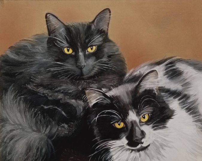
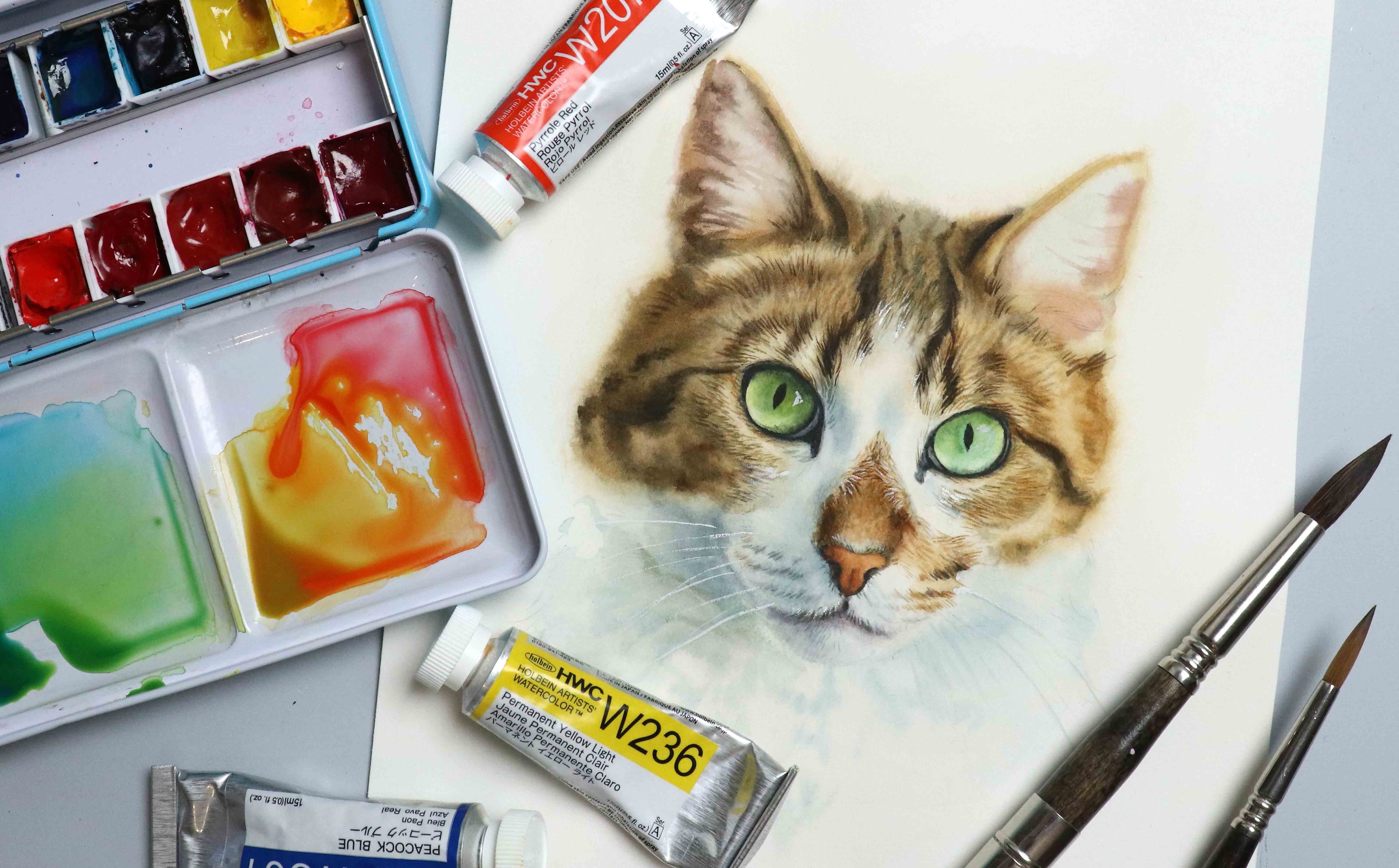
10. Cat Sketch; Measuring Proportions: For this one, I'm
going to be using watercolor to help fill
in some of the shading, so I'll be switching to my
mixed media sketchbook. You don't have to use
what I call it though. Feel free to stick with
just using pencil. Or if you want to bring in a different medium like chacal, pastel or magars, you
can do that as well. It's not a necessity. It's just going to speed
up the process and help us render in more
detail in less time. Let's have a look
at our reference. Once again, there are multiple
ways we could go about it. And if you want to break it down differently, definitely do that. We could start with a square by following some of
those straight angles, even in the fur itself. But I want to start
with a shape that more closely resembles
the shape of the head. Not quite a diamond
shape, but similar. Let's try, starting with
the top of the head, we want to get that angle in just to have a
starting point. If you've been creating
smaller size sketches like I have in the
previous lessons, I'd recommend going slightly
larger for this one. Once we have that
angle in place, we can draw the outs again, we just want to
follow the angles. Here comes the first
potential problem. If the length of
those lines does not match up proportionally
with the reference, it's going to be out of shape. So we're going to try our best
to get the same distance. Okay, if we take the top line, the line on the left is going
to be just a tad longer. And please don't
take my word for it. Practice checking on
your own reference. It's gonna help you
a lot more if you practice measuring these
things yourself as well. I'm going to create
a matching line, same length on the other side. Next two lines are going to be shorter than the first line, maybe about two
thirds of that one. I'm going to eyeball
mine, but feel free to check if you're unsure. The one on the right
is going to be slightly shorter than
the one on the left. Even though the chin is
slightly off center, I'm still going to
put the point of my shape at the
center of the bottom, which means if we
take the center point of the first line and go down, we know the point will come
in somewhere around here. And then if for these
two last lines, we have the right angles, the shape should match
up at least somewhat. We don't have to
measure everything in minuscule detail and
with time and practice, you'll become better
at judging this without measuring or
with limited measuring. Next, we can add in the
center line for the face, which is going to be slightly
off center and curved. And we can also add
in the eyeline. I'm going to create an eyeline for both the top and bottom. The bottom is going
to go close to where the two corners
are on that main shape, not 100%, but close enough. And for that top line, I'm looking at the
space right above it. So how much room do we
have in that section? And I want this to be
able to fit in one or the height of one
eye plus a bit more. Gonna add in the nose and
mouth as well as the ears. The height of the ears
is going to be close to the same height as the
top half of the face. We can then start placing the eyes and draw in
the neck as well. Already, when looking at it, I feel like my mouth is maybe sitting a bit too high up,
at least on the right side, I'm going to try and
pull that down a bit and then finish
off the shape. The eyes are also a
bit too close on mine, so I'm going to move
this eye further to the side because this eye is sitting more in the
center of that section. I think that's a bit better. Going to clean up the lines. So if you find the lines to be helpful still at this stage,
feel free to keep them. If you don't think
they're in the way, you don't have to
get rid of them. From here, we want to look
for more shapes that can help us divide the face into small and more
manageable sections. So above the nose, if we follow the shape of
the bridge of the nose, we have this squared
out shape here, and we can see how that kind
of connects to the eyes. Then around the eyes
near the inaconas, we have some white fur so
we can follow that shape. We've got the muscle or where
the whiskers are attached, which go kind of like this. You can follow both the
shape of the muscle itself, but also the shapes around it. This triangular area right
here near the left eye. It also looks like
the cat is smiling. We have these lines going right here and I'm looking
at the space surrounding these lines to judge where they
are in that space, but also whether they're
sitting near the top, bottom, or center of that space. G to add in the chin
approximately right here. We've got some
markings in the fur, so we can try and follow those. The one on the left is more
of partial shadow shape. We only got some of the
marking showing at the top, but I'm still going to try
and follow this shape. Then on the right side, it's a bit more prominent. The more of this
information we can successfully transfer
onto our sketch, the more it's going to look
like this specific cat. Once you're happy with the different
proportions, guidelines, and the shapes you've added, let's see if we can polish it
up and render the details.
11. Refining Sketch: Now that we have the
right proportions and a bunch of guidelines, let's see if we can
render the details. I'm going to begin by lightening the lines a bit to make
them less distracting. I'm going to start
with the eyes, but if you want to start in a different area,
definitely do that. It's all about
personal preference, but since the eyes are usually the first thing we connect
with when looking at someone, I want to try and get
these in place before working on any other
area of the face. I'm starting with
the larger shapes, so the shape of the eyeball
and then working around that, looking at the shapes
surrounding it, the waterline, the markings of the fur, and the tear duct. Not everyone enjoys
doing it this way. Maybe you prefer chipping
away on different areas of the face all at once going back and forth between
the different features. And if you find that easier,
that's completely fine. Whichever technique you prefer is the technique you
should be using. Take your time, don't rush it. It doesn't matter if you spend more or less
time than I do, as long as you're working in a pace that you're
comfortable with. If you find it difficult
to place the pupils, you can always add
more guidelines within the eyeball or iris, breaking it into small
sections and making it easier. It's not a big deal, though. If we're not happy with them, we can always erase them and move them
further to one side. Gonna go with more of
those markings of the fur, lightly sketching those in then moving down to the nose, I'm going to begin
with the basic shape, try and get the right angle. Drawing the nostrils. Something like this. We can always make
adjustments if needed. I'm going to go
over the shape of the mouth and muscle
one more time, making sure I have a shape
that I'm happy with. And while doing
this, although I am looking at the outline
of each shape, I'm also focusing on the shapes within the shapes,
if that makes sense. I'm both focusing on the edges, but also on the surface area, trying to judge if
the shapes that I'm currently working on match up with the shapes next to them. The chin is super fluffy, so rather than going in a straight line to
form the shape, I'm going to add
in some texture. It doesn't have to be exact, but it makes it
appear more accurate than having a line
going straight across. Once I have the main features in place and I'm fairly happy
with the way they look, I'm going to move
on to the ears. Just go over the
shape one more time, and add in a few more details on what I had on
my initial sketch, starting with the outer shape. And then for the bottom
line or baseline, just like with the chin, instead of having a straight
line going across, I'm going to add in
some fluffy texture and then see if we can break
down the inside of the ear, trying to capture some
of the details we see. Same with the other ear, go to start with
the outer shape. Something like this. It's definitely starting
to come together. Once we have that, we can go around the
outer perimeter of the face and add some
texture as well, following approximately what
I see in the reference. We don't need to get the exact texture for
it to look like this cat as long as we get the overall shape
and the proportions, so as long as we don't
make the face a lot whider with the fluff or make the
forehead appear too tall, by adding the texture,
it's all good. Going down onto the neck, again, I'm trying to follow
what I see in the reference with the neck and the shapes that
appear within this area, we don't have to be as accurate as with the facial features. There may be things
that are typical for that specific animal, so the way the fur falls
may be very specific. In that case, we may
want to try and really capture those specific
shapes or details. But if one of these
tufts of fur on the neck ends up being a bit larger or smaller than
on the reference, it's nothing to worry about. With that being said, when breaking down the neck into
these smaller tufts of fur, I'm using the facial features and ankles to help place them. Even if it's not 100% accurate, we still have a pretty good idea of where they're going to go. Before moving on, we can take a look at what we have so far, see if there are any
adjustments we need to make. I'm pretty happy with
my sketch overall, but I do feel like the
nose isn't quite right. The nostrils are not lining up, and that's kind of bothering me. So I'm going to erase some of this and see if I can
improve on the shape. That looks a lot better to me. May not be 100%, but good enough with
just practicing. If you wanted to
leave it like this, you could and just maybe play around with the
details a bit more, make sure you are
happy with the result. We are just focusing on the sketching portion
in this class, and at this point, it is ready
to be used for a portrait. You may want to erase
some of the guidelines, but I want to take it a bit
further and add some shading.
12. Shading & Class Project: The thing with portraits is that sometimes when
we have our sketch, even though all the
proportions may be correct, it still doesn't
always look like our reference because likeness is so much more than an outline. So let's try and add some
shading to hopefully make this sketch look even more like
our reference picture. Not going to worry
about technique or textures or getting in
those super fine details. We're just going to
add some foam to this otherwise very flat sketch. This is not watercol paper, so it's not going to
hold the water for as long as watercol paper would, but I'm still going
to try and wet the paper before going
in with any pigment. I'm going to start
down here near the mouth and chin area and just go straight in
with some shadows. I'm not going to make it
as dark as it should be. You can always dug it, but you can tell
how quickly this helps to add some
foam to the face. Going to go up into those
really dark values in the eyes, and the paper is already
starting to dry out in some places, but that's okay. It doesn't have to be perfect. So what we want to look
for are value changes. It's up to you if you want to start light and then go darker. That's probably the better way. I'm going to start dark and then move my way
to the lighter shades, which means I'm first going to focus on the more
dramatic shadows. This is not about perfection. We just want to
try and see if we can improve on the ness. O. Et's get some shading onto the side
of the face right here. Definitely need to gotten that and a touch
over here as well. I'm going to wit the
remaining portion of the paper where the ears are. And then we can add
some shading to the inside of the ear,
some light shading. And if you want, you can use your brush just to
wipe it off and use it to lift pigment if
you want to enhance that texture of fur
within the ear. Using a clean brush
to help control some of the pigment that
went outside of the lines, even though really
we don't have to. I kind of like when it has
a flow watercolor look, but I'm still going to
push that back into place. I'm going to go back to
the lower portion of the face and neck
wetting the paper again. Rewetting the paper while
the paper is still wet will definitely affect the
paper if we do this too much. So it may be a good idea
to let it dry in between, but I'm not seeing any
paper fibers coming loose, so I'm going to go in
with one more layer. A bit of detail near
the whiskers or muscle. I'm not really paying attention to the consistency of my paint. The main goal here is just to get some pigment onto the page. And a lot of the time when
practicing in a sketchbook, I think one of the best things to do is just completely let go of all the rules or
expectations and just play. Letting go of worrying and just playing can lead to so
many more happy accidents. And sometimes happy
accidents is exactly what we need in order to move forward
with our painting practice. I'm going to go back over
those same shadow areas, and then I'm also
going to try and catch some of the texture of
the fur near the chin. It's not a necessity, but because the texture
from the fur makes this shadow shape look more
choppy as in chopped up, not heavy set, it really can help with
the likeness to have that same or similar
texture compared to the chin looking like
a smooth ball shape. Once we've got that,
we can go with the sides of the face
and the neck a bit more, catch a few more of
the shadow shapes that are really going to
help add form and structure to the face
before moving on to adding some of the finer details
within the eyes and the nails. I'm going to speed up some of the footage in this lesson
because it is really just about playing
around and going back and forth, making
small adjustments. Et's talk about
the class project. So for the project
in this class, I would love for you
to sketch this cat. Whether or not you're
going to be adding any of the shading is
completely up to you. I will also say that if you
are more of a dog person or maybe just have your own cat or own pet that you'd prefer
to sketch instead, I accept that as well. There's no need to
be strict with this. And since I already included a dog in one of these lessons, I feel like I've opened up the possibility
for dog portraits. I. Aside from maybe the nose area, we've got most of the
basic shadows in place. So now we can start focusing
on some of the mid tones. We want the muscle but
especially that line of fur under the eyes to appear lighter than the
main portion of the cat. And we can also start looking
at some of the markings of the fur so that slight
stripy pattern we see. I'm gonna go back in into the Rs with a bit more
detail and texture. Not a lot, deepening some
of the values a bit. And there's definitely not quite enough contrast
between the main portion and those really deep areas within the eyes and the mouth. So I'm going to go back in with some thicker, darker paint. And This is not going to be a perfect
looking portrait, but at this point
in the process, one of the things that
we can see that takes away from the likeness is
the shading on the chin. It's not dark enough compared to in our
reference picture. Having more shadow
or deeper values in this area is going to help bring it back or make it recess. Whereas if there is too
much light in this area, it's going to make it
look more protruding, which it doesn't
in the reference. Even if you have the
correct shape and you have technically the correct
shadow shapes as well. In portraiture and
painting in general, it's so important to notice
these value changes. The realism or likeness doesn't always come from having
the most accurate outline. Of course, that does help, but the values really
help bring out the structure and
correct form or shape, which sometimes is
just as important. It's also going to bring
in a ton of depth, which will help draw the
viewer into the painting. You can play around with it
for as long as you want. This really is mostly about
the sketching portion, but just like sketching
and improving on your drawing skills can help with your painting techniques. It's kind of a vice
versa situation. So painting can also help you see more accurately
when sketching. And so practicing both
is super beneficial. Also, even though we're currently adding
shading to a cat, I still encourage you to not
necessarily see it as a cat, but still try to
look for the shapes. Of course, our goal is to
make it all come together, and hopefully by the end, we'll have something that looks
similar to the reference. But in order to
get to that point, it's important to notice
all the little shapes. So practice looking
for the shapes and angles that make
up this cat face. For the background,
I'm going to go a bit lighter than in the
reference photo, so I'm going to
keep it lighter at the top and then daga
towards the bottom. Now, having the top be lighter does mean that
we don't have as much of a contrast between
the fur of the cat on that top portion of the
head and the background. And there's actually a tip we can discuss here
because I did get a question about how to make an animal with very
light fur stand out. And one way is the
background coll you choose. So not necessarily the call
itself, whether it's blue, green, red, whatever, but
the value of the background. You don't have to pair a white or very light
colored animal. With a dark background, but having that contrast really helps it
pop and stand out. Another way, of
course, is to work on the values within
that animal itself. So even if you have an
animal, which in this case, is cream colored, make sure to really look
for the shadows. And if those shadows
appear very light, try to emphasize the
values of those, increase the value a bit and
make those dogs even darker. Not by exaggerating it, we don't want the cat to appear
a whole different color. So we don't want it
to go from beige or cream to being a mid
tone to dark brown. But using a wider array
of values can help. So that also means that when picking your
reference picture, try to avoid pictures of
photos that are overexposed. Sometimes it's unavoidable,
but as much as possible, it's better to work from
something that has less exposure and maybe more in the mid tone range than
something that's way too bright. And then even better
is if you can get a reference that
has all the values. So a photo that includes some interesting
shadows as well, because including the
entire value range from the lightest lights to the darkest docks can
help add so much depth. I am getting close to a point where I'm going
to call this one done. I'm just going to
go back in and add a few more strokes for a bit
more detail, not too much, and then I'm also
going to go back with the final adjustments, deepening the value on that chin area to really
help push that chin back. You don't have to be
precious with the details. A few random brush strokes or quick swipes with the brush can help add the impression of fur. You can also play around
with a dry brushing effect, get rid of most of the water from your brush and
use dryer paint. That can also help add some really interesting
texture to animal fur. If you're painting from
a color reference, sometimes it's more
difficult to see the value. So one thing you
can do if you have your reference on your
phone or computer is to go into the editing mode and
just switch the colors from RGB to black and white or decrease the saturation until it reaches the gray scale level. I'm sure that what
you've made so far looks great, but just in case, if you're sitting and you
feel like you've overdone it, overworked it, or it's
just not looking right, I do encourage you to continue. Sometimes we just need to push through that well
known, ugly stage, and sometimes it may just not end up being the
result we wanted. But there is usually always
something we can take away from those experiences
and those results, as well. We don't have to always create a masterpiece
in order to improve. When you see me going
in with my finger and using that on the sketch
or the painting itself, it's just something I do to
help smudge the paint and softening the edges without
adding any additional water. You could definitely
use a brush for this, but sometimes it's just faster to access
those ten digits. I also should be
sensible and say that I don't necessarily
condone this, though, because you're not
technically supposed to touch any colors that
may have toxic pigments. So, you know, stay safe. I am about ready to
call this one done. I really hope you
enjoyed this class. Can't wait to see
what you create, and that goes for any sketches you create from this class, whether it's going
to be this one, which is a class project, or if it's from one of the other lessons or even
from your own reference.
 Tanja Jensen, Artist - Sculpting, drawing and painting