Transcripts
1. Introduction: I have loved drawing
on paper ever since I got my hands on
crayons as a child. But as I've evolved as an artist and started
working more professionally, particularly in a more
digital art space, I began sketching with paper and pencil a lot more sporadically, oftentimes failing to
keep track of sketches I liked in going long periods of time without
sketching at all. I didn't do conceptual
drawings or studies. I didn't warm up my hand before working on larger illustrations, and I didn't do traditional
art in general. That is until I
began keeping and filling an entire sketchbook
as an annual practice. Keeping a sketchbook
that you draw in on a regular basis can be wonderful for practice
and iteration, keeping a consistent
drawing habit, like warming up your hand before moving on to more
labor intensive work, experimenting with
new to you materials or just freely drawing and seeing where
your mind takes you. I find that even after
bigger art projects wrap up and I'm
experiencing some burnout, spending an entire day just
drawing whatever I want in my sketchbook is one of my favorite ways to
recharge and unwind, and it makes me feel
like I'm able to draw the way I did
as a teen again, completely self indulgent and unimpeded by the pressures
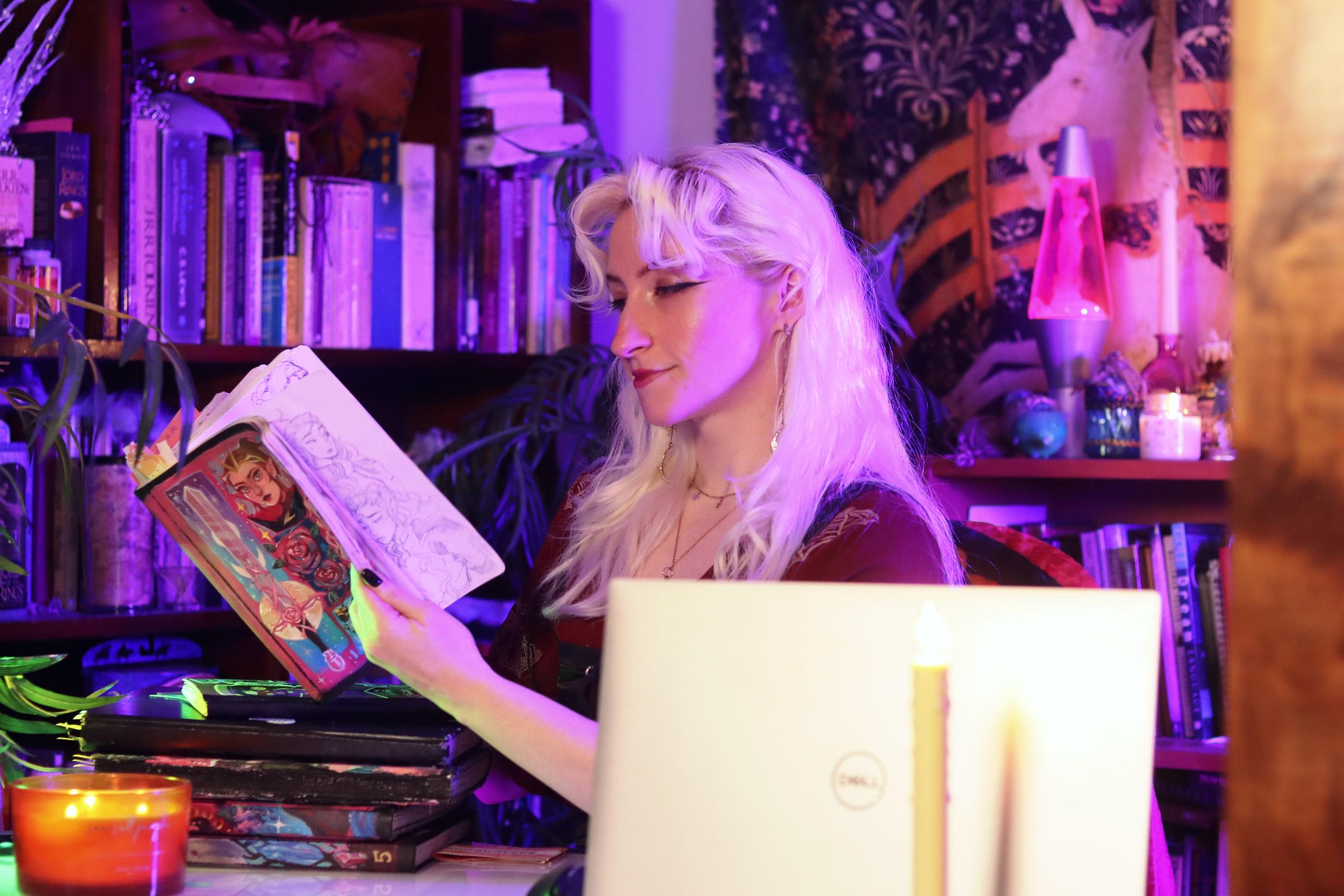
of clients and social media. Hi, I'm Kia, otherwise known
as Prickly Alpaca online. I'm a YouTuber illustrator
and cas player with a particular focus on original character
and costume designs, and I also love regularly filling a
sketchbook every single year. With most of my
illustration work being for channel
videos or for clients, a sketchbook has given me
my own personal space to exercise my creative
ideas, improve my skills, make ugly drawings sometimes, and keep up with
the drawing habit, regardless of whether
I decide to share those drawings with my
audience on social also, as an artist who uses a lot of digital
software in my work, keeping a sketchbook has also
helped me become genuinely less reliant on things like the Lasso tool, the warp tool, the undo button, and has strengthened my foundations
by helping me to focus more on intentional
observational drawing because when you're using
something like a ballpoint pen, your strokes are a lot
more difficult to undo. Lesson one, we will
brainstorm and I'll give you a tour of potential
drawing materials. And lesson two, I'll give
you a peek into some of my favorite sketchbook spreads so that we can maybe
spark some inspiration. Three, we'll find
references to draw from and create the first
sketch on our page. And Lesson four, we'll add
more sketches to the page, add color, fill spaces,
start to pretty it up. And in Lesson five, we'll
complete the spread and make any changes or finishing touches and then reflect
on our drawings. This class is for
anyone and everyone, but it will be most
useful to artists who already have a grasp on
basic drawing foundations and who would like to establish a regular drawing
habit to help you practice regularly and
nurture your ideas. Hope is that this class
helps you feel less intimidated by the idea of keeping a regular
sketchbook habit, that it shows you some ways
to make your spreads fun, visually appealing and personal. And that it helps you take your first step towards
completing your first sketchbook. Take a shot of water. Every time I say
sketchbook in this class. You're gonna be very hydrated. Finally, our class project is going to be to fill
a sketchbook spread, and then I would very much
like you to post a photo of your sketchbook spread in the project gallery down below. We're also going
to discuss making changes to your sketchbook spread towards the
end of the class, so you can even post before
and after, if you would like. It all depends on what you personally would like
to do with your spread. Now, without any further ado, let's get into it. I have a lot of
materials to show you.
2. Creating a Sketchbook Habit: One of the most
difficult parts of filling a sketchbook
over time is staying consistent and staying committed to filling a
particular sketchbook. As a mostly digital artist, but also somewhat traditional now since I have gotten
very deep in all of this. If I'm drawing
traditionally at all, I tend to do so in whatever sketchbook I'm
currently working on. That means I use it
for loser sketches, paintings, more
detailed studies. Basically, any traditional
art that I do, I do it in my current
like using it this way because it means most of my traditional art
is on one place. And it also helps me to fill sketchbooks a little bit faster. I'm not gonna lie.
That is a motivation. I don't usually draw on my sketchbooks daily right
now and haven't for a while, and I've even gone months without drawing in my sketchbook because I've gotten distracted by other projects or other work. But it's always the
designated place I return to whenever
I want to do artwork for myself for fun or study because I put absolutely
zero pressure on it. But it's also, once I put this much time into investing
in a collection of artwork, I'm just a lot more motivated to finish the
collection. It's interesting. It's like no pressure, but also just a little My strategy goes so deep that
the type of sketchbook I use factors into how
easy it is for me to fill it and how motivated
I am to keep drawing in it. I tend to use a sketchbook that doesn't have too many pages and a large format that
I personally feel comfortable drawing in and
one that is inexpensive. I usually get a durable, hardbound sketchbook with
smooth multimedia paper so that it can take pretty
much whatever I throw at it. One I usually get is a
Master's Touch eight by ten, and I usually grab it whenever it's on sale for
only around $11. Purchasing a sketchbook, some things you might
want to consider are what kind of sketchbook
dimensions do you prefer? What kind of mediums do you want to use
in your sketchbook? The kind of mediums
you want will dictate the kind of paper smoothness
and density you'll need? How many pages do you
want in your sketchbook? And finally, what kind of cover
or binding do you prefer? For beginners, my recommendation would be pretty much what I use a hardbound inexpensive
sketchbook with durable paper and
under 40 pages. Now, my schedule with my
sketchbook is completing a spread as more of a warm up
for more intensive artwork, like something for my clients
or my YouTube channel. If I begin a day with something personal that I really like, it tends to get the ball
rolling creatively and helps me to be physically
prepared for more drawing. Don't underestimate the value of warming up your hand at the
beginning of an art session. It's remarkably helpful for improving stability
and line quality and, frankly, just reducing
the amount of pain you feel whenever
you're trying to draw. Right now I am keeping
two sketchbooks, one for my nicer
finished sketches and one for planning
illustrations, quick warm ups and
figure drawings. I use my crappy
sketchbook to get my hand ready to draw
in a more fluid way, and whenever I'm planning
character designs, thumbnailing bigger
illustrations, and even taking
notes for projects. Super nice for fast doodles that I don't really
care too much about, and this one is nice
for sitting down and doing some actual obviously, you don't have to keep
sketchbooks this way. You can keep one sketchbook. You can keep five. I just like to have one that's a little nicer and
one that's, like, not so great so that
I can kind of get rough ideas out
quickly in one and then have, nicer art
and the other one. The point here is to illuminate the many ways in which
you can keep sketchbooks and have them so
that you can utilize them in your own creative way because for
the longest time, I didn't even realize
that there were ways that people did
this that were helpful. I just thought that everyone had these sketchbooks and no
one ever finished them, and they just sat
in your drawer at a certain point in time.
That's what mine did. And I was like, Oh, people do draw on
the whole thing. That's kind of crazy. Now, look at all of the
ones that I've filled. I think the biggest thing
that's kept me consistent is giving myself a time
limit for a sketchbook, but giving myself so
much breathing room with that limit that not hitting
my goal is almost impossible. The limit I've set for myself
is one year per sketchbook, and I find that that
works pretty well for me. I think it next year, I might go for more like six
months per book, but you can give yourself
as little as two months. You can shoot for two years, but I think that some kind of time limit is really helpful
for hitting those goals. Of course whenever you're
trying to hit this goal, you need to come up
with some kind of frequency for how much
you're going to draw. I see, at this point, I usually complete a spread at
least once a week. I don't have a designated
day of when I do that, trying to do it at
least once a week. With 40 spreads in
52 weeks in a year, it gives me plenty
of time to draw, even if I only do
it on my off days. Drawing daily is
unrealistic, in my opinion, but if you give
yourself a goal of drawing for an hour when you get home from work or
school and turn it into a way to relax and unwind, it can also help to establish
more of a habit and give it this positive spin to help you keep up with it a
little bit more frequently. For beginners, I think filling a two page spread once a
week is pretty attainable. So if you really
want to get into sketchbooking and don't have that much time on your hands, this is a pretty
reasonable goal to set.
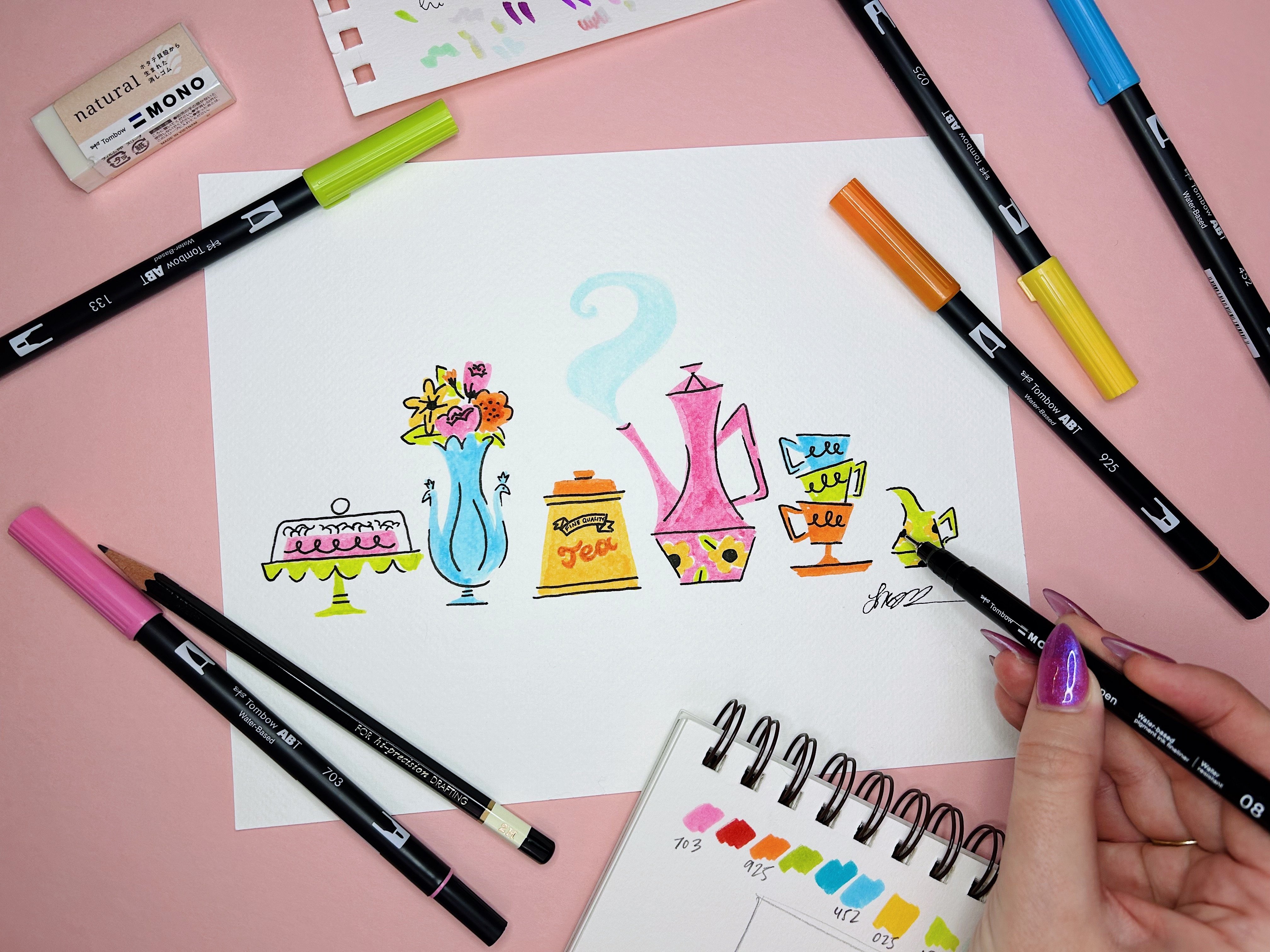
3. Exploring Materials: So what materials will you
need as you fall along today? Well, really any materials
can be used in a sketchbook. They don't have to be expensive, and oftentimes I find that affordable materials
even work better. This is a pack of
my favorite pens. It costs exactly $1. For me, sketchbooking
has also been a wonderful way to experiment
with new materials and mediums that I've
never tried but have wanted to try and see how they
interact with each other. See how I can make them
layer in interesting ways. It also really comes in handy
a lot of times whenever you want cover things up or alter
your sketch a little bit, whenever you don't like
how it's coming out. So some of the materials
I most commonly use and there kind of
are a lot of them are. A multimedia sketchbook with smooth paper that can handle
heavier mediums like paint. A mechanical pencil and erasers. BallpointPens. Preola
Super tips markers. Pro tip, water
based markers don't usually bleed through to the
other side of your page. A Pentel brush pen or
any brush pen, really? Deleter white manga
ink for covering up mistakes and adding
highlights to a drawing. I just personally like this
brand because it's really, really opaque and you
don't need much of it to correct something.
A white gel pen. Highlighters. And whenever
I'm feeling a little bit more adventurous or I want to do a fully completed
piece of art, sometimes I'll use watercolors, alcohol markers, although these will bleed
through pages on heavy use. Acrylic paints or
acrylic paint markers. And even stickers, sticky
notes, masking tape, and washi tape if I'd like
to cut out some images to do collage with or just
generally cover up mistakes. That's sort of the
extensive master list of what I use and some of the materials
you'll use whenever I do the tour of my
sketchbooks here. But for the purposes
of this class, you only really need a pencil on a racer, a ballpoint pen. It could be the color
of your choice. It may be something
to add a little bit of color like some highlighters, markers, watercolors
or sticky notes. But this is also optional. A collection of
items I listed that I purchased to
replenish my own stash, and I think this costed
me maybe $8 in total. And some of these, like
I said, are optional. So the materials really
don't have to be expensive. Next up, we'll take a brief tour of some of my
sketchbook spreads to start getting inspired and start thinking up some
ideas of our own.
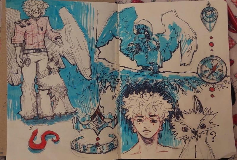
4. Touring My Sketchbooks: We get into the actual
sketching process, I want to show you some of my sketchbook work from the past five years,
I think it is. And I also want
to emphasize that even though you're following
along with my process, there is no one
right or wrong way to keep a sketchbook
or fill spreads. You don't have to fill both or full individual pages at once. I just personally
like doing that because I like my
spreads to have a theme. But sketchbooks can
have tons of variation. That's so to demonstrate
that variation, I'm going to show you some of my favorite spreads
from throughout the years and even a few spreads that aren't necessarily
my favorite. To give you some inspiration
and show you a bit of my sketchbook evolution and
how much they've helped me experiment and
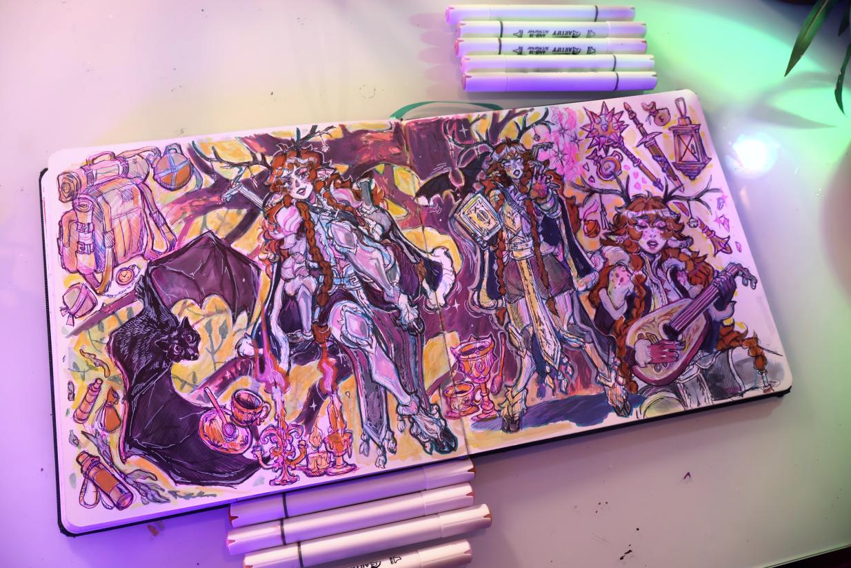
grow artistically. This is the first
sketchbook that I ever completed back in 2020. My art was pretty
different at this point, but there's quite a few spreads that I still like in here. I feel like you can really see an evolution in style
and confidence between this first sketchbook and the last sketchbook that
I completed back in 2024. Here we've just
got shape cats and some cute girls that I did
with some acrylic paint. Here are a couple of
unfinished sketches that I wanted to show you where I like the style
that's going on. I think they had
a lot of promise, but I guess I just didn't
feel like finishing them. But this is still a
finished sketchbook to me because I'm not going to go back and finish them now. And for the most part, there's still finished art in the rest of this. I
said, You know what? Good enough. Sometimes you
just got to let a sketch go. Then other places I will have a lot more
complicated finished art. These are some watercolor pieces that I still really like. I even have things like recipes for fantasy dishes from my
comic that doesn't exist. And alongside it, here
I have an example of some sketches
that I taped in. I guess I just wanted to fill up this page. Moving
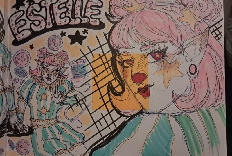
on to the next one. This one is from This is
from the end of 2018. Again, I taped things in
here. We got a sticker. We got some OCs. This is just a collection
of studies that I did based on I think
photos from Pintras. Paige uses a lot more color, a lot more texture variation. It's getting closer to the style of sketching that I do
now in my sketchbook. You can really see all the
maximalism starting to here's an example of a slightly more full or more complicated
piece that I did in here. Literally, it's just
21 pilots fan art. I like doing stuff
like this that utilizes a full two page spread. It's a nice page flip,
almost like a comic. Here's just a bunch more
random character sketches, but I think the
thing I liked was a little forest spill that
I did in the background, kind of using negative space to add some color to the page. This is a rare one that I just did in pencil, which can work, but you can see how it's kind dulling and getting
on the other pages. Pencil is sort of
interesting in sketchbooks because it's pressed in
pages up against each other. And it's usually the reason why I tend to prefer
ballpoint pens. Here's another big random
spread of Pintra studies. This is probably one of my
favorite types of spreads to do can really puzzle
piece things together, add sketches where you
think they'll look good. Nothing really has to match. There's just a flow to it. I really here's another example of studies meeting fan art. Here, I was trying to do
studies of people's faces, but then also add a little bit of caricature and
design to them. So I did a bunch of
the main cast of the office trying to really
cartoonify them a little bit, use shape language to simplify their faces and bring out
their most prominent features. This is old, but
I still like it, and it was a lot of
fun there's a spread where I was using acrylic
paint to do some studies, and I think this is one
of the first times that I used acrylic paint in this
way in my sketchbook. Obviously, this
sketchbook didn't necessarily hold up
to it super well, but I really love how it looks. I don't know, something about
the detail of trying to get more realistic skin
tones against a white page. It's just a really
easy way to study, and it produces some really satisfying
art, if I'm being honest. Also, another thing that I began doing at a certain point
is painting on the cover. This one has seen an awful lot of wear and tear at this
point, but I still love it. I think it came out super cute. I did the same with
this sketchbook. I made it more of a collage, sort of my own Pinterest
board of things that I liked whenever I was
working on this sketchbook, which are still all things
that I very much like. This one was begun in If
I had to guess My 22? I wanted to just show an example of how you can kind of, like, mess up the first page or make it into collage or just like, add stickers to it, add ticket stubs, the thing
from a crackerjack box. And, of course, lots of
drawings of arcane characters. This is nice cause you
can just kind of tape things in over time
and end up with a page that looks visually
appealing without putting too much pressure on it at the very beginning of
starting your sketchbook. You can see me here now adding a lot more color to my illustrations because I
started using those markers, and I got some
acrylic paint pens. And here I'm starting to make
my spreads a lot more busy, a lot more full and I just really love
filling space like this. At the same time, most
of these are also studies of faces and things
just to get practice, especially with drawing men because it's not
exactly my strong suit. Another example of something that's sort of not
typical of me, a page of eyes that I
really, really like, and I thought was a lot of
fun. There are no rules. You can do literally whatever. Is a page full of just Miles
Morales gestures that I did. Using a character like one
of the Spider Man to study gesture is another fun thing that I like to do
in my sketchbooks, because, again, it's like, study and practice
disguised as fan art. It's my favorite thing to
do because I'm having fun. But I'm also learning
at the same time. Wow. Of course, I also
had to do a page of these It was of Peter, as. More face studies
disguised as fan art. More fan art, but this
is just a painting, but I did my sketchbook for fun. And I definitely would have lost this if it wasn't in here. I would have lost
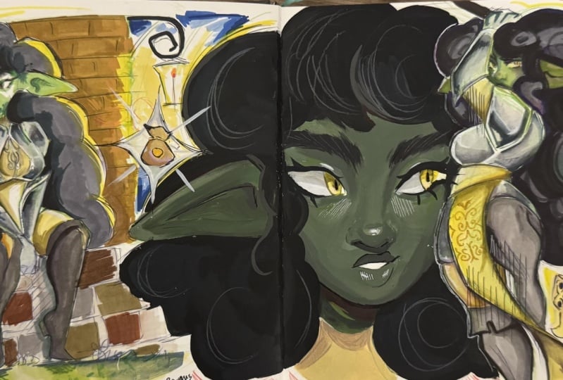
that, too. Just some original characters,
you can see here. I must have messed up
the faces on these, so I redrew them and put
sticky notes over it. I really like just having
this block of color in here, even though it sort
of shows a mistake. It adds layers, it adds texture. I like Here at the end, I also shove in loose drawings that I don't know where
they would go otherwise. Here's a random example
of a sketchbook that I just made designed to be
filled in about a week, and I think I did take
about a week to fill this. It's probably less
than 15 pages, but it is a sketchbook
nonetheless. It's just like a nice
little collection of art that I can look back on
in one little location. And there's a lot of fun studies I think it just turned out neat. There's a lot of little
paintings in here, which I also really like. I was really into using acrylic paint whenever I
filled the sketchbook. So I'm still a big fan of a lot of the artwork
that's in here. Probably also from 2022. Now we're getting
a lot more recent. Think this was my
2023 sketchbook. Again, a sort of collage style painting
on the very front. These are very, very fun to do. Page of this is just
covered stickers and little mementos
from that year. I took a couple of vacations, so I taped some stuff in. I have things as
random as stamps in here and also
Victoria's Secret coupon. I just liked the colors on it. He just drawing with my cousin's pen that
I stole from him. The last of us more examples of sticky notes that
you can tape in. Fan art from Buffy. Fan art from the last of us. Here are some pages of
action pose studies that I then used my original character to do so that they
were more fun. More fan art
disguised as studies. So more panting studies. Unfortunately, I don't
love how these turned out. The colors are a little
weird, but I did try. Here's a big page of
action pose studies. I really enjoy doing these and then filling in some
expressions in the margins, just making it an absolute
feast for the eyes. It's one of my favorite things. Studies this time
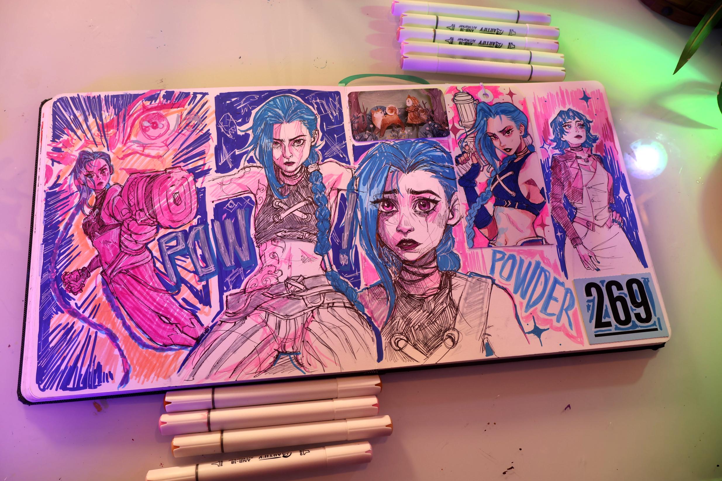
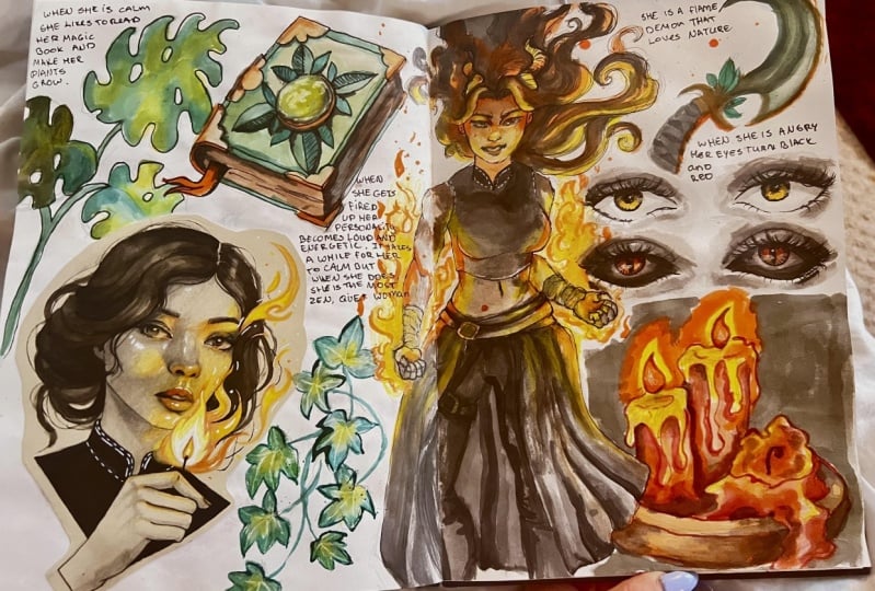
from Jennifer's body. Some action post studies. This time, you're using jinks. And finally, the most recent
completed sketchbook. Of course, there's another
painting on the front. I absolutely love how
this one came out. It's such a perfect
amalgamation of all the things that I
love to draw right now. Again, another
cover spread that's mostly sticky notes and stickers and just
random stuff taped in. I think movie stub kind of like a character design
exploration on this page. Pose studies using
jinx because she's so fun to do acrobatic
poses with More studies, but this time, it's Bitter
Colsal breaking bad, fan art. I'll have to maybe censor this. But again, more of the same. Studies but using Ellie
from the last of us. Studies but using Haley
Williams from Paramor. Again, you can see me
writing song lyrics in here and titles of
albums and stuff like that. Of studies. This I'm using
my original character, Rose. I think some of these are
studies of other artists, though, which is another
fun thing to do. More of the same
studies of Rose. And this page is living proof that no matter how much
you think you have art style and a
method of filling a sketchbook page and a subject matter that
you like to draw. Can always have a bit of
a Kar the frog phase. None of us are finally, more studies and some experimentation
with different mediums. I think this was one of the
first pages that I used, acrylic paint markers on. I swatch them here. So much fun. And those are some of
my favorite spreads and questionable spreads
in my sketchbooks from, like, 2018 until now. Like I said, these
are just a few of my specific pages that I fill using my methods
according to my taste. You might want your pages a lot more minimal and
clean than mine are. You might want them sketchier containing more finished art. The point is, a sketchbook is yours to do with, as you please, free of the opinions of your audience or the
Internet or other viewers. That being said, I personally find looking at
other people's artwork or sketchbook spreads to be an excellent motivator for helping me to draw
in mine regularly. So I have assembled
a Pintresbard with some inspiring spreads that you can find linked in
the resource section. Plus, I have also assembled
a YouTube playlist of sketchbook tours
from other creators that I find inspiring, as well. This can be really
helpful for seeing other processes for
filling sketchbook and how other
artists approach it. So recommend checking these out. If you'd like to see any of my sketchbooks in greater depth, I have full tours of each of them available on
my YouTube channel, and links for those
are available in the resource
section below as well. And the next lesson,
we'll come up with some ideas for what to
draw in our spread, and then we'll get sketching.
5. Generating Prompts: A lot of people, the blank
page is a place where people tend to get stuck
before they get started, and that can be
even more true of the actual first pages
in your sketchbook. I usually tend to get more attached to actually
finishing a sketchbook whenever I like how
the first spread or piece of art comes out.
Which is always nice. We always like it whenever we like the art in
our sketchbooks. I would also
encourage you to be a little bit less precious
with your sketchbook. Scribble all over your first
page in your sketchbook. Tape in a receipt or ticket stub from a memorable night out. Add stickers from
your favorite artist. Spill coffee on it or tape
in some dried flowers. I tend to treat my
sketchbook like a scrapbook or an
artistic diary. Having a really tactile
multimedia approach to things, I can create more
visual interest and feel more
connected to the page. Saving personal mementos in my sketchbook also
makes me more attached to it and more
eager to return to the same sketchbook every
time I'd like to draw. So as artists, we're usually
no strangers to art block. So sometimes the hurdle for drawing in your sketchbook
is quite literally, what do I draw? I don't
know what to draw. If you're struggling to maintain
a drawing habit because you don't know what to draw
or don't know where to start, it can be helpful
to use art prompts, participate in art challenges, like draw this in your style, draw fan art or do studies
of other people's artwork, do figure drawings, do
color palette themes, draw different
plants or animals, or even doodle more abstractly. There are so many
great ideas out there and so many
different things to draw and sometimes just considering your
options and looking at what other people draw can
be a great way to gain motivation and finally beat some vet you really
don't know what to draw. I'm going to include
a prompt list below in the class projects and resources tab that
you can use to spark inspiration for a sketchbook
session or spread. I've also assembled a
Pintresbard full of different art challenges and prompts that you can
look at for inspiration, along with an entire
Pintresbard of other creative and
inspiring spreads by other artists that you can also look through for
some inspiration. For purposes of our
demonstration today, I'm actually going to
generate ideas from my sketchbook spread using
the prompt list that I showed you to kind of show you how it works and how you can get some different ideas by
using a prompt generator. I'm also kind of
secretly excited to use it because it's got some
fun ideas on there. It definitely gears a
little bit more towards fantasy and fiction type
drawing and illustration, a lot of things that are
very much in my wheelhouse. If that's not exactly
your cup of tea, this might not be the
prompt list for you, but like I said, I did include some other ones
linked in that Pinterest, a lot more just like
general prompts and ideas and things that
will suit most people. I hope. And because I am
such a nerd, of course, the way you calculate these
prompts is by using dice for D and D. I
think it's more fun to use actual dice whenever you're rolling
for prompts like this. But if you don't have
dice to use for these, you can also just
search on the Internet. Roll a D four, roll a D
eight in the Internet. We'll bring up something
to do this for you. Some of these are for,
like, aesthetics, subject matter,
general art ideas. You can kind of use them in whatever combination
you would like to. First, I'm going to roll for
premise, which uses a D six. I wish I had another
camera on this, but I promise I'll be honest. And we rolled a two. I think from Imagination is fun. But for the purposes
of this class, I think that I am going to
go with from reference. So let's roll some
subject matter. Using a D four. And
we roll the two. So we've got humanoid
subject matter. For aesthetic slash genre. This is sort of determining
the general energy of this character that we're going to come up with
and draw here today. So I'm going to use a D 20 for that since there's only 16. We got a five, which is Nightce Which is ironic because that's sort of all
I want to draw right now. Anyways. Now we have
character class, which, again, this is more you're doing a
fantasy character. You're doing the kind
of art that I do. You don't have to do
this one, but I like it. Four, we have a
bard. A night Bard. That sounds fun. Then we have
color palette on a D six. This is sort of
just for fun if you really want to limit yourself
to a color know that I do, but I'm going to
roll it anyways. So analogous colors, which
are actually pretty fun, so we might do
that. We might not. Again, it just
entirely depends on what I want to do 'cause
this is my sketchbook page. And finally, for the species
and Whimsical Extras, I have over 20 on
both of these lists. So if you use these,
it's a little annoying. You have to look up like
a random generator. But you can find them pretty
easily just on the Internet. So if you just look up like
random number generator. 125. Alright, let's generate. We have 17, which is a ganas. Interesting. Very fun. For the whimsical extras, it's just sort of extra
themes to add to your page, things to draw together and make look
visually interesting, especially if you can't really think of any good ideas
that you really like. I like to doodle a lot of different things in the
margins of my pages. So this is sort of
where I would end up using prompts like
this. So let's see. You have five Roses and thorns. My goodness. How original? I've never done that one before. Let's do another one. 15. Yeah, fire and ice. That's kind of nice if we
have a Ganassi character. Alright, let's go again. We have ten general medieval weapons. It's really coming together. We just have a night character here. That's all.
Let's go again? Three. Ferns and vine. 23. Got ornate chalices,
mugs and dishes. 21. We got candles. And one more. 13, which is bats. So this is the sheet
that we rolled in the general promptlist
that we came up with. This is kind of just
a very loose set of ideas that I can go with to now go on and do my
sketchbook page. I can Straight as close or as far from it
as I would like, see where I can connect
some of these ideas and make them interesting
and add some design in. So, I am going to
generally try to stick with this whenever I do
my sketchbook spread. I'm also not
completely tied to it. I'm just going to
kind of go in and see where my artistic
whims take me.
6. Finding References: Here, if I know I'm
in the mood to draw and I want to draw a
human or humanoid, but I don't know what kind of
pose I would like to draw. I usually find that I can't go wrong with just using
some reference. Just in general, using
my sketchbook to improve my observational drawing
and my ability to draw from reference has
been really helpful for me. And oftentimes I'll find
an appealing reference of an image like a pretty girl
and recreate it in my style. Or I'll find an expression or a pose and follow
it up to a point. But then end it by making
it completely my own. The latter is what I'm going for here find reference images, there are tons of
professionally made packs of poses and stock photos
available for use. But I usually just
end up finding references by searching
on Pinterest. So today, I'm just
going to show you Exactly what I do whenever
I'm trying to find a pose. I usually just click
on the search bar. And I type in. Let's
do just sitting pose. And when you search, you should already be getting some
pretty decent results, but maybe your algorithm
isn't the way mine is. Usually, from here, I kind of
just begin looking through to see if there's anything close to what it is
I'm looking for. Say, I want to do a
pose like this that has kind of a lot of
character and flow to it. But maybe this exact pose isn't really what
I'm looking for. Here, whenever I
click on this one, if you scroll down,
you'll end up finding a lot of similar poses. Maybe, for instance, this pose is a little bit
more what I'm looking for. Maybe possibly this one is. I actually like this one a lot. And then we have things maybe a little bit
more like this. Basically, all I do
whenever I'm looking for Pose references is I start
clicking on ones that I like. I scroll down on those to see what some of the
suggestions are. And usually I can get closer and closer to what it is I'm
actually looking for. But once again, for the
purposes of this class, if you've searched
around Pintris for references and you still can't find anything
that you like, I've also assembled
the Pinters board of pose and expression
references, like photographs and anatomy
breakdowns by artists and just general photo poses. You can also, once again, find this linked in the
resources and Projects tab. But I think that I am actually
going to start out using this pose that we found
earlier because I can already kind of see a
vision coming together.
7. Creating Your First Sketch: So to finally get into the
actual sketch booking process, I already show you the reference that I
want to use before. I think what I'm going for this pose is to take
the window and kind of turn it into a tree branch that the characters kind
of leaning onto here. And I'm going to use a blue pen. Do the under sketch for
this because these are new and I want to
experiment with them, but you can use
whatever you want. So I think I'm just
going to kind of abstractly roughen tree branch, this character to
be leaning onto, maybe even have a tree trunk as part of the
composition of the page. I think I'm going to
make this a feminine character because,
of course, I am. I observe a reference like
this to begin sketching, my first concern is
trying to capture the gesture and
proportions of the pose. It's easy to get lost in all these little details
and visual noise. But first, we need
a decent foundation for our pose to get started. I usually just visualize the
basic shapes in my head, but you can also physically break down your reference into basic shapes by tracing over the volumes to make
them more clear. During this initial pass, I'm trying to use
solid shapes so I can visualize proportions
and perspectives better. So I try to avoid using curves, and I'm trying to mostly
use angled shapes, and I also try to capture the weight and
energy of the pose. I'm ready to detail the
form a little bit more. I'll use more construction lines to lay out the face and limbs, and I'll begin detailing in absual anatomical
features like muscles, joints, and fingers,
and I'll try to be mindful of proper
foreshortening and perspective. This is just how I like
to break down poses, but the general principle
of starting simple and getting more complicated
is pretty universal. And it's also best to draw in the basic figure and gesture before adding details like
hair, clothing or accessories. The shoulders lean like that. And then the hips are
touching down here. To sort of roughen
the hips like so. I'll make an indication
where the knee is coming up. And, again, I want this kind
of holding on to this tree. The way the person's holding on to the window in this pose. Then I want this arm to be putting their weight on a
tree branch that's down here. So something sort of like this roughen the
character's thigh. A really good way to kind of get the curvature of a thigh is to draw some lines on it so you can see the curve actively
happening like that. And I'm gonna draw their legs swinging down the way
it is in the reference. Their hips are sort of
leaning up like this. Feel like this is a
good climbing pose. This phase of the sketch, I'm really just loosely
roughing everything in. I like the chin of this character is sort
of at this angle. So I'll make mine similar. This is just an under sketch, so we're not tied to
anything at this stage. We're just sort of
making impressions of what we want this
to eventually be. So let's now add another
tree branch in here. Something sort of chunky and strong looking that can
support a human character. Maybe it branches off
like that a little bit. Just sort of roughly
sketching in the facial features now and
the general expression. I think we want to do a happy expression like
this character has. So we'll do something like that. Kind of altering my
leg anatomy here to make it a little
bit more correct. Maybe this branch goes
like this so that they can really get their hand on here. So we did agree that this
would be a humanoid character. So I do want to give
them some kind of features to make them
kind of inhuman. I've decided to
stay in our kind of fantasy D and D
character type space. I think I'm going to make
this a dear fawn girl. Since I'm making this under sketch in a
light colored pen, I can kind of go in and
start giving this character a little bit more individual
design elements here. I love a fawn with
a little vest. So let's go in that
direction with her. Let's give her some big hair. While we're at it, we can
kind of try alter these legs that I've drawn here to look
a little bit more fawn like. Be fair there we're kind of already looking this
way to begin with, so it's not a bad start. We'll probably go for a
pretty fluffy hairstyle here, then maybe with some
braids coming down. Let's also do some,
like, poofy pants. Maybe we'll do sort of like a partial skirt
situation, though. So pieces of fabric hanging down to give the design a
little bit more movement. And we also did discuss there being night characters involved. So let's give her some
cool armor, maybe. Some little cauldrons. Maybe some greaves. And some armor on her
forearms, little bracers. Maybe trim it in some fur to
keep her nature theme going. Give her a lute.
Sticking on her back. Someone's got to bring
the entertainment. And maybe she's got a
little caplet, too. I feel like that's very cute. While we're at it, we can define this tree a little bit more. But I don't want to
fill up the page too much because I want to, of course, draw a bunch
of other things on here. So from here, I have kind of done a rough sketch
with my blue pen. I have a nice looking character
design that I like a lot. So now I'm going to go in with my black pen and
refine everything, give her more of a
concrete character design, then we can continue moving
on with our other sketches. When I'm refining the sketch,
I'm still staying pretty loose and messy because these aren't really inks or anything. I just want to make the
character's expression pose and design clear and give the lines a decent
amount of appeal. I love refining
sketches like this with a really cheap ballpoint pen
because they tend to be able to give me really light lines or much bolder darker lines depending on how
hard I press down, which is really
nice for sketching completely do a lot of the sketches in my sketchbook entirely with pens like this, but I figured I'd do an
undersketch for the purposes of this class so that the art comes out a little bit cleaner. But I highly recommend
sketching with a pen like this if you've
never done it before. It helps avoid smudged pencil
lines in your sketchbook, and it forces you
to be a lot more intentional with your lines
since you can't erase pen. I've been using a bit
of a hybrid method in my sketchbook recently, doing a rough pass
with a pencil or a lighter colored pen
first to make sure I do decent proportions and
gestures that can be easily changed a little bit before
going in with a pen. But that's because I've been
trying to work on my poses, form, proportions, and
anatomy a lot more lately. I've been making myself draw a lot of things out
of my comfort zone, and I'm still getting
comfortable with drawing all in
ballpoint pen again. Whenever I'm refining one
of my sketches like this, I usually begin with what's important or the focal points. So I can refine those without too many other lines and visual noise around
to distract me. For character art that
usually means the face, hands and anything that's overlapping in front of the
other pans in the drawing, like hair and legs in
the case of this sketch. Making sure I tackle the
difficult and important bits like faces and hands early on makes me immediately
feel more confident in the sketch and helps me
gain that mental momentum. Sketch like this
where I'm drawing a character for the
first time, usually, it goes a little slower
because I'm making a lot of decisions about the character's visual appearance and clothing. So I try to sketch in a way
that goes layer by layer to avoid making mistakes
that I can't undo with pen. Once the characters
mostly refined, I also go in and add some parallel hatching on
any darkly colored areas of clothing or any areas of
the sketch that would be mostly dark if there were
actual shadows drawn in. To me, that just helps a
sketch pop a little bit more. And once that's all done, I moved on to refining the branches of the
tree a little bit and adding some hatching on the limbs to show the
direction of the bark. And with that, there's our
first sketch all done. And the next lesson, we'll
discuss adding more sketches to this page in a way that
complements the first sketch.
8. Adding Additional Sketches: So now we have one
sketch on the page that we're happy with or at
least I hope we do. I'm pretty satisfied
with this one. I think she turned
out really cute. So when I'm filling
a spread from here, I usually assess how much space I have left and what
kind of space it is and decide what
kind of sketch or sketches would look good
in that negative space. To be clear, sometimes giving a sketch more room to breathe
is the right creative move, but I usually prefer my pages to look really full and busy. Sometimes I'll come up
with poses or shapes from my imagination that would
look good in the free space, but oftentimes I'll head
back over to Pinterest, and I'll find more references or inspiration for
what to add next, especially if the
page has a theme one. So at this point, I kind
of feel like the direction this page is heading in is a
bit of a character design, character exploration type page. So I think would feel very natural in some of the
space that we have left. There's a few different poses showing off more
of this character. Since I kind of came up with a design and some clothing
in this first sketch, I feel like a full body
pose showing more of the character and more of what she's wearing would
look good maybe here. And then I think
I could maybe do some bust up sketches in the free space on this
side, maybe a headshot. And then on this side,
maybe I can do a bit of what's in my bag
type situation. Some of her accessories,
some of her weapons. Bring in some
sketches inspired by the prompts that we rolled
for a little earlier on. I think having the tree
here next to the character serves as a really nice early framing device
for this piece. I really love doing things
like this where it's just abstract and you can kind of make it go where you want to. It really helps to
make the rest of the process of filling the page. Even more creative, it
gives you a lot of options. So for the next sketch,
I've already gone over to Pinterest and looked up a
couple of different poses, and I thought that
this standing pose of the character reading a book and having his arm up
was really cool. That way, it shows some then it also shows off our
character's full outfit. So I think I'm
going to go on and move forward and put
that sketch here. And then I have also
been looking for a cool Bard pose because Bard was in one of the
prompts that we rolled. And I found this cool painting where the character has a bit of a coy expression on their face, which I'll probably
end up changing, but I like the general gesture, so I think I'm going to use this pose on the page
somewhere here, as well. So I'm once again going
to use my blue pen here. And I'm going to just go to
this area of the page and begin roughing in
this pose that I had here for my reference image. I'm probably not going to
keep the head the same. Want a slightly different
position on the head pose. That way we can see more
of our character's face. But I do like this hand gesture here. Something like that. Maybe have her body
partially turned. But face pose kind of head on. Can now use this pose
as an opportunity to show a little bit more
of her fawn anatomy. Maybe you have the legs
positioned like so. Can also give her a little tail. I think this is also
a good pose for this character because according
to our prompt generator, character is also a Ganassi. So I want her doing some kind
of elemental magic here. I only have this first sketch roughed in so far,
but while I'm at it, I think I'm going to
go ahead and also rough in this barred
pose that I want to do. Just so that I'm
using my space well, I'm not drawing in an area where I want this other
pose to eventually be. And when this pose heads
kind of like this, I'm gonna turn my character's
head the other direction. Go for a slightly
different expression here. I especially love the gesture of this other hand in this
painting that I'm referencing. I want to make sure
I get that in here. Again, whenever I'm
breaking these down, I'm doing them
very basic shapes, just purely looking at the shapes that are
represented and then trying to copy them
onto my general sketch. I don't know what
it is, but I am a sucker for a bad
that plays a lute, so that's also the instrument that our character
here is going to have. I think it would be nice
to have her braids kind of flowing and falling down
over the lute, like so. One of the reasons why I
gave this character kind of wild hair can
do so much with. And since she is playing
her lute at a tavern, I think I'll have more of
an off duty outfit on, maybe more of a tunic situation
instead of full armor, full cape and everything. So, similar to the first sketch, I'm just going to go in now with this black pen and refine
them a little bit more. When I'm refining a
sketch like this, I usually begin with
the things that are physically close to the
viewer in perspective, like the hand sticking out here, because getting
the foreshortening right here is important, and I don't want to
get distracted by dark visual noise whenever
I'm trying to get that right. Like I mentioned
before, I then continue on to other important
details like the face, hair, and anything else I really want the viewer to
focus on and look at. There I usually just go top
down refining the lines and adding hatch marks until I finally finish
refining my sketch. Sketches like this that I
really want to stand out. I also sometimes highlight
parts of the silhouette with a border line or a darker color to really make the whole
shape of the character pop. The second sketch here, I'm once again beginning with
the hands because they're one of the
most difficult and focal parts of the pose, especially since the gesture is a character playing
an instrument. And then I once again shift
to refining the forns that are sitting
in front of other forms in three D space. So I refined the lute, the braids, the jaw
line, the hairline, the horns, et cetera, before refining
things like the legs, skirt, and facial features. I'm not extremely happy
with the expression of the barred pose or how
I do the lute here, but I'll discuss how I fix that a little later
in the final lesson. Thing that I didn't do
with this spread that I wish I did and normally
managed to do more effectively is vary the size of my sketches and
my composition to include more of a big
medium and small layout. I usually like to make
full body sketches. The smallest sketches
on the page, and then the closer the
subject is to the viewer, like in a waist up
pose or headshot, I'll make those a
little larger to have size variation and emphasize things like the
character's face. And this spread, the head size of each sketch isn't
super different, so it's a little difficult for the viewer to know which
one to look at first. Fine, but I usually find
it more appealing when the viewer knows what order
to look at a spread in. It's even more satisfying
when a spread is planned in a way that
guides the viewer's eye. Sometimes I'm better
at composition and planning spreads in a
more intentional way, but sometimes it's also more fun to freely sketch
like I did today. It's really whatever
you feel like doing, and it's not extremely
necessary to think about composition
with a sketchbook page. But it can definitely
make flipping through your sketchbook more
it's also important to note that I design my
sketchbook and sketchbook pages in a way where it's eventually
supposed to be looked at. When my sketchbooks are completely done and
completely full, I do like to do flip throughs
for my YouTube audience, and I like to show
them to friends. I do like to take the
viewing experience into consideration because
it's something that I genuinely like to share. But you don't ever have to let anyone look at your sketchbook
if you don't want to. You don't have to
do flip throughs. You don't have to share your
sketches on social media. Your sketchbook can be
for your eyes only. It all depends on what you
personally want to do. Next up, we'll discuss
how I finish up this piece and fill
in the blank space for it to fully come together, and I'll share some
personal touches I like to do to add more texture
and color to my spreads.
9. Filling Up The Page: At this point, we have locked in a couple of sketches
that we're happy with. But if you're like me,
maybe you really like to fill a page or a spread and leave little to no white space. Sometimes I'll do this with little expression
studies in the margins. Adding notes or text or even by adding song lyrics
or poem stanzas. The aesthetic that I
like for my sketchbooks is stumbling across
the journal of an unknown artist
and finding there just chicken scratch
and mess in there. I really like to romanticize it and put a lot of my
own character into it, but you might want yours to
be a little bit more that's you and you've already
done a couple of sketches on your page and
you're happy with them, you might already be done. Take it in whatever
direction you'd like, but if you're a
maximalist like me, this lesson is
definitely for you. So to fill my space
in the sketchbook, like I said, a little earlier, I want to do some sketches here and then something
here as well, just to kind of compliment the current composition
that I have going here. And one of the things
that I rolled earlier in my miscellaneous prompt was which feels a little
out of place here, but I think it would be
cute if this character maybe had some kind
of that companion. So I think I pulled up
a reference image here. I'm trying to find a good
place for it on the page, and I think one might
be around here. So I have pink ball
point pen this time, just to kind of mix up
the colors a little bit, and I am going to see if
I can start blocking in this bat in a way that complements the
rest of the sketch. Again, just taking
very basic shapes. One of the things
I really like here is the wings as kind
of a framing element. So see if I can kind of use
those to help this fit well. Do absolutely love the
little ears of a bat. It's absolutely adorable. So we've got maybe
something like that. This actually fits the
framing pretty well. We can maybe draw some
branches here as well. Shaded in just to add some
texture and scribbles. I'm definitely going
to shade this in with more of a black
color later on, but for the time being, I think I'm in this corner, going to draw a little
adventurers pack. Then in some of the margins, we can draw some of
the things that she might have in her
adventurers pack. Let's do, like, a
little blanket on top here, little handle. Maybe a little canteen of water. Like this idea that she's
got a little bat companion. So let's just add him here. He's just chilling out
with her in this portrait. Just a little guy here. And we'll just draw
some other things that an adventure night Bard might need to keep with
them in the margins here. Little health potion
with some dried herbs, maybe some little candles. That was one of the
things that was listed. Prompt also said to give her
a little ornate chalice, so maybe something like this. And I also have medieval
weapons on this list. And given the antlers
and the pokiness, I feel like big old Morning Star mace situation
would be kind of cool. So, let's maybe do that up
in this corner over here. Sometimes a ruler does also come in handy whenever
you're trying to do things in a sketchbook. While I'm at it,
maybe she's also got a little dagger over here.
10. Finishing Touches: I get to this stage
in the spread, I'm usually looking at the page as one single cohesive
piece of art, even if all the
sketches that I have on a page don't particularly match. This is just my method of
completing a spread since I like to make them
really maximal and fill all of the white space. At this point, I like
to begin considering what touches might add more visual interest
to the spread. I like to use color
fills and color blogs, adematically matching
sketches in the margins, add cool shapes or doodle
cool little accessories, like the ones that can
be found on my prompts. Now it can also be a really
great time to cover up or change anything that I
don't particularly love. I'm definitely a huge believer
in sketchbooks remaining messy or even a little bit ugly in the
eyes of the artist. There's always
sketches that didn't come out exactly how I like, and that's part of what
makes the imperfection of a sketchbook free and
experimental and charming. But sometimes there are things that I would
like to cover. Alter, paint over. Or just change to make them look more interesting
and pleasing to me. I even find that
those changes can add a lot of extra texture and
character to a sketchbook. It's also kind of fun
to see the process of an artist correcting
something by covering up with paint or a sticky
note because it shows iteration and the artists making intentional
changes to their work. And it just kind of scratches a certain artistic itch for me. Another great way up or
edit a little bit is by taping in loose sketches that you did outside of
your sketchbook. You guys saw this a lot
in the tours that I did me just taping in
little sketches or paintings or even just
having loose sketches folded up in my sketchbook so that I could find them again. I really like doing
this because it has a very scrapbook collage
type of feeling. I like having other types of paper interact with
paper in my sketchbook. Again, it's about layers. It's about texture. I end up losing a
lot of the sketches or loose doodles
that I do otherwise. So putting them in a sketchbook is a great way to keep
everything in one place. Make sure you don't lose
sketches that you actually like. And it can also be a
more productive way to cover up sketches that
you don't necessarily like, because if you tape
something over it, you're not completely
losing what's underneath. You could always flip
the sketch up or peel the tape up and
still see the old sketch. Well, mostly disguising it whenever you're flipping
through the sketch. I added in my
additional sketches, I wanted to try and have some
fun with this spread and be really experimental with color and some of the shapes going on. First, I messed
around by blocking in a few darker colors
with my brush pen, especially trying to add more contrast to my
characters to make them pop. I then took one of
my crayola markers and moved on to shading
in a general tone for my character's
hair because I had a very specific ginger vision
for my little fawn girl. And I also added a few orange shadows for a bit of saturation. This point, I was a little on the fence about fully detailing the whimsical extras with
any kind of dark outline, but the composition of the page is feeling a little
off without it. So I also refine
those sketches a little bit with my
black ballpoint pen. And I'm trying not to overwork the definition of
these sketches, so I don't steal
too much attention away from the main characters. But without some
sort of outline, the composition definitely
feel unbalanced. I definitely liked that better. So now I decide I want
to add in a bit of a warm tone to divine the
general shape of the tree, since it's a big part
of my composition. So I do this with
one of my skin toned alcohol markers
since it's more of a gray but with
some warmth to it. I then begin the
step that would be a near fatal point for
the sketchbook page, trying to add some
greens and yellows to simulate splashes of
leaves and branches. It almost immediately took away from the framing effect
of the tree silhouette. And even though green is technically
complimentary with pink, I also was not a fan of this color combination
since it lacked intentionality and the colors we used in almost equal amount. Try and compensate for this and add the front end of
the tree back in, I tried shading it in with a slightly darker valued color, tried adding some general
definition to my characters, again, with my brush pen, added more yellows
into the background, and mostly scrambled to find any kind of balance with
my color choices here. By this stage, I had made
the tree pretty dark, added a more
saturated hair color, and added some purple to my characters to try to
tone areas of the design, which was a slight improvement, but I still wasn't a fan
of the page overall. This is where the aforementioned
editing comes in. I wish I could say that I
planned this mediocre color job in order to give you guys
an example, but I didn't. Whenever I alter things, I
use a lot of ink and paint. So I decided to take some of my delete or white ink
and paint over all of those greens and
yellows to restore the negative space and make my color palette
harmonious again. I also decided to stray
a little closer to our prompt selection and stick mostly to an analogous
color palette of yellows, oranges, magentas and purples. I used my pale
orange highlighter to add splashes of
less saturated. I used my white ink to add a few highlights
and white things out here and there
that I wanted to fix. And I also used an orange
acrylic paint marker to bring the hair back up
to a lighter peach value. And I used my yellow
highlighter to add a splash of color back into the negative space
around the tree. Next, I brought out my
brush pin again to add more dark areas into my
character's costume. And at this point, I also added
in more oranges, peaches, and pinks to fit that
analogous color palette and also made some final
finishing tweaks to things I didn't quite love, like covering up and
redrawing parts of the lute and my character's
face in that pose. Also added a few
extra highlights with my white gel pen to clean up a few areas and add
some graphic detail. And at the end here,
I'm just adding in some finishing
touches and making the details a little
bit more defined. Even though finishing
up this page was heavily experimental and including some decisions I wasn't pleased with
and wanted to change, it was really fun and resulted in a page that I'm
pretty pleased with. I wanted to share this process with you because it shows that even though my spreads usually end up in a pretty
nice looking place, there's usually a
lot of steps to get there because it's not
always easy to know how certain mediums
and marker colors are going to layer and interact
in traditional art. That experimental problem
solving aspect is one of my favorite parts about
the sketchbooking process. That here is my
entire sketchbook spread now fully complete. This was definitely a process to kind of get it to the place
that I want it to be, but that tends to be
the normal process whenever I do
sketchbook spreads, especially ones
that have slightly more experimental color
palettes going on. And I especially love
the little character that we came up with here today. I might even take this character and make her into an
actual character. But I draw on a we'll see. I know that some of you might think that this whole process is a little bit labor intensive
for what is a sketchbook, but you certainly
don't have to put nearly this much effort into your sketches if
you don't want to. At the end of the day,
they are just sketches. This is just what I
find joy in doing. I really like making
spreads that feel busy and intricate and have
a lot of color going on. But you can keep your sketchbook spreads a heck of
a lot more simple. Again, it is literally
whatever you want it to be. And that's what I find
so free about it. And why I continue to come back to one designated
sketchbook. That's what helps it over time. It's just a place to do
whatever art I want to do.
11. Final Thoughts: Congratulations and welcome
to the end of the class. By now, you should
have a decent idea of ways to study pose references
and make them your own piece together different subject matter in a visually
appealing way and approach your
sketchbook pages with less anxiety and
more creativity. If you completed a spread or multiple spreads
while following along, I encourage you to
share them in the project gallery down below so myself and your
fellow classmates can see what you've created
and get inspired. I would really love
to see what you came up with if you drew
along with this class, so please share your projects or just general
sketchbook spreads. I would love to see it Finally, thank you for joining me today. I hope you learn something and have become less daunted by the idea of starting or continuing your own
sketchbook journey. Keeping a sketchbook
has genuinely improved my artwork and given me a lower pressure place to explore my artistic ideas, and I hope you come away from this class feeling
inspired to do the same. So finally, thanks for
watching and Happy drawing. I'm not really capturing that
same Bob Ross energy, am?
 PricklyAlpaca, YouTuber & Illustrator