Transcripts
1. Class Introduction: I started out this year strong. I painted this, this, and this. It just feels like
the creativity is going to last
for ever and ever. But just a month
later, this happened. It's like ideas and motivations just
vanished from my life. Hi. My name is Esther Nariyoshi. I am a full-time illustrator
based in the US. This class is part of my
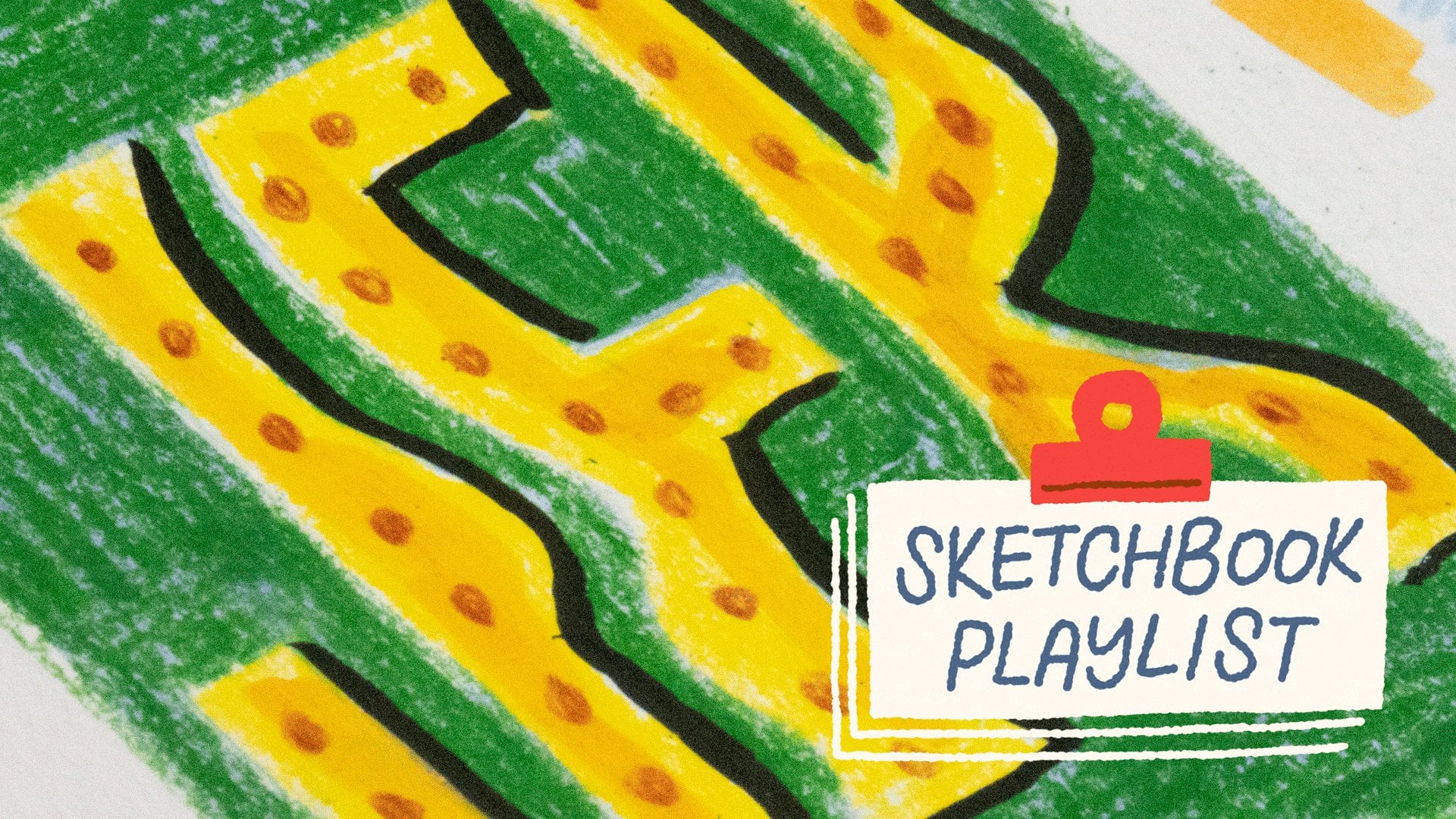
sketchbook playlist series. In this class, we're
going to explore ways to navigate a creative block
by doing something wrong. More specifically,
we're going to use all the wrong colors
from the get-go so that the pressure of the perfectionism is instantly off from the very beginning. I will explain more as we
go through the lessons. We all get stuck creatively
for different reasons. For me, oftentimes, I sense this internal pressure
of figuring out everything even before I get started and
this can feel really heavy. In this class, we're
going to bypass that analysis paralysis by starting something
wrong from the get-go. I hope you will join me
in this creative workout. Who knows, maybe by the end, you will find your
creative mojo again. I'll see you in class.
2. Playing with Shapes: Tomatoes are mostly red, but I think the world
needs more blue tomatoes, at least on your sketchbooks. Starting with the
untraditional color, is so helpful because that helps me suspend my internal
judgment for a minute so that I can trick
my brain long enough to create space
for experimentation. If your thing is something else, you can apply the same
principle in your process. The goal is to get going. Do whatever that
helps you to get your foot off of
that brake pedal. Think exploration more than destination is really helpful
when you are feeling stuck. The true organic growth needs a lot of
patience and grace. Let's get into it. In terms of art supplies, if you have taken any of my sketchbook playlist
series before, you know that I am
a big advocate on using whatever art supplies
you already have at home. This is helpful to sustain
your art practice without feeling the pressure of having
to have the right tools. Well, of course,
that being said, I am a professional illustrator, so I do have a few
extra medium here just to make the class watching
experience a little richer. I'm going to use a
couple gouache colors for the base layer. I've also had some
colored pencils and a couple of crayons, pencil for sketching,
and a dark marker, and a ink brush. Of course, if you choose to
use watercolor or gouache, you may also want
to have a brush. This one that I have is size 10. With that being said,
let's get started. The first step I'm
going to do is to just lay down
literally some blobs. I'm now thinking
particular vegetables or fruits at this moment. They could turn into
anything really. But if you already have
something in mind, feel free to draw the
general shape of it. This is just a regular
page of my sketchbook. It's not made for watercolor, but it can take some water, so it's just perfect
because I only have one layer planned that
is going to be wet. You can vary the size a bit and maybe draw some slight
variation of the shape as well. If you think about the
shape of the fruits, they're generally circle-ish if you look at them from one angle. Sometimes they can
have odd shapes. Really give yourself
freedom to experiment. Since I know none of the
fruits or veggies I'm going to draw has this color, so I'm not judging myself
when I lay down these shapes. There's so much freedom in not
judging yourself early on. Of course, you need to learn
to give yourself feedback. But what I've found
is that oftentimes, when the feedback is
given too early and often comes in a really
harsh form for me, that discourage
me to keep going. That's why sometimes I
find it so helpful to start with obviously
wrong color. I'm going to rinse
my brush completely and use the other
color that I had. This one is pale lavender. I'm just going to
squeeze a tiny bit. Another thing that I
found super helpful in not getting yourself stuck in the creative process is to not think about what you're going to
do about the piece. I know that if I think about, this is going to be a
great Instagram post or like for real, or a YouTube tutorial, I know I'm going to overthink. Then that's when the
perfectionism will kick in and will force myself to do everything
perfectly which I cannot. It takes the fun out of it. Try not to think about what
you're going to do about it. What I'm going to
do right now is to just fill in the gaps, maximize the use of my page. Obviously, I'm drawing
fruits and vegetables. You can also choose
a different subject, for example, we can draw some
random geometric shapes. That could be more fun as well. Well, speaking of that, maybe I'll draw a triangle here. It's not going to be a fruit. That is okay. I think that is going
to be my first layer. What I'm going to do is just to wait until it dries,
of course, off-screen. Then we'll come back
in a minute to add our second layer to give lives to our fruits and veggies.
See you in a bit.
3. Ideas for Swatches: Since I still have a
little bit of color in my palette and I know
this is acrylic wash, which means that
once they are dry, you will not be able
to reactivate them. I'm going to make most use
of these beautiful paints. I'm just going to use up whatever I have
left on my palette. Later before I start
drawing on my blobs, I can experiment and see how different mediums
react to one another. This is just a great way to
not waste your art supplies. I'm pretty much done
with the aqua color. Now I'm going to rinse my
brush and use up the lavender. I won't be demonstrating
this in this class, but if you have time, you can also experiment changing
the order of the medium. Sometimes if a+b does not
equal b+a in art world. Really give yourself the
freedom to play pretty much. Now I'm pretty much
through with my colors. Now, I just have to stay put
and wait until they're dry. I'll see you in a bit. I don't really have
any motifs in mind. What I'm going to
do is just draw on top of my swatches
using another medium. Over here, I want to layer on
top of this swatch as well as Stowe white paper to see if I have any visible difference. There is some, but
not super obvious. That's what I learned. I'm going to switch
to a different color. This one is like
warmer maroon color. It looks like the coverage
is still pretty full. Then there's not a whole
lot of difference. I'm drawing on paper as well as drawing on
this light lavender. I'm going to do the
same thing here. You might not see this
super clearly on camera, but when I draw on
this pale aqua color, I do see a difference between the layer over the white paper and
the aqua color. It's still pretty on the
subtle side of things, but it's something that
you can take notes off. Next, I'm going
to use my crayon. Now, I want to work on
the other color as well. This one is bright orange. Feel free to add a third layer if you really
like layered effect. The next thing I'm going to test is to
use my brush, ink pen. Then just draw over everything
to see the opacity. Looks like this brush
pen can pretty much cover anything that
is underneath. Similarly, this color
combination as well. These are all valuable
insights that you can use when you draw your
vegetables or paint. I have here my marker as well. This color is like
a warm dark gray, but on camera, it's
pretty much just black. Yeah, it's pretty heavy
coverage as well. These are good
information to bear in mind when you start painting
on top of our blobs, which we will do in
the next lesson.
4. Adding Final Details: Now most of our blobs are dry. I'm going to start
painting my second layer. The first medium that I
chose is my brush pen. What we've tested in
the previous lesson, this one has pretty
good coverage. What I'm going to
do is to think of a vegetable or a fruit and
then just start drawing. I think I'm going to start
with this little blob. Imagine if this is a tomato. I'm going to draw
some leaves on top. If you're not super sure
how things are going to go, feel free to use the blank part of your
sketchbook to test it out. I have a rough idea of how I
want to draw these leaves. By the way, feel free to pull
out a reference image if that helps you to
structure your painting. But I'm just going to
freehand over here without a reference image. Imagine this is like a little stem and then the
leaves will come out of here. The tomato leaves, especially the ones that attached to the tomato,
is pretty long. I'm just lightly, slowly letting go the pressure when I draw. This one is going
to be tiny behind. I'm just going to
leave it this way. Obviously, this is blue and you don't really
think of tomato. But if you can photoshop
the color in your mind, this looks like a tomato. Next, if we look at
this little skinny guy, it's asking to be
a chili pepper, so I'm just going to draw
a little bit of cap. I'm thinking of it as a person, so this feels like a cap. I have no idea what's
the correct term for it. Then you can draw a little stem. You can even draw some shadow if you imagine a light
source coming this way. A little of crosshatching. Feel free to introduce another color or medium
if you would like. I'm going to just layer on
a second color on top of the little cap here so that it differentiates
from the shadow over here. Right here is our
little chili pepper. I'm going to move
on to the next one. Actually, I wonder if I add a little bit of crayon,
what's going to happen? Well, to be honest, I'm not super into this
color combination, but I'm glad I tried it
out and I figured it out. The crayon that I used is also water-soluble, this brand, so I'm going to
add a bit of water to spread the crayon pigments
around a little bit. I might not like the result, or maybe I will like
it. I have no idea. But having no idea
is part of the fun. That means that you are
letting yourself to fail, to experiment, and to play. That is the goal of this class. I'm liking how this top
layer crayon is blending all the different parts together and that makes the shadow a little
bit more natural. I think I'm going to
leave it this way. Maybe I will make the
cap a bit larger. This one right here
is a little bit long, and it can be a potato, so I'm just going to
grab a colored pencil and add a little bit of here and there to
make it a potato. Nothing fancy. I'm going to move on to
this shape right here. Let me grab my supply
a little bit closer. Just looking at the shape here, it could be an egg, which can be a little boring. But I'm going to make
it a strawberry. I will use my marker
to add the seeds. I'm not thinking too
realistic or precise. I'm just going to add little random marks
throughout the body of the fruit and then I will leave a little space at the bottom for the leaves of the strawberries. This is a good starting point. I'm going to use
red for the leaf, which is the opposite of
green. Because why not? I'm just going to draw
over this shape as well. That is okay. It may not be super obvious. This is a bright orange. It might not make a huge
difference if I add another one. But I like the subtle difference
between the two colors. I'm going to call it a day. This is my strawberry, and I will move on
to the next one. Let's look at the
shape over here. It's pretty long and honestly, because it has a pointy
side on one side, I'm going to make this a carrot. I'm going to do the divots first using a dark aqua color, like little wrinkles
of the carrots. Even though the colors
are completely wrong, but you can tell it's starting
to look like a carrot. I'm going to add some
very simple leaves, similar to the strawberries. This class is meant
to be super quick and just to give you an
idea for you to practice, so the demos are
super simplistic. This is not my normal
drawing style. If it's a client work, I might spend hours
just on one part of the vegetable but today
we're going to play. Simple is okay. Here we go. Now we have our little carrot. Next one, we're going
to move on to this dot. While there's nothing
wrong with repetition, but just for the sake
of the class content, I'm going to turn this
thing into a blueberry. I'm going to add a little, what's that leaves on
top of the blueberry, like a little texture? It's like a belly button. I'm going to do that. I will draw the outline first
and then color it in. I like how opaque
this brush pen is. It's so dependable and
has very nice coverage. I'm not coloring
every single pixel, every single inch on this shape. I'm leaving a little
bit of space just to preserve a bit of texture. You get the gist. I'm just going to move on to different things
and start drawing. Obviously, this is not
a fruit or vegetable, but I like how the
two colors interact. Maybe the next time when
I start a new painting, I might sample some
color from here. That's pretty much
what I have for you today and I will see
you in the next lesson.
5. Final Thoughts: Thank you for taking my class. I hope you find this
exercise helpful. If you like my teaching style, don't forget to
give me a follow. I have almost 30 classes
for you to choose from. I hope I will see you soon.
 Esther Nariyoshi, Teaching Illustrator based in the US