Transcripts
1. Sketchbook Illustrator: 10 Days of Portrait Prompts: Hello and welcome to Sketchbook Illustrator, 10 days of portrait prompts. The class designed to spark your imagination by bringing the most important people in your life right into the heart of your sketchbook practice through simple, effective black and gray illustrations. If you journal then these little portrait illustrations can be a really great addition to your writing. Or perhaps you want to work on your illustration skills more generally, in which case, creating daily drawings is the perfect way to build confidence. I'm Kate Willis-Crowley. I also go by the pen name Inky Willis and I'm a children's author and illustrator. My most recent work is the Scribble Witch series published by Hachette, which features stylized black and gray drawings throughout, and these were made using the exact same three-step process featured in this class. It's the best style approach. Even though we're practicing drawing with faces, once you've picked up the basics, you can really apply it to drawing anything. You can even use the same approach in your digital work if that is something that appeals to you. I'm going to begin by guiding you through the three-step process using pencil, thin gray pen, then black pen. Then to consolidate that process, I'll be giving you daily portrait prompts for 10 days, sustaining a daily sketchbook habit. Finding your own style is an important part of illustrating. Before we jump into the daily portraits, we'll be trying out a ton of ways to draw facial features so that you can get an idea of what really feels right for you. Meaning that by the end of this class, not only will you have a sketchbook full of great drawings, but you also have a sense of your own individual style. Find your sketchbook, grab your pencil case, and let's get drawing.
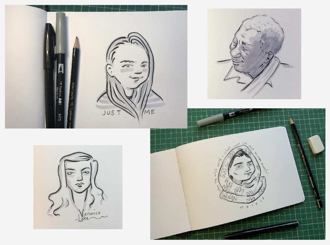
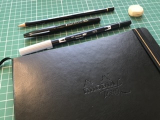
2. You Will Need...: You're going to need something to draw on for this class. A sketchbook or loose sheets of drawing paper will work fine. Then just a few essential pieces of drawing equipment for the three-step process I keep mentioning. For Step 1, you'll need a pencil. I'm using just a standard HB. You might also want to use an eraser. For Step 2, you'll need a gray felt tip or brush pen. I'm using this Tombow brush pen. If you happen to have a gray alcohol ink pen then grab that too. Alcohol inks don't streak like standard water-based felt tips, making them a nice, attractive option. But word of warning, whilst alcoholic inks do look amazing, they unfortunately believed to be most papers. If you're drawing into a journal, for instance, felt tips may just be a safer option. For Step 3, you'll need a black pen, a felt tip fine liner or brush pen would be ideal. I'll be using a Pentel Touch pen which has a nice varied line weights but any black pen will work. It's just a case of finding one that really suits you. You may want to experiment with a range of pens, even digital methods. The one of the exercises I'm going to demonstrate how this process can work digitally. The three steps really can be adapted to suit you in your artwork.
3. Skin: Skin. Before we began with the daily portraits, I want to share a few thoughts on representing different skin tones. The paler skin, you may want to leave the majority of it white. Of course, no one has ivory white skin in reality, but our brains are pretty good at filling in the blanks. This works as a tonal approximation, but if you want to try a pale gray to represent pale skin and then go for it, see what works. For darker skin, there are a couple of different things you can do. I'll leave you to decide which suits you best. Firstly, you can layer up your gray felt tip. If you're covering the whole face in felt tip, you'll want to work quickly to avoid streaks. Then leave this to dry for a few minutes before applying a second layer. The second layer can help define areas of shadow. Work quickly for both layers, to avoid the skin looking overworked and remember to leave the gray ink to dry thoroughly before applying your black. You'll notice that in my example, I haven't left any white in the girl's eyes. This is because unfortunately, doing so would mean working more slowly and inevitably this would lead to streaking. What can we do if streaky ink is becoming a real problem? One solution you might like to try is swapping your water-based felt tip for an alcohol-based pen. Alcohol ink pens are great for avoiding streaking. They won't give you a perfectly even surface, but that's fine. This isn't digital art. It's okay to see a bit of irregularity here in there. The application process, it's just as before applying a first layer, letting this dry, then adding a second layer. Here you can see how this comes together stage by stage. In image 1, I've applied my first layer of gray alcohol-based pen. Image 2, you can see I've applied a second layer to indicate areas of shade, giving the face extra definition. In image 3, I've added my black pen, completing the portrait. My advice is to experiment with as many different gray pens as you're able and try and find the best compromise between skin tone accuracy and an even streak-free application.
4. A Note on Working From Photographs: I know it's on working from photographs. During this class, we'll be working from photographs, sometimes your own photos, sometimes photos taken by others. There are so many convenient ways to find photographic reference. Google image is a really accessible starting point. For those who like to collect and organize their reference material, Pinterest is a great resource too. The images you find will be subject to different licensing agreements. But, as you're simply using the photographs as reference for your personal drawings, you don't need to worry too much about the legalities involved. Further to licensing, there are also conversations to be had around using other artists photograph as reference material. An important one being can be really cool a piece of art, our own, if it's based on someone else's work, you may already have strong opinions on this. My feeling is that if an illustrator makes a close copy of a photograph, then the original artist, the photographer deserve the huge amount of credit. If on the other hand, the illustrator uses the photo as a springboard to create something totally new, then that's a different matter, is totally right that the original photographer gets a mention. But equally, the new illustration has a life of its own and is a piece of art in its own rights. For my part throughout these lessons, I'll be crediting other photographers where relevant whilst aiming to make illustrations that really feel that there might own. Also, I'll be working from my own photo reference where possible. I bet most of you have thousands of great photos looking on your phones, so definitely use those to when you can.
5. Facial Features: Introducing the 3 Step Process: Facial Features: Introducing the Three-Step Process. Before we jump into the challenges, we're going to practice the three-step process, and to do this, we'll be drawing a bunch of facial features. This is your opportunity to experiment with different ways of drawing eyes, mouths, noses, facial hair, to see what works for you, and at the same time, really honing the three steps. In a nutshell, the steps are: One, pencil drawing, two, gray pen, three, black pen, and here's how the process works in practice. Step 1: Pencil drawing. This stage won't be visible in the final image, but it's arguably the most important stage of all because this is where we make the crucial judgments about line and style. But for the time being, I just want you to experiment. I'm aiming to fill a couple of pages with different ways to draw facial features, but you can fill even more pages if you want to. The pencil marks I'm getting down are really minimal, just the basic information about position and form because I'll be using my gray and black pens to really make these ideas come to life. If we take eyes, for example, even with really minimal marks, you can get across a strong sense of which direction they're looking. I made this little animation just to demonstrate what I mean. But it's really worth experimenting on paper if you haven't already. You can draw your facial features as stylized as you like. You can make your drawings realistic or comic, or really really minimal. I recommend trying everything and seeing what feels right. Step 2: Gray pen. This is a really loose state and it's probably where I relax into the process the most. I'm using my gray as my mid-tone, penning in dark areas and areas of shade. This gray will really help your black pop. I think it helps give your black line drawing a professional feel. Even if you're drawing something really simple, the gray will help it look like confident, deliberate style choice. As we're just using black, gray, and the white of the page, we have to use these tones, however best describes the people were drawing, we have to choose the closest approximation. If the person you're drawing has dark hair or skin, then you can use the gray more liberally; you can create layers of gray, you can experiment with different grays until you find what works. We'll be looking at this in more detail in the next video. Step 3: Black pen. You'll want to make sure your gray pen is totally dry before you apply your black to avoid the inks bleeding. I find a few minutes is enough for mine, but inks differ, so you might want to try a little trial and error to see what works for yours. This step has the most impact on your finished drawing, it's the part that really stands out, so conversely, it's the easiest bit to mess up. But the best thing to do to avoid messing up is just to get to know your pens really well, learn how it looks making all sorts of different lines and you might even want to try a bunch of different pens until you find one that feels really suited to your drawing style. But also keep in mind that messing up is fine. We're making quick portraits, so if you go wrong, you can literally just start again, that's what I do. In fact, when I'm creating illustrations for my books, I'll often make a handful of different versions then I pick my favorite.
6. Day 1: Selfie: Day 1, Selfie. To kick off the challenges we're going to be drawing ourselves. In preparation, it might be an idea to snap a few selfies on your phone or if you have some on there already, have a look through. I have to admit I don't consider myself a big selfie taker, but as you can see, I had quite a few to choose from. I've chosen my photo reference and now it's time for step 1, pencil. This stage isn't about getting an exact replica of the photo. I'm basically using the original image as a springboard, using it for a few basic pointers about the shape of my face and features because I'm going to ignore the tilt my head to keep things simple, getting down a simplified version of my nose, eyebrows, and eyes, making whatever pencil adjustments are needed, then just erasing unwanted lines. I'm happy with my pencil drawing. Now it's time for step 2, gray pen. Now, personally at this stage, I stop using my photo reference because I don't want the photo to dictate too many of my style choices. I want my own illustration taste to take over. If that feels a bit scary, then by all means keep your photo visible for as long as you need. I'm just adding a little circle there at the end of my nose to give that some shape. Don't feel like you have to do the same. Do whatever works for you. As I've said before, step 2 is probably the most laid backstage because I can keep my pen work really loose and relaxed at this point. I'm just panning in any areas of shade or areas of darker tone, and then giving my top a few stripes just because I want to, even though they're not in the original photo. Then I'm giving that a few minutes to dry, five-minutes should be absolutely plenty. But if you've laid up your gray pen, then maybe just give a few extra minutes just to be safe. Then it's straight into step 3, Black Pen. This stage is really going to stand out. The black is definitely going to be the strongest element on my page when I'm done. There's always a risk of things going wrong at this stage. If that happens, don't sweat it, just start over. These are quick illustrations, is not the end of the world. I'm conscious that if I draw too slowly and cautiously, my lines will look hesitant, which I want to avoid. I need to draw them with some degree of speed. I'm taking a breath, I'm telling myself where my line is going to go and then I'm committing it to paper. Because I've already laid out all the groundwork with the pencil and the gray pen, that's half the battle one already. There we are. That's my selfie portrait. Possibly a bit cuter than real life me, but why not? If you're wondering what to do with your selfie portrait now that you've made it, why not use it as a profile picture, either on social media or right here on Skillshare. Go and have fun making your selfie portrait, and I'll see you in the next lesson.
7. Day 2: Storyteller: Day 7, storyteller. For today's portrayed, I'm deliberately keeping the prompt really open to interpretation. When I think it's storytellers, I'm thinking of fiction writers, of playwrights, poets, lyricists, illustrators, or filmmakers. But you might even have someone in your social circle or family who spends a great yarn. If so, perhaps to make an illustration paying tribute to their storytelling skills is entirely up to you. For my demonstration pace, I've chosen to draw the Bard himself, William Shakespeare. I've chosen William because I thought it might be an interesting challenge to work from an illustration. Obviously, Shakespeare predates photography by a couple of 100 years. But this one, copper plate etching made by Martin Droeshout in the early 1600, it cooks up time and time again. Just like with photographic reference. I'm really conscious that I don't want to directly copy this image. It's just my starting point. With that in mind, I'm jumping into step 1, pencil drawing. I'm just very faintly outlining the curve of his head, indicating the brow, nose, and eyes. Then lips, chin, draw a line and ear. I'm keeping everything simple, just getting down the central lines and shapes. Then adding those waves of hair. Finally, that wonderful Elizabethan color. Then it's straight into step 2, gray pen. As always, keeping the gray pen work really loose. Using it to give darker types to his hair and to outline the face. Just following my pencil lines to get down some shade and depth before I apply the black pen. Before I go ahead and jump into step 3, I'm going to do something a bit different this time. I want to show a quote to go with my illustration. If you want to do the same, you may already know that good reads can be a great source of quotes from literature. There are a ton of different quote sites online. One which I sometimes use is brainyquote.com. There's a line I found from Midsummer Night's Dream, "Love looks not with the eyes, but with the mind," which is going to work here, I think. I'm just penciling that in, then adding a speech bubble. Now I'm ready for step 3. First off, I'm just penning in that quote. I'm keeping my lines really sparing and minimal. That's my finished storyteller, complete with quote. Have fun choosing and drawing your chosen storyteller. I'll see you in the next lesson.
8. Day 3: Animal: Animal. Today we're going to be drawing our animal friends and please interpret this however you like. You might want to draw your own pet or a friend's pet, in fact, this could make a really nice little gift for someone. Or perhaps you just want to use a source photo of a favorite animal from Google image and reinvent that image as an illustration. Or you can be very literal and draw a human animal, there something with fur scales or feathers might give you more of a varied challenge. I'm going to be drawing my cat, Alexander Perkins, also known as Alex. Anyway, you can see that I have a ridiculous amount of cat pics on my phone. I'm just going to scroll through and pick one, which looks like it will be a decent drawing reference. Then I'm ready to get started. Step 1, pencil. As I'm drawing, I'm really simplifying the shapes right down. As my photo is closely cropped, I'm making up some of the missing information. With the facial features, I want to keep a strong sense of Alex's expression, but I'm also making these quite stylized. So I'm not worrying about making an exact replica of the photo. Any unwanted pencil marks can be erased just so they don't show in that final image. Then step 2, gray pen. My main aim for this step is to keep Alex's white bits white, so I'm just getting that shape around his mouth and nose sorted early on. The rest of his body can be painted really loosely. Now to leave that to dry for a few minutes, then straight into step 3, black pen. Again, I'm being decisive with those black lines. I'm going a bit more cautiously around the eyes as the tiniest difference in line weights can make a big difference to his expression. But for all my other marks, I want to keep them looking quick, expressive, and confident. I'm emphasizing the whiskers and the flicks on his ears. I'm painting a nose made-up elements his tail, legs, and paws. I'm totally add lubing his stripes, keeping everything quite stylized. Then adding his name alongside the image just to the finishing touch. There he is. That's my finished portrait of Alexander Perkins. Have fun creating your own animal portrait illustration and I'll see you tomorrow.
9. Day 4: Old Photo: Old photo. Today's put trait inspiration comes from old photographs. You may want to have a scroll through Google image or Pinterest to see if there's anything that inspires you. Just as an example, I've headed over to Pinterest and I've literally just typed in old portrait photos in the search bar. That's brought up tons of great options to choose from. You may want to work from an old photo which is more personal to you. I'm fortunate to have access to a bunch of my mom's old photos. Some of them are from her youth and others date back as far as Victorian times, which is quite astonishing really. I don't actually know who everyone is and my moms be vague on some of the old ancestors too, but actually, that mystery around old family photos can be quite enticing. But I'm aware not everyone has a photographic record of their family history and even if they do, sometimes our personal histories can be triggering. So do what feels right and do what feels comfortable for you. Choose the reference that inspires you and fills you with excitement. I'm going to begin as always, by outlining these very basic shapes in pencil and getting the basic shape of her head and chin, then adding both her bonnet and simplifying that bonnet right down and keeping with my illustration style. Then I'm making a few simple marks for the facial features beginning with eyes and eyebrows, continuing down that line to indicate the nose, then adding some very simple lips. Then it straight into step 2, Grey pen. Initially, I'm penning in her hair, framing her face, then I'm penning her eyebrows and eyes and adding a shadow line to her nose, lips and chin. Then just little gray pen on the bonnet to give that some definition. Then adding the caps to the bonnet. Then I'm leaving that gray pen to dry for a few minutes before jumping in step 3, black pen. Before anything else, I'm black penning her facial features to make sure that those are just what I want them. Her eyes, the line of her brow are nice. Then I'm penning in how wonderfully symmetric hair. Then her chain detail. Adding a little extra detail to the bow of the bonnet. Then very loosely just indicating nice curves at the bonnet or so. I'm adding her name to this, because I know I'll forget her name if I do write it down. Here we are, is Elizabeth and she was alive, I'm told around 1865. I hope you have a fascinating time finding an image via portrait. Just to be estimate what I said before, pick one that intrigues you but keep in mind the old photos can bring back all sorts of emotions so be good to yourself. Have fun drawing and I'll see you tomorrow.
10. Day 5: Birthday: Birthday. My thinking behind today's challenge is that we could draw a family or friends whose birthdays are coming up then these illustrations can be posted on social media along with a nice birthday message when the big day comes. Or for the journalists among us, this can just be a really nice opportunity to practice drawing an image that might later be transferred into your journal to mark a loved one's birthday, but if you just want to treat this as a sketchbook exercise, then that's completely fine too. I've chosen to draw one of my nieces and because I didn't have too many photos of her, I decided just to be really straightforward and sent her a quick text. Luckily for me, she then sent a bunch of gorgeous photos for me to choose from. I like this one because I like the angle and I thought it could be a good opportunity to practice drawing a face with glasses. Again, as I launch in step 1, I'm looking to draw an illustration with a sense of the person's character, but without making it a carbon copy of the original photo. Now perhaps you want to experiment with different style facial features this time round. Is there something from your facial features page that you haven't tried yet that you want to try? Something that you could apply to this portrait. If so, be sure to get them relevant pencil lines down at this stage. To begin, I'm just sketching the shape of her head and neck and making sure I make a few adjustments to the neck and collar area just to suit my own personal style preferences. I'm working at the position of her glasses, thinking about how they relate to her nose and eyebrows so that everything is roughly in the right place. For her eyes, I'm going simple and stylized. Again, deviating from the photo and just adding a few lines to indicate her lips. I'm giving her a slight smile, not because she needs it, but because I want to write happy birthday underneath. It's going to look really sarcastic if she's got a total poker face going on. Everything is roughly where it needs to be for step 1, which means I'm all set for step 2. Just like before, I'm no longer looking at my face at this stage, I'm going to allow myself to go off piece to draw a stylized and illustrative as I like. I'm just loosely penning in dark areas and any areas that I need to shade. You know the drill by this point. I'm just going to get on with it. Finally time for step 3, as ever I'm keeping it minimal paying a little extra attention around the eyes because they make such an impact, but generally, I'm aiming to keep those black lines nice and confident. I'm really taking advantage of the calligraphic quality of my pen getting those varied line widths. If you're using a standard fine line pedal felt tip, then of course you're not going to have the varied line width, you're going to have more uniform line and that can be a great look too. Then giving a little more line weight to the lower edges of her glasses just to give a sense of shadow. That's that. All done and ready for my niece's birthday. I'll see you in the next lesson.
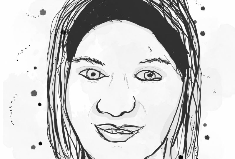
11. Day 6: Locket Worthy: Locket worthy, hello again, the prompt for today is Locket worthy. This is a chance to draw someone dear to you, someone his image you could imagine sitting inside a locket if you're a locket wearer, or simply someone that you love. Of course, prioritize your own well-being when you make your choice of photographic reference. Now, I'm anticipating that most people taking this class will make a pen drawing for this lesson. Please go ahead if you prefer to do this. But I wanted to take this opportunity to demonstrate how the three-step process also translates into digital drawing. If you happen to have an iPad with Procreate, then why not give that a go? I've created a new canvas the same size as my screen to keep things really simple. To add some variation, I've actually drawn a little locket for my portrait to sit in. You might like to do this too but it's absolutely not essential. You can just draw the portrait if you prefer. To keep my drawing reference handy while I'm working, I've imported the photo into the image as a separate layer. This is my five-year-old daughter, and I'm going to delete this layer when I'm done. If you're new to Procreate and you're not comfortable with layers yet, then you can keep your photo reference set fare, keep it elsewhere. I'm going to be doing the whole three-step drawing process on just one layer. There's no need to use layers at all If you drop a naught. Those of you using pen and paper, you don't need to worry about any of that. You can just go through your three steps as standard. I'm heading to my Brush Library in the top right corner. I'm selecting sketching and as a procreate alternative to my HB pencil, I'm choosing a brush code procreate pencil. I'm selecting a dark gray as my color, trying to replicate the tone of an HB pencil and I'm sizing my brush size to 15 percent. Though you can choose the color settings and size settings which really suit your image best. Just have a play around and see what works for you. Then as always, I'm using a photo reference just as a springboard, using it to get some general information about face shape, hair and features, but certainly not making a direct copy. I'm going a little larger with the eyes, making the image a tiny bit more cartoony. I'm leaving out her doll just to keep this nice and simple. Then it's back to the Brush Library for step two. For this step, I'm using a brush code streaks, which I've got stored in my favorites section because I use it so often. But you can find it in the inking section. I'm setting my color to gray to be super specific. I'm taking the saturation to zero percent and I'm taking the brightness to 80 percent, but you don't need to replicate my settings, go with whatever you prefer. Then for the size, I'm going for 10 percent. But again, I don't want to be too prescriptive. Just as I would with pen and paper, I'm loosely applying that gray pan layer, painting in the dark tones and any areas thrown into shadow. Then I'm ready for step three. Now, if you're working on paper, you'll need to remember to let your gray pen layer dry just for a few minutes before you go ahead and start drawing in black. But if you're working digitally, you can jump right in. I'm heading back to my Brush Library and I'm selecting this GJ pen. Again, you can find this in the inking section, though I've got it in my favorites as I use it so often. I've selected black, so brightnesses obviously zero percent and I've put the brush size to 12 percent. I'm just working exactly the same way I would with black pen on paper. I'm drawing confident minimalist lines. Then because I've got some blank space on the other side of my locket, I'm going to add a little quote for my daughter. If you're not drawing a locket and you want to add a quote, then you might want to put it in a speech bubble or you could write it around the outside of the image or underneath. See what looks good with your image. My daughter is going through a phase of getting off and if mixed up. It's one of those cute things that would probably disappear really soon. Actually, making a note of it with this illustration is pretty cool. It will help me remember the cuteness. There we are. That's my locket worthy portrait. I'll see you tomorrow.
12. Day 7: Inspirational: Today's put re-prompt is inspirational. I want you to have a think about the people who really inspire you, whether that's someone you know personally or someone in the media. For mine, I've chosen to make an illustration of Nobel Peace Prize Laureate Malala Yousafzai. Once you've got someone in mind for your portrait, you'll want to hit the usual sources, Google Image, Pinterest, go where you know you'll get some great photo reference. By this point, you know the drill. For Step 1, we're getting down those basic shapes, finding our own stylized way to represent facial features while still retaining the character of the person that we're drawing. Then Step 2, the photo reference goes away to enable the illustration to separate from the source material to become its own separate thing, and inking in any dark areas and any areas thrown into shade. I'm also going to use this stage to add some really loose designs to have scarf, just an indication of part in design. Then Step 3, I'm inking in all those key pencil lines in black, just the essential details. As it's my way, I like to add quotes when possible. There are a ton of great Malala quotes online. I could head to brainyquote.com, the site I mentioned earlier. But this time I found a good one, just through a Google search. When the whole world is silent, even one voice becomes powerful, and there she is. I'm excited to find out who inspires you. If you're happy to share your project piece, please do. I hope you have a wonderful time searching and drawing for today's challenge, and I shall see you tomorrow.
13. Day 8: Music Hero: Today's portrait prompt is music hero. Perhaps there's a musician in your family or friendship circle that you'd like to draw or if you're a musician yourself, then you might want to draw someone who inspired you to make the music that you make or perhaps there's someone in the wider world, his music is always on your playlist. I've chosen to draw a portrait of the late great B.B. King, a singer and guitarist. I've loved since I was small. I saw him in concert in San Francisco in the early 2000s and it was one of the most amazing live music experiences of my life. Choose someone whose music is really special to you then get image searching. I'm going to launch into step 1, getting on the main shapes and lines in pencil. By this point, I'm sure you're getting the hang of these steps but I'm going to continue talking you through them in case that's useful. I'm trying to get all of these angles right, getting all the features in place and just adding B.B King's guitar strap. I think the addition of the strap thrises portrait into context. Suddenly, we get the idea that he's in the middle of making music. That closed eye expression makes sense. Now I'm just giving the lightest indication of hair line and making any changes necessary. Then I'm into step 2. This time I'm going to apply two layers of gray pen. I still want to show the highlights though. Some areas are going to be left white. I'm replicating down my first layer of gray, working as quickly as I can to avoid streaking. I'm making a few extra loose marks to indicate hair. Then I'm leaving this first layer to dry for a few minutes before applying a second layer of gray pan. The second layer appears darker again, given my portrait edit depth. I'm adding a few light marks to indicate his mustache and I'm throwing the left side of his face into shade, his left, our right. Again, working quickly to avoid streaks. Then finally I'm ready for step 3. I'm beginning with a broken line of and his hairline, so it's not too heavy. Then making this line much more solid, moving across the forehead, cheek and nose. I'm being really selective about which lines I ink. Less is usually more, so just guessing a nice essential features. Getting a light suggestion of hair and then his shirt and guitar strap. There we are. There Is my portrait of my music hero, B.B. King. Have an amazing time drawing your eye music hero. You can even play some of their tracks or you work to draw you right into the spirit of their music. If anyone feels happy to share their drawer and then please do apply it to the projects. Happy drawing and I'll see you tomorrow.
14. Day 9: Silver Screen: Silver screen. In today's portrait, you will likely want to head back to those reference material; Gold mines, Pinterest, and Google image. Because today's prompt is silver screen. Think about your favorite old classic movies and see if you can find an actor you'd like to draw. I'm going to caveat this for those of you who drove the joy and more recent actor, that's fine too. But for my demonstration drawing, I'm going to be making an illustration of the super glamorous Veronica Lake. She's famous for her femme fatale film NWA rows back in the 1940s. Straight in step one, I'm copying down the basic shapes, positioning these facial features. Then I'm sketching the shape of her hair, how that frames the face, keeping it really simple. Then it's time for step 2. I'm grabbing a gray pen and inking any areas of shadowing. I'm emphasizing her cheekbones, shadow on her chin, her lips.Then again, a little rounded shadow on the nose just to indicate shape. Now following the line of the head and neck. I'm just emphasizing the V, of her dress collar because that can become the V for her name.Then straight into step 3. I'm inking in the eyebrows and eyes fast because this is where I feel I'm most likely to go wrong.I really want to get that sultry veronica Lake look.That works. I'm just extending down the line of the nose, then following the pencil guidelines. Then to finish, I'm just adding her name.That's my silver screen portrayed Veronica Lake. It takes some time to find someone you really want to draw. Make sure that the photo you're using lends itself to being referenced material for your illustration, i e, keep the angles simple unless you really want to challenge yourself, then get drawing. I'll see you again tomorrow.
15. Day 10: Artist: Hello again. This is day number 10. For the final portrayed prompts, I thought artist would be especially apt. Again, this prompt is deliberately open to interpretation. You might choose to draw a visual artist or a sound artist, or any other maker whose work you really admire. Then head to our old favorite places to find photo reference, so Google Images or Pinterest should serve you well. Or if your artist is contemporary, it might be worth checking them out on Instagram to see if they've uploaded any suitable selfies. I'm going to be making an illustration of photographer Annie Leibovitz. This photo of her was taken by Robert Scoble. I'm starting step one by penciling in all the basic shapes of her face, then mapping out those key details, eyes, glasses, making sure that her features are all where they need to be. I'm just erasing and correcting any lines which aren't quite right, being a little fussy over the angles at this stage so that I can relax into steps 2 and 3. Then because my subject is a photographer, I'm going to draw this as if it were a photo, hanging up to dry. Now for step 2, I'm panning in those dark areas, giving my drawing some depth, indicating shadow where needed. Then finally, step 3, time to add this black pen details. Again, keeping this nice and minimal, still making sure each mark feels deliberate and confident. There she is. I'm really looking forward to finding out which artists you've chosen to draw so do share your project work if you'd like to. Happy drawing.
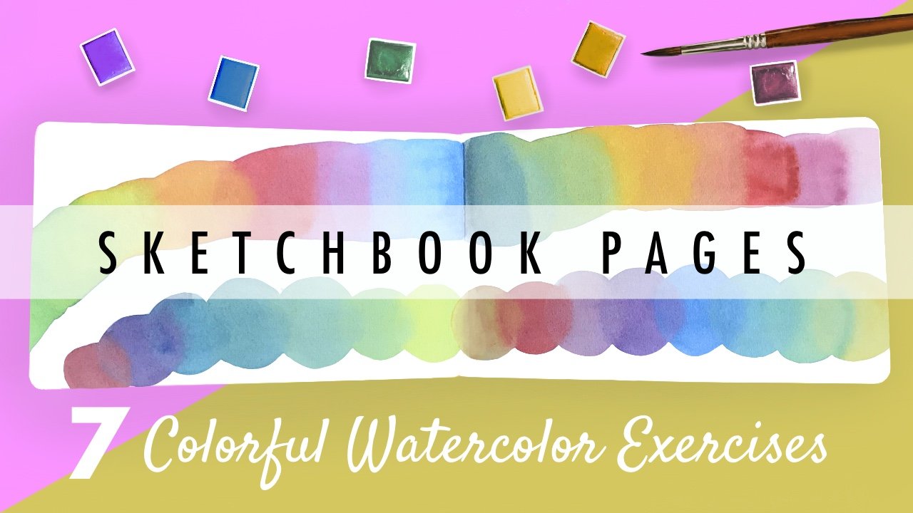
16. A Few Final Thoughts: Thank you for watching this Skillshare class, and congratulations if you managed to complete 10 days of portrays, what an achievement. I hope you've come away with some illustrations that you're incredibly proud of. Even more than that, I hope you're now feeling really at ease and confident with this three-step approach. It's something that you can apply to all sorts of illustration purposes whether you intend to illustrate children's books, magazines, social media, memes, posters. There are really so many possibilities, and you can push it in whichever direction suits your interest. Don't forget to upload your portraits to the projects if you're happy to do so, and I'll drop by and say hello. Seeing your progression and your artistic achievements is literally my favorite part of being a Skillshare teacher. If you'd like to share your work, then absolutely please do so, I'd love to see it. Likewise, if you paste anything from the class on social media, then feel free to tag me on Twitter and Instagram @inky_willis. I'll come by and say hello and I'd love to have a lick of what you've been doing. If you'd like to stay up to date with future classes, then you can follow me here on Skillshare, and if you're in the mood for more Daily Challenge classes, then I have a couple that you might like to check out. First off, there's my fearless sketchbook class. This is all about growing your sketchbook competence. Check it out if it's something that might be of interest. Secondly, if you have watercolor paints handy, I have seven colorful watercolor exercises ready to bring some rainbow joy into your sketchbook. I think that's that. All that's left to say is another heartfelt thank you. I hope this class has helped bring some fresh ideas to your sketchbook. Keep scribbling.
 Kate Willis-Crowley, Author and Illustrator