Transcripts
1. Class Introduction: I'm Liz Trapp and welcome
to my Sketchbook club. This series of classes is all about working
in a sketchbook. A sketchbook is such
a wonderful tool for creativity and
creative exploration. When I was an art
student in college, all my professors told
me to keep a sketchbook, and I never did, because I always thought of a sketchbook as a place where
you do pencil drawings. And I never really
saw the value of creative exploration that
can happen in a sketchbook. So I've made a series
of classes totally based on exploring creativity
in this sketchbook. And in this class, in particular, we're
diving into the landscape, which is often a
very tricky subject, no matter how you're trying
to represent the landscape. So in this class, we are going to jump
into the landscape. We're going to draw quick
gestural landscape sketches. We're going to use all
kinds of materials. We are going to do watercolor, like textural studies
of the landscape. Then we're going to do
st mixed media drawings in order to kind of bring
it all together and really try to have fun and maximize our creativity
in this amazing practice. Now I'm an art professor, and I walk my students through sketchbook exercises
just like this all the time in order to help
foster creativity and just engage in low
pressure creation. And sketchbooks are amazing, regardless if you're just
beginning and you're trying to figure out how to draw and what your art style is going to be. And if you're an
established artist or designer and you
just need to freshen up your ideas and your gesture and about how you see things and how you
think about things. I'm Liz Trapp. I'm an artist. I have shown internationally. I'm an art professor, and I'm really excited to
share this with you today. I'll see you in the
class. Thank you.
2. Project description: This course, I'll
walk you through four different
sketchbook exercises. You can do one or all four of them or some of them
for your class project. The first one is called Windows. We're going to start
this project out drawing four squares on a piece of
paper or a sketchbook page, and we'll do four quick sketches in each of those squares. Each one is timed, and
they're very fast. You can see I'm just
focusing on trying to get the gesture in this exercise. We'll wrap that first project up with a longer five
minute drawing. The goal of this
exercise altogether and this last drawing
is to help focus on gesture and working quickly and trying to really
get the essence of the landscape instead of
focusing in on too much detail. This is a fantastic
exercise to warm up with. And if you're going to
pick just one to do, I recommend doing
this first one, you'll get a lot out of it. The second exercise
is watercolor. For this, we're going to use
one color of watercolor. I picked in indigo,
and we'll focus on washes and directional
lines and texture. Directional lines just means utilizing several lines
in order to create this feeling of movement or to draw someone's eye
one way or another. We're going to use a foliage dense reference
photo for this one. I picked one of the
reference photos I uploaded. You can pick whatever
one you want. The third project,
we're going to do a mixed media landscape. For this project,
you'll use paint. I'm using Guash and your
dry materials together. This is a great project
to really think about kind of combining all of the different skills
we've worked on and returning to the
gesture or creating this quick mark and really developing it into a more
fully realized landscape. This one isn't timed, but I did mention in the video. I spent about 10
minutes doing it. I sped it up in the video, so I think it's just
about 5 minutes long. But it is a much quicker and fresher
look at the landscape. And for Project four, this is a bit of
a bonus project. I don't really introduce
any new skills here, but it's a fun way to
bring things together. This is a collage project. For this one, the first thing
that we'll do is just paint some blobby flowers on
a scrap piece of paper. I used my gash paint for that. Let it dry. And then
in my sketchbook, I returned to this idea of the watercolor landscape that we talked about
in Project two. And then once the flowers that
I painted first were dry, I cut them out and collage them down to kind of
just create you know, different way of approaching
this watercolor landscape. So through all these projects, we will explore a variety
of different skills, different ways of
putting them together, and different ways of
thinking about the landscape. And again, upload one, some or all of them
or just part of one to the project
area of the class. I cannot wait to see
what you do. Thank you.
3. Materials: Okay, materials for this class. Honestly, you can use
anything you have on hand. My recommendation is
to grab a sketchbook that can handle a variety
of materials wet and dry. If you don't have a sketchbook,
just grab some paper. You can work on anything. I also recommend a
variety of materials, but not too many color choices. For example, maybe
a few markers, a few cras watercolor, and maybe an acrylic or
tempra or a guashe paint. Some variety, a few colors
each. Nothing too big. I'm going to show you
what I'm using here, and you are welcome to
use the same thing. I'll list everything as well. But you can just don't
let that stop you. Just use whatever
you have on hand. Okay. Here are my materials. I'm using the
Talents art creation Sketchbook that's my go to. I love this, comes
in a bunch of sizes. These are Tambo dual brush pen markers,
variety of colors. Corn neo Color two. The neo Color two crans
are water soluble. Don't confuse them
with neo Color one, which is not water soluble. This is Cornda ash also. They're luminance
colored pencils. They just have two colors there. And Holbein acryl gah, which is acrylic ga. I love to work in that medium. It's nice opaque paint. If you don't have
this, you can also go with acrylic or
temperate paint. This is my Windsor Newton
watercolor palette. I'm going to use one
color from here, but it's nice to have
a transparent paint. So transparent paint
like a watercolor. Glue stick for some collage. Also scissors, I forgot
to show them here. Some brushes. I have a couple really well
loved brushes there. That's it. Go to it.
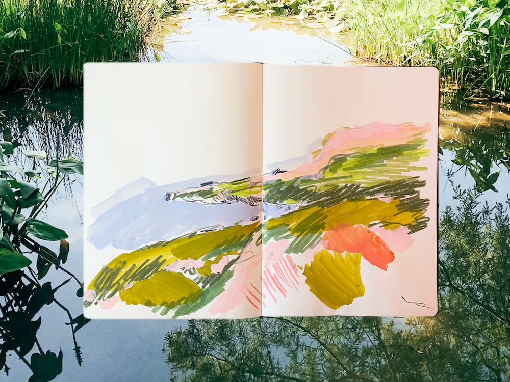
4. Intro to Project #1: Windows: Right? The first project
here is called Windows. This is a quick
sketchbook project. The idea is to get
you going fast and to help you focus only on
gesture and not perfection. So what you're going to do is you're going to start
with a ten second sketch, then a 22nd sketch,
a 32nd sketch, a 42nd sketch, and then we'll finish with
a five minute sketch. For all those sketches, you're going to use the
same reference photo. So go ahead and pick
one of the photos. I uploaded with the class. I'll be I've printed
them all off. I'll be using this top one for
this section of the class. You can also use your own photo. It doesn't matter as long as you have something to reference. So go ahead and get your reference photo and also an assortment
of dry materials. They don't have to be
the colors in the photo. They can be anything. The crazier, the better. But you do need an assortment. So I'll show you
what I've got here. I have some artist crayons. I introduced you to these
at the beginning of class, but I've got two shades of blue, two shades of green. I love these guys here. Couple pencils. Kind of violet one and a Paine's gray. It's
kind of my go to. And then a couple markers. Honestly, these are
the ones that work. Which is how I picked
the colors, but, you know, you might have a
better process for selecting. So a little assortment of materials and a sketchbook
or a piece of paper. The project will kind of
look like this at the end, so you're going to need
room for your four squares. And then I kind of flip the page and then use my five minute drawing
on the next spread. So buckle up. Let's do it. Don't worry about perfection. Focus on gesture. Okay.
I'll see you there.
5. Project #1 Windows: Go with the Windows project. Here's a quick glance at
what it will look like, and I have picked out
my reference photo. It's the top one there. And the first thing
I'm going to do is draw four equal squares. Just about my sketchbook
page, like you see here, I got to prepare some
of my doll materials, and then we'll get going. The idea with this
is just to focus on gesture and speed
and not perfection. It helps to get a
really fresh look at the landscape and
not overthink it, which is really the key here. So we're going to get started
here. I've got my image. I'm going to do the
same 14 times here. The first box is 10 seconds, get your materials,
and here we go. All right, I already
know I'm going to barely get anything
down in 10 seconds, just the coastline and
maybe a little color here, but that's my only goal
is to just get those. We're done with the 10 seconds. I can see that I really just got the very basic essence of this, just kind of a scribble. But we're going to
try to build on that. In our next box, 20 seconds. I'm going to work
right below this one. And here we go. I'm going to start the same
way I did the first time. I'm just trying to get
that coastline down. I've got my dark panes gray. Now I'm going to do the
same thing I did last time, get a little color down. My goal is to build on this. I've got some green,
just a quick scribble. I like using this violet
to have this foggy effect, and I'm going to
stick with that and a little blue for the
water, and we're done. The next box, 30 seconds. Let's try to build on what we've developed already. Here we go. Almost. Now here we go. Alright, I'm going to
start the same way. I've got my paints gray pencil and getting that coastline down. I'm getting better
at it because this is the third time I've done it. Trying to get a little
more texture in there. I know this is going to
feel a little longer. Around 30 seconds it
starts to feel longer. We're about halfway there. I've got some darker green down. Trying to add a little bit
of depth in that land mass. Now I'm scribbling some
blue down for water. I like that violet as this
sort of foggy feeling, and now we're done
with 30 seconds. So we're going to move
on to the last window, which is 40 seconds. Here we go. Didn't give you much
time in between there. It's hard to time it and
draw at the same time. But I'm going to start out
the same way I did before, that coastline with
the pines gray. I'm just kind of
working to get it down a lot from reference. I have my eyes almost solely
on that reference photo. I know it's off screen there, but I just scribbled some dark
green down at the bottom. And that light green. I'm trying to quickly
get more depth than I was able to in
the other windows. And I think we're
going to get there. There's a little more
information. I'm getting further. I'm going back in
with Pines gre, which I haven't been able
to do up to this point. So this is going to give me
a great way to move forward. We're up with 40
seconds to kind of move forward and think
about the landscape, but not overthink it. So I'm looking back at my windows and I
can see I've grown. In 10-40 seconds
through each stage. I encourage you not
to skip this part. I think it's a really
important part of the practice in order
to just move quickly. And now I know my next step is going to be a
five minute drawing. I'm not going to put a
timer up there for you. I am going to leave
it recorded in real time so that if you
are following along, you can just draw with me, get out your reference photo. But ultimately the goal of this and you can see I've
already started here. I threw my marker
across the desk. The goal of this is to retain that same quick gesture that you built up in
the ten second drawing, the 22nd drawing, and all
of those quick drawings. Because then the sketching
doesn't become tedious. You're used to working quickly. You're just trying to get
stuff down on the page, the general idea, then you can start building up
with more information. And I think that is such
a great way to approach this topic and to approach
a sketchbook practice. You can see here I'm working
through the coastline. I'm taking a little more time
because I know I've got it, just scribbling in
some darker values and really looking at that landscape as something
that's really broad. Picked that particular image, which I shared with you in the class materials here
because it's a little bit more simple and it's easier to break it up into
broad planes of color. It gives you this easier way
to explore the landscape. You can see here I've given
you just a different view. I'm going to go back
to the other view in just a minute so you can see
what's going on on the page. Importantly, I'm also sticking with the same materials here. I've flipped back. I'm
a little further along. I've got the same pattern that I was working on in
those shorter drawings. I loved that violet up on top. I sprinkled it throughout
other parts of the image. Not necessarily where I see violet because it's
nowhere. In there. But I love that it's
this lighter value. It adds a little
highlight to the image, and some of sketch booking
is also pulling away, using reality as a basis, but thinking about
the effect more than exactly what
colors are truly there. I love that violet for
that brightening effect, which I think does help me engage with that
landscape a little bit more. I'm just wrapping up here in the last about minute
of this practice. If you're following
along with me, you probably feel Oh, my gosh, 5 minutes feels so
long compared to those really fast drawings
that we were doing earlier. So, again, this is great
practice, and enjoy. I'm going to kind of let
you fade out with this.
6. Project #2 Watercolor Landscape: This is our second
sketchbook page exercise. We're going to use
watercolor for this or any transparent
medium that you have. For this one, we're going to
work from a reference photo, and we're going to
focus on texture and directional line
in this exercise. I'm showing you a couple
examples I've done here before. It offers a really beautiful,
illustrative effect, and I find that the
limited material is really helpful in focusing
on some of those qualities. So I'm going to walk you
through what I'm using here. I've just got my
regular sketchbook. I've got my reference
photo that I printed off. I'm using a different one
from the first exercise. You're welcome to use
any photo you like. I often do this from
memory as well. Because this is our first
time doing this together, I recommend using a photo
at least for one time. I'm pulling out my Windsor and
Newton watercolor palette, and I'm going to use
a really dark color. I like to work in an indigo, one of those shades there. Sometimes it takes me a
minute to find it on there. And I'm also going to pull out some of the brushes
that I'll be using. These are just
honestly my go tos. The one that I have
there is a round brush. It's number four, and that really well loved brush
is I believe an eight, a size eight round
brush as well. And really anything works well. I do like to use a broader
tip and a thinner tip. So I'm going to go
ahead and first of all, kind of see which shade
I am going to use. I think that's my indigo. Yep, there it is. I love indigo. It's just such a
beautiful, deep color, and offers a great variety
when you use it in washes, which we'll be doing here. So I've got my sketchbook,
my reference photo, my brush, and then my single
color of water color. You can use any
color that you want. So what I'm going to do is I'm just thinking
about this photo, and the key is to not
try to get every detail. So I know I'm going to
start with this tree, and mostly because
that's going to give me an anchor point in this picture. And then what I'm
going to do from there is just lay out some
mid tones with washes. After I get the tree
kind of laid out, I'm going to start thinking
about just where I see these forms and generally how much
space they take up. Especially in the early
Well, first of all, you're working in
your sketchbook, and so it's just a place
for experimentation. But especially in the
early brushstrokes, when you're just
laying out an image, it's helpful to just think
in really broad terms, like in this photo, where is land, and that's
where I'm starting. My photo is going to get in
the way there a little bit. But I'm trying to keep
it in the frame so you can get a sense as to how
I'm walking through it. Now I'm going along the edge. This is a little early to be putting in any sort of detail, but I'm just going for it. Just doing some circles, so I can remind myself that
there are rocks there. There's a little edge
wall in that pond. It's made up of these stones, and I'm just trying to indicate
that on the image here. Next, I'm doing lots of
little dots for these leaves. So you can see as I
work through this, it's more an expression of exploring different
ways of making marks to give a sense of your image
and not to make it perfect. And you saw from the examples at the beginning
of this exercise, that this exercise is much more about kind of mapping out the page and mapping
out the landscape and trying to make sense
of it than it is of actually, replicating
something realistically. So I'm going to walk through
some more elements here. I love this reference photo. I don't love the bridge in it because sometimes
that can be tricky, but it is going to give
us a good anchor point. So I'm starting to kind
of work in the bridge, some of the greenery
around the bridge, which is going to
help me kind of understand what's happening in the rest of the photo here. Believe it or not, I've
sped this up a little bit. I tend to work very slowly when I'm not
under time pressure. I didn't time this. I think I spent about 15 to 20 minutes working
on this sketchbook page. I think that's pretty consistent with how long I spend
on something like this. So it's not as stressful and
quick as the last exercise. Give you time to kind of slow
down and think about it. But, you know, I'm still
not spending forever on it. So I am exploring
how much water I put on my brush versus how much pigment I
put on my brush. This exercise tends to
work well when you have a little contrast in
your image as well. That's one of the reasons why I, really love to work with indigo because it offers a
beautiful contrast. It washes out really nicely to this kind of pale indigo blue. And then if you have a lot
of paint on your brush, you have almost this
ink like effect. So I often gravitate towards that for this type of exercise. Here, I see some
big broad leaves in this right hand
side of the image. And so I'm just using these
big thick brush strokes with my number eight brush just to kind of map it out a little and
give the essence of it. Don't veer away from
squiggly lines. They can give you a
really beautiful effect, especially when this is
such a foliage dense photo. When trying to
replicate that foliage, you're not going to get
it with every leaf. But I just tried to get
that feeling with squiggly, big, squiggly, washy
kind of lines. Those are technical
terms. I'm kidding. I'm going in with my
smaller brush now and a little bit less water down paint to try
to create a contrast. I put some little dots
in the water there. Really in an effort to kind of make it feel
like maybe there are little stones or
little ripples or something happening
there to break it up so it's not plain space. I'll go back in in a little bit and do that some more here. I'm focusing on some
different types of leaves. I'm just thinking
about the direction of my brush stroke
and different types. I'm doing little dots here versus dashes. Different scales. I'm letting it
sometimes bleed in where my page was still wet, and that's totally
that's beautiful. Actually, I encourage it. Just anything I can do to create this really nice variety of lines to create this sort
of essence of this image. I'm going to continue
working back in with again, just the smaller lines, more heavily pigmented
paint, less watered down. And I'm definitely
encouraging myself to layer on top of some of the
washes that I did before. It's almost like creating a sort of secondary layer of the image. Sometimes I'm working
in the negative space that I didn't paint before, and sometimes I'm working
over those washes. And again, just exploring
some directional line. And thinking about how I can create the effect
of this landscape. And then one of my
favorite things to do. There are not ducks
in the photo, but I love to add a duck. So I'm just adding some little ducks into the image and floating in
the pond, sweet ducks. It's. Oftentimes the
sketchbook exercises end up being que ching.
So there you go.
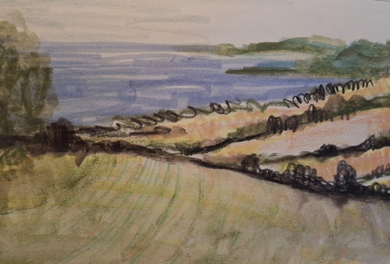
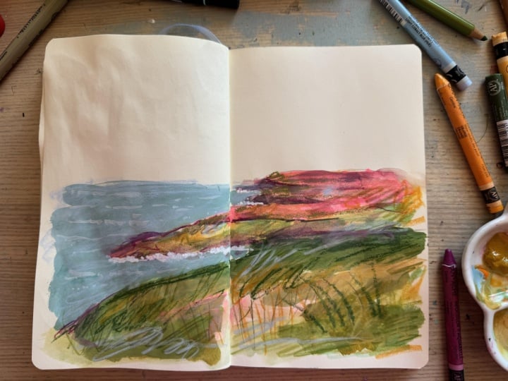
7. Project #3 Mixed Media Landscape: All right, this is
our third project. It's a mixed media landscape. This one is a little
bit more open. We're going to explore
mixed media and color here. You can use any materials
and any reference photo. I'm showing you an example here with a lot of
different textures, colors, different ways
of using line and shape. And the idea with this
is that you're starting to kind of bring
everything together. So I'm going to use
this reference photo. I used it for the first project. You can use a photo
you've already used or you know,
something else. It's completely up to you. I really love this coastline. I love a lot of things
about this photo. I think it's a great reference. So I'm gonna go
ahead and do that. I'm going to use
some gah for this, and our first layer is going
to be an opaque paint. I like acryl gah or acrylic gah because
it's really opaque. You can also use acrylic
paint or tempra. I'm also bringing back my dry materials from
the first project. I like to use the c,
the artists crayons, colored pencils and markers
to go back in and add detail. So I'm going to kind
of work in two stages. First, I'm going to lay out. I used a really light line, but it didn't even
show up on my paper. But I'm just using my
paints gray pencil to go ahead and lay out the coastline just like I did in those very first exercises that were like, 10 seconds long. I love that because it really loosens you up for
something like this. I filmed all of these in the
same day so that I could really kind of feel how the
sketches build on each other. I love doing that
in my own practice, and I hope you're able to
take advantage of that, too. Now I'm going in with gas here. I've mixed it with a lot
of water at the beginning. That olive turns yellow. And then sometimes I'm
using a thicker paint, and I'm just trying to lay
down this basic color. I have sped this up slightly just for the sake of learning, so you can see how it all comes together a
little bit quicker. But what I'm doing is I'm just exploring different values. And interestingly, I'm using coral here and then shell pink, which are those two sort of warmer tones to help
aid in my landscape, even though those colors
aren't in the picture. And that's something I
really want to emphasize. I try to explore that in
the shorter sketches, but I really want
to emphasize using some colors to sort of
brighten up the image, even if it's a color
you don't see there, adding in something unexpected. Is really exciting, and it's the perfect thing to do
in a sketchbook practice. I'm using that misty
blue gah for water. And then after I get a
little gouache down, I'm going to actually let
this dry just a little bit. So I'm looking at my
reference photo again, kind of planning where
I'm going to go next, and I'm just going right in with these crayons and starting
to try to add some depth. And again, I'm working
almost like I'm working in those ten and
22nd drawings scribbling. Getting planes of color down, not worrying too much
about any detail, obviously, but rather
thinking about the impact, how it all works together. I've got a marker now. I'm just going back in. The great thing about
those to Tambo markers and Korn dash crans is that both of those are water
soluble to an extent. They have kind of
different levels. But it creates a really
nice effect when you're mixing it with a water
soluble material like, you know, a wet
paint or something. So I'm just layering everything up It's
totally your call. You might do the gouache, and then let it dry, totally. And then come back to it. I let it dry for a little bit, and then just came back
in as fast as I could. A lot of that page is still wet. And then I'm just layering
in different colors here, different shades.
I like to work. If I have a picture
that's mostly green, I'll bring in like four or five different
shades of green, just to add a ton of
variety, if possible. I keep going back in to
emphasize that coastline, the way it just jets
out into the water, really like focusing on that. And I'm also bringing in some of these exercises
from before, right? The gesture from Project one, some of those directional lines from project to the
watercolor project. They really start to build up to kind of come together to
this. I'm pretty much done. I did limit myself time wise. I took about 10
minutes to do this. And again, I really
encourage you to work under a little bit of
a time limit for this because you'll keep
this fresh gesture. I also, I went back in. You probably saw and added some shell pink kind of
along the coastline, just to pull out areas
of light and lightness, even though they're not
pink in the picture. I think it really
adds some nice depth. And I'm just taking
the last little bit of time to go in and just
add a little more detail. Something you can't see is that that pencil is like gunked
up with paint at this point. I'm lucky I don't have
a hole in my paper, but that's it.
There you have it. The mixed media landscape.
8. Project #4 Bonus!Collage: Is a quick extra here. It's a fourth project, which is a mixed media collage. I'm showing you an example
here that I did before, where I combined some
painted elements that I cut out and
added to a watercolor. I'm going to make
a blooming garden. So I'm going to start with a scrap of paper and my gouache, where I'm just going to
paint really basic flowers. Then I'm talking circles. With other circles in
them, as you'll see here. So I'm using the same
colors I used before. I'm not changing any
of my materials. I've got the Acryla
gase in shell pink, and I'm just painting
those circles. Again, I'm going to cut this out so it's just scrap paper. Just going to paint a
few of them to start with just to kind of
give you the sense of. I've got the olive here, and I'm just adding some
little leaves around here. You can do anything on
your painted paper. You can paint flowers. You can just paint, like color
fields and cut those out. That has a really
nice effect too. Now, I'm grabbing some
of that coral and just going in and adding little centers to
those flowers there. Really basic, really simple. Let it dry. I've come
back with my sketchbook. Miraculously my
flowers have dried. I let m sit for about
an hour in between. And I'm going to do I'm
grabbing some darker color. I'm mixing up a little
bit more of like a greenish indigo with
a little green in it. And I'm doing essentially
the same exercise I did for the
watercolor project, which was Project two. Except I'm drawing
from my memory. I'm not using a reference
photo for this. You can do either. This
is truly just to play. I am sticking to
the same technique. So I am doing a pond. I'm going to obviously
put some ducks in it. But right now, what
I'm doing is focusing on adding some
foliage that pond, some vegetation, and I'm
doing that just by adding washes of that indigo
plus a little green. It's giving me some nice variety because I didn't
mix it perfectly, and I'm kind of alternating
one and the other. Adding some darker
color splotches. Maybe those are trees or bushes. They are a little more dense. Just like last time,
I'm adding my duck. So I'm just drying my
little ducks here. And then I'm going
to go back in and add a little more detail, not really a whole lot
throughout the image. I'm focusing on a lot of the
same things I thought about in project two directional
line, texture, thinking about how
to kind of make the image as interesting as I can through a variety
of different marks, while keeping this
one really simple. There's a pond across the street from my house that I
paint all the time. And anytime I do
something from memory, I usually paint this pond. I've spent so many
hours at the pond. So it's a favorite of mine. I really love how this is
starting to come together. Those simple marks that
kind of represents maybe plants at the edge of the pond that kind of make their
way into the water. I just think it's really
beautiful and interesting. So I'm excited about that. I think that you can find
little glimmers of things in your sketchbook
that then you can take out into your regular
studio practice, you know, no matter what it is, if you're a beginner
and just kind of exploring how to draw and paint. This is such a
great way to do it. And if you're an
established, you know, graphic designer or
illustrator or artist, it's a great way to
find new techniques that might kind of make
their way into your work. So here, I went back. I've got my scrap of paper. I'm going to let
my watercolor dry, and I'm just cutting out
the flowers and the leaves. It doesn't have to be perfect. I left some white
around the edges, but they're cute little flowers. So now I'm going to take
my kids glue stick. I borrowed from them. Nothing super fancy here, and I'm going to just
start gluing these down. And this can get
really beautiful. If you have a ton of
flowers that you paint, it just looks so cool to have that variety of
the opaque paint on, I used a little thicker paper. And then have that kind of against these beautiful
washes in your sketchbook. Again, this is just
like a mini exercise, but it's such a fun technique. And I think it's
something that might really interest you and kind of help you think about your art practice or
sketchbook practice. It is a really fun exploratory
place to just play. Like, you have these techniques, you have these materials, just play with them
and see where they go and how you can kind
of put them together. Into some fun exercises
and compositions. I decided that I just wanted to go back
in with a couple more, like, little marks of paint to kind of help
even it out a little. But I hope that you enjoy this exercise.
It's a really fun one. Tina.
9. Thank you: Thank you so much
in joining me in this class, Sketchbook
club landscapes. I had so much fun.
I hope you did too. In this class, just
to kind of review, we started out working
really quickly, focusing on gestural line. Then we went into
a little bit of watercolor, thinking
about texture. And then we started to kind of combine
some of these ideas together in a mixed media
landscape and then a collage. Um, I can't wait to
see what you did. Go ahead and upload your project to the
course on Skillshare. I love looking at all of them. You can upload if you did
all of the exercises, go ahead and upload all of them, or just one or a few.
The choice is yours. I just love to see
it, or if you did something inspired
by this project. Go ahead and that as well. And if you like this course, go ahead and leave it a review. And check out my other
Sketchbook club classes as well. This is the first one. Many more are on their way or
already up there. So thank you, thank you, thank you and have a great day
and happy creating. Right.
 Liz Trapp, artist