Transcripts
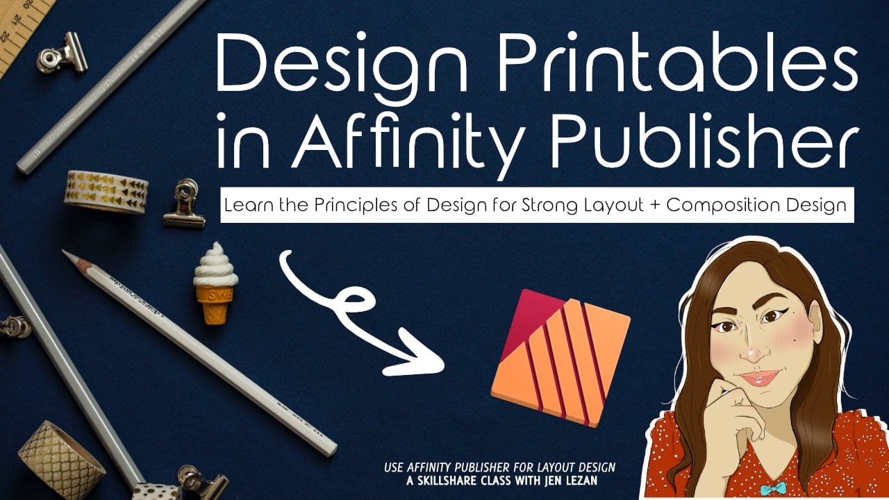
1. Course Introduction: You've heard of them. And if you're a part of the creative community or just
enjoy reading in general, you've probably been exposed to one at some
point in your life. Scenes are at their
very essence, independently created
and published magazines that tell me
stories for niche audiences. Historically, they have been the platform that the
counterculture use to release your ideas from
the Persian's of the 1930s. So the underground
punk rock scenes of the eighties and the
feminine manifestos of the nineties zones
have influenced creative culture and society
as a whole for decades. They disseminate the voice of people under oppressive rule, the inspire people to
take a stand through their art and never really unique way of
building community. This month, we're going
to be talking about genes and their latest rendition,
the digital team, and how you can
utilize the concept as a form of self-expression or promotion for
your creative work. Whether you are an artist and illustrator looking to
showcase your work. A designer who wants to create a unique portfolio or someone with a bigger
creative idea, wanting to bring it to life on pages with a team of
fellow creatives. This class is for you. I've done a lot of creative
work over the last 15 years, but some of my most memorable experiences were
drawing my time, publishing my InDesign
half-staff magazine. What started off as
a fashion project, launched into a six-year
self-directed creative journey showcasing the best of Indi Chicago creatives and
fashion, art and music. I did this alongside some of the most creative and
inspiring Chicagoans, people that I call friends. And that included photographers,
artists, writers, graphic designers,
stylus, makeup artists, fashion specialists,
and so much more. Hi everyone. If this is your first
class with me, welcome. If you are a returning
student, welcome back. I'm Jen, and I will be guiding you through
this creative course. I'm a freelance graphic
designer, illustrator, and educator base
out of the Midwest, and I run Bella and
Sophia creative studio. If you want to learn
more about me, you can visit me online at www dot fellow
Sophia creative.com. You can also check out my YouTube channel,
the freelance life. There. You'll get a behind the scenes
view of the work that I do as a creative freelancer
and educator, as well as access to
a huge library of additional free
tutorials relating to art design and illustration. I'm a huge advocate for sharing knowledge and really
accessible ways. And I found that
online courses and places like YouTube
are great for this. And they helped me
to connect with a really diverse group of people who are looking to
learn something new and who are looking to grow. So in today's class, we're going to be
learning about in designing our own digital Xen. I publish the indie
creators Chicago focusing half stack
for six years. And today I'm going to share
more about that journey, offer some insights
on designing and creating fuzziness
and show you how you can make your own gene using Affinity Publisher and the
online platform issue.com. So what is this class about? In this class, we
will be creating a digital Xen that
features personal work. This can be used as a
portfolio piece and it can also be a really
great item to use when pitching for clients. I'm going to walk you through the process of
designing and launching a digital Xen using Affinity Publisher and the
online platform issue.com. Before we get into the
nitty-gritty of designing though, I'm going to share
more about the history of genes and the evolution
into digital genes. I will share my
personal story and utilize inducing that I launched halfs back as a case study. I'll offer insights
on collaboration as I work with what started
off as three people. And that eventually
evolved into working with over 20 creatives for six years. We will review the
importance of having a concept and inspiration focus to guide the creative
decisions you make. Then we will talk about creative
direction and designing your scene right before we jump into lamp design in
Affinity Publisher, even if you're not familiar
with Affinity Publisher, I will make sure you
feel comfortable working in the
software and walk you step-by-step through the process of laying out your pages. I will touch a bit on using mockups to display your artwork, topography, and concepts
behind grid design. Then I will walk you
through the process of uploading your
Xen to issue.com. So who is this class
geared towards? This class is geared towards anyone interested
in learning how to use Affinity Publisher to design their own digital team, whether you're a beginner
or pro this course, we'll go through all the steps necessary to launch
your Z and online so that you can showcase
your work to the world in a fun
and creative format.
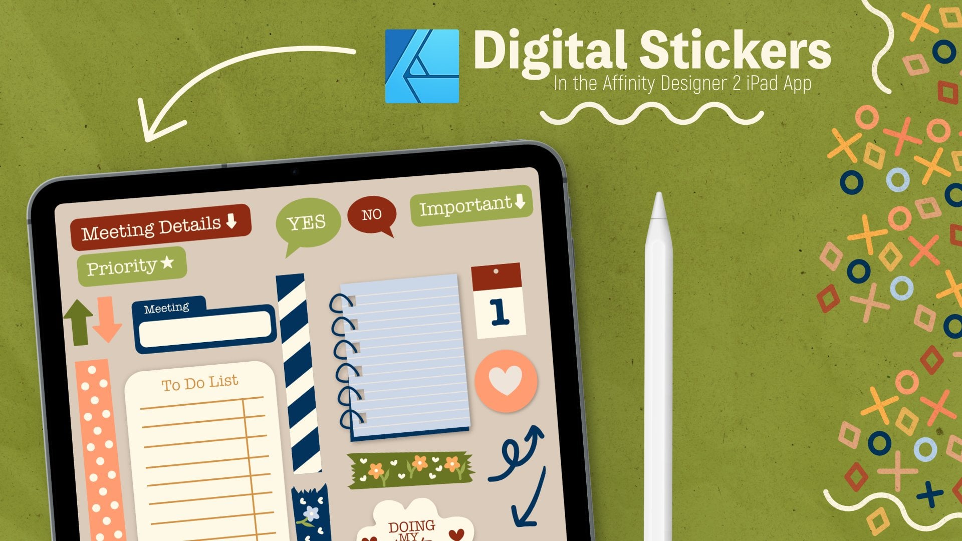
2. Course Project and Tools Needed: When it comes to this class, the tools that you'll need to work on the project include a computer with Affinity Publisher loaded onto it. I'll include the links to the affinity serif websites so that you can download a free trial. And then for the project, you'll probably want to have at least four visual pieces of artwork prepared. It can be illustrative work, digital design, surface pattern design, photography, whatever you want to feature. And then each of those work should have a paragraph description. And then I would also suggest grabbing a headshot of yourself and writing a quick artist's statement because we can use all of that in the layouts that we're going to be working with. So it'll give you a nice combo of imagery and text. So for our course project, you can do this on your own or you can work with a team if you have a group of creative friends who are willing to work with you and help you. But since not everyone will have access to people who could help launch this project, I'm going to assume that you are concepting, photographing, or creating mockups and laying out the Xen all on your own. So to make this a little bit easier for the class project, we're going to basically design a digital Xen portfolio. If you're a designer or an artist, the easiest topic will be to showcase your work and showcase yourself and share information on a topic that you're knowledgeable on. I would suggest the following, but you're not limited to this list. Feel free to add, expand, remove. But I think this will be a good way to get you started. So like I said earlier, you'll want to have floor visual projects with titles and at least one paragraph for each project. That paragraph could include things like explaining, inspiration and the process work that went into the creation of the visual piece. You'll also want to include a bio page featuring an image of yourself, an artist statement. And then I would also say include things like contact information and social media it leaks. You're Xen should include the following, a cover page for more interior pages. So basically a page for each project and then a back cover. And this will create about ten pages in total because each of those four interior pages are going to be double. And once you complete your Xen, you can upload it to issued outcome and then you can submit the link to view it in the course project gallery to share with your fellow classmates and myself. Make sure you check out the course project descriptions and check out the attachments for your class resources. I'm going to include an affinity publisher template that you can utilize for your layout. But feel free to update, revise, and edit once you get through the class and you feel more comfortable with the application, so that you can update it to make it feel and look the way you would like it to.
3. What is a Zine? : So the first thing I want to touch on is, what is a Xen and what can he do with it? So a Xen, short for magazine or a fancy a1, is a small circulation, self-publish work of original or appropriated texts and images. It's usually reproduce with a copy machine stapled together. It's a very, very, in its earliest renditions it was very simple. Genes are created by either a single person or a very small group of people. And they are popularly photocopied into physical prints for circulation. Today, though, with the advent of the Internet, more and more fanciness have gone digital. A fancy name, which is basically a blend of the words, fan and magazine, is a non official publication produced by enthusiasts of a particular cultural phenomenon, like a literary genre or musical genre. And it's basically for the entertainment of others who enjoy those very same things. The term was coined and it was really popularized within the science fiction role. But you see different genres from music like punk rock to cultural movements like feminism utilizing these throughout history. So what can you do with the Xen? There are many reasons people create and publish the scenes. Some of those reasons include sharing a niche skill or art, or developing a story or sharing your work with the community. Z's have also served as a very significant medium of communication and various subcultures. And they frequently draw inspiration from a DIY kinda philosophy, the concept of do-it yourself. And this basically disregards the traditional conventions of professional design and publishing houses. Kind of proposing an alternative, confident and self-aware contribution, which I think is really interesting, especially because I have a background in design and, and graphic design. And when you look at the barriers of entry for things like launching a magazine or getting published with a publishing house. There's a lot of stakeholders and there's a lot of gatekeepers and handwritten scenes or carbons, genes are individually made. This really emphasizes or really personal connection between the creator and the reader. Genes also have a very cultural and academic value, especially so in marginalized communities, many of which are otherwise little documented. There a way for these communities to make a statement and offer a voice to that community. See a lot of these reflected in the creation of Zinn archives and related programming in really major mainstream institutions like the Tate museum and even the British Library. Z's are also a great way to publish your own art, designs, plums, writings, musings, and anything else that you want to express without needing anyone else's permission to do so with a Zane, you can publish sketches, drawings, and mini comics mix words with images and textures, share personal manifesto. Create a visual portfolio work and so much more. Basically, what you put into a Xen is only limited by your imagination.
4. The Evolution to Digital Zines: Now let's talk about the evolution of the Xen, the digital Xen. With the rise of the Internet in the 1990s, magnesiums transitioned into blogs and websites, but there are still many papers genes created with the whole collage and cut and paste techniques of the past. There are a variety of formats for zones, but one way to get a wider reach an audience for your self-published seen is by digitally designing the layout, exporting it to a PDF, and utilizing an online platform like issue.com. This was the process that I took when I embarked on a journey with friends to launch our own gene in 2012, we launched a Kickstarter to fund our first print. You can watch a hilarious video included in the description box. And after that first run, we decided that it would make more sense financially to release the magazine digitally. This was the best decision we made. And launching on the platform issue.com exposed us to hundreds of thousands of new readers, which just absolutely blows my mind. So now that you have a bit of history on Cuisine, Culture and how I kind of started in the whole Xen world. I want to talk more about my journey running half stack.
5. My Halfstack Journey: So I'm going to utilize the launch of my InDesign and the years that I ran it as a case study of sorts. When I first launched half sack back in 2012, myself and a group of friends decided that we wanted to take our backgrounds and fashion marketing, design and editorial and put our minds together to launch a z. So when it comes to why launched personally, I was inspired by the work that I was doing as a freelancer for other independent genes in Chicago. And I wanted to showcase more of what Chicago creatives had to offer. Writing for outlets like the Chicago examiner and wedding guide Chicago. And I focus on trends in fashion. I was also working full time in corporate creative marketing for an accessories brand. And I did a lot of graphic design and editorial layout freelance for ND outlets like facto magazine and TR magazine. And back then, I ran my own blog. I had two good friends, Kate Medina, who worked in the fashion world. They knew design work and had backgrounds, is stylist for the retail industry. We all went to fashion school together and it makes sense for us to team up and round up other creative friends who are photographers, designers, and artists to not only bring this concept to life, but also to showcase the work that they were doing in our hometown, Chicago. I also ended up working primarily with a close friend of mine who is an incredibly talented photographer, laura Lopez, over the years to bring that visual concept to life. And you can find Laura on Instagram under the handle. The artists means nothing. So when it comes to what the magazine was focused on, half sack was an independent culture magazine focused on and dedicated to the local Chicago community. We showcase musicians, designers, boutiques, brands, artists, local entrepreneurs, and social changes who were on the rise because of the impact that they were making and the hard work that they were putting into their craft. So when it comes to the role that I played in the Xen as a founder, I acted as the publisher and creative director, coordinating, working with different creatives like photographers, stylists, makeup artists, graphic designers and writers, as well as working with brands, artists, musicians, designers, and PR companies that helped us to connect with those creatives that we featured. I came up with the themes of each issue, the focuses and the art direction for the key photo shoots that we worked on alongside Laura are our photographer to bring our creative visions to life. I also managed our team of 20 creatives and that included writers, graphic designers, copy editors and more and kept our publishing on schedule. And essentially we launched an issue every quarter for six years and we never missed a beat and never missed our self-imposed deadlines. Finally, I often had to also write articles and was in charge of the layout of the Xen. I worked on designing layouts for articles and creating visuals. In addition to working with about four to five other graphic designers who tissue 10 writers, photographers, stylists, and incredibly talented hair and makeup artists. Each issue. All of these creative people I am blessed to still call colleagues, but most importantly, they're my friends. When it comes to the features that we included in half stack, we focused on Chicago-based creatives and businesses. We showcase musicians, designers, boutiques, brands, artists, local entrepreneurs and social changes. And a well, our main focus was creatives. We also included articles that are related to things like politics and social issues going on in the city of Chicago, whether it was gun violence or gay marriage, we wanted to incorporate features about things that influenced and impacted our readers. Half stack launched in 2012 and we released For Plus issues a year for about six years, so one every quarter. And in 2018, I made a pivot and decided to shut down the magazine and wanted to refocus my energy, my freelance art business teaching, and a fine time to spend with my family because during that entire time that I was running half sack, I was working full-time teaching at multiple universities, freelancing. I was also at 1 working in the corporate world before I launched into full-time teaching and full-time freelance. And suffice it to say, I was really burnt out. It made the most sense to take a step back to figure out what was next for me and release something so that I can make room for myself and for other opportunities. While I was sad, I also knew that it was the right thing to do. And I found that the friends I made our lifetime friends and the skills that I gained over those six years have ended up benefiting me and the work that I do as a creative business owner. Whether I'm creating portfolios, my own website, freelancing, doing design and illustration work for others. Concepting out product shoots for my own shop or filming videos for my creative YouTube channels. In the courses I release, the skills that I learned during my days at half stack are often used in the work that I do today. It was an amazing opportunity to grow and learn and I'm so thankful for it. And I hope that with this class, even if you don't want to create a portfolio, but you have an idea for a Xen that you move forward with it and you launch it and you learn and grow with it. And if you can work with a team of amazing people, I highly, highly suggest it.
6. Thoughts on Collaborations: So before we move forward with talking more about layout design concepts, things like that, uh, wanted to touch on collaboration. That's one of the biggest things that I grew from and grew with during my time running half stack. One of the major things that I learned during my time running a Xen like half sack was at collaboration, was truly the secret sauce to the success of the issues. While you don't always have to work with others to launch a Xen. The scope of half stack was quite large. Our issues were hundreds of pages and often featured elaborate photo shoots. As I said before, I worked with 20-plus people for six years to release an issue a quarter. These creatives are the people I am still in contact with. Many of whom I consider close friends. And all of them continue to be an inspiration to me when it comes to launching the Xen focused on fashion or visual arts, you'll likely want to showcase that in a visual format. So I've found that working in the fashion industry, I was connected to the types of people who could bring creative vision to life. Photographers, stylists, models, and I had access to brands who were willing to lend out close. And that was really important, building those relationships, being professional, taking care of product, and keeping in mind how we were going to portray these brands to others was part of the growth that I was able to ensure for myself and others when we were working on these projects. Once one brand and company knows that you're responsible, you'll take care of their product and you create a beautiful, professional-looking end product, you'll find that others are going to want to work with you. And also a few of our closest friends were hairstylists and makeup artists, so they would help with hair and makeup on set. Then there were the writers and the copy editors in the graphic designers who worked alongside me to bring a form to our concepts. In each issue, the writers had an all access pass two events, restaurant openings, free shows and more. And those truly a fun time from Lollapalooza to bond through to meeting up and coming artists and designers and having the opportunity to interview them about their journey. The writing team really had a blast unfortunately or fortunately for some, it may be, it doesn't matter, but half sack was never a profit-generating project, but it was a labor of love for myself and my creative friends. So while we couldn't always pay models and hair and makeup team, we made it a point to feed people and writers got free access to some amazing things in Chicago. And while I'm a huge proponent for pain creatives for work, this wasn't really about making money at the time for anybody, not even myself. It was about building on a personal project that allowed each of the creatives to create works of art and professional projects that they can add to their personal portfolio and that would end up helping them gain paid work. The fact that I know people who made their hobbies a full-time jobs today because of the time that we worked together on this immense project is one of the things that I'm most humbled by. So now that you know the journey of my Azim, what will your speed like?
7. Concept + Inspiration: So having a concept and finding inspiration is really important. Basically, it's a topic or a focus for your scene. You want to have some sort of general plan will also touch on gathering visuals and words. So if you've never made a Xen before, getting started might seem a little intimidating. If you're putting your own voice out there by publishing your own scene, the first step that you need to take is deciding on a topic. There's no barrier to entry, so you can really do whatever you want. It might be helpful to think about what makes a good scene for you to work on. Think about what topics you could spend hours talking about, things that you're an expert on, or things that you want to learn about, that you're willing to research, to learn about and share that with others. You can even go cerebral and think about an abstract concept or thought and figure out how you can bring that to life visually, there's no limit. It might even be helpful to create a journal to track things that you're inspired by words, clippings are in the like. And since we're going the digital route for the course project, I always like to suggest using digital moodboards like pinterest.com. This is a fantastic way to organize your ideas and inspiration. Pinterest was a must use tool when I was coordinating photoshoot inspiration for half stack and even so still today for my creative projects, whether I'm sharing inspiration for our course or inspiration with a potential client for a project that we're working on. I find that places like Pinterest or digital moodboards are really, really helpful. So when it comes to the class project, now, if you're an artist or creative of some sort, things might be a little easier for you when it comes to your class project, you can utilize your own artwork and share insights on how you made it, what you were inspired by and why you created what you did. This will be the direction that I suggest you take for the class project. You can use photography of your process, work with your studio and office space looks like overhead shots of complete pieces, final scans of JPEG files of final art or creative projects. Anything along these lines will work. Personally. I'm going to create a portfolio inspired seen that showcases some of my surface pattern design and illustration work. I would suggest rounding up the falling. But you're not limited to this list for visual projects with titles and at least one paragraph for each project. And that paragraph should explain the inspiration and the process work that went into the creation of the visual pieces. You'll also want to include a bio page featuring an image of yourself, an artist's statement, and then some contact information and some possible social media links. This makes the whole writing process a bit easier as you have a prompt to work from. Well, feel free to write whatever you would like if you want to actually include articles and create a Xen based on a concept or something that you're an expert on, instead of showcasing your work as a promotional tool, that's totally fine.
8. Design Planning : Now we're getting to the fun part, designing your Xen art direction, basically, the format of your scene, how it will look, the size, how it'll be edited together. Those are the pieces that I really enjoyed this process. Once you have your theme, you've rounded up your materials. You have your work and the photos you want to share, as well as the written pieces. You'll want to think about how everything should be laid out and formatted and how everything goes together. So before we get into actually laying out the Xen in Affinity Publisher, I liked the concept out with a pen and paper. So here's some things to keep in mind. You'll want to think about what format your Xen will take. Obviously, we're working in a digital format, so size doesn't really matter too much. But of course, the shape will make a difference in the overall visual appeal you want to think about if you want it to be square or rectangle, large format, smaller format of many Xen, things like that. So keep that in mind. But if you were to print this out or you were doing this in a physical format, you'll probably want to think about, do you want your Zoom to be able to fit in someone's pocket? Are you looking to make something a bit more substantial and bigger? Will it be a folded piece of paper, will be stapled together? Or will you have a printed and bound somewhere? If you don't want to go the digital route, you can always assemble your Xen using paper and glue and tape and then scan or photocopy the pages to print more. You'll also want to think about how will it look. Spend some time thinking through an overall color palette, font choices and other design elements that will help the Xen strike a particular chord and mood, and that will make it feel cohesive. You can check out the Pinterest board that I shared in the course description for some inspiration, check out magazines and physical books in the world around you, or that you can find at your local library. You can also check out past issues of half stack here at issue.com slash refseq mag included in the description box so that you have an easy link to access and you can check out some of our past issues. It's, it's really amazing to see the trajectory of what we started with. I do have some physical copies to the point of where we ended in because I knew it was going to be our last scene. I ended up printing it using blurb just so that I had a commemorating, memorable issue for myself. So this was our first issue, and then this was our final issue, is very beautiful, very minimal. And you can see a huge difference in growth in terms of our layout skills and my layout skills from that original. So this final so six years gave me a lot of practice plus I had all kind of different clients during that time to where I was learning and doing new things that I was then able to apply to the work that I did on this first one project. Finally, you'll want to think about how will it be edited together? Well, it'd be broken into different sections. Will it all flow together organically with my Aziz, I had kind of a direction of what I wanted the magazine to Flow-like and I had it separated into each section. You'll want to think about, will it have an introduction, a table of contents, or any other hallmarks of a more traditional publication? I did this with half sac because their issues were quite large. But this is not always necessary. But as you can see, this is a pretty substantial leucine. It looked pretty much like an actual magazine. Whenever we would print these out, we didn't have a table of contents just to make things a little bit easier. I always had an introduction letter from the editor and the kinda highlighted and spotlighted our features and things like that. So I wanted to make it as professional as it had content that I really truly believed in and that the people I was creating with believed in. You can even think about how people go through and read through content and organize your content in a way that makes it a little easier to be consumed or that is just beautiful to look at. So once you've answered all these questions, you'll want to put pen to paper and basically mock up your Xen. What will the first thing be that the reader sees? What's the last or will the tax B and contacts to your visuals? How will the paragraphs look in contrast to your headers? Where do you want your contact information? I like to mock up magazines and just plain old 8.5 by 11 paper and then use that as my roadmap when I'm actually laying out the content in Affinity Publisher.
9. Getting familiar with the AP Interface: Now that you have your mockup ready to go, Let's jump into Affinity Publisher and begin to lay out our pages in our Xen. Let's jump into Affinity Publisher so that we can actually start the layout process. So I'm launching from my applications. Affinity Publisher is the third piece of software that affinity brand has. There's Affinity Photo, Affinity Designer, and Affinity Publisher. And Affinity Publisher is basically the layout platform if you are designing magazines, if you're laying out posters, if you're creating any type of book, this is the software for you. So now that I've launched the application, I just want to highlight a few things before we set up our new file. On the left-hand side, you will find all of your tools, so things for Lake, adding lines, adding shapes, placing images, your text boxes, and any type of grid that you might need. And then on the right-hand side is your studios. So you'll be able to find your layers here, your character studio to adjust your text and type anything dealing with your paragraph settings, your color, your swatches, and Stroke Studio. You can go up to the main menu bar up here at the top. And if you don't have a studio that maybe you want that I have here you can go into view, scroll down to studio, and then just make sure you check mark the studio that you need. And then this top main menu here is just your general the document menu. So you can set up a new file. You can edit and paste. You can add pages, delete pages under your document menu. You can also update any images that perhaps have lost their links in the resource manager. You have your text menu, your table menus, your layer menus, so that you can align in-group layers, hide and show things like that. Your Select, de-select that view menu that I showed you. You can adjust your view mode. You can also add or remove things from your Studios. You can also customize your toolbar here and then your window and your help options. The big thing to keep in mind is just like in Affinity Designer or Affinity Photo, if you've ever worked in them. There are persona's and right now we're currently in the Affinity Publisher persona, but you can work in the Affinity Designer persona. And you'll see that your tools on the left-hand side change a bit. And you can also work in the Affinity Photo as well, which I think is fantastic. So let's go back to our Affinity Publisher studio and let's set up our new file. So I'm going to go into the File menu, select New. And I'm just going to make this a very basic file. We're going to keep the page width at 8.5 by 11 and our DPI at 300. If you find that your document units are in some measurement that you are not familiar with. You can just click on it and you'll get this popup and you can select something that you are familiar with. So in my case, I'm going to select inches. Since we're doing for interior pages. Keep in mind within magazines, they're going to have a front and back page. So that's going to be eight pages total. And then you're going to have a cover page and a back page. So I suggest setting up your file with ten pages. And you want to check mark default master. And you wanna check mark facing pages so that you see which pages are next to each other. You can have everything arranged horizontally and starting on the right. And then you can keep your format in RGB mode because this is going to be digital viewed on mine. If you were to print something out, you'll probably want to utilize CMYK depending on the printer that you're working with. So just make sure you ask if that is something that you are potentially creating this for, um, then we can keep everything else the same. Also, make sure you have preferred linked. And then because I just like being able to keep all of my images in one file and I will link it directly there. So don't have any potential issues. Like if you know you're gonna be sending this file to multiple people to work on, then I would suggest embedding your resources. And basically what this means that the document is portable. But this is going to be at the expense of a greater size because all of your full range images are going to be loaded into the document. And all of those resources are stored in that file. Linked resources give a much smaller documents size as only the link information, which basically is kind of like a roadmap to where that file is saved on your system. And then hit Create.
10. Setting up Master Pages and Spreads: So once you create your file, you'll see on the left-hand side, you'll see your pages. So you have master pages and we have your general pages. This first page that we're looking at right here is the first in the setting. And then we can just double-click and it will take us to all of our other pages. And as you see, we have facing pages, meaning each page that would be next to each other is going to be laid out facing. And it just makes it easier to lay out the Xen. We have our cover and then our back page. So what's nice is we could add pages if we needed to. You could click on, say, a page in your layout and your spread here. And you can right-click and you can select Add Page. You can update the number of pages you're adding if you're going to insert it before or after the current page and then you can update the master will talk about master in a moment, but that's basically how you can add a page in and how to navigate through these pages. So I have a template already started that I want to show you really quickly. So this is a layout that we are going to be working on. Um, I suggest starting it off with who you are and some examples of work before we get into some of the additional interior pages. But as you see, you have your layouts on each spread like this. You have your left-hand page, your right-hand page. You can click on it and go directly to that page. And it just makes it easy to kind of navigate through the system when you're working with these little pages in the thumbnails here. So one thing I like to do is utilize master spread. So basically master spreads apply any element that you might want to all of your pages. So say for example, we wanted a number on each page and we want our name, our email, and our website. So I've already created a little website link here. And the end, what I did to do this was I went into my text frame tool and then I just created a text frame that is the size of what I wanted. And then I am going to go up into my upper left-hand corner. And I'm going to update my font. You can just click on the font here. And I'm going to update this font from Monaco to, I believe the font that I have originally here is bidder. And these are just fonts that I have in my system. I'm going to select italic. I'm just going to add my name, my e-mail, and my website. So, and then if it's too big, we can also edit and adjust the font size. So next to the font type, There's going to be your size menu here. If you click on it a little down arrow, you can increase or decrease the size. I'm going to bring this down to about nine points. I don't want it to overtake my page, but I still want it to be visible once I've updated my style and I've updated the size of it, I can begin to type in the information. So once I've created that, I'm actually going to go here and delete this old one. And then I'm going to select this one. I'm going to copy it. And then I'm going to go into my master pages. So if we go into a little pages menu here, you'll see Master Pages. What we'll wanna do is double-click inside of those master pages and it's going to pop up this blank page. So basically whatever we apply to these pages are going to be applied to every single page in our layout. It makes things so much easier so that you don't have to copy and paste and redo things over and over again, especially things that are repeating elements within your layout. So for example, like this contact information, I'm going to want this on the right-hand side and I want to have it kind of bumped in just a bit so I still have enough space for my page number. And I want it low enough so that it doesn't interfere with any the imagery that I'm going to add to my page. But I want it, I don't want it so low that it's going to get cut off. So I think this placement here is perfect. And then what I wanna do is also add page numbers. So to add a page number, I'm going to go back into my left-hand side, select my type tool. So there's the artistic type tool which allows you to just add letters and there's no limit to where that type will fall. Or you can utilize your type frame tool like we did with the with the contact information here. And basically, it's going to be limited to the size of your frame. You can't go beyond the scope of the frame. So in this case, I think I'm going to use the frame tool so that our number kind of stay within a certain parameter. So once I've selected that frame tool, I'm going to zoom in on my corner here on the left-hand side. And I'm going to create a frame that I think will fit up to a double digit. And I'm going to keep my font option as bidder. And instead of having it italic, I'm going to select Bold just so that it stands out. And then I'm going to increase my size from nine to 10. And what I wanna do now is go into my text menu at the very top. And I'm going to select Insert, and then I'm going to select fields, and then I'm going to select page number. And it's just going to give me a number. Let's fine. Because basically what our cover page number, this is going to be on this left-hand side, is going to automatically pop up. So I'm going to copy this by selecting it. You know, it's selected because it'll be outlined in blue. And then I'm going to copy it by hitting Command C or you can go to edit copy. And then I'm going to go to my right-hand side, my layout, and then I'm going to hit, I'm going to select pace. So you could either go to edit, paste or Command V. And I'm going to move this over to a place that makes sense. I can also select this text box and hold Shift and select the other text box. And then I can utilize my align tools. You can see these at the very top here in the upper right-hand side. I can align them to the top. Or I can go into my Layers menu, go into alignment, and then I can align it up top to the middle, aligned in the bottom so that everything is aligned on the page appropriately. Now that we're done with this, what we can do is go back into our main pages here and double-click and you'll start to see that all of the elements that we've added, like our page number, our contact information. They've all popped up on our pages without us having to go through and manually adding page numbers and whatnot to these layouts.
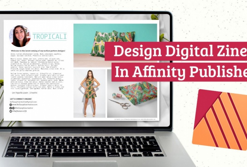
11. Creating the Bio Page Layout: So one thing I like to do is utilize and reference my sketches. I'm, while I'm working on my layout. So what I suggest you do is you can either do a side-by-side view where you just pull your, your publisher window to the left and then go into your downloads and then open up your sketches in say something like preview and pull them to the right so that you can look at them. And you can reference what your layout is going to be like. And it just makes things a little bit easier. But if you like working with all of your space, you can also just place your references directly onto your pages and then delete them afterwards. So what we'll do is go into File and then select Place. Go to your wherever you have your sketches saved. I just downloaded them. I'm going to select this first, these first two layout concepts and hit Open. And then I'm going to resize them and I'm just going to place them here just so that I have something or our friends, I'm gonna do the same thing with my other two Layout References. Go into File, select Place, place it in, I'm going to rotate. I'm going to resize this by holding Shift and pulling my corners in. And if you find that things go out of proportion, you can just hold Command and put your corners in as well. And then I'm going to rotate this by holding Shift and taking this little arm that has a white circle at the end of it and rotating it to the left. And when I hold shift, it rotates in 15 degree increments. So it will allow you to easily rotate 90 degrees. I'm going to resize this just a bit more so that it can see what I'm doing. And now released simply. I have access to my layout, so I already did this one, but I'm going to walk you through this process so that we can work on basically setting up the introduction pages for our layout. So this is the layout. This second option here, it had, I basically wanted an image of me, the title of the artwork that I'm featuring throughout this Xen. A welcome, a paragraph probably you might. Artist statement makes most sense here, and then contact information and then the artwork featured on the right-hand side. So this is that sketch and then this is that translated into a final piece. So what we'll do is work on setting this up on the second page. What we'll mainly be working with is shapes, text, and then placing images of our work mocked up. So we'll start with laying out the page. We'll start with lean on our pages and placing shapes that will work as place holders for us. And then we'll jump into working with mock-ups and then we'll place those final images before we export the final file. So what I'm gonna do is take this first image that I placed here and I'm just going to copy it. And then I'm going to place it here just as a reference so that I know what I'm working with. I know this is a little small, but I have an idea of what I wanna do. So let's get started with creating this left-hand side. So we're going to need a place for an image, a title, and then taxed. So I've already decided on the font that I'm going to use. I'm going to utilize this Monaco for my kind of longer paragraph texts because it's easier to read. I'm going to utilize bidder for all of my other details, but I'll utilize bidder in both bold and italic on the left-hand side here we are going to go into our shape tool. So if you scroll down right now mine looks like a triangle, but if you click on it with your mouse, hold it down, you'll see a pop-up where you can select all kinds of different shapes that you don't have to just select a circle. You can do any other shape that you would want to utilize that makes sense for your overall style. I'm just gonna do a circle to keep it nice and clean and just easy to look at, easy on the eyes. So I'm going to create a circle or my headshot. And once I've selected that circle, what I wanna do is update my fill color. So if you look in the upper left-hand corner, you'll see that the ellipse tool option is selected. And next to that you'll see you'll fill and a stroke. We don't want a stroke. We just want to fill, but I don't want to fill it with black because it's really dark. So I'm going to select this. Light blue here. It's one of my recent colors. You can also go into your color swatches and select from here. Or you can double-click on your little color or Option, your color field here in your swatches studio on the right-hand side. And when you double-click it, it will pull up a color chooser. And you can just utilize the color chooser here. If you wanted to add a stroke, you'll see that the stroke is behind your fill in the swatches studio. So just click on it and then you can add, you can add a stroke. If you want to remove the stroke, you can just hit this little white circle with a red dashed through it and it will remove your stroke. And then you can bring your fill forward by clicking on it. And you'll see that you have a blue film. What I suggest if you want a perfect circle is hold Shift while you're creating your circle with your mouse. So I'm going to hold Shift and then drag across. And it's going to create the circle for me. It doesn't need to be huge because you just want to be able to kind of highlight a quick little photo of who you are. So I think this will be a good size for this. Next, what we'll wanna do is add a title here. So I'm gonna go to the left-hand side, my toolbar, select the text, the frame text tool. And then I'm going to create a frame that is approximately the size, The title that I'm going to add. So once I've done that, then I will make sure I go into my font options in the upper left-hand side here and then increase the size of my font. Currently it's 10 points. I'm going to click on that dropdown and then I'm going to increase the size to about 36. I'm gonna change my color right now. It's currently black. I'm going to use that blue again. We can always change it back if need be, but I'm just going to select the blue from my recent color options here in my swatches. And if you don't see your swatches, just click through and it should pull up. So now that I've updated my color, I'm going to add my title, which is in my case, tropic Kali. And I'm not sure I want to use bidder for this. I think I'm going to use the same font that I used for my paragraph, which is that monocle. I'm going to go into my type options here. I'm going to select the little drop-down arrow is currently on bidder. So I'm going to select Monaco. And then looking at this, it's still kinda small, so I'm going to go into my type size and then I'm just going to increase it to 64. And then I'm going to utilize my black arrow tool, which is my move tool. And I'm going to just align this with the circle. If you see, well, I align this, a red line pops up. That's because I have magnetics turned on. So if we go to the upper menu here, you'll see this little magnet tools. So what you wanna do is make sure that magnet tool is turned on by clicking on it and it'll be a darker gray. And that's what will basically turn on your magnetics and will allow you to align two shapes into edges of your layout as well. You can also select your text hold Shift and then select your circle and utilize your align tools here, and it will align your layers here for you. If you notice you have like blue outlines, it's fine. It's just basically, it's just like the preview of everything. If you hold Shift on your keyboard, it will remove those. And then what I think I'm gonna do is add a little bit of line work to kind of highlight that this is a title, so I'm going to go to the left-hand side, select my pen tool. In this case, we don't want to fill, we want this to be a stroke. So if you go into your swatch, a studio on the right-hand side, on, you'll see there's like a little arrow, right next year Stroke Color option and your fill option, if you click on that little double arrow, it will give you a stroke. And then if you go into your Stroke Studio, you can adjust the size of your stroke as well. So I think I'm gonna keep it at two points for now. And then to create my stroke using my pen tool, I'm just going to tap on. I'm going to create a point on one side of my text hold Shift so that I can create a straight line. And then you'll see this little line, yellow line pop-up showing you that you're creating a straight line. And again, you'll see a green line pop up because I'm, I'm creating this using magnetics, so it shows that everything is all aligned. And then I'm going to tap on that other side, create that straight line. Then I'm going to hit my arrow and then just tap anywhere outside of my layout. And you'll see that I have added a line. So I'm going to select this line with my move tool and then I'm just going to hold Shift and move it down just slightly. So that moves down in a straight line. And then I'm going to hit Command C to copy it and the command V to paste it. And I'm going to hold Shift and then I'm going to pull it down again. And I'm just going to double-check to make sure everything is aligned properly. And they think I like this, this looks good. And now we want to add additional titles are paragraph and then any other contact information. So we're going to go into our text tools again. And instead of R, instead of the frame text tool, I'm going to select the Artistic Text tool here. I'm just going to drag in AD where I would like to place this header. So once I've added the space for this type would have been to do is update this, change it from a current size which is 27 down to something a little bit smaller. I think 14 should work just fine for title. And then I'm going to change the color. I'm going to go in and select a darker gray. I'm going to type in my header here, which is just gonna be welcome to my latest Surface Pattern Design catalog. If you ever want to zoom in. The easiest way to go about this is if you have a trackpad, use two fingers and press outwards to zoom in and then to zoom out. Take your two fingers and press in words like you're dragging, dragging inwards to do that. In order to zoom out, you could also go into View and select Zoom and hit zoom in. Or you can select Command Plus to zoom in, or Command minus to zoom out. Once I've added my header here, I'm just going to align everything up with my circle. I'm going to make sure the edges are flushed. So I'm going to select my text by clicking on it, hold Shift, select my circle. And then I'm gonna go to my align tools here, and I'm going to align horizontally to the left. So I have my header. Now I need to add some space for my paragraph. So let's go to our frame tool or Text Frame Tool selected. And then I'm going to create a frame that lines up to the left with my header and my circle, and then just pull it so that it lines up to the right with my tropic golly title here. And then I'm just going to drag it down the amount of space that I think I'm going to need. And if I need more, that's fine. You could always increased or decreased by pulling on your edges here. So once I've done that, you'll see the little cursor blinking. What we need to do is update the size and the color of this. I'm going to change this from the bidder type 2 monocle. So I'm going to go to my font-family options here, and it will automatically pop up. So I'm going to select that and I'm going to change it from 36 to 12 points so that I have enough space. And also when it comes to type design, just keep in mind how people read, where are typically reading from left to right. So whatever is the most important you're going to want to put to the left. And then people will read left to right, top to bottom. So anything that is supposed to be called out, I'm going to utilize bolder type options here. And then I want to make sure that anything that is body copy, I want to make sure that it's really easy and simple to read. And then if you have texts, you can copy and paste it in. If you don't though, you can go into your text menu at the very top and you can roll down to insert filler texts and it'll add that Lorem Ipsum. It just looks like gibberish, but it does a good job of adding placeholder text so that your elements look like they're ready to go. And you can always go back and edit this. Now if you don't want placeholder taxon, you have created your art artists bio, you can just select all of this with your mouse and just hit delete. And then you can go to wherever you've saved your document. So I have a page's file already here with my artists bio. And I'm just going to select all of that text that I have for my artists file and I'm going to copy it. And then I'm going to go back into my file and I'm going to select Edit, Paste without format so that it keeps the options I've already set for it instead of pasting with the options that were in my document. So yours might look a little funky like Mises, right? No, it's totally fine. We can go in and we can just revise and edit. So I'm going to go in and just fix my spacing by deleting and then revising and pulling things altogether. And then I'm going to resize my frame here. Once I've added my text, I'm realizing that I need to add my name somewhere. And also I have some areas here where I actually want to link out to a website. The beauty is that with Affinity Publisher, when you export these as PDFs, you can link, you can export them as a digital PDF and link certain pieces of tax so that when people click on them, it can take them to a specific website. I'm actually going to highlight some of this text here in my paragraph. I'm going to copy it by hitting Command C. And then I'm going to tap outside in the general area of my layout and then hit Paste by selecting Command V. I'm going to resize my frame here, and then I'm going to actually resize the text itself. When upset of this Monaco, I'm going to select my bidder be italic version of this. And then I'm going to add my name here and my title. And then I'm just going to move it so that it's aligned at the center with the circle. Now we're gonna go into this paragraph here, and I want to link Bella and Sophia creative, my studio so that I can link it out to my website. So I'm going to highlight it using my mouse. And then I'm going to go into my text menu at the very top. And then I'm going to go all the way down to interactive. I'm going to select Insert hyperlink. And basically this will allow me to hyperlink either an email, a file. You could also hyperlink pages. You can basically link to pages within your document as well. But in this case we just want a URL. And then I'm going to add my website URL. And you can change the character style if you do hyperlink, it's going to basically underlying this and then outline it in blue. Or you can just have no style and keep it as is if you hit a hyperlink and then hit Okay, basically have it highlighted in blue so that people know that it is alive, hyperlink that they can click on. You can also even update the color to make things look cohesive with your overall design by just highlighting it and then updating the swatch. Now the last thing I need to do on this side is add my contact and social media handles. So I have these little icons here. If you want anything like this, the best place I've found to find icons like this. You could search Google or you can go into, or you can visit the website icons 8. And you should be able to find simple icons that you can utilize for these little like call-outs. And then all you have to do is download them. You can download the whole pack or you can just download individual elements. I'm just going to copy my little name glaze here from where my images at the top and use it as a sign-off over here at the bottom. So I'll select that hit copy by selecting Command C or going to edit copy and then I'm going to paste it. And then I'm gonna hold shift and drag it down. And I want to resize this just a bit so that it's easier to see. And I'm just going to align things. And then below that, I want to do the Lechs connect online. So I'm going to use the same header that I have up here, copy that, and then I'm going to paste it. It's just going to paste right on top. So I'm going to hold Shift and then I'm going to use my mouse to drag it down in a straight line. And I'm going to update this to say, let's connect online. And I think I'm going to update the color of this to that blue just a little bit, something else that draws the eye in. And then I'm going to add my website and my social media handles. So first let's add those little icons. So I'm going to select File Place. And I already have these icons in a folder on my computer. But if you download yours, wherever you download them, it'll probably be in your downloads. You'll want to navigate to that. And so I'm just going to select all of these and then place them on any of the ones that I don't want. I can just delete, but I'm going to select them all so that they're all placed altogether, all of the same size so that I can select them all and resize all of them at the same time. So I'm gonna select my first icon, hold Shift, select my last so that everything is selected. And then I'm going to hit Open. And then you'll see on the left-hand side, this place images pop-up appears. You'll see this little arrow, downward pointing arrow. So just click on your page and then keep and clicking until you've placed all of the images. So now that everything is placed, I'm going to select them all using my black arrow tool. I'm going to move them all together. I'm going to hold Shift and I'm going to drag in from the corner to resize these so that they're smaller. And this is how I'm able to just make sure that all of the elements are the same size and then anything that I don't need, I can just delete. I just need Facebook and Instagram together because they're the same handle. And then below it I'm going to utilize my handle for, for my YouTube channel. What I wanna do now is utilize the same font that I used for my sign-off here or all of the text for my website and for my social media handles. So I'm just going to select that sign-off, copy it, and then paste it and then hold shift and drag down. And then I'm going to copy it a couple more times so that I can update everything for my lead. Once I've copied that, then I can just go in and double-click or triple-click so that I highlight everything in that text frame and then I can revise the text to whatever I need it to be. And then, like I said, if you need to increase the size of your frame, you can do so by just dragging out or dragging down from the sides. So now what we need to do is revise all of this so that everything is aligned properly. So since my website is the longest, I'm going to have that up top. And then I want to make sure that our social media icons and the social media handle are all aligned to the middle. So I'm going to select my icons by holding, by clicking on the first one, holding Shift, click on the Next and then click on the text. And then I'm going to go to my align tools here. And I'm going to select a line vertically in the middle. And it will make sure that everything is aligned in the middle. And then I'm just going to drag it up a bit so that it's a little bit closer to my website. And then I'm gonna do this same thing with my icon and the handle from a YouTube channels. And then I'm going to group these. So I'm going to select the tax hold Shift, select the icon, right-click it, and I'm going to select groups, so everything's altogether and we'll do the same thing for my Instagram and Facebook handles. I'm going to select them, right-click and then select group. And then I'll be able to select all of these. My website, hold Shift, select my Instagram and Facebook handle group, and then select my YouTube group. And what you'll notice is that everything is not left-hand line here. They're just a bit off. So what we'll do is just go into our line tools here and then select a line horizontally to the left and everything will now be flush and then hit Apply. All right, now that I've added all of my type, what we can do is add our shapes for our placeholder images. So I want to have images that go across both pages and that will fill up the right-hand side, bleed a bit into the left-hand layout as well. What we'll do is select this layout and then delete it. And then we'll go to our left-hand side, select our shape tools, and click down on the circle, select the rectangle tool and we'll use that to create the shapes for where we're placing these images. I'm going to make this first place holder shapes so that it aligns up top. We want to make sure we don't have a stroke and that we have a fill instead. So we'll go to our swatches and utilize that little double arrow to switch it from a stroke to a fill. And then we'll just drag our mouse across to fill in the space. And I want to make sure gives us a nice kind of border on the top and right. And then I'm going to create the additional shapes underneath. So I want to have a portrait size and then more of a square kind of landscape size. And what's nice is as you see, the little green and red lines will pop up because we have magnetics turned on. And then if we need to revise anything, we could always just go in, select our black arrow tool, select the shape, and then revise as needed. I just like making sure that any of the gutters between images are all equal and that it matches the border on the outside as well. So I'm just going to go in and revise just a bit so that it matches up nicely. And then this is our layout. Once we get the rest of our interior pages laid out, we can go back in and add pictures here. So first, let's save this. And then we'll jump into the next section of laying out some of these additional layout concept. So let's go up into File, select, Save As, and then save it under whatever name you want. I'm just saving it as my Xen project template because this is going to be a template that I will be uploading for you all to utilize. And then I'm going to save it in my course resources here.
12. Layout Design and Grid Tips: Now that we've designed this firstly out, kind of gotten comfortable with the interface. Now I want to touch a bit more on designing with a grid here in Affinity Publisher, one of the easiest ways to achieve an organized design is to apply a grid system. And we've already kind of done that naturally and organically when we created this initial layout with the images and the text and just how we've set everything up. But now I want to get into more details on how we've done that and then how we can apply it on the layout for our interior pages. So before we move on with that, I want to tap into some of my old issues of half stack and we can kind of explore this gridding concept. So grids in any kind of design, whether it is physical design like posters or magazines, or digital and interactive design, like user interface design with mobile element or just what we're seeing here on the issue website. Grids in design really help to provide a consistent experience across all kinds of devices. But also it helps people to kind of figure out how to move through content. The grid system basically helps to align page elements based on sequences of columns and rows. So when we look at this kind of like table of contents, we get actual grids within here. So this is a full-page spread of an image. But when we look at this, we can see the grid's actually brought to life using shapes and line and texts to kind of draw your eye to the left-hand page so that you can see what articles are on what pages. The grid system is really, really evident here. We see these larger, thicker grids in the letter from the editor, along with some call-outs of imagery on the right-hand side, you can tell that you're reading from left to right. When we use a column-based structure to place text, images and other type of elements within our layouts on. It just helps us to keep our content consistent. And in my opinion, it makes it easier to get through that information into read. So every element has its place. And we can see this instantly. And also we can use this almost as a template and reproduce it elsewhere within our layouts. So when it comes to design, There's five elements of layout design that I want you to kind of keep in mind as we're working through designing our layouts for our interior pages. These are basically just standard design elements at any designer will use when they're developing a layout design. So text, obviously we're going to be utilizing text and blacks of tax and layout design include things like headlines, which we see at this very top. Subheadings, which we see towards the bottom of our headline, cutters and any type of footers. And then of course, paragraph tax that has the body copy. So whatever cell of typography you use and whichever style you choose can really communicate a different mood and you compare different types of texts to achieve different effects. Wanted it to look and feel professional, but have some fun in terms of the use of color. And then of course, anything that I wanted to call out, I would use in bold. But then I wanted to make sure because we had so much tax that, that body tax, the body copy was easy to read. So image is another element that you should be keeping in mind. Images in your graphic design can include photographs, illustrations, infographics. All of this becomes part of your layouts. Large images can grab the attention of your audience and communicate messages within the text. So of course, if we look at this left-hand page, Elaine is front and center. And also the way the picture is orientated, she's looking up and if you're looking at the screen, it's to the left, but it's probably to her right from wherever she's spacing. But it's kind of as if she's looking at the text on the page. And we're also highlighting a quote that she has shared with us. So again, using images and relating it to the text around it, and allowing those images to grab the attention of your audience and communicate messages even without the tax. Then next element that I want to highlight is line. So line refers to the way that two points in space are connected. We already created a bunch of lines in this original layout here we're utilizing lines to kind of call out our copy towards the top the name of the collection. Line and shape is very important. But you also see that often in layout design within magazines kind of draw your attention and move your eyes through the content that you're looking at. So if we look back at this, we have lines all throughout these layouts to kind of help draw the attention or create division amongst your layout within the information design. Now, another element of design that you should keep in mind is shape. Shape in its most basic form, is a two-dimensional area that's surrounded by an outline. There are three different types of shapes, organic shapes which occur naturally in the world. Geometric shapes which are angular, mathematically consistent, like what we see here, we have a lot of squares and rectangles and abstract shapes that represent things in nature but aren't perfectly representative. So circles, squares, or any other shape that can be used in layout designed to add kind of like graphic elements to a page or to highlight tax or to live to delineate space between other visual elements is really important. So I like utilizing shape a lot. Obviously we use a lot of pictures. Shape can also just be a fun, creative addition to your layout. So like here in the looks for last, there are some triangle shapes is some I think are meant to draw your eye towards specific areas. But some are really just kinda of a design flair that have been added to the layout. And again, here's another place where a shape is used, not so much for anything specific other than decorative, but it also plays into the overall branding of this shampoo and conditioner, the USB brand. And it kind of plays into the layout. So a final design element that I want you to keep in mind is whitespace. Whenever I'm teaching, I always highlight that whitespace is really important as creatives. We have this tendency to want to see, to want to fill blank space. We see a blank space and we're like, Oh, we can add imagery to this, we can collage on this, we can scrap, look on this. We can add text and image, and sometimes that can be overwhelming to the viewer. So that's why I always tell my students so important to utilize blank space between elements in layout design, um, and that, that whitespace itself can be just as important as the visual elements themselves. The spacing around an element can draw the attention of the viewer to it and make it stand out. So this is a really great example of utilizing whitespace. And the graphic designer did a really fantastic job of laying this out. They utilize white-space in a really beautiful, elegant manner. It pulled the attention to the product and it did a good job of allowing your eyes to also rust while taking in a bunch of information. Now that we have a better understanding of the elements you want to keep in mind. I want to talk a little bit more about some good tips. So there's probably three key things to, to engage your readers when they are on a page or a spread when they're looking at your Zi1, the layout, your main image, and a headline. So typically, I'll draw people in that with the absolute best because I often find that I like closing with the best image. I like closing off the layout with some of the best imagery or having it in the center to keep people motivated to move through the story. But I still want a really strong image that draws the attention and captures the theme of the article. And then again, you want to highlight what this is about, an kind of tag, any key points like this is a cover story. And then because the title is a strong bold font, you want to highlight some of the most visible part. And they're often on the outer upper sections on the spread. And these are what's used to engage the reader. And then I want you to keep in mind that you shouldn't think of a page individually. Always design spreads as a whole, even if there's maybe like an add on one side. But this is a really great example of this. This is two pages, but when we look at it, especially because it's digital, you see the whole spread in all its glory highlighting the three creatives behind this micro series and some of their shrunk quotes relating to our interview. And also, I want you to think about as you're designing, how you can plan the viewing direction. Usually you are going to view content from the upper left to right and from top to bottom. So don't over-complicate your flow. Keep in mind how people usually taking content and then keep that in mind as you're designing your layout and you're creating your grid spacings. So these are just simple things to keep in mind, utilizing grids, using your columns and seeing how you can organize your content and really easy to consume ways, but that's elegant and really nice to look at. All right, so now that we kinda have some grid tips, let's take that and apply it to our next layout.
13. Creating the Interior Page Layouts: All right, so I'm gonna go back up to the top and I'm going to zoom in here. So we already have this spread done. What I'm thinking is we'll create an additional spread. So what I'm thinking is we'll create this next spread here and then these last two spreads, and that will give us four total spreads thinking, I'll do this next spread that focuses on the collection itself, showcasing the different visuals within the collection and just kind of describing the collection and pulling out color palettes that will be the majority of the pages that we need. And if you need more, you can always copy these and duplicate them and then update the, the imagery within the layout. All right, so I'm going to select this first concept. I'm going to copy it. And then I'm going to go into my blank spread here, paste it. I'm just going to pull it to the side, resize it so that its thumbnail size. And then start to kind of figure out where I'm going to work all of this in. What's nice is that I've already created a bunch of shapes and text blocks and things like that. And to maintain consistency, I can reuse all of those. So for example, we have the SRP, a Kali call out here. I can place that as my title here and then just update it for whatever it is that I need. Or in this case, we're kind of describing the tropic Kali collection itself. So I can just reuse this as is. And then same thing, we want a pair like a paragraph for text here. So I can take this large paragraph, copy it, and then paste it, and then just resize it so that it's smaller because I don't think I'm going to need this much text here. So I'm just going to highlight everything with my mouse and then just delete it and then take my black arrow tool. And I'm going to resize my text frame. And then I'm going to hold Shift and I'm going to use my move tool and my mouse to bump up the paragraph so that it's closer to the title. And then I'm just going to take this rectangle here. I'm going to select it and I'm going to copy it. And then I'm going to paste it, and then I can just resize it. So I want this to be the same size as this paragraph. So I just have to use my black arrow tool to resize everything down by dragging in the edges. And then I'm going to resize this just a bit so it's not as tall. And already we have our page coming together. We that's the beauty of this is that you don't have to do everything by hand every single time. You can copy and paste and reuse elements that you've already created and then just update whatever it is inside them. I'm going to take the welcome to my latest headline here, and then I'm going to copy that and paste it here towards the bottom. And I'm going to line this up with the middle, the center of this block here. And you'll see that it's centered because the red and green lines are popping up because I have magnetics turned on. And then I'm gonna hold shift and I'm just going to drag, drag it down just a little bit and I hold shift so that everything stays in a straight line and I'm just going to drag it just a bit down. And then I'm going to update this to say color palette. And also while we're typing because I don't know if I, I spelled this right. What's really nice is I can go into my text menu. I can scroll all the way down to spelling, and I can select Check spelling while typing, and it will check my spelling for me. So I did spell that right. It's highlighting things that are spelled correctly, but because they're all in one lake, there's no spacing between them. It's going to see it as a misspelling. But this is a great thing to turn on. I'm just turning it off because the red is distracting. But you can also always just select Check spelling when you're done and it will do a spell check for you. So I'm just going to uncheck mark check spelling while typing just so that I don't have the red underlines distracting me. Alright, so I have the color pellet year. Now what I need to do next is I'm going to add some circles to add the color palette from my collection. And then once I pull in those visuals from that collection, I can use my color dropper tool here, this little eyedropper tool to color pick from my actual designs. And then if you'd like to add your pan tone, you can. But for this, I'm just going to make it easy. I'm not going to add a pantone number 2, this right now, but I'm just going to add the color themselves. So I'm going to go into my Shape tool, and right now it's a rectangle, but I'm going to click on it, hold it, and then I'm going to scroll down to the ellipse tool and my pop-up. And I'm going to hold Shift and I'm going to create some perfect circles. So right now the circles are just going to be whatever color I currently have as my fill. Once I've created one in the size that I like, I'm going to copy it and paste it by hitting Command C, Command V or edit, copy, edit, paste. And then it's going to paste right on top. I'm going to hold Shift and then I'm going to drag it to the side. And then I'm going to select all of them by clicking on one hold Shift, click on the other, and then click on the last one. Command C to copy, command V to paste. And then I'm going to drag those to the side. And then what I wanna do is select all of them and I want to make sure that they're all aligned and spaced evenly lake right now you can tell some of them are further away from others and some are closer. So what we're gonna do is take our move, our black arrow, our move arrow or move tool. And we're going to highlight all of them by dragging across them. And then we're going to go into our alignment tools. I have that little shortcut up here in the upper right-hand corner, and I'm going to align these vertically up top. And then horizontally, I went to align horizontally in space the centers. And then what it does is basically distribute these evenly so that they're all speaking the same amount. And then all we have to do is update the color. So for right now, I'm just going to update them with just some colors that I have in my swatches for right now. I think some of these are from my collection already, but I'm just going to use what I have and then I can just update them later. Once I've completed the left-hand layout, what I wanna do is just select everything and make sure that it is centered on my page here. It feels like it's bumped up a little bit higher and I want this more towards the middle. And as a, what I'll do is I'll take my black arrow tool and I'll drag across everything on this page. And then I'm gonna hold shift and I'm just going to drag this down to the center and that red line should pop up showing that I am in the center of my spread. And I think that just, it looks better in terms of the overall feel of the page. Now what I wanna do is add another header. I'm going to take the tropic kali, I'm going to copy it. And then I'm going to paste it and I'm going to drag it over to the right-hand side. And then I'm going to update this from Trump colleague to save the collection. And if you're type all of a sudden disappears. That's just because your frame is too small. So I'm going to utilize my black arrow tool and I'm going to resize my frame so that it all fits. And then I'm just going to reposition this so that it's in the center. And then I'm going to resize these lines so that they go all the way across. And for this, I made this really simple. It's just stacked like masonry style tiles. So we will be able to do this using just we can utilize one of the squares that we are, one of the rectangles that we created in this first layout. I'm going to take this one, I'm going to copy it by selecting it and then hitting Command C. And then I'm gonna hit Command V and it's going to paste and I'm just going to drag it down. So I know I'm going to have 12 squares up, top three in the middle, and then two at the bottom. So I'm going to resize this so that this fits nicely within this area. So once I've resized it and I'm happy with the shape, I'm going to give some space in between the two. And I'm actually going to select everything on this page right now. And then I'm just gonna kinda reposition it so that it's in the center of the page. And I'm going to bump it up a bit because we're going to need some more room. And I'm going to select these two original squares. I'm going to copy them and paste them by hitting copy, by hitting Command C, Command V. And then I'm gonna hold shift and I'm going to drag them down so that they are towards the bottom. And then that gives me an idea of the shape and size that I need for these middle rectangles. So I'm going to select one of the rectangles, copy it and paste it and just drag it up. And I'm going to resize it. And then I'm going to select that one, copy it by hitting Command C and then Command V for pasting. And then I'm just going to line everything up with the rest. And I think this works nicely. All right, let's hit File Save As it'll be important for you to continuously save as you're working on this file so that you don't lose any work. Like I don't have very many issues with affinity crashing on me. It's a really great program. I've really liked it so far in the last few years that I've been using it. But I always suggest, even with that being the case, always save your work constantly as often as you can. All right, so we've created these first two layout concepts. Now let's go down to our final two layout concepts. These are very simple. It's just full-page mockups, design elements. And literally, all we're doing is creating placeholders, spaces or these images for these pages that will mostly be imagery. So again, reusing what we already have. We have shapes are ready so we can select one of these shapes and we can copy it. And then we can go down to this next page. We can hit Paste. And basically what I wanna do is create a full page. Feature here. So I'm just going to resize my rectangle so that it fills up the page. I think I like this shape. And then if we go back up to our layout design here, it looks like we have a bunch of rectangles that will basically show a full like print of the design. Again, we can just utilize the shapes that we have here. So I'm gonna take this shorter rectangles from the collection page. I'm going to copy it and then I'm going to go into my right-hand page and then I'm going to paste it and I'm going to resize it so that it fits all the way across. And then I'm just going to select that and I'm going to copy it again, command C or edit copy, edit, paste, or Command V for paste. And I'm just going to drag it down and kind of line it up and see how many I can fit in here. And then I think this will give us enough space to kind of add some descriptions. So I'm going to take this little paragraph here and I'm going to copy it. And then I'm going to paste it down towards the bottom. And I'm going to resize it just a bit so that it lines up with the overall shape of these. And then I'm just going to bump it down just a bit. And then the lastly out, it looks like we have, is just a double cage for print. I think I have one page for a mock-up and the other one edge of the print using that mock-up. So when I'm going to do is add another spreadsheets because I have a duplicate up here because of my original layout. And then I'm going to work with you guys to place images in the ones that we've created. But I want to create one where layout with you all so that you have some options. So what's nice is we can add pages really, really simply. So I'm going to go into my pages menu over here on the left-hand side. And then I'm going to select Page 9, which is the second-to-last in my series. And I'm going to right-click that and I'm going to select add pages. And I'm gonna get a pop up and it's going to ask you how many pages you want to add. I'm going to select two and I'm going to select insert after. And then I'm going to put the page that I'm currently on, which is page 9, and I want to make sure it has master spread a, which has the text for my website and the page numbers. And then I'm gonna hit okay. And it's gonna give me two additional pages. And this is where we'll create these last two full-page elements. So again, we already have a page, it's a full page elements, so all we have to do is copy that page. So I'm going to select Edit copy. And then I'm going to go into the new pages that I've created and select Edit, Paste. And then I'm gonna do the same thing for my right-hand side, edit paste. And it's probably just going to paste read over your left-hand side and that's fine. Just hold shift and drag it over to your right. And then make sure it's centered in your spread. And that should give you all of your page layouts. So make sure you save this. And typically what I like to do for my final page is just add my logo, my branding, and then my website. Keep it really simple. And if you want to remove the page number from that final page, you can just go into your pages menu over here on the left-hand side, and then right-click page 12 or your final page, whatever number it is. And then you want to select Clear masters and it's going to just clear whatever master page element is on that page. I'm just going to place my logo as an image. I'm going to select File Place, and then I'm going to find my logo. And then I have my logo as a PNG so that it has a transparent background. And I'm just going to place it and then I'm going to resize it by holding command or shift to resize it. And then I'm going to hold Shift and just drag it down to the center. I'm going to make sure everything's kind of lined up in the center. And then using the same type that I used for my header in this first page up here, I'm going to select it, copy. And then I'm just going to pay set up my last page. And I'm going to use that as the type for my website. I'm just going to resize that so it's a little bit bigger and then I'm going to modify the placement, select everything. I'm it make my logo just a little bit smaller. And then I'm going to select everything, Right-click it, group it so that I can move it together. And then I'm gonna make sure everything is centered on this back page. And that will be my closing page. Really simple, really easy. Um, it doesn't need to be any more complicated than that. I'm going to save this one last time. And now we can jump into working with our mockups so that we can place imagery in the actual layouts.
14. Finding and Using Mockups: Alright, so the next step that we're going to look at is basically applying our designs to mockups. This is a great way to showcase your, if you do surface pattern repeats or any type of artwork that you want to apply to like a product. This is a great way to do that. So where I usually get and purchase my mockups, I like to invest in creative businesses. And Creative Market has a ton of shops that offer items just like this. So if you go to Creative Market, I can go to different types of, we can find graphics patterns, textures, if you create patterns is a great place to sell and sell your patterns in your artwork. But what I like to do is utilize Creative Market for mock-ups. So you can just go into your search bar and type in mockups in templates, and you should get a bunch of hits. They have all kinds of mockups from items in elements to a peril, to fabric, poster designs, things like this. So this is a great one. Were you in, it's relatively inexpensive. And especially since you're using it in a commercial setting, you're not necessarily selling the mock-up, but you're using the mockup to sell your product. I would suggest purchasing commercial elements for these kinds of things. Another good place to check out is free pic.com. You do want to make sure that you search the usage rights on these. But again, you can just search up mockups and can even be more specific and lookup for things. Look up things like fabric mockups. And they have all kinds of great options that you can use to basically mock up your designs. And another great one is Design cuts. A really like design cuts a lot. You can search again for mockups. And they have all kinds of options from more interior related things like furniture and prints and wallpaper that you can apply your mockup. Two kids centered ones. Fashion related, athleisure, athletic wear, all kinds of options. So what I'll do is I'll include some links to design cuts in Creative Market in the description of this class so you can check them out for yourselves. Once you've downloaded your mockups, you can open them up in your application of choice. If you have affinity, you prefer to open up the PSD files in Affinity photo, you can do so, or you can just open up the downloads in Affinity Publisher. You can't open up PSD file. So that's what you want to make sure that whatever you download, especially if you're gonna be working in Affinity Publisher that it's compatible, then we are going to open it up in Affinity Publisher. So I'm going to go to where I have my image is saved and I'm going to open them up in Affinity Publisher. So I'm going to right-click Open With, and I'm going to select Affinity Publisher and it's going to launch my app. And this is what this file is going to look like. Typically what you'll see on the right-hand side is all of the layers. In this case, pull one design here pollutes your design there. These two little elements don't work, but what I find is that there is the whole drop-down of the imbedded grouping of the pillow, the texture, and the overlays. So I'm just going to select that layer and just select that drop-down. And you'll be able to see all of the different elements for each of those pillows. So I'm going to go into my persona's and I'm going to quickly change from Affinity Publisher persona to Affinity Photo Persona. And then I'm going to create a square that basically will cover this pillow here and an, in its entirety. It doesn't have to be huge, but you want it to make sure it covers all the different parts of this element. We're going to, once you've selected and created that square root of click on that square. And don't worry about the color. It really doesn't matter because we're going to apply a fill to this. So on the left-hand side there's a little circle that looks like a rainbow. It is your gradient tool. And this gradient tool allows you to update your fill type from a solid to a bitmap. So I have saved all of my patterns as bitmap. So I'm going to scroll down, I'm going to click on where it says type change from solid to bitmap. And I'm gonna get a pop-up. This pop-up is going to allow me to navigate to where my repeat pattern tiles are. So I'm going to go into my file system. I'm going to go into my digital art files. I'm gonna go to my surface pattern design files and then I'm gonna go to my design files. And I'm going to look for my tropic Halley folder. And I have all of these PNGs and these are what I've created to be the tiles of seamless patterns. So I'm going to select one of these and then I'm going to hit Open. And then I'm going to resize this with these little arms by holding Shift and dragging out or dragging into, make it smaller. I want this to be kinda big, so kind of pops out. And then I'm gonna hit my black arrow tool and I'm just going to leave this as is. And since I know It's this pink and yellow one, what I wanna do is take my rectangle that I've created and I'm going to drag it down into this group nest. And then I'm going to drag it so that it goes below the texture file. And basically what this does is create kind of like a clipping mask within the layers setup. You can adjust your overlay as needed if you want it to be more or less opaque. But what's nice is that this basically allows you to apply your print to something that has a nice texture and it makes it look more realistic. So we're going to do the exact same thing for pillar number two, which has these flowers. So we are going to make use of the fact that this is a digital file, and we're gonna make a copy of this. So I'm going to select that original rectangle. I'm going to copy it. I'm going to right-click and I'm a select Copy. And I'm going to hit Paste hitting Command V. And it's going to pace outside. And then I'm going to bring this over to the right-hand side and just drag it. And what we wanna do is ness this inside of this second pillow, but we also want to update the actual print. So I'm going to bring this print to the chop just so that it's easy to see. And then I'm going to hit that little gradient tool again and I'm going to change my type. I'm going to go into my type and I'm going to click bitmap again, so I get the pop-up and then I'm going to select my second print. I think I'm gonna go with this blue one because I think it jives nicely with the pink. And then I'm gonna hit Open and it's going to place it. And again, you can play around with the sizing increase, decrease, whatever you feel like by holding Shift and pulling these arms out or rotating them and things like that. I think this is a good size. I'm happy with that. Once I'm done, I'm going to hit the black arrow tool. And then I'm going to take this rectangle. I'm going to open up my pillows here for pillow to, I'm going to select that drop-down. And then I'm going to take that rectangle or square and I'm going to drag it so that it goes underneath that layer. And then I'm going to drag it so that it goes to the right. You don't want it all the way out to the left. You want it to the right so that it's housed right underneath the mask. And then once you've done that, you will have your mockup. So what you'll wanna do then is just hit File save As you can update the name of this so that you still have the original blank file. And I'm going to save it in my file system as a publisher file just so that I can always go back and edit it. Or you can save it as a dot PSD or an Affinity Photo file, whatever works best for you. But then what we wanna do is go into our export options. So we're going to go to File and our main menu, and we're going to select Export. And then we're going to export this as a high-res, best quality JPEG at 100%. We want to export the whole document, select export, and then save it wherever you plan on saving it. And then you'll repeat this same process with whatever other mockups you're using.
15. Adding Mockups to Layouts: Let's open up our template and what we're gonna do is just start placing our images. So basically now that we have everything laid out, we can always update, say you want to have some more text for certain sections. So I have about four paragraphs of text. So I can have four different sections of tech. So I think I might make this layout, I might adjust it a bit so that I can add a paragraph of text above it. And I'm just going to make sure it lines up with the the LEA on the right-hand side. And then I'm going to take my paragraph that I have under Trump Academy. I'm going to copy it and then I'm going to paste it here. And I'm just going to bump this up and increase the width so that it matches the size of this original piece here and it may end up being longer than this. So I'm going to give myself some more room. All right, and I think that works for now. So we have space for text as well as images. So what we wanna do now is place our images and then we can always go in and update the text really simply by just double-clicking inside of your textbox and revising and copying, pasting anything that you need to. So first things first. So let's go to this first spread here, and we're going to place an image into this rectangle here. So to place our image, we're going to go into a main menu at the top and we're going to select File, and we're going to select Place. And then this brings up another pop up. And this is going directly to my files where I have my mock-ups, so you may need to navigate elsewhere. But I know I have this white file that I was going to utilize for this specific page. So I'm going to select my fabric mock-up forth and then I'm gonna hit Open. And then I'm going to hold Shift and kind of resize it down. And right now it basically kind of overlaps that square and we want this to be clipped inside of this rectangle. So the best way to do that is to go into our layers on the right-hand side. And we're gonna take our layer with our fabric mockup and we're going to drag it so that it's underneath that main rectangle and then we're going to drag it to the right. So it kind of embeds and it clips into that rectangle. That's how you create a clipping mask. You can also undo it and you can go into your layers and right-click the layer with that square. And then when you right-click, you'll get this pop up. And what you could also do is select mask to be low. And that will also create the clipping mask. So now we'll do this for these additional elements here. So we're going to go into file again, select Place, and then navigate to that image, which I believe is this one. And then hit Open, tap into your screen and it will place it, hold shift and drag in from the corners. Or if you're finding that that distorts your image, hold Command and drag in from the corners and it will re-size everything in proportion. Alright, so now that I have that done, what I'm going to do is I'm noticing that if I mask this, the images too skinny. So what I'm gonna do is just keep the image without placing it into the square. And I'm just going to delete the square by clicking on it and just hitting Delete and then resizing the square next to it. And I think that's going to look better for what we're trying to do. All right, so now I'm going to go back in and place my last image, select File Place. And then I have one more mockup here, which is the pillows. So I'm gonna select those pillows, hit open, tap into my layout. It's going to place the image. I'm going to hold Command and drag and from my corners to resize this. And then I'm going to take that image, drag it underneath the rectangle, and then drag it to the right to clip it in. All right, and that is our spread. I think this looks great. So I'm going to place the, the image that I want in this larger section here. So I'm going to go into our file menu, select Place, find the additional image that I wanted to use. Hit open, tap inside of my page here, hold Command and drag in from the corners to resize and then kind of place everything where I'd like it on the screen. And then I'm going to take, I'm going to find that rectangle which is towards the bottom here. And I'm going to take that fabric and bring it and drag that layer underneath that rectangle. And then I'm going to drag it to the right underneath it so that it clips into that. And then I'll just adjust it as needed. And now what I wanna do is just apply the actual repeats themselves within this right-hand page. So I'm going to select this first box and then I'm going to go into my fill tool. I'm going to select that and then I'm going to change my fill type from solid to bitmap. And then I'm just going to apply my pattern tiles directly to these rectangles. So I'm gonna select my first one, place it in, and then I'm going to hold Shift and resize it and then you can rotate it as needed. All right, when I'm done, I'm going to select my black arrow tool tap outside of the layout. And then I'm going to select my next square. I'm gonna do the exact same process. And then I'm going to repeat this process for the rest of these squares, applying my pattern to each one. Okay, Now all of my patterns have been placed into the collection section. And now what you all can do is basically work through the rest of your layout. Placing your images, applying your patterns or any of your artwork to additional mock-ups that you want, and then updating your tax.
16. Creating your Cover and Exporting: So now that we've laid out all of our pages will all want to do really quickly, is complete or cover. And then we can export our file. So if we go up to page 1, you'll notice at the very bottom, we still have our master template element on our first page. You can choose to keep those there if you want, or you can choose to remove them. So the easiest way to remove any of your elements from your master spread on any of your pages. You'll go into your pages menu and then click on the page that you're trying to remove the element office. So in this case it's page one which will be our cover. You'll right-click it and you're going to select Clear masters and it will delete anything from the master spread on that page. But all the other pages will still have your master spread elements on them. So don't worry about that. So I'm going to go back to page one by double-clicking on it. And now we can begin to lay out our cover. I'm just going to keep this really simple. So I'm going to select my rectangle tool and I'm just going to create a basic rectangle that goes across the entirety of my first page here. And then I'm going to go into my tools here on the left-hand side and I'm going to select my gradient tool tool. And then when I click on that, it's that little rainbow circle. When I click on that up in the upper left-hand corner, I'm going to update my type from solid to bitmap. And then I'm going to select my files with my repeat patterns. And I'm just going to pick a print that I think will be fun for this cover. So I'm going to select my, my last print here with the banana. With the bananas and the leaves on that millennial pink background, I'm going to hit Open. And then I'm just going to hold Shift and pull in those little arms to resize. And they think I like this size here. And then when I'm done, I'm just going to select my black arrow tool and then tap out of my page. And this is going to be my cover, but I think it'll I think it'll be important to add some sort of title and information. So what I think I'll do is create a title with the name of the collection. So tropic Ali. And I'm just going to use that rectangle tool again. And I'm going to create a rectangle that goes across my page here. And if you notice you still have your print. You can just keep making your, your rectangle. Then go into your swatches studio on the right-hand side and double-click were the fill is. And then just update the color to something that makes more sense to you. I think I'm actually going to pull this green here. So I'm going to select my eyedropper tool from the left-hand side, it's towards the bottom. And then I'm going to click on an area of my print here that has the color I want, so this green and it will fill my new shape with that color. All right, so now what I wanna do is add the tropic golly title here. So I think I'm going to pull a font from, I'm going to pull this original font from our first page layout that we worked on. I'm going to copy it, copy and then I'm going to paste it onto page one. And then I'm going to update the color and the size. And then what I wanna do is resize it and recolor it. So first I'm going to double-click inside of it so that I can select it. And then I'm going to update the color to white just so that it's easier to read. And then I'm going to select my black arrow tool from the left-hand side. It's my move tool. And I'm going to hold command and I'm going to pull from the corners while it's still selected, you'll note selected because it's highlighted in blue. So I'm gonna hold Command pull from my quarters and I'm going to resize it so that it stretches across like cover. And then I'm going to kind of adjust the placement again. Remember I have magnetics turned on so you'll start to see like the green lines popup so that I know I'm in my center. And then I think I'm going to add text underneath this just to give some context. All right, so once I've kind of place that where I would like it, I think I'm going to add a little subtitle here that kinda describes what the collection is. So it's a vintage inspired tropical collection. So what I'm gonna do is take that little tagline from that firstly up that we created and I'm going to select it, I'm going to copy it just like what I did with the title. I'm going to go back onto page one. I'm going to paste it. And then I'm going to drag it down a bit. I'm going to hold Command. And then I'm going to pull from my corners and I'm going to resize it so that it goes across the bottom. And then I'm just going to adjust the placement. And then I'm going to update the color again so that it pops. I'm going to change it from this dark gray to white. So I'm going to double, triple click if I need to, to select everything, then go to the right-hand side and then go to my swatches studio. And then I'm going to update the color to white. And then if I need to fit still feels like it's a little off. I'm going to select that. Or I'm going to select the subtitle hold Shift, and then click on the title. And then I'm going to go to my Alignment tools here and I'm going to align center. And it'll pop by subtitle right under the center of that main title. And I think this will be our cover. I'm happy with it. So let's save it. Go to File, Save As, save it wherever you plan on saving it. We've already saved. So what we're gonna do is export this as a PDF so you can upload other file types, but since you can't export as a PDF and that is the main file type that works the best. I think in my opinion, with the issue platform we're going to export in that manner. So to export your file, you're going to select File Export. And then you're going to select PDF and you're going to want to select digital. You can select high-quality and see what your size limit is going to be. Obviously, since this is only ten pages. But we do have like repeat patterns and we do have some mockup files that might increase the size. I'd suggest at least a hundred and forty, four hundred and ninety two. I'm going to select a raster DPI of 192. I'm gonna make sure my areas set to All Pages and then I'm going to hit Export. So I'm going to update this. I'm going to just save over my original file name and then hit Save. So now we are ready to upload this to issue.com.
17. Uploading Your Final Zine to Issuu: Alright, now that we have exported our file, the time has come to upload the Xen to issue.com. So if you don't have an issue.com account, you'll want to create an account. This is the issue.com website. Like I said, you can utilize their free account. There's also different accounts and different subscriptions. For now, I would say just utilize the free basic account to get started and you can create your issue either using Google or Facebook or setting it up with an e-mail. I would suggest pausing the video, going through the prompt of setting up the account, and then making sure you're logged in and then press play and we can continue with the upload process. All right, so once you set up your account, if you've logged in, you will come to this upload page. So you can either just use the prompts here on the main screen or on the left-hand side, select Upload. And you can upload from your device, Google Drive or Dropbox. Since, since I've saved this on my desktop in a file, I'm just going to upload from my device. So I'm gonna click on that. And then I'm going to navigate to where I have this file. And then I'm going to select my final version and select Upload, and it will upload to issue.com. And what's nice is that issue also has a bunch of templates as well that you can utilize. So what issue does is basically it converts your PDF to an issue formatted file. And what you'll wanna do is while it's doing that is update the details so you can is update the title and your description. So basically, this all helps with your SEO so that, so I'm just going to name it what my, I'm going to name it what the actual title of the collection is. So tropic golly, I added some keywords in here. So of course the name of the collection, what the collection is, but it's inspired by, and I added some really important terms, their surface pattern design. So I would also suggest adding your name. So I'm going to add by Jen Vickie Elisa. Then you'll want to add a description. So basically describing what this is. You can even take some of the text and the information that you wrote up for the interior pages and use that in your description as well. You can also upload books or any other kind of element, whether it's a portfolio or manual or something corporate, you'll want to select type because this helps to increase your chance of getting your upload promoted by issue. The next thing you'll want to select is the availability and also detected link. So if you upgrade to a pro version, if you select Show detected links, it's going to automatically create link clickable links for you in the issue. But I found that you don't necessarily need that because you can go in, I believe, and add the links yourself. And then the rest of these options are for people who have pro counts. Once you're done with all of this you've updated, then what you can do is select Publish now, and then make sure you click accept your terms of service and then hit publish. And it will be online so you'll be able to copy and view live on issue. You can copy where the file is. You can add it to your website as well. You can select that and you can get your embed code. But like I said, that's only if you have a pro account. You can also go into your file and add links and videos. So I'm going to select add links. And what I'm gonna do is click on my first page and I'm going to go in and I'm going to add link. So for example, I have a links are ready embedded here. And I already have some links embedded in these layout. So what I wanna do is select Convert links. You can already see they're highlighted in blue on the Select Convert links. And I don't want them to be shopping links, I want them to be web and video links. And then I'm going to select entire document and then hit Convert. And then I'm going to keep going through and just making sure that all of my pages have the links that I want. So in this case, I have my website and contact here, so I just want to make sure I select the website. So I have this here. I'm going to use a little cross hair button here, and I'm going to create a link over it by dragging across. And then I'm going to select web link and then I'm going to insert the URL that I want people to go to and then hit Done. And I'm just going to work through each page and do this for each individual length that I want to have highlighted in here. Alright, once I've edited and revised and make sure all the links are placed where they need to. You'll see them outlined in red. Then I'm going to select Save and it'll save. And then I'm going to hit Publish Changes. And then I'm going to select View in the reader. And I'm just going to go through and just make sure that the links on my pages actually work and they do. So I'm going to expand this to full screen view so we can see what we're working with when I hover over anything that is linked, you'll see that a kind of outlines and blue. So I have courses link down here, and then I have my social media pages. So for example, if I click on this, it'll take me to my Facebook page. And again, this is just a fantastic way to go about promoting your brand, your work, and getting people who are looking at this because they enjoy looking at the surface pattern design work. But they'll be able to find you in other places and being able to utilize these link functions and things like that is what I think makes issue really fantastic. And it's just another great way to really double up on getting your work out there in front of a larger audience.
18. Zine Promotional Tips: As you consider ways to spread the word about your Xen, think about using the resources that are readily available to you. Your social media pages and your personal website can be really great places to start, especially if you plan to publish a digital Xen online, if you're seeing is a collaborative effort. Get your creative partners to promote it on their social media and websites too. That's something that we always did with each issue launch. But then each of the people that worked on that project, whether it be grams or designers or artists and musicians, or the people that worked on the Xen itself. Everyone made it a point to share on social media. And then also issue.com. There's already a built-in audience there. So being able to share that and organically include things like links to that website and to our particular handle really helped to get the word out about each issue. I also find that getting involved in some of the different Xen communities that already exists is another way to put yourself and your Z. And out there are, there are forums on Facebook groups that you can join to promote your work. That's a really great start. Just remember that the key word here is community. You don't want to just show up to a community that you're not a part of with the sole aim of just promoting your own work. So offering things that are beneficial to that community, supporting everyone else within that community, and then in turn, promoting and supporting your scene and your projects as well. If you plan on creating multiple issues of your Xen, it could be worth starting an Instagram or Twitter account or a Facebook page. I did this with half-staff. We had a Twitter and we had an Instagram account, which I ended up turning into my, my personal branded account now. And we also had a Facebook page and a Facebook community. And this is a great place where you can interact with readers and other people who are a part of the Xin community.
19. Final Thoughts: Thanks for showing up, learning and creating something great with me today. I really hope that you found this course helpful and that you're more comfortable using Affinity Publisher to design your own Xen that you can share with the world. Before I let you go though, please don't forget to submit your final project deliverables. So the class project gallery, I'm really looking forward to seeing everyone's final Dean. This is the first class you've seen, if mine and you want to learn more about me and my work, visit me online at www dot, but let's Sophia creative.com. You can also check out more of my courses relating to the design and creative industries, right? And my teacher profile, I'll be sure to leave links for any additional classes that I think might relate well to this one in the class description below. Thank you so much for watching and for creating with me today. I'll see you in the next one. Bye.
 Jenny Veguilla-Lezan, Latinx Designer & Illustrator