Transcripts
1. Introduction: [MUSIC] I always want to
elevate my wardrobe to make it look professional but also
stand the test of time, anyone who looks at my clothes can see the love and effort
that goes into them, that's because I pay
attention to the details. [MUSIC] Hi, my name is
Robyn Andrea Burgess, I'm a soloist and founder
of styles and seams a bit obsessed sewing blog and
indeed pattern business. I started sewing six years
ago after decades of struggling to find clothes
that fit my six-foot to body, my budget, and my
bowl, cheerful style, I taught myself how to design, and so a handmade wardrobe. Now, I am proud to
say that I have not bought clothes since
2018, everything, where I create for my imagination
and my sewing machine, I want my garments reflect
the effort I put into them. The big part of
looking expensive is elevating your
design choices to reflect the level of
attention to detail that isn't seen in
low-budget garments. In this class, we're taking on a tricky subject
for designers, sewing with prints and patterns. I'm going to show you how to
choose the right print and place them in ways
that will make the garment and the
where looked incredible. You'll learn how a
little scale and just a bit more mindfulness can dramatically improve the quality of your sewing creationists. You should take this class
if you're comfortable sewing garments but ready to take your style to
the next level, let's demystify
pattern placement together and unlock new
levels your sewing skills, I'm so excited to give
you all my secrets, let's get started. [MUSIC]
2. Getting Started: [MUSIC] Welcome to my
prints and patterns class. I'm so excited you're here. Have you ever seen one of those listicles with
clothing fails? You know the kind with big flowers right at the ***** like headlights or stripes that
are distractingly misaligned? Those quality assurance flops should have never left
the factory floor. But if you were the factory of your own handmade wardrobe, how do you prevent
wasteful costly mistakes in your sewing and
design process? Lazy or poorly placed patterns are par for the course
with fast fashion. In a factory process, patterns are laid on
stacks of fabric and cut to save as much
material as possible. Designer fashion,
on the other hand, can be incredibly
intentional about the direction of stripes
or alignment of checks. Elevating simple
prints to new heights. In this class, I'm
going to help you unlock the design potential
of prints and patterns. The garments you sew look as considered as all the effort
you put into creating them. Let's talk about what
we'll need for this class. First, you'll need
a paper pattern. I've chosen a simple
skirt with patch pockets. It's a relatively easy piece to make but will give us
a few opportunities to practice aligning
our prints when we add the pockets and so
the front and back. Then you're going to
need some fabric. Choose a plaid or
pattern fabric, whatever grabs your attention. Perhaps the design you love that you'd normally be
intimidated by. Then you'll need to bring
back some standard materials, like a pencil, ruler, fabric scissors, fabric chalk, pins, and of course,
your trusty machine. As always, you can find a
list of these materials in the project resources
where I'll also link to some alternative patterns in case you don't want
to make a skirt. The skills we're
going to learn in this class are universal, so you can choose any
pattern you want. Now, you have all the tools
you need to get started. Meet me in the next lesson, where we'll explore all of your design possibilities with prints and patterns. [MUSIC]
3. Exploring Patterns and Prints: [MUSIC] Welcome back.
In this lesson, we are exploring all
the different types of prints and patterns you
can find on fabric. I want to expose you
to the myriad of different options that are
out there so you can get excited about sewing
with prints and patterns and maybe
get rid of a little of intimidation when
it comes to choosing the right print to match
up to your sewing project. Let's dive in. First, let's talk about one of
the most common prints when it comes to
fashion; stripes. Stripes come in a
lot of varieties, a lot of different
sizes and colors. I'm wearing E-coat stripe. It's an Indian fabric
and it's in two colors, but stripes come in a ton
of different varieties. For example, this
wall is a nice, beautiful rainbow
circus print stripe. Instead of it just being a
back-and-forth of two stripes, you have so much
excitement in this print. But stripes don't just have
to be printed in two colors. Sometimes you have fabrics
like this corduroy, the nice wide wale where you
can see visible stripes just by the nap of the fabric or the direction in which the
fabric has been woven. There's also stripes that are
formed out of other print. Look for patterns like
this where you can definitely see some
direction in the pattern. You can see it going vertical, but it's more abstract, it's not just straight lines. It gives a lot more
excitement to the print. Stripes can even be
created with texture. This really beautiful
textured print comes out from the fabric. You can definitely see lines here in the
way that it's been designed because
there's a little bit of gap in-between each row, but it's not your
traditional strike. But definitely, treat something like this
just as you would a stripe and making
sure that you're planning out the
direction of the print. Let's move on to a little variation of
stripes and those are plugs. Plugs and checks, there's so many different
options out there. You're probably
familiar with Gangnam, which is a really basic check where everything is in square, but you can take
different types of plugs. Some will have squares and rectangles, different
color treatments, different scale on the horizontal
and the vertical axes, and then different colors
woven into them as well. You get a lot of variety with a size of the different lines and stripes that
are in this print. Another print you're probably
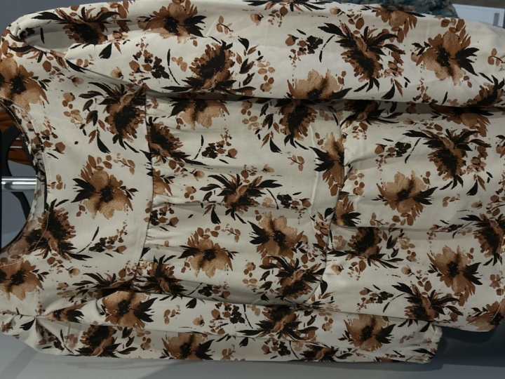
familiar with are florals. Florals come in so many
beautiful patterns. Here's a skirt that I made
with a dead stuck floral that is pretty abstract
and large and scale. I have this floral on a
viscous that is really small in scale but picks up
many of the same colors here. You also often see florals in different types of lace
and embroidery design. Here's a beautiful
gupio lace that has a nice floral into
the netting with a border print as well
that you can see. Definitely, explore
floral options. They evoke a lot of femininity, they evoke a lot of
grace and elegance, but you can also get
really funky with your floral if you have a
different color scheme. Next, let's talk about some more abstract prints or some more types of
novelty prints. Cheetah print and jaguar
and leopard animal prints. For the last several years, these have really
been regarded as neutrals where people
will mix and match them as if they're
just wearing like a plane fabric and that's
really exciting to see. It adds a lot of color and
contrast to an outfit. You also have more novelty
prints like the suns. It's just a nice two-color
print in a pretty big scale, but it's really beautiful
and gives a nice design. You find a lot of
novelty prints in children's garments and
just fun whimsical designs. Definitely play around
with the type of energy you're trying to
bring to your garment. Next we have some
more abstracts. These are beautiful
works of art. This silk has four colors in it, but it's giving so
much movement and so much interest from the
busyness of this print. Then I have this abstract that reflects painterly
brushstrokes. This print has a huge format. When you think about
prints this big also think about border prints, for example, or panel prints. But this is absolutely the
favorite print that I own. It's so beautiful and
I don't know what to do with it because the stakes
are so high for cutting it, it has to be incredible. I almost want to wait
until my sewing skills are good enough that there's no
way I'm going to mess it up. Lastly, here's a floral, but I wanted to show
this one to you because it is a jacquard fabric, meaning that not only is it printed on one side
of the fabric, you also have the print carried through to
the backside as well. When I sewed up a blazer, one that's back there with this, I could use both sides of this sprint to create a
really beautiful effect. Now let's talk about
how we can shop smart, and find the right
print for our project. The first thing I want you to consider is the
direction of the print. Something like this, has
one clear direction. The faces are going up. When you buy
something like this, you'll have to remember that
if you have a garment like I'm wearing where there's a tie or something that's
going to be angled, you're going to see that
angle in your print. It might be okay
for you to do that. That's a design choice, but it's more than
likely you're going to want to choose a
project for this fabric, but keeps the direction of that print going the right way. If you don't pay attention to the direction of this print, you might end up with suns
that have upside down faces. These aren't just circles, even though they give
the effect of circles, they definitely
have a clear face that's going in one direction. This is why I've had this
fabric pretty much the longest. [LAUGHTER] If you have
an abstract like this, it doesn't really matter the direction of
it because it's so dizzying that you can't
tell the right way up. Think about that as you're
choosing a print to get the right direction
onto your project. Next, let's talk about
the scale of your print. For example, these are
two different florals, and they have a very
different scale to them. There's this big floral here
and this small one here. When you think about the scale, oftentimes, that
is going to help to determine what your
use is for the garment. I made a short skirt
with this print, but what I really was
paying attention to is not having a ton of seam lines that would break up this print. If I were making, for example, Boost Yea, or something where I'm
cutting tiny little pieces, you wouldn't have
these clear blocks of the florals anymore. They'd be broken up by a ton
of different seam lines. That might be a look
that you're going for that could look
cute with this. But instead of having
these floral designs here, it would turn into
more of an abstract where it's just bits and
pieces of the floral. A smaller scale
print like this can do well broken into
smaller pieces. You can't really tell
the direction of this print and you can't
tell one way to the other. But remember that
scale also should be associated to the scale of
what you're making with it. Rules can always be broken, but generally speaking, when
you have something big, you want to make
something big out of it. When you have something small, you can't make something
big out of it, or you can't make
something small out of it. What's so good about small
prints is that they don't generally require a lot of effort when you're
lining them up. A print like this, I wouldn't really bother
to try to match up on my side seams or matchup in
the front because again, once you're just looking
at it from afar, you're not going to notice
those tiny little details are going to get
lost in this a bit. Another thing to remember is
that big prints make areas look bigger and small prints
can make areas look smaller. If you put a giant print over your butt and you really want
your butt to look smaller, you might be doing
the opposite effect. It's totally up to you. You could want your butt to look bigger. I'm for that also. Just make sure
you're intentional about that choice and you realize what you're doing
as you make that choice. It's really easy to understand the scale of a print when you're seeing it in a fabric store, but if you are buying
prints online, oftentimes, there's a ruler on
those pictures on the website to help
you see the scale. Let's move on to another concept with print called repeat. The repeat in a print is basically when the
pattern repeats itself; so when it starts over. Generally speaking, more expensive fabrics tend
to have a larger repeat, meaning that you're not
seeing that same artwork stamped on to the
pattern so frequently. The reason why that
happens is because there's just a lot more
effort that goes into creating a huge
repeat, for example, in 18-inch repeat might
take a lot more artwork by that graphic designer
than like a 6-inch repeat. The other thing to
remember though, is if you have a repeat
and you're working with like a novelty print or
even a strength like this, the larger your repeat is, that is often the more fabric you need to buy in order
to match your prints. Because if I'm trying
to have these stripes aligned and this distance is even wider than I might
have to shift my pattern over even more in order
to get those to line up. I'll show you more
about that when we get to a later lesson
in this class. But remember that when you're purchasing a printed fabric, you're often going
to need to purchase a little extra fabric to make sure that you get
your alignment right. A really good example
of why you need to buy extra fabric is this stress. Because of the stress has
this big bold stripe, I definitely want it to be very intentional about its placement. I had to make sure that I was following the green
line as I placed it, but I also wanted
to try to create some symmetry between
the shoulders. Instead of having
it be centered with the same color and then
it radiating outward, I actually had the
opposites here. The white meets
with this shoulder where the blue meets
with this shoulder. Again, that's a design choice you can make, but in my case, it was just because I didn't
have enough fabric to create the exact symmetry
I was looking for. One more thing to remember
with prints is that they sometimes signify
different errors. They are the fastest
thing to go out of style. Remember as you're
purchasing your prints, if you're not going
to use it right away, it might end up
getting a little bit dated before you
end up sewing it. It just gets stuck in
your fabric stash. I encourage you to explore all the prints and patterns
that are out there. One thing I like to
do is go online and explore the different categories
on the fabric websites. Click into the Novelties, click into the Stripes, click into the Florals, see all the different
ways that a given idea about a fabric can be rendered
with different scale, different sizes of
the pattern repeats, different colors and
really get a feel for what appeals to your taste. In the next lesson, we're going to talk
about creating optical illusions with prints. How to place them
on your body to get the best effect. I'll
see you there. [MUSIC]
4. Creating Optical Illusions: [MUSIC] Welcome back.
In this lesson, we're going to talk
about optical illusions and practical ways to place the prints
of your fabric to make your clothes
look even better. When something is slightly
amiss with your clothes, people tend to fixate
on that issue. I know a perfectionist
like me does. You want to make sure that
you're drawing people's eyes to the features of your
body that you love, and obscuring the things that maybe you're a little
bit insecure about. You can do that with
smart print placement and getting your pattern onto your body in a way
that's going to best highlight exactly how you
want to show yourself. Let's talk about line placement. Lines will draw the
eyes of another person. If you have a vertical line, that can draw your
eyes up and down, while a horizontal line
can draw your eyes across. You've of course
heard it said that horizontal stripes make
a person look wider. That certainly can be the case because the
horizontal lines can draw your eye across and make people focus on the width. I sometimes like that. As I was placing the
plaid on this skirt, I wanted people's
eyes to be drawn to the width at the fullest
part of my hips. That's because it would help
to create contrast with my waist and give me more of the hourglass shape that I like. But also, it's because
if I were to place a line at just off the hip, then it would create a dizzying effect and make me look more straight up and down. I always choose to place a line if I have a
plaid like this, right at the fullest part. A lot of fashion editors say
that if you're very tall, you shouldn't be
wearing vertical lines because they will
lengthen you even more. But I don't listen to them. I like to make items like
this jumpsuit that have just super long lines going
the length of the body. This is applied, and
you can see here that there are horizontal lines, but the lines that are on the vertical axis are
a lot more prominent. I'm using that effect to my
benefit to create more length through this
jumpsuit and make it look like it goes on forever. Another example
of this is a line that isn't quite
a straight line, but you can make it into one. With this Ankara
print that I have, it's definitely like a
crocodile in the way that it's designed but you can still see lines going from
the top to bottom. What I've done at
the waist seam, I've made a really intentional
decision to try to join this up and keep
the line going from the pants into the
top of this jumpsuit. You can follow the lines
that are going up and down. Something like this will make a shorter person look taller
or make a wider person look thinner because your eyes
are following up and down and they're not going
to be looking across. You can get intentional about the way that
you want your body to look just by making sure that you place it
in the right way. This is also a
really good example of symmetry and balance. Symmetry creates balance
for the garment by having the right and left sides
mirror each other. In this jumpsuit, what I've done is I've placed the center in this white panel so that
this more narrow bit of the pattern is hitting me at the same place on both sides. In this way I create
a symmetrical look. Then that balances also
down into the legs as well. Visual elements can
carry weight and draw the eye from one
side to the other. If this were a skew
and, for example, this line of this thinner
line were placed here, it would shift my whole
print off a little bit. If it weren't dead on-center, your eye would be
like, what's wrong? You wouldn't exactly know what's wrong just from
the first glance, but our eyes can recognize when things are a
little bit a skew. One other thing that you'll
have to think about when adding a bodice to a bottom on a jumpsuit or dress is how
you're going to connect the lines together and where
those darts are going to go. My bodice here doesn't have
any darts up at the top, but it does in the bottom. I've also had to be intentional in how I place these here. You'll see that it's
not exactly lined up. I did the best that I could because these being two halves, it's a little bit
wider here because of the shape of my body
than the width here. But what I did is
I had the darts, which you can almost
barely see coming into the bodice using these
more narrow lines. The dart pull out that stripe, that is the more narrow stripe. But you can still have some continuity going
down the length here. One of the most
frustrating moments in sewing is when you've spent
all this time creating a pattern that fits you and cutting it out and
sewing it up and then hanging it up and
realizing the print on your garment is a little
bit of skew and off-center. That just ruins the
look a little bit in my opinion and makes
it look just ever so slightly cheaper because that care wasn't put
into the placement. Just think about that as you're creating your center lines, as you're creating
your seam lines, as you're placing your darts
in your hips and just try to plan and plot that out before
you cut and go to the end. These details are the
difference between a rookie sewist and someone with a little experience
under their belt. Someone who's been sewing for a while recognizes the impact that those little shifts at the beginning are going to
have on the end result. I want you to fast forward to being an experienced sewist so I'm teaching you the tricks now to get you there
a little faster. Think about that as
you're creating skirts, there's so many
different illusions you can play with
in order to add more interest to what could
just be a really basic skirt. We've just talked about
optical illusions and the effects they can
create on your body. I want you to take a
look at the prints and patterns that you have
in your fabric stash. What are you going to
use for your project? Think about how
it's going to add length to your body or
width to your body, or draw your eye in one
direction or another. Think about how you want to
highlight your best assets. Meet me in the next
lesson where we talk about how to maintain
that design that you have in your head or on your mood board onto
your finished garment by placing your paper pattern onto your printed fabric
just the right way. [MUSIC]
5. Planning Pattern Placement: [MUSIC] We're going to
use the skills that we learned in the last lessons
to figure out how we want to plan out the placement
of these stripes along the vertical and horizontal axes of our skirt and along our body. Let's open up our fabric first and explore
what we have here. I'm going to open it
all the way up so I see the whole fabric from
salvage-to-salvage. I got a little
cut-out because it's a dead stop from a designer. But here's a salvage
edge of our fabric, which means that the grain
line is going this way. Like we said before, the least stretch is going
to be in this direction, and that's the way
we're going to want to place our skirt. I want to lay out my pattern. But before I do that, let's talk about cutting flat
versus cutting on the fold. Oftentimes with the skirt, you'll have a pattern piece
like this where there's a fold line and you only
have 1/2 of the pattern. There's no seam allowance along this fold line because
you're meant to cut it along the fold so that you
can have two equal halves. If you're working with a
truly symmetrical print and it's lightweight enough that you can get a nice crisp fold, it is okay to cut
it on the fold. But if you have a type of print, like this, for example, where it's not exactly
symmetrical because there's some details that
don't line up on both sides, I recommend that you get some tracing paper
and fold it in half and then trace out your
pattern so that you have a full skirt
front like this. This is going to help
you to be able to see the full pattern of your
fabric through your paper. When you line it out, you can really see
what your skirt is going to look like in
the finished version. It's also really
helpful to draw in that fold line or otherwise mark the center front line so you can find the
visual center of your pattern and also be able to look at
that onto your fabric. As you're doing this, make sure that you have it on the right side of your
fabric, of course. With the print, oftentimes
there's going to be a definite right
side and wrong side, but a nice woven fabric like this looks about
the same on both. Make sure that you choose a side and try to stay
consistent with that. As I lay out the
front of my pattern, I'm thinking about alignment
in a few different ways. First, I'm thinking about that symmetrical alignment
that's going to create a vertical center
and try to create some symmetry from right
to left for balance. But I'm also thinking about those horizontal lines
that I'm placing. What I've also done in my
pattern is drawn in a hipline. It's only on this side. I'm actually going
to extend that over, which will make it
a lot easier for me to have the hip go all the way across.
Let me do that now. You just want to take your ruler and just extend
that hipline over. If you don't already have the hipline marked
on your pattern, you can add that now. Let's go back to our fabric
and get it all lined up. [NOISE] As I'm
looking at my fabric, I'm seeing again that it's
not totally symmetrical, so I have to think
about what do I want to be at my center front. Part of that is really
determined about where are my hips
going to land on this? Is the hip want to create a seam really awkwardly along one
of these lines on the sides, or is there a better way
that I can lay it out? Because this has a salvage that's a bit of a darker border, I'm just going to
shift my pattern over a little bit
and try to find something without that there because it won't be the
same on both sides. Next, I'm just looking at what makes sense in
terms of a center front. Because again, this
isn't symmetrical, I don't think that I want
to line it up with one of these thick black
lines in the center. What I want to do
instead is actually line it up between
these two thin lines. That's going to put
the center front of my skirt right along this
white bit in the front. I think that's going
to look pretty good. Next, I need to choose how I place it from top to bottom. Where does my
hipline go on this? I mentioned before that I like to accentuate
my wider hips, and so I'm going to place
a thick line along one of the more prominent horizontal
lines on this pattern. For this pattern, it's one of these darker gray
and black lines. But before I completely
lock in that placement, I also need to think
about my hand. My pattern is drafted with a
one inch hem allowance here. That means that one inch from the bottom of this pattern is where I'm going to hem
the skirt and it's going to form a line at
the bottom of the skirt. I don't like the lines at my
bottom of the skirt to be on any of those dark
or prominent lines. I try to keep that bit
as quiet as possible, mostly because if you have a line that's just a
band at the bottom, it's going to cut off your eye, and so it's going to make
you look a little bit shorter if you have that as
a dark line at the bottom. It's going to throw
off your proportions. I want to make sure that I
have this placed in such a way that when this is folded
up one inch at the bottom, it's still is keeping it
on this lighter part of the fabric and it's
not going to be on this dark line all the
way across the bottom. I just have to think
about the balance between the placement of the hipline and the placement of
the hemline here. Also, of course, you
want to think about the placement of
the top as well. I need to find a compromise between getting the top
to not be on dark line, getting the bottom one
inch from the bottom, which I can also
mark with my pencil, to not fall on one
of the dark lines, and getting the hipline
to fall on the dark line. It might be a little bit tricky depending upon the
scale of your fabric, but it doesn't need to
be exactly perfect. For this hipline,
I can choose to have it at the top of this line, at the bottom of
this darker line. There's a little bit
of wiggle room there. Let me figure this out. At the top, I know that I have 5/8-7 inch seam allowance. I'm going to mark
that at the top of my pattern and at the bottom
I've just marked one inch. At both of those, I want them
to be on the whitespaces, and then I want the hipline
to be on a dark line. What it looks like
is best is to place this hipline on the bottom of one of these
thick dark lines. Because I know that this print actually is along the
grain lines straight, I can just place it
straight across and use that to help me guide where
I'm going to place my fabric. I think that I like this
from a vertical perspective. I have the hipline
where I want it. I have the hemline
where I want it because once it's
folded up an inch, it will still be
on this white bit. Once this is folded
down 5/8-7 an inch, it will still be on
this white bit up here. But I just want to double-check
what is this going to look like on the side seams. If I come in and I draw in the 5/8-7 inch seam
allowance that I have here and just
doing it at my hip, which is the widest
point on both sides, I can see that I'm
going to be hitting it right on these black lines. What's going to happen is
the skirt on the sides, once you take the
5/8-7 of an inch, it's going to start
on these black lines and it's going to end on
these black lines as well, which might look a little boxy. Now I just have to decide, do I really like that
center front placement or should I shift
it a little bit? If I shifted it to being along this black line instead of
along these double lines, would that look better? Well, no, because now
it's not really centered. Now I have one side off and not lined up on this
black line but the other is. You have to make
some concessions depending upon the
size of your print. You really have to
choose what's most important to you and prioritize. For me, I think it makes
more sense for me to keep the center and just deal with the fact that I'm going to have some black lines at my sides, because overall I think
that's going to be a bit more balanced for the look
that I'm going for and, again, for my size. I'm just going to make sure
everything is straight, I got it lined where
I want it to line, and I'm going to use
my pattern weights and then cut this out. I'm using pattern
weights right now, but actually because I definitely don't
want this to shift, this is such a straight pattern and it's already
shifting a little bit, I'm going to come and shear
this up with a few pins to make sure that it
doesn't shift on me and I don't get misaligned. [NOISE] I'm ready to cut. [MUSIC] We have the front of our skirt. The next thing we
need to worry about is getting the side seams to line up as we attach the back to the
front of the skirt. [MUSIC]
6. Seam and Pocket Placement: [MUSIC] I want you to get
your skirt back piece. The first thing
that we're going to do is think about
how this lines up. I've already drawn in my seam
allowance on my skirt back. Remember that the seam allowance will not be visible
on the final piece. When I say that it's
going to line up, I mean that this position that is five-eighths
of an inch away from the edge is going to
be exactly a budding. This part of the
back piece that's five-eighths of an inch
away from the edge. I need to think about
how this line comes into the pattern and what's effectively the
opposite of the line. There's two good ways to line up the skirt
front to the back, the first is to draw the
print of the fabric onto your pattern piece so that you can effectively
see what's going on. The other thing, however, I need to remember is that
there is a center back seam to the back because
I'm going to put a zipper in my skirt eventually. I also need to be mindful in the way that I was mindful of the front center seam
before this back bit. I'm going to have to be
doing that on a seam line, which means that fabric
is going to get folded back and two halves are
going to join together. I just want to be
conscious of that as well. Remember my choice for the center front was to have it between
these white lines. I might also consider doing
that with the back as well. Let's move over to
the fabric and start planning out the placement
of our back pattern piece. I'm just going to make
this line a little bit darker in my patterns
so I can see this line on the
backside as well as the front side when
I flip over my pattern. This line again is the line of the black line on
the fabric that is around my hip and that's a
good marker of where I want to keep it lined up when I place the pattern
down on my fabric. As I place this
down on my fabric, this is about where it
would be if I was doing a mirror image of the
fabric of the front. But I also again have to be cognizant of that
seam allowance. I need to effectively make it so that I'm giving myself
an extra five, eight, seven inches so that
when it lines up, it will create continuity
with the other side because I'm going to
be losing that fabric that's in-between
that seam allowance. I'm just going to
use the five-eighths of an-inch line that I have here and shift that over a bit. Because I need a
center back zipper, I need to have seam allowance
along my center back. That means that I'm
going to have something joining at the center back, and I'm effectively creating the line here where
I have this fold. I have to ask myself, what's more important, maintaining this side seam or trying to have a more pleasing
look at the center back? Because as I look at this, I'm not going to have
the same width here, just because in most
patterns the width of your hips might be a little bit different at your back
than at your front. I'm going to make
some decisions. Do I want to keep the same proportions of
the center back that I had or do I want it to
match up the side seams? Because I'm only really
joining another hip here and everything
else is on a curve, I actually think that it's more important for me to match
it up at center back. What I'm going to
do is shift this over because my pattern
repeat is pretty quick, I can either choose
this line or this line. I just want to
make sure that I'm saving as much
fabric as possible, so I choose the first
available line that I have to get that center back
exactly in the right spot. I folded up the seam allowance here so I have the
real center back. Now, as I unfold it, the actual cutting line
is going to be five, eight, seven inches
away from that edge. I think I've decided that
even though I've done this work to figure out where the side seams are going to be, I made a decision
that I was going to prioritize this center back. Each time you're working with fabric and you're
placing the patterns, you're going to have to pick your priorities because
it's very infrequent that your pattern has the
exact same scale as your proportions to have everything lined up
where you want it to be. I'm just going to get
this situated properly. Again, I have my hip line, same as with the front, the hip line is
going to match up at the lower bit of
this black line. I also, again, have the top and the bottom
so that they're going to hit nicely on those
white bits and not be on the black lines. I have my center back
seam right in-between those two thin lines so it'll be the same
as with the front. I'm ready to cut this out, this first one, and then we're going to go on
to the second one. [MUSIC] Now that we have this first
side of the back, it's going to be so much
easier to get the other side. What I'm actually going to do, is instead of using
the paper pattern and drawing all these lines, I'm just going to use
this piece of fabric and flip it over to
create the other side. One thing I will say though is, you don't want to flip
it over so that it's immediately next
to where it was. Because again, we're
going to be losing five-eighths of an inch
on here and on there, and it's going to end
up in the wrong place. Instead, I want to
take advantage of my pattern repeat and
line it up so that this is a continuous width where
I had it for the other side. Remember, our center back seam, it's falling between
these lines. I also want this edge to be five-eighths of an inch away
from these lines down below. Let's get it almost to
the spot where I want it to be and then do what I can to get these
lines all matched up. Now, hopefully, you can even see
where that fabric is because I have it
so well lined up [LAUGHTER]. Let's cut this out. If you want to be secure, just add a couple of
pins in key places like the hips and at the top where
you have these seams line. I'll just do one at the
bottom for good measure, one at the upper corner because we're going
to pivot there. I don't want to
give you bad habits with me not pinning things. There we go [MUSIC]. I have all the pieces for
my skirt and I've barely used up half of this
one yard of fabric. While you still have the
patterns on your fabric, I want you to go
ahead and mark all of your notches and all of your dots and do all
of the good things. It's also good to mark at
the hip line so that you can make sure you have that
as a place for joining up. I'm just going to
take this pattern off and figure out
pocket placement. We're looking at the
front of our skirt, and I just want you to
imagine that it's sewn up, we're going to get to that, but just think about
the finished garment. I drafted a little
square pocket, and this doesn't have any
seam allowance on it yet. I didn't do any curves, or fancy elements, or heam lines but I
wanted to give you an idea of some different
options on green lines. I've just put in a bias grain here and I've put it
in a straight grain, and I'm going to pretend
that I want a pocket to go about here on the fabric. What we just talked about
in drawing in the lines of the plot is going to be super helpful as you
plan out a pocket. If my pocket piece, I want it to go right here, I can make a couple
of different choices. I could have a pocket
that you barely can see, which means that I can cut
out a pocket that exactly mirrors this bit of the fabric along the
parts that you see, and I could paste it on there, and it would be like
an invisible pocket. Because the stitching lines
would just disappear and you'd just see the
continuation of this plaid. If I wanted a pocket that
stood out a little bit more, I can cut it on the bias. That's what I'm going to do. I'm going to show you
what it looks like with both versions of
just this pocket. Again, I'm not going to
add any seam allowance, I just want you to see
what it would look like all stitched up. Let's get some fabric. What I want to do first is just figure out exactly
the placement for it. Again, it's going to
have seam allowance, same my pocket to go
right about here. What I'm going to do
is just pin this onto the fabric so that it stays put. What I can do is just
draw these lines on. Let me grab my ruler
and I'm just going to draw this thick
black line over here, and this thick black
line over here, and I'm going to just give myself a line going the other direction just
for these thin lines. Let me examine my
fabric and find a spot that has the
print I'm looking for. I'm going to line up
those thick black lines and I got to try to
find a spot where I can get those thick black
lines and still get the lower one there. You just want to match
it up, I'm going to pin it on again. This is going to be
an invisible pocket because I'm making
it line up exactly. I'm not adding seam allowance, this is just for demonstration because it'd be
too much to try to show you actually cutting the seam allowance
and all of that. I just want to show you
how it will be invisible. If I wanted it to be
basically invisible, I've just cut it out
so it fades away. Can you even see that? Imagine you did have
seam allowance on here and you folded it
back all perfectly, and pristinely and you fold it back the fold line at the top. You could get a
pocket on here that you really would
only see as you put your hands in or you can see the top stitching lines
that you put around it. I'm going to just take
this same pattern piece, and what I've done is
I've put a bias line on here or a
45-degree angle line. Rather than worrying about making this perfectly lined up, I'm just going to find
another spot where I can set this at a
45-degree angle. Always make sure
that as you've said it on that 45-degree angle, you're looking at
your fabric the same way it is on your skirt. Lines, that tan line above it. This is the pocket so if I
wanted to go 45 degrees, rotate it that way, I would just rotate it and find a spot where I
can fit it on there. I'm just going to
use this line on my pattern to create that 45-degree, this
thick line here. I'm going to pin it on. Remember that if I'm
cutting it at 45 degrees, it's going to be on the bias. Now, this pocket is going
to have some stretch in it, which I may or may
not want but you can always interface it or underline it to keep it from
stretching out of a shape. Let me just cut this out. Of course, I could have chosen
it so that this would be exactly an x forming in
the center of the pocket. You can make your choices, I like how these lines go
like this and like this. The nerd in me likes the path. [LAUGHTER] But now you can
see that you can create a pocket on a
45-degree angle and it gives you such a different
impression than this pocket that's right here and
is basically invisible. We've covered a lot
in this lesson, we've talked about
defining where you want to put your style
lines on your garment, and how to achieve that as you cut out your prints and stripes. I hope you're excited to start cutting your fabric and explore all the different design
options available to you when working with
prints and patterns. Meet me in the next
lesson where we'll bring this all together and sew up
your final garment. [MUSIC]
7. Sewing Lines that Match: In the last class we
cut out our fabric. Once you cut out your fabric, one thing I want you to do, especially if you have
a fabric like mine that looks pretty much the
same on both sides, find a piece of chalk or
a piece of tape and make a mark on here so you know what the wrong side of the fabric is. I've just made little
x's in this blue chalk, so I can remember what
the wrong side is. That's going to help prevent
me from getting turned around and stitching
my skirt inside out. If you're following a pattern, what you're probably
going to want to do as the first step is actually
stitch your darts. Remember we've
learned how to stitch darts in one of my
previous classes, so you can go back
and revisit that if you need another how-to. I haven't put my darts in yet, but I still want to show
you the next steps here. So let's start with the back where I can show you this center back seam because that's going to be one
of the most simple ones to line up and show you that I have the
center back here. But what I'm going to do
first is line up the center back seam and pin it at
all of the key spots. So if you have a striped
fabric or if you have any type of
print on your fabric, you want to get it lined up
so that it matches well, and then what's best is
to put pins in all of those places on the lines or most of them so that
as you're are sewing, you can tell if you get a little bit off or if
you're keeping the line. We would have a zipper on
our center back seam here. Normally if you're
stitching this up, you would just stitch up to a certain point and then
put your zipper in. So let me show you that from the bottom bit that we
would stitch it up into. I like to put my pins right on the lines because that way I can see where it's
matching up perfectly. Because you want to make
sure this doesn't shift it all and you want
to keep it balanced, you might want to use more
pins than you normally would. So I'm just going to take
this over to my machine. What I'm going to do
first is just base this line along the seam
allowance and double-check it. So first of all, I want
to make sure that I switch my stitch to
a basting stitch, so that's the longest ditch
available on my machine. I'm going to base it here at
the exact seam allowance. You should remove
your pins as you go, but sometimes it's okay
to leave them in there. [NOISE] We're just basing, so no back stitching, and now we can check that seam, and I'm glad this
is a bad example. What I want to see is
this line looking as if there's no two seams here. So you can see here, I can see three of these lines, so I haven't really
gone over far enough in my stitch
to hide that. So what I would
do next is again, basing stitches are
really easy to remove. So I would grab a seam ripper, take that out and just try again to get it
nice and perfect. I would probably add an
invisible zipper to this and I'm not going
to walk you through all the steps of adding
an invisible zipper. But for me, I like to base my invisible zipper seem
as well before I go. Now imagine your zipper is in, your darts are in and everything
is done with your back. Now we're matching it
up to the front piece. So I'm just going to grab my front piece and
I'm going to look for the mark that I made telling me what the wrong side
of the fabric is. I just wanted to point
out that on my pattern, my backside is a little
bit bigger than my front. That's because I need a little
extra room for my hips. So as I match this up, it's not that it's
going to line up on both sides at the same time. So I'm going to pin
it to one side and then I'm going to
bring it over and pin it to the other side. But it's not going to fit down flat because they're
not exactly the same. Yours probably won't
be the same either. With right sides together, match up your front on your back pieces
at the side seams. This is where the notches we previously created
will come in handy. We want to match up those
notches or in this instance, if we're using the
lines of the plan, get those nice and lined up. Remember that we focused on
the hips for our alignment. So the first place that I want to put a pin is in the hips because that's the
place that I want to prioritize having it match up. So I'm going to start
with the pin there and then I'm just going
to work my way out. I'm going to try
to just push these together and get them
perfectly lined up. Again, it may take a couple of extra seconds to get these
all in the right place, but your finished
garment will thank you. Remember also that the very
edge isn't going to be seen. It's at the seam allowance line. So if you need to do
another double-check, you can draw in your seam
allowance on the fabric. Again, that will be the spot you want to
make sure it's working. Lots of pins prevent it from shifting on your
machine as you sew. Because we're just being really perfectionists
about the placement here, it's worth it to add extra. I think I might
have enough pins. I'm just going to put one
more for good measure. Right at this curve, because
I know I'm going to be pivoting at this
curve a little bit, and that's the place
it's most likely to need a little extra support
to keep it from shifting. Now that our pins are in, we can take this over to
our machine and based up the seam and just double-check we have the alignment right. Also go slow if you need to. You didn't just spend
a minute putting pins and all of that time
getting the alignment right to save 10 seconds on the seam because
you went too fast. [NOISE] Now we can
just open that up and see what our
scene looks like. Again, it's around a curve, so we're going to have to
bring it around a bit. It looks like we have the lines going this
way. Pretty good. I will say though, remember that we
made the choice. We decided that it was
more important to line up our center front and to line up our center back
with the symmetry. Our side seams on this
print aren't going to be perfectly showing
continuity of the plaid. That's a concession
that we had to make, and that's okay. You're not going to be
able to hit everything because your proportions
are more important. If your garment isn't fitted and you have a little
bit of wiggle for room, for example, if you're
sewing a gathered skirt, what you can do is just flub
it a little bit by making the gathers just a
little bit wider or a little bit more narrow in order to accommodate
your plaid. So now that we have
this basic together, what I would do is just
double-check my seam. Do I like this? Is there anywhere
it's not matching up? I can see here that
even at my hip point, I'm down by like
an 1/8 of an inch, and if I want to be a
perfectionist about it, which I usually do, I would take out
these based it seams and just try to fix it
and line it up again. Remember there's
nothing wrong with using your seam ripper. Some people think the seam
ripper is the big bad. It really isn't. Basting seams allows you
to test it out, to try it, to see how it's going to look
in your finished fabric, and then to make changes. So take your time in these
early steps and get it right. One more thing that you
could do to take your time, I'll show you on the other seam, rather than basting this
entire length of the fabric, sometimes what I will do is just base it at that
most important spot. What I could do is
line this up at the hip and just put a couple of pins
right here at the hip. So I'm just going to
keep it on basting stitch at my seam allowance, and I'm just going
to go one inch above and one inch below. Flip it out and see if I
have it lined up well. That's actually pretty close. I may be 16th of an inch off, so rather than having to
take out this whole seam, I just have to take off this little bit if I've messed it up. But now I can flip it back, and either bast up the
whole seam to check it again or just go ahead
and put my stitches in. Basting just a little bit is really helpful in a lot
of different places. Not just on lining up patterns, it's also really helpful if
you're trying to line up armpits or crutches or
anywhere that seam lines meet. You can always put a couple of basing stitches in, flip it out, make sure it's correct, then close it back up again with right sides together and
do your full stitches. So go ahead and get out your fabric in your
sewing machine, start putting more pins in
than you think that you need at exactly the spots where they need to get lined up, put in some basing stitches, check your work, and then
stitch up your seam. I'm going to go ahead
now and switch up the skirt and that will
be my complete project. Remember that
patience is a virtue when assembling your
garment at this point, so take your time and
good luck. [MUSIC]
8. Final Thoughts: [MUSIC] Congratulations, we have made it to the end
of this class. First, we learned about fabric and all of the options
that are there. Really my favorite
part of sewing. We talked about stripes
and plaids and florals, small-scale and large-scale, different directions,
abstract looks. We have also talked about how to use those prints on our bodies. Finding the right prints
for our projects. We have talked about fabric
repeats and how to purchase fabric for our projects
to make sure that we have enough to
get alignment right. Then we covered optical
illusions and how you can use the fabric you chose
to create certain effects. Elongating your bodies or
accentuating certain curves. Then we learn how to place our pattern onto
our fabric and make some important decisions about placement from symmetry
to side seams. Then we brought that
altogether by basing our seams and checking our work before
creating our final piece. Here we have the skirt
I have been working on. It is by no means
a finished piece, but it demonstrates the skills
that we have put together. From a symmetrical center seam in the front and in the back to a side seem that
keeps the continuity of the line of this flat
all the way around. I hope you will
finish up your skirt by doing all the things
you would normally do. Adding in the darts, putting in a zipper and ham, and maybe even adding some more design
elements like pockets, either an invisible
pocket or something on the bias to add a focal
point to the front. As always, the project resources are there with information on getting a pattern
for this skirt or anything that you need
to help you through. I cannot wait to see what
you create so make sure that you put your finished projects
in the project gallery. For my skirt I know
that it looks runway ready because I use the
Carolina Herrera dead stop. For $25 I have an absolutely beautiful
skirt that looks like it belongs in a
high-fashion house. Thank you so much for
joining me for this class. Fabrics are my favorite
part of sewing. I just love collecting all the different
prints and patterns. It's just like art that
I can have folded up and turn into a beautiful
garment at any time. I hope you're excited. Good luck on your
sewing journey.
 Robyn Burgess, Sewist & Designer