Transcripts
1. Introduction: Hello, and welcome to my class. My name is Maria Toca, and I'm a graphic designer. Today, I'm going to guide
you through designing these two retro inspired music posters in
Adobe Photoshop. Together, we'll explore the
exact process step by step, and I'll share some cool photoshop techniques
along the way. For example, I'll
show you how to use the best smart filters to
achieve this vintage look, including a custom
half tone effect, dreaming glow effect, distressed typography,
analog textures, and washed out colors that
give your posters a vintage. Also dive into the
details how to create a balanced layout that
works perfectly for a concert or any
other event poster. You can make similar
posters featuring your favorite band or musician and use
them as decoration, display them as wall art, or even explore printing them on merchandise like t shirts. This style is especially
popular for apparel. Additionally, you can use
these posters as templates to design your own event posters and add them to your
design portfolio. I'm sure you'll
enjoy this class, so let's get started.
2. Basic Principles of Poster Design: Okay, so before we start, I'd like to address
some nuances and the basic principles
of designing a music poster or pretty
much any event poster. So first of all,
the main components of this poster are the title, which is usually the name of the tour or the
name of the artist, or maybe the name of the song. If you want to
dedicate a poster to one specific song or a
single, that's totally fine. The image of the
band or a musician, and you need to decide what's going to be
the focal point, what is the most
important thing, the title or the
image of the band. They shouldn't compete
with each other. So if you make a very loud
and decorative title, maybe the image shouldn't
be that eye catching. Then the next thing is one or two secondary
titles and the small text, which is also called body text. And the last thing is little details which serve
as visual anchors to attract attention to
a specific area that you need to guide the viewers attention in
the way that you need. And a few rules slash tips that I would like to
give you before we start. First of all, the focus should be on the
title and the image. Well, probably one of these objects should be even more important
than the other one, but in general, these two
are the most important. So don't place them too far from the center and
close to the margins. Secondly, try not to use more than one decorative
or script font in your poster to not make it too
overwhelming for a viewer. The third principle is
the bigger the text, the more powerful and
eye catching it looks. And sometimes you don't
even need a font to be super unusual or
decorative to stand out. You can totally use very simple fonts like
standard Helvetica, aerial, something like that. This will be completely fine. Try choosing images in accordance to your
background color. For example, if it's black, make sure the image
is not too dark and its edges won't get
lost on this background. The next one, if it's
your personal project, try not to use this filler
words like um Ipsum, this automatic text that
photoshop gives you, and it looks kind of
undone straightaway when you look at it at
someone's portfolio. So it's better just
to ask Chat GPT, please generate me the
text for this kind of post generate me the list of cities for this kind of to post
or something like that. So you want to make it
look more realistic, and that's how it will
look more professional. And one more nuance is that if you want to make a tilted title, please be careful
choosing the font for it because usually script fonts
work better in this case, rather than most of
Serif or sansera fonts. But it also depends on the vibe and the feeling
that you want to create. Okay, and I think now we're ready to get started
with design.
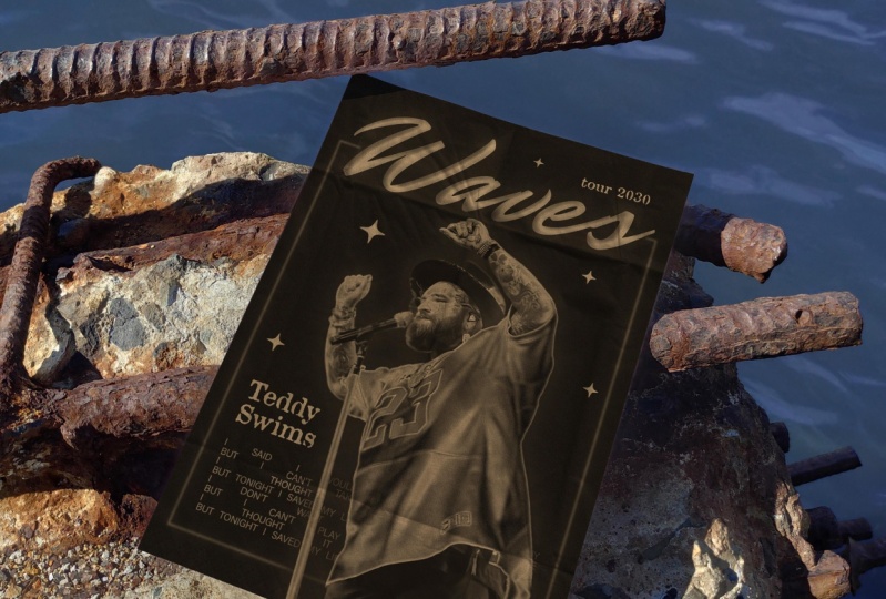
3. Poster 1 Adding Text : Okay, so we're going to start with creating
a new document. And for a poster, I'm choosing an A three format, which is 297 and
420 millimeters. Or in inches, that would be
11.6, actually, 11.7 16.5. Inches, but you
should be able to see the standard
formats of documents. And A three is like
a small poster, which is what I need, but always check
what is the format. That depends on how you're
going to use your poster. If you want to be really big, then just make sure you put the right dimensions
width and height, but always put 300
DPI resolution, which is good for printing unless you're printing
something really, really large, like a billboard. Anyways, creating
a new document. And then the first thing I
need is to add the text. Like we've already covered, we need a title, a subtitle, body text,
stuff like that. And I prepared for this video. So the name of the
tour will be Ashes. I'm just typing it here, Ash the name of the music
artist Jamie Stone. Then let's imagine that
it's a US and Canada tour. It's going to happen
in winter 2030. And in my case, I'm choosing to
emphasize the name of the tour rather than
the name of an artist, but you can do the opposite
thing just as you prefer. And now I'm going to
put all the cities and dates that I also asked
Chachi Bit to come up with. So yeah, this is going to
be the list of the dates.
4. Poster 1 Adding an Image: And another essential thing is the picture of our music
artist of Jamie Stone. I found an image of this
guy on nsplash and I think it could be a suitable photo for
this kind of poster. We just need to remove
the background, and I'm not sure if a shop is
going to do it really well, but let's try just the
button remove background. Yeah, as you can see, there's a lot of
flaws in this method. So I guess I'll have to do
a lot of things myself, but the good news is that we
don't really need to do it perfectly because we're going to manipulate the image a lot. So yeah, the first thing I do is I'm just clicking
on this mask layer. And I'm going to increase
the smooth parameter, just to make the edge a little smoother because in some places, we're going
to leave it like that. In some places, we're
going to fix it. Okay. And then I'm just
taking a brush tool and I'm going to go over some parts that are missing
with white color. Don't forget that your
mask should be selected, not the image itself. I'm going to go over his head. Obviously, I can't
do it perfectly. I'm doing it just to see
all the edges of the head. And the same thing
I'm going to do with his arm I guess nothing
else is missing now. We just need to remove some
areas that we don't need. And I'm going to do
that with the pen tool. I'm going just to select. Like, I'm creating a
path with a pen tool. And specifically, I'm selecting these
areas that I don't need. This is one. And another
one will be here. And also his head, it's not going to be perfect
because it's always hard to tout the fluffy objects or something that's not smooth. But in this case, we don't really need to make it perfect. We just need the right shape. So yeah, these are three areas
that we need to cut out. But right now, only one
of them is selected, so we just need to
hold command or control and click anywhere
outside of these three areas. Now nothing is selected. Or maybe we can also say
that all three are selected. So we just need to
press Control and press anywhere outside
control on Mac, not command, and on Windows, I guess it'll still be control. And then we just
select make selection. I usually put one
pixel feather radius, but if you want it
to be even moblary, you can increase it
or the vice versa, you can put zero if you
want it to be sharp. And then instead of deleting it because we're
on the mask layer, we just need to
hide it in a mask. So I just select a brush tool, black color, and I just go
over it with black color. Alright. Then I'm
going to put this guy into the black box that I'm just creating with
a selection tool. You can also create it
with a rectangle tool. Maybe that will be
more professional. Actually, yeah, let's create
it with a rectangle tool. Yeah, we just need we
don't need a stroke. We need to fill it with black. Color, and then we put
it behind the guy. And now, as you can see, there is a possibility
that this guy is going to disappear with
this black background. So we just need to make
him a little lighter. Well, for doing that, we need to rstorize him. So I'm just pressing the
right click on the layer, astorize layer, and
I'm pressing Command. Control arm to open
the curves panel. And I'm just shifting
this top point a little bit to the left to
make the whole image lighter. And also, I'm creating
another point in the middle, and I'm shifting it a bit
to the left as well to make the middle shades
also lighter. Alright. That should be fine.
And another thing, I would like to make the
edges of the image a little lighter because that's especially important
with black background. Especially I see the
problem with the guitar. Now, in this area,
it's really dark. It might potentially blend
with the background. So I'm choosing the dodge tool. You see what it does to a dog. So we're going to do something
similar with the guy. Yeah, right now, the
shadows are selected, that's fine, because that's
exactly what we need. This guitar seems to
be in the shadow zone, and we need to go over the
edge of this gut just to make it a little lighter and maybe the top edge
of this, as well. And I would also do that with these areas just to make sure
he will be very visible. And then I'll switch
it to the mid tones, and I'll go over the same
areas with mid tones. Okay, that should be enough. And the hierarchy in our poster is going to be
pretty much like this. Ashes is the title, so it's going to be the biggest, probably the same
width as this box. Yeah, the guy will be
inside of the box, but his head will be going
a little bit beyond. Winter 2030 is, like, a small nuanced detail. I'm going to put it in two lines and increase the leading, and I'm going to align
it to the right.
5. Poster 1 Choosing a Font: Now the fun part
is choosing fonts. Obviously, it can take forever, but I suggest something simple because the
word is really short. We don't really need
anything too decorative. Like, even this antonRgula or something like
impact would be fine. I find most of my
fonts on Adobe fonts, but also from other different
sources like on B hands, you can find a lot of people are just promoting their own fonts. Some of them are free, some
of them are just have a Futura is really nice one. This is a classic font. Maybe I could choose this one, but at the end, I decided to go with
Noya Kabel black, which looks really
vintage to me. I really love the
shape of the E when the horizontal line is
tilted a little bit. I think that creates
really nice vintage, aesthetic and a
bit playful vibe. As I'm going to put the
lettuce closer together. Not as close. I would say
-35 is fine. Maybe even 40. And I also need to align it with a box and make it central. It's really easy to
do that in Photoshop. If you press Shift, and if you try moving
these two objects, oh, sorry, two objects. At some point, you will see
the central purple line, like you see now,
like pink purple. That means that right
now it's in the center. And the next thing, I'm going to choose the font for US and Canada tour
and the tour dates. Again, nothing decorative. It's also going to be San Serif, something even simpler
than Noya Kabel. I don't want the viewer to be distracted
from the main title. One of my favorite fonts. Actually, the font
family is obviously they have a huge variety
of different weights, whether that be wide or
narrow or just regular. Yeah, it just fits
almost everywhere. So I think I'm going
to choose white, black and probably
make it all caps. Also, I'm going to
put it into lines. When you split it into lines, don't forget to remove
that last blank space because it's not centralized
now. Yeah, now it is. Okay. And the same font I
will use for winter 2030, white black or maybe white bold would be enough
and all caps. For the dates and the
venues and the cities, I'd like to choose
something a bit bolder. Maybe that's also
going to be obviously. Maybe something even simpler. I really like aerial black. It goes with almost everything. Yeah, I think I prefer that. Just to make it a
little bit bigger. Yeah, we just need
to make sure we don't make the space too tight. There must be enough
room for everything. So you can always move all the elements up if you
have enough space there.
6. Poster 1 Manipulating the Image: Okay. And now the
most interesting part is manipulating the image. And at first, how I'm
going to do that. I'm going to duplicate
the layer by pressing Command and J
or Control and J. Yeah, I do it just in case if I
need the original image, I'll just leave it here and
make it unvisible for now. And then I'm selecting
the background layer, and I'm also duplicating it by pressing Command and J and
then pressing Command and I, and that way I'm
inverting it into black. And I'm dragging this layer
closer to our top layer, but not on top,
just underneath it. And now I'm also selecting
the layer with the guy on it, and by pressing Command and E, I'm merging these
two layers together. Now, it's all one layer, and the next thing
we're going to do is adding a custom
pattern on it. You can add any
pattern you want, but I'm going to add the wavy one that you saw
on the preview image, and you will also
find the file with under this video, if
there are any files, you will probably find
the PNG image of waves. Yeah, it looks like this. We
don't need to make it big. Actually, considering that
this guy is pretty detailed, I need to make it
rather small than big. Okay, the next thing
we're doing is converting this layer with the guy on
the black background into smart object. And now we're creating two
adjustment layers. It's actually pretty easy with selecting the layer
with the guy first, and we're pressing this button, which is called create new
fill or adjustment layer. And we need an adjustment layer called curves.
Let's choose that. We don't really need to
change anything here. Well, you can try
to drag these dots, but nothing really interesting is happening. We'll just
leave it like that. Then we're selecting the
layer with the pattern, and we're creating another
adjustment layer in this list, but this time, it's not
going to be curves, it's going to be threshold. Again, you can drag this new dot to the
left to the right, but that's not quite the
effect that we want, nothing is really happening. The next thing
we're going to do, we're going to select
again the pattern layer. Going to filter blur, Gaussian blur, and we can
try to increase the radius. And now we see that something
is actually happening. Like at some point, the
lines are becoming more subtle and more adjusted to
the shape of the object, which is kind of what we wanted. Yeah, I will leave it
at a certain point, maybe this one right. And the same thing
we're going to do with the picture of the guy, we're selecting the layer with filter, blur, Gaussian blur. And again, we can try
adjusting these settings to the effect that we want like how sharp or smooth we
want the lines to be. You can adjust these
Gaussian blur settings again by just pressing
exactly on the settings. I want this guide
to be rather light than dark because we're
not going to forget that. The background is black and we don't want the
guitar to blend. And that's why I may click
on the curves layer, specifically on the curves, and I'm trying to
make it lighter by dragging the top
dot a little bit to the left and also
creating the.in the middle and also dragging
it to the left at the top. Maybe we don't need to drag
the top one that much. So you're just
adjusting the level of lightness for this guy. Maybe we don't need that
much of gaussian blur. Okay. I think this is
pretty much enough. And now all these four layers, I'm selecting all of
them by pressing. This one, shift and the top one, and I'm going to put them all in one folder and I'm going
to call it like a guy. So it'll just be a little
easier to navigate. And then this entire folder, I'm going to duplicate it
by pressing Command J, and then pressing Command
and E to rasterize it. And now we need to get
rid of the background. And in order to do that, I'm going to that
initial original layer with the guy that
we made invisible, and we find in that mask pressing command and
clicking on that mask once. That's what we just did. We just selected the entire
silhouette of a guy. And now, considering that the selected layer
is the top layer, we're just going to mask
it by pressing the mask and we're going to deactivate
the original folder. And now we just have the
guy without the background, which is exactly what we need. Actually, I out crop
this part a little bit. So I'm choosing the
rectangular make tool. I'm selecting this part
that I want to remove. And as I'm on a mask layer, I'm selecting a brush tool, black color, and I'm just
going over this area. That's how I'm deleting it. Or at least I'm
making it invisible.
7. Poster 1 Adding Details: Alright. We're almost done. So a couple of more effects are we going to
apply to the text, to the box and the
overlay textures on top. Another thing I
just noticed that his name is hidden
because it's black, so we need to make it white
and to put it on top. And also, I forgot to
choose the font for it. And I think I'm going to go
with Noya Kabel, as well. Okay, and now I realized that this post needs a
little more details in terms of the text. So I decided to add three
more pieces of text, something like the website. I don't really know
what to call it. Yeah. Okay. And another thing, I added a barcode just to
fill in the space here. We need to make sure
this is central. I guess it is. And then I'm
going to place the website. Here, the barcode should be aligned and the phone number
somewhere in between. Alright. And another
little detail is the star that I found on some free
websites with clipart. So I'm just going to
duplicate that a few times. Again, just to add some details, like a visual anchor to put viewers attention to the dates.
8. Poster 1 Distressed Effect: Alright, and now it's time for making this distressed
effect for the text. And in order to do that, I need to select the
layer with the dates, A with a website, with the phone number,
and Winter 2030. All these four layers, I am putting that in one folder. New group. I think I need
to call it small text. Then I'm going to
duplicate this group, Command J, Command E. That's
how I just rasterized it. And then I'm creating, don't forget that command
is control on Windows. And then I'm duplicating the
background layer, Command J, and putting it close to the small text copy layer,
which is rasterized. And I'm selecting them together, merging them by
pressing Command E and converting it into the
SMAT object, small text. Copy. Now, it's a smart object. Also, we need to
put them we need to change the layer
mode to multiply. So now it's not covering
the US and Canada toll. And the same thing we need to do with the US and
Canada Ty layer. We just duplicating the layer. We just merging it with a white background
and rasterizing it. Okay, so we
duplicated the layer. Scandat. And also, we duplicate
in the background layer. And now this background, the duplicated background with
duplicated US and candat, we're selecting them
together, merging them, Command E, and converting
to Smart Object. All right. This small text
group, we don't actually need. Well, you can keep
it just in case if you need to change
something in the text later. But if you're absolutely sure you're not going to
change anything, you may even delete it. I'm just going to
make it invisible. Okay. Sorry, small text copy, we go into Oh, actually, US and Candator should
also be multiplied. Small text copy,
should we go into filter bl, Gaussian blur. And we're applying Gaussian blur to the point when
it's still readable, but it's already very blurry, but even the numbers
should be readable. Let's say, 4.5 is fine. Okay. Then we go into
Filter, filter gallery. And yeah, you can choose grain. This is a pretty nice effect, especially if you put the
contrast to the maximum. Maybe not that nice
for tour tickets.com. I think it doesn't really work. But again, if it's not intended to be functional,
I think it's fine. If you're just creating it
for decoration purposes, you don't really need
to care about it much. But otherwise, it should
be a bit more legible. Usually like
applying torn edges. Oh, it's even worse,
even less legible. So we can try to adjust
the level of lightness, but, you know, it's
really hard to read that. I think grain, in that sense, is probably a better choice because it's still
possible to read it, but at the same time, it's
a very distressed effect. Like what we need. All right. And the same thing
we're going to do with this layer US and candator. We apply in filter,
blur, Gaussian blur. And in this case, we can increase the radius
because the text is bigger. And actually, we need to make
the original one invisible. Again, filter, blur, Gaussian blur, a little
bit more than that. Like, 6.8 is okay. And then we go into
Filter, filter gallery. And yeah, let's see
what grain does to it. US and candat, it's
a nice effect. Why not? If we
increase intensity. That can look interesting, but I think I'm leaning
towards torn edges. You can also adjust
the smoothness. I like to bring the
smoothness to the minimum, you can adjust the settings
just to your liking. I think I prefer this. Okay, I think it's
pretty legible. So we're almost done. And another thing
that came to my mind, I would also like to
make the edges a bit rough because they are
too sharp and too clean. And since it's a vintage poster, we need to make it a
little distressed. So again, I'm selecting
the background layer. I'm duplicating it. Command J. I'm bringing it
close to the rectangle, I'm merging them together. The layer mode multiply. I'm converting it
to smart object, then filter, blur,
Gaussian blur. And I think 6.8 is
pretty good one. Maybe we can go even farther than this. Well,
let's say seven. I like the number.
Okay. And then we go into filter
filter gallery. We can make torn edges, but also another thing, how to make it even more rough. We go into brush strokes, Spata, and now it's
even more fluffy. We need to choose what
kind of edge we want. And then we're creating
a new effect layer. And the second layer would
be probably torn edges. And again, you can adjust the smoothness and you see
the edges are pretty rough. I think you can even do that without applying
gaussian blood. This is just like
additional step, but you don't really need it.
9. Poster 1 Overlay Colors: Okay. And we pretty much done. And the last thing that
is left to do is to apply the overlay textures
and the colors on top. So basically, what I usually do is I'm creating a new
adjustment layer. This icon, new fill or
adjustment layer, solid color. And I'm choosing, for
example, something pink. I'm changing the layer
mode to multiply. Maybe darken. Now,
they look the same, but when we create
the second one, another solid color layer. And this one will be
for the darkest areas. Let's say we're going
to make it dark green. Okay, then we need to change this layer out to either
lighten or screen, which is almost the same. I think lighten
would be bit better. And again, you can adjust
the colors to your liking. You can change it later. To any color that you want
looks pretty vintage to me, but one more step, one more finishing touch, and it'll be even more vintage.
10. Poster 1 Applying the Stroke: Oh, actually, before that,
what I forgot to do, I wanted to apply the
stroke to the title Ashes. I'm just selecting
the layer with ashes. I'm clicking in this area twice, and the layer style
panel has opened, and I'm choosing the stroke. Outside color is white, and the size is a
little bit bigger. Don't really see it, do we? Because it's behind the box. Yeah, we need to put it here and maybe move it.
Yeah, we don't need. These top players to be moving.
Yeah, that's what I mean. When we see a little
bit of the stroke. Okay. Yeah, I think that makes a really nice effect of repeating the shapes
of the letters.
11. Poster 1 Overlay Texture: The finishing touch will be
to put a texture on top, put an analog texture of a
paper or something like that. I attached my texture below, so you can just download it
and use it in your projects. And it looks like this, and I'm going to
show you how to use it effectively or first of all, just in the size. Okay. And the next thing
we're going to do is we're changing the layer
mode to exclusion, the layer style, I guess. And also pressing Command
and I to invert the colors. But right now it's
pretty dull and gray. So I'm going to adjust
the curves by pressing Command and dragging these dots to make it a little
bit more prominent. I want to see the texture, but I don't want it to
look too gray. Yeah. I think this bottom dot
solves this problem. It makes it more
bright and visible, all the darkest areas. I think this is pretty nice. We're pretty much done, so this is the poster. And now we're going to jump
right into the second one.
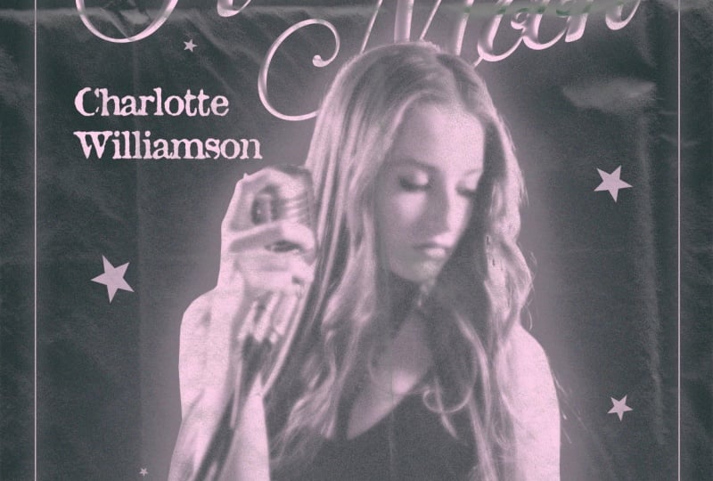
12. Poster 2 Adding Text: Okay. And now we're
creating the second poster. Again, I'm choosing
the same format, A three, resolution 300 DPI. And the first thing
I do as well, I'm entering the text. The name of the tour is
going to be EchossTur 2030. The name of the artist is
going to be Lilah Hart. And this time, instead
of making it as a tour poster with the list
of the cities and the dates, I will just add
lyrics from a song potentially the song
of this artist, I also ask Chad GPT to come
up with the idea of a song. So it's going to be more like decorative poster,
not that informative. Maybe like a merge,
something like that. And, of course, we need
a photo of an artist. And this time, I want to make it light on a black background.
13. Poster 2 Adding an Image: I chose this picture
for this poster. I found it on unsplash. I think it's a good picture. Might be a little bit
tricky to cut it out, but let's just try and do it with this automatic
remove background to, and it's not perfect. There are some areas
that we need to clean, but generally, it's not bad. So the first thing I do
is I click on the mask. I need to smooth
the selected area. Okay. Oh, it didn't work. I need to wait for a bit smooth. And then, okay. Mm
hmm. All right. And as you can see, there's still a lot of
things I'd like to fix. Okay, this area, we
need to bring it back. So I'm going to select
the brush tool, the white color,
and fix this area. And regarding the other areas, I guess, we'll have
to use the pen tool, even though it sounds
a bit daunting, but this seems to be the most effective
one, in this case. Yeah, I'm going to
quickly correct it. And here, it's a
little bit annoying. That's too many small details. But we don't really need to make it exactly detailed because, again, we can
manipulate this image. It's gonna be a little bit clearer than the image
on the first poster. But still, it doesn't
need to be perfect. Okay, there's something's
going on with the shoulder. I think we need to fix that. Everything is fine
with the hair. Okay. And I'm gonna
select the brush tool again and to brush it with black color to fix these areas. Alright. And there's
one more thing I need to correct
inside of this image. Make selection again.
Just remove it. All right. Oh,
there's one thing. Somehow I didn't fix.
I don't know why. It's this area. Okay?
That's really strange. I remember I've been doing it. Okay. Hey, the image is ready.
14. Poster 2 Choosing Fonts: And now I'm going to
choose the right fonts. I think this noir is really, really nice for
this image as well, but I'm going to change it because it's a different poster. I want to create a
different vibe with it. I would like some decorative
font or a script font. So just bear with
me while I'll be choosing my fonts because
it's going to take a while. Maybe something like this. Yeah. Luckily, with
adobe subscription, now you can see different
classes of fonts, so I can go straight
to script fonts and choose from them instead of browsing the
entire collection of every possible
font that I have. This one's pretty nice, but I think that
I'm going to stay with this one AethNRgula and I'm going to tilt it a little bit to create
some dynamic. And another thing, I'm going to check if there are any
interesting glyphs. So I'm just going to
select the letter S, open the panel Glyphs. If you don't have it, you
can always go to Window and press on glyphs and
it'll appear somewhere. So I'm going to select it again. And see what other options
for the S are available. There's not much, to be honest, but I see there are
some flourishes that I can put after
S. Like this one, for example, I think
it looks amazing. Then the tour and Lila Hart. I'm also going to change the
font to antique regular. But the name of the
artist obviously should be bigger than the tour
and the year of the tour. And this one can
be just Helvetica. I think it would
be totally fine. So this is the draft.
15. Poster 2 Manipulating the Image: Next thing I'm going to do is to apply effects on the image, how to create that dreamy look. At first, I'm going
to desaturate it by pressing Command
and hue saturation, and I'm going to bring
the saturation to -100. We're basically making
it black and white. And then I'm going to filter. The layer should be selected
filter filter gallery, and we're going to
choose diffuse glow. You can adjust the glow amount to your liking and the
clear amount as well. I think the less clear amount the more glowy the picture is, the more light it is. I think this one's pretty nice. It's already glowing. And also, I would like
to create an outer glow. So by double click in this area, I'm opening the
layer style panel. We are choosing outer glow, but I need to create
it in bigger size. This is the biggest size
that they can offer, but I need it bigger. So what I'm doing for that, I'm just duplicating the layer, Command J. I'm steurizing it, rasterizing the layer
style. This is important. And also, I'm going to
deactivate the layer underneath. And this one I'm going to scale down to make it a small image. And now I'm going to
layer style again, and I'm trying to
apply outer glow. So now it's a lot bigger. The opacite is a little
bit less than that. Alright. It's still
not that much. Maybe we need to scale
it down even more. Okay, this one's pretty good. And now we're rsturizing the layer style again
and we can activate, I mean, make it visible
the previous layer. Again. And now we're
scaling it up and yeah, pressing okay and
dragging it underneath. So now we can see that the
outer glow is a lot smoother. And here, we can
even get rid of it. We can make it I don't know, a little less prominent by bringing down the opacity,
something like that. Yeah, we don't really need
this second outer glow.
16. Poster 2 Manipulating the Type: Okay. And now we're going to manipulate the title and make it a little bit more shiny and
this metallic like effect. We're going to double
click in this area and activate bevel and Imbos effect, and we're going to adjust it
to the size of this text. The size, for example, yeah, I'm going to create
inner bevel smooth, and then you can change the angle to the one
that you prefer. I think I prefer this one.
This one's pretty nice. Okay. And another thing I would like to
add is some grain. Actually, I would apply outer glow to the
echoes, as well, and I would add
more noise to it, but not too much, a little bit and more.
And the bigger size. Okay. And in case with the girl, we can apply noise with filter gallery if we blend
it with the background. Yeah, this layer with the
big outer glow and the girl, I'm also selecting
the background, pressing Command E, so we're
merging them together. And then I go to
filter, filter gallery, and maybe we don't need
that much of diffuse glow, even though it's an interesting
effect, we can try. But if you want more
of a grain effect, so you should apply grain,
something like that. Okay. Even though diffuse glow looks really
interesting as well. Yeah, maybe we can do
something with it. But she's not that clear. Like, her face is not really
clear what's going on. Maybe something like that would be a good idea. All right. And the last thing, we're going to do the distressed effect with this text in a similar way how we did with the
previous poster. So I'm going to create a
black layer. Underneath it. I'm going to select
both the text and the black layer underneath, merge them together, Command E, change the layer mode to screen, convert to smart object, and then blur, Gaussian blur. Still we need to make it
more or less legible. Okay, we're bringing it
underneath the girl. Oh, actually, the
girl is deactivated. She needs to be on top and going back to that lyrics layer, and then we go into filter, filter gallery, and
probably grain. But we can also try
the diffuse glow. It also has to have a
lot of grain in it. I think I prefer
grain. All right.
17. Poster 2 Adding a Frame: And we're going to add a little more details by
adding the frame around it. So I'm choosing
the rectangle two and putting it around
this whole composition, and I'm going to
bring the corners a little bit closer
to the center so they are more rounded. You just press on
this little dot, and automatically, all the corners are going
to be more rounded. So we don't need any filling. This frame, we just
need a stroke, and we need to adjust the
width of this stroke. I'm not really sure. Maybe two pixels is
enough or maybe not. It seems like a bit too thin. So let's try five pixels. Yeah, it seems a lot better, and I would also apply the
outer glow to this line. Little bit more spread. To make it more noticeable, but it should be pretty subtle. Okay. Also, we need
to select this area, then command shift and I to
invert the selected area, and we're going to
press the mask. So now it's all in the mask. And a little detail I'd like
to add is some little stars. Yeah, something like
that. I just think it makes everything
a bit more cute.
18. Poster 2 Overlay Colors and Textures: Last thing I'm going to do the finishing touch
would be to add a solid color adjustment layer just to add a little
bit more color to it. Again, pink, changing the
layer mode to screen or oh, no, sorry, for
multiply or darken, I think multiply would
be a better choice. And the second
solid color layer, we would make it dark
green and screen. Then we can adjust it, making it to our preference, a little bit darker,
a little bit lighter just as you prefer. And the finishing touch. One more finishing touch, okay? That would be the texture
that we put on top. I also edit it down below. So at first, we click
Command I to invert it, and then we choose the exclusion layer mode and Command M to adjust the curves. Again, it's a little
bit too gray, but we need to make it darker, but still keep the texture. Something like this. Okay. I think this is
pretty much done. This is the result. You can always adjust it, making it a bit more subtle or a bit more bright,
just as you like. Yeah, but this is
the final poster.
19. Final Thoughts: And there you have it. These are the two posters that we've
created in this class. Your results might look a little bit different, and that's great. I'd love to see what
you came up with. Feel free to share it below
or share it on Instagram, tag me, or just
simply send me a DM. I hope the techniques that
you've learned today will be helpful and that you'll use them in your future
projects as well. You're interested in working in music industry or designing
posters in general, this is a fantastic project
to add to your portfolio. Having something like
this to showcase will make it easier to approach
potential clients. Even if you designed it just for yourself, I
hope you had fun. You can print these posters
to decorate your wall or turn them into a thoughtful
gift for your friend. It's always exciting to see what you bring to life
with these techniques. Stay inspired, stay curious, and keep creating work
that makes you proud.
 Maria Tokar, Graphic Designer | Poster Artist