Transcripts
1. Intro to Restful Art: Mattis is quoted as saying
creativity takes courage. But I'm here to tell you that
creativity also takes rest. As an artist, I feel happier
and more centered when I'm focused more on the process of making art than on the outcome. I'm a commercial artist, which means I'm often
exchanging my art for money, mostly through
illustrating books and licensing designs
for products. When I'm working on these
projects with clients, first, there are lots of opinions about my art that I need
to account for, and that can feel
disheartening sometimes. A second, there's
this obvious focus on the outcome on
hitting the deadline, on making the client happy, on delivering work that's
right for the project. And even though I've chosen this life of being a
commercial illustrator, it's easy to slide
into burnout when I find myself focusing
on the outcome only. Me and probably for you, too, it becomes about finding
balance between what clients need and what I
need as a creative human. And that's what we're
doing here in restful art, letting go of thoughts about the outcome and
just relaxing into the process of putting color and shape and line on a page. But this class isn't just
for working artists. It's for anyone who feels tired and deflated
and burned out. Living on this planet in
the 2020s is no easy task. There's a whole lot
to worry about. What we're doing
in this class is letting those worries rest
for just a little bit, making space for
your mind to wander, knowing that it's safe to do so. We're going to take
slow deep breaths as we work through
each exercise. We're going to let go
of judgment and follow the flow of the marks on the
page. We'll let it all go. We'll embrace the
quiet joy of letting our creative spirit wander across the pages of
our sketchbooks. Can't control everything
in the world, but this class invites
you to control what you can and
let go of the rest. If you're feeling tired
or burned out right now, it's possible that you
can't control the cause, at least not completely. But you can control carving out a small chunk of time
for creative rest. 15 minutes a day to breathe deeply and make some
process led art.
2. A Short Writing Exercise: Before diving into the
creative exercises, let's do a short
writing exercise. Grab paper and pen or open your Notes app
and then set a timer for 5 minutes and write on the following questions.
How do I feel today? Is there anything
that feels heavy? Anything that feels like it's holding me down or
holding me back? Is there anything I
would like to let go of? How would I like to feel? Is there anything new I'd like to invite into
my creative practice? Feel free to answer as many or as few of these
questions as you'd like. Start with the five
minute writing time, but of course, go
longer if you need to. Keep these thoughts
in mind as you proceed through the
restful art exercises. Remember to take deep
breaths as you work on each exercise and imagine each breath as a little
bit of letting go.
3. Materials: Hey, there, artist.
Before we get started with the restful art course, let's take a look at some of the materials that we're going
to be using in this class. Now, all of these
drawing painting demos are designed to be
simple and approachable. So they're not gonna
feel stressful. They're gonna be
beautiful and repetitive, and they're gonna give
you the space to breathe while also feeling like you're
honoring your creativity. So with that in mind, I just have a small selection of materials here and a small
selection of colors. You might choose to use
different materials. I definitely
encourage you to use whatever you feel most comfortable drawing
with and painting with, and I encourage you to use the colors that you
personally are drawn to. Now I personally really like blues and little
pops of warm colors. That's what I've chosen
here. Let's just take a quick look at
what we have got here. First of all, I'm just going to work from right
across to left. I've got a small jar
of clean ish water. It gets dirty at some
point, you'll see. Then I've also got
just a little towel to wipe my brush off on. I have a pair of
scissors. I'm only using these to cut this tape. This is a reusable tape,
I think it's called. It's a Scotch tape, but I'm just using it to create borders
on some of these pieces. You can use Sashi tape, masking tape, whatever you use. This is just my preference, and I don't have a
dispenser for it, so I have to use these
scissors to cut it. I've also got a little
bulldog clip that I use to hold my sketchbook pages down when they start to
get a little bucky. When I've used a lot
of water something. I've got this tiny
little palette that I'm using for my liquid watercolors. So these are ecoline
liquid watercolors. These are I love these because
they are really vibrant. And also, they're really
cheap. These bottles cost, I think, like less than
$4, I want to say. And you can use them to refill
your ecoline brush pens, which we'll talk
about in a minute. So I've got a few colors of
these that I'm going to use. I've got an indigo blue. I've got a bronze green. I've got a Prussian
blue, a bluish green. A burnt sienna, and the last
one I have is a fur green. I'm not going to use
all these necessarily, but I wanted to have some
really lovely options of some blues and greens. And then I also wanted
to have this sort of warm toned pop of color
for when I need it. This is what I'm going to be using. You don't
have to use these. You can use watercolors,
markers, acrylics, quash. Use anything that you have
that's really inspiring. But if you want to buy something
new to mess around with in your sketchbook,
these are amazing. They're so much fun.
They're so versatile. Now, with those, I've got three brushes I'm
going to be using. So first, I've got
just a really cheap, three quarter inch brush. This is, like, Michael's brand, Artists loft, super cheap. I think I got a
package of, like, four of these brushes in various sizes for,
like, $7, maybe. For stuff like this, it's great. I don't need a fancy brush for the things that we're going to be doing in this class,
and neither do you. Um, I've also got a couple
of Princeton brushes. This is a Lauren size
two round brush. I love this whole brush
series and use it a lot. And then this is also
a number two brush. This is a Princeton Neptune? Mm. Let's see. You don't remember. This is either a Princeton either a
neptune or a velvet touch. I think it's a neptune. Um,
I've cut the handle off. So I just took a pair of wire
snips and cut the handle off to make this short
little brush here because I wanted to experiment with
just feeling a little looser with the brush and being able to just
kind of hold the end here. In my sketchbook practice, like, it's kind of unwieldy sometimes to hold
the brush like this, like, you know, the long end. So I cut the handle off a brush. You don't have to do
this. If it makes you feel pancky, that's
fine. Don't do it. But I just found that
it helps me make some really interesting
marks and get some really interesting
textures and kind of, like, let go a little bit. And if you've taken my classes or if you've followed me
for any amount of time, you know that I'm
kind of naturally a tightly wound person. And, you know, anything
any art tool that can help me loosen up in my art making is something
I'm for sure, go to try. So we've just got a couple of things left that
we're going to look at. I use three different
markers in the class. So I use an Ecoline
brush pin, which again, you can use these
liquid watercolors to fill these brush pins. The nib comes off. These let me just pop this
off real quick. Yeah. So, see, there's a spare nib inside here, which
is really cool. And then you just
put your watercolor liquid watercolor down in here, and that refills these so you
can use them over and over again until you wear the double the double
brush nibs out. This is my marker
of preference for my sketchbook work because these are really, really juicy. They're really, like,
the colors are vibrant, and there's also just like I mean, this is inside of them. This liquid watercolor
is inside of them. So you can get a lot
of really fun effects with these brush pens
that you can't get with, like, a Tambo or anything else. And you'll see in one
of the exercises, just how beautifully these will bleed when you add
water onto them. They're amazing. Next up, I've got a couple of Windsor and Newton pro
marker watercolor markers. These are dual ended.
So there's a brush tip. And then there's a bullet tip on this end, which
is kind of cool. I've got an indigo marker and
then a Pain's gray marker, and we'll use these for
a couple of exercises. If you don't have these,
just get the brush pens. The brush pens are
absolutely fine. And again, maybe you will
watch the exercises, and you won't want
to use marker. Maybe you'll want to use paint or colored pencil or pastels or, you know, whatever
you want to use, use. Don't feel like
you are, you know, tied down to having to use
the same thing that I am. You know, in this class, I really want to
give you a place where you can just
kind of, like, relax. And syncing to some very
simple, relaxing art making. So don't stress yourself out over art materials
before you even get started. Start with what you love,
start with the colors that you enjoy and don't necessarily
worry about what I am doing. Now, on the flip side
of that, of course, if you're feeling like
you're in need of a change or you just want
to try something new, grab one of these things
and see what happens. Alright, so the
last things we're going to use are going to be these watercolor carne dash
No Color two wax pastels. So I've got a white one,
which we'll be using to add some details over some of these darker colors
we're going to use. And then I've got a
Prussian blue one. You can see this
one is well loved. This is the color of No Color two that I go through
most frequently. So I use this little nubbin to draw a little
bit in this class, and then we'll add
some water and get some really cool effects. So. This is just the basic setup of all the tools that
we're going to be using. And then, before we get started, let me show you the sketchbook that we are going to be using. So, if you've taken my
sketchbook classes in the past or watch
my YouTube videos, you probably know
that, in general, I really love art
creations sketchbooks. They're just they're affordable. They're really sturdy.
They can take quite a lot. However, for this class, I knew I wanted to use a
lot of watery mediums. I'm using a lot of this
liquid watercolor. I'm using a lot of markers and neo pastels that
are layered with water, and I knew that if I stuck with my trusty art
creation sketchbook, the pages were going to buckle and it wasn't really
going to get some of these beautiful effects like this that I wanted
to share with you. So in this case, I am using number one, a bigger sketchbook
than normal because I wanted to have more
space to expand. Use whatever sketchbook
size you want. And this sketchbook is a
Hannible watercolor book. I save this little thing so you guys can see
what it looks like and also see the name that I inevitably pronounced
incorrectly. That's my jam. So this is a cold pressed
watercolor sketchbook. It's 100% cotton, and
that's really important. For situations like
this where we're going to be using quite
a bit of water in our exercises because
these pages will absorb that water and they won't buckle in the same way that, you know, an art creation
sketchbook does. For example, this page, we use these liquid water
colors just really, like, thick thick
layers of them. And the water really sits on top of the page
until it soaks in. And you'll see here, like, the page is unbuckled, and it also didn't seep
through to the other side. So that's the reason that I chose the sketchbook
for this class. You absolutely don't need to choose this sketchbook
for this class. You can use whatever
sketchbook you have handy. You can use loose papers. You know, as always, I'm not encouraging you to buy a bunch of stuff
that you don't need. I'm encouraging you
to use what you have and try to
follow along with the exercises as
best as you can and see what you uncover as we go. Right, so head on over, and let's get started with our first restful art exercise.
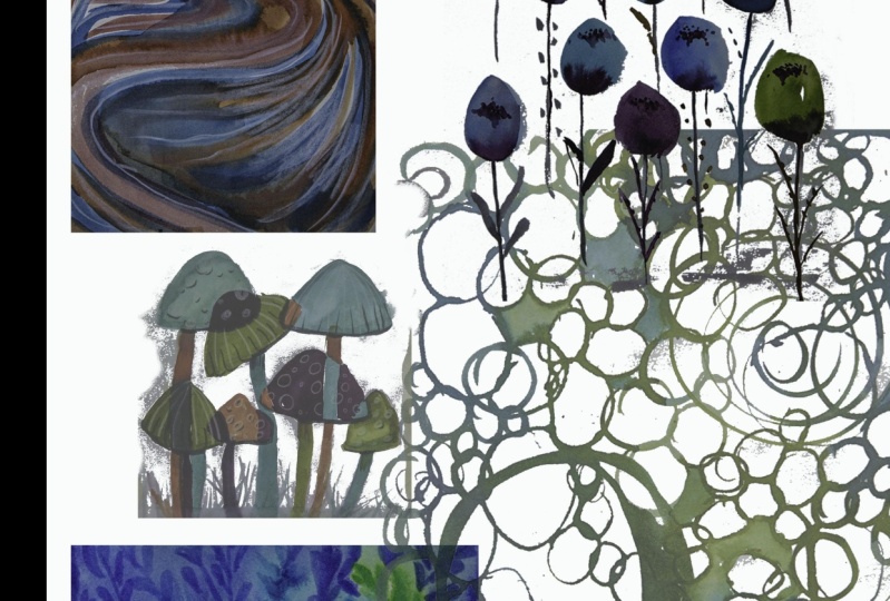
4. Download Your Inspiration PDF: This class includes an
inspiration PDF that you can find in the project and resources section
under Downloads. Grab your PDF now, and you'll find lots of
nature inspired inspiration to help you as we work through the exercises in this class.
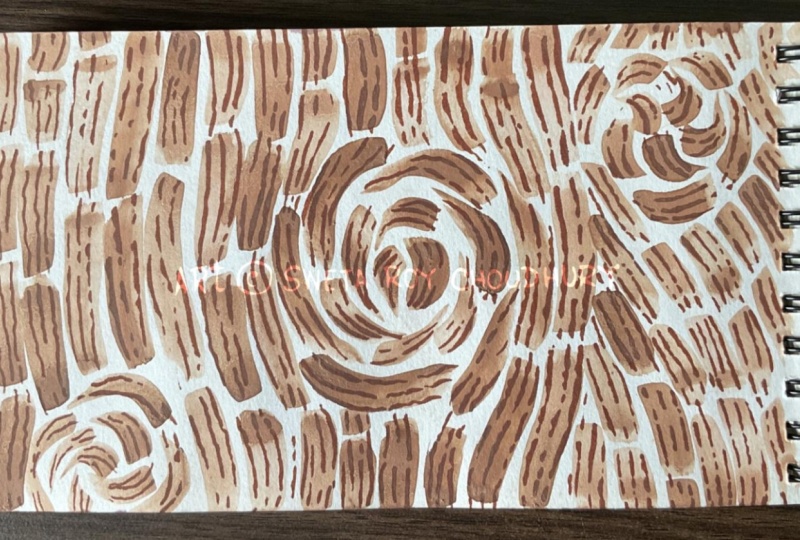
5. Exercise 1: Tree Bark: Welcome to Exercise
one tree bark. In this exercise, we're
going to be inspired by the shapes and lines and details that we'll
find in tree bark, and we're just going to be
painting some simple shapes, taking some deep breaths and enjoying the process as we go. So I'm going to be using
just a really cheap, three quarter inch wash brush. This is, like, a brush from Michael's.
It's nothing fancy. And I'm going to be using this
Ecoline liquid watercolor. This is burnt sienna. So most of the other colors
that I'm going to be using in this class are blues and greens. And this is my one
pop of warm color. And it just felt like it
was a really nice choice for painting tree bark. So I've just added a little
bit to my porcelain palette, and I'm prepping I'm getting
a jar of water ready here, and I'm actually just going to be adding a bit of
water on my brush, and then I'm going to be just maybe diluting this
liquid watercolor, just a tiny bit in one of the other spaces in this palette because
I don't want it to be a super
thick application. I want it to really
when I do this, I want the watercolor to really kind of drag across the page. I want to have some really
beautiful textures here. So if you're painting
along with me, all that we're going to be
doing in this first step is just creating vertical lines. And as we go, we're just letting the brush release from the paper and touch back
down from the paper. We'll make some shapes going
from the top to the bottom, and then we'll make
some other shapes that are going to go from
the bottom to the top. And you'll see, the second line I've done is more of
a connected line. The first line that I've
done is more broken up to kind of get that
sort of, like, tree bark. Kind of vibe here. So just gonna fill up the
whole page like this. And you can kind of
see what I'm talking about here where
I'm just dabbing a little bit of this liquid
watercolor into the palette. It's drying out on
my brush as I paint, and it's getting these
really beautiful line textures that I wouldn't be getting if
I was really loading this brush up with a lot
of this liquid watercolor. That texture is so good. It's one of the most
enjoyable parts for me of doing this kind of
exercise in my sketchbook. These exercises are
all so magical. Because they're so simple, but they let you feel like
you're still being creative. They let you feel
like you're still being in touch with
your artistic side. But if you're feeling a
little bit burned out, it's also gonna give you
that nice, creative rest. Alright, now we need to wait on this to dry
just a little bit. It doesn't need to
be completely dry. First, I just want to touch
up a couple of little spots, and then I'm going
to grab a marker, and I'm going to use this
marker to start adding in some line details within the individual shapes that I've just painted in
this burnt sienna. So I want to go for
something that's going to give me some
really good contrast here, and I'm going to go, I think with this Windsor and Newton watercolor pro marker, that is Indigo blue. I think it's going to give me
some really nice contrast. So I'm just going
to test this out. Now, if you feel unhappy to use your opposite sketchbook page as a testing ground for colors, use a scrap piece
of paper instead. I don't mind this. I
actually kind of like having my little test pages
within my sketchbooks. It's something nice
to look back on, I find, to see those
little exploration. So I'm using the brush
tip of this marker, and I'm going to use
a similar process in that I'm going to
vary the pressure on the strokes as I color over this burnt sienna shape in the individual
shapes that I've drawn. Again, I'm just kind of
thinking about the shapes between the pieces
of bark on a tree. You might be looking at a different reference
photo of a tree, finding different
inspiration for this. You might be drawing circles or, you know, any kinds of textures. Do whatever feels good for you. I personally love this one as a nice warm up
exercise when we're trying to sort of heal
from being tired and, you know, heal from maybe being a little
creatively depleted. I love this exercise
because it is so simple. It's just rectangles and lines. It's just single
brush strokes and then single marker strokes that are all just working together to make
something beautiful. And as I go through
this process, I like to take some deep
breaths in and out with, you know, each little collection of lines that I'm drawing. And I like to try to move my body as much as possible when I'm
working on this. So as I go in to this
piece of tree bark, that's a little bit longer, I'm standing up at my drawing
desk as I work on this, and I'm really just sort of
leaning my body forward at the top of the line and then leaning back to draw
the brush down. So I'm getting that nice release of quietly moving my body, of listening to my breath
as I draw these lines. I'm just getting to enjoy the process of doing
something creative that doesn't really take a lot
of creative effort for me. It's okay if I feel burned out. It's okay if I feel tired because this
exercise is very simple. It's just about simple shapes, simple movements, simple colors. So we're just going
to continue along, and we're just going to fill up the page with these strokes, just varying the pressure, sticking within these rough, organic rectangular shapes
that we've painted, and then just aiming to fill
up the entire page this way. So I'm going to keep going. I'm not going to
speed the video up, which is what I would
normally do in a class. I'm going to leave this real
time because we're trying to embrace our calmness. And I don't think that
watching someone paint at four times speed is
really going to do that. So I am going to
play a little bit of music as I finish
filling up this page, and I hope that you are
gonna draw along with me and take a few minutes of your own time to just
do some breathing, lightly move your
body as you draw, and fill up your pages with these wonderfully
relaxing lines. Alright. And we are done
with our tree bark exercise. I hope that you've found this to be relaxing and enjoyable, and I hope you're ready to head on over to the next video. And let's get started with
our next calming exercise.
6. Exercise 2: Curves: Welcome to exercise to curves. So we've got a fresh
sketchbook page opened here, and we've got some ecooline liquid watercolor
in indigo blue. I'm just going to add this to my little palette over here. And in this exercise, we're gonna be drawing curves, and I was thinking of a couple of things here
as I drew these shapes. At first, I was thinking
of the ripples in a stream as the water sort
of courses around rocks and, you know, different things
that might be in the way. And then as I paint for
a little bit longer, I start to realize
that these marks actually look a little bit like fur when they're all together. So I'm using my three quarter
inch wash brush again, and I'm using the
side of it this time, and I'm just varying
the pressure so that I can get these
pretty carved lines, and I'm also varying the amount of watercolor that I'm going to have in each
one of these lines. So just like before, I'm not going with a really thick application of paint here. I'm kind of dabbing it
off in another well. And the reason that I'm
doing that is because we're going to be adding
lots of layers to this. So we'll have some
blue stripes and some burnt sienna stripes and then maybe some
white eventually. So I don't want all of my curves to go the
same direction. So I'm going to start curving
off to the side here, and then I'm going to focus
on filling in the space that is left between the
two different curves. I'll just fill those
in with more curves. And then I'm going
to keep going and just add in a couple
different directions of these blue curves. Now, we're just going to let these blue curves
dry not completely, but just let them dry for a couple of minutes while we get set up with
our next color, which is going to be
that burnt sienna that we used in the
first exercise. So again, I'm just using the side of my three
quarter inch wash brush. And I'm not using the fully
pigmented liquid watercolor. I'm dabbing it into
this little well, empty well in my palette. So I'm getting a really
nice color variation. Now, one thing that you'll see is that the blue
isn't completely dry, so I'm very
intentionally letting the burnt sienna touch the edges of the
blue in some places, and you'll see that there's some really nice bleed
that's happening. There's some really nice
blooms that are going on. So I'm going to try to take
advantage of that effect as I continue to add these curves
in between the white spaces. Now you can let this be as neat or as messy as you
would like it to be. So these exercises are intended to give
you a place to take a creative breath and just find some peace in your
creativity again. So if you don't like the look of these
overlapping curves, if you are not a fan of
these bleeds and blooms, then, by all means, be a little more specific
with your line placement. Can also wait on the
blue line layer to dry before you start adding
in the burnt sienna color. I like how it looks when
they sort of bloom together. I think it's gonna just
add some interest to this, and it lets me relax
a little bit more and maybe not feel so
uptight as I'm painting. My natural tendency is
to be a little uptight. In general, and specifically
when I'm making art. So a lot of times I'm being
really mindful of that, and I'm working on exercises and ways of holding
my brushes and pencils and pens that encourage me to loosen
up a little bit because, you know, I want my
art to be a little freer than maybe it
has been in the past. Now, I'm just filling
in some more of the spaces with
this burnt sienna. And as I'm working, I'm realizing that I don't really love all
this white space. So I'm going to go back
in with our indigo blue, and I'm going to start layering more curves over the first
curves that we've drawn. No, this again, is
not completely dry. It's mostly dry.
So there will be a little bit of bleed and a little bit of
bloom that happens. And I'm actually in
some places going to go over just the blue edges. And then in some places, I'll be going over the burnt sienna, as well just to kind of
soften the overall look here. And again, you know, this is these
exercises are for you. They're to inspire you to come to a place of peace
with your creativity. So anything that you're
seeing me do that doesn't seem like a nice
experience for you. Feel free to not do it. You know, if you like the white
spaces between the lines, absolutely leave those.
I do not love them. So I'm just concentrating on going in with
this blue and just filling in some of
these white spaces and really just kind of
crossing some lines, really making this
very simple painting start to feel like it's a
little bit more cohesive. Now, because blue and orange are compliments on the color wheel in some of the places
where there is overlap, where I'm painting over where there are bleeds and blooms, you'll notice that
we're starting to get some really
nice neutral tones. So we have some
really lovely grays and some really lovely
browns, as well. And I'm just filling in
some of the edges here, which frankly, I kind of regret, but we're going to go in and we're going to
add some white. There's you know, with these exercises,
there's no judgment. There's you know, just just
giving myself in your case, yourself a place to just relax and chill and
make some simple marks. And if it doesn't go to plan, that's absolutely fine because this is this is nothing serious. This is just for relaxation, just for a little bit
of creative chill. So I'm adding in
white lines with my trusty neo coolor
crayon. This one is white. Now, I did make sure that my page was actually
dry before I started adding these lines because if I was using the neo
pastels on wet paper, it would be a different texture. I wouldn't give me
clean crisp lines, which is what I'm
going for here. I've also grabbed a bulldog
clip and just clipped the upper corner of
the sketchbook page because I've used a
lot of layers of, like, really pretty
wet color here. So the page is actually starting to buckle
just a tiny bit. Not a big deal, but enough
that when I, you know, put my crayon down,
it was kind of like bouncing the page,
which I don't love. So I just tacked my bulldog
clip up at the top here. So I'm just following the
original curves here, and I'm just adding
in this little bit of white just to add
some lovely contrast. And since I'm in this
upper corner here now, I'm just going to take
my bulldog clip off and just finish drawing my
lines in this upper corner, and then I'll finish drawing the lines over on the
left hand side, as well. And I'm just going to
add in our last couple of contrasting white lines, and we're done
with exercise two. So take a breather if
you need a breather or head on over to exercise
three, and let's get started.
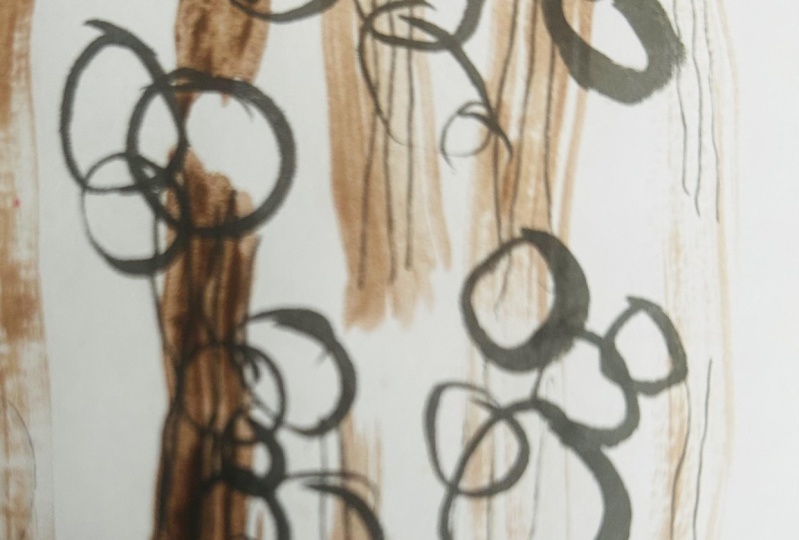
7. Exercise 3 : Ripples: Welcome to exercise
three ripples. So we've got a new page
of our sketchbook, and this time, I'm using three ecoline
liquid watercolors. I've got an indigo,
a bronze green, and a fur green. And these just have a little
bit of color variation, and I'm going to
be using them to draw overlapping
circles on my page. Now, this time, I'm just
going to use the dropper. So you see how these
come with a dropper. So I'm just going to
use the dropper to draw in these overlapping
circles in different colors, and I'm going to let them
start bleeding together and, you know, just
overlapping and touching. And that's really the
goal that I have here. So as I start on my
main sketchbook page, the goal is to paint circles that are always
touching another circle. So I'm going to
start out by just painting a few blobs of
circles in this bronze green, which is one of my favorite ecoline liquid
watercolor colors. It's just such a good green. And, you know, it's hard
to find a good green. So every one of these groups, I'm just making sure that the
circles are overlapping or touching in some way, as I go. I want to make sure that
every circle that I draw is in contact
with another circle. And this is a really
thick application of this liquid watercolor, and this is one of the reasons that I chose this
sketchbook instead of my usual art creations
sketchbook because I knew that I wanted to
do these exercises that were going to
take a lot of water, a lot of liquid, and I wanted to make sure that
the pages weren't going to, you know, bleed completely
through and buckle everywhere. So I'm just placing my bronze
green circles just kind of, you know, randomly in
groups across the page. And what I want to do
next is I'm going to use my indigo blue
and my fur green, and I'm going to
start overlapping my existing circles so everything can start
bleeding together. So this is the fur green, which is a really pretty
blue green color. Now, as with all the
other exercises, you can use whatever
colors you want to, use whatever you find
inspiring and comforting. You can experiment with these. I kept my palette, not quite monochromatic,
but I kept my palette. To colors that I knew were
I'm gonna work together, and we're going to be a little
bit gentle on the eyes. So, for me, that's like
no reds, no oranges, no yellows, really, like, earthy tones of
blues and greens. You might find that you love, you know, sunshiny colors, and you might want
to do this exercise in yellows and oranges. Or you might want to pick colors that you can
mix from the color wheel. So you might want to pick
some yellows and some blues. And then when your circles
overlap and touch, you'll get some
beautiful green mixes. Or you might want
to pick blues and reds so that when your
circles overlap and touch, you'll get some
beautiful purple mixes, whatever you want to do. Obviously. Again, these
exercises are always about you and helping you just gently reconnect with
your creativity. So I'm going to keep
filling up my page here, just adding more circles, lots and lots of watercolor, just, like, a really
thick application. So it's really going to soak into the paper here
in a few minutes. And as the circles start
to touch each other, they're going to
bleed a little bit. And instead of trying to
draw perfect circles now, I'm just kind of getting a
little bit scribbly with it. So feel free to be little freer with your circle
drawing and go ahead and just fill up this
entire page of circles in different colors that are just overlapping and touching and
bleeding into one another. Now, after drawing a few circles with the indigo blue dropper, I realize that I want to
vary my circle shape. So I'm going to
grab my little cut in half number two brush here and I'm going
to start dragging it through some of
the existing paint, picking it up, and just
seeing what other sorts of shapes and colors I can
get as I go through here. I love this little
cut off paint brush because it really it sort of it takes away some of the control
that I would normally have. But because I'm in my sketchbook, I don't
have to have, you know, the long handle of a brush and stand so far away
from my sketchbook, I can still be sitting
at my desk or standing at my desk and doing
these exercises. These always remind me of, like, the ripples in a body
of water if you, you know, drop a pebble in and you sort of
see those, you know, concentric ripples or, like, when a fish jumps out of the
water and you have, like, a splash or when a goose or a duck lands in the water and you get that little
bit of splash, and then you have the little
ripples that go out from it. So, you know, a good exercise as you're doing
this is to imagine that every circle
that you're drawing is the ripple from a worry
that you have dropped. Or from a bit of exhaustion
that you have let go of. So keep on filling up your page. Keep on experimenting with your materials as you go
through this exercise. You see a switch back to
the dropper at this point. I might go back to the
brush later and add in some fuller circles and, you know, some
different textures and different overlapping spots, kind of, like, letting this
be what it wants to be and letting go of the idea that it has
to be anything at all, that it has to be a
completed piece of art, that it has to be good, that it has to be
judged in some way. So instead, I'm just
taking some deep breaths, enjoying the colors,
enjoying the materials, and seeing what
happens as psycho. Isn't it lovely how all of these colors are really starting
to just blend together, and little areas are really
standing out because, like, you know, the bronze green is a lighter value than
the indigo blue. So you're really starting to see areas that the eye is drawn to. And it's just a lovely exercise, a lovely way to fill
up a sketchbook page without feeling stressed
out by the process. So we're almost done here. We're just going to fill
out this last little part. And if you're ready, head
over to the next exercise, and let's get started.
8. Exercise 4: Circle Flowers: Exercise for circle flowers. We're going to be using
our trusty little chopped off brush to start painting some circle shapes
just with some of the leftover ink that
we've already been using. Now, I'm actually going to
water this down quite a bit. So I've used an eyedropper just to add some water
to the center well. So this is going to be
quite a thin application. And all I'm doing here is
just painting rough circles, sort of scattered
around the page, almost like a poka
dot sort of layout. And as I go along, I'm going to be painting
these in a lighter color, and then I'm just
going to grab some of that dark indigo
liquid water color, and I'm going to drop it
in here just so I can get a little bit of color variation as these dry and
a little bit of, like, blooms and bleeding. And of course, because I'm not washing my brush
off as I go here, I'm going to get a little
bit of variation in color as I paint, as well. Don't you just love dropping
watercolor into watercolor? It's so satisfying to watch those colors
bloom into one another. So I'm going to keep
going on this page. Not really trying to
draw perfect circles. I'm just trying to complete, like I said, a loose
poka dot pattern. So the rows are staggered. So you see the first
row has three, the second row has two. This row will have
three, the next row will have two, and so on. So let's fill up our page with some more of these
loose, colorful circles. So next up, we're going to
draw in some stems and leaves. So I'm going to grab a marker and test it out over here on the left hand
side of my page, just to see if
it's going to give me the quality of the
line that I want. So this is an Ecoline brush pen. So this marker has the same liquid watercolor that I've been using
from a bottle. Can actually use the bottles
to refill these markers. So I want these flowers
to have a nice thin stem, and then I want
them to have, like, a really quick, like, two
stroke sort of leaf shape. So I was testing out the Windsor and
Newton marker here thinking I might want to
do some orange and blue, since that's my favorite
color combination. But I just it's not
working for my eyeballs. So instead, I'm
going to test out the Windsor and
Newton paints gray and see what we think
of that instead. So the circles that we have
painted are not entirely dry. They're mostly dry. So I'm going to go ahead and get started adding
these stem details. And I'm just using the
Windsor Newton Promarker. And you can see where I touched
the bottom of the circle, there's just going to be the tiniest little
amount of bleed. And that's because these
markers are watercolor markers. So they're going to
react very similarly to how it would react
if you were just painting a really thin line with a brush, which you can also do. If you don't want to
switch to a marker, you absolutely don't have to. This is just my preference
for drawing these stems. I want to have the
tiniest bit more control, and that's mostly because
I don't want to put my hand down on the paper because my circles are
still a little bit damp. And I know if I put my hand on the paper, it's going
to make a mess. So this is me trying to be
both impatient but relaxed. Alright, and next, we're
going to be adding in leaves. So let me do a little test here. Just want these leaves
to be really simple. So I'm really just doing
one or two strokes with the brush pen and leaving a little bit of white space
just for some variation. And again, the dots aren't
completely dry yet. So as I draw these leaves in, I'm trying very much not
to touch these dots. Now, this is a
restful art class. So if I was a little
more patient, I would wait on my
circles to dry instead of contorting myself around,
so I won't make a mess. But I am ever an
impatient person, especially when it
comes to making art. Once I get in the flow, even when it's, you know, just a quiet practice like this, once I get in the flow, I don't really want to stop. I'm really enjoying myself. I'm really enjoying
this simple exercise. And so I work, even though my circles
are not completely dry. And I actually think it's gonna benefit me in a few
minutes, though, because I'm going to add some center details to the circles. And because they're
not totally dry, I'm gonna get some really
nice bleed effect, and that's gonna look
really nice layered on top of the bloom that we got when we did the circles
in the first place. So, still using my Windsor
Newton marker brush tip, I'm just going to go into the center of each
flower and just add a little cluster
of dots to indicate, you know, the
center of a flower. And you can see,
just like I said, some of these circles are still a little bit damp
and because of that, there's a beautiful
bloom effect as I'm adding in these circles or these little dots
into the circles. So I'm just going to keep going, and I'm just going
to add in circles. No, I'm going to add in dots to the center of the circles. Try to say that five times fast, or even five times slow. Let's see what happens there. So let's just go ahead and
finish filling these in now. And that's it for our
circle flower exercise. Take a minute, take
some deep breaths. And if you feel ready, head
on over to Exercise five.
9. Exercise 5: Overlap: Exercise five overlap. So the point of this
exercise is to create an abstract piece of art by drawing some simple shapes from nature that overlap one another. So I'm gonna be drawing
some mushrooms. I just think that
the simple shapes are going to work
really well here. They're going to be
really easy to overlap, and then I'll have
some nice clean shapes to paint in later. So I'm using a Neo
Color two crayon. And the reason that I'm doing that is because I'm
going to be adding water at some point in this process to create a soft sort
of background. And I love neo core tous
for this. They're great. So I'm just drawing
in my mushrooms, overlapping them, giving myself
some nice shapes to draw. And I'm going to be honest. I think that I've not used
my space very well here. And I'm going to try to save it, but we might actually end up starting over
on this drawing. And I'm going to leave this in the class because I think
this is just really important to see and know that every artist
makes mistakes, that, you know, it happens that what you planned on doesn't turn out how
you thought it would. And sometimes you start over, and that's absolutely okay. So, yeah, I decided
to start this over. So I'm actually going
to tape off part of my page and just work on a small space in the center instead of focusing on the
entire page of the sketchbook. So what I'm doing right now is I've got some Scotch
removable tape, and I'm just cutting
a few pieces, and I'm just going
to block in, like, a roughly square inch
shape on the page, and then I'll draw my
mushrooms within that space, and we'll see if we
have some better luck. Oh, yeah, that's already better. So now I'm going to grab my three quarter
inch wash brush, and I'm going to dip
it in my water jar, getting, like, a
lot of water on it. And now I'm just going to, oh, you can see my
water is dirty. It's got a little bit of burnt Siana in it, but that's okay. So I'm just pulling the wet brush down from
the top to the bottom. Staying within my
taped square area. And the reason that I'm doing
this is because it creates this really beautiful bleed and run of the No Color two pastel, and that just gets rid of
a lot of the white space, gives me some
foundational texture so I can start working on this rough abstract
sort of painting. Alright, so I'm gonna be going back to my
eco lines again. We're gonna be using
a bluish green, my favorite bronze green, a burnt sienna, and
then a Prussian blue. And I want to have some variation between
my colors because we're going to be overlapping
we're gonna be painting these overlapping shapes that I have drawn in the mushrooms. So I want to make sure
that as I'm painting, there's enough contrast between the shape so that it's
not completely muddy. So I'm just filling
up my palette here with my chosen colors. There's a little bit
of burnt sienna in that well that I'm dropping
bronze green into, but I don't think enough to
really affect the color. So we'll just take this burnt
sienna and add it in here, and then we'll be ready
to start painting in. So I'm going to be using
my number two brush. It's a number two round. And I do want to make sure
this is mostly dry because I don't want a lot of bleed when I start
painting these in. And I'm also using pretty pretty not diluted. What's the word I'm looking for? Pretty pretty straight from the bottle watercolors here because I do want these
to be a little bit dark. Now, you can't really
tell with this blue. But where I'm touching
the neoclor lines, I will get a little bit of
a blend and a bleed there, and that's just going to add
an extra softness to this. So I'm just going to
start out with one color. So I've chosen this
Prussian blue, and I'm going to go
around the painting and just pick different areas
that are not touching, and I'm going to paint those in with this really concentrated. That's the word I
was looking for. Concentrated layer of
Prussian blue paint. Now I'm going to grab
some of the bluish green, and I'm going to start
painting in some of the other shapes
within the mushrooms. Now you see a little bit
more with this one where I'm starting to get
some of those edge bleeds from the neo color. I think that's really almost
kind of calming to watch. So I enjoy that. I
hope you do, too. So I'm going to continue
on with the bluish green, just filling in more areas. Again, making sure
that they're not touching anything that
I've painted bluish green. It can touch areas
that have been painted blue but not bluish green. And now we're going to go in with a little bit of
the bronze green, and we're going to start filling in even more of those spaces. Again, we'll get some
bleed from the neo color, but I think it's kind of lovely. And I'm just going to be mindful to not paint side by side
areas of the bluish green. And I also want to leave just a few areas for
the burnt sienna, which is going to give us some
nice contrast in the end. And now we're just gonna fill in a few remaining shapes
with this burnt sienna. And you'll see already that it's making a really nice contrast. And yeah, it's
looking really nice, where it's picking
up those edges of the No coolors as well. And I've just got a few spaces in here
for the burnt sienna. So might actually go in and
do some layering here and add the burnt
sienna over some of the blue areas and kind of see what
happens when I do that, just to see if I can get
some pretty layered colors. Alright, so I think we're
all done at this point. So I'm going to go ahead and
peel off my removable tape. And you'll see that because
my paint water was a little dirty when I painted over the neo
colors in the beginning, it's actually given this really
soft background color and this really nice texture that blends in with
the blue, as well. So it was a happy accident. So it turned out
well in the end. So you'll see now we've got this nice sort of framed shape
in the middle of the page. And let's just let this dry and see if there's anything
else we want to add to it. So this is actually
the next day, and I've had a chance
to look at it. And I've decided that
I want to go in with an off white pasca pen and
add in some dot details. I just think that it's gonna make everything feel
a little bit more cohesive. And, honestly, like, who doesn't love
drawing dots on things? Like, I've loved drawing dots on things
since I was a kid. So this is just a really
relaxing exercise. I'm just going to vary
the size of these dots, doing some little
tiny poka dots like this and then doing
some larger circles and letting it overlap in areas so that it really starts to bring all these shapes together. All right. And that is
our overlap exercise. So take a deep breath
and relax for a minute, and then head over to our
final exercise in this class.
10. Exercise 6: Kelp: Exercise six, Kelp. So in this exercise, I'm going to block off another
square in my sketchbook, and I'm going to use
this Ecoline Prussian blue brush pen and a
little bit of water. So this is going
to be a nice way to wrap up this
little mini course. It's gonna be another
relaxing exercise that you can do when you're
feeling a little tired, a little burned out,
a little exhausted. And you just need
some restful art. You want to be creative. You don't really want to use
your brain power to do it. You just want to have
something that is gonna let you move your hands,
maybe move your body, take some deep breaths, and be creative without having to stretch
yourself very far. So this is a nice
exercise for this. So I'm just going to
tape off my square. And now I'm going to grab
my Ecoline brush pen, and I'm going to
start by just drawing in some dainty, delicate lines. And, you know, this
exercise is called kelp. So, you know, that's kind of what I have in mind
here is, like, kelp and seaweed and just any
underwater foliage, really. So I'm just starting out with some really softly
curved lines that are connecting to
one another and branching off almost like
little tree branches. Now, we're gonna soften this whole look when we get
in here a little bit further, but for right now, we're just drawing these delicate
little branches. And now we're going
to start adding leaves to the end
of our branches, and we're going to do that
just by pressing down on our brush pen and dragging just a little
bit to make a leaf shape. Now, if we vary the way that
we're holding the brush pen, it's going to give us a variety
of different leaf shapes, and it's going to
feel really organic. And it'll feel good
in our body, too, to be moving our arms and our hands in different ways and, you know, trying out
different things. Now, the reason that I'm using this Ecoline brush pen is
because it is very juicy. I would say that this is, like, more liquidy than the
Windsor Newton watercolor. Marker. And there's a reason
that I'm choosing this. And you'll see as we go through as we get to the end
the effect that I'm going for and the
reason that I've chosen this marker that has so
much liquid in it and also, like, so much pigment
in the colors. So I'm just going to go
up and down the stems here and just keep adding a variety of
different leaf shapes, pressing in different ways, moving my arm around, moving the marker around, varying how hard and soft
I press on the marker, what part of the brush top of the marker I'm pressing
down on the paper, just to get a really nice
variety of leaf shapes. Okay, so now let's
grab our brush pen, and let's add in some more leaves to fill
in the white spaces. We're going to fill in as
much of the white space as we can in our little square that we've taped off in
this sketchbook page. Now, you actually don't really need to tape off a square
if you don't want to. I just discovered in
the last exercise that I really like taping off a smaller space so
that it almost makes a little frame around the art that you've created
when you're finished with it. So I think that's going to be really lovely for this piece, but you're also, of
course, welcome to just use the entire
sketchbook page. So continue along adding
in more leaf shapes, adding in more tiny
stems here and there, and just fill in as much
of the space as you can. H Alright, so we've got this space mostly
filled in with our blue, kelpie seaweedy leaf shapes, and now I'm going to grab my three quarter
inch wash brush. I'm going to load
it up with water, and I'm going to paint over the leaves
that we've already made. I'm going to just paint
over this with water. You can see the water has got a little bit of a tint, too. I had a little bit of a blue but that's actually going
to work really well. So I just barely dabbed
the water off on a towel. And you'll see as I drag the brush from the
bottom to the top here, because this eco line is
so juicy and pigmented, you can see how beautiful the bleed is already
starting to be. So we're really starting to get the effect
that this is actually underwater and that everything
is just softly distorted. So I'm just going to finish this off all the way over to the edge of our
little square here. And then I'm just going to wait a few minutes on it to dry, and then we'll start
peeling the tape off. This is such a fascinating
moment to me because you can sit here and
watch the paint bleed. There's so much water
that's been added on here, so you can just see
the softness building as we sit here and stare at this page and wait on it to dry. Now, because I'm me, of course, I'm a
little bit impatient. And I wish this was gonna dry
a little faster because I want to peel the tape
off and I want to see what the edges
look like underneath. So I'm going to maybe start fanning
this here in a second. Let's see if we can get this
to dry a little bit faster. Alright, so let's call
that good enough, and I'm going to start
peeling my removable tape. And I can see already that
because I used a lot of water, it actually bled under
my removable tape, which isn't terribly surprising because this tape
is not very tacky, so it doesn't stick down to the paper as
well as some other. Tapes. So you see
my square has gone a little wonky on the side
in the end where it's bled. So I'm actually going to add some water back to my three quarter
inch brush here, and I'm going to soften the
edge of the entire rectangle, so it matches this one
bleed edge on the end here. Let's see if we can pull
some more color from the leaves and just kind of
finish softening that edge. And look at that bleed there. It's just really starting
to soften the entire thing. And, of course, if you've painted all the way to the edge of your sketchbook, you don't have to worry
about this wonky square. But I'm doing my best to kind of make
it look like it's more intentional and make it look
even more like it's got, like, some, like, soft
underwater kind of vibes here. So that's it for the
restful art exercises. I hope that you have found some peace and calmness
in these exercises, and head on over to
the next lesson. We've got a little writing
exercise that we're going to use to wrap up this course.
11. Write and Reflect: Now that you've gone
through the exercises, take a few minutes to
write and reflect. Grab paper and pen or open
your Notes app again, and then set a timer for 5 minutes and write on
the following questions. How do I feel after completing
the restful art exercises? Which exercises did I connect
with the most and why? How can I include these in my
regular creative practice? Keep these thoughts in mind as you go forward with
your creative practice, and don't forget to share
the work that you've done in the project
section of this class. Be creative, but always
make time for rest, too.
 Stephanie Fizer Coleman, children's book illustrator/bird artist