Transcripts
1. Introduction: Hi guys, My name is Peter and welcome to the course in which we are going to build a modern responsive portfolio website and this President convert to digital world. It is really important to stand out from the crowd and to be unique. If you're applying for a job or approaching inclined, you should have something that is unique or distinctive, that set to your bot. With that said, having a portfolio website that showcases who you are, what are the different skills you process this plaguing the different projects that have that all these things can create a better impression of you. All right, now talking about this particular course, this course is curated for beginners. But it is going to be better if you guys have got a basic knowledge of HTML and CSS. And now let us talk about the course structure. So first of all, I'm going to give you guys a basic overview of our website. Explaining it is designed and functionalities so that you guys can get a better understanding of what we're going to build. Secondly, I'm going to share some best practices that you can implement while learning, especially while learning to code, so that I can obtain the maximum potential of this particular gods. After that, we get under the main part. So first of all, we will be setting up the project. And under the project we create the different files and folders required. The select or pick the different colors that we are using this particular website. And also we import all the necessary majors onto a project. After that, we start to code a website. So we will be coding the website section by section and RB start off with the hero section, followed by the abort section, skill section, project section, blog section, and the contact section. And once we completely coded website, now it is time for us to make our website responsive. And as we know nowadays, almost all users are browsing the Internet via their smartphone. So it's really important to have a website that can adapt to different screen ratios. So we have got two different videos in which I go step-by-step and explained how we can make a website responsive. So that's about the course structure. And as I already said, this is it significantly course in which I talk about the basic stuff as well as the development part in the simplest way possible. So that's it guys, thanks a lot for watching and I really, really hope to see you guys in the next lesson.
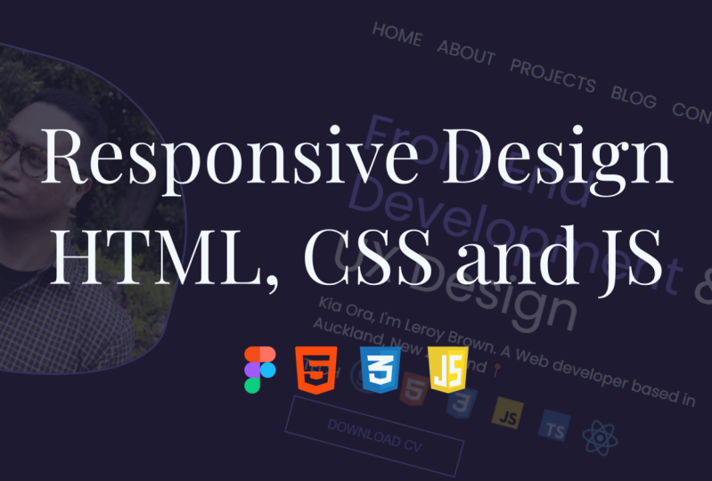
2. Website Overview: Hi guys, welcome to the video. And in this particular video, I'm going to give you guys the basic overview of our website. And right now what do you are seeing easily final product. And right now we are in the hero section. And in the top part here you can see this ESR navigation bar. And inside the navigation bar we have got a logo, different links, and a button. And these links are completely functional. So for example, if I wanted to go to the blog section again, click on the blog section and dies want to take us directly to the blog section with a smooth animation. And here in the hero section, in the second section we have got tau, the hero image, as with last text along with the button. And the bottom part, we have got a sharp structure. So this structure is made using clip-path, and we have also defined the curvature using the polygon function. So guys, if you don't understand these terms, don't worry, I have explained all these things in depth in the upcoming sections. So if you don't understand these terms, don't worry, at the end of each section, everything will be completely clear. Now let's move to the about section. So in the board section we have got an image, and in the right side we have got a text section which is having a hitting a small introduction. And here we have our social media icons. And these icons have a call-to-action. So if I click on any of these, these, I want to take us to the respective upside and now let us move to the skill section. So in the skill section again, we have got the curvature here. We have got the heading as a last a polygraph. And this is the car section. So we have a total of six different cards and each card is having a hover effect. So we basically made use of CSS grids to achieve this god structure. So that video in which we are going to build the skill section is value pack began to learn about the CSS grids, how we can define a grid, how we can provide gap between gods and a lot more. So each guard is having an image and a text information. And that's it. This is all about the skill section. Now let's move down to the project section. So this is the project section. We have got a heading and here we have got a slider. So this lighters basically made using an external JavaScript library known as slick slide it. So in this particular video, we'll learn about how we can use an external library, how we can access specific properties of the library and more. And here you can see that this either consists of an image and a paragraph. And in the bottom part, you can see that we have caught doors and these dots indicate the current slide. So you're going to see that a now we are in the first slide, so the color of the screen and it is heavier, wider bit. Now if I go to the second one, the second one is basically highlighted with a different color and a wider width. So this is all about the project section. And now let's move to the block section. So this is the blog section, and we have got a Hibbing Biograph, a dark background, and three different cards. And inside each card we have got image and the text information. So dyes or lab or to the block section. And now let's move to the last section that is the corn back midsection. So here we have got a heading. We have got two different cards. And inside each card we have got an image and some text information. And the bottom part we have got to the input section where we have got the username input, email in both the subject message as well as a button. So this is all about that. The conduct Me section and the footer section, we have got just a logo as we last saw, a couple of information. So this is the basic desktop or view of our website. And this regular upside is completely responsive. So if I get on to the developer tool here, you can see that and I decrease the width of the viewport. You can see this particular navbar getting disabled. And instead we have got a hamburger menu. And if I click on it, we have got at the end dire menu here. So again, I can click on any particular dissection and things work perfectly fine. And the hamburger menu is well laid out. We have got all the links as elastic clause icon. And right now we are in a bit of 1988 by 1949. So I'm going to go to iPhone 678. So this is how our website is gonna look on a mobile phone. It is looking pretty fine. Things are well laid out, things are readable. And website is completely sponsee for a mobile view. That's also good to an iPad view. And as you can see here also, the upside is well laid out. And for almost all screen ratios, our website is going to adapt based on the screen ratio. So we can conclude that our website is completely responsive and we have got an in-depth video of two parts saw in which I'm going to go step-by-step and explain each and every step of making a website responsive aspirin. And out of that, we also have a prototype. So I have made this particular prototype in Figma, and while building the website, we will be taking this particular prototype as a reference. So that's it guys, this is Saudi basic overview of our website. And I hope that you guys got a basic idea of what we are going to build in this particular video. So that's it, guys, thanks for watching, and I'll see you guys in the next videos.
3. Best Learning Practices: Hi guys. In this video I'm going to share some best practices that you can implement while learning so that I can juice out to the maximum potential out of this particular course. And the tips that I'm about to share has been implemented in my own learning process. And I think that they are worth sharing. First of all, as you guys know, this particular course is divided into multiple sections and it needs section. We basically build a particular part of the website. And what I would suggest you guys to do is start off, first of all, you should watch a section completely. And the lies, why we are building, observe the course structure and the problem-solving approach. And once you complete your watches action, then you should try to build a website on your own. When you're trying to build a website on Iran rather than just replicating what are the instructor is doing. You're thinking skills, your problem-solving skills, everything is going to grow in a much better way. So this is what I want to suggest, that is to watch this actually completely and then tried to build a website on your own. Secondly, users set small goals and asked me know nowadays a lot of the blend Duolingo course, but there's only a small fraction of people that complete the course. So in order to complete the course successfully set small goals. In our case, you can basically set a goal of, I want to complete one section every single day. And if you could consistently achieve this particular small goal or your bigger goal, that is to complete the entire course, become bloated with great ease. And finally, it is time for us to eliminate all sort of distractions. And studies have shown that even a few seconds of destruction, whether it can be a notification on a smartphone, can completely ruin your main concentration. So when you're studying, it is really important to avoid all Destruction Set or whether it can be a smart phone or any other things, you should try to avoid all sorts of distractions and completely concentrate on the study process. So these are some small changes that dike and implement on your learning process, which you'll have a much better impact on your learning process, which can make it more efficient and effective. So that's it, guys. Thanks a lot for watching and I'll see you guys in the next video.
4. Setting up the Project: Hi guys. In this video we are going to set up our project in VSCode. So Visual Studio Code is the texture data that I'm going to use in this particular web build. And you guys can use any of your preferred text editor. So the first thing that I'm going to do is that I'll be creating a new folder on my desktop. And I'm going to name this particular folder as portfolio. After that, I'm going to open up VS Code. And I'm gonna drag in the newly-created portfolio folder on the VS Code. And now we have caught that the portfolio folder opened up right here. And the now let us create all the basic files that are required. So I'm going to click on a New File button right here. And the first file that we're going to create ISA, the index.html file. All right, now let us create another folder, and I want to name this particular folder as CSS. And inside this particular folder, let us create our style.css file. Okay, now let's create another folder to store all of our images. And finally, let's create a file for it. Our JavaScript. Or Lai guys know we have created all the basic files to quiet. And now let's go to our index.html file and generate a basic boilerplate. Through that I'm an NDR, the exclamation mark and followed by the tap. And this generates the basic boilerplate. So the first thing that I wanna do is that I want to change the name of the upside to portfolio. And after that, I want to link the HTML and CSS together. To do that, I want to type in link. And inside the extra time, I'm going to Enter dot slash, select the CSS folder. Inside that I want to choose this Tyler CSS file to confirm whether the HTML and CSS file is linked together, I will not go to the CSS file. And I want to say like the body of our website and I wanna change the background to red. I'm going to save it. After that, I'm going to right-click on the index.html file and click on open with the live server. And as you can see that the website is working perfectly fine. Both of the HTML and CSS file is linked perfectly fine. So now we're done with the basic task of setting up the project. Now let us move to the second stage, guys, right now we are going to pick all the different colors data we will be using in this particular website. And we will be storing in these colors as variables. So while building DevOps side, the color selection process is going to be much easier and it can help us save a lot of time. So right now let's go to our prototype. And right here, I have listed all the different colors that we'll be using. That is, we will be using three different colors. And let's select the first color. Let's select the color from the field option and copy the hex code. And back to VS Code. Let's go to the CSS file. And to basically initialize these colors as variables, let's use the root function. And right now let's enter the name of the variable. So for the first color, I'm going to name it as primary, followed by colon. And the hashtag I'm going to paste in the hex code. So that is the first color. Now let's copy the hex code for the second color. And I want to name this particular color as pure. And I'm going to paste the hex code right here. And the next color is named as dark. And let's copy the hex code and paste it right here. So these are rather different colors that are, we earn a year since webgl website by initializing these courses available. So we can easily remember the name of the color and are directly apply the color by specifying the variable name. And it can in fact save a lot of time and it's much easier to remember kilobytes, so variable name rather than the hex code. And now we are done with the color picking process. And now let's move to the next stage in which we are not basically what all the different images and other assets on the VS Code. All right guys, now it is time for us to import all the different images and icons onto our project. So before that, let me show you the different icons and images that we will be using in this particular website. So right now I'm in the prototype that I've made in Figma. And as you can see, we have got the hero image right here. And if I scroll down here, we have got all the different social media icons. Moving down here you're gonna see all the different icons. In the skill section. We have got to the project icons, project images, the different blog images. They don't like me, icons and lot more. So these are the different images and icons that we will be using in this particular website. And learn where you guys, I've got all these in the resources section and I can download all these right from there. So now let us basically import all these onto our project. To that. I've got all these images right here, and I'm going to copy it. So after that, I'm going to go to the portfolio folder that we have created. And as you can see, we have got to the images folder and then open it. And I'm going to paste all of them right here. Now, if I go back to the VS Code Editor and inside the majors, as you can see, we have got all the different images ready to be used. So now we are finally done with the images and the icon part. I sweat. And now we have got the project completely set up already to be coded. So that's it, guys. We are done with the basic project setup. And I'll see you guys next video where we're going to start building our website.
5. Coding the Hero Section: Hi guys. In this video, we are going to build the hero section of our website. And in the previous video, we have basically created or protect along with all the different files. We have picked all the different colors that we are going to use this particular website. And also we have imported all different images onto a project. So right now let's go to our prototype right here. And as you can see, this end dissection is mainly named as the hero section. And this is what we're going to build in this particular video. So let us basically divide the hero section into two different parts. So first of all, let us build the navigation section. So this is the nav bar. And you can consider this navbar as a box. And inside this box we have different elements like the logo are different links and the back button. So first of all, let's create the basic box structure. To do that, let's go back to the index file and inside the body file, or create a header. And inside the header, I'm going to create a nav tag. So going back to the prototype, you're going to see that we have created the box. And inside the box we have got our different elements. So I'm going to classify these elements as left part and the right part. So in the left part we have got the logo and the different links. And the right part we have got the coin back button. So let's create a div for the left part. And I'm going to give it a class as a left. Just like that, I'm gonna create another div. And I'm going to name this particular div with the class as a right? All right, now let's get down to the left part. So here you'll see that in the left part, we have got Dao, the logo as the last, the different element. So we need to have separate due for the logo and for all these different links. So I want to create a div and I'm going to give it a class named as branding. And inside this particular div, I'm going to open up the image tag. And in the source I'm going to enter the org slash. Let's go to the images folder and I will end the logo. So nav dashed logo is the logo that we're gonna use. And let's create another div for the different links. So for that we're going to use anchor tag. So I'm going to undo a and press Tab. So I'm going to just end the hash right here. So we have got home a boat skills projects and block. So let's enter home first. And now what I'm gonna do is I'm going to select the end dyer, Dyer right here. And I press Alt, Shift and down arrow for four more times. So that is going to duplicate the exact same thing. And after home we have got about four or by skills, projects and block. All right, now we have created all these different angle tax. So now let's move on to the right part. So as you can see on the right part, we have got a button named as contact. So I'm going to just create a button tag and name. It does conduct. All right, Now we are done, but the navbar, we have created a box and inside the box we have got two different parts. On the left part, we have got the logo. There are different links and on the right part we have got the button. So let us save it, and now let us style this particular header. To do that, I wanna go to this Tyler CSS file. And right here I'm going to select the header. And I'm going to change the background too dark. So to access the variable, I'm going to end the war inside round bracket. I'm going to enter double dash. So now let's save it. And let's basically check out our website. And as you can see that it's here. And if you notice on the top right and the top part, we have got a little bit of spacing. It is because of the default web browser style sheet. So let's go back to our CSS file and here let us start. So star indicates the entire selection, so it selects the entire element. And let's type in margin 0. And padding 0. And box-sizing, border-box. Alright, now, if you come back, you can see that there is no whitespace on any off the corner. It is perfectly flush with dot-dot-dot part of the browser. So guys, if it's a corporate or type here, you can see that that didn't nav bar is basically located at the center of the beat. So in order to bring our nav bar to the center of the page, we need to create a container. So I'm gonna go back to our style.css file. And here I'm going to create a class named as contain it. And in this particular class, I'm going to give a Mac spirit of 11 52 pixel. And episodic for top and bottom is going to be 0, and for left and right is going to be 15 pixel. And also I'm going to give a margin of top and bottom of 0 and to make the undiagnosed prior to the sender, the left and right should be auto. So if I save it and if we come to our portfolio here, you can see that nothing has basically happened. That is because we haven't applied this particular newly-created glass onto our HTML. So I'm going to simply copy the name of the class right here. Let's go to our HTML file and write a both the nav back or right below the header tag. I'm going to create a div with a class name of container. And let us place the ending div tag right below the nav glossing tag and let us save. So let me quickly arrange it now or save it. And if I come and check, you can see that it is in the center right now. Now, let us basically change the color of all these different links. So the links obviously located right inside the left div. And so BIPAP, we can say that it is header, the nav, and then the left Div inside that we can access basically the anchor tag. So I'm gonna go to style our CSS. Here. I'm going to end the header, nav dot left and the anchor tag. So here I'm gonna change the color to your, let's say we then take a dog, we can see that the color has been changed to white or pure. And now there's remove all these underlines. So let's type in text decoration, none. And that is going to basically remove all the underlines. So basically we have brought the nav bar to the sender and the color of these links to white, as well as we have removed their underlying. So guys, if we check our prototype here, you can see that the navbar is basically aligned in a single line. That is, we have got now the logo, the different links followed by the button. But the upside is basically having all these different elements are arranged in a vertical manner. So in order to make them in an aligned or in a line manner when they use the flex property. And we will be making use of the flexbox or D evolved lot in this particular website built. So it is better to basically create a utility class so that it can save a lot of time for us in the future. So to do that, let's go to our code and our inside the CSS folder, I'm gonna create another file. And I want to name it as Udemy distort CSS and down and copy the name of the file. And let's just end up. So before moving on, let's go to our style.css file. And first of all, let us embark on our new utility class right here. So I want to import followed by two single chords. And let's enter the name of the file dot css and a colon. So now we have imported the utilities class. Now let's go to the utilities file and create a class named as Flex. And here we are going to under display flex. Alright, so right now on a copy the name of the class right here. Let us go to our index file and write inside our Nasdaq. I'm going to create a class and I'm going to paste the name of our utility class flex. And let's save it. And if I check the website here, you can see that the contact button has been moved on to the right. So if a base the same flex class inside our left div class and save it. You're going to see that the end dire links and the conduct button has been arranged the light manner. So guys, if you check right here, you can see that the links and the like button is not aligned with the logo. These are kind of misplaced. So to make them in a single line, let us create another utility class. And I'm going to name it as item sender. And we're going to put another line item sender and lives. Simply copy the name of the class. And first of all, let's place it inside the nav class. Let's save it and check it out. And you can see that the coin back button and the logo is in a single line now. And let us apply the same formula over left div. Let's paste it. And we have got all these in a single line. Now the next task is to have a lower dose based video when these are different elements so that, that looks nice. So to do that, I want to create another utility class and I will name it as space between. Let's have justify content, space between. Let's save it. So let's copy the class name. Let's go to index file and let's paste it inside the nav class, save it. And as you can see that the coin back button has went all the way to the left of the container. And now let's add a bit of space between this logo as Alaska in-between these links. So guys, if we take our prototypes, begin to see that there is actually a little bit of space above the nav bar. So there is a kind of a separation between the top of debate, the end diarrhea, nav bar, bar Dinah case. We don't have sufficient spacing between the top of the page and the navbar. So to do that, let's go to this Tyler CSS file. And here I'm going to basically select the header and the nav. And I'm going to basically provide a little bit of padding. So from the top and the bottom are going to give to them. And for left and right is going to be 0. So if I save it, you can see that there is actually sufficient amount of space between the top and the bottom. So now I want to give a bit of spacing between the logo and the link. So to do that, again, we can select the header and the nav. And if I go to my index.html file, we have got a class name that's branding inside which resides our logo. So I can basically select the branding glass. And I can give a margin, right? Move ten gram. Let's see. All right, It is kind of the center. And now let's also add a bit of spacing between all these different links. So we have already selected our link right here, that is the anchor tag. So I can actually provide the mountain right here. So let's see with Durham. Yeah, it kind of looks okay, so when we add a bit of more style is going to look even better. So for now, we have basically align the end dire nav bar in a line, the sub-region number of spacing. Now let's move to the next stage. So guys, right now let us basically change the phone that we are using. Currently we are using the basic phoned of our browser. But in our prototype here you can see that we are basically making use of the Poppins font. So they basically made use of Google phone to extract this particular form. So let's go to Google Fonts. And let us, So it's for Poppins right here. Let's select here. And we are going to see light in regular 400 as well as semi bold 600. And let us simply copy the link from here. Let's go to our index file and let's paste it right below the title. Let's save it. Let's go to our style.css. And I'm going to select the Barbie and foreign family. There's going to be Poppins. And if Poppins doesn't work for any reason, we will use sensitive. So if you check our website, we can see that the fault has been changed and that is looking much better now. And also I'm going to convert these to uppercase. So for dy, Let's scroll down and inside the tag, let's type in text transform uppercase. So now we have got all these different links in uppercase, and it kind of looks much better than having them in the lowercase. So rice, right now let's add a whole word state to all these different link button. So when we hover over them, the color changes. So through that, Let's go to a style file and let us copy the entire link from here and alerts a colon and typing hallway. So what we need to do is that we need to change the color. And the color is basically the primary color. So if you check it out here, you can see that when I hovered over these different links, the color changes to primary color. But it is kind of fast to basically have a smooth fade in and fade effect. Let us go back to style file and inside our header and nav left anchor tag, I'm going to add a transition. Transition. For all the elements 0.3 milliseconds and it's 0s. So now if I hover over them, you can see that it's having a smooth fade in and fade out of it. And that looks kind of good. So now we have either the order effect to all these different links as well. So guys, right now let us style our button and right node, but it is looking pretty basic. So if each account, our prototype here, you can see that our button right here is pretty styled. And we have got two different button, one right here and another one right here. So it is time for us to again make use of utility class. So let us go back to our code. And white here on the index.html file on the button section, I'm going to create a class. So I'll be having two different classes right here, that is btn, btn-primary. So the reason why I am having two different classes right here is that, so the first class, that is the btn class, will have the basic or the common properties. So if you check these two buttons, these two violins have the same width, the same padding. So these basic properties will be with halted in the btn class. And if you look at it this particular area, but it is having different properties like a solid background. And this one is having a transmitter, Baikonur. So these properties will be with the ordered in the btn-primary class for the first burden. And we'll create another class that is median secondary for this particular class. So the beating glass will have all the basic properties and to customize or to have individual properties, you'll be adding the classes like btn-primary and btn secondary. And I hope that you guys got a basic understanding of why having two different lines. So let's go to you during this class and let's create the btn class first. So it will be having a padding of 0.8 runs from top and bottom and three rum from left and right. So, so let me save the index.html file. And as you can see that we have got point a from, from top and bottom and 3 them from left and right. So let's also change the font weight to 600. Yes. And also let's change the font size to one room. And we will be also having a border that is going to be two pixels, solid, transparent. So the reason why we are having a transparent background this because second, but this is going to have a border, but the first one is not going to have it. But since these are having the same properties, we are going to have a border, but it's gonna be time spent by default. And let's also change the cursor to point it. So when you bring your cursor close to the button, is going to change to the pointer cursor. And now let us basically target the specific BTN primary class. And let us change the background to the primary color. All right, now we have got the first pattern ready. And I'm going to slightly decrease the phone wait because I think it's a bit too dark. Let us put it as 400. They are now it is predefined and also I'm going to change the text to uppercase. So that is text transform uppercase. So note that it's looking pretty fine. So now let's basically apply a hover state of this particular button aswell. So when they basically Harvard or this particular button, this particular button should basically look like this one. When I hover over this one, this one should look like this one. So to do that, let us basically copy the primary button right here. And let's apply a hallway. So now let's change the background to transparent. And let's apply a border color of primary. Let's save it and check it out. Yeah, let's also change the text color to pure. Okay, and also let's make it a bit smoother. So to do that, let's go to primary and either transition of all the items, that is 0.3 seconds is yeah, that looks much better. So now we have added a whole overstate or conduct pettiness. We'll now we are basically done with the nav bar of our website. So taking a look at our prototype, we have got the second bottle for hero section, which includes the hero image as we last saw that text, the right side. So we can basically have two different divs. One can hold the image and the other one can hold all these text and the button. So let's go back to our index file. And right below the closing tag of the nav, Let's create another div with a class name of hero. And inside this particular div, Let's basically have two different diff, one nice named as left-hander, the other one is named as right. So div, the class name of left. And another div, a class name of right. Alright, now let's get down to the left div. And inside the left div, we have got this particular image. Let's open an image tag. And inside the source I'm going to Enter dot slash. And let's navigate to the images folder and let me under hero man. All right, now we have got the main section. And now let's move to the right div. And in the right, we have got two different text. First one comprises of the name, so let's copy that. And I'm going to open up and it's six here. And I'm going to paste the name. And secondly, we have got AMA creative developer titles, so that's a main title. So let me copy it and let's create an H1 tag and let's paste it inside. Sorry, I haven't copied and I own. So I am a creator developer. And if you notice, you can see that develop per word is basically having a different color. So we need to place that inside a span. So let me copy it and the inside the bag, and let's create a span and paste in the developer word. All right, now let's check out our website. Okay, We can see the image right here. That's what allows the, I'm a creative director per title. And as you can see, we also need a button. So let's go back to our VS Code. And within the right div, Let's create another div, which all the button. And the button is named as download CB. Let's save it and let's check out the website. Yeah, we have got the button right here as well. So now let's check our prototype. And as you can see that the entire text and the button is towards the right of the mates and also the text and the button is located exactly in the vertical center of the image. And as you can see, we have got all the text and the button in the bottom of the image. So to make the text and the button towards the right of the mates and let us go back to our index file. And since we already have a utility class, all I have to do is data inside the Hero class. I just need to put in the flex utility class. Let's save it. And then we check back. Just like that. We have got the end diet text towards the right of the meats. And to make it in the vertical center of the image, again, we have got another utility class that is items descender. Let's apply this particular class. And within a span us against that, we have got the end diet text in the right side as well as in the vertical center of the image. So this is the beauty of having a utility class. It helped us save a lot of time. And now there's basically modify our image as well. So checking out the image path, image is located in hero inside the left div. So let's go to our style file and target or image that is Dodd hero dot left and the image. So let's basically give a bit of a 100 pixel and a border radius of 500 pixels. Let's save it and let's check the website. And as you can see that the image is sufficiently big. And also we have got a slight curvature in the bottom of the image, just like that off or prototype. Now let's basically style our text and the button and also have sufficient number of spacing between the image and different texts, as well as BDB in the text as well. So first of all, let us die the entire text right here. So if we check our website, you can see that at the end by Texas basically in black color. So let us change that first of all. And as we know that the Inditex is located in the right div of the hero class. So let us go to our style file, and I'm going to dot hero dot right. And inside the right div, I'm going to change the color of all the elements to white or pure. Let's save it. And as you can see that the color has become white. Now let's basically more defined the name. So again, the name is an H6 tag located in the right of the hero class. So let's again copy dot hero dot, right? And let's target the stack. And I'm going to change the font size to 1.6 room. Let's save it. Yeah, it's looking perfectly fine. And also now let's modify the H1 tag right here. So again, it is located in the right div of the hero class, so it is copied. Target the H1 tag, change the font size to 4 rem, Let's see. And let's also change the font weight to a 100. Let's save it. Yeah. That's looking fine on us against you that there's a lot of space between the first and the second line. So that is because of a larger line height. So let's also decrease the line height to 1.5. Let's see, 1.2. Yeah, that's looking perfectly fine. So now we have got a sufficient amount of space between the first, second line. Now, if each occur per time, we can see that Dalit developer word is in another color. So as we know, we have made a specific span for the developer. So let's target that. So that is again in the right div. And let's target the span. And I'm going to change the color to primary. Yeah. And I'm going to also add a bit of margin bottom so that, that, that is a good separation between the button and this particular, I'm a created a pervert. And I can do that in the hero dot write X1. So margin-bottom. Let us give one drum. Yeah, now we're organized separation and I wanna also provide a one gram of margin between the name and the Hammerklavier developer word. So for that, let's go to the 86 and provide a margin bottom of one rem. Yeah, now it is working perfectly fine. So now let's move to the next stage in which let's style our button. So if you check our prototype, we can see that the button is basically having a transparent background and a solid border. So let's go back to our index file. And we have already created a utility class for a basic buttons. So let's add a class to the button. So it's going to be btn. And also we should have another specific last for this particular button, and that's going to be btn secondary. So btn secondary. So let's save it and let's check the website. Yeah, now we have got to basically button. Now we need to customize it. And the way we want. So to do that, let's go to our utilities class and let us basically create a secondary class right here, that is PTEN dash secondary. So here we need the background to be transparent, and we need the color to be primary. And we also need the border. So we have already created the border, as you can see. But for the first case, we have made it transparent. But here we can provide a color so that it's border. Dash color is, again, make the color primary. Let's save it and check your site. Yeah, it is looking pretty fine. Now we also need to provide a host state. So when we hover over it, it should look like this particular button right here. So it is pretty symbol. Let's copy the entire weekend secondary clause right here. And let's provide a hover. So we need the background to be primary, and we need a color of the text to be dark. Let's save it and see. And let's also provide a transition delay. So let's go to our btn secondary oils. Let us simply copy this particular code from here and paste it right over here. And yeah, now it's looking predefined. So now we're done with the NDI right section. So we have our design, the indict text as well last year button. Now it is time for us to adjust the entire layout and make the hero section pop up. So guys need four beats or the prototype, you can see that there is actually sufficient number of space between the image and the text. But in our website we don't have that. So to do that, let's go back to our index file. And right inside the Hero class, I'm going to add one of our previously created utility class that is space between. Let's save it, and let's go back and forth. Now nothing has happened and ended. The thing that you can notice is that doll they text and the images actually not taking. Equal amount of space. That text is basically taking a lot more space than the image. And we need to equalize them under space taken by the image and the text. So true that tau indicate another utility class. And the class can be applied on the left Div. And the name of the class is flex dash one. Let me copy it and we also need to apply that on the right device. Well, let's save it and let's go to a utility class and basically create this particular class that is taught flex one. And all we do is we apply a flux of one. Let's save it. Let's go to a website. And you can see that now both the image and the text is taking the equal amount of space. And another thing that you can see that the image should be slightly towards the right. Basically the images note in the center position of its container, as you know, the image and the text is inside their respective div, but he made is not in the center of its div. So to do that, let's go back to our index.html file. And right inside the left, Dave, let's create another utility class that is just defer, sender, justified ash sender. Let me copy the name here. Let's go to the utilities class and let's paste it. And all we have to do is justify content center. Let's save it. And also let's save the index file. And now we have slightly got the image towards the right, which makes it towards the center of its own perspective div. So now we have got other hero section laid out. And the other thing that undoes that I'm going to provide a little bit more margin between this particular, I'm a creative development and the button. It kind of seems to be a lot closer to the word. So let's go to the style.css file. And right here we have got the H1 tag. I'm going to provide a margin bottom of tourism. Yeah, now we have got a good separation between all the different text. So guys, now it is time to get down to the interesting part where we are going to make this particular shop design in the bottom of our website. So for this to happen, you need to have a basic understanding of polygon. Now, if you look at a website, you can see that the top part, this is the first site. This one is the second side, the third side, the fourth site, and the fifth slide. So this particular point, this is the first, we'll be having the combination of x and y coordinate. Here. X and y will be 0. And when I traveled from here all the way to the right here, x is going to be a 100 and y is going to be 0. The reason why x is a 100, it is because X has traveled horizontally from this point all the way to this point. So it is a 100 and y changes when there is a vertical motion, but till now there is no vertical motion, so y is 0. Now, if I move from top to bottom all the way till here, and at this particular point, x is going to be a 100 and y is going to be also a 100 because there is both a horizontal, well less vertical motion. So both of the x and y-coordinate will be a 100 nerves basically cord till this point. So let's go back to our style file and scroll all the way up till we find the header tag where we have applied the bag down here, I'm going to enter a clip path. And let's select polygon. So in the first stage, the initial point where we have got to both x and y as 0, so it is 00. And in the second, x has reached this particular point where x is a 100 and y is 0. So x is going to be a 100 percent each, and y is going to be 0. And in the next stage, X is going to travel from here all the way till the bottom where x and y, both of them is going to be a 100 percent needs a 100 percent, d is a 100 percent each. So, So at this particular point, the organic guys to guess what will be the percentage of x and y. So x is going to travel from here to here. So till here it's going to be a 100 percent dates. So if it is to tell till this point, it's going to be around 70 percent each. And for the y's case, it is going to travel from here all the way till the bottom. If it reaches here, it is going to be a 100 percent H. And if it is going to reach till here, it's going to be around 80 percent each. So let's write that value right here, that is almost 70 percent each for x and 80 percent H for y. And then x and y is at this particular point, x is going to be 0 and y is going to be a 100 because X has not got any horizontal movement, but why has got a vertical movements? So x is 0 and y is going to be a 100 percent H, that is 0 coma 100 percent each. Let's save it and let's check the website out. Yeah, as you can see that we have got tau, the specified occur which right here. But we need to make some slight modification. That is, the spread of sharp edges too high. So let's decrease it and that we can do that by adjusting the y-value. So let's increase the y to 87 and see. Yeah, now it has become a bit down and also slightly towards the right. Now let's also do some slight modification to make it a little bit better. So guys, we can actually have a little bit of more space between the NDI hero content and the heart. It's so true that let us basically select the hero, the entire hero div. And let's basically provide a patty bought term of 5 them. Sorry. Let's save it. Now we have got a sufficient amount of spacing between the n dire hero content and the sharpest. And also let us see what is going to happen if you try to move the end, diet techs can alert a bit to the top. So to do that, let us select the end dire hero, right? So here we have got the NDA here or right, and let us provide a margin, top. So if you want do bring it to the top, you need to provide a negative value. Let's try with minus phi urine. Yep. Now it has become slightly to the upper site and it kind of looks nice. So now we have called tau, the end Dyer text and the image aligned perfectly. And also we have got a D sharp curvature and overall the hero section looks pretty nice. So guys, we are finally done with the hero section of our website. And our hero section is looking pretty similar to that of our prototype. And so the acid. And I really hope that you guys understood Tarde basic development that I've done in this particular video. And the nasa guys in the next video, we are going to build the hero section. And I'll see you guys there.
6. Designing the About Section: Hi guys, welcome to another video. And in this particular video we are going to create the About section of our website. So in the previous video, we have completely built out the hero section, which includes the nav bar and the end dire hero condensed section. So now let's build the abort section. And as you can see that we have got a box. And inside the box we have got two different element that is on the left side we have got the image, and on the right side we have got the entire text, which includes the heading, the main content, as a last different social media icons. So we should be having two different divs. One degree is going to hold the meat and the other one is gone. I heard all these different texts elements. So let's go to our index.html file. And let me zoom in. So right after the ending tag of the header, I'm going to create a new section with a class of about. And inside this section we need to create a box. So I'm going to create a div with a class of container. And inside the box, as you can see, will be having two different element, the image element and the text element. So let's create the first live. And I'm gonna give a class of right. And I'll have the second div, which is going to have the class of left. So I'm going to place the left div on the top. So inside the left, if we have got the image stack, so let's open that and inside the source, let's navigate to the images folder. And I'm going to use the hero man. It means the exact same image that we used in the hero section. So we are done with the right part, that is the image part. Now let's move on to the next spot. So first of all, we have got the H1, which is the keyboard meat and the me word is actually a different color. So we need to use a span. So let's go back and let's enter the right div. First of all, we will be having the H1 tag, which is going to have the about. And inside the span, we will be having the me word. And after that we have got the introduction. So let's copy that. So let's enclose that in an h3 tag, and let's paste it right over here. And after that we have got a little bit of random text filled up text. So let's basically create a paragraph here. Sorry. And let's ender Lauren 10, just for some filled up text. Or right now, it is time for us to add all of these different social media icons. And let's do that. So guys, to enclose all these different social media icons, I'm going to create another div right inside the right Div and are not give it a class as social. And inside that div, we're going to use anchor tag to hold all these different icons because all these icons have a call to action. So when I press on it, it should actually take us to another website. So it is better to use an anchor tag. So I'm going to create an anchor tag and the surface gonna remain null now. And insight daga, daga going to place an image. So let's go to the images folder. And the first of all, we have got the website logo, that is the worldwide, but dash B and G. So let's actually copy the excites a manga tag for four more times. So let us select it. And while pressing and holding on Alt and Shift, I'm going to press the down arrow for four more times. And this can help us to easily copy the particular text that we want. And now let's choose the second image, and that is the logo. Then we have got the Instagram one, LinkedIn, and GitHub. Right now we have what all the majors in place. Let's save it and let me open it up and live server once again. And as you can see, we have got the entire image and all the different icons, and I'll introduce some slight modification to make it smaller. All right, So before moving on, I'm going to provide a little bit of a spacing between the top part, that is Hero part under the abort part, as you can see that it is pretty close. So to do that, let us basically select this section right here, because the entire code is enclosed in the about section. So let's go to style. And I'm going to send back the about class. And I'm going to give a padding of three years come from the top and the bottom is 0 from left and right. Yeah, now we have course officially monospace from the top. And now let's basically reduced size and make them aligned in the baby won't. So the first thing that I want to do is start off inside the social class. We already have the flex utility class and apply died right here. Let's save it. And as you can see, now everything is aligned in a single line. And now let's basically make it a little bit smaller. So it is located in the about section inside the right class. That is the right division. And we have another div inside it known asocial. So let us go to our style file and I'm going to target the About section. And inside that we have got the social. Our div. And inside that we have got the anchor tag and the images and gloss inside the anchor tag. So let's select the image. And I'm going to basically change the height, 250 pixel. The 25 should look fine. Yeah, nonetheless, basically make it smaller and WWL style it later. And then also provide a margin, right? Margin right of 10 pixel. Now we have got the logo saw in my smallest size and also we have got sufficient amount of spacing between them. And I feel like a prototype. We can see that the text season the right of the image. So to do that, let's go back to our index.html. And right in the container, I'm going to again play the flex utility class and featured bug. We can see that the texture isn't the right of the image. And also let's make it the vertical center. So we have caught another utility class that is items that I send it and now it isn't descender. And also let's apply the flex dash one to the left and the right def, so that the image and the text Basel take equal amount of space. So let's apply flex dash one over the left if spotless for the right diff. Yeah, Now these two are taking the same amount of space. And now let's do some slight modification to make them look better. So guys, right now let us basically change the size of our image. This kind of looking a bit small. So let us basically select the image. So image is located in the left class, that is the left division. So let us go to a style file and let's target the about section. We have caught the left Div inside the left if we have got the image, and I'm going to change the height to 500 pixel. Also, I want to change the border radius. Border-radius to 1000 pixel. Let's save it. And let's see. Yes, now it is looking much better. And also known as do some slight modifications to our image. So now let's basically alter the About Me and apply the color that is specific color to the me word, just like that in our prototype. So the about me where it is located inside the right division of the class. So dot, dot, dot, right. And they abort me is an H1 tag. And let's change the font size, 250 pixel. And let's also change the color to primary, that is the span. So let's change the color to variable primary. Let's check the website. Yep. Now the abort me has been altered. Now let's target the H3. That is the introduction. Let me copy it. So let's change the font size to 20 pixel. And there's also add line-height of three. Let's save it. Yes, Now it's looking pretty better. And they're going to also add a couple of more paragraphs or sentences to this particular introduction area because it is kind of looking MD. So let's go to our index.html. And right here I'm going to add in a lot of Dundee. Let's save it. And obviously to have sufficient amount of space above this particular logo. So let's go to style our CSS. You already have the logo selected right here. So let's add a margin. Top of one rem. Yeah. Of course, sufficient amount of spacing between the logo as well as the end-diastolic enough. So guys, right now I'm going to increase the size of our paragraph because I kind of feel that it is a bit difficult to read. So let's go into our style.css. Again, let me select the about and the right divisions. And I'm going to target the polygraph and I want to increase the phone size to 20 pixel. Yeah, now it is much readable and also I want to slightly increase in size of these icons. So we have already selected the different social media icons, and I'm going to increase their height to 30 pixel. Let's save it. Yeah, now it is looking much better. So guys, we are done with the board section as well. And it is looking pretty similar to that of our prototype. And at this particular curvature we will basically achieved I dub and BR you're working on, Let's kill section because it's got to be easy to alter the top part of the skill section on land, the bottom part of the about me section. So we'll do that in the next video when we are building the skills section. So that's it guys with Libor section, we have successfully completed the build. And I'll see you guys next video. Thank you.
7. Coding the Skills Section: Hi guys, welcome to another video. And in this particular video we are going to build the skills section of our website. So in the previous videos, we have built the hero section as well as the abort such in. And now there is time for us to get onto the third part in which we are going to build the skills section. So talking about our design process, first of all, we will be creating the H1 tag. After that, w0 will be having a paragraph forward by all these different gods. So we have got our six different cards right here, and each god has got a couple of information within it, like a logo, smart heading, and a paragraph. And we will be using CSS grids to achieve this card look. So this is going to be a really informative video. And right now, Let's jump onto our index file. So the first thing that I want to do is that I want to slightly clean up our code. That is our index score. And as you can see that it is actually looking at large data collected and I'll be current actually identify a section that easily. So what I'm gonna do is that this end dire section right here is basically our hero section. So write a ball, our header. I'm going to create a comment that is an index file comment. So to do that, I'm going to open up an MD tag followed by an exclamation mark and two dashes. So this is gonna create an empty tag, and this is basically called as a comment. And whatever you write inside a common worn get executed. So here I'm going to write in hero section starts and I'm gonna copy it. And the lead space at the end of the header, and I want to rename it. Does hero section ends. Let's do the same for the abort section. Let's paste it here and let me rename it to About section. And let me copy it. And let's paste the same at the end of our abort section as well. So by doing this, our code looks much cleaner. And also if in the future, if you're under debug or God, we can easily identify the different sections in the index file as well. So right now let's get down to our skills section. So again, I'm going to create a die right here. And I want to name it as skills section starts. So first of all here and I'm going to create a section. So let me zoom in. Let's create a section with a class of skills. And inside this section I will be having a div with a class container so that we can place all the elements in the center of the page container. So inside this particular container will be having a heading and the paragraph. So the heading consists of two different parts. The main part and the skill spot. And skill spot is in a different color, so we need to end blows that inside a span. So let's create an H1 tag right here, and mice and listening skills inside the span. Followed by we have a paragraph, so I'm going under some filler text. All right, now we have got the heading as well as the paragraph. So now if we check the card section, as you can see that we are having six different guides and as I already said, we will be using CSS grids. So we actually need a box and inside the box will be having all these different cards. So let's create a wrapper or a box. So let me create it right here. But a class of card wrapper, guard dashed wrapper. Inside this particular wrapper, we will be having our single card. So let's create a div with the class of card. So in order to open the card, and as you can see that inside the guard VR hyping a logo. So let's create an image tag right here. So inside the source I'm going to do dot slash. Let's go to our images folder and let's selected code image. So now we have got the logo in place. Then we need a hitting so we can use an H2 tag. And I'm going to under development. And we have got a pie graph. When I enter lorem, don't d for some fill up next. So now we have got all the basic elements that are inside a car. So guys, before moving on, let us quickly do some slight styling to our skill, space-like style. Our heading has elastic, polygonal, and also let's dial is single card so that we can copy the same for all the different other cards. So let's go to our index file. And the first thing that I wanna do is that I want to provide a class to our H1 tag. That is the skills heading because we haven't given one before. So I'm gonna name it as section dash hurting. I want to save it. Let's go to our style.css. So the first thing that I'm going to do is tie powering this particular dark background. So as you can see that we have got all these skills class for this section. So I'm going to target that, that is stored skills. And I want to give a background of dark color that is dot. Let's save it. And now let's basically style are heading, so heading as CTO, different parts. So let us basically target the heading. So we have given a class of section dash. Let's copy. And I'm going to enter skills and then section dash heading. So first of all, let's change the color to pure. That is the white color. And lets us basically change the phone size 2, 3 room. And also let us make the text in the center of the page by providing a text align center. And let's save it and see how it's gonna look in the browser. Yep, he's looking predefined. And also let's provide a little bit of margin bottom so that it is well separated from the paragraph. So a margin bottom of wonder, should do good. Alright, no skills. Heading is looking fine. And also let us change the color of the skills word because we have got it in green here. So we have already applied a span to overall skill so we can easily access it via our section that shedding. So let's copy it. And let us target the span and change the color to primary. Yep. Pretty fine. So guys, right now let us tie our paragraph. That is, let's change its color to white and up bring it towards the center of the page. So what I'm gonna do, he said I'm going to copy this section dash heading right over here. Then I'm going to do plus v. So the cool thing about CSS is that WEF got this section dash heading, which is basically a class for this particular H1 tag. And by specifying plus b, it means that I want to say like didn't next element. And the next element that I want to select is basically a paragraph. So by specifying plus p, it means that I want to select the next element after this particular S1 tag. And that is basically epigraph. So inside this particular paragraph, I want to change the color to white that these fuel. And also I want to make it in the center of the base, so extra line sender. So I also want a margin bottom of eight rooms. So the paragraph and articles are well separated. Let's save it and see. And I do looking perfectly fine. So if we scroll down, you can see that at the end that car section is a walrus. And now let's try to fix that. So guys, now let's start our guard styling process. So let's jump on door HTML. And as you can see that are inside our God wrapper, be four. Now we have got just a single card. What, as you can see in the design, they basically need six cards. So now let's create six of them. So I'm going to select the entire card right here. And while pressing and holding on Alt and Shift, I'm going to press the down arrow key for five more times. And that basically made a total of six different cards. Let's save it and let us say curbside now. And as you can see that we have got us six different cards. So now let's get onto the styling process. And before that, let me quickly decrease the size of this particular icon so that it kind of looks better during design process. So let us just simply target the card wrapper and the images inside it. So let's go to a style file. And here I'm going under dot card paper and all the majors inside this particular div. And I'm going to change its height to 100 pixels. Let's save it. Yeah, now we're just kind of looking fine and let's modify it further during the design process. So now what I'm going do is that doll, it is basically selected card wrapper. So the guard Bradbury specifically inside the skills. And let's select the card wrapper. So here I'm going to type in display. Get it. So as I already told, you guys will be using a grid to achieve the cart like look so good. It is an absolutely powerful tool and I can help you achieve any sort of complex layout the way you want. So if I save it and we go to our website, you can see that nothing has basically happened. It is because we haven't defined the grid. So we introduce, define the guild-like, ah, how many rows or columns that Dhabi want. So here in our prototype we can see that we have got a two different rows and at three different columns. So we need to specify the number of columns right here. So I'm going to type in grid template columns. And here I'm going to type in one FR space, one FR space, one FR. So if each workout, as you can see. I've got three different columns and each column we have got two different element. And this is the magic of grid inaction. And now let's further style these cards. So guys saw know if it said pre-prototype, you can see that the card is basically having a white background. And now let's basically change the background offer card. So before that, as I already said, you need to specify or define a grid. And we have specified the grid by typing in 1543 times. So we have got three different columns. But it's going to be a long process. And if we have more than five or six different columns. So there is actually another way in which you can do that. That is you can simply specify a repeat. The beat. And the first parameter is going to be how many time that tie want to repeat a particular element. So in our case it's three. And the next parameter is what do you want to repeat for three times? In our case, it is one F5. And if I save it and if you check our website and refresh it, you can see that nothing has happened. That means the repeat function is working perfectly fine. And now let's change the background color of the car. And as we know that God is basically located inside the card wrap-up. So let us copy then that core from here and paste it here. And also let's add a dot card and let's change the background to white. So back note to pure. Let's save it and see how the diagram has been changed. And as you can see that all of these cards are dot congested together. So we need to have sufficient number of space between them, just like that in our prototype. So since we are using grid, It's an easy process, is a simple process. Or we have to do is that we need to specify the gap, that is grid, dash, column dash gap. Let's specify a space of Turin. Let's save it. And as you can see that we have got F2 remote space between all these cards. And as you can see, we also need a bit of space in the bottom, but in this particular part. So let's specify a row gap. Now we have specified a column gap. Now let's copy it. And I'm going to change the column to row. And let's provide arrow gap of 67. Let's save it. And as you see that, now we have course sufficient amount of space between these cards. And as you can see that the, all these elements inside the card Sartre congested. And if you check your prototype, you can see that everything is having so between them or no space from the border of the guard. So let us provide a bit of padding to the cart. So let's go to our card here and provide a padding of freedom from the top and bottom and two room from left and right. Let's save it. And as you see that, I know our card is looking pretty good. We have course sufficient amount of padding and submission amount of spacing between the cards. Now as basically walk inside the card and make these elements in their respective position. So guys, if we took our prototype, you can see that the logo is kind of floating on top of the card. And now it is time for us to achieve this kind of a look. So if we check the index file, we can see that the amaze is basically located inside the card. God is completely wrapped around the card wrapper division. So if we go to style file, so the first thing that I wanna do is that I want to basically cut the image selector for mere, because previously we have changed the height of the image. And I have pasted it right here so that we can easily relate between the image and the guard. So the first thing that I want to do is that I'm going to change the position of the image to absolute. And I want to change the position of the card to relate it. Let's save it. And now we can see that the image is basically inside the card. And by specifying absolute and delayed div, it means that the god is going to basically act as the parent and the image is going to act as a type. So for example, inside the amazing, if I specify top 0, you can see that announced the majors go on to the top part of the card. For example, if I want to specify left 0. Now you can see that the image went all the way to the left of the car, not the left of the page. Now, the guard is going to act as the parent and the images can act as the child. Now, if it's like the proton can see that the images are actually floating on top of the card. So we need to bring the image out of the guards, so we need to use negative value. So what I'm gonna do is that I'm going to change the top to minus 3.5 M. And let's save it. And if you check the upside against you that now it is autistic out. And now we need to bring it towards the center of this particular car. To do that, let us change the left. So now left is 0. That's why the images all the way to the left of the gut. So if I bring it up 50 percent date. Now the main should be in the center, but it is not in the sender of the guard. It is because the left edge can see that the left edge is basically at the center of the card. The NOR descender of the images at the 50 percent of the card, the left end of this particular image is at D 50 percent of the card. Now we need to bring the sender of the mate towards the center or the 50 percent of the card. So to do that, let's go back to our image again. And we are going to use Transform Time solid. So time select is basically used to move the major online for the x-axis, y-axis, like again, move it horizontally, vertically in the way you want. Now we only use Translate X because we want to move the image in the horizontal path. So if I simply put then 50 percent is going to move the image towards the right. But we want to move the mass towards the left because we need to bring this into part of the maids in this end up on the card. So let us put a minus 50%. And if I save it, you can see that now the image is at the exact center or the 50 percent of the cup, 50% of the car and 50 percent of the image is exactly aligned in the top horizontal edge of the column. So this is how we achieve this kind of a floating look for the icon. And now the car section is looking predefined. And as you can see that we have working order space between the paragraphs and a God, I'm going to slightly decrease the margin bottom of our bag enough. So if we scroll up, we can see the p tag and we're gonna decrease it to six of them. And let's see how it is going to look. Now it is actually looking much better. Now let's move to the next part. So guys, right now let us style detects inside the card. So first of all, let us go to our styles.css. And inside the cards I'm going to make the extra line as sender. So then write text is basically aligned in the center. Secondly, I also want to leave a space between the two and the paragraph. So again, let us copy then direct card section from here. Let's paste it over here and let us select the H2 tag. And I'm going to give a margin bottom of one drum. Let's save it. Yeah, no, it's looking predefined. So finally, let's also add a hover state. So when i all at all, at this particular card, we basically get Daddy playing with the color. So let us again select the card section from here, and I'm going to paste it over here. Let's give a whole hour. And I want the background to be playing with the color. So good to see. Yeah, it is. We can define also we need that smooth fade in and fade or defect. So let's again go to our card right over here and provide a transition of all the elements, 0.3 milliseconds. And it is, yeah, it is looking pretty fine now. Now let's change all these different icons here as well. It is pretty easy to change them. And let's go to our index.html. So let's change the second card. So this one is the postcard. And now let's go to the second garden, change the image. So we have got Dui, Yu x, then we have got iPhone, I guess, then videography. And finally we have got a GitHub. So if I save it, Let's see our website. As you can see that all the different icons are in its place and it is looking pretty fine. So the last thing that we need to do is this particular curvature right over here. So we already did that in the previous video, an assailant request you guys to just try out if you can achieve that on your own because we already did in the previous section, just radios elephant. See if we can figure out how we can now make this particular era sharp curvature I DO here. So they give up looking minute and try to figure it out yourself. So I hope that you guys have tried it out. And if you were not able to figure out how we can do that, please do watch the previous video in which I have explained the design process in depth. So right now let us basically try to achieve this particular curvature on our website. So let's go to our index file. And as you can see that the entire skill section resides inside this particular section, which is having a class of skills. So if we go to style file in the dog part again, see the skills part where we have applied the background. So right in here I will type in Clip path polygon. And I have already tested various values. And dy finally came out with a couple of values and I'm going to paste it. I go here and let's save it. So if we check our website, you can see that we have got a slight curvature. But you can see that our logo has been overridden by this particular curvature. So we did a little bit of padding on top of our head. So here we have got our container. So inside the container we have got all the other stuff. So if you could provide little bit of padding on top of the container, BOB will be able to bring down this particular heading. So I'm going to go to a style file and right below as kills, I'm going again target or skills and the container. And I'm going to give a padding top of a 100 pixel. And that basically brings down then dissection EBIT down, and now everything is clearly visible. And we were also able to achieve this particular curvature as per our prototype. So that's it guys. So we learned quite a lot in this particular video. Be completely built out the, the skill section. And that's it. I hope that you guys understood the basic stuff that we have debt in this particular video. So that's it, guys. In the next video, let us move to the next part of our website.
8. Creating the Projects Section: Hi guys, welcome to the video. And in this particular video, v are gonna build the project section of our website. So in the previous videos, we have to build the hero section, the About section, and the skill section. And now it is time for us to jump onto the project section. And if you analyze a project section, you can see that we have got a main heading right over here. And below the heading here you can see the image. This is basically the project image. And we also have a small paragraph that is going to define what the project is. And here you can see different dots. So these doors depend upon the number of slides that you have. And this green dot right here indicates the current slide that you already. So basically we have got a heading. And the second part is this slide apart. So we can basically classify the slide apart into two different sections. So the first section can be the image and Biograph, and the second section can be this particular different dots. So that's all about participation. And now it is time for us to code and bring the produce section on your life. So rice, right? No, Let's go to our index file and that's again, see this E sub skill section. So if we scroll down right below the closing tag of our section, I'm going to place a comment that indicates that our skin section has ended and mid-line it. And here I don't create another comment that indicates that the project section has started. And here, I'm going to zoom in. And let's create a section with a class of projects. And inside the section I want to create another div with a class of container inside this particular div. First of all, we have got an inch one that has the name of projects. So let's pretend it's one, and let's type in the projects. All right, now we have got the H1 tag in place. Now let's get down to the main slide apart. So guys, we basically need a wrapper to hold all the different slides that we are going to create so that the wrapper encloses all the different slides. So let's create 1 first. So to do that, let's go to our index file. And right below our H1 tag, I'm going to create another div with a class of slider. And inside this particular slide, a division we will be creating our first slide. So again, I'm gonna create another div with a class of slide. So inside the slide, as you can see, we have got an image first. So let's create an image tag. And inside the source I'm going to enter dorsolateral. Let's go to the image folder. And I have created a image with a name of data visualization. So let's select the first one. And secondly, we also have a paragraph here. So let's create a paragraph tag and I'm going to enter some text. Let's save it. So now we have got the image as velocity paragraph in their respective positions. So guys, as of now we have got zest is single slide, but we actually need a couple of more slides. So to do that, I want to select our singles light. And while pressing and holding on Alt and Shift on my keyboard, I'm going to press the down arrow for three more times. And that basically creates a total of four different slides. So let's save it and check our website. And as you can see that now we have got four different images and for different paragraphs. So the first thing that I want to do is that I want to reduce the size of the image. So to do that, let's go to our index file. So basically the major located in this leader division, inside this slide division, they can access the mate. So let's go into style.css file. Here, I'm going to select the slider. So in cell slider we can access this slide, the vision, and in satisfy division besides our image. So let's select the image and I'm going to provide a width of 500 pixels and a height of around 280 pixels. All right, now this ice is much better. So right now it is time for us to walk on our slider, because now we just have got an image and a paragraph. So now let's do that. So guys, to create our slider, we will be using a library known as a slick slider. So to get that, let's go to Google and search for slick slider. And we are going to choose the first option right here. And let's navigate to the usage section. And if you scroll all the way down here, you can see the script. So let's copy then dies clip from here. And after that, let's go to our index file. And right above the closing tag of her body, let us place all the score. Let me align it. And let's save it. So now we have got a JavaScript, but we also need the CSS for our slider. So to get that, let us go back to the website and click on the Get it now option right here. And let's copy the CSS. So it is basically a CDN. It's copied. Let us go back to our index file and scroll all the way to the top and write a bot, our CSS linkage, let us place this particular slide is CSS, and let's save it. So if we check our website right now, you can see that nothing has basically happened. It is because we haven't defined the slider and now let's do that. So guys, before moving on you to make a slight modification. So let's say in open these slicks library website, Let's go to that website and let us click on the Get it now option right here. So let's copy the JavaScript here it is because we are using a CD and CSS. So we also need to use a CDN JavaScript as well. So let's copy it from here. Let's go back to our index.html file. And if you scroll all the way down, so this is so the code that we have previously copied from the slick slider upside. So let's replace the last line of code from here and paste the new code. And let's save it. And as you know, we already created the app.js file during the first video where we set up the project. So we also need to link our index or HTML file to JavaScript. Here I'm going to render script dot source, and instead of source, I'm going under dot slash. And let's select the app.js file. So now we have linked or the unnecessary file. So right now let us go to our app.js file. So here I'm going to use jQuery. So let me enter dollar and B are going to select the document. And I'm going to choose door ready. And here inside round bracket, I'm going to create a callback function. And this particular code means that document.ready indicates that when the pages basically loaded, I won't the code inside this particular function to be executed. So this is why this particular code means. So here we need to select the wrapper of our slide. So here you can see that the index.html file, the wrapper is named as slide it. So let me copy that and let us go back to our JavaScript file. So in jQuery Biao going to select an element using the dollar sign, followed by the name of the class. So I'm going to enter dot followed by the name of the class that slider. So here I'm going to enter dot slick. Let's open an open bracket and open this slick function. So when I wanted to save it. And if we check the website here, you can see that now we have got a slide it, but we don't have a lot of style now. But as you can see that the basic functionalities are applied like we have what a next button which basically satellites to the next slide. You also have got a previous button right here. So right now we are having a pretty basic look for a slide it. And now we design for us to modify and customize slided and make it in the way we want. So guys, before styling our sunlight it let us do some basic stuff like styling the project. And also I want a little bit of padding bottom to our section so that the cart is so well separated from this particular white background. So let us complete these basic task first. So the first thing that I want to do, he said I'm going to go to the style.css. And if you check the index file, we can see that that the skill section has a section of skills. So let us basically provide a padding bottom to the skill section. So let's go to the style file. And if you scroll all the way up here, you can see we have already selected the skills and the container class. So let's provide a padding bottom of a 100 pixels. Save it. And asks you that now we have got to back in old and the bottom part of the card and the next page or the next section is not colliding. Now, that looks fine. Now let us Tyler projects heading. So if we check the index file, you can see that the H1 is basically inside the project section. So let's go to our CSS file. Here I'm going to end at DOT projects. And I want to select the H1 tag. First of all, I'm going to change the font size to three rem, I want to bring the text to the center of the page. So let's type text-align center, and also provide a margin. Top of one rem. And let's save it. All right, now the project heading is in the center of the page. And now we're done with that. Now let's get down to this tiling purposes or for slider, the first thing that I wanna do is that I'm going to provide a bit of space in the bottom and the top part of the image so that it looks just like that of our prototype. So to do that, let us go to our style.css and we have already selected the means. So here I want to give a margin top of three rem, and a margin bottom of 38, I'm aswell. Let's save it. And now if you go to our website, you can see that there's sufficient monospace. The top and the bottom. And if you check the prototype, you can see that the entire image and the paragraph is in the center of this particular section. So to do that, let us select or a slider. And inside the slider we have got the slides. And first of all, let's provide text-align center. So if you save it, and if you check the website, you can see that the text is basically in the sender. And now we need to bring the image to the sender. To do that, I'm going to provide a display flex. Now we have got then die element in a horizontal manner. Now let's provide align items, center, line items, sender. So now this particular text is in the vertical center of the image. Now we can provide a flex direction column to bring this particular bag it off in the bottom part of the image. So here let's provide a flex direction of column. Now if I save it, you'll see that now this particular paragraph is in the bottom bottles for the image. And I want to slightly decrease the margin bottom of the image. And I'm going to bring it to two or m. Now it looks fine. So we have made some slight modification to our image, and we also have brought the maze and paragraphs to the center of this particular project section. So as right now, let us remove these buttons. So to remove these buttons, Let's go to our app.js file. And here inside our select function, I'm going to type in arrows, colon false. I'm going to save it. So now if we check the website and see that the buttons are no more visible, but we actually need dots, just like that of our prototype. So as a first step or an undue is that here I'm going to type in dots according true. And if you save it here, you can see that now we have got the basic dots, but these are not the dots that we actually want. So these are unordered list. So in order to create a custom dot, you actually need to create a custom division. So let's go to our index.html file, right here, right below the end of our slider. So you can see that this is where our slider division ends. Here, I'm going to create another div with a class of slider dash dot. So now we have created an empty div. But as of now, our JavaScript don't know that we actually need a custom dot, so we need to select this particular dots. So I'm going to copy the class name. Let's save it, and let's go to our JavaScript file. And here I'm going to create append dots, followed by colon, create a single quote inside it. I'm going to select our slider dash dot. So make sure that you place in a dog before that. And let's place the class name that is Slider dash dot. Now we have basically created or custom dot. And if you save it, then DFE check. As of now we can't see a lot of genes. Now, we need to do some further modification to make it in the way we want. So guys, the next thing that I'm going to do is start off. Let's modify this particular end dire control section. So when you make it look just like that of a prototype. So the first thing that I wanna do is that the Hylton see all these different dots. And as I already said, these doors are unordered list. So right now let us create a custom class for all these different dots. And by using that custom class, we can basically modify then diet system right here. So to do that, let's go to our JavaScript file once again. And here we are going to use another property that is doors class. And we want to create a class named as dots and make sure that you don't add a period. That is because we are not selecting an element, we are simply declaring a class. So I will type in dots and let's save it. Now, if you go back to the website, there won't be any change. So why no, and are opened up the Chrome developer tools. So to open it, right-click and click on the Inspect option right here. And if I scroll down and as I click on selection option and I fight, choose our unordered list right here. Here you can see that the unordered list right now is going to have the dots class that we specified in our JavaScript file. And here you can see all the different allies. So these are all the different list. So what we are gonna do is that w0, I want to apply a flex to this particular dots so that all these different controls are going to come in a single line, just like that we want in our prototype. And also we can disable these dots. So that's what we're gonna do right now. So to do that, let's go back to our style.css. So here I'm going to select the projects. Instead the projects we have got the Slider dash, dot. And now let's also select our custom dots class. And the first thing that I wanna do is that I'm going to disable this particular black dot right here. So to do that, Let's type in list, style, type, and let us change that to none. If I save it. So you can see that the black dots have disappeared. And now let's make it in a single line. Now it is stacked one nor the other that is in a vertical position. Now we need to make it horizontal. To do that, let's simply apply a display flex. Display flex. And if I save it here, you're gonna see that nothing has basically happened. It is because of, it is really difficult to override or the slick slide is a code. So to do that, we need to enter an exclamation mark and type in important. Now if I save it, you can see that now we have got it in a single line. So guys, this is how we can alter a particular element in the way you want. So in our case, we have created a custom class. You seeing this slide is property. Then using that class, we have modified our control system right here. Now let's modify this entire system. So to make it into the center of our section, I'm going to apply justify-content center. And now we have got a descender. Now let's further styles particular control system. So guys, if we check our prototype here, you can see that this particular controller or this slide controller, is basically displayed in terms of dots. But currently in our side we are having number inside these different dots. So if I right-click and open up our Chrome developer tools. And if we select our dots from here, you can see that this is the unordered list. So the unordered list consists of all the different slides. And if I opened up the unordered list, you can see the four different allies. So if I move down through these allies in the top part again, see the selection. So these four allies indicate the four different slides that we have. And now if I open up one of these allies, it, you can see a button and the button is basically having a value of one. So now I need to remove this particular one value. So let's do that. So let's go back to our style.css. And here I'm going to copy this particular code from here. Now we have basically selected the wrapper that it's slider dash dot. So this wrapper consist of all the different slides. So I'm going to select it button of all the different slides. And I'm going to change the font size to 0. So if I change the font size to 0, the elements, this plate will be none. The elements won't be visible. So I'm gonna change the font size to 0. Now if I save it, you can't actually see the element. Let me zoom in a bit. We could actually see a small mark of the element, but they are still present right over here. Now let's modify these different buttons further. So the first thing that I'm going to do is that I'm going to provide some width and height to our dots. So I'm going to provide a width of almost eight pixels and a height of 50 pixels. Let's save it. And now these are slightly visible. And the next thing that I'm going to do is that I'm not provide a bit of space between these different dots. So let's provide a margin, right, of five pixel. Let's save it. Now they have course option number of space between them. Now let's remove their border and outline. So I'm going to provide a border of none. And our line of men as well. Let's save it. And now they are plain elements. So let us change their background, color it, so back it out. And I'm going to paste in the hex code. Let's save it and let's check. Yeah, the background color has been applied. And I'm going to provide a border radius so that these look in occured man, it just like that of our prototype. So let's provide a border radius of 50 pixels. And now they have a curved look. And also I'm going to change the cursor to point it cursor pointer. So when we bring our cursor on top of these torts, they changed to the point that look, and these dots actually worked perfectly fine. Now we need to do some slight modification to these dots so that R, this display a green color in the current slide it is sitting. Now let's do that. So the thing that we needed to do right now is that I need to differentiate the active slide. So here you can see that the light is having a different color as a wider bit. So right, No, Let's go to our website and I'm going to right-click and click on Inspect option right here. Now if I scroll down and if we selected dots right here, here, I'm going to open up the entire list. And one thing that I want you guys to notice is this particular slick active class. The select active class is only present on the 1st deadline. Now I want to select the second alive. And you can see that that is slick active class has moved to the second enlight. Now I'm going to select it third and light, and it has moved on to the third list. So this particular slick activist dynamically applied to the current dot or the current list that we are selecting. So uses particular slick active class. We can basically alter our current dot. So now let's do that. Let me close the developer tool and let's go back to our style.css. Here, I'm going to select the projects. Inside the projects we have the dots. And now I'm going to select the ally. And they alive that I want to select these. So the active and light that is slick dash active. And what I want to alter is the button. And the thing that I wanted to change that I'm going to change the background was 24. And the pattern that I want to apply is the primary color. Let's save it and let's check it out. As you can see now we are having a green colored for the current or the active slide. Let me move to the first one. Yeah, the colorist standing perfectly fine. And also I want the width to be increased for the active dot. So I want to increase the width to almost 16 pixel. Let's save it. Yeah, the current dot is having a higher word and the color is also being changed. So let me quickly increase the margin bottom of our projects. So I'm going to simply select the project section and the container inside it. And I'm going to provide a margin bottom of a 100 pixels. Let's save it. So now we have reception placing the bottom and you can see the different doors clearly. So as per our partner type, we are having the dots. And also for the active dot, we are having a differentiator that is different color and a wider shot. So all we did here is that we have basically selected the current or the active list. You're having a slip dash active class. And we're simply altering the properties of that particular alive which is currently active. So that's it guys. We have completely built the project section. That is, we have got an end soon and fully functional slide it and you guys can easily see these images. So if you go to the index file, we can simply change the image right here. And the other I will directly to sell it in this particular slide it as well. So we can now also click on these different buttons to navigate around the slide it. And we also have irrespective paragraph for each slide it as well. So that's it guys. And I really hope that you guys understood the basic concept of slided and how we can access a different properties of a library and more. So thanks for watching and I'll see you guys in the next video.
9. Building the Blog Section: Hi guys, welcome back to the video. And in this particular video, we are going to build the myBlock section of our website. And Eve, we analyze this particular section. You can see that we have got a my blog heading and a paragraph. And in the bottom bar, we have got three different cards. And inside each guard we have got a couple of information, like an image, a heading. We have got the date that the main content and read more text. So these other different condense inside the card. So basically we have got the heading part as Alaska to three different gods. And now let's hit do our index file and start building the my blog section. So in the index file, first of all, let me copy this particular comment and let us paste it right below the closing of the section and let us rename it does protect the section ends. And again, I'm going to open up another comment which indicates that the myBlock section has started. And here, basically I'm going to zoom in and let us create a section with a class of my block. And inside this particular section, Let's create another division with the class of container. And inside this particular container, we basically have our heading and the paragraph. So I'm going to create an H1 and I want to give it to us, my blog. And as you'll see that the blog word is in a different color. So Window and enclose that in a span. And let's paste it inside the span. All right, and after they assume we have where the paragraph, so let's put in some random text inside it. All right, now we have created the H soon as elastic paragraph. And now it is time for us to get down to the card section. So basically we need a card wrapper. So inside the card wrapper resides all of our cards. So first of all, right, below the paragraph tag, I don't create another div with a class of card dash for APA. So inside this particular card wrapper, we have got our cards. So I want to create our first God. So for that, let's create a div with a class of card and insides particular card. First of all, we have got our image. So for the image, I wanna create another division with a class of image dash wrapper. So inside its particular image wrapper, we have got our image. So I'm going to open up an image tag and inside the source I want to enter dot slash. And let's do already majors. And here I have caught article pH one photo and I want to select that. And that's for the image section right here. Now let's get down to the content section. So for the content, I'm gonna create another division right here with a class of card dash content. And inside this particular god dash coordinate Division B will have all the different texts materials. So first of all, we have got our H1. So I'm going to create an electron right here. And here. I'm going to copy this particular hitting from here. And I'm going to paste it right over here. Let's save it. And below the H1 we have got the date as against C. So I want to end glows a date in a span. And let me copy the date from here. And let's paste it right over here. And after that we have got deep enough. So let me create a p tag for some filler text. And finally, we also have a read more text. So this particular Texas corner, I have a call to action, so I'm going to enclose that inside an anchor tag and I want to name it as read for. Let's save it, and let's check our website. So in the bottom bar we have got the heading, the paragraph that God image and the different materials. So now let's style all of these. So guys, if we take our prototype, you can see that we have learned three different cards. And to duplicate this particular card, Two more time, let's go to our index.html. And as you know, this particular N dy Division consist of a single card. So while pressing and holding on Alt and Shift, I'm going to press down arrow for two more times to create a total of three different cards. Let's save it. And if we check the website, you can see that now we have a total of three different cards. In the prototype. You can see that the, my blog section is having a dark background. So let us say in the background as well. And here you can see that at the end dire, my blog section resides inside this particular section with a class of my blog. So let's copy that. Let's go to our style.css here. I want to. Ender dot my blog and change the background too dark. Let's save it and see if it's Eclipse IDE. You can see that the background has become dark. And now let us basically style our heading and the paragraph. So it blew that. Let's go to our index file. And I want to give a class to our H1. So I'm going to name it Us section dash heading, save it, and then also copy the class name and here, but I want to inter dot myBlock door section heading. And I'm going to change the color to pure. So if you check the upside again, see that the white color has been applied not only to the adjoin, but also to our paragraph and also the H-zone and the paragraph has automatically be the aligned to the center of the section. Can you guys guess why this happened? So the reason why this happened is that Dhabi have k1, the class name section, Dutch heading do our area as shown in my blog section. And if you remember, we gave the same name to our s1 in this skill section, as you can see. So that is why this section dash heading has actually become a utility class. So when we apply the same named to our my blog section, the properties they are get activated to this particular paragraph I spelt. So our work actually got a bit easier. Now let's basically change the color of this particular blog. So as you know, you already have a span. So let us select, then dire stuff from here. Paste it, and target the span and change the background. Sorry, change the color to primary. Let's save it. And there you go. We have got the ETC1 and the paragraph all set. So now let's make these cards in a single line just like that in our prototype. So as, you know, we can make use of CSS grids to achieve that look. So let's go to our style.css. And right here I'm going to select the card wrapper. So dot my blog space dot card wrapper. Let's select that and I'm going to apply a display grid. And now we redefine the grid like good dash template, Nash columns. So let us use the repeat function. I want to repeat this for three times and parameter is wonderful. So if I save it, you can see that now we have got all these three cards in a single line. And as you can see, all these guards are collected together. We need a space between them. So let's go back. And right here, I'm going to mention dash column Gap. Column dash gap of 30 theorem. Let's save it. And now we have got a three lemmas space between all these different cards. And if we check the protocol, we can see that the condensed section, the car dash condom section is basically having a white bag down. And now let's do that. So here I'm going to copy this code from here. And now let's also select the card kanban card dash condensed. And here let us change the background to pure. Save it. As you can see that we are having a small division right over here it is because we just applied at the background to our car dash condemned, but we did apply the bag down to the end direct God, so that's my bad. So let's come back here and let me copy the entire core from here. Let's paste it. And let us also target then direct card and change the background to pure. And if we save it, you can see that now for the background extends all the way till the image and to the bottom of the card. So now let's provide a bit of padding. As you can see, the entire text is cluttered inside. So now we have already selected the car dash condemned. So let me provide a padding of 20 from this diagram will be applied to both top and bottom and left and right. So let's save it. And as you can see that now we have got sufficient amount of spacing inside the card as well. So guys, first of all, let us provide a bit of margin bottom to this particular hitting right here. So let's go back to our style.css and admins zoom in a bit. And right over here, I'm going to select our my, my blog section. And inside of my book section, we have got to let card dash content and inside the car dash Condon, we have the H1 tag. So I'm gonna select that and I'm going to provide a margin bottom of one rem. Let's save it. And as you can see, we have heard a margin bottom of wonder. And next, basically we can style this particular paragraph. Again, I'm going to copy this particular code from here. Let's paste it. And instead of H1, let us target paragraph. And I'm going to provide a margin top of one rem and a margin bottom of one rem as well. So now we have got the sufficient amount of space on top of the paragraph and in the bottom part of the paragraph. And now let's tie this particular anchor tag. So again, I'm going to copy this particular code from here. And let us target the anchor tag. And I'm going to change the color to basically our dark color. And also let us remove the text decoration. Text decoration none. And that is looking pretty fine. So now we are basically done with our guard section. So if you notice you can see the others a lot of gap in this particular area. And it is because we are having a lot of margin bottom to our paragraph. So right here I'm going to select the my blog section and the my book section. We have got our H1. So the H1 is having a class of section dash heading. So let me copy that. And here let's set targets section does shading. And after this section dash heading, we have got the paragraphs. So let's simply use plus, plus b. And whatever code that I'm going to write inside this particular block is going to overwrite any code in there, a section dash heading. So I'm going to provide a margin bottom of 30. If I save it. As you can see now, we have got adequate and Moldova margin bottom two are very paragraph and there were no also provide a bit of padding to the bottom of this particular my blog section. Let's scroll all the way to the top. Here you can see the my blog section. Here, I'm going to provide a padding bottom of a 100 pixel. So now we have course submission number 2 space in the bottom part of our my blog section. And if you scroll up, you can see that the heading, my blog is really close to our project section. So let's give a little bit of padding top. So here I'm going to basically copy the my blog section dash hitting because this section now shading is a class for your H1. So here I'm going to provide a padding top of one rem. And if we save it, and now we have our solution amount of space and let us see with tourism. Yep. Looking pretty fine now. So that's it, guys. We are done with the my blog section and it was pretty easy because we already had the knowledge of grids. And we have got the hitting the paragraph and the different cards and they can easily change this particular images from the index file. And we also have a read more function that for now takes us nowhere. And that's it. And I really hope that you guys and destroy this particular video as well. And thanks for watching, and I'll see you guys in the next video.
10. Coding the Contact Section: Hi guys, welcome to the video. And in this particular video, we are going to build the contact section of our website. And if we analyze ago dissection, you can see that we have got a heading right here. And below that we have got two different gods. And inside each God we have got any means, a heading and an information text. So first of all, let us build the first part right here. So let's go to our index file. And the first thing that I'm going to do is that I want to copy this particular Coleman from here. And I'm going to paste it right here at the end of a section, and I'm going to name it as my blog section ends. Again here I'm going to open up another comment and I will name it as contact section starts. And here I'm going to open up a section with a class of conduct. And let's get down to the section. And before that, let me zoom in a bit. And here I'm going to create a division with a class of container. And inside this container, first of all, we have got our heading. That is conduct me and the me word is in another color. So let me copy it. So here in an opened up and H1 tag and inserted beheld God Dao the conduct. And inside the span we have the word. So that's it for drought, the heading part. And now let's get onto the card section. So basically began create a card wrapper. And inside the card wrapper we can basically store these two cards. So I'm going to create another div with a class of car dashboard, arpa. And inside this particular card wrapper, we basically have all of our cards. So I'm gonna create another division with a class of God. So inside the God, first of all, we have got the image. So I'm going to open up an image tag and inside source I'm going to do dot slash. And let's go to the images folder. And let's search for iPhone. And this is the image. So basically below the image we haven't got a heading. So I'm going to enclose the cold meat x inside an H2. So let's open up an H2 tag and let me paste the text here. And below that we have got a number information. So let me copy that and I'm going to paste it inside and H4. All right, now we have got that, the entire card section ready. And as you can see, we have got two different cards. And as of now we have got just a single car. So I'm going to copy this particular division right here, and let's paste it once more. And now we have 12 different gods. So let's save it and check our website. And if you scroll all the way to the bottom, now we have got two different cards, but their respective extra information. So right here I'm going to change the image of the second God to me. And also let us copy this particular information from here and paste it right here. Let's save it and check our website once again. All right, now let's get onto the further simplification of all these different cards. And let's also arrange the layout as well. So guys, as a first step, let us dial our H1 right here. So let's go back to our index file and write inside our H1 tag. I want to give a class of section dash heading. And let's save it. And if you check the website, they can see that we can direct me where it is actually missing. But it is actually missing. It is still here. So if you don't know in the previous video, I told you guys that dissection, that shading is a utility class. And by default, utility classes having a color of a pure or white. So we need to alter that color. So there's go to index.html. And here I'm going to call P the section dash heading, class name. And now I'm in style.css. So let's select the conduct section as well, asset section, dash heading glass. And I'm gonna change the color to dark. Let's save it. And also let's change the color of our, MY word, that is this pan. And change its color to the primary color. So let's save it. And when we go back to upsell, you can see that now the heading is looking perfectly fine. So now let us basically get, don't do our cards. So the first thing that I'm going to do is that I'm going to provide display grid. So as you can see, that God is basically aligned in a horizontal manner. So let us make use of for display grid. And here I'm going to select the conduct section. Inside the cone dissection. We have got to the car dash wrapper. And here I'm going to provide our display grid. And now let's define the grid, that is dash template, dash columns. So here I'm going to use the repeat function. And I want this to repeat for two times. And the second parameter is wonderful. And if you save it, and if we go back to website, you can see that these two are aligned in a horizontal manner. And now let us get on door card and alter the size of our icons. And also let us style our text content inside the card as well. So guys, the first thing that I'm going to do is that let us reduce the size of these icons. So let's go back to our style.css. And if you can see the images basically located inside the car division, which is basically inside the card dash wrap-up. So when our copays particular code from here, and let's paste it and let us select the card and the immediate inside it. And I'm going to provide it a high TOEFL, almost a 100 pixel. And also let's provide a margin. Bottom 04 most one room. And let's save it. And if each active site, and you can see that the size is basically advocate and the text is not basically in the center. As you can see, it is misplaced. So to bring the textures and Dulles go back to the style.css. And here I'm going to select the card. So inside the card we have got the text and we are going to text align it to the sender. And now we have gone through the entire content to the center of the screen. And also we have got the text also aligned center inside the car as well. And as you can see, we don't have a lot of space below our H zone. These cards are too close to our int1, so we need a bit of padding bottom and right here in the section heading, I'm going to provide a padding more thermo foremost to rem, save it. And now we have a sufficient amount of space. And as you can see, we don't have a lot of space for this particular cone back section. So let us also provide a bit of padding. So here I'm going to select the conduct as a last the container. And let us provide a padding bottom of almost 100 pixel. Let me save it. And those let me align it. And now being of course options based on the bottom as well. So now we have got the end dire first part of the contact me section. That is the god as well as information in place. And now it is time for us to build the form section or the input section. And now let's get to that. So guys, in the prototype you can see that this end dissection is known as the input section. So in the first line we have got two different inputs. And the second line, behalf god and other input. And in the third line we have got a text area followed by a send button. So this end dissection is our input section. So right now let's go to our index file and design the structure of the input section. So right here at the closing tag of our card wrapper, which is right over here. I'm going to create a form. And inside the form, I'm going to create a division with a class of input dash wrap. So in this input dash grab division will be having the first two inputs, solar media, the first input right here. Let me delete the stuff. So we have for the typos text and we also need a place holder. And that is going to be your name. Let me copy and paste it right here. So let me copy this particular code. And I'm going to paste it right here. And secondly, we have got the e-mail input. So let me copy the placeholder text from here. And right here I'm going to replace our placeholder with your email, and I'm gonna change the type to email as well. So that is our first in Bootstrap. Now we have got these two inputs and I want to enclose data in another division. So I2 and I want to create our second division with a class of input wrap dash T2. And inside this particular division I'll be having another input, which is going to have the type as text and the place holder as subject. And finally, we also have x data right here. And let me copy the placeholder. And here I'm going to open up a text area. And I'm going to provide a place holder of your message. And finally, we also have got a button. And for the button, I'm going to create another division right below the closing director of our input, dash rad two. And inside this particular division, we'll be having our button. And the button is named as cent. Let me copy it and let's paste it. So we already have a utility class for now button. So let us open up a glass tag and btn and btn primary. So let's save it and let's check our website. So as you can see now we have got all the defined elements like the yourname in both the URI million, but the message section, this object has the largest Send button. Now it is time first style, the entire input section. So as a first step, let's go back to our index file. And right here I'm going to call P the input, the Azure grab class name, and let us go to our CSS. And here I'm going to select the conduct class, as well as how the input dash rapper. And I'm going to provide a display grid. And the grid template is column. And I want it to repeat four times and you save it. And if you check the website and you can see that the your name and your email is in a single line and you also need a bit of space between them. To do that, let us provide a grid gap of almost to room. Let's save it. And now we have quite a bit of space between them and also be needed space in the bottom, Bartlesville. So here I'm going to provide a margin. Bottom of one drum. Let's save it. Now we have got submission but ISPs in the bottom part as well. And as you can see that the subject and the messages in a single line, but in the prototype we can see that these are in two different lines. So to do that, what I'm gonna do is that I'm going to select the second input VR app, which basically encloses the second in Bhutan, the next idea. And here again, I'm going to select conduct section as well as in Burdash R2. And I'm going to provide a display flex. So now if I save it, you can see that these two are in the same line. Now I need to change the flex direction to column. So flex direction column. And now we have got these two in two separate lines. And now we need the furthest ILDs in Boots. So if we check the border, you can see that the input is basically having a lot of padding inside. But our, anybody's not having the same. The placeholders are really close to the border of the input. And now let's fix that. So to do that, let's go back to our style.css and white here, I'm going to select our corn back and inside the conductor and select the entire input tags. And I'm going to provide a padding of almost one dream for both top, bottom and left and right. And now we have got a sufficient number of padding in the top, bottom, and left, right off our input. And here you can see that the subject boat and the message input or the message text UDL really close to each other. And now it is provide a bit of margin bottom to our subject or really can provide margin top two are MRSA as well. So here I'm going to cope with this particular chord. And I want to select the input. And let's provide a margin bottom of almost one room. And now we have course which numbers piece. And also you can see that wor message place order is really close to the border. And even if I type something that is really close to the border, so we need a bit of padding inside the text area as well. So here again, I'm going to copy this particular code. And let us target our ADR and provide a padding of almost one rim. And also it does provide a margin bottom of one or maybe two of them, so that the text data and the batteries well separated. And now it is looking perfectly fine. So we also need to provide a bit of margin bottom to these cards. As you can see, the cod and the in Buddhist really close to each other or release. We can provide a bit of margin doped with this particular law in Bootstrap possible. So we're, I'm gonna do is I'm gonna copy this particular code from here. And let's paste it here and select the input and provide a margin. Top of them. Or maybe three of them should look fine. Yep, now we have core good separation from what the cards as well. And now over invert section is looking predefined deselect that of our prototype. And now let's do some finer texture to make it look even better. And if you notice, you can see that the pattern is basically misplaced. And in the prototype we have got the button in the center. So to bring into this, NLS, go back to our index file. And for the division right here, let us provide a class of btn dash Harappa. And let me copy this particular class name. Let's save it. So let me go to our style.css. And here I'm going to select the conduct, as well as our button dash Rapa. And let us provide text-align center. So if I save it, you can see that the pattern is now in the center. But there is a small issue that when I hovered over it again and see that it takes this nor visible. So in the index file you can see that I have given a property of BTN primary. So in the utilities again see that we are having the beach and dice primary class. And in the hallway or effect, we basically changed the color of our text to pure. And I'm going to slightly change that to primary. I save it. Now we can see that the text is clearly visible and there is also a change. So here, previously this regular corn doctrine was white when we hover over it now it has changed or green Asbell. And I kinda feel that this looks much better than the white conduct dot text when the hall where it's applied. So no diabetes also fixed. I can see that the conduct Me section is actually fine. And we also need a bit of padding top to the heading as well. So let's do that. So let's go to our styles.css. And right here I'm going to provide a padding, top off almost one rem. And let us increase that to Romans. See whats a difference. And now we have got a good separation. So guys, that's it. We have finally built the conduct Me section as well, and it is looking just like that of our prototype. And again, I hope that you guys understood the basic development that we did in this particular video. So that's it, guys, thanks for watching and I'll see you guys in the next video.
11. Designing the Footer: Hi guys, welcome to the video. And in this particular video, v are going to build default day off our website. So finally we have reached the bottom part of our website. So if you analyze the border, you can see that B does have got a logo and apex right here. And also we have got a dark background to our folder. So let's go to our index file and let me click Open this particular text from here, and let us paste it at the end of our conduct section. And again here I'm going to open up another Coleman which indicates that the footer section has started. Here. Let me zoom in and let's open up a footer tag. And inside this particular tag, first of all, we have got the logo. So I'm going to open up an image tag. And inside the medius, we have caught that the nav guys logo down and select that. Secondly, we have got this particular x right here. So let me copy it. And here I'm going to open up another division that a class of footer dash text. And inside this division we can simply paste in the code. And let's save it. Let us visit our website. And here you can see that we have got the logo as well as the text right here. So now we need to provide a dark background. So let's go to style.css. And here I'm going to select the entire footer. And let's provide a background of dark. And also we need that the local SQL last saw the text to be in the center of the footer. So there's also provide extra line centered. Now, if I save and go back to the website, you can see that we have quarterly logo as well as the X right here. So now let us provide the padding as well as change the color of our footers. So to do that, let's go back to our style.css first afford here, I'm going to select the image. And let's provide a margin top of almost the urine. And chin bought them off almost one drum. And here you're gonna see that now we have our solution space in the top and the bottom. And I'm going to slightly reduce the margin top because it's a bit too high. And now it is looking at predefined. And let's also change the color of our text right here. So here I'm going to copy the footer. So let's target the footer text. And inside that we have got our footer text. So I'm going to change the color to pure. Let's save it. Yep. And you can see that we don't have a lot of padding bottom two over x criteria. It is really close to the bottom part of this particular folder. So let's provide a padding bottom of almost to room so that there's light separation. Now we have quite a good separation for reading texts as well. So that's it guys. Now the photon is working pre-defined, just like that of our prototype. Thanks for watching, and I'll see you guys in the next video.
12. Assigning the Scroll Animation: Hi guys, welcome to the video. And in this particular video we are going to provide scroll animation to our website. So right here on the navbar you can see that we have provided different links. And as of now, if you press on any link, you can see that nothing basically happens. But after providing scrolling animation, when you press on any of these burdens, it is going to take you to the respective location. So for example, if I click on a board, it is going to take me to the aboard 16 automatically. And if I press on the project section, it is going to automatically take me to the project section. That is what is underscore animation. And now let's apply scroll and dimension to our website. So let's go to our index file. And first of all, let me copy this comment and let us close our footer comment as well. And now, if we go all the way to the top till our hero section. In the hero section again see all the links that we have specified and inside it's Shift drag, you can see that we have provided a hash and there is no specified location or pot. So right now let's go to our a bolt section and let us basically do some alteration. So right now we are in the board section and inside this particular section, I'm going to provide an ID. So ID is basically a unique keyword. So for example, in this particular section, I'm going to provide an idea of about. This means that I can create another ID with an ID of a boat anywhere else in this particular file. So IDs are unique elements. So as you can see, we have created an ID for our About section. And I'm going to copy this particular ID. And right here inside the anchor tag, inside this particular graph, I'm going to paste the a bout ID. So we have got hash and the name of the ID that is a bot. So now if I save and I, if we go back to your website and if I click on the about link right here or the a boat anchor tag and see that up on takers to the about section. But as you can see that there is no animation. So providing animation is pretty symbol. So the program animation, let's go to our CSS file. And if I scroll all the way to the top of the CSS file right here, I'm going to select the HTML and I'm going to provide a scroll behavior of smooth if I save it. And if I click on the About anchor tag once again, you can see that now we have a smooth scroll animation. So this is all about providing a scroll animation to our website. And now let's do the same for all these other links. And let's go to our index file. And here inside our head did I'm going to provide an ID of home. Let's copy that and paste it right here in the anchor tag. And let's go to our skill section. Inside that section, I'm gonna provide another ID with skills as the name. And let's also go to the produce section and do the same. The diversity of projects. And finally, it's also go to or my book section and provide an ID of my blog. And let's do the same for the corn dissection as well with an ID of conduct. So that's it. Now, let's go back to our anchor tag and specify the ID here as well. Now we have acquired skills. For your skill section. Put six for the project section and my blog for the blog section. And let's save it and let's check our website. So on our personal projects. And it's going to take us to the project section. If I press on a blog, it is one. Take us to the blog section. What a boat. Yep, everything's working perfectly fine. So this is how we can provide us grow our animation to our website. So anyone who is with the new website can directly go to any of these respective section by just a click. And they are treated with a smooth animation. So that's all for this burglary, the guys. In the next video, we are going to make our website completely responsive for all sorts of screen sizes. And that's it. I'll see you guys next video. Thanks for watching.
13. Responsive Website - Navigation Menu Part-1: Hi guys, welcome to the video. And in this particular video, we are going to make our website responsive. So this is the first part of it. And in this particular video, we are going to build a mobile navigation. So before getting onto the video, I wanted to give you guys a basic understanding of a word we are gonna do in this particular video. So to do that, I'm going to right-click and let's open up the developer tool. So this is how the developer tool, and as you can see, this end dissection is known as the view port section. And we can basically I just the width and height of the viewport as well. So right now I'm going to decrease the bit itself, the viewport. And as you can see that when I go all the way till the left again, see, then dive up Cyclopses. We can see a lot of whitespaces. And if you notice the navbar, we have godaddy links into different lines and it is actually looking pretty bad. So if a person logs onto your website with this kind of screen ratio like 9018949. This is what they're going to see. So we need to make the fix all this stuff up. So you can see that when we read around 998, you can see that the nav bar or the links split up into two. So we need to fix that. And instead of this particular end diagnose, Barbie are going to create a navigation menu. So for a small screen size, we will disable the navbar. Instead, we'll provide a hamburger. So when the user clicks on hamburger, the end died nav bar will be displayed. So this is what we are going to do in this particular video. So it's going to be really interesting. We're going to learn a lot about how to make a website responsive because our desktop version is looking pretty awesome. But as the present day trends say, almost all the uses are gonna use a smartphone and they are going to visit your website via a smartphone. So our smart for viewpoint is looking pretty bad and now it is time for us to fix it. So let's get started. So guys, if you notice I'm going to decrease the size of the viewport. That is the width of the viewport. And at this particular point, when the parentheses around 988 again see that the links have split up into two different lines. And what we need is that at this particular stage, links are going to split up into two different healthier disable the entire nav got. So for that to happen, we are going to use media query. So the media query, we are going to specify a break-even, or in our case, it's a width of the viewport. So when that break-even As reached v, I want to disable the nav bar. And you're gonna see that WE have heard a lot of whitespaces and let's move that. So I'm right now in the CSS file and white here, I'm gonna select HTML and the body. And I'm going to provide overflow x as hidden. Now if I save it, you can see that the y space has gone. And now let us identify the break-even or the width in which we want the navbar to be disabled. So again, I'm going to decrease the width of the viewport. And here you're gonna see that around this particular point, around 1988 is where the links section is split into two part. I'm not going to take it till this particular point because you can see that the conduct and the links are pretty close. And I'm gonna go with the safe value of our most around the ones that are 204. And the issue of taking it all liberal line 88 is that if a person with this kind of a viewport axis, you're upsetting and see the conduct and the end diet links are pretty close. And it's not looking that great. So if it is 1024, it is kind of looking nice even in this kind of a width and height of the viewport. So what we are going to do is that let's go to our styles.css. And I'm going to scroll all the way to the bottom. And here, the US media query I'm going to enter at the rate of media. And the insight on bracket, I want to specify the width, that is max width. And as we have discussed, we even go with 1024 pixel. And here I'm going to open up the body. So whatever I'm going to specify in this particular block will be applicable when the vertex right here crosses 1024. So here let us disable the navbar. So let's go to index file. And inside the nav, I'm going to provide an ID of main dash f. Let me copy that and let's save it. Let's go back to style.css. And here let us select our nav bar. So that is inside the header, we are going to select the navbar. So we're going to select the navbar via the ID. So we need to provide hashtag to select the ID. And here I'm going to display none. Now if I save it, and you can see that the navbar is missing. So let me demonstrate that. So now the current wealth is almost 1054. And you guys can check this particular value when it is almost 10 to four. When it crosses 10 to four, you can see that the nav bar is disabled. So this is what I meant by break-even. So when the break-even of 1024 is attained, at this particular point, our code inside our media query with Ebert 0, 1, 0 to four pixel gets activated. And inside the media query, we disable the navbar, and that basically happened. So guys, the first thing that I'm going to do is that we need to build our hamburger. So we are in a place or hamburgers somewhere right over here. So to do that, let's go to our index file and let us copy the entire code inside the body. So we are going to select the entire sections. So let me decrease the size and the deselect the entire code which is inside the body all the way till the photo. So let's cut it. So if you are on Windows, you can control and x, and if you are a Mac, you can recommend and x. So now let me zoom in a bit. And here inside the body, I'm going to create a division with a class of site dash, dash Harappa. And inside this particular division, let us paste the code. So all we did is that we basically created a new division which is named as our site dash main dash wrapper. And inside this particular Rapa, we have pasted the entire code that is in dire body. And now let me align it. All right, the next thing that I'm gonna do is that inside our side dice mean that's wrapper. We are going to create another division with a class of hamburger. And inside this particular division, I wanna create a button. And this button is going to have an image which is named as hamburger dot SVG. Now if I save it and if you go to our website, here in the top part again, see our hamburger I doubt here. And now we need to style it and we need to change its position and we need to transport it to somewhere right over here. So to do that, let's basically select our site dash, dash wrapper. Let's go to our style.css. And here, let us say like this, I dash Mendes wrapper and change its position to relate dv. And now let us select our hamburger. So the hamburger is inside our site dash Mendes wrapper. So first let's select that, followed by our hamburger girl. And here I'm going to change its position to absolute. And I'll be new to located somewhere over here. So let us provide it a top of almost 40 pixel. And right off again around 40 pixel. And if I save it, and you can see that now the hamburger is missing by radius over here, but behind the bag out. Now we need to bring it in front of the bag down. To do that, let's provide an insert index of 11. If I save it. Here, you can see that now we have got a hamburger icon over here. So the hamburger is basically an enclosed inside a button. So by default it is going to have a background I've lined and a border. And now we'll do for the stylet. So right here on the style.css, I'm going to copy the entire code from here, which selects the hamburger division. So inside the hamburger division we have got the button. So here I'm going to provide a background as to none. Now, if I save it, you're going to see that the background is basically the disabled, but again, see the border right here. So what I just provide a border, none. Now if I save it, the border is basically disabled. But if I click on it, it's going to basically provide an outline over it. So let's also provide an outline of none. Now if I save it, the hamburger is gone and look perfectly fine. So there is also slightly in Greece the size of the hamburger. So to do that, let's copy then direct port from here. Let's paste it and select the image. And let's provide a very tough almost 30 pixels. Let's save it. And now you can see that the hamburger is clearly visible and that's also change the cursor to point the fold-over button and save it. Now the hamburger is completely fine. Let's close the developer tool. And now you can see that the hamburger is basically visible in the normal view as well. And we need to fix that, and it'll do that in a second. And here you can see that all the other properties of the hamburger is working perfectly fine. That is in the right position and it's looking pretty fine as well. Now let's get down to defer the customization of the hamburger. So guys, right now I am in my Developer Tools section. And here you can see we haven't got that the hamburger menu right over here. And I believe in me press on it. We need a menu to pop out and that Meno should display all the links like home about skills and not. So that is what we are going to build right now. So let's go to our index file. So right here, this is our hamburger division, and right below that I want to create another division, but a glass of mobile, nice nav. And then decide this particular division, I'm going to create an unordered list. So inside this particular unordered list, I'm going to create another list. And this list consists of an anchor tag. So basically, when we press on home or a board, it is to take us to that upper section, right, so we need an anchor tag for that. And here I'm going to name this anchor tag as home, just like that of our nav bar. And we need a total of four more different links. So I'm gonna copy this for four more times. And I will just rename that. So here I'm going to copy from the hero section and let's paste it here. This copious kills and paste it here. Projects. And finally the block. And now let's save it. And if we check our website here in the dog part again, see the end diarrhea. Mobile dies never division with all the different links. And now let's dial it. So guys, right now, our hamburger may do is actually taking up space of a website. As you can see this displayed on top of our website, what we actually need this data, this particular section should be hidden on the left side. And then we click on the hamburger menu. This and dissection should pop out and display all these menu. And the hamburger menu should also take up the entire width and height of the screen. So this is our basic requirement, and now let's start to build that. So before that, let me go to the index.html file. And here you can see that the mobile word is misspelled. So I'm going to rename it to MOBI allele and let's save it. And it may also copy this particular class name from here. After that it is go to our style.css. And here let us select the mobile nav class. So first of all, I'm going to give position as fixed. And I'm going to give a top of 0 and a left of 0 as well. So it's going to be as left to the screen as possible. Now if I save it here, you can see that the hamburger menu is now not visible. It is because we haven't provided any set index. It is now behind our website. Now we need to bring it in front. So here let us provide an index. So we need to provide a higher value, for example, on a 1001. And let's see. And now we can see that our hamburger menu is visible. So let us provide it back down to it. So there's provide a background of pure. Let's save it. And as you can see now, the hamburger menu is visible. And I already said the hamburger menu should take up the entire screen. So we need to provide a width of 100 percent as well as a height of 100 percent. Now if I save it here, you can see that the hamburger is taking up the entire screen. Since we provided it with a higher index value, it is on top of all the different layers and sections of the website. And now here you can see that at the end, dire links are really close to the border. So let's provide a padding of two rems to left, right, and top and bottom. Sorry. Let's save it for right now we have provided a padding of two REM. So guys, as of now we don't have anything to close our hamburger menu. We have opened it, but we also need to close it, right? So we need to create a crow's I can write here on the right so that Darwin we click on it, the hamburger menu disappears and goes to the left side. So to do that as go back to our index file and write inside our mobile dash nav division. I'm going to open up a button with a class of times. And inside this particular button I'm going to open up an image and let's under dot slash, go to Images folder and select an image with the name of times 30 SVT. Let's save it. And if you go to upside here again, you see we have got a cross icon, but we need this to be in the right side. So to do that, let us basically copy the class name from here, go to style.css. And here let's select this particular division. And first of all, I'm going to give position as fixed. And let us also provide top as 30 pixels. And let's bring it all the way to the right. That is right. For most a 100 pixel. So if I save it, you're going to see that now the icon is almost to the right. And this is basically a button. So by default it is going to have a background outline and a border. And let's disable all those things. So here I'm going to provide a background of none, sorry, known as provide an outline of none as a border. None. Now if I save it, you can see a plane cross icon. And let's also provide cursor as point up so that WE bring our mouths. It's going to look like that of a cursor. And now we have got a clause icon here as well. So guys here you can see that our cross icon is a lot smaller and rescue clean grease its size. So to do that, I'm going to copy the time's class. And here I'm gonna select the image and let's change it to 1.5 m. Let me save it. And as you can see now it is sufficiently large and dismissible. Now let us dial all these different links. So to do that, I'm going to select our More pi, dash NADPH division. And let us select the entire unordered list first of all, and you can see we have what? Dots right here. Let's disable that. So true that I don't type in list dash style, dash type as none. Now if I save it, you can see that the dots are no more visible. Secondly, let us also style these different links as well. So the text. So here I'm going to select the unordered list, the list and the anchor tag inside it. So first of all, I'm going to change its color to dark. So now we have got dark color right here. And you can see that we have what underlines. So let's disable that by specifying text decoration. None. Now we have got no underlines as well as I'm going to increase their phone size to them so they will be clearly visible. Now we have got the links styled, and as you can see, these rings are really close to each other, so we need to provide a bit of margin bottom. So for that I'm going to copy the link. That is the align. And I'm going to provide a margin bottom of or most to them. Now we have a perception gap between them. So here you can see that the Enlil list is really close to the top of the page. So that is provide a bit of padding. So to do that, let us go to our mobile nav. And here I'm going to provide a padding top of five rem. And now we have course options based on the top. And also I'm going to bring this in dire list to the center of the page. So here let us provide text-align center. Now we have got the Inditex theme ascender. So guys, now we are done with the basic navigation may know design. And now let us provide the basic functionalities to our navigation menu. Like when we click on the Close button, this particular navigation should close and then we click on the hamburger icon. Vertical navigation window should open. And now let's provide these basic functionalities. So for that, we are going to use our app.js for providing the functionality. Before that, let us go to our index file and let us give a class to our button, which is the hamburger button. So let me copy the name from here. And let's provide a class of hamburger Dash button. And here I'm gonna copy this particular class name asphalt, and let's save it. Now let's go to our app.js. And right here, I'm going to create a variable. So we can create a variable using lead, watt or cones. And I'm gonna give a variable name of hamburger. So right here I'm going to reselect, that is document dot querySelector. And inside the round bracket, I'm going to specify the class of the lemon that I want to select. So in our case, we want to select the button. So we need to specify the class provider to the button, that is hamburger Dash button. And don't forget to provide the dot since VR basically accessing the element. So now we have selected the hamburger button and also we need to select the cross icon as well. So here I'm gonna create another variable with the name of time. And here again, I'm going to document and select over cross icon. And if I'm not wrong, we have given a class of times. So let's verify it. So here we have a given a class times to our button. So let's copy it and let's paste it. So guys, now we have selected these two elements, and right now it is time for us to provide an event listener. So we have selected the button, and now we need to tell the button what to do when we click on it. So to do that, I'm going to copy the hamburger variable name from here. And we are going to add an event listener. And the award should the event listener listen for, that is basically a click. And when a person clicks on the hamburger icon, this particular function, this particular function is going to get executed. So summarizing the code, when someone clicks on the hamburger icon, this particular function gets triggered and the code inside it gets executed. So that is the basic fundamental behind this particular event listener. And we need the same for our times I or the Times button aswell. So I'm going to duplicate the code and I want to change the variable name 2 times 0. Right? Now we just specify what should happen when we are going to click on this particular hamburger icon. So guys, before moving on, let us visit our website. And as you can see that in the present scenario when BB Zeta website, the only thing that we can see Eastern navigation menu, but by default, and when we received our website, we should note see the navigation menu. This should be visible only when we click on the hamburger menu. So we need to hide the navigation menu. So what we are going to do is that we are going to transport the NDI navigation menu to the left. So when we click on the hamburger menu, it should come up. So to do that, let's go to our style.css. And right here in the mobile dot, let us basically apply a translate X. So to do that, I'm going to open up transform. And here I'm going to specify. Translate X. So translate X or translate is basically used to move objects. And we have already used translate in the skill section where we need to bring the logo and the card in the sender and translate it specifies that we need to move the element in the horizontal axis. And if I enter any positive value, it's going to take the element diverse, right? But right now we won't this particular navigation menu to be on the left. So we need to provide negative value, and I'm going to provide minus a 100 percent. So minus a 100 percent is going to take the element out of the screen. So if I save it, the navigation menu is no more visible. It is actually not gone. It is somewhere in the right side. So if I change the value to almost 80 percent, you can see half of it. So it is actually in the left side, but we can actually see it. So I'm going to bring that back to 100 percent. Or like now we have by default made a navigation menu hidden. So the next thing that we are going to do is that Darwin me click on the hamburger icon right here. The navigation menu should come back to its original position. So to do that here I'm going to create another class that is named US dot open. And here I'm going to copy this particular code from here. Let's paste it. And here I'm going to specify the translate x as 0. So by specifying translate x 0, it is going to bring back our navigation menu back to its original position. So if I save it, and if I go back to our website right here, I'm going to increase the width of this particular section. And if I select our hamburger. And here we're going to see the mobile dashed nav class and then we'll open it up. And E Fi provide the open class right here. So here the open is going to bring back our navigation menu to its original position. So if I simply specify open in the nav class, we're gonna see that we have got tau, the navigation menu back to its position. And if I remove it, you can see that it's hidden. So with the help of JavaScript, we need to dynamically, I locate our class to this particular mobile dashed NADPH. So it's pretty easy to do that. Let us go back to our app.js. And here in the index file you can see that this is the mobile Lord nav. Inside it is where we have got the end diarrhea navigation menu. So that's why we are going to add open right here in this particular class. So here I'm going to copy the class name. First of all, we need to select our mobile nav class. So here in the app.js, I'm going to create another variable known as nav. And again, I'm gonna copy this particular code. And here I'm going to select our mobile nav plus 4, right? So here we have basically selected our mobile nav class. And now when we click on our hamburger button, we need our navigation menu to be visible. To do that, I'm going to type in mobile nav, dot class list, dot add. And what class that we need to add, that is the open class. So inciting glucose, I'm going to specify open and close it. So this particular code says that when we click on the hamburger button, we need this particular function to execute. So the function body says that when we click on the hamburger button, we need to add a particular class to our mobile nav plus, which we are selected right here. So if we go back to our code and if I click on this particular raw hamburger icon, we can see that now we have got our navigation window open. And here you can see that the operand has automatically dynamically been added to the mobile app. So if I refresh again, and here you can see that now we don't have a open class along with the mobile nav. But the momentum, and I'm going to click on the hamburger button here you can see that our JavaScript dynamically adds this particular open class, that is class list dot add open does this particular job. So this is how we basically achieve the functionality of opening the navigation menu when we click on the hamburger icon. So now we need to also provide functionality to our clause I can, so when we click on it, we need others particular navigation menu to go to the left side. So here you can see that the moment when I remove the open class, we're going to see that dow, the navigation menu is hidden. So by removing the operand glass, we can basically remove the navigation menu. So here we have already selected our cross icon, and here inside our event listener for your cross icon. And I'll copy is particular for chord from here. And I'm gonna paste it. And instead of adding the open glass, I'm going to remove the operative glass. That is class list dot remove open. Now if I save it and the other, you go back to website. Here I want to click on the hamburger menu, which opens up our navigation menu. And here you can see now we have got open class in the mobile dash Na plus, and I'm going to click on the cross icon they opened last has been removed, and that hides have a navigation menu. So now we have basically achieved the two basic functionalities. That is, when we click on the hamburger button, we have the navigation menu opened up and then we click on the cross icon. The navigation menu has been disabled or hidden. So guys, when we click on the hamburger button, you can see that at the navigation menu it just flashes in and flushes out. There is no smooth animation to it. So to provide a sliding animation, Let's go back to our style.css and white inside our mobile dot. Now, let us provide a transition for all the elements and it's going to be 0.5 seconds and it's ease in and out. Now if I save it. And now when I click on the hamburger button, you can see that there's a smooth in and smooth out animation. So now we have got the hamburger button as Elastic Clause button and then died functionality along with animation, all set.
14. Responsive Website Part - 2: Hi guys, welcome to the video. And in this particular video we are going to make our website completely responsive. So in the previous video, as a first step towards making our website responsive, we actually made our navigation menu. So this is one of the most important video of our website. Because making a website response to use really important at this particular person stage. Because our website should look perfect in almost all screen sizes. So if I under f, L on my keyboard, which is going to open up our developer tool. You're going to see that now we are in almost 13, 25 bit by 949 height. And now if I produce a word, here, you can see that now we have got our hamburger menu. The navbar has been disabled. But now if I select a 10 day height of an iPhone turn here you can see that our website is completely broken. Things are not looking findings or non-visible. Some of them are overlap and is completely broken. And now it is time for us to fix all these issue and make our website look perfect in almost all screen sizes. And let's get started. So guys, if we check our style.css here we can see a container. So this condition has a math expert, a padding and the margin. So this container is basically for our desktop. So this container make sure that our upside looks good on the desktop version. But we actually need a lot of convenience like this to make our website look good in radius or a screen sizes as well. So if we scroll down here, you can see that we have basically applied a media query right here. So I'm going to cut that and let's paste it at the bottom. And let us basically have all the media queries at the end of the file. So here you can see that this particular media, he gets activated when the falls below 1024 pixel. And now, For now we have got just a single modification. That is we make or disable display off our navigation bar. So Eve feature curbside right now, let us basically make the iPad version of our website responsive. But she's having a bill TO 768 and height of 1024. So the first thing that I'm going to do is that you didn't see that the image and the text right here is pretty large. So let us basically decrease their size. So here I'm going to click on the element selector, and I'm going to select the image. Let me slightly increase the width of the section. And the cool thing is that here you can see that w0 are having the path to this particular image. We need not go door index by land manually find the location of our era image. The image selector automatically provides the part of this particular image. So I'm going to simply copy this particular path from here and right here inside our media query, paste it. And I'm going to decrease its width to 260 pixels. If I save it, you can see that the size has been decreased and now there's also change the size of our x-ray here. It's actually looking pretty big. Again, I want to select our text from here. And here you can see we have got the entire path to this particular area text. I'm going to copy it. Let's go back to the style.css. And here I'm going to paste it. And I'm going to decrease the font size to almost to room. And if I save it here, you can see that the node size is looking pretty fun. But you can see that the image and the text is really close to the top part of the page. We need to provide a B tells top padding, top. So we know that this particular end dire elementary sides inside the hero section. So similarly we can provide a bit of padding top door hero section. So here I'm going to select the hero section and that is provide a padding top of 10 rem. Let's save it. And now I can see that we are having sufficient amount of space in the top part of our image and the text. So guys, you can see that the image and the text is 3D clause to the left edge of our page. And let's also provide a bit of padding left to our hero section so that at least two elements resides in the center of this particular page. So here I'm going to provide a padding. Left almost fired him. And if I save it, we can see that now the image and the text is at the bed sender of this particular section. And now let us move to the second section that is so the About Me section. And here I'm going to slightly reduce the size of the image. So again, I want to select the image. And here you can see then that path, I'm going to copy it. So right here, let us paste apart. So here I'm going to reduce the height to almost 400 pixel. And I want to also slightly bring this particular image the right because there's a lot of free space here. So I'm going to provide a padding left off tomorrow. Yeah. Now if the image is looking perfectly fine and the text is already looking fine, it is readable and also it is in the appropriate position. And we are done with the abort section, aspirin. So guys, right now let's move to my skill section right here. In the mice kills section, you can see that we are having three cards in a single row, so the guards are not having sufficient amount of space. So now let us try to make two cards in a single line. So first of all, I wanna say like the endocardium here. And here, you can see that we have provided a grid and WAS specified three elements in a single row. And let us try to use that too and see. And as you can see now it is looking pretty fine. That is two cards in a single line. And notice apply that. So we're going to copy the code from here, that is the path. Let's paste it here. Again. I'm going to copy the grid template columns as well, and the space to save it. Yep. Now the skill section is looking a key fine. And now let's move to the project section. For this section is also looking both equally fine. Now, if you go to the blog section again, see that we basically had three cards, but now only two cards that are visible. Again, I'm going to select this particular area guards from here. And I'm going to specify the grid template columns as one. Because we don't really have three cards. And if I specify one will be having one God in a row. That's again, see, this is how it is looking now. So actually we need to make some slight modifications to this particular area, my blog section. So first of all, I'm going to call P the path from here. Let us paste it over here. And that's also copy. The template column is copied and pasted. And also let us provide a grid gap of almost four rem. Let's save it. And as he has the data, the image is not actually stretching all the way until the end of the pH. So we need to make some slight modification in our CSS to achieve that. So guys, now let's go to our CSS file and let me scroll all the way to the top on the leaf find my blog section. So this is where the myBlock section starts. And if we check our index while you can see that the image is located inside the car dash wrapper. So let me copy it. And here I want to basically select my block, the card wrapper, the card and the image inside it. And I'm going to provide a width of 100 percent and a high trough 100 percent. And if I save it here you can see that now the issue is fixed. We have got the image stretching all the way till the end of this particular card. So that makes the myBlock section also perfectly fine. Now we have got the contact me section, which is also perfect. And default results are looking perfectly fine. So now we have completed the responsive design of our iPad viewport, which is having a bit of almost 768 and a height of 12 to 24. It's looking perfectly fine. The navigation menu works perfectly fine. And overall, the website is looking really good in this particular aspect ratio. And now let's further move on to making our discrete ratios responsive. So guys, now let's get down to the responsive design of our mobile device. Here, I'm going to choose iPhone 6, 7, and 8. And here you can see that our website is again, a complete myth. Things are all around. Guard side, misplaced. Half of the toughest, basically not even visible. And now let's basically style this particular mobile view port of our website. So right now let's go to our style.css. And right at the end of our first media query. And we'll create our second media query, which is going to have a max width of of almost 576 pixels. And let's open the media query. So whenever our view port reaches a burritos less than 576, this particular chord gets triggered, so let's save it. And if we check our website, you can see that the hero image and the text is in a single line. And if I select the image here, you can see that the hero division is having a flex property applied. So if we could change the flex direction to column, we can bring this particular text in the bottom part of the image. So what I'm gonna do is that I'm going to select the entire hero section. And I'm going to provide a flex direction of column. Now if I save it, now, the text is in the bottom part of the image. And here you can see that in the dog part we are having a lot of free space. Let us slightly bring this image a bit to the top side. So I'm going to select the image. So here you see that the image is located in the left division. So our copy, this particular code from here, this base did. And I wanna give a margin top of almost minus five rem. And if I save it here you can see that the image has slightly be known to the top side. And now let us basically style this particular text. So first of all, I'm going to select the text. So here you can see that the text is basically located in the right division. So I'm going to copy the code from here, and let's paste it. So the first thing that I want to do is start. You're going to see that the text is really close to the image. I wanna give a bit of padding top. So I'm going to give a padding darpa foremost, den drum. Now the text is having some space between the image. And I'm going to align the text in sender so that it looks much better. In that case, you can see that the text is suicide and the bottom needs to the other side. So if I provide text-align center, it should actually look fine. Yep. Now for the text and the button is all outlined in a sender minute with wanting to nor DC's totality and dire division knees towards that right of the screen. And let us actually provide a bit of padding right, to make it in the center of this section. So there's provided by adding the right default most to run. And if I save it, you're going to see that null if the text is in the centre of the section. And it was also apply it to an embedding to the image as well. So I'm going to provide a guiding light up almost to RAM. All right, Now for the image and the text is kind of in the center. Now here you can see that this particular clip path, we need to slightly bring down the value. So if I select this particular section, and if I select the header here you can see this is the clip pot. So let us basically try your different values. So I'm going to increase this particular value. So what you're going to see that 95 basically provides a good curvature. So we're going to select the header and I'm going to copy this particular value. So here let us select the header and let us provide the clip path. If I save it. Now we have got the perfect curvature. So now let's move to the airport section. So here you can see that again, we are having a flex and that the flex direction is no grow in are the genes that a column. So again, I'm going to select this particular section. And here you can see we have a flex applied. So when I select the container from here, let's go back to our style.css. And we're going to select the container and we are going to change the flex direction to column. Save it. You can see that we have got the image on the top and the airport may text and the bottom. But now we should align these texts in the center. So let us select it from here. So the text is located in the right division of the above. So I'm gonna copy this particular code from here. And let's paste it here. And I want our text align center. Now if the texts should be in the center, yes. Now we have got the text in the center. And another thing to note is that we have these social icons towards the left. We should also doing that at the center. Now let's select that. And you're gonna see that we're having a class of social. So again, the dire icons are located in the right division. So let's simply copy this particular code from here, paste it, and also let us elect the social division aspirin. And let's provide this define content centered. Now, they are centered. Alright, now if the board Me section is looking predefined VM cord, the image, the text z is towards the center. The icons are also looking fine. Now let's get down to the Skills section right here. And the first thing that I'm gonna do is doubtless fix this particular curvature. So again, I want to select the skills plus, and here again to see the NDI clip-path. And first of all, let's copy this particular code from here. And we are going to select the skills. So here, let's select the skills and based upon, and now let's try out some values here and see how we can basically align the curvature. So fascicle, I wanna select the first value here. This basically decrease it to 70. And let's also change the second value to almost two. Alright, No, this isn't working perfectly fine. So that is 70 N2 for the first two values, 70. And to save it, and the curvature is looking perfectly fine. Now in skill section, you can see that we have gotta do different colors in a single line. Bartleby can't actually see the second God. So what we can do is that we can select a card and if we could change the grid template to one, it should actually look fine. Let's try one. Yes, There is looking perfectly fine. So again, let's select this particular part. And here that the scope be the grid template columns. And the repeat for just one dime. So to save it. And that's also looking perfectly fine. So the skill section is done. Now if you go to the block, sorry, the project section, we need to basically resize the image. So again, I'm going to select the image. So the image is located inside sliders light AND me. So let's copy that and paste it right over here. So I'm going to change the height to 200 pixels. And let's change that to 300 pixels. It save it, and that's looking pretty fine. So the produce section is also basically done. Now let's go to the my blog section. That my blog section is also predefined now. And that the coin back midsection. So this is where we need to do some slight modifications. You can see the email is nor completely visible. So we have basically provided a great formula. These two soldiers all ticketed. So let me select it. And here you're gonna see that we have provided to FOR, that is, this is going to repeat for two times. And if I remove, and therefore, now we can see that data URI Milhouse has gone to the second line and let us do some slight modification to fix this particular gap here. So let me copy this, paste it over here. And I'm gonna copy this code from here as well as pasted. And also less reduce the group dash gap to 0. Save it. And if I select the second element right here, you can see that we are having a margin top of almost three times. So just copy this particular pot pasted. And let us reduce the margin top to one rem. And if I save it, now we have accord sufficient amount of space on our guys know we are basically done with the complete responsive build off our mobile version. And that is actually looking perfectly fine in my opinion. So you guys can also make some slight tweaks to make it the way you want. So you can also reduce the size of these images you can provide biding. We can do a lot of other stuff to make it even better. So it's up to you. And that's again, see the upside is looking pretty fine. Things are in place. We have worst average number of spacing. All the text can be easily visible, n that can be easily read. And eyes looking pretty fine. So if I click on the hamburger right here, you can see that this particular icon is a lot to the left side. So let's also slightly adjust its position. So in our selected. So I'm going to select the times just a dime store the image. So I'm going to move it to the right to almost 30 pixel. I save it. Yeah, now it is in the perfect position, although guys, it is actually looking perfectly fine. Now let's get to the next stage. So guys, right now, I am in the desktop view of our website and you can see that we have got the hamburger button visible, but it should not be here. I know the hamburger button should be disabled or should be hidden by default, this should be visible or lib and the width of the viewport kurtosis 1024 pixel. So to fix this bug, let's go to style.css. And right inside our site dash, dash rapper dot hamburger, I'm going to provide display none. Now if I save it, you're going to see that all the hamburgers no more visible. And I'm going to copy this particular pot. Let's go to our media query where the maximum is 1024. And here, let us paste apart. And that change the display to block. Now if I save it and I, if I open up the developer tool here, you can see that the current budget is 12 57 and the moment when the closest 1024. And again see that the hamburger but then is specific just like that and it won't be visible. Linda inhibit the data then when 0 to four pixels. So note that bug is also fixed and everything is working perfectly fine. And the next thing that we need to fix, It's tied up. When we open up the Navigation menu, then we click on any of these links. Nothing is basically happening. Now venue the fleece, this particular issue as well. So right, No, Let's go to index.html. And here you can see that this is the navigation menus, links. And you don't have any location in our HF. And if you scroll down here, you can see this is the nav bars links. And if you remember, we have provided ID though these different sections. And let's simply copy these IDs to this particular link in the navigation menu aspirin. So let me copy it. Let's save it. And now if we go to our website and if I open up the Navigation menu and if I click on skills, nothing has basically happened. But if I close this particular navigation window, you can see that we are in the skills section. And this is actually a small issue. That is, when I click on any of these links that navigation mayors nor closing on its own, but that upside actually takes us to the desired location. Now let's fix this particular issue as well. So to fix this regular shoeing, do make use of JavaScript runs again. So before that, let us give a class to all these different links so that we can select these different links, Euler angles, tags, way I JavaScript. So here I'm going to give a glass of click. And now secondly, in this particular and get data, I'm going to give a glass of Glick dash one. Let me copy it. Let's do the same for the third hunger DAG class name of click dash T2 for tangled tag with the class of Glick dash three, and the last anchor tag with the class of click dashboard. Now let's save it, and now let's go to our JavaScript and select each and every anchor tags. So let's go to app.js. And right here, I'm going to create an underbelly below four click. And we're going to document and querySelector. We're going to select our class was to fall. And secondly, I'm gonna create another variable for our second forever second anchor tag. So let's place it down, it, rename it down. So I'll click dash T2 for maybe click dash one. And they want to replace the glass right here. And I'm going to do the exact same for all these different links. So we have made a small typo here. I'm going to rename this class has click dashboard. And now let's save it. Save the JavaScript as we know, let me bring this to this particular area. And here what we want to do is that when we click on this particular link, we want this particular navigation menu to gloss. And we have a blue weighted, the exact same foil, Alberta gross per decade as well. That is when we click on over cross button, we're basically removing the open glass from the mobile now dark class list. So there's equilibrium, the same concept to all these different cliques. So I'm going to copy this particular code from here. Let's paste it. And I'm going to select the first element. Let's paste it there, getting an a copy the code. So venial love 1234 more Good. So they're selected and while pressing and holding and all time shift demo, Placido not afford four more times. And now let's simply change. The variable name. Is clicked dash one. Now we have got to click to pick three and week four. Now if I save it, let's go back to our website and then open up the Navigation menu. And if I'm going to click on projects, you can see that the navigation window automatically closes and we are in the project section. Let's do that for our blog section. And it is working perfectly fine. So that's it, guys. We have finally completed our website. It is completely responsive for any sort of screen sizes, and they can basically add more media query and customize this website as well. I have dated formula basically two different conditions. Now, ADB port height is less than 1024 pixel and less than of ISMB, six pixels. So if you have any specific boots, they can basically implement the same concept. And you can customize your upside and ultimately make your website responsive for any sort of screen ratios. I have basically given you guys a basic idea of how you can make your apps responsive or a particular viewport width. So that's it, guys. Thanks for watching and I'll see you guys in the next video.
15. Making Download CV Button Functional: Hi guys, welcome to the video. In this video we are going to make our Download
button functioning. So as you can see
that right now, if we click on Download button, basically nothing happens. But in this particular
video we are going to add functionality to our downward button so that a debit number, we click on it, I'll resume, it gets automatically
downloaded. It's basically a symbol pulses. So the first thing that
I'm gonna do is that I'm going to basically
add my resume onto my project frequency that this is
basically my project. We have called the index
file, CSS file images, JavaScript and all that stuff. What I'm gonna do is
that I want to simply drag and drop my resuming. It is basically a PDF
file onto my project. Right now I have got my
resume or my project, and I can redefine
it right here. We have got my decimeter
PDF right here. Now we are in our index file. Now, if you take a look, we are right now in our hero
section and the fiscal down. Inside our right division, we have got our
download CPE button. We are going to make
our downloading process happened with the help
of the an anchor tag. So what I'm gonna do is
start within the division, I want to create an anchor tag. So I'm going to enter a and
press tab inside the extra, I'm gonna provide the name of my PDF file because it's
in the same directory. So I just need to specify
the name of the file. So the name of my
PDF is my address. You may PDF. So I have already
gotten sedition, So a 100% of my body do my
file has been selected. So the next thing that I'm
gonna do is that I want to use a diagnosis download tag,
sorry, download tag. So download tag is
basically an HTML5 tag. Whatever I specify inside the
dollar die will be the name displayed to the file
download, for example, and render assuming whenever
I click on dollar button, the name of the
file that this WOW, we're assuming this
week's becomes more clear when you see the
practical implementation of it. Now inside our anchor
tag and I'm going to paste our w dot cv button. Let's remove the blank
space and save it. So now if I come back to the website and double-click
on an order button, you can see that our file
has been overloaded. And as I already said, we have given the download
name as resuming. So the name of the file
downloadable be resubmit or PDF. It is as simple as this domain
Download button function. So that's the guys, thanks for watching and I'll see you
guys in the next video.
16. Conclusion: Hi guys. Thanks a lot for tuning in order until the end. If you haven't come across all these videos to this particular final video, it shows your dedication and your passion towards technology is commendable. And the first of all, I really hope that you guys enjoyed this particular course. And more than that, I thought that I was able to deliver the desired value. So once again, thanks a lot for watching, and I really hope to see you guys in another video under the speeded Onsen signing off.
 Peter Johnson, Software Engineer