Transcripts
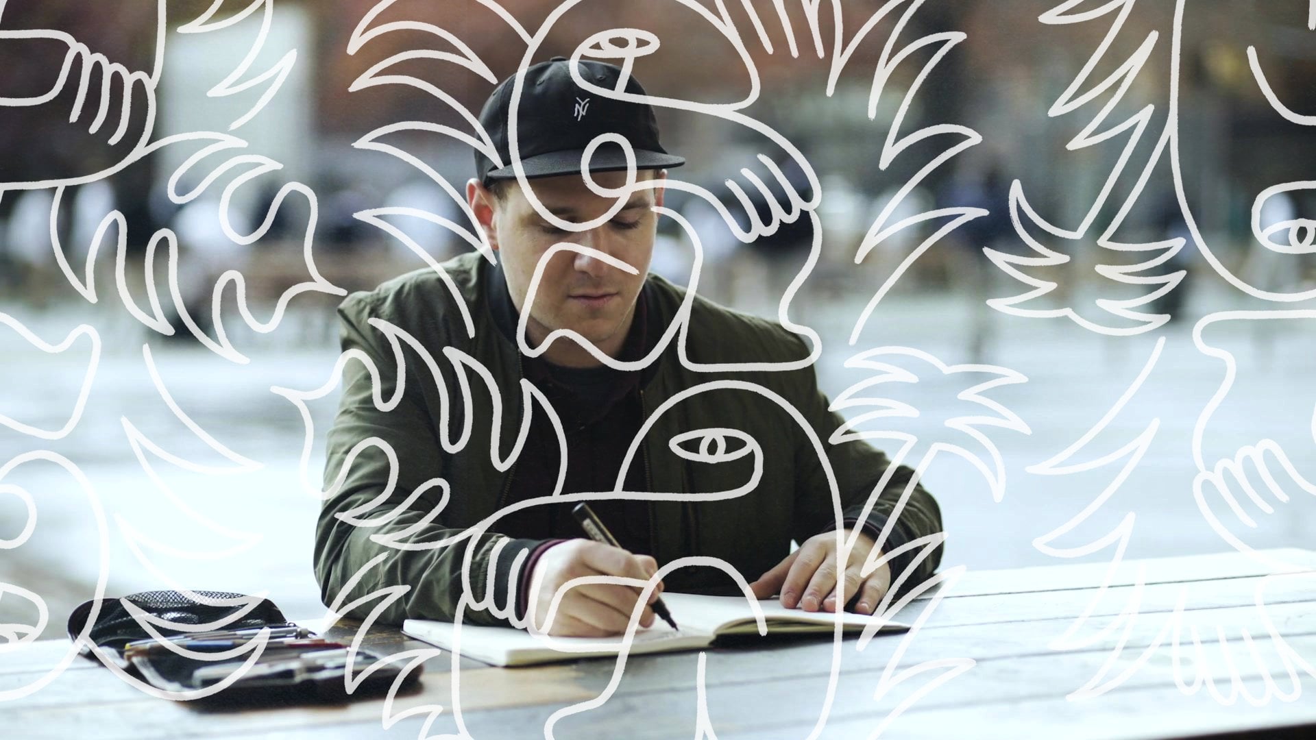
1. Introduction: When you were playing that record, what were you thinking? Hi, I'm Eric Friedensohn. Most people know me as Efdot. I'm an illustrator, artist, and muralist based in Brooklyn. A photo can really bring you back to a memory in your past, and when you go back and add your own illustrations and details on top of the photo, you can increase the storytelling and make the photo even more powerful. This year I've gotten to work with Topps. I've been re-imagining 20 of their iconic cards from their archive. I've been putting my spin on it, re-illustrating them and creating one-of-a-kind pieces of art. Photography is like music that can transport you back in time to when the photo was taken. What we're going to today is like a remix. We're going to get into something that takes inspiration from where the art originally came from but adding your own unique spin on it. I'll be showing you today how to draw directly on a photo and remix it into a photo illustration, bringing out your own unique artistic expression. I'm going to take you through my process of choosing a simple photograph, concepting and sketching, illustrating and adding color and ending up with a final finished photo illustration. This class is for up and coming illustrators, graphic designers, photographers, artists, really anybody who's starting to try digital illustration. More than the sum of its parts, a photo and illustration are going to end up yielding something way beyond what you expect. I'm excited to take you through this. I love this process of photo illustration so much because it takes out the intimidation of the blank canvas. You have a photo you can already start with and develop your artwork from there. You can go back into your own memories, find something that you want to revisit and bring it to light and make it something really special. I'm super excited to share this class with you. Let's go.
2. Class & Project Overview: Today's project is to re-mix a photograph. We're going to be choosing a personal photo and adding in our own illustrations, that really bring out a story and show off your artistic expression. I chose this project because it's a really fun way of creating multilayer artwork that takes out the stress of approaching the blank canvas. A photograph gives you a lot of material to work with already, so this project is great for those just starting out. In today's class, we're going to cover a few different steps. First, we're going to look at some of the artists and photographers that inspire me and some examples of combining photography and illustration. Then we're going to look at our own photograph and assess which ones are good for photo illustration. After this, we'll learn how to come up with concepts to enhance the photo and really tell a story. Then we'll get into sketching, refining, and coloring our own composition on top of a photograph to create our own photo remix. We'll also look at various uses for this new artwork from social media, to prints, to editorial applications. Since we're working with digital photography in this class, the primary tool we're going to be using is the iPad. Whatever drawing tablet you have at home works, but you need a stylus. I'm going to be using the Apple pencil. I'll also be sketching and brainstorming ideas on paper in my sketchbook with pencil, pen, marker, whatever you have is fine, but the main tool you're going to need is the drawing tablet. Keep an open mind throughout this class. It'll be successful if you create something you didn't expect if you get a little bit messy, and you start to look at photography and drawing in a whole new way. Let's get into it and start checking out some photos.
3. Finding Inspiration: This video is all about gathering inspiration. Here we have a bunch of my favorite books from artists that inspire me. Some of them, photographers, some of them, illustrators, some of them combining the two mediums. Hopefully, this gets your gears turning and gets you inspired for the project. This first book we're going to look at is by Christoph Niemann, it's called Sunday Sketching. Christoph Niemann is a world famous illustrator from Germany. He has this process where he'll just take a simple photo of something in his home, and then he'll figure out a way to tell a story by adding some simple illustrations to it. This is of a much more minimal approach than what I'm typically used to, but they're all really clever, and I love how he's looking at different objects and everyday items in a totally new way. When was the last time you saw a roll of tape and thought about a bicycle? Really cool ideas in here. Whenever I'm feeling stuck and I can't come up with a clever concept, I pull out this book because Christoph just has so many good little anecdotes in here. The biggest takeaway I get from Christoph's work is to reimagine ordinary everyday objects and see them in a new light. What was the role of tape? It might get turned into a bicycle if you have the imagination for it. That's the cool thing about illustration, as you can really imagine anything, it doesn't have to exist in the real world. You can combine the real and imaginary worlds, and I think Christoph does an amazing job of that. The next book I want to show you is by Jonathan Mehring. It's called Skate the World, it's National Geographic Skateboarding book. I'm a huge skater, and I wanted to show you this book because of the compositions here. We can talk about which ones of these might be good for photo illustration, not for today's project, but just looking at really high-quality photos and the action of photography here. In this case, for example, there's a lot going on in this photo. It works really well on its own. I don't know if this one really needs any photo illustration. It might get lost if you started adding details on the bottom here. But then when you find a photo that has a little more negative space like this one, it's a much simpler composition, not as much noise going on. One of these might be good for adding illustration on top. The takeaway from this book I wanted to share with you is that not every photo needs illustration, some of them are beautiful and exciting on their own, and you might actually be doing a disservice to the photo if you add illustration. Look for those photos that have some negative space, not too many details. I'm using skate photography, but you can use whatever photography you want. I'll also be telling you a little bit more about how I choose photos and analyze them in the next lesson. The last book I want to show you is a Keith Haring book. This is some of his works from the 1980s. If you don't know Keith Haring, you should definitely check out more of his work, but I love his style so much, it's influenced me a lot. I think the thing I love about it is how simple the line work can be, but it can still tell such a compelling story and really draw you in and make you want to understand what's happening in the image. He painted a lot of murals as well, and his work inspired me to get into mural painting using big bold brushes and unconventional tools. I think his work, out of all the artists out there, has had one of the biggest influences on my work. You can imagine that some of these might look good with a photo in the background. He did a little bit of photo illustration in this book, but most of it is just really simple black and white line drawing that can be applied to a photo with a big brush show and procreate. This is great for inspiration for the class. Something else I loved about Keith Haring's work is he always had a message behind his art. Rather than just doodling fun, abstract lines, he actually wanted to change the world with his art. How can you approach this project with a mission or a message that can move it beyond just simple doodles on top of a photo? In addition to the great artists like Christoph Niemann, Keith Haring, I wanted to show you some more obscure artists. This one is a book by Artemio Rodriguez, he's a Mexican artist. I hadn't heard of him until just a year ago. But when you go to the bookstore, you're going to find all the typical artists that other people are looking at. But I think in order to push your style in different directions, it's helpful to find some more obscure references and to gather inspiration from unexpected places. This is his style, it's very influenced by Mexican folk art, and this night and day, heaven, hell duality that you see in his work. I just like looking Artemio's work because it's just so weird and different. It resonates with me deeply. Whatever artwork resonates with you, it doesn't have to be one of the great artists that everybody knows their name, it can be someone you just found out about yesterday and no one knows who they are. it could actually lead to a whole new body of work. Something else I like about his work, just flipping through these pages, is just how the little details he includes make all the difference, like this is such a cool spread, but he decided to shade it in a way that was unconventional, almost like a tattoo or an old etching. I think that that choice just makes this illustration so powerful. Look for your own references. Look for different artists that inspire you, they don't have to be the most famous artists out there. It's okay to have strange references or obscure artists that you look up to. If anything, I think following artists and getting inspiration from unexpected places, the more obscure the better, because you're going to get more interesting results that most people aren't getting those same references. Look for those obscure artists that no one else knows about and get some inspiration. The last artist I want to show you is named Kervin Brisseaux. He also uses portrait photography, similar to how Chris does it. Kervin and Chris both have their own visual language of how they draw on photography. This probably took them a long time to develop, but you can see here that all of his photos have the face cut out with an illustrated background, adding accessories on top. It's a really unique look. I love when his work pops up in my feed and I always get inspired when I see it. Just like taking a simple model photograph and elevating it in a way that's really unexpected. For these three artists and the books that we have here on the table, I'm going to list them in the Links section of this class so you can check them out, do a little further reading on them. I'm also curious to see who inspires you. When you do post your project at the end of this class, site your references because it's always cool to be sharing work that we haven't seen before. This next piece I want to show you is a card design that differ the tops project. This is Willie Mays. With all the cards really, I'm doing research to find out what makes this player unique and what was part of the story. I found out that his nickname was The Say Hey Kid. Incorporating some details from the context, New York 1954 really just to tell that story of what was on the original card, but didn't exist as part of the graphic, so remixing it in my own way. The finished card looks like this in a case. I think this was one of my most fun ones just because it feels like very dudely and energetic. Now, this last one I want to show you is a photo that I took myself in Union Square in Manhattan. Originally there was no mural here or there's no lettering, it was just a red wall. I saw it while I was walking down the street and I thought that place would look perfect for a mural. I'm using this process of photo illustration, in this case, it's lettering, to tell the story of what was happening in this New York moment. It actually ended up leading to a commercial project and I was able to paint this mural in real life. That shows you the power of using this process to show off your imagination. If you're a photographer, you're not able to actually execute what's in your mind, you can use this process to pitch it to a client and you never know where it's going to go. Hopefully seeing these artists that inspire me and some of my work has gotten your gears turning a little bit. Now I want you to spend some time looking for artists that inspire you and make sure to add those when you upload your projects later at the end of the class so we can see who inspires you. It's always good to be sharing work that is fresh and exciting. Now, in the next video, we're going to show you how to choose a photo and get started in the process.
4. Picking Your Photo: In this video, we're going to talk about choosing a photo and what photos make for good photo illustrations. We're going to be focusing on action photography, specifically skate photography for me. But it could be as simple as two people high-fiving or a person waving or holding up an object. There a few considerations that you should be thinking about when you're going through photos and trying to select the right one for your project. The first one is about the action that's happening in the photo. For me, I'm going to be doing skateboarding photography, but you can choose whatever action you want. It could be as simple as two people doing a high-five, it could be someone holding up an object, athlete doing their sport. It's really up to you and you can get creative with this. Second consideration is the background. What's happening behind the subject is going to inform how you draw on top of it. If you want to completely block out the background and illustrate a brand new one, that's up to you. But if there's something there to work with, I'd say use it to your advantage. The next is the lighting. If you find a photo that has good lighting and there's enough contrast in the image that you can see what's going on, that's usually a good photo. If the figure is silhouetted out of the background and they're popping forward, that works, but it's also going to give you a more dramatic effect. It's just up to you. It needs to have good lighting and be in focus. The next thing you want to be looking at is the composition of the photo. Make sure that you're using a photo that you're happy with the cropping as is. You can crop the sides or change the composition in the final illustration, but at least having enough information to work with in the photo is really important. The last thing to think about is how does the photo makes you feel? It sounds simple, but if you end up with a photo that has a really dramatic feeling to it, that's how your illustration is mostly going to look in the end. If you want to create something that's really uplifting and happy, then try to find a photo that gives you that expression right off the bat and then you can use those to inform your illustration. A simple portrait or landscape might not be enough to work with. We're going to start on my favorite resource for photography, which is Unsplash. Unsplash is a stock photography website where you can search for whatever you want. They're really high-quality photos. In terms of stock photo websites, it's one of the best out there. I just started skateboarding and I'm going to see what I find. Let's talk about some of these images and see which ones would be good for illustration. Remember, these are all free to use on Unsplash. You can go into your camera roll if you want and find some photos from your past, but they do need to be high-quality, they need to be crisp, need to have something to work with there, so be picky. It's okay to be picky in this stage. Looking at these photos, immediately drawn to this one because it has a lot of negative space in the sky. There's a very clear subject and action going on. There's also an interaction happening here between the photographer down here and the skateboarder in the air. There could be some cool storytelling there with an illustration. Something like this is cool. It's more of a lifestyle shot, is more ambiguous, you can't see the person's face. Might be a little bit harder to work with. Something like this is really cool because it silhouettes the subject making more of the focus on the illustration. If you're going to do something like this with a silhouette, you got to be more confidence about your illustration skills because you're not going to be able to rely on much of the photography there for telling the story. This one's a little bit too boring. It's like much going on. It's a skateboard with water in the background. I would try to find something that has a person in the photo doing an action. This one would be perfect. Lots of open space to work with. Again, this would have more emphasis on creating content from the illustration. I think this one has a good balance of subject and background with a little bit of information going on in the background. I can see using an image like this and adding some speech bubbles or adding something happening between these people in the background and the person in the foreground. You can go and search whatever you want on here. They have pretty much every sport. I'm actually going to use a photo of myself for this project though. This one was a throwback to the previous Skillshare class. We filmed it in a skate park. This is the same skate park where we filmed my last Skillshare class, which was about sketching an illustration. I really like this photo. It's going to be a bit of a challenge because there is a lot going on in the background, but I have some ideas already of what I could do for this. Spend some time looking through photos and find the one that you want to use for your photo illustration. Before you move on to the next video, make sure you have that one selected so that we can get started. Feel free to look through your camera roll and find images that are the most crisp and the most compelling. I do think that you're going to find some great stuff on Unsplash if you want to go there and find something that's meaningful to you. If you definitely want to use a personal photo, that's fine, just make sure that it checks all the boxes. Once you've chosen your photo that you want to work with for this project, we're going to move on to the next section, which is about brainstorming ideas.
5. Concepting & Brainstorming: In this video, we're going to be covering concepting and brainstorming ideas for your photo illustration. We're going to be looking at the photo. First before you start doodling all over it, let's look at it and get some ideas of what we could actually put on there. Let's slow down a little bit and create some lists of words and some sketches on paper that we can then work into our photo illustration later on. The idea of this exercise is to get into the open mode. The open mode I covered a lot in my previous Skillshare class about inspiration to illustration, but it's the idea of just letting go of what needs to make sense or be productive and just getting the ideas out of your brain onto the paper. This is a great way to let perfectionism and the idea of something finished, just let it go. This is about being in the moment, channeling that curiosity that you have when you were a kid and looking for things that most people might not see right away, and that is what is going to make your illustration more strong in the end. The first exercise that I like to do is just writing lists of words on paper. I call them word association lists, and I usually start just with a blank page. I write whatever I can on the top left corner just to beat the blank page, so I'm writing Skillshare illustration on photography. I have my photo here on my iPad that I can reference and look around and see what details catch my eye, and that's going to inform how I make these lists. I'm looking at this photo here, the subject right in the middle of the frame. There's a lot of passion on my face in this photo. My friend Henry shot this a few months ago, and I remember that feeling of doing that trick on that day and I'm just thinking about what was going through my head. I think the first thing that comes to my mind is just the thrill of skateboarding. I'm just going to let my mind wander and write down some words. You might feel like the words you're writing are a little bit cheesy or unproductive. Again, the idea is just to get stuff on the page. You might come back to one of these words and that could end up making your illustration really amazing in the end. Now I'm starting to look around the photo at the background. There are some other people and buildings in the back. I think the windows could be an opportunity to make some fun details in the back, the sky for sure, and then what does that mean to me this idea of being in the urban landscape. Maybe that's what I want to bring home with this, is like the place of where I'm skating here in this photo. Every photo has contexts in it, even if it's just a little bit in the background. If you want to play that up in your illustration, that is a great way to do it. It's just like filling in the negative space with details that further the concept of the place the photo was taken. If I wanted to put in the sky like Brooklyn, that's one way to fill that space and make it feel more exciting. Some of the people in the background here I'm seeing they're just lounging. If there are people in the background of your photo, you can add speech bubbles, like little lines in the back to create a secondary story in the image beyond just the main subject. I think when I see Brooklyn and I think of this skate park, it's gritty, it's do it yourself. I like how my shirt is flying up in the wind a little bit, so there's some motion there. Maybe it's like flying. I can put wings on myself if I wanted to get real fancy with it. I think the fence is an opportunity to bring in some details. I could have peeking through the fence or putting a hole in the fence. If there's a wall in the background of your image, you could bust a hole on the wall. You can literally do anything you want with these details, so breaking through the wall. You see how this exercise is going to help me come up with some better ideas versus just immediately jumping into the easiest thing, which is to outline the contours of the photo. I think since I have some words here already and some ideas, I can always come back to this and add more words, but I'm going to start on this opposite page, start sketching some of this ideas out. Since there's all these windows in the back, I thought it would be cool to have maybe a hand coming out of a window, something like this. Maybe someone, if this is the building, could be someone coming in from behind the building. If the sky is open, you can also add details like planes or birds coming in from the back. Just going to draw these here so I remember, maybe I'll put some animals or objects in the sky. The tree. Same thing if you wanted to include a little squirrel hanging out on the tree, you could have a little squirrel. These are not meant to be perfect sketches, these are just me coming up with ideas. Remember that. Don't judge the quality of your sketches here, this isn't going to be in the final thing. I think the fence was a cool opportunity. Now that I'm drawing the fence, I can see maybe putting letters here. Something that's maybe not noticeable right away when you look at the image, but it would be cool if you zoomed in and you saw letters inside the fence here. Just continuing to look around in the photo and find interesting areas that inspire me and things that we could add details to. I think some of these skate obstacles here are interesting geometry. I will just redraw them and think like, "What else could that be?" It almost looks like a bed or something like someone hanging out, laying down. I see this skateboarder in the back of the shot and he's moving, so maybe putting some lines to show the motion there or maybe showing what he's looking at, what he's thinking, so doing some speech bubbles, like stay focused. Maybe it's two spires in the background are interesting. I might end up editing them out depending on what I do in the back here, but they definitely call more attention to the center of the image and I think it actually helps a lot. I think the photographer did that on purpose, framing me between those. You could also add that on your image if I wanted to add more spikes and more spires coming off the image. I think something I like to put in a lot of my illustration is a little manhole cover and have eyeballs inside the manhole so someone's like picking out. Something about hiding and only showing part of a figure in your illustration can be really fun especially in a city like New York, there's always mysteries around every corner. Now I'm thinking critically about these ideas and thinking what's the feeling that I want the viewer to have when they look at this image. It's already a pretty energetic pose and action that I'm doing here in the photo, so I could just play off of that and try to make it as energetic as possible or it could be more about the context. It could be about just skating in Brooklyn, or it could be about the thrill of just skateboarding in general. I think I'm going to focus more on the context because these buildings in the back are so recognizable for me. Skating in Brooklyn is my concept for the main, for what I want to share with the world. Maybe if the viewer has never been to Brooklyn, it'll be an aspirational thing that they would love to come visit someday. For me, it just speaks to my memories, speaks to what I like to do, my lifestyle here in New York. I think that's going to be my main concept and then I'll use everything else to draw more attention to that. I think this idea of putting a figure coming out of someone in the windows or something happening in the background with the windows could be really interesting, and then just playing up the New York City parks. Another exercise that you could do to help you see some new things in the photo is if you wanted to, you could turn the photo upside down and see what that does to what you see here. I actually didn't really notice this tree that much before, I was just focusing on the sky so bringing that to the bottom of the image makes me want to play with that tree a little bit more. It's funny how when you flip an image upside down that you start to notice totally different things. This T-shape is something I didn't really notice before. That could actually be the start of a word. If I wanted to write a word like thrill on the image, I could use the photo as a starting point for that. Try turning your photo upside down and see what it does for you. If it helps you come up with some new ideas, just make sure you get them down on paper. Because once we start drawing, we'll keep this up next to us and we'll be able to have some good ideas to draw from. While we're working on paper, we can also take a look at some different mark making techniques that I like to use. One of them being the idea of speed. A simple lining drawn like that is going to feel different than the quick line that shows how fast you drew it. Just by looking at it, you can tell. Is a little bit more difficult to replicate that digitally, but if you have an idea that involves motion, it definitely worth trying out and you can manipulate the brushes in Procreate to give you this effect. Another thing to consider is pattern, simply just making dots or lines or shapes. Not that interesting on paper, but if you overlay it over sections of a photo, you can also use as light and shadow, drawing attention to or away from specific areas in the photo. Then on the note of light and shadow, just the idea of adding a dark black line or a white area can also play with the foreground and the background. We'll get more into this when we're in Procreate, but I just wanted to show you how I think about it on paper first. Now that we've got a few ideas on paper, we're going to start drawing digitally in the next lesson, so get ready to start using Procreate.
6. Set Up in Procreate: Now we're drawing on the iPad in this video, and I wanted to first show you a file that I created a while ago, my illustration on another skateboarding photo, and just to show you how the layers work in Procreate, it's very much like Photoshop. You might be used to this, it's based on pixels and each layer is stackable and manipulatable based on whatever you want to do. In the bottom layer, I have my photo. I shot this photo last year, in Mexico. I wanted to tell the story of what it felt like to do this trick so I mapped out some ideas on a layer using a white line work, and just some fun details in here, like scoop and commit, remind me of how I was feeling during that and the craziness of that skate session. Then starting to play with color on a separate layer. In the end, I felt like the white line work was just too busy so I duplicated it and turned it to be black line work, and so that was the final image. I had an optional layer here to make the skateboard black, I think I ended up keeping it like this. But just to show you, you can do a lot with duplicating layers, and now we're going to dive into creating our own file for this project. When you open up Procreate, you have a lot of options here, that common standard. I like to create my own size most of the time, I like to work at a much larger size than I need to. That way, just in case, if I want to scale it down, I have the super high resolution artwork. Sometimes I'll even work larger than the photo. Yes, the photo might get a little bit pixelated, but the artwork is super crisp, and it's a higher resolution than we even need. I'll do one here that is 4,500 pixels by 7,000 pixels, this is a really large file. One thing to note is that if you do a custom size and you start putting in some numbers here, it's going to tell you how many layers you can have in your composition. You can see here that a composition that's 5,000 pixels by 4,500 is going to give us 19 layers maximum. That's just should be enough for me but anything lower than that, if you get closer to 10 layers, for me, in my process, I like to have at least 15 layers to play around with. If we bring that number down, you can see it, it updates to higher number of layers. DPI is the resolution of the image, we're going to keep it 300 so that way if we wanted to print this out, it's going to look good. That's how I set up the file. Let's work with this size, actually. I think that 19 layers as perfect as a maximum. The first thing I'm going to do is I'm going to add my photo and I have it right here. The proportions of the image are a little bit more narrow than the background but that's okay, I'll just turn the background black so it disappears, or a dark gray. Now, I have my photo. I don't have to set up the layers too much here but if I did want it to stay more organized, I can just name them so it's easy to refer back. I have a layer called photo and a layer called sketch. It's really important to be sketching on a different layer than your photo. Because if you're drawing directly on the photo, you're not going to be able to move it around or erase it very easily. It's pretty much just like drawing on paper and it's hard to undo. Those are the limitations of Procreate. You can undo things to an extent but, especially if you quit the app, it's going to be hard to backtrack, so keeping those layers is really important to stay organized. Just to show you an example of what you can do with the layers in Procreate. If I started to draw on this layer two, I can pull up the opacity, and turn it down or turned it up. There's also these different blend modes that create different results in Procreate, that just made me realize that it should be a yellow sun in the background. Feel free to experiment with Procreate and get the hang of it. If you're new to this, there's a lot of great options, but you also don't need to go crazy. In terms of brushes, I have a few that I really like to use that come standard with Procreate, and also a few brushes that I was able to download and import into Procreate. The ones that come standard with Procreate that I like to use are the sketching brushes, specifically the 6B Pencil, which is what I used to create that last illustration I showed you. It has a lot of really nice texture and it really feels like you're drawing with the edge of the pencil when you turn it sideways. The Apple Pencil also has a tilt function so it's going to look differently depending on how you hold it on the screen, and you can also edit the settings within the brush. There's a lot of options here so don't get too overwhelmed. But if you did want to play with the pressure sensitivity or the thickness, or the trail off of the stroke to show more emotion, you can do that in all these settings. There's also this streamline function which sometimes smoothes out your curves. If you have a shaky hand and you wanted to cheat a little bit, I don't think it's cheating, some people call it cheating, but the streamline will smooth out your curves for you, and I encourage you to try it out if you feel like you want smoother curves. Besides the sketching brushes, I really like these inking brushes called Reed and the Brush Pen. Those are my two favorites in that section, they give you a little bit more of a solid, still textured feel. That's what I'm always trying to use in my work is something that feels handmade, even though it was made on an iPad, it still has a little bit of that soul. I'm always playing around with the other brushes that come with the program to see if there's something I can do with them depending on what I'm trying to draw. There's a grid brush. If you wanted to do something that was a little bit more geometric and you needed a layer of graph paper, essentially, in the background, you can just brush that in using the standard grid brush. Halftone, dot patterns, there's a lot of different options in here. Spray paint, I like to use that sometimes to give it that street mural quality. Then I have a few brush sets that I imported into Procreate as well. This one's called the Black Magic half-tones and the Drunk Sailor brushes. They're both downloaded from the same company, it's called RetroSupply, my friend Dustin runs his company, he sells really cool digital tools so I support him with that. Those are mainly all the brushes I use, I don't get too fancy with the watercolor or the oil paint. If you want to play around with those, they're there, but those are my main few categories. You can also rearrange the brushes if you'd like to put your most commonly used brushes at the top or create a new group of brushes just so that they're your essential tools. Make sure you have your new composition setup in Procreate and a nice high resolution, still keeping some layers for you to play around with, and then import your photo and we'll be ready to get started.
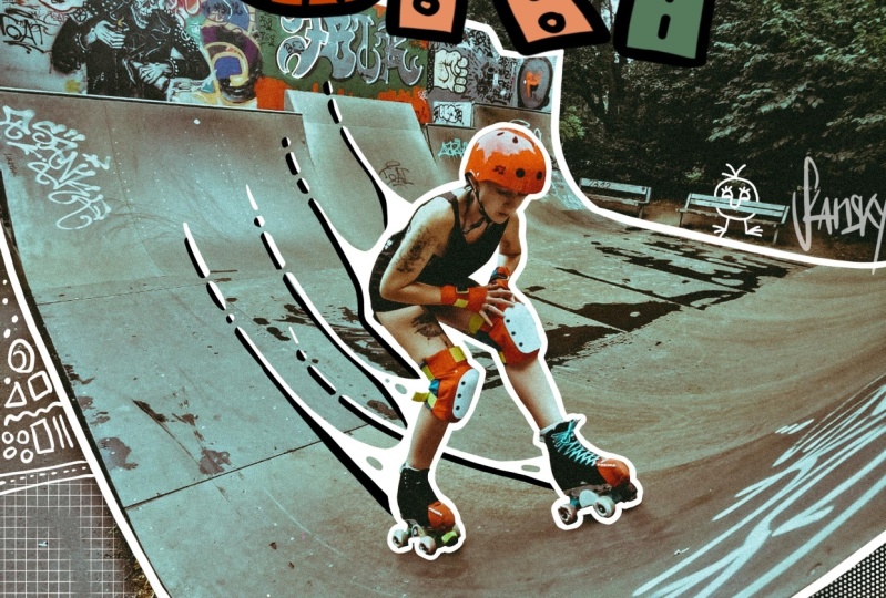
7. Sketching the Layout: Let's get started on our photo illustration. We have our file setup, our photos imported. We're going to refer back to the concepts that we came up with in one of the previous videos so that we can sketch some ideas on top of the photo and really start working with the composition. First thing I'll do is I'll make that new layer where I'm going to be sketching my ideas. I'll start out with a 6B pencil. Since this photo is relatively light, I'll start sketching with black, and looking back at my lists here on paper, I know that I want to incorporate this idea of energy into this piece. There's already some energy going on, but I think telling the story of skating in Brooklyn, how it feels to be doing this trick is what I want to illustrate here and just heightening what's already going on. I also want to give this a little bit more of a sense of place. I'm going to add some details that feel like Brooklyn to me and illustrate the scene a little bit better, more than what you can see in the shot. The first idea I came up with was if we can scale down the photo a little bit, that's an option that we don't often consider, you don't have to use the exact composition. If we wanted to add more sky on top, we can do that. I'm going to add a little bit more white on top and see how that looks as a sky. Luckily, the sky here is pretty bright white. I'll probably will take out the tree. Just brush right over that, and then for the fence part, I'm not going to worry too much about it right now. I might end up doing illustrated details over that, but at least now, this gives us a little bit more negative space on top because my idea was to put some lettering on top that says Brooklyn or skating in Brooklyn. I'm going to try both. Naturally, I work very quickly with the layers. I've already created a second layer. Let's just call this one sky. This one will be called sketches, and we'll go back to the black. Without thinking too much, I'm just seeing how it looks with some big bold letters on top. It almost feels like an album cover already, and if you feel like you're running out of room, you can always just select the area and scale it down, play around with that individual layer or even just part of that layer. I was running out of room, the classic lettering mistake, so I just scale it down. One of the best parts about doing this digitally is you can scale down and scale up your layers really easily. You can do that with collage and move them around, but you can't easily scale with analog materials. That's one of the things I love about Procreate. If I wanted to just make this B in Brooklyn a little bit larger to match the other letter, I can also select it with the Lasso tool, and just increase the size of that B. It might be cool if it was peaking up from behind the buildings. I'm going to try adding a little bit more lettering on top that says skateboarding in Brooklyn, or just skating in Brooklyn. Now, I can turn on and off a layer to see what I liked better. I think it needs something on top, but the way that I did it here was too big, too bold. Let's see how that looks scaled down in terms of the composition. I think that's feeling a little better. I'm going to try drawing it in a more simple one line style. Sometimes you draw the image and it just looks better when you add more or less letters, so it's okay to change up your ideas as you draw. This is feeling pretty good so far in terms of the lettering. Now, I'm going to look back at my ideas on paper and see which are the things that we can add in the background to make this more interesting. Definitely, most of the focal point is on me in the middle here. One of the easy ways to draw attention to part of your image is to do a contour line around the figure or around a specific part of the image, it almost gives it an effect like it looks like a sticker and it has like a white border around it. You can add even more details and do a pattern around the border, but it's definitely a great way to draw attention to part of the image. I can try just outlining my body here. As you can see, it's creating a texture from that pencil brush. I'm going to use a different brush, one One my Drunk Sailor inking brushes to get a CRISPR line. This is also one of the first steps that I do when I start doing my baseball cards, just to get started and have something to go off of, is just drawing right around the figure to isolate. I just came up with an idea while I'm drawing around the skateboard, I could even put some lettering on the skateboard coming down and that's one of those details that you probably won't see right away. That's the beauty of working with an image that's a little bit more busy, is you can hide little Easter eggs around the composition that aren't easily noticeable right away, but it adds a lot of depth to the finished piece. If I wanted to add like NYC here, it's a nice little place for our detail. I'm going to save this detail for a little bit later once I have smaller things working.
8. Adding in Elements: You can always increase or decrease the size of your brush on the left side. If you want to get more precise, just bring it down to a closer point, or you can change brushes entirely and try using a different tool, same thing goes with the eraser and the brush tool. I think I want to play around with some of the windows here, I'm just going to start by doing the same thing on a new layer, isolating the windows, call this layer windows. Which are the windows that I want to call attention to? This one feels right in terms of the placement and the composition, the eye naturally goes up and around the hand and leads your eye over here, if I wanted to add a little detail here, I feel like it would add a lot to the composition. That's something to think about too, is your photo already has a natural way that your eye moves around the composition. You can use your illustration to accentuate that and create even more movement. Little shortcut that I learned recently is if you double tap the Apple pencil, it switches from brush to eraser, sometimes I do it by accident. I think it would be cool if I created some movement towards the center or away from the center, so potentially doing some lines radiating from here can be cool. They don't have to be straight lines, they can do wobbly lines. Maybe coming from one side you can try it just to see if it feels balanced like that. I think maybe since I'm coming up the ramp, I can accentuate that and just see how it looks, that feels cool. Instead of just having these lines floating, I can connect them here so it feels like it's radiating off of the figure. I'm not using color here, I'm just using black and white to get the composition. We're going to worry about just getting the ideas down first, refining them later, and then adding color at the end. I'm going to fly through this so that we can keep filling out the composition. I'd like to add some fun details because right now it's feeling a little bit too expected, one of the ideas I had in my sketchbook was to have an arm reaching out and one of the windows or to have a squirrel climbing up the fence. The plane in the background as well, just finding the right placement for that, I think the top-left could be good for our plane. First I'm going to add a little bit more sky back there. Now I just came up with an idea as I'm drawing this, it would be cool if the plane had a banner that was trailing off of the back of the plane and that had some of the lettering inside of it so that it wasn't just floating. Maybe the skating in becomes part of the the banner here, in order to re-size it, I just got to go to the right layer. In this phase of sketching, nothing is precious, every layer that you're creating is just an idea that can be turned on or off, manipulated or erased to refactor your fine into your final piece. Don't worry about getting everything right in this stage, it's just getting all the elements onto the page so that you have something to work with. I am just adding in the details now for the banner coming off of this plane, I don't know if I'll end up keeping this, I think it feels better than it did before, so I think we're headed in a good direction. I keep being drawn to this figure in the back here, it would be cool to have him with a speech bubble, not sure what he's saying yet, but I think having something there helps to balance out the composition a little bit. It's already getting a little bit busy, but I wanted that. Then in the refining and color stage, I can simplify or bring things forward and backward using opacity or different techniques. But for now it's just getting all these elements on here. It would be cool to add an animal climbing up here, and then out from this window, having a hand coming up, it can even come over the topography, it's coming up here and it has the Hangzhou symbol. Helps to tell the story a little bit. That's good enough for now. It can also go and erase some of the lettering so that it pops forward. One of the tricks in procreate that you should get accustomed with is the masks tool, sometimes you want to erase part of your layer, but what if you want to change your mind and go back and use it again? You can duplicate the layer and just manipulate the new copy of it, but one easy way to do it is to have a mask. You just click the layer, click mask, and now you essentially have a layer on top of your drawing and you can erase away details, but they're still there when you turn off the mask. If I ever want to get back these lines from the lettering, they're still there. I can show you by turning the mask on and off. I'm not actually erasing them, just hiding them temporarily, and that gives me an idea of what could be in the foreground and background just by playing around with that. Since it's Brooklyn, maybe we add a little bodega on the corner, I can add a little sign here that just says bodega. It's really small, so most people won't notice it, but those little things that make people smile. Hopefully, it will make your illustration be more memorable, be the more special to you. I'm going to see what it looks to lay some shadows down on the ground because right now these lines get a little bit lost. What happens if I take the pencil and just shade in the ground here? I'm going to move this layer underneath my line work so I can see it popping up front, I'm not sure if I like it. I can turn it on and off to see which one I like better. I think having something on the ground is going to help, but maybe not pure black. In the next video, we can try to refine that, but I think this is coming together nicely. Something you can also do is, if you have a flat surface, just when I was showing you with the mural mock-up, if you have a flat surface in your image, you can draw and make it look like there's actually writing or images on that surface. Here there's a sign on the outside of the park, I could add some lettering that looks like it's tagged graffiti on there. I'm going to write, "Live for today." I can go back and retrace this with a different brush if I want to get the spray paint effect, but I like that phrase, I feel like it belongs there. You can get away with vandalism and procreate, I still don't know what I want this guy saying, but I can figure that out later. The only part of the composition that's bothering me right now is this part, because it's feels like it's a whole, I think to fill that area, maybe I'll do some drips coming off of the window here. If you see an area of your image that feels it's empty or your eye keeps getting stuck on that area, just go back to your lists and see if there's any ideas you can work in or you can also start back over and come up with some new ideas on paper. Whichever feels more comfortable if you want to draw on the iPad or list things out on paper. Right now I feel like this is feeling pretty balanced overall. The entire composition is slightly crooked, I'm realizing with the ground here, but I can select every layer if I want and just rotate them and see how that looks. If we want to even it out. Now, the vertical is getting a little bit crooked, so maybe we distort the image slightly to get both the horizontals and the verticals straight. I can also just enlarge everything or add more of the sky later, but these four corners will allow you to distort the image and get the perspective that you're looking for. Takes a little bit of playing with, and then you can also hit undo with tackling two fingers and then redo, tap three fingers and see which one you like better, I think I like the straighter version better. It does help to Zoom in and make sure that the image is staying nice and crisp. We're working with a nice high resolution image, so we're good, but if you do start distorting and resizing your image it's going to affect the resolution. I think this composition is ready to go in terms of the basic layout. In the next video, we're going to start refining the details and finally add color.
9. Refining the Lettering: We have our sketch on the iPad now, and we've laid out most of the different elements that we're going to work with. It feels semi-balanced. In this video, we're going to be retracing over some of these elements and refining the shapes so that we are moving towards the final illustration. What we can do in this stage is turn off the background layer, which is the photo, to see what we've drawn. If you're not able to see it, you can also change the background color to make your illustrations and drawings pop. That way, you can at least see what you're working with. Here, the main things I'm going to refine are the lettering, where it says "Skateboarding in Brooklyn." I'm just going to retrace over everything with a little bit more detail and attention to the form of it because I want it to flow nicely and just feel refined. I'll do that on a new layer. I can also group the layers that I already created just by selecting all of them swiping to the right and then hit group. That's my sketch group and I often name every single layer. But if it helps you, you can name the group of layers, sketches, and then I'll be able to turn off and on the first version versus the second version. I'm going to use the inking brush, the Drunk Sailor brush, you can also use the Reed brush or one of these other inkers. You just test them out and see which ones you like if you want to get a finished look. I'll also turn down the opacity of the sketches a little bit, just so that I can see that they're there, but I don't have to see them at full opacity. I'll start with the lettering. Let's retrace the lettering. I do like this big blocky style for the lettering, it feels like street art, it feels natural for the setting. But in order to make it pop off of the background, I think doing a filled in layer versus just the line work is really going to help, and I can also play with different values, so maybe the B is one color and the R is another color. Right now, I'm just going to work with gray to make sure that this is working on a contrast level. I believe that good design works with or without color, and so it's helpful sometimes just to start in grayscale before you get carried away with color. Once you find the color that you want in this color palette, you can just simply find the color and then click the circle and drag it onto your shape. Another example with black here. Sometimes it fills in more than you wanted it to, I only wanted it to fill this area with the R, but it ended up filling in with the B, so in that case, you might have to do it manually. There's other ways of doing it using the selection tool. If I wanted to just select the R, now, I can get it like that. It just takes some getting used to with the layers, and it also depends on what brush you're using. If it's easier for Procreate to see the edges of the shape, then it'll have an easier time filling it in. I think just having the letters be alternating colors would be pretty cool, so a medium color and a dark color, since the background is light. I'm going to do the same thing and just draw right over this area and I can mask it out later, just so that I have the Brooklyn lettering isolated on its own layer. To select a color in the composition, you can just use your finger, hold down for a couple seconds, and it'll pull up the color picker. I'm also refining the edges of the letters as I do this, just adding a little bit more negative space or positive space, where I feel like it needs it to make it more legible and more pleasing to the eye. A lot of this is just intuitive after practicing lettering for a long time. But if you zoom out, and you look at the whole thing, maybe the left side of this looks a little bit too heavy, so maybe we try adding back those counter shapes and see if that helps. When I used to do lettering as my main focus for my creative work, I was so picky about getting every letter perfect, and it took some time for me to really snap myself out and just let go because there's so much amazing art that you can create when you're not focused on following the rules and making the most perfect, most legible, the most whatever. Just do it the way that feels natural for you and it just took me a long time to embrace that. That's the process I'm using right now. I'm not thinking. I'm using the tools as an extension of my hand and just going through, and it becomes a bit of a flow state after a while, where you're just responding to what's on the screen and not thinking too hard. Now, I'm going to do a new layer. We'll call this one Brooklyn. We'll call this one the Plane and we can turn down the opacity of the one that was sketched there before. With the plane, I do want to take a little bit more time to get this to look like a nice shape. Because it's on its own layer, I can easily adjust the size or the proportions of the plane. Maybe I'll make it a little bit smaller. I think I'm going to leave it as a line drawing for now. I can see how it looks at the end. Then I'm going to retrace this banner, taking a little more time to get these curves nice and smooth. If I wanted to use that streamline option in the brush settings to get my curves a little more smooth, I can do that, and that way when I draw, it just smooths everything out. I'm looking at this top line and basing it off of that. I think when I draw the lettering in, right now it doesn't really make sense the way the lettering is sitting on the banner, I think it should actually be going up and down like the waving of the flag. I think I'm going to add another layer with pencil and just do some guidelines. I know that the lettering is going to sit inside this shape that I'm drawing right now. Let's try a lighter gray to differentiate it. Lettering can be tedious to get it to feel right, but I think it's worth it in the end to spend that little extra time. Do one more layer on top of that. I can get rid of the sketch underneath. I'll just add a few more guidelines here. Skateboarding, in will go here, two letters, S-K-A-T-E-B-O-A-R-D-I-N-G, 13 letters. That's a long word. The middle will be right around here. For longer words, I'll draw a line in the middle so I can build outward from there. The middle letter in skateboarding I guess it's the o. The o is going to be right around here. This is another sketch layer. I'm not going to use this in the final but it just helps me to map it out. A little bit too small there, and I'll just undo. Now I'll do one more layer on top to retrace that a little carefully with the inking brush. It feel a little bit larger, so it's bold. I can see if I like that. I think that feels like a good thickness for the letters. I'm just going to move it down a little bit. Now I'm just going to go ahead and finish the rest of this lettering on top. That's closer to how it's going to feel, I think it's better. Still going to keep that bottom layer turned on so I can reference it for some of these other details, but I'll turn down the opacity so it's not as distracting. I think we need to finish off the end of this banner. I'm going to match the angle of the lettering here, and do a diagonal. I think if I remember seeing a banner, it has these triangles coming off of it, and then strings. This is just based on memory. If you're drawing a representational image and you need a reference, it's super easy on the iPad to import a photo. But I'm just going to wing this one. This feels a little bit too big, so I'm just going to distort it a little bit. Because I drew this on another layer, I can move this back and forth and decide which should be centered right above there. I think that feels good. Now I will create a new layer for this detail here. I think that could be a light gray filled in. It'll probably end up being a bright color, but for now light gray is fine. Just to see what I'm doing, I can darken the background. I'm going to turn the photo back on just for a second to make sure it's looking good. Let's turn off the sketches layer, so that now we have lettering and we have the photo. It's starting to come together. You can see how the sketch is just getting more and more refined through this process of redrawing and repositioning. I'm going to make a few more refinements here on the art. I definitely need to clean up the area around the figure and these motion lines and retrace what's happening on the fence. But I'm going to fast-forward through this so you could see what's going on. Now I'm adding some outlines here just to make things pop a little more. It's a very busy photo. I'm probably going to also add some shadows underneath some of these objects. It's getting pretty crazy. I could also eliminate some of the elements if I felt like maybe part of the photo just needs to be covered so it's a little less crazy. I wonder what it would look like if we brought everything in and it was more of a square image. Something that's throwing this off is the fence on the left side. If we take the lettering and the plane and everything, and we just pinch it in, and then we cropped everything. I'm not actually going to crop the photo because I want to save it just in case. What I can do is add a rectangular bar right here. I almost like that better. I can toggle that on and off to see. It just feels more focused. What's cool about this is I can also have the lettering poking out of the boundary a little bit. The border then becomes part of the image. I lost some of that graffiti lettering but I felt like it was probably too much for such a small space. Let's turn off the sketches layer. This is what we're working with so far. The sky can come back. I'm going to add some black lines underneath these white lines just to make them come forward.
10. Polishing the Details: Now I'm feeling good about this composition and how all the elements are starting to work together, but it still needs a little bit more refinement. So I'm going to do one more session of just cleaning up all the details and playing with the shadows so that it doesn't feel so busy, and then we can move on to the color. I think it needs a few more minutes of cleaning up those details so I'm just going to dive in. Found a cool moment in here where I was calling out one of the windows and I realized that the leg was blocking it, so now I'm going to erase it out from the leg. I might do that with more of the windows now so that you can see through what's happening in the foreground into those windows. I'm going to add a little camera on the bottom left corner. Something was missing from that area and I thought maybe a camera looking up and to the right might solve that problem. This is looking pretty good overall, but I'm seeing that some elements are balancing each other out, like the arm and the leg on the left and right side are balancing each other out. But this speech bubble needs something on the bottom left to balance it out. So I'm going to add in a little camera icon pointing up towards the middle of the photo just to draw your eye back. It also helps to tell the story of taking this photo at the skate park. I think it's going to be fun. I didn't do a sketch of a camera, but I'm not going to go back to the sketchbook at this point. I think I can just wing this. I think that's a good tip, is don't get hung up on drawing one thing just because you like it. I'm sure that you can think of better ideas that if it doesn't feel like it's working that can fill in the spaces better around your image. Sometimes you can't force a square peg into a round hole. Feels a little bit better. It's like an old school medium format camera. You'll notice here that some of these shapes have drop shadows, some of them have outlines. Sometimes I like to keep them all consistent like everything has an outline or everything has a drop shadow. But in this case, I think it's fine to have a little bit of inconsistency. This is a very energetic illustration, I think it adds to having a little bit of variation in there, as long as there's not only one part of the image that gets a special treatment that the rest of it doesn't. If you're going to have multiple techniques going on like outlines and drop shadows, at least having a little bit of both scattered around the image is going to be good. It's going to balance out the camera a little bit by adding some black down here. Here's where that faster line comes into play where I'm using a light pressure on the iPad and I'm getting a nice brush stroke with this read brush. I can really play with essentially like a vignette around the image. I don't normally do this, but I think for this specific image, it makes a lot of sense. Just covering up some of the edges with black just to simplify the image a little bit more and draw your attention to the middle. Play with some of the windows popping through there. I think I just got to add a little bit more black on top and then we're good. Ended up making this more of a square composition in the end. Wasn't expecting to do that, but it just felt like there was all this unnecessary information on the sides and it was detracting from the overall image, so don't be afraid to change things up. Now this feels like it's working on a black and white level, which is amazing because if it's working here, it's most likely 99 percent of the time going to look even better with color. If you jump straight into color and it's not working, sometimes you got to go back to the drawing board. I think having this all worked out with just light and shadow is going to help us a lot in the next stage of the process. Once you have your artwork in a good place with black and white, we're going to move into the next video, which is all about adding color and finalizing our photo illustration.
11. Applying Color: To get started with adding color, we're going to first just look around the illustration art and see which areas we want to add color to. So right now I'm looking at it and I think the lettering for sure should pop and that should have a bright color. I can have two different colors for each of the letters, maybe inside the banner, I'll add some color. I think these white lines coming off are going to stay white because I like the way that they pop, but I'm also going to play around with adding color in the arm and the leg and the little speech bubble. I'm probably going to keep the background as a black vignette. I think it looks nice as is. Here are some general tips to think about when you're adding color to your photo illustration. One is how much color is already in the photo. You can make your photo from a color photo into a black and white photo and then keep the illustrations in color, or do the opposite and see what effect that has. I totally recommend you just try different options and see what you like. You can even duplicate the entire document and procreate and try a different version so that you don't have too many layers stacking up. For me, I've started to identify which areas I want to color in. I'm now starting to think about what colors I want to use. Something you might not know about me is I'm partially colorblind, so I can't actually see all the colors. I can see most saturated colors. That's why I tend to work in that palette of primaries and secondary colors. It's like really bright colors. All those desaturated ones are the ones that give me trouble and I don't like the energy of those anyway, are too subdued. I'm much more energetic person. I like my artwork to feel that way as well. In terms of which colors to use, I'm gravitating towards blue and yellow for this composition, I think certain colors have a really strong connotation. Red can feel like danger or can feel like anger. If it's used in sparing ways, it could definitely add a lot of energy to a piece, but blue is always a good color to start with, it's a very pleasing palette. I think some of these letters can go blue. Blue also sounds like the word Brooklyn, so it just came to mind. I'm going to duplicate the gray-scale layers and just start filling in colors. There's two different ways to fill in colors. One is by selecting the color and just dragging it in. You can see it already started to fill in multiple letters there. Just the way that procreate recognized the different letters there. I actually like the colors that it shows automatically, the only one that it didn't pick up there was the y. So I'm going to do that one manually. We've got our blue Brooklyn. Having that looks really nice as is, if you want to play with it without modifying everything too much, you can do a hue saturation layer and just play around with the hues here to see which color looks best. I definitely think red is not the right fit. Green, not too bad, I like green. The blue's still my favorite, I think. Purple could be an interesting direction. Right now. What do we think? Purple or blue? Blue is too expected, let's do purple. You can also play with the contrast here because we have two different colors. I can do a curves layer. This just shows you all the values that are in the image on a graph. If I pull in the highlights, you can see that all the bright pinks turn more bright, if I pull in the shadows, all the dark purples turn more dark. You can also play with the mid tones by flexing this curve up and down. Looks like the y got a little bit brighter for some reason, I can fix that. That feels good so far for the other letters. This y has given us a little trouble, so let's just fill it in manually. Sample the color from one of the other letters and drag it right in. Nice. That looks good for the lettering. I'm just seeing this area right here that was bothering me. Have the lettering come over that, so that it comes forward. If you need to add back some outlines or shadows, it definitely has a different field when you add color to it. With the Brooklyn lettering, I'll just erase out some of these areas. Can also do this at the very end after you've applied your color. But since it's pretty fast, I just want to thicken up this spaces a little bit. Great. Now for the arm and the leg, which are the second largest elements in the composition. I usually start from largest to smallest. That way you can just control what's the most impactful element on the page. It's almost like the hierarchy of information that you get in graphic design. For this, maybe we will use a lighter pink in the same family as that purple. I think a little bit lighter maybe. Can also play with making it a little more red or a little bit more blue. I think let's go into the reddish family. That feels good. Again, as I'm adding this color, I'm noticing some other things that I want to just fix about the way that the shape interacts with the other shapes around it. You can just correct those things as you go or do it all at the end. Next element is the leg. I think since this one was a light-colored, I'll probably do this one a darker color. I'll keep it in the same family though since they're related on the page. Oops, I think I'm on the wrong layer. There we go. That feels good too. Let's try a slightly darker one for the hand just to see how it looks. I can undo and redo to see which one feels better. I think I like the darker version better because it allows for the subject to just pop forward even more with the white lines there. Looks like I might have missed a spot here. I just fill that in. I think the way that the black is sitting behind this feels good, but it needs to match on the other side. I'm just going to add a little bit more black behind here. Some people will say that black isn't a color, it's at the absence of color. I think for all the purposes of this class, black is certainly important to work with while you're adding color as everything affects what's around it. A little bit more up here. I'm keeping this pretty sketchy and loose. That's one of the good things about photography is that it hides imperfections a little bit. It's similar to like, if your design is very straight and geometric. If one of those lines is a little bit wonky, you're going to notice that. I think if you work with more organic lines or if you work with photography that has a lot of value diversity I guess, like a lot of highlights, mid tones and shadows, it hides mistakes pretty well and you can really just keep it loose. But then when you zoom out, it all comes together. Add little bit of shadow underneath this white line just to make it pop forward. Whatever you want to pop forward, now's the time if you want to add a shadow underneath it or a highlight on it. In this case, we're working with a white line, so it's already a highlight. You can really see how that one little detail of removing that white line makes it go backward in space and it looks like it's wrapping around this skateboard. Let's see, if you want to add any more color anywhere else. This one ended up being a pretty minimal style illustration, in terms of color. I think maybe adding an outline around the lettering could be interesting. With black, just because everything else is getting a black shadow or a black outline. I'll just do a final touchups on top layer. I think this banner on the top needs to have just a subtle color in there. I'll do almost white, but like a pinkish color underneath there. It's telling me that I'm out of layers. So that means I got to delete some stuff I'm not using, happens all the time with these large files. We're good now. I like that pink. It's like a Pepto-Bismol. I'm just going to add a little bit more black to make the subject come forward in space as like a big blob underneath and see if that helps. Too much black. Just a little bit more there I think will do the trick. At this point, I was noticing that the middle of the image is not as exciting as the outside of the image, but I still want the subject to pop forward. Originally, having these shadows as black, I can try what it looks like with a dark purple color just to see if that helps bring forward the subject a little more, and I think it helps because our eyes gravitate towards color. So everywhere else has color. Why don't we add it in the middle as well? Then it can actually come over the black areas so that the color makes it come forward on top of the background even more. I like the solution a lot. Alternating colors so every other line is pink, purple, pink, purple just gives it that radiating energy. I think a lot of this inspiration also comes from neon lights, flashing. If you're thinking energy, I feel like neon is one of the things where no matter what you're going to draw in neon, it's going to look like energetic. The flashing colors is one of my signature things that I do in a lot of my work. The one area I didn't add color was the chill. I think that can be the same light pink. Just like that, and then the lettering can go black. I'll just use the saturation or maybe it goes purple. See how that looks. At this point, I'm just looking to balance the illustration and make sure that there's enough color in each area. You don't have to cover every single inch. It's just about which parts of the image you want to draw more attention to. Then now, we have a very nearly finished piece. Just to make sure that I like every area of it, I do this test or you just squint at it and see what areas feel they could use a little bit more improvement. I think the left side is feeling a little bit dark, so it could be just brightening up this hand a little bit to see how that looks. Yeah, I think that helps if they're similar in value. We have a finished illustration here. Photo plus lettering, plus simple doodle style illustrations on top. I think it really comes together nicely, it feels balanced. I might do a few more quick touchups just around the edges of things to clean them up. But I think this is looking good. It's looking like almost finished. If you're at this point with your work or maybe you need a little bit more time to refine, don't be afraid to just take a break and put it down, come back to it. You probably will notice different things that you want to change about the piece. But then once it's ready to go, you can export it, and that's what we're going to be showing you in the next video, is how to prepare it for whatever application you want to use it for.
12. Exporting & Sharing: We've finished our illustration. Now we're going to talk about applying it to different usage cases in the real world. For me, I make a lot of prints with my artwork, but that's definitely not the only way you can use an illustration like this. You can keep it all digital, you can use it on social media. You can have it be used as a digital ad or even a printed ad. It could be part of an editorial project. It could just be a simple gift for a friend that you send them in a text message. There really is no rhyme or reason to this. If your artwork is more graphic, it could even look awesome on a t-shirt. When we're exporting the artwork, it's important to keep in mind what application you're going to use it for, just to make sure that it's the correct file format and resolution. If you're ready to print straight from your iPad, there is a way to do that. You do have to have a wireless printer set up. The way you do it, is you just export it just like you would any other way as a JPEG but instead of air it, you save the image and then you go over to your Photos app and hit the little "Share" button, scroll down and there is the print queue. Then you just select your printer and you'll be able to get it off and into your hands. If you're done with the artwork and you're ready to share it, you can do so directly from the iPad. If you have your social media apps on here, you just export it as a JPEG from Procreate and it's ready to go. When you're exporting from Procreate, there's a few different options. You just click the wrench icon, click "Share" and you're here with a few different options. If you wanted to keep the layers and the drawing, you can export it as a PSD. For our purposes, a PDF or a JPEG works fine. I'll just hit "JPEG" and export it via AirDrop to my MacBook Air. Now it's on my laptop and I can import it right into Photoshop and play around with the cropping or getting rid of some of the extra background area, and we'll get this ready for print. Once you have your image on the computer, can drag it into Photoshop or whatever photo editing app you want to use and resize it to the size that you want to print. We're going to add that gray background color here and then just crop it so that this is all we're going to get when we print it out and keeping it to a square makes sense. Then if you're happy with the result, you can just hit Command-P for print and send it off to your printer. All right, let's go grab our print.
13. Conclusion: Congrats. Congrats. Congratulations, you made it to the end of the class. Today we learn how to see photography in a more playful way, remixing it with illustration into something completely yours. We covered a lot of steps in this class, from choosing a photo to sketching and refining your artwork. If there's one thing I want you to take away from this class is not to see photography and illustration as two separate mediums. They both have their merits, but when you combine them together, we can make something that's greater than some of its parts. Remember, photography is capturing what you can see. An illustration is imagining what you can't see. That's the beauty of creativity; you can combine two things that don't normally go together. I'm really excited to see what you created in this class. If you made it part of the way through the class or all the way through to the end of the project, make sure to upload whatever you created, the artwork, the original photo, your brainstorming list and sketches to the project gallery in this Skillshare class. I'll give you some feedback there and also make sure to check out what everyone else made, too. Well, by the way, if you want to check out more of my work, you can find me on efdotstudio.com or on Instagram @efdot. I'm always open to answering questions. Shoot me a DM or an email and I'll get back to you. Thanks so much for going through this class with me today. I'm so excited to see your photos come to life.
 Eric Friedensohn, @efdot - Muralist / Designer in Brooklyn